描写图表
德语专四作文 图表描述
图表描述德福写作部分常见的配图作文有:第一种是表格式图表(Balkendiagramm), 横竖格中的数据表示某种或几种事物发展的状况。
看这种图要注意表格的标题和项目分类,观察各个项目之间的内在关系,对图表中所反映出的数据,趋势或问题进行对比分析,找出和归纳产生的原因,推测出未来的发展。
第二种是数字曲线图(Kurvendiagramm),图中的曲线形象地表示某些事物的状况及发展进程。
看这种图要注意曲线的上下起伏变化,注意年份和对应的增量关系。
第三种是蛋糕式图表(Tortendiagramm),这种图是由一个圆形和圆内几个扇形组成。
各个形的比例代表了相应部分在总量中所占的分额。
此表反映了总量和分量,分量和分量的相对比例关系。
第四种是柱子型图(Sulendiagramm),柱子与柱子之间的数据或百分比表示某种事物发展趋势或者几种事物的比较。
第五种是流程图(Skizze)这种形式表示某些事物之间的因果关系,如温室效应,酸雨,臭氧层空洞等如何产生,某一生产或实验流程。
第六种是组合图(Synthesediagramm),组合图表有多种形式;如饼状型和柱子型、曲线型和柱子型等。
对这种图表的描述要掌握好整体和分图之间的关系。
此特点是对其一图表的概括性描写转切过渡到另一图表的具体描述。
以上六种配图作文的共同点是:要求考生把非文字的信息转化成内容连贯的文字形式,以文字形式来描写某些事物的状况以及它们的发展变化(上升或下降),归纳重点信息,比较数据,分析事物产生发展的原因和结果。
I. Reihenfolge der Beschreibung1. Einleitung:引论、导入:Thema(allgemeine Informationen, keine Details)Erscheinungsjahr /Quelle / Thema der GraphikBeispiele:Das Schaubild mit der Überschrift/Titel …...“gibt Auskunft/ Information über …In der Grafik mit dem Titel …...“geht es um ......In der Abbildung / Grafik / Auf dem Schaubild werden ..... dargestellt / gezeigt.Das Schaubild mit der Überschrift/Titel …....“aus 出处zeigt +A/ dass, ...Die Graphik mit dem Titel …...“zeigt/ beschreibt, dass/wieviel(e)/was/wie…………Das vom Verlag .... herausgegebene Diagramm mit dem Titel …....“zeigt/ informiert darüber, dass.....Die Graphik stammt aus dem Jahr …und informiert über ....../darüber, dass………Das Schaubild/Die Grafik/Das Diagramm gibt einen Überblick über....../ bietet einenÜberblick über........2. Hauptteil:Beschreibung der Graphik in Einzelheiten (Details):-> Überleitung zwischen Einleitung und Beschreibung-> auswählen:wichtige interessante Informationen/Veränderungen-> systematisch schreibenz. BWas wird verglichen? ==>* verschiedene Orte (Staaten, Regionen, Städte)* verschiedene Zeiten* Gesellschaftliche Gruppen und Schichten (Arbeitnehmer - Arbeitgeber, Männer -Frauen)* Was ist beim Vergleich (Zahlenvergleich) besonders auffällig? (Extreme)* Ist die Entwicklung aufwärts, abwärts, stetig, wechselhaft?* Wo sind die Hoch-, Tief- und Wendepunkte?* Wie sind die Anfangs- und die Endwerte? (数目,数字)* Wie sind die Minimal- und die Maximalwerte?运用过渡句:Wie das Diagramm/ Schaubild darstellt, .......(如同图表显示的那样……)Nach diesem Diagramm/ Schaubild / dieser Tabelle ..........(按照这一图表...)Das Diagramm/ Schaubild macht uns deutlich......(这一图表使我们清楚地看到……)Aus diesem Diagramm / Schaubild / dieser Tabelle ist zu ersehen / ersichtlich,...(从这一图表可以看出……)Es fällt auf / Es ist unverkennbar / Überraschend ist, dass ...In der Graphik wird der Anteil/die Zahl G…mit dem Anteil/der Zahl…G verglichen.In der Graphik vergleicht man den Anteil/die Zahl……mit dem Anteil/der Zahl…G3. Schluss->Zusammenfassung der wichtigste(n) Aussage(n) der Graphik.->Interpretation der Besonderheiten (politische / gesellschaftliche / individuelleGründe nennen)BeispieleAus diesem Diagramm / Schaubild / dieser Tabelle ergibt sich, ......(从这一图表得出……)Zusammenfassend lässt sich sagen/feststellen, dass ...(总而言之,可以说……)Aus der Graphik kann man ersehen, dassAus der Graphik kann man entnehmen, dassZusammenfassend kann man sagen, dass …………..Es ist festzustellen, dass die Zahl/der Anteil von/ G ... in den letzten Jahren tendenziell steigt / sinkt.Dieses Phänomen / Diese Entwicklung kann man folgendermaßen erklären: ……..Dieses Phänomen / Diese Entwicklung läßt sich folgendermaßen erklären: ……..Der Grund der Veränderung liegt darin, dass.......Die Ursache dafür liegt darin, dass.....Vermutlich kann man sagen, dass...A ist die Ursache von B.A verursacht B.A hatB zur Folge.B ist die Folge von A.II. Ausdruck数字共计为……die Zahl 数目,数量| die Anzahl (总数中)一部分、一些| der Anteil 部分、份额betragen 总计,共计,总数为sich belaufen auf 合计,共计liegen bei 落在(某个数字)上entfallen auf 分配,分摊ausmachen 共计Beispiele:1. Die Ausgaben für Miete im Jahr 1994 betragen 415 DM.2. Die Kaffeeproduktionen belaufen sich 1970 auf 483.000 t.3. Die Prozentzahl liegt im Jahr 1978 nur noch bei 9,4%.4. Die Ausgaben für Miete im Jahr 1997 machen 267 DM aus.其它表述方法:5. Die Studierenden geben 415 DM für Miete aus.6. Die Studierenden brauchen 415 DM für Miete.7. Von dem gesamten Gewinn entfallen auf jeden Teilnehmer 100 DM.全部利润分配给每位参与者各100马克。
高考英语强化之如何写图表英语作文
高考英语强化之如何写图表英语作文图表作文是graph、diagram、chart、table、picture等数据来阐述论题的一种英语作文形式。
图表英语作文既能考察学生的写作能力,有要求学生有较高的观察力和想象力,是很好的测试题型。
致使近几年,英语图表作文在高考英语中出现的频率明显增加。
目前高考英语中出现较多的图表作文主要分为表格或者图形两种类型。
表格形式作文是将统计的数据或被说明的事物直接用表格形式体现出来。
图形形式作文是用图形表示数据变化、或者表示数据大小或数量之间的差异、异或内部结构变化等等。
如何写图表英语作文?常用写作方法就是先描写数据变化,再分析变化背后的原因,最后点明个人看法及对未来发展趋势、问题解决提出方法等等。
具体步骤:1. 确定主题。
仔细审题,看懂图表的意思,对比数据之间的关系、寻找数据的变化规律,明确作文写作中心。
2.列提纲。
整理文章要点,文章框架结构。
3.写作。
开头直截了当,尽快入题,直接表明主题;行文一般以10个句子为宜,用最有把握的词语句型将规定内容加以表达,各个层次适当使用一些过渡性的连接词,使文章内容连贯、结构清晰;结尾要干净利落,归纳总结或发表评论。
4.检查。
高考英语图表作文高频词语或句子总结表概述:As is shown by the graph,…表列举:for example、for instance表补充:besides、in addition表数量(增减):… amount to …add up to 、come to 、sum up to、… increase from … to …表转折:however、nevertheless、yet表对比:on the one hand…on the other hand、in spite of、Compared with … ,表原因:because of、thanks to、due to表结果:therefore、thus、as a result、so 、It can be seen from the table that …表结论:to conclude、in a word、in brief、to sum up、in my opinion、in short (= In brief)、in conclusion、As far as I’m concerned、To conclude , it seems clear that …。
Writing 2 如何写图表作文 graph writing

—如何描述图表信息
• 注意抓住图表个性( characteristic)。不同 类型的图表反映的信息重点不一样:柱状图的 描写重点在于比较和对比;曲线图重点在于描 述曲线的上升与下降趋势,并对明显的高峰和 低谷进行细节描写;饼状图应该依次描写,突 出重点,如果有几个饼图,还应作对应的比较; 表格信息相对而言不很直观,应在仔细阅读之 后发现其特点,找出突出鲜明的信息对比描写。
图表信息较多时,可以在描述数据变化和比较数据 时顺便将静态数据写出来,如: In managerial positions, there are more males than females ( 10% and 5% respectively).
第三部分:Conclusion 得出结论
• 不要写得太多,一两句话就可以了,重点 在第二部分。 • 基于图表分析原因或展望未来,不要加入 主观想象或评论。
2)减少、下降趋势
to decline/an decline, to collapse/a collapse, to drop/a drop, to go down, to decrease/a decrease, to fall/a fall, to reduce/ a reduction, downward trend, move downwards, slump(暴跌).
Writing Practice
•Task: The chart below shows the number of men and women in further education in Britain in three periods and whether they were studying full time or part time.
高考图表作文专项讲解及练习(有答案)

图表作文本节内容一)图表作文写作要求图表作文就是把非文字信息(通常为各种图表表示的数字信息等)转换成文字信息的一种作文。
它要求我们用文字来描述非文字性的图表或对图表显示的关系作解释说明。
图表作文一般在题目中给出作文的标题和一个或几个统计表格、圆图形、曲线图或条形图,有时还用英文或中文提纲的形式给出提示,具体要求:1. 用文字描述图表,客观解释图表中所传递的信息,并找出某种规律或趋势;2. 就图表中所反映的某种趋势或问题分析其原因或后果。
图表作文着重说明事实,常常通过对图表中所反映的具体数据的说明、分析、比较,对某种事物或现象的事实或变化情况等加以说明,并提出结论或看法。
因此,图表作文常常采用议论文的写作方法。
二)写作步骤1.仔细阅读图表,了解图表所达的内容。
首先,用一句话概括图标的内容。
2.描写图表所反映的问题或规律3.结尾部分得出结论,表述自己的观点,结束全文。
(1)如果图表反映的是好的现象,首先要肯定、发表观点最后预测未来;(2)如果图表反映的是不好的现象,首先要否定、提出解决办法或建议三)写作实用表达(一)点明主题引用具体或粗略的数据,然后作出概括性分析,点名主题或引出需要论述的问题。
常用的词有:1.泛指一份数据图表:a data graph/chart/diagram/illustration/table饼图:pie chart 表格图:table 柱形图:bar chart趋势曲线图:line chart / curve diagram2.describe, show, represent, illustrate, reveal等等。
3. figure, statistic, number, percentage, proportion常用的开篇句型(即概述图表内容时常用的表达法)1.The graph/chart/table above shows / describes / illustrates that.....2. From the above graph/chart, it can be seen that…3. As is shown in the graph…4.The chart/table shows the differences between…5. According to the table/pie chart/ graph/bar graph, we can see/conclude that …(二)分析差异描写变化及总趋势特征、分析差异:数据说明常用套语:1.There was a great /slight increase /rise in…2.The number /rate has nearly doubled, compared with that of last year.3.The number is …times as much as that of….原因说明常用套语:1.The reason for…is that…2.The change results from the fact that…3.There are several causes for this significant growth in…. To begin with .... In addition/ Furthermore/ Moreover,...4. There are many factors that may account for...but the following are...(三)得出结论结尾常用套语1. Personally/ as far as I’m concerned/ in short/ in brief/ in conclusion /in summary2. It’s clear/evident from the chart that… / We can draw the conclusion that…3. From what has been discussed above/Taking into account all these factors, we can draw the conclusion that…4. There is no doubt that special attention must be paid to the problem of...5. It is high time that we put an end to the tendency of...图表作文常用单词、词组和句型总结:1)表示数据变化的单词或词组rapid/ rapidly 迅速的,飞快的,dramatic/ dramatically 急剧的sharp /sharply 明显的,急剧的significant/ significantly 重大的sradual/ gradually 渐进的,逐渐的steady / steadily 稳固的stable / stably 稳定的slow /slowly 缓慢的slight / slightly 略微的2)在描述中常用到的词汇significant changes 图中一些较大变化noticeable trend 明显趋势distribute 分配in terms of/ regarding/ with regard to/ as far as sth is concerned 关于,就...而言3) 描述增减变化常用的句型Compared with … is still increased by …The number of … grew/rose from … to …An increase is shown in …; then came a sharp increase of …In … the number remains the same/drops to …There was a very slight (small/slow/gradual) rise/increase in ......There was a very steady (marked/sharp/rapid/sudden/dramatic) drop (decrease/decline/fall/reduction) in ....../ compared with that of last year).4) 图表作文常用句型精选1. The table shows the changes in the number of.....over the period from....to......该表格描述了在...年至...年间...数量的变化。
德语图表描写
图表描写一、描写Schaubild的三大部分1. Einleitung 引论、导入:Thema 主题——allgemeine Informationen, keine Details 大致内容,无须细节例如:Das Schaubild/Die Grafik/Das Diagramm ->beschreibt | zeigt | informiert über | gibt einen Überblick über | bietet einen Überblick über | stellt ...... dar | veranschaulicht | handelt sich um或者使用被动态:Auf dem Schaubild/In der Grafik werden ...... dargestellt/gezeigt.2. Hauptteil 主体部分:Detailinformationen 细节信息-> auswählen 选择:wichtige interessante Informationen/Veränderungen 重要的、有趣的信息或变化-> systematisch schreiben 系统化地描写3. Schluss 结尾:Zusammenfassun g, eventuell Kommentar 总结,可以加一些个人的评论例如:-> Zusammenfassend lässt sich sagen/feststellen, dass ... 总而言之,可以说……-> Aus dieser Grafik ergibt sich, dass ... 由这幅图可以得出……二、数字共计为……die Zahl 数目,数量| die Anzahl (总数中)一部分、一些| der Anteil 部分、份额betragen 总计,共计,总数为| sich belaufen auf 合计,共计| liegen bei 落在(某个数字)上| entfallen auf 分配,分摊| ausmachen 共计例如:1. Die Ausgaben für Miete im Jahr 1994 betragen 415 DM.2. Die Kaffeeproduktionen belaufen sich 1970 auf 483.000 t.3. Die Prozentzahl liegt im Jahr 1978 nur noch bei 9,4%.4. Die Ausgaben für Ernährung im Jahr 1997 machen 267 DM aus.其它表述方法:5. Die Studierenden geben 415 DM für Miete aus.6. Die Studierenden brauchen 415 DM für Miete.7. Von dem gesamten Gewinn entfallen auf jeden Teilnehmer 100 DM. 全部利润分配给每位参与者各100马克。
英语图表作文写作及范文

10
图一分析
• 一、借助于题目Job Problems for College Graduates,可以看出是关于大学毕业生找工作的 问题。因此尽管表中有许多数字,但只要顺着有 关工作职业的数字,就能发现图表所要反映的问 题。
• 二、看图表哪些数字变化最大:图表中有三组六 个数字,分别表示毕业生继续读书、找专业对口 的工作和找专业不对口的工作。但以后两组数据 在十年里的变化最大。因此它们就是文章要讨论 的主要问题。
decreased dropped fell
from 10 to 5 percent. to 15 percent. by 15 percent.
23
3. The
figure percentage number population
has nearly has almost has more than
• 2)看一下图表中的哪些数字前后变化最大。
9
图一(Job Problems for College Graduates)
4% 7%
89%
12%
58%
30%
1981
1
2
3
1992
1
2
3
• 上图1、2 、3分别表示: • 1:Graduates who continue to study • 2:Graduates who take jobs irrelevant to their majors • 3:Graduates who hold jobs in their majors
19
例2
• Rising Divorce Rates in China
(per thousand)
16
图表趋势描写用词
今天我们所要关注的是运动图表,无论是什么题目的运动图表,无论题出的多难,我们都要清醒的认识到,那就是考官也逃不出如下的5个范畴,它们分别是运动范畴,程度范畴,时间范畴,数据范畴与连接范畴。
在运动范畴中存在着如下的8种运动趋向:1、保持平稳:我们可以使用的套用结构有: stay stable/ remain steady举例:表示人口数量保持平稳的时候可以写: the number of population stayed stable。
/the number of population remained steady2、上升/增加:我们可以使用的套用结构有:rise/ climb/ increase/ ascend/mount/aggrandize(增加)举例:人口上升:the number of populationincreased/ascended/mounted等等。
3、下降/减少:我们可以使用的套用结构有:fall/ drop/ decrease/ descend/ decline举例:人口减少:the number of population decreased/ declined4、下降后保持平稳:这个线段前面是向下的,后面是平的,在表示这个平的时候我们就不可以使用remain steady了,我们要使用的结构是bottom out举例:人口下降后保持平稳:the number of population decreased and bottomed out5、上升后保持平稳:前面的上升我们就不用说了,但是在上升以后保持平稳,我们需要使用level off举例:人口上升后保持平稳:number of population mounted and leveled off、6、复苏:前面下降了以后,然后就上升了,这两条线段的连接点就叫复苏。
英语中表达为recover举例:人口下降后复苏:number of population decreased and recovered7、波动:就像我们的心电图一样。
四六级图表作文的写作
一.图表作文发展的历史背景图表作文在四六级98年6月四六级作文合题之前共出现过五次,其中六级四次(均为chart),四级一次(为table)。
合题从98年月始到03年1月止,共十次,只是在02年6月考过一次图表作文。
之后分题之后,六级在03年6月与9月连续两次考察了图表作文(9月的考试是北京等七省市由于众所周知的原因而推迟的考试)。
图表作文历来被认为是一种相对高级的写作形式,所以早期多在六级出现。
图表作文至少包含描述图表与解释原因两个部分,所以字数较长,因此首次四六级同时使用与字数的增加正好恰合。
而图表作文的提纲中很少只包含两个部分,即只要求大家描述图表与解释原因,如02年6月第3条提纲即是“你认为目前大学生在计算机使用中有什么困难或问题”,而03年6月六级考试第3条提纲是“说明这些变化对个人和社会产生的影响”,这就构成了混合模板的文章(上述两篇都是原因——后果/影响类的文章)。
即使提纲中只有两点(如96年6月六级),最后下结论时还是要或多或少有一些办法或展望式的话语,这跟原因类文章是一样的。
二.图表数据的描述不管是chart还是table(由于在四六级考试中还未出现过考研中常见的cartoon,所以此文暂不引入此话题),都必须进行描述,而且最好放在文章的第一部分,且长度不宜过短(根据具体情况而定),也不要太长(一般不要超过第二段的长度)。
虽然在实际阅卷中,阅卷老师对于数据描述的总的容忍度很高,也就是只要语言正确,采用不同的方法均可以,但是阅卷老师之间由于种种原因,在此问题上的理解很不一致,甚至有的人不看第一部分,直接跳至第二部分,所以这里给出一点意见,即在第一段的处理上建议大家应采用折中的手法,即总结规律、切中要害(引用数字要见机行事),而不要过细,面面俱到,或者直接得出规律而完全抛开数据。
描述数据我们要首先看看是几个变量(A),每个变量有几个数据(B),不妨以A*B表示。
现在大多数时间是chart,需要大家读图,表格只出现过一次,而这次的变量和数值都很多(91年6月四级,是4*5)。
雅思小作文各类图表写法汇总
雅思小作文各类图表写法汇总1、line graph线图要注意分段。
尤其是多条线,如果放在一起描述,很容易混乱。
所以建议还是分开来描述,主要原则是仅看描述就能画出图线。
一般而言,是按时间,除了结合时间还要看走势上的分段,大段的描述不可缺;另外就是最高点和最低点,以及拐点的数字以及时点描述。
只有具备了这两点,才能画出图线的走势。
对于不同线之间的比较,可以在最后一段进行,利用交点进行分段。
2、Bar chart柱状图,同样的,要注意分组。
尤其是多国家、多年分之间的比较,建议考生根据最大的特点分成两组(最多三组),然后分组(一组一段)进行叙述。
此类图中,可以少用数据,可以动态的方式进行描述,同时可以利用排名来叙述特点。
描述完特点后,如果图表较为简单,最后一段可以把每项的最高、最低点写一下。
如果类别少(2个),还是分别进行描述比较清晰。
无论了line graph 还是bar chart 尽量以单项从头至尾的描述为首选(这样清晰明了),中间穿插一两次对比,或者最后对比。
(但这种描述方式只适合于比较的项目少的情况,即只是两者之间的比较。
类别一旦多,如果是可以归为两类的情况,则也可以采用这种描述方式,否则不适用)3、Table表格也可以分为动态描述和静态描述。
动态:即为紧跟一个国家,从头到尾描述完所有特点,然后再描述另外的国家。
静态是:每个特点就每个国家分别描述。
无论以上两种采用哪一个,都应当注意分组,尤其是在国家和特点过多的情况下,分组描述,可以减少字数。
对于明显的两类,建议采用动态描述法,因为它们在每一项特点下都具有相似的规律,这样比较明晰。
两个图表的写作:一般分为两段,分别进行描述。
如果其中一个图特别简单,可以用最后一段简单描述,如果两个图表差不多复杂就采用1:1的比例,分别对各自特点进行描述,然后在最后一段将两者进行联系和比较。
雅思写作4、Pie饼图建议不要按一个一个饼来描述,而是根据饼中的信息进行分组描述,同样的注意动态描述和最值,这里不多加赘述了。
英语作文图表数据描写
英语作文图表数据描写The Evolution of Digital Media Consumption.In the ever-evolving landscape of digital media, understanding the trends in consumption patterns is crucial for businesses, marketers, and content creators. This article delves into the intricacies of digital media consumption, analyzing the data presented in various charts and graphs to uncover valuable insights.Firstly, let's take a look at the overall trend in digital media usage over the past decade. The graph reveals a steep upward trajectory, indicating a significant increase in the number of hours spent on digital devices. This rise is primarily attributed to the proliferation of smartphones, tablets, and other mobile devices, which have made digital content more accessible and convenient.Breaking down this data further, we can see that social media usage has grown exponentially in recent years. Thechart depicts a dramatic surge in the number of activesocial media users, especially on platforms like Facebook, Instagram, and Twitter. This growth is driven by the increasing popularity of social media as a means of communication, entertainment, and information dissemination.Another notable trend is the rise of video content. The graph shows that the number of hours spent watching online videos has skyrocketed in the past few years. This is dueto the increasing availability of high-quality video content, coupled with the rise of platforms like YouTube, Netflix, and Amazon Prime Video. The popularity of short-form video content, such as TikTok and Instagram Reels, has also contributed significantly to this growth.Moving on to the demographics of digital media consumption, we find that younger generations are the most avid consumers of digital content. The chart reveals that millennials and Generation Z spend significantly more time on digital devices compared to older generations. This is because they are more tech-savvy, have grown up in adigital age, and prefer consuming content in digital.。
高考英语书面表达:如何写好图表作文?

图表作文多以说明文和议论文为主;考查时要求同学们根据所给的图表、数据等进行分析、研究、阅读其中的文字和说明,弄清各种信息之间的关系,提炼要点,然后组织语言进行写作,得出令人信服的结论,必要时还要加入自己的观点。
时态方面除特定的时间用过去时外,常用一般现在时。
表格(table)、曲线图(line graph)、柱形图(bar chart)与饼形图(pie chart)。
图表作文通常是三段式。
1.第一段分析图表中的数据变化反映出的问题或趋势,简要叙述图表所揭示的信息。
常用词汇:table, chart, figure, graph, describe, tell, show, represent等。
2.第二段分析原因。
在描写数据间变化及总趋势特征时,可采用分类式或对比式以支持主题,并阐明必要的理由,且要注意层次清楚。
常用词汇:rise, drop, reduce, fall , rise, increase, decrease, on the contrary, as…as…, compared to/with, the same as, be similar to, be different from, in contrast to3.第三段提出解决问题的办法或建议。
常用词汇:in a word, in short, generally speaking, it is clear from the chart that, we candraw the conclusion that等。
另外,还应注意以下几个问题:◆文章应包括图表所示内容,但不必全部写到;◆叙述调查结果时要避免重复使用百分比;◆最重要的是要有表明自己观点的句子。
1、How to begin your passage 直接点明本图表所反映主题.(1) According to the table / chart/ graph, we can see/conclude that …(2) The table/ graph/ data shows/ indicates/ points out that …(3)As we can see from the table, …As can be seen from the graph, …As is shown in the chart, ….2. How to interpret the related information 分析数据间的主要差异及描述趋势increase/ rise / climb / go up / jump/ rocket/ doubledecrease/ go down/ drop/ fall/ decline/ reduceremain stable/ go on steadily/ stay the samesteady/steadily; slow/slowly; slight/slightly;gradual/gradually;rapid/rapidly; sudden/suddenly;significant/significantly;dramatic/dramatically;sharp/sharply80%: eighty percent1/2: half of the…3/4 : three fourths of the…是…的两倍: double that of…/ is twice that of…剩余的: the rest(谓语形式依据所指代的名词单复而定)①3/4的学生喜欢体育运动。
表格描写
1、图形种类及概述法:泛指一份数据图表:a data graph(曲线图)/chart/diagram/illustration/table饼图:pie chart直方图或柱形图:bar chart/histogram趋势曲线图:line chart/curve diagram表格图:table流程图或过程图:flow chart/sequence diagram程序图:processing/procedures diagram2、常用的描述用法The table/chart diagram/graph shows (that)According to the table/chart diagram/graphAs (is)shown in the table/chart diagram/graphAs can be seen from the table/chart/diagram/graph/figures,figures/statistics shows (that)……It can be seen from the figures/statisticsWe can see from the figures/statisticsIt is clear from the figures/statisticsIt is apparent from the figures/statisticstable/chart/diagram/graph figures (that)……table/chart/diagram/graph shows/describes/illustrates3、图表中的数据(Data)具体表达法数据(Data)在某一个时间段固定不变:fixed in time在一系列的时间段中转变:changes over time持续变化的data在不同情况下:增加:increase/raise/rise/go up ……减少:decrease/grow down/drop/fall ……波动:fluctuate/rebound/undulate/wave ……稳定:remain stable/stabilize/level off ……二、相关常用词组1、主章开头图表类型:table(表格)、chart(图表)、diagram(图标)、graph(多指曲线图)、column chart(柱状图)、pie graph(饼图)、tree diagram(树形图)描述:show、describe、illustrate、can be seen from、clear、apparent、reveal、represent内容:figure、statistic、number、percentage、proportion2、表示数据变化的单词或者词组rapid/rapidly 迅速的,飞快的,险峻的dramatic/dramatically 戏剧性的,生动的significant/significantly 有意义的,重大的,重要的sharp/sharply 锐利的,明显的,急剧的steep/steeply 急剧升降的steady/steadily 稳固的,坚定不移的gradual/gradually 渐进的,逐渐的slow/slowly 缓慢的,不活跃的slight/slightly 稍微的、略微地stable/stably 稳定的3、其它在描述中的常用到的词significant changes 图中一些较大变化noticeable trend 明显趋势during the same period 在同一时期grow/grew 增长distribute 分布unequally 不相等地in the case of 在……的情况下in terms of/in respect of/regarding 在……方面in contrast 相反,大不相同government policy 政府政策market forces 市场力量measuren n.尺寸,方法,措施v.估量,调节forecast n.先见,预见v.猜测三、图表描述套句精选1.the table shows the changes in the number of……over the period from……to……该表格描述了在……年之……年间……数量的变化。
如何描写表格雅思写作
如何描写表格table描写表格的方法与其他图表相似,需要采用比较和对比的方法, 只是它包含的数据多,信息量大。
因此描述表格应注意以下几点:1. 不要把所有数据全部描述。
2. 把数据归类。
在归类过程中往往需要考生运用常识对表格的信息进行分类. ClassificationBe classified into n categories –the simpler, the better3. 寻找重点数据,例如:最高,最低,最大,最小等.抓特点,找趋势。
对比比较出结果。
Sample 1:The given table summarizes some data collected by a college bookstore for the month of June 1997. Write a report describing the sales figures of all the publications, based on the information shown below.Body:Members of public would not buy fiction books, and only 44 college staff and 30 college students buy it. However, fiction books bought by book club members equal to the amount of college staff and college students.Compared with non-book club members, book club members prefer non-fiction books, for they have bought 800 non-fiction books, which is far much higher than others.The number of magazines bought by college students is amazing. It reaches 1219. On the contrary, book club members do not like magazines very much, for they only bought 29 magazines, which means one eleventh of books bought by college staff, one sixtieth by college students, and one third by members of public. (最大最小倍数)。
柱状图写作技巧

柱状图写作技巧1. 柱状图写作注重“比较”(找出similarity)和“对比”(找出difference),也就是说需要横向总结所有柱状图表的共性特征,也要分别描写各个柱子的个性特征。
2. 有两种写作方式:其一是对不同时间段内的数据进行比较,适合于数据代表的物体较少且时间界限明确的情况。
另外是对单独数据的全程描述,适合于描述数据对象很多且时间划定不清晰的情况。
柱状图数据描述句型举例:1) the bar chart shows the changes in the numberof……over the period from……to……该柱状图描述了在……年之……年间……数量的变化。
2) the bar chart provides some interesting dataregarding……该柱状图为我们提供了有关……有趣数据。
3) this is a bar chart which describes the trend of……该柱状图描述了……的趋势。
4) As can be seen from the diagram,great changes have takenplace in……从柱状图中可以看出,……发生了巨大变化。
二、曲线图写作技巧1. 曲线图是动态图,解题的切入点在于描述趋势;2. 在开头部分对整个曲线进行一个阶段式的总分类;3. 趋势说明。
即,对曲线的连续变化进行说明,如上升、下降、波动、持平。
以时间为比较基础的应抓住“变化”:上升、下降、或是波动;4. 极点说明。
即对图表中最高的、最低的点单独进行说明。
不以时间为比较基础的应注意对极点的描述。
曲线图数据描述句型举例:1) The line chart depicts the changes in the number of……over the period from 2010 to 20 13.该曲线图描述了从2010年到2013年……数量的变化。
报告中如何描述和解释图表和图形
报告中如何描述和解释图表和图形引言:在进行研究和分析时,图表和图形是一种常用的工具,用于传达数据和信息。
当我们写报告时,对于图表和图形的描写和解释是至关重要的,因为它们可以更直观地呈现数据和结果。
本文将探讨如何在报告中恰当地描述和解释图表和图形。
一、描写图表和图形的基本信息无论是柱状图、折线图还是饼图,我们都需要在报告中提供这些基本信息:图表或图形的名称、数据来源、数据范围、单位等。
例如,对于一张柱状图来说,我们可以写道:“下图呈现了2010年至2020年间每年的销售额。
数据来源为公司内部销售数据统计。
”二、描述图表和图形的趋势和变化我们常常利用图表和图形来展示数据的趋势和变化,因此在报告中,我们需要对其进行精确的描述。
例如,我们可以写道:“从图表可以看出,销售额在2010年至2013年间逐年上升,之后在2014年达到巅峰,随后开始下降,并在2020年达到最低点。
”三、解释图表和图形中的关键点有时,图表和图形中可能存在一些关键点或异常情况,需要我们给予解释。
在解释时,我们可以联系相关的背景知识,提供对这些关键点的合理解释。
例如,我们可以写道:“销售额在2014年达到了最高点,这可能是由于市场需求增加和推出了新产品导致的。
”四、比较和归纳当我们有多个相关的图表和图形时,可以进行比较和归纳,以展示数据的差异和联系。
比如说,我们可以写道:“与2010年相比,2015年的销售额呈现了显著的增长,然而在2018年和2020年销售额出现了明显的下降,这显示出市场竞争的激烈程度”。
五、解读图表和图形的影响因素图表和图形所展示的数据和结果受到多个因素的影响,我们可以在报告中对这些影响因素进行解读。
例如,我们可以写道:“销售额的下降可能是由于市场饱和、经济不景气和竞争加剧等多个因素共同影响的结果。
”六、提出未来趋势和建议在报告的最后,我们可以通过对图表和图形的分析,提出未来的趋势和建议。
例如,我们可以写道:“鉴于市场竞争的激烈程度,公司应该加大产品研发和市场推广的力度,以提升销售额,并寻找新的市场机会。
英语描述图表资料汇总

英语描述图表资料汇总这类图标话题或作文描述时,注意以下几点:审题时,除了要把握好图表的表层信息外,还要分析图标的深层含义,如原因、根源、可能的发展趋势等。
图表中所提供的说明文字往往是问题的切入点,一定要仔细分析。
描述数据时要抓住重点,为中心服务,不必面面俱到,切忌毫无目的地罗列图表中的数据。
如果数据较多,抓住图表中的极端点(如最大或最小、最多或最少,最好或最差)和基本相同进行描述。
主题句应明确,最好放在文章的开头,这样会使重点突出,主题明了。
常见模板第一段:总体描述图表,指明时间段,指出突出变化或不同常用句型或短语:As is clearly shown in the chart(图表)/ table(表格)/graph(线性图), ___________ According to the figures given in the table/chart/graph, ____________It can be seen from the table/chart/graph, _____________________.The figures in the table/chart reflect that ________________.especially, ________________(指出突出变化)第二段:(分析原因)There are several factors leading to this change / difference ……..There are several reasons for _____________.(引出原因)To begin with, _______(原因一)In addition, ______________(原因二)For example, _________(举例说明)Last but not the least, __________(原因三)To sum up——————————————(简要总结)第三段:(解决方法)Perhaps the best way to solve this problem is to …Many workable solutions have been found to dealing with this problemHere are some suggestions that we should …My suggestion is that …It is suggested that …提出个人观点As for meFor my partAs far as I am concernedI am in favor of…In my opinion一、词汇积累:1.各种图表的名称(Types of chart)饼状图(Pie chart):饼状图内部分成一块一块,用于表示所占分量,那一块一块就叫"segment"。
图表趋势描写用词
今天我们所要关注的是运动图表,无论是什么题目的运动图表,无论题出的多难,我们都要清醒的认识到,那就是考官也逃不出如下的5个范畴,它们分别是运动范畴,程度范畴,时间范畴,数据范畴与连接范畴。
在运动范畴中存在着如下的8种运动趋向:1、保持平稳:我们可以使用的套用结构有: stay stable/ remain steady举例:表示人口数量保持平稳的时候可以写: the number of population stayed stable。
/the number of population remained steady2、上升/增加:我们可以使用的套用结构有:rise/ climb/ increase/ ascend/mount/aggrandize(增加)举例:人口上升:the number of populationincreased/ascended/mounted等等。
3、下降/减少:我们可以使用的套用结构有:fall/ drop/ decrease/ descend/ decline举例:人口减少:the number of population decreased/ declined4、下降后保持平稳:这个线段前面是向下的,后面是平的,在表示这个平的时候我们就不可以使用remain steady了,我们要使用的结构是bottom out举例:人口下降后保持平稳:the number of population decreased and bottomed out5、上升后保持平稳:前面的上升我们就不用说了,但是在上升以后保持平稳,我们需要使用level off举例:人口上升后保持平稳:number of population mounted and leveled off、6、复苏:前面下降了以后,然后就上升了,这两条线段的连接点就叫复苏。
英语中表达为recover举例:人口下降后复苏:number of population decreased and recovered7、波动:就像我们的心电图一样。
谈谈英语写作:如何描写统计图表
谈谈英语写作:如何描写统计图表杨兰【期刊名称】《大学英语》【年(卷),期】2000(000)005【摘要】统计图表是传递信息的一种重要形式。
要求人们准确无误地用语言来描写图表所传递的内容,进而对数据进行分析与讨论,即为英语测试中的图表式作文。
因此,准确地用英语来描述统计图表所表达的内容,是英语学习者应该掌握的一项技能。
一般说来,图表写作可分为四个步骤:观察图表,组织材料,描写图表和修改成文。
本文将从以L四个步骤入手,介绍一些有关图表描写的写作技巧。
一、观察图表观察图表是为了准确理解图表所传递的信息。
首先要认清图表的形式,抓住其特点。
统计图表一般有两种形式,一种是把统计的数字和被说明的事物直接用表格的形式表示出来,这就是统计表(table,见例1)。
另一种形式是统计图(graph),如线形图(linegraph),条形图(bargraph)和圆形图(piegraph)等。
线形图中的曲线能清楚地显示数据的变化(见例2)。
条形图表示数量的大小以及数量之间的差异(见例3)。
圆形图以圆内扇形的大小表示总体内部结构的变化(见例4)。
观察图表首先要看清楚图表的文字说明,以确定其主题,然后仔细研究图表,以发现数据的主要特征或变化趋势,如例2的标题表明本图为1960年至1990年中国普通学校专职教师每年的总人数,曲线的形状显示了教...【总页数】3页(P)【作者】杨兰【作者单位】【正文语种】中文【中图分类】H315【相关文献】1.高一英语写作人物描写教学实践 [J], 杨凤君2.基于语类教学法的统计图表英语写作教学探讨 [J], 曹煜茹3.过程体裁法在高中英语写作教学中的运用——以人物描写为例 [J], 朱敏4.基于语类教学法的统计图表英语写作教学探讨 [J], 曹煜茹5.浅谈英语写作中的景物描写——以"The Middle Eastern Bazaar"及"Lajia Temple"为例 [J], 方燕妮因版权原因,仅展示原文概要,查看原文内容请购买。
- 1、下载文档前请自行甄别文档内容的完整性,平台不提供额外的编辑、内容补充、找答案等附加服务。
- 2、"仅部分预览"的文档,不可在线预览部分如存在完整性等问题,可反馈申请退款(可完整预览的文档不适用该条件!)。
- 3、如文档侵犯您的权益,请联系客服反馈,我们会尽快为您处理(人工客服工作时间:9:00-18:30)。
描写图表
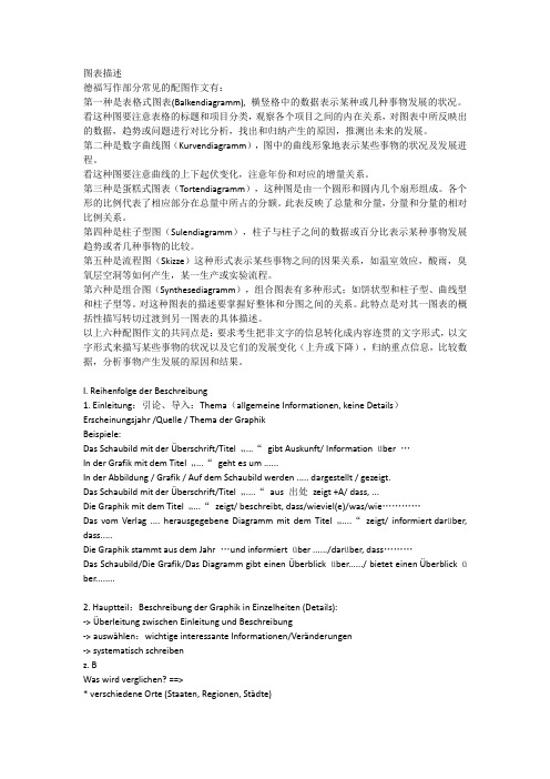
第一篇:Car Accidents Declining in Walton City
1. 描述图表中反映的车祸发生率的变化。
2. 分析该市车祸发生率下降的原因。
3. 你对该市今年车祸发生率走势的预测。
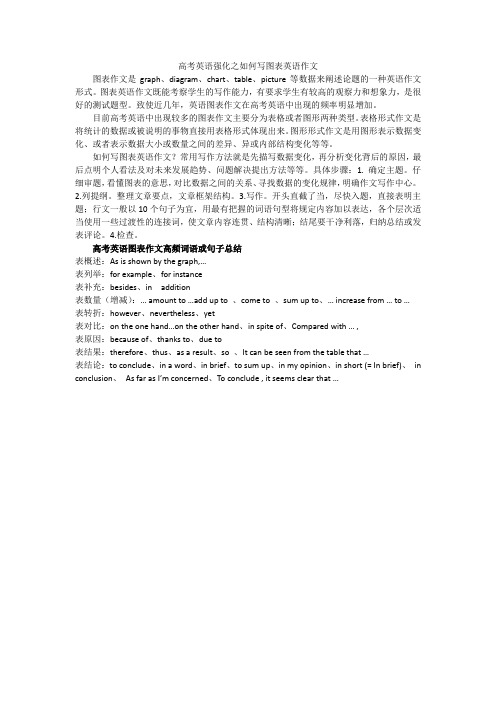
第二篇:Changes in the Ownership of Houses
1. 根据图表描述该市住房产权的变化。
2. 分析产生这些变化的原因。
3. 说明这些变化对个人和社会产生的影响。
(注:数据分别为:1990:75-25;1995:60-40;2000:20-80)
051015202530354045Jan Feb Mar Apr May June July Aug Sept O ct Nov Dec Months in 19
N u m b e r o f C a r A c c i d e n t
s Ownership of Houses in a Big City in China 0
1020
304050
607080
90199019952000
Year
P r o p o r t i o n (%)
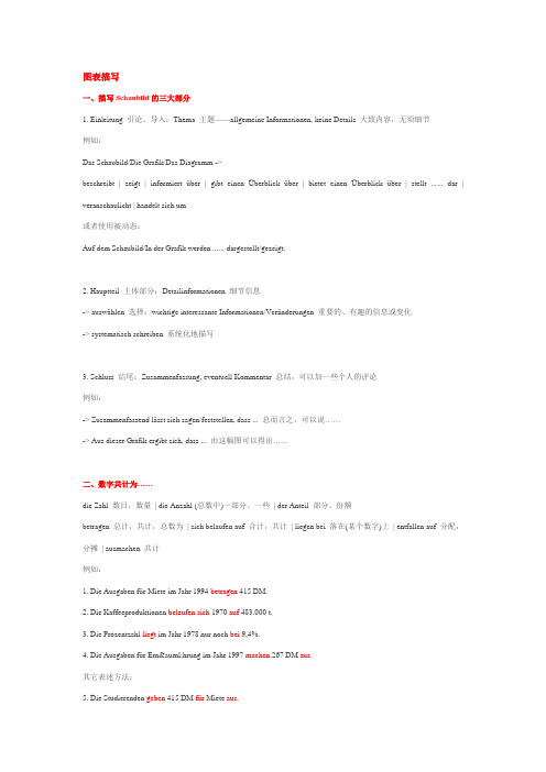
第三篇:Personalized Service on Line
1. 根据图表描述网络个性服务的交易情况。
(网络个性化服务:通过Internet,顾客把求购商品的信息,如大小、颜色、样式等通过网络发送给生产厂家,由生产厂家根据顾客要求生产出产品,然后通过邮局邮寄给顾客)
2. 分析网络个性化服务流行的原因。
3. 你对此的看法。
注:数据分别为:1998:0.2;2000:1;2002:10;2004:32;2006:80
Turnover
(Million)
19982000200220042006
Year
Turnover of Personalized Online Services in X City。