雅思小作文考试题目汇总
雅思小作文题型整理
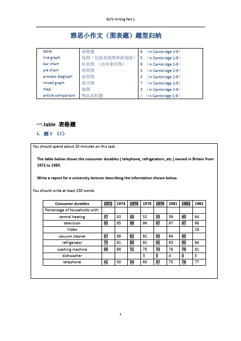
雅思小作文(图表题)题型归纳一.t able 表格题1.剑2 (1)4.剑5(4)6.剑7(1)二.Line graph线图(含直线和曲线图)1.剑3(4)You should spend about 20 minutes on this task.The graph below shows the unemployment rates in the US and Japanbetween March 1993 and March 1999.Write a report for a university lecturer describing the information shownbelow.You should write at least 150 words.You should spend about 20 minutes on this task.The graph below shows the proportion of the population aged 65 and overbetween 1940 and 2040 in three different countries.Summarize the information by selecting and reporting the main features,and make comparisons where relevant.Write at least 150 words.You should spend about 20 minutes on this task.The graph below shows the consumption of fish and some different kinds of meatin a European country between 1979-2004.Summarize the information by selecting and reporting the main features, andmake comparisons where relevant.Write at least 150 words.You should spend about 20 minutes on this task.The graph below shows the quantities of goods transported in the UK between 1974 and 2002 by four different modes of transport.Summarize the information by selecting and reporting the main features, and make comparisons where relevant.Write at least 150 words.5.剑9(4)三.Bar chart 柱状图You should spend about 20 minutes on this task.The chart below shows the amount of leisure time enjoyed by men and women of different employment status.Write a report for a university lecturer describing the information shown below.Write at least 150 words.Leisure time in a typical week: by sex and employment status,1998-99You should spend about 20 minutes on this task.The table below shows the figures for imprisonment in five countries between 1930 and 1980.Write a report for a university lecturer describing the information shown below.You should write at least 150 words.You should spend about 20 minutes on this task.The chart below shows the amount spent on six consumer goods in fourEuropean countries.Write a report for a university lecturer describing the information shown below. You should write at least 150 words.You should spend about 20 minutes on this task.The charts below show the level of participation in education and sciencein developing and industrialized countries in 1980 and 1990Write a report for a university lecturer describing the information shown below. You should write at least 150 words.5.剑4(3)You should spend about 20 minutes on this task.The chart below shows the different levels of post-school qualifications inAustralia and the proportion of men and women who held them in 1999.Summarize the information by selecting and reporting the main features,and make comparisons where relevant.You should write at least 150 words.You should spend about 20 minutes on this task.The charts below show the main reasons for study among students ofdifferent age groups and the amount of support they received from employers.Summarize the information by selecting and reporting the main features,and make comparisons where relevant.You should write at least 150 words.You should spend about 20 minutes on this task.The charts below give information about USA marriages and divorce ratesbetween 1970 and 2000, and the marital status of adult Americans in twoof the years.Summarize the information by selecting and reporting the main features,and make comparisons where relevant.You should write at least 150 words.You should spend about 20 minutes on this task.The chart below shows information about changes in average house prices in fivedifferent cities between 1990 and 2002 compared with the average house prices in 1989.Summarize the information by selecting and reporting the main features, and makecomparisons where relevant.You should write at least 150 words.四.Pie chart饼图1.剑7(4)2.剑8(2)3.剑9(3)五.流程图1.剑1(2)You should spend about 20 minutes on this task.The diagrams below show the life cycle of the silkworm and the stages inthe production of silk cloth.Summarize the information by selecting and reporting the main features,and make comparisons where relevant.Write at least 150 words.六.混合图。
雅思写作小作文真题整理;5题
我的托福雅思必过雅思写作小作文真题整理5题雅思写作小作文真题整理5大题目供考生们练习,同学们在备考雅思写作的局部的时候记得逐项突破,加强练习力度,下面的内容同学们可以做个参考。
雅思写作小作文真题练习内容如下:1. Write a report describing the information in the graph below.You should write at least 150 words.You should spend about 20 minutes on this task.2. You should spend about 20 minutes on this task.Eating sweet foods produces acid in the mouth, which can cause tooth decay.(High acid levels are measured by low pH values)Describe the information below and discuss the implications for dental health.You should write at least 150 words.3. You should spend about 20 minutes on this task.The diagram below shows the average hours of unpaid work per week done by people in different categories. (Unpaid work refers to such activities as childcare in the home, housework and gardening.) Describe the information presented below, comparing results for men and women in the categories shown.Suggest reasons for what you see.You should write at least 150 words.4. You should spend about 20 minutes on this task.The chart below shows estimated world literacy rates by region and by gender for the year . Write a report for a university lecturer describing the information below.You should write at least 150 words.5. You should spend about 20 minutes on this task. The graph shows Internet Usage in Taiwan by Age Group, 1998-.Summarise the information by selecting and reporting the main features, and make comparisons where relevant.You should write at least 150 words.雅思写作小作文真题希望以上内容可以帮到你,核心备考能力+应试技巧,这才是取得雅思高分的秘诀。
作文之雅思小作文线图题库

雅思小作文线图题库【篇一:雅思线图小作文题目1】the graph below shows average carbon dioxide (co2) emission per person in theunited kingdom, sweden, italy and portugal between 1967 and 2007.【篇二:雅思小作文题库练习集锦】1.writing task 1you should spend about 20 minutes on this task.the pie charts below show units of electricity productionby fuel source in australia and france in 1980 and 2000. summa rise the information by selecting and reporting the main features, and make comparisons where relevant.write at least 150 words.writing task 1you should spend about 20 minutes on this task.the pie charts below show units of electricity productionby fuel source in australia and france in 1980 and 2000. summa rise the information by selecting and reporting the main features, and make comparisons where relevant.write at least 150 words.he charts compare the sources of electricity in australia and france in the years 1980 and 2000. between these years electricity production almost doubled,risingfrom 100 units to 1970 in australia, and from 90 to 180 units in france.in contrast, france used coal as a source for only 25 units of electricity in 1980, which was matched by natural gas. the remaining 40 units were produced largely from oil and nuclear power, with hydro contributing only 5 units. but by 2000 nuclear power, which was not used at all in australia, had developed into the main source, producing almost 75% of electricity, at 126 units, while coal and oil together produced only 50 units. other sources were no longer significant.overall, it is clear that by 20000 these two countries relied ondifferent principal fuel sources: australia relied on coal andfrance on nuclear power.这些图比较了1980 年和 2000 年澳大利亚和法国的电的根源。
雅思写作35个基础作文题目超全整理

雅思写作35个基础作文题目超全整理为了帮助考生们更好地备考雅思写作考试,文都国际教育小编给大家带来雅思写作35个基础作文题目超全整理,以下是详细内容,希望对同学们的备考有所帮助!1.You are an university student who are living in the accommodation at the campus.One day you find something wrong with your accommodation.So you write a letter to the House Officer to tell them what happened,the reason you think,what you decide to do,and whether if it is right.2.It is wrong that our government pay more money to the artist projects,for instance,there are more and more paintings and sculptures appearing at the public places,because there are more important thing to do.What's you opinion?Do you agree or disagree with it?3.Participating in a sport is as important for psychological health as it is for physical condition and social development.4.writing to an English speaking college aboutqualification,accommodation,fee,what courses do you want to choose and why.5.You have left college.But you didn't say goodbye to your friend who live in the room with you because he had a course at that time.Write a letter to him to appology and tell hem how you spend that days before you leave and how you get home.Then invite him to visit you.6.Some people say the parents should except school to conduct their children's behavior and tell them what is'right'or'wrong'.Others say schools should take this responsibility.Please give your point about it.7.Write to the agency officer and complain about the rent car which has sth wrong.Tell them the problems of the car you rent from the agency and your requiring.8.As the developing countries and the third world countries,there are a funds,how to use it?Invest in the basic education or in the high-technology,for instance,computer?What's your opinion?9.You are a foreign student.Write to the Student Union,introduce your hobbies and interests and ask information of clubs and societies.You want to join a club or society enjoy your time when you study there.10.Fast food is developing more and more popular.It replaces other traditional food.Some people think it is good,some people disagree with it.What's your opinion about it.Give some reason of your opinion.11.A friend will visit Beijing.You will meet him at airport.But for some reason,you have to be late.Explain the reason.Since you haven't meet each other,tell the friend where you will meet and how to recognize each other.12.More and more children's writing&math ability are affected by computers and calculators.We should limit the use of those tools.Disagree or agree.13.you have broke your leg and have to stayed in hospital.you received many cards and letters from your classmates.write a letter to tell them your detail of your position and thank them at the same time.14.some people say that it is impossible for women to be an effective women and to be a good mother in home at the same time.they also suggest that the government should give the salary to mothers who stay at home to take care of their children.15.You are a history teacher at a high school.You see an ad at the local newspaper to introduce the local museum which coincidens with what you teach now.Write to the museum officer and tell them that you want to bring your students to visit it.16.Participating in a sport is as important for psychological health as it is for physical conditions and social development.17.You live in a room in college which you share with another student.You find it very difficult to work there because he or she always has friends visiting.They have parties in the room and sometimes borrow your things without asking you.Write a letter to the Accommodation officer at the college and ask for a new room nest term.You would prefer a single room.Explain your reason.18.Who has responsible for our old people?19.Write to the agency officer to complain about a rent house by them.Tell them the problems of the house and your requiring.20.You read an ad about a sale of a shop in the local newspaper,when you came to buy the goods you wanted,you find the sale had ended.Write to the shop manager and complain about this.Require for the compensation.21.Write to an English speaking college aboutqualification,accommodation,fee,what courses do you want to choose and why.22.You are accepted as an oversea student by an university.Before you go to the university,write to the student officer and ask them sth about the accommodation,the transportation,and the class schedule.23.Your friend write to you and tell you that he is hesitating to chose computer or history as his major in university.Write to him and tell him your opinion.24.Write a letter to your friend and express thanks for his present which was brought to you during you were ill at the hospital.25.The first car appeared on British roads in 1888.By the year 2000 there may be as many as 29 million vehicles on British roads.Alternative forms of transport should be encouraged and international laws introduced to control car ownership and use.What do you think?Give reasons for your answer.26.The threat of nuclear weapons maintains world peace.Nuclear power provides cheap and clean energy.The benefits of nuclear technology far outweigh the disadvantages.Give reasons for your answer.27.People can do longer expect a job for life.What should individuals and governments do to prepare the current and future environments for different working conditions?28.As technological innovation brings about rapid changes and retraining becomes a lifelong necessity,industry should take over more and more of the responsibility for education.29.It is more important for governments to ensure adequate standards of housing,education and health care for their citizens by developing the industrial base than to use their resources to develop the rural areas.30.Business education and training today must promoter environmental awareness.31.Whilst studying abroad provides an opportunity to broaden one's experience,it also presents the danger of negative influences from the host culture.32.Technological advances continue to improve manufacturing efficiency;the weight of a drinks can has come down from thirty-five grams to about fifteen grams,for example,and modern cars and production techniques are much more energy ernments need to control the environment rather than controlling industry,as companies already control their resources very efficiently.33.Training for work is far more important than proving a broad-based education.34.What steps should a student take in preparing for tertiary education and what would be the benefit of taking such steps?35.The developed world should lead by example and not insist that aid to the Third World is used to develop rural areas.以上就是小编给大家搜集整理的雅思写作35个基础作文题目,供考生们参考。
雅思写作A类小作文真题范文word版(汇总78页)
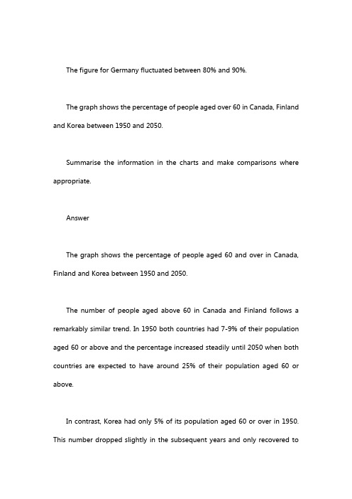
The figure for Germany fluctuated between 80% and 90%.The graph shows the percentage of people aged over 60 in Canada, Finland and Korea between 1950 and 2050.Summarise the information in the charts and make comparisons where appropriate.AnswerThe graph shows the percentage of people aged 60 and over in Canada, Finland and Korea between 1950 and 2050.The number of people aged above 60 in Canada and Finland follows a remarkably similar trend. In 1950 both countries had 7-9% of their population aged 60 or above and the percentage increased steadily until 2050 when both countries are expected to have around 25% of their population aged 60 or above.In contrast, Korea had only 5% of its population aged 60 or over in 1950. This number dropped slightly in the subsequent years and only recovered tothe?original level of 5% in 2000. Between 2000 and 2020 the number of people aged 60 or over in Korea increased more rapidly and is expected to reach 9% in 2020. After 2020 the aged population is expected to increase very rapidlyovertaking Canada and Finland in around 2035 and reaching 30% by 2050.The lower initial aged population of Korea can be attributed to the lower development of Korea in the early part of the 20th century, but rapid development and healthy diets in the second half of the 20th century are probably the cause of the increased longevity in Korea.You should spend about 20 minutes on this task.The diagram below shows the process by which bricks are manufactured for the building industry.Summarise the information by selecting and reporting the main features, and make comparisons where relevant.Write at least 150 words.The picture illustrates how bricks are produced.The process begins when clay is dug out through the use of a digger, which is followed by clay passing through a metal grid. Fine clay is then carried by a roller after which sand and water are added to it. In the next stage, either this mixture is pressed through a frame and cut into bricks using a wire cutter, or it is put into moulds and formed into bricks. Following that, the bricks are dried in a drying oven for one to two days. The next three stages involve two kilns connected to a cooling chamber. The dried bricks are first heated from 200 to 980 degrees centigrade, before being exposed to high temperature (870 to 1300 degrees). They are then cooled within 48 to 72 hours. Eventually, they are packed and delivered to customers by trucks.Overall, the procedure of producing bricks is comprised of ten stages which are rather simple.(161 words)You should spend about 20 minutes on this task.The diagrams below show the stages and equipment used in the cement-making process, and how cement is used to produce concrete for building purposes.Summarise the information by selecting and reporting the main features, and make comparisons where relevant.Write at least 150 words.The diagrams show how cement and concrete are produced. Overall, there are five stages in the production of cement, while the procedure for producing concrete from cement and a few other simple ingredients involves a single stage.Cement production begins when the initial raw materials, namely limestone and clay, are crushed using two rotating drums to make a fine powder which is then mixed in a cylindrical mixer. The next stage involves a tube-like rotating heater with a blowtorch mounted at its bottom opening. The mixed powder is fed from the top and simultaneously heated and blended, after which it is transferred to a grinder using a conveyor belt. There, it is milled to yield the final cement product which is eventually packed in bags.This cement is used as raw material in the production of concrete in a second process. An initial mixture comprising 15% cement, 10% water, one-quarter sand and half gravel is fed into a rotating concrete mixer wherethey are stirred until the concrete mix is ready for construction purposes.(174 words)You should spend about 20 minutes on this task.The chart below shows the amount spent on six consumer goods in four European countries.Summarise the information by selecting and reporting the main features, and make comparisons where relevant.Write at least 150 words.The diagram compares how much money was spent on six different products in Germany, Italy, France and Britain.Overall, more money was spent on toys and photographic film than on any other product. Also, the British were the biggest spenders in all six categories among the nations compared in the bar chart, while the lowest spending levels were attributed to German consumers.In Britain, the highest amount of money was spent on photographic film (more than 170 million pounds), while similar amounts were spent on personal stereos and tennis racquets which together ranked last.The French spent the second highest amount of money among the four nations on compact disks, toys and photographic film, while they ranked last in personal stereos, tennis racquets and colognes.Italian consumers spent more money on toys than on any other product (a bit less than £160 million), but they also paid a lot for photographic film.Finally, Germans spent the least overall, having similar spending figures for all 6 products compared in the chart.(170 words)You should spend about 20 minutes on this task.The graph below shows the consumption of fish and some different kinds of meat in a European country between 1979 and 2004.Summarise the information by selecting and reporting the main features,and make comparisons where relevant.Write at least 150 words.The diagram compares changes in consumption figures for different kinds of meat and fish in a country in Europe from 1979 to 2004. Overall, although beef was initially the most popular type of meat, it was overtaken by chicken towards the end of the survey. In contrast, the figure for fish remained the least significant throughout the period.In the first year, beef had a consumption of about 225 grams per person per week, after which it experienced a sudden drop of 50 before increasing to about 230 in 1984. There were small fluctuations until 1989, which was followed by a dramatic decrease to around half as high as its original level in 2004.The figure for lamb was initially almost as high as that for chicken (around 150 grams). However, while the former declined gradually as it reached approximately 60 in the last year, the latter saw a considerable growth and outstripped beef consumption in 1989, peaking at 250 in 2004.Fish consumption was originally approximately 60 grams and experienced a small fall of about 10 over the period.(180 words)You should spend about 20 minutes on this task.Chorleywood is a village near London whose population has increased steadily since the middle of the nineteenth century. The map below shows the development of the village.Summarise the information by selecting and reporting the main features, and make comparisons where relevant.Write at least 150 words.The map shows how a village called Chorleywood developed over a period of 126 years. Overall, it saw considerable growth, both in the establishment of new residential areas and transportation routes, which occurred over four phases.From 1868 to 1883 there were only two main roads in the region with Chorleywood covering a small area along one of them. Over the next 40 years, the village grew southward alongside the road and a railway was built in 1909passing through this part. Chorleywood station is also located in this area of the village.Over the period between 1922 and 1970, the railway was the line along which Chorleywood expanded, both towards the east and west. However, a motorway was constructed in 1970 parallel to one of the main roads and further development of the village occurred around its intersections with the other main road and the railway between 1970 and 1994. Furthermore, Chorleywood Park and Golf course is now located in an area enclosed by the two main roads, the railway and this motorway.(174 words)The first graph shows the reasons for studying in the UK by age, while the second graph shows the support given by employers for training by age.Summarise the information in the charts and make comparisons where appropriate.AnswerThe bar chart shows the percentage of students who choose to studybecause of their career or interest in the UK in five different age groups while the line graph shows how the level of support as a percentage from employers in terms of time-off work and help with fees changes between the age of 20 and 60.The bar shows that young people in the under-25 age group study primarily for reasons of career development (80%) but this number decreases steadily over time and falls to 67% for the 30-39 age group. By the time people reach the 50-59 age group fewer than 20% study because of their career. The opposite trend is seen with the number of students studying because of interest increasing steadily as they age with only 20% studying because of interest in the under 25?group, but this rises to nearly 70% in those in the 50-59 age group.The second chart shows that the level of support for study by employers is high in the early stages of people’s career at about 80% for people aged 20, but this decreases steadily to around 60% by age 40 before falling more steeply to 20% by age 60.The graph shows the monthly expenditure on three types of restaurant food in Australia. The plot shows the annual number of restaurant visits for the same types of food between 1965 and 2015.Summarise the information in the charts and make comparisons where appropriate.AnswerThe bar graph shows the expenditure of different income groups in Italian, Indian and Chinese restaurants in Australia, while the scatterplot shows the number of annual visits per person to the same type of restaurants between 1965 and 2015.The proportion of money spent on Chinese and Italian food is similar for high ($42 and $20), medium ($35 and $14) and low ($13 and $8) income groups. As people’s income becomes higher, the proportion of money that is spent on Indian food drops from being the most to least favoured style of food. This suggests that Indian food is preferred because it is the least expensive option.In 1970 the total number of restaurant visits per year was approximately 5 visits per person, which was made up of 3 and 2 visits per person to Chinese and Italian restaurants, respectively. The total remained low until 1985, but after that time increased steadily to around 50 visits per year by 2015. After 1985, the number of visits to Chinese restaurants increased in a continuous upward trendreaching 22 visits per person per year by 2015, while visits to Italian and Indian restaurants initially followed a similar trend but the number of visits began to level out after the year 2000 reaching 15 and 12 visits per person per year by 2015, respectively. People having higher disposable incomes and less free time are probably the causes of the dramatic change in eating habits.You should spend about 20 minutes on this task.The graph below gives information about Dubai gold sales in 2002.Summarise the information by selecting and reporting the main features, and make comparisons where relevant.Write at least 150 words.The diagram illustrates how gold sales in Dubai changed from January to December 2002.Overall, the figure fluctuated widely before returning to its original level at the end of the year. Besides, gold sales were at their highest in March, while the weakest figures could be observed in July and September.In the first month of 2002, the figure stood at 200 million dirhams and rose slightly to reach about 225 million in February. This was followed by another increase, although much steeper, in March when sales hit 350 million. However, this upward trend was suddenly broken and sales declined dramatically over the next 4 months to reach a little over 100 million in July. August sales saw a significant rise back to January levels as the figure nearly doubled, but it dropped again in September to the same level as it was in July. There was a small increase of about 100 million dirhams in October, after which the figure levelled off and remained relatively unchanged over the last two months of 2002.(174 words)You should spend about 20 minutes on this task.The two maps below show an island, before and after the construction of some tourist facilities.Summarise the information by selecting and reporting the main features, and make comparisons where relevant.Write at least 150 words.The maps illustrate how an island has changed following the development of various facilities for visitors.Overall, there have been significant constructions in the island in terms of accommodation and facilities for tourists. It is noteworthy that these developments have occurred without any noticeable damage to the trees.The length of the island is over 1200 metres while its width varies from about 200 to 500 metres in different places. Originally, there was a beach to the left of the island, and the eastern and western parts were covered with woodland, apart from which the island was completely bare.In comparison, swimming facilities have now been built in the beach. Furthermore, the western woodland is surrounded by a series of huts which are connected to each other and to the beach via footpaths. There is also a restaurant in northern part which is connected to a reception building in the middle of the island as well as a new pier to the south by means of a vehicle track. Finally, a larger set of huts have been constructed between the reception and the eastern woodland.(185 words)The pie chart shows why agricultural land in America has become less productive. The table shows how these causes affected the three regions in the Americas.Summarise the information reporting the important features and make comparisons where relevant.AnswerThe pie chart shows the causes of land degradation (deforestation, over-cultivation, over-grazing and other causes) in North, Central and South America, while the bar chart shows the percentage of land degraded in America by cause and region and the total percentage of land degraded.The pie chart shows that over-grazing makes up 35% of land degradation while deforestation and overgrazing are responsible for 32% and 27% of land degradation, respectively. Other causes of land degradation make up 8% of the total degradation.Central America has by far the highest level of land degradation at 13.8%,which is caused by deforestation (6.2%), over-cultivation (4.9%) and overgrazing (2.3%). Approximately 13% of land in South America is degraded and is caused by deforestation (6.3%) with smaller contributions from over-grazing (4.4%) and over-cultivation (2.3%). North America has by far the lowest level ofland degradation at 5.8%, which is mainly due to over-cultivation (3.7%) and overgrazing (1.8%). Deforestation made up only 0.3% of land degradation in North America.You should spend about 20 minutes on this task.The diagram below shows the life cycle of the honey bee.Summarise the information by selecting and reporting the main features, and make comparisons where relevant.Write at least 150 words.The chart illustrates the stages in the life of honey bees. It takes approximately five weeks (34 to 36 days to be exact) to complete. All in all, this life cycle is comprised of six stages from eggs to fully mature bees.The first stage is when the female bee lays up to a couple of oval eggs onceevery 72 hours. These eggs hatch between nine and ten days later, and immature bees, called nymphs, emerge which lack the typical bee stripes.Over the next 3 weeks nymphs experience three moulting stages, that is, they shed their skins to allow further growth to occur: The first moulting happening 5 days after the eggs hatch, a week after which the second one takes place. Nine days later nymphs moult for a third time and young adult honey bees emerge, identified by their horizontally striped backs. These take four more days to mature into larger adult bees whose backs are marked with bolder and darker stripes, and the cycle starts over again.(171 words)You should spend about 20 minutes on this task.The diagram gives information about the process for making pulp and paper.Summarise the information by selecting and reporting the main features, and make comparisons where relevant.Write at least 150 words.The diagram shows the process through which wood is used to manufacture pulp and paper for printing and box production purposes. Overall, it is rather sophisticated and is comprised of more than ten stages.The process begins when trees are cut down to produce logs, after which they are chipped and combined with purchased wood chips in a digester. The resulting pulp is then washed and screened to make clean pulp.This pulp can then be used to produce rough paper for making boxes. After forming the pulp in a former device, it is dried and formed into a reel. Next, it is cut into paper bales which are finally packed.Alternatively, the clean pulp may be used to make refined paper for printing purposes. Once it is cleaned in pulp cleaners, it is dried and pressed, first in pulp presses and then in paper presses. Ultimately, it goes through another drying stage in paper dryers before being rolled.(159 words)The diagram shows the process through which wood is used to manufacture pulp and paper for printing and box production purposes. Overall,it is rather sophisticated and is comprised of more than ten stages.The process begins when trees are cut down to produce logs, after which they are chipped and combined with purchased wood chips in a digester. The resulting pulp is then washed and screened to make clean pulp.What happens next depends on the type of paper that needs to be produced: if it is rough paper for packaging purposes, the pulp is formed in a former device before it is dried and formed into a reel. Next, it is cut into paper bales, which are finally packed.Alternatively, if the pulp is used to produce refined paper for printing purposes, it is cleaned further in pulp cleaners, following which it is dried and pressed, first in pulp presses and then in paper presses. Ultimately, it goes through another drying stage in paper dryers before being rolled.(170 words)The charts below describe the population in Iran and Spain in 2010 and the expected population in 2060.Summarise the information in the charts and make comparisons whereappropriate.AnswerThe two bar charts show the actual and expected percentage of the population in three age groups (0-15, 16-55 and 55+ years) in Iran and Spain in 2010 and 2060.In Iran in 2010 the number of people in the 0-15 age group was just under half (48.2%) of the total population, while the population aged 16-55 years was slightly higher (48.3%). In contrast, the number of Iranian people aged over?represented only 3.5% of the population. By 2060, it is expected that the population will have aged significantly, with the number of people aged 0-15 years expected to decrease to 43.1%, while the number of people in the 16-55 and 55+ age groups is expected to increase to 50.2% and 6.8%, respectively.In Spain in 2010 the percentage of young people was much lower (14.7%) compared to Iran, while the 16-55 and 55+ age groups made up 61.4% and 23.9% of the population, respectively. By 2060 the population of Spain is expected to age further with the number of people in the 0-15, 16-55 and 55+ age groups expected to be 11.3%, 48.5% and 40.2%, respectively.Essay NotesThis question is quite challenging as there are 2 bar charts, and data is both for the past and the future and there are relatively few data points (12 in total). The introduction is particularly difficult because of the number of different elements that need to be included.From a structural point of view the data can be readily divided logically in two ways. The first is by country and the second by year. It is best to divide the data by country as this leads to a more imple and clearer description of the data. In general, it is best not to logically divide the data into paragraphs by time. Data should be divided by time within a paragraph.The first body paragraph focuses on Iranian data because it is the first bar chart presented in the question. The data is also described in chronological (time) order. The earliest to latest year and youngest to oldest age group is the order that is adopted throughout giving the essay a clear consistent structure. There are so few data points provided in the question that each individual pointshould be described. However, it should be noted that trends are also described –notably that the population is expected to age and there are expected to be a higher proportion of older people in the future.The second body paragraph describes the data for Spain. The data is presented in the same order as for the Iranian data and the only difference is that the situation in Iran is contrasted with that in Spain. Again the small amount of data means that each individual data point can be described which means that a reader who has not seen the original question should be able to reproduce the data exactly.You should spend about 20 minutes on this task.The chart below shows the different levels of post-school qualifications in Australia and the proportion of men and women who held them in 1999.Summarise the information by selecting and reporting the main features, and make comparisons where relevant.Write at least 150 words.The bar shows the difference between the percentage of females and males in different post- school qualifications in Australia in 1999.Overall, women had the highest share in two qualifications, while menranked first in three. The highest figures for women and men were reported in undergraduate diploma and skilled vocational diploma, respectively.There was a significant difference between the proportions of males and females in skilled vocational diploma, with the former standing first with 90%.The disparity between the two figures was almost the same in undergraduate diploma and postgraduate diploma. However, while in the former women had the highest share with 70%, men accounted for the largest percentage in the latter with 70%.Women also ranked first in bachelor’s degree, whereas the share of men was lower by a narrow margin (55% and 45%, respectively). In contrast, in master’s degree, the contribution of females was 2/3 as high as that of males, as the latter was responsible for the largest share with 60%.(164 words)You should spend about 20 minutes on this task.The diagram below shows the process of using water to produce electricity.Summarise the information by selecting and reporting the main features, and make comparisons where relevant.Write at least 150 words.The diagram shows the process through which water is used to produce electrical power. Overall, hydroelectric power is generated using water from the sea through a relatively sophisticated procedure which comprises over ten stages.The process begins when seawater is heated by the sun and evaporates to form small clouds in the sky. Next, they merge into a storm cloud, which then rains over the mountain. This rainwater is gathered in the reservoir behind a dam. The following steps involve a pipe which connects the reservoir to a turbine as well as a pump, and is controlled using a valve. Once this valve is opened, water flows into the turbine and rotates it to produce electrical current, following which it is pumped back into the reservoir. After this, the electricity produced by the turbine is transferred to the transformer station through high voltage cables. The last stage is when the electrical power is delivered to domestic and industrial consumers, as well as educational and medical facilities.(169 words)You should spend about 20 minutes on this task.The diagram below shows how geothermal energy is used to produce electricity.Summarise the information by selecting and reporting the main features, and make comparisons where relevant.Write at least 150 words.The diagram shows that there are five main stages in the production of electricity through the use of geothermal energy.The process begins with cold water being pumped from the surface of the earth down into a4.5 kilometer-deep injection well. From there, it is transferred to the geothermal zone, a subterranean region composed of hot rocks, before reaching the production well, which is a vertical pipe similar to the injection well but a bit wider.In the stage that follows, the hot water is pumped up through the production well into a condenser on the surface where it is converted into steam, following which it is used to power a turbine and rotate it. This turbine is connected to an electricity generator which, when rotated by the turbine, produces electricity. The process ends when the electricity generated by the generator is transferred to the power grid for consumption by end users.(152 words)You should spend about 20 minutes on this task.The tables below give information about sales of Fairtrade*-labelled coffee and bananas in 1999 and 2004 in five European countries.Summarise the information by selecting and reporting the main features, and make comparisons where relevant.Write at least 150 words.The tables show how fairtrade coffee and banana sales changed in five countries in 2004 compared to 1999. Overall, Coffee sales rose in all countries with the highest sales observed in Switzerland. Banana sales also rose in all buttwo countries, and were highest in the UK.In 1999, the most significant coffee sales, 3 million (3m) euros were reported in Switzerland, and they doubled in 2004. The figure for the UK was originally 50% lower than that for Switzerland (1.5m) while sales in Denmark were slightly higher (1.8m). However, while the former rose dramatically to 20m, the latter remained relatively stable. There was little difference between the figures for Belgium (1m) and Sweden (0.8m), and both experienced noticeable increases to 1.7m and 1m, respectively.UK had the highest banana sales in both years, as they rose over threefold from 15 million euros to 47m. Swiss sales were originally almost twice as high as those of Denmark (1 and 0.6m, respectively), and both surged, reaching 5.5 and 4m. There was little difference between the figures for Sweden and Belgium (2 and 1.8m, respectively), and both nearly halved to reach about 1m in 2004.(193 words)You should spend about 20 minutes on this task.The diagrams below show the changes that have taken place at West Park Secondary School since its construction in 1950.Summarise the information by selecting and reporting the main features, and make comparisons where relevant.Write at least 150 words.The diagrams illustrate how West Park Secondary School has developed since 1950 when it was built. Overall, the school saw significant growth although its recreational facilities did not develop as much as its buildings and parking space.In 1950, the school was a single building located along the main road and to the right of a series of houses. There was a large playground which was located right behind the school building to the right of some farmland.Thirty years later in 1980, the houses were demolished and replaced by a car park, as well as a new science block, for the school while the old school building was changed into its main building. The farmland was also replaced by a new sports field, but the playground remained unchanged.In the last year, 2010, the car park was extended, as a result of which the land previously allocated to the sports field was added to it. However, about a。
雅思小作文饼图题

雅思小作文饼图题篇一:两个雅思写作小作文饼图练习题两个雅思写作小作文饼图练习题雅思小作文饼图是所有图表中出现次数最多的一个,所以需要大家更为关注。
下面为大家搜集整理了雅思写作小作文饼图的练习题,共有两个,都是比较简单的两个饼图,大家在备考的时候,注意结构和顺序的描写。
1. The following pie charts illustrate the energy use in the USA. Write a report for a university lecturer describing the information given in the pie charts below.2. The following two pies show the average family income of New Zealand in 1990 and 2000 and the way people spend their income. Write a report for a university lecturer describing the information given in the pie charts below.以上就是这两个雅俗写作小作文饼图练习题的全部内容,包括了美国的能源使用和新西兰的平均家庭收入两个话题。
大家在备考雅思写作小作文饼图的时候,可以适当的练习一下上面的这两个题目。
雅思小作文图表描述方式小结雅思小作文的图表描述是有自己的方式和特点的,掌握了这个方式可以让大家的小作文备考更快也更加贴近考试的要求。
下面就为大家整理了雅思小作文图表描述的方式,供大家参考。
1. 与趋势有关的词语:上升(v.):increase, rise, climb, ascend, surge, shoot up下降(v.):decrease, decline, drop, fall, descend, plunge持平(v.):remain stable, keep constant, level off, flatten out波动(v.):fluctuate, wave, go up and down快速(adj./adv.):considerable/considerably, significant/significantly, substantial/substantially, remarkable/remarkably, dramatic/dramatically稳步(adj./adv.):steady/steadily, stable/stably, moderate/moderately, modest/modestly缓慢(adj./adv.):slight/slightly, minimal/minimally, marginal/marginally顶点(n. /v.):peak趋势(n.):trend/ tendency2. 与大小相关的词语:Outnumber (v.):在数量上超过The demonstrators were outnumbered by the policeExceed (v.):在数量上超过Triple (v.):变成三倍The figure has tripled.Double (v.):变成两倍The price of houses has virtually doubled over the past few years.Mount to (v.):达到Counterpart (n.):对应的另一方,比较的另一方this product is better than its counterparts此外,朗阁海外考试研究中心建议考生还应考虑一下题中数据和百分比有没有联系,如果有的话还应辅以一些关于比例和占据的语句。
作文范文之雅思小作文真题模拟汇总

作文范文之雅思小作文真题模拟汇总预览说明:预览图片所展示的格式为文档的源格式展示,下载源文件没有水印,内容可编辑和复制作文范文之雅思小作文真题汇总雅思小作文真题汇总【篇一:剑桥雅思4-9小作文题目分类汇总】题型1——table(表格)cambridge ielts 4test 1:the table below shows the proportion of different categories of families living in poverty in australia in 1999.summarise the information by selecting and reporting the main features, and makecomparisons where relevant.test 4:the table below gives information about the underground railway systems in six cities.summarise the information by selecting and reporting the main features, and makecomparisons where relevant.test 2:the table below gives information about changes in modes of travel in england between 1985 and .summarise the information by selecting and reporting the main features, and makecomparisons where relevant.test 1:the table below gives information on consumer spending on different items in five different countries in .summarise the information by selecting and reporting the main features, and makecomparisons where relevant.题型2——line graph(线性图)cambridge ielts 5test 1:the graph blew shows the proportion of the population aged 65 and over between 1940 and 2040 in three different countries.summaries the information by selecting and reporting the main features, and make comparisons where relevant.【篇二:雅思小作文题库练习集锦】1.writing task 1you should spend about 20 minutes on this task.the pie charts below show units of electricity production by fuel source in australia and france in 1980 and .summa rise the information by selecting and reporting the main features, and make comparisons where relevant.write at least 150 words.writing task 1you should spend about 20 minutes on this task.the pie charts below show units of electricity production by fuel source in australia and france in 1980 and .summa rise the information by selecting and reporting the main features, and make comparisons where relevant.write at least 150 words.he charts compare the sources of electricity in australia and france in the years 1980 and . between these years electricity production almost doubled,risingfrom 100 units to 1970 in australia, and from 90 to 180 units in france.in 1980 australia used coal as the main electricity source (50 units) and the remainder was produced from natural gas, hydro power (each producing 20 units) and oil (which produced only 10 units). by , coal had become the fuel for more than 75% of electricity produced and only hydro continued to be another significant source supplying approximately 20%.overall, it is clear that by 0 these two countries relied on different principal fuel sources: australia relied on coal and france on nuclear power.这些图比较了1980年和澳大利亚和法国的电的来源。
剑桥雅思小作文题目分类汇总

剑桥雅思⼩作⽂题⽬分类汇总题型1——Table(表格)Cambridge IELTS 4TEST 1:The table below shows the proportion of different categories of families living in poverty in Australia in 1999.Summarise the information by selecting and reporting the main features, and make comparisons where relevant. Cambridge IELTS 5TEST 4:The table below gives information about the underground railway systems in six cities.Summarise the information by selecting and reporting the main features, and make comparisons where relevant. Cambridge IELTS 6TEST 2:The table below gives information about changes in modes of travel in England between 1985 and 2000.Summarise the information by selecting and reporting the main features, and make comparisons where relevant. Cambridge IELTS 7TEST 1:The table below gives information on consumer spending on different items in five different countries in 2002.Summarise the information by selecting and reporting the main features, and make comparisons where relevant.题型2——Line Graph(线性图)Cambridge IELTS 5TEST 1:The graph blew shows the proportion of the population aged 65 and over between 1940 and 2040 in three different countries. Summaries the information by selecting and reporting the main features, and make comparisons where relevant. Cambridge IELTS 9TEST 4:TEST 2:The pargh below shows the consumption of fish and some different kinds of meat in European country between 1979 and 2004.Summarise the information by selecting and reporting the main features, and make comparisons where relevant. Cambridge IELTS 8TEST 4:The graph below shows the quantities of goods transport in the UK between 1974 and 2002 by four different modes of transport.Summarise the information by selecting and reporting the main features and make comparisons where relevant.题型3——Bar Chart(条形图/柱状图)Cambridge IELTS 4TEST 3:The chart below shows the different levels of post-school qualifications in Australia and the proportion of men and women who held them in 1999.Summaries the information by selecting and reporting the main features, and make comparisons where relevant. Cambridge IELTS 5TEST 2:The charts below show the main reasons for study among students of different age groups and amount of support they received from employers.Summarise the information by selecting and reporting the main features, and make comparisons where relevant. Cambridge IELTS 6TEST 4:The charts below give information about USA marriage and divorce rates between 1970 and 2000, and the marital status of adult America in two of the years. Summarise the information by selecting and reporting the main features, and make comparisons where relevant.The chart below shows information about changes in average house prices in five different cities between 1990 and 2002 compared with average house prices in 1989. Summarise the information by selecting and reporting the main features, and make comparisons where relevant.TEST 2:题型4——Pie Chart(饼图)Cambridge IELTS 7TEST 4:The pie charts below show units of electricity production by fuel source in Australia and France in 1980 and 2000. Summarise the information by selecting and reporting the main features, and make comparisons where relevant. Cambridge IELTS 8TEST 2:The three pie charts below show the changes in annual spending by a particular UK school in 1981, 1991, and 2001. Summarise the information by selecting and reporting the main features, and make comparisons where relevant.题型5——混合图Cambridge IELTS 4TEST 2:The graph blew shows the demand electricity in Engliand during typical days in winter and summer.The pie chart shows how electricity is used in an average English home.Summarise the information by selecting and reporting the main features and make comparisions where ralevant.Cambridge IELTS 4TEST 4:The charts below give information about travel to and from the UK, and about the most popular countries from UK residents to visit.Summarise the information by selecting and reporting the main features, and make comparisons where relevant.The graph and table below give information about water use worldwide and water consumption in two different countries. Summarise the information by selecting and reporting the main features, and make comparisons where relevant. Cambridge IELTS 8TEST 1:The pie chart below shows the main reasons why agricultural land becomes less productive. The table shows how these causes affected three regions of the world during the 1990s.Summarise the information by selecting and reporting the main features, and make comparisons where relevantTEST 3:题型6——Process Diagram(流程图)Cambridge IELTS 6TEST 3:The diagrams below show the life cycle of the silkworm and the stages in the production of silk cloth.Summarise the information by selecting and reporting the main features, and make comparisons where relevant. Cambridge IELTS 8TEST 3:The diagrams below show the stages and equipment used in the cement-making process, and how cement is used to produce concrete for building purpose. Summaries the information by selecting and reporting the main features, and make comparisons where relevant.题型7——Map(地图题)Cambridge IELTS 5TEST 3:The map below is of the town of Garlsdon. A new supermarket(s) is planned for the town. The map shows two possible sites for the supermarket.Summarise the information by selecting and reporting the main features, and make comparisons where relevant.Test 1。
雅思小作文大全及范文1

雅思小作文大全及范文1雅思小作文大全及范文雅思考试是全球范围内最受欢迎的英语语言能力考试之一。
其中,雅思写作分为大作文和小作文两部分。
小作文主要测试考生的书面表达能力,包括图表描述、流程图描述、地图描述等。
下面将为大家提供一份雅思小作文大全及范文,以帮助考生更好地备考。
1. 图表描述题目:The chart below shows the percentage of people who played team sports in a small town in 2010 and 2015.范文:The bar chart illustrates the proportion of individuals participating in team sports in a small town in the years 2010 and 2015. Overall, it can be observed that there was a significant increase in the number of people engaging in team sports during this period.In 2010, approximately 40% of the town's population participated in team sports, while the remaining 60% did not engage in any form of team sports. However, by 2015, this figure had risen to around 60%, indicating a substantial growth in participation.Looking at the specific sports, football was the most popular team sport in both years. In 2010, around 25% of the population played football, while basketball and volleyball were played by approximately 10% and 5% of the residents, respectively. In contrast, by 2015, the percentage of people playing football had increased to nearly 40%, while basketball and volleyball saw a slight decline to about 8% and 4% respectively.In conclusion, the bar chart demonstrates that the number of individuals participating in team sports in the small town increased significantly between 2010 and 2015. Football remained the most popular sport, while basketball and volleyball experienced slight fluctuations in participation rates.2. 流程图描述题目:The diagram below shows the process of recycling plastic bottles.范文:The diagram illustrates the process of recycling plastic bottles. It can be seen that there are six main stages involved in this process, from the collection of plastic bottles to the production of new plastic products.Firstly, the plastic bottles are collected by recycling trucks and transported to a recycling center. At the recycling center, the bottles are sorted according to their type and color. This is followed by the process of shredding, where the bottles are cut into small pieces.Next, the shredded plastic is washed and cleaned to remove any impurities. Once the plastic is clean, it is melted down and transformed into small pellets. These pellets are then transported to a plastic manufacturing plant.In the manufacturing plant, the plastic pellets are reheated and molded into various shapes, such as bottles, containers, or other plastic products. Finally, the new plastic products are packaged and ready to be distributed to consumers.Overall, the diagram shows a clear and systematic process of recycling plastic bottles, starting from collection and sorting, to shredding, cleaning, melting, molding, and finally, the production of new plastic products.3. 地图描述题目:The maps below show the changes that have taken place in a seaside town between 1995 and present day.范文:The maps compare the changes that have occurred in a seaside town between 1995 and the present day. Overall, it can be seen that there have been significant developments in terms of infrastructure and facilities in the town over the years.In 1995, the town had a small harbor located to the east of the town center. There were only a few buildings near the harbor, including a hotel and a restaurant. The town center itself consisted of a few streets with residential houses and a small park.In contrast, the present day map shows a much larger and more developed town. The harbor has been expanded and now includes a marina, which can accommodate a greater number of boats. Additionally, there are several new buildings surrounding the harbor, including a shopping mall, a cinema, and a sports center.Furthermore, the town center has undergone significant changes. The number of streets has increased, and there are now more residential houses and commercial buildings. The small park has been transformed into a larger recreational area with a playground and a picnic area.In conclusion, the maps clearly demonstrate the substantial growth and development of the seaside town over the years. The expansion of the harbor, the construction of new buildings, and the improvement of recreational facilities have contributed to the overall transformation of the town.。
剑桥雅思真题小作文题目分类总结(4-8)
精心整理题型1——Table(表格)Cambridge IELTS 4TEST 1:The table below shows the proportion of different categoriesSummarise the information by selecting and reporting the main features, and make comparisons where relevant. Cambridge IELTS 7TEST 1:The table below gives information on consumer spending on different items in five different countries in 2002. Summarise the information by selecting and reporting the main features, and make comparisons where relevant.题型2——Line Graph(线性图)features, and make comparisons where relevant. Cambridge IELTS 8TEST 4:The graph below shows the quantities of goods transport in the UK between 1974 and 2002 by four different modes oftransport.Summarise the information by selecting and reporting the main features and make comparisons where relevant.题型3——Bar Chart(条形图/柱状图)Cambridge IELTS 4features, and make comparisons where relevant. Cambridge IELTS 6TEST 4:The charts below give information about USA marriage and divorce rates between 1970 and 2000, and the marital status ofadult America in two of the years.Summarise the information by selecting and reporting the main features, and make comparisons where relevant. Cambridge IELTS 7TEST 3:Cambridge IELTS 8TEST 2:The three pie charts below show the changes in annual spending by a particular UK school in 1981, 1991, and 2001. Summarise the information by selecting and reporting the mainfeatures, and make comparisons where relevant.题型5——混合图Cambridge IELTS 4TEST 2:The graph blew shows the demand electricity in Engliand duringTEST 1:The graph and table below give information about water use worldwide and water consumption in two different countries. Summarise the information by selecting and reporting the main features, and make comparisons where relevant.TEST 1:The pie chart below shows the main reasons why agricultural land becomes less productive. The table shows how these causes affected three regions of the world during the 1990s.cement-making process, and how cement is used to produce concrete for building purpose.Summaries the information by selecting and reporting the main features, and make comparisons where relevant.题型7——Map(地图题)TEST 3:The map below is of the town of Garlsdon. A new supermarket(s) is planned for the town. The map shows two possible sites for the supermarket.。
- 1、下载文档前请自行甄别文档内容的完整性,平台不提供额外的编辑、内容补充、找答案等附加服务。
- 2、"仅部分预览"的文档,不可在线预览部分如存在完整性等问题,可反馈申请退款(可完整预览的文档不适用该条件!)。
- 3、如文档侵犯您的权益,请联系客服反馈,我们会尽快为您处理(人工客服工作时间:9:00-18:30)。
The charts below show the reasons why people left the UK and why people stayed in the UK.The table gives the information about different means of transportation people choose to take in the UK in 2002.The two maps below show the development of Huntingdon (now and future).The bar chart below gives information about the change of transportation tools for students in New Zealand in 1993 and 2003.The two pie charts below show the different ways people use in working days between 1980 and 2006.The pie charts below show the changes of different study methods of university students by course types in 1984, 1994 and 2004.The table below gives information about changes in UK population by age group in 1985 and 2005 and shows the figure predicted in 2015.The pie charts below show the proportion of time spent on different types of websites by male and female students.The table below gives information on the ratios of male to female workforce in different fields of work in New Zealand in 1993 and 2003.The two bar charts below show the percentages of male and female students in secondary education and higher education for four different regions of the world in 2000.The table below gives information about annual salaries of five different employment sectors in Australia in 2006.Task One: two pie charts describing the percentages of the people staying in and moving out of UKTask Two: Someone believes that a country should help its local residents, while others believe that the help should be given to the most needed. Discuss both of opinions and present your opinion.Task One: a table describing the transportations of UKTask Two: Governments are more responsible for scientific research than private companies. To what extent do you agree or disagree?Task One: a map describing the change of townsTask Two: The gap between the poor and rich gets larger. What cause the phenomenon and how to solve it?Task One: a bar chartTask Two: Many people believe that there is a general increase in anti-social behaviours and lack of respect for others. What cause the phenomenon and how to solve it?Task One: pie chart: the distribution of business timeTask Two: Air travel is only beneficial to the richest people. To what extent do you agree or disagree?Task One: three pie charts of course selectionTask Two: Social development improves the living standard of the public. However, some social values may get lost in the process. What are the advantages and disadvantages of this phenomenon?Task One: table of British Population in three yearsTask Two: Someone believes that the development of technology brings negative influences. To what extent do you agree or disagree?Task One: two pie charts of the time that male and female students spend on-lineTask Two: The life expectancy of mankind is lengthening. What effects does the phenomenon bring to both individuals and society?Task One: two bar charts introducing the percentages of male and female students in secondary and higher schoolsTask Two: Machines are gaining in popularity today. What are the positive and negative influences of the phenomenon?Task One: a table introducing the annual income of AustralianTask Two: Children are now more interested in watching TV than creative activities. What cause the phenomenon and how to solve it?Task One: a bar chart introducing the users and non-users of different ages in Queensland, AustraliaTask Two: Someone believes that cheaper air tickets benefit mankind, while other people believe that it damages environment. Discuss both viewpoints and give your own opinion.Task One: a table introducing the percentages of male and female managers in three levelsTask Two: Governments are responsible for helping the public with healthy lifestyle. To what extent do you agree or disagree?Task One: a table introducing the religious and civil marriagesTask Two: Everyone wants a car, a car, and a fridge. Discuss the advantages and disadvantages of the phenomenon.Task One: four bar charts describing the work hours in European countriesTask Two: Schools should teach students the academic subjects, which are helpful for their life. Therefore, other subjects such are music and sports are not important. To what extent do you agree or disagree?Task One: the changing functions of a room (reading room---meeting room---theatre)Task Two: Someone prefers distance education, while other people prefer attending college in person. Discuss the benefits and drawbacks of the two ways.Task One: flow chart of balloonTask Two: Someone believes that children should obey their parents suggestions, while other people believe that the way may cause children to be ill-prepared for the future. Discuss both views and present your opinion.Task One: changes of a villageTask Two: May young people are now leaving schools with negative attitudes toward learning. What cause the phenomenon and how to solve it?Task One: a pie chart describing the changes of consumptionTask Two: Students from poor background such asrural areas often find it difficult to access to university education, so people think universities should make it specially easy for them to study at. To what extent do you agree or disagree?Task One: two tables describing coffee and bananaTask Two: People are now changing their jobs and living places frequently. What are the advantages and disadvantages of this lifestyle?Task One: two maps: layouts of a centreTask Two: Some people have prejudice against international travel, for they do not derive any benefits from it and broaden their own horizons. What cause the phenomenon and how to improve the situation?Task One: Three Maps: changes of a villageTask Two: More young people than ever work as officials in governments now. How do you think about this phenomenon?Task One: six pie charts describing the satisfaction level of undergraduates and post-graduatesTask Two: More agricultural people move to cities to find jobs. What troubles does the phenomenon bring and how to solve it?Task One: four bar charts describing the changing of world populationTask Two: University students should pay for all of their learning cost since higher education benefits individuals more than society. To what extent do you agree or disagree?Task One: 4 bar charts describing the sales of digital gamesTask Two: Various problems emerge, as cities develop. What problems are there with the young and how to solve them?Task One: a bar chart describing the materials that Internet users downloadTask Two: More organizations have their own special days. Why do they do this and how effective do you think the special days are?Task One: a bar chart describing the materials that Internet users downloadTask Two: Planners tend to build the facilities (shops, museums, etc) separately according to their respective functions. What are the advantages and disadvantages of this practice?Task One: a line chart describing the GDP of a country on bases of medicine, pension, and educationTask Two: Mobiles phones have been necessary today. What influences do they have on both individuals and society?Task One: a bar chart describing the sports that male youngsters doTask Two: Some people think it is necessary to use animals for testing medicines intended for human use. Others, however, think it is not right to do that. Discuss both of these views and give you own opinion.Task One: a bar chart describing how often people visit a villageTask Two: Some teenagers are addicted to television and games. What effects does the phenomenon have on their families and society? What measures can be taken to solve it?Task One: two line graphs describing the attending rates of male and female students in secondary educationTask Two: Some countries regulate employees’ work time. Why do governments do this and what are the positive and negative influences with the practice?Task One: describe two stones for the making of some toolsTask Two: Ageism in employment is illegal in some countries. What positive and negative influences does the law bring?Task One: four pie charts describing the percentages of part-time and full-time studentsTask Two: Pollution and environmental problems are caused by the development of a country. Therefore, someone believes that it cannot be avoided. To what extent do you agree or disagree?Task One: two pie charts describing the spending on music and readingTask Two: Someone believes that a taxpayer has done his part as a citizen. However, someone believes that a citizen should assume other responsibilities. Discuss both views and present your opinion.Task One: a bar chart describing road vehicle conditionsTask Two: Someone believes that parents should read or tell stories to their children. However, some others find it unnecessary because children can read books and watch TV by themselves. Discuss both views and present your own opinion.Task One: a table describing water consumptionTask Two: Someone believes that people have benefited from modern communication technology, while others believe that some people do not benefit at all. Which opinion do you agree with?Task One: two bar charts describing the percentages of male and female students participating in cultural activities and sportsTask Two: In some countries, small town-center shops are replaced by large out-of-town shops. As a result, the use of cars increases. What are the advantages and disadvantages of the phenomenon?Task One: a pie chart and a table describing the postages of four European countriesTask Two: Museums are getting less important, when people can have access to information on the Internet. To what extent do you agree or disagree?Task One: Two pictures describing the change of a townTask Two: Junk food does harm to people's health. Therefore, some experts find education an effective way to prevent/ stop people from eating the food. However, someone finds the education insignificant. Discuss both views and give your own opinion.。