如何安装笔刷
PS常用画笔介绍
15 怎样随意变换图片的大小?
答:编辑--自由变化,也可以快捷键,CTRL+T
同时按这SHIFT,即可实现等比例缩放,这样才不会是图片人物变形。
16 教程中经常给一张填充图片素材,这个怎么填充呢?
答:再ps打开,编辑--定义图案,再填充--图案,找到你刚才定义的图案即可
7 什么叫作“羽化”? (好多融图教程中好象都提到过)
答:羽化,就是把你的当前图层选区的边缘由内向外径向逐渐透明。羽化时提示所选的“半径”就是边缘的羽化范围,半径越大,羽化范围越大,反之。羽化的作用是能使两张放在一起的图片显得更自然些,不至于边缘太过僵硬。羽化功能选项的位置是在顶端菜单中的“选择”里
如果是CS8.0中文版本的,释放到Photoshop文件\增效工具\滤镜文件夹里
4 什么叫软角画笔(以及怎样使用下载的笔刷呢)?
答:软角画笔是指那种中间是“实心”,而周围是“虚而模糊”的那种笔刷(笔刷就是你画笔/橡皮擦/加深减淡工具/……的落笔形状)
在使用画笔/橡皮擦/加深减淡工具/……等工具的时候,只要在图象上单击鼠标右键即可选择笔刷形状了(如果还是没有下载的笔刷,那么可以单击右上角的画笔,然后再点此时出现的一个向右的小三角,选载入画笔,找到下载的笔刷即可)
1 下载的字体如何安装到PS里?
答:首先,打开我的电脑——控制面板——外观和主题——字体(或者找C:\WINDOWS\Fonts)然后,打开下载的解压包(确认你的电脑里有WinRAR系统工具)最后,把解压包里的文件全部复制到第一步里打开的文件夹中即可。(如果正在使用PS,则需先关闭后再打开)
2 下载的笔刷/动作/样式/自定义形状等等PS插件是如何安装到PS里的?
快速掌握Photoshop中的触控笔和绘图板技巧

快速掌握Photoshop中的触控笔和绘图板技巧Photoshop是一款广泛应用于图像编辑和数字绘画的软件,对于想要更高效和精确地使用该软件的用户来说,掌握触控笔和绘图板技巧是至关重要的。
本文将介绍一些在Photoshop中使用触控笔和绘图板的技巧,帮助你更好地应用这些工具,提高工作效率。
第一点是了解Photoshop中绘图板的设置。
在使用绘图板之前,首先要确保绘图板和驱动程序已经正确安装,并且与Photoshop软件兼容。
进入Photoshop后,打开“编辑”菜单,选择“首选项”,然后点击“绘图板和笔”选项。
在这里,你可以进行相关的设置,例如调整笔的压感和灵敏度,选择不同的笔尖等。
记得根据自己的使用习惯和喜好进行调整。
第二点是学会使用快捷键和手势。
Photoshop中有很多快捷键和手势,利用它们可以大大提高操作效率。
例如,按住触控笔的侧键可以切换工具或切换笔刷大小,同时也可以通过手势来调整画布缩放和旋转。
这些快捷键和手势需要经常使用才能熟练掌握,但一旦熟练掌握后,你将能更加流畅地操作软件。
第三点是熟悉Photoshop中的画笔工具。
Photoshop提供了丰富多样的画笔工具,包括铅笔、钢笔、喷雾笔等。
了解和熟悉这些不同的画笔工具的用途和特点,可以帮助你更好地实现绘画需求。
此外,你还可以通过调整画笔的大小、形状、透明度和流量等属性来实现更精细的绘画效果。
第四点是掌握图层的使用技巧。
在Photoshop中,图层是非常重要的概念。
了解如何创建、复制、删除、隐藏和合并图层,以及如何使用不同的图层混合模式和调整图层透明度,都能大大增加你的编辑和绘画灵活性。
此外,你还可以使用图层蒙版和图层样式来进一步提升图像的效果和质感。
最后一点是利用Photoshop中的滤镜和修饰工具。
Photoshop提供了许多滤镜和修饰工具,可以帮助你快速添加特殊效果和调整图像细节。
例如,你可以使用模糊滤镜来实现景深效果,使用曲线工具来调整图像的亮度和对比度,使用修复画笔工具来修复瑕疵等。
下载的字体如何安装到PS里

下载的字体如何安装到PS⾥下载的字体如何安装到PS⾥?1 下载的字体如何安装到PS⾥?答:⾸先,打开我的电脑——控制⾯板——外观和主题——字体(或者找C:\WINDOWS\Fonts)然后,打开下载的解压包(确认你的电脑⾥有WinRAR系统⼯具)最后,把解压包⾥的⽂件全部复制到第⼀步⾥打开的⽂件夹中即可。
(如果正在使⽤PS,则需先关闭后再打开)2 下载的笔刷/动作/样式/⾃定义形状等等PS插件是如何安装到PS⾥的?答:下⾯以安装笔刷为例:先把下载后的解压包解压,把笔刷⽂件(⽂件后缀是.abr⽂件)释放到某个固定的⽂件夹⾥,然后把释放后的笔刷⽂件粘贴到你的PS软件⾥的“预置”⽂件⾥的“画笔”⽂件夹⾥。
接着重新打开PS,打开⼀张图⽚,使⽤画笔⼯具,在其属性下拉列⾥就可以找到新的笔刷了,完成。
其他插件安装也是⼀样的⽅法。
3 下载的滤镜是如何安装到PS⾥的?答:滤镜插件下载后释放到Photoshop滤镜⽂件夹⾥如果是英⽂CS版本或7.0版本以下的,释放到Photoshop⽂件\Plug-Ins\Filters⽂件夹⾥如果是CS中⽂绿⾊版本的,释放到Photoshop⽂件\Required\增效⼯具\滤镜⽂件夹⾥如果是CS8.0中⽂版本的,释放到Photoshop⽂件\增效⼯具\滤镜⽂件夹⾥4 什么叫软⾓画笔(以及怎样使⽤下载的笔刷呢)?答:软⾓画笔是指那种中间是“实⼼”,⽽周围是“虚⽽模糊”的那种笔刷(笔刷就是你画笔/橡⽪擦/加深减淡⼯具/……的落笔形状)在使⽤画笔/橡⽪擦/加深减淡⼯具/……等⼯具的时候,只要在图象上单击⿏标右键即可选择笔刷形状了(如果还是没有下载的笔刷,那么可以单击右上⾓的画笔,然后再点此时出现的⼀个向右的⼩三⾓,选载⼊画笔,找到下载的笔刷即可)5 做完的图怎么保存为⼀张图⽚呢(以及如何使图⽚保持为透明背景的)?答:选顶上菜单栏的第⼀项⽂件——存储为——选“格式”为JPEG(如果想保持透明背景的图⽚可以保存为GIF或者PNG)6 如何从PS软件转到IR对图⽚进⾏编辑(以及为什么我的“转换按钮”⼀直是灰的)?答:点击左侧⼯具栏的最后⼀项“转换按钮”即可由PS转到IR对图⽚进⾏编辑。
Illustrator CS6软件应用中常见问题及解决办法

Illustrator CS6软件应用中常见问题及解决办法Illustrator CS6是最新的图形设计软件,由Adobe公司开发,主要用于创建和编辑图像、图形、图表和其他设计元素。
它具有强大的插图工具、矢量图形支持、平面设计工具和其他优秀特性,使其成为设计师和插画家的必备工具。
然而,像所有软件一样,Illustrator CS6也存在一些常见问题,本文将介绍这些问题及其解决方法,以帮助用户更好地使用Illustrator CS6。
一、无法打开Illustrator文档有时候,您可能无法打开Illustrator文档。
这可能是由于以下原因:1. 文档已被损坏:当Illustrator文档被损坏时,软件将无法打开它。
2. 缺少必要的插件:当Illustrator文档中使用了某些功能时,可能需要安装特定的插件。
如果您的计算机上没有这些插件,则无法打开文档。
3. 缺乏Document Raster Effects Settings:如果安装了旧版本的Illustrator,可能会导致这个问题。
解决方法:1. 重新创建文档:如果Illustrator文档损坏,您需要重新创建它。
2. 安装必要的插件:您需要找到缺失的插件并将它们安装在您的计算机上。
3. 更改缺乏的设置:请在“File”菜单中选择“Document Raster Effects Settings”,并确保“Screen(72 ppi)或High(300 ppi)”已被选择。
二、笔刷无法工作在Illustrator CS6中,用户可以使用不同的笔刷来绘制不同的图案。
但是,有时候用户可能会遇到笔刷无法工作的问题,这可能是由于以下原因:1. 笔刷未正确安装:当一个笔刷没有被正确地安装时,用户将无法使用它。
2. 插件缺失:某些笔刷需要插件才能正常工作,如果缺少这些插件,笔刷就无法正常工作。
3. 笔刷设置错误:某些笔刷需要特定的设置方能正常工作。
如果没有正确地设置这些笔刷,用户将无法使用它们。
如何制作Photoshop自定义画笔
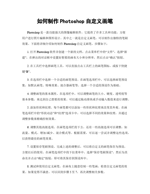
如何制作Photoshop自定义画笔Photoshop是一款功能强大的图像编辑软件,它提供了许多工具和功能,方便用户进行照片编辑和图形设计。
其中之一就是自定义画笔,可以制作出独特的笔刷效果。
下面将详细介绍如何制作Photoshop自定义画笔,步骤如下:1. 打开Photoshop软件并创建一个新的文档。
点击菜单栏中的“文件”,选择“新建”,在弹出的对话框中设置好想要的画布大小和分辨率,然后点击“确认”按钮。
2. 在工具栏中选择画笔工具。
可以直接点击工具栏上的画笔图标,或按下快捷键“B”。
3. 在选项栏中选择一个合适的画笔预设。
在画笔选项栏中,可以选择画笔预设集,如默认画笔、特殊效果、混合器画笔等。
选择一个合适的预设作为基础。
4. 调整画笔的基本属性。
在选项栏中,可以调整画笔的大小、硬度、透明度等基本参数,来达到自己想要的效果。
可以通过拖动滑块或手动输入数值来进行调整。
5. 添加形状和纹理。
每个画笔都可以添加一些形状和纹理来改变其外观。
在画笔选项栏中的“形状动态”和“纹理”选项卡中,可以选择不同的效果和纹理,并通过调整参数来精确控制效果。
6. 调整其他高级选项。
在画笔选项栏的下方,还有一些高级选项可以调整,如流量、模式、增加/减少、混合模式等。
根据需要,可以逐一尝试并调整这些选项,以获得最佳的画笔效果。
7. 设置保存笔刷预设。
完成上述的调整后,可以将自定义的画笔保存为预设,方便以后的使用。
在画笔选项栏中的下拉菜单中,选择“保存笔刷预设”,然后为其命名并点击“确定”按钮,即可将其保存到预设库中。
8. 测试和使用自定义画笔。
在画布上随意绘制一些笔画,检查自定义画笔的效果。
如果觉得不满意,可以回到步骤5至7,再次调整相关参数。
以上就是制作Photoshop自定义画笔的详细步骤。
通过调整画笔的基本属性、添加形状和纹理以及调整其他高级选项,可以制作出各种独特的画笔效果,让作品更加生动有趣。
不断尝试和实践,你会发现自己能够制作出个性化的画笔,并在创作中发挥更多的想象力和创造力。
Photoshop笔刷运用教程
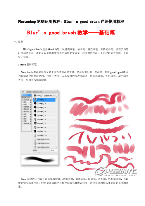
Photoshop笔刷运用教程:Blur’s good brush详细使用教程Blur’s good brush教学——基础篇一.绘画Blur’s good brush包含Good画笔、风格类画笔、油画笔、特效画笔、形状类画笔、纹理类画笔6类画笔工具,我们可以选择其中需要的画笔来完成某一种类型的绘画,下面我将向大家做一个简要的讲解。
1.Good系列画笔-Good brush类画笔包含了若干综合类的画笔工具,是最为常用的一类画笔,其中good1-good10系列画笔是使用率最高的,包含了大部分人喜爱用的常规类画笔,如圆形画笔、方形画笔、扁平画笔等等,可用于常规类绘画。
-Good画笔内还包含了许多模拟绘画风格的笔触,如水彩笔、国画笔、水粉画、色粉笔等等,可以根据情况选择使用,但是要注意画笔名称旁边的笔触模式标注,选择正确的模式才能得到正确的效果。
-一些特殊型的画笔如辉光、高光、撒盐等也需要根据笔刷名称后面的标注正确设置笔刷模式才能得到正确的效果,以后使用任何一类笔刷都要注意这一点。
2. Stylize brush风格类画笔-Stylize风格类画笔包含了很多形状特殊或是带有纹理的笔刷,可以绘制出非常有个性化的作品。
3. Oil brush油画类笔刷油画类笔刷包含两类画笔,一类为绘画笔,一类为混色笔,油画笔1-8可以直接用于上色,混色笔必须使用涂抹工具来使用,它可以模拟出颜料未干时的色彩混合效果,混合效果将在下一部分具体介绍。
4. FX brush特效类画笔-特效类画笔是非常重要的一类画笔,可以非常简单的为画面添加各类特殊效果,如气体、燃烧、发光、魔法等等,需要注意的是,笔刷的模式设置在这里非常重要,大部分笔刷都带有“滤色/颜色减淡”的设置,需要细心留意。
-特效类画笔还包含标注有“3d”字样的画笔,如3d云等,这类画笔需要根据用笔的轻重来控制笔触的角度和大小,由此来表现出带有空间远近透视感的变化,需进行适当的练习才能较好的掌握。
如何安装笔刷(详解)

如何安装笔刷:
首先笔刷有两种格式ABR格式
和TPL格式
先说ABR格式如何安装:
1.点击菜单栏的窗口,然后点击窗口下的画笔预设:
打开这个窗口之后,点击右下方按钮
然后点击载入按钮:
找到笔刷所在文件夹,然后选择一个笔刷(如:26种数字艺术插画涂抹笔触),点击载入即可:
再说TPL格式:
点击菜单栏的窗口,然后点击窗口下的工具预设:
然后选择工具预设菜单栏里右上角按钮,打开如图的下拉菜单
然后选择载入工具预设,之后选择你笔刷所在文件夹然后点击载入
笔刷安装完成。
PS:再补充一句,工具预设的笔刷是有文字描述的笔刷,看不到画笔画出来长啥样,如例图:
而,画笔预设的笔刷能看到画出来长嘛样儿,但是没有文字描述,如例图:
同学们安装完成后,记得告诉老师哦~。
lazynezumipro的用法

Lazy Nezumi Pro(LNP)是一款专业的绘图软件辅助工具,它为许多绘图和图形设计软件提供了更流畅的笔触和更精确的控制。
下面是 Lazy Nezumi Pro 的基本用法:安装 Lazy Nezumi Pro:1.下载软件:在 Lazy Nezumi Pro 官网上购买并下载软件。
2.安装软件:执行下载的安装程序,并按照提示进行安装。
3.激活软件:在安装完成后,按照软件提供的步骤激活软件。
使用 Lazy Nezumi Pro:1.启动 Lazy Nezumi Pro:打开你的绘图软件(例如 Photoshop、Clip StudioPaint、Painter 等),然后启动 Lazy Nezumi Pro。
2.选择配置文件:在 Lazy Nezumi Pro 界面中,你可以选择不同的笔刷配置文件,每个配置文件都有不同的笔刷效果。
你可以根据绘图需求选择合适的配置文件。
3.调整笔刷设置:在配置文件中,你可以调整各种笔刷设置,如压感响应、稳定性、旋转等。
这些设置可以根据你的绘图风格和需求进行调整。
4.启用笔刷效果:在 Lazy Nezumi Pro 界面中,确保开启了 "Enable" 开关,以启用所选的配置文件中的笔刷效果。
5.绘图:使用你的绘图软件开始绘图,Lazy Nezumi Pro 将提供更流畅、更精确的笔刷效果。
你可以感受到笔刷更好地响应手绘动作,并能够绘制更自然的线条。
快捷键和功能:•Ctrl + Alt + N:切换 Lazy Nezumi Pro 界面的显示和隐藏。
•Ctrl + Alt + R:重新加载 Lazy Nezumi Pro。
注意事项:•Lazy Nezumi Pro 不是一个独立的绘图软件,而是一个作为插件运行在其他绘图软件之上的工具。
•在使用 Lazy Nezumi Pro 之前,请确保你的绘图软件与 Lazy Nezumi Pro 兼容。
AI全面指南:笔刷工具

AI全面指南:笔刷工具Ai的笔刷工具(Paintbrush Tool)和笔刷面板(Brush Panel)是Ai中的两个强大的工具,在笔刷工具和笔刷面板的帮助下,你可以用矢量图创作出绚丽的花朵、图案等图形,这个教程将对Ai的笔刷工具和画笔面板的基础要点进行详细的讲解,教大家如何创造自己的笔刷。
1.Ai笔刷工具介绍基本上,Ai笔刷工具的作用和钢笔工具的作用差不多,就是通过点击和拖拽绘制出矢量路径,不同的是,笔刷工具允许将预先做好的矢量图形施加到路径上去,虽然只是这点不同,但是却足够让你极大地改善用Ai做出来的矢量图产品的质量,并且可以制作出超乎你自己想象的作品。
2.Ai的四种笔刷类型Ai有四种类型的笔刷,每一种笔刷施加给路径时会呈现不同的外观。
书法笔刷:Ai书法笔刷可以模拟墨水笔、画笔的效果,使用书法笔刷,可以对笔尖进行相应设定,作出不同效果。
散布笔刷:Ai散布笔刷可以将矢量图形定义为笔刷,当施加给路径时,这些矢量图形副本就会沿着路径散布。
艺术笔刷:Ai艺术笔刷同样可以将矢量图形定义为笔刷,当施加给路径时,这些矢量图形就会沿着路径伸缩,如下图所示:图案笔刷:Ai图案笔刷允许将5个矢量图形定义为图案笔刷的起点、终点、边线、内边角、外边角。
施加给路径时,这些矢量图形将会沿着路径的不同位置进行分布。
这是Ai最复杂的笔刷,请见下文的详解。
3.应用笔刷和用笔刷绘制图形Ai有两种方式来使用笔刷工具,可以直接用笔刷工具绘制图形,也可以将笔刷工具应用到一个路径上。
∙用笔刷绘制: 选中笔刷工具(B),在笔刷面板里选择相应的笔刷,直接在画布上绘制即可。
∙应用到路径:选择要应用笔刷的路径,然后从笔刷面板里选择相应的笔刷即可。
4.Ai笔刷工具的参数设置在Ai中双击工具栏的笔刷工具,就会打开Ai笔刷工具的选项,下面会对各个选项逐一讲解。
A:阀值设置(Tolerances):∙精确度(Fidelity):精确度的值越低,就会增加更多的锚点到路径上,相反,精确度越高,生成的路径的锚点数目就越少。
教你如何安装Photoshop笔刷、自定义形状、滤镜等
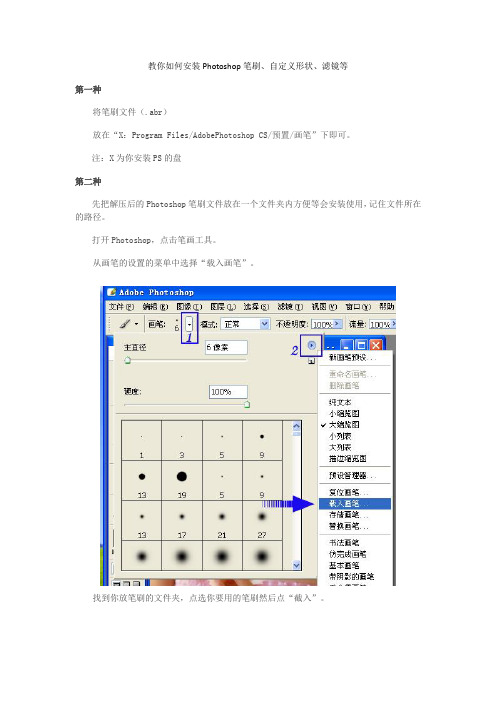
教你如何安装Photoshop笔刷、自定义形状、滤镜等第一种将笔刷文件(.abr)放在“X:Program Files/AdobePhotoshop CS/预置/画笔”下即可。
注:X为你安装PS的盘第二种先把解压后的Photoshop笔刷文件放在一个文件夹内方便等会安装使用,记住文件所在的路径。
打开Photoshop,点击笔画工具。
从画笔的设置的菜单中选择“载入画笔”。
找到你放笔刷的文件夹,点选你要用的笔刷然后点“截入”。
载人几个笔刷文件都可以,在这可以看你的载入的笔刷。
选择你的笔刷大小颜色。
最好是新建一个图层,现在可以用新笔刷自由绘画。
在笔刷面版会有一个三角小箭头,点开后点载入画笔即可,其他工具同上。
如果是RAR压缩包里,要先解出来才可以。
哈哈把笔刷复制到PHOTOSHOP预置-画笔里面就好了关于下载笔刷安装与使用1、先把解压后的笔刷文件放在一个文件夹内(方便使用)记住路径(就是放在那个盘了)2、打开PS点击笔画工具3、找到你放笔刷的文件夹,点选你要用的笔刷然后点载入4、载入几个都可以,在这可以看你的载入的笔刷5、选择你的笔刷大小颜色。
最好是新建一个图层画吧6、如果你想用原来的笔刷了。
点击这里就可以回到原来的笔刷了7、这里还可以调节状态自己琢磨一下8、还可以做个渐变填充按住ctrl点击笔刷图层9、还可以改变混合模式,怎么做的好看就要发挥你的想像力了外挂滤镜的安装与Photoshop内部滤镜不同的是,外挂滤镜需要用户自己动手安装。
安装外部滤镜的方法分为两种:一种是进行了封装的外部滤镜,可以让安装程序安装的外挂滤镜;另外一种是直接放在目录下的滤镜文件。
安装滤镜的方法很简单,直接将该滤镜文件及其附属的一些文件拷贝到“Photoshop PlugIns”下即可。
先找到滤镜所在目录,如光盘根目录下的PlugIns下的不同公司出品的滤镜目录,进入这些目录,你会发现除了滤镜文件8bf与8bi之外,还有一些帮助文件、asf、dll等文件,一般的安装文件就是将这个目录一起拷贝到Photoshop的滤镜目录即可,在下一次进入Photoshop时,打开“Fitler”菜单,便会发现新安装的滤镜;另外,为了节省空间,也可以将滤镜目录下的滤镜文件拷贝到Photoshop的滤镜目录下,但是要注意的是:拷贝时要看一下该滤镜有没有附属所动态链接库dll文件或asf文件,如果未将滤镜拷贝完整,那么将不能正常使用该滤镜,另外在拷贝单个滤镜文件之前,请先记下它的文件名,如果下次进入Photoshop后不能正常使用的话,就可以将其删除掉,以节省硬盘空间。
procreate笔刷安装3种方法
一、使用QQ(注:需保证iPad上已安装QQ和procreate)
1、同时登录电脑和iPad的QQ软件。
2、将下载好的笔刷拖进电脑QQ,发送到【我的ipad】;
3、从iPad上接收文件,选择打开方式为procreate。
二、使用百度网盘(注:需保证iPad上已安装百度网盘和procreate)
1、将电脑上下载好的笔刷文件上传至百度网盘;
2、从iPad上打开百度网盘App,找到笔刷文件夹;
3、选择扩展名为brushset或brush的文件下载;
4、打开网盘下载完成页面,选择已下载的笔刷文件,点击分享键,选择procreate 即可。
三、使用腾讯微盘(注:需保证iPad上已安装腾讯微盘和procreate)
1、将电脑上下载好的笔刷文件上传至腾讯微盘;
2、打开procreate软件后,上划iPad屏幕底部;
3、找到腾讯微盘的应用图标,长按将图标拖到屏幕右边,实现双屏展示;
4、打开procreate的笔刷库,点击+号可创建新的笔刷文件,并命名(便于查找分类);
5、在右侧找到腾讯微盘中的笔刷文件,长按并拖拽到procreate里就可以啦~。
《photoshop》笔刷怎么导入
《photoshop》笔刷怎么导入
不少人都不明白,photoshop笔刷怎么导入,有需要的可以来看看photoshop 笔刷导入方法一览!
photoshop笔刷导入方法教程:
1、先下载笔刷,再在“笔画”中载入画笔,打开PS,选中左侧的“画笔”工具。
2、在打开画笔工具后需要调节参数,在最上方画笔大小的下面有一个下拉箭头。
3、打开下拉箭头右侧的设置选项(PS CC以下版本是一个小三角形状)。
4、找到并点击“载入画笔”。
5、找到之前下载好的笔刷工具插件,然后点击右下角的“载入”。
6、确定后,再查看是否加载完成。
7、加载进去之后就可以放心使用了。
procreate笔刷用法

procreate笔刷用法
Procreate是一款设计师和画家必备的应用程序,其功能强大且
易于使用。
其中最强大的功能之一是它的笔刷。
提供了许多笔刷类型,颜色和效果,从而使绘画过程变得更加简单和有趣。
下面是关于Procreate笔刷用法的一些步骤:
步骤一:打开Procreate并创建一个新画布。
在主界面上点击“+”符号,然后选择“New Canvas”选项。
在弹出菜单中,选择画布
大小和分辨率。
点击“Create”即可创建一个新画布。
步骤二:选择适合您绘画需求的画笔。
点击工具栏上的笔刷图标,显示出可用的笔刷。
选择一个,如果需要调整笔刷类型和大小,可以
通过单击和拖动来实现。
可以在“Brush Library”中找到更多的笔刷
类型。
步骤三:开启绘画。
在您的新画布上使用您选定的笔刷进行绘画。
可以使用工具栏上的颜色选择器来改变颜色,以便更好地匹配您的创意。
步骤四:使用Procreate提供的特殊效果以及与笔刷相关的功能。
可以尝试使用滤镜、图形变换等特效,以及对笔刷形状、颜色等进行
微调。
步骤五:记得保存您的作品。
点击左上角的箭头符号,选择“Export”即可导出您的作品。
Procreate还支持将您的作品保存到云端以进行备份。
总之,Procreate的笔刷是其核心功能之一,并且使用它们可以
使您的创作变得更加令人印象深刻。
即使您从未涉足绘画和设计领域,也可以凭借Procreate的简单易用性和强大的功能有所作为。
红笔正确的安装方法

红笔正确的安装方法*本文将为大家介绍红笔的正确安装方法,并提供一些有用的技巧和注意事项,以确保安装顺利进行。
*1. 准备工作在开始安装红笔之前,请确保您已具备以下准备工作:- 一台运行Windows、Mac OS或Linux操作系统的电脑;- 网络连接,用于下载红笔的安装文件;- 磁盘空间,用于安装红笔和存储相关文件。
2. 下载红笔安装文件您可以在红笔的官方网站([3. 安装红笔根据您的操作系统不同,下面将介绍不同的安装方法:3.1 Windows操作系统1. 双击下载的红笔安装文件,打开安装向导。
2. 请按照向导的指示选择安装路径和其他选项。
如果您不确定如何选择,请使用默认设置。
3. 单击“下一步”开始安装过程。
4. 完成安装后,您可以在开始菜单或桌面上找到红笔的快捷方式。
3.2 Mac操作系统1. 双击下载的红笔安装文件,将其拖动到应用程序文件夹中。
2. 打开“应用程序”文件夹,找到并双击红笔的图标。
3. 完成安装后,您可以在“启动台”中找到红笔的图标,并将其固定到Dock栏中。
3.3 Linux操作系统1. 打开终端,并导航到下载文件所在的目录。
2. 运行以下命令安装红笔:`sudo dpkg -i redpen-x.x.x.deb`(Replace `x.x.x` with the correct version number)3. 输入管理员密码并按下回车键。
4. 完成安装后,您可以在应用程序菜单中找到红笔的图标。
4. 使用红笔4.1 打开红笔根据您的操作系统,选择适当的方式打开红笔。
您可以在开始菜单、启动台或应用程序菜单中找到红笔的图标,并点击打开。
4.2 配置红笔第一次运行红笔时,您需要进行一些初始配置,例如选择语言、设置字体和布局等。
根据您的个人喜好进行配置,并点击“保存”或“应用”按钮。
4.3 使用红笔进行标注现在您已经准备好开始使用红笔进行标注了!在打开要标注的文件后,您将在红笔的工具栏中找到各种标注工具,如划线、涂鸦、批注等。
书法字笔刷使用方法
书法字笔刷使用方法
书法字笔刷的使用方法可以参考以下几点:
1. 选择笔刷:在书法字笔刷中,可以选择不同粗细、硬度的笔触,以及不同的书写风格,例如楷书、行书、草书等。
根据需要选择合适的笔刷,可以让书法作品更加自然、流畅。
2. 调整笔刷大小:在书法字笔刷中,可以调整笔刷的大小,以适应不同的书写需求。
如果需要写大字,可以选择大笔刷;如果需要写小字,则选择小笔刷。
3. 调整笔刷硬度:在书法字笔刷中,可以调整笔刷的硬度。
如果想要更粗的笔画,可以选择更软的笔刷;如果想要更细的笔画,则选择更硬的笔刷。
4. 掌握笔画技巧:在书写笔画时,可以运用不同的技巧来提高书写效果。
例如,可以通过调整笔刷的角度和力度来控制笔画粗细、变化和节奏,以达到更好的书写效果。
5. 注意笔顺:在书写汉字时,需要注意笔顺的顺序。
正确的笔顺可以提高书写的美感和流畅度。
建议遵循汉字的规范笔顺进行书写。
6. 适当停顿:在书写过程中,可以适当停顿以控制笔画的速度和节奏。
停顿可以让笔画更加有力、有节奏感,同时也可以让书写更加自然、流畅。
7. 练习与掌握:通过不断练习和掌握书法字笔刷的使用方法,可以提高书写水平,让书法作品更加美观、有艺术感。
ps软件怎么用
ps软件怎么用标题:PS软件的基本使用方法在当今数字化时代,Photoshop(简称PS)是一款非常受欢迎的图像处理软件。
无论是专业设计师还是普通用户,都可以通过它来编辑、修饰和创建图像。
下面是PS软件的基本使用方法,希望对初学者有所帮助。
一、安装和启动PS软件安装PS软件的方法因版本而异,但通常只需按照提示进行操作即可。
安装完成后,点击桌面上的快捷方式或在程序列表中选择Photoshop图标,即可启动软件。
二、界面概览启动PS软件后,会弹出一个“欢迎界面”或“开始界面”,提供新建文件、打开现有文件以及访问教程和模板等选项。
点击菜单栏中的“文件”选项,可以打开现有文件或新建一个文件进行编辑。
PS软件的主界面通常由菜单栏、工具栏、选项栏和面板组成。
菜单栏位于软件顶部,包含了许多功能和选项。
工具栏位于界面左侧,提供了各种不同的工具来编辑图像。
选项栏位于菜单栏下方,可根据所选工具的不同显示相应的选项。
面板位于界面右侧,用于管理图层、色彩、调整和滤镜等。
三、基本操作1. 打开和保存文件:按下Ctrl+O(苹果电脑为Command+O)可打开文件浏览器,选择要打开的文件,PS软件将加载并显示在工作区中。
要保存文件,可按下Ctrl+S(苹果电脑为Command+S),然后选择保存路径和文件格式。
2. 放大和缩小图像:使用工具栏中的放大镜工具和缩小镜工具,点击图像可以放大或缩小其显示。
3. 移动图像:在图像上点击并拖动鼠标,即可移动图像。
如需要移动图像层,可使用图层面板中的移动工具。
4. 调整图像尺寸:点击菜单栏中的“图像”选项,然后选择“图像大小”,在弹出的对话框中调整图像的尺寸。
5. 调整亮度和对比度:点击菜单栏中的“图像”选项,然后选择“调整”和“亮度/对比度”,在弹出的对话框中调整图像的亮度和对比度。
6. 使用图层:图层是PS软件的重要功能之一,可以对图像进行分层处理。
通过图层面板,可以新建、删除、隐藏和合并图层,以及调整图层的透明度、混合模式和样式。
BrushinstallationFAQ(笔刷安装常见问题)
Brush installation FAQ (笔刷安装常见问题)Note: multiple brush files can be loaded repeatedlyIn the settings menu, you can also adjust the preview mode of the brush file (size, size, list, etc.)If you want to revert to the initial state of the brush file, select the reset brushOther options and values, according to the needs of their own settingsThe filter has a green version and an installation versionThe former simply copies the file (usually suffix 8BF) to the PS installation pathSynergy tool \ filterSome PS version files are called: Plug-InsThe installation of the filter will prompt the selection path during installation, (path ibid.)Or build a folder (path free) to store the filter file so farCall the plug-in filter by setting up in PSBrush spacingIn the Photoshop press the shortcut key "F5" to bring up the brush palette, the brush palette and brush tool and there is no direct relationship, which is set with the brush palette. In fact, should be named as the brush palette is more appropriate.As follows, click the yellow "Brush NIB" shape, if the following options (such asdynamic shapes), if there is tick, first remove all. Then select the 9 pixel brush in the brush preset list.A wavy line at the bottom is a preview of the brush effect, which is equivalent to drawing a picture in the image. This preview will also change if we change the settings.From the diagram above, we see the familiar diameter and hardness, and their function is the same as what we have seen before. It is the control of size and edge emergence. Today, let's start with brush spacing.Take a closer look at the spacing below the hardness. Now the value is 25%. What does that mean? The brush we used in front can be thought of as a series of dots. If we set the spacing to 100%, we can see the dots in the order of the head and tail:If set to 200%, you will see a clear gap between the dots. The gap is just enough to add a dot. Following chart:As you can see, the distance is actually the center of the distance from each of the two dots. The greater the spacing, the greater the distance between the dots.Question: why do we not draw dots when we draw a line in front?Answer: This is because the value of the pitch is a percentage, and the percent reference is the diameter of the brush. When the diameter is very small, the distance between the dots calculated by this percentage is also small, so it is not obvious. And when the diameter is large, this percentage calculates the distance is also big, the dot effect is obvious.We can do a contrast test to keep 25% spacing, set the diameter to 9 pixels and 90 pixels, and then draw a line in each image, and compare their edges. Following chart:You can see that the first straight line has a smooth edge, and the edges of the second lines are clearly curved. These arcs are made up of the outer edges of many points.Following chart:So use a larger brush when you want to cut the distance properly. The minimum distance is 1%, and the maximum diameter of the brush is 2500 pixels. Then, when 2500 pixel diameter is used, the minimum distance between the dots is 25 pixels, which looks very obvious, so it doesn't work well. The solution is to draw a large rectangle instead.If you turn off the spacing option, then the distance of the dots is determined by the speed at which the mouse drags, the slower spots are denser, and the faster places are sparse.Roundness and angleThe brushes we used were all regular circles. Now that we have more than one roundness control, we can set the brush shape to an ellipse.Roundness is also a percentage, representing the ratio of ellipse length to diameter. 100% is the 0% circle, ellipse shape of the flat.The tilt angle is the angle of the ellipse, when the roundness is 100% angle has no significance, because no matter how eccentric tilt is still a way.In addition to input values, you can also change the roundness by drawing two control points (the green circle in the picture below) in the diagram, and then click and drag in the diagram to change the angle.After flipping the X and flipping the Y, the shape of the brush changes in actual rendering, although the angle and roundness of the setting remain unchanged. As shown below, the horizontal direction is the effect of flipping the X. The vertical direction is the effect of flipping the Y.It seems that the two flip effects are the same, rotating a certain angle, but flipping and spinning are two entirely different concepts. As you can see from the following chart, the three edges of the red, green, and blue points of the ellipse edge are reversed, and you will see that this is not what rotation can do.Flipping is also called mirror image. Draw the oval on the top left corner of the picture above, then take a mirror,The position of the two thin lines, respectively, from the mirror, is the mirror image. You can do it yourself and see if the mirror image is the effect above.We said earlier about the brush spacing, which is somewhat unusual in the ellipse. We set a brush with a diameter of 20 pixels, an angle of 15, a roundness of 50%, and a space of 200%. Use the SHIFT key to draw an image similar to the figure below:Question: two lines brush different distancesSpecial brushUntil now, we are using circular or elliptical brush, dull, change is the effect. Now let's use other shapes of brushes.As shown in the figure below, select a maple leaf shape (green box) in the brush tip shape. The sample size of this brush (brush sampling will be introduced later) is 74 pixels, but this is in our 400The 300 image too big, so we changed to 45 pixel size. If you want to recover the sample size, click the "use sample size” button. This button is not valid until the size has been changed Spacing is set to 120%. Following chart:Is it because I always feel depressed with black drawings? Then let's change the foreground color of an orange (243111, 33). In Photoshop, the foreground color is the color of the drawing tool Notice that even if you change the foreground color, it is still black in the brush preview. Now compare the effect of flipping XY, as shown in the following line, with the effect of no flip shake. The second line is the effect of flipping the X and flipping the Y.As you can see, the second lines of maple leaf (pictured above, left, third, and fourth) appear upside down, which is the flip effect, also known as the mirror image.Now we have more options: size jitter 70%, angular jitter 100%, and roundness jitter 50%. It looks different, different angles, and different. Then set the spacing to 100%. Don't draw any more boring straight lines this time. Is the lover still angry because you stole a drink? Then draw a heart and give it to her.Do you think the color is too single? Then make some changes to enrich the colors. We use the dynamic color option to achieve this goal. The foreground / background jitter is set to 100% as shown below.The function of this option is to change the color between the foreground color and the background color. The default background is white, or you can choose it yourself. Following chart:In the drawing above, 5 background colors are changed: yellow, grey, green, blue and purple. Add the foreground color orange, in total 6 colors. But looking closely, you will find that there are far more than 6 colors (such as the upper left corner of the blue part). Why is that?This is because the effect of jitter is within a range, not just at two extremes. Like the brush size jitter in the front, not only the two largest and smallest diameters, but also a series of intermediate transitions in diameter. The wobble here is the same. The selected foreground color and background color just define the two endpoints of therange of jitter, and the transition colors of the middle series are included in the range of jitter. As shown below, the two colors of the head and tail are the foreground color and the background color. The middle is the transition zone between the foreground color and the background color.In the foreground / background jitter, but also control options, and we use it in front of contact is similar, if you select fade out, will be in the specified step in the foreground to background color, if you continue to step after drawing, will remain as the background color.Turn off foreground / background jitter (set to 0%). Look at the following hue jitter, saturation jitter, and brightness jitter. The concept of hue, saturation, and brightness has been mentioned in the course #01, where dithering is the use of this color pattern.Now move the heart-shaped image we painted in front to Photoshop, as shown below:Then use the menu [Image > Adjustments > hue / saturation] shortcut keys CTRL+U ”, this will start a color adjustment function (specifically the use will be presented in a later tutorial). Try changing hue, saturation, and brightness (see brightness) to see what effect it has.For the orange in the image, the change of color turns orange into red, blue, etc.. Changing the saturation will make the orange gray or bright. Change brightness (brightness) will lead to partial black or white.Now, we still use the maple leaf shape brush in front, size 30 pixels, roundness 100%, spacing 100%, turn off dynamic shapes, and turn off other options in color dithering.Select a pure red foreground color, set the hue jitter to 20%, 50%, 80%, 100%, respectively,Each drawing a straight line, the effect is shown below:As you can see, the higher the hue jitter, the more colorful the color. Why is that? What percentage of the hue jitter is the standard?Let me answer the second question first. This percentage is based on hue range. The course #01 we learned about the hue of knowledge, know the hue is a ring, in order to facilitate viewing, we will hue ring 180 degrees of cut, pull into an intermediate is red, two is the color blue, as shown below:The color we choose is red, and the red is exactly at the center of the hue bar. The percentage of hue jitter, then, refers to the range in which the red is centered, while extending to the left and right. So we draw 4 straight lines of maple leaves,Now we are ready to start painting the galaxy. Set a brush: 3 pixels in diameter, 100% in roundness, and 200% in spacing. Size jitter 100%, scatter 1000% two axes, quantity 4, quantity jitter 90%.[this post is edited by langzie398 at 16:12 2007-9-22]Langzie398PS 2UID 25670Essence 0Integral 12Post 111PS coins 12 yuanPopular 28 starsThe publicity value is 22 pointsPrestige 0 pointsRead permission 5Register 2007-8-25Status offline, #2 using props published in 2007-9-22, 16:10 information, personal space short message plus friendsBrush storageYou can save this setting for later use. The method is the triangle button click the upper right corner of the brush paletteSelect the new brush preset”. Or click the new button at the bottom of the brush palette. Then enter a name. You can use Chinese, and here we enter the nebula as the name. Everyone in the actual use of the process, it is best to use a more appropriate name to name, so that it is convenient to find.Drawing galaxiesCreate a new 400 x300 images, we can also set their own larger size. Since it' s Milky way, the bigger ones look more comfortable. Here we' 11 touch the layer for the first time, just touch it briefly and make some preparations for the formal learning layer behind. At the sametime, using layers can also make our effects look better.First, fill the entire image with pure black. This filling process requires all shortcuts to complete. Remember?According to the "D" to ensure that the color is black and whitebackground foreground, ALTDELETE "before filling the scenery. Then out of the layers palette menu, [Window > Layer] shortcut key "F7”, will see look similar to the following:Now click the new button below the layers palette, this created a new layer. The layers palette will increase, as shown below:To ensure that in the layers palette, the choice is the new layer 〃1. Set the foreground color to white. How do I select the foreground color white? That is according to the "D" and "X” to exchange the foreground and background color. Next, draw on the nebula brush you just set. With the mouse in the image rotation, and some places can turn back and forth several times. Roughly draw the following effect:All right, the galaxy is ready. Yes, don't doubt it. It's that simple! Because of the size, jitter, and scatter effect, the dots of the brush look like stars, bright and variable. A brush can create a starry sky!Maybe the effect is not convincing, because the image seems to be too far away from the Milky Way Galaxy we see in science fiction movies. OK, let' s go on refining it. Use the nebula brush to continue drawing on the new layer, similar to the figure below:What is it? Insects? Although it does look like an insect, believe this insect is closer to our childhood dream!Now we' 11 use the filter function. Make sure the layer selection is new, use the menu [Filter > twist > rotate, twist, and then set as shown below:After the determination of the image has undergone a qualitative change, the original "insects" transformed into a spiral galaxy, which is the effect of filters. Following chart:Now add a few lines, as follows:And then the rotational distortion filter, can use the filter menu first or "CTRL F”, you can repeat the filter operation, the effect is as follows:It works better than the first spin. Now draw some lines against the direction of rotation, as shown below, so that the effect of rotation is not so obvious after using the filter, making the galaxy appear to be strewn with layers.Rotate the filter again, and you can also use the shortcut keys to redo the filter,The effect is shown below:Now the rotation of galaxies has been very good, but under normal circumstances, we can not see such a positive galaxy, basically flat oval. Then we' 11 use Photoshop's "free transform" feature to change it.To ensure the layer selection in a new layer, use the menu [Edit > Free Transform] shortcut CTRL T ”, which started the free transform tool. At this point there will be adjustments around the galaxy, as shown below:In the adjustment frame edge has 8 control points (the line between the square). With the mouse as the top middle control point, the mouse cursor becomesAt this point, press the left button and drag it down to flatten the image, as follows。
- 1、下载文档前请自行甄别文档内容的完整性,平台不提供额外的编辑、内容补充、找答案等附加服务。
- 2、"仅部分预览"的文档,不可在线预览部分如存在完整性等问题,可反馈申请退款(可完整预览的文档不适用该条件!)。
- 3、如文档侵犯您的权益,请联系客服反馈,我们会尽快为您处理(人工客服工作时间:9:00-18:30)。
笔刷载入方式:打开PS,编辑-->预设管理器-->载入-->然后点你下载解压后要载入的笔刷-->载入,就可以啦!
引用:
注意:压缩文件解压后是JBR类型的,需要改为ABR类型的才可以使用.
改名方法:
打开"我的电脑",菜单选"工具"-"文件夹选项"-"察看"-把"隐藏已知文件的扩展名"的勾去掉.确定.
然后鼠标右键点击需要改名的文件,选择"重命名",把JBR改为ABR后,按回车键.弹出一个对话框,点确定即可.字体的安装方式:将文字安装到windaows目录下的fonts文件夹中。
引用:
使字体能共享的一种安装方法
在d盘或者其它盘(反正不在c盘)新建一个fonts文件夹,将你收集到的字体,都安装进去吧。
1.通过“控制面板”打开“字体”文件夹.
2.从“文件”菜单中打开“新安装字体”对话框,选择新字体[或者其他操作系统]的fonts文件夹.
3.在“字体列表”中选中需要的字体,去掉“将字体复制到fonts文件夹”复选框前的对号,点击“确定”.这时,安装的字体只是这些字体的快捷方式,而非字体文件本身.
这样,所用的空间很小,而又不影响使用新字体。
这样做的好处是
1、不用担心新字体会影响系统安全稳定
2、重装操作系统[包括双操作系统]不必重新下载安装字体。
3、最惬意的就是共享。
双操作系统也共享字体吧。
大家都知[wiki]道[/wiki],字体文件的体积都是比较大的,特别是中文。
将fonts文件夹里的字体尽数搬出,只剩下5个搬不动的字体,再采用上述方法,少了上百m哦。
补充一下
1:将你字体库里的所有新安装的字体文件删除掉
2:在你的任意硬盘中建立一个fonts文件夹,将所有的新字体文本放进去
3:打开控制面版,进入字体库
4:点“文件”----“新安装字体”
5:在弹出的框中找到你刚才新建立在任意盘中的fonts文件夹,选中它。
这时,所有的新字体文本会在上面出现,点旁边的“全选”
6:将“将字体复制到fonts文件夹”前面的勾去掉
7:最后点击“确定”。
ok。
(注意,是新的字体,不包括以前系统的)
图案添加方法:
引用:
解压出文件,放在安装PS的目录文件里
如c:\Program Files\Adobe\Photoshop CS\预置\图案
滤镜插件的安装方法:
引用:
滤镜插件下载后请释放到Photoshop滤镜文件夹里 1、如果是英文CS版本或7. 0版本以下的,释放到Photoshop文件\Plug-Ins\Filters文件夹里 2、如果是C S中文绿色版本的,释放到Photoshop文件\Required\增效工具\滤镜文件夹里 3.如果是cs8.0中文版本的,释放到photoshop文件\增效工具\滤镜文件夹里.。