ABAQUS如何画XY曲线图1
abaqus荷载-位移曲线
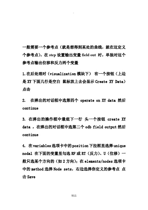
一般需要一个参考点(就是想得到某处的曲线,就在这定义个参考点),在step设置输出变量field out 时,单独对这个参考点输出位移和反力两个变量
1.在后处理时(visualization模块下)有一个按钮(上边是XY下面几行是空白鼠标放上去会显示Create XY Data)点击
2. 在弹出的对话框中选第四个 operate on XY data 然后continue
3. 在弹出的操作框中最底下一行头一个按钮 create XY data ,在弹出的对话框中选第二个odb field output然后continue
4. 在variables选项卡中的position下拉框里选择unique nodal 在下面的变量里勾选RF或RT(反力)、U(位移)一般只选某个方向的(如2方向);在elements/nodes选项卡中的method选择Node sets,右边选择你定义的参考点点击Save
5.这时在操作框里XY Data栏下会有两个数据,他们是参考点处的反力和位移随时间的变化,在右边的operators里有一个函数combine(x,x),点一下这个函数会出现在expression栏里,将两个数据位移和反力用add to expression添加到combine函数的括号里,注意位移在前,反力在后,中间的逗号是英文的“,”
6.将expression另存为(save as按钮)一个新的名字,可以用plot expression查看曲线,也可以在主窗口的XY Data manager用plot查看,用edit读取数值
如果觉得位移和反力的符号是相反的,可以在第5步combine之前将两个数据反号另存为新的数据之后combine 如有侵权请联系告知删除,感谢你们的配合!。
总结Abaqus操作技巧总结(个人)
Abaqus操作技巧总结打开abaqus,然后点击file——set work directory,然后选择指定文件夹,开始建模,建模完成后及时保存,在进行运算以前对已经完成的工作保存,然后点击job,修改inp文件的名称进行运算。
切记切记!!!!!!1、如何显示梁截面(如何显示三维梁模型)显示梁截面:view->assembly display option->render beam profiles,自己调节系数。
2、建立几何模型草绘sketch的时候,发现画布尺寸太小了1)这个在create part的时候就有approximate size,你可以定义合适的(比你的定性尺寸大一倍);2)如果你已经在sketch了,可以在edit菜单--sketch option ——general--grid更改3、如何更改草图精度可以在edit菜单--sketch option ——dimensions--display——decimal更改如果想调整草图网格的疏密,可以在edit菜单--sketch option ——general——grid spacing中可以修改。
4、想输出几何模型part步,file,outport--part5、想导入几何模型?part步,file,import--part6、如何定义局部坐标系Tool-Create Datum-CSYS--建立坐标系方式--选择直角坐标系or柱坐标系or球坐标7、如何在局部坐标系定义载荷laod--Edit load--CSYS-Edit(在BC中同理)选用你定义的局部坐标系8、怎么知道模型单元数目(一共有多少个单元)在mesh步,mesh verify可以查到单元类型,数目以及单元质量一目了然,可以在下面的命令行中查看单元数。
Query---element 也可以查询的。
9、想隐藏一些part以便更清楚的看见其他part,edge等view-Assembly Display Options——instance,打勾10、想打印或者保存图片File——print——file——TIFF——OK11、如何更改CAE界面默认颜色view->Grahphic options->viewport Background->Solid->choose the wite colour!然后在file->save options.12、如何施加静水压力hydrostaticload --> Pressure, 把默认的uniform 改为hydrostatic。
abaqus画xy图

一般需要一个参考点(就是想得到某处的曲线,就在这定义个参考点),在step设置输出变量field out 时,单独对这个参考点输出位移和反力两个变量
1.在后处理时(visualization模块下)有一个按钮(上边是XY下面几行是空白鼠标放上去会显示Create XY Data)点击
2. 在弹出的对话框中选第四个operate on XY data 然后continue
3. 在弹出的操作框中最底下一行头一个按钮create XY data ,在弹出的对话框中选第二个odb field output然后continue
4. 在variables选项卡中的position下拉框里选择unique nodal 在下面的变量里勾选RF或RT(反力)、U(位移)一般只选某个方向的(如2方向);在elements/nodes选项卡中的method选择Node sets,右边选择你定义的参考点点击Save
5.这时在操作框里XY Data栏下会有两个数据,他们是参考点处的反力和位移随时间的变化,在右边的operators里有一个函数combine(x,x),点一下这个函数会出现在expression栏里,将两个数据位移和反力用add to expression添加到combine函数的括号里,注意位移在前,反力在后,中间的逗号是英文的“,”
6.将expression另存为(save as按钮)一个新的名字,可以用plot expression查看曲线,也可以在主窗口的XY Data manager用plot查看,用edit读取数值
如果觉得位移和反力的符号是相反的,可以在第5步combine之前将两个数据反号另存为新的数据之后combine。
ABAQUS如何画XY曲线图2
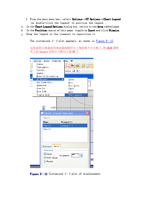
1.From the main menu bar, select Options XY Options Chart Legend(or double-click the legend) to position the legend.α.In the Chart Legend Options dialog box, switch to the Area tabbed page. β.In the Position region of this page, toggle on Inset and click Dismiss. χ.Drag the legend in the viewport to reposition it.The customized X–Y plot appears, as shown in Figure D–12.这里说的主要就是用来加曲线图中左上角的那个小方框了,把ARAE属性页上的Insert旁的小方框勾上就OK了.Figure D–12 Customized X–Y plot of displacement.2.You will now display a second X–Y plot in a new viewport. To createa new viewport, select Viewport Create from the main menu bar.The new viewport appears. The same X–Y plot that you had in the first viewport appears in the new viewport.When multiple viewports are visible, the dark gray title bar indicates the current viewport; all work takes place in the current viewport. For more information, see “What is a viewport?,” Section4.1.1 of the Abaqus/CAE User's Manual.3.Tile the viewports vertically by selecting Viewport TileVertically from the main menu bar.4.Create a similar X–Y plot of vertical velocity (V2) versus time.You cannot select velocity during the first step because the first step was not a dynamic step; Abaqus/Standard computed velocity and acceleration only during the second and third steps. Use the same X-axis range as before, and use a Y-axis range from 1000 to –1000.Label the Y-axis Velocity V2. The finished plot is shown in Figure D–13.上边说的意思就是说告诉我们如何建立多个视窗显示多条曲线了.可按下图操作Figure D–13 Customized X–Y plot of velocity.D.11 Operating on X–Y dataAn X–Y data object is a collection of ordered pairs that Abaqus stores in two columns—an X-column and a Y-column. The Operate on XY Data dialog box allows you to create new X–Y data objects by performing operations on previously saved X–Y data objects. In this tutorial you will create a stress versus strain data object by combining a stress versus time data object with a strain versus time data object. Then, you will plot the stress-strain curve..这部分讲的就是教我们如何画应力应变曲线了,可以好好看看D.11.1 Creating the stress versus time and strain versus time data objectsThe first step in creating the stress-strain curve is to create the stress versus time and the strain versus time data objects from the history output. The data objects will contain data from only the first step of the analysis, where the punch rests on the surface of the foam block and compresses the block under its own weight.先建立两条数据曲线,一条是应力-时间曲线,一条是应变-时间曲线To create the X–Y data objects:1.In the Results Tree, double-click the XYData container.The Create XY Data dialog box appears.2.In this dialog box, select ODB history output if it is not alreadyselected and click Continue.The History Output dialog box appears.3.In the History Output dialog box, do the following:a.Click the Variables tab.b.In the Output Variables field, select Logarithmic straincomponents: LE22 at Element 1 Int Point 1 in ELSET CENT.c.Click the Steps/Frames tab.d.Select Step 1.e.Click Save As.The Save XY Data As dialog box appears. the X–Y data Strain, and click OK.A data object called Strain containing logarithmic strain data(LE22) from integration point 1 of element 1 during the first step of the analysis appears in the XYData container.这三步就是进如何建立应变-时间曲线图的,双击一下下图文件树中的阴影部分就会弹出”Create XY Data”对话框了接下来就可以选择相应的单元,画出该单元对应的应变-时间曲线了,如果相要的单元不好找就可以按上面的方法输入一个变量进行筛选了.要注意的是,在有限元分析中,只有单元才存在应变-时间,应力-时间曲线的,节点是不存这样的曲线的.e a similar technique to create a data object containing stressdata (S22) from integration point 1 of element 1 during the first step of the analysis. Name this data object Stress.Tip: Filter the variable list according to *S22*.Now you are ready to combine the two data objects to create a stress versus strain data object.5.Dismiss the History Output dialog box.。
abaqus python 曲线函数

abaqus python 曲线函数Abaqus Python 曲线函数1. 简介Abaqus 是一款强大的有限元分析软件,Python 是一种广泛使用的编程语言。
在Abaqus 中,可以使用Python 编写脚本来完成各种任务。
其中,曲线函数是一种常用的功能,可以用于定义材料特性、加载条件等。
2. 曲线函数的基本概念曲线函数是一种描述变量与时间(或其他自变量)之间关系的数学函数。
在 Abaqus 中,曲线函数通常用于描述材料特性、加载条件等。
曲线函数由若干个数据点组成,每个数据点包括自变量和因变量两个值。
通过这些数据点可以确定一个连续的曲线,从而实现对变量与时间之间关系的描述。
3. 创建曲线函数在 Abaqus 中创建曲线函数需要使用 Python 脚本。
下面是一个简单的例子:```pythonfrom abaqus import *from abaqusConstants import *# 创建一个空白曲线函数对象myCurve = Curve()# 添加数据点myCurve.addDataPoint(0, 0)myCurve.addDataPoint(1, 1)myCurve.addDataPoint(2, 4)myCurve.addDataPoint(3, 9)# 打印所有数据点for i in range(myCurve.numDataPoints):print(myCurve.getDataPoint(i))```这段代码创建了一个空白的曲线函数对象,并添加了四个数据点。
最后通过循环打印了所有数据点的值。
4. 曲线函数的属性曲线函数有许多属性可以设置,包括名称、单位、描述等。
下面是一个例子:```pythonfrom abaqus import *from abaqusConstants import *# 创建一个空白曲线函数对象myCurve = Curve()# 设置名称、单位和描述myCurve.setName('MyCurve')myCurve.setUnits('mm', 'MPa')myCurve.setDescription('Stress-strain curve')# 添加数据点myCurve.addDataPoint(0, 0)myCurve.addDataPoint(1, 1)myCurve.addDataPoint(2, 4)myCurve.addDataPoint(3, 9)# 打印所有数据点和属性值print('Name:', )print('Units:', myCurve.xUnits, myCurve.yUnits) print('Description:', myCurve.description)for i in range(myCurve.numDataPoints):print(myCurve.getDataPoint(i))```这段代码创建了一个空白的曲线函数对象,并设置了名称、单位和描述。
abaqus荷载-位移曲线
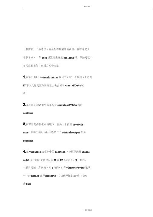
一般需要一个参考点(就是想得到某处的曲线,就在这定义
个参考点),在step设置输出变量fieldout时,单独对这个参考点输出位移和反力两个变量
1.在后处理时(visualization模块下)有一个按钮(上边是XY下面几行是空白鼠标放上去会显示CreateXYData)点
击
2.在弹出的对话框中选第四个operateonXYdata然后continue
3.在弹出的操作框中最底下一行头一个按钮createXY data,在弹出的对话框中选第二个odbfieldoutput然后continue
4.在variables选项卡中的position下拉框里选择unique nodal在下面的变量里勾选RF或RT(反力)、U(位移)
一般只选某个方向的(如2方向);在elements/nodes选项卡中的method选择Nodesets,右边选择你定义的参考点点
击Save
5.这时在操作框里XYData栏下会有两个数据,他们是参考
点处的反力和位移随时间的变化,在右边的operators里有
一个函数combine(x,x),点一下这个函数会出现在expression 栏里,将两个数据位移和反力用addtoexpression添加到combine函数的括号里,注意位移在前,反力在后,中间的
逗号是英文的“,”
6.将expression另存为(saveas按钮)一个新的名字,可以用plotexpression查看曲线,也可以在主窗口的XYData manager用plot查看,用edit读取数值
如果觉得位移和反力的符号是相反的,可以在第5步
combine之前将两个数据反号另存为新的数据之后combine。
abaqus表格构造曲线
Abaqus表格构造曲线:工程分析与可视化的有力工具摘要:本文将深入探讨如何利用Abaqus表格功能构造曲线,并分析其在实际工程分析中的重要性。
我们将通过实例演示如何利用表格数据生成曲线,并对结果进行解读。
最后,我们将讨论这一功能如何提升工程分析的效率与准确性。
一、引言Abaqus是一款广泛应用于工程领域的有限元分析软件。
其强大的分析功能和灵活的可视化工具为工程师们提供了便捷的解决方案。
其中,表格构造曲线功能在工程分析中具有重要作用。
通过这一功能,工程师可以轻松地将数据转化为直观的曲线形式,便于观察和分析。
本文将详细介绍这一功能的使用方法和应用场景。
二、Abaqus表格功能简介Abaqus表格功能允许用户创建、编辑和查看数据表格。
这些数据可以来源于模型的各种输出结果,如应力、应变、位移等。
表格可以自定义列名、单位和数据格式,以满足不同工程需求。
此外,Abaqus还支持从外部文件导入数据,为用户提供了丰富的数据来源。
三、构造曲线方法1. 准备数据:首先,我们需要收集用于构造曲线的数据。
这些数据可以是模型分析的结果,也可以是从其他来源获取的实验数据或理论计算值。
确保数据的准确性和一致性对于获得可靠的曲线至关重要。
2. 创建表格:在Abaqus中创建一个新的表格,并将准备好的数据输入到表格中。
可以根据需要添加列和行,调整列宽和行高,以及设置数据格式和单位。
3. 生成曲线:选择表格中的数据列,使用Abaqus的绘图工具生成曲线。
可以设置曲线的样式、颜色和标签,以便于区分不同的数据系列。
此外,还可以调整坐标轴的范围和刻度,以及添加图例和注释,以提高曲线的可读性。
4. 结果解读:根据生成的曲线,我们可以直观地观察数据的变化趋势和规律。
例如,通过分析应力-应变曲线,我们可以了解材料的弹性模量、屈服强度和极限强度等关键参数。
通过对比不同条件下的曲线,我们还可以评估各种因素对分析结果的影响。
四、应用实例以一个简单的拉伸试验为例,演示如何利用Abaqus表格构造应力-应变曲线。
abaqus 接触压力曲线
abaqus 接触压力曲线
在Abaqus中,要获取接触压力曲线,你可以按照以下步骤操作:
1.打开分析作业:在Abaqus中打开你的分析作业。
2.查看结果:在"Results"选项卡中,选择"Step/Frame",然后选择你想要查看压力曲线的特定步骤或帧。
3.创建图表:在"Create/Edit Plot"对话框中,选择"XY Plot",然后点击"Create"。
4.选择变量:在"XY Plot"对话框中,选择"Surface-to-Surface Contact"作为变量类型,并选择"Pressure"作为你要绘制的变量。
5.设置图表选项:你可以设置图表的一些选项,例如X轴和Y轴的名称,以及图表的标题。
6.保存图表:点击"Save"按钮将图表保存为图像文件,或者点击"Print"按钮将图表打印出来。
通过以上步骤,你可以在Abaqus中生成接触压力曲线。
abaqus荷载位移曲线

a b a q u s荷载位移曲线 Document serial number【UU89WT-UU98YT-UU8CB-UUUT-UUT108】一般需要一个参考点(就是想得到某处的曲线,就在这定义个参考点),在step设置输出变量field out 时,单独对这个参考点输出位移和反力两个变量1.在后处理时(visualization模块下)有一个按钮(上边是XY下面几行是空白鼠标放上去会显示Create XY Data)点击2. 在弹出的对话框中选第四个 operate on XY data 然后 continue3. 在弹出的操作框中最底下一行头一个按钮 create XY data ,在弹出的对话框中选第二个odb field output然后continue4. 在variables选项卡中的position下拉框里选择unique nodal 在下面的变量里勾选RF或RT(反力)、U(位移)一般只选某个方向的(如2方向);在elements/nodes选项卡中的method选择Node sets,右边选择你定义的参考点点击Save5.这时在操作框里XY Data栏下会有两个数据,他们是参考点处的反力和位移随时间的变化,在右边的operators里有一个函数combine(x,x),点一下这个函数会出现在expression栏里,将两个数据位移和反力用add to expression添加到combine函数的括号里,注意位移在前,反力在后,中间的逗号是英文的“,”6.将expression另存为(save as按钮)一个新的名字,可以用plot expression查看曲线,也可以在主窗口的XY Data manager用plot查看,用edit读取数值如果觉得位移和反力的符号是相反的,可以在第5步combine之前将两个数据反号另存为新的数据之后combine。
abaqus绘制的曲线调格式

Abaqus是一款强大的有限元分析软件,它在工程领域中有着广泛的应用。
在使用Abaqus进行有限元分析时,有时候我们需要对生成的曲线进行调格式,以满足特定的需求。
本文将探讨如何使用Abaqus 绘制的曲线进行格式调整的方法和注意事项。
一、Abaqus绘制曲线的基本方法在Abaqus中,我们可以通过创建模型、定义材料和加载边界条件来进行有限元分析。
在分析过程中,Abaqus可以生成各种曲线图,比如应力-应变曲线、载荷-位移曲线等。
在绘制这些曲线的过程中,Abaqus提供了丰富的选项和功能,用户可以根据需求进行曲线的格式调整。
二、Abaqus绘制曲线的常见格式调整1. 曲线颜色和线型调整Abaqus可以在绘制曲线时,对曲线的颜色和线型进行调整。
用户可以通过选择不同的颜色和线型来区分不同的曲线,使得曲线图更加清晰易懂。
2. 坐标轴范围和刻度调整Abaqus允许用户调整曲线图的坐标轴范围和刻度,以适应不同的数据范围。
通过设置合适的坐标轴范围和刻度,可以使曲线图呈现更加合理的比例和分布。
3. 标题和图例设置用户可以在Abaqus中为绘制的曲线图添加标题和图例,以便更好地说明曲线的含义和相关信息。
合适的标题和图例可以使曲线图的阅读和理解更加方便。
三、Abaqus绘制曲线格式调整的注意事项1. 数据准确性在进行曲线格式调整的过程中,需要确保所使用的数据准确无误。
误差或不准确的数据将会影响到曲线的呈现和分析结果,因此在进行格式调整之前需要对数据进行仔细的检查和验证。
2. 格式一致性在绘制曲线时,需要保持曲线的格式一致性。
比如曲线的颜色、线型、坐标轴范围和刻度等,都需要保持一致,以便使曲线图整体呈现出统一的风格和视觉效果。
3. 用户需求在进行曲线格式调整时,需要考虑用户的需求和使用场景。
不同的用户可能会对曲线图有不同的需求,因此需要根据具体的情况进行格式调整,以满足用户的需求。
四、结语Abaqus是一款功能强大的有限元分析软件,它提供了丰富的选项和功能,用户可以根据自己的需求进行曲线格式的调整。
ABAQUS若干技巧

1.请教高手怎么制作荷载-位移曲线后处理中create X-Ydata1. 选择ODB field output,对话框里选择加载点的RF,建立reference force和加载步之间的关系,保存;2. 在ODB field output里,对话框里选择需要位移的节点和U,建立位移U和加载步间的坐标,保存。
3. 选择operate on XY data,combined上两步里的结果。
Initial Conditions和Excel的使用By 小梦关键字格式:*initial conditions, type=stress,input=bb.dat上面的关键字插于*STEP语句之前,两语句之间不能有空格。
施加预应力场只是initial conditions关键字的一个应用,详见abaqus6.8帮助文档,《ABAQUS Analysis User’s Manual》的第28.2节“initial conditions”。
实例:平衡初始地应力平衡条件:由应力场形成的等效节点载荷要和外载荷相平衡,如果平衡条件得不到满足,将不能得到一个位移为0的初始状态,此时所对应的应力场也不再是所施加的初始应力场。
解决方法:首先将重力载荷施加于土体上,施加符合工程实际条件的边界条件,计算得到在重力载荷下的应力场,再将得到的应力场定义为初始应力场,和重力载荷一起作用于原始的有限元模型,就可以得到既满足平衡条件又不违背屈服准则的初始应力场,可以保证各节点的初始位移近似为0。
步骤:1、 1、建立有限元模型,部件类型为轴对称模型,网格类型为CAX4R。
2、建立分析步:Geostatic1、 3、建立载荷,在Geostatic分析步中,只需要施加重力载荷。
下载 (8.12 KB)2009-7-12 14:4844、创建工作,进行分析5、将分析得到的应力场保存为一个文本文件,inp格式。
在工作目录下会生成一个bb.inp文件1、 6、用excel打开bb.inp文件。
ABAQUS如何画XY曲线图解析

数据准备(1)启动ABAQUS COMMAND(2)在COMMAND中输入abaqus fetch job=viewer_tutorial(3)在COMMAND中输入abaqus viewer(4)根据提示打开数据库viewer_tutorial.odbD.10 Displaying and customizing an X–Y plotYou can display X–Y plots of data written to the output database. For the tutorial you will display the vertical displacement of the rigid body reference node versus time.The Visualization module also allows you to display X–Y plots of the following:∙Data read from an ASCII file.∙Data entered at the keyboard.∙Existing data, either combined with other data or arithmetically manipulated.以上内容讲的主要是根据数据库文件绘制所需变量与时间的曲线图D.10.1 Displaying an X–Y plotYou will now display an X–Y plot of displacement versus time.To display an X–Y plot:1.In the Results Tree, click mouse button 3 on History Output for theoutput database named viewer_tutorial.odb. From the menu thatappears, select Filter.2.In the filter field, enter *U2* to restrict the history output tojust the displacement components in the 2-direction.3.Double-click the data object containing the history of the verticalmotion of the rigid body reference node: Spatial displacement: U2 at Node 1000 in NSET PUNCH.Abaqus displays an X–Y plot of displacement versus time, as shown in Figure D–11.Figure D–11X–Y plot of displacement versus time.Default options selected by Abaqus include default ranges for the X- and Y-axes, axis titles, major and minor tick marks, the color of the line, and a legend.4.The legend labels the X–Y plot U2 N: 1000 NSET PUNCH. This is adefault name provided by Abaqus.以上操作如下图所示,如果输出变量列表中含有太多变量时,要找出我们想要的变量并不容易,这时就可以用输入”*U2*”表示2方向上的位移值,以去除列表中其余不必要的变量,便于选择,之后要把鼠标放在输出变量列表框里双击一下.接下来点击下面的”Plot”按钮就可以显示曲线了.不过由以上操作过程可以看出,要显示这样的数据曲线,首先是需要我们在建模时就要要根据需要设置相应的节点集合和单元集合.比如这个数据库文件中就有下图所示的节点集和单元集.要不然就没法画这样的曲线图了.D.10.2 Customizing an X–Y plotBy default, Abaqus computes the range of the X- and Y-axes from the minimum and maximum values found in the data read from the output database. Abaqus divides each axis into intervals and displays the appropriate major and minor tick marks. The Axis Options allow you to set the range of each axis and to customize the appearance of the axes; the Curve Options allow you to customize the appearance of the individual curves; the Chart Options and Chart Legend Options allow you to position the grid and legend, respectively. X–Y plot customization options apply only to the current viewport and are not saved between sessions.(这部分讲的主要是对曲线图进行相关的操作,这些操作主要包括:设置坐标轴的名称,单位;调整图域的大小;设置刻度线的长度,数量;是否显示栅格,是否有标题栏.自已摸索一下就OK了,也可以跳过不看)To customize an X–Y plot:1.From the main menu bar, select Options XY Options Axis(or clickin the prompt area to cancel the current procedure, if necessary, and double-click either axis in the viewport).Abaqus displays the Axis Options dialog box.2.Switch to the Scale tabbed page, if it is not already selected.3.Specify that the X-axis should extend from 0 (the X-axis minimum)to 20 (the X-axis maximum) and that the Y-axis should extend from –200 (the Y-axis minimum) to 0 (the Y-axis maximum).Tip: Select each axis in turn in the Axis Options dialog box, and then edit the scale as noted above.4.From the options in the Axis Options dialog box, do the following.∙In the Scale tabbed page, request that major tick marks appear on the X-axis at four-second increments (select By incrementin the Tick Mode region of the page).∙Request 3 minor tick marks per increment along the X-axis (this corresponds to a minor tick mark every second) and 4minor tick marks per increment along the Y-axis (thiscorresponds to a minor tick mark every 10 mm).∙In the Title tabbed page, type a Y-axis title of Displacement U2 (mm).∙In the Axes tabbed page, request a Decimal format with zero decimal places for the Y-axis labels.5.Click Dismiss to close the Axis Options dialog box.前面几步主要是设置坐标轴,可按下图操作,主要就是弄明白四个属性页的意思就可以了,SCALE是调整坐标和显示比例的,Trik Marks是用来调整刻度线的长度,线型,数量的. Title是用来设置坐档轴的名称,单位的.Axis是用来设置曲线的线型颜色的.6.From the main menu bar, select Options XY Options Chart (ordouble-click any empty spot in the plot) to modify the grid lines and position the grid.a.In the Chart Options dialog box that appears, switch to theGrid Display tabbed page.b.Toggle on Major in both the X Grid Lines and Y Grid Linesfields. Change the color of the major grid lines to blue; theline style should be solid.c.Switch to the Grid Area tabbed page.d.In the Size region of this page, select the Square option.e the slider to set the size to 75.f.In the Position region of this page, select the Auto-alignoption.g.From the available alignment options, select the fourth tolast one (position the grid in the bottom-center of theviewport).h.Click Dismiss.以上说了这么多也同什么,就是用来调整图弄的显示区域的大小了,总共就二个属性页,很了看的)1.From the main menu bar, select Options XY Options Chart Legend(or double-click the legend) to position the legend.α.In the Chart Legend Options dialog box, switch to the Area tabbed page. β.In the Position region of this page, toggle on Inset and click Dismiss. χ.Drag the legend in the viewport to reposition it.The customized X–Y plot appears, as shown in Figure D–12.这里说的主要就是用来加曲线图中左上角的那个小方框了,把ARAE属性页上的Insert旁的小方框勾上就OK了.Figure D–12 Customized X–Y plot of displacement.2.You will now display a second X–Y plot in a new viewport. To createa new viewport, select Viewport Create from the main menu bar.The new viewport appears. The same X–Y plot that you had in the first viewport appears in the new viewport.When multiple viewports are visible, the dark gray title bar indicates the current viewport; all work takes place in the current viewport. For more information, see “What is a viewport?,” Section4.1.1 of the Abaqus/CAE User's Manual.3.Tile the viewports vertically by selecting Viewport TileVertically from the main menu bar.4.Create a similar X–Y plot of vertical velocity (V2) versus time.You cannot select velocity during the first step because the first step was not a dynamic step; Abaqus/Standard computed velocity and acceleration only during the second and third steps. Use the same X-axis range as before, and use a Y-axis range from 1000 to –1000.Label the Y-axis Velocity V2. The finished plot is shown in Figure D–13.上边说的意思就是说告诉我们如何建立多个视窗显示多条曲线了.可按下图操作Figure D–13 Customized X–Y plot of velocity.D.11 Operating on X–Y dataAn X–Y data object is a collection of ordered pairs that Abaqus stores in two columns—an X-column and a Y-column. The Operate on XY Data dialog box allows you to create new X–Y data objects by performing operations on previously saved X–Y data objects. In this tutorial you will create a stress versus strain data object by combining a stress versus time data object with a strain versus time data object. Then, you will plot the stress-strain curve..这部分讲的就是教我们如何画应力应变曲线了,可以好好看看D.11.1 Creating the stress versus time and strain versus time data objectsThe first step in creating the stress-strain curve is to create the stress versus time and the strain versus time data objects from the history output. The data objects will contain data from only the first step of the analysis, where the punch rests on the surface of the foam block and compresses the block under its own weight.先建立两条数据曲线,一条是应力-时间曲线,一条是应变-时间曲线To create the X–Y data objects:1.In the Results Tree, double-click the XYData container.The Create XY Data dialog box appears.2.In this dialog box, select ODB history output if it is not alreadyselected and click Continue.The History Output dialog box appears.3.In the History Output dialog box, do the following:a.Click the Variables tab.b.In the Output Variables field, select Logarithmic straincomponents: LE22 at Element 1 Int Point 1 in ELSET CENT.c.Click the Steps/Frames tab.d.Select Step 1.e.Click Save As.The Save XY Data As dialog box appears. the X–Y data Strain, and click OK.A data object called Strain containing logarithmic strain data(LE22) from integration point 1 of element 1 during the first step of the analysis appears in the XYData container.这三步就是进如何建立应变-时间曲线图的,双击一下下图文件树中的阴影部分就会弹出”Create XY Data”对话框了接下来就可以选择相应的单元,画出该单元对应的应变-时间曲线了,如果相要的单元不好找就可以按上面的方法输入一个变量进行筛选了.要注意的是,在有限元分析中,只有单元才存在应变-时间,应力-时间曲线的,节点是不存这样的曲线的.e a similar technique to create a data object containing stressdata (S22) from integration point 1 of element 1 during the first step of the analysis. Name this data object Stress.Tip: Filter the variable list according to *S22*.Now you are ready to combine the two data objects to create a stress versus strain data object.5.Dismiss the History Output dialog box.D.11.2 Combining the data objectsIn this section you will create a stress versus strain data object by combining the stress versus time and strain versus time data objects.To combine the data objects:1.In the Results Tree, double-click the XYData container.2.From the Create XY Data dialog box that appears, select Operate onXY data and click Continue.An Operate on XY Data dialog box appears. The dialog box contains the following lists:∙The XY Data field on the left contains a list of existing X –Y data objects.∙The Operators field on the right contains a list of all the possible operations you can perform on the data objects.3.From the Operators field, click combine(X,X).combine( ) appears in the expression text field at the top of the dialog box.4.In the XY Data field, drag the cursor across both the Strain andthe Stress data objects to select both and click Add to Expressionnear the bottom of the dialog box.The expression combine("Strain","Stress") appears in theexpression text field. In this expression "Strain" will determine the X-values and "Stress" will determine the Y-values in thecombined plot.5.From the buttons along the bottom of the Operate on XY Data dialogbox, click Save As.6.From the Save XY Data As dialog box that appears, enter the nameStress-Strain and click OK.The new data object Stress-Strain appears in the XYData container.7.Cancel the Operate on XY Data dialog box.以上部分讲的就是如何利用已有的应力时间,应变曲线得到应力应变曲线了(1)在右侧函数栏中单击一下功夫combine()(2)在函数栏左边的变量列表中双击一下XYDATA_STRAIN(3) 在函数栏左边的变量列表中双击一下XYDATA_STRESS(4)单击下面的SAVE AS按钮起个名字,关闭该对话框(5)双击图中阴影部分就可以了D.11.3 Plotting and customizing the stress-strain curveYou will now use the Stress-Strain data object that you just created to plot the stress-strain curve.这部分讲的就是如何给应力应变曲线设置标题,栅格以及如何从应力应变曲线中获得曲线上某点的数值并保存到文件中去,看看就可以了,很简单的.To plot the stress-strain curve:1.In the XYData container, double-click Stress-Strain.A plot of the stress-strain curve appears in the viewport.2.Your plot of stress versus strain inherited the customized chartsettings from your previous plot. To restore the default chartoptions, do the following:a.Open the Chart Options dialog box.b.Toggle off Major in both the X Grid Lines and Y Grid Linesfields.c.Click Dismiss.3.The plot of stress versus strain appears, as shown in Figure D–14. In this figure, the visibility of the plot legend has been suppressed (open the Chart Legend Options dialog box; in theContents tabbed page, toggle off Show legend).Figure D–14X–Y plot of stress versus strain.D.12 Probing an X–Y plotYou can use the Query toolset in the Visualization module to probe your model and X–Y plots. You can also write the resulting probe values to a file. In this tutorial you will use the probe capability to obtain X- and Y-values from your stress/strain plot and to write these values to a file.To probe an X–Y plot:1.From the main menu bar, select Tools Query; select Probe valuesfrom the Query dialog box.The Probe Values dialog box appears. Because an X–Y plot is in the current viewport, this dialog box will display X–Y curve data.2.At the top of the dialog box, toggle on Interpolate between points.This option allows you to select arbitrary points along the curve.3.In the viewport, position the cursor over the X–Y curve.When the arrow at the cursor approaches the X–Y curve, the point being probed is highlighted and information about it, including the corresponding X–Y coordinates, appears in the Probe Values table.4.Click at various points along the curve.The points are added to the Selected Probe Values table.5.When you have finished selecting points, click Write to File.The Report Probe Values dialog box appears.By default, the data in the Selected Probe Values table are written to a file called abaqus.rpt in your current directory. The options in this dialog box allow you to change the name of this file and the format of the data written to the file.6.Click OK to write your data to the file.7.From the Probe Values dialog box, click Cancel to exit probe mode.A dialog box appears to inform you that the Selected Probe Valuestable contains data. Click Yes to indicate that it is OK to continue;the data in the table will be deleted.D.13 Displaying results along a pathX–Y data can be generated for a specific path through your model. In this tutorial you will specify a node list path along the top of the foam block and plot the displacement magnitude along this path.这部分讲的就是如何按照变量随路径的变化了,按以下步骤操作就可以了,关键是要理解自己所建立的变量路径曲线的物理意义了.D.13.1 Creating a node list pathA path is a line you define by specifying a series of points through the model. In a node list path all of the specified points are nodal locations. You create a node list path by entering node labels or node label rangesin a table. To determine the node labels of interest, it is helpful to create a model plot with the node labels visible.To create a node list path:1.Click the tool to display the undeformed model shape.Use the Common Plot Options dialog box to display the node labels.Identify the nodes on the top edge of the foam block.2.In the Results Tree, double-click Paths.The Create Path dialog box appears. the path Displacement. Accept the default selection of Nodelist as the path type, and click Continue.The Edit Node List Path dialog box appears.4.In the Path Definition table, select PART-1-1 in the Part Instancefield, type 1:601:40 in the Node Labels field, and press [Enter].(This input specifies a range of nodes from 1 to 601 at increments of 40.) Alternatively, you can pick the nodes for the node list directly from the viewport by clicking Add Before...or Add After...in the Edit Node List Path dialog box.The selected path is highlighted in the plot in the currentviewport.5.Click OK to create the path and to close the Edit Node List Pathdialog box.D.13.2 Displaying results along a node list pathAbaqus obtains analysis results for each of the points on the path you have defined and generates X–Y data pairs; the X-values are the specified points in the model, and the Y-values are the analysis results at these points. You can generate an X–Y plot of the data pairs.To display displacement results along a node list path:1.In the Results Tree, double-click the XYData container.2.In the Create XY Data dialog box that appears, select Path; and clickContinue.The XY Data from Path dialog box appears with the path that you created visible in the list of available paths.Accept the default selections in the X Values portion of the dialog box.3.The result that will be plotted is displayed in the Y Values portionof the dialog box. If U is not indicated as the field output variable, click Field Output to change the variable.In the Field Output dialog box:a.Select U as the variable Name.b.Select Magnitude from the Invariant field.c.Click OK.d.In the Selected Plot State dialog box that appears, selectAs is to proceed without changing the plot state.4.Click Plot to generate an X–Y plot of U along the path, as shownin Figure D–15. You may need to reset the X–Y plot options to their default settings.Figure D–15 Path plot of U along the top of the foam block.You have now finished the tutorial.。
abaqus python 曲线函数
Abaqus Python 曲线函数一、引言在工程领域,使用数值模拟软件进行仿真分析是非常常见的工作。
Abaqus是一款广泛应用于有限元分析的软件,它提供了Python编程接口,使得用户可以使用Python自定义各种功能。
本文将介绍Abaqus Python中的曲线函数相关内容,包括曲线的创建和操作等。
二、Abaqus Python基础在使用Abaqus Python编程之前,首先需要了解一些基础知识。
Abaqus Python是一种脚本语言,它可以通过Abaqus命令窗口或者Python脚本文件进行运行。
在Abaqus Python中,可以使用import语句导入相关的模块,例如导入曲线模块可以使用以下语句:from abaqus import *from abaqusConstants import *导入模块后,可以使用该模块提供的函数和类进行编程。
三、曲线函数的创建在Abaqus Python中,可以使用Curve函数创建曲线对象。
Curve函数的基本语法如下:curveObject = Abaqus.Curve(expression=expression, range=[start, end], method=' LINEAR', ncps=number_of_control_points)其中,expression表示曲线的表达式,可以是一个数学公式或者用户自定义的函数。
range表示曲线的范围,即起始点和终止点的坐标值。
method表示曲线的拟合方法,常见的方法包括线性拟合和样条拟合等。
ncps表示曲线的控制点数目。
四、曲线函数的操作1. 曲线点的获取使用Abaqus Python可以轻松获取曲线上的任意点的坐标值。
可以使用函数interpolate在曲线上插值计算某个点的坐标值,效果如下:coordinate = curveObject.interpolate(u=u)其中,u表示曲线上的参数值,coordinate表示该参数值对应的坐标值。
abaqus坐标系
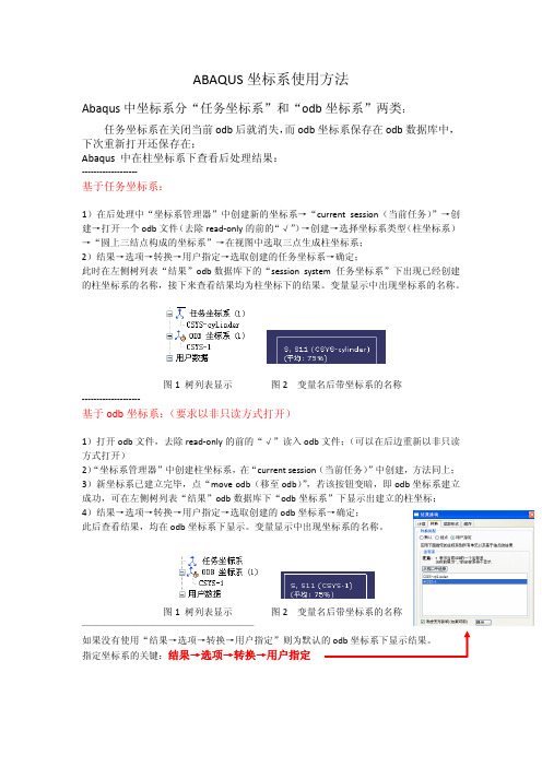
ABAQUS坐标系使用方法Abaqus中坐标系分“任务坐标系”和“odb坐标系”两类:任务坐标系在关闭当前odb后就消失,而odb坐标系保存在odb数据库中,下次重新打开还保存在;Abaqus 中在柱坐标系下查看后处理结果:‐‐‐‐‐‐‐‐‐‐‐‐‐‐‐‐‐‐‐基于任务坐标系:1)在后处理中“坐标系管理器”中创建新的坐标系→“current session(当前任务)”→创建→打开一个odb文件(去除read‐only的前的“√”)→创建→选择坐标系类型(柱坐标系)→“圆上三结点构成的坐标系”→在视图中选取三点生成柱坐标系;2)结果→选项→转换→用户指定→选取创建的任务坐标系→确定;此时在左侧树列表“结果”odb数据库下的“session system 任务坐标系”下出现已经创建的柱坐标系的名称,接下来查看结果均为柱坐标下的结果。
变量显示中出现坐标系的名称。
图1 树列表显示 图2 变量名后带坐标系的名称‐‐‐‐‐‐‐‐‐‐‐‐‐‐‐‐‐‐‐‐基于odb坐标系:(要求以非只读方式打开)1)打开odb文件,去除read‐only的前的“√”读入odb文件;(可以在后边重新以非只读方式打开)2)“坐标系管理器”中创建柱坐标系,在“current session(当前任务)”中创建,方法同上; 3)新坐标系已建立完毕,点“move odb(移至odb)”,若该按钮变暗,即odb坐标系建立成功,可在左侧树列表“结果”odb数据库下“odb坐标系”下显示出建立的柱坐标; 4)结果→选项→转换→用户指定→选取创建的odb坐标系→确定;此后查看结果,均在odb坐标系下显示。
变量显示中出现坐标系的名称。
图1 树列表显示 图2 变量名后带坐标系的名称 ——————————————————指定坐标系的关键:结果→选项→转换→用户指定。
AbaqusXY数据的操作

AbaqusXY数据的操作
1、在“可视化“模块选择工具-XY数据-创建-ODB场变量输出-选择需要输出的节点/单元的数据。
2、在“可视化“模块选择工具-XY数据-创建-操作XY数据,在右边选择运算符,在左边选择需要运算的数据添加到表达式-绘制表达式-另存为...,此时会多出一个 XY数据(以 XYData-1 名称为例)
3、在XY数据管理器中,选中刚才“另存为..."的XY数据("XYData-1"),点击右边的“编辑”即可看到运算后的结果。
如果需要把各个节点的数据结果导出来,可以在可视化模块选择报告-场输出-选择自己想输出的节点的变量
如果已有XY数据,也可以在可视化模块选择报告-XY(X)...-选
择自己想输出的XY数据。
abaqus参数化曲线命令

abaqus参数化曲线命令
在Abaqus中,要参数化曲线可以使用以下命令:
1. PARAMETRIC命令:PARAMETRIC命令可以在实例的Part Workshop中创建参数化曲线。
在工作区中选择Create -> Parametric Curve。
然后选择点以创建曲线的拟合,并指定参数范围和步长。
2. SMOOTH命令:SMOOTH命令可以对曲线进行平滑处理。
在工作区中选择Transform -> Smooth Curve。
然后选择要平滑的曲线并指定平滑因子。
3. COORDS命令:COORDS命令可以通过输入坐标点来定义曲线。
在工作区中选择Create -> Coord. Point。
然后选择点以创建曲线的拟合。
4. ANGLE命令:ANGLE命令可以通过输入点和角度来定义曲线。
在工作区中选择Create -> Angle Point。
然后选择点和角度以创建曲线的拟合。
这些命令可以帮助你在Abaqus中创建和参数化曲线。
可以根据具体的需求选择合适的命令来操作。
ABAQUS如何画XY曲线图1
D.10.2 Customizing an X–Y plotBy default, Abaqus computes the range of the X- and Y-axes from the minimum and maximum values found in the data read from the output database. Abaqus divides each axis into intervals and displays the appropriate major and minor tick marks. The Axis Options allow you to set the range of each axis and to customize the appearance of the axes; the Curve Options allow you to customize the appearance of the individual curves; the Chart Options and Chart Legend Options allow you to position the grid and legend, respectively. X–Y plot customization options apply only to the current viewport and are not saved between sessions.(这部分讲的主要是对曲线图进行相关的操作,这些操作主要包括:设置坐标轴的名称,单位;调整图域的大小;设置刻度线的长度,数量;是否显示栅格,是否有标题栏.自已摸索一下就OK了,也可以跳过不看)To customize an X–Y plot:1.From the main menu bar, select Options XY Options Axis(or clickin the prompt area to cancel the current procedure, if necessary, and double-click either axis in the viewport).Abaqus displays the Axis Options dialog box.2.Switch to the Scale tabbed page, if it is not already selected.3.Specify that the X-axis should extend from 0 (the X-axis minimum)to 20 (the X-axis maximum) and that the Y-axis should extend from –200 (the Y-axis minimum) to 0 (the Y-axis maximum).Tip: Select each axis in turn in the Axis Options dialog box, and then edit the scale as noted above.4.From the options in the Axis Options dialog box, do the following.∙In the Scale tabbed page, request that major tick marks appear on the X-axis at four-second increments (select By incrementin the Tick Mode region of the page).∙Request 3 minor tick marks per increment along the X-axis (this corresponds to a minor tick mark every second) and 4minor tick marks per increment along the Y-axis (thiscorresponds to a minor tick mark every 10 mm).∙In the Title tabbed page, type a Y-axis title of Displacement U2 (mm).∙In the Axes tabbed page, request a Decimal format with zero decimal places for the Y-axis labels.5.Click Dismiss to close the Axis Options dialog box.前面几步主要是设置坐标轴,可按下图操作,主要就是弄明白四个属性页的意思就可以了,SCALE是调整坐标和显示比例的,Trik Marks是用来调整刻度线的长度,线型,数量的. Title是用来设置坐档轴的名称,单位的.Axis是用来设置曲线的线型颜色的.6.From the main menu bar, select Options XY Options Chart (ordouble-click any empty spot in the plot) to modify the grid lines and position the grid.a.In the Chart Options dialog box that appears, switch to the Grid Display tabbed page.b.Toggle on Major in both the X Grid Lines and Y Grid Lines fields. Change the color of the major grid lines to blue; the line style should be solid.c.Switch to the Grid Area tabbed page.d.In the Size region of this page, select the Square option.e the slider to set the size to 75.f.In the Position region of this page, select the Auto-align option.g.From the available alignment options, select the fourth to last one (position the grid in the bottom-center of the viewport).h.Click Dismiss.以上说了这么多也同什么,就是用来调整图弄的显示区域的大小了,总共就二个属性页,很了看的)。
ABAQUS幅值曲线教程文件

ABAQUS 幅值曲线精品文档ABAQUS 幅值曲线*AMPLITUDE 定义一个幅值曲线。
这个选项允许任意的载荷、位移和其它指定变量的数值在一个分析步中随时间的变化(或者在ABAQUS/Standard 分析中随着频率的变化)。
产品:ABAQUS/Standard,ABAQUS/Explicit 必需的参数:NAME 设置这个参数等于将要用来指定幅值曲线的标签。
可选的参数:DEFINITION设置DEFINITION=TABULAR (默认)是用表格形式定义幅值-时间(或者幅值-频率)。
设置DEFINITION=EQUALLY SPACED, PERIODIC, MODULATED, DECAY, SMOOTH STEP, SOLUTION DEPENDENT, or BUBBLE 是按照给定的幅值曲线来定义幅值。
INPUT 设置这个参数等于包含这个选项数据行的准备要输入文件的名字。
对这样文件名的语法,看输入的语法规则。
如果忽略这个参数,则假定数据接着关键字行。
TIME对时间步设置TIME=STEP TIME (默认)。
如果幅值被引用的步是在频域上,时间步相应于频率。
在整个非扰动分析步中对总的时间累计设置TIME=TOTAL TIME 。
VALUE 设置VALUE=RELATIVE (默认)定义相对数值。
设置VALUE=ABSOLUTE 对绝对数值的直接输入。
在这种情况下,忽略载荷选项中数据行的值。
在节点连接到截面定义包含TEMPERATURE=GRADIENTS (默认)的梁单元和壳单元上指定温度不能在VALUE=ABSOLUTE 中使用。
对DEFINITION=EQUALLY SPACED 必须的参数:FIXED INTERVAL设置这个参数等于固定时间(或者频率)间距,在固定的时间(或者频率)间距上给定幅值数据。
对DEFINITION=EQUALLY SPACED 可选的参数:BEGIN收集于网络,如有侵权请联系管理员删除精品文档设置这个参数等于时间(或者最小频率),在时间(或者最小频率)上第一幅值被给定。
- 1、下载文档前请自行甄别文档内容的完整性,平台不提供额外的编辑、内容补充、找答案等附加服务。
- 2、"仅部分预览"的文档,不可在线预览部分如存在完整性等问题,可反馈申请退款(可完整预览的文档不适用该条件!)。
- 3、如文档侵犯您的权益,请联系客服反馈,我们会尽快为您处理(人工客服工作时间:9:00-18:30)。
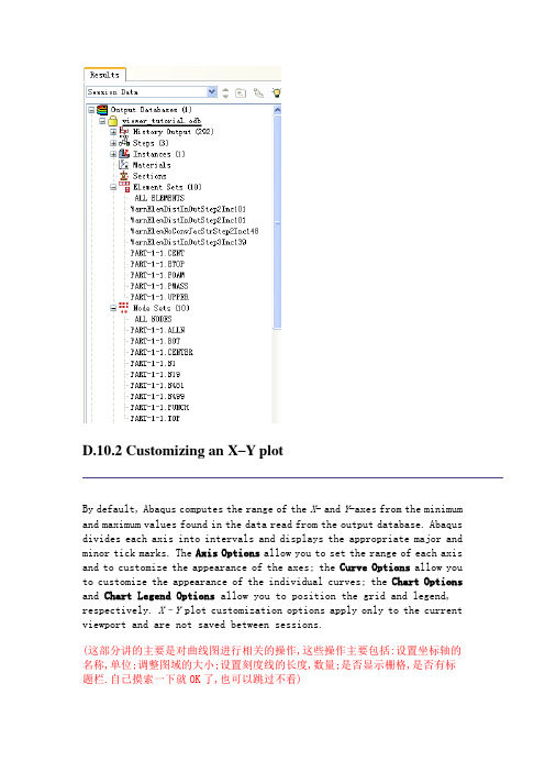
D.10.2 Customizing an X–Y plot
By default, Abaqus computes the range of the X- and Y-axes from the minimum and maximum values found in the data read from the output database. Abaqus divides each axis into intervals and displays the appropriate major and minor tick marks. The Axis Options allow you to set the range of each axis and to customize the appearance of the axes; the Curve Options allow you to customize the appearance of the individual curves; the Chart Options and Chart Legend Options allow you to position the grid and legend, respectively. X–Y plot customization options apply only to the current viewport and are not saved between sessions.
(这部分讲的主要是对曲线图进行相关的操作,这些操作主要包括:设置坐标轴的名称,单位;调整图域的大小;设置刻度线的长度,数量;是否显示栅格,是否有标题栏.自已摸索一下就OK了,也可以跳过不看)
To customize an X–Y plot:
1.From the main menu bar, select Options XY Options Axis(or click
in the prompt area to cancel the current procedure, if necessary, and double-click either axis in the viewport).
Abaqus displays the Axis Options dialog box.
2.Switch to the Scale tabbed page, if it is not already selected.
3.Specify that the X-axis should extend from 0 (the X-axis minimum)
to 20 (the X-axis maximum) and that the Y-axis should extend from –200 (the Y-axis minimum) to 0 (the Y-axis maximum).
Tip: Select each axis in turn in the Axis Options dialog box, and then edit the scale as noted above.
4.From the options in the Axis Options dialog box, do the following.
∙In the Scale tabbed page, request that major tick marks appear on the X-axis at four-second increments (select By increment
in the Tick Mode region of the page).
∙Request 3 minor tick marks per increment along the X-axis (this corresponds to a minor tick mark every second) and 4
minor tick marks per increment along the Y-axis (this
corresponds to a minor tick mark every 10 mm).
∙In the Title tabbed page, type a Y-axis title of Displacement U2 (mm).
∙In the Axes tabbed page, request a Decimal format with zero decimal places for the Y-axis labels.
5.Click Dismiss to close the Axis Options dialog box.
前面几步主要是设置坐标轴,可按下图操作,主要就是弄明白四个属性页的意思就可以了,SCALE是调整坐标和显示比例的,Trik Marks是用来调整刻度线的长度,线型,数量的. Title是用来设置坐档轴的名称,单位的.Axis是用来设置曲线的线型颜色的.
6.From the main menu bar, select Options XY Options Chart (or
double-click any empty spot in the plot) to modify the grid lines and position the grid.
a.In the Chart Options dialog box that appears, switch to the Grid Display tabbed page.
b.Toggle on Major in both the X Grid Lines and Y Grid Lines fields. Change the color of the major grid lines to blue; the line style should be solid.
c.Switch to the Grid Area tabbed page.
d.In the Size region of this page, select the Square option.
e the slider to set the size to 75.
f.In the Position region of this page, select the Auto-align option.
g.From the available alignment options, select the fourth to last one (position the grid in the bottom-center of the viewport).
h.Click Dismiss.
以上说了这么多也同什么,就是用来调整图弄的显示区域的大小了,总共就二个属性页,很了看的)。