实用文库汇编之25个时尚漂亮的英文字体
英文字体大全
英文字体大全以下是的英文字体大全:1. Times New Roman: Times New Roman是一种经典英文字体,常用于学术论文、书籍、杂志等正式场合。
2. Arial: Arial是一种无衬线字体,常用于商业文件、广告和宣传品等场合。
3. Helvetica: Helvetica是一种被广泛应用的无衬线字体,其简洁、现代和可读性高的字体设计使其成为许多设计师的选择。
4. Georgia: Georgia是一种有衬线字体,具有较大的字母间距和易于阅读的特点,适用于印刷品、广告、杂志等设计领域。
5. Calibri: Calibri是一种Microsoft Office的默认字体,适用于商业文档、简历、报告等正式场合。
6. Verdana: Verdana是一种无衬线字体,具有广阔的字母间距,易于阅读,适用于Web设计和数字化文件。
7. Tahoma:Tahoma是一种无衬线字体,适用于数字屏幕和可视化设计,具有高度的可读性。
8. Century Gothic:Century Gothic是一种粗体有衬线字体,适用于广告、印刷和Web设计等领域。
9. Futura: Futura是一种无衬线字体,其简单、现代和透明的设计使它成为许多设计领域的首选。
10. Garamond: Garamond是一种优美的有衬线字体,通常用于书籍、印刷品和广告等正式场合。
11. Baskerville: Baskerville是一种有衬线字体,设计优雅、华丽,适用于正式场合的商业文档、印刷品等。
12. Myriad: Myriad是一种现代化的无衬线字体,适用于品牌标志、广告和印刷品等设计领域。
13. Palatino: Palatino是一种优美的有衬线字体,常用于印刷品、书籍、广告和商业文档等正式场合。
14. Rockwell: Rockwell是一种特大号的有衬线字体,具有强烈的视觉冲击力和可读性,适用于标志和广告设计等领域。
个时尚漂亮的英文字体

个时尚漂亮的英文字体文件编码(008-TTIG-UTITD-GKBTT-PUUTI-WYTUI-8256)
25个时尚漂亮的英文字体当我们设计不同的banner、海报以及其它平面设计的作品时,都需要一些字体来搭配,不同类型的作品就使用不同的类型字体,这些才能做到统一风格的效果,使用你的设计更加美观。
Homestead
用在复古风格的设计作品不错。
Satellite
AnandaNamaste
MosaicLeaf
适合包装类的字体设计
Inro
这个Inro字体适合用于海报设计上。
Lavanderia
设计师的字体配图很好看,大家可以参考下他的排版和。
RBNo2
这个使用RBN02的字体排版很不错,像是适合用在杂志设计。
Nomed
多边形、时尚、抽象风格的Nomed字体。
Ribbon
这个适合用在印刷文字上
Nevis
NeoDeco
时尚女性的英文字体,适合用时尚类的杂志排版设计Plstk
Accent
时尚!
Val
简约时尚风!倾斜式排版。
Absinthe
使用文字来排版成图像。
Tetra
Kabel
Kilogram
Code
Telefond
Novecento
Hagin
Molesk
Paranoid
多边形风格的英文字体。
书中常用的英文字体
书中常用的英文字体
以下是一些书中常用的英文字体:
- Times New Roman:这是一种非常经典的字体,常用于书籍、报纸和杂志等出版物中。
它的字形简单、清晰,非常适合用于正文排版。
- Arial:这是一种无衬线字体,也是一种非常流行的字体。
它的字形简洁、现代,适合用于标题和副标题等需要突出显示的文本。
- Cambria:这是一种衬线字体,通常用于书籍的标题和副标题等重要文本。
它的字形优雅、精致,非常适合用于正式的出版物。
- Calibri:这是一种现代字体,也是Microsoft Office 套件中的默认字体。
它的字形简洁、清晰,非常适合用于文档和演示文稿等。
- Helvetica:这是一种无衬线字体,常用于广告、标志和海报等设计中。
它的字形简洁、有力,非常适合用于需要强调品牌形象的设计。
这些字体都是非常常用的英文字体,你可以根据自己的需求选择适合的字体。
漂亮的中英文字体汇总

目录常用的漂亮中文字体汇总 (2)正体字 (2)活体字 (2)胖胖字 (3)软笔字 (3)古风字 (3)签笔字 (4)常用的漂亮英文字体汇总 (5)正体(印刷体) (5)连体和手写(圆体/花体,手写印刷体) (7)卡通体 (10)哥特体 (13)其他 (14)常用的漂亮中文字体汇总点击下载可编缉原文档本文档来自于本人的百度经验《去哪里找手绘海报的POP字体(中文版)》《有哪些漂亮的英文字体及如何表现》正体字正体字正体字正体字迷你简家书迷你简方叠体微软雅黑正体字正体字正体字造字工房悦黑体方正细谭黑简体方正综艺简体活体字活体字活体字活体字叶根友圆趣卡通体方正喵呜体迷你简漫步活体字活体字活体字迷你简少儿汉真广标迷你简菱心活体字活体字活体字汉仪粗圆简方正稚艺简体华康少女文字W5(P)胖胖字胖胖字胖胖字胖胖字迷你简胖头鱼汉仪琥珀体简汉仪黑咪体简软笔字软笔字软笔字软笔字软笔字汉仪黛玉体简叶根友蚕燕隶书汉仪柏青体简迷你简凌波古风字适合表现人文历史古风的素材里。
古风字古风字古风字叶根友蚕燕隶书(新春版)叶根友行书繁叶根友毛笔行书古风字古风字古风字书体坊米芾体章草李旭科书法古风字古风字古风字草檀斋毛泽东字体孙过庭草体测试版金文大篆体签笔字手写体亲切自然,适合表现手写的设计中。
签笔字签笔字签笔字方正喵呜体方正硬笔行书简体叶根友钢笔行书升级版签笔字签笔字签笔字方正静蕾简体迷你简丫丫书体坊赵九江钢笔行书签笔字签笔字签笔字书体坊硬笔行书书体坊雪纯体书体坊安景臣钢笔行书常用的漂亮英文字体汇总正体(印刷体)Segoe UI Light、Poiret One等几款纤细的字体,优雅简洁,尤其适合现在流行的扁平风格。
微软雅黑等几款稍微粗的无衬线字体,在正文里面大量使用方便识别。
Tahoma比较圆润,给人以亲切感。
Times New Roman是一款比较经典的衬线字体,适合表现人文历史类的设计中。
ABCDEFabcdef123450Segoe UI LightABCDEFabcdef123450DFGKinBun-W3ABCDEFabcdef123450Poiret OneABCDEFabcdef123450Sakkal MajallaABCDEFabcdef123450微软雅黑ABCDEFabcdef123450黑体ABCDEFabcdef123450Tw Cen MT Condensed Extra Bold ABCDEFabcdef123450Tahoma ABCDEFabcdef123450Arial Rounded MT Bold ABCDEFabcdef123450Times New Roman ABCDEFabcdef123450 Simplified Arabic FixedABCDEFabcdef123450GungsuhChe连体和手写(圆体/花体,手写印刷体)Vladimir Script和Rage Italic是两款比较经典英文花体字,飘逸简洁。
英文字体大全
英文字体大全在日常生活和工作中,我们经常会用到各种各样的英文字体。
不同的字体能够传达不同的情感和风格,因此选择合适的英文字体显得尤为重要。
本文将介绍一些常见的英文字体,帮助大家更好地了解和运用它们。
首先,我们来介绍一种经典的英文字体——Times New Roman。
这种字体是一种比较正式和传统的印刷字体,它的特点是笔画稳重,字形端庄,非常适合用于正式的文书、报告或者书籍排版。
Times New Roman在印刷品中应用广泛,是许多学术论文和书籍的首选字体。
接下来,我们介绍一种比较时尚和个性化的英文字体——Helvetica。
Helvetica 字体简洁、清晰、易读,被广泛应用于海报、广告、标志设计等领域。
它的设计风格简洁大方,非常适合展现现代感和科技感,是许多设计师和广告人员钟爱的字体之一。
除了Times New Roman和Helvetica,还有一种英文字体——Arial。
Arial字体也是一种比较通用的字体,它的特点是字形简洁、清晰,适合用于各种文档和网络排版。
在电子邮件、网页设计、PPT制作等方面,Arial字体都有着广泛的应用。
另外,还有一种比较艺术和华丽的英文字体——Script。
Script字体仿佛是用毛笔或钢笔书写的,字形多变、连笔流畅,适合用于书法作品、婚庆邀请函、文艺海报等场合。
Script字体充满了浪漫和艺术气息,能够为作品增添一份独特的韵味。
除了以上介绍的几种英文字体,还有许多其他的字体,如Calibri、Verdana、Georgia等,它们各具特色,适合用于不同的场合和目的。
在选择字体时,我们需要根据具体的需求和效果来进行合理的选择,避免过度追求花哨而忽略了内容本身的重要性。
总的来说,英文字体的选择对于文档的排版和设计有着重要的影响。
不同的字体能够传达不同的情感和风格,因此在使用时需要慎重考虑。
希望本文介绍的常见英文字体能够帮助大家更好地运用它们,为自己的作品增添亮点。
30套漂亮的时尚字体
30套漂亮的时尚字体现在,不论在哪个领域,视觉效果都变得相当重要了,因为它是第一印象,因此,我们必须给观众造成震撼性的视觉效应,吸引观众的注意力,这是一个非常具有挑战性的任务,但是只要你有合理的布局,懂得他们的需求,一定可以虏获观众的心。
一个吸引人的布局组成肯定包括酷炫时尚的字体。
那么今天为您分享30套时尚字体,从典型的powerpoint演示到网站设计,相信它们肯定能为你的项目增色。
1.Modern Font2.Moderna Font3.Moderno Rounded Regular Font4.Modern Antiqua Font5.SB Modern Font6.Moderno Outline Font7.ModernAristrocrat Font8.Taco Modern Font9.Moderno Edged Regular Font10.Chocolate Dealer Font11.Modern Building Font12.D Old Modern Font13.Moderno Font14.ModernCaligraphy Font15.Shit Happens Font16.ModernRingflash Font17.Modern Conformist Font18.Modern Plate Font19.Modern Craft Font20.ModerneFraktur Font21.ModernMonospace Regular Fon22.Super Modern Black Font23.Modern Curve Font24.BulgariaModerna Font25.ModernKerawang Font26.Alpha Male Modern Font27.Modern Edge Font28.Good City Modern Font29.Modern Hand Fraktur Font30.Champagne__amp__Limousines 资料由AAA教育整理。
25款足以让设计师用一辈子的经典英文字体!
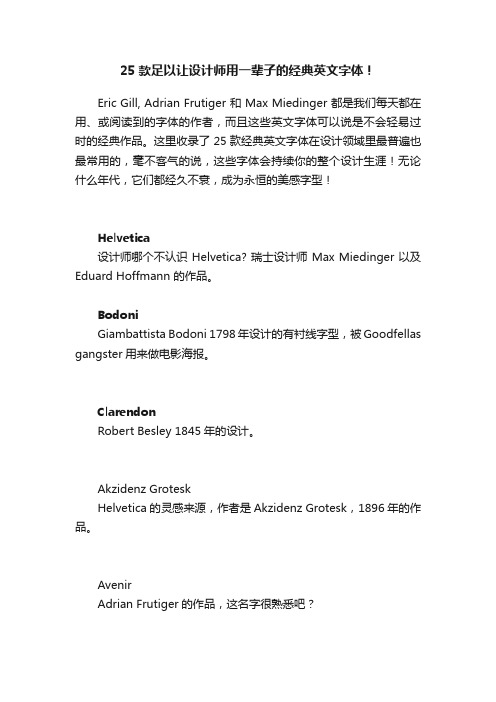
25款足以让设计师用一辈子的经典英文字体!Eric Gill, Adrian Frutiger 和 Max Miedinger 都是我们每天都在用、或阅读到的字体的作者,而且这些英文字体可以说是不会轻易过时的经典作品。
这里收录了25款经典英文字体在设计领域里最普遍也最常用的,毫不客气的说,这些字体会持续你的整个设计生涯!无论什么年代,它们都经久不衰,成为永恒的美感字型!Helvetica设计师哪个不认识 Helvetica? 瑞士设计师 Max Miedinger 以及Eduard Hoffmann 的作品。
BodoniGiambattista Bodoni 1798年设计的有衬线字型,被Goodfellas gangster用来做电影海报。
ClarendonRobert Besley 1845年的设计。
Akzidenz GroteskHelvetica的灵感来源,作者是Akzidenz Grotesk,1896年的作品。
AvenirAdrian Frutiger的作品,这名字很熟悉吧?FrutigerAdrian Frutiger 的另外一个作品。
FF DINAlbert-Jan Pool 1995年的作品,与其他的字型相比之下来得比较新。
Futura20年代 Paul Renner 的作品,被许许多多的公司用来做成logo。
News GothicMorris Fuller Benton 1908年的作品,被电影 StarWars 用作开场 credits 的字型。
Meta1986年 Erik Spiekermann 的作品。
Gill SansEric Gill 1926年的作品, 伦敦 Underground 的看牌就是用着这个字型。
Garamond可以说是最有名的有衬线字型。
很多时候被用来当成书本内容的字型。
Mrs EavesZuzana Licko 1996年设计的有衬线字型。
DaxUPS常用的字型,Hans Reichel 作品。
100种最漂亮的字体
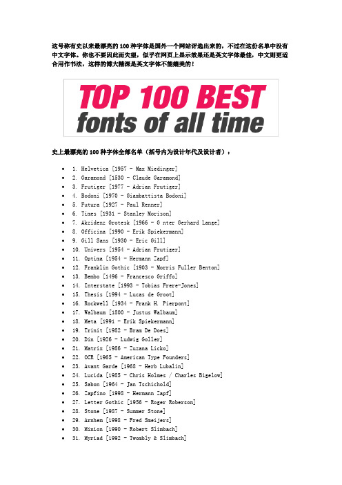
这号称有史以来最漂亮的100种字体是国外一个网站评选出来的,不过在这份名单中没有中文字体。
你也不要因此而失望,似乎在网页上显示效果还是英文字体最佳,中文则更适合用作书法,这样的博大精深是英文字体不能媲美的!史上最漂亮的100种字体全部名单(括号内为设计年代及设计者):∙ 1. Helvetica [1957 - Max Miedinger]∙ 2. Garamond [1530 - Claude Garamond]∙ 3. Frutiger [1977 - Adrian Frutiger]∙ 4. Bodoni [1970 - Giambattista Bodoni]∙ 5. Futura [1927 - Paul Renner]∙ 6. Times [1931 - Stanley Morison]∙7. Akzidenz Grotesk [1966 - G nter Gerhard Lange]∙8. Officina [1990 - Erik Spiekermann]∙9. Gill Sans [1930 - Eric Gill]∙10. Univers [1954 - Adrian Frutiger]∙11. Optima [1954 - Hermann Zapf]∙12. Franklin Gothic [1903 - Morris Fuller Benton]∙13. Bembo [1496 - Francesco Griffo]∙14. Interstate [1993 - Tobias Frere-Jones]∙15. Thesis [1994 - Lucas de Groot]∙16. Rockwell [1934 - Frank H. Pierpont]∙17. Walbaum [1800 - Justus Walbaum]∙18. Meta [1991 - Erik Spiekermann]∙19. Trinit [1982 - Bram De Does]∙20. Din [1926 - Ludwig Goller]∙21. Matrix [1986 - Zuzana Licko]∙22. OCR [1965 - American Type Founders]∙23. Avant Garde [1968 - Herb Lubalin]∙24. Lucida [1985 - Chris Holmes / Charles Bigelow]∙25. Sabon [1964 - Jan Tschichold]∙26. Zapfino [1998 - Hermann Zapf]∙27. Letter Gothic [1956 - Roger Roberson]∙28. Stone [1987 - Summer Stone]∙29. Arnhem [1998 - Fred Smeijers]∙30. Minion [1990 - Robert Slimbach]∙31. Myriad [1992 - Twombly & Slimbach]∙33. Eurostile [1962 - Aldo Novarese]∙34. Scala [1991 - Martin Majoor]∙35. Syntax [1968 - Hans Eduard Meier]∙36. Joanna [1930 - Eric Gill]∙37. Fleishmann [1997 - Erhard Kaiser]∙38. Palatino [1950 - Hermann Zapf]∙39. Baskerville [1754 - John Baskerville]∙40. Fedra [2002 - Peter Bil'ak]∙41. Gotham [2000 - Tobias Frere-Jones]∙42. Lexicon [1992 - Bram De Does]∙43. Hands [1991 - Letterror]∙44. Metro [1929 - W. A. Dwiggins]∙45. Didot [1799 - Firmin Didot]∙46. Formata [1984 - Bernd M llenst dt]∙47. Caslon [1725 - William Caslon]∙48. Cooper Black [1920 - Oswald B. Cooper]∙49. Peignot [1937 - A. M. Cassandre]∙50. Bell Gothic [1938 - Chauncey H. Griffith]∙51. Antique Olive [1962 - Roger Excoffon]∙52. Wilhelm Klngspor Gotisch [1926 - Rudolf Koch] ∙53. Info [1996 - Erik Spiekermann]∙54. Dax [1995 - Hans Reichel]∙55. Proforma [1988 - Petr van Blokland]∙56. Today Sans [1988 - Volker K ster]∙57. Prokyon [2002 - Erhard Kaiser]∙58. Trade Gothic [1948 - Jackson Burke]∙59. Swift [1987 - Gerald Unger]∙60. Copperplate Gothic [1901 - Frederic W. Goudy] ∙61. Blur [1992 - Neville Brody]∙62. Base [1995 - Zuzana Licko]∙63. Bell Centennial [1978 - Matthew Carter]∙64. News Gothic [1908 - Morris Fuller Benton]∙65. Avenir [1988 - Adrian Frutiger]∙66. Bernhard Modern [1937 - Lucian Bernhard]∙67. Amplitude [2003 - Christian Schwartz]∙68. Trixie [1991 - Erik van Blokland]∙69. Quadraat [1992 - Fred Smeijers]∙70. Neutraface [2002 - Christian Schwartz]∙71. Nobel [1929 - Sjoerd de Roos]∙72. Industria [1990 - Neville Brody]∙73. Bickham Script [1997 - Richard Lipton]∙74. Bank Gothic [1930 - Morris Fuller Benton]∙75. Corporate ASE [1989 - Kurt Weidemann]∙77. Trajan [1989 - Carol Twombly]∙78. Kabel [1927 - Rudolf Koch]∙79. House Gothic 23 [1995 - Tal Leming]∙80. Kosmik [1993 - Letterror]∙81. Caecilia [1990 - Peter Matthias Noordzij]∙82. Mrs Eaves [1996 - Zuzana Licko]∙83. Corpid [1997 - Lucas de Groot]∙84. Miller [1997 - Matthew Carter]∙85. Souvenir [1914 - Morris Fuller Benton]∙86. Instant Types [1992 - Just van Rossum]∙87. Clarendon [1845 - Benjamin Fox]∙88. Triplex [1989 - Zuzana Licko]∙89. Benguiat [1989 - Ed Benguiat]∙90. Zapf Renaissance [1984 - Hermann Zapf]∙91. Filosofia [1996 - Zuzana Licko]∙92. Chalet [1996 - House Industries]∙93. Quay Sans [1990 - David Quay]∙94. C zanne [1995 - Michael Want, James Grieshaber] ∙95. Reporter [1938 - Carlos Winkow]∙96. Legacy [1992 - Ronald Arnholm]∙97. Agenda [1993 - Greg Thompson]∙98. Bello [2004 - Underware]∙99. Dalliance [2000 - Frank Heine]∙100. Mistral [1953 - Roger Excoffon]排名前33位最漂亮的字体效果如下:。
好看的英文字体书法_英文书法字体
好看的英文字体书法_英文书法字体推荐文章圣诞节快乐精美的英文字体图片热度:经典的动物英文字体设计图片热度:圣诞风格的英文字体设计图片热度:生日快乐精美的英文字体图片热度:设计时用的英文字体高清图片热度:在日常的英语教学中,老师很少注重学生的英文书写,其实,英文的书法也是一样重要的,下面小编带给大家的是好看的英文字体书法,希望你们喜欢。
好看的英文字体书法欣赏用英语介绍中国书法The art of calligraphy is widely practiced and revered in the East Asian civilizations that use Chinese characters. These include China, Japan, Korea, and formerly Vietnam[1].In addition to being an artform in its own right, calligraphy has also influenced ink and wash painting, which is accomplished using similar tools and techniques. The East Asian tradition of calligraphy originated and developed from China, specifically the ink and brush writing of Chinese characters. There is a general standardization of the various styles of calligraphy in the East Asian tradition. Calligraphy has also led to the development of many other forms of art in East Asia, including seal carving, ornate paperweights, and inkstones.ToolsThe paper, ink, brush, and inkstone are essential implements of East Asian calligraphy: they are known together as the Four Treasures of the Study (T: 文房四宝 / S: 文房四宝) in China, and as the Four Friends of the Study (HG: 문방사우/ HJ: 文房四友) in Korea. In addition to these four tools, desk pads and paperweights are also used by calligraphers.PaperSpecial types of paper are used in East Asian calligraphy.In China, Xuanzhi, traditionally made in Anhui province, is the preferred type of paper. It is made from the Tartar wingceltis (Pteroceltis tartarianovii), as well as other materials including rice, the paper mulberry (Broussonetia papyrifera), bamboo, hemp, etc.In Japan, Washi is made from the kozo (paper mulberry), ganpi (Wikstroemia sikokiana), and mitsumata (Edgeworthia papyrifera), as well as other materials like bamboo, hemp, rice, and wheat. somtimes the brush is used to put ink on a pen InkThe ink is made from lampblack (soot) and binders, and comes in sticks which must be rubbed with water on an inkstone until the right consistency is achieved. Much cheaper, pre-mixed bottled inks are now available, but these are used primarily for practice as stick inks are considered higher quality and chemical inks are more prone to bleeding over time, making them less suitable for use in hanging scrolls. Learning to rub the ink is an essential part of calligraphy study. Traditionally, East Asian calligraphy is written only in black ink, but modern calligraphers sometimes use other colours. Calligraphy teachers use a bright orange ink with which they write practice characters for students and correct students' work.BrushThe brush is the traditional writing implement in East Asian calligraphy. The body of the brush can be made from either bamboo, or rarer materials like red sandalwood, glass, ivory, silver, and gold. The head of the brush can be made from the hair (or feather) of a wide variety of animals, including the wolf, rabbit,deer, chicken, duck, goat, pig, tiger, etc. There is also a tradition in both China and Japan of making a brush using the hair of a newborn, as a once-in-a-lifetime souvenir for the child. This practice is associated with the legend of an ancient Chinese scholar who scored first in the Imperial examinations by using such a personalized brush.Today, calligraphy may also be done using a pen, but pen calligraphy does not enjoy the same prestige as traditional brush calligraphy.InkstoneA stone or ceramic inkstone is used to rub the solid ink stick into liquid ink and to contain the ink once it is liquid. Cheaper inkstones are made of plastic.Inkstones are often carved, so they are collectible works of art on their own.PaperweightPaperweights come in several types: some are oblong wooden blocks carved with calligraphic or pictorial designs; others are essentially small sculptures of people or animals. Like inkstones, paperweights are collectible works of art on their own right.Desk padThe desk pad (Chinese T: 画毡, S: 画毡, Pinyin: huàzhān; Japanese: 下敷 shitajiki) is a pad made of felt. Some are printed with grids on both sides, so that when it is placed under the translucent paper, it can be used as a guide to ensure correct placement and size of characters. These printed pads are used only by students. Both desk pads and the printed grids come in a variety of sizes.SealMain article: Chinese sealWorks of calligraphy are usually completed by the artist putting his or her seal at the very end, in red ink. The seal serves the function of a signature.StudyThe Chinese method of holding the brushHow the brush is held depends on which calligraphic genre is practiced. For Chinese calligraphy, the method of holding the brush is more special; the brush is held vertically straight gripped between the thumb and middle finger. The index finger lightly touches the upper part of the shaft of the brush (stabilizing it) while the ring and little fingers tuck under the bottom of the shaft. The palm is hollow and you should be able to hold an egg in there. This method, although difficult to hold correctly for the beginner, allows greater freedom of movement, control and execution of strokes. For Japanese calligraphy, the brush is held in the right hand between the thumb and the index finger, very much like a Western pen.A paperweight is placed at the top of all but the largest pages to prevent slipping; for smaller pieces the left hand is also placed at the bottom of the page for support.In China, there are many people who practice calligraphy in public places such as parks and sidewalks, using water as their ink and the ground as their paper. Very large brushes are required. Although such calligraphic works are temporary (as the water will eventually dry), they serve the dual purpose of both being an informal public display of one's work, and an opportunity to further practice one's calligraphy.In Japan, smaller pieces of Japanese calligraphy are traditionally written seated in the traditional Japanese way (seiza),on the knees with the buttocks resting on the heels. In modern times, however, practitioners frequently practice calligraphy seated on a chair at a table. Larger pieces may be written while standing; in this case the paper is usually placed directly on the floor, but some calligraphers use an easel.A man practicing calligraphy in Beihai Park, BeijingCalligraphy takes many years of dedicated practice. Correct stroke order, proper balance and rhythm of characters are essential in calligraphy. Skilled handling of the brush produces a pleasing balance of characters on the paper, thick and thin lines, and heavy and light inking. In most cases, a calligrapher will practice writing the Chinese character yong (永) many, many times in order to perfect the eight basic essential strokes contained within the character. Those who can correctly write the yong character beautifully can potentially write all characters with beauty.Basic calligraphy instruction is part of the regular school curriculum in both China and Japan.。
24套适用于扁平化设计英文字体
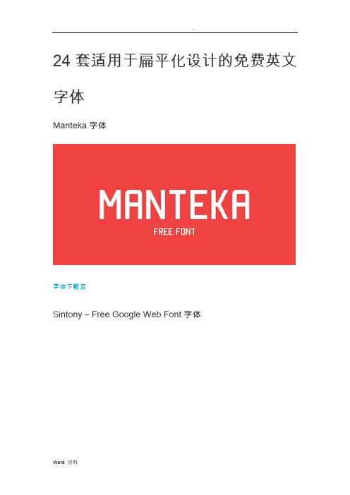
24套适用于扁平化设计的免费英文字体
Manteka字体
字体下载页
Sintony – Free Google Web Font字体
字体下载页
Bellota字体
字体下载页
Corbert Regular字体
字体下载页
Frontage Typeface字体
字体下载页
ALEO | Free Font Family字体
字体下载页
GRAYSTROKE FREE FONT字体
字体下载页
HEMIGRAPHY FREE FONT字体
字体下载页
Laika FREE字体
字体下载页
SEAGLE FREE FONT字体
字体下载页
ALEX BRUSH字体
字体下载页ALLER字体
字体下载页AMBLE字体
字体下载页CODE字体
字体下载页EXO字体
字体下载页
MUSEO SLAB字体
字体下载页QUICKSAND字体
字体下载页
SINA NOVA字体
字体下载页
SOFIA PRO字体
字体下载页
SOURCE SANS PRO字体
字体下载页
Free Langdon Font字体
字体下载页
Museo Slab字体
字体下载页
Nexa free font字体
字体下载页Nougatine字体
字体下载页Chunkfive字体。
26个字母唯美美术字体

26个字母唯美美术字体文字特点
A:曲线流畅、优雅而又细腻,非常具有时尚感。
B:精致的圆弧线条,显得格外精美细节感,体现出极致的优雅与精致。
C:精巧的笔画和曲线,使得它显得格外典雅大气。
D:精致的折线给人一种轻盈的感觉,十分别致独特。
E:流线形的曲线,让人有一种轻快浪漫的感受。
F:细腻的曲线,把繁琐变得柔和而有趣。
G:缕空的笔画,给人一种婉转流畅的感受。
H:精致的曲线,带着一份戏剧般的奔放。
I:毫不停歇的线条,令人心潮澎湃。
J:华丽的笔画,充满着浪漫之情。
K:精致的折线,给人一种清新淡雅的感受。
L:精致的曲线,让字体变得格外温柔。
M:动感十足的线条,让感情激荡不已。
N:向上漂亮的折线,带着一股活力的气息。
O:流畅的曲线,给人一种梦幻般的感受。
P:温柔的曲线,令人沉醉其中。
Q:精致的折线,让字体变得更加有趣。
R:精美细腻的笔画,让人着迷其间。
S:优美的弧度,让人心旷神怡。
T:精致的曲线,给人温柔的感受。
U:优雅的折线,显得格外精巧优美。
V:流畅的曲线,让人心旷神怡。
W:温柔的曲线,让人感到放松。
X:精致的折线,令人着迷其中。
Y:流畅的曲线,给人一种令人放松的感受。
Z:精致的折线,让人有一种清新明朗的感觉。
- 1、下载文档前请自行甄别文档内容的完整性,平台不提供额外的编辑、内容补充、找答案等附加服务。
- 2、"仅部分预览"的文档,不可在线预览部分如存在完整性等问题,可反馈申请退款(可完整预览的文档不适用该条件!)。
- 3、如文档侵犯您的权益,请联系客服反馈,我们会尽快为您处理(人工客服工作时间:9:00-18:30)。
作者:于椅上
作品编号:785632589421G 101
创作日期:2020年12月20日
实用文库汇编之25个时尚漂亮的英
文字体
当我们设计不同的banner、海报以及其它平面设计的作品时,都需要一些字体来搭配,不同类型的作品就使用不同的类型字体,这些才能做到统一风格的效果,使用你的设计更加美观。
Homestead
用在复古风格的设计作品不错。
Satellite
Ananda Namaste
Mosaic Leaf
适合包装类的字体设计
Inro
这个Inro字体适合用于海报设计上。
Lavanderia
设计师的字体配图很好看,大家可以参考下他的排版和配色。
RBNo2
这个使用RBN02的字体排版很不错,像是适合用在杂志设计。
Nomed
多边形、时尚、抽象风格的Nomed字体。
Ribbon
这个适合用在印刷文字排版上
Nevis
Neo Deco
时尚女性的英文字体,适合用时尚类的杂志排版设计
Plstk
Accent 时尚!
Val
简约时尚风!倾斜式排版。
Absinthe
使用文字来排版成图像。
Tetra
Kabel
Kilogram
Code
Telefond
Novecento
Hagin
Molesk
Paranoid
多边形风格的英文字体。
作者:于椅上
作品编号:785632589421G 101 创作日期:2020年12月20日。