liferay(aui)validator标签
validator校验用法

validator校验用法validator校验用法是指在web开发中使用validator插件对表单数据进行校验的方法。
validator插件是一款轻量级的表单验证插件,可以对表单中的数据进行实时的、全面的校验,并在校验失败时向用户提供友好的提示信息。
使用validator插件进行表单校验的方法如下:1. 引入validator插件。
可以从官网下载相关的js和css文件,也可以使用CDN链接进行引入。
2. 为表单添加验证规则。
在表单元素中添加data-rule属性来指定验证规则,例如:<input type='text' name='username' placeholder='用户名' data-rule='required|minlength:6|maxlength:20' />上述代码中,data-rule属性指定了验证规则,该规则表示用户名不能为空,长度不能少于6个字符,不能超过20个字符。
3. 在表单提交时进行校验。
可以使用validator插件提供的validate()方法来进行表单校验,例如:$('form').validate({rules: {userna {required: true,minlength: 6,maxlength: 20}},messages: {userna {required: '用户名不能为空',minlength: '用户名长度不能少于6个字符',maxlength: '用户名长度不能超过20个字符'}}});上述代码中,使用validate()方法对表单进行校验,其中rules 属性指定了验证规则,messages属性指定了校验失败时的提示信息。
通过以上三个步骤,就可以使用validator插件对表单数据进行全面的、实时的校验,并为用户提供友好的提示信息。
vant中 validator的用法

vant中validator的用法Vant 是一款基于Vue.js 的移动端组件库,提供了丰富的组件和工具,方便快速开发高质量的移动应用。
其中,validator(验证器)是Vant 中的一项重要功能,用于对用户输入的数据进行校验,以确保数据的合法性和准确性。
本文将详细介绍Vant 中validator 的用法,并逐步解释其使用步骤和注意事项。
1. 什么是Vant 的validator?Validator 是Vant 中的一项重要功能,用于对用户输入的数据进行校验。
它允许我们以简单的方式定义各种校验规则,并且可以在需要时对输入的数据进行验证。
Validator 提供了多种内置的校验规则,如必填、字符长度、数字范围、手机号码等,同时还支持自定义校验规则,以满足开发者的个性化需求。
2. 如何使用Vant 的validator?采用Vant 的validator 校验用户输入的数据非常简单,只需遵循以下几个步骤即可:Step 1: 引入Vant 组件库及validator首先,在项目中引入Vant 组件库的相关文件,可以通过NPM 安装或使用CDN 引入。
其次,确保导入了validator 的模块,通常我们可以这样导入:javascriptimport { Validator } from 'vant';Step 2: 定义校验规则接下来,我们需要定义要应用于用户输入的校验规则。
这些规则被存储在一个对象中,每个规则对应一个字段。
例如,要求用户名字段必填、密码字段长度在6-16 个字符之间,我们可以这样定义校验规则:javascriptconst rules = {username: [{ required: true, message: '请输入用户名' }],password: [{ min: 6, max: 16, message: '密码长度在6-16个字符之间' }]};Step 3: 执行校验当用户提交表单或需要校验数据时,我们可以使用Validator 的validate 方法来执行校验操作。
liferay(aui)form标签

Table of Contents [-]The Alloy UI Forms are a great tool to help developers build very nice forms really fast. Alloy is included in Liferay v6.0+.These are some of the advantages of using these forms:∙Nice styling of the forms for a better usability∙Unified styling: all the forms look the same and are controlled in one place∙Dynamic Attributes: any attribute that can be used for an html tag can also be used for an aui tag. For example, you can use onClick, onChange, onSubmit, title... in anyaui:form, aui:select, aui:input and it will work the same as if you use it an a plain form, select or input.Tags #These are the tags that can be used in aui forms and some of their attributes. They all support dynamic attributes, which means that you can add any additional attribute and it will be used. For example, if you add the attribute onFocus to a aui:button, the <button> will have this onFocus attribute.Form #Attributes #∙action: The same action as in the html form tag, but the url is automatically escaped (and encoded...etc). If you don't want the action url to be automatically escaped, youshould set escapedXml to false.∙escapeXml: True by default. Set it to false if you don't want the action url of your form to be automatically escaped. Note: Does not work in current alloy 0.1a ∙cssClass: custom classes for additional styling (the attribute class will be ignored)∙inlineLabel: set this attribute to true if you want all your labels in the form to be inline with the form fields name: the name of the formExample #<aui:form action="<%= editEntryURL %>" method="post" name="fm" onSubmit='<%= renderResponse.getNamespace() + "saveEntry(false); return false;" %>'>Fieldset #You should have all your fields grouped at least under one fieldset. It is a good practice to separate different areas with different fieldsets.Attributes #∙cssClass: custom classes for additional styling (the attribute class will be ignored) ∙column: set this attribute to true if you want this fieldset to be displayed as a column instead of as a row. (this allows you to have a form with several columns) ∙title: text which describes the group of elements inside the fieldset. (It creates the legend for the fieldset)∙cssClass: custom classes for additional styling (the attribute class will be ignored) ∙disabled. Set this to true to disable clicking on the button.∙first: set this to true if this is the first element in the form (for css styling)∙last: set this to true if this is the last element in the form (for css styling)∙type: by default the type is button, but it can be set to submit, cancel or image.∙name: It will be used for the id of the button.∙value: The message that the button will display. If empty, it will be save for submit type buttons and cancel for cancel type buttons.∙onClick: javascript code to be executed when clicking on the button. If this attribute starts with http://, the button will take you to that page when the user clicks on it.Example #<aui:button name="cancelButton" type="button" value="cancel"last="true" />Button Row #∙cssClass: custom classes for additional styling (the attribute class will be ignored)Example #<aui:button-row><aui:button name="saveButton" type="submit" value="save" /><aui:button name="cancelButton" type="button" value="cancel" /></aui:button-row>Model Context #Used to set an object that will be accessed from fields in the form.Attributes #∙bean: The object that will be accessed∙model: The class of the bean. Class model hints are saved in portal-model-hint.xml located in the META-INF.Example #<aui:model-context bean="<%= entry %>" model="<%= BlogsEntry.class %>" />Input #Attributes #∙cssClass: custom classes for additional styling (the attribute class will be ignored) ∙disabled. Set this to true to disable the input field.∙first: set this to true if this is the first element in the form (for css styling)∙last: set this to true if this is the last element in the form (for css styling)∙helpMessage: message to display when the user hovers a question mark icon next to the field label∙name: name of the field∙id: id of the field. (If empty, it will be the same as the name)∙label: Label to display (automatically translated). If this attribute is used and the value is an empty String, then no label will be shown. If the attribute is not used, the label is obtained from the name (automaticalle formatted from ThisIsAName tothis-is-a-name).∙inlineField: set this to true if you want this field to be inline with the next element∙inlineLabel: set this to left if you want this field to be inline with the label and the label at the left of the input or right if you want the field to be inline with the label but at theright of the input.∙checked: Set this to true if your element must be checked by default (only enabled when type=radio)∙type: the type of input element. These are some of the values that type could have: o texto hidden When the type is hidden, the value is automatically escaped.o textarea Will display a multiline input fieldo passwordo checkboxo assetCategories to for display categories (seeliferay-ui:asset-categories-selector)o assetTags Used to display tags (see liferay-ui:asset-tags-selector)o timeZone Used to display the time zones (see liferay-ui:input-time-zone)o empty Leave the type empty if you want it to be automatically obtained from the bean and the field. If you set a type, then the value won't be obtainedfrom the bean.∙suffix: Message to display at the right of the input field.∙prefix: Message to display at the left of the input fieldThe field can be prepopulated accesing an object set withe the model Context tag or with these attributes (the type attribute must be blank and it will be automatically obtained later from the bean). The field of the bean accessed will be the name attribute.∙bean: An object that will be accesed to the get value for this element∙model: The class of the bean objectExample #<aui:model-context bean="<%= entry %>" model="<%= BlogsEntry.class %>" /><aui:input name="title" /><aui:input name="displayDate" value="<%= displayDate %>" /><aui:input name="tags" type="assetTags" />Examples about the label attribute #<aui:input name="titleNormal" />In this situation the label will be title-normal<aui:input name="titleNormal" label="another-title" />In this situation the label will be another-title<aui:input name="titleNormal" label="" />In this situation there won't be labelSelect #Attributes #∙bean: An object that will be accessed. (Only valid when using listType)∙listType: The name of the ListType (can be obtained from ListTypeImpl.java). Using this attribute will automatically generate all the options and mark the option from thebean as selected (the bean can be obtained from the model context) ∙showEmptyOption. Displays an empty option as the first option of the select.∙disabled. Set this to true to disable the selector.∙cssClass: custom classes for additional styling (the attribute class will be ignored) ∙first: set this to true if this is the first element in the form (for css styling)∙last: set this to true if this is the last element in the form (for css styling)∙helpMessage: message to display when the user hovers a question mark icon next to the field label∙name: name of the field∙id: id of the field. (If empty, it will be the same as the name)∙label: Label to display (automatically translated). If this attribute is used and the value is an empty String, then no label will be shown. If the attribute is not used, the label is obtained from the name (automaticalle formatted from ThisIsAName tothis-is-a-name).∙inlineField: set this to true if you want this field to be inline with the next element ∙inlineLabel: set this to left if you want this field to be inline with the label and the label at the left of the selector or right if you want the field to be inline with the label but atthe right of the selector.∙suffix: Message to display at the right of the selector.<aui:select label="asset-selection" name="selectionStyle"onchange="<%= renderResponse.getNamespace() + "chooseSelectionStyle();" %>"> <aui:option selected="<%=selectionStyle.equals("dynamic") %>" value="dynamic"><liferay-ui:messagekey="dynamic" /></aui:option><aui:option selected="<%= selectionStyle.equals("manual") %>" value="manual"><liferay-ui:message key="manual" /></aui:option></aui:select>Option #Attributes #∙cssClass: custom classes for additional styling (the attribute class will be ignored) ∙label: The label to show for the option (automatically translated).∙value: The value of the option. If this field is empty, then, the label will be used as the value too.∙selected: set this to true if this option should appear as selected in the select form. Example #<aui:option selected="<%= selectionStyle.equals("manual") %>"value="manual"><liferay-ui:message key="manual" /></aui:option>These 4 expressions are equivalent:<option value="one"><liferay-ui:message key="one"><option><aui:option value="one"><liferay-ui:message key="one"><aui:option><option label="one" value="one" /><option label="one" />Link (a) #Attributes #∙cssClass: custom classes for additional styling (the attribute class will be ignored) ∙href: the url of the link∙label: the content of the <a> element (automatically translated).<aui:a href="[[|]]" target="blank">Liferay</aui:a><aui:a href="[[|]]"label="liferay" target="blank" />Field Wrapper #Used to wrap any other element in a form (radio elements, custom elements...) Attributes #∙cssClass: custom classes for additional styling (the attribute class will be ignored) ∙first: set this to true if this is the first element in the form (for css styling)∙last: set this to true if this is the last element in the form (for css styling)∙helpMessage: message to display when the user hovers a question mark icon next to the field label∙name: name of the field∙label: Label to display (automatically translated). If this attribute is used and the value is an empty String, then no label will be shown. If the attribute is not used, the label is obtained from the name (automaticalle formatted from ThisIsAName tothis-is-a-name).∙inlineField: set this to true if you want this field to be inline with the next element ∙inlineLabel: set this to left if you want this field to be inline with the label and the label at the left of the field or right if you want the field to be inline with the label but at theright of the field.Example #<aui:field-wrapper name="permissions"><liferay-ui:input-permissions modelName="<%=BlogsEntry.class.getName() %>" /></aui:field-wrapper>Legend #The legend element is created using the attribute title in aui:fieldset.#Layout #Used to wrap columns (avoiding tables)Attributes #∙cssClass: custom classes for additional styling (the attribute class will be ignored)∙columnWidth: This will be the width of the column. It must be a percentage value.Valid values: 10, 15, 20, 25, 28, 30, 33, 35, 40, 45, 50, 55, 60, 62, 65, 66, 70, 75, 80, 85, 90, 95∙cssClass: custom classes for additional styling (the attribute class will be ignored) ∙first: set this to true if this is the first element in the form (for css styling)∙last: set this to true if this is the last element in the form (for css styling) Example #<aui:layout><aui:column columnWidth="25" first="true">...</aui:column><aui:column columnWidth="75" last="true">...</aui:column></aui:layout>Other Examples #Textarea #Textarea elements can be done using aui:inputExample #<aui:input type="textarea" name="comments" />Radio #The radio element can be done using aui:field-wrapper and aui:inputExample #<aui:field-wrapper name="gender"><aui:input inlineLabel="right" name="gender" type="radio" value="1" label="male" /><aui:input checked="<%= true %>" inlineLabel="right"name="gender" type="radio" value="2" label="female" /></aui:field-wrapper>More #Alloy UI Forms is a set of taglibs build on top of the Alloy UI JavaScript+CSS framework. For more information about the framework visit: 。
Liferay 6开发指南

Liferay 6.0开发指南1. 介绍1、已有的应用集成方法:将应用重写为一个Portlet创建一个简单的Portlet整合应用(一般使用Web Service),可以使用iframe或http 代理(可以使用Liferay's WebProxy portlet)。
已有的应用要像部署门户插件一样,把WAR文件部署到应用服务器里,可以使用控制面板或直接复制的方式完成。
Liferay可以自动创建一个Portlet通过iframe集成已有应用。
2、自定义主题风格(Themes)3、自定义布局模板(Layout Templates)4、自定义或扩展门户功能:Hook plugins)Hook plugins可以用来扩展Liferay的核心功能。
5、高级扩展方式:Ext plugins扩展插件可以允许开发人员修改Liferay的核心部分,可以修改任何一个类。
扩展插件部署之后需要重新启动应用服务器。
Liferay 6.0之后用Ext plugins的开发方式替换了原来的Ext Environment开发方式,这样可以简化部署。
之前的扩展环境可以转换为一个独立的插件。
2. 插件开发工具包(THE PLUGINS SDK)2.1 安装Liferay1、下载Liferay Portal bundled with Tomcat;/downloads2、下载Plugins SDK;3、删除liferay-portal-[version]/tomcat-[tomcatversion]/webapps 除ROOT和tunnel-web目录的其他所有文件夹。
4、打开liferayportal-[version]/tomcat-[tomcat-version]/bin目录,运行startup.bat,启动Liferay。
5、http://localhost:8080,默认帐号/密码:test@/test。
6、设置环境变量ANT_HOME,将$ANT_HOME/bin加入到PATH环境变量中。
validator校验规则

validator校验规则
validator校验规则是用于验证用户输入数据的规则。
校验规则
可以是预定义的规则,也可以是自定义的规则。
以下是一些常见的validator校验规则:
1. 必填字段:用户必须填写该字段,不能为空。
2. 最小长度:用户输入的数据长度必须大于等于指定的最小长度。
3. 最大长度:用户输入的数据长度必须小于等于指定的最大长度。
4. 正则表达式匹配:用户输入的数据必须满足指定的正则表达式。
5. 数字范围:用户输入的数据必须在指定的数字范围内。
6. 枚举值:用户输入的数据必须是指定的枚举值之一。
7. 唯一性检查:用户输入的数据在数据库中必须是唯一的。
8. 自定义规则:用户可以根据自己的需求编写自定义的校验规则。
根据不同的开发框架和工具,具体的校验规则的实现方式可能会有所不同。
常见的实现方式包括使用开发框架提供的校验器、编写自定义的校验器函数等。
开发人员可以根据具体的需求和开发环境选择适合的校验规则实现方式。
Liferay系列文章(六)Liferay应用之配制

Liferay系列文章(六)Liferay应用之配制Liferay Portal缺省只有一个系统管理员用户test,且以用户的电子邮件地址****************为登录用户名,密码是test。
Liferay Portal针对不同的用户会展现出不同的服务网页。
当浏览Portal主页网址时,自动转入网址web/guest/home调出面向所有人的Guest社区公共主页。
一个注册用户登录系统后,可以选择访问不同类型的Portal主页。
这也是Portal同传统网站所不同的地方。
以test用户登录Liferay Portal系统,鼠标移到右上角的“Welcome Test T est!”处调出菜单。
再把鼠标移到“我的地方”,可以看到test用户可以访问的Portal类型有“我的公共”,“T est Organization”,“Test Location”和“Guest”,且每一项又分为“公开页”和“私有页”。
其中“公开页”是其他人可以访问的网页,“私有页”则仅自己或注册用户且经过授权才可访问。
如“我的公共”中的“公开页”可以被所有人访问,而其“私有页”仅用户自己访问。
在每个Portal的主页中可以建立若干个网页,每个网页可以定义为不同的类型:Portlet,Panel,Embedded,Article,URL和Link to Page。
其中Portlet网页是最常用的一类。
在Portlet网页中,可以按照需要布置若干个Portlet插件。
每个Portlet插件实现不同的功能,在独立的小窗口中展现内容。
在Portlet窗口的右上角有5个图标,分别用来设置外观,配置功能属性,设置最小化或最大化显示,或者关闭Portlet窗口。
有权限的用户,可以添加、配置或删除Portlet。
系统的配置是由系统管理员实施的。
以test用户登录后,先进入“我的公共”私有页中,删除不需要的Portlet,只保留“语言”Portlet。
jquery中validator的用法

jquery中validator的用法1.引言1.1 概述概述部分的内容可以包括以下内容:jQuery中的Validator是一个强大的表单验证插件,它可以帮助开发者对用户输入的表单数据进行有效的验证和过滤。
通过使用Validator,开发者可以轻松地验证用户输入的数据是否符合预期的格式和规则,从而提高应用程序的可靠性和安全性。
Validator的核心理念是基于规则和验证器,开发者可以定义各种验证规则,并将其应用到表单字段上。
当用户提交表单时,Validator会自动触发验证规则,并根据规则中定义的条件和要求对用户输入的数据进行验证。
如果输入数据符合规则要求,Validator将返回验证通过的结果,否则将返回相应的错误信息。
除了基本的验证功能,Validator还提供了丰富的扩展功能,如自定义错误消息、条件验证、异步验证等。
开发者可以根据实际需求进行配置和定制,使其更适应各种复杂的业务场景。
在使用Validator时,开发者只需简单地引入相应的脚本文件,并通过一些简单的代码片段即可实现表单的验证功能。
Validator提供了一系列方便的API和方法,可以帮助开发者更加灵活地控制和管理验证过程。
总之,通过使用jQuery中的Validator,开发者可以轻松地实现表单验证,并有效地提高应用程序的可靠性和用户体验。
在接下来的文章中,我们将详细介绍Validator的常用方法和用法,以及其优势和局限性。
文章结构部分应该介绍本文的整体结构和各个部分的内容概要。
可以按照以下方式编写1.2 文章结构的内容:1.2 文章结构本文分为引言、正文和结论三个部分。
引言部分主要介绍了本文的概述、文章结构和目的。
在概述中,简要介绍了将要讨论的主题——jquery中Validator的用法。
接下来,讲解了本文的文章结构,包括引言、正文和结论三个部分。
最后,明确了本文的目的,即介绍jquery中Validator的基本概念、常用方法和用法,以及讨论其优势和局限性。
Validator
也可以从/commons/下载单独的Validator框架软件。
1validator-rules.xml文件
validator-rules.xml包含了一组通用的验证规则,对所有的struts应用都适用。struts软件中自带了这个文件。一般情况下没有必须要修改该文件,除非需要修改或扩展默认的规则。如果想扩展默认的验证规则,最好把自定义的客户规则放在另一个xml文件中,而不是直接添加到validator-rules.xml中。
org.apache.struts.action.ActionMessage,
javax.servlet.http.HttpServletRequest"
msg="errors.required">
methodParams="ng.Object,
mons.validator.ValidatorAction,
mons.validator.Field,
javax.servlet.http.HttpServletRequest"
depends="required"
msg="errors.minlength">
</validator>
如果depends属性包含多个验证规则,则用逗号隔开。如:
*****************************
在一般情况下,actionForm是被存储在一定的scope中(request或session,通过action的scope属性来配置),当我们在配置时,指定name而不指定attribute,那么指定的name值就作为actionForm存储在scope中的key值,我们可以在action中通过httpServletRequest.getAttribute("指定的name属性值")来获得这个actionForm;当我们既配置了name又配置了attribute,那么actionForm存储在scope中的key值就采用attribute属性指定的值了,这时要通过httpServletRequest.getAttribute("指定的attribute属性值")来获得actionForm,此时通过httpServletRequest.getAttribute("指定的name属性值")是不能获得actionForm的。
AUI
用为设置表单中能够访问的 JavaBean 对象。 属性: bean: 能够访问的 JavaBean 对象名称 model: JavaBean 对象的类名 示例: <aui:model-context bean="<%= entry %>" model="<%= BlogsEntry.class %>" />
1
AUI 使用说明
Alloy UI 标签使用
Alloy UI 标签是 Liferay6.0 版本引入的一组帮助开发者提供快速表单元素创建的 UI 集合。 使用 Alloy UI 主要有如下优势: 有更好的用户体验 统一的样式风格,所有的表单组件都是一样的风险,且在这个地方便能控制展现 动态属性:在 HTML 标签的任何属性都能使用。例如,在 aui:form,aui:select, aui:input
1 Form 标签
标签属性: action:与 HTML 标签中的 action 属性一样。但该属性是自动转码的(如针对&符号进
行转码),如果需要该 URL 的自动转码,则需要设置 escapedXml 为 False。 escapeXml: 默认为 True 。如果不需要设置 URL 自动转码,则设置为 false。注意:在
4
AUI 使用说明
name 属性值为: ThisIsAName 则转化为 this-is-a-name)。 inlineField:如果希望该标签与下一标签内联,则设置该值为 True。 inlineLabel: 如果希望该标签与输入域与左边的标签内联,则把值设置为 left。同样,如果设 置为 right,则表示与输入域右边的标签内联。 checked: 如果希望该标签默认是选中的,则设置为 true(只有当 type=radio 时有效)。 type: 输入域的类型。这些类型主要有:
Validator注解使用
Validator注解使⽤Validator 注解使⽤为什么要⽤validatorjavax.validation的⼀系列注解可以帮我们完成参数校验,免去繁琐的串⾏校验不然我们的代码就像下⾯这样:/*** ⾛串⾏校验** @param userVO* @return*/@PostMapping("/save/serial")public Object save(@RequestBody UserVO userVO) {String mobile = userVO.getMobile();//⼿动逐个参数校验~ 写法if (StringUtils.isBlank(mobile)) {return RspDTO.paramFail("mobile:⼿机号码不能为空");} else if (!Pattern.matches("^[1][3,4,5,6,7,8,9][0-9]{9}$", mobile)) {return RspDTO.paramFail("mobile:⼿机号码格式不对");}//抛出⾃定义异常等~写法if (StringUtils.isBlank(userVO.getUsername())) {throw new BizException(Constant.PARAM_FAIL_CODE, "⽤户名不能为空");}// ⽐如写⼀个map返回if (StringUtils.isBlank(userVO.getSex())) {Map<String, Object> result = new HashMap<>(5);result.put("code", Constant.PARAM_FAIL_CODE);result.put("msg", "性别不能为空");return result;}//.........各种写法 ...userService.save(userVO);return RspDTO.success();}这被⼤佬看见,⼀定说,都9102了还这么写,然后被劝退了什么是javax.validationJSR303 是⼀套JavaBean参数校验的标准,它定义了很多常⽤的校验注解,我们可以直接将这些注解加在我们JavaBean 的属性上⾯(⾯向注解编程的时代),就可以在需要校验的时候进⾏校验了,在SpringBoot中已经包含在starter-web中,再其他项⽬中可以引⽤依赖,并⾃⾏调整版本:<!--jsr 303--><dependency><groupId>javax.validation</groupId><artifactId>validation-api</artifactId><version>1.1.0.Final</version></dependency><!-- hibernate validator--><dependency><groupId>org.hibernate</groupId><artifactId>hibernate-validator</artifactId><version>5.2.0.Final</version></dependency>注解说明1.@NotNull:不能为null,但可以为empty(""," "," ")2.@NotEmpty:不能为null,⽽且长度必须⼤于0 (" "," ")3.@NotBlank:只能作⽤在String上,不能为null,⽽且调⽤trim()后,长度必须⼤于0("test") 即:必须有实际字符验证注解验证的数据类型说明@AssertFalse Boolean,boolean验证注解的元素值是false@AssertTrue Boolean,boolean验证注解的元素值是true @NotNull任意类型验证注解的元素值不是null @Null任意类型验证注解的元素值是null@Min(value=值)BigDecimal,BigInteger, byte,short, int, long,等任何Number或CharSequence(存储的是数字)⼦类型验证注解的元素值⼤于等于@Min指定的value值@Max(value=值)和@Min要求⼀样验证注解的元素值⼩于等于@Max指定的value值@DecimalMin(value=值)和@Min要求⼀样验证注解的元素值⼤于等于@ DecimalMin指定的value值@DecimalMax(value=值)和@Min要求⼀样验证注解的元素值⼩于等于@ DecimalMax指定的value值@Digits(integer=整数位数, fraction=⼩数位数)和@Min要求⼀样验证注解的元素值的整数位数和⼩数位数上限@Size(min=下限,max=上限)字符串、Collection、Map、数组等验证注解的元素值的在min和max(包含)指定区间之内,如字符长度、集合⼤⼩@Past java.util.Date,java.util.Calendar;Joda Time类库的⽇期类型验证注解的元素值(⽇期类型)⽐当前时间早@Future与@Past要求⼀样验证注解的元素值(⽇期类型)⽐当前时间晚@NotBlank CharSequence⼦类型验证注解的元素值不为空(不为null、去除⾸位空格后长度为0),不同于@NotEmpty,@NotBlank只应⽤于字符串且在⽐较时会去除字符串的⾸位空格@Length(min=下限,max=上限)CharSequence⼦类型验证注解的元素值长度在min和max区间内@NotEmpty CharSequence⼦类型、Collection、Map、数组验证注解的元素值不为null且不为空(字符串长度不为0、集合⼤⼩不为0)@Range(min=最⼩值, max=最⼤值)BigDecimal,BigInteger,CharSequence, byte,short, int, long等原⼦类型和包装类型验证注解的元素值在最⼩值和最⼤值之间@Email(regexp=正则表达式,flag=标志的模式)CharSequence⼦类型(如String)验证注解的元素值是Email,也可以通过regexp和flag指定⾃定义的email格式@Pattern(regexp=正则表达式,flag=标志的模式)String,任何CharSequence的⼦类型验证注解的元素值与指定的正则表达式匹配@Valid任何⾮原⼦类型指定递归验证关联的对象如⽤户对象中有个地址对象属性,如果想在验证⽤户对象时⼀起验证地址对象的话,在地址对象上加@Valid 注解即可级联验证验证注解验证的数据类型说明此处只列出Hibernate Validator提供的⼤部分验证约束注解,请参考hibernate validator官⽅⽂档了解其他验证约束注解和进⾏⾃定义的验证约束注解定义。
liferay配置
1. 关于LiferayLiferay 是一个完整的门户解决方案,基于J2EE的应用,使用了EJB以及JMS等技术,前台界面部分使用Struts MVC 框架,基于XML的portlet配置文件可以自由地动态扩展,使用了Web服务来支持一些远程信息的获取,使用Lucene实现全文检索功能。
(Lucene是一套用于全文检索和搜寻的开源程式库,由Apache软件基金会支持和提供。
Lucene提供了一个简单强大的应用程式接口,能够做全文索引和搜寻,在Java开发环境里Lucene是一个成熟的免费开放源代码工具;就其本身而论,Lucene是现在并且是这几年,最受欢迎的免费java资讯检索程式库。
人们经常提到资讯检索程式库,就像是搜寻引擎,但是不应该将资讯检索程式库与网搜索引擎相混淆。
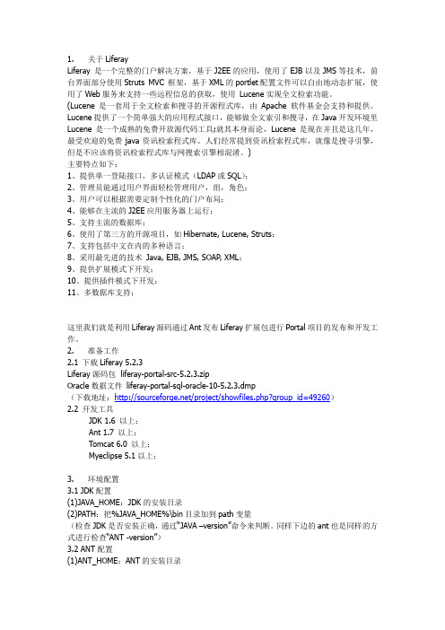
)主要特点如下:1、提供单一登陆接口,多认证模式(LDAP或SQL);2、管理员能通过用户界面轻松管理用户,组,角色;3、用户可以根据需要定制个性化的门户布局;4、能够在主流的J2EE应用服务器上运行;5、支持主流的数据库;6、使用了第三方的开源项目,如Hibernate, Lucene, Struts;7、支持包括中文在内的多种语言;8、采用最先进的技术Java, EJB, JMS, SOAP, XML;9、提供扩展模式下开发;10、提供插件模式下开发;11、多数据库支持;这里我们就是利用Liferay源码通过Ant发布Liferay扩展包进行Portal项目的发布和开发工作。
2. 准备工作2.1 下载Liferay 5.2.3Liferay源码包 liferay-portal-src-5.2.3.zipOracle数据文件liferay-portal-sql-oracle-10-5.2.3.dmp(下载地址:/project/showfiles.php?group_id=49260)2.2 开发工具JDK 1.6 以上;Ant 1.7 以上;Tomcat 6.0 以上;Myeclipse 5.1以上;3. 环境配置3.1 JDK配置(1)JAVA_HOME:JDK的安装目录(2)PATH:把%JAVA_HOME%\bin目录加到path变量(检查JDK是否安装正确,通过“JAVA –version”命令来判断。
Validators

在中验证控件如下:1、RequiredFieldValidator:验证一个必填字段,如果这个字段没填,那么,将不能提交信息。
2、CompareValidator:比较验证。
比较两个字段值是否相等,如密码和确认密码两个字段是否相等;比较一个字段与一个具体的值。
3、RangeValidator:范围验证。
验证一个字段是否在某个范围中,如成绩字段要是0~100范围中。
4、RegularExpressionValidator:正则表达式验证。
它根据正则表达式来验证用户输入字段的格式是否合法,如电子邮件、身份证、电话号码等。
5、CustomValidator:在运行定制的客户端JavaScript或VBScript函数时,可以使用这个控件。
下面,我们来看这些控件的使用1、RequiredFieldValidator(必填字段验证)的使用RequiredFieldValidator控件使用的标准代码如下:1<asp:RequiredFieldValidator ID="Validator_Name" runat="Server" ControlToValidate="要检查的控件名"2 ErrorMessage="出错信息" Display="Static|Dymatic|None">3占位符4</asp:RequiredFieldValidator>在以上标准代码中:ControlToValidate:表示要进行检查控件ID;ErrorMessage:表示当检查不合法时,出现的错误信息;Display:错误信息的显示方式;Static表示控件的错误信息在页面中占有肯定位置;Dymatic表示控件错误信息出现时才占用页面控件;None表示错误出现时不显示,但是可以在ValidatorSummary中显示;占位符:表示Display为Static时,错误信息占有"占位符"那么大的页面空间;现在,让我们看一个实例:1<asp:TextBox ID="t xtName" runat="Server"/>2<asp:RequiredFieldValidator ID="Validator1" runat="Server" ControlToValidate="t xtNa me"3 ErrorMessage="姓名必须输入" Display="Static">4*姓名必须输入5</asp:RequiredFieldValidator>在以上例子中,检查txtName控件是否有输入,如果没有,显示错误信息"姓名必须输入"。
跟我学Struts框架中的Validator验证器——在Web应用系统中应用Validator框架的基本步骤
3、创建 Form Bean 组件
2 杨教授工作室,版权所有,盗版必究, 2/16 页
杨教授工作室 精心创作的优秀程序员 职业提升必读系列资料
为了使用 Validator 框架, 在 Web 应用系统中的 Form Bean 程序必须从 ValidatorForm 类 (或 者 ValidatorActionForm 类)来继承,而不是 ActionForm 类本身或者 DynaActionForm(此时 在标准的 ActionForm 类中所提供的 validate( )方法已经被嵌入到 Vቤተ መጻሕፍቲ ባይዱlidator 框架中)的实施过 程。
3 杨教授工作室,版权所有,盗版必究, 3/16 页
extends ValidatorForm
杨教授工作室 精心创作的优秀程序员 职业提升必读系列资料
erName = newUserName; } public String getUserName() { return userName; } public void setUserPassword(String newUserPassword) { erPassword = newUserPassword; } public String getUserPassword() { return userPassword; } } 注意: 1) 这个类不提供 ActionForm 的 reset( )和 validate( )方法的实施过程,因为 ValidatorForm 提供了相应过程; 2) 如果写了 validate( )这个方法,就会屏蔽掉在 Validation.xml 中定义的验证部分,换句 话说就是系统运行时,Validation.xml 里对应此 ActionForm 的定义的错误验证部分不 实行。
validator校验规则

validator校验规则
validator校验规则是一种常用的前端数据校验方式,用于验证输入的数据是否符合预设的规则。
在开发中,我们经常需要对表单数据、用户输入等进行校验,以确保数据的有效性和安全性。
以下是validator校验规则的一些常见应用场景和实例:
1. 必填字段校验:在表单中,某些字段可能是必填项,用户必须填写才能提交表单。
通过validator校验规则,可以验证这些字段是否为空,如果为空则提示用户必须填写。
2. 长度限制校验:有时我们需要对输入的字符串长度进行限制,比如密码必须在6-20个字符之间。
通过validator校验规则,可以判断输入的字符串长度是否符合要求,如果不符合则提示用户重新输入。
3. 邮箱格式校验:在用户注册或登录时,我们需要验证邮箱格式是否正确。
通过validator校验规则,可以检查用户输入的邮箱地址是否符合邮箱的基本格式要求,如包含@符号、正确的域名等。
4. 数字范围校验:当需要输入数字时,有时我们需要限制数字的范围。
通过validator校验规则,可以判断用户输入的数字是否在预设的范围内,如果超出范围则提示用户重新输入。
5. 正则表达式验证:有些表单字段需要更加复杂的验证规则,这时可以利用正则表达式进行校验。
通过validator校验规则,可以使用正则表达式对用户输入的内容进行匹配和验证。
通过使用validator校验规则,可以在前端实现对用户输入数据的快速校验,提升用户体验和数据的准确性。
开发人员可以根据实际需求定义和定制校验规则,以保证数据的准确性和安全性。
@Validated和@Valid校验参数、级联属性、List
@Validated和@Valid校验参数、级联属性、List@Validated和@Valid的区别在Controller中校验⽅法参数时,使⽤@Valid和@Validated并⽆特殊差异(若不需要分组校验的话):@Valid:标准JSR-303规范的标记型注解,⽤来标记验证属性和⽅法返回值,进⾏级联和递归校验@Validated:Spring的注解,是标准JSR-303的⼀个变种(补充),提供了⼀个分组功能,可以在⼊参验证时,根据不同的分组采⽤不同的验证机制⽅法级别:@Validated注解可以⽤于类级别,⽤于⽀持Spring进⾏⽅法级别的参数校验。
@Valid可以⽤在属性级别约束,⽤来表⽰级联校验。
@Validated只能⽤在类、⽅法和参数上,⽽@Valid可⽤于⽅法、字段、构造器和参数上校验参数、级联属性1、校验参数当⼊参为实体对象时,需要在⽅法上加@Valid或@Validated或者在参数前加@Valid或@Validated,或者在类上加@Validated@Valid@GetMapping("/exam-info")public Boolean getInfo(User user){......}@GetMapping("/exam-info")public Boolean getInfo(@Valid User user){......}@Validated@GetMapping("/exam-info")public Boolean getInfo(User user){......}@GetMapping("/exam-info")public Boolean getInfo(@Validated User user){......}public Class User{@NotNull("id不能为空")private Integer id;}2、嵌套验证@valid作⽤于属性上有嵌套验证作⽤,@validated不能作⽤于属性上,如下代码在User类的属性car上添加@valid注解,当传参id为空时会报错。
SpringValidator校验解析
表单校验解析1.表单校验的必要性基于Web的应用,必须对用户提交的表单进行前台和后台的校验。
前台验证主要看需求和用户体验。
用户输出错误的表单参数,可以马上得到提醒,同时减轻服务器压力。
后台验证注重的是安全性。
防止恶意用户向后台提交非法数据。
后台验证是必要的,前台验证是充分的。
前台的校验通常是通过html,javascript等前台的技术来限制用户的输入,并对用户做出友好的提示和建议,它的最大好处是快。
在表单数据尚未提交到后台应用程序即能做出校验并提示给用户,用户可以更改或者重新输入数据。
这种方式的用户体验好。
但是,仅仅前台的校验是不能保证提交数据的合法性的。
尽管现在有一些前台脚本的压缩和加密技术可以初步模糊前台的脚本,不过通过一定的手段是可以恢复本来面目的。
这样我们的前台就完全暴露在用户面前了。
用户就可以通过firebug之类的工具篡改前台页面和数据,甚至可以向后台直接提交非法数据。
如果后台不再对数据进行校验,轻则程序会崩掉,重则被不良企图者利用,这会是致命的。
后台校验通常是对客户端提交的表单进行逻辑校验。
校验失败则向前台返回错误信息,校验通过之后才允许进一步执行程序。
后台校验需要用户提交表单之后,才进行校验,能有效地保证提交数据的合法性。
后台校验的用户体验较差,同时在后台频繁地校验表单参数,加重了服务端的负担。
所以,对于一个Web项目,前台和后台的表单校验,都是必不可少的。
2.前后台校验的统一2.1. 增删改查2.1.1. 查询Web项目最常用的操作是增删改查。
查询操作应使用Http GET提交表单,增加、删除、修改操作应该使用Http POST提交表单。
查询操作的主要漏洞是SQL注入。
为了防止SQL注入,Web应用程序访问数据库时,不应该使用字符串拼接的形式。
参数化查询可以防止SQL注入。
参数化查询(Parameterized Query 或Parameterized Statement)是访问数据库时,在需要填入数值或数据的地方,使用参数(Parameter) 来给值。
validator框架的使用
Validator-rules.xml文件每一个<validator>标签中可以设置7个属性属性:验证规则的名称2.classname 和method属性:配置对应类的方法3.msg属性是:错误信息的键的名称- 到消息资源包中提取4.depends属性是:指定在调用当前验证规则之前必须调用其他的验证规则5.methodparams属性是:该规则调用方法的参数类型6.jsFunctionname属性是:javascript自动生成的方法的名字Validatro框架以成为Jakarta的公共项目的一部分,可以从/commons/下载单独的Validator框架,在Struts中已经呆了这个框架。
Validator主要依赖两个jar包Jakarta-oro.jar:-提供一组处理文本的类,具有文本替换、过滤、和分割功能。
Commons-validator.jar:提供了一个简单、可扩展的验证框架,包含了通用的验证方法和验证规则。
在用Struts中用这个框架,需加入这两个包,用起来感觉还不错。
下面介绍一下。
Validator采用基于两个xml文件的方式来配置验证规则,分别为validation.xml,validator-rules.xml。
在struts应用中,需放到web-inf目录下。
1.validator-rules.xml这个文件包含了一组验证规则,对所有struts应用都适用。
一般情况不用修改这个文件,除非要修改或扩展默认规则。
如果要给应放到另一个xml文件中,而不是直接添加到validator-rules.xml文件中,这样当Validator升级时,不用修改validator-rules.xml文件。
2.validator.xml文件这个文件是针对于具体struts应用的,他可以为应用中的ActionForm配置验证规则。
而不用编码实现验证。
例如一个验证登陆form的例子,要求用户名必须填写,秘密要求必填、最大、最小长度及其内容的要求。
validator校验用法

validator校验用法
Validator校验用法指的是在Web应用程序开发中使用Validator来验证表单数据的正确性。
Validator是一种用于验证表单数据的技术,能够确保表单数据的正确性,并提高系统的安全性和可靠性。
在使用Validator时,需要定义一组校验规则,来确保表单数据的正确性。
这些规则可以包括数据类型、数据长度、数据范围、格式等方面的校验。
Validator提供了一些内置的校验规则,同时也支持自定义规则。
在实际使用中,可以通过在HTML标签中添加Validator属性来设置校验规则,例如:
<input type='text' name='username'
validator='required,username'/>
其中,validator属性的值为校验规则,多个规则之间用逗号隔开。
例如,required表示必填项,username表示只能输入字母和数字。
在提交表单时,Validator会对表单数据进行校验,并根据校验结果返回相应的提示信息。
如果校验通过,则可以提交表单数据,否则需要进行修正。
总的来说,Validator校验用法可以有效地提高Web应用程序的安全性和可靠性,确保表单数据的正确性。
在实际使用中,需要根据具体情况来选择合适的校验规则,并进行适当的定制。
跟我学Struts框架中的Validator验证器——Validator框架中的相关配置文件
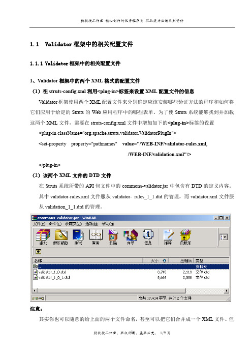
/WEB-INF/validation.xml"/> </plug-in> (2)该两个 XML 文件的 DTD 文件 在 Struts 系统所带的 API 包文件中的 commons-validator.jar 中包含有 DTD 的定义内容。 其中 validator-rules.xml 文件服从 validator- rules_1_1.dtd 的管理,而 validator.xml 文件服 从 validation_1_1.dtd 的管理。
配置文件 validator-rules.xml 主要是用来说明和标识应该被插入到框架中的验证方法程序 的基本信息(并提供每个验证的逻辑的名称)。同时在 validator-rules.xml 文件中还可以定义 每个验证方法程序中的客户端 JavaScript 代码(也即可以配置 Validator 让它把这个 JavaScript 代码发送到浏览器上,这样验证就可以同时在客户端和服务器端进行了)。
</form-validation> 而在 struts-config.xml 中的配置内容
<struts-config>
<form-beans>
<form-bean
name="productActionForm"
type="tianbin.cherl.form.productActionForm" />
- 1、下载文档前请自行甄别文档内容的完整性,平台不提供额外的编辑、内容补充、找答案等附加服务。
- 2、"仅部分预览"的文档,不可在线预览部分如存在完整性等问题,可反馈申请退款(可完整预览的文档不适用该条件!)。
- 3、如文档侵犯您的权益,请联系客服反馈,我们会尽快为您处理(人工客服工作时间:9:00-18:30)。
aui:validator
That is the current documentation on aui:validator. I'll be happy to give a better explanation of it for you though. aui:validator is a tag used in aui:input fields to validate the fields for the form. For example:
--------------
<aui:input name="Name" value=''" label="Name">
<aui:validator name="required" />
<aui:validator name="alpha" />
</aui:input>
--------------
In the example above the value of the name attribute of the aui:validator tag marks the field as required and says that only alpha characters are allowed. If you were to try to validate the field with other characters then alpha you would receive a default error message that says "please enter only alpha characters." If you want to
replace the default error message, you have to add a "errorMessage" attribute to the aui:validator tag. For example:
---------------
<aui:validator name="alpha" errorMessage"Enter characters that exist in the alphabet next time please" />
---------------
There are several values for you to choose from for the name attribute of the aui:validator tag:
**acceptFiles:** List of filetypes accepted. (Default:empty)
**alpha:** Evaluates whether or not a field contains only alpha characters.
(Default:none)
**alphanum:** A boolean value that determines whether a field is suppose to
contain only alphanumeric characters and evaluates it accordingly.
(Default:false)
**date:** A boolean value that determines whether a field is a Date and
evaluates it accordingly. (Default:false)
**digits:** A boolean value that determines whether a field is suppose to
contain only digits and evaluates it accordingly. (Default:false)
**email:** A boolean value that determines whether a field is a date and
evaluates it accordingly. (Default:false)
**equalTo:** Evaluates whether a field is equal to the field written.
(Default:empty)
**iri:** A boolean value that determines whether a field is a IRI and evaluates
it accordingly (Default:false)
**max:** Evaluates whether the integer value is less than or equal to the value
written. (Default:none)
**maxLength:** Evaluates whether a field is over the maximum length of
characters specified. (Default:empty)
**min:** Evaluates whether the integer value is greater than or equal to the
value written. (Default:none)
**minLength:** Evaluates whether a field is under the minimum length of
characters specified. (Default:empty)
**number:** A Boolean value that determines whether a field is suppose to
contain only numeric values and evaluates it accordingly. (Default:false)
**range:** Evaluates whether the integer value lies within the range given.
(Default:none)
**rangeLength:** Evaluates whether a field lies within the range of characters
written. (Default:empty)
**required:** Evaluates whether the field is required before submission.
(Default:false)
**url:** A boolean value that determines whether a field is a URL and evaluates
it accordingly. (Default:false)
For attributes that have a max or min and require a value, you will need to specify it in the tag. For example:
---------------
<aui:validator name="max">20</aui:validator>
---------------
Note that the aui:validator tag will need to be placed within a larger aui:form tag of your JSP and that you will need to reference the proper taglibs. Here is an example JSP for a portlet:
---------------
<%@ taglib uri="/portlet_2_0" prefix="portlet" %>
<%@ taglib uri="/tld/aui" prefix="aui" %>
<portlet:defineObjects />
<aui:form name="myForm" action="" method="post">
<aui:input name="Name" value='' label="Name">
<aui:validator name="required" />
<aui:validator name="alpha" errorMessage"Enter characters that exist in the alphabet next time please" />
</aui:input>
<aui:button type="submit" name="submit" value="submit" />
</aui:form>
---------------
Hope this helps.。