CSS居中手册
css实现垂直水平居中的方法
css实现垂直水平居中的方法在CSS中,要实现元素的水平居中和垂直居中,有多种方法可以选择。
下面将介绍一些实现这两种居中方式的常用技巧。
一、水平居中要实现元素的水平居中,可以使用以下方法:1.1 text-align: center通过将父元素的text-align属性设置为center,可以将其内部的行内元素水平居中。
这个方法适用于行内元素和行内块元素。
1.2 margin: auto通过将父元素设为块级元素,并将其左右外边距都设置为auto,可以实现水平居中。
这个方法适用于块级元素。
1.3 display: flex通过将父元素的display属性设置为flex,并使用属性justify-content: center,可以实现其内部元素的水平居中。
这个方法适用于块级元素。
1.4 position: absolute + left: 50% + transform: translateX(-50%)通过将要居中的元素设置为绝对定位(position: absolute),然后通过设置左侧偏移量为50%(left: 50%),再使用transform属性将其平移回左侧偏移量的50%(transform: translateX(-50%)),可以实现水平居中。
这个方法适用于任何元素。
二、垂直居中要实现元素的垂直居中,可以使用以下方法:2.1 line-height:父元素的高度值通过将父元素设为块级元素,然后将其line-height属性设置为与自身高度相等的值,可以实现内部元素的垂直居中。
这个方法适用于行内元素和行内块元素。
2.2 display: table + display: table-cell + vertical-align: middle通过将父元素的display属性设置为table,再将内部元素的display属性设置为table-cell,并且设置vertical-align属性为middle,可以实现垂直居中。
CSS-屏幕居中网页内容的三种方法
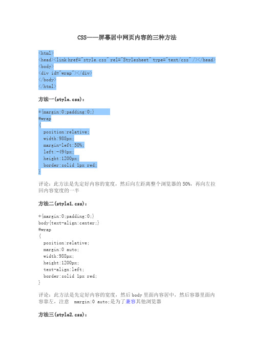
CSS——屏幕居中网页内容的三种方法<html><head><link href="style.css" rel="Stylesheet" type="text/css" /></head> <body><div id="wrap"></div></body></html>方法一(style.css):*{margin:0;padding:0;}#wrap{position:relative;width:988px;margin-left:50%;left:-494px;height:1200px;border:solid 1px red;}评论:此方法是先定好内容的宽度,然后向左距离整个浏览器的50%,再向左拉回内容宽度的一半方法二(style1.css):*{margin:0;padding:0;}body{text-align:center;}#wrap{position:relative;margin:0 auto;width:988px;height:1200px;text-align:left;border:solid 1px red;}评论:此方法是先定好内容的宽度,然后body里面内容居中,然后容器里面内容靠左,注意 margin:0 auto;是为了兼容其他浏览器方法三(style2.css):*{margin:0;padding:0;}#wrap{position:relative;width:988px;margin-left:-494px;left:50%;height:100%;border:solid 1px red;}评论:和方法一类似,可以对比方法一看理论上还有其他方法,现在网站上用的是第二种。
css 实现上下左右居中的几种方法

css 实现上下左右居中的几种方法(原创版3篇)目录(篇1)1.标题:css 实现上下左右居中的几种方法2.方法一:使用 Flexbox 布局3.方法二:使用 Grid 布局4.方法三:使用绝对定位与 transform5.方法四:使用绝对定位与 margin:auto6.方法五:使用 position:relative 与 transform7.总结:各种方法的优缺点及适用场景正文(篇1)在网页设计中,实现元素的上下左右居中是一个常见的需求。
CSS 提供了多种方法来实现这一效果。
本文将介绍五种常用的方法。
方法一:使用 Flexbox 布局Flexbox 是 CSS3 引入的一种弹性盒子布局模式,可以轻松实现元素的居中。
首先,将需要居中的元素的容器设置为 display: flex,然后使用 justify-content 和 align-items 属性分别设置水平和垂直居中。
方法二:使用 Grid 布局Grid 布局是 CSS3 引入的另一种布局模式,适用于实现复杂的布局设计。
通过将容器设置为 display: grid,并使用 place-items 属性设置元素在网格中的位置,可以实现上下左右居中。
方法三:使用绝对定位与 transform通过将需要居中的元素设置为 position: absolute,并使用 top、left、right、bottom 等属性设置元素相对于容器的位置,然后使用transform 属性设置旋转角度,可以实现上下左右居中。
方法四:使用绝对定位与 margin:auto将需要居中的元素设置为 position: absolute,并使用margin-left、margin-right、margin-top、margin-bottom 设置为 auto,可以实现上下左右居中。
方法五:使用 position:relative 与 transform将需要居中的元素设置为 position: relative,并使用 transform 属性设置旋转角度和偏移量,可以实现上下左右居中。
CSS上下居中3种方案

CSS上下居中3种⽅案在CSS⾥不好使了,在CSS⾥解决上下居中问题⼜能⽀持both IE和Firefox的有3种⽅案:第⼀种,上下居中⽂字:⽅法是使⽤line-height,因为line-height就是⽤来定义⽂字⾏与⾏之间的距离,所以定义⽂字框的line-height等于框的⾼度可以让⽂字上下居中. h1 { font-size: 3em; height: 100px; line-height: 100px; }需要注意的是:如果中间的⽂字不只⼀⾏,并且使⽤分⾏显⽰的时候,这个就不好⽤了.第⼆种,⾮⽂字的上下居中:使⽤absolute positioning,需要注意的是这个⽅法只能在框有定义好的⾼度才能⼯作. 不适合动态⾼度的框.假如代码为:Hi, I'mVertically AlignedAbigo sudo mara paulatim odio, accumsan luptatum nibh nibh refero metuo opes ut fatua.要上下居中 CSS编写为:.vert {width: 580px;height: 190px;position: absolute;top: 50%;left: 50%;margin: -95px 0 0 -290px;}上边的margin计算公式为:* Width of Element / 2 = Negative Left Margin* Height of Element / 2 = Negative Top Margin第三种⽅法:Content here#floater {float:left; height:50%; margin-bottom:-120px;}#content {clear:both; height:240px; position:relative;}。
css 居中方法

css 居中方法CSS居中方法在网页设计中,居中是一个非常常见且重要的需求。
通过CSS可以实现多种居中方式,本文将详细介绍几种常用的CSS居中方法。
一、水平居中1. 文本水平居中要让文本水平居中,可以使用text-align属性。
将要居中的文本包裹在一个容器元素内,然后给容器元素设置text-align: center;即可实现文本的水平居中。
2. 块级元素水平居中如果要让一个块级元素水平居中,可以使用margin属性。
将该元素的左右外边距都设为auto,这样该元素就会水平居中。
3. flex布局水平居中使用flex布局可以更方便地实现水平居中。
在容器元素上设置display: flex;和justify-content: center;即可使内部元素水平居中。
二、垂直居中1. 单行文本垂直居中要使单行文本垂直居中,可以使用line-height属性。
将行高设置为容器的高度,文本就会垂直居中。
2. 块级元素垂直居中要让一个块级元素垂直居中,可以使用绝对定位和负边距。
首先将该元素的上下外边距都设为auto,然后将该元素的定位方式设置为绝对定位,再通过top: 50%;和transform: translateY(-50%);使元素垂直居中。
3. flex布局垂直居中使用flex布局可以更方便地实现垂直居中。
在容器元素上设置display: flex;和align-items: center;即可使内部元素垂直居中。
三、水平垂直居中1. 定位和负边距法通过设置绝对定位和负边距可以实现元素的水平垂直居中。
将要居中的元素的宽度和高度设为固定值,然后将该元素的定位方式设置为绝对定位,通过top: 50%;和left: 50%;将元素定位到父容器的中心位置,最后通过负边距将元素向左上方移动一半的宽度和高度,即可实现水平垂直居中。
2. flex布局法使用flex布局可以更方便地实现元素的水平垂直居中。
在父容器上设置display: flex;和justify-content: center; align-items: center;即可使子元素水平垂直居中。
css水平居中的方法
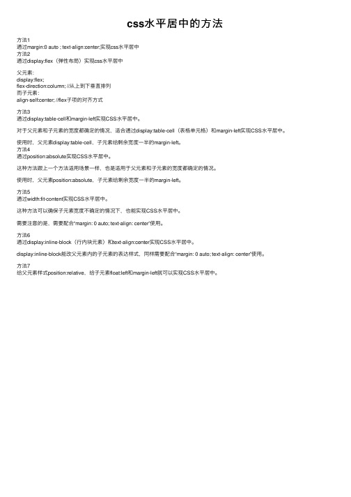
css⽔平居中的⽅法⽅法1通过margin:0 auto ; text-align:center;实现css⽔平居中⽅法2通过display:flex(弹性布局)实现css⽔平居中⽗元素:display:flex;flex-direction:column; //从上到下垂直排列⽽⼦元素:align-self:center; //flex⼦项的对齐⽅式⽅法3通过display:table-cell和margin-left实现CSS⽔平居中。
对于⽗元素和⼦元素的宽度都确定的情况,适合通过display:table-cell(表格单元格)和margin-left实现CSS⽔平居中。
使⽤时,⽗元素display:table-cell,⼦元素给剩余宽度⼀半的margin-left。
⽅法4通过position:absolute实现CSS⽔平居中。
这种⽅法跟上⼀个⽅法适⽤场景⼀样,也是适⽤于⽗元素和⼦元素的宽度都确定的情况。
使⽤时,⽗元素position:absolute,⼦元素给剩余宽度⼀半的margin-left。
⽅法5通过width:fit-content实现CSS⽔平居中。
这种⽅法可以确保⼦元素宽度不确定的情况下,也能实现CSS⽔平居中。
需要注意的是,需要配合“margin: 0 auto; text-align: center”使⽤。
⽅法6通过display:inline-block(⾏内块元素)和text-align:center实现CSS⽔平居中。
display:inline-block能改⽗元素内的⼦元素的表达样式,同样需要配合“margin: 0 auto; text-align: center”使⽤。
⽅法7给⽗元素样式position:relative,给⼦元素float:left和margin-left就可以实现CSS⽔平居中。
实现css文字垂直居中的8种方法
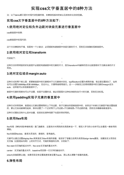
实现css⽂字垂直居中的8种⽅法注:以下demo都只是针对现代浏览器所做,未兼容低版本的IE以及其他⾮主流浏览器。
实现css⽂字垂直居中的8种⽅法如下:1.使⽤绝对定位和负外边距对块级元素进⾏垂直居中css垂直居中效果:css垂直居中实现代码:这个⽅法兼容性不错,但是有⼀个⼩缺点:必须提前知道被居中块级元素的尺⼨,否则⽆法准确实现垂直居中。
2.使⽤绝对定位和transform代码如下:这种⽅法⾮常明显的好处就是不必提前知道被居中的元素的尺⼨,因为transform中偏移的百分⽐就是相对于元素⾃⾝的尺⼨⽽⾔。
3.绝对定位结合margin:auto这种⽅式的两个核⼼是:把要垂直居中的元素相对于⽗元素绝对定位,top和bottom设置为相等的值,我这⾥设置成0了,当然也可以设置为99999px或者-99999px,⽆论什么,只要两者相等就⾏。
这⼀⼀步做完之后再将要居中的元素的margin设为auto,这样就可以实现垂直居中了。
被居中元素的宽度也可以不设置,但是不设置的话,就必须是图⽚这种⾃⾝就包含尺⼨的元素,否则⽆法实现。
4.使⽤padding实现⼦元素的垂直居中这种⽅式⾮常简单,就是给⽗元素设置相等的上下内边距,则⼦元素⾃然是垂直居中的,⾃然这个时候⽗元素是不能设置⾼度的,要让它⾃动被填充起来,除⾮设置了⼀个正好等于上内边距+⼦元素⾼度+下内边距的值,否则⽆法精确地垂直居中。
这种⽅式看似没有什么技术含量,但其实在某种场景下也是⾮常好⽤的。
5.使⽤flex布局flex布局(弹性布局/伸缩布局)⾥门道颇多,这⾥先针对⽤到的东西简单说⼀下,想深⼊学习的⼩伙伴可以去看阮⼀峰⽼师的博客。
flex也就是flexible,意思为灵活的,柔韧的,易弯曲的。
元素可以通过设置display:flex;将其指定为flex布局的容器,指定好了容器之后再为其添加align-items属性,该属性定义项⽬在交叉轴(这⾥是纵向周)上的对齐⽅式,可能的取值有五种,分别如下:flex-start:交叉轴的起点对齐;flex-end:交叉轴的重点对齐;center:交叉轴的重点对齐;baseline项⽬第⼀⾏⽂字的基线对齐;strech(该值是默认值):如果项⽬没有设置⾼度或者设置为auto,那么将占满整个容器的⾼度。
css居中的几种方法
css居中的几种方法CSS居中的几种方法。
在网页设计中,居中是一个常见的需求。
无论是文字、图片还是整个元素,都可能需要在页面中水平或垂直居中。
在CSS中,实现居中有多种方法,接下来我们将介绍几种常用的CSS居中方法。
1. 文字水平居中。
要让文字水平居中,可以使用text-align属性。
将text-align设置为center即可实现文字的水平居中。
例如:```css。
.center {。
text-align: center;}。
```。
通过给父元素添加.center类,其内部的文字就会水平居中显示。
2. 元素水平居中。
对于块级元素,可以使用margin属性来实现水平居中。
假设要将一个div元素水平居中显示,可以使用如下的CSS代码:```css。
.center {。
width: 200px;margin: 0 auto;}。
```。
这里设置了元素的宽度,并将左右外边距设为auto,这样就可以实现元素的水平居中。
3. 元素垂直居中。
实现元素的垂直居中相对复杂一些,但也有多种方法可以实现。
其中一种常见的方法是使用flex布局。
例如:```css。
.container {。
display: flex;justify-content: center;align-items: center;height: 300px;}。
这段CSS代码将容器设置为flex布局,然后通过justify-content和align-items属性将内部元素水平和垂直居中。
4. 绝对定位居中。
另一种常见的元素垂直居中方法是使用绝对定位。
可以通过如下的CSS代码实现:```css。
.center {。
position: absolute;top: 50%;left: 50%;transform: translate(-50%, -50%);```。
这段代码将元素的位置设置为绝对定位,然后通过top: 50%和left: 50%将元素的左上角移动到父元素的中心,最后使用transform属性将元素在水平和垂直方向上平移自身宽高的一半,从而实现元素的居中显示。
CSS实现居中代码

CSS实现居中代码在设计⽹页模板时,经常要⽤CSS来控制块级元素的⽔平或是垂直位置,往往需要进⾏居中的操作。
今天我就和⼤家⼀起来研究下如何⽤CSS来控制元素的居中。
1、单⾏垂直居中⽂字在层中垂直居中vertical-align 属性是做不到的.我们这⾥有个⽐较巧妙的⽅法就是:设置height的⾼度与line-height的⾼度相同!<div style="line-height:500px;height:500;"></div>2、层⽔平居中设置div的宽度⼩于⽗div的宽度,设置 margin:0 auto;,即可让div居中。
#parentdiv{width: 500px;}#childdiv {width: 200px;margin:0 auto;}3、层中的⽂字⽔平居中在childdiv的css加上text-align:center;#parentdiv{width: 500px;}#childdiv {width: 200px;margin:0 auto;text-align:center;}4、div层垂直居中<div style="width:275px;height:375px;border: solid red;"><div style=" background:green;height: 375px; width: 275px; position: relative; display: table-cell; vertical-align: middle;"><div style=" background:red;position:static;position:absolute\9; top: 50%;"><div style=" background:blue;position: relative; top: -50%;"></div></div></div></div>5、div层垂直⽔平居中,英⽂超长换⾏<div style="float:left;width:275px;height:375px;border: solid red;"><div style=" height: 375px; width: 275px; position: relative; display: table-cell; vertical-align: middle;"><div style="position:static;position:absolute\9; top: 50%;"><div style="position: relative; top: -50%; text-align: center;"><div style="width: 85px;WORD-WRAP: break-word;TABLE-LAYOUT: fixed;word-break:break-all;margin:0 auto;"></div></div></div></div></div>7、垂直居中和使⽤text-align⽔平居中<div style="float:left;width:275px;height:375px;border: solid red;"><div style=" height: 375px; width: 275px; position: relative; display: table-cell; vertical-align: middle;"><div style="position:static;position:absolute\9;top: 50%;"><div style="position: relative; top: -50%; text-align:center;"><div style="width: 275px;"><div style="width: 160px;WORD-WRAP: break-word;TABLE-LAYOUT: fixed;word-break:break-all;text-align:left;"> </div></div></div></div></div></div>8、垂直居中和使⽤margin⽔平居中<div style="float:left;width:275px;height:375px;border: solid red;"><div style=" height: 375px; width: 275px; position: relative; display: table-cell; vertical-align: middle;"><div style="position:static;position:absolute\9; top: 50%;"><div style="position: relative; top: -50%; "><div style="margin:0 auto;width: 160px;WORD-WRAP: break-word;TABLE-LAYOUT: fixed;word-break:break-all;"></div></div></div></div></div>。
CSSposition居中(水平,垂直)
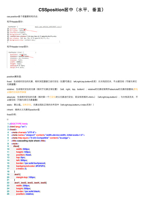
CSSposition居中(⽔平,垂直)css position是个很重要的知识点:知乎Header部分:知乎Header-inner部分:position属性值:fixed:⽣成绝对定位的元素,相对浏览器窗⼝进⾏定位(位置可通过:left,right,top,bottom改变);与⽂档流⽆关,不占据空间(可能与其它元素重叠)relative:⽣成相对定位的元素(相对于元素正常位置)(left,right,top,bottom);relative的元素经常⽤作absolute的元素的容器块;原先占据的空间依然保留absolute:⽣成绝对定位的元素(相对第⼀个已定位的⽗元素进⾏定位;若没有则相对<html>)(left,right,top,bottom);与⽂档流⽆关,不占据空间(可能与其它元素重叠)static:默认值。
没有定位,元素出现在正常的⽂件流中(left,right,top,bottom,z-index⽆效!)inherit:继承从⽗元素的position值fixed⽰例:1<!DOCTYPE html>2<html lang="en">3<head>4<meta charset="UTF-8">5<meta name="viewport" content="width=device-width, initial-scale=1.0">6<meta http-equiv="X-UA-Compatible" content="ie=edge">7<title>cascading style sheet</title>8<style>9 #test{10 width: 500px;11 height: 100px;12 position: fixed;13 top: 0px;14 left: 500px;15 border: 1px solid burlywood;16 background-color: #F2F2F2;17 z-index: 2;18 }19 .test1{20 margin-top: 100px;21 }22 .test1, .test2, .test3, .test4, .test5{23 width: 200px;24 height: 300px;25 border: 1px solid black;26 position: relative;27 left: 500px;28 background-color: gray;29 }30</style>31</head>32<body>33<div id="test"></div>34<div class="test1">1</div>35<div class="test2">2</div>36<div class="test3">3</div>37<div class="test4">4</div>38<div class="test5">5</div>3940</body>41</html>View Code#test部分始终固定在上⽅,不发⽣移动。
css垂直居中七个方法

css垂直居中七个方法
CSS垂直居中的方法有很多种,以下是其中七种:
1. 使用flexbox:使用`align-items`或`align-content`的属性,可以轻松实现垂直居中的效果。
2. 使用grid:使用CSS Grid布局的`align-items`属性,也可以实现垂直居中。
3. 使用position和transform:将元素的`position`设置为`absolute`或
`fixed`,然后使用`transform`属性将其垂直居中。
4. 使用line-height:如果元素只包含文本,可以使用`line-height`属性将其垂直居中。
5. 使用table-cell:将元素的`display`属性设置为`table-cell`,然后使用`vertical-align`属性将其垂直居中。
6. 使用position和top/bottom:将元素的`position`设置为`absolute`或`fixed`,然后使用`top`和`bottom`属性将其垂直居中。
7. 使用CSS变量和calc:使用CSS变量和calc函数,也可以实现元素的垂直居中。
这些方法各有优缺点,使用时需要根据具体情况选择合适的方法。
css居中-水平居中,垂直居中,上下左右居中

css居中 -水平居中 ,垂直居中 ,上下左右居中
网页布局居中必不可少,其中包括水平居中,垂直居中,上下左右居中,下面一一详述。
水平居中
<div class="container"> <div class="item">居中</div>
</div>
1.text-align: center; 对父元素设置text-align: center;子元素即可居中。但子元素是有限制的,只对图片,文字等行内元素有效。 如果子元素有一定宽度,可以设置子元素display:inline-block;
} </style>
第二种方法
<style> .container { background-color: #ffecf7; height: 200px; font-size: 0; text-align: center; } .container:after { content: ''; display: inline-block; height: 100%; vertical-align: middle; }
<style> .container { text-align: center; }
.item{ display: inline-block; width: 100px; background-color: #ff266e;
}
</style>
效果
2.margin: 0 auto; 元素本身设置 margin: 0 auto; 这种方法对能设置宽度的元素起作用. <style> .container { text-align: center; background-color: #a08b8b; }
手把手教你CSS水平、垂直居中的10种方式(小结)

⼿把⼿教你CSS⽔平、垂直居中的10种⽅式(⼩结)⾯试必备,⼯作⼀定会⽤到。
emmm⼤家都懂的,话不多说,先直接贴⼀个总结和效果图。
总结PC端有兼容性要求,⼦元素宽⾼固定,推荐absolute + 负marginPC端有兼容要求,⼦元素宽⾼不固定,推荐absolute + transformPC端⽆兼容性要求,推荐flex移动端推荐使⽤flex要怎么实现上⾯这幅图的效果呢,下⾯为⼤家总结了10中常⽤的⽅法。
⾸先我先创建⼀个公共的模板样式<template><div class="two"><div class="parent"><div class="child">123</div></div></div></template><style lang="less" scoped>.parent{margin: 0 auto;width: 300px;height: 300px;border: 1px solid red;box-sizing: border-box;.child {height: 100px;width: 100px;background: #2f8df0;}}</style>然后具体⽤到的样式单独写在⽅法⾥⾯,⾸先先介绍4个平时布局的技巧。
1.⽔平居中div⾥⾯的div,设置⼦元素的宽度。
.parent{width:300px;margin:0 auto;}注意:如果⼦元素设置了display:table-cell,那么margin:0 auto;将会失效。
2.设置⽂字垂直居中,设置包含⽂字div的⾼。
.child{text-align:centerline-height:100px //知道⼦元素的⾼,设置和⾼⼀样的⾼度}3.两个或者多个块级元素垂直居中对齐,⽗元素设置height和line-height相等。
行内块元素水平居中方法
行内块元素水平居中方法
行内块元素水平居中的方法有多种,以下是一些常见的方法:
1. 使用margin属性:如果行内块元素的宽度是固定的,可以通过设置左右margin为自动(margin: 0 auto;)来实现水平居中。
2. 使用text-align属性:如果行内块元素是块级元素内部的行内元素,可以通过将其父元素的text-align属性设置为center来实现水平居中。
3. 使用flex布局:可以通过将父元素设置为flex容器(display: flex;),然后使用justify-content属性将其子元素(行内块元素)居中。
4. 使用grid布局:如果行内块元素是网格项,可以使用grid布局的justify-items和align-items属性来实现水平居中。
5. 使用CSS transform属性:可以通过将行内块元素的位置设置为相对定位(position: relative;),然后使用transform属性将其向左移动其自身宽度的一半,从而实现水平居中。
这些方法可以根据具体情况选择使用,具体效果可能因浏览器和CSS版本的不同而有所差异。
【基础】CSS居中的15种方式

【基础】CSS居中的15种⽅式简⾔CSS居中是前端⼯程师经常要⾯对的问题,也是基本技能之⼀。
今天有时间把CSS居中的⽅案汇编整理了⼀下,⽬前包括⽔平居中,垂直居中及⽔平垂直居中⽅案共15种。
如有漏掉的,还会陆续的补充进来,算做是⼀个备忘录吧。
1 ⽔平居中1.1 内联元素⽔平居中利⽤text-align: center可以实现在块级元素内部的内联元素⽔平居中。
此⽅法对内联元素(inline), 内联块(inline-block), 内联表(inline-table), inline-flex元素⽔平居中都有效。
** 核⼼代码:**.center-text {text-align: center;}** 演⽰程序:**1.2 块级元素⽔平居中通过把固定宽度块级元素的margin-left和margin-right设成auto,就可以使块级元素⽔平居中。
** 核⼼代码:**.center-block {margin: 0 auto;}** 演⽰程序:**1.3 多块级元素⽔平居中1.3.1 利⽤inline-block如果⼀⾏中有两个或两个以上的块级元素,通过设置块级元素的显⽰类型为inline-block和⽗容器的text-align属性从⽽使多块级元素⽔平居中。
** 核⼼代码:**.container {text-align: center;}.inline-block {display: inline-block;}** 演⽰程序:**1.3.2 利⽤display: flex利⽤弹性布局(flex),实现⽔平居中,其中justify-content⽤于设置弹性盒⼦元素在主轴(横轴)⽅向上的对齐⽅式,本例中设置⼦元素⽔平居中显⽰。
** 核⼼代码:**.flex-center {display: flex;justify-content: center;}** 演⽰程序:**2 垂直居中2.1 单⾏内联(inline-)元素垂直居中通过设置内联元素的⾼度(height)和⾏⾼(line-height)相等,从⽽使元素垂直居中。
css垂直居中:5种方法
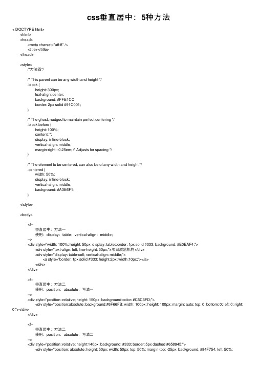
css垂直居中:5种⽅法<!DOCTYPE html> <html> <head> <meta charset="utf-8" /> <title></title> </head> <style> /*⽅法四*/ /* This parent can be any width and height */ .block { height: 300px; text-align: center; background: #FFE1CC; border: 2px solid #91C001; } /* The ghost, nudged to maintain perfect centering */ .block:before { height: 100%; content: ''; display: inline-block; vertical-align: middle; margin-right: -0.25em; /* Adjusts for spacing */ } /* The element to be centered, can also be of any width and height */ .centered { width: 50%; display: inline-block; vertical-align: middle; background: #A3E6F1; } </style> <body> <!-- 垂直居中:⽅法⼀ 使⽤:display:table;vertical-align:middle; --> <div style="width: 100%; height: 50px; display: table;border: 1px solid #333; background: #E0EAF4;"> <div style="text-align: left; line-height: 50px;">项⽬质监机构</div> <div style="display: table-cell; vertical-align: middle;"> <a style="border: 1px solid #333; height:2px; width:10px;"></a> </div> </div> <!-- 垂直居中:⽅法⼆ 使⽤:position:absolute;写法⼀ --> <div style="position: relative; height: 150px; background-color: #C5C5FD;"> <div style="position:absolute; background:#6F66FB; width: 100px; height: 100px; margin: auto; top: 0; bottom: 0; left: 0; right: 0;"></div> </div> <!-- 垂直居中:⽅法⼆ 使⽤:position:absolute;写法⼆ --> <div style="position: relative; height:140px; background: #333; border: 5px dashed #658945;"> <div style="position: absolute; height: 50px; width: 50px; top: 50%; margin-top: -25px; background: #84F754; left: 50%;margin-left: -25px;"></div> </div> <!-- 垂直居中:⽅法三 使⽤:display:flex; justify-content: center;⽔平居中 align-items: center; 垂直居中 IE9,IE8下不⽀持; --> <div style="display: flex; display: -webkit-flex; height: 200px; background: #FFFFCC; border: 3px solid #C0014E; align-items: center; justify-content: center;"> <div style="height:70px; width:70px; background: #29F9F9;"></div> </div> <!-- 垂直居中:⽅法四 使⽤:display:inline-block; --> <div class="block"> <div class="centered"> <h1>haorooms案例题⽬</h1> <p>haorooms案例内容,haorooms案例内容haorooms案例内容haorooms案例内容haorooms案例内容haorooms案例内容haorooms案例内容haorooms案例内容haorooms案例内容</p> </div> </div> </body></html>。
CSS实现垂直居中的5种方法
CSS实现垂直居中的5种⽅法利⽤ css 来实现对象的垂直居中有许多不同的⽅法,⽐较难的是选择那个正确的⽅法。
我下⾯说明⼀下我看到的好的⽅法和怎么来创建⼀个好的居中⽹站。
使⽤ css 实现垂直居中并不容易。
有些⽅法在⼀些浏览器中⽆效。
下⾯我们看⼀下使对象垂直集中的5种不同⽅法,以及它们各⾃的优缺点。
⽅法⼀这个⽅法把⼀些 div 的显⽰⽅式设置为表格,因此我们可以使⽤表格的 vertical-align property 属性。
<div id="wrapper"><div id="cell"><div class="content">Content goes here</div></div></div>#wrapper {display: table;}#cell {display: table-cell;vertical-align: middle;}优点:content 可以动态改变⾼度(不需在 CSS 中定义)。
当 wrapper ⾥没有⾜够空间时, content 不会被截断缺点:Internet Explorer(甚⾄ IE8 beta)中⽆效,许多嵌套标签(其实没那么糟糕,另⼀个专题)⽅法⼆:这个⽅法使⽤绝对定位的 div,把它的 top 设置为 50%,top margin 设置为负的 content ⾼度。
这意味着对象必须在 CSS 中指定固定的⾼度。
因为有固定⾼度,或许你想给 content 指定 overflow:auto,这样如果 content 太多的话,就会出现滚动条,以免content 溢出。
<div class="content"> Content goes here</div>#content {position: absolute;top: 50%;height: 240px;margin-top: -120px; /* negative half of the height */}优点:适⽤于所有浏览器不需要嵌套标签没有⾜够空间时,content 会消失(类似div 在 body 内,当⽤户缩⼩浏览器窗⼝,滚动条不出现的情况)⽅法三这种⽅法,在 content 元素外插⼊⼀个 div。
css垂直居中的方法
css垂直居中的方法CSS垂直居中是网页设计中常见的一种布局需求,尤其是对于有特定高度的容器元素,在其中需要居中一个子元素的情况下,垂直居中就显得尤为重要。
本文将介绍CSS中实现垂直居中的各种方法,包括使用display属性、flex布局、table布局以及绝对定位与负边距等方式。
一、使用display属性1. 当容器元素为块级元素时(1)使用padding属性当容器元素为块级元素时,可以通过在容器内部添加padding来达到垂直居中的效果,代码如下:```height: 300px;background-color: #ccc;padding: 100px 0;}.child {height: 50px;width: 50px;background-color: #fff;margin: 0 auto;}```容器元素的高度需要预设,同时padding属性的上下值需设置成相同的数值,这样子元素就能够在容器中垂直居中。
(2)使用line-height属性在容器元素为块级元素时,还可以通过设置line-height属性来实现垂直居中,代码如下:```height: 300px;background-color: #ccc;line-height: 300px;}.child {height: 50px;width: 50px;background-color: #fff;margin: 0 auto;}```这种方式需要注意的是,子元素的高度和行高需要相等,而且容器元素的高度也需要预设。
2. 当容器元素为行内元素时当容器元素为行内元素时,需要将display属性设置成inline-block或者table-cell 来实现垂直居中,代码如下:(1)使用inline-block```background-color: #ccc;font-size: 0;text-align: center;}.child {display: inline-block;height: 50px;width: 50px;background-color: #fff;vertical-align: middle;}```(2)使用table-cell```display: table-cell;height: 300px;background-color: #ccc;text-align: center;vertical-align: middle;}.child {height: 50px;width: 50px;background-color: #fff;margin: 0 auto;}```在使用table-cell的方式时,需要将容器元素的display属性设置为table-cell,并且限制其宽度,同时设置text-align和vertical-align属性为center。
css图片居中(水平居中和垂直居中)
css图⽚居中(⽔平居中和垂直居中)css图⽚居中(⽔平居中和垂直居中)css图⽚居中分css图⽚⽔平居中和垂直居中两种情况,有时候还需要图⽚同时⽔平垂直居中,下⾯分⼏种居中情况分别介绍。
css图⽚⽔平居中利⽤margin: 0 auto实现图⽚⽔平居中利⽤margin: 0 auto实现图⽚居中就是在图⽚上加上css样式margin: 0 auto 如下:<div style="text-align: center; width: 500px; border: green solid 1px;"><img alt="" src="https:///img/baidu_jgylogo3.gif" style="margin: 0 auto;"/></div>利⽤⽂本的⽔平居中属性text-align: center代码如下:<div style="text-align: center; width: 500px; border: green solid 1px;"><img alt="" src="https:///img/baidu_jgylogo3.gif" style="display: inline-block;"/></div>css图⽚垂直居中利⽤⾼==⾏⾼实现图⽚垂直居中这种⽅法是要知道⾼度才可以使⽤,代码如下:<div style="text-align: center; width: 500px;height:200px; line-height:200px; border: green solid 1px;"><img alt="" src="https:///img/baidu_jgylogo3.gif" style="display: inline-block; vertical-align: middle;"/></div>利⽤table实现图⽚垂直居中利⽤table的⽅法是利⽤了table的垂直居中属性,代码如下:这⾥使⽤display: table;和display: table-cell;来模拟table,这种⽅法并不兼容IE6/IE7,IE67不⽀持display: table,如果你不需要⽀持IE67那就可以⽤缺点:当你设置了display: table;可能会改变你的原有布局<div style="text-align: center; width: 500px;height:200px; display: table;border: green solid 1px;"><span style="display: table-cell; vertical-align: middle; "><img alt="" src="https:///img/baidu_jgylogo3.gif" style="display: inline-block;"/></span></div>利⽤绝对定位实现图⽚垂直居中如果已知图⽚的宽度和⾼度可以这样,代码如下:<div style="width: 500px;height:200px; position: relative; border: green solid 1px;"><img alt="" src="https:///img/baidu_jgylogo3.gif" style="width: 120px; height: 40px;position: absolute; left:50%; top: 50%; margin-left: -60px;margin-top: -20px;"/> </div>移动端可以利⽤flex布局实现css图⽚垂直居中移动端⼀般浏览器版本都⽐较⾼,所以可以⼤胆的使⽤flex布局,(flex布局参考)演⽰代码如下:css代码:<style type="text/css">/*web前端开发/*/.ui-flex {display: -webkit-box !important;display: -webkit-flex !important;display: -ms-flexbox !important;display: flex !important;-webkit-flex-wrap: wrap;-ms-flex-wrap: wrap;flex-wrap: wrap}.ui-flex, .ui-flex *, .ui-flex :after, .ui-flex :before {box-sizing: border-box}.ui-flex.justify-center {-webkit-box-pack: center;-webkit-justify-content: center;-ms-flex-pack: center;justify-content: center}.ui-flex.center {-webkit-box-pack: center;-webkit-justify-content: center;-ms-flex-pack: center;justify-content: center;-webkit-box-align: center;-webkit-align-items: center;-ms-flex-align: center;align-items: center}</style>html代码:<div class="ui-flex justify-center center" style="border: green solid 1px; width: 500px; height: 200px;"> <div class="cell"><img alt="" src="https:///img/baidu_jgylogo3.gif" style=""/></div></div>本⽂链接:。