国际知名咨询公司图表大全教学教案
国际知名咨询公司全套内部培训教程大全

国际知名咨询公司全套内部培训教程大全第一章:公司历史与文化1. 公司成立及发展历程- 公司的起源和背景- 公司的发展历程和成就2. 公司使命与愿景- 公司的使命宣言和核心价值观- 公司的愿景和发展方向3. 公司文化与价值观- 公司文化的内涵和特点- 公司价值观的传承和践行第二章:咨询业务知识1. 咨询行业概述- 咨询行业的背景和发展趋势- 咨询行业的主要领域和服务内容2. 咨询方法与工具- 咨询分析方法和解决问题的工具- 咨询项目管理和执行流程3. 行业专业知识- 不同行业的特点和挑战- 行业分析和市场调研技巧第三章:人际沟通与协作1. 团队合作与领导力- 高效团队合作与协调- 领导力和团队激励2. 沟通技巧与表达能力- 积极主动的沟通方式和技巧- 有效表达和引导他人的沟通能力3. 多方沟通与利益协调- 不同利益相关方的沟通与协调- 利益关系的平衡和达成共识第四章:项目管理与执行1. 项目规划与执行- 项目计划和实施的方法与工具- 项目控制和问题解决2. 风险管理与决策分析- 风险识别和应对策略- 决策分析和问题解决技巧3. 成果评估与总结- 项目成果评估和反思总结- 项目经验的分享与传承第五章:市场拓展与客户服务1. 客户需求分析与解决方案- 客户需求的识别和挖掘- 解决方案的设计和推进2. 市场开拓与竞争分析- 市场调研和竞争分析- 市场定位和营销策略3. 客户关系维护与服务质量- 客户关系管理和维护技巧- 优质客户服务的标准与流程第六章:个人发展与职业规划1. 职业规划与发展路径- 职业生涯规划的方法与技巧- 发展路径和职业目标的设定2. 自我管理与学习能力- 时间管理和自我调适- 持续学习和个人成长的重要性3. 职业素养与品牌建设- 专业素养和职业道德- 个人品牌的建设和维护通过以上的内部培训教程,可以帮助公司员工在工作中获得更多的实战技能和知识储备,提升个人和团队的综合素质和竞争力。
同时,也有利于加强公司内部的凝聚力和团队协作能力,为公司长期的发展打下坚实的基础。
国际知名咨询公司的图表大全参考PPT
In general, use whole numbers unless you have a specific reason for including decimals
Axis titles are optional and should not be used if the information is given elsewhere or is self-evident
Do not add unit
120
symbols (e.g., $
or M) to the axis
100
labels (except for
%).
80
Set the intervals
60
to the largest
reasonable value
40
possible
20
0
All numbers in the graph (data and axis labels) should be the same size. Text labels may be smaller if necessary
Templates – Graphs
US Business Group
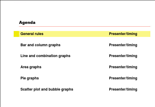
Agenda
General rules Bar and column graphs Line and combination graphs Area graphs Pie graphs Scatter plot and bubble graphs
In general, include all relevant information while keeping the graph as simple as possible
国际知名咨询公司的图表大全ppt课件

Title is bold, with the time period appearing after a comma. Always write out the year in full. The optional subtitle provides additional info on the data and is not bold, italics, 2 points smaller than the title. Line spacing is 1
0
Title, time period
Subtitle
6 10
7
15 13 7 8 10 4
24 22
5
10
15
20
25
Axis title
28 30
Source: Text is Arial, 8-point, plain; a semicolon should separate each item; the line should end in a period.
Bar graph, 2 data series
Axis title
Category A Category B Category C Category D Category E
0
Title, time period
Subtitle
6 6
10 10
7 7
15 15
5
10
15
20
Axis title
Source: Text is Arial, 8-point, plain; a semicolon should separate each item; the line should end in a period.
国际知名咨询公司的ppt图表大全课件
Bar graph, 1 data series
Title, time period Subtitle
Axis title
Axis title
Source: Text is Arial, 8-point, plain; a semicolon should separate each item; the line shoLeabharlann ld end in a period.
All numbers in the graph (data and axis labels) should be the same size. Text labels may be smaller if necessary
Do not add unit symbols (e.g., $ or M) to the axis labels (except for %). Set the intervals to the largest reasonable value possible
When necessary, give the total for the column in a separate box
Title, time period Subtitle
Axis title
Axis title
100% stacked bar graph
Source: Text is Arial, 8-point, plain; a semicolon should separate each item; the line should end in a period.
If a given data element is too small to fit a data label, place the label outside in a separate text box
国际知名咨询公司的图表大全85456--资料
Try to use colors from the main color palette as much as possible
When choosing colors for adjacent graph elements, be sure to alternate light and dark colors (examples from the color palette shown below):
Presenter/timing Presenter/timing Presenter/timing Presenter/timing Presenter/timing Presenter/timing
Create graphs using the native PowerPoint chart software, rather than pasting graphs from Excel
When the data refers to projected or estimated figures, add “E” to the year label
Remember to adjust the document title tracker when you create a new document. It should match the name of the PowerPoint file
Stacked bar graph
Title, time period
Subtitle
Category A 6 6 3 5 1 21
Category B 10
10 5 7 3
35
Category C 10
10 7
94
40
知名咨询公司KPMG全套内部培训教程1

目录
• KPMG公司及业务介绍 • 咨询行业概述与市场趋势 • KPMG内部培训体系介绍 • 专业技能提升课程 • 行业知识拓展课程 • 职业素养提升课程
01
KPMG公司及业务介 绍
KPMG公司历史与发展
创立初期
国际化进程
KPMG起源于19世纪的荷兰,由Piet Klynveld、William Piet、Johann Plenk 和Alfred Goerdeler四人共同创立。
掌握商业计划书的写作技巧和注意事项,如清晰表达商业想法、突出亮 点和优势、合理预测市场前景等。
03
商业计划书案例分析与实战演练
通过案例分析和实战演练,提高商业计划书的撰写能力和水平。
项目管理与团队协作能力
1 2 3
项目管理基础知识
了解项目管理的基本概念、原则和方法,包括项 目范围管理、时间管理、成本管理、质量管理等 方面。
竞争格局
国际知名咨询公司占据市场主导地位,本土咨询公司逐渐崛 起。
主要参与者
麦肯锡、波士顿咨询、贝恩、埃森哲等国际知名咨询公司。
未来发展趋势预测
01
02
03
04
数字化咨询
随着人工智能、大数据等技术 的发展,数字化咨询将成为未
来咨询行业的重要趋势。
跨界合作
咨询公司与其他行业企业跨界 合作,共同为客户提供更全面
创新与数字化能力
KPMG注重创新和数字化发展 ,积极运用新技术和新方法提 升服务质量和效率。
客户关系管理
KPMG重视客户关系管理,通 过深入了解客户需求和建立长 期合作关系,为客户提供个性
化的服务。
企业文化与价值观
诚信为本
国际知名咨询公司的图表大全--图表为主

In general, use whole numbers unless you have a specific reason for including decimals
Axis titles are optional and should not be used if the information is given elsewhere or is self-evident
Do not add unit
120
symbols (e.g., $
or M) to the axis
100
labels (except for
%).
80
Set the intervals
60
to the largest
reasonable value
40
possible
20
0
All numbers in the graph (data and axis labels) should be the same size. Text labels may be smaller if necessary
15
10
7
5
4
0 1998
1999
2000
32 25
2001
2002E
CAGR 1998-2002
68%
The CAGR block should be placed to the right of the graph. Font size should be close to that the graph’s data labels
Dataset 1 Dataset 2 Dataset 3 Dataset 4 Dataset 5
国际知名咨询公司的图表大全85376-57页PPT精选文档

Presenter/timing Presenter/timing Presenter/timing Presenter/timing Presenter/timing Presenter/timing
Create graphs using the native PowerPoint chart software, rather than pasting graphs from Excel
Participation in Harley Davidson conventions, 2019-2019
Thousands of people
35
When used, axis
30
tick marks should
be placed on the
25
outside of the axis
20
16
0
Title, time period
Subtitle
6 10
7
15 13 7 8 10 4
24 22
5
10
15
20
25
Axis title
28 30
Source: Text is Arial, 8-point, plain; a semicolon should separate each item; the line should end in a period.
Bar graph, 2 data series
Axis title
Category A Category B Category C Category D Category E
0
Title, time period
Subtitle
《麦肯锡图表总汇》课件

价值链展示了组织内部的价值创造过程,包括研发、采购、生产、销售和服务等 环节。它有助于企业更好地理解价值创造过程,找出潜在的改进点和机会,提高 组织的效率和效果。
03
CATALOGUE
麦肯锡图表应用
商业分析
商业分析
麦肯锡图表在商业分析中应用广泛, 通过数据可视化,帮助企业理解和分 析市场趋势、消费者行为、竞争态势 等,为决策提供有力支持。
客户金字塔
总结词
客户金字塔是用来表示不同类型客户群体和其需求的图表。
详细描述
客户金字塔展示了不同类型的客户群体,包括潜在客户、普 通客户、忠诚客户和VIP客户等,以及他们的需求和价值。它 有助于企业更好地满足不同类型客户的需求,提高客户满意 度和忠诚度。
价值链
总结词
价值链是用来表示组织内部价值创造过程的图表。
详细描述:该图表通过不同颜色的柱状图展示某公司在各个市场的份额和增长率 ,使得市场定位一目了然,方便决策者快速了解公司在各个市场的表现。
案例二:某公司组织结构优化图
总结词:层次分明
详细描述:该图表采用树状图的形式,清晰地展示了公司的组织结构和各部门之间的关系,有助于员工了解自己的位置和职 责,也有利于公司进行组织结构的优化和调整。
持续学习
不断更新知识和技能, 以适应快速变化的市场
环境
诚信负责
对客户、员工和社会负 责,保持高度的职业道
德和操守
02
CATALOGUE
麦肯锡图表种类
流程图
总结词
流程图是用来表示一系列流程或过程 的图表,通常包括开始、结束和一系 列的步骤。
详细描述
流程图通过图形符号展示了一个过程 的流程顺序,包括决策点、操作、输 入和输出等。它有助于理解和改进流 程,找出潜在的问题和改进点。
国际知名咨询公司的图表大全(PPT 56页)

Shadow R-153 G-153 B-153
R-255 G-254 B-243
R-204 G-204 B-153
R-073 G-133 B-163
R-67 G-67 B-148
Agenda
General rules Bar and column graphs Line and combination graphs Area graphs Pie graphs Scatter plot and bubble graphs
Presenter/timing Presenter/timing Presenter/timing Presenter/timing Presenter/timing Presenter/timing
Create graphs using the native PowerPoint chart software, rather than pasting graphs from Excel
Growth in color bars, 1990-2000
Millions of Pixels
45
40
35
30
25
1
20
5
15
3
10
6
4
3
9 7
5
7
10
Байду номын сангаас10
5
6
0
10
10
1990
1995
2000
If a given data element is too small to fit a data label, place the label outside in a separate text box
国际知名咨询公司的图表大全85466

Bar graph, 2 data series
Axis title
Category A Category B Category C Category D Category E
0
Title, time period
Subtitle
6 6
10 10
7 7
15 15
5
10
15
20
Axis title
Source: Text is Arial, 8-point, plain; a semicolon should separate each item; the line should end in a period.
Make sure that the graph is resized with the same aspect ratio (vertical/horizontal proportions)
If the text becomes distorted, undo immediately!
Use the corner object boxes only when resizing graphs! It is also advisable to hold down the <shift> key when doing so
Stacked bar graph
Title, time period
Subtitle
Category A 6 6 3 5 1 21
Category B 10
10 5 7 3
35
Category C 10
10 7
94
40
When necessary, give the total for the column in a separate box
国际知名咨询公司的图表大全85466

In general, include all relevant information while keeping the graph as simple as possible
Cumulative number of Rhodes Scholars, 1900-1980
Harvard vs. Yale
35
30
25
20
15
10
5
4
0 1995
7 1996
32 25 16
1997
1998E
1999E
The safest way to change the size or position of graph elements is to do so within the native graph application itself
Subtitle
6
Category B
10
Axis title
Category C
7
Category D
24
Category E 0
15
5
10
15
20
25
30
Axis title
Source: Text is Arial, 8-point, plain; a semicolon should separate each item; the line should end in a period.
Stacked bar graph
Title, time period
Subtitle
Category A 6 6 3 5 1 21
Category B 10
10 5 7 3
35
好用的著名咨询公司图表绘制教材ppt课件

COM/010308/SH-Charts (2000GB)
玩具熊生
产企业
1988 1989 1990 1991 1992 1993 1994 1995 1996 1997 1998
1 2 3 4 5 6 客户 总额
232.6 256.6 292.6 269.4 252.2 248.7 247.0 204.2 242.8 278.4 312.7 134.1 142.0 163.6 151.0 204.6 241.3 270.4 342.3 422.8 468.7 524.8
线形图
散点图
12
麦肯锡制作的图表都遵循标准的格式
COM/010308/SH-Charts (2000GB)
信息标题陈述 对所列数据的 理解
图表标题介绍 图表的主题
脚注对图表中 的某一元素进 行评述
对甲产品的需求在过去5年已经增长了2倍多
甲产品的市场需求 百万元
16 14
7
10
9*
6
4
6
4
3
8
9
6
5
2
成功的图表都具备以下几项关键要素
COM/010308/SH-Charts (2000GB)
每张图表都 传达一个明 确的信息
少而精
销售额正稳步上升
图表与 标
500 400 300 200 100
0 1月 2月 3月 4月 5月 6月 7月 8月
清晰易读
格式简单 明了并且 前后连贯
61.0 65.6 69.0 61.6 82.5 89.7 93.2 105.5 137.1 167.1 170.2 59.3 64.5 71.4 52.0 89.3 97.1 108.7 114.8 146.2 158.3 163.9 394.8 404.9 430.1 399.5 510.4 536.5 589.6 607.9 761.2 879.9 957.5 128.3 134.7 144.1 130.0 176.1 194.0 209.6 212.2 254.9 281.6 353.4 400.3 386.3 393.6 357.4 466.6 477.3 493.4 472.9 521.9 517.7 514.9 1409.4 1451.6 1564.7 1420.5 1781.7 1884.6 2012.1 2059.5 2586.9 2751.7 2997.4
- 1、下载文档前请自行甄别文档内容的完整性,平台不提供额外的编辑、内容补充、找答案等附加服务。
- 2、"仅部分预览"的文档,不可在线预览部分如存在完整性等问题,可反馈申请退款(可完整预览的文档不适用该条件!)。
- 3、如文档侵犯您的权益,请联系客服反馈,我们会尽快为您处理(人工客服工作时间:9:00-18:30)。
Use the corner object boxes only when resizing graphs! It is also advisable to hold down the <shift> key when doing so
Try to use colors from the main color palette as much as possible
When choosing colors for adjacent graph elements, be sure to alternate light and dark colors (examples from the color palette shown below):
Participation in Harley Davidson conventions, 1998-2002
Thousands of people
35
When used, axis
30
tick marks should
be placed on the
25
outside of the axis
20
16
Be careful when resizing graphs!
If resizing graphs in the main PowerPoint application, make sure to use only the corner object boxes (see diagram)
Make sure that the graph is resized with the same aspect ratio (vertical/horizontal proportions)
Growth in color bars, 1990-2000
Millions of Pixels
45
40
4
35
3
30
9 7
25
1
20
5
15
3
5
7
10
10
10
6
5 6
0
1990
10 1995
10element is too small to fit a data label, place the label outside in a separate text box
Templates – Graphs
US Business Group
Agenda
General rules Bar and column graphs Line and combination graphs Area graphs Pie graphs Scatter plot and bubble graphs
Title is bold, with the time period appearing after a comma. Always write out the year in full. The optional subtitle provides additional info on the data and is not bold, italics, 2 points smaller than the title. Line spacing is 1
When the data refers to projected or estimated figures, add “E” to the year label
Remember to adjust the document title tracker when you create a new document. It should match the name of the PowerPoint file
In general, use whole numbers unless you have a specific reason for including decimals
Axis titles are optional and should not be used if the information is given elsewhere or is self-evident
15
10
7
5
4
0 1998
1999
2000
32 25
2001
2002E
CAGR 1998-2002
68%
The CAGR block should be placed to the right of the graph. Font size should be close to that the graph’s data labels
35 30 25 20 15 10
4 5 0
1995
7 1996
32 25 16
1997
1998E
1999E
The safest way to change the size or position of graph elements is to do so within the native graph application itself
Presenter/timing Presenter/timing Presenter/timing Presenter/timing Presenter/timing Presenter/timing
Create graphs using the native PowerPoint chart software, rather than pasting graphs from Excel
If you want to insert a callout, use this type of text box, not the yellow ones used in this document for editorial comments
Select from the palette shown below for box fills, graphs, shadows, and other color elements