最新国际知名咨询公司的图表大全
合集下载
国际知名咨询公司的图表大全85466-精品文档57页

Subtitle
6
Category B
10
Axis title
Category C
7
Category D
24
Category E 0
15
5
10
15
20
25
30
Axis title
Source: Text is Arial, 8-point, plain; a semicolon should separate each item; the line should end in a period.
35
30
25
20
15
10
5
4
0 1995
7 1996
32 25 16
1997
1998E
1999E
The safest way to change the size or position of graph elements is to do so within the native graph application itself
Dataset 1 Dataset 2
24 24
25
30
Bar graph, 12 categories
Axis title
Category A Category B Category C Category D Category E Category F Category G Category H Category I Category J Category K Category L
Yale Harvard
42 1900
78 1920
16 20
50 25
1940
国际知名咨询公司的图表大全85466

In general, include all relevant information while keeping the graph as simple as possible
Cumulative number of Rhodes Scholars, 1900-1980
Harvard vs. Yale
35
30
25
20
15
10
5
4
0 1995
7 1996
32 25 16
1997
1998E
1999E
The safest way to change the size or position of graph elements is to do so within the native graph application itself
Subtitle
6
Category B
10
Axis title
Category C
7
Category D
24
Category E 0
15
5
10
15
20
25
30
Axis title
Source: Text is Arial, 8-point, plain; a semicolon should separate each item; the line should end in a period.
Stacked bar graph
Title, time period
Subtitle
Category A 6 6 3 5 1 21
Category B 10
10 5 7 3
35
咨询公司图表大全

Presenter/timing Presenter/timing Presenter/timing Presenter/timing Presenter/timing Presenter/timing
Create graphs using the native PowerPoint chart software, rather than pasting graphs from Excel
Subtitle
6
Category B
10
Axis title
Category C
7
Category D
24
Category E 0
15
5
10
15
20
25
30
Axis title
Source: Text is Arial, 8-point, plain; a semicolon should separate each item; the line should end in a period.
Stacked bar graph
Title, time period
Subtitle
Category A 6 6 3 5 1 21
Category B 10
10 5 7 3
35
Category C 10
10 7
94
40
When necessary, give the total for the column in a separate box
Yale Harvard
42 1900
78 1920
16 20
50 25
1940
1960
99 32
国际知名咨询公司的图表大全-57页PPT文档资料

Do not add unit
120
symbols (e.g., $
or M) to the axis
100
labels (except for
%).
80
Set the intervals
60
to the largest
reasonable value
40
possible
20
0
All numbers in the graph (data and axis labels) should be the same size. Text labels may be smaller if necessary
Stacked bar graph
Title, time period
Subtitle
Category A 6 6 3 5 1 21
Category B 10
10 5 7 3
35
Category C 10
10 7
94
40
When necessary, give the total for the column in a separate box
In general, do not use borders on bars, columns, pie pieces, et cetera
Be careful when resizing graphs!
If resizing graphs in the main PowerPoint application, make sure to use only the corner object boxes (see diagram)
Shadow R-153 G-153 B-153
常用国际知名咨询公司的图表大全

24
Category E 0
15
5
10
15
20
25
30
轴头衔
来源: 文本是Arial, 8-point, 平原; 分号应该分开的各自的项目; 线应该结果时期.
轴头衔
条图表, 2数据系列
头衔, 时间时期
副题
Category A Category B
6 6
10 10
Dataset 1 Dataset 2
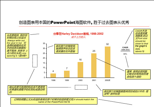
创造图表用本国的PowerPoint海
图软件, 胜于过去图表从优秀
头衔是粗体, 有时 间时期出现之后逗 点.Always write
out the year in full. 可选择的副题供应 另外的信息在数据 和是不粗体, 斜体 字, 2点小的比头 衔.Line spacing is 1歈d哨?
分享在Harley Davidson常规, 1998-2002
成千上万的人
35
就在那个时候使用,
30
轴滴答声标志应该
是放置在在外面轴
25
32 25
20
16
CAGR 1998-2002
68%
CAGR木块 应该是放置 到图表.的 正义Font size should be close to that the graph’s data labels?$
15
10
5
4
0 1998
色(例子从调色板表明在下面):
生长在颜色马齿龈, 1990-2000
像素的数百万
45
4
40
35
3
9
30
7
25
1
5
7
20
5
国际知名咨询公司的图表大全85456--资料
Try to use colors from the main color palette as much as possible
When choosing colors for adjacent graph elements, be sure to alternate light and dark colors (examples from the color palette shown below):
Presenter/timing Presenter/timing Presenter/timing Presenter/timing Presenter/timing Presenter/timing
Create graphs using the native PowerPoint chart software, rather than pasting graphs from Excel
When the data refers to projected or estimated figures, add “E” to the year label
Remember to adjust the document title tracker when you create a new document. It should match the name of the PowerPoint file
Stacked bar graph
Title, time period
Subtitle
Category A 6 6 3 5 1 21
Category B 10
10 5 7 3
35
Category C 10
10 7
94
40
国际知名咨询公司的图表大全--图表为主

In general, use whole numbers unless you have a specific reason for including decimals
Axis titles are optional and should not be used if the information is given elsewhere or is self-evident
Do not add unit
120
symbols (e.g., $
or M) to the axis
100
labels (except for
%).
80
Set the intervals
60
to the largest
reasonable value
40
possible
20
0
All numbers in the graph (data and axis labels) should be the same size. Text labels may be smaller if necessary
15
10
7
5
4
0 1998
1999
2000
32 25
2001
2002E
CAGR 1998-2002
68%
The CAGR block should be placed to the right of the graph. Font size should be close to that the graph’s data labels
Dataset 1 Dataset 2 Dataset 3 Dataset 4 Dataset 5
国内外著名的咨询公司
国内外著名的咨询公司
国际著名咨询公司:麦肯锡、罗兰贝格、科尔尼、波士顿、毕博、埃森哲、锡恩、安达信
国内著名咨询公司:天行健企业咨询、远卓、新华信、汉普、北大纵横
另外还有:叶茂中策划(广告)、麦肯特(营销传播网)
中国最优秀的市场调研公司:艾瑞市场咨询iRearch
中智库玛(中国著名在线市场调研公司)
国外著名的市场调研公司:
DisplaySearch(DisplaySearch是一个由29名成员组成的核心团队,分布于北美和亚洲,提供全套有价值的市场预测,技术评估,调查,研究和分析,并组织有影响力的全球性行业事件。
)
iSuppli(iSuppli是一家全球领先的针对电子制造领域的市场研究公司。
)
IDC(国际数据公司(IDC)是全球著名的市场咨询和顾问机构。
)MCG(MCG是一家国际著名的咨询公司,在市场调研领域有众多成功案例。
)
国外著名的商情数据库有:DIALOG、DATA_STAR、ORBIT、DUN &BRADS系统等。
更多咨询公司介绍:。
(常用)国际知名咨询公司的图表大全
轴头衔
来源: 文本是Arial, 8-point, 平原; 分号应该分开的各自的项目; 线应该结果时期.
备忘录
普通规则 条和列图表 线和结合图表 范围图表 馅饼图表 分散小块土地和泡沫图表 推荐者/计时 推荐者/计时 推荐者/计时 推荐者/计时 推荐者/计时 推荐者/计时
基本线图表有数据标签
头衔, 时间时期
C
D
F
Ca te go ry
Ca te go ry
Ca te go ry
Ca te go ry
Ca te go ry
Ca te go ry
G Ca te go ry
A
B
E
Ca te go ry
堆列图表
头衔, 时间时期
副题
90 80 70 60
CAGR 84
总数 分类-E xx%
10
54 40 35 21
3 7 5 10 10 Category B 4 9 7 10 10 Category C 15 Category D 6 10 8 15
Dataset 5
xx%
14 12
Dataset 4
xx%
轴头衔
50 40 30 20 10 0 1 5 3 6 6 Category A
Dataset 3
xx%
24
Dataset 2
xx%
24
Dataset 1
xx%
Category E
轴头衔
来源:
文本是Arial, 8-point, 平原; 分号应该分开的各自的项目; 线应该结果时期.
100% 堆列图表
头衔, 时间时期
副题
100% 90% 80% 70% 5 7 5 7 6 10 10 9 1 3 4 6 10 8 10 14 12
国际知名咨询公司的图表大全85376-57页PPT精选文档

Presenter/timing Presenter/timing Presenter/timing Presenter/timing Presenter/timing Presenter/timing
Create graphs using the native PowerPoint chart software, rather than pasting graphs from Excel
Participation in Harley Davidson conventions, 2019-2019
Thousands of people
35
When used, axis
30
tick marks should
be placed on the
25
outside of the axis
20
16
0
Title, time period
Subtitle
6 10
7
15 13 7 8 10 4
24 22
5
10
15
20
25
Axis title
28 30
Source: Text is Arial, 8-point, plain; a semicolon should separate each item; the line should end in a period.
Bar graph, 2 data series
Axis title
Category A Category B Category C Category D Category E
0
Title, time period
Subtitle
国际知名咨询公司的图表大全-精选
In general, use whole numbers unless you have a specific reason for including decimals
Axis titles are optional and should not be used if the information is given elsewhere or is self-evident
Presenter/timing Presenter/timing Presenter/timing Presenter/timing Presenter/timing Presenter/timing
Bar graph, 1 data series
Category A
Title, time period
0
Title, time period
Subtitle
6 10
7
15 13 7 8 10 4
24 22
5
10
15
20
25
Axis title
28 30
Source: Text is Arial, 8-point, plain; a semicolon should separate each item; the line should end in a period.
Dataset 1 Dataset 2
24 24
25
30
Bar graph, 12 categories
Axis title
Category A Category B Category C Category D Category E Category F Category G Category H Category I Category J Category K Category L
国际知名咨询公司的图表大全(PPT 56页)

Shadow R-153 G-153 B-153
R-255 G-254 B-243
R-204 G-204 B-153
R-073 G-133 B-163
R-67 G-67 B-148
Agenda
General rules Bar and column graphs Line and combination graphs Area graphs Pie graphs Scatter plot and bubble graphs
Presenter/timing Presenter/timing Presenter/timing Presenter/timing Presenter/timing Presenter/timing
Create graphs using the native PowerPoint chart software, rather than pasting graphs from Excel
Growth in color bars, 1990-2000
Millions of Pixels
45
40
35
30
25
1
20
5
15
3
10
6
4
3
9 7
5
7
10
Байду номын сангаас10
5
6
0
10
10
1990
1995
2000
If a given data element is too small to fit a data label, place the label outside in a separate text box
- 1、下载文档前请自行甄别文档内容的完整性,平台不提供额外的编辑、内容补充、找答案等附加服务。
- 2、"仅部分预览"的文档,不可在线预览部分如存在完整性等问题,可反馈申请退款(可完整预览的文档不适用该条件!)。
- 3、如文档侵犯您的权益,请联系客服反馈,我们会尽快为您处理(人工客服工作时间:9:00-18:30)。
Column graph, 1 data series
Axis title
35
30
25
20
15
10
5
4
0 1998
Title, time period
Subtitle
25 16 7
1999
2000 Axis title
2001
Source: Text is Arial, 8-point, plain; a semicolon should separate each item; the line should end in a period.
Bar graph, 1 data series
Category A
Title, time period
Subtitle
6
Category B
10
Axis title
Category C
7
Category D
24
Category E 0
15
5
10
15
20
25
30
Axis title
Source: Text is Arial, 8-point, plain; a semicolon should separate each item; the line should end in a period.
国际知名咨询公司的图表大 全
Agenda
General rules Bar and column graphs Line and combination graphs Area graphs Pie graphs Scatter plot and bubble graphs
Presenter/timing Presenter/timing Presenter/timing Presenter/timing Presenter/timing Presenter/timing
Stacked bar graph
Title, time period
Subtitle
Category A 6 6 3 5 1 21
Category B 10
10 5 7 3
35
Category C 10
10 7
94
40
When necessary, give the total for the column in a separate box
100% stacked bar graph
Category A
6
Category B
10
Category C
10
Category D
24
Title, time period
Subtitle
6
3
5
1
10
5
7
3
10
7
9
4
24
12
14
10
These “series lines” are optional and can be turned on and off under “Format Data Series/Options”
Dataset 1 Dataset 2 Dataset 3 Dataset 4 Dataset 5
Axis title
Category D
24
24
12
14
10
84
Category E
15
15
8
10 6
54
0
10
20
30
40
50
60
70
80
90
Axis title
Source: Text is Arial, 8-point, plain; a semicolon should separate each item; the line should end in a period.
32
2002E
CAGR
1998-2002
xx%
Column graph, 2 data series
Axis title
Title, time period
Subtitle
70
Column 1
60
Column 2
50
40 32
30
20
10
8 4
0 Category A
14 7
Category B
16 Category C
0
Title, time period
Subtitle
6 10
7
15 13 7 8 10 4
24 22
5
10
15
20
25
Axis title
28 30
Source: Text is Arial, 8-point, plain; a semicolon should separate each item; the line should end in a period.
Axis title
50 25 Category D
64 32 Category E
Source: Text is Arial, 8-point, plain; a semicolon should separate each item; the line should end in a period.
Dataset 1 Dataset 2 Dataset 3 Dataset 4 Dataset 5
Axis title
Category E
15
0%
20%
15
8
40%
60%
Axis title
10 80%
6 100%
Source: Text is Arial, 8-point, plain; a semicolon should separate each item; the line should end in a period.
Dataset 1 Dataset 2
24 24
25
30
Bar graph, 12 categories
Axis title
Category A Category B Category C Category D Category E Category F Category G Category H Category I Category J Category K Category L
Bar graph, 2 data series
Axis title
Category A Category B Category C Category D Category E
0
Title, time period
Subtitle
6 6
10 10
7 7
15 15
5
10
15
20
Axis title
Source: Text is Arial, 8-point, plain; a semicolon should separate each item; the line should end in a period.