雅思小作文柱状图
雅思写作小作文范文 雅思写作柱状图bar chart 无报酬工作时间.doc

雅思写作小作文范文雅思写作柱状图bar chart 无报酬工作时间今天我们雅思写作小作文分范文的文章来研究下柱状图bar chart。
该图表按照所拥有的孩子的数量将婚后夫妇分成三类:没有孩子,有1到2个孩子,有3个以上孩子。
并在每个类别中都给出了男性和女性每周所做的无报酬工作的时间。
对比起来还是比较容易的。
小编搜集了一篇相关的高分范文,以供大家参考。
雅思写作小作文题目The diagram below shows the average hours of unpaid work per week done by people in different categories. (Unpaid work refers to such activities as childcare in the home, housework, and gardening.)Summarise the information by selecting and reporting the main features, and make comparisons where relevant.雅思写作小作文范文The given column graph shows information on the duration of unpaid works done by men and women of different categories.上面的柱状图给出的信息为不同类别的男性和女性所做的无报酬工作的持续时间。
As is presented in the illustration, married women who don’t have children do the unpaid-works (gardening, child care, and household works) 30 hours per week whereas married men do the similar unpaid jobs for about 18 hours per week. Women, this translation is from Laokaoya website, who have one or two children do such work for 50 hours/week but the men from the same category do only 17hours (approximately) each week. The women who have more than 3 kids seem to work the highest amount of unpaid works per week and that is nearly 60 hours. Surprisingly male from the same category work even less; amounting only 16 hours (approximately) of unpaid works.按照说明中所呈现的内容,结婚而没有孩子的女性每周所做没有报酬的工作(园艺,照顾孩子和整理家务)的时间为30小时。
雅思写作-小作文范文-柱状图

柱状图C1T3题目The chart below shows the amount of money per week spent on fast foods in Britain. The graph shows the trends in consumption of fast foods.Write a report a university lecturer describing the information shown below.The chart shows that high income earners consumed considerably more fast foods than the other income groups, spending more than twice as much on hamburgers (43 pence per person per week) than on fish and chips or pizza (both under 20 pence). Average income earners also favored hamburgers, spending 33 pence per person per week, followed by fish and chips at 24 pence, then pizza at 11 pence. Low income earners appear to spend less than other income groups on fast foods, though fish andchip remains their most popular fast food, followed by hamburgers and then pizza. From the graph we can see that in 1970, fish and chips were twice as popular as burgers, pizza being at that time the least popular fast food. The consumption of hamburgers and pizza has risen steadily over the 20 year period to 1990 while the consumption of fish and chips has been in decline over that same period with a slight increase in popularity since 1985.分析:题目The chart below shows the amount of money per week spent on fast foods in Britain. The graph shows the trends in consumption of fast foods.两句话,两个图第一段The chart shows that high income earners consumed considerably more fast foods than the other income groups, spending more than twice as much on hamburgers (43 pence per person per week) than on fish and chips or pizza (both under 20 pence).•说明了高收入人群的两个特点,第一是消耗快餐最多,第二是人群中hamburger, fish and chips, pizza的特点•spending more than twice as much on hamburgers than on fish and chip and chips or pizza 这是一句令人费解的句子,含义应为“消耗的汉堡是薯片或匹萨的两倍多”,应用的句型应当为典型的表示倍数关系的句型“n times as…as”,比如✓This airplane flies two times as fast as that one. 这家飞机的飞行速度是那架的两倍。
雅思作文真题解析及范文分享

雅思作文真题解析及范文分享为了让大家更好的备考雅思写作,我给大家整理了雅思作文真题,下面我就和大家共享,来观赏一下吧。
2022年11月1日雅思小作文真题解析及范文:柱状图小作文题目是:The chart below shows the average time 16-22-year olds spent on playing video games in four different countries between 1992 and 2022.Summarize the details. Select and report the main features and make comparisons where relevant.范文解析该柱状图难度中等偏下,数字相对较少,共有8个数字。
让我们先来看一下3w(when, where, what)。
When是过去的两个年份1992和2022,切记用过去时态。
Where为四个国家,what为16-22岁的年轻人花费在视频嬉戏上的时间。
可以看出when和where两个变量,要求我们描述这十年间的变化趋势和国家之间的静态对比。
所以考生可以根据时间为主线去分段,也可以根据国家去分段。
雅思小作文真题范文:The bar chart compares the amount of time spent on video games on average by youngsters aged between 16-22 years old from four countriesin two years 1992 and 2022.该柱状图对比了1992年至2022年期间,来自四个国家、年龄在16岁至22岁之间的青少年平均花在电子嬉戏上的时间。
It is evident that in 1992, the largest amount of time (85 hours) allocated to video games was from young people in country B. This was narrowly followed by country C and country A where respectively 78 hours and 76 hours were spent while it took the minimal hours for thisage group to play video games in country D, standing at merely 50.很明显,在1992年,最大的时间(85小时)安排给视频嬉戏是年轻人的国家。
雅思写作小作文范文 雅思写作柱状图bar chart 六种商品的花费.doc
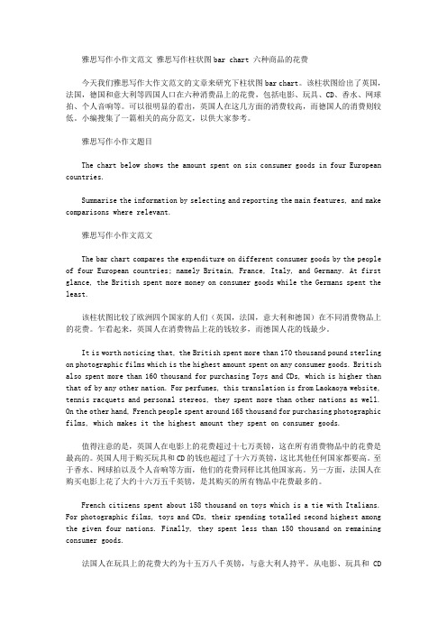
雅思写作小作文范文雅思写作柱状图bar chart 六种商品的花费今天我们雅思写作大作文范文的文章来研究下柱状图bar chart。
该柱状图给出了英国,法国,德国和意大利等四国人口在六种消费品上的花费,包括电影、玩具、CD、香水、网球拍、个人音响等。
可以很明显的看出,英国人在这几方面的消费较高,而德国人的消费则较低。
小编搜集了一篇相关的高分范文,以供大家参考。
雅思写作小作文题目The chart below shows the amount spent on six consumer goods in four European countries.Summarise the information by selecting and reporting the main features, and make comparisons where relevant.雅思写作小作文范文The bar chart compares the expenditure on different consumer goods by the people of four European countries; namely Britain, France, Italy, and Germany. At first glance, the British spent more money on consumer goods while the Germans spent the least.该柱状图比较了欧洲四个国家的人们(英国,法国,意大利和德国)在不同消费物品上的花费。
乍看起来,英国人在消费物品上花的钱较多,而德国人花的钱最少。
It is worth noticing that, the British spent more than 170 thousand pound sterling on photographic films which is the highest amount spent on any consumer goods. British also spent more than 160 thousand for purchasing Toys and CDs, which is higher than that of by any other nation. For perfumes, this translation is from Laokaoya website, tennis racquets and personal stereos, they spent more than other nations as well. On the other hand, French people spent around 165 thousand for purchasing photographic films, which makes it the highest amount they spent on consumer goods.值得注意的是,英国人在电影上的花费超过十七万英镑,这在所有消费物品中的花费是最高的。
雅思小作文-柱状图
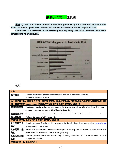
雅思小作文–柱状图题目1:The chart below contains information provided by Australia’s tertiary institutions about the percentage of male and female students enrolled in different subjects in 1995.Summarize the information by selecting and reporting the main features, and make comparisons where relevant.范文:1/ 4题目2:The chart below contains information about USA marriage and divorce rates between 1970 and 2000, and the marital status of adult Americans in two of the years.Summarize the information by selecting and reporting the main features, and make comparisons where relevant.2/ 4读图:动态图【因为有时间】,需要描述变化趋势These two graphs illustrate the change of marital status of American between 1970 and 2000.【改写题目】According to the first graph,there were 2.5m marriages in both 1970 and 1980, and then this figure decreased gradually during the next two decades, reaching to 2m in 2000. By comparison, the number of divorces first increased from 1m in 1970 to around 1.4 in 1980 and then slowly declined back to 1m in 2000.【分类描述第一幅柱状图,时态:一般过去时】As can be seen from the second bar chart,the percentage of married American adults dropped by more than 10% , from 70% in 1970 to less than 60% in 2000. Meanwhile, the percentage of adult Americans who were never married increased from about 15% in 1970 to20% in 2000, and despite still less than 10% , the proportion of divorced adults significantly went up from 1970 to 2000. Moreover, the percentages of the widowed in 1970 and 2000 accounted for less than 10% respectively, and showed a slight drop.【分类描述第二幅柱状图,时态:一般过去时】In conclusion, marital status of Americans in 2000 was not as optimistic as that of three decades ago. (1781.如果有两幅图表,则分成2段分别一一描述2.表示数值上升下降的常用句式有:•The number of …dropped from … to …•The percentage of …increased from about … to less than…•The proportion of … significantly went up from … to …3.切忌没有结论。
雅思写作小作文范文 雅思写作柱状图bar chart 影响工作表现的因素.doc
雅思写作小作文范文雅思写作柱状图bar chart 影响工作表现的因素今天我们雅思写作小作文范文的文章来研究下柱状图bar chart。
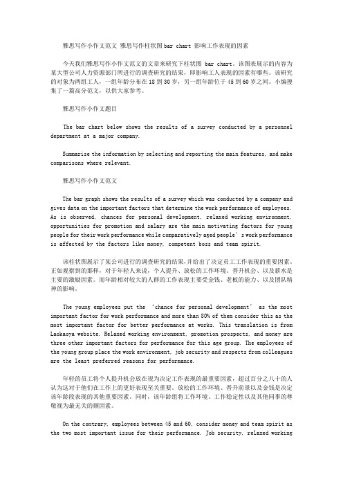
该图表展示的内容为某大型公司人力资源部门所进行的调查研究的结果,即影响工人表现的因素有哪些。
该研究的对象为两组工人,一组年龄分布在18到30岁,另一组年龄位于45到60岁之间。
小编搜集了一篇高分范文,以供大家参考。
雅思写作小作文题目The bar chart below shows the results of a survey conducted by a personnel department at a major company.Summarise the information by selecting and reporting the main features, and make comparisons where relevant.雅思写作小作文范文The bar graph shows the results of a survey which was conducted by a company and gives data on the important factors that determine the work performance of employees. As is observed, chances for personal development, relaxed working environment, opportunities for promotion and salary are the main motivating factors for young people for their work performance while comparatively aged people’s work performance is affected by the factors like money, competent boss and team spirit.该柱状图展示了某公司进行的调查研究的结果,并给出了决定员工工作表现的重要因素。
英语考试作文-8日雅思写作考试小作文范文:柱状图

英语考试作文8日雅思写作考试小作文范文:柱状图The chart below shows the heath spending among five different countries in 2002本题属于静态柱图。
柱子的数目比较多,且每个国家类别中柱子的分布特征也大同小异。
因此考生在处理数据时,务必对比分析不同国家对于同一个项目支出比例的差别。
此外还需多多观察不同项目支出之间的关系,以便突出强调图形最大的特征(数值重点)经典传送门:考官simon 9分写作大小范文共80篇大赏真题传送门:2017全年雅思写作真题范文大汇总(第一时间更新)范文:The bar chart compares the proportion for health expenditure of GDP in five nations in the year 2002.Overall, it is obvious that apart from USA, the percentage of public funding was higher than that of theprivate one among other four countries. And the distinction between these two categories in France was the biggest.Compared with people living in other nations, American themselves paid more for medical bills, reaching 12%; on the contrary, Japanese and French only had to shoulder about 2% of medical cost. As for Germany, they spent a little more than Italian.Referring to public spending, it is interesting to notice that USA also allocated the most proportion for healthcare, at approximately 10%, almost tripled that in Japan whose public spending was the least. German’s public spending ranked the second place ( 9%), which was the same as its ranking in terms of private funding.According to the data illustrated above, we can clearly see that the total spending in USA was the highest, while in Japan was the lowest. Besides, France and German stood at the same ranking.原创来自小站范钰红老师 183 words。
(完整版)雅思写作-小作文范文-柱状图
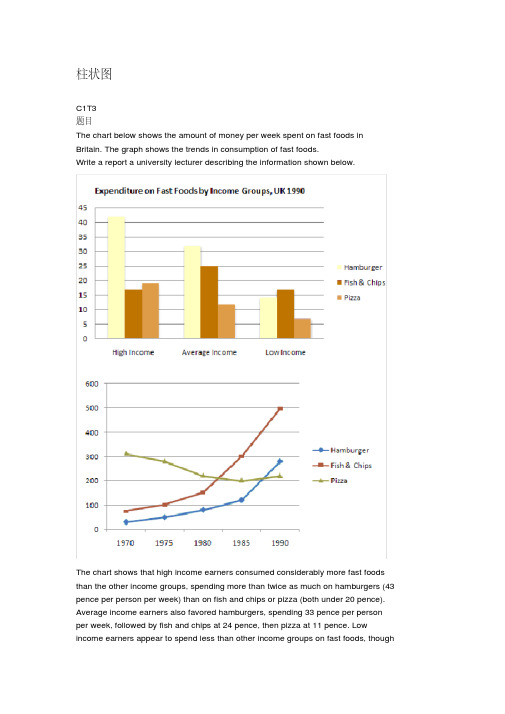
柱状图C1T3题目The chart below shows the amount of money per week spent on fast foods in Britain. The graph shows the trends in consumption of fast foods.Write a report a university lecturer describing the information shown below.The chart shows that high income earners consumed considerably more fast foods than the other income groups, spending more than twice as much on hamburgers (43 pence per person per week) than on fish and chips or pizza (both under 20 pence). Average income earners also favored hamburgers, spending 33 pence per person per week, followed by fish and chips at 24 pence, then pizza at 11 pence. Low income earners appear to spend less than other income groups on fast foods, thoughfish and chip remains their most popular fast food, followed by hamburgers and then pizza.From the graph we can see that in 1970, fish and chips were twice as popular asburgers, pizza being at that time the least popular fast food. The consumption of hamburgers and pizza has risen steadily over the 20 year period to 1990 while the consumption of fish and chips has been in decline over that same period with a slight increase in popularity since 1985.分析:题目The chart below shows the amount of money per week spent on fast foods inBritain. The graph shows the trends in consumption of fast foods.两句话,两个图第一段The chart shows that high income earners consumed considerably more fastfoods than the other income groups, spending more than twice as much onhamburgers (43 pence per person per week) than on fish and chips or pizza(both under 20 pence).说明了高收入人群的两个特点,第一是消耗快餐最多,第二是人群中hamburger, fish and chips, pizza的特点spending more than twice as much on hamburgers than on fish and chip and chips or pizza 这是一句令人费解的句子,含义应为“消耗的汉堡是薯片或匹萨的比如两倍多”,应用的句型应当为典型的表示倍数关系的句型“n times as…as”,? This airplane flies two times as fast as that one. 这家飞机的飞行速度是那架的两倍。
雅思小作文柱形图真题

雅思小作文柱形图真题英文回答:The bar chart illustrates the percentage of people in different age groups who participated in various leisure activities in a particular country. Overall, it can be observed that younger people tend to engage in more physical activities, while older individuals prefer more sedentary leisure activities.Looking at the data in more detail, it is evident that the highest percentage of individuals participating in physical activities is in the 18-24 age group, with approximately 80% of them engaging in sports. This could be attributed to the fact that younger people are generally more energetic and physically active. For instance, many young adults enjoy playing football, basketball, or going to the gym to stay fit.In contrast, the percentage of people participating inphysical activities decreases as age increases. In the 45-54 age group, only around 50% of individuals are involved in sports. This decline could be due to various factors, such as physical limitations or work commitments. For example, middle-aged adults often have demanding jobs and less free time to dedicate to sports activities.Moving on to sedentary leisure activities, the highest percentage of individuals engaged in reading can be observed in the 55-64 age group, with approximately 70% of them reading books or magazines. This could be because older individuals have more leisure time and enjoy the relaxation and mental stimulation that reading provides. For instance, many retirees find pleasure in reading novels or keeping up with current affairs through newspapers.In conclusion, the bar chart demonstrates that younger people are more likely to participate in physical activities, while older individuals prefer sedentaryleisure activities such as reading. These findings can be attributed to factors such as age-related physical limitations, work commitments, and personal preferences. Itis important to note that these trends may vary across different countries and cultures.中文回答:这个柱状图展示了不同年龄段的人参与各种休闲活动的百分比。
雅思柱状图小作文写作模板
雅思柱状图小作文写作模板雅思小作文柱状图是考试中最常见的一类图形,柱状图如何描述写成为大家棘手的问题。
下面为大家分享雅思柱状图小作文写作模板。
大家可以参考学习。
雅思柱状图写作模板1The bar chart compares the proportion of employees of both genders employed in executive positions in ACNE Oil Company within a one-year period between July 1993 and June 1994.As can be seen from the chart, the percentage of male employees generally increased with the rise of the job categories from Grade E to Grade A while the opposite was true with that of women.Grade A, which was reported as the highest position, was a male dominated one in which only one-tenth of the staff were female while male employees accounted for the rest.When it comes to Grade B and C, men also took up over half of the employees, accounting for 80% and 60%, which are 50% and 10% higher than that of women respectively.However, the situation in the other two jobs categories, which were relatively lower in rank, was totally reversed, with women taking up relatively larger proportion. Men constituted roughly 40% in Grade D, 20% less than that if women and most of the working staff in Grade E were women (over 70%) , twice the percentage of men.To sum up, on the rank ladder of ACME Oil Company, male employees took up a higher and higher proportion than the weaker sex as it gradually went up to the peak -------- Grade A.雅思柱状图写作模板2The chart below shows the amount of money per week spenton fast foods in Britain. The graph shows the trends in consumption of fast foods.Write a report for a university lecturer describing the information shown below.柱状图显示的是1970-1990二十年间英国人每周在快餐上花费了多少钱;曲线图展示的是这二十年间快餐消费的趋势。
英语考试作文-10日雅思写作小作文真题范文:柱状图
英语考试作文10日雅思写作小作文真题范文:柱状图为大家带来3月10日场的雅思写作小作文真题及范文。
本场雅思小作文题目是:The chart below shows the average snow depth in Canada during the 6 months. Summarize the information by selecting and reporting the main features,and make comparisons where relevant.请看范文详情:雅思写作小作文范文The bar chart provided gives information about the changes in the snow precipitations measured in millimeters monthly (Nov. to Apr.) in three separate years.柱状图提供的信息是在3年的时间内,每月(11月至4月)的雪量变化的变化情况。
From an overall view, the depths of snow increased from late winter to early spring generally except in year three, meanwhile, this place suffered the heaviest snowstorm in the year two, especially in April.从整体上看,除第三年以外,冰雪的深度从晚冬到早春都有所增加,同时,这一地区遭遇了今年最严重的暴风雪,尤其是在4月。
Specifically, in year one and two, in November, the accumulated snow in this place was 100 millimeters (mm) and over 150 mm. both figures rose significantly during the next five months, peaking in April at 300 mm and 450mm finally.具体来说,在1、2年的11月,这个地方的积雪量是100毫米(mm)和150毫米,这两个数字在接下来的5个月里都有明显的上升,4月份达到了300毫米和450毫米的峰值。
雅思图表作文真题范文
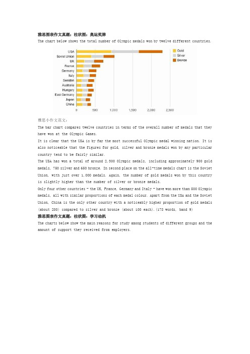
雅思图表作文真题:柱状图:奥运奖牌The chart below shows the total number of Olympic medals won by twelve different countries.雅思小作文范文:The bar chart compares twelve countries in terms of the overall number of medals that they have won at the Olympic Games.It is clear that the USA is by far the most successful Olympic medal winning nation. It is also noticeable that the figures for gold, silver and bronze medals won by any particular country tend to be fairly similar.The USA has won a total of around 2,300 Olympic medals, including approximately 900 gold medals, 750 silver and 650 bronze. In second place on the all-time medals chart is the Soviet Union, with just over 1,000 medals. Again, the number of gold medals won by this country is slightly higher than the number of silver or bronze medals.Only four other countries - the UK, France, Germany and Italy - have won more than 500 Olympic medals, all with similar proportions of each medal colour. Apart from the USA and the Soviet Union, China is the only other country with a noticeably higher proportion of gold medals (about 200) compared to silver and bronze (about 100 each).(178 words, band 9)雅思图表作文真题:柱状图:学习动机The charts below show the main reasons for study among students of different groups and the amount of support they received from employers.参考雅思小作文范文The bar charts compare students of different ages in terms of why they are studying and whether they are supported by an employer.It is clear that the proportion of students who study for career purposes is far higher among the younger age groups, while the oldest students are more likely to study for interest. Employer support is more commonly given to younger students.Around 80% of students aged under 26 study to further their careers, whereas only 10% study purely out of interest. The gap between these two proportions narrows as students get older, and the figures for those in their forties are the same, at about 40%. Students aged over 49 overwhelmingly study for interest (70%) rather than for professional reasons (less than 20%).Just over 60% of students aged under 26 are supported by their employers. By contrast, the 30-39 age group is the most self-sufficient, with only 30% being given time off and help with fees. The figures rise slightly for students in their forties and for those aged 50 or more.(178 words, band 9)雅思图表作文真题:柱状图:The chart below shows numbers of incidents and injuries per 100 million passenger miles travelled (PMT) by transportation type in 2002.雅思小作文范文The bar chart compares the number of incidents and injuries for every 100 million passenger miles travelled on five different types of public transport in 2002.It is clear that the most incidents and injuries took place on demand-response vehicles. By contrast, commuter rail services recorded by far the lowest figures.A total of 225 incidents and 173 injuries, per 100 million passenger miles travelled, took place on demand-response transport services. These figures were nearly three times as high as those for the second highest category, bus services. There were 76 incidents and 66 people were injured on buses.Rail services experienced fewer problems. The number of incidents on light rail trains equalled the figure recorded for buses, but there were significantly fewer injuries, at only 39. Heavy rail services saw lower numbers of such events than light rail services, but commuter rail passengers were even less likely to experience problems. In fact, only 20 incidents and 17 injuries occurred on commuter trains.(165 words, band 9)雅思图表作文真题:柱状图:各地房价The chart below shows information about changes in average house prices in five different cities between 1990 and 2002 compared with the average house prices in 1989.雅思小作文范文:The bar chart compares the cost of an average house in five major cities over a period of 13 years from 1989.We can see that house prices fell overall between 1990 and 1995, but most of the cities saw rising prices between 1996 and 2002. London experienced by far the greatest changes in house prices over the 13-year period.Over the 5 years after 1989, the cost of average homes in Tokyo and London dropped by around 7%, while New York house prices went down by 5%. By contrast, prices rose by approximately 2% in both Madrid and Frankfurt.Between 1996 and 2002, London house prices jumped to around 12% above the 1989 average. Homebuyers in New York also had to pay significantly more, with prices rising to 5% above the 1989 average, but homes in Tokyo remained cheaper than they were in 1989. The cost of an average home in Madrid rose by a further 2%, while prices in Frankfurt remained stable. (165 words)雅思图表作文真题:饼状图:垃圾处理The pie charts below show how dangerous waste products are dealt with in three countries.雅思小作文范文:The charts compare Korea, Sweden and the UK in terms of the methods used in each country to dispose of harmful waste.It is clear that in both the UK and Sweden, the majority of dangerous waste products are buried underground. By contrast, most hazardous materials in the Republic of Korea are recycled.Looking at the information in more detail, we can see that 82% of the UK’s dangerous waste is put into landfill sites. This disposal technique is used for 55% of the harmful waste in Sweden and only 22% of similar waste in Korea. The latter country recycles 69% of hazardous materials, which is far more than the other two nations.While 25% of Sweden's dangerous waste is recycled, the UK does not recycle at all. Instead, it dumps waste at sea or treats it chemically. These two methods are not employed in Korea or Sweden, which favour incineration for 9% and 20% of dangerous waste respectively.(159)。
雅思写作小作文范文 雅思写作柱状图bar chart 学习背后的原因.doc
雅思写作小作文范文雅思写作柱状图bar chart 学习背后的原因今天我们雅思写作小作文范文的文章来研究下柱状图bar chart。
第一张图展示了不同年龄段的人们选择进一步学习的理由,对比究竟是出于兴趣多一些还是出于职业考虑多一些。
第二张图给出了其资金来源的信息,比较是自费的多一些还是雇主支持的多一些。
小编搜集了一篇相应的考官范文,以供大家参考。
雅思写作小作文题目The charts below show the main reasons for study among students of different age groups and the amount of support they received from employers.Summarise the information by selecting and reporting the main features, and make comparisons where relevant.雅思写作小作文范文The bar charts compare students of different ages in terms of why they are studying and whether they are supported by an employer.柱状图比较了不同年龄学生学习的原因,以及他们是否被其雇主所资助。
It is clear that the proportion of students who study for career purposes is far higher among the younger age groups, while the oldest students are more likely to study for interest. Employer support is more commonly given to younger students.很明显,因为职业目的学习的学生比例在年轻人中远高于其他类别,而年纪最大的学生更多的是出于兴趣去学习。
雅思写作小作文范文 雅思写作柱状图bar chart 日常花费.doc

雅思写作小作文范文雅思写作柱状图bar chart 日常花费今天我们雅思写作小作文范文的文章来研究下柱状图bar chart。
该图表共显示了4个国家,分别为德国、意大利、法国和英国,以及这些国家的民众在音响、网球拍、香水、CD、玩具和电影方面的花费。
因为图中数据较多(共有24个),如果每条数据都详细描述的话,无论是时间和篇幅都不够用。
因此小编搜集了一篇相应的考官范文,以供大家参考。
雅思写作小作文题目雅思写作小作文范文The bar chart compares consumer spending on six different items in Germany, Italy, France and Britain.柱状图比较了德国、意大利、法国和英国的消费者在六种不同物品上的花费。
It is clear that British people spent significantly more money than people in the other three countries on all six goods. Of the six items, consumers spent the most money on photographic film.很明显,英国民众在所有六种物品上都明显花费比其他三个国家民众更多的金钱。
在六种物品中,消费者在电影上花费的金钱最多。
People in Britain spent just over £170,000 on photographic film, which is the highest figure shown on the chart. By contrast, Germans were the lowest overall spenders, with roughly the same figures (just under £150,000) for each of the six products.英国民众在电影上的花费超过170000英镑。
雅思4类图表作文范文

雅思4类图表作文范文
一、柱状图。
哇塞,看这柱状图,某城市的私家车数量可是像火箭一样往上
冲啊!五年前才5万辆,现在直接飙到15万辆了,涨得比房价还快!不过话说回来,公共交通那边就不太好过了,以前每天80万人次,
现在只剩下60万了,看来大家都更喜欢自己开车出门啊。
二、折线图。
话说这折线图,看得我心情都跟着起伏了。
那国家失业率啊,
前几年涨得跟股票似的,从4%一路飙升到6%,让人看了都捏把汗。
不过好在后来稳住了,还往下掉了点,虽然没回到从前,但好歹也
算个好兆头吧。
雅思小作文柱状图优秀范文及解析

雅思⼩作⽂柱状图优秀范⽂及解析 雅思写作除了词汇量要达到以外,还有很多提分点的哦。
店铺为雅思栏⽬⼤家带来雅思⼩作⽂柱状图优秀范⽂及解析,希望对⼤家备考雅思有所帮助! 第⼆类:柱状图 You should spend about 20 minutes on this task. The charts below show the levels of participation in education and science in developing and industrialized countries in 1980 and 1990.Write a report a university lecturer describing the information shown below. You should write at least 150 words. model answer 1.The data shows the differences between developing and industrialized countries’ participation in education and science.2.In terms of the number of years of schooling received, we see that the length of time people spend at school in industrialized countries was much greater at 8.5 years in 1980, compared to 2.5 years in developing countries. The gap was increased further in 1900 when the figures rose to 10.5 years and3.5 years respectively. 3.We can see a similar pattern in the second graph, which shows that the number of people working as scientists and technicians in industrialized countries increased from 55 to 85 per 1,000 people between 1980 and 1990, while the number in developing countries went from 12 to 20. 4.Finally, the figures for spending on research and development show that industrialized countries more than doubled their spending, from $200bn to$420bn, while developing countries decreased theirs , from$75bn down to $25bn. 5.Overall we can see that not only are there very large differences between the two economies but that there gaps are widening. 分析 第⼀段: 1 The data shows the differences between developing and industrialized countries’ participation in education and science. 本句话依旧是对题⼲进⾏改写。
(完整版)雅思写作-小作文范文-柱状图
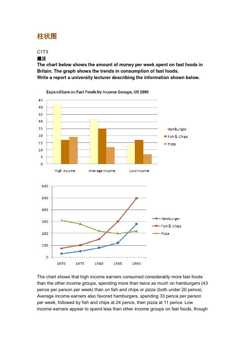
柱状图C1T3题目The chart below shows the amount of money per week spent on fast foods in Britain. The graph shows the trends in consumption of fast foods.Write a report a university lecturer describing the information shown below.The chart shows that high income earners consumed considerably more fast foods than the other income groups, spending more than twice as much on hamburgers (43 pence per person per week) than on fish and chips or pizza (both under 20 pence). Average income earners also favored hamburgers, spending 33 pence per person per week, followed by fish and chips at 24 pence, then pizza at 11 pence. Low income earners appear to spend less than other income groups on fast foods, thoughfish and chip remains their most popular fast food, followed by hamburgers and then pizza.From the graph we can see that in 1970, fish and chips were twice as popular as burgers, pizza being at that time the least popular fast food. The consumption of hamburgers and pizza has risen steadily over the 20 year period to 1990 while the consumption of fish and chips has been in decline over that same period with a slight increase in popularity since 1985.分析:题目The chart below shows the amount of money per week spent on fast foods in Britain. The graph shows the trends in consumption of fast foods.两句话,两个图第一段The chart shows that high income earners consumed considerably more fast foods than the other income groups, spending more than twice as much on hamburgers (43 pence per person per week) than on fish and chips or pizza (both under 20 pence).•说明了高收入人群的两个特点,第一是消耗快餐最多,第二是人群中hamburger, fish and chips, pizza的特点•spending more than twice as much on hamburgers than on fish and chip and chips or pizza 这是一句令人费解的句子,含义应为“消耗的汉堡是薯片或匹萨的两倍多”,应用的句型应当为典型的表示倍数关系的句型“n times as…as”,比如✓ This airplane flies two times as fast as that one. 这家飞机的飞行速度是那架的两倍。
雅思写作小作文范文 雅思写作柱状图bar chart 房价变化.doc
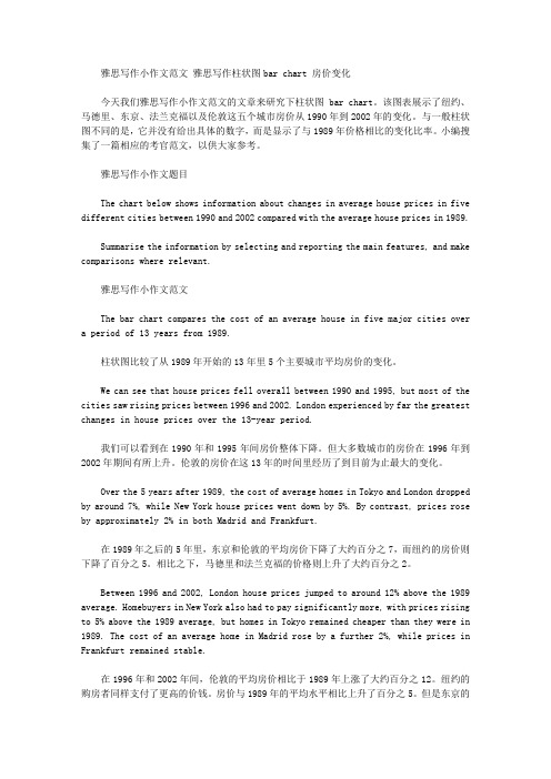
雅思写作小作文范文雅思写作柱状图bar chart 房价变化今天我们雅思写作小作文范文的文章来研究下柱状图bar chart。
该图表展示了纽约、马德里、东京、法兰克福以及伦敦这五个城市房价从1990年到2002年的变化。
与一般柱状图不同的是,它并没有给出具体的数字,而是显示了与1989年价格相比的变化比率。
小编搜集了一篇相应的考官范文,以供大家参考。
雅思写作小作文题目The chart below shows information about changes in average house prices in five different cities between 1990 and 2002 compared with the average house prices in 1989.Summarise the information by selecting and reporting the main features, and make comparisons where relevant.雅思写作小作文范文The bar chart compares the cost of an average house in five major cities over a period of 13 years from 1989.柱状图比较了从1989年开始的13年里5个主要城市平均房价的变化。
We can see that house prices fell overall between 1990 and 1995, but most of the cities saw rising prices between 1996 and 2002. London experienced by far the greatest changes in house prices over the 13-year period.我们可以看到在1990年和1995年间房价整体下降。
雅思作文柱状图

雅思作文柱状图雅思作文柱状图范文雅思柱状图是动态图表,作文切入点是描述趋势。
下面是店铺整理的'柱状图作文范文,希望能帮到大家!预期寿命This bar chart compares how long people can expect to live in seven different countries.We can see that in each of the seven countries people have a life expectancy of between63 years and 83 years. People will live longest in Canada at 83 years and the United States (81 years), while Bangladesh has the lowest life expectancy at just 63 years. Of the other countries, Turkey, Vietnam, Iran and India all have a similar level close to the average of 73 years.We should also note that women are expected to live longer than men in all these countries. On average, females will live approximately 4 years longer than men, although there are differences here. The greatest difference is in the United States (about 5 years),while in Iran females are expected to live only 2 years longer than men. However, the major exception is Bangladesh where both genders have the same life expectancy.Thus, we can see there are comparisons to be made in life expectancy both in geographical location and gender.澳大利亚的通话The chart shows the time spent by Australian resident on different types of telephone calls between 2001 and 2008.Local fixed line calls were the highest throughout the period,rising from 72 billion minutes in 2001 to just under 90 billion in 2003. After peaking at 90 billion the following year, these calls had fallen back to the 2001 figure by 2008.National and international fixed line calls grew steadily from 38 billion to 61 billion at end of the period in question, though the growth slowed over the last two years.There was a dramatic increase in mobile calls from 2 billion to 46 billion minutes. This rise was particularly noticeable between 2005 and 2008, during which time the use of mobile phones tripled.To sum up, although local fixed line calls were still most popular in 2008, the gap between the three categories had narrowed considerably over the second half of the period in question.人口和财富The chart compares population shares in various regions of the world with the distribution of wealth in these same regions. It can be seen that population shares in almost all cases do not relate to the distribution of wealth.Even though North America has only approximately 6% of the world’s population, it boasts nearly 34% of global wealth. A similar situation can be seen in Europe, which has 15% of the global population but 30% of global wealth, and the rich (high income) Asia-Pa cific countries with 5% of the world’s population but 24% of its wealth.On the other hand, the total wealth of people in China, India, Africa, Latin America and Caribbean, and the other poor (lower income) countries in Asia-Pacific is far less than their shares of the world population. This is most striking in India, where 16% of the world’s population own only 1% of the world’s wealth andin China, which has the highest percentage of global population (24%) but only 3% of the world’s wealth.数码产品销量The bar chart compares the turnover in dollars from sales of video games for four different platforms, namely mobile phones, online, consoles and handheld devices, from 2000 to 2006.It is clear that sales of games for three out of the four platforms rose each year, leading to a significant rise in total global turnover over the 7-year period. Sales figures for handheld games were at least twice as high as those for any other platform in almost every year.In 2000, worldwide sales of handheld games stood at around $11 billion, while console games earned just under $6 billion. No figures are given for mobile or online games in that year. Over the next 3 years, sales of handheld video games rose by about $4 billion, but the figure for consoles decreased by $2 billion. Mobile phone and online games started to become popular, with sales reaching around $3 billion in 2003.In 2006, sales of handheld, online and mobile games reached peaks of 17, 9 and 7 billion dollars respectively. By contrast, turnover from console games dropped to its lowest point, at around $2.5 billion.。
- 1、下载文档前请自行甄别文档内容的完整性,平台不提供额外的编辑、内容补充、找答案等附加服务。
- 2、"仅部分预览"的文档,不可在线预览部分如存在完整性等问题,可反馈申请退款(可完整预览的文档不适用该条件!)。
- 3、如文档侵犯您的权益,请联系客服反馈,我们会尽快为您处理(人工客服工作时间:9:00-18:30)。
雅思小作文A类慎浩(words= 163)第一段:题目改写与仿写第二段:总体趋势1 发展变化2 比较第三段:期中一种情况+另一种情况第四段:结论段最大值最小值中间值特殊值起点终点环球雅思慎浩Through what is provided in the(图形),we can learnthe information about major shifts in(标题)during the period of时间respectivelybar / column chart / graph第一段:题目改写仿写Through what is provided in the six column charts(图形),we can learnthe information about major shifts in aids given by six developed countries(标题)during the period of2008, 2009 and 2010 respectively. =33Through prep 通过be provided in 提供Major shift n 主要的变化graph n 图形During the period of adj. 在。
的时期内Respectively adv 分别地Column chart 柱状图bar chart 柱状图Line chart 线形图pie chart 饼状图map 地图Process 流程图First and foremost Besides, in addition ,第二段句型In general, it is noticeable that the total 项目in 时间were slightly more than that in时间, being approximately数值and 数值respectively. In comparison, the 项目in时间wereconsiderably fewer, amounting to about数值.In general adv 总而言之noticeable adj 值得注意的Total adj 总数的be slightly more than adv 略微多于Approximately adv 大约respectively adv 分别地In comparison adv 与之相比considerably adv 相当地Amount to adv 到达达到第二段:总数比多/ 比少In general, it is noticeable that the total aids in 2010 were slightly more than that in 2008, being approximately 60 billion and 56 billion respectively. In comparison, the aids in 2009 were considerably fewer, amounting to about only 50 billion.封闭校区柱状图第二段:总数+ 比多+ 比少In general, it is noticeable that the total passenger kilometers in2000 were slightly more than that in 1900110billion and about 100 billion respectively. Meanwhile, the passenger kilometers in 2000 were slightly more than that in 1990in air, bus and rail. However, the converse condition was actually found in bicycle and motorbike /In comparison, the 项目in时间were considerably fewer, than 项目in 时间amounting to about数值.第二段句型In general, it is noticeable that the total 项目in 时间were slightly more than that in时间, being approximately数值and数值respectively.Meanwhile, the 主题词in 时间were slightly more than that in 时间in项目,项目,and 项目.However, the converse condition was actually found in 项目and项目.Meanwhile adv 于此同时be slightly more than vt 略微地多于Converse condition n 相反的情况be actually found in vt 在。
可以看到However adv 然而In general, it is noticeable that the total主题词in 时间wereslightly more than that in数值and about 数值respectively. Meanwhile, the 主题词in 时间were slightly more than that in时间in项目, 项目and项目. However, the converse condition was actually found in项目, 项目and项目.Football, Rugby, Basketball, Badminton, Fishing, RidingIn this survey , football, rugby, basketball and riding were the principal forms that people joined in sports, being approximately 数值,数值,数值and数值. However, the ratios of badminton and fishing occupied the insignificant share, about 数值and 数值Football, rugby , basketball, badminton , fishing, riding. 2014年4月24号小作文In general, it is noticeable that the total percentage of watching was slightly more than that of participating ,the gap between both was about 数值, (being approximately 数值and 数值respectively. Meanwhile, the scale of men watching sports is dramatically more than that of participating sports in football, basketball and riding. However, the converse condition was actually found in rugby, badminton andfishing.=54Meanwhile, the scale of 主题词is dramatically more than that of 主题词in项目and 项目. However, the converse condition was actually found in项目and 项目=54In general adv 总而言之general adj.普遍的通常的Noticeable adj.可以看见的notice 看+able adj.Slightly adv 略微地be slightly more than 比。
略高Total adj.总数的总体的Being approximately adv 大约respectively adv 分别地In comparison adv 与之先比的是cooperation n 合作配合Compared with 比较be considerable fewer 明显更低地fewer adv 更少更低amounting to adv 达到about adv 大约complete 完成= 41句型:Conspicuously, the scale of 主题词in 时间is larger than that in 时间in the 项目,项目,项目and 项目..However, the主题词in 时间were slightly lower than that in 时间in 项目,but higher than that in时间.Meanwhile, the主题词in 时间occupied the latest, apart from the situation in项目, where the主题词in 时间were less than that in 时间.第三段:分类最大值+(特殊值)+最小值Conspicuously, the scale of aids in 2010 is larger than that in 2008 and 2009in the US, UK, Japan, Germany, and Sweden .However, the aids in2010were slightly lower than that in 2008 in Netherlands ,but higher than that in2009. Meanwhile, the aids in 2009 occupied the latest, apart from the situation in Sweden, where the aids in 2008 were less than thatin 2009. =67句型:Conspicuously, the scale of 主题词in 时间is larger than that in 时间a in the 项目,项目,项目and 项目..However, the 主题词in时间were slightly lower than that in 时间in 项目,but higher than that in时间.Meanwhile, the主题词in 时间occupied the latest, apart from the situation in项目, where the主题词in 时间were less than that in 时间.第三段:句型:In this survey,项目and 项目were the principal N of主题词+时间, 数值and 数值.By contrast,不同的项目represented an insignificant share, with less than数值/By contrast,不同的项目represented an insignificant share,数值,数值,and数值respectivelyThrough what is provided in the 图形,we can learn the information about major shifts of …. During the period ofIn this survey,buses and trains were the principal modes of public transport during the last decade in the UK, each between 40 and 50 billion kilometers travelled. By contrast, the annual distance covered by bicycle, motorbike and air travel only represented an insignificant share,with less than 8 billion passenger kilometers for each.In this survey,项目and 项目were the principal modes of public transport during the last decade in the UK, 数值each between 40 and 数值50 billion kilometers travelled. By contrast, the annual distance covered by bicycle, motorbike and air travel only 不同的项目+数轴represented an insignificant share,with less than 8 billion passenger kilometers for each. By contrast adv 与之相反的是最大值In this survey,项目and 项目were the principal N of主题词+时间, 数值and 数值.最小值By contrast,不同的项目+数轴represented an insignificant share,with less than数值/By contrast,不同的项目+数轴represented an insignificant share,数值,数值,and数值respectivelyRespectively adv 分别地In this survey, the aids given by USA, UK, Germany and Japan were the principal forms among the six developed countries, being approximately数值,数值,数值and 数值respectively. However, the aids offered by Netherland and Swede occupied / represented an insignificant share, about 数值and 数值.In this survey, USA, UK, Germany , and Japan were the principal aiding countries among the six developed countries / that six developed countries provided, 数值,数值,数值and 数值respectively. By contrast , Netherland and Swede represented an insignificant / a lower share, 数值,and数值respectively. Occupied 占据occupy the latest 占据最小第四段:最大值+最小值In brief, the 主题词given by 项目(sth done by sth )were the most among总的项目. However, the opposite situationoccurred in项目.In brief, the aids given by the US were the most among the six countries. However, the opposite situation occurred in Sweden. =22第四段: 差值:最大(差值)+最小(差值)In brief, the gap between drama and romance in the percentage of film releases was the most conspicuous. Meanwhile, as for the percentage of tickets sales, the corresponding situation also occurred between comedy and the equal numbers of fantasy and romance.=39第四段:句型:最大值+最小值(差值比较)In brief, the gap between项目and 项目in the 图形was most conspicuousMeanwhile, the corresponding/opposite situation also occurred between项目and the 项目.最大值+最小值In brief, the 主题词were / was the most among the 项目.However, the opposite situation occurred in 项目The opposite situation occurred in sth =The converse situation emerged in sthIn brief, the passenger kilometers travelled by bus were the most among the six different transports. However, the converse situation emerged in the bicycle.I n brief, the gap between项目and项目was the most among 总的项目. However,the converse situation emerged in between 项目and 项目.。
