DoNetBar使用教程
dotnetbar messageboxex汉化按钮方法

dotnetbar messageboxex汉化按钮方法()1、在解决方案资源管理器下打开application.Design.vb:2、在打开的插入引用:Imports DevComponents.DotNetBar3、在Protected Overrides Sub OnCreateMainForm()过程下主窗体语句加载前插入如下语句:AddHandler LocalizationKeys.LocalizeString, AddressOf LocalizationKeys_LocalizeString3、在类Partial Friend Class MyApplication 下插入如下过程函数:Public Sub LocalizationKeys_LocalizeString(sender As Object, e As LocalizeEventArgs) Select Case e.KeyCase DevComponents.DotNetBar.LocalizationKeys.MessageBoxCancelButtone.LocalizedValue = "取消"e.Handled = TrueCase DevComponents.DotNetBar.LocalizationKeys.MessageBoxYesButtone.LocalizedValue = "是"e.Handled = TrueCase DevComponents.DotNetBar.LocalizationKeys.MessageBoxRetryButtone.LocalizedValue = "重试"e.Handled = TrueCase DevComponents.DotNetBar.LocalizationKeys.MessageBoxAbortButtone.LocalizedValue = "终止"e.Handled = TrueCase DevComponents.DotNetBar.LocalizationKeys.MessageBoxCloseButtone.LocalizedValue = "关闭"e.Handled = TrueCase DevComponents.DotNetBar.LocalizationKeys.MessageBoxContinueButton e.LocalizedValue = "继续"e.Handled = TrueCase DevComponents.DotNetBar.LocalizationKeys.MessageBoxHelpButtone.LocalizedValue = "帮助"e.Handled = TrueCase DevComponents.DotNetBar.LocalizationKeys.MessageBoxIgnoreButton e.LocalizedValue = "忽略"e.Handled = TrueCase DevComponents.DotNetBar.LocalizationKeys.MessageBoxNoButtone.LocalizedValue = "否"e.Handled = TrueCase DevComponents.DotNetBar.LocalizationKeys.MessageBoxOkButtone.LocalizedValue = "确定"e.Handled = TrueCase DevComponents.DotNetBar.LocalizationKeys.MessageBoxTryAgainButton e.LocalizedValue = "重试"e.Handled = TrueEnd SelectEnd Sub4、至此完成,效果如下:。
DotNetBar第三方控件使用笔记

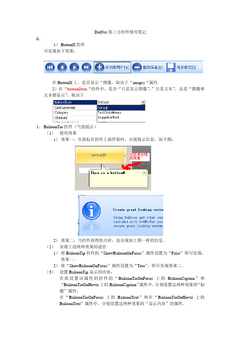
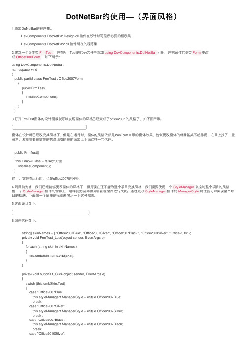
DotNet第三方控件使用笔记一、ButtonX控件可实现如下效果:(1)在ButtonX上,是否显示图像,取决于“images”属性。
(2)在“ButtomItem”控件中,是否“只是显示图像”,“只是文本”,还是“图像和文本都显示”,取决于。
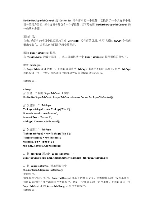
二、BalloonTip控件(气泡提示)在添加了BalloonTip控件后,其他各个控件会出现对应的“……上的BalloonText”和“……上的BalloonCaption”属性,通过修改这两个属性可设置鼠标移动到控件时弹出的气泡提示的标题和内容,也可通过代码设置这个两个属性,如:balloonTip1.SetBalloonCaption(txtUserName,"提示");balloonTip1.SetBalloonText(txtUserName,"输入你的大名吧");balloonTip1.SetBalloonCaption(txtUserPw,"提示;balloonTip1.SetBalloonText(txtUserPw,"大名输完了就是你的密码咯");")1.使用效果1)效果一:在鼠标在控件上面停留时,出现提示信息,如下图:2)效果二:当控件获得焦点时,也出现如上图一样的信息。
2.实现上述两种效果的途径1)将BalloonTip控件的“ShowBalloonOnFacus”属性设置为“False”即可实现效果一。
3.设置BalloonTip显示的内容2)将“ShowBalloonOnFacus”属性设置为“True”,即可实现效果二。
1)在欲设置该属性的控件的“BalloonTipOnFocus上的BalloonCaption”和“BalloonTipOnHover上的BalloonCaption”属性中,分别设置这两种效果的“标题”属性;2)在“BalloonTipOnFocus上的BalloonText”和在“BalloonTipOnHover上的BalloonText”属性中,分别设置这两种效果的“显示内容”的属性。
donetbar安装说明
注意:1.本程序仅供学习交流用,请支持正版软件。
================================================================================ ==2.破解步骤:步骤一.首先安装DotNetBar,然后将解压后的两个破解dll覆盖到原来安装目录下。
步骤二.运行菜单"Microsoft visual studio 2005(8)"->"visual studio tools"->"visual studio 命令提示程序",且在提示符下运行如下DOS命令:-----------------------------------------------------cd <dotnetbar安装目录>gacutil /u DevComponents.DotNetBar2gacutil -u DevComponents.DotNetBar.Design-----------------------------------------------------以上两命令各自的执行结果必须有提示卸载的程序集数 = 1 (或者大于1的数也可)然后运行:-----------------------------------------------------gacutil -i DevComponents.DotNetBar2.dllgacutil -i DevComponents.DotNetBar.Design.dll-----------------------------------------------------步骤三.在VS2005(8)工具箱上,首先删除安装程序添加的DotNetBar选项卡,然后右键选择,"添加选项卡",输入任意合适的选项卡名称,选中新加的选项卡,右键选择“选择项”,添加DevComponents.DotNetBar2.dll控件,则控件添加成功。
DotNetBar安装、破解及使用
DotNetBar安装
安装、、破解及使用
2009-4-20
安装与破解
安装条件:机器上已安装VS2005。
第一步: 安装DotNetBar,即执行DotNetBarSetupVS2008Trial.MSI, 按提示进行。
(注:本程序也可从官网下载)。
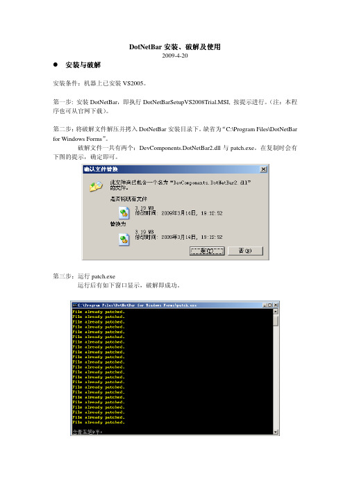
第二步:将破解文件解压并拷入DotNetBar安装目录下。
缺省为“C:\Program Files\DotNetBar for Windows Forms”。
破解文件一共有两个:DevComponents.DotNetBar2.dll与patch.exe。
在复制时会有下图的提示,确定即可。
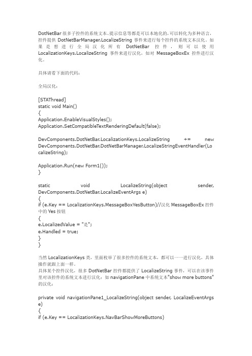
第三步:运行patch.exe
运行后有如下窗口显示,破解即成功。
使用
运行VS2005新建一个windows应用程序项目,进入之后可以看到工具箱中多出了一项:DotNetBar,见下图:
先择一个DotNetBar控件,拖入窗口,运行一下,没有注册提示,好了,可以使用了。
DotNetBar提供了许多例子,在“C:\Program Files\DotNetBar for Windows Forms\Samples”中可以找到,读者可以自己去试一试。
汉化DotNetBar中控件的系统文本
DotNetBar很多子控件的系统文本、提示信息等都是可以本地化的,可以转化为多种语言,控件提供DotNetBarManager.LocalizeString事件来进行每个控件的系统文本汉化。
如果是想进行全局汉化所有DotNetBar控件,则可以使用LocalizationKeys.LocalizeString事件来进行汉化,如对MessageBoxEx控件进行汉化。
具体请看下面的代码:全局汉化:[STAThread]static void Main(){Application.EnableVisualStyles();Application.SetCompatibleTextRenderingDefault(false);DevComponents.DotNetBar.LocalizationKeys.LocalizeString += new DevComponents.DotNetBar.DotNetBarManager.LocalizeStringEventHandler(Lo calizeString);Application.Run(new Form1());}static void LocalizeString(object sender, DevComponents.DotNetBar.LocalizeEventArgs e){if (e.Key == LocalizationKeys.MessageBoxYesButton)//汉化MessageBoxEx控件中的Yes按钮{e.LocalizedValue = "是";e.Handled = true;}}当然LocalizationKeys类,里面枚举了很多控件的系统文本,都可以一一进行汉化,具体操作就跟上面一样。
具体某个控件汉化,很多DotNetBar控件都提供了LocalizeString事件,可以在该事件里对该控件的系统文本进行汉化:如navigationPane中系统文本"show more buttons"的汉化:private void navigationPane1_LocalizeString(object sender, LocalizeEventArgs e) {if (e.Key == LocalizationKeys.NavBarShowMoreButtons){e.LocalizedValue = "显示更多按钮";e.Handled = true;}}其他控件的汉化都跟上面的模式一样,这里就不一一介绍了。
DotNetBar使用简介
DotNetBar使用简介这里都是我自从去年开始用dotnetbar这个vs上的美化控件之后的一些使用心得和使用技巧,我现在几乎每次用到这个控件的时候,都会按照下面的技巧,来安排我的这些控件的排列方式啊,style等等,希望给各位一些抛砖引玉的作用,也欢迎大家写出自己的小技巧,让我们的winform程序更加漂亮~~几个修改的地方1、RIBBONTITLE,一开始要留空,后来用代码修改2、把左上角的圆点的功能删除掉3、左上角要写成:系统状态:联通中4、下来要解决一个问题,就是关于DATAGRID,的TITLE,都要让所有的名称都排下,不要换行使用RIBBONCONTROL要注意的几个问题:1、首先将form的text设置为空2、然后将form的controlbox设置为false3、然后将form的formborderstyle设置为Sizable4、最后一步,在ribboncontrol的标题栏写窗口标题,注意不是text而是RibbonControl1.TitleText = “非煤矿山应急救援指挥系统–基本情况数据库”5、如果你喜欢,我习惯将FORM的STARTPOSITION设置为CENTERSCREEN 使用BAR作为STATESBAR的几个小技巧1、这个BAR是DOTNETBAR系列里的BAR,而不是其他的:》2、要将STYLE设置为OFFICE20073、将ROUNDCORDERS设置为FALSE会好看一点,我试了试,圆角的怎么看都不舒服4、将BARTYPE设置为STATUSBAR使用GROUPPANEL的小技巧:1、把BACKCOLOR设置为透明2、将style中的textlinealignment 设置为center(ps:之前是near实在有点难看,太贴近上部了)3、内部的label一般使用vs自带的标准label即可,不需要使用ribbon的labelx,我觉得肯定会涉及到painting的问题导致性能下降,而且我觉得使用PANELEX1、一般要设置padding为1,1,1,1否则,当内部空间维DOCK FILL的时候,会把PANEL的边框挡住,效果不好看2、如果PANELEX就在RIBBONCONTROL的里面,一般设置LOCATION为3,0,同时在右侧拖动的时候,拖动到一个恰好位置之后,再把SIZE的宽度加4,这样效果很好对TABLE类窗口的修改1、去掉原点下的菜单2、去掉系统:联通中,右侧的那个QUICKITEM3、将DATAGRIDVIEWX的LOCATION调整到3,3,同时,将宽度向右增加24、将每一个PANELX的TEXT都留空美化DATAGRIDVIEWX的几点1、修改ALTERNATINGROWSDEFAULTCELLSTYLE的BACKCOLOR2、修改COLUMNHEADERSHEIGHT建立RIBBONCONTROL的几点小细节1、建立一个FORM,将form的text设置为空,将controlbox设置为false,将startposition设置为centerscreen;2、拖过来一个RIBBONCONTROL,加工一下RIBOONCOTROL,比如是去掉原点下的选项,去掉QUICKITEM等等,然后拖放位置,这时候我一般有两个处理ribboncontrol的方式,一种是利用ribboncontrol作为整个form,那么就将ANCHOR 设置为UP DOWN LEFT RIGHT四个侧面;另外一种是利用ribboncontrol左右一个顶部的导航栏,那样的话,就不需要设置anchor了,去掉多余的ribbontabitem2和ribbontamitem1上多余的ribbonbar1,ribbontabitem1字样不用去掉,可以在程序里统一设置它和titletext的内容3、托一个BAR过来,几点设置,DOCK为BOTTOM,ROUNDCORNER为FALSE,BARTYPE为STATUSBAR,然后再把ribboncontrol的下边缘向下拖,放在ribbonbar旁边4、如果在这里放一个PANELX的时候,有两种情况1)只有一个PANELX,情况简单一点,直接DOCK为FILL就好(发现这样不行,PANEL不会随着RIBBONPANEL的变大而同样变大,所以这个方法OVER了)解决方法:如果是这样,现在找到了一个方法,把PANELX放在LOCATION=3,0,然后在ribboncontrol的sizechanged方法中用这两句变化:Me.PanelEx1.Height = Me.RibbonControl1.Height – 60Me.PanelEx1.Width = Me.RibbonControl1.Width – 6效果比较完美。
DotNetBar第三方控件使用笔记

DotNet第三方控件使用笔记一、ButtonX控件可实现如下效果:(1)在ButtonX上,是否显示图像,取决于“images”属性。
(2)在“ButtomItem”控件中,是否“只是显示图像”,“只是文本”,还是“图像和文本都显示”,取决于。
二、BalloonTip控件(气泡提示)在添加了BalloonTip控件后,其他各个控件会出现对应的“……上的BalloonText”和“……上的BalloonCaption”属性,通过修改这两个属性可设置鼠标移动到控件时弹出的气泡提示的标题和内容,也可通过代码设置这个两个属性,如:balloonTip1。
SetBalloonCaption(txtUserName,"提示");balloonTip1。
SetBalloonT ext(txtUserName,”输入你的大名吧”);balloonTip1。
SetBalloonCaption(txtUserPw,"提示;balloonTip1.SetBalloonT ext(txtUserPw,"大名输完了就是你的密码咯");”)1. 使用效果1)效果一:在鼠标在控件上面停留时,出现提示信息,如下图:2)效果二:当控件获得焦点时,也出现如上图一样的信息。
2. 实现上述两种效果的途径1) 将BalloonTip控件的“ShowBalloonOnFacus”属性设置为“False”即可实现效果一。
3. 设置BalloonTip显示的内容2) 将“ShowBalloonOnFacus”属性设置为“True",即可实现效果二。
1) 在欲设置该属性的控件的“BalloonTipOnFocus上的BalloonCaption”和“BalloonTipOnHover上的BalloonCaption"属性中,分别设置这两种效果的“标题"属性;2) 在“BalloonTipOnFocus上的BalloonT ext”和在“BalloonTipOnHover上的BalloonT ext”属性中,分别设置这两种效果的“显示内容”的属性.4. 属性“AlerAnimation”设置“BalloonTip”出现的效果5. “BalloonTip”除了出现在该控件附近,还可以出现在屏幕的右下角,示例程序如下:private AlertCustom m_AlertOnLoad=null;m_AlertOnLoad=new AlertCustom();Rectangle r=Screen。
DotNet第三方控件使用笔记
DotNet第三方控件使用笔记0、1)ButtonX控件可实现如下效果:在ButtonX上,是否显示“图像,取决于“images“属性2)在“buttomItem“控件中,是否“只是显示图像”,”只是文本”,还是“图像和文本都显示”,取决于1、BalloonTio控件(气泡提示)(1)使用效果1)效果一:在鼠标在控件上面停留时,出现提示信息,如下图:2)效果二:当控件获得焦点时,也出现如上图一样的信息。
(2)实现上述两种效果的途径1)将BalloonTip控件的“ShowBalloonOnFacus”属性设置为“False”即可实现,效果一。
2)将“ShowBalloonOnFacus”属性设置为“True”,即可实现效果二。
(3)设置BalloonTip显示的内容:在欲设置该属性的控件的“BalloonTioOnFocus上的BalloonCaption”和“BalloonTioOnHover上的BalloonCaption”属性中,分别设置这两种效果的“标题”属性;在“BalloonTioOnFocus上的BalloonText”和在“BalloonTioOnHover上的BalloonText”属性中,分别设置这两种效果的“显示内容”的属性。
(4)属性“AlerAnimation”设置“BalloonTip”出现的效果,(5)“BalloonTip”除了出现在该控件附近,还可以出现在屏幕的右下角,示例程序如下:private AlertCustom m_AlertOnLoad=null;m_AlertOnLoad=new AlertCustom();Rectangle r=Screen.GetWorkingArea(this);m_AlertOnLoa d.Location=newPoint(r.Right-m_AlertOnLoad.Width,r.Bottom-m_AlertOnLoad.Height);m_AlertOnLoad.AutoClose=true;m_AlertOnLoad.AutoCloseTimeOut=15;m_AlertOnLoad.AlertAnimation=eAlertAnimation.BottomToTop;m_AlertOnLoad.AlertAnimationDuration=300;m_AlertOnLoad.Show(false);//false::指示该控件是否需要获得焦点才出现“BalloonTip”(6)“BalloonTip”除了可以通过“添加控件”的方式使用,也可以通过编程的方式使用,示例程序如下:DevComponents.DotNetBar.Balloon b=new DevComponents.DotNetBar.Balloon();b.Style=eBallonStyle.Alert;b.CaptionImage=balloonTipFocus.CaptionImage.Clone() as Image;b.CaptionText="Balloon Status Information";b.Text="Balloons are now enabled for Balloon Tip Test area. Hover mouse overthe area and set the focus to any control.";b.AlertAnimation=eAlertAnimation.TopToBottom;b.AutoResize();b.AutoClose=true;b.AutoCloseTimeOut=4;b.Owner=this;//指示父控件b.Show(button2,false);//button2::指示在那个控件附近出现“BalloonTip”(7)还可以对“BalloonTip”出现时的效果进行程序控制,如下:// BalloonTriggerControl property returns control that invoked balloon// BalloonTriggerControl属性返回触发“BalloonTip”的控件if(balloonTipHover.BalloonTriggerControl==groupBox1){// BalloonControl is already prepared Balloon control that is just about to be displayed // Setting BalloonControl to null will cancel balloon displayPoint p=Control.MousePosition;// Adjust cursor position so cursor is below tipp.Offset(-balloonTipHover.BalloonControl.TipOffset,balloonTipHover.BalloonControl.TipLength+ 4);//Offset属性将点p进行平移balloonTipHover.BalloonControl.Location=p;}(8)与之类似的是DotNetToolTip所有控件都有的“ToolTip”属性,也可以是控件在鼠标划过时出现类似的东西,如下图2、DotNetBarManager控件与Bar控件的使用示例效果如下图:(1)DotNetBarManager控件----将该控件添加到工程后,将给Bar控件提供了“停靠点(DockSite)”,可以实现是工具栏在窗体的“上、下、左、右“摆放。
DotNetBar的使用—(界面风格)
DotNetBar的使⽤—(界⾯风格)1.添加DoNetBar的程序集。
DevComponents.DotNetBar.Design.dll 控件在设计时可见所必要的程序集DevComponents.DotNetBar2.dll 控件所在的程序集2.建⽴⼀个窗体类FrmTest,并在FrmTest的代码⽂件中添加using DevComponents.DotNetBar;引⽤,并把窗体的基类Form更改成Office2007Form,如下所⽰:using DevComponents.DotNetBar;namespace wind{public partial class FrmTest : Office2007Form{public FrmTest(){InitializeComponent();}}}3.打开FrmTest窗体的设计⾯板就可以发现窗体的风格已经变成了office2007 的风格了,如下图所⽰。
窗体在设计时已经改变其风格了,但是在运⾏时,窗体的风格依然是WinForm⾃带的窗体效果,貌似更改窗体的继承基类不起作⽤,在⽹上找了⼀些资料,发现需要在窗体的构造函数的最前⾯加上下⾯这样⼀句代码。
public FrmTest(){this.EnableGlass = false;//关键,InitializeComponent();}这下,窗体在运⾏时,也是office2007的风格。
4.到⽬前为⽌,我们已经能够更改窗体的风格了,但是现在还不能为整个项⽬变换风格,我们需要使⽤⼀个StyleManager来控制整个项⽬的风格,拖⼀个StyleManager控件到窗体上,这样就把窗体和风格管理控件进⾏关联。
通过更改StyleManager控件的ManagerStyle属性就可以实现整个项⽬的换肤,下⾯做⼀个简单的⽰例来演⽰⼀下这种效果。
5.界⾯设计如下:6.窗体代码如下。
string[] skinNames = { "Office2007Blue", "Office2007Silver", "Office2007Black", "Office2010Silver", "Office2013" };private void FrmTest_Load(object sender, EventArgs e){foreach (string skin in skinNames){this.cmbSkin.Items.Add(skin);}}private void buttonX1_Click(object sender, EventArgs e){switch (this.cmbSkin.Text){case "Office2007Blue":this.styleManager1.ManagerStyle = eStyle.Office2007Blue;break;case "Office2007Silver":this.styleManager1.ManagerStyle = eStyle.Office2007Silver;break ;case "Office2007Black":this.styleManager1.ManagerStyle = eStyle.Office2007Black;break;case "Office2010Silver":this.styleManager1.ManagerStyle = eStyle.Office2010Silver;break;case "Office2013":this.styleManager1.ManagerStyle = eStyle.Office2013;break;}}这下就实现了窗体的整体⽪肤变换,不仅仅窗体的风格变了,还包括窗体上的控件也会发⽣改变,甚⾄整个项⽬的窗体以及上⾯的控件都会发⽣改变,下⾯将演⽰⼀下效果。
条形码控件DotNetBarcodeV2.4.0说明

DotNetBarcodeV2.4.0说明1. 使用DotNetBarcode 之前,添加引用DotNetBarcode.dll2. 方法一览C#using System;DotNetBarcode bc1 = new DotNetBarcode();在新实例建立的时候也可以指定条形码的类型QRCode=>二维条码,用于手机和PDA 等领域Jan13 => JAN(Japan Article Number)13位。
一般用于普通商品。
Jan8 => JAN(Japan Article Number)8位。
一般用于普通商品。
Code39 =>数字0~9;大写字母A ~Z ;9个其他字符:space ,$, %, *, +, -, ., /, :。
用于商界。
【例】DotNetBarcode bc1 = new DotNetBarcode(DotNetBarcode.Types.Code39)【方法名】W riteBar(string code, float X, float Y, float X2, float Y2, Graphics ev)【功能】画条形码。
【参数】code:条形码的文字X:左上角的X 座标。
Y:左上角的Y 座标。
X2:宽度。
Y2:高度。
ev:System.Drawing.Graphics 【注意点】由于QRCODE 为正方形,所以当X 与Y 不相同时,以小的那个为基准,但QR 骗码为了以1象素单位制作条形码,自动地选择限制Width 和High 的小的一方的大小的最大的象素,以1象素表示条形码大小也不能均衡的情况,条形码不显示【方法名】CopyToClip b oard(string code, float W idth, float High)功能:把当前条码放入剪贴板参数:code: 表示想翻译的条形码的文字Width:宽度。
High:高度。
【注意点】当是一维条码时,Width ,High 可以适当选择,当表示QR 码时,Width 和High 需要相同,因为此时要保证图形为正方形.此方法调用了Clipboard.SetDataObject().Clipboard 类只能用于设置为单线程单元 (STA) 模式的线程中。
dotnetbar.supertabcontrol用法
DotNetBar.SuperTabControl 是DotNetBar 控件库中的一个组件,它提供了一个具有多个选项卡的用户界面,每个选项卡都包含一个子控件。
以下是使用DotNetBar.SuperTabControl 的一些基本步骤:添加引用:首先,确保你的项目中已经添加了对DotNetBar 控件库的引用。
你可以通过NuGet 包管理器来安装它,或者从官方网站下载安装程序。
添加SuperTabControl 控件:在Visual Studio 的设计视图中,从工具箱拖动一个SuperTabControl 控件到你的窗体上。
配置TabPages:在SuperTabControl 控件中,你可以添加多个TabPage 来表示不同的选项卡。
每个TabPage 可以包含一个子控件。
可以通过代码或属性窗口来配置这些选项卡。
示例代码:csharp// 创建一个新的SuperTabControl 实例DotNetBar.SuperTabControl superTabControl = new DotNetBar.SuperTabControl();// 创建第一个TabPageTabPage tabPage1 = new TabPage("Tab 1");Button button1 = new Button();button1.Text = "Button 1";tabPage1.Controls.Add(button1);// 创建第二个TabPageTabPage tabPage2 = new TabPage("Tab 2");TextBox textBox2 = new TextBox();textBox2.Text = "TextBox 2";tabPage2.Controls.Add(textBox2);// 将TabPages 添加到SuperTabControl 中superTabControl.TabPages.AddRange(new TabPage[] { tabPage1, tabPage2 });// 将SuperTabControl 添加到窗体中this.Controls.Add(superTabControl);处理事件:如果你需要响应用户与SuperTabControl 或其子控件的交互,例如切换选项卡或点击按钮,你可以为相应的事件添加事件处理程序。
c#控件dotnetbar的用法
DotNetBar介绍DotNetBar是一款带有51个Windows Form 控件的工具箱,使开发人员可以轻而易举地创建出专业美观的Windows Form应用程序用户界面,控件全部采用C#编写,引入了全部Office 2007 style Ribbon控件、Office 2003 样式、支持Windows XP主题等。
DotNetBar for WindowsForms 8.8 全面支持Office 2010 风格的后台应用程序菜单。
具体功能:●为Office 2007 Ribbon 控件提供了Black,Silver ,Blue三种配色方案,支持Windows VistaGlass、tab groups, ribbon hyper menus, multi-level KeyTips, complete Quick Access Toolbar (QAT),支持Ribbon Menu Tabs●Office 2007 Ribbon Bar 控件具有组合按钮,弹出按钮等●Office 2007 Super Tooltips控件具有18种颜色样式●支持停靠窗口自动隐藏,灵活的视图分割●支持具有Office 2007, 2005, Office 2003/XP/2000,样式的Hyper-Menus 和工具条●支持具有Office 2007和2003样式的导航面板,支持扩展和收缩●Tab Container控件具有9种不同的样式,16种配色方案,支持颜色自定制●Explorer Bar控件使程序员可以创建出具有XP样式的Explorer Bar●Tab-Strip控件具有九种预定义的样式,支持tabbed MDI ,颜色自定义●Side Bar 控件具有两种布局类型、5种不同的样式、18种预定义颜色方案,支持拖拉功能●BubbleBar 是一个灵活的toolbar控件●Stand alone Bar可以用于创建具有Office 2007 的状态条●可扩展的Splitter控件●可展开的Panel控件,●多功能的Panel控件●Balloon/Alert控件用于传达一些重要的信息给最终用户●Wizard控件支持Wizard97规范,可以创建安装文件。
DotNetBarv8.8.0.0安装说明文档
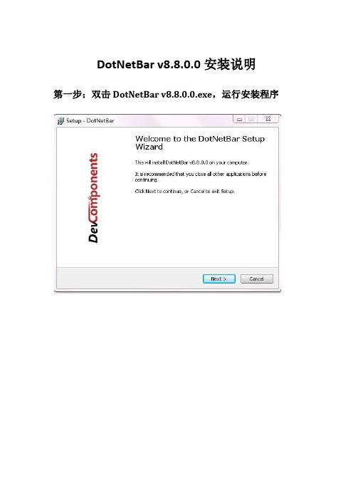
DotNetBar v8.8.0.0安装说明
第一步:双击DotNetBar v8.8.0.0.exe,运行安装程序
第二步:单击next按钮,进入下一步,不做任何操作,继续单击next按钮,进入安装路径选择窗体如下:
单击Browse按钮,选择要安装到的路径,单击next,进入下一步。
第三步:DotNetBar自动安装,出现安装完成界面如下:
第四步:单击Finish按钮,退出安装。
第五步:打开我的电脑,切换到第二步安装到的路径的bin目录下,示例路径为C:\Program
C:\Program Files\DotNetBar\Bin,找到DevComponents.DotNetBar2.dll和DevComponents.Instrumentation.dll这两个dll文件。
第六步:打开VS2010,选择文件→新建—>项目→Windows 窗体应用程序,新建一个winForm应用程序,
第七步:选择顶部“视图”菜单,在下拉菜单中选择“工具箱”,弹出工具箱对话框
将第五步找到的DevComponents.DotNetBar2.dll和DevComponents.Instrumentation.dll这两个dll文件直接拖放到工具箱对话框中,工具箱中会自动添加DotNetBar所有的控件,以后就可以直接拖放到窗体进行使用了,最后结果如下
第八步:安装DotNetBar v8.8.0.0成功。
DotNetBar教程

DotNetBar教程在DotNetBar教程(一)里,用一个实例介绍了DotNetBar在.NET环境下的使用(原文见/hans_gis/archive/2010/07/13/1776817.html),在本篇里,介绍一下ExpandablePanel 控件的用法。
从其名称Expandable中可以意识到该控件是个具有伸缩性的控件,如此可以利用这个特点高效的利用有限的界面。
新建VB类型的名称为ExpandablePanel的项目,修改窗体类的定义,将Inherits System.Windows.Forms.Form改为Inherits DevComponents.DotNetBar.Office2007Form(和C#代码有少许差别),FrmMain类继承了DevComponents.DotNetBar.Office2007Form类,界面便由Windows窗体普通风格变成Office2007风格。
添加ExpandablePanel1和ExpandablePanel2两个控件到窗体上,略做排版调整,如下图所示:CollapseDirection属性是该控件的最重要的属性之一。
Expandablepanel控件的一个重要的特点就是可以收缩/展开,其CollapseDirection属性则可以设置其收缩展开的方向。
CollapseDirection的属性值是一个枚举变量,可以取四个值,分别为BottomtoTop、ToptoBottom、RighttoLeft、LefttoRight 。
修改Expandablepanel1的CollapseDirection为RighttoLeft,效果为由右至左收缩,由左至右展开。
ExpandablePanel本身也是一个容器,向ExpandablePanel1中添加ExpandablePanel3和ExpandablePanel4,设置它们的Dock属性为Top。
c#winform及DotnetBar笔记

c#winform及DotnetBar笔记1.DataGridView 格式化显⽰cell⾥的数据⽇期等。
进⼊编辑列,选择要设置的列,DefaultCellStyle⾥->⾏为->formart设置2.tabstrip和mdi窗⼝的结合使⽤给MDI窗⼝加上TabPage。
拖动个tabstrip到MDI窗⼝上tabstrip⾥选择到主窗⼝名就加上TABPAGE了。
dock要设置成top。
但⼦mdi窗⼝在第⼀次打开的时候上⾯⼀截没现实出来,相当于tabpage⾼度⼀截遮挡了mdi窗⼝内容,但第⼆次打开mdi窗⼝就好了。
解决,将mdi support->mdiautohide设置为false就ok了。
3.DevComponents.DotNetBar.TabControl动态添加Tab这个和系统的TabPage不同,⼀个TabPage分为了DevComponents.DotNetBar.TabItem,DevComponents.DotNetBar.TabControlPanel两个部分。
最简单的添加tab和pannels的办法是⽤TabControl.CreateTab⽅法,然后将返回TabItem对象,这样就可以⽤TabIte m.AttachedControl⽅法来访问这个tab的pannel。
在这个pannel上你可以使⽤像TabItem.AttachedControl.Controls. Add(myControl)这样的⽅法代码:TabItem tim = this.tabControl1.CreateTab("⼀个Tab"); Label lblTest = new Label(); lblTest.Text = "wawawa"; tim. AttachedControl.Controls.Add(lblTest);设置dotnetbar主题为⿊⾊black1.继承public partial class Form1 : DevComponents.DotNetBar.Office2007RibbonForm2.引⽤using DevComponents.DotNetBar;using DevComponents.DotNetBar.Rendering;3.页⾯中放⼊⼀个RibbonControl4.设置该控件this.ribbonControl1.Office2007ColorTable =DevComponents.DotNetBar.Rendering.eOffice2007ColorScheme.Black;该句可放到desingner.cs InitializeComponent()⾥。
DotNetBar11.3图文介绍
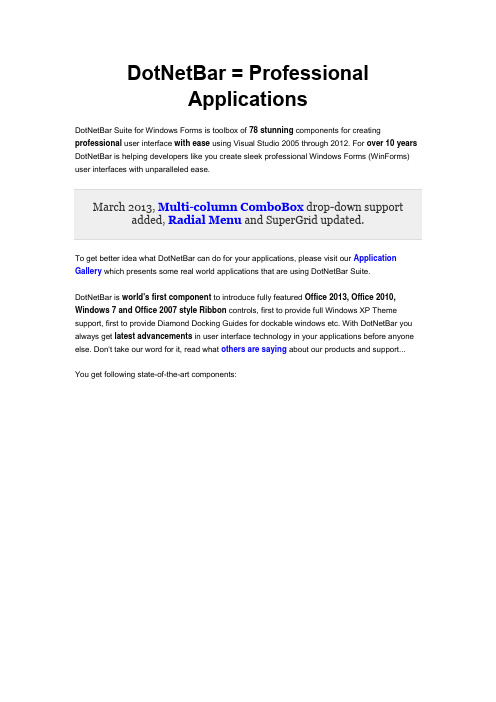
DotNetBar = ProfessionalApplicationsDotNetBar Suite for Windows Forms is toolbox of 78 stunning components for creating professional user interface with ease using Visual Studio 2005 through 2012. For over 10 years DotNetBar is helping developers like you create sleek professional Windows Forms (WinForms) user interfaces with unparalleled ease.To get better idea what DotNetBar can do for your applications, please visit our Application Gallery which presents some real world applications that are using DotNetBar Suite.DotNetBar is world's first component to introduce fully featured Office 2013, Office 2010, Windows 7 and Office 2007 style Ribbon controls, first to provide full Windows XP Theme support, first to provide Diamond Docking Guides for dockable windows etc. With DotNetBar you always get latest advancements in user interface technology in your applications before anyone else. Don't take our word for it, read what others are saying about our products and support...You get following state-of-the-art components:World's first set of Metro User Interface controls with Metro Tiles, toolbars, slide panels, forms, completely automatic color scheme generation for unlimited color themes and more. Make applications using the latest user interface style available today.Office 2013, Office 2010, Windows 7 and Office 2007 Ribbon Control with unlimited color schemes, Backstage Application Menu, Windows Vista Glass support, tab groups, ribbon hyper menus, multi-level KeyTips, complete Quick Access Toolbar (QAT) customization and complete support for Ribbon Menu TabsOffice 2013 Ribbon Bar control with button groups, popups and moreOffice 2007 Super Tooltips control with 18 color stylesOffice 2007 Super Grid powerful and extremely customizable Data Grid control with nested grids, data-binding, master-detail support, filtering, data-grouping and more...Advanced TreeView Control with Office 2007 styling, fantastic drag & drop support,multi-selection and multi-column support and more...Schedule/Calendar control Great looking calendar, scheduling control with multi-resource support and powerful recurring appointments engine.Advanced Property Grid Control Easy appearance customization, property name and value mapping, Office 2007, 2010 styling and more...TreeGX control Present hierarchical data in new visually engaging way with TreeGX. You can visualize decision trees, hierarchies, create mind maps or capture and organize ideas, everything within your application using TreeGX.Auto-hide dockable windows with Diamond Docking Guides. Document Docking with the most flexible split-view docking engine.CrumbBar™ Control bread-crumb space saving horizontal tree control.Micro-Charts item and control for super fast (renders over 2000 new charts/second) micro charts that can be added to toolbars, menus and the Ribbon.Touch keyboard control with multi-touch support, custom layouts and custom rendering.Knob/dial control Customizable knob control with number of built-in visual styles.Gauge control with linear and circular gauges, full interactivity, multi-bar and multi-gauge support and more.Hyper-Menus and Toolbars with Office 2007, 2005, Office 2003/XP/2000, Office 2007 style popup Galleries, mini-markup language, Windows XP Theme support, full color customization and much more...Navigation Pane Control Office 2007, 2003 style container control with collapse/expand functionality built-inSuperTabControl 6 different styles, 16 per-tab color schemes, full color customization and much more...Explorer Bar Control World-class Windows XP style Explorer Bar control...Tab-Strip Control, with 9 different styles including OneNote, Auto-MDI support for tabbed MDI applications and full color customization...Side Bar Control that has won respect of developers, with 2 layout types, 5 different styles, 18 predefined color schemes, drag & drop support and much more...BubbleBar control, an elegant toolbar control with easy-to-click buttons that you can't get anywhere else... We released it first in June 2005.Stand alone Bar. Create status bars just like in Office 2007, toolbars etc.Expandable Splitter Control for intuitive management of screen real-estate.Expandable Panel control in Office 2010, 2007, 2003 style, with complete control over appearance.Multi-functional Panel Control a Who's Who of panel controls. Multiple functions unlimited possibilities...Balloon/Alert Control the absolute necessity to communicate important information to your end users.Wizard Control fully featured, completely customizable and flexible Wizard control with RTL support. Adheres to the Wizard97 specification.ButtonX Control stand-alone button control with drop-down menu, Office 2007, Office 2003, 2005 and custom color scheme control.Color Picker drop-down in Office 2010/2007 style that can be added to ribbon control, toolbars, menus etc. Includes Custom color creation dialog.Item Panel, a super-flexible control with Office 2010/2007 style, drop-down support and rich layout functionality.Office 2010/2007 Style Forms for consistent Office 2010 look and feel.Office 2010/2007 Style check box and radio button control.Progress bar control in Office 2010, 2007, Office 2003 and 2005 like style with marquee and standard progress display abilities.MessageBox drop-in replacement in Office style for consistent user interface look and feel.Drop-in replacement for text box in Office style with skinned scrollbars, watermark text support and custom button embedded into the text box.ComboBoxEx is drop-in replacement for combo box in Office 2013, 2010, 2007 and 2003 style, multi-column and watermark text support.GroupPanel replacement for group box in Office 2007 style, skinned scrollbars andtext-markup support.Office 2007 style Slider control for consistent user interface look and feel.Office 2007 style Label control with complete text-markup support and auto-sizing.Date/Time Picker, control in Office 2007 style with extensive customization options, null value support, custom formatting and much more...Month-Calendar, control in Office 2007 style with easy custom rendering support,multi-selection, per-day image settings and more...Double value input, control with custom value formatting, NULL value support, Office 2007 style and more... Use it for currency entry, percentages or any other decimal values.Integer value input, control with NULL value support, custom buttons, Office 2007 style and more...Reflection Image Control provides great looking reflections for your images, supports disabled state and extensive background and border styling options.Reflection Label Control with text-markup, disabled state and extensive background and border styling options.Horizontal and Vertical Scroll-bar Controls with Office 2007 styling.Advanced Masked Text Box Controls with Office 2007 styling, drop-down support and custom buttons.TextBoxDropDown control is a single line Office 2007 style text-box with drop-down support and custom buttons.ComboTree Control ComboBox with drop-down Tree control and Office 2007 style.Rating Control 5 Star rating control with average rating display support and text-markup.WarningBox Control an non-intrusive Office 2007 style warning panel control with text-markup support.IP Address Input Control Highly customizable formatted and free-text based IP Address Input control.SuperValidator Control Validate user input without writing any code...Highlighter Control Highlight any control, or just focused control, using distinctive border.Commands Component Easy to use Commanding model that helps you separate the User Interface from Application logic. Make sure to check out the RibbonPad sample which demonstrates how to use Commands.Switch Button control Great looking and fully customizable switch button.Task-Dialog component that can be used to display information and receive simple input from users. Our task-dialog works anywhere and supports our text-markup for textual headers and content.Circular Progress control with 5 visual styles and endless and minimum/maximum progress indicator types.Analog Editable Clock control with 2 visual styles, custom styling and automatic and manual modes.Color Comb control for color selection from color comb matrix.Color Blend control for color selection from blended colors matrix.Time selector control for easy time input and 12 and 24 hours time selection support. Also used as part of our DateTimeInput control.Office 2007 style ListViewEx control drop-in replacement for ListView control requires no code changes. Not available for .NET Framework 1.0, 1.1.DataGridViewX, Drop-in replacement for DataGridView control in Office 2007 style including headers, rows and scroll-bars and 11 new column types including data-time and numeric editors.Calculator control is provides simple and visually pleasing calculator which is also integrated into our SuperGrid and stand-alone numeric editors as drop-down.Replacement for standard Binding Navigation control so you can have same DotNetBar visual styles throughout your app.Direct RichTextBox replacement with styled scroll-bars to fit all DotNetBar visual styles.Toast Notifications component for non-intrusive application messages.Radial Menu control.Written entirely in C# DotNetBar takes full advantage of new .NET architecture and framework and provides easy to use component for you and your end-users. DotNetBar Supports all versions of and works great with Visual 2012.We don't want you to buy DotNetBar before you try it so we are providing fully function trial version of DotNetBar available for download now.To jump start your usage of DotNetBar we help you with Movie Tutorials to get up to speed and running in minutes.Screen-shots above use icons from our Professional Icon Pack and Essential Icon Pack.DotNetBar was announced on Microsoft Tech·Ed 2001 in Atlanta. Read our Press Release for more information. Our .NET products have been officially launched on February 13, 2001. You can read our joint press release with Microsoft here.。
DotNetBar 教程
DotNetBar教程(一)DotNetBar是一组用于.NET Framework环境下的一组组件集,利用该组件集能够打造绚丽并且实用的应用程序界面,给开发人员提供极大的便利。
关于DotNetBar,详情请参考其官方网站:该组件集目前最新版本是8.8(不知最近有没有升级版本),可以从该网站上下载到试用期为一个月的试用版本。
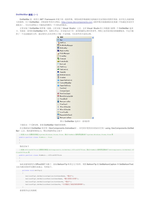
正常安装了DotNetBar组件集(前提:已经安装了Visual Studio)之后,会在Visual Studio的工具箱窗口新增一个DotNetBar选项卡,里面是一系列的DotNetBar控件,如图1所示。
在安装目录下有一系列的源码示例可供参考。
网络上也有很多版本的破解版本,不过只提供了一个动态链接库文件,建议使用人员从官网上下载一个试用版,可以参考其丰富的示例。
图1 DotNetBar选项卡一系列控件下面给出一个C#实例,看看DotNetBar绚丽的效果吧。
在正确添加对DotNetBar的引用(DevComponents.Dotnetbar2),在代码中使用对应的命名空间(using DevComponents.DotNet Bar)之后,修改窗体类的定义,默认的窗体类定义如下//此处Form完整的名称是System.Windows.Forms.Form,表示FrmMain窗体类是继承于System.Windows.Forms.Form类public partial class FrmMain : Form{}修改后如下//此处Office2007Form完整的名称是DevComponents.DotNetBar.Office2007Form,表示FrmMain窗体类是继承于DevComponents.DotNetBar.Of fice2007Form类public partial class FrmMain : Office2007Form{}如此该窗体便变为Office2007风格了。
dotnetbar textboxdropdown的用法
dotnetbar textboxdropdown的用法dotnetbar是一个非常受欢迎的控件库,它提供了许多有用的控件,其中包括TextBoxDropdown控件,它可以帮助您轻松地创建具有交互性的用户界面。
在本文中,我们将介绍dotnetbar TextBoxDropdown控件的基本用法。
一、创建TextBoxDropdown控件首先,您需要在您的项目中包含dotnetbar控件库,并确保正确地引用了它。
接下来,您可以使用TextBoxDropdown控件来创建一个文本框,该文本框具有下拉列表供用户选择。
您可以使用以下代码示例来创建一个TextBoxDropdown控件:```csharpTextBoxDropdown myTextBox = new TextBoxDropdown();```二、添加选项要使用TextBoxDropdown控件为用户提供选项,您需要将选项添加到下拉列表中。
您可以使用AddItem方法来添加选项。
例如,如果您想要一个文本框,用户可以选择“男性”或“女性”作为选项,您可以使用以下代码:```csharpmyTextBox.AddItem("男性");myTextBox.AddItem("女性");```三、选择选项当用户选择一个选项时,TextBoxDropdown控件会自动更新文本框中的值。
您可以通过设置TextBox的值来获取用户选择的选项。
例如,您可以使用以下代码获取用户选择的选项:```csharpstring selectedOption = myTextBox.Text;```四、禁用和启用选项您可以使用Enable方法来启用或禁用TextBoxDropdown中的选项。
例如,如果您想要禁用“男性”选项,可以使用以下代码:```csharpmyTextBox.Items[0].Enabled = false;```五、其他属性设置dotnetbar TextBoxDropdown控件还提供了其他属性,如样式、颜色等。
DOTNETBAR制作圆角窗体和圆角控件代码实例
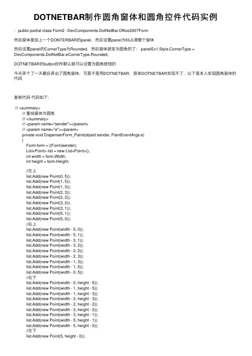
DOTNETBAR制作圆⾓窗体和圆⾓控件代码实例:public partial class Form2 : DevComponents.DotNetBar.Office2007Form然后窗体⾥加上⼀个DONTERBAR的panel,然后设置panel为fill占满整个窗体然后设置panel的CornerType为Rounded,然后窗体就变为圆⾓的了: panelEx1.Style.CornerType = DevComponents.DotNetBar.eCornerType.Rounded;DOTNETBAR的button控件默认就可以设置为圆⾓按钮的今天弄个了⼀天最后弄出了圆⾓窗体,可是不是⽤DOTNETBAR,原来DOTNETBAR实现不了,以下是本⼈实现圆⾓窗体的代码复制代码代码如下:/// <summary>/// 重绘窗体为圆⾓/// </summary>/// <param name="sender"></param>/// <param name="e"></param>private void DispenserForm_Paint(object sender, PaintEventArgs e){Form form = ((Form)sender);List<Point> list = new List<Point>();int width = form.Width;int height = form.Height;//左上list.Add(new Point(0, 5));list.Add(new Point(1, 5));list.Add(new Point(1, 3));list.Add(new Point(2, 3));list.Add(new Point(2, 2));list.Add(new Point(3, 2));list.Add(new Point(3, 1));list.Add(new Point(5, 1));list.Add(new Point(5, 0));//右上list.Add(new Point(width - 5, 0));list.Add(new Point(width - 5, 1));list.Add(new Point(width - 3, 1));list.Add(new Point(width - 3, 2));list.Add(new Point(width - 2, 2));list.Add(new Point(width - 2, 3));list.Add(new Point(width - 1, 3));list.Add(new Point(width - 1, 5));list.Add(new Point(width - 0, 5));//右下list.Add(new Point(width - 0, height - 5));list.Add(new Point(width - 1, height - 5));list.Add(new Point(width - 1, height - 3));list.Add(new Point(width - 2, height - 3));list.Add(new Point(width - 2, height - 2));list.Add(new Point(width - 3, height - 2));list.Add(new Point(width - 3, height - 1));list.Add(new Point(width - 5, height - 1));list.Add(new Point(width - 5, height - 0));//左下list.Add(new Point(5, height - 0));list.Add(new Point(5, height - 1));list.Add(new Point(3, height - 1));list.Add(new Point(3, height - 2));list.Add(new Point(2, height - 2));list.Add(new Point(2, height - 3));list.Add(new Point(1, height - 3));list.Add(new Point(1, height - 5));list.Add(new Point(0, height - 5));Point[] points = list.ToArray();GraphicsPath shape = new GraphicsPath();shape.AddPolygon(points);//将窗体的显⽰区域设为GraphicsPath的实例form.Region = new System.Drawing.Region(shape); }。
- 1、下载文档前请自行甄别文档内容的完整性,平台不提供额外的编辑、内容补充、找答案等附加服务。
- 2、"仅部分预览"的文档,不可在线预览部分如存在完整性等问题,可反馈申请退款(可完整预览的文档不适用该条件!)。
- 3、如文档侵犯您的权益,请联系客服反馈,我们会尽快为您处理(人工客服工作时间:9:00-18:30)。
我这里讨论的版本是DotNetBar 6.7.0.1 for VS2005的破解版本,其他版本我一个是没有时间找到,另外也是因为大同小异下载地址,见这里,如果还有哪个朋友下载不了,就加我QQ吧,如果你能提供一个群,我会写在这里,然后利用群空间来整理控件,方便你我下载地址是/soft/show.asp?id=2879&showasp=1&details.html在VS2005中的添加方法与IRISSKIN2类似,不过我这里再说一次:先把控件拷到你的程序BIN/Debug下,再到程序里,先引用,然后再工具栏新个一个选项,然后右键选择“选择项”菜单,在这个对话框里点浏览,里把这个DLL重新添加进来,这样,就可以把控件加到先项框里,接下来就是把控件拖到界面上,在代码里加上上面的说明的代码,就可以使用了。
有好几十个空间,可以把你的程序装扮成office2007。
很COOL!这里转几篇使用的日志:1-----------------------------------------------------DotNetBar的SuperTooltip控件使用技巧DotNetBar是一个顶尖的.net第三方表示层空间。
作出来的窗口可以说是非常非常非常的cool!SuperTooltip控件主要可以用于实现提示框。
在它提供的sample中,实现了树视图中,鼠标移动到树节点上时显示的提示框。
我的一个项目中用到了树视图,在项目完成以后我决定把它用DotNetBar美化一下。
在参考着sample的代码对我的代码进行修改和调试的过程中,我发现sample的代码并不是拿来用就行了的,还是需要理解以后进行修改。
按照sample的代码,假设我们的Form Form1中有控件TreeView treeView1,那么为treeView1实现提示框的方法如下:(我没用窗口编辑器,只修改代码来着)1在项目的引用中添加DevComponents.DotNetBar。
新建一个类NodeSuperTooltipProvider,将sample中的这个类的代码复制过来。
注意,如果你的程序里的树节点不是用的.net自带组件TreeNode,而是从TreeNode继承而来的自定义类型,那么将以下所有代码中的TreeNode都改成你自定义的类型,并且很多地方也要加入强制类型转换。
using System;using ponentModel;using System.Drawing;using System.Windows.Forms;namespace SuperTooltip{/// <summary>/// Wrapper so SuperTooltips can be displayed for node objects./// </summary>public class NodeSuperTooltipProvider : Component,DevComponents.DotNetBar.ISuperTooltipInfoProvider{private TreeNode m_Node=null;/// <summary>/// Creates new instance of the object./// </summary>/// <param name="node">Node to provide tooltip information for</param> public NodeSuperTooltipProvider(TreeNode node){m_Node=node;}/// <summary>/// Call this method to show tooltip for given node./// </summary>public void Show(){if(this.DisplayTooltip!=null)DisplayTooltip(this,new EventArgs());}/// <summary>/// Call this method to hide tooltip for given node./// </summary>public void Hide(){if(this.HideTooltip!=null)this.HideTooltip(this,new EventArgs());}#region ISuperTooltipInfoProvider Members/// <summary>/// Returns screen coordinates of object./// </summary>public System.Drawing.Rectangle ComponentRectangle{get{Rectangle r=m_Node.Bounds;r.Location=m_Node.TreeView.PointToScreen(r.Location);return r;}}public event EventHandler DisplayTooltip;public event EventHandler HideTooltip;#endregion}}2在Form1种添加控件:private DevComponents.DotNetBar.SuperTooltip superTooltip1;private System.Windows.Forms.Timer tooltipDisplayDelay;一个是SuperTooltip,另一个是.net本身带的Timer,用于控制提示框显示的时间。
3 Form1中的InitializeComponent()函数中添加:ponents = new ponentModel.Container();this.superTooltip1 = new DevComponents.DotNetBar.SuperTooltip();this.tooltipDisplayDelay = newSystem.Windows.Forms.Timer(ponents);需要初始化components是因为那个Timer初始化的时候要用。
不过去掉可以不可以我也没试过……//// superTooltip1//this.superTooltip1.DefaultFont = new System.Drawing.Font("Tahoma", 8.25F, System.Drawing.FontStyle.Regular, System.Drawing.GraphicsUnit.Point, ((System.Byte)(0)));//// tooltipDisplayDelay//this.tooltipDisplayDelay.Interval = 1000;4写一个生成所有节点的提示框的函数:private superTooltip_Refresh(){// Load SuperTooltip information for each node...TreeNode node=treeView1.Nodes[0];while(node!=null){// Creates wrapper to provide SuperTooltip control access to the node object NodeSuperTooltipProvider sp=new NodeSuperTooltipProvider(node); node.Tag=sp;// Assign the wrapper to SuperTooltip control together with information// about what to display on Super Tooltip for this node.superTooltip1.SetSuperTooltip(sp,newDevComponents.DotNetBar.SuperTooltipInfo([header_text],"",[additional_tex t],null,null,DevComponents.DotNetBar.eTooltipColor.Lemon));// Must expand node to get to the child nodes via NextVisibleNodenode.Expand();node=node.NextVisibleNode;}}其中[header_text]和[additional_text]处添加希望在提示框中显示的string。
[header_text]会被加粗。
另外,SuperTooltipInfo的最后一个参数用来改变颜色。
本来这些代码在sample里面是写在Form1的Load事件函数里面的,但是一般来说用到树视图的程序都会对节点进行各种操作,比如添加、删除、修改等等。
我设计的提示框中显示的是节点的Text、它子节点的Text和它父节点的Text。
开始我按照sample的代码把这些代码写在Form1的Load事件函数中,结果当我删除了一个节点时,它父节点的提示框内容并没有改变。
其原因就是以上这段生成每个节点的提示框的代码只在Form1生成的时候才调用Load事件函数,而改变树视图后并不重新生成。
所以,我把这些代码单独写在一个函数中,并在Form1的Load事件函数中调用它,并且在我对树和节点进行操作以后也会调用它,以刷新所有的提示框。
5 Form1的Load事件函数,每个添加、修改、删除节点的button、menuItem等对象的Click事件函数的最后加入代码:this.superTooltip_Refresh();6定义一个TreeNode私有属性:private TreeNode m_LastMouseOverNode = null;7 treeView1的MouseMove事件函数:TreeNode nodeAt=treeView1.GetNodeAt(e.X,e.Y);if(nodeAt!=m_LastMouseOverNode){HideNodeTooltip();if(nodeAt!=null){m_LastMouseOverNode=nodeAt;// Delayed displaytooltipDisplayDelay.Start();}}8 treeView1的MouseDown事件函数:// Hide tooltip if any is visible...HideNodeTooltip();9 treeView1的MouseLeave事件函数:// Hide tooltip when mouse leaves tree controlHideNodeTooltip();tooltipDisplayDelay.Stop();10 tooltipDisplayDelay的Tick事件函数:tooltipDisplayDelay.Stop();if(m_LastMouseOverNode!=null)ShowNodeTooltip(m_LastMouseOverNode);11 ShowNodeTooltip和HideNodeTooltip函数:private void ShowNodeTooltip(TreeNode node){if(node==null)return;NodeSuperTooltipProvider sp=node.Tag as NodeSuperTooltipProvider; sp.Show();m_LastMouseOverNode=node;}private void HideNodeTooltip(){if(m_LastMouseOverNode!=null){NodeSuperTooltipProvider sp=m_LastMouseOverNode.Tag as NodeSuperTooltipProvider;sp.Hide();m_LastMouseOverNode=null;}}12以上6-11步,都是sample代码中原封不动搬来的,但是运行的时候有一个重大问题,就是当我添加一个节点以后,当我的鼠标移动到新节点上时,会出现Null异常。