LabVIEW 界面设计秘诀
LabVIEW与人机交互实现人机交互界面设计
LabVIEW与人机交互实现人机交互界面设计LabVIEW(Laboratory Virtual Instrument Engineering Workbench)是一款用于测试、测量和控制应用的集成开发环境。
它提供了丰富的工具和函数,使得用户可以通过编程来实现各种各样的应用。
在LabVIEW中,人机交互界面的设计是非常重要的,它能够直接影响到用户的体验和使用效果。
本文将介绍如何利用LabVIEW来实现人机交互界面的设计。
一、LabVIEW中的人机交互界面设计原则在设计人机交互界面时,有几个原则是需要遵循的:1. 视觉一致性:保持界面的整体风格和布局的一致性,避免使用过多不同的颜色、字体和图标,以免造成混乱和困惑。
2. 易于理解和使用:界面应该尽可能简洁明了,让用户能够快速掌握其功能和操作方法。
适当使用文字说明、图标和提示可以帮助提高用户的理解度。
3. 交互友好性:设计时要考虑用户的习惯和使用习惯,尽可能减少操作步骤和输入,提供直观的交互方式,比如按钮、滑动条等。
4. 错误处理和反馈:当用户操作错误或者出现异常情况时,界面应该能够及时给出错误提示和反馈,让用户知道出了什么问题。
二、LabVIEW中的人机交互界面设计步骤1. 界面布局:首先需要确定界面的整体布局,包括各个控件和指示器的位置、大小和对齐方式等。
可以利用LabVIEW提供的拉伸点和对齐工具来辅助完成布局。
2. 控件选择:根据应用需求,选择合适的控件来展示和操作数据。
LabVIEW提供了丰富的控件库,包括按钮、滑动条、图表等,可以根据需要进行选择和定制。
3. 控件设置:对于每个控件,需要设置其属性和行为。
比如按钮的初始状态、滑动条的取值范围等。
通过属性编辑器或者右键菜单可以进行设置。
4. 事件处理:根据用户的操作,界面会触发一系列的事件,比如点击按钮、拖动滑动条等。
通过给控件绑定事件处理程序,可以实现对这些事件的响应和处理。
5. 数据交互:人机交互界面不仅仅是展示数据,还需要和底层的数据进行交互。
LabVIEW的面板设计和用户界面优化

LabVIEW的面板设计和用户界面优化LabVIEW是一种用于编写控制和测量系统的强大的图形化编程语言。
在设计和开发LabVIEW应用程序时,面板设计和用户界面优化是非常重要的,它不仅可以影响用户的体验,还可以提高程序的可维护性和可扩展性。
本文将探讨如何设计LabVIEW面板和优化用户界面。
一、面板设计原则1. 界面简洁明了:LabVIEW面板应该尽量避免过于复杂和拥挤的设计,只展示必要的控件和指示器。
合理的布局和空白区域可以增强界面的整洁度和可读性。
2. 控件选择与布局:选择适当的控件是关键,不仅要考虑功能需求,还要考虑用户的直观习惯。
应该将相关的控件放在一起,并且进行合理的布局,以提高用户的操作效率。
3. 颜色和样式的搭配:选择合适的颜色和样式可以增强界面的美观性和可视性。
应该避免过多的颜色和装饰,保持简洁和一致性。
4. 错误处理和状态指示:在面板设计中应该考虑到错误处理和状态指示,以便用户能够轻松地识别和解决问题。
可以通过合理的标识、颜色和图标来指示错误状态和程序的运行情况。
二、用户界面优化技巧1. 响应速度优化:用户界面应该尽可能地响应迅速,避免卡顿和延时。
可以通过减少计算量、优化算法和合理使用缓存等方式来提高程序的执行效率。
2. 输入验证和限制:在对用户输入进行处理时,应该进行验证和限制,以确保输入的准确性和合法性。
可以使用适当的控件属性进行输入检查,或者在程序中添加相应的逻辑来处理无效输入。
3. 异常处理和容错设计:优化用户界面还需要考虑到异常情况的处理和容错设计。
在程序出现异常时,应该提供相应的错误信息和解决方案,以便用户能够快速地解决问题。
4. 文档和帮助信息:为了方便用户使用和了解程序,应该提供相应的文档和帮助信息。
可以在界面中添加必要的说明文字、标签和帮助按钮,以引导用户正确地操作。
5. 用户反馈和改进:为了不断改进用户界面,应该收集用户的反馈意见和建议。
可以通过用户调查、反馈按钮等方式主动获取用户的意见,然后根据反馈做出相应的改进。
五彩生辉—— LabVIEW 界面配色秘诀

五彩生辉——LabVIEW界面配色秘诀NI资深应用工程师潘宇注:本文为LabVIEW网络讲坛系列短片的技术文档,第一部《界面风云》中将主要讲述在LabVIEW中创建用户界面的方法与技巧。
众所周知,在自然界中存在着各种各样的色彩,正是由于这些靓丽的色彩,才使得生活环境变得美好。
大家可以想象一下,如果这个世界上只有灰和白,那么世界会变成什么样子?然而,有很多出类拔萃的LabVIEW编程人员,他们在技术方面往往具有很强的判断力和出色的创造性,但是,在程序的界面配色上,却始终如图1所示的那样,全灰色的单调界面。
图1.单调的灰色界面相比之下,如果能够合理地搭配颜色,对于界面来说会有事半功倍的效果,真正做到五彩生辉,如图2。
要知道,当我们距离界面较远的时候,我们所看到的并不是排版,也不是控件,而是色彩。
那么,究竟该怎样来使用色彩呢?总体来讲,色彩是一个很主观的概念,可谓“仁者见仁、智者见智”,不同的人有着自己不同的配色标准。
但是,既便如此,对于色彩的设计还是有一些共同的标准和前人的经验可以借鉴的。
图2.色彩丰富的LabVIEW界面图3.“总体协调,局部对比”的配色方案首先,就是配色总体的应用原则,即“总体协调,局部对比”,也就是:整体色彩效果应该是和谐的,只在局部的、小范围的地方可以有一些强烈色彩的对比。
以图3的程序为例,首先我们确定了主基调为蓝色,那么整个应用程序的前面板对象都用深浅不同程度、不同饱和度的蓝来表示不同的对象。
但是,局部地方,可以使用一些明亮的红色、黄色、绿色等,与背景白色形成明显对比,突出需要强调的各个地方。
其次,在前面板中巧妙地使用透明色往往也会起到神奇的作用,在图4中,通过透明色,我们可以将一个基本的波形图控件(上图)转换为一个更为美观的显示方式(下图);而在图5中,则可以通过将按钮控件设为透明来实现自定义按钮外观的效果。
这两个应用的具体步骤请参考视频内容。
图4.使用透明色改观波形图控件最后,在这里还有一些技巧和经验分享给大家:一. 所有不用显示前面板的子VI 前面板可以让它保持LabVIEW 的默认灰色,以方便区分主VI 和子VI 。
LabVIEW中的人机交互和用户界面设计

LabVIEW中的人机交互和用户界面设计在LabVIEW中,人机交互和用户界面设计是非常重要的,它直接影响到软件的易用性和用户体验。
本文将讨论LabVIEW中的人机交互和用户界面设计的一些基本原则和常用技巧。
一、人机交互的基本原则1. 简洁明了:用户界面应该简洁,提供清晰的信息展示和操作方式。
避免使用过多的图形元素或文字描述,让用户能够迅速理解界面的功能和操作方法。
2. 一致性:保持界面的一致性,使得用户在不同的功能模块或界面之间能够快速切换和适应。
统一的布局、颜色和字体风格,以及相似的操作方式都有助于提高用户的学习效率和工作效率。
3. 易学易用:LabVIEW的用户界面应该尽可能简单易懂,减少用户的学习成本。
采用直观的图标、按钮和菜单等元素,结合适当的帮助文档和提示信息,使得用户能够快速理解和使用软件。
4. 反馈机制:对用户的操作进行及时的反馈是人机交互中的重要环节。
界面的响应速度应该尽可能快,同时通过状态栏、弹窗或进度条等方式提示用户当前的操作状态和结果。
5. 用户个性化:考虑到不同用户的习惯和需求,LabVIEW应该提供一定的个性化选项。
例如,允许用户自定义快捷键、界面颜色、单位设置等,以提高用户的满意度和工作效率。
二、用户界面设计的常用技巧1. 布局和界面风格:合理的界面布局能够有效地组织信息和功能模块,使得用户操作更加流畅。
可以使用分组、对齐、间距等方式来整理界面元素,以及选择合适的颜色、字体和图标来提升界面的美观性。
2. 导航和菜单设计:在LabVIEW中,使用导航栏、左侧菜单或标签页等方式来展示不同功能模块和页面是常见的做法。
将相关的功能模块进行分类和分组,使得用户能够便捷地找到需要的功能。
3. 输入和输出控件:LabVIEW提供了各种输入和输出控件,如按钮、滑块、文本框、图表等。
在设计用户界面时,要根据实际需求选择合适的控件,并设置合适的控件属性和事件响应。
4. 异常处理和错误提示:LabVIEW中的软件可能会发生各种异常情况和错误,在界面设计中要考虑到这些情况并进行适当的处理和提示。
Labview界面设计
状态栏
28
隐藏窗格
30
状态栏
31
忙光标
32
随时为用户更新信息
34
小型触摸屏App
35
应用规则
小型触摸屏
无需创新 • 使用与物理仪器类似 的大型输入控件和指 示控件 • 简单才是王道
少就是多 • 屏幕实际使用空间非 常重要,要谨慎地利 用 • 使用托盘、选项卡或 多个屏幕来拓宽屏幕 空间
•
•
用户如何与程序交互
首先映入用户眼帘的组件
•
UX: 用户体验
• •
有时可与UI互换使用 涉及范围更广,包含工作流程
3
一些通用原则
1.
无需创新 少就是多 考虑用户
2.
3.
4
1.无需创新
使用熟悉的元素
• • • •
按钮 图标 术语 对话框
•
菜单
5
1.无需创新
仍需一定的创意
触摸屏 大按钮
室外 高对比度
10
更好的是……
良好的UI设计需要才能、培 训和/或经验
如果您身边有专家,则寻求 他们的帮助 他们不一定要是LabVIEW用 户 - PPT、PDF、Photoshop 也可用于设计
使用Photoshop初步设计的银色控件
11
UI示例
• • •
再次保存菜单的原 始位置,以便菜单 之后返回
40
户外信息显示
41
应用规则
信息控制台显示
无需创新 • 从电视、网站或类似 应用中获取灵感
少就是多 • 以可立即识别的方法 仅显示重要信息
52.界面设计技巧 1 - 利用 LabVIEW 自带控件
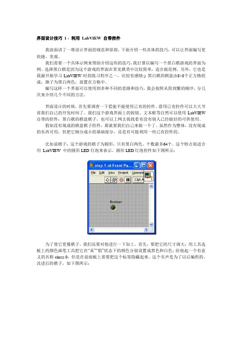
界面设计技巧1 - 利用LabVIEW 自带控件我前面讲了一堆设计界面的规范和原则,下面介绍一些具体的技巧,可以让界面编写更快捷、美观。
我们需要一个具体示例来帮助介绍这些的技巧,我打算以编写一个黑白棋游戏的界面为例。
选择黑白棋是因为这个游戏的界面在常见棋类中比较简单,适合做范例。
另外,它也是我最开始学习LabVIEW时的练习程序之一,比较有感情:) 黑白棋的棋盘由8×8个正方格组成,旗子为黑白两色,放置在方格中。
编写这样一个界面可以使用到多种不同的思路和技巧,我会按照从简到繁的顺序,分几次来介绍几个不同的方法。
界面设计的时候,首先要调查一下看能不能使用已有的控件。
借用已有控件可以大大节省我们自己的开发时间了。
我们这个游戏界面上的按钮、文本框等自然可以使用LabVIEW 自带的控件;黑白棋的棋盘棋子,也可以上网去找找看有没有别人已经做好的可供使用。
假如没有现成的棋盘棋子控件,那就要我们自己来做一个了。
虽然作为整体,没有现成的东西可用,但把它细分成小的基础部分,还是有可能利用一些已有控件的。
比如说棋子:这个游戏的棋子为圆形,只有黑白两色,个数最多64个。
这个特点很适合用LabVIEW 中的圆形LED灯泡来表示。
圆形LED灯泡控件如下图所示:为了使它更像棋子,我们还要对他进行一下加工。
首先,要把它的尺寸调大;用工具选板上的颜色画笔工具把它在“真”“假”状态下的颜色分别设置成黑色和白色;给他起一个有意义的名称-chess 0,但是在前面板上需要把这个标签隐藏起来,这个名声是为了以后编程的。
改进后的棋子,如下图所示:我们总共需要64个这样的棋子,排成8行8列。
其它的棋子不需要再一个一个添加,以第一个棋子为模板,拷贝复制,就生成了第二个;再把两个棋子都选中,复制生成四个;重复这一过程,生成8、16、32、64个棋子。
如下图所示:下面我们要把这些棋子排列整齐。
如果有耐心,可以用鼠标一个一个的调整每个棋子的位置。
LabVIEW面板设计美观与实用并重

LabVIEW面板设计美观与实用并重LabVIEW(Laboratory Virtual Instrument Engineering Workbench)是一款强大的可视化编程软件,广泛应用于工程、科学和教育领域。
在使用LabVIEW进行软件开发时,面板的设计是非常重要的一环。
一个优秀的LabVIEW面板既要具有美观的外观,同时也要实用,能够提高用户的工作效率和操作体验。
第一节:美观设计的原则在进行LabVIEW面板设计时,下面几个原则是我们必须要遵循的:一、简洁明了:不要过于拥挤,尽量避免元素过多、视觉混乱的情况。
可以通过合理的布局和分组,使界面整洁有序。
二、配色搭配:选择合适的颜色搭配,使界面色彩和谐统一。
可以通过选用合适的调色板或者自定义配色方案来实现。
三、字体与图标:选择合适的字体和字号,确保文字的清晰可读。
对于需要标识的控件,可以使用合适的图标替代文字,提高界面的直观性。
四、对比度和亮度:控制好界面的对比度和亮度,确保用户可以清晰地看到界面上的各个元素。
第二节:实用设计的要点LabVIEW面板的设计不仅仅追求美观,还要注重实用性,提高用户的工作效率。
下面是一些实用设计的要点:一、合理的布局:将相关的控件和指示器进行分组,并根据任务的逻辑关系进行布局。
在设计布局时要注重用户的习惯和易用性,让用户能够快速找到需要的控件。
二、自定义控件:LabVIEW提供了丰富的控件库,我们可以根据实际需求自定义控件,使其更符合用户的操作习惯和使用需求。
三、合适的控件命名:给控件起一个能够清晰表达其功能的名称,不要使用过于晦涩的术语,保持简洁明了。
可以使用标签或者快捷键来辅助控件的识别和操作。
四、错误提示和帮助文档:当用户输入错误或者需要帮助时,给出明确的错误提示和帮助信息,帮助用户快速解决问题。
五、界面响应速度:优化界面的响应时间,减少用户等待的时间。
对于大数据量的操作,可以通过进度条或者其他方式提示用户正在进行处理。
LabVIEW与GUI设计如何打造友好的用户界面

LabVIEW与GUI设计如何打造友好的用户界面LabVIEW是一种强大的图形化开发环境,广泛应用于工程和科学领域。
在实际应用中,一个友好的用户界面(GUI)设计对于提升用户体验和工作效率至关重要。
本文将讨论如何利用LabVIEW和GUI设计原则来打造友好的用户界面。
一、界面布局界面布局是用户界面设计的基础,一个合理的界面布局可以帮助用户快速理解和操作程序。
在LabVIEW中,我们可以利用块图(Block Diagram)和前面板(Front Panel)两个视图来实现界面设计。
1. 块图:块图是LabVIEW的主要编程界面,用于编写程序的逻辑和算法。
在界面布局上,我们应该注重模块化和可读性,将不同功能的代码放置在不同的子VI(Virtual Instrument)中,通过连接线将它们串联起来。
这样可以突出主要功能模块,降低代码的复杂度,便于代码的维护和扩展。
2. 前面板:前面板是用户与程序交互的界面,需要关注布局的美观和易用性。
首先,我们可以将不同功能模块放置在前面板的不同区域,便于用户直观地找到所需功能。
其次,合理运用图形控件和文本提示,帮助用户理解程序的输入和输出。
特别是对于频繁使用的功能模块,可以将其设置为按钮或滑动条等直观的控件,方便用户进行操作。
二、颜色和样式颜色和样式的选择对于用户界面的美观和舒适度具有重要影响。
在LabVIEW中,可以通过界面编辑器自定义控件的颜色、字体和样式,以适应特定的应用场景。
1. 颜色选择:不同的颜色传达不同的信息和情感,我们应该根据实际需求选择适合的颜色。
一般来说,鲜明但不刺眼的颜色更易于吸引用户的注意力。
特别是对于警告或错误信息,可以使用醒目的红色或橙色,以便用户能够快速发现并采取相应的措施。
2. 样式设计:样式设计包括图标、按钮和文本等元素的选择和修改。
在选择图标时,我们应该选择与功能相关的图像,保持风格一致,避免混乱和不必要的干扰。
对于按钮的设计,应该注重其易用性和操作便捷性,可以通过调整大小、样式和点击效果来增强用户的互动体验。
使用LabVIEW进行人机交互界面设计

使用LabVIEW进行人机交互界面设计LabVIEW(Laboratory Virtual Instrument Engineering Workbench)是一款功能强大的图形化编程语言和开发环境,广泛应用于科学研究、工程控制、教育培训等领域。
它提供了丰富的开发工具和库,使得开发者可以轻松地构建各种应用程序,其中包括人机交互界面设计。
本文将介绍如何使用LabVIEW来进行人机交互界面设计。
一、LabVIEW概述LabVIEW是由美国国家仪器公司(National Instruments)开发的一款图形化编程软件。
它的特点是以数据流图为基本编程模型,开发者通过将各种功能模块(称为虚拟仪器)以图形化的方式连接起来,完成程序的设计与开发。
LabVIEW具有良好的可视化特性和模块化设计,使得人机交互界面设计变得简单而高效。
二、LabVIEW界面设计基础在LabVIEW中进行人机交互界面设计的基础是控件和面板。
控件是用来接收用户输入或展示输出结果的元素,例如按钮、滑块、文本框等;面板是控件的容器,用于布局和组织控件。
LabVIEW提供了丰富的控件库,开发者可以根据需求选择合适的控件。
三、创建用户界面1. 打开LabVIEW软件,创建一个新的VI(Virtual Instrument);2. 在界面菜单中选择Controls Palette,浏览并选择适合项目需求的控件;3. 将选中的控件拖拽到面板上,布局和调整它们的位置和大小,以便形成一个直观、友好的界面;4. 对每个控件设置属性,包括名称、标签和默认值等;5. 针对每个控件添加事件处理程序,以便实现相应的功能逻辑。
四、实现交互功能1. 针对各个控件的事件处理程序,编写相应的功能模块;2. 利用LabVIEW提供的模块化设计能力,将这些功能模块组合起来,构建一个完整的交互系统;3. 添加对外部数据源或设备的接口,例如传感器数据的输入和执行器的控制;4. 调试和验证交互功能,确保系统的正常运行,并进行必要的修改和优化。
LabVIEW编程技巧与最佳实践
LabVIEW编程技巧与最佳实践LabVIEW是一种广泛应用于工程领域的可视化编程语言,它的特点是通过图形化的编程界面进行程序设计。
在使用LabVIEW进行编程时,我们需要掌握一些技巧和遵循最佳实践,以提高程序的效率、可读性和可维护性。
本文将介绍一些LabVIEW编程的技巧和最佳实践,帮助读者更好地应用LabVIEW进行工程项目开发。
I. 命名规范在LabVIEW程序中,良好的命名规范是非常重要的,它能够使得程序代码更具可读性和易于理解。
以下是一些建议的命名规范:1. 控件和指示器:使用有意义的名称来标识控件和指示器,例如使用“按钮”作为命名,而不是默认的“Button1”。
2. VI(Virtual Instrument):给VI命名时,应使用能够准确描述功能的名称,避免使用过于简单或含糊不清的命名。
同时,还应注意使用合适的前缀来说明其功能,例如“Read_file”、“Write_data”等。
3. 数据类型:对于数据类型的命名,应使用能够表达其含义或用途的名称。
例如,对于包含温度数据的变量,可以使用“temperature”作为名称。
II. 数据流的管理在LabVIEW中,数据流是程序中的核心,良好的数据流管理可以使程序更清晰明了、易于维护。
以下是一些数据流管理的技巧:1. 数据线的走向:在连接节点时,保持数据线的整洁有序。
可以使用直线、折线等方式来使数据线的走向更加清晰。
2. 控制数据线流向:使用Bundle和Unbundle节点来管理和传递复合数据结构,而不是直接将数据线连接到复合结构的元素。
III. 错误处理良好的错误处理是编程中的重要一环,以下是一些错误处理的最佳实践:1. 错误码的使用:使用良好的错误码来标识不同类型的错误,以便于程序在发生错误时进行合适的响应。
2. 异常处理:使用异常处理来捕获和处理可能发生的异常情况,以保证程序的稳定性和可靠性。
IV. 程序调试与优化1. debug模式:在进行程序开发时,使用debug模式来逐步调试程序。
LabVIEW界面设计打造简洁易用的用户界面

LabVIEW界面设计打造简洁易用的用户界面在当前信息化时代,软件界面设计变得越来越重要。
一个好的用户界面能够提升软件的易用性和用户体验,而一个繁复、混乱的界面则可能导致用户流失。
作为一个强大且灵活的控制与测量软件,LabVIEW(Laboratory Virtual Instrument Engineering Workbench)在界面设计方面也备受关注。
本文将介绍如何通过LabVIEW界面设计打造简洁易用的用户界面。
一、功能定位与界面设计在开始设计用户界面之前,我们需要先明确软件的功能定位。
通过明确软件的目标和用户需求,我们能够更好地选择合适的界面设计方案。
在选择界面设计方案时,我们可以考虑以下几个方面:1. 界面整体布局:合理的界面布局能够使用户能够快速找到需要的功能和信息。
我们可以采用经典的三栏式、主从式或者平铺式布局,根据实际需求决定。
2. 导航设计:导航设计关乎用户在软件中的行为流程,合理的导航设计能够提高用户的操作效率。
我们可以通过添加菜单、工具栏和导航面板等形式来实现良好的导航设计。
3. 控件选择:选择合适的控件能够直观地呈现数据或者功能,同时也能够提高用户的操作效率。
在LabVIEW中,我们可以使用按钮、滑动条、图表等控件来实现各种功能的展示和操作。
二、界面美化与风格设计除了功能定位和界面设计,界面美化和风格设计也是打造简洁易用的用户界面的关键。
以下是几个实用的界面美化和风格设计建议:1. 颜色搭配:合理的颜色搭配能够提高界面的美观度和可读性。
我们可以选择简洁明快的颜色,同时避免颜色过于杂乱,影响用户的视觉体验。
2. 图标设计:图标是用户界面中重要的组成部分之一,好的图标设计能够让用户更好地理解功能或者操作内容。
我们可以选择简洁明了的图标,或者自定义特定样式的图标。
3. 字体选择:合适的字体能够提高用户的阅读体验。
我们可以选择易读且符合软件风格的字体,同时避免字体过于花哨、难以辨认。
LabVIEW形编程打造自定义用户界面

LabVIEW形编程打造自定义用户界面LabVIEW (Laboratory Virtual Instrument Engineering Workbench)是一种基于图形化编程的集成开发环境,广泛应用于工程和科学领域。
通过LabVIEW,用户可以使用各种图形化的工具和函数来构建自定义的用户界面。
这篇文章将介绍如何利用LabVIEW形编程来打造自定义的用户界面。
一、LabVIEW形编程简介LabVIEW形编程是基于图形化编程的思想和方法,其核心概念是将代码表示为一个个的图形化模块,称为虚拟仪器(Virtual Instrument)。
在LabVIEW中,我们可以使用各种图形化工具和函数来设计和配置这些虚拟仪器,从而实现自定义的用户界面。
二、自定义用户界面的设计1. 界面布局:LabVIEW提供了丰富的UI控件,如按钮、文本框、图表等。
我们可以通过拖拽这些控件并调整其位置和大小来设计界面的布局。
2. 控件设置:每个控件都有各自的属性和事件,可以通过设置这些属性和事件来实现控件的功能和交互。
例如,我们可以设置按钮的标签和颜色,以及按钮被点击时触发的事件。
3. 数据绑定:LabVIEW支持将控件与数据源进行绑定。
通过数据绑定,界面上的控件可以实时显示、更新来自数据源的数据。
这样,用户可以方便地通过界面与数据进行交互。
4. 图形化编程:LabVIEW提供了丰富的图形化编程工具和函数库,可以通过连接和配置这些工具和函数来实现自定义的行为。
例如,我们可以使用条件判断、循环和数学函数来对数据进行处理和计算。
5. 事件处理:LabVIEW支持处理界面上的各种事件,如按钮点击、鼠标移动等。
通过设置事件处理函数,我们可以在相应事件发生时执行特定的操作,从而实现更加灵活和交互性的用户界面。
三、LabVIEW形编程实例下面,我们将通过一个简单的实例来演示LabVIEW形编程的过程。
我们要设计一个简单的计算器界面,包含两个文本框用于输入两个数字,一个下拉列表用于选择运算符,一个按钮用于执行计算,并在界面上显示计算结果。
LabVIEW中的GUI设计与美化

LabVIEW中的GUI设计与美化LabVIEW(Laboratory Virtual Instrument Engineering Workbench)是一种流行的图形化编程语言和系统设计平台,广泛应用于工业自动化、实验室测量和控制等领域。
本文将探讨LabVIEW中的GUI设计与美化,旨在帮助读者提升LabVIEW应用程序的用户体验。
一、设计原则与指导在进行GUI设计和美化之前,我们需要了解一些基本的设计原则和指导,以便能够创造出简洁、直观和易用的用户界面。
下面列出了几个重要的方面:1.一致性:保持界面的一致性对于用户来说非常重要。
使用相同的颜色、字体和布局样式,确保不同的界面元素之间没有突兀感。
2.简洁性:在设计界面时,应避免过度设计和信息的过载。
只展示最关键和必要的信息,保持界面的简洁性,让用户能够快速而轻松地完成任务。
3.易用性:用户界面应该是直观和易于理解的。
按钮、滑块和选择框等控件的功能应该与其外观一致,以便用户可以轻松地使用和操作。
二、界面布局与风格1.布局设计:在设计界面布局时,我们可以选择使用网格布局或自由布局。
网格布局允许我们将控件和元素放置在规则的网格单元中,使界面更整齐和统一。
自由布局则更加灵活,可以根据需求调整控件的位置和大小。
2.颜色与主题:选择合适的颜色与主题能够有效地增强界面的吸引力和可读性。
可以选择明亮而饱和的颜色来吸引用户的注意力,或使用浅色背景与深色前景形成对比,提高文字和控件的可读性。
3.图标与图像:适当使用图标和图像可以帮助用户快速理解界面的功能和操作。
选择清晰、简洁的图标,并确保其与其他元素的样式和风格相匹配。
三、控件设计与优化1.按钮设计:按钮是最常用的控件之一,我们可以通过设计各种不同的按钮样式来增强界面的美观度。
可以为按钮添加阴影、边框和鼠标悬浮效果,使按钮在被点击时有明显的反馈。
2.滑块与选择框:滑块和选择框通常用于调节数值范围或进行选项选择。
LabVIEW中的人机交互界面设计技巧

LabVIEW中的人机交互界面设计技巧LabVIEW是一款非常强大的图形化编程环境,广泛应用于工业自动化、测量与控制领域。
在LabVIEW中,人机交互界面是用户与程序进行信息交流的重要途径。
良好的人机交互界面设计能够提高用户的工作效率,优化用户体验,本文将介绍一些LabVIEW中的人机交互界面设计技巧。
一、界面布局与排版设计1. 合理划分界面区域在设计LabVIEW界面时,首先要根据功能和信息的关联性进行界面区域的划分。
可以使用容器控件,如Tab控件、Cluster等,将相关的控件组织在一起,提高界面的可读性和易用性。
2. 使用合适的控件LabVIEW提供了丰富的控件元素供用户选择,如按钮、滑动条、数字显示等。
在选择控件时,要根据功能需求和用户习惯进行选择,以达到最好的用户体验。
3. 合理调整控件的大小和位置控件的大小和位置对用户的操作和视觉效果有很大影响。
需要根据控件的功能和重要性,合理调整控件的大小和位置,以避免界面混乱和操作困难。
4. 使用合适的配色方案良好的配色方案能够给用户带来舒适的视觉体验。
在LabVIEW 的界面设计中,可以选择适合应用场景和颜色搭配的配色方案,提高界面的美观性和可读性。
二、界面操作方式设计1. 设置合理的交互方式在LabVIEW中可以通过按钮、复选框、滑动条等控件进行用户操作,通过响应事件来实现不同操作的功能。
在设计界面时,要根据实际需求设置合理的交互方式,如单击、双击、拖动等。
2. 提供合适的反馈机制用户操作后,及时给予反馈是良好的用户体验的重要组成部分。
可以在界面中设置合适的提示信息、动态效果或状态指示器等,及时向用户传达操作结果和系统状态。
3. 设计可撤销与重做功能在LabVIEW应用中,用户可能会频繁进行参数调整和试验验证等操作。
为了提高用户操作的自由度,可以设计可撤销与重做功能,使用户可以轻松地回退和恢复操作。
三、界面美化与优化1. 图标与图片的使用在界面设计中,可以使用图标和图片来增加界面的美观性和信息量。
《LabVIEW 程序设计教程》课件第七章 人机界面设计

7.1 下拉列表控件和枚举控件 7.2 列表框控件 7.3 表格与树形控件 7.4 VI属性设置 7.5 对话框 7.6 菜单 7.7 选项卡 7.8 多面板 7.9 光标 7.10 自定义控件和数据类型 7.11 用户界面设计 7.12 VI程序设计规则
7.1 下拉列表控件和枚举控件
多面板程序事件结构框图
通过菜单实现多面板程序
7.9光标
Windows平台上的光标通常分为两类,一种是动 画光标,保存为*.ani文件;另一种是静态光标,保 存为*.cur文件。
LabVIEW自带光标图
设置光标忙碌状态实例
7.10自定义控件和数据类型
LabVIEW专门提供了自定义控件编辑窗口来编辑自 定义控件。右击前面板的任何控件,在弹出的快捷 菜单中选择“高级---自定义…”选项,就可以打开自 定义控件编辑窗口
7.3表格与树形控件---表格
Express表格的例子
树形控件
树形控件的编辑
编辑树形控件
7.4 VI属性设置
7.5对话框
对话框按类型分为两类对话框:一种是信息显示对话 框,另一种是提示用户输入对话框。
其中,信息对话框有四种: 1) 单按钮对话框 2)双按钮对话框 3)三按钮对话框 4)显示对话框信息
动态交互界面
7.12VI程序设计规则
关于前面板的设计 关于程序框图的设计 关于VI
谢谢
步骤一:加载菜单文件
步骤二:添加菜单选择(用户)事件
步骤三:编写程序框图
右键快捷菜单
右键快捷菜单是为某一个具体控件设置的菜单,只有 当用户右击该控件时,才会弹出菜单。
它更具有针用户更多的交互需求。
右键快捷菜单的创建方式也有两种,一种是通过菜单 编辑器创建菜单,另一种是通过编程动态创建菜单。
LabVIEWGUI设计与用户界面优化
LabVIEWGUI设计与用户界面优化LabVIEW是一种基于图形化编程语言的软件开发环境,广泛应用于控制系统和数据采集等领域。
GUI(Graphical User Interface)设计与用户界面优化在LabVIEW开发中起着至关重要的作用。
本文将就LabVIEW GUI设计和用户界面优化进行探讨。
一、LabVIEW GUI设计在进行LabVIEW GUI设计时,需要考虑以下几个方面:1. 界面布局设计:合理的界面布局能够使用户更加方便地操作。
可以采用分区布局、标签页布局等方式,将不同的功能模块放置在不同的区域,使界面整体看起来更加清晰明了。
2. 控件选择:LabVIEW提供了各种各样的控件供用户选择。
在进行GUI设计时,需要根据实际需求选择合适的控件。
例如,如果需要输入数据,可以选择文本框或者数值调节控件;如果需要显示数据,可以选择波形图或者表格控件等。
3. 颜色和字体选择:合适的颜色和字体能够使界面更加美观。
可以选择符合应用场景的颜色主题,并根据实际需求选择合适的字体。
需要注意的是,颜色和字体的选择要符合用户的视觉习惯,不要过于花哨或者难以辨识。
4. 图标设计:对于一些需要频繁使用的功能按钮,可以设计特定的图标以便用户直观地识别。
图标的设计要简洁明了,同时要符合用户的认知习惯。
5. 响应速度:在设计GUI时,需要尽量减少响应时间,以提升用户体验。
可以使用多线程技术来分担计算负载,避免操作界面卡顿。
二、用户界面优化除了GUI设计之外,用户界面的优化也是非常重要的。
以下几点可以提升LabVIEW应用程序的用户体验:1. 界面简洁明了:避免在界面上过多地放置控件,以免用户感到混乱。
只展示必要的信息和功能,保持界面的简洁性。
2. 错误处理:在程序运行过程中,需要对可能出现的错误进行处理,并向用户给出相应的提示。
合理的错误处理机制能够提升用户对程序的信任度。
3. 用户导引与帮助:在程序中添加用户导引和帮助文档,方便用户快速上手。
设计LabVIEW高级用户界面
设计LabVIEW高级用户界面图2. 虽然两个VI的功能并无区分,然而秒表形状的控件让用户更简单识别出其跑秒功能下面介绍三个LabVIEW技巧,协助您改进程序,使它拥有外观和功能都越发优秀的UI。
1. 自定义UI外观改进UI外观最容易的方式是利用其他元素替代LabVIEW默认的灰色前面板背景以及“新式控件面板”。
只要容易转变前面板的背景色彩、利用外部资源美化您的UI、或者只用容易利用系统控件模板,无需投入大量时光举行自定义您就可以获得举世无双的界面外观了。
另外,系统输入控件和显示控件对大多数用户来说都是十分认识的,由于它们是特地设计成具有操作系统风格的。
这使得用户能够迅速认识功能,因而更具有易用性。
自定义控件增强了丰盛性和灵便性。
用法LabVIEW控件编辑器,您可以剖析每个控件,对组成控件的每个底层图形组成部分举行分别和修改。
这一技巧令每一个控件越发风格化、易于识别,或者越发能表现它们所表示的现实世界信号。
从给按钮添加模型贴图到修改仪表背景,控件自定义是改进LabVIEW UI外观最受欢迎的一种方式。
2. 合理组织复杂UI然而,陪同着您的应用程序功能范围的扩大,您不得不常常在您的LabVIEW前面板增强大量的显示信息。
幸运的是,假如不要求同时显示全部的控件,LabVIEW有两个容易的技巧可以简化处理复杂UI的工作。
选项卡(Tab)控件是一个常用的UI组件,它可以有效地将UI功能封装成几个不同的部分。
它们容易易用,并且比大多人想象的更为灵便。
在您的前面板添加一个选项卡控件,然后将其它输入和显示控件填充到选项卡,您可以增强和删减选显卡个数,转变选显卡的透亮度,挑选选显卡的物理位置以垂直显示分类,甚至您还可以给选显卡添加。
然而,利用选项卡虽然获得了易用性,却牺牲了扩展性。
由于用户的尺寸的缘故,添加的选显卡控件的数目是有限的。
在举行开发前您应当认真考虑这一详情。
另外,虽然大多数内容不行见,但选项卡控件会一次性加载全部输入和显示控件到内存中。
LabVIEW程序界面的布局.

LabVIEW程序界面的布局.俗话说:“人靠衣装,佛靠金装”,应用程序的界面是提供给使用者的第一印象,直接影响到应用程序的用户体验。
因此,有效、合理的界面能够为程序增色不少。
LabVIEW 提供了丰富的界面控件供开发者选择,有经验的程序员往往能够利用这些控件做出令人称赞的界面效果。
在《LabVIEW Development Guidelines》(下载)和《The LabVIEW Style book》(介绍)书中都有专门的章节来论述LabVIEW程序界面设计规范和方法。
本文主要从应用应用开发的角度描述一些通用的界面设计的方法。
1.1控件的分类和排列在LabVIEW中,控件通常被笼统地分为控制型控件(Control)和显示型控件(Indicator)。
而对某一个具体的应用而言,更需要把Control和Indicator进行细分,使得具有同样功能的控件排放在一起,甚至组成若干个Group组。
LabVIEW提供了一系列工具供程序员排列和分布控件的位置以及调整控件的大小,如图1所示。
图(a)是排列对齐工具,其中的图标可以很清楚地知道各个按钮的作用。
使用Ctrl+Shift+A可以重复上一次的排列方式。
图(b)是位置分布工具,可以快速地分布各个控件之间的位置。
图(c)是大小调整工具,可以快速地调整多个不同控件的大小(注意:部分控件的大小是不允许被调整的)。
图(d)是组合和叠放次序工具,Group表示把当前选择的控件组合起来形成一个整体;Ungroup与Group相反,表示分散已经整合起来的各个控件;Lock 表示锁定当前选择的控件,此时控件将无法被编辑(包括移动控件的位置,调整控件的大小等);Unlock是解锁指令;Move Forward、Move Backward、Move to Front和Move to Back 表示修改当前选择控件的排放次序。
1 控件排列和分布工具图2是某个测试界面的控件摆放实例,尽管这些控件都是Indicator控件,但是仍然根据显示功能和内容的不同将控件进行了分类。
利用LabVIEW进行人机交互界面设计与实现

利用LabVIEW进行人机交互界面设计与实现使用LabVIEW进行人机交互界面设计与实现随着科技的进步,人机交互界面在各个领域都扮演着重要的角色。
人机交互界面的设计与实现关系到用户体验的好坏,而利用LabVIEW 这一强大的工具进行设计与实现,不仅能够提高界面的易用性和美观性,还能够增加系统的可靠性和扩展性。
本文将介绍利用LabVIEW进行人机交互界面设计与实现的方法和技巧。
一、LabVIEW概述LabVIEW是一种图形化编程环境,由美国国家仪器公司开发。
它以图形化的方式进行编程,使得程序的开发变得直观、高效。
LabVIEW具有强大的数据获取、分析和可视化能力,广泛应用于工程和科学领域。
二、人机交互界面设计原则在进行人机交互界面设计时,应遵循一些基本原则,以提高用户的满意度和使用体验。
以下是一些常见的人机交互界面设计原则:1.界面简洁易懂:界面应尽量简洁明了,避免过多的冗余信息和复杂的操作步骤,使用户能够迅速上手。
2.一致性:在界面的设计中,保持一致性是非常重要的。
相同的功能应该采用相同的图标、样式和颜色等,以提供一致的使用体验。
3.可用性:界面应该具有良好的可用性,即用户能够很容易地找到所需要的功能,并且能够正确操作。
此外,还可以提供一些辅助功能,如快捷键、提示信息等,以增加用户的便利性。
4.可扩展性:当系统需要增加新功能或者进行功能修改时,界面能够方便地进行扩展和修改,而不需要对整个系统进行重构。
三、LabVIEW进行人机交互界面设计与实现的步骤利用LabVIEW进行人机交互界面设计与实现,需要经历以下几个步骤:1.界面布局设计:首先要确定界面的整体布局,包括控件的排列方式、大小和位置等。
可以使用LabVIEW提供的各种控件,如按钮、文本框、图表等,来构建界面。
2.控件属性设置:对于每个控件,需要设置其属性,包括外观、交互方式等。
通过设置控件的属性,可以实现界面的美观和易用性。
3.事件处理:在LabVIEW中,可以为每个控件添加触发事件,即当用户操作控件时,相应的事件将被触发。
- 1、下载文档前请自行甄别文档内容的完整性,平台不提供额外的编辑、内容补充、找答案等附加服务。
- 2、"仅部分预览"的文档,不可在线预览部分如存在完整性等问题,可反馈申请退款(可完整预览的文档不适用该条件!)。
- 3、如文档侵犯您的权益,请联系客服反馈,我们会尽快为您处理(人工客服工作时间:9:00-18:30)。
First of all we’ll quickly define what we mean by UI and introduce some rules, or guidelines, that you should follow to help you create quality UIs. UI design principles are no different in LabVIEW as they are for any other programming language and there are many good resources available on the internet and in books; consequently we won’t spend too much of our time here today talking about generic UI principles. Topics such as how to choose nice colors or group like objects are important but since they are covered so well elsewhere I will leave those as a homework assignment and spend most of our time here showing you some techniques and features in LabVIEW which will allow you to create much better UIs without doing too much extra work.Finally, since LabVIEW has such a strong community of developers I’ll leave with a URL where you can go and get some reusable UI components, as well as discuss and share your UI‐related questions.UI stands for user interface. It is the way your applications user gives commands and receives feedback from your application.For those of you who develop applications to sell, the UI is often the “cover” to your book –the crucial first impression. A good UI implies a thorough, professional development team whereas a sloppy UI can turn potential clients off.A good UI makes the user’s job easier since they spend less time trying to figure out how to complete their task (which often translates to less questions for the developer). I bet you can name a few applications off the top of your head where an unintuitive UI makes using that application more difficult than it should be which translates into inefficiency, frustration and resentment from you, the user.Your job as the UI developer is to predict the points of frustration and lay out an interface that helps the user get their job done. Getting the job done is most people’s primary concern.The design of the user interface and the usability of the application are closely intertwined. Any visual element that doesn’t contribute in some way to the efficient completion of tasks in your application is in some ways superfluous “eye candy”. This isn’t necessarily bad but it certainly shouldn’t be where you spend most of your time.Likewise, functionality or features that aren’t represented in the UI can only be considered background tasks since the user has no way of using that functionality.Some general rules I suggest you keep in mind as you develop are 1. Don’t be innovative, 2. Less is more, and 3. Think about your user. I’m not saying that you should never break one of these rules, but if you do you should do so consciously and for good reason.Let’s look a little deeper at each of these rules….My first rule is don’t be innovative.To illustrate this point think about a car interior. Everyone who knows how to drive a car is familiar with a steering wheel, two or three pedals, a gear stick of some kind, normally turn signal stalks etc. You don’t have to relearn how to drive a new car. The basic controls are the same as your old car (the radio or navigation probably isn’t –and for me that is often a point of frustration).Chances are the program you are writing is not going to be the user’s first computer program. Therefore the user has some kind of pre‐learned notions of how to interact with applications. You should fit into those notions rather than forcing the user to learn your way of doing things. A good rule people working on Windows systems is “make your application behave like Microsoft Office” since so many people are familiar with Office. Practically this means using common designs for buttons, using icons people will recognize, putting menus in places people expect them etc.Note that this rule doesn’t mean you can’t be a little creative. There is still space for customization and adding your own touches, just do so in a way that doesn’t impact the usability of your program.Rule#2 Less is More.Don’t clutter up the screen unnecessarily with obscure settings or controls. Hide things that are only used infrequently and give the user a way to bring them back when necessary.Presenting the user with fewer options eliminates distractions and allows them to focus on whatever it is that they ought to be focusing on.One company who is very good at applying this rule is Apple. Both the iPod and the iPhone have been huge successes, despite generally costing more, having fewer features and lower specs than competitors products. One of the big reasons for this success is Apple’s commitment to stripping out unnecessary options and making an attractive user experience that preserves the important core functionality with fewer distractions. The iPod with it’s wheel and the iPhone with it’s solitary button are simple, yet effective.As a developer it’s easy to assume that everyone knows how your application works and how to complete tasks using it –and if you are the intended user that’s great. For those of us who have to develop applications for other people to use then we have to keep those other people in mind as we develop.The first implication of this is helping a user who doesn’t know as much as you do. They might not intrinsically know what each button/control in your applications does (although they might if you follow rule #1). For those cases where you have a unique action in your application use contextual cues to teach your user. Tooltips and status bars are common techniques that allow users to get more information about what a button does before they click on it.Once the user clicks on something they generally expect something to happen. If the task is particularly slow you need to update the user to let them know that your application is working correctly. Just because you know what should happen in a given situation doesn’t mean that your user does.The second major implication of thinking about your user is thinking about how and where the program will be used. Will the user have a mouse or keyboard? If one is missing that has implications as to how you will get input from the user. Touch screens are becoming increasingly popular and have their own sets of requirements (such as larger buttons and not relying on mouseover effects). Is your application going to be used outdoors or on low color displays? If so you will want to pick color schemes that do not rely on the user being able to see subtle differences in contrast.We’ll spend most of the rest of this presentation looking at three different UI scenarios and some techniques you can implement in LabVIEW to improve your applications.The Windows Desktop App is used on a PC with a high‐resolution monitor, a keyboard and a mouse. The user spends a fair amount of time engrossed by the application and expects this application to sit alongside other applications that they have installed on their computer.This is a very common scenario where users generally have a lot of established UI expectations that you should take advantage of. Luckily LabVIEW has a number of features that can help you do just that.Before we dive into LabVIEW let’s review the rules and discuss how they apply to this scenario.LabVIEW contains three different sets of controls. The “Modern” style is set as the default but you can change this preference in Tools»Options»Front Panel. Since I primarily develop for desktop applications I tend to set my default to be the System controls since they match the operating system that the application is being run on.A quick and easy way to convey more meaning with your buttons is by adding decals.People know that a floppy disk icon means save and a picture of a housecorresponds to a “Home” screen. Using these icons in your application lets theuser almost work on autopilot as their visual brain can recognize the button and not rely on reading every word./watch?v=2NdqXh67makHow to Add Decals to Buttons1.Drop a System OK Button on the front panel.2.Right click on the control and select Advanced»Customize…3.Edit»Import Picture to Clipboard and select your image ‐•PNG files work best since transparency is preserved4.Right click on the control and select Import Picture from Clipboard»Decal5.Click the wrench icon to change customize mode6.Move the decal or the text so they aren’t overlapping7.Save your custom controlReuse tip:If you give your customized control an icon and save it in <LabVIEW>\user.lib it will show up in the controls palette under User Controls.Tooltips are the explanatory text that appears when the mouse hovers over a UI element for a few seconds. There is no better way to help and unsure user figure out exactly what a given button does by popping it up right as they hover over the button in a state of indecision.LabVIEW has this capability built in for all controls./watch?v=NGeElmr1q2gThe default graphs in LabVIEW were designed to look similar to the physical instruments that virtual instruments often replace. Since we are developing for a different type of user –namely the desktop PC use case –we can change the color scheme to better fit the work environment and also help our user with their primary task.In this application I am assuming that the user is trying to identify whether or not a given sine wave violates a simple limit test./watch?v=rOUcBvyHj5EThe LabVIEW toolbar is for you, the LabVIEW developer. It includes all the debugging and editing tools you need to create your application. It is unlikely that your end user cares about these tools and worse yet, the extra buttons may distract and confuse your user. Hiding the toolbar while your application is running is generally a good idea once you know that the application is functioning correctly./watch?v=2CbKuBVGzo0The run‐time menu is the familiar File, Edit, etc menu you see at the top of most Windows applications. LabVIEW has a default run‐time menu with a large set of entries which may or may not be applicable to your user.LabVIEW allows you to easily edit the menu to contain as many or as few of the default options as you wish. You can also add your own menu items and use the event structure to handle the user’s selection./watch?v=wkpiAmHFddMYou can also customize the run‐time shortcut (right click) menus for any control by right‐clicking on the control and going to Advanced»Run‐Time Shortcut Menu»Edit.Grouping infrequently changed options or controls in a separate dialog is a quick, easy, and common way of freeing up space on the main display.Dialogs work best for “set‐and‐forget” type of options that you don’t expect people to regularly interact with or need to reference. They also work well for controls that require lots of contextual information to assist the user in making a decision./watch?v=L‐hNmzQ9tFcCompartmentalizing is a common organizational strategy that groups like objects in their own areas. Just like a workspace or a child’s bedroom ‐‐It’s much easier to keep places tidy if everything has it’s own place.Panes are areas of a front panel that are separated by splitters. By default, front panels start with just one big pane which works great for small, simple applications. For larger or more complex apps I like to separate the front panel into several panes for a few reasons: 1.Panes allow some parts of the front panel to remain in place while other parts scroll ormove.2.Panes can be fixed to either edge of the screen and can have a fixed width or share theavailable screen size proportionally. This makes it much easier to handle differentscreen sizes./watch?v=hZ180R7ADtoAnother advantage of panes is that since a splitter is a GObject we can change it’s position programmatically using VI Server. Using a button, event structure and property node we can give the user the ability to “hide” a panel completely and then bring it back with the click of a mouse.Another special‐use case for panes can be to create a persistent status bar. In the bottom left of your status bar add a string control and simply update the text contained in the status bar via local variable wherever you need to.This simple technique is one of the most effective ways of keeping your user informed as to what state your application is in or what task it is busy performing.Along the lines of keeping the user updated –LabVIEW lets you change the cursor to a busy cursor programmatically. The busy cursor is an OS‐wide UI element that most users are quite familiar with (it means –“wait, I’m trying to do something!”)./watch?v=_mosr‐oTgRMPutting everything together you have a few options for updating the user. Personally I think the best approach is to use all of them! I even include a progress bar if I know how long a given task will take.If you don’t update the cursor or inform the user in some other way you run the risk of your user thinking that clicking a button or performing some other action went unnoticed by your application. Impatient users have a tendency to re‐click or otherwise attempt to force some change (including the dreaded Ctrl‐Alt‐Delete) if they don’t think the application is responding. It is up to you to let them know that everything is OK and that the app is just busy.For really long tasks (longer than a couple of seconds) you might want to add a cancel capability if possible. You don’t want a mis‐click to tie up the application for a long time.The next application we will look at is for a small touch screen display. Here our primary concerns are the small screen size, the need to account for fingers rather than a much more precise mouse cursor and the possibility of glare or direct sunlight impairing the contrast of our display.Again, applying the rules really ensures we think about our requirements.First of all since we want simple, high contrast controls, that more resemble physical buttons the modern control style makes more sense than system in this case.Secondly since the screen real‐estate problem is probably our biggest challenge here. Lets spend some time looking at a creative solution.Tab controls are a common way of displaying multiple pages worth of information. The “tabs” at the top allow the user to see what displays are available and switch between them.Having switchable pages of displays is perfect for our use case since we have such a small screen. However the “tabs” themselves could be problematic since the touch screen might not be accurate enough to press in such small locations reliably.VI Server comes in very handy again here since we can hide the tabs and change the page programmatically.In the demo I use two tab controls. One to contain the sliding menu and one to contain the pages of controls/graphs etc.The sliding menu tab control only has one page and has the tabs hidden. The reason I use the tab control is that it is a convenient container that I can move programmatically.The other tab control has several pages which are changed using VI Server according to which button the user presses in the menu.This is the SubVI which does the sliding. In the demo I use it to move a tab control that contains all the menu buttons but it works with any type of front panel control.The basic premise of the VI is that in order to move an object from it’s initial position to a desired position it moves the object halfway and then iterates until the object gets to the desired location. This approach generates the natural sliding appearance where the object moves quickly at first and then slows down as it stops.Putting the tab control containers, move.vi and an event structure together you have all the elements of the sliding menu. When the menu button is clicked we slide the tab control to the visible position and store the old position in shift register. Then when the user makes a selection we slide the menu tab control back to it’s original position (storing the visible position in the shift register) and switch the main content tab control to the desired page.The last application we will look at today is an informative kiosk display. This type of application has a unique set of demands since there isn’t much user interaction –the primary concern is allowing a user to consume some important information with just a quick glance.We are assuming the information density is fairly low and an attractive appearance is an important consideration in order to attract attention.Just like your computer desktop background you can use an image as the background of your front panel. A well chosen background image can provide context (i.e. “I know this is the pond temperature monitoring VI because I can see the pond in the background”) or visual appeal.On the other hand –too complicated of a background image can be distracting and make important controls and data hard to read. There is rarely an absolute right or wrong in this regard but if you know what LabVIEW is capable of and keep the 3 rules in mind you are in a good place to make your own determination./watch?v=gxXJfonTlFcIn the demo you will see that I used a “busy” background image but still made the controls easy to read by including a semi‐transparent decoration with a nice gradient fill and drop shadows. LabVIEW currently doesn’t have these kind of effects built in but you can easily import images from other applications when you need them.This particular decoration I created in Microsoft PowerPoint and imported into LabVIEW as an image which sits on top of my background image./watch?v=gjYfqhlv2hQAnother default behavior that you may choose to override is the frame applied to all controls and indicators. For most applications the frame is beneficial to separate the controls contents from surrounding labels. The default behavior of white backgrounds for controls and gray backgrounds for indicators is another usability feature that subtly indicates to the user whether or not a given object accepts input or not.If you choose to go without these features you do have that ability. For this particular application we aren’t concerned about users becoming confused about controls vs indicators since it’s a read‐only application./watch?v=jgUB1oDmf‐4The weather icon indicator is a special case of the previous technique. By combining a transparent picture ring control with some transparent PNGs you can create some pretty powerful, nice looking graphics which will add some visual appeal to your application and also increase the usability of your UI by providing instantly recognizable icons for various states./watch?v=AmDLCsnOegwYou’ll also notice the gauge control in our demo doesn’t look anything like the default gauge control.Most of the default controls in LabVIEW can be customized by replacing most of the source imagery using the control editor. Since doing so requires a fair amount of artistic ability and knowledge of external images editors we aren’t going to cover exactly how to create your own controls in this presentation.This particular control is part of the Inspired Control Suite available for download from the community. In the community you can also find a tutorial explaining the details of how to create customized controls.。