雅思A类柱形图小作文范文
雅思真题小作文柱形图

雅思真题小作文柱形图英文回答:The given bar chart provides a comparison of the average number of hours spent on various types of digital media by individuals in two different age groups: 18-24 and 55-64.The chart reveals that individuals in the 18-24 age group spend significantly more time on digital media than those in the 55-64 age group across all categories except watching television.Specifically, 18-24 year-olds spend an average of 3.5 hours per day on social media, compared to only 1.8 hours per day for 55-64 year-olds. Similarly, they spend an average of 2.8 hours per day on instant messaging, while55-64 year-olds spend only 1.4 hours per day on this activity. For playing video games, the difference is even more pronounced, with 18-24 year-olds spending an averageof 2.4 hours per day compared to just 0.8 hours per day for 55-64 year-olds.Interestingly, the trend reverses for watching television, with 55-64 year-olds spending an average of 2.2 hours per day on this activity, while 18-24 year-olds spend only 1.6 hours per day.Overall, the chart demonstrates a clear generational divide in digital media consumption, with younger individuals spending significantly more time on social media, instant messaging, and video games, while older individuals spend more time watching television.中文回答:根据给定的条形图,我们可以对18-24岁和55-64岁这两个年龄组的个人在不同类型数字媒体上花费的平均小时数进行比较。
雅思小作文范文柱状图
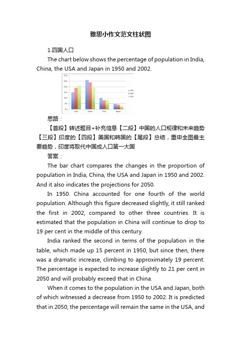
雅思小作文范文柱状图1.四国人口The chart below shows the percentage of population in India, China, the USA and Japan in 1950 and 2002.思路:【首段】转述题目+补充信息【二段】中国的人口规律和未来趋势【三段】印度的【四段】美国和韩国的【尾段】总结,重申全图最主要趋势,印度将取代中国成人口第一大国答案:The bar chart compares the changes in the proportion of population in India, China, the USA and Japan in 1950 and 2002. And it also indicates the projections for 2050.In 1950. China accounted for one fourth of the world population. Although this figure decreased slightly, it still ranked the first in 2002, compared to other three countries. It is estimated that the population in China will continue to drop to 19 per cent in the middle of this century.India ranked the second in terms of the population in the table, which made up 15 percent in 1950, but since then, there was a dramatic increase, climbing to approximately 19 percent. The percentage is expected to increase slightly to 21 per cent in 2050 and will probably exceed that in China.When it comes to the population in the USA and Japan, both of which witnessed a decrease from 1950 to 2002. It is predicted that in 2050, the percentage will remain the same in the USA, andin Japan, the percentage is likely to keep falling.Overall, it seems that India will become the country with the largest population although there is still a huge number of people in China.2.通勤工具Different modes of transport used to travel to and from work in one European city in 1960, 1980 and 2000.思路:1. 分段原则为:上升的一段,下降的一段,波动的一段。
雅思写作小作文范文 雅思写作柱状图bar chart 美国心脏病患者数量.doc

雅思写作小作文范文雅思写作柱状图bar chart 美国心脏病患者数量今天我们雅思写作小作文范文的文章来研究下柱状图bar chart。
该图表以每千人为单位,给出了美国男性居民和女性居民在不同年龄段患有心脏病的人数。
图中数据比较少,男性与女性之间的差别也很明显,十分容易进行分组比较。
小编搜集了一篇相关的高分范文,以供大家参考。
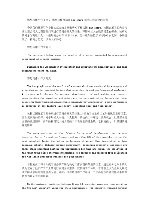
雅思写作小作文题目The chart below shows information about Heart Attacks by Ages and Genders in the USA.Summarise the information by selecting and reporting the main features, and make comparisons where relevant.雅思写作小作文范文The chart compares the number of people (in thousands) having heart attacks per year in the USA based on their age and gender. As a general trend, it is observed that more men suffer from heart attacks compared to women in all age groups.该柱状图按照年龄和性别比较了美国每年心脏病患者的数量。
从整体的趋势来看,在所有年龄段中,遭受心脏病困扰的男性都要多余女性。
It is seen in the chart that the risk of having a heart attack among men increases manifold after the age of 45. As compared to 123,000 men having a heart attack in the age group of 29-44, there are 424,000 and 440,000 men who suffer from heart attacks in the age group of 45-64 and 65+ respectively. This article is from Laokaoya website. Only 3000 women suffer from heart attacks under the age of 45. The risk increases in the age group of 45-64 and reaches almost the similar rate as of men after the age of 65.从图表中可以看出,男性患上心脏病的风险在45岁之后大幅上升。
雅思写作-小作文范文-柱状图

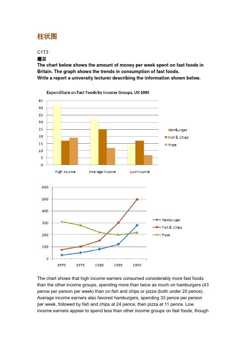
柱状图C1T3题目The chart below shows the amount of money per week spent on fast foods in Britain. The graph shows the trends in consumption of fast foods.Write a report a university lecturer describing the information shown below.The chart shows that high income earners consumed considerably more fast foods than the other income groups, spending more than twice as much on hamburgers (43 pence per person per week) than on fish and chips or pizza (both under 20 pence). Average income earners also favored hamburgers, spending 33 pence per person per week, followed by fish and chips at 24 pence, then pizza at 11 pence. Low income earners appear to spend less than other income groups on fast foods, though fish andchip remains their most popular fast food, followed by hamburgers and then pizza. From the graph we can see that in 1970, fish and chips were twice as popular as burgers, pizza being at that time the least popular fast food. The consumption of hamburgers and pizza has risen steadily over the 20 year period to 1990 while the consumption of fish and chips has been in decline over that same period with a slight increase in popularity since 1985.分析:题目The chart below shows the amount of money per week spent on fast foods in Britain. The graph shows the trends in consumption of fast foods.两句话,两个图第一段The chart shows that high income earners consumed considerably more fast foods than the other income groups, spending more than twice as much on hamburgers (43 pence per person per week) than on fish and chips or pizza (both under 20 pence).•说明了高收入人群的两个特点,第一是消耗快餐最多,第二是人群中hamburger, fish and chips, pizza的特点•spending more than twice as much on hamburgers than on fish and chip and chips or pizza 这是一句令人费解的句子,含义应为“消耗的汉堡是薯片或匹萨的两倍多”,应用的句型应当为典型的表示倍数关系的句型“n times as…as”,比如✓This airplane flies two times as fast as that one. 这家飞机的飞行速度是那架的两倍。
雅思英语图表作文范文(必备3篇)

雅思英语图表作文范文第1篇A类雅思各类图表作文要点及范文一.曲线图解题关键1曲线图和柱状图都是动态图,解题的切入点在于描述趋势。
2在第二段的开头部分对整个曲线进行一个阶段式的总分类,使写作层次清晰,同时也方便考官阅卷。
接下来再分类描述每个阶段的specifictrend,同时导入数据作为分类的依据。
3趋势说明。
即,对曲线的连续变化进行说明,如上升、下降、波动、持平。
以时间为比较基础的应抓住“变化”:上升、下降、或是波动。
题中对两个或两个以上的变量进行描述时应在此基础上进行比较,如变量多于两个应进行分类或有侧重的比较。
4极点说明。
即对图表中最高的、最低的点单独进行说明。
不以时间为比较基础的应注意对极点的描述。
5交点说明。
即对图表当中多根曲线的交点进行对比说明。
6不要不做任何说明就机械地导入数据,这不符合雅思的考试目的。
曲线图常用词汇动词—九大运动趋势一:表示向上:increase,rise,improve,grow,ascend,mount,aggrandize,goup,climb, take off, jump,shoot up暴涨,soar,rocket, skyrocket雅思英语图表作文范文第2篇It is said that countries are becoming similar to each other because of the global spread of the same products, which are now available for purchase almost anywhere. I strongly believe that this modern development is largely detrimental to culture and traditions worldwide.A country’s history, language and ethos are all inextricably bound up in its manufactured artefacts. If the relentless advance of international brands into every corner of the world continues, these bland packages might one day completely oust the traditional objects of a nation, which would be a loss of richness and diversity in the world, as well as the sad disappearance of t he manifestations of a place’s character. What would a Japanese tea ceremony be without its specially crafted teapot, or a Fijian kava ritual without its bowl made from a certain type of tree bark?Let us not forget either that traditional products, whether these be medicines, cosmetics, toy, clothes, utensils or food, provide employment for local people. The spread of multinational products can often bring in its wake a loss of jobs, as people urn to buying the new brand,perhaps thinking it more glamorous than the one they are used to. This eventually puts old-school craftspeople out of work.Finally, tourism numbers may also be affected, as travelers become disillusioned with finding every place just the same as the one they visited previously. To see the same products in shops the world over is boring, and does not impel visitors to open their wallets in the same way that trinkets or souvenirs unique to the particular area too.Some may argue that all people are entitled to have access to the same products, but I say that local objects suit local conditions best, and that faceless uniformity worldwide is an unwelcome and dreary prospect.Heres my full answer:The line graphs show the average monthly amount that parents in Britain spent on their children’s s porting activities and the number of British children who took part in three different sports from 2008 to is clear that parents spent more money each year on their children’s participation in sports over the six-year period. In terms of the number of children taking part, football was significantly more popular than athletics and 2008, British parents spent an average of around £20 per month on their children’s sporting activities. Parents’ spending on children’s sports increased gradually over the followi ng six years, and by 2014 the average monthly amount had risen to just over £ at participation numbers, in 2008 approximately 8 million British children played football, while only 2 million children were enrolled in swimming clubs and less than 1 million practised athletics. The figures for football participation remained relatively stable over the following 6 years. By contrast, participation in swimming almost doubled, to nearly 4 million children, and there was a near fivefold increase in the number of children doing athletics.剑桥雅思6test1大作文范文,剑桥雅思6test1大作文task2高分范文+真题答案实感。
雅思写作小作文范文 雅思写作柱状图bar chart 影响工作表现的因素.doc
雅思写作小作文范文雅思写作柱状图bar chart 影响工作表现的因素今天我们雅思写作小作文范文的文章来研究下柱状图bar chart。
该图表展示的内容为某大型公司人力资源部门所进行的调查研究的结果,即影响工人表现的因素有哪些。
该研究的对象为两组工人,一组年龄分布在18到30岁,另一组年龄位于45到60岁之间。
小编搜集了一篇高分范文,以供大家参考。
雅思写作小作文题目The bar chart below shows the results of a survey conducted by a personnel department at a major company.Summarise the information by selecting and reporting the main features, and make comparisons where relevant.雅思写作小作文范文The bar graph shows the results of a survey which was conducted by a company and gives data on the important factors that determine the work performance of employees. As is observed, chances for personal development, relaxed working environment, opportunities for promotion and salary are the main motivating factors for young people for their work performance while comparatively aged people’s work performance is affected by the factors like money, competent boss and team spirit.该柱状图展示了某公司进行的调查研究的结果,并给出了决定员工工作表现的重要因素。
雅思写作小作文范文 雅思写作柱状图bar chart 男女休闲时间.doc
雅思写作小作文范文雅思写作柱状图bar chart 男女休闲时间今天我们雅思写作小作文范文的文章来研究下柱状图bar chart。
该图表所呈现的信息为男性和女性每周在休闲娱乐上所花费的时间,并按照他们不同的工作状态进行了细分。
图表本身并不复杂,也很好对不同的数据进行对比。
小编搜集了一篇相关的高分范文,以供大家参考。
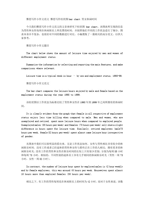
雅思写作小作文题目The chart below shows the amount of leisure time enjoyed by men and women of different employment status.Summarise the information by selecting and reporting the main features, and make comparisons where relevant.Leisure time in a typical week in hour – by sex and employment status, 1998-99.雅思写作小作文范文The bar chart compares the leisure hours enjoyed by male and female based on the employment status during the year 1998 to 1999.该柱状图以工作状态为标准比较了男性和女性在1998年到1999年之间所拥有的休闲时间。
It is clearly evident from the graph that female in all respective of employment status enjoys less time killing when compared to male. Men and women, who are unemployed and retired, spent more leisure hours when compared to employed people. Unemployed males (85 hours per week) and females (78 hours per week) only show a slight difference in hours spent for leisure time. Similarly, retired employees (male75 hours per week, female 82 hours per week) spent almost same leisure hour irrespective of gender.从图表中我们可以很明显的看出来,无论工作状态如何,女性与男性相比享有较少的休闲娱乐时间。
雅思A类小作文范文:交通出行方式对比数据
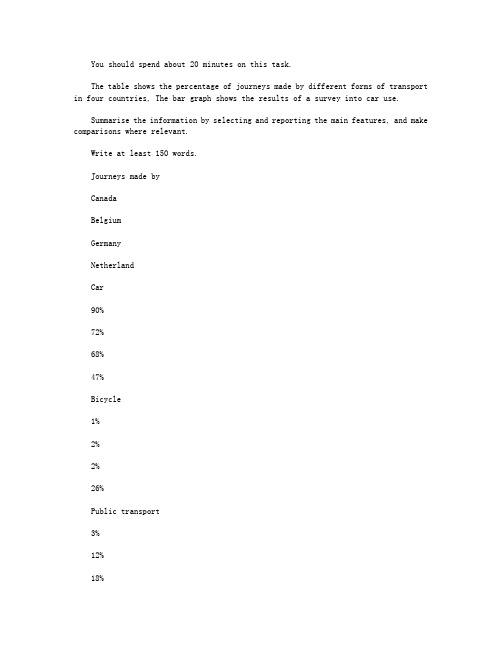
You should spend about 20 minutes on this task.The table shows the percentage of journeys made by different forms of transport in four countries, The bar graph shows the results of a survey into car use.Summarise the information by selecting and reporting the main features, and make comparisons where relevant.Write at least 150 words.Journeys made byCanadaBelgiumGermanyNetherlandCar90%72%68%47%Bicycle1%2%2%26%Public transport3%12%18%8%On foot5%11%11%18%Other1%3%1%1%Most cited reasons people travel to work by car (Canada)?The table compares modes of transport used in four countries:?Canada, Belgium, Germany and the Netherlands. Percentage of journeys made by car, bicycle, public transport and on foot are given. The bar chart shows the results of a survey into reasons people in the?Canada travel to work by car.该表比较了四个国家的运输方式:加拿大、比利时、德国和荷兰。
柱状图描述 英文作文

柱状图描述英文作文英文:When it comes to describing a bar chart, there are a few key things to keep in mind. First, it's important to understand what the chart is showing. In general, a bar chart is used to display data in a way that makes it easy to compare different values. Each bar represents adifferent category or group, and the height of the bar corresponds to the amount of data in that category.For example, let's say you're looking at a bar chart that shows the sales of different products over the course of a year. Each bar would represent a different product, and the height of the bar would correspond to the amount of sales for that product. By looking at the chart, you could quickly see which products were the most popular and which ones were less successful.Another important thing to consider when describing abar chart is the scale of the chart. This refers to the range of values that are represented on the chart. For example, if the chart only goes up to 100, then any values above 100 won't be shown. It's important to keep this in mind when interpreting the data, as it can affect how you understand the chart.Overall, a bar chart is a useful tool for displaying data in a way that's easy to understand. By paying attention to the categories, the scale, and the overall layout of the chart, you can quickly get a sense of what the data is telling you.中文:描述柱状图时,有几个关键点需要注意。
柱形图范文雅思写作柱状图小作文写

柱形图范文雅思写作柱状图小作文写.在雅思小作文的图表中,柱状图的出现频率非常高,而且相对来讲还是比较难的,这是因为柱状图的分析比较复杂.所以大家掌握一些雅思小作文柱状图的写作技巧还是很有必要的.柱状图的写作重点无非就是数据的描述,一般可以分为两种情况,就是根据每个组里的柱子的个数,有单柱子和多柱子.第一种情况,单柱子.这种情况好写,就是分别说一下就可以了,如果是以时间为横轴的话,就写一下趋势,如果是以组为横轴,则直接写.第二种情况,多柱子.这个情况比较麻烦,数据少比如每个组里就两个柱子,可以全写,如果数据比较多,比如每个组里有六个柱子,那就取几个最大或者最小的就行,也就是说在比较的过程中想要拿到想要的结果就要找对比鲜明的那一对就对了.把对比最鲜明的几个柱子描述清楚,其他的可以一带而过.注意:对于柱状图,数据太多,则起点,结点和数量相等点必写,倍数点必写.这是因为这些点都是非常有代表性的点,分析这些点就可以基本看出这些柱状图分析的主要结果了.以上就是关于柱状图的雅思小作文的写作技巧,而且这是最简单的技巧介绍,最适合大家记忆和应用的了.看了技巧之后,大家想要真正的掌握就必须得花一定的时间来练习了.通过上面的雅思小作文柱状图的技巧介绍,大家在写作雅思小作文的时候,可以根据不同图表的信息量的大小,重要信息点的安排等等内容进行适当的应用和借鉴,这样雅思写作柱状图小作文获得高分也就不是什么难事了.描述图表时,先把你从图中获取的东西写下来,再用图中的信息去证实它。
The bar chart shows the increase in the number of people who join in governmental employee entrance exam. Precisely, it increased steadily from 300,000 in xx to 1,030,000 by the year xx.下面为大家的是关于雅思小作文图表信息的表达方式和结构安排。
雅思图表作文真题范文
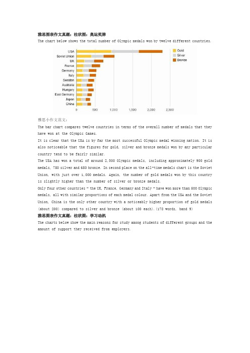
雅思图表作文真题:柱状图:奥运奖牌The chart below shows the total number of Olympic medals won by twelve different countries.雅思小作文范文:The bar chart compares twelve countries in terms of the overall number of medals that they have won at the Olympic Games.It is clear that the USA is by far the most successful Olympic medal winning nation. It is also noticeable that the figures for gold, silver and bronze medals won by any particular country tend to be fairly similar.The USA has won a total of around 2,300 Olympic medals, including approximately 900 gold medals, 750 silver and 650 bronze. In second place on the all-time medals chart is the Soviet Union, with just over 1,000 medals. Again, the number of gold medals won by this country is slightly higher than the number of silver or bronze medals.Only four other countries - the UK, France, Germany and Italy - have won more than 500 Olympic medals, all with similar proportions of each medal colour. Apart from the USA and the Soviet Union, China is the only other country with a noticeably higher proportion of gold medals (about 200) compared to silver and bronze (about 100 each).(178 words, band 9)雅思图表作文真题:柱状图:学习动机The charts below show the main reasons for study among students of different groups and the amount of support they received from employers.参考雅思小作文范文The bar charts compare students of different ages in terms of why they are studying and whether they are supported by an employer.It is clear that the proportion of students who study for career purposes is far higher among the younger age groups, while the oldest students are more likely to study for interest. Employer support is more commonly given to younger students.Around 80% of students aged under 26 study to further their careers, whereas only 10% study purely out of interest. The gap between these two proportions narrows as students get older, and the figures for those in their forties are the same, at about 40%. Students aged over 49 overwhelmingly study for interest (70%) rather than for professional reasons (less than 20%).Just over 60% of students aged under 26 are supported by their employers. By contrast, the 30-39 age group is the most self-sufficient, with only 30% being given time off and help with fees. The figures rise slightly for students in their forties and for those aged 50 or more.(178 words, band 9)雅思图表作文真题:柱状图:The chart below shows numbers of incidents and injuries per 100 million passenger miles travelled (PMT) by transportation type in 2002.雅思小作文范文The bar chart compares the number of incidents and injuries for every 100 million passenger miles travelled on five different types of public transport in 2002.It is clear that the most incidents and injuries took place on demand-response vehicles. By contrast, commuter rail services recorded by far the lowest figures.A total of 225 incidents and 173 injuries, per 100 million passenger miles travelled, took place on demand-response transport services. These figures were nearly three times as high as those for the second highest category, bus services. There were 76 incidents and 66 people were injured on buses.Rail services experienced fewer problems. The number of incidents on light rail trains equalled the figure recorded for buses, but there were significantly fewer injuries, at only 39. Heavy rail services saw lower numbers of such events than light rail services, but commuter rail passengers were even less likely to experience problems. In fact, only 20 incidents and 17 injuries occurred on commuter trains.(165 words, band 9)雅思图表作文真题:柱状图:各地房价The chart below shows information about changes in average house prices in five different cities between 1990 and 2002 compared with the average house prices in 1989.雅思小作文范文:The bar chart compares the cost of an average house in five major cities over a period of 13 years from 1989.We can see that house prices fell overall between 1990 and 1995, but most of the cities saw rising prices between 1996 and 2002. London experienced by far the greatest changes in house prices over the 13-year period.Over the 5 years after 1989, the cost of average homes in Tokyo and London dropped by around 7%, while New York house prices went down by 5%. By contrast, prices rose by approximately 2% in both Madrid and Frankfurt.Between 1996 and 2002, London house prices jumped to around 12% above the 1989 average. Homebuyers in New York also had to pay significantly more, with prices rising to 5% above the 1989 average, but homes in Tokyo remained cheaper than they were in 1989. The cost of an average home in Madrid rose by a further 2%, while prices in Frankfurt remained stable. (165 words)雅思图表作文真题:饼状图:垃圾处理The pie charts below show how dangerous waste products are dealt with in three countries.雅思小作文范文:The charts compare Korea, Sweden and the UK in terms of the methods used in each country to dispose of harmful waste.It is clear that in both the UK and Sweden, the majority of dangerous waste products are buried underground. By contrast, most hazardous materials in the Republic of Korea are recycled.Looking at the information in more detail, we can see that 82% of the UK’s dangerous waste is put into landfill sites. This disposal technique is used for 55% of the harmful waste in Sweden and only 22% of similar waste in Korea. The latter country recycles 69% of hazardous materials, which is far more than the other two nations.While 25% of Sweden's dangerous waste is recycled, the UK does not recycle at all. Instead, it dumps waste at sea or treats it chemically. These two methods are not employed in Korea or Sweden, which favour incineration for 9% and 20% of dangerous waste respectively.(159)。
雅思A类柱形图小作文范文

雅思A类柱形图小作文范文The chart shows the division of household tasks by gender in Great Britain. Write a report for a university lecture describing the information shown below.You should write at least 150 words.Source: Office for National Statistics on behalf of the Controller of Her Majesty's Stationery Office.Study these three sentences and then write three similar sentences about other parts of the chart.1 Women spend over twice as much time doing kitchen tasks as men.2 Men spend 30 minutes a day doing kitchen tasks whereas / while women spend 74 minutes a day.3Women are more active in the kitchen than men (74 minutes a day for women as opposed to 30 minutes for men).Sample ReportLook at the following sample answer to the writing task.Write a word in each space.The chart shows the average number of minutes per day men and women in Great Britain spend on jobs around the house.In total, men spend just over two-and-a-half hours on household tasks whereas women spend slightly less than four hours. Women spend more than twice as much time doing kitchen tasks such as cooking and washing up as men (74 minutes for women as opposed to30 minutes for men. Women are also more active in cleaning the house- it takes 58 minutes of their day compared to / with 13 minutes for men - and childcare, where women put in more than twice as much time as men.On the other hand, men are more active in gardening and pet care, where they spend twice as long as women, and maintenance and DIY, on which they spend 15 minutes more than women. Women account for almost all the time spent on washing and ironing clothes. This takes them 25 minutes, while / whereas men spend just 2 minutes on this task.Overall the figures show that women spend more time on routine domestic chores than men, while / whereas men do more household maintenance, gardening and pet care.。
雅思写作小作文范文 雅思写作柱状图bar chart 日常花费.doc

雅思写作小作文范文雅思写作柱状图bar chart 日常花费今天我们雅思写作小作文范文的文章来研究下柱状图bar chart。
该图表共显示了4个国家,分别为德国、意大利、法国和英国,以及这些国家的民众在音响、网球拍、香水、CD、玩具和电影方面的花费。
因为图中数据较多(共有24个),如果每条数据都详细描述的话,无论是时间和篇幅都不够用。
因此小编搜集了一篇相应的考官范文,以供大家参考。
雅思写作小作文题目雅思写作小作文范文The bar chart compares consumer spending on six different items in Germany, Italy, France and Britain.柱状图比较了德国、意大利、法国和英国的消费者在六种不同物品上的花费。
It is clear that British people spent significantly more money than people in the other three countries on all six goods. Of the six items, consumers spent the most money on photographic film.很明显,英国民众在所有六种物品上都明显花费比其他三个国家民众更多的金钱。
在六种物品中,消费者在电影上花费的金钱最多。
People in Britain spent just over £170,000 on photographic film, which is the highest figure shown on the chart. By contrast, Germans were the lowest overall spenders, with roughly the same figures (just under £150,000) for each of the six products.英国民众在电影上的花费超过170000英镑。
雅思写作-小作文范文-柱状图

柱状图C1T3题目The chart below shows the amount of money per week spent on fast foods in Britain. The graph shows the trends in consumption of fast foods.Write a report a university lecturer describing the information shown below.The chart shows that high income earners consumed considerably more fast foods than the other income groups, spending more than twice as much on hamburgers (43 pence per person per week) than on fish and chips or pizza (both under 20 pence). Average income earners also favored hamburgers, spending 33 pence per person per week, followed by fish and chips at 24 pence, then pizza at 11 pence. Low income earners appear to spend less than other income groups on fast foods, though fish andchip remains their most popular fast food, followed by hamburgers and then pizza. From the graph we can see that in 1970, fish and chips were twice as popular as burgers, pizza being at that time the least popular fast food. The consumption of hamburgers and pizza has risen steadily over the 20 year period to 1990 while the consumption of fish and chips has been in decline over that same period with a slight increase in popularity since 1985.分析:题目The chart below shows the amount of money per week spent on fast foods in Britain. The graph shows the trends in consumption of fast foods. 两句话,两个图第一段The chart shows that high income earners consumed considerably more fast foods than the other income groups, spending more than twice as much on hamburgers (43 pence per person per week) than on fish and chips or pizza (both under 20 pence).说明了高收入人群的两个特点,第一是消耗快餐最多,第二是人群中hamburger,fish and chips, pizza的特点chips or pizza 这是一句令人费解的句子,含义应为“消耗的汉堡是薯片或匹萨的两倍多”,应用的句型应当为典型的表示倍数关系的句型“n times as…as”,比如这家飞机的飞行速度是那架的两倍。
(完整版)雅思写作-小作文范文-柱状图
柱状图C1T3题目The chart below shows the amount of money per week spent on fast foods in Britain. The graph shows the trends in consumption of fast foods.Write a report a university lecturer describing the information shown below.The chart shows that high income earners consumed considerably more fast foods than the other income groups, spending more than twice as much on hamburgers (43 pence per person per week) than on fish and chips or pizza (both under 20 pence). Average income earners also favored hamburgers, spending 33 pence per person per week, followed by fish and chips at 24 pence, then pizza at 11 pence. Low income earners appear to spend less than other income groups on fast foods, thoughfish and chip remains their most popular fast food, followed by hamburgers and then pizza.From the graph we can see that in 1970, fish and chips were twice as popular as burgers, pizza being at that time the least popular fast food. The consumption of hamburgers and pizza has risen steadily over the 20 year period to 1990 while the consumption of fish and chips has been in decline over that same period with a slight increase in popularity since 1985.分析:题目The chart below shows the amount of money per week spent on fast foods in Britain. The graph shows the trends in consumption of fast foods.两句话,两个图第一段The chart shows that high income earners consumed considerably more fast foods than the other income groups, spending more than twice as much on hamburgers (43 pence per person per week) than on fish and chips or pizza (both under 20 pence).•说明了高收入人群的两个特点,第一是消耗快餐最多,第二是人群中hamburger, fish and chips, pizza的特点•spending more than twice as much on hamburgers than on fish and chip and chips or pizza 这是一句令人费解的句子,含义应为“消耗的汉堡是薯片或匹萨的两倍多”,应用的句型应当为典型的表示倍数关系的句型“n times as…as”,比如✓ This airplane flies two times as fast as that one. 这家飞机的飞行速度是那架的两倍。
雅思写作小作文范文 雅思写作柱状图bar chart 房价变化.doc
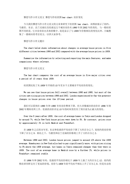
雅思写作小作文范文雅思写作柱状图bar chart 房价变化今天我们雅思写作小作文范文的文章来研究下柱状图bar chart。
该图表展示了纽约、马德里、东京、法兰克福以及伦敦这五个城市房价从1990年到2002年的变化。
与一般柱状图不同的是,它并没有给出具体的数字,而是显示了与1989年价格相比的变化比率。
小编搜集了一篇相应的考官范文,以供大家参考。
雅思写作小作文题目The chart below shows information about changes in average house prices in five different cities between 1990 and 2002 compared with the average house prices in 1989.Summarise the information by selecting and reporting the main features, and make comparisons where relevant.雅思写作小作文范文The bar chart compares the cost of an average house in five major cities over a period of 13 years from 1989.柱状图比较了从1989年开始的13年里5个主要城市平均房价的变化。
We can see that house prices fell overall between 1990 and 1995, but most of the cities saw rising prices between 1996 and 2002. London experienced by far the greatest changes in house prices over the 13-year period.我们可以看到在1990年和1995年间房价整体下降。
描述柱状图的英语范文 雅思
描述柱状图的英语范文雅思英文回答:A bar chart is a graphical representation of data that uses rectangular bars to represent the values of different categories or groups. Each bar represents a single category or group and its height corresponds to the value of that category or group. Bar charts are commonly used to compare the values of different categories or groups and to visualize the distribution of data.Bar charts can be either vertical or horizontal. In a vertical bar chart, the bars are drawn vertically, with the height of each bar representing the value of the corresponding category or group. In a horizontal bar chart, the bars are drawn horizontally, with the length of each bar representing the value of the corresponding category or group.Bar charts are a simple and effective way to visualizedata. They are easy to read and understand, and they can be used to convey information quickly and clearly. Bar charts are also a versatile tool, and they can be used to represent a wide variety of data types.中文回答:柱状图是一种图形数据表示,使用矩形条形来表示不同类别或组的值。
雅思柱状图小作文写作模板

雅思柱状图小作文写作模板雅思小作文柱状图是考试中最常见的一类图形,柱状图如何描述写成为大家棘手的问题。
下面为大家分享雅思柱状图小作文写作模板。
大家可以参考学习。
雅思柱状图写作模板1The bar chart compares the proportion of employees of both genders employed in executive positions in ACNE Oil Company within a one-year period between July 1993 and June 1994.As can be seen from the chart, the percentage of male employees generally increased with the rise of the job categories from Grade E to Grade A while the opposite was true with that of women.Grade A, which was reported as the highest position, was a male dominated one in which only one-tenth of the staff were female while male employees accounted for the rest.When it comes to Grade B and C, men also took up over half of the employees, accounting for 80% and 60%, which are 50% and 10% higher than that of women respectively.However, the situation in the other two jobs categories, which were relatively lower in rank, was totally reversed, with women taking up relatively larger proportion. Men constituted roughly 40% in Grade D, 20% less than that if women and most of the working staff in Grade E were women (over 70%) , twice the percentage of men.To sum up, on the rank ladder of ACME Oil Company, male employees took up a higher and higher proportion than the weaker sex as it gradually went up to the peak -------- Grade A.雅思柱状图写作模板2The chart below shows the amount of money per week spenton fast foods in Britain. The graph shows the trends in consumption of fast foods.Write a report for a university lecturer describing the information shown below.柱状图显示的是1970-1990二十年间英国人每周在快餐上花费了多少钱;曲线图展示的是这二十年间快餐消费的趋势。
雅思写作柱状图小作文满分
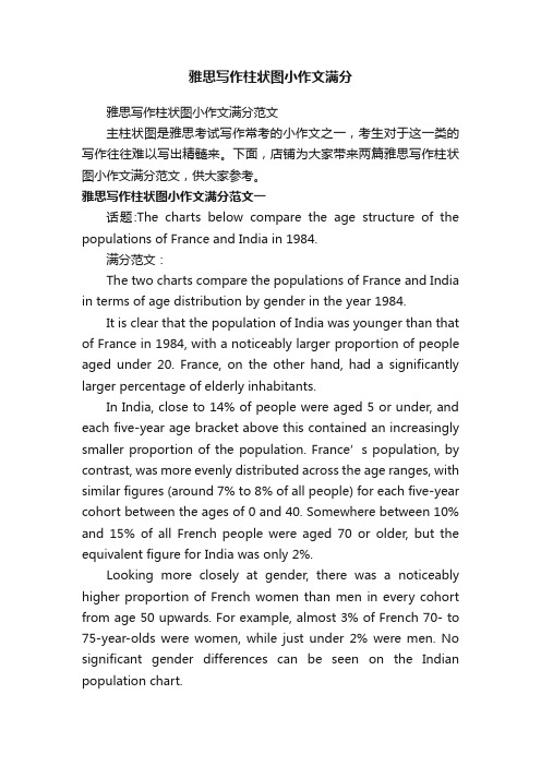
雅思写作柱状图小作文满分雅思写作柱状图小作文满分范文主柱状图是雅思考试写作常考的小作文之一,考生对于这一类的写作往往难以写出精髓来。
下面,店铺为大家带来两篇雅思写作柱状图小作文满分范文,供大家参考。
雅思写作柱状图小作文满分范文一话题:The charts below compare the age structure of the populations of France and India in 1984.满分范文:The two charts compare the populations of France and India in terms of age distribution by gender in the year 1984.It is clear that the population of India was younger than that of France in 1984, with a noticeably larger proportion of people aged under 20. France, on the other hand, had a significantly larger percentage of elderly inhabitants.In India, close to 14% of people were aged 5 or under, and each five-year age bracket above this contained an increasingly smaller proportion of the population. France’s population, by contrast, was more evenly distributed across the age ranges, with similar figures (around 7% to 8% of all people) for each five-year cohort between the ages of 0 and 40. Somewhere between 10% and 15% of all French people were aged 70 or older, but the equivalent figure for India was only 2%.Looking more closely at gender, there was a noticeably higher proportion of French women than men in every cohort from age 50 upwards. For example, almost 3% of French 70- to 75-year-olds were women, while just under 2% were men. No significant gender differences can be seen on the Indian population chart.雅思写作柱状图小作文满分范文二话题:The chart below shows the total number of Olympic medals won by twelve different countries.参考范文:The bar chart compares twelve countries in terms of the overall number of medals that they have won at the Olympic Games.It is clear that the USA is by far the most successful Olympic medal winning nation. It is also noticeable that the figures for gold, silver and bronze medals won by any particular country tend to be fairly similar.The USA has won a total of around 2,300 Olympic medals, including approximately 900 gold medals, 750 silver and 650 bronze. In second place on the all-time medals chart is the Soviet Union, with just over 1,000 medals. Again, the number of gold medals won by this country is slightly higher than the number of silver or bronze medals.Only four other countries - the UK, France, Germany and Italy - have won more than 500 Olympic medals, all with similar proportions of each medal colour. Apart from the USA and the Soviet Union, China is the only other country with a noticeably higher proportion of gold medals (about 200) compared to silver and bronze (about 100 each).。
- 1、下载文档前请自行甄别文档内容的完整性,平台不提供额外的编辑、内容补充、找答案等附加服务。
- 2、"仅部分预览"的文档,不可在线预览部分如存在完整性等问题,可反馈申请退款(可完整预览的文档不适用该条件!)。
- 3、如文档侵犯您的权益,请联系客服反馈,我们会尽快为您处理(人工客服工作时间:9:00-18:30)。
雅思A类柱形图小作文范文
The chart shows the division of household tasks by gender in Great Britain. Write a report for a university lecture describing the information shown below.
You should write at least 150 words.
Source: Office for National Statistics on behalf of the Controller of Her Majesty's Stationery Office.
Study these three sentences and then write three similar sentences about other parts of the chart.
1 Women spend over twice as much time doing kitchen tasks as men.
2 Men spend 30 minutes a day doing kitchen tasks whereas / while women spend 74 minutes a day.
3Women are more active in the kitchen than men (74 minutes a day for women as opposed to 30 minutes for men).
Sample Report
Look at the following sample answer to the writing task.
Write a word in each space.
The chart shows the average number of minutes per day men and women in Great Britain spend on jobs around the house.
In total, men spend just over two-and-a-half hours on household tasks whereas women spend slightly less than four hours. Women spend more than twice as much time doing kitchen tasks such as cooking and washing up as men (74 minutes for women as opposed to30 minutes for men. Women are also more active in cleaning the house- it takes 58 minutes of their day compared to / with 13 minutes for men - and childcare, where women put in more than twice as much time as men.
On the other hand, men are more active in gardening and pet care, where they spend twice as long as women, and maintenance and DIY, on which they spend 15 minutes more than women. Women account for almost all the time spent on washing and ironing clothes. This takes them 25 minutes, while / whereas men spend just 2 minutes on this task.
Overall the figures show that women spend more time on routine domestic chores than men, while / whereas men do more household maintenance, gardening and pet care.。