考研英语作文必背模板图表作文.doc
考研图表作文英语作文模板

考研图表作文英语作文模板The following is a template for an English composition on the topic of "Graduate Entrance Exam Chart":Introduction:In the past few years, there has been a significant trend in the number of students applying for the Graduate Entrance Exam. The chart provided illustrates this trend, highlighting the changes in the number of applicants over a specific period.Body Paragraph 1:The chart displays the number of applicants from [Year 1] to [Year 2]. It is evident from the data that there was a steady increase in the number of students opting to take the exam. In [Year 1], the number of applicants was [X], which rose to [Y] in [Year 2]. This growth can be attributed to various factors, such as the increasing demand for higher education and the competitive job market.Body Paragraph 2:A closer look at the chart reveals that there was a particularly sharp increase in the number of applicants in [Year 3], reaching [Z] students. This surge could be due to the introduction of new incentives by educational institutions, such as scholarships or the expansion ofcertain popular programs. Additionally, the chart may also show a slight decline or plateau in the number of applicants in subsequent years, suggesting a stabilization or saturation point in the market.Body Paragraph 3:It is also important to consider the demographic breakdown of the applicants. The chart may provide insights into the proportion of male to female applicants, or the distribution across different age groups. For instance, the data could show that there is a higher percentage of younger students taking the exam, indicating a trend towards early specialization and career planning.Conclusion:In conclusion, the chart offers a comprehensive overview of the trends in the Graduate Entrance Exam applicant pool. The steady increase in numbers reflects the growing importance of postgraduate education in today's society. It is crucial for educational institutions to adapt to these trends and provide the necessary resources and support to accommodate the growing number of students seeking higher education.This template can be adapted to fit specific data points and trends that are presented in the actual chart. The key is to provide a clear and concise analysis of the data, supported by relevant examples and potential reasons for the observed trends.。
考研英语图表作文考前必备范文

21篇图表作文范文第一类:市场经济、行业发展类T opic 1: Mobile-phone subscriptionsFrom the bar chart given above, we can observe that mobile-phone subscriptions in developing and developed country experienced some changes during the past several year. The number of mobile-phone subscriptions in developing countries increased dramatically from less than 1 billion in 2000 to 4 billion in 2008. Taking a look at the statistics of mobile-phone subscriptions in developed countries, we can see that it ascended gradually from less than 1 billion in 2000 to the maximum at 1 billion in 2007, and then remained unchanged in 2008.The bar chart reveals that there exists difference in the development of mobile-phone subscriptions between developing and developed countries. What exactly contribute to this phenomenon? Reasons can be listed as follows: the authorities in developing countries have issued some preferential policies to protect and promote the development of the mobile-phone industry. Moreover, with the improvement of financial status and purchasing power, people in mounting numbers can afford to buy mobile-phones which was once deemed expensive. When it comes to developed countries, its slow growth can be best attributed to the market saturation: almost every one has owned mobile-phones, it is no need for them to buy a new one.By observing the trend in developed countries, we may forecast that the mobile-phone subscriptions will not continue to grow rapidly, as developing countries will meet the same problem of “limited grow space”. This is, obviously, the law of the market development.(236 words )T opic 2: Domestic market share of different car brandsFrom the bar chart given above, we can observe that the market share of different brands in domestic car markets experienced some changes during the past several years. The car market share of Chinese brands increased markedly from 25% in 2008 to roughly 35% in 2009. During the same period , the proportion of Japanese brands decreased sharply by nearly 10% from 35% to 25%. The percentage of American brands remained unchanged at 15% from 2008 to 2009.The bar chart reveals that there exists some difference in the development tendency among different car brands. What exactly contribute to this phenomenon ? Reasons can be listed as follows: for one thing, the Chinese government has issued some preferential policies to protect and promote the rapid extension of domestic automotive industry. Moreover, with the decline of the prices of domestic cars, people in mounting numbers are more inclined to choose them. As for Japanese car brands, its loss of customers can be attributed to the “Recall Crisis” and low price performance ration.To maintain the leading position, Chinese automotive industry should spare no efforts to improve their capabilities of products innovation, service awareness and continue to lower its prices. Only in this way can the car industry enjoy a sustainable development. (208 words)T opic 3: The boom of overseas traveling industryFrom the bar chart given above, we can observe that the number of people traveling abroad experienced some changes during the past several years. From 1999 to 2000, the number of Chinese people traveling abroad increased rapidly from 7.5 million to 10 million, and then to 12.1 million in 2001.The bar chart reveals that people in mounting numbers are going to travel abroad. What exactly contribute to this phenomenon? Reasons can be listed as follows: for one thing, the authorities have issued some preferential policies to promote the development of the overseas tourism industry, which encourages a sudden emergence of travel agencies that can provide customers with convenient overseas tourism services. Additionally, with the improvement of financial status and purchasing power, a considerable number of Chinese people can afford the once-deemed-expensive traveling expenses. Last but not least, as there exists huge difference in cultures, customs and landscapes between China and overseas countries, quite a few people hold that overseas traveling is not only a perfect way to relax oneself, but also enrich their knowledge and expand their horizons.By observing the past trends, we may forecast that the growth tendency will continue. However,it is also a highly variable industry which is vulnerable to seasons and climates,international political situation,fluctuations in exchange.T opic 4: Changes in the ownership of houses in ChinaFrom the bar char given above, we can observe that the ownership of houses in China experienced some changes during the past several years. The proportion of state-owned houses decreased sharply by almost 50% from 70% in 1950’ to 20% in 1990’. On the contrary, during the same period, the percentage of private houses increased rapidly from 30% to 80%.The bar chart reveals that there exists an opposite trend in the development of state-owned and private houses ownership. What exactly contribute to this phenomenon? Reasons can be listed as follows: for one thing, the authorities have issued some preferential policies to the development of private houses industry. Additionally, with the improvement of financial status and purchasing power, citizens in mounting numbers can afford to buy private houses which were deemed expensive. Last but not least, people’s decision to buy a house can also be ascribed to the power of so-called “group dynamics”: when members of our social networks own their private house one after another, we unconsciously imitate them , of course, if we have enough money.The continual growth of private houses is a symbol of the improvement of people’s living standard. However, the authorities should also place a value on the restriction of houses’ price. Otherwise, it will one day be a obstacle of the rapid and sound development of economy. (224words)T opic 5: Changes in the number of TV-goers and Film-goers From the curve chart given above, we can observe that the number of film-goers and TV-goers experienced some changes over the past decade. From 1975 to 1985, the number of film-goers decreased rapidly from 80 million to nearly 10 million. During the same period, the number of TV-goers increased sharply from less than 10 million to approximately 100 million.The curve chart informs us of the phenomenon that there exists an opposite tendency between film-goers and TV-goers. Many reasons can account for this phenomenon, and the followings might be the most critical ones: for one thing, by improving the quality of programs, the TV-industry has retained a large body of televiewers and attracted quite a few potential viewers that would have swarmed into cinemas. When it comes to the cinema, the reason why it slackens might be attributed to the change of people’s consumption idea, people in increasing numbers hold the opinion that the ticket fare is sometimes too high for them to afford. Besides, by taking advantage of the convenience offered by the Internet, people can download their favorite movies from the websites directly instead of sitting in the movie theater, which also reinforces the inexorable decline of cinema industry.Whether the film industry will continue to shrink away or not is still unknown. However, no one can deny the fact that movies play an indispensable role in enriching our lives. Perhaps one day, the cinema industry will enjoy a revival, time will tell.T opic 6: Global E-commerce turnoverFrom the curve chart given above, we can observe that the turnover of global E-commerce experienced some change during the past several years. From 1997 to 2005, it rose dramatically from 20 billion to 900 billion.The curve chart reveals that the global E-commerce industry enjoys an explosive growth. Quite a few reasons can be listed to account for this phenomenon, and the followings might be the most critical ones: for one thing, the authorities of different countries have issued some preferential policies to protect and encourage the development of E-commerce, thus quite a few online-transaction websites emerge overnight. Moreover, the one-click-payment consumption mode has been widely accepted by the public thanks to the widespread availability of the Internet. Last but not least, people’s decision to purchase on-line can also be put down to the power of so-called “group-dynamics”: when our friends are shopping at network, we will be influenced by them and imitate their behaviors unconsciously.The rapid development of E-commerce signals that new business models contribute largely to the sustainable development of the global economy. However, when enjoying the fruits offered by modern technology, we should also keep an eye on the underlying threat of it. In a world features open boundary, deception and fraud sometime abound. (209 words )T opic 7: The development tendency of fast food and sitdown restaurantFrom the curve chart given above, we can observe that the number meals of fast food and sitdown restaurant experienced some changes during the past several years. The number of meals of fast food increased slowly from 20 in 1970 to nearly 30 in 1980. From 1980 to 2000, it ascended rapidly from 30 to approximately 90. On the contrary, when observing the statistics of sitdown restaurant meals, we can find that it increased slowly from 20 in 1970 to roughly 50 in 2000.The curve chart informs us of the phenomenon that there exists some difference in the development tendency between fast food and sitdown restaurants. What exactly contribute to this phenomenon? Reasons can be listed as follows: for one thing, with the pace of modern life quickening, people barely have much time to waste in lining up for restaurant meals, on the contrary, fast food meals can do help busy people save a great deal of time. Additionally, the authorities have issued some preferential policies to protect and encourage the rapid extension of fast food industry , thus the public can buy fast food at shops scattering around the city. On the contrary , people in diminishing numbers are willing to eat at sitdown restaurant. They think that eating at restaurant is always time-consuming and inconvenient. Besides, food at restaurant is comparatively expensive than fast food.by observing the trend of the past, we may forecast that the number of fast food meals will continue to rise in the years to come. However, we should also take the detrimental impact of fast food into consideration. Do remember that fast food is one of the main causing factors of diseases such as heart attack, obesity and diabetes.T opic 8: Investment in Beijing from different countries and regionsFrom the pie chart given above, we can observe that it reflects the statistics of investment in Beijing from different countries and regions. The proportion of investment from Hong Kong accounts for 44%, ranking first. The percentage of investment from other 23 countries and regions ranks second among all, making up 20.8 %. Japan occupies 19.2%, ranking third. When it comes to the U.S.A., we can find that it takes up 16% , 28% lower than that of Hong Kong.The pie chart reveals the phenomenon that most of the investment in Beijing stem from Hong Kong. What exactly contribute to this phenomenon? Reasons can be listed as follows: in the first place, China's investment policy provide preferential treatment to investors from Hong Kong. They are more likely to be immune to high taxes and other charges. Moreover, quite a few Hong Kong investors hold the opinion that, with the same language, cultures, traditions and customs, mainland is an ideal and promising investment resort which will be bound to generate considerable profits. Last but not least, it will not take a long time to commute between Hong Kong and Chinese mainland, the region advantage also has attracted more Hong Kong investors to locate their companies and factories in the mainland.The public can benefit a lot from Hong Kong investment. People can buy products with superior quality at a comparatively cheaper price. However, balancing the investment proportion from different countries is also a issue needed to be put at the top of relevant administration departments’agenda. Thus, people can be exposed to a greater variety of products and have more purchasing options. (272 words)第二类:职场职业类满意不清楚不满意小于等于40岁16.7% 50.0% 33.3%41-50岁0.0% 36.0% 64.0%大于50岁40.0 50.0% 10.0%T opic 9: The difference of job satisfaction among people at diverse ages.From the table chart given above,we can observe that it reflects the statistics of staff’s job satisfaction in a certain company. 50% of staff at the age less than and equal to 40 years old are not clear about their job satisfaction. Staff at the age between 41 and 50 years old who are not content with their jobs account for 64%. When it comes to the staff at the age over 50 years old, we can find that 40% of them are satisfied with their jobs, ranking first among all the three age groups.The table chart reveals that there exists huge difference in job satisfaction among people at different ages. What exactly contribute to this phenomenon ? Reasons can be listed as follows: the reason why people at the age less than and equal to 40s are not clear about their jobs is that they don’t have so much time and energy to reflect on whether his job is goo or not, all they have to do is to work hard and contend for more opportunities. As forthose who are at the age between 41 and 50 years old, confronted with pressures from works, families and society, they can hardly stay put. Instead, they should pour all their energies into making money, supporting their families and enhance their social status. However, entering into a new stage of life: 50 years old, they are more likely to enjoy their life. Moreover, a fat pay, high social status, sense of achievement and respect form others enables them to lead a comfortable and satisfactory life.As common saying goes, “ it is impossible to please anyone.” In terms of jobs, it also can hardly please any staffs. However, we can do something to change the situation : staffs themselves should adjust their attitude towards jobs. The companies should also enforce some policies to improve staffs’ living standard and enhance the sense of gratification. (325words)T opic 10: The changes of Chinese professionsFrom the pie chart given above, we can observe that the professions structure of Chinese people experienced some changes during the past several years. From 1980 to 1999, the percentage of agricultural professions decreased by 30% from 68% to 38%. During the same period, however, service sectors increased rapidly from 5% to 22%. When it comes to the manufacturing professions, its percentage rose markedly from 27% in 1980 to 40% in 1999.The pie chart reveals the phenomenon that there exists some difference in the development tendency among different professions in China. What exactly contribute to this phenomenon ? reasons can be listed as follows: for one thing, with the rapid process of urbanization, people in mounting numbers, especially youngster, have left their village homes ,moved into big cities and thus been out of agricultural industries. Moreover, quite a few people, especially college graduates hold that it is comparatively easy for them to make more money in the service industry. When it comes to the manufacturing industry, its transformation might be attributed to the adjustment of industrial structure: the authorities have issued some preferential policies to promote the rapid extension of manufacturing industry, thus, more workforces are required.By observing the change over the past several years, we may forecast that the proportion of professions of service and manufacture will continue to rise. However, a high value should be placed on the development of agricultural industry by the public and the authorities. Otherwise, with the number of people who are engaged in agriculture diminishing, we will one day have nothing to eat! (262words)T opic 11: Different job inclination between boys and girlsFrom the bar chart given above, we can find that it reflects the statistics of profession inclination between girls and boys. Most obviously, 40% of boys intend to be a manager, with only 15% of girls choosing this job. When it comes to the profession of teacher, we can observe that 45% of girls prefer to take this job, while the proportion of boys only account for 5%, 40% lower than that of girls.The bar chart informs us of the phenomenon that there exists some difference in profession inclination between boys and girls. What exactly contribute to this phenomenon ? reasons can be listed as follow: for one thing, quite a few boys regard being a manager as a symbol of success. As this profession stands for promising futures, fat pay and competence. Moreover, boys’ decision to be a manager can also be attributed to the power of so-called “group dynamics”: when members of their social network prefer to be a manager after graduation, they are easily influenced and imitate others’ behavior unconsciously or consciously. When it comes to girls, the are more inclined to be a teacher. As this profession features stability and respect. Take social and biological factors into account, we know that it is reasonable for girl to choose teacher as their ideal profession goals.Both girls and boys have rights to choose their profession. However, one thing we should bear in mind is that there exists no better or worse, superior or inferior jobs, but suitable and satisfactory ones. (254words)T opic 12:Different additional working hours among diverse professionsFrom the bar chart given above, we can observe that it reflects the statistics of additional working hours among different kinds of professions. Self-employed businessmen spends nearly 2 hours per day in working overtime, ranking first. On the contrary, civil servants’ additional working hours is the shortest, only less than 50 minutes per day. The overtime of scientific researchers, cultural and sports workers and teachers ranks from 80 minutes to less than 50 minutes.The bar chart informs us of the phenomenon that there exists some difference in additional working hours among diverse careers, especially between self-employed businessmen and civil servants. Ample reasons can account for this phenomenon: firstly, to make more profits, businessmen have to spend more time in manufacturing products, attracting and retaining customers and managing staffs. Moreover, with the competition becoming fiercer, they have no alternative but to work overtime to avoid being eliminated by the market and their rivals. When it comes to civil servants, things are not all the thing. Confronted with less risks and pressures, leading a steady and routine life, they don’t have to work overtime frequently.Working overtime is a two-bladed sword. Surely, it will both generate considerable benefits. However, it will give rise to some damages. We should balance our work, life and health. Otherwise we will eventually become a machine and slave of work. (224words)第三类:文化教育T opic 13: The enrollments of The master of engineeringFrom the bar chart given above, we can observe that the enrollments of master of engineering experienced some changes during the past several years. From 1998 to 2000, it increased gradually from roughly 2,500 to nearly 5000. However,it rose rapidly from 15,000 in 2001 to approximately 3,5000 in 2004.The bar chart reveals the phenomenon that the enrollments of master of engineering is growing sharply. Many factors can account for this phenomenon, and the followings might be the most critical ones: for one thing , the authorities have issued some policies to promote the development and expansion of engineering industry which includes architecture, electric engineering and so on. Thus, experts , specialists and graduates majoring in this field are needed. Moreover, Quite a few students hold that a master degree of engineering can ensure them to find an ideal and promising job with ease. Last but not least, students’ decision to pursue a master degree of engineering can also be attributed to the power of “group dynamics”: when members of their social networks take engineering as a college major, they unconsciously imitate and follow the trend.By observing the trend of the past, we may forecast that this tendency will continue. However, A master degree of engineering can not ensure students an ideal and well-paid job, it is their abilities, skills and diligence that will guarantee a satisfactory job and promising future.(234 words)T opic 14: The expansion of university enrollmentsFrom the bar graph given above, we can observe that the enrollments of colleges and universities experienced some changes during the past several years. College enrollments increased rapidly from 1.5 million in 1998 to 2.25 million in 1999. From 1999 to 2000, it ascended more dramatically by 1.15 million from 2.25 million to 3.4 million.The bar char informs us of the phenomenon that students in mounting numbers are going to colleges and universities. Quite a few reasons can account for this phenomenon, and the followings might be the most critical ones: for one thing, the authorities have issued some policies to promote the development of college education and the expansion of enrollment. Additionally, It is universally acknowledged that college education is the basic requirement for an ideal and promising job. Last but not least, with the improvement of financial status, people can afford to pay the intuition of university education.By observing the tendency of the past, combined with the current economic situation, we may forecast that the enrollments of colleges and universities will continue to rise. However, we might as well take the unemployment rate into consideration, with so many students graduating, will there be enough openings for them ? (202 words)T opic 15: Sources of income of American and Chinese studentsFrom the pie chart given above, we can observe that it reflects the statistics of sources of income of American and Chinese students. When it comes to American students, they get 15% of income from scholarship, 35% from part-time jobs and 50% from parents. In terms of Chinese students, income from scholarship accounts for 5%, and 5% of their income are from part-time jobs, 90% from their parents, 40% higher than that of American students.The pie charts informs us of the phenomenon that there exists some difference in the sources of income between American and Chinese students. What exactly contribute to this phenomenon? Reasons can be listed as follows: for one thing, the reason why Chinese students get most of income from their parents is that Chinese parents hold that students should focus all their energies on study, they don’t need to worry about their living expense and endeavor to make money. For another, However, American students tend to have a strong sense of independence. They would rather make money through part-time jobs or scholarship than ask their parents for money.This difference between American and Chinese students may stem from cultural difference. Americans emphasize independence, to encourage students from their parents earlier. While Chinese people emphasize interpersonal relationships ,mutual aid and rely on. From my perspective, Chinese students should enhance their consciousness of independence. On in this way can they be mature sooner. (235 words )T opic 16: Students’ graduation intentionsFrom the table chart given above, we can observe that it reflects the statistics of students’ graduation intention. From 2004 to 2012, the proportion of students who are determined to further study increased rapidly from 45% to 76%. During the same period, the percentage of students who are willing to work after graduation remains steady.The table chart informs us of the phenomenon that students in increasing numbers are willing to further study after graduation. What exactly contribute to this phenomenon? Reason can be listed as follows: for one thing, facing with intense competition in the employment market, quite a few students regard further study as a buffer. moreover, they are convinced that a higher education will put them in a competitive position in the future employment market. their decision could also be attributed to the power of so-called “group dynamics”: when their friends and classmates choose to study after graduation, they will be influenced easily and imitate others’behaviors.By observing the tendency of the past, we may forecast that the proportion of further study will continue to rise. However, students should bear in mind that a higher education will not guarantee them an ideal job. It iscapabilities and skills that determine their future. (206words)第四类:社会负面现象话题T opic 17: The correlation between population growth and extinct speciesFrom the curve chart given above, we can observe that the number of population and extinct species in U.S. experienced some changes during the past several hundreds of years. From 1800 to 2000, the number of population increased rapidly from 0 to 250 million. From 1600 to 1800, the number of extinct species rose gradually from 10 to 30. However, it increased sharply from 30 in 1800 to 70 in 1900.The curve graph informs us of the phenomenon that there exists close correlation in the growth between extinct species and population. Many reasons can account for this phenomenon, and the followings might be the most critical ones: firstly, the growing extinction of species could be attributed to the absence of people’s consciousness of wild animal’s protection. Moreover, to rake in excessive profit margins from animal-products transaction, quite a few businessmen tend to overlook the existence rights of wild animals and poach them savagely. Last but not least, relevant laws and regulations might not have been strictly enforced to impose a heavy penalty on those who poach and kill animals, which also reinforces this trend.something must be done to change the current situation. For one thing, the public should enhance their consciousness of animals’protection. Moreover, a large-scale education campaign should be launched to popularize the idea that wild animals are also members of our nature and ecosystem. Only in this way can we balance the relationships between human being and other species. (244 words)T opic 18: The phenomenon of aging populationFrom the table chart given above, we can observe that it reflects the statistics of the trend of population in China. From 1990 to 2003, the number of people aged 60 and above increased gradually from 97.19 million to 136 million. While from 2020 to 2050, it will ascend from 230 million to 410 million. From 1990 to 2003, the proportion of people aged 60 and above rose slowly from 8.8% to 10.2%. While from 2020 to 2050, it will rise from 15.6% to 27.4%.The table chart informs of the phenomenon that the aging population is becoming increasingly severe. What exactly contribute to this phenomenon? Reasons can be listed as follows: for one thing, the authorities have issued some preferential policies to improve senile security’s system, which enables the elders to lead a comfortable life. Moreover, with the improvement of living standard, elderly people in mounting numbers are placing a high value on health care, thus people can live longer than ever before. Moreover, the phenomenon of aging population canalso be attributed to the improvement of medical technology, many once-seemingly-incurable diseases could be healed nowadays, which means that people lead a much longer life.The aging of the population is a result of social progress and economic development. However, This phenomenon will bring about undesirable consequences in the future. By 2035, economists say, there will be two retirees for each worker. Thus, the problem of how to deal with it should be on the agenda. (247words)T opic 19:Life expectancy and infant mortalityFrom the bar chart given above, we can observe that the life expectancy and infant mortality experienced some changes during the past several years. From 1960 to 1990, the life expectancy increased from 40 years old to roughly 60 years old. During the same period, the rate of infant mortality decreased from nearly 20% to 10%.The bar chart inform us of the phenomenon that people can live longer nowadays. What exactly contribute to this phenomenon ? Reasons can be listed as follows: for one thing, with the improvement of living standard, elderly people in mounting numbers are placing a high value on health care, thus people can live longer than ever before. When it comes to the decline of the rate of infant mortality, it can be attributed to the improvement of medical technology, many once-seemingly-incurable diseases could be healed nowadays, which means that less infant will suffer from fatal diseases and can lead a longer life.Rising life expectancy and decline of infant mortality is a symbol of social progress and economic development. However, it will also bring about some undesirable consequences such as the aging of population. Thus, the problem of how to deal with it should be on the agenda.(204 words)T opic 19: Accidents in a Chinese cityThe table chart given above reveals the statistics of accidents in a Chinese city. 608 accidents are caused by drivers turning left without due care, ranking first, and it increased by 10% over 2004. The number of accidents caused by drivers driving under the influence of alcohol is 208, and it increased rapidly by 15%.The table chart informs us of the phenomenon that accidents are mainly caused by drivers turning left without due care and accidents caused by drivers driving under the influence of alcohol is rising dramatically. What exactly contribute to this phenomenon ? Reasons can be listed as follows: for one thing, accidents caused by turning left without due care can be attributed to the absence of people’s consciousness of driving security. In terms of the causing factor of alcohol, the reason why people often drive after drinking is that laws and regulations might not have been strictly enforced to warn people not to do this.Due attention should be paid to this phenomenon before things get worse. The authorities should impose a。
图表作文英文范文考研
图表作文英文范文考研下载温馨提示:该文档是我店铺精心编制而成,希望大家下载以后,能够帮助大家解决实际的问题。
文档下载后可定制随意修改,请根据实际需要进行相应的调整和使用,谢谢!并且,本店铺为大家提供各种各样类型的实用资料,如教育随笔、日记赏析、句子摘抄、古诗大全、经典美文、话题作文、工作总结、词语解析、文案摘录、其他资料等等,如想了解不同资料格式和写法,敬请关注!Download tips: This document is carefully compiled by theeditor. I hope that after you download them,they can help yousolve practical problems. The document can be customized andmodified after downloading,please adjust and use it according toactual needs, thank you!In addition, our shop provides you with various types ofpractical materials,such as educational essays, diaryappreciation,sentence excerpts,ancient poems,classic articles,topic composition,work summary,word parsing,copyexcerpts,other materials and so on,want to know different data formats andwriting methods,please pay attention!Paragraph 1: The chart shows a variety of data. There are different sections and numbers that represent something. It's kind of interesting to look at.Paragraph 2: Well, you can see from the chart thatthere are some clear patterns. Some things are going up, while others are going down. It makes you think.Paragraph 3: Another thing is that there are these spikes and dips. It's like a roller coaster. You never know what to expect next.Paragraph 4: And then there are these colors or symbols that add to the confusion. But also make it more visually appealing.Paragraph 5: In conclusion, the chart is a mess of information that you have to sort through to make sense of it. But it's fun to try.。
考研图表英文作文

考研图表英文作文1. What does the chart show?The chart illustrates the percentage of people who own smartphones in different age groups. It is divided into five age categories, ranging from 18 to 65 years old.2. What is the general trend in smartphone ownership?The general trend in smartphone ownership is that the younger the age group, the higher the percentage of people who own smartphones. For example, the 18-24 age group has the highest percentage of smartphone ownership at 95%, while the 55-65 age group has the lowest at 61%.3. Are there any exceptions to the trend?Yes, there are some exceptions to the trend. In the 45-54 age group, the percentage of smartphone ownership is higher than in the 35-44 age group. This could be due to avariety of factors, such as increased access to technologyor changes in work and social habits.4. What do you think are the reasons for the trend?There are several reasons for the trend of higher smartphone ownership in younger age groups. One reason is that younger people are more likely to be early adopters of new technology. Additionally, smartphones are often seen as a status symbol among young people, and they may be more likely to prioritize purchasing one over other expenses. Finally, younger people tend to be more tech-savvy and may be more likely to use their smartphones for a variety of purposes, such as social media and entertainment.5. Do you think the trend will continue in the future?It is likely that the trend of higher smartphone ownership in younger age groups will continue in the future. As technology continues to advance and become moreintegrated into daily life, younger people will likely continue to be early adopters and prioritize technology intheir spending. However, it is also possible that as older generations become more comfortable with technology, the gap between age groups may begin to narrow.。
英文考研作文图表
英文考研作文图表1. The bar chart shows the number of people indifferent age groups who use smartphones. As we can see, the highest percentage of smartphone users falls in the age group of 18-24, accounting for approximately 40% of the total. This indicates that young adults are the most active users of smartphones.2. The line graph illustrates the trend of average global temperature over the past century. It is evidentthat there has been a gradual increase in temperature over the years. This suggests that climate change is a pressing issue that needs to be addressed urgently.3. The pie chart displays the distribution of household expenses in a typical urban family. It is clear that the largest proportion of the budget is spent on housing, followed by transportation and food. This highlights the importance of these basic necessities in our daily lives.4. The scatter plot depicts the relationship between hours spent studying and exam scores. Interestingly, there seems to be no clear correlation between the two variables. This suggests that factors other than studying time may influence academic performance.5. The table presents data on the top five countries with the highest GDP growth rates in the past year. It is notable that all of these countries are emerging economies. This demonstrates their potential for rapid economic development.6. The line graph shows the fluctuation in oil prices over a five-year period. It is evident that there have been significant fluctuations in prices, with a sharp increase in 2014 followed by a gradual decline. This indicates the volatility of the oil market.7. The bar chart compares the literacy rates of different countries. It is clear that developed countries have higher literacy rates than developing countries. This highlights the importance of education in promoting socialand economic development.8. The pie chart illustrates the distribution of online shopping preferences by product category. It is evidentthat electronics and clothing are the most popular categories, while books and groceries are less commonly purchased online. This reflects changing consumer behaviorin the digital age.9. The scatter plot displays the relationship between income and happiness levels. Surprisingly, there seems tobe a weak correlation between the two variables. This suggests that factors other than financial well-being contribute to overall happiness.10. The table presents data on the number ofinternational tourists visiting different countries. It is evident that France attracts the highest number of tourists, followed by Spain and the United States. This highlightsthe popularity of these destinations among travelers.。
2024考研英语一作文模板全套
2024考研英语一作文模板全套一、图表作文。
Nowadays, with the rapid development of economy, the issue of (图表中的主题) has aroused wide concern in the society. According to the (图表名称) provided by (提供数据的机构), it can be seen that (图表内容的简单描述). From the data, we can draw the conclusion that (得出的结论).There are several reasons behind this phenomenon. Firstly, (原因一). Secondly, (原因二). Last but not least, (原因三).To solve this problem, I think the government should take effective measures. On the one hand, (解决这一问题的建议一). On the other hand, (解决这一问题的建议二). Only in this way can we (解决这一问题的效果).In conclusion, (总结的观点). As long as we take these measures, we can successfully (得出的结论).二、观点对比类作文。
Nowadays, (话题) has been the focus of the society. Some people hold the view that (观点一), while others argue that (观点二). As for me, I am in favor of the former/latter view.Those who support (观点一) have their reasons. Firstly, (理由一). Secondly, (理由二). What's more, (理由三).On the other hand, those who advocate (观点二) also have their reasons. Firstly, (理由一). Secondly, (理由二). What's more, (理由三).In my opinion, (个人观点). On the one hand, (理由一). On the other hand, (理由二). Therefore, I firmly support the view that (个人观点).In conclusion, (总结观点). As long as we take these measures, we can successfully (得出的结论).三、图画作文。
考研柱状图表类英语作文万能模板

考研柱状图表类英语作文万能模板Title: Template for Writing Bar Chart Essays in Graduate Entrance ExaminationIntroduction:In the graduate entrance examination, bar chart essays are commonly used in the writing section. Understanding how to analyze and describe data presented in bar charts is essential for scoring well in this part of the exam. In this article, we will provide a comprehensive template for writing bar chart essays in the graduate entrance examination.Template:1. Introduction- Introduce the topic and give an overview of the data presented in the bar chart.- State the purpose of the analysis and what the reader can expect in the following paragraphs.2. Description of the Bar Chart- Provide an accurate description of the data presented in the bar chart.- Mention the categories or variables represented on the x and y-axes.- Point out any significant trends or patterns in the data.3. Comparison of Data- Identify similarities and differences between the categories or variables in the bar chart.- Use comparative language such as "higher than," "lower than," "equal to," etc.- Use appropriate linking words to connect the comparisons, such as "similarly," "on the other hand," "conversely," etc.4. Analysis of the Data- Interpret the data presented in the bar chart and explain the implications of the trends or patterns observed.- Offer insights into why certain categories or variables show particular trends.- Provide explanations for any unexpected or outlier data points.5. Conclusion- Recap the main points discussed in the analysis.- Summarize the key findings from the bar chart.- Suggest potential areas for further research or analysis based on the data presented.Conclusion:Mastering the art of writing bar chart essays is crucial for scoring well in the writing section of the graduate entrance examination. By following the template provided in this article, test-takers can effectively analyze and describe data presented in bar charts, allowing them to demonstrate their analytical skills and critical thinking abilities. Practice using this template to enhance your writing skills and improve your performance on the exam.。
考研英语作文必背模板图表作文.doc
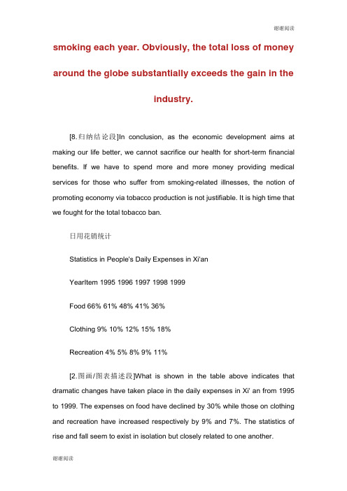
smoking each year. Obviously, the total loss of moneyaround the globe substantially exceeds the gain in theindustry.[8.归纳结论段]In conclusion, as the economic development aims at making our life better, we cannot sacrifice our health for short-term financial benefits. If we have to spend more and more money providing medical services for those who suffer from smoking-related illnesses, the notion of promoting economy via tobacco production is not justifiable. It is high time that we fought for the total tobacco ban.日用花销统计Statistics in People's Daily Expenses in Xi'anYearItem 1995 1996 1997 1998 1999Food 66% 61% 48% 41% 36%Clothing 9% 10% 12% 15% 18%Recreation 4% 5% 8% 9% 11%[2.图画/图表描述段]What is shown in the table above indicates that dramatic changes have taken place in the daily expenses in Xi' an from 1995 to 1999. The expenses on food have declined by 30% while those on clothing and recreation have increased respectively by 9% and 7%. The statistics of rise and fall seem to exist in isolation but closely related to one another.[6.原因列军段]There are two factors accounting for these changes. Development in economy is an essential one in the five years. The increased income resulting from economic growth plays an important part in the less expense on food. Hence, a small percentage of total income is enough to cover food expense. Another one is the changes in life style. When food presents no worry to the average, people begin to focus more of interest on handsome appearance and happy leisure time. As a result of such a shift, spending on clothing and recreation increased year after year.[9.趋势预测段]From the analyses made above, we may come to the conclusion that people's living standards in Xi' an have been constantly improved between 1995 and 1999. With the further growth in economy and more changes in life style, the tendency indicated in the table will continue in the table will continue in the better direction.中国大学网研究生考试频道欢迎你!/。
- 1、下载文档前请自行甄别文档内容的完整性,平台不提供额外的编辑、内容补充、找答案等附加服务。
- 2、"仅部分预览"的文档,不可在线预览部分如存在完整性等问题,可反馈申请退款(可完整预览的文档不适用该条件!)。
- 3、如文档侵犯您的权益,请联系客服反馈,我们会尽快为您处理(人工客服工作时间:9:00-18:30)。
smoking each year. Obviously, the total loss of money around the globe substantially exceeds the gain in the industry.
[8.归纳结论段]In conclusion, as the economic development aims at making our life better, we cannot sacrifice our health for short-term financial benefits. If we have to spend more and more money providing medical services for those who suffer from smoking-related illnesses, the notion of promoting economy via tobacco production is not justifiable. It is high time that we fought for the total tobacco ban.
日用花销统计
Statistics in People's Daily Expenses in Xi'an
YearItem 1995 1996 1997 1998 1999
Food 66% 61% 48% 41% 36%
Clothing 9% 10% 12% 15% 18%
Recreation 4% 5% 8% 9% 11%
[2.图画/图表描述段]What is shown in the table above indicates that dramatic changes have taken place in the daily expenses in Xi' an from 1995 to 1999. The expenses on food have declined by 30% while those on clothing and recreation have increased respectively by 9% and 7%. The statistics of rise and fall
seem to exist in isolation but closely related to one another.
[6.原因列军段]There are two factors accounting for these changes. Development in economy is an essential one in the five years. The increased income resulting from economic growth plays an important part in the less expense on food. Hence, a small percentage of total income is enough to cover food expense. Another one is the changes in life style. When food presents no worry to the average, people begin to focus more of interest on handsome appearance and happy leisure time. As a result of such a shift, spending on clothing and recreation increased year after year.
[9.趋势预测段]From the analyses made above, we may come to the conclusion that people's living standards in Xi' an have been constantly improved between 1995 and 1999. With the further growth in economy and more changes in life style, the tendency indicated in the table will continue in the table will continue in the better direction.
中国大学网研究生考试频道欢迎你!/。