雅思小作文柱线表解析
雅思小作文范文柱状图
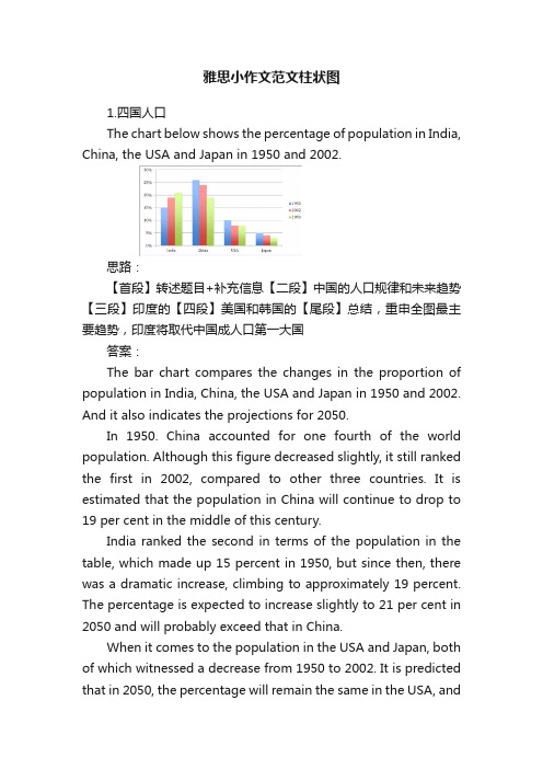
雅思小作文范文柱状图1.四国人口The chart below shows the percentage of population in India, China, the USA and Japan in 1950 and 2002.思路:【首段】转述题目+补充信息【二段】中国的人口规律和未来趋势【三段】印度的【四段】美国和韩国的【尾段】总结,重申全图最主要趋势,印度将取代中国成人口第一大国答案:The bar chart compares the changes in the proportion of population in India, China, the USA and Japan in 1950 and 2002. And it also indicates the projections for 2050.In 1950. China accounted for one fourth of the world population. Although this figure decreased slightly, it still ranked the first in 2002, compared to other three countries. It is estimated that the population in China will continue to drop to 19 per cent in the middle of this century.India ranked the second in terms of the population in the table, which made up 15 percent in 1950, but since then, there was a dramatic increase, climbing to approximately 19 percent. The percentage is expected to increase slightly to 21 per cent in 2050 and will probably exceed that in China.When it comes to the population in the USA and Japan, both of which witnessed a decrease from 1950 to 2002. It is predicted that in 2050, the percentage will remain the same in the USA, andin Japan, the percentage is likely to keep falling.Overall, it seems that India will become the country with the largest population although there is still a huge number of people in China.2.通勤工具Different modes of transport used to travel to and from work in one European city in 1960, 1980 and 2000.思路:1. 分段原则为:上升的一段,下降的一段,波动的一段。
雅思小作文柱状图写作:重在数据描述

雅思小作文柱状图写作:重在数据描述
在雅思小作文的图表中,柱状图的出现频率非常高,而且相对来讲还是比较难的,这是因为柱状图的分析比较复杂。
所以大家掌握一些雅思小作文柱状图的写作技巧还是很有必要的。
柱状图的写作重点无非就是数据的描述,一般可以分为两种情况,就是根据每个组里的柱子的个数,有单柱子和多柱子。
第一种情况,单柱子。
这种情况好写,就是分别说一下就可以了,如果是以时间为横轴的话,就写一下趋势,如果是以组为横轴,则直接写。
第二种情况,多柱子。
这个情况比较麻烦,数据少比如每个组里就两个柱子,可以全写,如果数据比较多,比如每个组里有六个柱子,那就取几个最大或者最小的就行,也就是说在比较的过程中想要拿到想要的结果就要找对比鲜明的那一对就对了。
把对比最鲜明的几个柱子描述清楚,其他的可以一带而过。
注意:对于柱状图,数据太多,则起点,结点和数量相等点必写,倍数点必写。
这是因为这些点都是非常有代表性的点,分析这些点就可以基本看出这些柱状图分析的主要结果了。
以上就是关于柱状图的雅思小作文的写作技巧,而且这是最简单的技巧介绍,最适合大家记忆和应用的了。
看了技巧之后,大家想要真正的掌握就必须得花一定的时间来练习了。
雅思柱状图作文写作技巧:数据描述很重要

最权威的国际教育服务平台
资料来源:教育优选 /
雅思柱状图作文写作技巧:数据描述很重要
在雅思小作文的图表中,柱状图的出现频率非常高,而且相对来讲还是比较难的,这是因为柱状图的分析比较复杂。
所以大家掌握一些雅思小作文柱状图的写作技巧还是很有必要的。
柱状图的写作重点无非就是数据的描述,一般可以分为两种情况,就是根据每个组里的柱子的个数,有单柱子和多柱子。
第一种情况,单柱子。
这种情况好写,就是分别说一下就可以了,如果是以时间为横轴的话,就写一下趋势,如果是以组为横轴,则直接写。
第二种情况,多柱子。
这个情况比较麻烦,数据少比如每个组里就两个柱子,可以全写,如果数据比较多,比如每个组里有六个柱子,那就取几个最大或者最小的就行,也就是说在比较的过程中想要拿到想要的结果就要找对比鲜明的那一对就对了。
把对比最鲜明的几个柱子描述清楚,其他的可以一带而过。
注意:对于柱状图,数据太多,则起点,结点和数量相等点必写,倍数点必写。
这是因为这些点都是非常有代表性的点,分析这些点就可以基本看出这些柱状图分析的主要结果了。
以上就是关于柱状图的雅思小作文的写作技巧,而且这是最简单的技巧介绍,最适合大家记忆和应用的了。
看了技巧之后,大家想要真正的掌握就必须得花一定的时间来练习了。
雅思写作小作文之柱状图详解
雅思写作小作文之柱状图详解雅思写作小作文之柱状图详解,小作文一般都是图表作文,常见的类型主要有表格图、曲线图、柱状图、饼状图和画图题,虽然种类比拟多,但是每个题型都有自己的规律,给大家搜集了雅思写作小作文题型的详细内容希望能够给大家带来帮助!从雅思写作小作文历年题型来看柱图和线图是每月常考的题型,有时候可能会有连考或者是交替考的趋势,饼图和表格题也是相对频率较高的题型,画图题那么是围绕在流程图或者是地图题上面,不管考取哪一种题型,要求都是一样的。
经常在考试的时候图表看懂了但是数据比拟凌乱,找不出明显的特征,或者是找到了特诊但是不知道用什么样的思路来把它描述的清楚一些。
一般情况下单柱子的小作文试题比拟简单,主要是分析一下横纵轴上的内容即可,如果是以时间为横轴的话,主要是写纵轴上的趋势,如果是以组为横轴,那就直接进行对柱子进行描述即可。
但是多数情况下雅思小作文柱状图是以多柱子的形式出现的,这个时候就要针对横纵轴之间的对应关系逐个分析。
如果柱子的个数比拟少的时候可以全局部析,但是要是柱子的个数比拟多的情况下就要着重找几个柱子进行分析。
雅思写作小作文范文分享:1. The chart and graph below give information about sales and shareprices for Coca-Cola.Write a report for a university lecturer describing the information shownbelow.· You should write at least 150 words.· You should spend about 20 minutes on this task.Model answer:The pie chart shows the worldwide distribution of sales of Coca-Cola in theyear and the graph shows the change in share prices between 1996 and.In the year , Coca-Cola sold a total of 17.1 billion cases of their fizzy drinkproduct worldwide. The largest consumer was North America, where 30.4 percent of the total volume was purchased. The second largest consumer wasLatin America. Europe and Asia purchased 20.5 and 16.4 per cent of the totalvolume respectively, while Africa and the Middle East remained fairly smallconsumers at 7 per cent of the total volume of sales.Since 1996, share prices for Coca-Cola have fluctuated. In that year, shareswere valued at approximately $35. Between 1996 and 1997, however, pricesrose significantly to $70 per share. They dipped a little in mid-1997 and thenpeaked at $80 per share in mid-98. From then until their value fellconsistently but there was a slight rise in mid-.2. The chart below gives information about global sales of gamessoftware, CDs and DVD or video.Write a report for a university lecturer describing the information.· You should write at least 150 words.· You should spend about 20 minutes on this task.Model answer:The chart shows the changes in the sales of video material / DVDs, gamessoftware and CDs around the world in billions of dollars over a three-yearperiod. It can be seen that the sales of videos / DVDs and games softwarehave increased, while the sales of CDs have gone down slightly.Between and , the sale of videos and DVDs rose by approximately13 billion dollars. In , just under 20 billion dollars worth of these itemswere sold, but in , this figure had risen to a little over 30 billion dollars.The sales of games software also rose during this period, but less sharply.Sales increased from about 13 billion dollars in to just under 20 billiondollars three years later. By contrast, during the same time period, the sale ofCDs fell from 35 billion dollars in to about 32.5 billion dollars in .3. The graphs below show the types of music albums purchased bypeople in Britain according to s3x and age.Write a report for a university lecturer describing the information shownbelow.· You should write at least 150 words.· You should spend about 20 minutes on this task.Model answer:The three graphs provide an overview of the types of music people purchase inthe UK. At first glance we see that classical music is far less popular than popor rock music.While slightly more women than men buy pop music, the rock market isdominated by men with 30% buying rock, compared to 17% of women. Fromthe first graph we see that interest in pop music is steady from age 16 to 44with 20% of the population continuing to buy pop CDs after the age of 45.The interest in rock music reaches its peak among the 25 to 34 year olds,though it never sells as well as pop. Interest also drops off after the age of 35with an even sharper fall from age 45 onwards, a pattern which is the oppositeto the classical music graph.雅思写作小作文之柱状图详解的详细内容就是这些,包括了详细的范文以及写作技巧和注意点,希望对雅思考试有所帮助,更多雅思最新资讯请继续关注雅思频道。
英语考试作文-24日雅思写作小作文范文:柱状图+表格

英语考试作文24日雅思写作小作文范文:柱状图+表格2018年5月的最后一场雅思考试已经结束,一起来回顾本场雅思考试的小作文吧。
本场雅思写作小作文题目为:The chart and table show the population size and life expectancy of three countries.题型为柱状图与表格题混合模式。
总体来说难度不大,建议考生将柱状图与表格的数据分开描述,并注意时态。
雅思小作文真题: The chart and table show the population size and life expectancy of three countries.Summarize the information by selecting key features and making comparison where is relevant.小作文范文解析:改题目属于柱状图和表格的混合型,要求描述三个国家在过去和将来人口数量和寿命的变化趋势。
建议把柱状图和表格分开来写,柱状图按照国家主体进行描述在,注意时态。
而寿命都是上升,国家之间也要对比。
范文共计9句话。
雅思小作文范文: The bar chart and the table illustrate variations in the demographic size and life span in 1950, 2000 and projections for 2050 in three countries including China, the United States and Spain.It is striking to note that China is always the most populous country, with its population accounting for more than 400 million in 1950. After 5 decades, this figure tripled and then is projected to keep rising to almost 1600 million in 2050. Meanwhile, a similar trend could be spotted in American population, quadrupling to nearly 400 million over the centenary. The Spanish remained the least and the most stable at around 80 million.As reflected from table, Life expectancy in all the countries is on a rise especially in China where it is projected to double from the initial 40.1 to 79 in 2050. Also noticeable is life of the Spanish is mostly the longest one, growing from 69 to 82.8 years old over this period except in 2000 when it was surpassed by that of Americans who lived 79 years old. American people will also enjoy rising longevity, approaching 82 years old.In summary, the Chinese always tremendously outnumber Americans and the Spanish and life span is predictedto improve and become almost equal in these countries.范文原创自小站老师Alice.Hua 字数 213 words以上就是2018年4月24日雅思写作真题范文,。
雅思小作文柱图大全

To sum up, younger people are keen on pop and rock, while classical enjoys more popularity among those who are older than 45. Nevertheless, people who are from 25 to 34 seem to appreciate all three music types.
The areas of land damage in Africa and Asia are similar, totaling approximately 1,200 million hectares for each, while in Australia and Europe the numbers are considerably lower, averaging between 300 and 400 million.
由此,我们了解了过去的几十年里美国人对待 婚姻的态度以及他们多方面的婚姻状况。
Thus, we have gained an insight into the attitudes of Americans towards marriage and their multifaceted statuses in the past decades of years.
Looking at the causes behind land damages, it can seen from the chart that in Africa, Europe and especially Australia, breeding is the leading cause of land loss, damaging approximately 500, 110 and 380 million hectares of land respectively. Next comes tree cutting which takes away slightly larger areas of land than farming in all the three regions.
雅思小作文-线图课件

P3
In spite of some fluctuation in the expected percentages, the proportion of older people will probably continue to increase in the next two decades in the three countries. A more dramatic rise is predicted between 2030 and 2040 in Japan, by which time it is thought that the proportion of elderly people will be similar in the three countries
介绍段包括
时间段 X轴
数据形式 Y轴
研究的对象
大体描绘一下趋势
D
C
A
B
The graph below shows radio and television audiences throughout the day in 1992.
The line graph describes the percentage of radio listeners and television viewer over four years in the U.K. throughout the day from Oct to Dec in1992.
线型作文三要素
趋势
添加标题
时间
添加标题
prep
添加标题
数据
添加标题
v+adv/adj+n
添加标题
tense
添加标题
雅思小作文柱图表图写作_英语考试_外语学习_教育专区

CHERYL XIAMEN NEWORIENTAL SCHOOL IELTS INTERNATIONAL LEARNING CENTRE
各种图各种写
Language for comparisons
Percentage of boy and girl students in Class A
The second graph shows that employer support is maximum (approximately 60%) for the under 26yr students. It drops rapidly to 32% up to the third decade of life, and then increases in late adulthood up to about 44%. It is unclear whether employer support is only for career-focused study, but the highest level is for those students who mainly study for career purposes.
• whereas the popularity of buses has declined
since 1960, falling from just under 35% in 1960 to 27% in 1980 and only 15% in 2000.
P4
• The graph indicates the growing use of cars for commuting to work between 1960 2000, and the continued decline in the popularity of buses from being the most popular mode of transport in 1960 to the least popular in 2000.
雅思小作文柱状图优秀范文及解析

雅思⼩作⽂柱状图优秀范⽂及解析 雅思写作除了词汇量要达到以外,还有很多提分点的哦。
店铺为雅思栏⽬⼤家带来雅思⼩作⽂柱状图优秀范⽂及解析,希望对⼤家备考雅思有所帮助! 第⼆类:柱状图 You should spend about 20 minutes on this task. The charts below show the levels of participation in education and science in developing and industrialized countries in 1980 and 1990.Write a report a university lecturer describing the information shown below. You should write at least 150 words. model answer 1.The data shows the differences between developing and industrialized countries’ participation in education and science.2.In terms of the number of years of schooling received, we see that the length of time people spend at school in industrialized countries was much greater at 8.5 years in 1980, compared to 2.5 years in developing countries. The gap was increased further in 1900 when the figures rose to 10.5 years and3.5 years respectively. 3.We can see a similar pattern in the second graph, which shows that the number of people working as scientists and technicians in industrialized countries increased from 55 to 85 per 1,000 people between 1980 and 1990, while the number in developing countries went from 12 to 20. 4.Finally, the figures for spending on research and development show that industrialized countries more than doubled their spending, from $200bn to$420bn, while developing countries decreased theirs , from$75bn down to $25bn. 5.Overall we can see that not only are there very large differences between the two economies but that there gaps are widening. 分析 第⼀段: 1 The data shows the differences between developing and industrialized countries’ participation in education and science. 本句话依旧是对题⼲进⾏改写。
雅思图表作文柱状类写法解析

剑盟雅思预备学院官网:/雅思图表作文柱状类写法解析在雅思作文中,图表作文也是考试的常见类型,那么图表作文中柱状类的写作题目应该如何来写呢?怎样对柱状图做出更好的解析,才能够迎合考官,拿到高分呢?下面就我们一起来看看吧!1.如果横轴有明显的时间推移的话,烤鸭们应连接柱子顶点,重在描述柱子的升降起伏,写法类似于线状图。
2.如果无时间推移,则写法和饼状图一样。
即按照各比较对象所占比例的高低写,同时要注意各所占比例之间的比较。
可以用到的词汇有:1.表示“占多少”的动词Account forTake upMake upContribute toHaveRepresent2.表示“最高级”和“比较级”第一/最小 the largest/biggest proportion of第二 the second/next largest/expensive(+ 形容词的最高级)第三 followed closely by最低/最小 the smallest percent of all3.表示“相同比例”即在饼状图中遇到了比例相同或者差不多的饼,如有A B两个比较对象。
A accounts for the same percentage asB .剑盟雅思预备学院官网:/ The proportion of A is as high as BA andB contributed equally/evenly to (all )在观察柱形图的时候首先要留意横轴的数据,若横轴为时间轴或者是年龄趋势,那么我们在主体段写作时候的基本思路就为从左到右;若横轴数据为具体专有名词诸如地点,交通工具等时,主体段的写作思路就可能是按照柱形的长度排列。
本文根据上述的分析做以下的总结:一、按照横轴从左到右排列数据:1. 两根柱且趋势截然相反在这种写法中,我们要注意观察2根柱的上升/下降的幅度。
以下我们就来看一个例子:The charts below show the main reasons for study among students of different age groups and the amount of support they received from employers.Write a report for a university lecturer describing the information below.You should write at least 150 words.You should spend about 20 minutes on this task.The first graph shows that there is a gradual decrease in study for career reasons with age. Nearly 80% of students under 26 years, study for their career. This percentage gradually declines by approximately15% every decade. Only 40% of 40-49yr olds and 18% of over 49yr olds studied for career reasons in late adulthood.Conversely, the first graph also shows that study stemming from interest increases with age.There are only 10% of under 26yr olds studying out of interest. The percentage increases slowly till the beginning of the fourth decade, and increases dramatically in late adulthood. Nearly same number of 40-49yrolds study for career and interest. However 70% of over 49yr olds study for interest in comparison to 18% studying for career reasons in that age group.在第一幅柱状图中,我们可以看到,蓝色和红色的2根柱呈现出截然相反的变化趋势,因此,我们在排列数据时可以分别描述各自的上升/下降幅度,见划线第一个句子。
雅思作文——柱状图和表格
对比和比较
All the same/just the same as Contrary to B,A is …. Conversely, B is … On one hand, on the other hand Compare, contrast A with B
高分词汇 A is higher than B的高级方法 Be superior/inferior to 社会地位 social status
Overall, the students who watch less television have higher scores, and the average test scors increases.
The highest score of 80 is for students who usually watch one hour or less of television a day.
100 50
25 20
T.V
Newspaper
Internet
Billboards
250
125
50
25
200
75
100
20
Advertising Expenditure
Model
The bar chart shows the respective amounts of money in thousands of dollars spent on different types of advertising by two companies- Acme and Famous.
As much as 不可数名词 as many as 可数 The books of this semester are two times as
雅思小作文柱状图解析

The graph below shows the different modes of transport used to travel to and from work in one European city in 1960, 1980 and 2000.
• The graph shows the changing patterns in commuting by train, car, tube or bus for commuters in London in the years 1960, 1980 and 2000. • The number of people using trains at first rose from just under 20% in 1960 to about 26% in 1980, but then fell back to about 23% in 2000. • Use of the tube has been relatively stable, falling from around 27% of commuters in 1960 to 22% in 1980, but climbing back to reacows how age and gender influence the frequency of heart attacks in the US. • Less than 6% of all heart attacks occur in the 2944 age group. The number of women who suffer heart attacks in this group is negligible - only 3000 per year, compared to 123,000 men. • However the proportion of men and women with heart attacks rises dramatically between 45 and 64, with over half a million per year. Over 420,000 men a year in this age group have heart attacks. The incidence amongst women increases - women have one heart attack for every three men in this age group.
雅思写作小作文中的柱状图该怎么分析
雅思写作小作文中的柱状图该怎么分析雅思写作小作文中的柱状图该怎么分析雅思写作考试的小作文部分有一类题型是柱状图,不知道大家了解的多不多,是不是有合适的方法应对这类雅思小作文,今天文都国际教育小编将为大家介绍的是如何分析雅思写作中的柱状图,希望对大家有帮助。
在雅思小作文数据类题目中,柱状图的信息量往往较多且杂,因而成为了了大部分雅思烤鸭们比较头疼的题型。
在对雅思写作考试柱状图的数据处理的过程中,除了对柱状图进行动态或静态的区分、进而对数据进行相应的变化趋势或分布状态描述以外,在雅思文章中还有一个重要的细节需要进行阐述,而这个夺分的关键,就是柱子间的差距所体现出的信息。
下面就以两道例题为例,简单地展示如何从“差距”这个细节中找到隐藏的信息点。
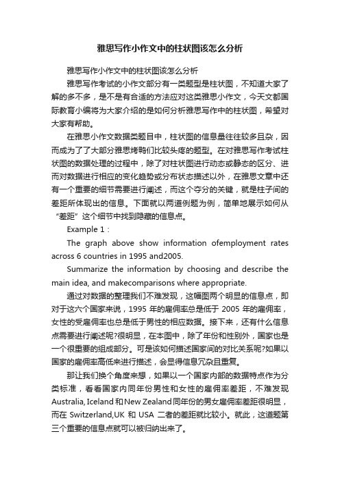
Example 1:The graph above show information ofemployment rates across 6 countries in 1995 and2005.Summarize the information by choosing and describe the main idea, and makecomparisons where appropriate.通过对数据的整理我们不难发现,这幅图两个明显的信息点,即对于这六个国家来说,1995年的雇佣率总是低于2005年的雇佣率,女性的受雇佣率也总是低于男性的相应数据。
接下来,还有什么信息点需要进行阐述呢?很明显,在本图中,除了年份和性别外,国家也是一个很重要的组成部分。
可是该如何描述国家间的对比关系呢?如果以国家的雇佣率高低来进行描述,会显得信息冗杂且重复。
那让我们换个角度来想,如果以一个国家内部的数据特点作为分类标准,看看国家内同年份男性和女性的雇佣率差距,不难发现Australia, Iceland 和New Zealand同年份的男女雇佣率差距很明显,而在Switzerland,UK 和USA 二者的差距就比较小。
雅思小作文柱状图范文和写法介绍

雅思小作文柱状图范文和写法介绍对于柱状图出现的高频情况,每一个烤鸭都十分清楚,bar chart有那么的重要。
那么今天的干货就是告诉你,逐段讲解每一段要写什么!还有怎么写!先来一个例子:The chart shows the expenditure of two conturies on consumer goods in .★首先标题很重要,这是要我们明白这个图的含义。
接下来就要看xy横坐标和纵坐标。
然后有哪些内容今天我们就省略介绍横纵坐标的内容,因为我相信你们都会看,也都知道左边是钱,右边是5种具体的工程。
还有这是两个国家的比拟。
先来看看大体结构:Introduction:改写图的标题“The chart shows the expenditure of two conturies on consumer goods in .〞OverviewBody paragraph 1Body paragraph 2Introduction:The chart illustrates the amount of money spent on 5 consumer goods〔cars、computers、books、perfume and cameras〕in France and the UK in .分析一下:我并没有把标题中的所有的单词都同意替换,因为不是每个词都可以被改写的,例如“ The chart〞,还有两个国家和时间。
这是介绍段,所以你要具体介绍到底有哪些消费品,所以我不但给出了具体的数字5种并且把这五种罗列了出来。
而且我用了括号,这个括号在写task1的时候很好用。
你可以把很多信息集合写在括号里,罗列出来就行,不涉及写句子和语法。
不过不能只改写标题,还要看看有哪些图中有但是标题中没有的信息,比方“Pounds Sterling〞所以要再加上一句。
The chart illustrates the amount of money spent on 5 consumer goods〔cars、computers、books、perfume and cameras〕in France and the UK in . Units are measured in pounds sterling.★接下来我们要说的是Overview段,这一段很重要。
- 1、下载文档前请自行甄别文档内容的完整性,平台不提供额外的编辑、内容补充、找答案等附加服务。
- 2、"仅部分预览"的文档,不可在线预览部分如存在完整性等问题,可反馈申请退款(可完整预览的文档不适用该条件!)。
- 3、如文档侵犯您的权益,请联系客服反馈,我们会尽快为您处理(人工客服工作时间:9:00-18:30)。
6. 达到最低点:reach a bottom (nadir) at/ bottom out at/ reach the lowest level (point)
7. 表示在波动中上升/下降 (fluctuate): Fluctuate with an overall upward (downward) trend Increase (decline) despite a few fluctuations (in spite of) there are some ups and downs/ rises and falls in…
第三段:亮点!描述第三列内容,与第二段内容相联系。 Interestingly, Tokyo, which only has 155 kilometers of route, serves the most passengers per year, at 1927 million passengers. The system in Paris has the second greatest number of passengers, at 1191 million passengers per year. The smallest underground railway system, Kyoto, serves the smallest number of passengers per year as predicted.
2. In general, people in all five countries spent most of their income on basic living requirements: food and clothes, while expenditure on leisure and education constituted the smallest proportion.
8. P10 表示“在某段时间内”: during the period from…to…; between…and…; during the span of 5 years; during the first two decades; ★Witnessed句式 (主语为时间:某个时间段见证了某种趋势变化。) eg. The period from 1980 to 2000 witnessed/ saw a slight rise from 100m to 120m in the sales figure. ★Underwent句式 (主语为物体:某物经历了某种趋势变化。) eg. The sales figure underwent/ experienced a slight rise from 100m to 120m during the first twenty years (1980-2000). 9. 表示倍数: the number doubled/ tripled/ quadrupled/ quintupled from…to… the number increased five-fold from…to… the number increased seven times as much as + 数字 Increase by 100 增加了 Increase at/ to 100 增加到
1. The table reveals the different proportions of annual consumption in five countries in 2002. 揭示了,表明了: reveal; reflect; indicate; demonstrate; express; present; show; (大作文:某人表明观点: state; claim; suggest; declare;)
13. 排序
…ranked first; followed by…; next is…; then comes…
静态图:
1. 倍数、排序(同动态图)
2. P12 比较大小:larger than/ less than; outweigh
3. 数据相似:A was approximately as much as that of B. A showed a great resemblance/similarity to B. A and B shared similar figures. 4. 最大值:ranked first; had the largest percentage/ proportion of.. 最小值:What cannot be ignored is…; had the smallest percentage/ proportion of…
Compared with other four countries, the percentage of spending that people in Turkey on food, drink and tobacco was the largest at 32.14%. On the contrary, the spending on the same item/ category in Sweden was the least (15.7%),while that in the rest countries (Ireland, Italy and Spain) accounted for 28.91%, 16.36% and 18.80% respectively. In terms of the expenditure on clothes and shoes, Italians paid more (9%) compared with others, while Swedish people still spent the smallest percentage at 5.40%. Meanwhile, the expenditure on this category in
第一段:改写题目
The data given by the table is about the details regarding the underground railway systems in six cities.
第二段:第一、二列作为一段,运用最高级以及相互比较。 London has the oldest underground railway system among the six cities. It was opened in 1863. Paris is the second oldest, in which it was opened in 1900. It was followed by Tokyo, Washington DC and Kyoto. Los Angeles has the newest/ latest underground railway system, and was only opened in 2001. In terms of the size, London has the longest route, 394 kms, which is twice as large as the system in Paris. In contrast, Kyoto has the smallest one, only 11 kms, which is 30 times less than that of London. Subsequent adj. 接下来的 on the contrary, conversely adv. 相反地
About, around, nearly, close to, approach, approximately 大约
5. 占比:account for; take up; make up; constitute; hold; occupy; cover; possess; #43;序数词 eg. 三分之一:one third 五分之三:three fifths
IELTS写作
Lesson 2表格&线图&柱图
一、动态图和静态图所需要的词汇(P10~14)
动态图: 347,231
1. 上升:increase/ rise/ grow up/ climb/ ascend/ take on an upward trend… (1)缓慢地: slowly/ gradually/ gently/ slightly/ moderately/ steadily/ fractionally… (2)迅速地: sharply/ dramatically/ rapidly/ substantially/ significantly/ considerably/ enormously/ tremendously/ quickly… (3)迅速地上升:soar(高涨)、surge(剧增)、leap(飞跃)、shoot up、 rocket、zoom up, skyrocket v.… 2. 到达顶峰: reach a peak (zenith)/ peak at/ arrive at the highest level (point); maximum n. Maximise v.
10. 比较上升/下降的程度
the increase of … was not as dramatic as that of…
the decline of … was just as moderate as that of…
11. 回到原点 dropped back to the initial/ original level…
第四段 In conclusion, the underground railway systems in different cities vary a lot in the size of the system, the number of passengers served per year and in the age of the system.
