雅思图表写作:线图
雅思图表作文-线图

Dubai Gold SalesThe line graph shows estimated sales of gold in Dubai for 12 months in 2002 in millions of dirhams. There were two main seasons for gold sales.The main season for sales is in the December to May period. Saleswere consistently above 200 million dirhams per month, rising sharply to a peak of 350 million dirhams in March. However, for the next four months, sales declined steadily,reaching an annual low of 120 million dirhams in July.In August, there was a sudden increase. Sales almost doubled, rising from 120 million dirhams in July to 210 million dirhams in August. This was followed by a drop in September, the July figure.From September to October, sales recovered, from 120 to 180 million. In October and November, sales r emained steady, and there was a small increase in December to 190 million dirhams.In conclusion, the main sales period is in the early part of the year, slumping in the summer, except for a sudden increase in August.Dubai Tourism, 1990-1994The graph shows the numbers of tourists in hundreds of thousands visiting Dubai between 1990 and 1994. There are several features in the graph.First of all, the total number of tourists increased rapidly between 1990 and 1994. In 1990 there was a total of 450,000 tourists in Dubai. This rose sharply to 625,000 in 1991, an increase of more than 30%, and rose slightly again to just under 700,000 in 1992. In the following two years, the number of visitors started to pick up again and reached 1 million in 1994. This was more thandouble the figure for 1990.The second trend is that there was a huge increase in the number of tourists from Russia. In 1990, Russian tourists comprised only 20,000 or less than 5% of visitors. This number shot up to 50,000 in 1991 and doubled again to more than 100,000 in 1992. Between 1992 and 1994, the number trebled, from 110,000 to 330,000. This meant that Russian tourists made up one-third,or 33%, of Dubai’s 1 million visitors in 1994. In comparison, the number of tourists from other countries increased only slightly, from 550,000 in 1991 to 580,000 in 1994.In conclusion, although the number of tourists from all countries is increasing, Russian tourists are becoming more and more important for the tourism industry in Dubai.North American Fish CatchesThe graph shows changes in fish catches for the US and Canada over the last 30 years.The most significant feature is that fish catches have declined drastically in both the US and Canada since the mid-1980s. Although Canadian production is much lower, its echoes US figures, declining or increasing at the same rate.Between 1972 and 1977, US fish catches averaged between 2.5 and 2.75 million tonnes per year, while Canadian landings fluctuated between 800,000 and 1.1 million tonnes. In 1997, however, there was a big increase in fish caught in the US, and this rise continued up to a peak of 5.5 million tonnes in 1987. During the same period, Canada’s catch increased from 1 million tonnes to 1.5 million tonnes, an increase of 50%.From 1987 onwards, there was a sudden decline in both countries. US figures tumbled to 4 million tonnes in 1995, a drop of 28%, and Canadian catches plunged to 0.5 million tonnes, a drop of 66%. In the following four years, US catches fluctuated around the 4 million tonne mark, while Canadian catches rose very slightly.In general, both Canadian and the much larger US catch have declined dramatically since their peak in the mid-1980s.。
雅思小作文线图思路
雅思小作文线图思路英文回答:When it comes to brainstorming ideas for a line graphin IELTS Writing Task 1, the key is to first understand the data presented in the graph. For example, if the line graph shows the changes in temperature over a period of time, I would first look at the x-axis to see the time frame and then look at the y-axis to see the temperature range. This helps me to have a clear understanding of the data before I start writing.Next, I would identify the main trends or patterns in the line graph. For instance, if the line graph shows a steady increase in temperature over the years, I would make a note of that and think about how to describe this trendin my writing. It's important to pay attention to the highs and lows in the graph as well, as they can provide valuable information for my description.After understanding the data and identifying the main trends, I would start drafting my writing. I would use a variety of vocabulary to accurately describe the changes shown in the line graph. For example, instead of repeatedly using the word "increase", I might use synonyms like "rise", "climb", or "grow" to make my writing more diverse and interesting.In addition, I would pay attention to the overall structure of my writing. I would begin with an introduction that gives an overview of the line graph, then move on to describing the main trends and any significant points, and finally end with a conclusion that summarizes the keypoints from the graph.Overall, when approaching a line graph in IELTS Writing Task 1, it's important to take the time to understand the data, identify the main trends, use a range of vocabulary, and structure the writing effectively.中文回答:在处理雅思写作任务1中的线图时,关键是首先要理解图表中呈现的数据。
雅思小作文题型整理
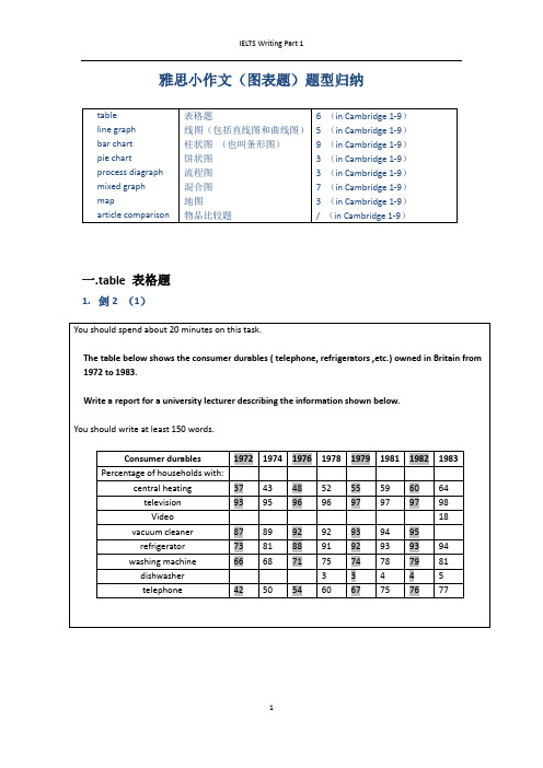
雅思小作文(图表题)题型归纳一.t able 表格题1.剑2 (1)4.剑5(4)6.剑7(1)二.Line graph线图(含直线和曲线图)1.剑3(4)You should spend about 20 minutes on this task.The graph below shows the unemployment rates in the US and Japanbetween March 1993 and March 1999.Write a report for a university lecturer describing the information shownbelow.You should write at least 150 words.You should spend about 20 minutes on this task.The graph below shows the proportion of the population aged 65 and overbetween 1940 and 2040 in three different countries.Summarize the information by selecting and reporting the main features,and make comparisons where relevant.Write at least 150 words.You should spend about 20 minutes on this task.The graph below shows the consumption of fish and some different kinds of meatin a European country between 1979-2004.Summarize the information by selecting and reporting the main features, andmake comparisons where relevant.Write at least 150 words.You should spend about 20 minutes on this task.The graph below shows the quantities of goods transported in the UK between 1974 and 2002 by four different modes of transport.Summarize the information by selecting and reporting the main features, and make comparisons where relevant.Write at least 150 words.5.剑9(4)三.Bar chart 柱状图You should spend about 20 minutes on this task.The chart below shows the amount of leisure time enjoyed by men and women of different employment status.Write a report for a university lecturer describing the information shown below.Write at least 150 words.Leisure time in a typical week: by sex and employment status,1998-99You should spend about 20 minutes on this task.The table below shows the figures for imprisonment in five countries between 1930 and 1980.Write a report for a university lecturer describing the information shown below.You should write at least 150 words.You should spend about 20 minutes on this task.The chart below shows the amount spent on six consumer goods in fourEuropean countries.Write a report for a university lecturer describing the information shown below. You should write at least 150 words.You should spend about 20 minutes on this task.The charts below show the level of participation in education and sciencein developing and industrialized countries in 1980 and 1990Write a report for a university lecturer describing the information shown below. You should write at least 150 words.5.剑4(3)You should spend about 20 minutes on this task.The chart below shows the different levels of post-school qualifications inAustralia and the proportion of men and women who held them in 1999.Summarize the information by selecting and reporting the main features,and make comparisons where relevant.You should write at least 150 words.You should spend about 20 minutes on this task.The charts below show the main reasons for study among students ofdifferent age groups and the amount of support they received from employers.Summarize the information by selecting and reporting the main features,and make comparisons where relevant.You should write at least 150 words.You should spend about 20 minutes on this task.The charts below give information about USA marriages and divorce ratesbetween 1970 and 2000, and the marital status of adult Americans in twoof the years.Summarize the information by selecting and reporting the main features,and make comparisons where relevant.You should write at least 150 words.You should spend about 20 minutes on this task.The chart below shows information about changes in average house prices in fivedifferent cities between 1990 and 2002 compared with the average house prices in 1989.Summarize the information by selecting and reporting the main features, and makecomparisons where relevant.You should write at least 150 words.四.Pie chart饼图1.剑7(4)2.剑8(2)3.剑9(3)五.流程图1.剑1(2)You should spend about 20 minutes on this task.The diagrams below show the life cycle of the silkworm and the stages inthe production of silk cloth.Summarize the information by selecting and reporting the main features,and make comparisons where relevant.Write at least 150 words.六.混合图。
雅思线形图作文
雅思线形图作文The line graph illustrates the number of visitors to three different London museums— the British Museum, the National Gallery, and the Science Museum— from 2007 to 2012.Overall, it is evident that the British Museum consistently attracted the highest number of visitors, while the Science Museum saw a gradual increase in attendance over the years. The National Gallery, however, experienced fluctuations in its visitor numbers.In 2007, the British Museum started with approximately 5 million visitors, which rose steadily to around 6 million in 2010 before peaking at approximately 6.5 million in 2012. This upward trend indicates its growing popularity among tourists.In contrast, the National Gallery had around 4.5 million visitors in 2007. The number fluctuated slightly, reaching a high of 5 million in 2008, but then it dropped to about 4 million in 2010, before recovering to 4.5 million in 2012. This inconsistency suggeststhat the National Gallery faced challenges in maintaining its visitor numbers.The Science Museum, starting at about 3 million visitors in 2007, showed a steady increase throughout the period, reaching around 4.5 million by 2012. This indicates an increasing interest in the Science Museum, possibly due to new exhibitions or marketing efforts.In conclusion, while the British Museum remained the most popular among the three, the Science Museum showed a positive growth trend, contrasting with the fluctuations experienced by the National Gallery.中文翻译:该线形图展示了从2007年到2012年间,三个不同伦敦博物馆—大英博物馆、国家美术馆和科学博物馆—的游客数量。
雅思写作Task 1 曲线图 Line Chart

You should write at least 150 words.
综合图:
综合图:model answer
• The graphs give information about global birth rates and population size. They predict that the global population growth rate will begin to decrease towards the middle of this century and will eventually stabilize at approximately 11 billion.
饼型图题:
You should spend about 20 minutes on this task.
The two pie charts below show the percentage of the Earth’s surface area and the percentage of the two world’s population for the seven continents.
You should write at least 150 words.answer
1
This line graph shows the birth and death rates per thousand population from 1900 to 1980. Before 1920 the birth rate remained level at around 40 per thousand. Then from 1920 it fell until it reached 30 per thousand in 1930. From 1930to 1945 it rose slowly(increased steadily) to 50 per thousand. Since 1945 it had decreased/fallen steadily. It got to 20 per thousand in 1980. The birth control measures were becoming effective and the birth rate was falling/decreasing at the moment and would continue to fall.
雅思作文——线状图

A. Chart 1. Pie chart 2. Line Chart 3. Bar Chart B. Table C. Process
总分结构 总:替换标题 分:整体特征 细节 - 抓住特征项 -合并同类项
2. Line Chart:
Line Chart 1. Environment
改变句式结构
用代词(线图是一个数据不停变化,可以用代词)
用 before / after 连接 Prices rose for two years, before dropping again in 1992 After a slight drop, there was a steady price rise.
线图核心:趋势
Model 1
The graph shows the bird population in Europe, measured in million, from years 1977 to 2001, in threeyearly intervals. Overall, the graph shows the population decreased over time. In 1977, the population was 120 million birds. This increased to a peak of about 126 million in 1980, and then dropped sharply over the next six years to approximately 98 million in 1986. It then rose significantly to about 112 million in 1989. It fell sharply over the next three years to about 95 million in 1992 and remained relatively stable after that at between 96 and 90 million birds. The graph shows a trend of a gradual decrease in the number of birds since 1995.
雅思线图范文

雅思线图范文以下是一个可能的雅思线图作文范文,字数超过700字。
如果你对于字数有特殊要求,请告诉我。
The line graph depicts the changes in the population of three different types of turtles over a 20-year period, from 1990 to 2010. The data is presented in the units of thousands.Overall, it is clear that the population of turtle types A and B fluctuated over the period shown, while the population of type C experienced a steady upward trend. Furthermore, type A experienced the greatest change in population over the 20-year period.In 1990, the population of type A turtles stood at around 50,000, while the population of type B turtles was slightly higher, at about 60,000. The population of type C turtles was the lowest, at around 40,000.Over the next five years, the population of type A turtles rapidly increased to almost 80,000, making it the most populous type by 1995. The population of type B turtles also increased, but at a slower rate, reaching around 70,000. The population of type C turtles remained relatively stable at around 40,000.Between 1995 and 2000, the population of type A turtles continued to rise, reaching its peak at approximately 90,000. In contrast, the population of type B turtles decreased slightly to around 65,000. Type C experienced a significant increase in population, reachingover 110,000 by 2000.From 2000 to 2005, the population of type A turtles declined gradually to approximately 75,000. Type B turtles experienced a sharp decrease to below 50,000. The population of type C turtles continued to increase, surpassing 130,000 by 2005.Finally, in the last five years of the period, the population of type A turtles fluctuated around 85,000, while the population of type B turtles remained relatively stable at around 45,000. Type C turtles continued to dominate, with their population peaking at around 140,000 by 2010.In conclusion, the line graph demonstrates the varying population trends of three types of turtles over a 20-year period. While type A and B turtles experienced fluctuations in population, type C turtles witnessed a continuous increase. Overall, type C turtles had the highest population by the end of the period shown.。
雅思图表作文题的写作技巧
雅思图表作文题的写作技巧1、line graph线图要注意分段。
尤其是多条线,如果放在一起描述,很容易混乱。
所以建议还是分开来描述,主要原则是仅看描述就能画出图线。
一般而言,是按时间,除了结合时间还要看走势上的分段,大段的描述不可缺;另外就是最高点和最低点,以及拐点的数字以及时点描述。
只有具备了这两点,才能画出图线的走势。
对于不同线之间的比较,可以在最后一段进行,利用交点进行分段。
2、Bar chart柱状图,同样的,要注意分组。
尤其是多国家、多年分之间的比较,建议考生根据最大的特点分成两组(最多三组),然后分组(一组一段)进行叙述。
此类图中,可以少用数据,可以动态的方式进行描述,同时可以利用排名来叙述特点。
描述完特点后,如果图表较为简单,最后一段可以把每项的最高、最低点写一下。
如果类别少(2个),还是分别进行描述比较清晰。
无论了line graph 还是bar chart尽量以单项从头至尾的描述为首选(这样清晰明了),中间穿插一两次对比,或者最后对比。
(但这种描述方式只适合于比较的项目少的情况,即只是两者之间的比较。
类别一旦多,如果是可以归为两类的情况,则也可以采用这种描述方式,否则不适用)3、Table表格也可以分为动态描述和静态描述。
动态:即为紧跟一个国家,从头到尾描述完所有特点,然后再描述另外的国家。
静态是:每个特点就每个国家分别描述。
无论以上两种采用哪一个,都应当注意分组,尤其是在国家和特点过多的情况下,分组描述,可以减少字数。
对于明显的两类,建议采用动态描述法,因为它们在每一项特点下都具有相似的规律,这样比较明晰。
两个图表的写作:一般分为两段,分别进行描述。
如果其中一个图特别简单,可以用最后一段简单描述,如果两个图表差不多复杂就采用1:1的比例,分别对各自特点进行描述,然后在最后一段将两者进行联系和比较。
雅思写作4、Pie饼图建议不要按一个一个饼来描述,而是根据饼中的信息进行分组描述,同样的注意动态描述和最值,这里不多加赘述了。
雅思作文line graph
雅思作文line graph
《我的雅思作文之线图体验》
嘿呀,咱来说说那次考雅思遇到线图作文的事儿。
记得那回啊,我坐在考场里,紧张得不行。
当我看到那个线图的时候,脑袋一下子就有点懵了。
那线图就像是一条弯弯扭扭的小蛇,上面还有各种数据点呢。
我就盯着它看呀,心里想着:“哎呀妈呀,这可咋整呀!”我开始努力回忆老师讲过的那些方法,什么先描述总体趋势啦,再讲讲不同阶段的变化啦。
我深吸一口气,让自己镇定下来,然后就开始动笔了。
我写着写着,就感觉自己好像进入了一个奇妙的世界,那个线图在我眼前变得越来越清晰。
我就像在给这条小蛇讲故事一样,把它的变化一点点描述出来。
比如说,有一段线突然上升得特别快,我就写“哇塞,这段就跟坐了火箭似的,蹭蹭就上去啦!”还有一段比较平稳的,我就说“嘿,这段就像个安静的小宝宝,乖乖地待在那儿呢。
”我尽量让自己的描述生动有趣,感觉自己都快变成一个小漫画家了。
等我写完的时候,我长舒了一口气,看着自己的作文,还挺有成就感的呢。
虽然不知道最后能得多少分,但至少我努力把那个线图给描述清楚啦。
现在想想,雅思作文里的线图还真是挺有意思的,就像一场特别的冒险,让我在紧张中也体验到了乐趣呢!哈哈!。
雅思图表写作范例

1 4
柱型图:model answer
As for the photography option, more females than males are enrolled from every country except Germany. In fact, no female German students are taking Photographic Design. Only 一 male from each country is enrolled in Photography, except for 二 males from Taiwan.
population is its unevenness.
9
饼型图:model answer
The total number of the people of Asia, Africa and South America comprises almost threefourths of the world’s population and the majority of the countries on these continents are poorer and less developed. On the other hand ,the richer countries in North America and Europe control 八0% of the global economy. Although a lot of the world’s natural resources like oil come from the poorer counties, the richer countries are using far more resources.
雅思写作-小作文范文-线图
线图C5T1原题The graph below shows the proportion of the population aged 65 and over between 1940 and 2040 in three different countries.Summarize the information by selecting and reporting the main features, and make comparisons where relevant.The graph shows the increase in the ageing population in Japan, Sweden and the USA. It indicates that the percentage of elderly people in all three countries is expected to increase to almost 25% of the respective populations by the year 2040. In 1940 the proportion of people aged 65 or more stood at only 5% in Japan, approximately 7% in Sweden and 9% in the US. However, while the figures for the Western countries grew to about 15% in around 1990, the figure for Japan dipped to only 2.5% for much of this period, before rising to almost 5% again at the present time.In spite of some fluctuation in the expected percentages, the proportion of older people will probably continue to increase in the next two decades in the three countries. A more dramatic rise is predicted between 2030 and 2040 in Japan, by which time it is thought that the proportion of elderly people will be similar in the three countries.分析:题目The graph below shows the proportion of the population aged 65 and over between 1940 and 2040 in three different countries.第一段The graph shows the increase in the ageing population in Japan, Sweden and the USA.•作者没有一上来提示图表内容,而是直接奔向中心思想,也就是文章的主旨句。
雅思线形图

这张桌子是那张桌子的三倍大。 ❖ This table is 3 times as big as that one. ❖ This table is 3 times bigger than that one. ❖ This table is 3 times the size of that one. ❖ The size of this table is 3 times of that one. 今年的产量是2006年的3倍。 The output of this year is 3 times what it
3.大约,估计:
about,around, roughly, in the rough, in the neighborhood of, approximately, or thereabout, just over…, just under…, …or so, 例:around / roughly / approximately 20
was in 2006.
倍数高级表达法:
(1)…是原来的…倍:数字 + -fold (2)…增长或者下降了…倍: 数字-1 + -fold
…shows / experiences / witnesses/ undergo a three-fold increase / rise / decrease / reduction
1. 字数 2. 单词拼写,不要缩写 3. 单位 4. 时态 (开头段永远是一般现在时) 5. 语法错误:主谓一致,缺少或者多余谓
语,没有连词等
雅思小作文范文-线图
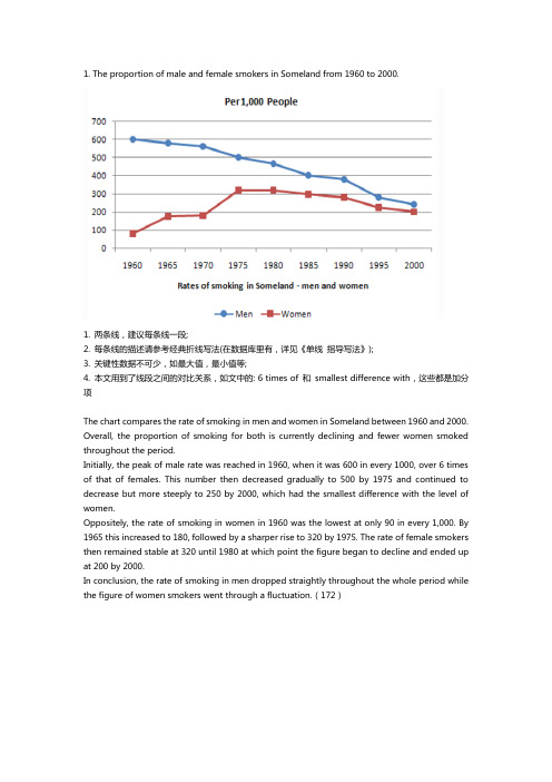
1. The proportion of male and female smokers in Someland from 1960 to 2000.1. 两条线,建议每条线一段;2. 每条线的描述请参考经典折线写法(在数据库里有,详见《单线指导写法》);3. 关键性数据不可少,如最大值,最小值等;4. 本文用到了线段之间的对比关系,如文中的: 6 times of 和smallest difference with,这些都是加分项The chart compares the rate of smoking in men and women in Someland between 1960 and 2000. Overall, the proportion of smoking for both is currently declining and fewer women smoked throughout the period.Initially, the peak of male rate was reached in 1960, when it was 600 in every 1000, over 6 times of that of females. This number then decreased gradually to 500 by 1975 and continued to decrease but more steeply to 250 by 2000, which had the smallest difference with the level of women.Oppositely, the rate of smoking in women in 1960 was the lowest at only 90 in every 1,000. By 1965 this increased to 180, followed by a sharper rise to 320 by 1975. The rate of female smokers then remained stable at 320 until 1980 at which point the figure began to decline and ended up at 200 by 2000.In conclusion, the rate of smoking in men dropped straightly throughout the whole period while the figure of women smokers went through a fluctuation.(172)2. Radio and television audiences throughout the day in 1992.以下是6分, 7分和9分范文,可以看出,上6分的文章都有一个共性,就是没有大的语法错误,分段合适,表达清晰,且进行适当的词汇替换。
雅思英语折线图作文模板
雅思英语折线图作文模板Line Graphs are commonly used in IELTS Academic Writing Task 1 to illustrate changes or trends over a period of time. In this article, we will discuss the structure and key points to include in an IELTS Line Graph essay. By following a proper template and using accurate and concise language, you can effectively convey the information presented in the graph.Introduction:The introduction should provide a general overview of the graph and its main features. It is important to paraphrase the task statement and mention the time frame of the data.Sample Introduction:The line graph illustrates the changes in [subject] over a period of [time frame]. The graph displays [X-axis] on the horizontal axis and [Y-axis] on the vertical axis. Overall, the graph shows fluctuations in [subject] with some notable trends.Body Paragraphs:The body paragraphs should present the key details and trends shown in the graph. It is crucial to provide accurate data and describe the main features of the graph in a logical order.Paragraph 1:Begin by describing the highest and lowest points on the graph, as well as any significant changes or trends. Use comparative language to show the differences between the data points.Sample Paragraph 1:The graph starts with [lowest point] in [year], followed by a steady increase to [highest point] in [year]. From [year] to [year], there was a gradual decline to [lowestpoint] in [year]. It is worth noting that the highest point was approximately [X units] higher than the lowest point.Paragraph 2:Focus on the overall trend by describing the general pattern of the graph. Mention any peaks, dips, or plateaus that occur throughout the given time frame.Sample Paragraph 2:Throughout the period shown, there was a fluctuating trend in [subject]. There were noticeable peaks in [year] and [year], followed by a sharp decline in [year]. After that, there was a gradual increase until [year], where the trend plateaued. This pattern suggests a cyclical nature in the data.Paragraph 3:Analyze any specific details or changes that are evident in the graph. Use comparative language to highlight the differences between the data points.Sample Paragraph 3:In terms of [specific detail], there was a significant increase from [year] to [year], with a peak of [highest point] in [year]. However, there was a sharp decrease in [year], resulting in a drop of approximately [X units]. This decline was followed by a gradual recovery until [year], where the data stabilized.Conclusion:The conclusion should summarize the main points discussed in the body paragraphs and provide a final observation or prediction based on the graph.Sample Conclusion:In conclusion, the line graph demonstrates the fluctuations in [subject] over [time frame]. The data shows a cyclical pattern with peaks in [year] and [year], as well as asharp decline in [year]. Based on the information provided, it can be predicted that [subject] will continue to fluctuate in the future.Overall, by following this template and using accurate and concise language, you can effectively write an IELTS Line Graph essay. Remember to analyze the main features of the graph, describe the trends and changes, and provide a logical conclusion based on the given information. Practice writing essays using different line graphs to improve your skills and familiarity with this task type.。
雅思写作小作文范文 雅思写作折线图(线状图) 英国孩子运动.doc
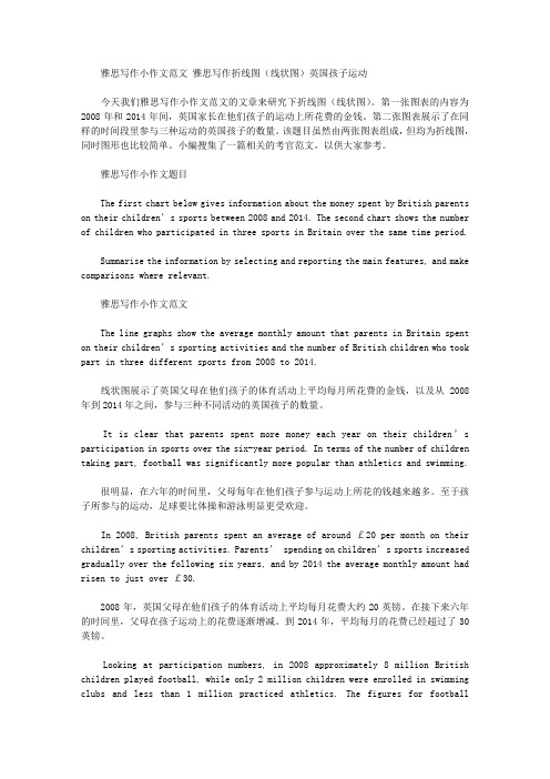
雅思写作小作文范文雅思写作折线图(线状图)英国孩子运动今天我们雅思写作小作文范文的文章来研究下折线图(线状图)。
第一张图表的内容为2008年和2014年间,英国家长在他们孩子的运动上所花费的金钱。
第二张图表展示了在同样的时间段里参与三种运动的英国孩子的数量。
该题目虽然由两张图表组成,但均为折线图,同时图形也比较简单。
小编搜集了一篇相关的考官范文,以供大家参考。
雅思写作小作文题目The first chart below gives information about the money spent by British parents on their children’s sports between 2008 and 2014. The second chart shows the number of children who participated in three sports in Britain over the same time period.Summarise the information by selecting and reporting the main features, and make comparisons where relevant.雅思写作小作文范文The line graphs show the average monthly amount that parents in Britain spent on their children’s sporting activities and the number of British children who took part in three different sports from 2008 to 2014.线状图展示了英国父母在他们孩子的体育活动上平均每月所花费的金钱,以及从2008年到2014年之间,参与三种不同活动的英国孩子的数量。
雅思写作小作文线形图表题(附范文)

雅思写作小作文线形图表题(附范文)雅思写作– LINE GRAPHWRITING TASK 1 (Test 2, Cambridge IELTS 7)You should spend about 20 minutes on this task. This graph below shows the consumption of fish and some different kinds of meat in a European country between 1979 and 2004.Summarise the information by selecting and reporting the main features, and make comparisons where relevant.Write at least 150 words.范文The graph illustrates changes in the amount of beef, lamb, chicken and fish consumed in a particular European country between 1979 and 2004.In 1979, beef was by far the most popular of these foods, with about 225 grams consumed per person per week. Lamb and chicken were eaten in similar quantities (around 150 grams), while much less fish was consumed (just over 50 grams).However, during this 25-year period the consumption of beef and lamb fell dramatically to approximately 100 grams and 55 grams respectively. The consumption of fish also declined, but much less significantly to just below 50 grams, so although it remained the least popular food, consumption levels were the most stable.The consumption of chicken, on the other hand, showed an upward trend, overtaking that of lamb in 1980 and that of beef in 1989. By2004 it had soared to almost 250 grams per person per week.Overall, the graph shows how the consumption of chicken increased dramatically while the popularity of these other foods decreased over the period.(173 words)WRITING TASK 1 (Test 4, Cambridge IELTS 8)范文The graph illustrates the quantities of goods transported in the United Kingdom by four different modes of transport between the time period of 1974 and 2002. Over this span of 28 years, the quantities of goods transported by road, water and pipeline have all increased while the quantity transported by rail has remained almost constant at about 40 million tonnes.The largest quantity of goods transported both in 1974 and 2002 was by road (70 million tonnes and 98 million tonnes respectively) while the lowest both in 1974 and 2002 was by pipeline (about 5 million tonnes and 22 million tonnes respectively). The amount of goods transported by water was constant from 1974 to 1978, where it showed an exponential growth, rising to almost 60 million tones after which it plateaued for about 20 years before starting to rise gradually again.The amount of goods transported by rail is almost constant at 40 million tonnes in 1974 and 2002, with decreases in quantity in between the years. It is also interesting to note that almost all showed a decrease in 1994 in amount of goods transported except for the pipeline, which actually peaked in that year. In conclusion the road remains the most popular method of transporting goods in the UK while water and pipelines are becoming increasingly used. In contrast, rail has not become more popular as a method of transport.WRITING TASK 1 (Test 4, Cambridge IELTS 9)范文The graph shows energy consumption in the US from 1980 to 2012, and projected consumption to 2030.Petrol and oil are the dominant fuel sources throughout this period, with 35 quadrillion (35q) units used in 1980, rising to 42q in 2012. Despite some initial fluctuation, from 1995 there was a steady increase. This is expected to continue, reaching 47q in 2030.Consumption of energy derived from natural gas and coal is similar over the period. From 20q and 15q respectively in 1980, gas showed an initial fall and coal a gradual increase, with the two fuels equal between 1985 and 1990. Consumption has fluctuated since 1990 but both now provide 24q. Coal is predicted to increase steadily to 31q in 2030, whereas after 2014, gas will remain stable at 25q.In 1980, energy from nuclear, hydro- and solar/wind power was equal at only 4q. Nuclear has risen by 3q, and solar/wind by 2. After slight increases, hydropower has fallen back to the 1980 figure. It is expected to maintain this level until 2030, while the others should rise slightly after 2025.Overall, the US will continue to rely on fossil fuels, with sustainable and nuclear energy sources remaining relatively insignificant.。
雅思小作文-线形图
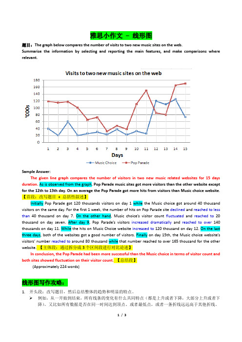
雅思小作文– 线形图题目:The graph below compares the number of visits to two new music sites on the web.Summarise the information by selecting and reporting the main features, and make comparisons where relevant.Sample Answer:The given line graph compares the number of visitors in two new music related websites for 15 days duration. As is observed from the graph, Pop Parade music sites got more visitors than the other website except for the 12th to 13th day. On an average the Pop Parade got more hits from visitors than Music choice website.【首段:改写题目+ 总括性叙述】Initially Pop Parade got 120 thousands visitors on day 1 while the Music choice got around 40 thousand visitors on the same day. For the first 1 week, the number of hits on Pop Parade site declined and reached to less than 40 thousand on day 7. On the other hand, Music choice’s visitor count fluctuated and reached to20 thousand on day seven. After day 9, Pop Parade’s visitors increased dramatically and reached to over140 thousands on day 11. While the hits on Music Choice website increased to 120 thousand on day 12. On the last three days, both of the websites got a good number of visitors. Finally on day 15th, the Music choice website’s visitors’ number reached to around 80 thousand while that number reached to over 165 thousand for the other website. 【主体段:通过拆分成3个区间段进行对比论述】In conclusion, the Pop Parade had been more successful than the Music choice in terms of visitor count and both sites showed fluctuation on their visitor count.【总结段】(Approximately 224 words)线形图写作攻略:1.开头段:改写题目,然后总结整体的趋势和明显的特点。
- 1、下载文档前请自行甄别文档内容的完整性,平台不提供额外的编辑、内容补充、找答案等附加服务。
- 2、"仅部分预览"的文档,不可在线预览部分如存在完整性等问题,可反馈申请退款(可完整预览的文档不适用该条件!)。
- 3、如文档侵犯您的权益,请联系客服反馈,我们会尽快为您处理(人工客服工作时间:9:00-18:30)。
4.波动: fluctuate
1.上升趋势: increase, grow, climb, ascend ( jump, surge, soar, shoot up )
2.下降趋势: decline, decrease, descend ( plunge, slump)
② The period from 8 pm to 10 pm sees a slight rise, but finally the number of people declines again from 180 at 9 pm to 135 at 10 pm.
回顾使用过的句型
描述最高点
① Then, the number shoots up over the next two hours, peaking at 400 at 8 am.
line chart/curve diagram 主体段模版:
The line chart compares the rate of _____.
It can be clearly seen that _____________. Male smokers… . In contrast, female smokers… .
② 表示分别的副词是 respectively。
复习
问题:
Writing Skills
4、主体段表示趋势的其 他动词有哪些?
最高点最低点达到多少占多少预测多少 -
② 表示趋势的短语-其它(熟记):
1.最高点: peak at, reach the highest point at,
2.最低点: bottom out at, reach the bottom at, the lowest point at
② The next two hours experiences a sharp rise again, with 6 pm arriving at 380 people.
回顾使用过的句型
描述最低点
① After that, the number declines rapidly for two hours, bottoming out at 180 at 10 am.
3. The period between May and September saw a steady growth in the number of visitors from 70,000 to 140,000 .
4. The gradual rise in visitor numbers from 30,000 to approximately 45,000 in the first four months was followed by a sharper increase in May.
统计数据句型
Writing Skills
表达-2:
百分率一直大 幅下滑,到早 上8点最低降到 约45%。
The percentage …
统计数据句型
Writing Skills
表达-2:
百分率一直大 幅下滑,到早 上8点最低降到 约45%。
The percentage declined substantially until 8:00 am, bottoming out at about 45%.
To conclude, we can see that_____________.
★A comparison of … shows that … while … . ☆A comparative study of … shows that … while … .
句子写作巩固
WRITING Skills
统计数据句型
Writing Skills
表达-5:
价格在1994年急剧 下挫,不过很快恢 复到了原来水平, 最后冲上新的高点。
The price ….
统计数据句型
Writing Skills
表达-5:
价格在1994年急剧 下挫,不过很快恢 复到了原来水平, 最后冲上新的高点。
The price plunged dramatically in 1994, but then it regained its previous level, before soaring to a new peak.
② The next two hours experiences/ witnesses/ saw a sharp rise again, with 6 pm arriving at 380 people.
( 在哪段时间。。。)
回顾使用过的句型
描述下降
① From this point onwards, the number plunges to only 100 from 2 pm to 4 pm.
复习
Writing Skills
问题:
2、主体段表示趋势的动 词有哪些?
上升-下降-不变-波动 (见 P215, P218 趋势图)
② 表示趋势的短语-动词(熟记):
数字趋势动词
趋势动词替换
1.上升趋势: rise, go up,
2.下降趋势: fall, sink, drop, dip, reduce, go down
3.达到多少(量): reach, arrive at, amount to, hit, stand at
4.预测(会有)多少: predict, expect, forecast 句型为: A is predicted/ expected/forecasted to reach…
线图主体段写作
认真阅读P226主体段范文。 总结表示升降、平稳、波动以及最高点和 最低点的句型。 注意数据的表达,放置的位置。
复习
Writing Skills
问题:
1、主体段表示时间推移 的短语有哪些?
① 表示时间推移的短语(熟记):
At first, (=initially) Then, After that, From this point onwards, Finally (=eventually) …
(不要老是使用 at 6 o’clock, at 8 o’clock 来开始一个句子。)
如何统计数据
Writing Skills
表达-1:
从早上6点到8点 看电视的人数有 个小小的增长,由 3%到7%。
There …
如何统计数据
Writing Skills
表达-1:
从早上6点到8点 看电视的人数有 个小小的增长,由 3%到7%。
There was a slight rise in the number of TV audiences from about 3% at 6:00 am to about 7% at 8 am.
② From this point onwards, the number plunges to only 100 from 2 pm to 4 pm.
③ After 6 pm, the number falls again, reaching the lowest point of 130 at 8 pm.
3.保持不变: level off/out at, hover at, stabilize at, reach a plateau at
复习
Writing Skills
问题:
3、主体段表示趋势的形 容词/副词有哪些?
速度快-速度慢-幅度大-幅度小
② 表示趋势的短语-形容词(熟记):
1.速度快: sharp, rapid, dramatic, drastic 2.速度慢: gradual, slow, steady, gentle 3.幅度大: significant, substantial, marked 4.幅度小: slight, modest, moderate 注意: ① 以上加 ly 均为副词。
统计数据句型
Writing Skills
表达-6:
尽管价格波动很 大,但趋势明显 向上。
In spite of ….
统计数据句型
Writing Skills
表达-6:
尽管价格波动很 大,但趋势明显 向上。
In spite of the sharp fluctuations in the price, the trend was obviously upwards.
统计数据句型
Writing Skills
表达-3:
接下来的两个小 时,数字又巨幅 攀升,中午时分 最高达到280。
The next ….
统计数据句型
Writing Skills
表达-3:
接下来的两个小 时,数字又巨幅 攀升,中午时分 最高达到280。
The next two hours witnessed a dramatic rise in the number again, with the number reaching 280 at midday.
引用数据方法
你知道吗?
Writing Skills
图表主体段写作,第一句话是主题句, 支持句介绍数据时要详尽。
请看例句:
图表引用数据句型:
1. The number picked up in June, rocketing by almost 500% .
2. There was a marked improvement in July with the number of visitors surging 400% .
Learn the new while reviewing the old