罗马体英语书法共27页文档
英文书法【Copperplate】第一部分——简介、准备及小写
英文书法【Copperplate】第一部分——简介、准备及小写整理:新浪微博@香菜不追爱英文书法简介英文书法顾名思义就是对英文的书写艺术创作,可能很多人不太了解英文书法,其实生活当中处处都有英文书法的影子~像中国的书法一样英文书法也有很多字体,下面就来介绍几种最常见的的字体~【copperplate】(中译为铜版体或铜版印刷)copperplate的特点就是粗细变化非常明显,飘逸灵动,典雅高贵【gothic】(中译为哥特体)gothic是古代教会等机构用来抄写的一种艺术字型,是相当华丽的书写和印刷风格,多见于中世纪时的神学文献。
竖线较粗,且多有装饰性很强的缀线,但是相当不容易辨认。
现多作为报纸标题,起装饰作用。
gothic之中也有很多的分类:【gothic】之【Old English】【gothic】之【German Text】【gothic】之【Square Hands】【Italic】(中译为意大利体)Italic起源于文艺复兴早期并沿用至今日,简单又不失美感如一条绸带飘然纸上。
【Roman】(中译为罗马体)罗马体在它慢长的发展史中渐渐成为世界的标准字母体系,因为它的标准,美丽、灵活性。
它无论在什么情况下,用什么大小都容易去读写。
上面我们介绍了几种常见的字体,那么他们是怎么写出来的呢这就是我们接下来要学的东西了。
但是因为小雨和Carol都是高中生的说。
所以只有在暑假期间能发节目。
于是我们只能教【copperplate】和【gothic】的基础知识,Carol负责【copperplate】部分;我负责【gothic】部分。
大家可以根据自己的喜好选一种来练习也可以两种都学~把写法告诉大家了,最重要的还是自身的练习哦~只有多练多写才会写出那么美美的字呢~所以开始教写法的时候我们会留练习作业,大家把自己的练习图片拍下来输到电脑里,再通过写日志版面的图片→本地上传,上传图片之后右键点击图片→图片属性→图片地址,把地址复制到回复框里就OK啦~目前小雨只想到这个办法。
英语作文书法
英语作文书法英文回答:Calligraphy, an ancient art form involving the expressive writing of characters, has captivated humans for centuries. It transcends mere penmanship, elevating written language to an aesthetic masterpiece. Originating in China, calligraphy has flourished in various cultures worldwide, each developing unique styles and techniques that mirror their respective civilizations.Chinese calligraphy, the progenitor of this art form,is a profound expression of harmony, balance, and spiritual connection. The brushstrokes, imbued with intention and emotion, evoke a depth of meaning beyond the words themselves. Chinese calligraphers meticulously study the structure and flow of characters, transforming them into elegant works of art that embody the essence of the written language.Japanese calligraphy, known as shodo, is deeply influenced by Chinese tradition yet infuses its own unique aesthetics. Shodo emphasizes simplicity, spontaneity, and the harmonious interplay of ink and paper. Japanese calligraphers strive for a dynamic balance between control and freedom, capturing the fleeting beauty of the moment.Arabic calligraphy, with its intricate geometric patterns and flowing script, has played a pivotal role in Islamic art and architecture. The intricate designs and elegant curves of Arabic letters create mesmerizing patterns that adorn mosques, palaces, and manuscripts. Arabic calligraphers demonstrate a remarkable proficiency in wielding the reed pen, creating a mesmerizing symphony of lines and flourishes.Western calligraphy, encompassing various styles from medieval manuscripts to modern typography, has evolved through the centuries, reflecting the artistic and technological advancements of each era. Romanesque, Gothic, and Italic scripts, with their distinctive strokes and embellishments, showcase the intricate artistry of scribesduring the Middle Ages. Modern Western calligraphy, influenced by technological innovations, explores new materials and techniques, creating dynamic and innovative designs.Beyond its aesthetic appeal, calligraphy holds profound cultural significance. It has been used to transcribe sacred texts, record historical events, and convey personal expressions. The study and practice of calligraphycultivate patience, discipline, and a deep appreciation for the written word.In contemporary times, calligraphy continues to thrive as an art form and a means of spiritual expression. Artists and designers incorporate calligraphic elements into their works, creating visually stunning pieces that blend tradition with modernity. Calligraphy workshops and exhibitions abound, allowing enthusiasts to immerse themselves in this captivating art form.中文回答:书法。
意大利体英语书法范文
意大利体英语书法范文English:Italian Renaissance calligraphy is characterized by its elegance, balance, and precision. The use of delicate strokes and elaborate embellishments create a sense of harmony and beauty in the written word. One of the most famous Italian calligraphers of the Renaissance period is Ludovico Vicentino degli Arrighi, known for his stunning chancery hand. His work exemplifies the exquisite skill and attention to detail that defined Italian calligraphy during this time. Calligraphy in Italy during the Renaissance was not only a form of writing but also an art form that reflected the cultural and intellectual vitality of the period. The influence of humanism and the revival of classical art and literature can be seen in the graceful curves and intricate designs of Italian calligraphy. This period also saw the development of new scripts, such as the cancelleresca, which further enriched the diversity and creativity of Italian calligraphy. Overall, Italian Renaissance calligraphy remains a testament to the artistic achievements of the time and continues to inspire calligraphers and artists around the world.中文翻译:意大利文艺复兴时期的书法以其优雅、平衡和精确性而闻名。
英文铜板印刷体书法字帖
英文铜板印刷体书法字帖Here are some examples of informal and diverse English paragraphs suitable for a copperplate calligraphy practice book:1. The sun was shining brightly, and the birds were singing their morning songs. It was a perfect day for a walk in the park. The flowers were blooming, and the air smelled so fresh. I couldn't help but smile as I walked along the path, taking in the beauty of nature.2. I've been meaning to try that new restaurant downtown. I heard their menu has a wide range of delicious options, from seafood to vegan dishes. It's been on my list for weeks, and I think I'll finally make it there this weekend. I'm looking forward to trying something new and exciting.3. The book I'm reading right now is absolutely fascinating. It's a thriller that keeps me on the edge ofmy seat. I can't put it down, and I'm staying up late justto finish another chapter. The characters are so well-developed, and the plot twists are unexpected. I highly recommend it to anyone who loves a good mystery.4. My cat has been so playful lately. She's beenchasing her tail and jumping on everything in sight. Ithink she's trying to tell me that she needs more attention. I've been busy with work, but I'm going to make sure to spend some extra time with her this evening. She deservesall the love and affection she can get.5. The weather has been unpredictable lately. It's been raining one day and sunny the next. I'm not sure what to wear anymore! I wish I could just pack my entire closetinto one bag and bring it everywhere I go. But alas, that's not possible. I'll just have to keep checking the forecast and dressing accordingly.。
意大利花体英文书法
意大利花体英文书法Italian calligraphy is a unique and captivating art form that has captivated the hearts and minds of artists and enthusiasts alike for centuries. Originating in the Italian Renaissance, this elegant script has evolved over time to become a symbol of sophistication and timeless beauty. At its core, Italian calligraphy is a harmonious blend of form and function, where each stroke of the pen is imbued with a sense of grace and elegance.The origins of Italian calligraphy can be traced back to the 15th century, a time of great artistic and cultural renaissance in Italy. During this period, the country was home to a flourishing community of scribes, illuminators, and calligraphers who dedicated themselves to the art of beautiful handwriting. These skilled artisans drew inspiration from the classical Roman scripts, as well as the ornate Byzantine styles, to create a distinctive calligraphic style that would become known as the "Italic" or "Chancery" hand.One of the key features of Italian calligraphy is its emphasis on the cursive flow of the letters. Unlike the more rigid and formal Gothicscripts that were prevalent in Northern Europe, the Italic hand is characterized by a graceful, slanted appearance and a sense of fluidity. The letters are connected by smooth, flowing strokes, creating a seamless and harmonious overall appearance. This style of writing was not only aesthetically pleasing but also highly practical, as it allowed for faster and more efficient penmanship.Another hallmark of Italian calligraphy is its attention to detail and precision. The calligraphers of the Renaissance era were masters of their craft, and they took great pride in the execution of each individual letter. The strokes were meticulously crafted, with a consistent weight and rhythm that gave the script a sense of balance and harmony. The use of contrast between thick and thin lines, as well as the careful placement of serifs and other decorative elements, added to the overall elegance and sophistication of the Italic hand.One of the most renowned practitioners of Italian calligraphy was the legendary scribe and calligrapher Ludovico degli Arrighi, also known as "Vicentino." Born in the late 15th century, Arrighi was renowned for his exceptional skill and artistry, and his work is considered among the finest examples of the Italic script. His treatise on calligraphy, "La Operina," published in 1522, became a seminal work that influenced generations of calligraphers and scribes.Arrighi's influence can be seen in the work of many other Italiancalligraphers who followed in his footsteps. From the ornate and highly decorative scripts of the Baroque era to the more minimalist and refined styles of the neoclassical period, the Italic hand has remained a constant source of inspiration and admiration for artists and enthusiasts alike.Today, the art of Italian calligraphy continues to captivate and inspire. Modern calligraphers have embraced the timeless elegance of the Italic script, incorporating it into a wide range of applications, from fine art to commercial design. The use of Italian calligraphy in wedding invitations, greeting cards, and other stationery items has become increasingly popular, as people seek to add a touch of sophistication and timeless beauty to their personal and professional communications.Beyond its practical applications, Italian calligraphy has also found a home in the world of fine art. Calligraphers have elevated the Italic script to new heights, using it as a medium for self-expression and creative exploration. The interplay of light and shadow, the fluidity of the strokes, and the overall aesthetic appeal of the Italic hand have all contributed to its enduring popularity among artists and art enthusiasts.One of the most remarkable aspects of Italian calligraphy is its ability to transcend time and culture. While the Italic script has its rootsfirmly planted in the Italian Renaissance, it has since become a global phenomenon, with calligraphers and enthusiasts from around the world embracing its timeless elegance and beauty. From the United States to Japan, the art of Italian calligraphy continues to captivate and inspire, serving as a testament to the enduring power of the written word and the human desire for artistic expression.In conclusion, Italian calligraphy is a truly remarkable art form that has stood the test of time. From its origins in the Italian Renaissance to its continued influence in the modern world, this elegant script has captivated the hearts and minds of artists, enthusiasts, and everyday individuals alike. Whether used for practical purposes or as a medium for creative expression, the Italic hand remains a symbol of sophistication, beauty, and the enduring power of the written word.。
英语书法13种字体
英语书法13种字体引言书法是一门古老而优雅的艺术形式。
作为文字的书写艺术,书法在不同的文化中有不同的发展和表现。
英语书法则是指以英文字母为基础进行书写艺术的一种形式。
在英语书法中,有许多不同的字体和风格可以选择。
本文将介绍13种常见的英语书法字体,以帮助读者了解和学习不同的字体形式。
1. Uncial字体Uncial字体源于古代西欧的书写风格,其特点是字母都是大写且无连写。
Uncial字体常用于奢华和传统的场合,如婚礼请柬和书籍封面。
示例:ABCDEFGHIJKLMNOPQRSTUVWXYZ2. Blackletter字体Blackletter字体,也称为Gothic字体,源于中世纪的德国和英格兰,是一种非常装饰性和正式的字体。
它的特点是尖角和锯齿状的字母形状,一般用于标题和标志设计。
示例:ABCDEFGHIJKLMNOPQRSTUVWXYZ3. Roman字体Roman字体是一种经典和传统的字体风格,通常在书籍和文本排版中使用。
它的特点是均匀直立的字母形状,适合各种正式场合。
示例:ABCDEFGHIJKLMNOPQRSTUVWXYZ4. Italic字体Italic字体是斜体的一种形式,通常用于强调文字或添加一些装饰性。
它常见于印刷体和手写体中,用于引文、书籍标题等。
示例:ABCDEFGHIJKLMNOPQRSTUVWXYZ5. Modern字体Modern字体是一种典雅而独特的字体形式,它的特点是字母倾斜和笔画细长。
Modern字体常见于传单、海报和宣传材料的设计中。
示例:ABCDEFGHIJKLMNOPQRSTUVWXYZ6. Copperplate字体Copperplate字体是一种书法风格字体,源自18世纪的英国和美国。
它以流畅的弯曲和优雅的笔画而闻名,常用于正式场合和婚礼请柬等。
示例:ABCDEFGHIJKLMNOPQRSTUVWXYZ7. Brush Script字体Brush Script字体是一种用毛笔或刷子书写的字体,它的特点是弯曲的字母和自由流畅的笔画。
最全-英语英文书法手写字帖大合集电子教案

最全-英语英文书法手写字帖大合集使用英文书法字帖:意大利体1•手写印刷体(楷书)① 宽松式写法 ABC E F 6 H I 」K L M-忖:~6—P~b R S T U V~ W~sX Y Z才 p f gnlr 「寸二Jc _. I m.② 紧凑式M 写法 _ ________ ■一 :―_ _-ru. ------------------------------------------------------------------------------------------------------------------------------------------------------- ------------ --- 一 r-BBMV - : wan ar 斤迪一匸0 —旷尸卡H 」一^J UM MG 卡 Pk —$ Tr —fr 卅 X —JL 壬 u-v ff x-i pzzz③左斜式(- HF )写法n TT~ p-~£| 1JT :J StS —X 齐 zII ' 0匚D 2 FEW \ W七乂N G P Q R -£ T D Y④右斜式(10。
)写法斤芳CT—E F 6 // / ~mITS P廿石孑丁〃 1/处%Q b工d_" g h i寸匕—~7r~ q p q 厂5 十p—v /v x 乡z2.意大利体(行书)■■■ '' ■■ ■■・—I ■ i ■■ k— | ・・“ ‘■ ■ ■・「・■ —•—*~& P 0「5 T U 1/ V F^F 壬3.圆体(草书)①基本写法f e 扭卷士ynzzaL”比乎沪_______________________________ . -- ― _ - 一―― ■■ ■•—• ■- ■②装饰性写法(欧式草书)③变格位写法④法文写法0 甘CrtK讦七#Z⑤混成写法(规格要求:六线五格,斜度要求:30° ~35。
英语书法临摹字帖
英语书法临摹字帖摘要:一、英语书法简介1.英语书法的起源和发展2.英语书法的分类和特点二、英语书法临摹字帖的作用1.提高英语书法技巧2.增强对英语字母结构的认识3.丰富个人的字体库三、如何选择适合自己的英语书法临摹字帖1.明确学习目标2.考虑个人喜好3.选择适合的字帖难度四、英语书法临摹字帖的使用方法1.仔细观察字体2.练习基本笔画3.逐步提高难度五、总结1.英语书法临摹字帖的重要性2.持续练习,提高英语书法水平正文:英语书法是一种优美的艺术形式,起源于古老的罗马字母,经过数百年的演变和发展,逐渐形成了现代英语书法的风格。
英语书法不仅具有实用性,还能体现个人的审美和文化素养。
因此,学习和掌握英语书法对于英语学习者来说具有重要的意义。
英语书法临摹字帖是学习英语书法的有效工具。
通过临摹字帖,学生可以提高自己的英语书法技巧,熟悉英语字母的结构和笔画顺序,丰富个人的字体库。
此外,临摹字帖还有助于培养学生的耐心和专注力,提高审美能力。
在选择英语书法临摹字帖时,学生应该明确自己的学习目标,考虑个人喜好,以及选择适合自己水平的字帖。
例如,如果学生希望提高自己的手写体技巧,可以选择一款以手写体为主的字帖;如果学生喜欢优美的书法风格,可以选择一款具有艺术性的字帖。
在实际使用英语书法临摹字帖时,学生应该先仔细观察字帖中的字体,熟悉每个字母的结构和笔画顺序。
然后,学生可以开始练习基本笔画,逐渐过渡到完整的单词和句子。
为了提高练习效果,学生还可以在练习过程中逐步提高难度,例如从简单的单词和短语开始,逐渐过渡到复杂的句子和文章。
总之,英语书法临摹字帖是学习英语书法的重要工具,可以帮助学生提高书法技巧,丰富字体库,提高审美能力。
英文硬笔书法
十八世纪英文圆体
二十世纪初英文圆体
书法范例
圆体书法范例
意大利体
执笔方法
具体要求是:
1.用右手的大拇指指肚、食指指肚和中指第一指节侧 部捏住笔杆。五个手指的具体位置是:中指在下方抵住 笔杆,食指的位置在笔杆的上方,拇指在食指稍上一点 的位置,无名指和小指都自然弯曲,辅助在中指的下面, 不直接与笔杆接触,起底座的作用。
English Calligraphy
主要书体与书写技巧
(一)意大利体 Italic Type
(二)圆体
Round Hand
(三)手写印刷 Print Hand
(四)哥特体 Gothic Script
(五)罗马体 Roman
(六)现代罗马体 Times New Roman
(七)美术字体 Typography
按:是大拇指的作用。拇指自然前伸,前端紧按 在笔杆内侧,由内向外用力。 ;
压:是食指的作用。食指前端压在笔杆外侧,与 拇指相对用力捏住笔杆,并稍微向下施加压力。
顶:是中指的作用。中指以指甲侧面自下向上用 力顶住笔杆。
抵:是无名指和小指的作用。因中指的力量较弱, 无名指和小指便弯曲地紧紧抵在中指下面起辅助 作用。
英文书法作品欣赏
作品欣赏
作品欣赏
2.执笔不可过高或过低。执笔过高难于控制住笔尖, 执笔过低书写不灵活、死板。其具体部位大约是执笔手 指指尖距笔尖2.5cm左右。
3.笔杆与纸面的倾斜度一般在45度左右。
4.笔杆的上部要斜靠在食指的指根与手掌相接处,而 不能靠在虎上。如果靠在虎口上,笔杆会太斜,不是 钢笔设计的最佳角度,而且也不灵活。
2.轻笔重笔相间。
书写都有起笔、行笔和收笔,这三个基本 动作。在完成这三个动作时,所用的力是 不同的,有时就轻一些,有时就重一些。 那么,什么地方应该轻笔,什么地方应该 重笔,这要依据是什么笔画来决定。
新罗马字体介绍共21页
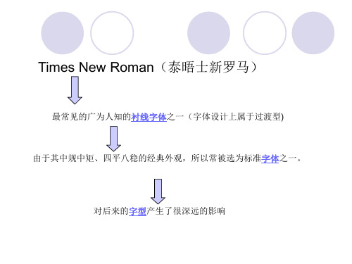
诞生的故事
(这个字体还是很有争议的)
半个多世纪以来,Times New Roman被归功于印刷界的 “泰坦”——斯坦利·莫里森( Stanley Morison). 但在 上 世纪80年代,一名加拿大印刷工赫然发现,莫里森的 Times New Roman可能涉嫌剽窃。
《泰晤士报》的英文名称 The Times,诞生 于1785年,创始人是约翰·沃尔特(John Walter)。The Times 中文直译过来应该是 《时报》。然而它的译名却变成与读音相近, 但毫无关联的“泰晤士河”(River Thames) 一样。由于约定俗成的关系,错译保留至今。 诞生之初,这张报纸的名称是《世鉴日报》 (The Daily Universal Register)。
Times New Roman为Stanley Morison、Starling Burgess和 Victor Lardent共同创造
画草图的维克多
斯坦利·莫里森
木船设计师威廉·伯吉斯
是由Monotype公司于1932年发表,并为英国的《泰晤士报》首次采用。 返回
斯坦利·莫里森(Stanley Morison)和他的著作《帕乔利和他的罗马字母表》 (帕乔利是意大利文艺复兴时期的几何数学家,传说还是现代会计的始祖)
此后一段时间,新字体发明工作开始运行——甚至一些字母已经刻好铜版——恰在此 时,伯吉斯忙着跟莱特兄弟造飞机就中途放弃了这个项目。兰斯顿莫诺公司试图将这 刚具雏形的字体卖给《时代》杂志(Time),遭到拒绝。于是伯吉斯这未完成的项目, 被草草的贴上“54号”标签后搁置一边,一放就超过了半个世纪。
转眼就到了上文提到的1987年,在这一年加拿大印刷工杰拉尔德(Gerald Giampa) 偶然中发现了“54号”并买下了它。“54号”与Times New Roman如此相像让杰拉尔 德兴奋不已,他知道这很可能是莫里森抄袭的证据。于是,杰拉德找到字体界的权威 迈克·帕克(Mike Parker)帮忙。经过分析,帕克坚信伯吉斯才是Times New Roman 的发明者。为此,他在《印刷史》(Printing History)这本杂志上撰文详述此事。不仅 如此,帕克在70多岁的时候,将伯吉斯未完成的事业重新拾了起来。
英文手册法【Copperplate】第一部分——简介、准备及小写
精心整理英文书法【Copperplate】第一部分——简介、准备及小写整理:新浪微博@香菜不追爱英文书法简介英文书法顾名思义就是对英文的书写艺术创作,可能很多人不太了解英文书法,其实生活当中处处都有英文书法的影子~像中国的书法一样英文书法也有很多字体,下面就来介绍几种最常见的的字体~【copperplate】(中译为铜版体或铜版印刷)copperplate的特点就是粗细变化非常明显,飘逸灵动,典雅高贵【gothic】(中译为哥特体)gothic是古代教会等机构用来抄写的一种艺术字型,是相当华丽的书写和印刷风格,多见于中世纪时的神学文献。
竖线较粗,且多有装饰性很强的缀线,但是相当不容易辨认。
现多作为报纸标题,起装饰作用。
gothic之中也有很多的分类:【gothic】之【OldEnglish】【gothic】之【GermanText】【gothic】之【SquareHands】【Italic】(中译为意大利体)Italic起源于文艺复兴早期并沿用至今日,简单又不失美感如一条绸带飘然纸上。
【Roman】(中译为罗马体)罗马体在它慢长的发展史中渐渐成为世界的标准字母体系,因为它的标准,美丽、灵活性。
它无论在什么情况下,用什么大小都容易去读写。
上面我们介绍了几种常见的字体,那么他们是怎么写出来的呢?这就是我们接下来要学的东西了。
但是因为小雨和Carol都是高中生的说。
所以只有在暑假期间能发节目。
于是我们只能教【copperplate】和【gothic】的基础知识,Carol负责【copperplate】部分;我负责【gothic】部分。
大家可以根据自己的喜好选一种来练习也可以两种都学~把写法告诉大家了,最重要的还是自身的练习哦~只有多练多写才会写出那么美美的字呢~所以开始教写法的时候我们会留练习作业,大家把自己的练习图片拍下来输到电脑里,再通过写日志版面的图片→本地上传,上传图片之后右键点击图片→图片属性→图片地址,把地址复制到回复框里就OK 啦~目前小雨只想到这个办法。
英语意大利体字帖范文

英语意大利体字帖范文1. In the realm of art, calligraphy stands as a testament to the beauty that can be wrought from the union of language and form. It is an elegant dance between ink and parchment, where every stroke tells a story and each curve whispers poetry. The art of calligraphy transcends mere written communication; it elevates words into visual masterpieces, breathing life into the alphabet and imbuing them with a soul.在艺术的殿堂里,书法犹如语言与形式完美结合之美的生动见证。
它是墨与纸优雅的舞蹈,每一笔都述说着故事,每一道曲线都在低语诗篇。
书法艺术超越了单纯的书面交流,它将文字提升为视觉杰作,赋予字母生命,使之充满灵性。
2. To engage in calligraphy is to embark on a journey of discipline and patience. The pen, guided by a steady hand and a focused mind, becomes an instrument of creation. Each letter, meticulously crafted, reveals the artist's dedication to their craft and their respect for the centuries-old tradition they inherit. This ancient art form demands not only technical proficiency but also a deep understanding of the nuances and rhythm inherent in thelanguage being inscribed.从事书法,便是踏上一条纪律与耐心之旅。
罗马体英语书法
Over time, the style evolved and because more additional, with integrated flows and more complex forms It was later influenced by the Gothic art movement, leading to the development of Gothic English Calligraphy
Logo and branding
Romanesque English Calligraphy can be used in logo design and branding to create a sense of heritage and relevance It adds a touch of elegance and distinction to any brand identity
Characteristics
This style of calligraphy is known for its monitoriality, weight, and balance It often uses a combination of majors (capital letters) and minuscules (lowercase letters) to create a harmonious visual effect
Romanesque Englishrview of Romanesque English Calligraphy
• The Basic Elements of Romanesque English Calligraphy
• Skills and Practice of Romanesque English Calligraphy
(完整word版)英语书法

英文书写第一节概述英文字母共26个,它的书写比汉字简单得多,也容易得多,但是,任何一门艺术都有自己的规律和要求。
学习任何一门艺术都是分层次、按阶段,日臻完善,渐入佳境的。
学习英文书写也是如此。
初学者必须熟悉字体的形式、组合和比例,熟悉基本笔画、笔顺和运笔方法。
在此基础上,再熟悉大小写字母的配合及连写。
只有这样扎扎实实地练好书写基本功,才能写出优美、流畅的英文字。
一、字母规格英文字母的规格分上中下三部分,可用四条平行线来分割,这就是我们平时用的三格练习薄。
最上面的一条线称为顶线,是字母书写的上边沿。
第二条线称为主体线,是小写字母主体的上边沿。
第三条线称为基准线,是大多数大写字母和无下伸部分的小写字母的下边沿。
第四条线称为底线,是字母下伸部分的下边沿。
我们把第一条线和第二条线之间的区域称为上伸区,将第三条线和第四条线之间的区域称为下伸区,最中间的区域称为主体区(如图2-1所示)顶线上伸区主体线主体区基准线下伸区底线图2-1二、字母结构任何字母形式都可以简化成基本骨架,体现出每个字母的基本结构。
从几何图形来说,英文字母可分为方、圆、三角三种(如H、O、A),其整体的外形多为长方形,个别字母为正方形(如M、W);从结构来说,可以分为单结构(如O、D)和双结构(如B)两类。
字母表中的大写字母严格以书写线为准,高度相同。
小写字母,除了字母的基本高度,还有笔画的上伸和下伸部分。
小写字母有较多的结构特征和形式。
字母内部的空间有十分重要的协调比例的作用。
这是从美学角度来考虑字母整体形状的。
例如大写字母A,A中间的横道固定在一点上,使内三角和字母底部的空间保持平稳,给人以劲健舒展的感觉,让人看着美观。
三、字母形体比例字母的比例就是高度和宽度的固定关系。
字母的形体都有一定的比例。
不同的字母有着不同的宽度。
一般来说,字母的比例本身应给人以美感。
字母表中所有字母都应统一于一个合理的比例系统。
手写体中的小写字母,除i、l、m、w和z字母外,其余字母的宽度基本相同。
英文花体种类
英文花体种类【实用版】目录一、英文花体的定义与分类1.定义2.分类1.哥特体2.罗马体3.意大利体4.手写体二、英文花体的历史与发展1.起源2.发展过程1.中世纪时期2.文艺复兴时期3.近现代时期三、英文花体的应用与价值1.书法艺术2.设计领域3.文化交流正文【一、英文花体的定义与分类】英文花体,又称英文书法,是一种富有艺术性的英文字母书写形式。
它源于罗马时代,经过数百年的演变和发展,形成了多种独特的风格。
英文花体主要分为以下几类:1.哥特体:源于中世纪,特点是笔画华丽、复杂,充满装饰性。
2.罗马体:又称古典体,起源于古罗马,笔画粗细均匀,横平竖直,结构严谨。
3.意大利体:起源于文艺复兴时期,强调笔画的流畅和优美,具有较强的艺术性。
4.手写体:源于近现代,特点是笔画随意、流畅,富有个性。
【二、英文花体的历史与发展】英文花体的历史可以追溯到罗马时代。
在此基础上,它经历了漫长的发展过程,形成了多种独特的风格。
1.起源:英文花体最早可以追溯到罗马时代的石刻文字,这些文字具有较强的装饰性和艺术性。
2.发展过程:1.中世纪时期:哥特体开始出现,成为这一时期的主流。
它为后来的花体发展奠定了基础。
2.文艺复兴时期:随着文艺复兴运动的兴起,意大利体逐渐流行。
这一时期的英文花体更加注重笔画的流畅和优美,具有较强的艺术性。
3.近现代时期:随着社会进步和科技发展,手写体开始出现,并在现代设计领域得到广泛应用。
【三、英文花体的应用与价值】英文花体不仅具有较高的艺术价值,还在多个领域得到广泛应用。
1.书法艺术:英文花体作为一种独特的艺术形式,在书法艺术领域具有重要地位。
它可以提高个人的审美能力和艺术修养,成为一种富有魅力的艺术表现形式。
2.设计领域:英文花体在设计领域具有广泛的应用,如海报、书籍封面、邀请函等。
其独特的艺术风格可以为设计作品增色添彩。
3.文化交流:英文花体作为一种跨文化的艺术形式,可以促进不同国家和地区之间的文化交流,增进相互了解和友谊。
英文字帖范文

英文字帖范文Here is an essay on the topic of "English Calligraphy Sample Text" with more than 1,000 words, written entirely in English without any additional titles or punctuation.The art of English calligraphy has a rich and storied history dating back centuries. From the elegant flourishes of Copperplate script to the bold strokes of Blackletter, the written word has long been elevated to an exquisite form of visual expression. As we explore the realm of English calligraphy, we uncover a world of beauty, discipline, and the power of the written language.At the heart of English calligraphy lies a deep appreciation for the nuances of letterforms. Each stroke, curve, and angle holds the potential to convey emotion, evoke a mood, or simply captivate the eye. The mastery of these letterforms requires a keen eye for detail, a steady hand, and a profound understanding of the rhythms and proportions that define the written word.One of the most revered styles of English calligraphy is the Copperplate script, a graceful and flowing hand that originated in the 18th century. This style is characterized by its elegant slant,delicate flourishes, and the use of a pointed dip pen to create thin and thick lines. Copperplate calligraphers meticulously practice the formation of each letter, ensuring that the curves and connections flow seamlessly, creating a sense of harmony and balance on the page.Another prominent style of English calligraphy is the Blackletter, also known as Gothic script. This bold and dramatic hand emerged in the Middle Ages and is distinguished by its angular, Gothic-inspired letterforms. Blackletter calligraphy often features thick, vertical strokes and intricate, intertwining flourishes that lend an air of grandeur and formality to the written word. The mastery of Blackletter requires a steady hand, a keen eye for proportion, and a deep understanding of the geometric principles that underpin its construction.Beyond these iconic styles, the world of English calligraphy encompasses a vast array of other scripts, each with its own unique character and aesthetic. From the playful and whimsical Italic hand to the refined and elegant Spencerian script, the diversity of English calligraphic styles is a testament to the endless creative potential of the written language.Regardless of the specific style, the practice of English calligraphy is a deeply meditative and introspective pursuit. Each stroke, each letter,and each word is imbued with a sense of intentionality and focus. Calligraphers must cultivate a keen eye for detail, a steady hand, and a deep understanding of the principles of design and composition.The process of creating a calligraphic masterpiece is often described as a dance between the calligrapher and the ink, a delicate interplay of control and spontaneity. As the pen glides across the page, the calligrapher must be attuned to the nuances of the ink, the texture of the paper, and the subtle shifts in pressure and rhythm. This heightened awareness and attention to detail are what elevate the written word into a work of art.Beyond its aesthetic appeal, English calligraphy also holds a deep cultural significance. In an age of digital communication, the handwritten word has become a symbol of authenticity, personal expression, and the preservation of a timeless craft. Calligraphers around the world are dedicated to upholding the traditions of their art, passing down the techniques and knowledge to future generations.In the realm of English calligraphy, the written word becomes a canvas for the expression of emotion, the celebration of beauty, and the preservation of cultural heritage. Whether it's the elegant flourishes of Copperplate, the bold strokes of Blackletter, or the playful charm of Italic, each calligraphic style offers a unique windowinto the rich tapestry of the English language.As we delve deeper into the world of English calligraphy, we are reminded of the power of the written word to transcend the boundaries of mere communication and become a form of artistic expression. Through the mastery of letterforms, calligraphers invite us to slow down, to appreciate the beauty of the written word, and to connect with the timeless traditions that have shaped the evolution of the English language.。
v的各种写法
v的各种写法摘要:一、前言二、字母v的起源与演变1.古罗马字母表中的V2.演变过程三、V的常见书法风格1.罗马体2.哥特体3.意大利体4.手写体四、V在各种语言中的表现1.英语2.汉语3.日语4.法语五、V的创意写法与应用1.艺术作品中的V2.设计中的V3.生活中的V六、结论一、前言在文字的世界里,每个字母都有其独特的历史与魅力。
今天,我们将探讨字母“V”的各种写法,了解其起源与演变过程,以及在不同语言和文化中的表现。
二、字母v的起源与演变1.古罗马字母表中的V字母“V”源于古罗马字母表中的“V”,其形状类似于两个并排的“U”。
在拉丁语中,这个字母代表辅音“v”,与英语中的“v”相似。
2.演变过程随着罗马帝国的发展,拉丁字母传播到欧洲各地。
在演变过程中,字母“V”的形状逐渐与其他字母区分开来,如手写体中的“V”字形状,以及哥特体和意大利体中的美化写法。
三、V的常见书法风格1.罗马体罗马体是一种正式的字体,字母“V”在这种字体中呈尖头形状,与其他字母有明显的区分。
2.哥特体哥特体是一种中世纪的书法风格,字母“V”在这种字体中通常呈圆头形状,装饰性强。
3.意大利体意大利体是一种优美的书法风格,字母“V”在这种字体中线条流畅,形4.手写体手写体是一种自然、随意的书法风格,字母“V”在这种字体中有多种形状,具有较强的个性。
四、V在各种语言中的表现1.英语在英语中,字母“V”通常表示辅音“v”音,如单词“voice”和“five”。
2.汉语汉语中没有字母“V”,但汉语拼音中有类似发音的字母“W”,如单词“wu”和“wei”。
3.日语日语中的字母“V”与英语相似,表示辅音“v”音,如单词“ビール”(啤酒)和“ヴァイオレーム”(小提琴)。
4.法语法语中,字母“V”通常表示辅音“v”音,如单词“violette”(紫罗兰)和“voyage”(旅行)。
五、V的创意写法与应用1.艺术作品中的V在艺术作品中,字母“V”常被用作装饰元素,如在绘画、雕塑和建筑中。
