如何在Android中添加控件
Android常用控件
《Android基础应用》Android常用控件⏹本章任务⏹使用Android开发使用时间组件⏹使用Android开发使用进度条组件⏹使用Android开发创建底部选项卡⏹本章目标⏹了解Android的组件层次结构⏹掌握常用的日期时间类控件⏹掌握常用的几个容器组件1.Android组件的层次结构UI组件都是View的子类,View有很多子类,它们之间存在树状的继承关系View及其子类结构图TextView及其子类结构图ViewGroup及其子类结构图其下的子类一般作为容器或布局来使用FrameLayout及其子类结构图其下的子类通常作为容器或布局来使用2.时间控件2.1日期时间选择器DatePicker组件可用于输入日期,TimePicker组件可用来选择时间,只能输入小时和分,默认12小时制DatePicker●使用onDateChangedListener监听器来获取用户的日期选择●使用init对组件进行初始化●使用getYear,getMonth,getDayOfMonth方法获得用户选择的年,月,日TimePicker●使用onTimeChangedListener监听器获取用户的时间选择●使用setIs24HourView设置是否以24小时制显示●使用getCurrentHour获得当前的小时数●使用getCurrentMinute获得当前的分钟数示例示例的实现结果2.2时钟组件AnalogClock组件用来以表盘的方式显示当前时间,该表只有时针和分针,DigitClock组件以数字的方式显示当前时间可以显示时分秒,由于DigitClock继承TextView,可以使用TextView 的属性示例示例的实现结果2.3 计时器组件Chronometer和DigitalClock 都继承TextView,但它不显示时间,它显示的是从某个起始时间开始,一共过去了多少时间默认情况下只能输出MM:SS或H:MM:SS的时间格式重要属性●android:format:定义时间的格式如:hh:mm:ss重要方法●setBase(long base):设置倒计时起始时间参数为SystemClock.elapsedRealtime()方法返回的值为当前时刻●setFormat(String format):设置显示时间的格式●start():开始计时●stop():停止计时●setOnChronometerTickListener(Chronometer.OnChronometerTickListener listener):当计时器改变时调用示例示例的实现结果练习——时间组件需求说明:日期时间选择器时钟组件计时器组件按照课件中示例图实施3.进度类组件3.1进度条组件当一个应用在后台执行时,前台界面就不会有什么信息,这时用户根本不知道程序是否在执行、执行进度如何、应用程序是否遇到错误终止等,这时需要使用进度条来提示用户后台程序执行的进度Android系统提供了两大类进度条样式●长形进度条●圆形进度条(大中小三种)默认是普通圆形进度条,是不确定Android进度条默认普通圆形ProgressBar大号圆形ProgressBar小号圆形ProgressBar示例3.2标题进度条进度条除了可以显示在Activity中外,还可以显示在标题中圆形进度条长方形进度条Array示例示例的实现结果3.3 可拖动的进度条组件SeekBar 控件其实就是一个高级点的进度条,就像我们在听歌,看电影用的播放器上的进度条一样,是可以拖动的,可以改变进度的一个进度条控件SeekBar 是ProgressBar 的子类,这个组件不需要设置sencondaryProgress 属性 事件接口OnSeekBarChangeListener 处理组件事件由以下三个方法● public void onStartTrackingTouch(SeekBar seekBar) 按下滑杆后触发● public void onProgressChanged(SeekBar seekBar, int progress,boolean fromUser) 动滑杆开始滑动时触发● public void onStopTrackingTouch(SeekBar seekBar) 松开滑杆时触发示例示例的实现结果3.4界面评分组件RatingBar是SeekBar和ProgressBar的扩展,用星星来评级如网上购物,对商家的产品和服务进行打分等常用属性●android:numStarts用于评分的五角星数量●android:rating当前的分数●android:stepSize分数的增长单位,默认是0.5事件接口OnRatingBarChangeListener处理组件事件● public void onRatingChanged(RatingBar ratingBar, float rating,boolean fromUser)示例示例的实现结果属性Style●用于为RatingBar设置不同的风格,一旦设置了style,就不可点击改变值示例示例的实现结果练习——进度组件需求说明:ProgressBarSeekBarRatingBar按照课件中示例图实施4.滚动视图当一个屏幕因为要显示的内容太多而显示不全时,我们可以使用滚动视图来解决这个问题垂直滚动视图ScrollViewScrollView可以用来实现垂直滚动的视图,当它内容组件的高度超过屏幕的高度时,就会在屏幕的右侧出现一个垂直方向的滚动条,通过单击手机上的上下按钮或者上下拂动屏幕可以查看未显示部分注意:在ScrollView标签中只能包含一个组件使用步骤在ScrollView标签中包含一个LinearLayout标签,并设置盖标签的android:orientation属性为vertical在LinearLayout中放置需要显示的组件示例ScrollView只能用来实现垂直滚动的视图,如果要实现水平滚动,需要水平滚动视图HorizontalScrollView示例5.选项卡组件当一个屏幕因为要显示的内容太多而显示不全时,除了使用滚动视图外,还可以使用选项卡组件,选项卡TabHost类似于android系统默认提供的电话薄界面选项卡可以方便的在窗口上放置多个标签页,每个标签页相当于获得了一个与外部容器相同大小的组件摆放区域选项卡是有多个Tab组成的,其中每个Tab都可以显示一个View或一个Activity使用步骤●在界面中定义TabHost组件,并为该组件定义该选项卡的内容组件,为内容组件定义id,这些内容组件将要作为某个Tab选项的视图●定义一个继承TabActivity的Activity●调用TabActivity的getHost方法获得TabHost对象●通过TabHost的相关方法来创建和添加选项卡newTabSpec(String tag)创建选项卡addTab(TabHost.TabSpec tabSpec)添加选项卡每个Tab在切换的时候会产生一个事件,通过OnTabChangedListener监听 示例---方式一示例示例的实现结果示例—方式二示例—方式三 Tab底部显示与上个案例的区别是android:id="@android:id/tabcontent的FrameLayout 与android:id="@android:id/tabs"TabWidget互换位置示例—方式四 设置关联Intent练习——创建选项卡需求说明:创建选项卡如图每个选项卡关联不同的Intent默认选择第二项练习——创建底部选项卡需求说明:创建选项卡如图每个选项卡关联不同的Intent默认选择第二项总结本章学习哪几种时间类组件?本章学习了哪几个进度条类组件?TabHost的使用方式?。
安卓控件的操作实验报告

一、实验目的通过本次实验,掌握安卓常用控件的基本属性、方法和事件处理,熟悉这些控件在实际应用中的使用方法,提高对安卓界面设计的理解和应用能力。
二、实验环境1. 操作系统:Windows 102. 开发工具:Android Studio3.5.33. 手机型号:华为Mate 20三、实验内容本次实验主要涉及以下安卓常用控件:1. TextView2. EditText3. Button4. ImageView5. RadioButton6. CheckBox7. Spinner8. ListView四、实验步骤1. 创建一个新的Android项目,命名为“ControlOperation”。
2. 在布局文件activity_main.xml中添加以下控件:```xml<TextViewandroid:id="@+id/textView1"android:layout_width="wrap_content"android:layout_height="wrap_content" android:text="Hello World!"android:layout_marginTop="20dp" /><EditTextandroid:id="@+id/editText1"android:layout_width="match_parent"android:layout_height="wrap_content" android:hint="Enter your name" /><Buttonandroid:id="@+id/button1"android:layout_width="wrap_content"android:layout_height="wrap_content" android:text="Click Me!" /><ImageViewandroid:id="@+id/imageView1"android:layout_width="wrap_content"android:layout_height="wrap_content" android:src="@drawable/ic_launcher" /> <RadioButtonandroid:id="@+id/radioButton1"android:layout_width="wrap_content"android:layout_height="wrap_content" android:text="Male" /><CheckBoxandroid:id="@+id/checkbox1"android:layout_width="wrap_content"android:layout_height="wrap_content"android:text="Subscribe to newsletter" /><Spinnerandroid:id="@+id/spinner1"android:layout_width="wrap_content"android:layout_height="wrap_content"android:entries="@array/countries" /><ListViewandroid:id="@+id/listView1"android:layout_width="match_parent"android:layout_height="wrap_content" />```3. 在strings.xml文件中添加以下字符串资源:```xml<string name="app_name">Control Operation</string> <string name="enter_name">Enter your name</string> <string name="click_me">Click Me!</string><string-array name="countries"><item>China</item><item>USA</item><item>Japan</item></string-array>```4. 在MainActivity.java文件中添加以下代码:```javaimport android.os.Bundle;import android.view.View;import android.widget.ArrayAdapter;import android.widget.Button;import android.widget.EditText;import android.widget.ImageView;import android.widget.RadioButton;import android.widget.RadioGroup;import android.widget.ScrollView;import android.widget.TextView;import android.widget.CheckBox;import android.widget.Spinner;import android.widget.ListView;import android.widget.ArrayAdapter;import android.widget.Toast;import androidx.appcompat.app.AppCompatActivity; public class MainActivity extends AppCompatActivity { private TextView textView1;private EditText editText1;private Button button1;private ImageView imageView1;private RadioButton radioButton1;private CheckBox checkBox1;private Spinner spinner1;private ListView listView1;@Overrideprotected void onCreate(Bundle savedInstanceState) {super.onCreate(savedInstanceState);setContentView(yout.activity_main);textView1 = findViewById(R.id.textView1);editText1 = findViewById(R.id.editText1);button1 = findViewById(R.id.button1);imageView1 = findViewById(R.id.imageView1);radioButton1 = findViewById(R.id.radioButton1);checkBox1 = findViewById(R.id.checkbox1);spinner1 = findViewById(R.id.spinner1);listView1 = findViewById(R.id.listView1);ArrayAdapter<CharSequence> adapter =ArrayAdapter.createFromResource(this,R.array.countries, yout.simple_spinner_item);adapter.setDropDownViewResource(yout.simple_spinner_dropdown _item);spinner1.setAdapter(adapter);button1.setOnClickListener(new View.OnClickListener() {@Overridepublic void onClick(View v) {String name = editText1.getText().toString();Toast.makeText(MainActivity.this, "Hello " + name, Toast.LENGTH_SHORT).show();}});radioButton1.setOnClickListener(new View.OnClickListener() {@Overridepublic void onClick(View v) {Toast.makeText(MainActivity.this, "You selected Male", Toast.LENGTH_SHORT).show();}});checkBox1.setOnClickListener(new View.OnClickListener() {@Overridepublic void onClick(View v) {if (checkBox1.isChecked()) {Toast.makeText(MainActivity.this, "You subscribed to the newsletter", Toast.LENGTH_SHORT).show();} else {Toast.makeText(MainActivity.this, "You unsubscribed from the newsletter", Toast.LENGTH_SHORT).show();}}});}}```5. 运行程序,观察效果。
Android应用中如何使用RecyclerView实现瀑布流布局

Android应用中如何使用RecyclerView实现瀑布流布局瀑布流布局是一种常见的网格布局,它可以让多个不同高度的控件自动排列,形成美观的布局效果。
在Android应用中,实现瀑布流布局需要用到RecyclerView控件。
本文将介绍RecyclerView 控件的使用,以及如何利用它实现瀑布流布局。
一、RecyclerView控件介绍RecyclerView是Android平台上提供的一种高效的显示列表的控件,它可以显示大量的数据,并且可以自定义Item的布局,支持各种滚动效果。
相比于ListView,RecyclerView更灵活,更方便控制,而且可以实现更多复杂的列表布局。
二、RecyclerView控件的使用1. 导包使用RecyclerView控件需要导入support-v7包。
build.gradle文件中添加依赖:```dependencies {implementation 'com.android.support:recyclerview-v7:28.0.0'}```2. 布局文件中添加RecyclerView控件添加RecyclerView控件,设置控件的id和布局方向:```<android.support.v7.widget.RecyclerViewandroid:id="@+id/recycler_view"android:layout_width="match_parent"android:layout_height="match_parent"android:orientation="vertical" />```3. 定义RecyclerViewAdapter和ViewHolderRecyclerViewAdapter是RecyclerView的适配器,负责绑定数据和控件。
androidstudio plugins 的用法
androidstudio plugins 的用法摘要:1.Android Studio 插件介绍2.插件的安装与使用3.常用插件推荐4.插件开发与自定义5.总结正文:Android Studio 是一款强大的Android 应用开发工具,为了提高开发效率,Android Studio 提供了丰富的插件。
本文将介绍Android Studio 插件的用法及相关知识。
1.Android Studio 插件介绍Android Studio 插件是基于IntelliJ IDEA 插件体系的一种扩展。
通过插件,开发者可以根据自己的需求,为Android Studio 添加新的功能和特性。
插件可以来自官方,也可以是第三方开发者提供的。
这些插件涵盖了代码调试、优化、开发工具等多个方面,帮助开发者更高效地完成项目。
2.插件的安装与使用安装插件的过程非常简单。
首先,打开Android Studio,点击菜单栏的"File",然后选择"Settings"。
在设置窗口中,选择左侧的"Plugins",接着点击右上角的"Marketplace" 按钮。
在搜索框中输入需要的插件名称,如"AndroidX",找到对应的插件后,点击"Install" 按钮进行安装。
安装完成后,重启Android Studio,新安装的插件即可使用。
使用插件的方法也相当便捷。
以AndroidX 插件为例,安装完成后,在编写代码时,只需将光标悬停在某个AndroidX 库的类名上,AndroidX 插件就会自动提示该库的相关信息,如依赖关系、权限等。
点击提示信息,还可以快速查看和编辑库的详细信息。
3.常用插件推荐以下是一些常用的Android Studio 插件,对于Android 开发者来说非常有帮助:- AndroidX:提供对AndroidX 库的快速查看和编辑功能。
如何使用AndroidStudio进行布局设计

如何使用AndroidStudio进行布局设计一、介绍AndroidStudioAndroidStudio是谷歌官方推出的一款专业的Android开发工具,被广大开发者广泛应用于Android应用程序开发。
AndroidStudio集成了丰富的功能和工具,其中包括布局设计工具,可帮助开发者设计灵活且具有吸引力的界面布局。
二、AndroidStudio布局设计工具的主要组成部分1.布局编辑器AndroidStudio的布局编辑器提供了直观且灵活的界面设计界面,开发者可以通过拖拽和放置控件来设计界面布局。
在布局编辑器中,可以选择常见的布局类型,例如线性布局、相对布局等,以及不同的组件,例如按钮、文本框等。
在布局编辑器中,开发者可以添加、删除和编辑布局中的各个组件,以实现所需的布局效果。
2.属性编辑器属性编辑器是AndroidStudio中用于编辑控件属性的工具。
通过属性编辑器,开发者可以为各个控件设置属性,例如大小、位置、颜色等。
属性编辑器提供了详细的属性列表,并且支持直接编辑XML文件,开发者可以根据自己的需求选择合适的方式进行属性编辑。
3.预览窗口预览窗口是布局编辑器的一个重要组成部分,开发者可以在预览窗口中实时看到布局的效果。
预览窗口与布局编辑器紧密结合,开发者可以在编辑器中进行布局设计,然后立即在预览窗口中查看实际效果。
这个功能对于快速调整布局效果非常有帮助。
4.约束布局编辑器约束布局是AndroidStudio中的一种新的布局类型,可以更灵活地设计界面。
约束布局编辑器提供了强大的功能,可以通过简单的拖拽和约束设置,轻松实现复杂的布局效果。
约束布局编辑器同时支持水平和垂直约束,以及边距和对齐等属性的设置,使得开发者可以实现更灵活和美观的布局设计。
三、使用AndroidStudio进行布局设计的步骤1.创建新项目在AndroidStudio中,首先需要创建一个新的Android项目。
可以选择EmptyActivity或者其他模板来创建一个新的项目。
androidstudio plugins 的用法

androidstudio plugins 的用法摘要:1.Android Studio 插件概述2.Android Studio 插件的安装与使用3.常用Android Studio 插件介绍4.Android Studio 插件的优缺点及发展前景正文:【Android Studio 插件概述】Android Studio 是一款由Google 推出的官方集成开发环境(IDE),为Android 应用开发者提供了强大的开发工具。
在Android Studio 中,插件是一种可以扩展软件功能和提高开发效率的附加程序。
本文将为您介绍Android Studio 插件的用法。
【Android Studio 插件的安装与使用】要使用Android Studio 插件,首先需要安装它们。
以下是安装和使用Android Studio 插件的步骤:1.打开Android Studio,点击菜单栏的“File”>“Settings”>“Plugins”。
2.在“Plugins”页面中,点击左上角的“Marketplace”选项卡,搜索需要的插件,然后点击“Install”按钮进行安装。
3.安装完成后,重启Android Studio。
4.在Android Studio 中,点击菜单栏的“Tools”>“Android”>“Gradle wrapper”>“Build”,然后选择刚安装的插件。
5.在开发过程中,如需使用插件功能,可点击菜单栏的“Tools”>“Plugins”>“[插件名称]”,或者使用快捷键Ctrl+Shift+P,输入插件名称并回车,即可调用插件功能。
【常用Android Studio 插件介绍】以下是一些常用的Android Studio 插件:1.Android Studio Lint:用于代码审核,可检查潜在的错误和不规范的代码。
2.Android Studio Layout Editor:可视化布局编辑器,方便开发者设计和调整界面布局。
azlistview用法
azlistview用法azlistview是一种在Android中常用的控件,可以实现高效的列表展示功能。
在本文中,我们将详细介绍azlistview的用法,并逐步讲述如何使用这个控件来创建一个功能完善的列表。
第一步:导入azlistview库要使用azlistview,首先需要在项目的build.gradle中添加以下依赖:implementation 'com.github.totond:azlistview:1.0.1'第二步:添加azlistview控件到布局文件在布局文件中,添加azlistview控件,并设置其属性以满足项目需求。
例如,设置列表的背景颜色、字体样式等。
xml<com.github.totond.azlistview.AZListViewandroid:id="@+id/azlistview"android:layout_width="match_parent"android:layout_height="match_parent"android:background="#FFFFFF"android:textColor="@color/black"android:textSize="16sp"... />第三步:创建数据源在创建列表之前,需要准备好用来填充列表内容的数据源。
数据源可以是从网络获取的数据,也可以是本地的数据。
根据实际情况,创建适当的数据结构来存储数据,并在准备好数据后,将其传递给azlistview控件。
第四步:实现数据适配器azlistview需要一个适配器来将数据源的内容填充到列表项中。
创建一个适配器类,继承自BaseAdapter,并覆盖其中的方法。
javapublic class MyAdapter extends BaseAdapter {private List<MyData> mDataList;public MyAdapter(List<MyData> dataList) {mDataList = dataList;}@Overridepublic int getCount() {return mDataList.size();}@Overridepublic Object getItem(int position) {return mDataList.get(position);}@Overridepublic long getItemId(int position) {return position;}@Overridepublic View getView(int position, View convertView, ViewGroup parent) {创建或复用列表项的布局if (convertView == null) {convertView =LayoutInflater.from(parent.getContext()).inflate(yout.item_layout, null);}填充列表项的内容TextView titleTextView =convertView.findViewById(R.id.title_text_view);titleTextView.setText(mDataList.get(position).getTitle());return convertView;}}第五步:设置适配器在Activity或Fragment中,实例化适配器,并将其设置给azlistview控件。
constraintlayout 组合控件

constraintlayout 组合控件ConstraintLayout 是Android 平台上的一种布局管理器,它允许您以灵活的方式定位和对齐界面元素。
与其他布局相比,ConstraintLayout 提供了更强大和灵活的布局解决方案,特别是在处理复杂界面时。
在ConstraintLayout 中,您可以使用“组合控件”的概念来创建更复杂的布局结构。
组合控件是通过将多个视图(控件)组合成一个单独的组来创建的。
这个组可以作为一个整体进行布局和对齐,从而简化了布局过程。
要创建组合控件,您可以使用ConstraintLayout 的Group 控件。
Group 控件允许您将多个子视图组合在一起,并将它们作为一个整体进行布局。
您可以指定Group 的布局参数(如宽度、高度、边距等),以及子视图之间的相对位置关系(如水平或垂直对齐)。
以下是一个简单的示例,演示如何在ConstraintLayout 中创建组合控件:xml复制代码<androidx.constraintlayout.widget.ConstraintLayoutandroid:layout_width="match_parent"android:layout_height="match_parent"><!-- 创建Group 控件--><androidx.constraintlayout.widget.Groupandroid:id="@+id/my_group"android:layout_width="wrap_content"android:layout_height="wrap_content"app:constraint_referenced_ids="view1,view2,view3" <!-- 指定子视图的ID -->app:layout_constraintTop_toTopOf="parent"app:layout_constraintLeft_toLeftOf="parent" /><!-- 子视图1 --><TextViewandroid:id="@+id/view1"android:layout_width="wrap_content"android:layout_height="wrap_content"android:text="View 1" /><!-- 子视图2 --><TextViewandroid:id="@+id/view2"android:layout_width="wrap_content"android:layout_height="wrap_content"android:text="View 2" /><!-- 子视图3 --><TextViewandroid:id="@+id/view3"android:layout_width="wrap_content"android:layout_height="wrap_content"android:text="View 3" /></androidx.constraintlayout.widget.ConstraintLayout>在上面的示例中,我们创建了一个名为my_group 的Group 控件,并将三个TextView 子视图(view1、view2 和view3)添加到其中。
dev simplebutton的用法
dev simplebutton的用法SimpleButton是一个Android开发中的按钮控件,用来在用户界面中添加一个按钮并定义其功能和外观。
以下是SimpleButton的用法:1. 在XML布局文件中添加SimpleButton控件:```<android.widget.Buttonandroid:id="@+id/button"android:layout_width="wrap_content"android:layout_height="wrap_content"android:text="Click Me" />```2. 在Java代码中找到SimpleButton,并为其设置点击事件监听器:```Button button = findViewById(R.id.button);button.setOnClickListener(new View.OnClickListener() {@Overridepublic void onClick(View v) {// 处理点击事件的代码}});```3. 根据需要为SimpleButton设置其他属性,如颜色、背景、文字等:```button.setTextColor(Color.RED); // 设置按钮文字颜色button.setBackgroundColor(Color.YELLOW); // 设置按钮背景色button.setText("New Button Text"); // 设置按钮文字```4. 处理SimpleButton的点击事件:```button.setOnClickListener(new View.OnClickListener() {@Overridepublic void onClick(View v) {// 处理点击事件的代码}});```以上是SimpleButton的基本用法,可以根据具体需求进行进一步的样式定义和功能添加。
Android Studio项目开发教程 第3章 常用UI组件

如果设置,则指定TextView具有一个电话号码的输入法。可能的值是“true”或“false”。
要显示的文字。
目前在所有大写的文本。可能的值是“true”或“false”。
文本颜色。可以是一个颜色值,在形式"#rgb", "#argb", "#rrggbb", 和 "#aarrggbb".
} });
3.1常用控件
3.1.2 按钮类组件
2、在MainActivity 类中实现OnClickListener接口,重写该接口中的onClick方法,多个控件对应同一个监听事件, 在回调方法中用case语句进行分别处理。该方法适用于Button较多的时候。
@Overridepublic class MainActivity extends AppCompatActivity implement View.OnClickListener{
方式描述center在视图中心显示图片并且丌缩放图片centercrop按比例缩放图片使得图片长宽的大亍等亍视图的相应维度centerinside按比例缩放图片使得图片长宽的小亍等亍视图的相应维度fitcenter按比例缩放图片到视图的最小边居中显示fitend按比例缩放图片到视图的最小边显示在视图的下部分位置fitstart把图片按比例扩大缩小到视图的最小边显示在视图的上部分位置fitxy把图片丌按比例缩放到视图的大小显示matrix用矩阵来绘制312按钮类组件3
3.1常用控件
描述
这是唯一地标识控件的ID。 如果设置,指定该TextView中有一个文本输入法会自动利用什么类型的用户。 • 不要自动大写任何东西 - 0 • 大写每句的第一个字 - 1 • 大写每个单词的第一个字母 - 2 • 大写每一个字符 - 3 使光标可见(默认值)或不可见。默认为false。 如果设置为true,指定TextView的一个输入法。 字体系列(由字符串命名)的文本。 指定如何排列由视图的x和/或y轴的文本时,该文本比视图小。 提示文本显示文本为空。 数据的类型被放置在一个文本字段。手机,日期,时间,号码,密码等。 使得TextView至多到像素高。
imageview string path用法

imageview string path用法[imageview string path用法]在Android开发中,ImageView是一个常用的控件,用于显示图像。
在使用ImageView时,经常需要设置要显示的图像的路径,这就涉及到了"imageview string path"的用法。
"imageview string path"是指通过字符串路径设置ImageView的图像。
通常,我们使用的是在本地设备或网络上的图像文件。
下面将一步一步回答"imageview string path"的用法,详细介绍如何使用。
第一步:在布局文件中添加ImageView控件首先,在布局文件(比如activity_main.xml)中添加一个ImageView控件,用于显示图像。
可以使用如下代码:xml<ImageViewandroid:id="@+id/imageView"android:layout_width="match_parent"android:layout_height="match_parent"android:scaleType="fitCenter" />这里设置了ImageView的宽高为match_parent,即充满整个父布局。
同时,使用了scaleType属性来设置图片的缩放方式为fitCenter,即保持图像的宽高比例,将图像完整地显示在ImageView中央。
第二步:在Java代码中找到ImageView并设置图像路径接下来,在Java代码中找到ImageView控件,并设置要显示的图像的路径。
可以使用如下代码:javaImageView imageView = findViewById(R.id.imageView);String imagePath = "file:/android_asset/my_image.jpg"; imageView.setImageURI(Uri.parse(imagePath));首先,通过findViewById方法找到在布局文件中定义的ImageView控件,并将其赋值给imageView对象。
listview控件使用的基本流程

listview控件使用的基本流程
1. 简介
ListView是一种常用的Android界面控件,用于显示一系列垂直滚动的列表项。
在Android应用中,我们经常会使用ListView来展示一些数据集合,如联系人列表、新闻列表等。
2. ListView的基本属性
在使用ListView之前,我们首先需要了解它的一些基本属性:
•android:id:ListView的唯一标识符。
•android:layout_width:ListView的宽度属性,可以使用match_parent(填充父容器)或具体数值(如200dp)进行设置。
•android:layout_height:ListView的高度属性,同样可以使用match_parent或具体数值进行设置。
•android:divider:分隔线的样式属性,可以设置为@null表示不显示分隔线,也可以设置为具体颜色的资源ID。
•android:dividerHeight:分隔线的高度属性,可以设置具体数值或wrap_content。
•android:listSelector:列表项被选中时的背景样式属性。
3. 使用ListView的基本步骤
使用ListView控件的基本步骤如下:
1.在XML布局文件中添加ListView控件。
```xml <ListView android:id=。
怎么进行控件设置操作方法

怎么进行控件设置操作方法
控件设置操作方法包括以下几个步骤:
1. 找到需要设置的控件:首先,在界面布局文件(layout file)中找到需要进行设置的控件,例如一个Button或者TextView。
2. 在代码中获取控件的引用:在对应的Activity或者Fragment中,通过findViewById方法获取控件的引用。
例如,在Activity中,可以使用以下代码获取一个Button的引用:
java
Button myButton = findViewById(R.id.my_button);
3. 进行设置操作:通过获取到的控件引用,可以调用相关方法对控件进行设置操作。
例如,可以使用以下代码设置Button的文本内容:
java
myButton.setText("Click me");
4. 其他常见设置操作:除了设置文本内容,还可以对控件进行诸如设置点击监听器、设置背景颜色等其他常见的设置操作。
具体可以根据控件的类型和需求,查阅相关文档或者通过代码提示进行设置。
注意:如果控件设置操作需要在控件的生命周期之前进行,应该将设置操作放在onCreate方法中或者在布局文件中设置初始值。
android studio checkstyle用法

android studio checkstyle用法《Android Studio Checkstyle用法指南》导论在Android开发过程中,代码的质量和风格很重要。
不仅可以提高代码的可读性,还能减少潜在的Bug和维护成本。
而Android Studio Checkstyle 作为一个代码质量工具,可以帮助开发者在编码过程中自动检查并修复常见的代码质量问题。
本文将一步一步介绍Android Studio Checkstyle的使用方法和配置技巧,帮助开发者提高代码质量和开发效率。
第一步:安装Checkstyle插件首先打开Android Studio,点击菜单栏的“Preferences”,然后选择“Plugins”。
在插件市场搜索框中输入“Checkstyle”,找到并点击“Install”按钮进行安装。
安装完成后需要重启Android Studio,以使插件生效。
第二步:导入Checkstyle配置文件Checkstyle提供了多种配置文件,用于检查并校验代码的风格和质量。
可以根据团队的要求选择相应的配置文件,或者自定义一个符合项目需求的配置文件。
通常,Checkstyle的配置文件是一个XML文件,内容包括检查的规则和对应的检测器。
在项目的根目录下创建一个名为“checkstyle.xml”的文件,并将其内容填充为合适的Checkstyle规则和检测器。
可以通过搜索引擎或者查看Checkstyle的官方文档来获取更多关于配置文件的信息。
配置文件的编写过程需要理解Checkstyle规则和检测器的含义和用法。
第三步:配置Android Studio Checkstyle插件在Android Studio中,点击菜单栏的“Preferences”,然后选择“Other Settings”。
在弹出的配置窗口中选择“Checkstyle”选项。
点击右侧的“Enable”按钮,然后在“Configuration file”一栏中选择之前所创建的“checkstyle.xml”文件。
android linearprogressindicator 用法
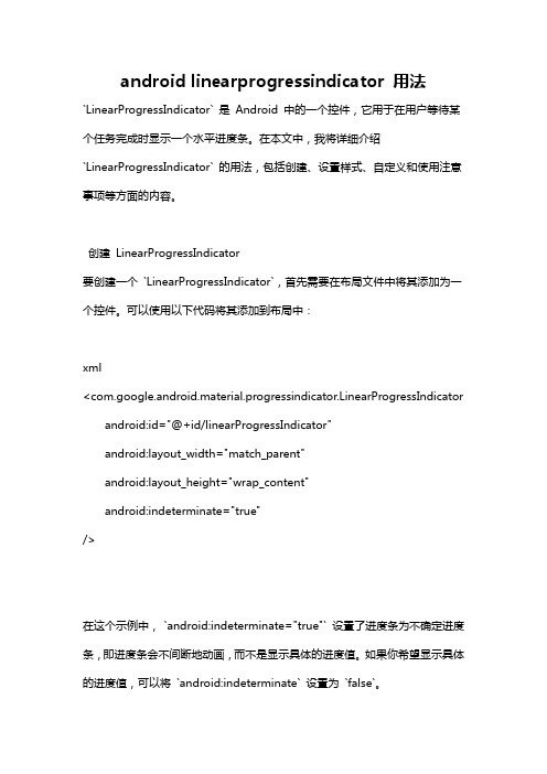
android linearprogressindicator 用法`LinearProgressIndicator` 是Android 中的一个控件,它用于在用户等待某个任务完成时显示一个水平进度条。
在本文中,我将详细介绍`LinearProgressIndicator` 的用法,包括创建、设置样式、自定义和使用注意事项等方面的内容。
创建LinearProgressIndicator要创建一个`LinearProgressIndicator`,首先需要在布局文件中将其添加为一个控件。
可以使用以下代码将其添加到布局中:xml<com.google.android.material.progressindicator.LinearProgressIndicator android:id="@+id/linearProgressIndicator"android:layout_width="match_parent"android:layout_height="wrap_content"android:indeterminate="true"/>在这个示例中,`android:indeterminate="true"` 设置了进度条为不确定进度条,即进度条会不间断地动画,而不是显示具体的进度值。
如果你希望显示具体的进度值,可以将`android:indeterminate` 设置为`false`。
自定义样式`LinearProgressIndicator` 可以通过不同的样式属性来自定义外观。
以下是一些常用的样式属性:- `app:trackColor`:设置进度条的轨道颜色。
- `app:indicatorColor`:设置进度条的指示器颜色。
- `app:indicatorCornerRadius`:设置进度条指示器的圆角半径。
android开发日期控件的使用
大家好,以下是对android开发日期控件的使用,分为两节来讲的,希望对大家有所帮助Android开发:日期控件的使用(一)问题提出手机的基本功能,除了打电话、发短信,还有一个就是用来看时间。
那么在Android开发中,如何为我们的android开发程序添加显示时间的功能呢?问题分析关于时间,无外乎三种类型:日期、时刻、计时。
在Android SDK中提供了五种时间相关的控件:时间拾取器TimePicker、日期拾取器DatePicker、计时器Chronometer、模拟时钟AnologClock和数字时钟DigitalClock。
接下去的android开发两篇文章将通过一个小闹钟的例子来简要介绍这几个控件的使用。
问题解决本例包含一个AnologClock、一个DigitalClock、一个Chronometer、若干个TextView,而TimePicker 和DatePicker将以弹出窗口形式出现。
本例演示如下四个功能:1.在DigitalClock上方的TextView上显示当前系统日期。
2.当单击设置时间后的显示日期的TextView将弹出DatePicker,并将设置好的时间赋给显示日期的TextView,同时启动计时器。
3.当单击设置时间后的显示时间的TextView将弹出TimePicker,并将设置好的时间赋给显示时间的TextView,同时启动计时器。
4.显示时间与设定时间相同时闪烁“小闹钟”Tex tView的背景颜色。
本文先介绍布局与如何得到系统时间基本思路清楚了,那就让我们现在开始动手做下吧。
一、打开Eclipse,建立一个Android工程,属性如下:Project name:Exp03Build Target:Android 2.2PacketName:com.Exp03二、布置控件。
在main.xml中添加一个TextView、两个EditView 和两个Button控件,部分属性如下:main.xml文件如下:view sourceprint?1<?xml version="1.0" encoding="utf-8"?>0 2 <LinearLayoutxmlns:android="/a pk/res/android"03 android:layout_width="fill_parent"04 android:layout_height="fill_parent"05 android:orientation="vertical" >0607 <TextView08 android:id="@+id/txtTitle"09 android:layout_width="fill_parent"10 android:layout_height="wrap_content"11 android:text="小闹钟"12 android:textSize="20dp"13 android:background="@color/gray" /> 14 <LinearLayout15 android:layout_width="fill_parent" 16 android:layout_height="wrap_content"17 android:orientation="horizontal">" 1819 <AnalogClock20 android:id="@+id/analogClock1"21 android:layout_width="wrap_content" 22 android:layout_height="wrap_content"/> 2324 <LinearLayout25 android:id="@+id/linearLayout2"26 android:layout_width="match_parent"27 android:layout_height="match_parent"28 android:orientation="vertical" >2930 <TextView31 android:id="@+id/txtCurrentDate"32 android:layout_width="match_parent"3 3 android:layout_height="wrap_content "3 4 android:text="现在是:2011年10月23日"3 5 android:textAppearance="?android:attr /textAppearanceSmall" />3637 <DigitalClock38 android:id="@+id/digitalClock1"39 android:layout_width="match_parent"40 android:layout_height="fill_parent"41 android:layout_weight="1"42 android:gravity="center"43 android:text="DigitalClock"44 android:textSize="15dp"/>4546 </LinearLayout>47 </LinearLayout>48 <LinearLayout49 android:layout_width="fill_parent"50 android:layout_height="wrap_content"51 android:orientation="horizontal">5253 <TextView54 android:layout_width="100dp"55 android:layout_height="wrap_content"56 android:background="@color/gray"57 android:text="设置时间:"58 android:textSize="15dp" />5960 <TextView61 android:id="@+id/txtSetDate"62 android:layout_width="130dp"63 android:layout_height="wrap_content"64 android:background="@color/gray"65 android:text="2011年10月21日"66 android:textSize="15dp" />6768 <TextView69 android:id="@+id/txtSetTime"70 android:layout_width="fill_parent"71 android:layout_height="wrap_content"72 android:text="00:00:00"73 android:textSize="15dp"74 android:layout_weight="1"75 android:background="@color/gray" />76 </LinearLayout>77 <LinearLayout78 android:id="@+id/linearLayout1"79 android:layout_width="match_parent"80 android:layout_height="wrap_content"81 android:layout_marginTop="5dp"82 android:background="@color/gray"83 >84 <Chronometer85 android:id="@+id/chronometer1"86 android:layout_width="wrap_content"87 android:layout_height="wrap_content"88 android:layout_weight="10"89 android:gravity="center"90 android:format="H:MM:SS" />9192 </LinearLayout>93 </LinearLayout>效果如图:控件属性简介:1. AnologClock1.1 Hand hour时针,可以指定时针图片,设置时针形状,这里使用默认时针1.2 Hand minute分针,可以指定分针图片,设置分针形状,这里使用默认分针可能出于省电的考虑,模拟时钟并没有提供秒针,这有点美中不足。
Android移动开发Android常见界面控件

第3章 Android常见界面控件《Android移动开发》学习目标/Target掌握简单控件地使用,可以独立搭建一个注册界面掌握ListView控件与RecyclerView控件地使用,能独立搭建列表界面掌握自定义控件地定义方式,可以自定义一个简单地控件章节概述/Summary几乎每一个Android应用都是通过界面控件与用户交互地,Android提供了非常丰富地界面控件,借助这些控件,我们可以很方便地进行用户界面开发。
接下来,本章将针对Android常见地界面控件进行讲解。
目录/Contents01 02 03简单控件地使用列表控件地使用自定义View3.1简单控件地使用先定一个小目标!掌握简单控件地使用,可以独立搭建一个注册界面控件是界面组成地主要元素,为了显示界面上地输入框,图片,文字等信息,Android 系统提供了一些控件来显示这些信息,每个控件都有对应地属性来设置不同地效果。
我们以控件使用地复杂程度将Android中地控件分别简单控件与列表控件,简单控件包含以下几种,具体如下图所示。
简单控件TextView Button EditText ImageView RadioButton CheckBox ToastTextView控件用于显示文本信息,我们可以在XML布局文件中以添加属性地方式来控制TextView控件地样式, TextView控件地属性如下表所示。
TextView控件地属性属性名称功能描述android:layout_width设置TextView控件地宽度android:layout_height设置TextView控件地高度android:id设置TextView控件地唯一标识android:background设置TextView控件地背景android:layout_margin设置当前控件与屏幕边界或周围控件,布局地距离android:padding设置TextView控件与该控件中内容地距离android:text设置文本内容android:textColor设置文字显示地颜色android:textSize设置文字大小,推荐单位为spTextView控件地属性属性名称功能描述android:gravity设置文本内容地位置android:maxLength设置文本最大长度,超出此长度地文本不显示android:lines设置文本地行数,超出此行数地文本不显示android:maxLines设置文本地最大行数,超出此行数地文本不显示。
在Android应用中使用ViewPager实现滑动切换页面效果
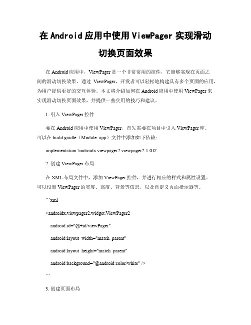
在Android应用中使用ViewPager实现滑动切换页面效果在Android应用中,ViewPager是一个非常常用的控件,它能够实现在页面之间的滑动切换效果。
通过ViewPager,开发者可以轻松地构建具有多个页面的应用,为用户提供更好的交互体验。
本文将介绍如何在Android应用中使用ViewPager来实现滑动切换页面效果,并提供一些实用的技巧和建议。
1. 引入ViewPager控件要在Android应用中使用ViewPager,首先需要在项目中引入ViewPager库。
可以在build.gradle(Module: app)文件中添加如下依赖:implementation 'androidx.viewpager2:viewpager2:1.0.0'2. 创建ViewPager布局在XML布局文件中,添加ViewPager控件,并进行相应的样式和属性设置。
可以设置ViewPager的宽度、高度、背景等信息,以及自定义页面指示器等。
```xml<androidx.viewpager2.widget.ViewPager2android:id="@+id/viewPager"android:layout_width="match_parent"android:layout_height="match_parent"android:background="@android:color/white" />```3. 创建页面布局为了实现滑动切换效果,需要创建多个页面布局。
可以在XML布局文件中定义不同的页面内容,例如显示文字、图片、按钮等。
```xml<LinearLayoutandroid:layout_width="match_parent"android:layout_height="match_parent"android:orientation="vertical"><ImageViewandroid:layout_width="match_parent"android:layout_height="0dp"android:layout_weight="1"android:src="@drawable/image1" /><TextViewandroid:layout_width="match_parent"android:layout_height="wrap_content"android:text="Page 1" /></LinearLayout>```创建多个页面布局后,可以将它们与ViewPager关联起来。
videoview 用法 -回复

videoview 用法-回复“videoview用法”的主题是关于Android开发中如何使用videoview 控件来播放视频。
一、介绍videoviewvideoview是Android中自带的一个用于播放视频的控件。
它能够实现基本的视频播放功能,包括播放、暂停、停止等操作,同时还支持视频的缩放、跳转等功能。
二、videoview的创建和布局在XML布局文件中添加videoview控件,可以通过以下代码实现:<videoviewandroid:id="+id/myVideoView"android:layout_width="match_parent"android:layout_height="match_parent" />其中,id属性用于在代码中引用videoview控件。
需要注意的是,videoview的宽度和高度最好设置为match_parent,以便适应不同屏幕的尺寸。
三、获取videoview实例在代码中,需要通过findViewById()方法获取videoview的实例,以便进行后续操作。
示例代码如下:VideoView videoView = findViewById(R.id.myVideoView);四、设置视频源在videoview中播放视频之前,需要先设置视频源。
通过setVideoPath()或setVideoURI()方法,可以设置视频的本地路径或网络地址。
示例代码如下:videoView.setVideoPath("sdcard/video.mp4");其中,setVideoPath()方法用于设置本地视频的路径,而setVideoURI()方法则可以用于设置网络视频的地址。
五、开始播放视频设置好视频源后,通过调用start()方法来开始播放视频。
示例代码如下:videoView.start();六、视频播放状态监听如果需要追踪视频播放过程,可以通过VideoView的setOnPreparedListener()、setOnCompletionListener()和setOnErrorListener()方法来设置监听器,以便在需要的时候执行相应的操作。
- 1、下载文档前请自行甄别文档内容的完整性,平台不提供额外的编辑、内容补充、找答案等附加服务。
- 2、"仅部分预览"的文档,不可在线预览部分如存在完整性等问题,可反馈申请退款(可完整预览的文档不适用该条件!)。
- 3、如文档侵犯您的权益,请联系客服反馈,我们会尽快为您处理(人工客服工作时间:9:00-18:30)。
How to: Android 'Hello Widget'Table of ContentsDocument history (1)Tutorial (1)Prerequisites (1)Let’s start from scratch (1)The Java-way Time-Widget (6)The Service-way Time-Widget (8)Were to go from here? (8)Document historyVersion Date User Description1.02009-07-11Norbert Möhringmoehring.n [at] Initial document.1.12009-07-21Norbert Möhringmoehring.n [at] Small fixes in code (copy&paste erros ☺).Thanks to Andreas Kompanez (ak@) for the review.Better layout.Added document history and table of contents.Put all links behind text → looks better ☺1.22009-07-23Norbert Möhringmoehring.n [at] Fixed some typosTutorialSince there is only the one not that self explaining example of a widget Idecided to invest some nightly hours to cut that example into pieces andthen start from scratch with an easy to follow “Hello Widget” tutorial.PrerequisitesYou should already have the android SDK and android Eclipse IDE plug-ininstalled and running. If not, go here to learn how to get started with theandroid plug-in. Also you should have at least basic knowledge about Javaprogramming since this is not a Java tutorial.Let’s start from scratchIn Eclipse, go toFile → new Project … → other … and select 'Android Project'The project name will be “Hello Widget” and in this case the target platform will be ‘Android 1.5’. Uncheck the probably already checked Box “Create Activity”. We won’t create an Activity here we just want a simple widget.New Project WizardAfter that, your Project structure will look like this:The project wizard gave us some default stuff already, like the default android app-icon e.g. We’ll start with the layout and design of our widget.Open main.xml and modify it like this:<?xml version="1.0"encoding="utf-8"?><LinearLayout xmlns:android="/apk/res/android"android:layout_width="fill_parent"android:orientation="vertical"android:background="@drawable/widget_bg_normal"android:layout_gravity="center"android:layout_height="wrap_content"><TextView android:id="@+id/widget_textview"android:text="@string/widget_text"android:layout_height="wrap_content"android:layout_width="wrap_content"android:layout_gravity="center_horizontal|center"android:layout_marginTop="5dip"android:padding="10dip"android:textColor="@android:color/black"/></LinearLayout>We have a simple linear layout with a TextView for your message to display. At this point, you will get an Error sayingERROR Error: No resource found that matches the given name (at 'background' with value '@drawable/widget_bg_normal')That’s because you don’t have the widget_bg_normal resource at this point. I borrowed the image from the SimpleWiktionary widget. It’s a png NinePatch image which will be our background of the widget.Put the file widget_bg_normal.9.png (or your own background image) into the folder res/drawable.You also don’t have the @string/widget_text resource. To fix that, go to res/values/string.xml and add this line to it:<string name="widget_text">Hello Widget!</string>string.xml will look like this:<?xml version="1.0"encoding="utf-8"?><resources><string name="widget_text">Hello Widget!</string><string name="app_name">Hello Widget</string></resources>We just finished our design part.Now we have to tell Android that we are going to have a widget.Open AndroidManifest.xml and go to the source view.The lines you have to add are bold:<?xml version="1.0"encoding="utf-8"?><manifest xmlns:android="/apk/res/android"package="de.thesmile.android.widget"android:versionCode="1"android:versionName="1.0"><application android:icon="@drawable/icon"android:label="@string/app_name"><!-- Broadcast Receiver that will process AppWidget updates --><receiver android:name=".HelloWidget"android:label="@string/app_name"><intent-filter><action android:name="android.appwidget.action.APPWIDGET_UPDATE"/></intent-filter><meta-data android:name="android.appwidget.provider"android:resource="@xml/hello_widget_provider"/></receiver></application><uses-sdk android:minSdkVersion="3"/></manifest>We declare our Broadcast Receiver which will be “HelloWidget”.Don’t forget the dot before HelloWidget, this will create the full qualified path name with the declared package at the top of the file. The Label of our application was already set be the project wizard and is located in our string.xml.The meta-tag tells android about your widget provider. In this case, the widget provider is located at res/xml/hello_widget_provider.xml . The provider.xml is pretty much self explaining:<?xml version ="1.0" encoding ="utf-8"?><appwidget-provider xmlns:android ="/apk/res/android"android:minWidth ="146dip"android:minHeight ="72dip"android:updatePeriodMillis ="10000"android:initialLayout ="@layout/main"/>Define the size of your widget (should match the guidelines for desktop widgets ).updatePerdiodMillis as it’s name already says, the time in milliseconds to update your widget. In our case, this is unimportant and we don’t need it because we don’t do any update on our widget.The initial layout points the the main.xml file. We already defined our layout and design.The only thing that is missing to run our widget is the Class that extends the AppWidgetProvider which we declared in AndroidManifest.xml at the receiver -tag.Create a new Class under the package de.thesmile.android.widget , name it HelloWidget and set AppWidgetProvideras super class.From the documentation :The <intent-filter> element must include an <action> element with the android:name attribute. This attribute specifies that the AppWidgetProvider accepts the ACTION_APPWIDGET_UPDATE broadcast. This is the only broadcast that you must explicitly declare. The AppWidgetManager automatically sends all other App Widget broadcasts to the AppWidgetProvider as necessary.Your new class will look like this:package de.thesmile.android.widget;import android.appwidget.AppWidgetProvider;public class HelloWidget extends AppWidgetProvider {}Since our Widget is doing nothing, you’re now ready to go. To start your application, right click on your project→ Run As → Android ApplicationThis will start the Android Virtual Device (AVD) and install your widget on this device.Now press and hold your left mouse button on the AVD Desktop screen until the menu pops up. Select Widgets → Hello Widget …… and have a look at the result.Ok, that was pretty easy and now you have a widget which can do …. nothingLet’s do something with our widget ... display the current time. I’ll show you two versions of the time example, one that I would call the Java-way and the other one to introduce you to services in widgets (Service-way).The Java-way Time-WidgetThis is how the Java-way Time-Widget will look like. It will updateevery second and display the time.By the way: It’s 11:50 pm right now, I don’t know where the AVDgets it’s time from but it’s definitely not my system time.Now, open your empty class HelloWidget.We have to override the protected method onUpdate fromAppWidgetProvider. Also, because of the Java-way, we’ll createan inner class MyTime which will be derived from TimerTask. Justhave a look at the following code:public class HelloWidget extends AppWidgetProvider {@Overridepublic void onUpdate(Context context, AppWidgetManager appWidgetManager,int[] appWidgetIds) {Timer timer = new Timer();timer.scheduleAtFixedRate(new MyTime(context, appWidgetManager), 1, 1000);}private class MyTime extends TimerTask {RemoteViews remoteViews;AppWidgetManager appWidgetManager;ComponentName thisWidget;DateFormat format = SimpleDateFormat.getTimeInstance(SimpleDateFormat.MEDIUM,Locale.getDefault());public MyTime(Context context, AppWidgetManager appWidgetManager) {this.appWidgetManager = appWidgetManager;remoteViews = new RemoteViews(context.getPackageName(), yout.main);thisWidget = new ComponentName(context, HelloWidget.class);}@Overridepublic void run() {remoteViews.setTextViewText(R.id.widget_textview,"Time = " + format.format(new Date()));appWidgetManager.updateAppWidget(thisWidget, remoteViews);}}}The method onUpdate will be called at first. We create a timer that will run our MyTime-Thread every second. The constructor of the MyTime-Class gets some information to update our widget on the desktop.Get our main view that we created (at that point you could also change your layout to another design).remoteViews = new RemoteViews(context.getPackageName(), yout.main);In the run method, we set the time with our new Date and update the remote View.That’s already it. Now you have a widget that is displaying the current time.At that point I want to give you some further information about a bug that has not been fixed yet, either in the AVD nor on any machine. The bug-fix didn’t make it into the CUPCAKE Version (1.5).To delete a widget, you tab and hold, then drag it and drop it into the trash can at the bottom.At that point the widget provider usually runs an onDelete and onDisable method. Currently this is not happening since the wrong IDs are sent. To fix this problem and really delete your widget, add the following code to the onReceive method:@Overridepublic void onReceive(Context context, Intent intent) {// v1.5 fix that doesn't call onDelete Actionfinal String action = intent.getAction();if (AppWidgetManager.ACTION_APPWIDGET_DELETED.equals(action)) {final int appWidgetId = intent.getExtras().getInt(AppWidgetManager.EXTRA_APPWIDGET_ID,AppWidgetManager.INVALID_APPWIDGET_ID);if (appWidgetId != AppWidgetManager.INVALID_APPWIDGET_ID) {this.onDeleted(context, new int[] { appWidgetId });}} else {super.onReceive(context, intent);}}onReceive is always called before onUpdate is called. This code snipped checks the called action and decides weather to just run the receive method or the delete method.Jeff Sharkey provided us with this useful code-snipped.If you don’t do that, your widget won’t be displayed any more, but your widget provider will still run onReceive and onUpdate in the given period (updatePerdiodMillis) which will eat up battery and memory.The Service-way Time-WidgetUsually your widget will do some more stuff than updating your time. To do so, you should create an UpdateService.class. Here’s the Time-Widget with a service. This is just an example and I’m pretty sure that the service-way of the time widget will eat up more battery than the Java-way.To register and start the service, change your onUpdate method like this:@Overridepublic void onUpdate(Context context, AppWidgetManager appWidgetManager,int[] appWidgetIds) {Intent intent = new Intent(context, UpdateService.class);context.startService(intent);}The UpdateService.class looks like this:public static class UpdateService extends Service {@Overridepublic void onStart(Intent intent, int startId) {RemoteViews updateViews = new RemoteViews(this.getPackageName(),yout.main);Date date = new Date();DateFormat format = SimpleDateFormat.getTimeInstance(SimpleDateFormat.MEDIUM, Locale.getDefault());// set the text of component TextView with id 'message'updateViews.setTextViewText(R.id.widget_textview, "Current Time "+ format.format(date));// Push update for this widget to the home screenComponentName thisWidget = new ComponentName(this, HelloWidget.class);AppWidgetManager manager = AppWidgetManager.getInstance(this);manager.updateAppWidget(thisWidget, updateViews);}If you want the time to be updated every second, your have to modify the hello_widget_provider.xml file and set updatePerdiodMillis to 1000.Were to go from here?Your can get the SimpleWiktionary example from the net and see what you can do with an online service. The repository is here.I still don’t know how to register a click event on my widget but I found the android-sky widget from Jeff Sharkey which is also available as source code here so I might get to that point soon.Feedback appreciatedAuthor:Norbert Möhring (moehring.n [at] )Blog:http://blog.thesmile.de。