@Matlab中Bode图的绘制技巧
用MATLAB分析闭环系统的频率特性

用MATLAB分析闭环系统的频率特性闭环系统的频率特性指的是系统在不同频率下的响应特性。
在MATLAB中,可以通过不同的函数和工具箱来分析闭环系统的频率特性。
下面将介绍一些常用的方法。
1. 传递函数分析法(Transfer Function Analysis Method):传递函数描述了系统的输入和输出之间的关系。
在MATLAB中,可以使用tf函数创建传递函数对象,并利用bode函数绘制系统的频率响应曲线。
例如,假设有一个传递函数G(s) = 1/(s^2 + s + 1),可以用以下代码创建传递函数对象并绘制其频率响应曲线:```matlabG = tf([1], [1, 1, 1]);bode(G);```运行上述代码,将会显示出频率响应曲线,并且可以通过该函数的增益曲线和相位曲线来分析系统在不同频率下的响应特性。
2. 状态空间分析法(State-Space Analysis Method):状态空间模型描述了系统的状态变量之间的关系。
在MATLAB中,可以使用ss函数创建状态空间模型,并利用bode函数绘制系统的频率响应曲线。
例如,假设有一个状态空间模型A、B、C和D分别为:```matlabA=[01;-1-1];B=[0;1];C=[10];D=0;sys = ss(A, B, C, D);bode(sys);```运行上述代码,将会显示出频率响应曲线,并且可以通过该函数的增益曲线和相位曲线来分析系统在不同频率下的响应特性。
3. 伯德图法(Bode Plot Method):Bode图可以直观地表示系统的频率响应曲线。
在MATLAB中,可以使用bode函数绘制系统的Bode图。
例如,假设有一个传递函数G(s) =1/(s^2 + s + 1),可以用以下代码绘制其Bode图:```matlabG = tf([1], [1, 1, 1]);bode(G);```运行上述代码,将会显示出Bode图,并且可以通过该图来分析系统在不同频率下的增益和相位特性。
matlab中bode的用法
matlab中bode的用法Bode Plot: A Comprehensive Guide to MATLAB's bode() FunctionIntroduction:In the field of control systems engineering, it is crucial to analyze the frequency response of a system. The Bode plot provides valuable insights into the stability, gain, and phase response of a system. MATLAB offers a powerful tool, the bode() function, to generate Bode plots quickly and accurately. This article will provide a comprehensive guide on how to effectively use the bode() function in MATLAB.Definition of Bode Plot:A Bode plot is a graphical representation of a system's frequency response, which presents the gain and phase shift angles as functions of frequency. The magnitude plot depicts the system's gain at various frequencies, while the phase plot represents the phase shift introduced by the system at different frequencies. The Bode plot is commonly used in various engineering disciplines to gain insights into system behavior.Syntax of bode() Function:The bode() function in MATLAB allows the user to analyze the frequency response of a given system. Its general syntax is as follows:bode(sys)bode(sys, w)bode(sys1, sys2, ...)bode(sys1, sys2, ..., w)Here, "sys" represents the linear dynamic system model, and "w" denotes the vector of frequencies at which the Bode plots are to be evaluated. Additionally, the function can handle multiple systems, enabling comparative analyses.Generating Bode Plots:To generate a Bode plot in MATLAB, the first step is to create the system model. This can be achieved by either specifying transfer function coefficients or state-space matrices. Once the model is defined, the bode() function is used to generate the plots.Consider the following example, where we have a transfer function with a numerator of [1] and a denominator of [1, 2, 3]:num = [1];den = [1, 2, 3];sys = tf(num, den);By executing the following line of code, we can easily generate and plot the Bode plot:bode(sys)Customizing Bode Plots:The bode() function in MATLAB provides several options for customizing the appearance and content of the generated Bode plots. Some of the commonly used options are listed below:1. Frequency Range:By specifying the frequency range, users can restrict the range of frequencies displayed on the plot. This can be achieved by defining the vector "w" with the desired frequency range when calling the bode() function.2. Plotting Multiple Systems:The bode() function allows users to compare the frequency responses of multiple systems on a single plot. This can be done by passing multiple system models as arguments to the function.3. Plotting Multiple Outputs:When dealing with a system with multiple outputs, users can choose to plot the frequency response of each output separately. By default, MATLAB plots all outputs on a single graph, but this can be changed by specifying the output index as an additional argument.4. Plotting Options:The bode() function provides options to customize plot appearance, including grid lines, labels, titles, and color. These options enable users to communicate their results more effectively.Conclusion:In conclusion, the Bode plot is an essential tool for analyzing the frequency response of control systems. MATLAB's bode() function simplifies the process of generating Bode plots and provides numerous customization options. By utilizing this function effectively, engineers and researchers can gain valuable insights into system stability, gain, and phase response.。
自动控制原理基础-项目4-MATLAB绘制系统的Bode图和Nyquist图

MATLAB draws the Bode diagram and Nyquist diagram of the system
MATLAB R2020a基本操作
1. 鼠标双击MATLAB R2020a 图标,打开MATLAB软件。
2. 获得系统默认频率范围的Nyquist图
案例1
3. 在MATLAB软件命令框中输入如下命令
4. 获得系统自定义频率范围的Nyquist图
说明:除了在MATLAB软件命令框中直接输入命 令外,还可以利用脚本编辑器编写M文件,通过 运行M文件来绘图。
2. 等待MATLAB启动完毕。
MATLAB 绘制系统Bode图
案例1
1. 在MATLAB软件命令框中输入如下命令
2. 获得系统默认频率范围的Bode图
案例1
3. 在MATLAB软件命令框中输入如下命令
4. 获得系统自定义频率范围的Bode图
MATLAB 绘制系统Nyquist图
案例1ቤተ መጻሕፍቲ ባይዱ
1. 在MATLAB软件命令框中输入如下命令
matlab中bode的用法

matlab中bode的用法Bode's Usage in MATLABBode plot is a graphical representation that depicts the frequency response of a system. This plot consists of two parts: magnitude response and phase response. MATLAB provides a powerful function called "bode" to generate Bode plots and analyze the frequency characteristics of a system. In this article, I will explain the usage of the "bode" function in MATLAB.The syntax of the "bode" function in MATLAB is as follows:[magnitude, phase, frequency] = bode(sys)Here, "sys" represents the transfer function or state-space model of the system under consideration. Upon execution, the "bode" function returns three outputs: magnitude, phase, and frequency.The "magnitude" output represents the magnitude response of the system and is usually plotted in decibels (dB). It indicates how the system amplifies or attenuates different frequencies. Positive values indicate amplification, while negative values indicate attenuation.The "phase" output represents the phase response of the system and is plotted in degrees. It shows the phase shift introduced by the system for each frequency. Positive values indicate a phase lead, while negative values indicate a phase lag.The "frequency" output represents the frequency axis corresponding to the magnitude and phase responses. It is usually plotted in logarithmic scale.To generate a Bode plot using the "bode" function, we need to define the system in MATLAB first. This can be accomplished by creating a transfer function or state-space model using the appropriate MATLAB functions.For example, let's consider a simple transfer function:sys = tf([1],[1 2 1])To generate the Bode plot of this system, we can use the following code:[magnitude, phase, frequency] = bode(sys)After executing this code, the magnitude, phase, and frequency responses will be stored in the variables "magnitude," "phase," and "frequency," respectively.To visualize the Bode plot, we can use the "semilogx" function to plot the magnitude response and the "semilogx" or "semilogy" function to plot the phase response. Additionally, we can use the "grid" function to add gridlines for better readability.Here's an example code snippet to plot and visualize the Bode plot:semilogx(frequency, 20*log10(magnitude))grid onxlabel('Frequency')ylabel('Magnitude (dB)')title('Bode Plot - Magnitude Response')figuresemilogx(frequency, phase)grid onxlabel('Frequency')ylabel('Phase (degrees)')title('Bode Plot - Phase Response')By executing the above code, two separate figures will be displayed showing the magnitude and phase responses of the system, respectively.In conclusion, the "bode" function in MATLAB is a useful tool for generating Bode plots and analyzing the frequency characteristics of a system. By providing the transfer function or state-space model of the system, the function calculates and returns the magnitude, phase, and frequency responses, allowing us to visualize and study the behavior of the system at different frequencies.。
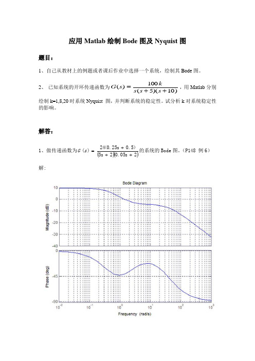
应用Matlab绘制Bode图及Nyquist图
解答:
1、做传递函数为 G (s ) 解:
24 (0.25s 0.5) 的系统的 Bode 图。 (P148 例 6) 5s 20.05s 2
2、 已知系统的开环传递函数为 G ( s )
100k ,用 Matk=1,8,20 时系统 Nyquist 图,并判断系统的稳定性。试分析 k 对系统稳定 性的影响。 解: (1)当 K=1 时,由题意得 P=0,由 Bode 图得 N=0,则 Z=N+P=0,系统稳 定。
应用 Matlab 绘制 Bode 图及 Nyquist 图
题目:
1、自己从教材上的例题或者课后作业中选择一个系统,绘制其 Bode 图。 2、 已知系统的开环传递函数为 G ( s )
100k ,用 Matlab 分别 s ( s 5)(s 10)
绘制 k=1,8,20 时系统 Nyquist 图,并判断系统的稳定性。试分析 k 对系统稳定性 的影响。
(2) 当 K=8 时,由题意得 P=0,由 Bode 图得 N=2,则 Z=N+P=2,系统不稳 定。
(3)当 K=20 时,由题意得 P=0,由 Bode 图得 N=2,则 Z=N+P=2,系统 不稳定。
bode图实验

实验七 控制系统的Bode 图一 实验目的1.利用计算机作出控制系统的Bode 图2.观察记录控制系统得开环频率特性;3.控制系统得开环频率特性分析;二、实验步骤1.开机执行程序C :\matlab \bin \matlab.exe (或用鼠标双击图标)进人MATLAB 命令窗口;2.相关MATLAB 函数Bode(num,den)Bode(num,den,w) %w 极为频率变量ω[mag,phase,w]= Bode(num,den) %mag-相位,phase-幅角给定系统开环传递函数G 0(s) 多项式模型,作系统bode 图。
其计算公式为。
)()()(0s den s num s G = 式中, num 为开环传递函数G 0(s)的分子多项式系数向量,den 为开环传递函数G 0(s)的分母多项式系数向量。
函数格式1:给定num 、den 作波得图,角频率向量w 的范围自动设定。
函数格式2:角频率向量w 的范围可以由人工给定。
(w 为对数等分,由对数等分函数logsspacpce()完成.例如w =logspace(-1,1,100)。
函数格式3:返回变量格式。
计算所得的幅值mag 、相角Phase 及角频率w 返回至MA TLAB 命令窗口,不作图。
更详细的命令说明,可键入“help bode ”在线帮助查阅。
例如,系统的开环传递函数10210)()()(20++==s s s den s num s G 作图程序为:(分两次输入)num=[10];den=[1 2 10];bode(num,den); %得到bode 图9-6 bode 图,注意横标。
再输入以下语句w=logspace(-1,1,32); %执行后得到bode 图9-7 bode 图,注意横标。
bode(num,den,w);比较图9-6、图9-7的横坐标命令(人工定标)w =logspace(d1,d2,n) 将变量w 作对数等分。
matlab绘制bode图技巧(可编辑修改word版)
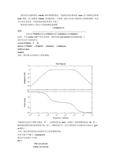
我们经常会遇到使用Matlab 画伯德图的情况,可能我们我们都知道bode 这个函数是用来画bode 图的,这个函数是Matlab 内部提供的一个函数,我们可以很方便的用它来画伯德图,但是对于初学者来说,可能用起来就没有那么方便了。
譬如我们要画出下面这个传递函数的伯德图:1.576e010 s^2H(s)=s^4 + 1.775e005 s^3 + 1.579e010 s^2 + 2.804e012 s + 2.494e014(这是一个用butter 函数产生的2 阶的,频率范围为[20 20K]HZ 的带通滤波器。
)我们可以用下面的语句:num=[1.576e010 0 0];den=[1 1.775e005 1.579e010 2.804e012 2.494e014];H=tf(num,den);bode(H)这样,我们就可以得到以下的伯德图:可能我们会对这个图很不满意,第一,它的横坐标是rad/s,而我们一般希望横坐标是HZ;第二,横坐标的范围让我们看起来很不爽;第三,网格没有打开(这点当然我们可以通过在后面加上grid on 解决)。
下面,我们来看看如何定制我们自己的伯德图风格:在命令窗口中输入:bodeoptions我们可以看到以下内容:ans =Title: [1x1 struct]XLabel: [1x1 struct]YLabel: [1x1 struct]TickLabel: [1x1 struct]Grid: 'off'XLim: {[1 10]}XLimMode: {'auto'}YLim: {[1 10]}YLimMode: {'auto'}IOGrouping: 'none'InputLabels: [1x1 struct]OutputLabels: [1x1 struct]InputVisible: {'on'}OutputVisible: {'on'}FreqUnits: 'rad/sec'FreqScale: 'log'MagUnits: 'dB'MagScale: 'linear'MagVisible: 'on'MagLowerLimMode: 'auto'MagLowerLim: 0PhaseUnits: 'deg'PhaseVisible: 'on'PhaseWrapping: 'off'PhaseMatching: 'off'PhaseMatchingFreq: 0PhaseMatchingValue: 0我们可以通过修改上面的每一项修改伯德图的风格,比如我们使用下面的语句画我们的伯德图:P=bodeoptions;P.Grid='on';P.XLim={[10 40000]};P.XLimMode={'manual'};P.FreqUnits='HZ';num=[1.576e010 0 0];den=[1 1.775e005 1.579e010 2.804e012 2.494e014];H=tf(num,den);bode(H,P)这时,我们将会看到以下的伯德图:上面这张图相对就比较好了,它的横坐标单位是HZ,范围是[10 40K]HZ,而且打开了网格,便于我们观察-3DB 处的频率值。
实验二 用MATLAB实现线性系统的频域分析
实验二用MATLAB实现线性系统的频域分析[实验目的]1.掌握MATLAB平台下绘制典型环节及系统开环传递函数的Bode图和Nyquist图(极坐标图)绘制方法;2.掌握利用Bode图和Nyquist图对系统性能进行分析的理论和方法。
[实验指导]一、绘制Bode图和Nyquist图1.Bode图绘制采用bode()函数,调用格式:①bode(sys);bode(num,den);系统自动地选择一个合适的频率范围。
②bode(sys,w);其中w(即ω)是需要人工给出频率范围,一般由语句w=logspace(a,b,n)给出。
logspace(a,b,n):表示在10a到10b之间的 n个点,得到对数等分的w值。
③bode(sys,{wmin,wmax});其中{wmin,wmax}是在命令中直接给定的频率w的区间。
以上这两种格式可直接画出规范化的图形。
④[mag,phase,ω]=bode(sys)或[m,p]=bode(sys)这种格式只计算Bode图的幅值向量和相位向量,不画出图形。
m为频率特性G(jω )的幅值向量;p为频率特性G(jω )的幅角向量,单位为角度(°)。
w为频率向量,单位为[弧度]/秒。
在此基础上再画图,可用:subplot(211);semilogx(w,20*log10(m) %对数幅频曲线subplot(212);semilogx(w,p) %对数相频曲线⑤bode(sys1,sys2,…,sysN) ;⑥bode((sys1,sys2,…,sysN,w);这两种格式可在一个图形窗口同时绘多个系统的bode图。
2. Nyquist曲线的绘制采用nyquist()函数调用格式:① nyquist(sys) ;② nyquist(sys,w) ;其中频率范围w由语句w=w1:Δw:w2确定。
③nyquist(sys1,sys2,…,sysN) ;④nyquist(sys1,sys2,…,sysN,w);⑤ [re,im,w]=nyquist(sys) ;re—频率响应实部im—频率响应虚部使用命令axis()改变坐标显示范围,例如axis([-1,1.5,-2,2])。
MATLAB分析系统稳定性方法

MATLAB分析系统稳定性方法Matlab在控制系统稳定性判定中的应用稳定是控制系统的重要性能,也是系统能够工作的首要条件,因此,如何分析系统的稳定性并找出保证系统稳定的措施,便成为自动控制理论的一个基本任务.线性系统的稳定性取决于系统本身的结构和参数,而与输入无关.线性系统稳定的条件是其特征根均具有负实部.在实际工程系统中,为避开对特征方程的直接求解,就只好讨论特征根的分布,即看其是否全部具有负实部,并以此来判别系统的稳定性,由此形成了一系列稳定性判据,其中最重要的一个判据就是劳斯判据。
劳斯判据给出线性系统稳定的充要条件是:系统特征方程式不缺项,且所有系数均为正,劳斯阵列中第一列所有元素均为正号,构造劳斯表比用求根判断稳定性的方法简单许多,而且这些方法都已经过了数学上的证明,是完全有理论根据的,是实用性非常好的方法.具体方法及举例:一用系统特征方程的根判别系统稳定性>>p=[112235];>>roots(p)二用根轨迹法判别系统稳定性:对给定的系统的开环传递函数>>clear>>n1=[0.251];>>d1=[0.510];>>s1=tf(n1,d1);>>sys=feedback(s1,1);>>P=sys.den{1};p=roots(P)>>pzmap(sys)>>[p,z]=pzmap(sys)>>clear>>n=[1];d=conv([110],[0.51]);>>sys=tf(n,d);>>rlocus(sys)>>[k,poles]=rlocfind(sys)频率特性法判别系统的稳定性三BODE图法:1)绘制开环系统Bode图,记录数据。
>>num=75*[000.21];>>den=conv([10],[116100]);>>sys=tf(num,den);>>[Gm,Pm,Wcg,Wcp]=margin(sys)>>margin(sys)2)绘制系统阶跃响应曲线,证明系统的稳定性。
Matlab中Bode图的绘制技巧(精)
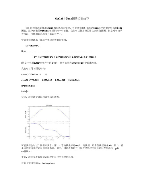
Matlab中Bode图的绘制技巧我们经常会遇到使用Matlab画伯德图的情况,可能我们我们都知道bode这个函数是用来画bode 图的,这个函数是Matlab内部提供的一个函数,我们可以很方便的用它来画伯德图,但是对于初学者来说,可能用起来就没有那么方便了。
譬如我们要画出下面这个传递函数的伯德图:1.576e010 s^2H(s= ------------------------------------------------------------------------------------------s^4 + 1.775e005 s^3 + 1.579e010 s^2 + 2.804e012 s + 2.494e014(这是一个用butter函数产生的2阶的,频率范围为[20 20K]HZ的带通滤波器。
我们可以用下面的语句:num=[1.576e010 0 0];den=[1 1.775e005 1.579e010 2.804e012 2.494e014];H=tf(num,den;bode(H这样,我们就可以得到以下的伯德图:可能我们会对这个图很不满意,第一,它的横坐标是rad/s,而我们一般希望横坐标是HZ;第二,横坐标的范围让我们看起来很不爽;第三,网格没有打开(这点当然我们可以通过在后面加上grid on解决)。
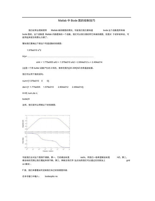
下面,我们来看看如何定制我们自己的伯德图风格:在命令窗口中输入:bodeoptions我们可以看到以下内容:ans =Title: [1x1 struct] XLabel: [1x1 struct] YLabel: [1x1 struct] TickLabel: [1x1 struct] Grid: 'off'XLim: {[1 10]} XLimMode: {'auto'} YLim: {[1 10]} YLimMode: {'auto'} IOGrouping: 'none' InputLabels: [1x1 struct] OutputLabels: [1x1 struct] InputVisible: {'on'} OutputVisible: {'on'} FreqUnits: 'rad/sec' FreqScale: 'log' MagUnits: 'dB' MagScale: 'linear' MagVisible: 'on' MagLowerLimMode: 'auto' MagLowerLim: 0 PhaseUnits: 'deg' PhaseVisible: 'on' PhaseWrapping: 'off'PhaseMatching: 'off'PhaseMatchingFreq: 0PhaseMatchingValue: 0我们可以通过修改上面的每一项修改伯德图的风格,比如我们使用下面的语句画我们的伯德图:P=bodeoptions;P.Grid='on';P.XLim={[10 40000]};P.XLimMode={'manual'};P.FreqUnits='HZ';num=[1.576e010 0 0];den=[1 1.775e005 1.579e010 2.804e012 2.494e014];H=tf(num,den;bode(H,P这时,我们将会看到以下的伯德图:上面这张图相对就比较好了,它的横坐标单位是HZ,范围是[1040K]HZ,而且打开了网格,便于我们观察-3DB处的频率值。
(完整版)Matlab中Bode图的绘制技巧(精)
Matlab中Bode图的绘制技巧我们经常会遇到使用Matlab画伯德图的情况,可能我们我们都知道bode这个函数是用来画bode图的,这个函数是Matlab内部提供的一个函数,我们可以很方便的用它来画伯德图,但是对于初学者来说,可能用起来就没有那么方便了。
譬如我们要画岀下面这个传递函数的伯德图:1.576e010 s A2H(s= ..........................................................................................................sA4 + 1.775e005 sA3 + 1.579e010 sA2 + 2.804e012 s + 2.494e014(这是一个用butter函数产生的2阶的,频率范围为[20 20K]HZ的带通滤波器。
我们可以用下面的语句:num=[1.576e010 0 0];den=[1 1.775e005 1.579e010 2.804e012 2.494e014];H=tf( num,de n;bode(H这样,我们就可以得到以下的伯德图:可能我们会对这个图很不满意,第一,它的横坐标是rad/s,而我们一般希望横坐标是HZ;第二,横坐标的范围让我们看起来很不爽;第三,网格没有打开(这点当然我们可以通过在后面加上grid on解决)。
F面,我们来看看如何定制我们自己的伯德图风格:在命令窗口中输入:bodeoptio ns我们可以看到以下内容:ans =Title: [1x1 struct] XLabel: [1x1 struct] YLabel: [1x1 struct] TickLabel: [1x1 struct] Grid: 'off' XLim: {[1 10]} XLimMode: {'auto'} YLim: {[1 10]} YLimMode: {'auto'} IOGrouping: 'none' InputLabels: [1x1 struct] OutputLabels: [1x1 struct] InputVisible: {'on'} OutputVisible: {'on'} FreqUnits: 'rad/sec' FreqScale: 'log' MagUnits: 'dB' MagScale: 'linear' MagVisible: 'on' MagLowerLimMode: 'auto' MagLowerLim: 0 PhaseUnits: 'deg' PhaseVisible: 'on' PhaseWrapping: 'off'是这样的,运行命令 ctrlpref ,出现控制系统工具箱的设置页面, Units 改为Hz 就好了PhaseMatchi ng: 'off'PhaseMatchi ngFreq: 0PhaseMatchi ngValue: 0我们可以通过修改上面的每一项修改伯德图的风格,比如我们使用下面的语句画我们的伯德图: P=bodeopti ons;P.Grid='o n';P.XLim={[10 40000]};P.XLimMode={'ma nual'};P.Freq Un its='HZ';num=[1.576e010 00]; den=[1 1.775e0051.579e0102.804e012 2.494e014];H=tf( num,de n;bode(H,P这时,我们将会看到以下的伯德图:上面这张图相对就比较好了,它的横坐标单位是HZ ,范围是[10 40K]HZ ,而且打开了网格,便于我们观察-3DB 处的频率值。
matlab伯德函数用法

matlab伯德函数用法在MATLAB中,伯德图(Bode plot)是一种用于分析线性时不变系统频率响应的方法。
它显示了系统的幅度和相位随频率变化的特性。
要使用MATLAB绘制伯德图,您可以使用`bode`函数。
以下是使用`bode`函数绘制伯德图的基本步骤:1. 定义系统对象:首先,您需要定义一个描述系统的对象。
这通常是通过定义系统的传递函数、差分方程或状态方程来实现的。
例如,假设您有一个传递函数H(s) = 10/(s^2 + 2s + 5),您可以将其表示为MATLAB的`tf`对象:```matlabnum = [1];den = [1 2 5];sys = tf(num, den);```2. 绘制伯德图:使用`bode`函数绘制伯德图。
例如:```matlabbode(sys);```这将绘制出系统的幅度和相位响应随频率变化的曲线。
默认情况下,`bode`函数将绘制出从0到10倍于系统最高频率的频率范围的响应。
3. 自定义频率范围:如果您想在特定的频率范围内绘制伯德图,可以使用`bode`函数的频率参数来指定频率范围。
例如,要绘制从0到1000 Hz的频率响应,可以这样做:```matlabbode(sys, 0:1000);```4. 添加标题和标签:为了使图形更易于理解,您可能希望添加标题和标签。
使用MATLAB的图形处理功能(如`title`, `xlabel`, `ylabel`等)来添加这些元素。
例如:```matlabtitle('Bode Plot of the System');xlabel('Frequency (Hz)');ylabel('Magnitude and Phase Response');```5. 显示图形:最后,使用`grid on`命令添加网格线,然后使用`drawnow`命令更新图形窗口以显示结果。
Matlab波特图Bode绘制
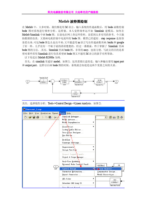
Matlab波特图绘制在Matlab中,大多时候,我们都是用M语言,输入系统的传递函数后,用bode函数绘制bode图对系统进行频率分析,这样做,本人觉得效率远不如Simulink建模高。
如何在Matlab/Simulink中画bode图,以前也在网上查过些资料,没看到太多有用的参考。
今天做助教课的仿真,又要画电机控制中电流环的bode图,模型已经建好,step response也很容易看出来,可这bode图怎么也出不来,又不愿意用m语言写出传递函数再画。
baidu和google 了好一阵,几乎没有一个帖子说的清清楚楚的,经过一番摸索,终于掌握了Simulink里画bode图的方法。
.其实,Simulink里画bode图,非常的easy,也很方便。
写此文的目的是希望对那些常用Simulink进行仿真希望画bode图又不愿用M语言的新手有所帮助。
以下均是以Matlab R2008a为例。
首先,在simulink里建好model。
如图1,这里需要注意的是,输入和输出要用input port 和output port,这样以后画bode图的时候,系统就会知道是这两个变量之间的关系。
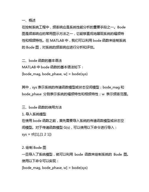
其次,选择线性分析。
Tools->Control Design ->Linear Analysis。
如图2。
将出现如图3所示的Control and Estimation Tools Manager窗口。
第三步,激动人心的时刻到了,哈哈。
如果你是按照前面的步骤来的,那么这时候,你就应该可以直接画出bode图,在窗口的下方,将“Plot linear analysis result in a ”前面的方框打上勾,已打的就不用管了,再在后面的下拉框里选择“bode response plot”,即画output port和input port之间的bode图,再点击“Linearize Model”按钮,就OK了。
其实除了bode图,还可以画其他很多响应曲线,比如step response、impulse response和Nyquist图等等,只需选择相应的step response plot,inpulse response plot或者Nyquist plot等等。
matlab中bode函数源程序
一、概述在控制系统工程中,频率响应是系统性能分析的重要手段之一。
Bode 图是频率响应的常用图示方法之一,它能够直观地展现系统的幅频特性和相频特性。
在MATLAB中,我们可以利用bode函数来绘制系统的Bode图,对系统的频率响应进行分析和评估。
二、bode函数的基本语法MATLAB中bode函数的基本语法如下:[bode_mag, bode_phase, w] = bode(sys)其中,sys表示系统的传递函数模型或状态空间模型;bode_mag和bode_phase分别表示系统的幅频特性和相频特性;w表示频率范围。
三、bode函数的使用方法1. 导入系统模型在使用bode函数之前,首先需要导入系统的传递函数模型或状态空间模型。
对于传递函数模型G(s),可以使用以下命令进行导入:sys = tf([1],[1 2 1])2. 绘制Bode图一旦导入了系统模型,就可以利用bode函数来绘制系统的Bode图。
使用以下命令可以实现:[bode_mag, bode_phase, w] = bode(sys)3. 显示Bode图绘制Bode图之后,可以使用以下命令来显示幅频特性和相频特性:figuresubplot(2,1,1)semilogx(w,20*log10(bode_mag))grid onxlabel('Frequency (rad/s)')ylabel('Magnitude (dB)')title('Bode Magnitude Plot')subplot(2,1,2)semilogx(w,bode_phase)grid onxlabel('Frequency (rad/s)')ylabel('Phase (deg)')title('Bode Phase Plot')四、实例演示下面我们以一个具体的系统为例,演示bode函数的使用方法。
MATLAB中调用simulink并绘制bode图技巧
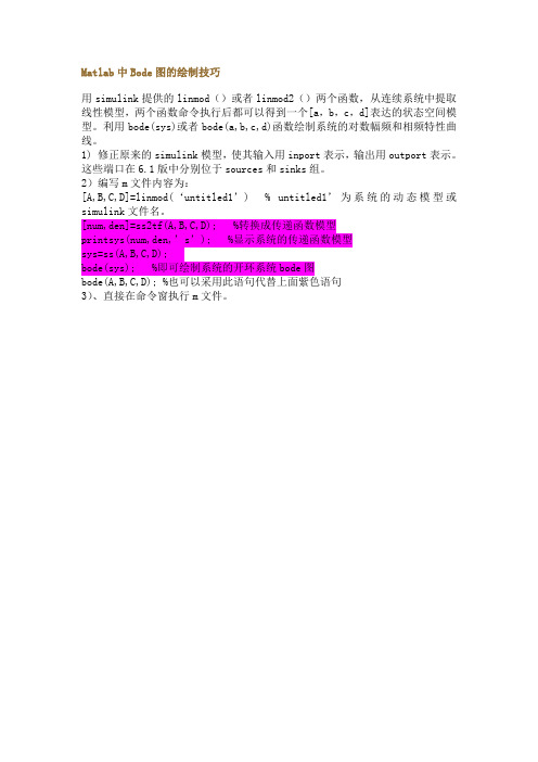
Matlab中Bode图的绘制技巧
用simulink提供的linmod()或者linmod2()两个函数,从连续系统中提取线性模型,两个函数命令执行后都可以得到一个[a,b,c,d]表达的状态空间模型。
利用bode(sys)或者bode(a,b,c,d)函数绘制系统的对数幅频和相频特性曲线。
1) 修正原来的simulink模型,使其输入用inport表示,输出用outport表示。
这些端口在6.1版中分别位于sources和sinks组。
2)编写m文件内容为:
[A,B,C,D]=linmod(‘untitled1’) % untitled1’为系统的动态模型或simulink文件名。
[num,den]=ss2tf(A,B,C,D); %转换成传递函数模型
printsys(num,den,’s’); %显示系统的传递函数模型
sys=ss(A,B,C,D);
bode(sys); %即可绘制系统的开环系统bode图
bode(A,B,C,D); %也可以采用此语句代替上面紫色语句
3)、直接在命令窗执行m文件。
- 1、下载文档前请自行甄别文档内容的完整性,平台不提供额外的编辑、内容补充、找答案等附加服务。
- 2、"仅部分预览"的文档,不可在线预览部分如存在完整性等问题,可反馈申请退款(可完整预览的文档不适用该条件!)。
- 3、如文档侵犯您的权益,请联系客服反馈,我们会尽快为您处理(人工客服工作时间:9:00-18:30)。
Matlab中Bode图的绘制技巧
我们经常会遇到使用Matlab画伯德图的情况,可能我们我们都知道bode这个函数是用来画bode图的,这个函数是Matlab内部提供的一个函数,我们可以很方便的用它来画伯德图,但是对于初学者来说,可能用起来就没有那么方便了。
譬如我们要画出下面这个传递函数的伯德图:
1.576e010 s^2
H(s)= ------------------------------------------------------------------------------------------
s^4 + 1.775e005 s^3 + 1.579e010 s^2 + 2.804e012 s + 2.494e014
(这是一个用butter函数产生的2阶的,频率范围为[20 20K]HZ的带通滤波器。
)
我们可以用下面的语句:
num=[1.576e010 0 0];
den=[1 1.775e005 1.579e010 2.804e012 2.494e014];
H=tf(num,den);
bode(H)
这样,我们就可以得到以下的伯德图:
可能我们会对这个图很不满意,第一,它的横坐标是rad/s,而我们一般希望横坐标是HZ;第二,横坐标的范围让我们看起来很不爽;第三,网格没有打开(这点当然我们可以通过在后面加上grid on解决)。
下面,我们来看看如何定制我们自己的伯德图风格:
在命令窗口中输入:bodeoptions
我们可以看到以下内容:
ans =
Title: [1x1 struct]
XLabel: [1x1 struct]
YLabel: [1x1 struct]
TickLabel: [1x1 struct]
Grid: 'off'
XLim: {[1 10]}
XLimMode: {'auto'}
YLim: {[1 10]}
YLimMode: {'auto'}
IOGrouping: 'none'
InputLabels: [1x1 struct]
OutputLabels: [1x1 struct]
InputVisible: {'on'}
OutputVisible: {'on'}
FreqUnits: 'rad/sec'
FreqScale: 'log'
MagUnits: 'dB'
MagScale: 'linear'
MagVisible: 'on'
MagLowerLimMode: 'auto'
MagLowerLim: 0
PhaseUnits: 'deg'
PhaseVisible: 'on'
PhaseWrapping: 'off'
PhaseMatching: 'off'
PhaseMatchingFreq: 0
PhaseMatchingValue: 0
我们可以通过修改上面的每一项修改伯德图的风格,比如我们使用下面的语句画我们的伯德图:P=bodeoptions;
P.Grid='on';
P.XLim={[10 40000]};
P.XLimMode={'manual'};
P.FreqUnits='HZ';
num=[1.576e010 0 0];
den=[1 1.775e005 1.579e010 2.804e012 2.494e014];
H=tf(num,den);
bode(H,P)
这时,我们将会看到以下的伯德图:
上面这张图相对就比较好了,它的横坐标单位是HZ,范围是[10 40K]HZ,而且打开了网格,便于我们观察-3DB处的频率值。
当然,你也可以改变bodeoptions中的其它参数,做出符合你的风格的伯德图。
是这样的,运行命令ctrlpref,出现控制系统工具箱的设置页面,Units改为Hz就好了
R = abs(Z) theta = angle(Z)。