小作文1折线图
雅思写作小作文范文 雅思写作折线图(线状图) 公司垃圾数量.doc
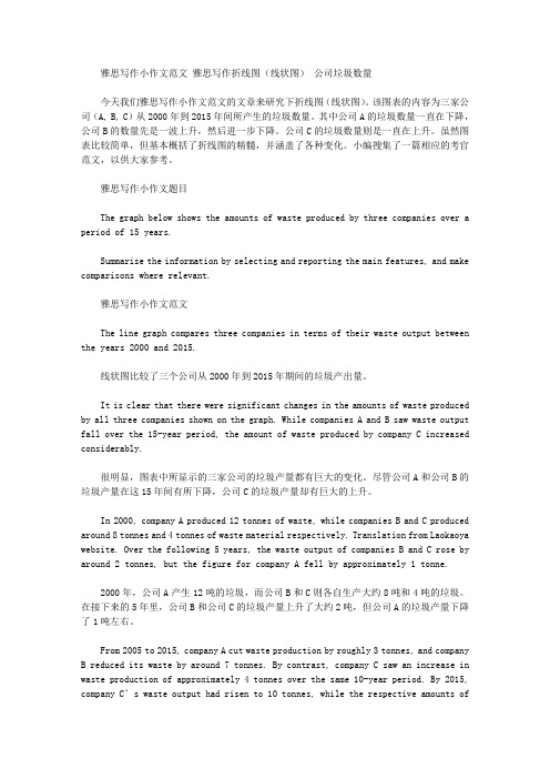
雅思写作小作文范文雅思写作折线图(线状图)公司垃圾数量今天我们雅思写作小作文范文的文章来研究下折线图(线状图)。
该图表的内容为三家公司(A, B, C)从2000年到2015年间所产生的垃圾数量。
其中公司A的垃圾数量一直在下降,公司B的数量先是一波上升,然后进一步下降。
公司C的垃圾数量则是一直在上升。
虽然图表比较简单,但基本概括了折线图的精髓,并涵盖了各种变化。
小编搜集了一篇相应的考官范文,以供大家参考。
雅思写作小作文题目The graph below shows the amounts of waste produced by three companies over a period of 15 years.Summarise the information by selecting and reporting the main features, and make comparisons where relevant.雅思写作小作文范文The line graph compares three companies in terms of their waste output between the years 2000 and 2015.线状图比较了三个公司从2000年到2015年期间的垃圾产出量。
It is clear that there were significant changes in the amounts of waste produced by all three companies shown on the graph. While companies A and B saw waste output fall over the 15-year period, the amount of waste produced by company C increased considerably.很明显,图表中所显示的三家公司的垃圾产量都有巨大的变化。
雅思写作小作文范文 雅思写作折线图(线状图) 酸雨.doc

雅思写作小作文范文雅思写作折线图(线状图)酸雨今天我们雅思写作小作文范文的文章来研究下折线图(线状图)。
该图表展示了从1990年到2007年英国四个部门的酸雨排放量。
单位为百万吨。
四个部门分别为:交通与通勤部门,电力、燃气以及水利供应部门,家庭以及其他产业部门。
小编搜了一篇相应的考官范文,以供大家参考。
雅思写作小作文题目The graph below shows UK acid rain emissions, measured in millions of tonnes, from four different sectors between 1990 and 2007.Summarise the information by selecting and reporting the main features, and make comparisons where relevant.雅思写作小作文范文The line graph compares four sectors in terms of the amount of acid rain emissions that they produced over a period of 17 years in the UK.折线图比较了英国四个部门在17年间排放的酸雨数量。
It is clear that the total amount of acid rain emissions in the UK fell considerably between 1990 and 2007. The most dramatic decrease was seen in the electricity, gas and water supply sector.很明显,英国的整体酸雨排放量在1990年到2007年之间显著下降。
下降幅度最大的是电力、燃气以及水利供应部门。
剑桥雅思6-test1-小作文-折线图学习笔记
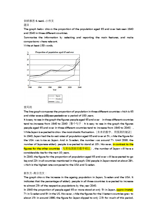
剑桥雅思6-test1-小作文题目:The graph below shows the proportion of the population aged 65 and over between 1940 and 2040 in three different countries.Summarise the information by selecting and reporting the main features, and make comparisons where relevant.Write at least 150 words.我写的The line graph compares the proportion of population in three different countries which is 65 and older over a 100year periodover a period of 100 years.It is easy to see in the graph the figures people aged 65 and over in three different countries tend to increase from 1940 to 2040(整个句子:It is easy to see in the graph the figures people aged 65 and over in three different countries tend to increase from 1940 to 2040), While Japan is expected to show the most drastic fluctuation.(未来的数字,用预测的被动)In 1940, Japan had the lowest rates of population aged 65 and over at 5%, while the figure for the USA was twice as Japan. And in Sweden, the number was around 7%. Until 2030, the number of Japanese elderly people is expected to stand at 10%. However, in contrast to the figures for the other countries(与其他国家的数字相比), the number of Japan will have a considerable rise for the next 10 years.In 2040, the figure for the proportion of population aged 65 and over will be expected to go beyond 23% in all countries mentioned in the graph. Old people in Japan stand at about 28%, which is the highest rate compared to the USA and Sweden.新东方-高分范文:The graph shows the increase in the ageing population in Japan, Sweden and the USA. It indicates that the percentage of elderly people in all three countries is expected to increase to almost 25% of the respective populations by the year 2040.In 1940 the proportion of people aged 65 or more stood at only 5% in Japan, approximately 7% in Sweden and 9% in the US. However, while the figures for the Western countries grew tobefore rising to almost 5% again at the present time.In spite of some fluctuation in the expected percentages, the proportion of older people will probably continue to increase in the next two decades in the three countries. A more dramatic rise is predicted between 2030 and 2040 in Japan, by which time it is thought that the proportion of elderly people will be similar in the three countries.Simon版本范文:The line graph compares the percentage of people(proportion of the population的同义替换)aged 65 or more(over同义替换)in three countries over a period of 100 years(小作文中描述图表涉及的年段就用这个表述,背诵)It is clear that(小作文概览段句型)the proportion of elderly people increases in each country between 1940 and 2040. Japan is expected to see the most dramatic changes in its elderly population.In 1940, around 9% of Americans(知道具体国家人的称呼的时候可以替换国家名词)were aged 65 or over, compared to about 7% of Swedish people and 5% of Japanese people. The proportions of elderly people in the USA and Sweden rose gradually over the next 50 years, reaching just under 15%(表示仅仅少一点)in 1990. By contrast, the figures for Japan remained below 5% until the early 2000s.Looking into the future, a sudden increase in the percentage of elderly people is predicted for Japan, with a jump of over 15% in just 10 years from 2030 to 2040(日本的老年人口比例被预测突然增加突然增加,从2030年到2040年的短短10年时间里,比例将增长15%以上). By 2040, it is thought that around 27% of the Japanese population will be 65 years old or more, while the figures for Sweden and the USA will be slightly lower, at about 25% and 23% respectively(而瑞典和美国的数字则略低,分别约为25%和23%).积累:第一段(改写):小作文中描述图表涉及的一段时间:over a period of 100 years第二段:第一句句型:It is clear that图表中超过三类:in each country,in three countries表示整体趋势是剧烈的增长:see the most dramatic changes数据段:直接描述数据,句子太短则用compare对比其他类别的数据:around 9% of Americans were aged 65 or over,compared to about 7% of Swedish people and 5% of Japanese people.表述剧烈的百分比增长:a sudden increase in the percentage of elderly people is predicted for Japan在一段时间内持续缓慢增长,然后在某一年到达了一个数字:rose gradually over the next 50 years,reaching just under 15% in 1990直到某个时候一直低于某一数字:the figures for Japan remained below 5% until the early 2000sabout 25% and 23% respectively.表示(未来)一段时间内的突然增加(从什么年代到什么年代),从什么数字到什么数字,:a sudden increase in the percentage of elderly people is predicted for Japan, with a jump of over 15% in just 10 years from 2030 to 2040水字数必备短语:与其他国家的数字相比:in contrast to the figures for the other countries图表中有未来的年代,描述未来的第一句:Looking into the future具体数字前面的形容词:不太确定,大概数字:around,approximately,almost,about,nearly表示只有:just over,only多:over,further,少:under,below其他:比例的同义替换:percentage of people,proportion of the population老人的同义替换:elderly people,elderly population进行比较的连接词:while,by contrast,表示未来的数据:it is thought that,is predicted for Japan ,is expected to see the most dramatic changes折线图:关于结构:第一段:第二段:概述段用一般现在时图表中如果有未来的数据,则用“预测”的被动。
英语作文折线图万能模板

英语作文折线图万能模板英文回答:The line graph provides a visual representation of the change in sales of a particular product over a period of time. The x-axis of the graph represents the time period, while the y-axis represents the sales figures.To describe the trend in the line graph, you can use the following phrases:Overall trend:The sales of the product have shown a steady increase/decrease over the time period.The sales of the product have fluctuated over the time period.Specific time periods:There was a significant increase/decrease in sales from [time period] to [time period].Sales remained relatively stable from [time period] to [time period].Comparison of time periods:Sales in [time period] were significantlyhigher/lower than in [time period].Sales have increased/decreased by [percentage]from [time period] to [time period].In addition to describing the trend, you can alsoidentify any notable features of the line graph, such as:Peaks: The graph shows a peak in sales at [time period].Troughs: The graph shows a trough in sales at [timeperiod].Seasonality: The graph shows a seasonal pattern, with sales increasing/decreasing during certain times of the year.Outliers: The graph contains an outlier, which is a data point that is significantly different from the rest of the data.中文回答:折线图直观地呈现了某一产品在一段时间内的销售变化情况。
雅思写作小作文范文 雅思写作折线图(线状图) 美国肉类消耗量.doc

雅思写作小作文范文雅思写作折线图(线状图)美国肉类消耗量今天我们雅思写作小作文范文的文章来研究下折线图(线状图)。
该图表来自于华盛顿邮报的网站,数据相对于真正的雅思考试而言要更多一些。
因此如何挑选数据和进行对比就显得尤为重要。
小编搜集了一篇考官写的范文,以供大家参考。
雅思写作小作文题目雅思写作小作文范文The line graph shows changes in the per capita consumption of beef, pork, broilers, and turkey in the United States between 1955 and 2012.该折线图展示了1955年到2012年期间美国每人牛肉、猪肉、鸡肉和火鸡肉的消耗量。
It is noticeable that beef was by far the most popular of the four types of meat for the majority of the 57-year period. However, a considerable rise can be seen in the consumption of broilers, with figures eventually surpassing those for beef.很显然,牛肉在57年中的大多数时间都是四种肉类中最受欢迎的类型。
然而,鸡肉的消费量可以看到明显上升,并最终超过了牛肉的数量。
Between 1955 and 1976, US beef consumption rose from around 60 to a peak of 90 pounds per person per year. During the same period, consumption of broilers also rose, to nearly 30 pounds per person, while the figures for pork fluctuated between 50 and 40 pounds per person. Turkey was by far the least popular meat, with figures below 10 pounds per capita each year.在1955年到1976年期间,美国牛肉的消耗量从每人每年60磅,上涨到最高点每人每年90磅。
英语作文折线图万能模板
英语作文折线图万能模板英文回答:Line Graph Essay Template.Introduction.Begin with a brief overview of the subject or trend being illustrated in the line graph.Provide some context or background information to set the stage for the analysis.Body Paragraphs.Paragraph 1:Describe the overall trend shown in the line graph, focusing on any key peaks, valleys, or changes in slope.Identify any significant points or events that may have influenced the trend.Paragraph 2:Analyze specific data points or time periods in more detail.Identify any patterns, correlations, or relationships between the data points.Explain the reasons behind any significant changes or fluctuations.Paragraph 3:Discuss the implications or conclusions that can be drawn from the data.Consider the potential causes or consequences of the trends observed.Provide any insights or recommendations based on the analysis.Conclusion.Summarize the main findings of the analysis.Restate the overall trend and its significance.End with a brief discussion of the implications of the findings or any future considerations.Example Line Graph Essay.Introduction.The line graph below illustrates the global sales of smartphones from 2010 to 2020. The data shows a steady increase in sales over this decade, with a significant spike in 2017.Body Paragraphs.Paragraph 1:The graph shows a consistent upward trend in smartphone sales, with a steady increase from 2010 to 2016. In 2017, sales surged significantly, reaching over 1.5 billion units sold. After this peak, sales continued to rise, albeit at a slower pace, reaching almost 2 billion units sold in 2020.Paragraph 2:The spike in sales in 2017 can be attributed to several factors, including the release of new and innovative smartphone models, the expansion of mobile networks to remote areas, and the growing popularity of mobile apps. The gradual increase after 2017 likely reflects the continued growth of the smartphone market as well as technological advancements and the introduction of more affordable smartphones.Paragraph 3:The rising sales of smartphones have had a significant impact on the global economy and societal trends. Smartphones have become essential devices for communication, information, and entertainment. They have revolutionizedthe way we live, work, and connect with others. The continued growth of the smartphone market is expected to have further implications for businesses, industries, and our overall way of life.Conclusion.The line graph clearly demonstrates the dramatic risein global smartphone sales from 2010 to 2020. The surge in 2017 and the continued increase after that highlight the growing popularity and importance of smartphones in our modern world. The findings of this analysis providevaluable insights for understanding the trends and implications of the smartphone market.中文回答:折线图论文模板。
折线图英语作文雅思
折线图英语作文雅思英文回答:A line graph is a visual representation of data points connected by straight lines. It is typically used to track changes in data over time, or to compare different sets of data.Line graphs are often used in business, finance, and economics to track trends and patterns in data. They can also be used in scientific research to visualize the results of experiments.When creating a line graph, it is important to choose the appropriate scale for the xand y-axes. The x-axis typically represents time, while the y-axis represents the value of the data being tracked. It is also important to label the axes clearly and to use a legend to identify the different lines on the graph.Line graphs can be a powerful tool for visualizing data and identifying trends. However, it is important to remember that they are only a two-dimensional representation of the data, and they may not capture all of the complexity of the data.中文回答:折线图是一种用直线连接数据点的可视化表示形式。
折线图英文作文模板

折线图英文作文模板英文回答:The line graph is a common type of graph used to display data over a period of time. It consists of a series of data points connected by straight lines. The x-axis represents the time period, while the y-axis represents the value of the data being measured.In my opinion, the line graph is an effective way to illustrate trends and patterns in data. It allows us to easily see how the data changes over time and identify any significant fluctuations or correlations. For example, if I were analyzing the sales performance of a company over the past year, I could use a line graph to show the monthly sales figures. This would allow me to identify any seasonal trends or periods of growth or decline.Furthermore, the line graph can also be used to compare multiple sets of data. For instance, if I wanted to comparethe sales performance of different products within the same company, I could plot multiple lines on the graph to show how each product's sales have changed over time. This would enable me to determine which products are performing well and which ones may need improvement.In addition, the line graph is a useful tool for making predictions and forecasting future trends. By analyzing the existing data and identifying patterns, we can make informed predictions about how the data may continue to change in the future. For example, if I were analyzing the stock market, I could use a line graph to predict thefuture performance of a particular stock based on its past performance.Overall, the line graph is a versatile and intuitive way to present data. It allows us to easily understand and interpret complex information, making it a valuable tool in various fields such as business, finance, and research.中文回答:折线图是一种常见的图表类型,用于展示一段时间内的数据。
英语作文折线图模板及范文

英语作文折线图模板及范文The ability to effectively present and analyze data is a crucial skill in today's data-driven world. One commonly used method for visualizing data is the line graph, which allows for the clear depiction of trends and changes over time. In this essay, I will provide a template and sample essay for a line graph, highlighting the key elements and structure that can be utilized to create a compelling and informative written analysis.A line graph is a type of chart that uses line segments to connect different data points, typically arranged along the x-axis (horizontal) and y-axis (vertical). This type of visualization is particularly useful for illustrating changes or fluctuations in a variable over a specific period of time. The line graph can be used to display a single data series or multiple data series, allowing for the comparison of different trends or patterns.When constructing a line graph essay, it is important to follow a structured format that provides a clear and comprehensive analysis of the data presented. The essay should generally consist of thefollowing key components:1. Introduction:- Start the essay by briefly introducing the topic of the line graph and providing some context about the data being presented.- Clearly state the main purpose or objective of the line graph, such as highlighting a particular trend, comparing different variables, or identifying significant changes over time.- Provide a concise overview of the key information that will be discussed in the body of the essay.2. Description of the Line Graph:- Describe the x-axis and y-axis of the line graph, including the units of measurement and the time period or range being displayed. - Identify the different data series or lines shown in the graph, providing a brief explanation of what each line represents.- Mention any notable features or characteristics of the line graph, such as the shape of the lines, the presence of peaks or valleys, or any significant changes in the trend over time.3. Analysis of the Data:- Examine the overall trends and patterns observed in the line graph, identifying any significant increases, decreases, or fluctuations in the data.- Provide a detailed analysis of the changes or trends, explainingthe potential reasons or factors that may have contributed to the observed patterns.- Compare and contrast the different data series or lines, highlighting any similarities or differences in their trends and discussing the potential implications or insights that can be drawn from these comparisons.- Identify any notable events, changes, or external factors that may have influenced the data, and discuss how these factors may have impacted the observed trends.4. Conclusion:- Summarize the key findings and insights derived from the analysis of the line graph.- Discuss the broader implications or significance of the observed trends and patterns, and how they may be relevant to the overall topic or context.- Provide any concluding thoughts or recommendations based on the insights gained from the line graph analysis.To illustrate the application of this template, here is a sample essay for a line graph:The line graph depicts the average monthly temperatures recorded in a coastal city over a five-year period, from 2017 to 2021. The x-axis represents the months of the year, while the y-axis shows thetemperature in degrees Celsius. The graph displays two distinct data series, one representing the average daily high temperatures and the other representing the average daily low temperatures.The overall trend observed in the line graph is a clear seasonal pattern, with temperatures peaking during the summer months and reaching their lowest points during the winter months. The average daily high temperatures range from a low of around 15 degrees Celsius in the winter to a high of approximately 28 degrees Celsius in the summer. The average daily low temperatures exhibit a similar seasonal pattern, fluctuating between 8 degrees Celsius in the winter and 18 degrees Celsius in the summer.Examining the data more closely, we can see that the summer months (June, July, and August) consistently experience the highest temperatures, with the average daily high reaching its peak in July at around 28 degrees Celsius. Conversely, the winter months (December, January, and February) consistently record the lowest temperatures, with the average daily low dipping to approximately 8 degrees Celsius in January.The observed seasonal patterns can be attributed to the city's coastal location, which influences its climate. During the summer months, the city's proximity to the ocean helps moderate the temperatures, preventing them from reaching excessively high levels. However, inthe winter, the coastal location leads to lower temperatures, as the ocean's cooling effect becomes more pronounced.It is worth noting that the line graph also reveals some year-to-year variations in the temperature patterns. For instance, the average daily high temperatures in 2019 were slightly higher than in the other years, while the average daily low temperatures in 2020 were slightly lower. These variations may be due to factors such as changes in weather patterns, ocean currents, or other environmental influences that can impact the local climate.In conclusion, the line graph provides a clear and informative visualization of the average monthly temperature patterns in the coastal city over a five-year period. The data reveals a distinct seasonal trend, with temperatures peaking in the summer and reaching their lowest points in the winter. The coastal location of the city is a key factor influencing these temperature patterns, and the graph also highlights some year-to-year variations that may be attributable to various environmental factors. This analysis of the line graph can be valuable for understanding the city's climate, planning for seasonal changes, and potentially informing future urban planning and infrastructure decisions.。
折线图英文作文模板
折线图英文作文模板英文回答:A line graph is a visual representation of data points that are connected by straight lines. It is commonly used to show trends or changes over time. Line graphs are usedin a wide variety of fields, including finance, economics, science, and engineering.To create a line graph, you first need to plot the data points on a coordinate grid. The horizontal axis (x-axis) typically represents time, while the vertical axis (y-axis) represents the value of the data. Once the data points have been plotted, you can connect them with straight lines.Line graphs can be used to show a variety of different trends. For example, a line graph can be used to show the growth of a company's stock price, the change in the temperature over time, or the relationship between two different variables.Line graphs are a versatile and effective way to visualize data. They are easy to understand and can be used to communicate complex information quickly and clearly.中文回答:折线图是通过直线连接数据点的可视化表示。
英语折线图作文范例
英语折线图作文范例英文回答:In the modern era, data visualization has become an indispensable tool for conveying complex information concisely and effectively. Line charts are a versatile type of graph that depicts trends and patterns over time. They are widely used in various disciplines, including business, science, and education.One of the primary advantages of line charts is their ability to reveal trends. By connecting data points with lines, they create a visual representation of how a particular variable changes over time. This allows users to quickly identify upward or downward trends, as well as any fluctuations or anomalies.Line charts are also effective for comparing multiple variables. By plotting different lines on the same graph, users can easily examine the relationships betweendifferent variables and identify any correlations or differences. This can provide valuable insights into the behavior of the variables and help users make informed decisions.In addition to their simplicity and clarity, linecharts can also convey large amounts of data efficiently.By using different colors, line styles, and symbols, users can represent multiple data sets on a single graph. This allows for efficient comparisons and enables users toidentify patterns and trends across different data sets.However, it is important to note that line charts have certain limitations. They are most suitable for displaying continuous data that changes over time. For categoricaldata or data with significant gaps, other types of graphs, such as bar charts or scatterplots, may be more appropriate.Overall, line charts are a powerful tool forvisualizing trends and patterns over time. Their simplicity, clarity, and ability to handle large amounts of data make them a versatile choice for a wide range of applications.中文回答:折线图。
折线图 英文作文范例
折线图英文作文范例英文:When it comes to data visualization, one of the most commonly used types of charts is the line chart. A linechart is a graph that displays information as a series of data points connected by straight lines. It is useful for showing trends over time or comparing multiple sets of data.One of the advantages of the line chart is its simplicity. It is easy to read and understand, even for those who are not familiar with data analysis. Additionally, it allows for the identification of patterns and trends, making it a popular tool for forecasting.On the other hand, the line chart has its limitations.It is not suitable for displaying large amounts of data, as it can become cluttered and difficult to read. It is alsonot effective for showing changes in data that occurrapidly or irregularly.Overall, the line chart is a useful tool for data visualization, but it should be used appropriately and in conjunction with other types of charts to fully convey the information being presented.中文:谈到数据可视化,最常用的图表类型之一就是折线图。
折线图英语作文范文带图

折线图英语作文范文带图英文回答:Line charts are a type of graph that is used to represent data points that are plotted over time. They are commonly used to show trends and changes over time, and can be used to compare different data sets.Line charts are created by plotting data points on a coordinate plane, with the x-axis representing time and the y-axis representing the data value. The data points are then connected by lines, which show the trend of the data over time.Line charts can be used to represent a variety of data, including financial data, sales figures, and scientific data. They can be used to compare different data sets, such as the sales of two different products or the performance of two different stocks.Line charts are a versatile tool that can be used to represent a variety of data. They are easy to understand and can be used to quickly identify trends and changes over time.中文回答:折线图是一种用来表示随时间变化的数据点的图表。
折线图作文英语模板
折线图作文英语模板英文回答:One can get an insight into the growth, development, and decline of various aspects of a phenomenon by analyzing a line graph. Line graphs are a form of diagram that displays the changes in a variable over time. They are often used to visualize trends, patterns, and relationships in data. Line graphs are versatile and can be used across various disciplines, including economics, finance, science, and engineering. Their simplicity and effectiveness make them a popular tool for data visualization and communication.Line graphs consist of two axes: the x-axis and the y-axis. The x-axis usually represents time or an independent variable, while the y-axis represents the dependent variable, which is the variable being measured. The data points are plotted on the graph, and a line is drawn to connect them. The line graph allows readers to quickly identify trends and changes in the data, as well as comparedifferent variables over time.Line graphs can provide valuable information about the dynamics of a system. They can reveal trends, patterns, and relationships that may not be apparent in the raw data. By examining the slope of the line, one can determine whether the variable is increasing, decreasing, or remaining stable. Additionally, line graphs can help in identifying turning points, such as peaks and troughs, which may indicate significant changes in the system.Despite their versatility and usefulness, line graphs have certain limitations. They are not as effective in displaying complex relationships between multiple variables, and they can be misleading if the axes are not scaled appropriately. Furthermore, line graphs can only represent continuous data and may not be suitable for categorical data.Overall, line graphs remain a powerful and widely used tool for data visualization. Their simplicity andeffectiveness make them accessible to a wide range of audiences and disciplines. By providing a clear and concise visual representation of data, line graphs enable users to understand trends, patterns, and relationships, aiding in decision-making and knowledge discovery.中文回答:通过分析折线图,我们可以深入了解某个现象的各个方面的增长、发展和衰退。
折线统计图的作文

折线统计图的作文
“哎呀,妈妈,你看这次考试的成绩分布,要是能画成图就好啦!”我嚷嚷着。
那天,阳光透过窗户洒在房间的地板上,形成一片片光影。
我和妈妈坐在书桌前,看着我的考试卷子。
妈妈笑着说:“那可以用折线统计图呀,能很直观地看出成绩的变化呢。
”
我好奇地问:“啥是折线统计图呀?”妈妈耐心地解释道:“就是用线条把一个个数据点连起来,这样就能清楚地看到数据的走势啦。
”我似懂非懂地点点头。
后来,在数学课上,老师真的讲到了折线统计图。
老师在黑板上画出各种折线,一边画一边说:“同学们,看,通过这个折线统计图,我们可以清楚地了解很多信息哦。
比如这个商品的销量变化,这个同学的成绩进步情况。
”我眼睛睁得大大的,觉得好神奇呀。
我和同桌小声说:“嘿,原来这就是折线统计图呀,还挺有意思的。
”同桌也点点头说:“是呀,比看一堆数字直观多了。
”
回到家,我迫不及待地对妈妈说:“妈妈,我今天知道折线统计图好厉害啦!”妈妈笑着说:“那你可以用它来分析分析你的零花钱使用情况呀。
”我一想,对啊,这多好玩呀。
于是,我开始记录自己每天的零花钱使用,然后画成了折线统计图。
看着那起起伏伏的线条,我自言自语道:“哎呀,我有时候花钱好多呀,像个小山一样高,有时候又好少,像个小山谷。
”我好像发现了一个大秘密似的。
这折线统计图不就像我们的生活吗?有起有落,有高有低。
有时候开心得像在山顶,有时候又会遇到低谷。
但这就是生活呀,丰富多彩的。
我觉得我对折线统计图的了解越来越深啦,它可真是个有趣又有用的东西呢!我以后还要用它来发现更多有趣的事情!。
数学日记折线统计图300字

数学日记折线统计图300字
这是一张折线统计图,它表示的意思非常清楚。
首先将折线图平分为4份,再把各段直线上某点到另两点的距离和在一起作出这条线的垂线,然后把每段长度用点连接起来,就得到一组数据。
今天我就画了一个简单的折线统计图。
首先看到的是这幅折线统计图的右下角有三条竖线,中间那条横着的黑线就是从 a 地到 b 地的最短路径线,也叫做“虚拟线”。
要想算出结果,就必须在正确判断实际路程的基础上运用所学过的知识对于现在使用的公路来说,公路总长是7×5=30千米,而最近的城市却比公路远19千米;如果乘汽车去,还不能算最方便、快捷的交通工具呢!
- 1 -。
英语折线图作文万能模板
英语折线图作文万能模板英文回答:In the realm of data analysis and communication, a line chart emerges as a versatile tool to visually present the changes in a numerical dataset over time. This informative graphic aids in identifying trends, patterns, and relationships within the data, making it indispensable for various applications.Line charts consist of a horizontal axis representing the independent variable (typically time), and a vertical axis representing the dependent variable (the numerical value being observed). Data points are plotted as points on the chart, and lines connect these points to illustrate the progression of the data over time.The ability to overlay multiple lines on a single chart allows for comparative analysis and the identification of similarities and differences between different datasets.Line charts also enable the easy identification of maximum and minimum values, as well as the overall shape of the data distribution.中文回答:一、线形图的概念和特点。
折线图作文波动描述
折线图作文波动描述
哎呀,看这折线图,跟过山车似的!一会儿冲上天,一会儿又
掉下来,真是刺激啊!这就是生活吧,有时候一帆风顺,有时候又
波折重重。
不过没关系,只要咱们有勇气,就能一路闯过去!
哈哈,这折线图真是有意思,就像我心情的起伏一样。
有时候
高兴得像个孩子,有时候又沮丧得像只落汤鸡。
不过嘛,生活就是
这样,酸甜苦辣都有,咱们得学会接受它,享受它!
咦,这折线图还挺有规律的,上升下降都按照一定的节奏来。
就像我每天的工作,虽然有时候忙得团团转,但还是有条不紊地进
行着。
嘿嘿,只要有计划,生活就不会乱套!
哎呀,这折线图好像我的感情经历啊!一会儿和恋人甜蜜蜜的,一会儿又闹点小矛盾。
不过嘛,爱情就是这样,需要双方共同努力
去经营。
只要咱们心往一处想,劲往一处使,就能一起走过风风雨雨!。
英语折线图作文范例
英语折线图作文范例In the field of academic writing, the use of graphs and charts is crucial to effectively communicate ideas and findings. Among these visual aids, line graphs are particularly useful for depicting trends and patterns over time. In this article, we will explore an example of an English essay that utilizes a line graph to analyze and interpret data.The topic of our essay is the impact of technology on student learning outcomes over the past decade. Toillustrate this topic, we will use a line graph that shows the trends in student test scores and the amount of time spent using technological devices for learning purposes.The graph begins in the year 2010, with both lines representing test scores and technology usage starting at a relatively low point. As we move through the decade, the line representing technology usage rises steeply,indicating a significant increase in the amount of time students are spending using devices for learning. Simultaneously, the line representing test scores alsorises, indicating a positive correlation between technology usage and student performance.In the early years of the decade, the increase in technology usage is gradual, with a corresponding gradual increase in test scores. However, as we reach the later years, the rise in technology usage becomes more rapid, and so does the increase in test scores. This suggests that as students become more reliant on technology for learning, their performance improves at a faster rate.There are several possible explanations for this observed trend. Firstly, the widespread availability of technology has made it easier for students to access educational resources and information. Secondly, the use of technology for learning has become more sophisticated, with the development of interactive tools and platforms that engage students more effectively. Finally, the integration of technology into the classroom has fostered a more collaborative and innovative learning environment, which has been shown to improve student outcomes.However, it is important to note that the observed correlation between technology usage and test scores doesnot necessarily imply causation. It is possible that other factors, such as changes in teaching methods or the overall quality of education, could have contributed to the improvement in student performance.In conclusion, the line graph presented in this essay provides valuable insights into the relationship between technology usage and student learning outcomes over the past decade. The observed trend suggests that as students become more reliant on technology for learning, their performance improves at a faster rate. However, it is crucial to consider other potential factors that could have influenced this relationship. Future research could explore the specific mechanisms through which technology affects student learning, and how these effects can be optimized to further improve educational outcomes.**英语折线图作文范例的中文解读**在学术写作领域,图表和图形的使用对于有效传达思想和发现至关重要。
折线图 英文作文
折线图英文作文英文:When it comes to data visualization, one of the most commonly used types of charts is the line chart, also known as the line graph. A line chart is a graphical representation of data that displays information as a series of data points connected by straight lines. It is particularly useful for showing trends over time or comparing different sets of data.Line charts are commonly used in various fields such as finance, economics, and science. For example, in finance, line charts can be used to show the stock prices of a company over a period of time, while in science, line charts can be used to show the changes in temperature over time.One of the advantages of using a line chart is that it is easy to read and interpret. The lines connecting thedata points make it easy to see the trend and direction of the data. Additionally, line charts can be used to show multiple sets of data on the same chart, making it easy to compare them.However, there are also some limitations to using line charts. For example, line charts may not be suitable for showing data that has a lot of fluctuations or irregularities. In such cases, other types of charts such as scatter plots or bar charts may be more appropriate.Overall, line charts are a versatile and effective tool for visualizing data. By using them effectively, we can gain valuable insights and make informed decisions based on the trends and patterns that they reveal.中文:说到数据可视化,最常用的图表类型之一就是折线图,也称为折线图表。
- 1、下载文档前请自行甄别文档内容的完整性,平台不提供额外的编辑、内容补充、找答案等附加服务。
- 2、"仅部分预览"的文档,不可在线预览部分如存在完整性等问题,可反馈申请退款(可完整预览的文档不适用该条件!)。
- 3、如文档侵犯您的权益,请联系客服反馈,我们会尽快为您处理(人工客服工作时间:9:00-18:30)。
雅思写作图表作文常用词汇和句型一一.雅思图表作文写作常用词汇●动词类1. 表明indicate;show;demonstrate;reveal;give a breakdown of; give information about;reflect2. 上升increase;rise;grow(growth); climb;go up3. 下降decrease; fall; decline; drop;slide4. 急剧上升:shoot(shot) up; soar; jump ;surge5. 急剧下降:collapse; plunge; plummet6. 波动:fluctuate (fluctuation)7. 保持不变:remain constant;remain unchanged;remain stable;(little change);8. 达到顶峰:peak at; reach a peak of; reach the summit of9. 达到低谷:reach the lowest point/the bottom at10.经历某种变化:experience;11. 见证:witness;see12. 组成:constitute;consist of; be made up of13. 占:be responsible for; account for;occupy;represent;be shared by●形容词副词1.表示“速度快”:Sharp(ly); rapid(ly); dramatic (dramatically); significant(ly); considerable (considerably); Marked(ly);noticeable(noticeably)2. 表示“速度慢”:Gradual(ly); steady (steadily); slow(ly); slight(ly)●数据修饰词大约:about;around;roughly;approximately;nearly仅高于:just over仅低于:just under●分别: respectively; each●时间修饰词1. 从2000年到2005年:from 2000 to 2005;between 2000 and 2005;over the period from 2000 to 2005;during 2000 and 2005;2. 在接下来的五年里:During the following/next five years3. 在过去的五年里:over the past/last five years二.曲线走势描述用语1. 稳步下降2. 逐渐上升3. 波动剧烈4. 微微下降5. 突然下降6. 大幅攀升7. 剧烈下降8. 保持不变三、描述数据变化的五种句式(1)变化的主体+动词+副词+by+变化幅度+时间From …to…The number of cinema admission dropped slightly from 1995 to the year of 2000. The number of satellite TV stations increased significantly from 1957 to 1997.(2)There be + 形容词+ 名词+of +变化幅度+ in +变化的主体+时间There was a sharp decrease in the number of television licenses from 1957 to 1967. There was little change in the number of private cars from 1967 to 1997.There was a significant increase in the number of bicycles from 1997 to 2000.There was a fluctuation between 200 and 300 in the number of radio stations in UK between 2000 and 2010.(3)时间+ saw / witnessed + 形容词+ 名词+ in + 变化的主体The past decade witnessed a sharp decline in cinema admission.(4)变化趋势+ is seen/ witnessed + in + 变化主体+ 时间A sharp increase was seen in the number of tourists during the period between 2000 and 2005.(5)变化主体+witness/see/experience+形容词+名词+时间The number of tourists experienced a sharp increase during the period between 2000 and 2005.接数字介词(1)描述数据变化中到达一个点:Interest rates fell to 6 percent in August.(2)描述数据变化中到达在某个顶点、底点:Interest rates peaked at 7 percent in July.Interest rates reached a peak of 7 percent in July.(3)描述数据变化中增减的幅度Interest rates rose by 2 percent this year.There was a rise of 2 percent in interest rates this year.(4)描述数据在两个点之间变化Interest rates rose from 5 to 7 percent this year.Interest rates fluctuated between 5 and 7 percent all year.四:模板句型As can be seen from the table, …As is shown in the table,……is the primary choice of…, next comes…描述数据的波动:…fluctuated, dropping from…to … and then climbing back to … before finally falling to ……fluctuated, jumping to … from… and then dropping back to … before finally shooting up to ….五. 写句子。
1. 巧克力的消耗稳步下降。
2. 电影的产量急剧上升。
3. 来自非洲的香料出口这段期间剧烈波动。
(香料spice,出口export)4.新产品的发展逐渐下降。
5. 调查投资显著下降。
(research investment)6.票的购买大幅下降。
7. 网站数量大幅上升。
8.芒果销量突然下降。
9.在主题公园,来客数量有些微的波动。
10. 糖类的出口逐渐下降。
11. 超市食品的质量慢慢降低。
12.乘飞机的乘客数量波动剧烈。
13. 鸡的消耗呈上升/下降趋势。
14. 其他工人的薪水花费从1981年的28%下降到2001年的仅仅15%。
15. 书的支出金额先于1991年增加到20%,然后在时期末减少到仅仅有9%.16. 在研究方面的花费在1990年急剧上升到270万。
17. 家具和设备的成本有相反的趋势。
18. 五月和九月期间游客的人数从700稳步增长到1400。
19. 前四个月,游客数量逐渐上升。
20. 在2001年,个人电脑销量波动剧烈。
参考答案1. 下降:fall=dip; decrease; drop; decline;Dip表示“微降”。
以上动词均可做“动词”和“名词”使用。
Rapid/sharp/steep/dramatic/steady/gradual decline2. 急剧下降:plummet; plunge3.上升:rise; increase; climb; grow; go upA growing number of people are taking part-time jobs.越来越多的人在做兼职。
A steady climb in house prices房价的稳步上升。
以上动词除了grow之外,均可做名词用。
Grow的名词growth。
4.急剧上升: soar; shoot up; surge; jumpSoar猛增,反义词plummetSurge, jump可做动词和名词。
The price of petrol has soared during recent weeks.Surge=shoot up=suddenly increase突然增加5. 波动:fluctuate6. 保持不变:do not change; remain at the same level; maintain stability7.达到顶峰:peak (at)/reach a peak of8.达到谷底:plunge to a low of9. 改变的速度:(The speed of change):steady, steadily, sudden, suddenly, dramatic, dramatically, wild, wildly, slow, slowly, gradual, gradually, significant, significantly, noticeable, noticeably,Fast, rapidly, quickly; slowly, gradually, steadily;10.达到…数量:reach; hit; arrive at; amount to; stand at11. 占据:account for/makeup/represent/occupy/constitute曲线描述走势用语。
1. Fall steadily稳步下降2. rise gradually逐渐上升3. fluctuate wildly波动剧烈4. drop slightly微微下降5. drop suddenly突然下降6. climb sharply大幅攀升7. decline dramatically剧烈下降8. level off/out(vt, vi)平稳,稳定写句子。
