雅思图表作文的种类及描述方法整理
雅思小作文各种图题、表格题技巧总结
雅思小作文各种图题、表格题技巧总结雅思作文Task 1受图表内容的限制,遣词造句的要求非常有限,只需针对考试,把核心表达用准用熟即可,所谓博大不如精深。
下面是威学教育雅思教研组总结的雅思小作文线图题、柱形图题、饼图题、表格题以及流程图等的写作总结!线图、柱状图、饼图,表格题介绍段introduction介绍段内容几乎完全不用创新,就是对题目文字部分的第二段做改写,paraphrase the rubric.所谓改写,要么换词,要么换句式。
例如:(I4-100)The charts below give information about travel to and from the UK and most popular countries for UK residents to visit.换词(1) 图 The charts图:chart, graph(雅思写作中完全等价,无差别)线:line / curve chart柱图:bar / column graph饼:pie chart表:table / statistics / figures(2) 动词“表明”give information about介绍段是客观描述,用一般现在时态,give information about 虽然在这篇作文中最好不再用,但是informal learning,随手学到的东东,留作其它文章再用。
替换的词语和结构很多,比如我常用的show /illustrate / demonstrate/compare,大家也可以选几个自己喜欢并且拼写准确的形成风格。
第二段其余部分的替换因题而异,比如travel换成visitthe UK换成Britain(注意不是England,英格兰只是Britain的一部分)popular换成fashionablecountry换成nationUK residents to visit换成UK tourists不过随着练习作文数量的增加,你会惊喜的发现,雅思图表作文,连描述的对象都是类似的。
雅思写作任务1中的图表解释与描述

雅思写作任务1中的图表解释与描述在雅思写作考试中,任务1要求学生解释和描述图表。
图表类型可以是图表、表格、流程图或地图。
学生需要对图表中的数据进行解读,并用适当的词汇和句子来描述和解释。
图表解释和描述通常可以按照以下结构进行组织:1. 引言段:简要概述图表中的主题和数据类型。
最好使用一两句话来引出主题。
2. 总体描述:以全局的方式描述图表中的趋势或关键特征。
可以提到一些关键数字或明显的趋势。
3. 细节描述:对图表中的具体数据进行更详细的描述。
可以选择几个最重要或最显著的数据点进行描述,并用适当的比较和对比来增加分析的深度。
4. 结论段:总结整个图表的主要特点和趋势。
强调最重要的观察结果,并提供一些可能的解释或预测。
下面是一个例子来展示如何按照以上结构来写一篇图表解释和描述的文章:---引言段:本文将解释和描述一张关于全球食品浪费的柱状图。
图表展示了2000年至2015年之间,各大洲每年浪费的食物数量。
数据由联合国提供。
总体描述:总体来看,全球食品浪费数量在这个时间段内持续增长。
同时,发达国家浪费的食物要远远多于发展中国家。
细节描述:在2000年,发展中国家平均每年浪费大约2000万吨食物,而发达国家浪费数量高达8000万吨。
然而,在2015年,发展中国家的食品浪费增加到了3000万吨,而发达国家的浪费数量达到了1亿吨。
在这个时间段内,拉美地区的食品浪费率增长最快。
从2000年的500万吨增加到了2015年的1000万吨。
亚洲和欧洲的食品浪费也有显著增长,分别从2000年的1000万吨增加到了2015年的2000万吨和3000万吨。
结论段:从这些数据可以看出,全球食品浪费是一个严重的问题,尤其是在发达国家。
这可能是因为消费者的浪费行为和供应链中的问题所导致的。
为了减少食物浪费,我们需要通过教育和政策改变来提高人们的意识,并改进供应链的效率。
---以上是一个简单的范例,展示了如何按照结构来写一篇图表解释和描述的文章。
雅思小作文技巧及范文
雅思小作文写作技巧及范文一.图表类型饼状图,直方图或柱形图趋势曲线图表格图流程图或过程图程序图二.解题技巧A. 表格图1 横向比较: 介绍横向各个数据的区别,变化和趋势2 纵向比较:介绍横向各个数据的区别,变化和趋势3 无需将每一个数据分别说明,突出强调数据最大值和最小值,对比时要总结出数据对比最悬殊的和最小的说明:考察例举数字的能力和方法。
注意怎样通过举一些有代表性的数据来有效地说明问题。
B. 曲线图1 极点说明: 对图表当中最高的,最低的点要单独进行说明2 趋势说明: 对图表当中曲线的连续变化进行说明,如上升,下降,波动,持平3 交点说明: 对图表当中多根曲线的交点进行对比说明说明:关键是把握好曲线的走向和趋势,学会 general classification, 即在第二段的开头部分对整个曲线进行一个阶段式的总分类,使写作层次清晰。
接下来在分类描述每个阶段的 specific trend, 同时导入数据作为你分类的依据。
注意不要不做任何说明就机械性的导入数据!可以使用一些比较 native 的单词和短语来描述 trend。
C. 饼状图1 介绍各扇面及总体的关系2 各个扇面之间的比较,同类扇面在不同时间,不同地点的比较3 重点突出特点最明显的扇面:最大的,最小的,互相成倍的D. 柱状图1. 比较 : similarity2.对比 : difference)3.横向总结所有柱状图表的共性特征 & 分别描写各个柱子的个性特征E.流程图1.首先说明:做什么工作的过程,目的是什么 2.准备工作 3.按时间/过程先后描述4.结果 5.简单总结说明:注意流程图里的“因果关系” 或每一流程的“承前启后” 关系;表达每一流程的主体内容,阐明这种关系;揭示其内在联系或规律;最后,给予简要归纳和总结。
F. 实物/器具工作过程 1.实物的名称,功能 2.基本结构 3.工作过程 4.简单总结G. 综合图1 不求甚解,不拘泥于细节2 分门别类,分段落详细介绍各个图表3 不画蛇添足,主观臆断或猜测图表之间的关系三.写作结构框架结构1.开头:该图阐述的是______ 的______.共有以下几个部分组成。
雅思英语图表作文范文(必备3篇)

雅思英语图表作文范文第1篇A类雅思各类图表作文要点及范文一.曲线图解题关键1曲线图和柱状图都是动态图,解题的切入点在于描述趋势。
2在第二段的开头部分对整个曲线进行一个阶段式的总分类,使写作层次清晰,同时也方便考官阅卷。
接下来再分类描述每个阶段的specifictrend,同时导入数据作为分类的依据。
3趋势说明。
即,对曲线的连续变化进行说明,如上升、下降、波动、持平。
以时间为比较基础的应抓住“变化”:上升、下降、或是波动。
题中对两个或两个以上的变量进行描述时应在此基础上进行比较,如变量多于两个应进行分类或有侧重的比较。
4极点说明。
即对图表中最高的、最低的点单独进行说明。
不以时间为比较基础的应注意对极点的描述。
5交点说明。
即对图表当中多根曲线的交点进行对比说明。
6不要不做任何说明就机械地导入数据,这不符合雅思的考试目的。
曲线图常用词汇动词—九大运动趋势一:表示向上:increase,rise,improve,grow,ascend,mount,aggrandize,goup,climb, take off, jump,shoot up暴涨,soar,rocket, skyrocket雅思英语图表作文范文第2篇It is said that countries are becoming similar to each other because of the global spread of the same products, which are now available for purchase almost anywhere. I strongly believe that this modern development is largely detrimental to culture and traditions worldwide.A country’s history, language and ethos are all inextricably bound up in its manufactured artefacts. If the relentless advance of international brands into every corner of the world continues, these bland packages might one day completely oust the traditional objects of a nation, which would be a loss of richness and diversity in the world, as well as the sad disappearance of t he manifestations of a place’s character. What would a Japanese tea ceremony be without its specially crafted teapot, or a Fijian kava ritual without its bowl made from a certain type of tree bark?Let us not forget either that traditional products, whether these be medicines, cosmetics, toy, clothes, utensils or food, provide employment for local people. The spread of multinational products can often bring in its wake a loss of jobs, as people urn to buying the new brand,perhaps thinking it more glamorous than the one they are used to. This eventually puts old-school craftspeople out of work.Finally, tourism numbers may also be affected, as travelers become disillusioned with finding every place just the same as the one they visited previously. To see the same products in shops the world over is boring, and does not impel visitors to open their wallets in the same way that trinkets or souvenirs unique to the particular area too.Some may argue that all people are entitled to have access to the same products, but I say that local objects suit local conditions best, and that faceless uniformity worldwide is an unwelcome and dreary prospect.Heres my full answer:The line graphs show the average monthly amount that parents in Britain spent on their children’s s porting activities and the number of British children who took part in three different sports from 2008 to is clear that parents spent more money each year on their children’s participation in sports over the six-year period. In terms of the number of children taking part, football was significantly more popular than athletics and 2008, British parents spent an average of around £20 per month on their children’s sporting activities. Parents’ spending on children’s sports increased gradually over the followi ng six years, and by 2014 the average monthly amount had risen to just over £ at participation numbers, in 2008 approximately 8 million British children played football, while only 2 million children were enrolled in swimming clubs and less than 1 million practised athletics. The figures for football participation remained relatively stable over the following 6 years. By contrast, participation in swimming almost doubled, to nearly 4 million children, and there was a near fivefold increase in the number of children doing athletics.剑桥雅思6test1大作文范文,剑桥雅思6test1大作文task2高分范文+真题答案实感。
雅思图表作文讲解
A. 地图题 方位的表达:有比例尺一定要描述大小;详细描述汽车道和行人小径 In/on/(120 km) to the east of…在内部 Be located in… At/in the southern corner/end of… On/along the eastern edge of… On the opposite side of… = opposite to The next period stretched from 1883 to 1922 New settlements = new residential buildings
The flow chart illustrate in four stages how the Australian Bureau of Meteorology gathers its updated weather information in order to make reliable weather forecasts. As is shown in the diagram, in the first stage there is the “incoming information”. Specifically, weather data is collected from outer space, on land, and at sea, by satellites, radars, and drifting buoys, respectively. Then, in the second stage, experts will analyze incoming data and get ready for forecasting. Particularly, satellite photos, radar screens, as well as synoptic charts are carefully studied. In the following stage, the central computer will be in charge of data integration, through which d. In the last stage, weather data is widely broadcast to the general public via TV, radio, and telephone (recorded announcement). Therefore, the flow chart clearly describes how raw weather data is collected, studied, prepared, and finally broadcast.
雅思小作文之图表作文
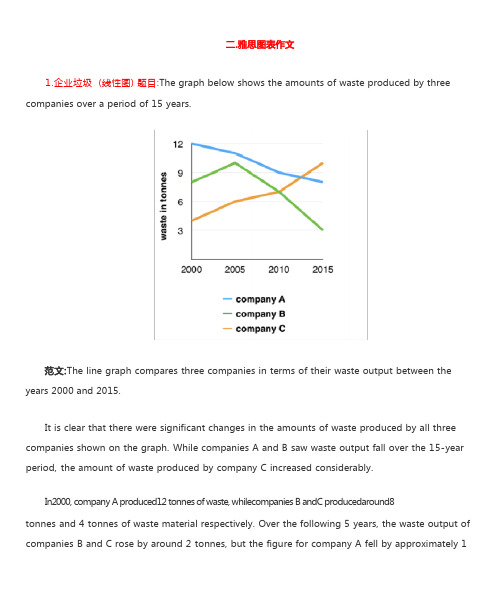
1.企业垃圾 (线性图) 题目:The graph below shows the amounts of waste produced by three companies over a period of 15 years.years 2000 and 2015.It is clear that there were significant changes in the amounts of waste produced by all three companies shown on the graph. While companies A and B saw waste output fall over the 15-year period, the amount of waste produced by company C increased considerably.In2000, company A produced12 tonnes of waste, whilecompanies B andC producedaround8tonnes and 4 tonnes of waste material respectively. Over the following 5 years, the waste output of companies B and C rose by around 2 tonnes, but the figure for company A fell by approximately 1tonne.From 2005 to 2015, company A cut waste production by roughly 3 tonnes, and company B reduced its waste by around 7 tonnes. By contrast, company C saw anincrease inwaste productionof approximately 4 tonnes over the same 10- year period. By 2015, company C’swaste output hadrisento10tonnes, while the respective amounts of waste fromcompanies A andB haddroppedto8 tonnes and only 3 tonnes.(192 words, band 9)这条线图对三家公司的废物产出从 2000 年到 2015 年进行了比较。
雅思写作备考中的图表数据描述与分析方法

雅思写作备考中的图表数据描述与分析方法在雅思写作备考中,图表数据的描述与分析方法是一个关键的技巧。
图表数据描述与分析旨在帮助考生清晰地传达图表中的信息,并展示对数据的深入理解。
本文将介绍一些有效的方法来描述和分析雅思写作中的图表数据。
一、图表数据描述1. 描述整体趋势:首先,我们可以描述图表中呈现的整体趋势。
可以使用类似于“总体来看”、“总体趋势是”等短语来引出描述。
例如,如果图表显示了过去几年某个城市的人口变化情况,可以说“总体来看,该城市的人口在近几年稳定增长”。
2. 细节描述:接下来,我们需要针对图表中的具体数据进行描述。
可以使用具体的数字、比例或百分比等来描述。
例如,如果图表显示了某个国家不同年龄段的人口比例,可以说“18至30岁年龄段的人口占总人口的30%,是各个年龄段中的最高比例”。
3. 时间和地点描述:如果图表中涉及到时间和地点的变化,我们也需要对其进行描述。
可以使用时间词和地点词来具体说明。
例如,如果图表显示了某个地区不同月份的降水量情况,可以说“6月份的降水量最高,为100毫米”。
二、图表数据分析1. 找出关键信息:在分析图表数据时,需要从中挑选出关键的信息。
这些关键信息可能是特殊的数据点、变化的趋势或者与主题相关的数据。
通过找出这些关键信息,可以帮助我们进行更有针对性的分析。
2. 建立对比:图表数据可以提供不同变量之间的比较基础。
在分析时,可以通过对比不同变量的数据来突出差异和相似之处。
例如,如果图表显示了不同国家的能源消耗量,可以对比两个或多个国家之间的差异并分析原因。
3. 确定影响因素:对图表数据进行深入分析时,需要确定可能影响数据变化的因素。
这些因素可能是经济因素、政治因素、社会因素等。
通过分析这些因素与数据的关系,可以深入理解数据的背后含义。
4. 展望未来趋势:在分析图表数据时,考生可以尝试根据已有数据预测未来的趋势。
这要求考生具备一定的推理能力和对数据的深入理解。
通过展望未来,可以增加文章的可读性和独特性。
雅思图表类英语作文模板

雅思图表类英语作文模板英文回答:1. Introduce the chart/graph: Briefly describe the type of chart/graph, the data it presents, and the time period or geographical location it covers.2. Overall trend: State the general trend or pattern observed in the data. Use specific numbers or percentages to support your statement.3. Key features: Highlight the most important or noticeable features of the chart/graph, such as peaks, valleys, or changes over time.4. Possible reasons: Speculate on the reasons behind the trends or features you have identified. Consider external factors or events that may have influenced the data.5. Predictions or recommendations: Based on the data presented, make predictions about future trends or provide recommendations for action.中文回答:雅思图表类英语作文模板。
1. 图表介绍,简要描述图表类型、数据内容以及时间跨度或地理范围。
2. 总体趋势,陈述数据中观察到的总体趋势或模式。
雅思图表作文讲解主要供英语二同学参考
雅思图表作文:一.图表的种类(表格,柱状图,线形图,饼状图,流程图,地图等)二.解题思路:开头段改写题目,正文段学会分组,结尾段学会总结。
(一定要与不要)三.学员问题:分组问题,时态问题,常备词汇,短语记不住,不会用。
四.常备词汇五.写什么?:起点(最高值),终点(最低值),拐点,交点,变化趋势,总数(末段)第一类:表格题目:剑桥7, Test 1 Writing Task 1You should spend about 20 minutes on this task.The table below gives information on consumer spending on different items in five different countries in 2002.Summarise the information by selecting and reporting the main features, and make comparisons where relevant.Write at least 150 words.Percentage of national consumer expenditure by category-2002参考范文:The table gives the breakdown about data on consumer spending on various items (Food/Drink/Tobacco, Clothing/Footwear and Leisure/Education) in five different countries (Ireland, Italy, Spain, Sweden and Turkey) in 2002.Generally, each country consumed much more in food/drink/tobacco where Turkey dominated the first place with 32.14%, standing in marked contrast with Sweden (only 15.77%) than in other 2 categories. In terms of Clothing/Footwear, Italy expectedly spent most with 9% compared with still Sweden seeing the smallest proportion (5.4%). As for Leisure/Education, it was Turkey and Spain that consumed the most and least with 4.35% and 1.98% respectively.Additionally, we can see immediately that in food/drink/tobacco, after Turkey, Ireland,Spain and Italy came in turn with 28.91%, 18.80% and 16.36%. On the contrary, in Clothing/Footwear, we failed to see big gap from Ireland, Spain and Turkey in middle positions which saw different reductions of 2.57%, 2.49% and 2.37% in comparison with Italy, likewise, in Leisure/Education, still small differences were found. To be exact, Turkey was followed by Sweden, Italy and Ireland in a slow falling turn with 3.22%, 3.2% and 2.21%.In conclusion, people prefer to spend on those products directly relating to food. (189 words)Writing Task 1You should spend about 20 minutes on this task.The table below summarises some data collected by a college bookshop for the month of February 1998.Write a report describing the sales figures of various types of publications, based on the information shown in the table.Write at least 150 words.参考范文:The table describes some sales figures gathered by a university bookstore for February, 1998.We can see from the table that the non-book club member figures are made up of sales to college staff, college students and members of the public. More specifically, college staff bought 332 magazines, 44 fiction and 29 non-fiction books while college students bought 1249 magazines, 194 non-fiction books and 31 fiction books. More magazines were sold to college students than any other group of customers. In contrast, although no fiction books were sold to members of the public, they bought 122 non-fiction books and 82 magazines.According to the table,book club members bought more fiction (76) and non-fictionbooks (942) than other customers. On the other hand, magazine sales to club members (33) were fewer than to any other type of customers.The total number of sales for the month was 3134 (1474 to college students, 405 to staff,204 to the public and 1051 to book club members). 151 books sold were fiction and1287 were non-fiction. Therefore, it can be clearly seen from the table that magazines accounted for the greatest number of sales (1696).(192 words)使用括弧的注意事项:后面不加单位。
雅思小作文各类图表写法汇总
雅思小作文各类图表写法汇总1、line graph线图要注意分段。
尤其是多条线,如果放在一起描述,很容易混乱。
所以建议还是分开来描述,主要原则是仅看描述就能画出图线。
一般而言,是按时间,除了结合时间还要看走势上的分段,大段的描述不可缺;另外就是最高点和最低点,以及拐点的数字以及时点描述。
只有具备了这两点,才能画出图线的走势。
对于不同线之间的比较,可以在最后一段进行,利用交点进行分段。
2、Bar chart柱状图,同样的,要注意分组。
尤其是多国家、多年分之间的比较,建议考生根据最大的特点分成两组(最多三组),然后分组(一组一段)进行叙述。
此类图中,可以少用数据,可以动态的方式进行描述,同时可以利用排名来叙述特点。
描述完特点后,如果图表较为简单,最后一段可以把每项的最高、最低点写一下。
如果类别少(2个),还是分别进行描述比较清晰。
无论了line graph 还是bar chart 尽量以单项从头至尾的描述为首选(这样清晰明了),中间穿插一两次对比,或者最后对比。
(但这种描述方式只适合于比较的项目少的情况,即只是两者之间的比较。
类别一旦多,如果是可以归为两类的情况,则也可以采用这种描述方式,否则不适用)3、Table表格也可以分为动态描述和静态描述。
动态:即为紧跟一个国家,从头到尾描述完所有特点,然后再描述另外的国家。
静态是:每个特点就每个国家分别描述。
无论以上两种采用哪一个,都应当注意分组,尤其是在国家和特点过多的情况下,分组描述,可以减少字数。
对于明显的两类,建议采用动态描述法,因为它们在每一项特点下都具有相似的规律,这样比较明晰。
两个图表的写作:一般分为两段,分别进行描述。
如果其中一个图特别简单,可以用最后一段简单描述,如果两个图表差不多复杂就采用1:1的比例,分别对各自特点进行描述,然后在最后一段将两者进行联系和比较。
雅思写作4、Pie饼图建议不要按一个一个饼来描述,而是根据饼中的信息进行分组描述,同样的注意动态描述和最值,这里不多加赘述了。
雅思4类图表作文范文

雅思4类图表作文范文
一、柱状图。
哇塞,看这柱状图,某城市的私家车数量可是像火箭一样往上
冲啊!五年前才5万辆,现在直接飙到15万辆了,涨得比房价还快!不过话说回来,公共交通那边就不太好过了,以前每天80万人次,
现在只剩下60万了,看来大家都更喜欢自己开车出门啊。
二、折线图。
话说这折线图,看得我心情都跟着起伏了。
那国家失业率啊,
前几年涨得跟股票似的,从4%一路飙升到6%,让人看了都捏把汗。
不过好在后来稳住了,还往下掉了点,虽然没回到从前,但好歹也
算个好兆头吧。
雅思写作图表描述

雅思写作图表描述在雅思写作任务1中,经常会出现关于图表描述的题目。
图表描述是考察考生对数据的理解和组织能力,同时也要求考生能够准确地用英文词汇和语法进行描述和分析。
本文将介绍如何写一篇清晰、准确的雅思写作图表描述。
一、引言段在引言段,我们需要简要介绍图表所展示的数据内容。
我们可以涵盖以下几个方面: - 简单描述图表类型:如线形图、柱状图、饼状图等。
- 图表展现的主题:如能源消耗、人口增长、教育水平等。
- 时间和地点范围:如1990年至2020年、全球、某个国家等。
段落一:总体概述在第一个段落,我们需要给出整个图表数据的总体描述和比较。
我们可以使用以下结构进行描述:- 展示数据的总体趋势和变化:如上升、下降、保持稳定等。
- 用具体的数据支持总体概述的观点:如数据增长了百分之几、达到了多少等。
- 对比不同的数据:如不同类别之间的比较、不同时间段的比较等。
段落二:细节描述在第二个段落,我们需要更具体地描述图表中的数据细节。
我们可以运用以下组织结构来实现:- 描述数据中的每个细节:以从最高到最低的顺序逐个描述每个数据点。
- 使用具体的数字和百分比来支持描述:如“从10%上升到了20%”、“增长了50%”等。
- 引入相关的词汇或表达来进行准确的描述:如“达到峰值”、“有显著的下降”等。
段落三:总结观点在第三个段落,我们需要总结我们在前面段落中得出的观点和结论。
我们可以运用以下结构进行总结:- 概括整篇图表描述的主要内容:简要回顾我们在前面段落中的描述。
- 强调图表中的关键点:如最高点、最低点、显著的变化等。
- 提供对于数据可能存在的原因和影响的解释:如政策变化、经济发展等。
段落四:个人观点(可选)在最后一个段落,我们可以根据需要提出个人观点。
这一段主要用于表达个人意见和看法,可以更自由地阐述个人观点,并且提供支持观点的例子。
通过以上的组织结构和写作技巧,我们可以编写出一篇清晰、准确的雅思写作图表描述。
在实际写作过程中,我们要避免重复使用相同的表达和词汇,要注重句型的变化和对比的描述。
雅思写作任务1中的图表分析与比较
雅思写作任务1中的图表分析与比较雅思写作任务1中的图表分析与比较是雅思考试中的重要一部分。
在这个任务中,考生需要阅读和解读给定的图表,包括图表类型如条形图、线图、表格等,并从中提取出有效的信息进行分析和比较。
本文将详细介绍雅思写作任务1中的图表分析与比较的步骤和技巧。
1. 图表类型的识别与描述在开始分析和比较图表之前,我们首先需要准确识别图表的类型,并进行简洁明了的描述。
图表类型包括线图(Line Graph)、条形图(Bar Chart)、饼图(Pie Chart)、表格(Table)等。
在描述图表时,可以使用一些描述性词汇,如“上升”、“下降”、“达到峰值”、“逐渐增加”等。
同时,还需要注意使用正确的时态和语态来描述图表,例如使用一般现在时来描述永久性的事实。
2. 主要趋势的分析在图表分析中,我们需要关注图表中的主要趋势和关键信息。
这些信息可以是变化的趋势、高点、低点、峰值等。
让我们以一个条形图为例,来看如何进行主要趋势的分析。
首先我们需要观察图表中每个条形的高度,并找出其中的共同点和差异点。
然后,我们可以根据这些共同点和差异点来描述并分析图表中的主要趋势。
可以用一些连接词如“相比于”、“在整个期间内”、“然而”、“逐渐增加”等来连接句子,使得分析更加连贯。
3. 数据的比较和对比在图表分析中,除了分析图表本身的趋势外,还需要进行数据的比较和对比。
比较可以是在同一图表中不同时间点的数据对比,也可以是不同图表之间的数据对比。
在进行数据比较和对比时,需要注意使用适当的比较词汇和短语,如“相对于”、“与...相比”、“相似的是”、“不同的是”等。
同时,还可以使用一些数字和百分比来强调差异和相似的程度。
4. 数据的具体细节分析在图表分析时,我们还需要注意详细数据的分析,即对具体数值的解读。
具体细节分析可以是对高点和低点的标注,对特殊点的解释,对原因和结果的推理等。
在这一步中,可以使用一些限定词汇和副词来具体描述数据细节,如“最高的是”、“最低的是”、“最显著的是”、“突然”、“逐渐”、“渐增”等。
雅思图表写作范例

THANKS
感谢观看
在写作图表时,应尽量简洁明了,避免冗长和复杂的 句子和段落。
03
图表写作范例
柱状图范例
总结词
柱状图用于比较不同类别之间的数据 ,通过柱子的高度来展示数据的大小 。
详细描述
柱状图范例可以展示不同年份、不同 地区的销售数据、人口数量等,通过 对比不同数据点,帮助读者直观地了 解数据之间的差异。
折线图范例
表格范例
总结词
表格是一种展示数据的常见方式,通过行列排列展示数据。
详细描述
表格范例可以包含各种类型的数据,如销售数据、人口普查数据等,通过表格可以方便地对比不同数据点,查找 规律和趋势。
04
图表写作练习
练习题目
图表类型:柱状图
1
2
题目要求:分析某城市不同年龄段人口数量变化
3
数据来源:根据给定的数据,描述1980年、 2000年和2020年0-14岁、15-30岁、31-50岁和 50岁以上四个年龄段的人口数量。
趋势。
按照类别组织
02
按照类别组织信息,可以将不同类型的数据进行分类和比较。
使用图表
03
使用图表可以直观地展示数据,使读者更容易理解和比较数据。
语言使用的注意事项
使用正式语言
在写作图表时,应使用正式语言,避免使用口语化和 俚语。
避免歧义
在写作图表时,应避免使用可能引起歧义的词汇和表 达方式。
简洁明了
比较和对比
在描述数据时,应将数据与其他数据 进行比较和对比,以更准确地描述数 据的意义和重要性。
强调变化和趋势
在描述数据时,应强调数据的变化和趋势 ,如使用“增长”、“下降”、“增加” 、“减少”等词汇描述数据的变化。
雅思A类TASK1图表作文写作方法
雅思A类TASK1图表作文写作方法一、图形种类及概述法:数据图表:a data graph/chart/diagram/illustration/table饼图:pie chart表格图:table直方图或柱形图:bar chart / histogram趋势曲线图:line chart / curve diagram流程图或过程图:flow chart / sequence diagram程序图:processing/procedures diagram圆柱图:column chart描述:show/describe/illustrate/apparent/reveal/represent/demonstrate/indicate/depict以下是一些较常用的描述用法The table/chart diagram/graph shows (that)According to the table/chart diagram/graphAs (is) shown in the table/chart diagram/graphAs can be seen from the table/chart/diagram/graph/figures,figures/statistics shows (that)...It can be seen from the figures/statisticsWe can see from the figures/statisticsIt is clear from the figures/statisticsIt is apparent from the figures/statisticstable/chart/diagram/graph figures (that) ...二、data的具体表达法增加:increase / raise / rise / go up / grow/ jump/ ascend减少:decrease / grow down / drop / fall/decline/reduce/ descend波动:fluctuate / rebound / undulate / wave ...稳定:remain stable(steady) / stabilize / level off ...最常用的两种表达法:1. Verb+Adverb formThe number of XXX+increase/jump/rise/decrease/drop/fall/fluctuate...+insignificantly/significantly/slightly/suddenly/rapidly/dramatically/sharply/steeply/steadily/ gradually/slowly...+from (第一时间) to (第二时间) / between (第一时间) and (第二时间)2. Adjective+Noun formThere was a (very)sudden/rapid/dramatic/significant/sharp/steep/steady/gradual/slow/slight+increase/jump/rise/decrease/drop/fall/fluctuation (注意:上述很多词不可用于修饰fluctuation)+in the number of XXX from (第一时间) to (第二时间) / between (第一时间) and (第二时间)描述稳定的data:The number of XXX remained steady/stable from (第一时间) to (第二时间) / between (第一时间) and (第二时间)The number of XXX stayed the same from (第一时间) to (第二时间) / between (第一时间) and (第二时间)There was little change / hardly any change / no change in the number of XXX from from (第一时间) to (第二时间) / between (第一时间) and (第二时间)描述不同状态的dataNoun form:steady drop / sharp rise peak / dramatic fall / sharp dropVerbal form:(to) bottom out / (to) reach the bottom / (to) increase gradually / (to) reach a plateau / (to) remain steady描述the highest point以及the lowest point高点极值:The monthly profit / The figures / The situation ...+peaked in (月份/年) <准确时间点用at XXX> at XXX% / XXX(极点data)或者reached a peak / a high point at XXX% / XXX(极点data)低点极值:XXX bottomed out / reached+rock / the bottom / a low point或者hit a trough此外,在描述过程中还有很多的conjunctional words/sentences,最常用的固定搭配如下:并列:as well as(句首/中), also, as well(句尾), either, neither, too, moreover, furthermore, in addition, additionally, besides, what's more, apart from ...举例:for example, for instance, to illustrate, as an illustration, in particular, particularly, especially事实:as a matter of fact, in fact, actually, as long as, so long as ...雷同/近似:similarly, likewise(句首/尾), at the same time, equally ...转折:however, whereas, nevertheless, nonetheless, though, although, even though, while, yet, on the contrary, contrarily, in contrast, conversely, on the other hand, unlikely, in stead (of), in s123e of, des123e of ...原因与结果1. cause-suggestion (几乎不常用)since / now that ...; I hope that...because of/on account of/owing to/thanks to + (doing) sth, I hope that...2. cause-effect (较常用)XXX lead to / bring about / result in/ account for ...(一个句子), therefore / thus / hence / as a result / consequently / (and) so ...3. effect-cause (较常用)XXX be caused by / result from / be the result of / be the effect of / be the consequence of ...(一个句子), because ...it is adj. that ...it is unimaginable that ...it is undeniable that ...it is interesting to discover that ...变化程度:sudden/suddenly 突然的,意外的 rapid/rapidly 迅速的,飞快的,险峻的的dramatic/dramatically 戏剧性的,生动的 significant/significantly 有意义的,重大的,重要的sharp/sharply 锐利的,明显的,急剧的steep/steeply 急剧升降的steady/steadily 稳固的,坚定不移的 gradual/gradually 渐进的,逐渐的slow/slowly 缓慢的,不活跃的 slight/slightly轻微的、略微地stable/stably 稳定的其它在描述中的常用到的词significant changes 图中一些较大变化noticeable trend 明显趋势during the same period 在同一时期 distr123te 分布,区别unequally 不相等地pronounced 明显的average 平均no doubt 无疑地corresponding adj. 相应的,通讯的 represent vt. 阐述,表现overall 总体上讲 in the case of adv. 在...的情况下in terms of / in respect of / regarding 在...方面三、标准化结构:(此部分仅供参考。
- 1、下载文档前请自行甄别文档内容的完整性,平台不提供额外的编辑、内容补充、找答案等附加服务。
- 2、"仅部分预览"的文档,不可在线预览部分如存在完整性等问题,可反馈申请退款(可完整预览的文档不适用该条件!)。
- 3、如文档侵犯您的权益,请联系客服反馈,我们会尽快为您处理(人工客服工作时间:9:00-18:30)。
雅思图表作文的种类及描述方法整理
导读:本文雅思图表作文的种类及描述方法整理,仅供参考,如果觉得很不错,欢迎点评和分享。
图形种类及概述法:
数据图表:a data graph/chart/diagram/illustration/table 饼图:pie chart
表格图:table
直方图或柱形图:bar chart / histogram
趋势曲线图:line chart / curve diagram
流程图或过程图:flow chart / sequence diagram
程序图:processing/procedures diagram
圆柱图:column chart
描述:show/describe/illustrate/apparent/reveal/represent/demonstr ate/indicate/depict
以下是一些较常用的描述用法
The table/chart diagram/graph shows (that)
According to the table/chart diagram/graph
As (is) shown in the table/chart diagram/graph
As can be seen from the table/chart/diagram/graph/figures,
figures/statistics shows (that)...
It can be seen from the figures/statistics We can see from the figures/statistics
It is clear from the figures/statistics
It is apparent from the figures/statistics table/chart/diagram/graph figures (that)。