雅思小作文:separate line graphs answer
IELTS Line graph 雅思小作文 曲线图解析

at 数据 at 时间点.
第2页/共39页
重点句型
• 有波动但总体上升,之后下降 • From then on, it generally maintained
第17页/共39页
方法2
• 第一步: 时态----过去时 现在时 将来时 • 第二步: 观察规律 • 1. 都大幅上升 • 2. 美国和瑞典前50年基本完全相同 • 3. 90年后,美国和瑞典分道扬镳,应该分别来写 • 4. 日本的变化完全不同,应该单独占一段 • 第三步:首尾各一段,美国和瑞典一段,日本一段,共四段
an upward trend until the peak( about 数据) was reached at 时间点, in spite of some small fluctuations. • However, after that there was a slump in the percentage, and it continued until 时间点 when the number reached
重点句型
• 先下降再上升,之后下降并持平 • However, 对象 first experiences a gradual decline from 数据 at 时
间点 to 数据 at 时间点, which is the lowest in the day, and then a steady climb, back to its peak of 数据 at 时间点. In contrast to 比较 的对象, 对象 decrease slightly and almost level out for most of the evening, with a peak (nearly 数据) at 时间点.
雅思写作Task 1 曲线图 Line Chart

You should write at least 150 words.
雅思TASK 1图表作文
线型图:model answer
1
This line graph shows the birth and death rates per thousand population from 1900 to 1980. Before 1920 the birth rate remained level at around 40 per thousand. Then from 1920 it fell until it reached 30 per thousand in 1930. From 1930to 1945 it rose slowly(increased steadily) to 50 per thousand. Since 1945 it had decreased/fallen steadily. It got to 20 per thousand in 1980. The birth control measures were becoming effective and the birth rate was falling/decreasing at the moment and would continue to fall.
线型图:model answer
• Numbers then decline, with the lowest number being recorded at 4.00 in the afternoon. There is then a rapid rise between 4.00 and 6 pm. After 7 pm numbers fall significantly, with only a slight increase again just after 8 pm, tailing off after 9 pm. • The graph shows that the station is most crowded in the early morning and early evening rush-hour periods.
雅思小作文两线重合

雅思小作文两线重合英文回答:I have encountered a situation where the two lines on a graph in my IELTS Writing Task 1 overlapped. This meansthat the two lines intersected at some point and shared the same value or trend. It is important to effectively describe and analyze this type of graph in order to achieve a high score in the IELTS exam.In this particular case, the graph depicted the number of cars and bicycles sold in a certain country over a period of time. The x-axis represented the years, while the y-axis represented the number of vehicles sold. The line representing car sales started at a higher value and gradually decreased over time, while the line representing bicycle sales started at a lower value and gradually increased. However, at a certain point, the two lines crossed each other and continued in a similar pattern.This overlapping of the lines indicates that there wasa point in time when the number of bicycles sold exceededthe number of cars sold. This could be due to various reasons such as a growing awareness of environmental issues, a promotion of cycling as a means of transportation, or an increase in the cost of owning and maintaining a car. The graph shows that during this period, the demand forbicycles was higher than that of cars.中文回答:我在雅思写作任务1中遇到了两条线在图表上重叠的情况。
雅思图表小作文详解

Mexico
Surinam Jamaica Cuba
4,300
3,700 2,600 2,100
10.5
7.0 15.2 4.4
97
122 63 118
Sample Answer 1 It can be seen from the table that the Bahamas and Argentina had GDP of $13,000 and $9,100 per capita respectively and the adult illiteracy rates were 4.4 and 3.6 in the two countries. Brazil and Mexico had GDP of $4,900 and $4,300 per capita, and their adult illiteracy rates were 16.8 and 10.5. Surinam, Jamaica and Cuba had $3,700, $2,600, and $2,100 respectively, with the adult illiteracy rate at 7.0, 15.2, and 4.4. The table shows that another indicator, Newspaper Sales per 1,000 people had a huge number more than 100 of Argentina Surinam and Cuba. This was followed by the Bahamas 99, Mexico 97, Jamaica 63, and Brazil 40.
两种方案: 1.按照孩子年龄的区别来一一描述四个饼形,共分四段,每段中 进行母亲情况的比较; 2.按照母亲工作状况的区别描述,每段中进行孩子年龄的比较: 1)不工作的母亲; 2)兼职工作的母亲; 3)全职工作的母亲。
雅思小作文中各种形式的图的英文的表达方式
雅思小作文中各种形式的图的英文的表达方式In the IELTS Academic Writing task 1, candidates are often required tointerpret and describe various forms of data in the form of charts, graphs, tables, and diagrams. These visual representations of information can come in different forms, such as line graphs, bar charts, pie charts, tables, diagrams, and maps. It is important for candidates to be able to accurately describe and analyze these different forms of data in order to effectively communicate the information to the reader.One common form of data representation in the IELTS Academic Writing task 1 is the line graph. Line graphs are used to show trends and changes over a period of time. When describing a line graph, it is important to mention the x-axis and y-axis, the units of measurement, and any significant changes or trends that are evident in the graph. For example, 'The line graph illustrates the changes in the unemployment rate in the UK from 2005 to 2015. The x-axis represents the years, while the y-axis represents the percentage of unemployment. There was a steady increase in the unemployment rate from 2005 to 2010, followed by a gradual decrease from 2010 to 2015.'Another common form of data representation is the bar chart. Bar charts are used to compare different categories or groups. When describing a bar chart, it is important to mention the categories or groups being compared, the units of measurement, and any significant differences or patterns that are evident in the chart. For example, 'The bar chart compares the sales of three different carbrands in the US in 2018. The x-axis represents the car brands, while the y-axis represents the number of units sold. Brand A had the highest sales, followed by Brand B and Brand C.'Pie charts are also commonly used to represent data in the IELTS Academic Writing task 1. Pie charts are used to show the proportions of a whole, with each 'slice' of the pie representing a different category or group. When describing a pie chart, it is important to mention the categories or groups being represented,the percentage or proportion of each category, and any significant differences or patterns that are evident in the chart. For example, 'The pie chart illustratesthe distribution of household expenses in the UK in 2019. The largest proportionof expenses was allocated to housing, accounting for 35% of the total, followed by transportation at 25%, and food at 20%.'In addition to line graphs, bar charts, and pie charts, candidates may also be required to interpret and describe tables, diagrams, and maps in the IELTS Academic Writing task 1. Tables are used to present numerical data in rows and columns, while diagrams are used to illustrate processes or systems. Maps are used to show geographical information and spatial relationships. When describing tables, diagrams, and maps, it is important to accurately convey the information presented and highlight any significant details or patterns that are evident.In conclusion, the ability to accurately describe and analyze various forms of data in the IELTS Academic Writing task 1 is crucial for candidates to achieve a high score. Whether it is a line graph, bar chart, pie chart, table, diagram, or map, candidates must be able to effectively communicate the information to the reader. By understanding the different forms of data representation and practicing the skills of interpretation and description, candidates can improve their performance in the IELTS Academic Writing task 1 and increase their chances of success.。
雅思写作小作文范文 雅思写作折线图(线状图) 公司垃圾数量.doc
雅思写作小作文范文雅思写作折线图(线状图)公司垃圾数量今天我们雅思写作小作文范文的文章来研究下折线图(线状图)。
该图表的内容为三家公司(A, B, C)从2000年到2015年间所产生的垃圾数量。
其中公司A的垃圾数量一直在下降,公司B的数量先是一波上升,然后进一步下降。
公司C的垃圾数量则是一直在上升。
虽然图表比较简单,但基本概括了折线图的精髓,并涵盖了各种变化。
小编搜集了一篇相应的考官范文,以供大家参考。
雅思写作小作文题目The graph below shows the amounts of waste produced by three companies over a period of 15 years.Summarise the information by selecting and reporting the main features, and make comparisons where relevant.雅思写作小作文范文The line graph compares three companies in terms of their waste output between the years 2000 and 2015.线状图比较了三个公司从2000年到2015年期间的垃圾产出量。
It is clear that there were significant changes in the amounts of waste produced by all three companies shown on the graph. While companies A and B saw waste output fall over the 15-year period, the amount of waste produced by company C increased considerably.很明显,图表中所显示的三家公司的垃圾产量都有巨大的变化。
作文范文之雅思作文线状图
雅思作文线状图【篇一:雅思小作文——线形图(line graphs)】智课网ielts备考资料雅思小作文——线形图(line graphs)摘要:线形图是雅思写作task 1 里常考的图形之一,其写作非常值得我们深入研究。
现专供以下学习材料,希望能对各位“雅友”的线形图写作带去一些启发和帮助。
线形图是雅思写作task 1 里常考的图形之一,其写作非常值得我们深入研究。
现专供以下学习材料,希望能对各位“雅友”的线形图写作带去一些启发和帮助。
line graphsline graphs are more popular than all other graphs combined because their visual characteristics reveal data trends clearly and these graphs are easy to create. line graphs, especially useful in the fields of statistics and science, are one of the most common tools used to present data.a line graph is a visual comparison of how two variables—shown on the x- and y-axes—are related or vary with each other. it shows related information by drawing a continuous line between all the points on a grid. for information on the shapes of line graphs, see the organizing data chapter.line graphs compare two variables: one is plotted along the x-axis (horizontal) and the other along the y-axis(vertical). the y-axis in a line graph usually indicates quantity (e.g., dollars, litres) or percentage, while the horizontal x-axis often measures units of time. as a result, the line graph is often viewed as a time series graph. for example, if you wanted to graph the height of a baseball pitch over time, you could measure the time variable along the x-axis, and the height along the y-axis.although they do not present specific data as well as tables do, line graphs are able to show relationships more clearly than tables do. line graphs can also depict multiple series which are usually the best candidate for time series data and frequency distribution.e graphs share a similar purpose. the column graph, however, reveals a change in magnitude, whereas the line graph is used to show a change in direction.in summary, line graphsshow specific values of data wellreveal trends and relationships between datacompare trends in different groups of a variablegraphs can give a distorted image of the data. if inconsistent scales on the axes of a line graph force data to appear in a certain way, then a graph can even reveal a trend that is entirely different from the one intended. this means that the intervals between adjacent points along the axis may be dissimilar, or that the same data charted in two graphs using different scales will appear different.example 1 – plotting a trend over timefigure 1 shows one obvious trend, the fluctuation in the labour force from january to july. the number of students at andrews high school who are members of the labour force is scaled using intervals on the y-axis, while the time variable is plotted on the x-axis.the number of students participating in the labour force was 252 in january, 252 in february, 255 in march, 256 in april, 282 in may, 290 in june and 319 in july. when examined further, the graph indicates that the labour forceparticipation of these students was at a plateau for the first four months covered by the graph (january to april), and for the next three months (may to july) the number increased steadily. figure 1. labour force participation in andrews high schoolexample 2 – comparing two related variablesfigure 2 is a single line graph comparing two items; in this instance, time is not a factor. the graph compares thenumber of dollars donated by the age of the donors. according to the trend in the graph, the older the donor, the more money he or she donates. the 17-year-old donors donate, on average, $84. for the 19-year-olds, the average donation increased by $26 to make the average donation of that age group $110.figure 2. average number of dollars donated at evergreen high school, by age of donorexample 3 – using correct scalewhen drawing a line, it is important that you use the correct scale. otherwise, the lines shape can give readers the wrong impression about the data. compare figure 3 with figure 4:figure 3. number of guilty crime offenders, grishamvillefigure 4. number of guilty crime offenders, grishamvilleusing a scale of 350 to 430 (figure 3) focuses on a small range of values. it does not accurately depict the trend in guilty crime offenders between january and may since it exaggerates that trend and does not relate it to the bigger picture. however, choosing a scale of 0 to 450 (figure 4) better displays how small the decline in the number of guilty crime offenders really was.example 4 – multiple line graphsa multiple line graph can effectively compare similar items over the same period of time (figure 5).figure 5. cell phone use in anytowne, 1996 to 2002figure 5 is an example of a very good graph. the message is clearly stated in the title, and each of the line graphs is properly labelled. it is easy to see from this graph that the total cell phone use has been rising steadily since 1996,except for a two-year period (1999 and 2000) where the numbers drop slightly. the pattern of use for women and men seems to be quite similar with very small discrepancies between them.相关字搜索:雅思【篇二:线状图】如何写好开头段1表示展示,显示的单词归纳1. show. to make sth. clear; to prove sth.证明,表明v. to say what sb./sth. is like 描写,描绘;叙述揭示;揭露;暴露;泄露4. display v. /displei/ to show signs of sth., especially a quality or feeling 显示;表现;显露5. illustrate v. to use pictures, photographs, diagrams, etc. ina book, etc. (用图、实例等)说明,阐明6.demonstrate v. to show sth. clearly by giving proof or evidence 显示,表露to show sb./sth., especially in a picture 展示;描述8. indicatev. to show that sth. is true or exists 表明;象征;暗示9.unfold v. to be gradually made known; to gradually make sth. known to other people显露,表露;呈现10. exhibit v. to show signs of sth?especially a quality or feeling 表尔,显出11. depict v. to show or represent sth. in a work of art such asa drawing or painting描绘,描画;描述12. outline 描绘以上动词在语义都接近,但需注意:它们后面所跟的宾语不同总结起来就是而担其它的一般只接名词宾语!对...进行分析the table gives a breakdown of different types of family who were living in poverty in australia in 2009.提供关于...的信息the chart gives information about post-school qualifications in terms of different levels of further education reached by men and women in australia in 2009.比较the charts compare the sources of electricity in australia and france in the years 1980....a glance at the graph provided reveals some striking similarities between chinese and us birth rates during the period 1920-2000.....5.given are two graphs concerning criminality in britain.其它替换词★number 丨nambs/数字★figure 丨figa/数字★percentage百分率,百分比the percentage of aged couples who lived in poverty in australia in 1999 was 4%. ★proportion 比例,比率this bar chart indicates the proportion of medical complaints of patients visiting therapists in australia in 2012.★rate 比例,比率;率the bar chart reveals different rates of post-school qualifications in australia in 2010. ★amount. /smaunt/数量,数额(一般与不可数名词连用)theres been a great amount of research into the subject.强化练习到尼泊尔的游客来自何处)in march 2010.有多少降雨)over a year,.(3) the chart gives 混合型汽车在全球的销售)between 2006 and 2009.不同交通方式)used by overseas visitors to travel in new zealand.少图书馆的书.) over this four-year period.售) in japan, the us and the rest of the world from 2006 to 2009.2.时间的连接词练习(二选一)1.the number of students who took spanish was 150 in/on 2010.2.according to the data, mandarin decreased during/at that period.3.since/from 2000, the trends have changed greatly.4.the chart shows the number of people going abroadfrom/between 2000 and 2010.5.in general, all the figures steadily increased over/from 1911 to 2011 .6.during the period 1980 and/to 1990, there was a gradual decrease.7.i have been learning japanese for/in two years now.8.the chart shows changes in irish school eollment figures over/at a 20-year period.9.on/in may 4,2012,in plain sight concluded its fifth and final season.10.the 12th china beijing international high-tech expo will be held in/on may.11.the number started a long decline from 1930onwards/afterwards.12.the period 1250 to/and 1350 is a period of religious and secular literature in english.13.the charts indicate how much a uk school spent on different costs in/for four separate years: 1981,1991,2001 and 2011.表示连续的时间段2. during the same period3. in the no. years spanning from 19xx through 19xx4. from then on= from this time onwards= in the subsequent years.句子翻译练习1.以上的线状图表明了在英国冬季和夏季的一天中用电的需求量。
雅思写作小作文线图高分范文解析!

线图雅思小作文范文解析线图雅思小作文范文解析!动态线图,这已成为近两年来雅思考试的主流,下面三立在线小编就为大家分享一篇雅思写作小范文之线图九分范文。
希望同学们可以从中学习雅思线图写作技巧The line graph compares average yearly spending by Americans on mobile andlandline phone services from 2001 to 2010.概括线图内容It is clear that spending on landline phones fell steadily over the 10-yearperiod, while mobile phone expenditure rose quickly. The year 2006 marks thepoint at which expenditure on mobile services overtook that for residentialphone services.总述一条线总体趋势,和另一条行程对比In 2001, US consumers spent an average of nearly $700 on residential phoneservices, compared to only around $200 on cell phone services. Over thefollowing five years, average yearly spending on landlines dropped by nearly$200. By contrast, expenditure on mobiles rose by approximately $300.自2001年开始,描述cell phone每一段的变化趋势。
In the year 2006, the average American paid out the same amount of money onboth types of phone service, spending just over $500 on each. By 2010,expenditure on mobile phones had reached around $750, while the figure forspending on residential services had fallen to just over half this amount.对比手机服务,写出手机服务的特征。
雅思小作文 折线图
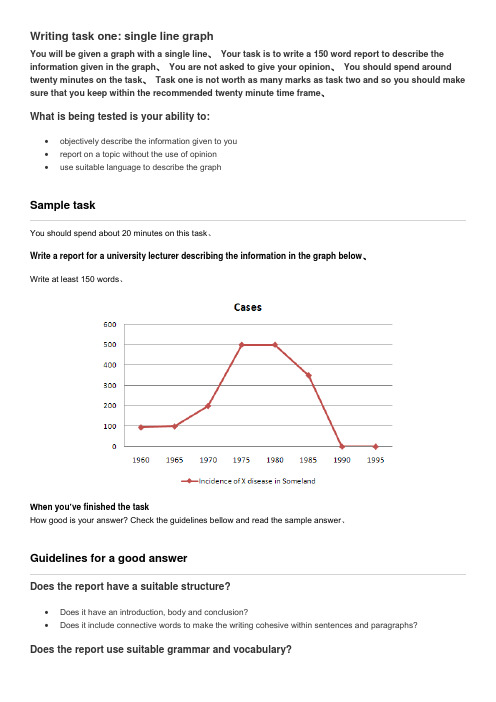
Writing task one: single line graphYou will be given a graph with a single line、Your task is to write a 150 word report to describe the information given in the graph、You are not asked to give your opinion、You should spend around twenty minutes on the task、Task one is not worth as many marks as task two and so you should make sure that you keep within the recommended twenty minute time frame、What is being tested is your ability to:•objectively describe the information given to you•report on a topic without the use of opinion•use suitable language to describe the graphSample taskYou should spend about 20 minutes on this task、Write a report for a university lecturer describing the information in the graph below、Write at least 150 words、When you’ve finished the taskHow good is your answer? Check the guidelines bellow and read the sample answer、Guidelines for a good answerDoes the report have a suitable structure?•Does it have an introduction, body and conclusion?•Does it include connective words to make the writing cohesive within sentences and paragraphs?Does the report use suitable grammar and vocabulary?•Does it include a variety of sentence structures?•Does it include a range of appropriate vocabulary?Does the report meet the requirements of the task?•Does it meet the word limit requirements?•Does it describe the whole graph adequately?•Does it focus on the important trends presented in the graphic information?Sample answerThe graph shows the number of cases of X disease in Someland between the years 1960 and 1995、As an overall trend, it is clear that the number of cases of the disease increased fairly rapidly until the mid seventies, remained constant for around a decade at 500 cases before dropping to zero in the late 80s、In 1960, the number of cases stood at approximately 100、That number rose steadily to 200 by 1969 and then more sharply to 500 in 1977、At this point the number of cases remained stable until 1984 before plummeting to zero by 1988、From 1988 to 1995 Someland was free of the disease、In conclusion, the graph shows that the disease was increasingly prevalent until the 1980s when it was eradicated from Someland、What do you think?What is your opinion of this sample answer? How well does it meet the requirements of the guidelines? Read the teacher's comments on this answer、Teacher's comments on the sample answer“The report structure is easy to follow and logical with a clear introduction, body and conclusion、The candidate uses cohesive words to connect pieces of in formation and make the writing flow such as ‘until’ and ‘before’ in the second sentence、The candidate uses a variety of grammatical structures and vocabulary so that the writing is not repetitive、In terms of task requirements the report is a little short but this is because the simple graph used as an example does not have sufficient information for the candidate to describe、In the real IELTS test the graph will have more information and so the need to look for trends will be even greater than in this example、”Strategies for improving your IELTS scoreSelecting informationIt is important that you describe the whole graph fully、However, this does not mean that you should note every detail、In most cases there will be too much information for you to mention each figure、You will therefore need to summarise the graph by dividing it into its main parts、This is what we mean by describing the trends、For example, in a chronological line graph it might seem sensible to describe the information year by year or period by period、The graph above gives the information in five year sections so we could write our report like this:The number of cases of X disease started at 50 in 1965 and then went up gradually to 100 in 1965 and continued up to 200 in 1970 and then went up more sharply to 380 in 1975、While this way of describing the information may be accurate, it does not meaningfully sum up the information in the graph、In fact, the information in the graph would most meaningfully be described in four chronological sections following the shape of the graph、In the Sample Task, the graph shows four main trends:•first, a gradual increase from 1960 to 1968•second, a steeper increase from 1968 to 1977•third, a plateau from 1977 to 1983•fourth, a drop from 1983 to 1988The structure of the report must show these four main trends clearly、Report structureYour report should be structured simply with an introduction, body and conclusion、Tenses should be used appropriately、IntroductionUse two standard opening sentences to introduce your report、These opening sentences should make up the first paragraph、Sentence one should define what the graph is about; that is, the date, location, what is being described in the graph etc、For example:The graph shows the number of ca ses of X disease in Someland between the years 1960 and 1995 …Notice the tense used、Even though it describes information from the past, the graph shows the information in the present time、Notice that the sample opening sentence does not simply copy the words used on the graphic material、Copied sentences will not be assessed by the examiner and so you waste your time including them、Describing the overall trendSentence two (and possibly three) might sum up the overall trend、For example:It can be clearly seen that X disease increased rapidly to 500 cases around the 1980s and then dropped to zero before 1999, while Y disease fell consistently from a high point of nearly 600 cases in 1960 to less than 100 cases in 1995、Notice the tense used、Here we are talking about the occurrence of the disease in the past、Describing the graph in detailThe body of the report will describe the graph or graphs in detail、You will need to decide on the most clear and logical order to present the material、Line graphs generally present information in chronological order and so the most logical order for you to write up the information would, most probably be from earliest to latest、Bar graphs, pie charts are organised in different ways and so you need to decide on the organisation of each one、Concluding sentencesYour report may end with one or two sentences which summarise your report to draw a relevant conclusion、Grammar and vocabularyAvoiding repetitionYou will receive a higher mark if your writing uses a range of structures and vocabulary correctly rather than a limited number、For example, the candidate who writes:The number of cases of X disease started at 50 in 1965 and then went up to 200 in 1970 and then went up to 500 in 1980 and then went down to zero in 1990、will lose marks for being repetitive、You should therefore practise writing reports using a wide variety of terms to describe the different movements in the graphs and different structures to vary your writing、Describing trendsTrends are changes or movements、These changes are normally expressed in numeric items, for example, population, production volumes or unemployment、There are three basic trends:Expressing movement: nouns and verbsFor each trend there are a number of verbs and nouns to express the movement、We can use a verb of change, for example:Unemployment levels fellOr we can use a related noun, for example:There was a fall in unemployment levelsDirection Verbs NounsRose (to)Increased (to)Went up (to)Climbed (to)BoomedA riseAn increaseGrowthAn upward trendA boom (a dramatic rise)Fell (to)Declined (to) Decreased (to) Dipped (to) Dropped (to) Went down (to) Slumped (to) Reduced (to)A decreaseA declineA fallA dropA slump (a dramatic fall) A reductionLevelled out (at) Did not changeRemained stable (at) Remained steady (at) Stayed constant (at) Maintained the same level A levelling out No changeFluctuated (around) Peaked (at) Plateaued (at)Stood at (we use this phrase to focus on a particular point, before we mention the movement, for example:In the first year, unemployment stood at … )A fluctuationReached a peak (of) Reached at plateau (at)Describing the movement: adjectives and adverbsSometimes we need to give more information about a trend as follows:There has been a slight increase in the value of the dollar (degree of change)Unemployment fell rapidly last year (the speed of change)Remember that we modify a noun with an adjective (a slight increase) and a verb with an adverb (to increase slightly)、Describing the degree of changeAdjectives Adverbsdramatic dramaticallysharp sharplyhugeenormous enormouslysteep steeplysubstantial substantiallyDescribing the speed of changeExercise 1Use the following terms and any others necessary to describe the graph below、initially, stood at, dip/dipped, peak/peaked, level/levelled outWe can describe a trend by looking at:•the difference between two levels•the end point of the trendDescribing the difference between two levelsThis year unemployment has increased by 20,000 cases (the difference between this year and last year is 20,000 cases)、This year there has been an increase in unemployment of 5%、Notice the prepositions、We use to increase by (with the verb) and an increase of (with the noun)、Describing the end pointThis year unemployment has risen to 10% (the end result is that unemployment is up to 10%)、This year there has been a rise in unemployment to 10%、Notice the prepositions、We use to rise to (with the verb) and a rise to (with the noun)、Exercise 2Write 3 sentences describing the graph below using by, of and to、Expressing approximationWe use words to express approximation when the point we are trying to describe is between milestones on the graph、just under well under roughly approximatelyabout just over well over nearly。
雅思作文line graph
雅思作文line graph
《我的雅思作文之线图体验》
嘿呀,咱来说说那次考雅思遇到线图作文的事儿。
记得那回啊,我坐在考场里,紧张得不行。
当我看到那个线图的时候,脑袋一下子就有点懵了。
那线图就像是一条弯弯扭扭的小蛇,上面还有各种数据点呢。
我就盯着它看呀,心里想着:“哎呀妈呀,这可咋整呀!”我开始努力回忆老师讲过的那些方法,什么先描述总体趋势啦,再讲讲不同阶段的变化啦。
我深吸一口气,让自己镇定下来,然后就开始动笔了。
我写着写着,就感觉自己好像进入了一个奇妙的世界,那个线图在我眼前变得越来越清晰。
我就像在给这条小蛇讲故事一样,把它的变化一点点描述出来。
比如说,有一段线突然上升得特别快,我就写“哇塞,这段就跟坐了火箭似的,蹭蹭就上去啦!”还有一段比较平稳的,我就说“嘿,这段就像个安静的小宝宝,乖乖地待在那儿呢。
”我尽量让自己的描述生动有趣,感觉自己都快变成一个小漫画家了。
等我写完的时候,我长舒了一口气,看着自己的作文,还挺有成就感的呢。
虽然不知道最后能得多少分,但至少我努力把那个线图给描述清楚啦。
现在想想,雅思作文里的线图还真是挺有意思的,就像一场特别的冒险,让我在紧张中也体验到了乐趣呢!哈哈!。
折线图英语作文雅思
折线图英语作文雅思英文回答:A line graph is a visual representation of data points connected by straight lines. It is typically used to track changes in data over time, or to compare different sets of data.Line graphs are often used in business, finance, and economics to track trends and patterns in data. They can also be used in scientific research to visualize the results of experiments.When creating a line graph, it is important to choose the appropriate scale for the xand y-axes. The x-axis typically represents time, while the y-axis represents the value of the data being tracked. It is also important to label the axes clearly and to use a legend to identify the different lines on the graph.Line graphs can be a powerful tool for visualizing data and identifying trends. However, it is important to remember that they are only a two-dimensional representation of the data, and they may not capture all of the complexity of the data.中文回答:折线图是一种用直线连接数据点的可视化表示形式。
N455雅思作文-simon--小作文2_decrypted
50.line graphs(Thursday,September01,2011)1.Try to write4paragraphs-introduction,summary of main points,2detailparagraphs.2.For your summary paragraph,look at the"big picture"-what changeshappened to all of the lines from the beginning to the end of the period shown(i.e.from the first year to the last).3.You don't need to give numbers in your summary paragraph.Numbersare specific details.4.Never describe each line separately.The examiner wants to seecomparisons.5.If the graph shows years,you won't have time to mention all of them.Start describing details(paragraph3)with a comparison of the lines for the first year shown on the graph(e.g.In1990,the number of...).e the past simple(increased,fell)for past years,and'will'or'isexpected/predicted to'for future years.7.Don't use the passive(e.g.the number was increased),continuous(e.g.the number was increasing),or perfect tenses(e.g.the number has increased).51.process diagrams(Thursday,September08,2011)1.Try to write4paragraphs-introduction,summary of main points,2detailparagraphs.2.Write the introduction by paraphrasing the question3.For your summary,first say how many steps there are in the process.Then say where/how the process begins and ends(look at the first and last stages).4.In paragraphs3and4,describe the process step by step.5.You could describe the steps in one paragraph,but it looks moreorganised if you break the description into two paragraphs.Just start paragraph4somewhere in the middle of the process.6.Mention every stage in the process.e'sequencing'language e.g.at the first/second/following/finalstage of the process,next,after that,then,finally etc.8.Times(e.g.past dates)are not usually shown,so use the present simpletense.9.It's usually a good idea to use the passive e.g.'At the final stage,theproduct is delivered to shops'52.house pricesHere's part of a news article I found about UK house prices:There was seemingly good news for UK home owners when Halifax announced house prices had risen by0.3%in July2011,boosting the average value of a property to£163,981.Halifax also noted that prices were0.5% higher over the three months from May to July than in the previous three months.But is it time to celebrate the renaissance of the housing market?Even Halifax’s index shows that over the preceding12-month period,prices actually fell by2.6%.Despite the price increases seen in recent months,we are finding that the average price of a property remains just under13%below its peak in 2007.Try to answer the questions below.Write a full sentence for each answer.1.What happened to UK house prices in July2011?2.What do the figures0.5%and2.6%refer to?pare the2011average UK house price with the2007average.Line graphs always show changes over time.Here's some advice about how to describe them:Is there a trend that all of the lines follow(e.g.an overall increase)?Just mention general things like 'overall change','highest'and 'lowest',without giving specific figures.The key years to describe are the first year and the last year.You should also mention any'special' years(e.g.a peak or a significant rise/fall).Process diagrams show how something is done or made.They always show steps/stages.Here's some advice about how to describe them:(rewrite it by changing some of the words).Include the first and last steps that you mentioned in the summary,but try to describe them in more detail or in a different way.(because we don't need to know who delivered the product).If you want to learn how to describe trends(increase,decrease etc.), searchfor some news about house prices.53.'house prices'chartSome advice:1.Introduction:paraphrase the question.2.Summary:compare the two periods(prices fell overallfrom1990-95,but rose from1996-2002),and mention that London prices changed the most.3.Details:write one paragraph about each period.4.Note:don't write-5%,write"fell by5%".The chart below shows information about changes in average house prices in five different cities between1990and2002 compared with the average house prices in1989.The bar chart compares the cost of an average house in five major cities over a period of13years from 1989.We can see that house prices fell overall between 1990and1995,but most of the cities saw rising prices between1996and2002.London experienced by far the greatest changes in house prices over the 13-year period.Over the5years after1989,the cost of average homes in Tokyo and London dropped by around7%, while New York house prices went down by5%.By contrast,prices rose by approximately2%in both Madrid and Frankfurt.Between1996and2002,London house prices jumped to around12%above the1989average. Homebuyers in New York also had to pay significantly more,with prices rising to5%above the1989 average,but homes in Tokyo remained cheaper than they were in1989.The cost of an average home in Madrid rose by a further2%,while prices in Frankfurt remained stable.(165words)54.full essayThe table below shows the proportion of different categories of families living in poverty in Australia in1999.The table gives information about poverty rates among six types of household in Australia in the year1999.It is noticeable that levels of poverty were higher for single people than for couples, and people with children were more likely to be poor than those without.Poverty rates were considerably lower among elderly people.Overall,11%of Australians,or1,837,000people,were living in poverty in1999.Aged people were the least likely to be poor,with poverty levels of6%and4%for single aged people and aged couples respectively.Just over one fifth of single parents were living in poverty,whereas only12%of parents living with a partner were classed as poor.The same pattern can be seen for people with no children:while19%of single people in this group were living below the poverty line,the figure for couples was much lower,at only7%.(150words,band9)describing percentages You could either put the percentage at the beginning of the sentence (example1),or put it at the end of the sentence (example2):1.6%of single aged people were living in poverty.2.The level of poverty among single aged people stood at6%.You could also add a comparison:1.6%of single aged people were living in poverty, compared to only4%of aged couples.2.The level of poverty among single aged people stood at6%,whereas the figure for aged couples was only4%.Which sentence do you think is clearer?Also,why have I used"people"and "couples"in my sentences when the table says "person"and"couple"?55.IELTS Writing Task1:describe a map(From Cambridge IELTS5)The map below is of the town of Garlsdon.A new supermarket(S)is planned for the town.The map shows two possible sites for the supermarket.Here is some advice:1.Introduction-Just paraphrase the question(instead of'two possible sites'youcould write'two potential locations').2.Summary-The main point is that the first site(S1)is outside the town,whereasthe second site is in the town centre.Also,you could mention that the map shows the position of both sites relative to a railway and three roads which lead to three smaller towns.3.Details(2paragraphs)-Don't write a separate paragraph about each site;it'smuch better to compare the sites.I'd write one paragraph comparing the position of each site relative to Garlsdon(mention the different areas of the town),and another paragraph about the positions relative to transport links with the other three towns.Here's my band9essay.I focused on describing similarities and differences.The map shows two potential locations(S1and S2)for a new supermarket in a town called Garlsdon.The main difference between the two sites is that S1is outside the town,whereas S2 is in the town centre.The sites can also be compared in terms of access by road or rail, and their positions relative to three smaller towns.Looking at the information in more detail,S1is in the countryside to the north west of Garlsdon,but it is close to the residential area of the town.S2is also close to the housing area,which surrounds the town centre.There are main roads from Hindon,Bransdon and Cransdon to Garlsdon town centre, but this is a no traffic zone,so there would be no access to S2by car.By contrast,S1 lies on the main road to Hindon,but it would be more difficult to reach from Bransdon and Cransdon.Both supermarket sites are close to the railway that runs through Garlsdon from Hindon to Cransdon.56.1IELTS Writing Task1:how to select main points Introduction:The bar chart compares the number of people in prison in five different countries over a period of50years.Usually I look for a change from the beginning to the end of the period.However,there is no overall trend because the figures fluctuate.So,I'll talk about the highest and lowest figures instead.Summary of the main points:While the figures for imprisonment fluctuated over the period shown,it is clear that the United States had the highest number of prisoners overall.Great Britain,on the other hand,had the lowest number of prisoners for the majority of the period.56.2selecting detailsUnited StatesThe United States had the highest number of prisoners in four out of the six years shown on the chart,and in1980the figure for this country peaked at nearly140,000prisoners.Canada Canada had the highest figures for imprisonment in1930and1950, with about120,000prisoners in both years.New Zealand and AustraliaThe figures for New Zealand an Australia fluctuated between40,000and 100,000prisoners,although New Zealand's prison population tended to be the higher of the two.Great BritainIn contrast to the figures for the other countries,the number of prisoners in Great Britain rose steadily between1930and1980,reaching a peak of about 80,000at the end of the period.57.1describing numbersA good exercise is to choose one piece of information(a number)from a graph or chart,and try to describe it in several different ways.Here are5different sentences describing the'all marriages'figure for the year 1951(from the graph above):1.Around400,000couples got married in the UK in1951.2.Around400,000weddings took place in the UK in the year1951.3.In1951,there were around400,000marriages in the UK.4.In1951,the number of UK marriages stood at about400,000.5.In1951,the figure for marriages in the UK was approximately400,000. 57.2the summary paragraphTo summarise graphs,I look for the overall change from the first year to the last year shown.I also look for the main trends or the highest and lowest numbers.Here's my2-sentence summary for the graph above:It is clear that the total number of marriages per year fell between1951and2009.While the number of first marriages fell dramatically from the end of the1960s,the figure for remarriages remained stable.57.3describing detailsAfter your summary,you then need to describe specific details.It's important to include numbers and make some comparisons.For line graphs,I always use the following approach:1st detail paragraph:compare the numbers for the first year(e.g.1951),then describe the changes up to a key point on the graph(e.g.peak numbers in 1971).2nd detail paragraph:explain the general trend for each line after the key point(1971),then compare the numbers for the last year shown(2009).When there is a lot of information (like in the bar chart below),it can be difficult to select the main points. The table below shows the figures for imprisonment in five countries between1930and1980.(The y axis shows numbers of prisoners in thousands)(Cambridge IELTS2)The bar chart contains a lot of information,so you will not beable to include everything.Make sure that you write something about each country. Select the most relevant point for each country,and don't forget to mention some figures.I've written an example sentence about each country below.UK marriages,1951-2009 As part of your task1essay,you need to write a general summary of the information(examiners call this the'overview').I usually write my summary straight after the introduction,but you can also put it at the end of the essay.Try to write2paragraphs describing details.It looks more organised if you divide the information into2 parts.58.Selecting&bar chart essayThe following bar chart has a total of24bars.It's impossible to describe24pieces of information in only20minutes,so you need to select.A simple rule is to select at least one key thing about each country.Here are some examples:Britain:highest spending on all6products,give the figure for photographic film.France:second highest for3products,but lowest for the other3.Italy:Italians spent more money on toys than on any other product. Germany:lowest spending overall,similar figures for all6products.The bar chart compares consumer spending on six different items in Germany,Italy,France and Britain.It is clear that British people spent significantly more money than people in the other three countries on all six goods.Of the six items,consumers spent the most money on photographic film.People in Britain spent just over£170,000on photographic film,which is the highest figure shown on the chart.By contrast,Germans were the lowest overall spenders,with roughly the same figures(just under£150,000)for each of the six products.The figures for spending on toys were the same in both France and Italy, at nearly£160,000.However,while French people spent more than Italians on photographic film and CDs,Italians paid out more for personal stereos,tennis racquets and perfumes.The amount spent by French people on tennis racquets,around£145,000,is the lowest figure shown on the chart.Note:-I tried to keep the essay short(154words)by selecting carefully.-It's difficult to change spend,but I used spending,spenders and paid out.59.IELTS Writing Task1:comparisonsYou can use"compared to","compared with"and"in comparison with"in the same way.For example:∙Prices in the UK are high compared to/with/in comparison with (prices in)Canada and Australia.∙Compared to/with/in comparison with(prices in)Canada and Australia,prices in the UK are high.When writing about numbers or changes,I find it easier to use"while"or "whereas":∙There are5million smokers in the UK,while/whereas only2million Canadians and1million Australians smoke.∙Between1990and2000,the number of smokers in the UK decreaseddramatically,while/whereas the figures for Canada and Australia remained the same.Please note:We don't say"comparing to".We say"2million"not"2millions".mon mistakes&overview●What is wrong with these sentences?1.In1985,Canada was about19million tonnes.2.Australia was lower,at15million tonnes of wheat exports.3.In1988,Canada increased by about5million tonnes of wheat exports.4.Australia exported about11millions of tonnes of wheat in1990.●What big mistake in the first3sentences has not been made in the4thsentence?CORRECT ANSWERS FROM SIMON:1.In1985,Canada exported about19million tonnes of wheat.2.Australia exported less wheat,at15million tonnes.3.In1988,Canadian wheat exports increased by about5million tonnes.4.Australia exported about11million tonnes of wheat in1990.NOTE1:You can't say"Canada was19million tonnes"or"Australia was lower" or"Canada increased"-the country didn't increase,the wheat exports increased.NOTE2:The verb use was the big mistake in the first3sentences(e.g.'Canada was'-see note1).The4th sentence is better because the verb'exported'is used.However,we don't say"11millions of tonnes",we say"11million tonnes".Example overview:It is clear that Canada exported more wheat than Australia and the European Community for most of the period shown. However,while Canada's wheat exports fluctuated and Australia's fell,wheat exports from the European Community rose steadily.61.to,by,with,atSeveral people have asked me to explain how to use to,by,with and at when describing numbers.Here are some examples to give you a basic idea of the differences:1)Use to when describing what happened to the number:In2008,the rate of unemployment rose to10%.2)Use by when describing the amount of change between two numbers:In2009,the rate of unemployment fell by2%(from10%to8%).3)Use with to give the idea of'having'the number:Obama won the election with52%of the vote.4)Use at to add the number on the end of a sentence:Unemployment reached its highest level in2008,at10%.Many students make the same mistakes when describing numbers. You must express numbers correctly if you want to get a high score.If you want to get a high score for task1,you must write an'overview' of the information.An overview is a summary of the main points or general trends.How would you write an overview for this graph?62.'water cycle'essayThe picture illustrates the way in which water passes from ocean to air to land during the natural process known as the water cycle.Three main stages are shown on the diagram.Ocean water evaporates, falls as rain,and eventually runs back into the oceans again.Beginning at the evaporation stage,we can see that80%of water vapour in the air comes from the oceans.Heat from the sun causes water to evaporate,and water vapour condenses to form clouds.At the second stage, labelled‘precipitation’on the diagram,water falls as rain or snow.At the third stage in the cycle,rainwater may take various paths.Some of it may fall into lakes or return to the oceans via‘surface runoff’.Otherwise, rainwater may filter through the ground,reaching the impervious layer of the earth.Salt water intrusion is shown to take place just before groundwater passes into the oceans to complete the cycle.(156words,band9)63.line graph&pie chart(Cambridge IELTS4,page54)The line graph compares daily electricity consumption in England during the winter and summer,while the pie chart shows information about the different uses of this electricity in an average English household.It is clear that English homes use around double the amount of electricity in the winter compared to the summer.Throughout the year,just over half of the electricity consumed by English households is used for heating rooms and water.Fill the gaps below using words from the following list:demand(x2),lowest,at(x2),in, highest,consumption(x2),peaks,twice1.The daily______of electricity in England is about______as high in the winter compared to the summer.2.During the winter,______for electricity____________around45,000units between9p.m.and10p.m.3.During the summer,______of electricity is at its______,at about20,000 units,between1p.m.and2p.m.4.______for electricity is______its______between6a.m.and9a.m. ______both seasons.1.consumption,twice2.demand,peaks at3.consumption,highest4.demand,at,lowest,in Note:"demand FOR","consumption OF"Fill the gaps using words from the following list:appliances,remaining,account,proportion, for,largest,household1.In an average English home,the____________of electricity,52.5%,isused for heating rooms and water.2.Three kitchen______,namely ovens,kettles and washing machines,____________17.5%of______electricity use.3.The______30%of electricity is used for lighting,televisions and radios(15%),and vacuum cleaners,food mixers and electric tools(15%).rgest proportion2.appliances,account for,household3.remaining The diagram below shows the water cycle,which is the continuous movement of water on,above and below the surface of the Earth. Note:Verbs will be active,not passive e.g."water evaporates",not "water is evaporated".Here are some tips:1.Introduction:Paraphrase the question.You could use the words 'natural process'.2.Summary:Say how many stepsthere are,and mention the first and last steps.You can choose where the cycle begins,but I'd start from the ocean.3.Details(2paragraphs):Describe the process step by step.You don't have to mention every word shown on the diagram,so don't worry if you don't understand'salt water intrusion'.4.No conclusion:It's a description, so there is nothing to conclude.The graph below shows the demand for electricity in England during typical days in winter and summer. The pie chart below shows how electricity is used in an average English home.64.1'consumer durables'tableThe table below shows the consumer durables owned in Britain from1972to 1983.We did paragraph3as an example:In1972,93%of British homes had a television,and this increased to98%in 1983.The majority of homes also had a vacuum cleaner and a refrigerator. These consumer durables were owned by over90%of households by the end of the period.Washing machines were the fourth most common item,with 66%of households owning one in1972,rising to80%of households in1983. 64.2nouns and verbsDon't write:-Walking was255miles per person in1985.-Car was the highest form of transport.Do write:-The average person walked255miles in1985.-People travelled more miles by car than by any other form of transport.64.3'table'essayThe table below gives information about the underground railway systems in six cities.The table shows data about the underground rail networks in six major cities. The table compares the six networks in terms of their age,size and the number of people who use them each year.It is clear that the three oldest underground systems are larger and serve significantly more passengers than the newer systems.The London underground is the oldest system,having opened in1863.It is also the largest system,with394kilometres of route.The second largest system,in Paris,is only about half the size of the London underground,with 199kilometres of route.However,it serves more people per year.While only third in terms of size,the Tokyo system is easily the most used,with1927 million passengers per year.Of the three newer networks,the Washington DC underground is the most extensive,with126kilometres of route,compared to only11kilometres and 28kilometres for the Kyoto and Los Angeles systems.The Los Angeles network is the newest,having opened in2001,while the Kyoto network isthe smallest and serves only45million passengers per year.(185words)Here's our essay plan:1.Introduction:paraphrase the question2.Overview:highest=TV,biggest change= telephone and central heating3.Describe figures for the4items with highest percentages4.Describe figures for the4items with lowest percentagesCharts and tables usually show nouns rather than verbs.However, you need to find the right verb in order to write a good sentence. Example:(Cambridge IELTS6,page52)65.Line graph:Cinema AttendanceWhen describing a line graph:-Do not describe each line separately.-You must compare the figures.Here is an example of how to compare the4lines for the year1990:In1990,almost90%of14to24year olds went to the cinema at least once a year.Cinema attendance was about30%lower than this among people aged 25to34and35to49,while the figure for those aged over50was the lowest, at only40%.If you can write comparisons like this,you will get a very high score.Try using my comparison as a model to help you compare the figures for2010.66.look at the chart first&migration essayA goodpiece of advice for IELTS writing task1:look at thechart/graph/picture before you read the question.Sometimes the question contains words that you don't know,and this can cause you to panic.But you don't really need to understand the question if you already understand the chart.The chart gives information about UK immigration,emigration and net migration between1999and2008.Both immigration and emigration rates rose over the period shown,but the figures for immigration were significantly migration peaked in2004 and2007.In1999,over450,000people came to live in the UK,while the number of people who emigrated stood at just under300,000.The figure for net migration was around160,000,and it remained at a similar level until2003. From1999to2004,the immigration rate rose by nearly150,000people,but there was a much smaller rise in migration peaked at almost 250,000people in2004.After2004,the rate of immigration remained high,but the number of people emigrating fluctuated.Emigration fell suddenly in2007,before peaking at about420,000people in2008.As a result,the net migration figure rose to around240,000in2007,but fell back to around160,000in2008.The graph below gives information about cinema attendance in Australia between1990and the present,with projections to2010.67.Three bar charts(Cambridge IELTS3,page73)The charts below show the levels of participation in education and science in developing and industrialised countries in1980and1990.The three bar charts show average years of schooling,numbers of scientists and technicians,and research and development spending in developing and developed countries.Figures are given for1980and1990.It is clear from the charts that the figures for developed countries are much higher than those for developing nations.Also,the charts show an overall increase in participation in education and science from1980to1990.People in developing nations attended school for an average of around3 years,with only a slight increase in years of schooling from1980to1990.On the other hand,the figure for industrialised countries rose from nearly9years of schooling in1980to nearly11years in1990.From1980to1990,the number of scientists and technicians in industrialised countries almost doubled to about70per1000people. Spending on research and development also saw rapid growth in these countries,reaching$350billion in1990.By contrast,the number of science workers in developing countries remained below20per1000people,and research spending fell from about$50billion to only$25billion.(187words)68.IELTS Writing Task1:graph trends(Thursday,August12,2010) The line graph compares the percentage of people in three countries who used the Internet between1999and2009.It is clear that the proportion of the population who used the Internet increased in each country over the period shown.Overall,a much larger percentage of Canadians and Americans had access to the Internet in comparison with Mexicans,and Canada experienced the fastest growth in Internet usage.In1999,the proportion of people using the Internet in the USA______about20%.The figures for Canada and Mexico______lower,at about10% and5%respectively.In2005,Internet usage in both the USA and Canada______around70%of the population,while the figure for Mexico______just over25%. 1.was2.were3.rose to4.reachedBy2009,the percentage of Internet users______highest in Canada.Almost 100%of Canadians______the Internet,compared to about80%of Americans and only40%of Mexicans. 5.ed69.describe a mapThe map shows the growth of a village called Chorleywood between1868and1994.It is clear that the village grew as the transport infrastructure was improved.Four periods ofdevelopment are shown on the map,and each of the populated areas is near to the main roads,the railway or the motorway.From1868to1883,Chorleywood covered a small area next to one of the main roads. Chorleywood Park and Golf Course is now located next to this original village area.The village grew along the main road to the south between1883and1922,and in1909a railway line was built crossing this area from west to east.Chorleywood station is in this part of the village.The expansion of Chorleywood continued to the east and west alongside the railway line until1970.At that time,a motorway was built to the east of the village,and from1970to 1994,further development of the village took place around motorway intersections with the railway and one of the main roads.For graphs that show time periods (years,months etc.):1.Look for the overall trend from left to right on the graph.Is there a change from the first year to the last year?2.Do the lines on the graph follow a similar trend,or can you see any differences?easy verbs:For IELTS writing task1, don't worry about using"difficult" verbs or verb tenses.Forget about continuous and perfect tenses;just use present or past simple.There are2types of map:1.A map that shows a comparison2.A map that shows development of an area.。
雅思英语折线图作文模板
雅思英语折线图作文模板Line Graphs are commonly used in IELTS Academic Writing Task 1 to illustrate changes or trends over a period of time. In this article, we will discuss the structure and key points to include in an IELTS Line Graph essay. By following a proper template and using accurate and concise language, you can effectively convey the information presented in the graph.Introduction:The introduction should provide a general overview of the graph and its main features. It is important to paraphrase the task statement and mention the time frame of the data.Sample Introduction:The line graph illustrates the changes in [subject] over a period of [time frame]. The graph displays [X-axis] on the horizontal axis and [Y-axis] on the vertical axis. Overall, the graph shows fluctuations in [subject] with some notable trends.Body Paragraphs:The body paragraphs should present the key details and trends shown in the graph. It is crucial to provide accurate data and describe the main features of the graph in a logical order.Paragraph 1:Begin by describing the highest and lowest points on the graph, as well as any significant changes or trends. Use comparative language to show the differences between the data points.Sample Paragraph 1:The graph starts with [lowest point] in [year], followed by a steady increase to [highest point] in [year]. From [year] to [year], there was a gradual decline to [lowestpoint] in [year]. It is worth noting that the highest point was approximately [X units] higher than the lowest point.Paragraph 2:Focus on the overall trend by describing the general pattern of the graph. Mention any peaks, dips, or plateaus that occur throughout the given time frame.Sample Paragraph 2:Throughout the period shown, there was a fluctuating trend in [subject]. There were noticeable peaks in [year] and [year], followed by a sharp decline in [year]. After that, there was a gradual increase until [year], where the trend plateaued. This pattern suggests a cyclical nature in the data.Paragraph 3:Analyze any specific details or changes that are evident in the graph. Use comparative language to highlight the differences between the data points.Sample Paragraph 3:In terms of [specific detail], there was a significant increase from [year] to [year], with a peak of [highest point] in [year]. However, there was a sharp decrease in [year], resulting in a drop of approximately [X units]. This decline was followed by a gradual recovery until [year], where the data stabilized.Conclusion:The conclusion should summarize the main points discussed in the body paragraphs and provide a final observation or prediction based on the graph.Sample Conclusion:In conclusion, the line graph demonstrates the fluctuations in [subject] over [time frame]. The data shows a cyclical pattern with peaks in [year] and [year], as well as asharp decline in [year]. Based on the information provided, it can be predicted that [subject] will continue to fluctuate in the future.Overall, by following this template and using accurate and concise language, you can effectively write an IELTS Line Graph essay. Remember to analyze the main features of the graph, describe the trends and changes, and provide a logical conclusion based on the given information. Practice writing essays using different line graphs to improve your skills and familiarity with this task type.。
雅思小作文折线图范文
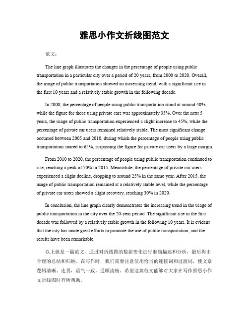
雅思小作文折线图范文范文:The line graph illustrates the changes in the percentage of people using public transportation in a particular city over a period of 20 years, from 2000 to 2020. Overall, the usage of public transportation showed an increasing trend, with a significant rise in the first 10 years and a relatively stable growth in the following decade.In 2000, the percentage of people using public transportation stood at around 40%, while the figure for those using private cars was approximately 35%. Over the next 5 years, the usage of public transportation experienced a slight increase to 45%, while the percentage of private car users remained relatively stable. The most significant change occurred between 2005 and 2010, during which the percentage of people using public transportation soared to 65%, surpassing the figure for private car users by a large margin.From 2010 to 2020, the percentage of people using public transportation continued to rise, reaching a peak of 70% in 2015. Meanwhile, the percentage of private car users experienced a slight decline, dropping to around 25% in the same year. After 2015, the usage of public transportation remained at a relatively stable level, while the percentageof private car users showed a slight recovery, reaching 30% in 2020.In conclusion, the line graph clearly demonstrates the increasing trend in the usage of public transportation in the city over the 20-year period. The significant rise in the first decade was followed by a relatively stable growth in the following 10 years. It is evident that the city has made great efforts to promote the use of public transportation, and the results have been remarkable.以上就是一篇范文,通过对折线图的数据变化进行准确描述和分析,最后得出合理的总结和归纳。
雅思小作文-线形图
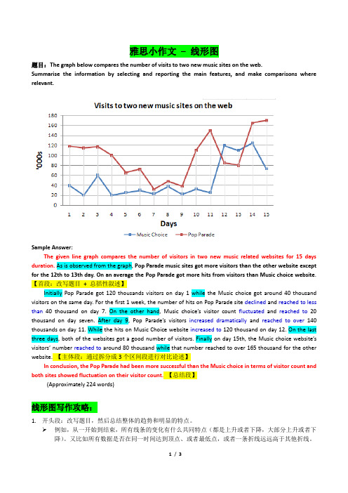
雅思小作文– 线形图题目:The graph below compares the number of visits to two new music sites on the web.Summarise the information by selecting and reporting the main features, and make comparisons where relevant.Sample Answer:The given line graph compares the number of visitors in two new music related websites for 15 days duration. As is observed from the graph, Pop Parade music sites got more visitors than the other website except for the 12th to 13th day. On an average the Pop Parade got more hits from visitors than Music choice website.【首段:改写题目+ 总括性叙述】Initially Pop Parade got 120 thousands visitors on day 1 while the Music choice got around 40 thousand visitors on the same day. For the first 1 week, the number of hits on Pop Parade site declined and reached to less than 40 thousand on day 7. On the other hand, Music choice’s visitor count fluctuated and reached to20 thousand on day seven. After day 9, Pop Parade’s visitors increased dramatically and reached to over140 thousands on day 11. While the hits on Music Choice website increased to 120 thousand on day 12. On the last three days, both of the websites got a good number of visitors. Finally on day 15th, the Music choice website’s visitors’ number reached to around 80 thousand while that number reached to over 165 thousand for the other website. 【主体段:通过拆分成3个区间段进行对比论述】In conclusion, the Pop Parade had been more successful than the Music choice in terms of visitor count and both sites showed fluctuation on their visitor count.【总结段】(Approximately 224 words)线形图写作攻略:1.开头段:改写题目,然后总结整体的趋势和明显的特点。
- 1、下载文档前请自行甄别文档内容的完整性,平台不提供额外的编辑、内容补充、找答案等附加服务。
- 2、"仅部分预览"的文档,不可在线预览部分如存在完整性等问题,可反馈申请退款(可完整预览的文档不适用该条件!)。
- 3、如文档侵犯您的权益,请联系客服反馈,我们会尽快为您处理(人工客服工作时间:9:00-18:30)。
题目:
The first chart below gives information about the money spent by British parents on their children’s sports between 2008 and 2014. The second chart shows the number of children who participated in three sports in Britain over the same time period.
范文:
Here's my full answer:
The line graphs show the average monthly amount that parents in Britain spent on their children’s sporting activities and the number of British children who took part in three different sports from 2008 to 2014.
It is clear that parents spent more money each year on their children’s participation in sports over the six-year period. In terms of the number of children taking part, football was significantly more popular than athletics and swimming.
In 2008, British parents spent an average of around £20 per month on their children’s sporting activities. Parents’ spending on children’s sports increased gradually over the following six years, and by 2014 the average monthly amount had risen to just over £30.
Looking at participation numbers, in 2008 approximately 8 million British children played football, while only 2 million children were enrolled in swimming clubs and less than 1 million practised athletics. The figures for football participation remained relatively stable over the following 6 years. By contrast, participation in swimming almost doubled, to nearly 4 million children, and there was a near fivefold increase in the number of children doing athletics.。
