图表类作文(完整版)
英文图表类 作文

英文图表类作文1. The bar chart shows the percentage of people in different age groups who use social media. It's interesting to see that the highest percentage of social media users is in the 18-34 age group, with over 80% of people usingsocial media. 。
2. The line graph illustrates the change in temperature over the course of a week. As we can see, there was a sharp increase in temperature on Wednesday, followed by a gradual decrease towards the end of the week.3. The pie chart displays the distribution of household expenses. It's surprising to see that the largest portion of expenses is on entertainment, with 30% of the budget allocated to this category.4. The table compares the sales performance ofdifferent products in the past year. It's clear that Product A has consistently outperformed the other products,with the highest sales in every quarter.5. The scatter plot shows the relationship betweenhours of study and exam scores. It's evident that there isa positive correlation between the two variables, as students who study more hours tend to achieve higher scores.6. The flow chart outlines the process of applying fora visa. It's quite a complex procedure, with multiple steps and documents required at each stage.7. The diagram depicts the structure of a typical cell. It's amazing to see the intricate network of organelles and membranes that make up a single cell.。
六级图表类作文范文

六级图表类作文范文
范文:
第一段,图表揭秘。
一看这图表,就知道近几年那城市居民出行方式可变了不少。
私家车越来越多,公共交通和走路的人越来越少。
第二段,私家车火爆。
说起私家车,那可真是火得一塌糊涂。
从2018年到2023年,
私家车的使用率从30%一路飙升到快50%了。
这背后啊,肯定是大家
生活好了,都想开车方便点。
第三段,公共交通遇冷。
可另一边呢,公共交通就没那么受欢迎了。
图表显示,用公共
交通的人越来越少,可能和私家车多了、公交服务没跟上都有关系。
第四段,步行渐少。
再来说说步行。
以前大家都爱走路,现在可不一样了。
城市的节奏越来越快,大家都想快点到达目的地,所以走路的人就少了。
第五段,环境与健康小忧。
这出行方式一变,环境和健康也跟着受影响。
私家车多了,空气和噪音污染都加重了;走路的人少了,大家运动也少了,健康自然就受影响了。
第六段,未来咋办。
那未来怎么办呢?城市管理者可得好好想想了。
高考备考写作专题:图表分析作文

高考备考写作专题:图表分析作文第一篇:全球二氧化碳排放量变化趋势随着工业化和现代化的发展,全球二氧化碳排放量不断增加,给地球的生态环境带来了巨大挑战。
下面是一幅描述全球二氧化碳排放量变化趋势的图表。
从图表中可以看出,自20世纪50年代开始,全球二氧化碳排放量呈现出逐年增加的趋势。
在20世纪70年代到80年代之间,排放量增速开始明显加快,到了90年代更是达到了高峰。
然而,在近几年,尽管二氧化碳排放量仍然在增加,但增速明显放缓。
造成全球二氧化碳排放量增加的原因有很多,但主要是工业生产、能源消耗和交通运输等活动所引起的。
这些活动大量使用化石燃料,例如煤炭、石油和天然气,导致了大量的二氧化碳释放到大气中。
全球二氧化碳排放量的增加给地球的生态环境带来了诸多问题。
首先,大量的二氧化碳排放导致大气中温室气体浓度升高,进而造成气候变化,例如全球气温上升、极端天气事件增多等。
其次,二氧化碳还会导致海洋酸化,对海洋生物造成威胁。
此外,由于空气污染加剧,人们的健康也受到了威胁。
为了应对全球二氧化碳排放量增加的问题,各国政府和国际组织已经采取了一系列的措施,例如限制工业排放、推广清洁能源和绿色交通等。
但要真正解决二氧化碳排放问题,还需要全球各方共同努力,包括改变生活方式、提高环保意识等。
第二篇:中国城市人口增长随着城市化进程的不断推进,中国城市人口呈现出快速增长的趋势。
下面是一幅描述中国城市人口增长的图表。
从图表中可以看出,1990年以前,中国城市人口增长较为缓慢,但之后迅速加快。
尤其是在2000年以后,城市人口增长速度急剧提升。
目前,中国的城市化率已经超过了50%。
城市人口增长的原因有很多,主要是农村人口向城市转移和城市自然增长导致的。
一方面,农村居民为了追求更好的生活条件和就业机会,纷纷涌向城市。
另一方面,由于医疗水平的提高和生活条件的改善,城市人口的自然增长也较快。
城市人口增长给中国带来了很多挑战。
首先,城市人口的快速增加导致了城市基础设施和公共服务压力的加大。
(完整版)图表作文范文汇总.docx
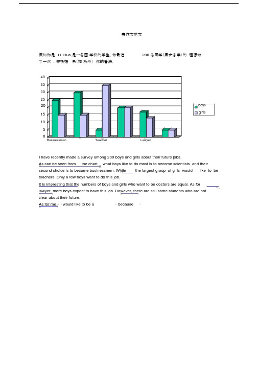
表作文范文假如你是Li Hua,是一名国学校的学生。
你最近200 名同学(男女各半)的理想做了一次,并根据果(如所示)你的看法。
4035302520boysgirls15105Businessman Teacher LawyerI have recently made a survey among 200 boys and girls about their future jobs.As can be seen from the chart, what boys like to do most is to become scientists and their second choice is to become businessmen. While the largest group of girls would like to be teachers. Only a few boys want to do this job.It is interesting that the numbers of boys and girls who want to be doctors are equal. As for lawyer, more boys expect to have this job. However, there are still some students who are notclear about their future.As for me , I would like to be a⋯because⋯7崇文一模某英文报纸正在开展题为“中学生课堂注意力”的专栏讨论,你校准备参加,并请你代表学校写一篇文章给该英文报纸投稿。
下面的图表为你校的调查结果,请你根据所提供的信息做简要说明,并根据提示给出改善的建议。
注意:图中数据为学生人数百分比。
中学生课堂注意力集中的情况中学生课堂注意力不能集中的原因40%30%70%60%能够集中注意力不能集中注意力课堂干扰睡眠不足与疲劳改善注意力的建议:教室课堂课间通风、明亮积极参与课堂活动适量活动或适当休息注意: 1.词数:不少于60。
雅思英语图表作文范文(必备3篇)

雅思英语图表作文范文第1篇A类雅思各类图表作文要点及范文一.曲线图解题关键1曲线图和柱状图都是动态图,解题的切入点在于描述趋势。
2在第二段的开头部分对整个曲线进行一个阶段式的总分类,使写作层次清晰,同时也方便考官阅卷。
接下来再分类描述每个阶段的specifictrend,同时导入数据作为分类的依据。
3趋势说明。
即,对曲线的连续变化进行说明,如上升、下降、波动、持平。
以时间为比较基础的应抓住“变化”:上升、下降、或是波动。
题中对两个或两个以上的变量进行描述时应在此基础上进行比较,如变量多于两个应进行分类或有侧重的比较。
4极点说明。
即对图表中最高的、最低的点单独进行说明。
不以时间为比较基础的应注意对极点的描述。
5交点说明。
即对图表当中多根曲线的交点进行对比说明。
6不要不做任何说明就机械地导入数据,这不符合雅思的考试目的。
曲线图常用词汇动词—九大运动趋势一:表示向上:increase,rise,improve,grow,ascend,mount,aggrandize,goup,climb, take off, jump,shoot up暴涨,soar,rocket, skyrocket雅思英语图表作文范文第2篇It is said that countries are becoming similar to each other because of the global spread of the same products, which are now available for purchase almost anywhere. I strongly believe that this modern development is largely detrimental to culture and traditions worldwide.A country’s history, language and ethos are all inextricably bound up in its manufactured artefacts. If the relentless advance of international brands into every corner of the world continues, these bland packages might one day completely oust the traditional objects of a nation, which would be a loss of richness and diversity in the world, as well as the sad disappearance of t he manifestations of a place’s character. What would a Japanese tea ceremony be without its specially crafted teapot, or a Fijian kava ritual without its bowl made from a certain type of tree bark?Let us not forget either that traditional products, whether these be medicines, cosmetics, toy, clothes, utensils or food, provide employment for local people. The spread of multinational products can often bring in its wake a loss of jobs, as people urn to buying the new brand,perhaps thinking it more glamorous than the one they are used to. This eventually puts old-school craftspeople out of work.Finally, tourism numbers may also be affected, as travelers become disillusioned with finding every place just the same as the one they visited previously. To see the same products in shops the world over is boring, and does not impel visitors to open their wallets in the same way that trinkets or souvenirs unique to the particular area too.Some may argue that all people are entitled to have access to the same products, but I say that local objects suit local conditions best, and that faceless uniformity worldwide is an unwelcome and dreary prospect.Heres my full answer:The line graphs show the average monthly amount that parents in Britain spent on their children’s s porting activities and the number of British children who took part in three different sports from 2008 to is clear that parents spent more money each year on their children’s participation in sports over the six-year period. In terms of the number of children taking part, football was significantly more popular than athletics and 2008, British parents spent an average of around £20 per month on their children’s sporting activities. Parents’ spending on children’s sports increased gradually over the followi ng six years, and by 2014 the average monthly amount had risen to just over £ at participation numbers, in 2008 approximately 8 million British children played football, while only 2 million children were enrolled in swimming clubs and less than 1 million practised athletics. The figures for football participation remained relatively stable over the following 6 years. By contrast, participation in swimming almost doubled, to nearly 4 million children, and there was a near fivefold increase in the number of children doing athletics.剑桥雅思6test1大作文范文,剑桥雅思6test1大作文task2高分范文+真题答案实感。
英语作文图表作文(五篇范文)
英语作文图表作文(五篇范文)第一篇:英语作文图表作文图表分析作文1As is clearly shown in the table/ figure/ graph / chart, 图表总体描述 between 年代 and 年代.Especially, 突出的数据变化.There are three reasons for 具体表示急剧上升、下降或特殊现象的词.To begin with, 原因一.In addition / Moreover, 原因二.For example, 具体例证.Last but no least, 原因三.In short,总结上文.As far as I am concerned, / For my part, / As for me,作者自己的观点.On the one hand, 理由一.On the other hand, 理由二.In brief,总结上文.图表分析作文2The table / figure / graph / chart shows that 图表总述from 年代to年代.It is self-evident that突出的数据变化.Three possible reasons contribute to 具体表示急剧上升、下降或特殊现象的词或代词代替上文内容.One reason is that原因一.Another reason is that 原因二.For instance,举例证.What’s more原因三.As a result, 重述上文之趋势.However, in my opinion 作者观点.For one thing,理由一.For another, 理由二.T o sum up,总结上文.图表分析作文3It can be seen from the table / figure / graph / chart that图表总述between年代and年代.Especially,突出的数据变化.Why are there such great changes during 图表涉及的年头数years? There are mainly two reasons explaining具体表示急剧上升、下降或特殊现象的词或代词代替上文内容.First,原因一.In the old days,比较法说明过去的情况.But now,说明现在的情况.Second,原因二.As a result,总结上文.In my viewpoint,作者自己的观点.On the one hand,论点一.On the other hand,论点二.图表分析作文4As the table / figure / graph / chart shows,图表总述in the past years年代.Obviously,突出的数据变化.Why are there suchsharp contrasts during 图表涉及的年头 years?Two main factors contribute to具体表示急剧上升、下降或特殊现象的词或代词代替上文内容.First of all,原因一.In the past,比较法说明过去的情况.But now 说明现在的情况.Moreover,原因二.Therefore,总结上文.As I see it,作者自己的观点.For one thing,论点一.For another,论点二.图表作文补充句型• As is shown in the graph…如图所示…•The graph shows that…图表显示…•As can be seen from the table,…从表格中可以看出…•From the chart, we know that…从这张表中,我们可知…• All these data clearly prove the fact that… 所有这些数据明显证明这一事实,即…• The increase of ….In the ci ty has reached to 20%.….在这个城市的增长已达到20%.• In 1985, the number remained the same.1985年,这个数字保持不变.• There was a gradual decline in 1989.1989年,出现了逐渐下降的情况.第二篇:英语图表作文图表描述专题训练(一)这类作文时,注意以下几点:第一,审题时,除了要把握好图表的表层信息外,还要分析图标的深层含义,如原因、根源、可能的发展趋势等。
2023年考研英语一作文范文(精选6篇)
2023年考研英语一作文范文(精选6篇)2023年考研英语一作文篇1一、不同体裁(一)图表类1.开头句:As is vividly shown/described/depicted inthe picture,______________(图表总内容).From the graph/chart/table/pie/bar, we knowthat______________(图表总内容).2.具体描述:In the first/second/left right cartoon,______________ (单个图表内容).As is shown in the second drawing,______________ (单个图表内容).On the one hand, the picture tells us that______________(单个图表内容); On the other hand, the other one informs us that______________(单个图表内容).3. 结尾句:It is safe to draw the conclusion that______________ (结论).It can easily be seen that______________ (结论).(二)说明类1. Some people are in favor of the ideathat______________ (话题). They point out the fact that______________ (正方观点1).They also argue that_________________ (正方观点2). There might be some element of truth in these people’s belief. However, other people stand on a different ground since they consider it harmful to do so. They firmly point out that______________ (反方观点).2. Recently the issue of whether or not_________________(话题) has been in the limelight and has aroused wide concern in the public. There are two major arguments that can be made for. For one thing, the obvious advantage is that______________ (优点1). For another, it is widely hold that people usually when______________ (优点2). But we must not lose sight of the fact that there are still some drawbacks, one of which is that______________ (缺点1).二、不同题材1.保护环境Though being a little exaggerating, the picture illuminates a serious fact that ______________.And for that matter, a recent report also supported this viewby_____________. On the contrary, we are sad to perceive that _____________. Therefore, in my opinion, it is already high time for the whole world to form a solid cooperation fighting against _____________, because not a single government or person can be exempt from its harm. A series of down-to-earth measures need to be urgently implemented to control _____________.2.人口增长The picture depicts a scene in which_____________. The scene is presented in an artistic and ironic manner. Crowds of people are crammed in_____________. Further examination reveals that_____________. Apparently, the picture symbolizes that humans, with such a huge population, may one day suffer from the exhaustion of earth resources.Take_____________for example. Given the fact that _____________, we find that _____________. To make things worse,_____________. If the conflict between population boom and shortage of resources is not properly controlled, we have every reasonto hold a pessimistic perspective towards human’s future on Earth. Perhaps eventually we would face the situation suggested by the picture, that is,_____________. Accordingly, I strongly recommend that the whole globe launch aggressive programs to address this fatal contradiction.3.身体健康The picture_____________. What is strikingly noticeable is _____________ , but it can be easily explainedby_____________shown in the picture. The unhealthiness discloses a prevalent phenomenon that has long existed in the China. One the one hand,_____________. On the other hand,_____________. As a result, the integration of poor living conditions and work pressure leads naturally to theirpoor health and short life-span, just as the picture tells us. The situation is rather depressing because_____________, and it is largely owing to_____________. To solve the problem, I think there should be a thriving social trend_____________, and those who_____________should be rewarded with good living and working conditions.2023年考研英语一作文篇2一、正面话题模板:As is shown above, in the middle of the cartoon stands + 主题词,which symbolizes + 主题词的另一种表达,+ 同位语即主题词第三种表达 + 表示主题词动作的非谓语动词 (例如:in the middle of the cartoon stands a hot pot,which symbolizes culture,the one containing many Chinese culture symbol. The drawer"s intention seems to be highly self-evident and the meaning causes us to be thought-provoking. It is therefore safe to draw the conclusion that + 主题词 + is momentous and fundamental to the mind what food is vital and significant to the body.)Not only I, but also the best philosophers and poets also praise that this concept should be a permanent universal values. Obviously, I can think of no better reasons for the phenomenon other than the following two. Initially, the millennia-long run of + 主题词+ left us with a lot of traditions that are extremely profoundly rooted. 加拓展句:主题词is a kind of emotional strength, which can support us no matter how dark around us becomes.(比如:爱心/自信/亲情/团结/坚持/诚信/友谊/乐观的态度/是一种情感的力量,无论我们周围有多么的黑暗,它都能支持我们。
英语图表作文模板及精选4篇

英语图表作文模板及精选4篇(经典版)编制人:__________________审核人:__________________审批人:__________________编制单位:__________________编制时间:____年____月____日序言下载提示:该文档是本店铺精心编制而成的,希望大家下载后,能够帮助大家解决实际问题。
文档下载后可定制修改,请根据实际需要进行调整和使用,谢谢!并且,本店铺为大家提供各种类型的经典范文,如总结报告、合同协议、规章制度、条据文书、策划方案、心得体会、演讲致辞、教学资料、作文大全、其他范文等等,想了解不同范文格式和写法,敬请关注!Download tips: This document is carefully compiled by this editor. I hope that after you download it, it can help you solve practical problems. The document can be customized and modified after downloading, please adjust and use it according to actual needs, thank you!Moreover, our store provides various types of classic sample essays, such as summary reports, contract agreements, rules and regulations, doctrinal documents, planning plans, insights, speeches, teaching materials, complete essays, and other sample essays. If you want to learn about different sample formats and writing methods, please pay attention!英语图表作文模板及精选4篇学而不思则罔,思而不学则殆,以下是本店铺给大伙儿收集整理的英语图表作文模板及精选4篇,欢迎参考。
图表作文(三篇)(转的)

[10.建议措施段]In order to protect the wildlife, I have some suggestions. First, the governments should make laws to prevent them from being caught and killed. Second, the governments should educate people to love nature and protect it. Third, as for ourselves, we should take practical actions to protect our living environment.
英语图表作文模板及范文(通用12篇)

英语图表作文模板及范文(通用12篇)(经典版)编制人:__________________审核人:__________________审批人:__________________编制单位:__________________编制时间:____年____月____日序言下载提示:该文档是本店铺精心编制而成的,希望大家下载后,能够帮助大家解决实际问题。
文档下载后可定制修改,请根据实际需要进行调整和使用,谢谢!并且,本店铺为大家提供各种类型的经典范文,如工作总结、工作计划、合同协议、条据文书、策划方案、句子大全、作文大全、诗词歌赋、教案资料、其他范文等等,想了解不同范文格式和写法,敬请关注!Download tips: This document is carefully compiled by this editor. I hope that after you download it, it can help you solve practical problems. The document can be customized and modified after downloading, please adjust and use it according to actual needs, thank you!Moreover, our store provides various types of classic sample essays for everyone, such as work summaries, work plans, contract agreements, doctrinal documents, planning plans, complete sentences, complete compositions, poems, songs, teaching materials, and other sample essays. If you want to learn about different sample formats and writing methods, please stay tuned!英语图表作文模板及范文(通用12篇)英语图表作文模板及范文第1篇The table/chart diagram/graph shows (that)According to the table/chart diagram/graphAs (is)shown in the table/chart diagram/graphAs can be seen from the table/chart/diagram/graph/figures,figures/statistics shows (that)……It can be seen from the figures/statisticsWe can see from the figures/statisticsIt is clear from the figures/statisticsIt is apparent from the figures/statisticstable/chart/diagram/graph figures (that)……table/chart/diagram/graph shows/describes/illustrates图表类英语作文范文The past years have witnessed a mounting number of Chinese scholars returning from overseas.As is lively illustrated by the column chart, the number of returnees climbed from a mere thousand in 20XX to over thousand in 20XX, at an annual increase rate of around 50%.A multitude of factors may have led to the tendency revealed by the chart, but the following are the critical ones from my perspective.First and foremost, along with the development ofChinese economy and society, the number of Chinese studying abroad has been soaring in the past years, which has provided an eXpanding base for the number of returnees.In the second place, the government has enacted a series of preferential policies to attract overseas Chinese scholars back st but not least, the booming economy, science and technology in this country have generated more attative job opportunites for scholars returning from overseas.The waves of returnees will definitely contribute to this nation’s development, since they have brought back not only advanced science and technology but also pioneering concepts of education and management.With more scholars coming back from overseas, and with the concerted efforts of the whole nation,we have reasons to eXpect a faster rejuvenation of this country.更多培训课程:苏州个人提升英语更多学校信息:苏州虎丘区朗阁教育机构咨询电话:英语图表作文模板及范文第2篇Students tend to use computers more and more frequently nowadays.Reading this chart, we can find that the average number of hours a student spends on the computer per week has increased sharply.In 1990, it was less than 2 hours; and in 1995, it increased to almost 4 hours, and in 2000, the numbersoared to 20 hours.Obviously computers are becoming increasingly popular.There are several reasons for this change.First,computers facilitate us in more aspects of life.Also, the fast development of the Internet enlarges our demands for using computers.We can easily contact with friends in remote places through the Internet.Besides, the prices of computers are getting lower and lower,which enables more students to purchase them.However, there still eXist some problems, such as poor quality, out-of-date designs and so on.And how to balance the time between using computers and studying is also a serious problem.Anyhow, we will benefit a lot from computers as long as we use them properly.英语图表作文模板及范文第3篇As can be clearly seen from the graph/table/chart (As is shown in the table/figure), great changed have taken place in_______,The_________have/has skyrocketed/jumped from _____to _____.When it comes to the reasons for the changes,different people give different eXplanations.Here I shall just give a begin with, ______What’s more,___________, Last but not least, ________.While it is desirable that ___________,there are still some problems and difficulties for __________Firstly, __________,In addition, __________,In a word, __________.以上就是为大家整理的英语专四图表作文范文模板,希望能够对大家有所帮助。
图表描述类英语作文(4篇)

图表描述类英语作文(4篇)图表描述类英语作文篇一The above bar chart informs us of the phenomenon that there exist some differences in additional working hours among diverse careers, especially between self-employed businessmen and civil servants. Self-employed businessmen spend nearly 2 hours per day in working overtime. On the contrary, civil servants’ additional working hours is the shortest, only less than 50 minutes per day. The overtime of scientific researchers, cultural and sports workers and teachers is 80 minutes, 70 minutes and 55 minutes respectively.Ample reasons can account for this phenomenon. Firstly, to make more profits, self-employed businessmen have to spend more time in manufacturing products, attracting customers, providing after-sale services and managing staff. Moreover, with the competition becoming fiercer, they have no alternative but to work overtime to avoid being eliminated by the market and their rivals. When it comes to civil servants, things have gone otherwise. Confronted with less risks as well as pressures and leading a steady and routine life, they don’t have to work overtime frequently.Working overtime is a two-bladed sword. Surely, it will generate considerable benefits. However, it will give rise to some damages, especially to our health. We should balance our work, life and health or we will eventually become a machine and salve of work.四级英语作文图表类篇二图片模板:It seems to me that the cartoon / drawing issending a message about ____________(图画内容),which reveals ____________(稍作评价).In myperspective of view, ____________ (表明个人观点)。
图表作文20篇
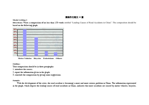
图表作文范文20篇Model writing 1Directions: Write a composition of no less than 150 words entitled “Leading Causes of Road Accidents in China”. The composition should be based on the following graph.Motor Vehicles Bicycles Pedestrians OthersOutline:Your composition should be in three paragraphs:1. introduce the causes;2. report the information given in the graph;3. conclude the composition by giving some suggestions.Sample:With the development of the cities, the road accident is becoming a more and more serious problem in China. The information represented in the graph, which depicts the leading causes of road accidents in China, indicates that most accidents are caused by motor vehicles, bicycles,and pedestrians.In the graph we can clearly see that motor vehicles are responsible for the largest part of road accidents, namely about 50% of them. Bicycles account for 35% of the accidents and pedestrians caused nearly 10%. These statistics indicate that motor vehicles have to some extent become a threat to the security of whole society, which endangers people’s lives.Since we know that motor vehicles are the leading cause of road accidents in China, we should take some measures to improve the situation. First, we should make a law to punish any violators of traffic regulations. Then, cyclists should use hand signals to warn other road users of their intentions. Last but not least, the department concerned should educate ordinary people to walk on a zebra crossing or overpass when they cross a street. All in all, it’s time for us to attach great importance to this problem.Model writing 2Directions: Take a look at the table below. It shows the number of road accidents in Britain in different places as well as the ages of theSampleThe chart above organizes data about road accidents involving children in Britain by when and where the accidents occurred. It can be seen that the incidence of accidents decreases as the children’s age increases and that age correlates with the circumstances surrounding the accident.For all ages, the most common situation leading to accident is playing in the street but young children were particularly affected. Children between the ages of 5-7 seemed to get into accidents while engaged in activities appropriate to their age, such as shopping for their parents orgoing home from school. In fact, this age group accounted for the most road accidents of all. Children between 8 and age 11 had the most accidents cycling in the street. After age 11, the number of accidents dropped considerably in all situations.From the chart, we get to know that playing in the street is the most common and universal site of accidents of all ages, but the risks that other sites and situations present vary with the children’s ages.Model writing 3Directions: Write a composition entitled “Changes in US Spending Patterns”. The composition should be based on the following pie charts.Sample:The pie charts show changes in American spending patterns between 1966 and 1996.Food and cars made up the two biggest items of expenditure in both years. Together they comprised over half of household spending. Food accounted for 44% of spending in 1966, but this dropped by two thirds to 14% in 1996. However, the outlay on cars doubled, rising from 23% in 1966 to 45% in 1996.Other areas changed significantly. Spending on eating out doubled, climbing from 7% to 14%. The proportion of salary spent on computers increased dramatically, up from 1% in 1996 to 10% in 1996. However, as computer expenditure rose, the percentage of outlay on books plunged from 6% to 1%.Some areas remained relatively unchanged. Americans spent approximately the same amount of salary on petrol and furniture in both years.In conclusion, increased amounts spent on cars, computers, and eating out were made up for by drops in expenditure on food and books. Model writing 4Directions: For this part, you are allowed 30 minutes to write a composition of no less than 150 words on Changes in People’s Diet. Study the following table carefully and your composition must be based on the information given in the table. You should quote as few figures as possible.Outline:Write three paragraphs to:1. State the changes in people’s diet in the past five years2. Give possible reasons for the changes3. Draw your own conclusionSample:As can be seen in the table, there have been great changes in people’s diet in the past five years. During the five years, the consumption ofgrain decreased by 4%, while that of meat and milk increased by 4% and 3% respectively. From the figures we can draw the conclusion that grain, as the staple food in China, is playing a less important role in people’s diet, while the consumption of high-energy food, such as meat and milk, has increased steadily.What caused these changes? I think the reasons are as follows: First, the open policy brings the people opportunities to earn a lot of money. Second, people nowadays pay more attention to the structure of their diet. They are seeking the most reasonable diet structure, which will do good to their health.From the above, we can see that, with the development of the country, people’s living standard has greatly improved in the five years. We can also expect better living standard and more reasonable diet structure in the future.Model writing 5Directions: For this part, you are allowed 30 minutes to write a composition on the topic Health Gains in Developing Countries. Your composition should be no less than 120 words.Outline:You must base your composition on the following instruction given in Chinese:1. 以下图为依据描述发展中国家的期望寿命(life expectancy)和婴儿死亡率(infant mortality)的变化情况。
(完整版)雅思经典图表作文范文
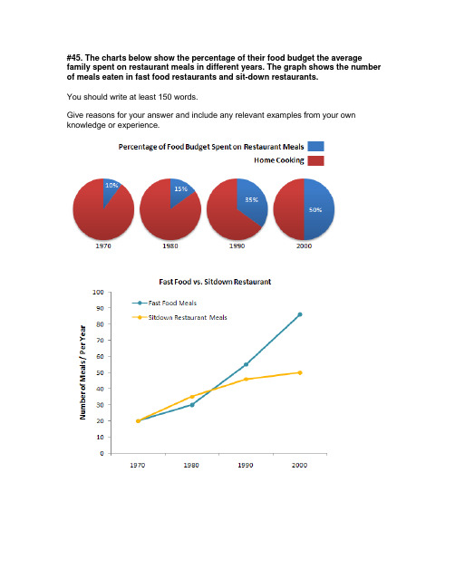
#45. The charts below show the percentage of their food budget the average family spent on restaurant meals in different years. The graph shows the number of meals eaten in fast food restaurants and sit-down restaurants.You should write at least 150 words.Give reasons for your answer and include any relevant examples from your own knowledge or experience.Over the past 30 years, the average family has dramatically increased the number of meals that they eat at restaurants. The percentage of the family's food budget spent on restaurant meals steadily climbed. Just 10 percent of the food budget was spent on restaurant meals in 1970, and 15 percent in 1980. That percentage more than doubled in 1990, to 35 percent, and rose again in 2000 to 50 percent. Where families eat their restaurant meals also changed during that 30-year period. In 1970, families ate the same number of meals at fast food and sit-down restaurants. In 1980, fam¬ilies ate slightly more frequently at sit-down restaurants. However, since 1990, fast food restaurants serve more meals to the families than do the sit-down restaurants. Most of the restaurant meals from 2000 were eaten at fast food restaurants. If this pattern continues, eventually the number of meals that families eat at fast food restaurants could double the number of meals they eat at sit-down restaurants.(164 words)#44. You should spend about 20 minutes on this task.The map below is of the town of Garlsdon. A new supermarket (S) is planned for the town. The map shows two possible sites for the supermarket.Summarise the information by selecting and reporting the main features, and make comparisons where relevant.You should write at least 150 wordsmodel answer:The first potential location (S1) is outside the town itself, and is sited just off the main road to the town of Hindon, lying 12 kms to the north-west. This site is in the countryside and so would be able to accommodate a lot of car parking. This would make it accessable to shoppers from both Hindon and Garlsdon who could travel by car. As it is also close to the railway line linking the who towns to Cransdon (25 km to the south-east), a potentially large number of shoppers would also be able to travel by train.In contrast, the suggested location, S2, is right in the town centre, which would begood for local residents. Theorically the store could be accessed by road or rail from the surrounding towns, including Bransdon, but as the central area is a no-traffic zone, cars would be unable to park and access would be difficult. Overall, neither site is appropriate for all the towns, but for customers in Cransdon, Hindon and Garlsdon, the out-of-town site (S1) would probably offer more advantages.(179 words)# 43. You should spend about 20 minutes on this task.The table below shows CO2 emissions for different forms of transport in the European Union.The Pie Chart shows the percentage of European Union funds being spent on different forms of transport.You should write at least 150 words.model answer:The chart shows CO2 emissions per passenger kilometre for variuos methods of transport in the European Union while the pie chart shows European Union spending on transport. Flying by air produces by far the greatest CO2 emissions, approximately three times as much as passenger cars which are the next largest producers. Very little is spent by the EU on air travel while roads make up more than half of the EU transport budget.Trains produce about three times less CO2 emissions per passenger kilometre than passenger cars and eight times less than air travel. Nearly a third of EU transport funds are spent on railways.Ships are a clean form of transport and produce about the same amount of CO2 per passenger kilometre as trains do. However, only 2 percent of EU funds are spent on ports. A further one percent is spent on inland waterways.Coaches are the cleanest form of transport. Emissions of CO2 per passenger kilometre from coaches are half those of buses. Buses emit less than half as much CO2 per passenger kilometre as cars. The European Union spends 10 percent of its transport budget on public transport, such as buses and coaches. (197 words)The table below shows the sales at a small restaurant in a downtown business district.Summarize the information by selecting and reporting the main features, and make comparisons where relevant.You should write at least 150 words.Give reasons for your answer and include any relevant examples from your own knowledge or experience.model answer:The sales at this small restaurant during the week of October 7 to 13th followed a fairly set pattern from Monday to Friday, and then showed notable shift on the weekend. The lunch and dinner sales during the week peaked on Friday and then dipper down as the weekend set in.During the week of October 7-14th, the lunch sales averaged at approximately $2,400. The highest lunch sales occurred on Friday, and the lowest occurred on Sunday. Sunday's lunch sales were approximately $1,000 less than the average lunch sales during the rest of the week.Dinner sales, which generated at least $1,000 to $1,500 more a day than lunch sales, also remained steady during the week. Just like the lunch sales, the dinner sales peak on Friday and dipped down for the weekend.Excluding Wednesday and Thursday, the lunch and dinner sales from October 7-11 rose gradually until the end of the business week. Midweek, on Wednesday and Thursday, the sales were slightly lower than they were on Tuesday.According to the sales report, this restaurant has a steady lunch and dinner crowd. The most profitable day during the second week of October was Friday. Sunday, was the least prof¬itable day, with the full day's sales totaling/totalling less than the Friday dinner sales. These numbers are reflective of a restaurant that is located in a business/financial district where business hours are Monday through Friday.In June 1996, an experimental flu vaccine was trialled in a large country town on females only.Summarise the information by selecting and reporting the main features, and make comparisons where relevant.You should write at least 150 words.Give reasons for your answer and include any relevant examples from your own knowledge or experience.model answer:The diagrams show data for a flu epidemic which hit a large country town in 1996. Figure 1 gives the number of persons who died; Figure 2 shows the percentage breakdown of females who received a new flu vaccine; and Figure 3 gives the number of cases of flu before and during the epidemic.In Figure 1 it can be seen that the flu was responsible for the deaths of 2 females but no males in the period from March to May. However, from June to August, there were 4 female deaths and 1 male death.According to the pie chart in Figure 2, only those females most at risk were given the new flu vaccine; 28% did not take part in the trial. Of those females who took part, 35% were aged (over 65 years old); 24% were babies or children; and 13% were either hospitalised or receiving other medical attention.From Figure 3 it is clear that the new vaccine had a positive effect on the number of new cases of flu reported in females. There were just over 1000 cases reported in March, climbing rapidly to a peak of 3500 in June. Thereafter, the number of cases dropped slowly to about 2800 in August, before levelling off at 2500 for the rest of the year. For males, the figures were lower but showed a similar trend throughout the epidemic.(232 words)#39. You should spend about 20 minutes on this task.The chart below shows estimated world literacy rates by region and by gender for the year 2000.Write a report for a university lecturer describing the information below.You should write at least 150 words.model answer:In this report I will describe a bar chart that shows the estimated world illiteracy rates by gender and region for the year 2000.First I will look at male illiteracy for the 6 areas shown. The lowest rates were in Developed Countries, Latin America/Caribbean and East Asia/Oceania with rates of 1% (approximately), 10% and 8% (approximately) respectively. The rates for the next three areas were much higher and quite similar to each other. Sub-Saharan Africa, the Arab States and South Asia had rates of approximately 31%, 29% and 34%.Female illiteracy was much higher relatively in each area except LatinAmerica/Caribbean where it was only slightly higher. The lowest rates for female illiteracy were again Developed Countries, Latin America/Caribbean and East Asia/Oceania with rates of approximately 2%, 12% and 20%. Again the rates for the next three areas were much higher and quite similar to each other. Sub-Saharan Africa, the Arab States and South Asia had rates of approximately 48%, 52% and 56%.This ends my report.# 38. You should spend about 20 minutes on this task.The chart shows the number of mobile phones and landlines per 100 people in selected countries.Write a report for a university lecturer describing the information given.You should write at least 150 words.model answer:The graph shows the number of mobile phones and landlines per 100 users, for selected countries. Overall, most of the countries included in the graph have more mobile phones subscribers than landlines.Most European countries have high mobile phone use. The biggest users of mobile phones are the Italians, with 88 cell phones per 100 people. For example, Italy has twice as many mobile phones as landlines, with 88 mobiles per hundred people compared to 45 for landlines. Mobile phone use is low in Canada, with fewer than 40 phones per 100 people. Denmark is also unusual because it has slightly more landlines than mobile phones.However, in some countries, the number of landlines is higher than the number of mobile phones. One example is the USA, where the number of mobiles, at 50 per 100 people, is much lower than the number of landlines, at almost 70 per hundred.A similar pattern can be seen in Canada. The highest number of landlines in the graph is in Denmark, with about 90 per 100 people. In contrast, the lowest figures for fixed lines are in Italy and the UK.In conclusion, it seems that mobile phone use is higher in Europe than in North America.# 37. You should spend about 20 minutes on this task.The graphs show enrolment in different colleges in the Higher Colleges of Technology in 1999.Write a total of 150 - 200 words about the information in the three graphs. Write a report for a university lecturer describing the information given. You should write at least 150 wordsmodel answer:The charts shows student enrolment by gender and level in different colleges of the Higher Colleges of Technology colleges in the UAE.There are clear differences in male and female enrolment. Females outnumber men in all the colleges, with almost 25% more students in Dubai Women's college than in Dubai Men's. Ras Al-Khaimah Women's College has almost 180 students, compared to only 100 in the Men's college.Females also outnumber males by level, with almost double the number of men at Higher Diploma level (330 compared to 181). Only at Diploma level does the number of men slightly exceed that of women.Over half the students are in Certificate level, with less than a quarter at Higher Diploma or Bachelor level.In conclusion, most students in the Higher Colleges are enrolled at Diploma level or below, and the majority of students are women.(143 words)# 36. You should spend about 20 minutes on this task.The line graph below shows the number of annual visits to Australia by overseas residents. The table below gives information on the country of origin where the visitors came from. Write a report for a university lecturer describing the information given.You should write at least 150 words.NUMBER OF VISITORS (million)1975 2005SOUTH KOREAJAPANCHINAUSABRITAINEUROPE 2.93.20.30.40.91.19.112.00.81.12.94.5Total 8.8 30.4model answer:The given line graph illustrates information on the number of overseas visitors traveling to Australia in millions of people. Overall, one notable trend seems to be that Australia has steadily become more popular as a destination spot. For example, there were 20 million more visitors to Australia in 2005 than in 1975. That's a jump from 10 million to 30 million in 20 years.The second table gives statistics showing the countries whose residents went to Australia between 1975 and 2005. In both years, the largest number of visitors came from Japan, followed by South Korea and Europe. Britain, the United States and China also had many people traveling to Australia in these years. In fact, the number of people visiting Australia grew in every one of these countries. For example, in 2005, 12 million people went there from Japan compared with only 3.2 million in 1975.(147 words)#35. You should spend about 20 minutes on this task.The table below shows the consumer durables (telephone, refrigerator, etc.) owned in Britain from 1972 to 1983.Write a report for a university lecturer describing the information shown below. You should write at least 150 words.Consumer1972 1974 1976 1978 1979 1981 1982 1983 durablesPercentage ofhouseholds with:central heating 39 43 48 52 55 59 60 64television 93 95 96 96 97 97 97 98video 18vacuum cleaner 87 89 92 92 93 94 95refrigerator 73 81 88 91 92 93 93 94washing66 68 71 75 74 78 79 80 machinedishwasher 3 3 4 4 5telephone 42 50 54 60 67 75 76 77 model answer:The chart shows that the percentage of British households with a range of consumer durables steadily increased between 1972 and 1983. The greatest increase was in telephone ownership, rising from 42% in 1972 to 77% in 1983. Next came centralheating ownership, rising from 37% of households in 1972 to 64% in 1983. The percentage of households with a refrigerator rose 2 1% over the same period and of those with a washing machine by 14%. Households with vacuum-cleaners. televisions and dishwashers increased by 8%, 5% and 2% respectively. In 1983. the year of their introduction, 18% of households had a video recorder.The significant social changes reflected in the statistics are that over the period the proportion of British houses with central heating rose from one to two thuds, and of those with a phone from under a half to over three-quarters. Together with the big increases in the ownership of washing machines and refrigerators, they are evidence of both rising living standards and the trend to lifestyles based on comfort and convenience.#34. You should spend about 20 minutes on this task.The table below shows the figures for imprisonment in five countries between 1930 and 1980.Write a report for a university, lecturer describing the information shown below. You should write at least 150 wordsmodel answer:The table shows that the figures for imprisonment in the five countries mentioned indicate no overall pattern of increase or decrease. In fact there is considerable fluctuation from country to country.In Great Britain the numbers in prison have increased steadily from 30 000 in 1930 to 80,000 in 1980. On the other hand in Australia, and particularly in New Zealand the numbers fell markedly from 1930 to 1940. Since then they have increased gradually, apart from in 1980 when the numbers in prison in New Zealand fell by about 30,000 from the 1970 total. Canada is the only country in which the numbers in prison have decreased over the period 1930 to 1980, although there have been fluctuations in this trend. The figures for the United States indicate the greatest number of prisoners compared to the other four countries but population size needs to be taken into account in this analysis. The prison population in the United States increased rapidly from 1970 to 1980 and this must be a worrying trend.。
(完整版)图表作文范文汇总

n e图表作文范文汇总假如你是Li Hua,是一名国际学校的学生。
你最近对200名同学(男女各半)的择业理想做了一次调查,并根据调查结果(如图所示)谈谈你的看法。
I have recently made a survey among 200 boys and girls about their future jobs.As can be seen from the chart, what boys like to do most is to become scientists and their second choice is to become businessmen. While the largest group of girls would like to be teachers. Only a few boys want to do this job.It is interesting that the numbers of boys and girls who want to be doctors are equal. As for lawyer, more boys expect to have this job. However, there are still some students who are not clear about their future.As for me , I would like to be a …because …BusinessmanTeacherLawyeri n t h07崇文一模某英文报纸正在开展题为“中学生课堂注意力”的专栏讨论,你校准备参加,并请你代表学校写一篇文章给该英文报纸投稿。
下面的图表为你校的调查结果,请你根据所提供的信息做简要说明,并根据提示给出改善的建议。
注意:图中数据为学生人数百分比。
改善注意力的建议:教室通风、明亮课堂积极参与课堂活动课间适量活动或适当休息注意:1.词数:不少于60。
雅思4类图表作文范文

雅思4类图表作文范文
一、柱状图。
哇塞,看这柱状图,某城市的私家车数量可是像火箭一样往上
冲啊!五年前才5万辆,现在直接飙到15万辆了,涨得比房价还快!不过话说回来,公共交通那边就不太好过了,以前每天80万人次,
现在只剩下60万了,看来大家都更喜欢自己开车出门啊。
二、折线图。
话说这折线图,看得我心情都跟着起伏了。
那国家失业率啊,
前几年涨得跟股票似的,从4%一路飙升到6%,让人看了都捏把汗。
不过好在后来稳住了,还往下掉了点,虽然没回到从前,但好歹也
算个好兆头吧。
图表类英语作文范文
图表类英语作文范文图表类型的英语写作如果不擅于观察漫画的话,作文写出来可能会偏题。
下面是小编给大家带来图表类英语作文,供大家参阅!图表类英语作文范文篇1第一段:说明图表开篇句:As the bar chart shows, ____ during the years of ____to____.扩展句:1、As early as _____.2、Then _____ years later, ____.3、And arriving in the year ____, ____.第二段:解释图表变化原因主题句:Several factors contribute to _____.扩展句:1、______. (原因1)2、And ______.(原因2)3、Furthermore, ______ (原因3)4、All these result in ____.第三段:提出解决办法结尾句:However, ____ is faced with some problems.扩展句:1、With _____, ____, the effect of which is not only discouraging, but also challenging.2、So my principle is to pay due attention to ___, but notjustto____.示范第一段:说明图表开篇句:As the bar chart shows, the number of people below the poverty line decreased dramatically during the years of 1978 to1997.扩展句:1、As early as 1978, about 250 million people were under the poverty line.2、Then seven years later, the number became three fifths thatof1978.3、And arriving in the year 1997, the number was reduced to50millions.第二段:解释图表变化原因主题句:Several factors contribute to the sharp decrease of the below-poverty population.扩展句:1、The reform and opening following 1978 enabled the peasants to become much better off. (原因1)2、And with the development of Chinese economy, that policy also improved city dwellers lives greatly. (原因2)3、Furthermore, the high-tech introduced made it possible for the countrys economy as a whole to take off. (原因3)4、All these result in the great fall of theChinesepopulationbelow the poverty line.第三段:提出解决办法结尾句:However, a further decrease in the number of poverty-stricken people is faced with some problems.扩展句:1、With quite few employees being laid off, the effect of which is not only discouraging, but also challenging.2、So my principle is to pay due attention to the newcomers, but not just to care for the poor, say, in remote mountain areas.范文As the bar chart shows, the number of people below the poverty line decreased dramatically during the years of 1978 to 1997. Asearly as 1978, about 250 million people were under the poverty line.Then seven years later, the number became three fifths that of 1978.And arriving in the year 1997, the number was reduced to 50 millions.Several factors contribute to the sharp decrease of the below-poverty population. The reform and opening following 1978 enabled the peasants to become much better off. And with the development of Chinese economy, that policy also improved city dwellers lives greatly. Furthermore, the high-tech introduced made it possible for the countryseconomy as a whole to take off. All these result in the great fall of the Chinese population below the poverty line.However, a further decrease in the number of poverty-stricken people is faced with some problems. With quite few employees being laid off, the effect of which is not only discouraging, but also challenging. So my principle is to pay due attention to the newcomers, but not just to care for the poor, say, in remote mountain areas.图表类英语作文范文篇2The past years have witnessed a mounting number of Chinese scholars returning from overseas. As is lively illustrated by the column chart, the number of returnees climbed from a mere 69.3 thousand in 2008 to over 272.9 thousand in 2012, at an annual increase rate of around 50%.A multitude of factors may have led to the tendency revealed by the chart, but the following are the critical ones from my perspective. First and foremost, along with the development of Chinese economy and society, the number of Chinese studying abroad has been soaring in the past years, which has provided an expanding base for the number of returnees. In the second place, the government has enacted a series of preferential policies to attract overseas Chinesescholars back home. Last but not least, the booming economy, science and technology in this country have generated more attative job opportunites for scholars returning from overseas.The waves of returnees will definitely contribute to this nation’s development, since they have brought back not only advanced science and technology but also pioneering concepts of education and management. With more scholars coming back from overseas, and with the concerted efforts of the whole nation, we have reasons to expect a faster rejuvenation of this country.图表类英语作文范文篇3一、图表类型基本单词图表类型:table(表格)、chart(图表)、diagram(图标)、graph(多指曲线图)、column chart(柱状图)、pie graph(饼图)、tree diagram(树形图)、饼图:pie chart、直方图或柱形图:bar chart/histogram、趋势曲线图:line chart/curve diagram、表格图:table、流程图或过程图:flow chart/sequence diagram、程序图:processing/procedures diagram二、图表描述基本词语1、描述:show、describe、illustrate、can be seen from、clear、apparent、reveal、represent2、内容:figure、statistic、number、percentage、proportion三、常用的描述句型The table/chart diagram/graph shows (that)According to the table/chart diagram/graphAs (is) shown in the table/chart diagram/graphAs can be seen from the table/chart/diagram/graph/figures,figures/statistics shows (that)……It can be seen from the figures/statisticsWe can see from the figures/statisticsIt is clear from the figures/statisticsIt is apparent from the figures/statisticstable/chart/diagram/graph figures (that) ……table/chart/diagram/graph shows/describes/illustrates看过图表类英语范文的人还。
图表作文范文
注:红色字体为框架,绿色字体为经典表达或常用词/词组;其他为强调P.S. 每篇字数都在200左右,已达六级水平,如遇到此类作文,可以在解决问题(第三段)部分稍缩减。
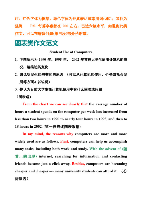
图表类作文范文Student Use of Computers1.下图所示为1990年、1995年、2002年某校大学生适用计算机的情况,请描述其变化2.请说明发生这些变化的原因(可以从计算机的使用,价格或社会发展等方面加以说明)3.你认为目前大学生在计算机使用中有什么困难或问题(图表略)From the chart we can see clearly that the average number of hours a student spends on the computer per week has increased from less than two hours in 1990 to nearly four hours in 1995, and then to 18 hours in 2002. (第一段描述图表数据)In my mind, the reasons why computers are more and more widely used are as follows. First, computers can help us accomplish many tasks, including both work and study. With the advent of (随着…的出现)internet, searching for information and contacting friends become just a click away. Besides, computers are becoming cheaper and cheaper---- many university students can afford it. (分析原因)The negative effects of computers are also are also clear. T o begin with, computers may be out of order(发生故障) from time to time,and repairing them can be both expensive and time-consuming. Second, more and more students spend too much time playing computer games or chatting online, which are both bad habits. (问题或困难)All in all, I should say the advantages outweigh(及物动词,后直接加宾语;意思:[重要性]胜过,超过,重于…)the disadvantages. The key lies in whether we can make good use of it to enhance work and study. (结论)Changes in the Ownership of Houses1.根据下图描述该市住房产权的变化2.分析产生这些变化的原因3.说明这些变化对个人和社会产生的影响From the chart, we can see clearly that in a big city in China, state-owned houses declined abruptly from 75% in 1990 to 60% in 2000, while private houses rose from 25% to 40% and then to80 during the same period. (描述图表数据)Two reasons, in my mind, can account for the fundamental changes in the ownership of houses. On the one hand,the housing reform(改革)is one of the most important urban(城市的)economic reforms and the old system of house distribution(分配)isreplaced by individual purchase of real estate. On the other hand, as the income level goes up, people want to live in larger and more comfortable houses. (分析原因)Such changes have a significant impact on both individuals and the whole society. For one thing,with the deepening of (随着…的深化)the housing reform, private housing investment witness an unprecedented (空前的) boom(繁荣). For another, national urban construction undergoes sustainable development, which is of great importance to the national economy as a whole (总的来说). In a word,the housing reform is beneficial to both individuals and the whole society. (说明所产生影响)Traveling Abroad1.近十年来X市有越来越多的人选择处境旅游2.出现这种现象的原因3.这种现象可能产生的影响As is vividly indicated in the above chart,the number of people in City X traveling abroad has increased considerably in the past decade. Especially in the recent 5 years, the figure has been more than triple d (使…成三倍),surging from 40,000 to 120,000. (描述图表数据)The reasons for the increasing of people traveling abroad are as follows. Firstly, with the development of economy, people are richenough to afford to travel abroad. Secondly,tourism has been greatly developed over the decade and it is safe and convenient to travel abroad. Thirdly, people are encouraged to go abroad to widen their horizon and to keep themselves informed of (使…了解) what is going on around the world. (分析原因)From the changes reflected in the chart, we can predict that this trend will bring lots of benefits for us.On the one hand, traveling abroad will help tourists learn great amount of experiences and cultures which will be inevitably beneficial for their own development. On the other hand, it may facilitate(促进,帮助) the cultural exchange and enhance the friendship between our country and the rest of the world. (说明影响)附:应用文类作文,如果为信件,格式为January 1, 2011Dear XXX,………………………………………………………………………………….…………………………………………..Best regards.Yours sincerely/ truly/ faithfully,Li Xiaoming(不要写真名)。
英语作文图表分析范文(汇总30篇)

英语作文图表分析范文(汇总30篇)(经典版)编制人:__________________审核人:__________________审批人:__________________编制单位:__________________编制时间:____年____月____日序言下载提示:该文档是本店铺精心编制而成的,希望大家下载后,能够帮助大家解决实际问题。
文档下载后可定制修改,请根据实际需要进行调整和使用,谢谢!并且,本店铺为大家提供各种类型的经典范文,如工作总结、工作计划、合同协议、条据文书、策划方案、句子大全、作文大全、诗词歌赋、教案资料、其他范文等等,想了解不同范文格式和写法,敬请关注!Download tips: This document is carefully compiled by this editor. I hope that after you download it, it can help you solve practical problems. The document can be customized and modified after downloading, please adjust and use it according to actual needs, thank you!Moreover, our store provides various types of classic sample essays for everyone, such as work summaries, work plans, contract agreements, doctrinal documents, planning plans, complete sentences, complete compositions, poems, songs, teaching materials, and other sample essays. If you want to learn about different sample formats and writing methods, please stay tuned!英语作文图表分析范文(汇总30篇)英语作文图表分析范文第1篇图表类写作模版(1)模版1According to the chart / graph / diagram / table, we clearly learn that _________.As early as _________,___________.Then,_________.Last,__________.In contrast, by _________,__________.There are many reasons accounting for _________.Firstly, _________.Secondly,__________.Finally,_________.As a result,_________.As far as I am concerned,_________.For one thing,__________.For another,________.In brief, I hold that__________.(2)模版2What is shown in the chart / graph / diagram / table above indicates that in recent years, more and more people payattention to _________.The number of those who _________has increased ________,and furthermore,____________.There are two factors responsible for the changes.In the first place,_________.Moreover,__________.Yet, it is noticeable that __________.From the analysis, we can safely draw the conclusion that__________.It is possible that in the future,the tendency will__________.(3)模版3As is shown in the chart / graph / diagram / table above,__________has charged drastically in the past _________.While ___________,now the percentage of__________is __________.Meanwhile,the number of _________has soared up to ________.There are mainly two possible reasons contributing to the rapid changes.The first is that _________.Secondly,__________.In my point of view, the changes have a great influence on _________.At the same time,_______.To sum up ,_________.英语作文图表分析范文第2篇1、图形种类及概述法:泛指一份数据图表: a data graph/chart/diagram/illustration/table饼图:pie chart直方图或柱形图:bar chart / histogram趋势曲线图:line chart / curve diagram表格图:table流程图或过程图:flow chart / sequence diagram程序图:processing/procedures diagram2、常用的描述用法The table/chart diagram/graph shows (that)According to the table/chart diagram/graphAs (is)shown in the table/chart diagram/graphAs can be seen from the table/chart/diagram/graph/figures,figures/statistics shows (that)……It can be seen from the figures/statisticsWe can see from the figures/statisticsIt is clear from the figures/statisticsIt is apparent from the figures/statisticstable/chart/diagram/graph figures (that)……table/chart/diagram/graph shows/describes/illustrates how……3、图表中的数据(Data)具体表达法数据(Data)在某一个时间段固定不变:fiXed in time在一系列的时间段中转变:changes over time持续变化的data在不同情况下:增加:increase / raise / rise / go up ……减少:decrease / grow down / drop / fall ……波动:fluctuate / rebound / undulate / wave ……稳定:remain stable / stabilize / level off ……最常用的两种表达法:动词+副词形式(Verb+Adverb form)形容词+名词形式(Adjective+Noun form)英语作文图表分析范文第3篇雅思考试学术类图表作文分析考试学术类图表作文要求考生观察一幅图表并用自己的语言呈现出图表中的信息。
图表类作文
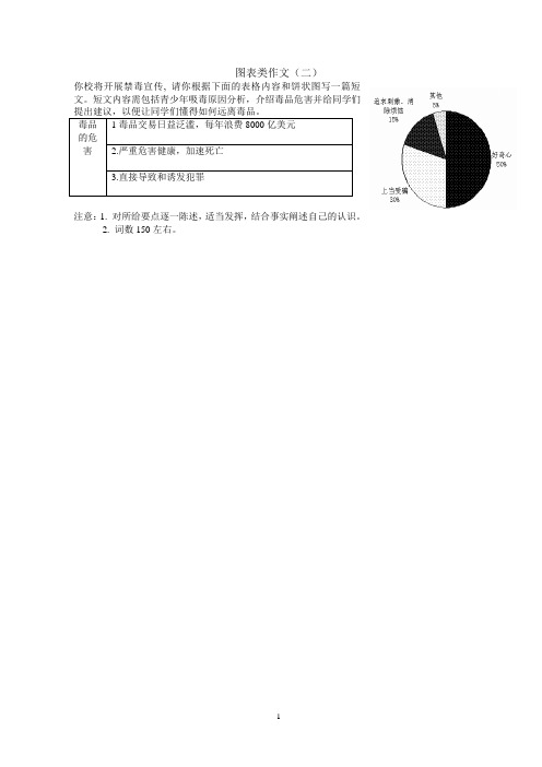
图表类作文(二)你校将开展禁毒宣传, 请你根据下面的表格内容和饼状图写一篇短文。
短文内容需包括青少年吸毒原因分析,介绍毒品危害并给同学们毒品的危害1毒品交易日益泛滥,每年浪费8000亿美元2.严重危害健康,加速死亡3.直接导致和诱发犯罪注意:1. 对所给要点逐一陈述,适当发挥,结合事实阐述自己的认识。
2. 词数150左右。
_____________________________________________________________________________________ _____________________________________________________________________________________ _____________________________________________________________________________________ _____________________________________________________________________________________ _____________________________________________________________________________________ _____________________________________________________________________________________ _____________________________________________________________________________________ _____________________________________________________________________________________ _____________________________________________________________________________________ _____________________________________________________________________________________ _____________________________________________________________________________________ _____________________________________________________________________________________ _____________________________________________________________________________________ _____________________________________________________________________________________ _____________________________________________________________________________________ _____________________________________________________________________________________The trade of drugs is widespread, which costs up to $800 billion every year. As we all know, drugs do great harm to our health, even causing people to die at an early age. Meanwhile, it directly contributes to the happening of crimes. But to our sadness, more and more young people begin taking drugs.As can be seen in the pie chart, 30% of the teenagers taking drugs are cheated into doing it, and 50% are driven by curiosity. Another 15% just seek excitements .The rest try it for some other reasons.In order to protect us students from drugs, what should we do? I think, we should be careful to make friends and stay away from those who always behave badly. Also, it’s very important for us to lead a healthy lifestyle and hold positive attitudes towards life. Do remember that trying drugs out of curiosity is very dangerous.。
- 1、下载文档前请自行甄别文档内容的完整性,平台不提供额外的编辑、内容补充、找答案等附加服务。
- 2、"仅部分预览"的文档,不可在线预览部分如存在完整性等问题,可反馈申请退款(可完整预览的文档不适用该条件!)。
- 3、如文档侵犯您的权益,请联系客服反馈,我们会尽快为您处理(人工客服工作时间:9:00-18:30)。
表复苏:recover, bounce back
e.g:the number of population recovered from 2 million
常用形容词和副词--变化程度 abrupt(ly),sudden(ly),dramatic(ally),drastic(ally),sharp(ly) quick(ly),,rapid(ly),marked(ly),significant(ly) considerable(considerably),substantial(ly),moderate(ly) gradual(ly),slight(ly),enormous(ly), vast(ly)
e.g: the number of population reached the peak at 8 million
最低点:reach the bottom
e.g: After decreasing, the number of population bottomed out at 4 million.
平稳:remain stable ,steady,gradual,stay/remain/maintain/keep/be the same
e.g: the number of population mounted and leveled off at 7 million
the number of population stayed stable at 5 million
图表类作文
图表题的五种类型
table line graph bar chart pie chart process diagram
表格题 线图 柱状图 饼状图 流程图
Note:图表题和议论文最根本的差异就是图表题 是客观性写作而议论文是主观性写作。
常用动词词汇:
上升:increase, rise ,grow, soar,shoot up
e.g: the number of population increased/ ascended/ mounted to(by)…
下降: decrease ,fall ,drop ,descend ,decline ,reduce , plunge
e.g: the number of population decreased /declined to(by)…
b. According to the figure, the number of teachers decreased dramatically from five million in 1960 to (no more than) three million in 1962.
2. 1979年之后,牛肉和羊肉的消费状况分别急剧下降到大约100和55 斤。
一、如何描述数据的上升或下降
一般来说,有两种句式表达数据的上升或下降。
a. 描述对象+表示增长或减少的动词+程度副词+数据+时间 点
b. There was a + 表示程度的形容词+表示增长或减少的名 词+数据+时间点
Example:
a. The birth rate in China increased steadily from about 10 percent in 1920 to just over 15 percent in 1935, followed by a sharp decline to nearly 5 percent in 1940.
b. There was a steady increase in the birth rate in China from about 10 percent in 1920 to just over 15 percent in 1935,followed by a sharp decline to nearly 5 percent in 1940.
句子演练:
1.根据图表中的数据,教师的人数从1960年的500万急剧下滑到1962 年300万。
a. According to the figure, there was a sharp decrease in the number of teachers from five million in 1960 to three million in 1962.
波动:fluctuate ,rise and falls up and down
e.g:the number of population fluctuated between 2 and 10 million
最高点:reach the peak, reach the highest point, reach the zenith
图表时间的表达: 1.in + 月/年 2.between… and… 3. from… to… 4. over the period from…to… 5. in the year between … and… 6.in the 3 years spanning from 2001 through 2004 7.for the first 3 months 8.for/during/over the next/ following 6 months 9.for/during/over/in the of 4 months 10.for/during/over/in a 4-month period 11.over/for/during the same period 12.from then on/ from this time/ point onwards/since then 13.by the year of… 14. after/before+年/月