图表类英语作文范文

合集下载

初中英语作文图表类模板及范文

初中英语作文图表类模板及范文

初中英语作文图表类模板及范文In the realm of English essay writing for junior high students, the chart and graph essay genre poses a unique challenge. This type of essay requires students to analyze and interpret data presented visually, translate it into meaningful insights, and then communicate these insights clearly and coherently. To assist students in this endeavor, a template and sample essay are provided below.**Template for Chart/Graph Essay**1. **Introduction**:* Briefly introduce the chart/graph and its purpose.* State the main trend or observation. 2. **Body Paragraph 1**:* Describe the data related to the first key aspect of the chart/graph. * Analyze the reasons behind the trend or observation. * Discuss the significance or implicationsof this trend. 3. **Body Paragraph 2**:* Describe the data related to the second key aspect of the chart/graph. * Analyze the reasons behind the trend orobservation. * Discuss the significance or implications of this trend. 4. **Conclusion**:* Summarize the main trends and observations. * Provide a closing thought or recommendation based on the analysis.**Sample Essay****Title**: Interpreting Trends in Teenage Sleep Habits In the chart below, we see a comparison of average sleep hours among teenagers in different countries. The chart reveals a concerning trend: the majority of teenagers in these countries are not getting enough sleep.In the United States, the average teenager sleeps just over 7 hours per night, which is below the recommended 8-10 hours. This could be due to various factors, such as late-night social media use, academic pressure, or extracurricular activities. The lack of sufficient sleep among American teenagers could have serious implicationsfor their health and academic performance.In contrast, teenagers in China sleep an average of over 8 hours per night. This could be attributed tocultural differences in sleep habits or the relatively lighter academic workload compared to their peers in the United States. The higher sleep hours among Chinese teenagers might explain their better performance in international academic competitions.Overall, the chart highlights the need for a global effort to improve sleep habits among teenagers. Parents, educators, and policymakers should work together to create an environment that encourages healthy sleep patterns. For example, schools could implement earlier start times and provide more breaks during the day to encourage better sleep habits among students. Additionally, parents can set limits on screen time before bedtime and ensure a quiet and comfortable sleep environment for their children. By prioritizing sleep, we can help teenagers achieve theirfull potential both academically and physically.**解析**:这篇图表类英语作文围绕“青少年睡眠习惯的趋势”展开。

图表型英语作文模板
图表型英语作文模板

图表型英语作文模板篇一:英语作文图表类提纲类作文写作模板第一部分、写作模板——图表式作文It is obvious in the graphic/table that the rate/number/amount of Y has undergone dramatic changes. It has gone up/grown/fallen/dropped considerably in recent years (as X varies). At the point of X1, Y reaches its peak of …(多少).What is the reason for this change? Mainly there are …(多少) reasons behind the situation reflected in the graphic/table. First of all, …(第一个原因). More importantly, …(第二个原因). Most important of all, …(第三个原因).From the above discussions, we have enough reason to predict what will happen in the near future. The trend described in the graphic/table will continue for quite a long time (if necessary measures are not taken括号里的使用于那些不太好的变化趋势).第二部分、写作模板——提纲式作文一、说明原因型模块(一)Nowadays , there are more and more XX in some big cities . It is estimated that ( 1 ). Why have there been so many XX ? Maybe thereasons can be listed as follows.The first one is that ( 2 ) .Besides, ( 3 ) . The third reason is ( 4 ). To sum up , the main cause of XX is due to ( 5 ) .It is high time that something were done upon it. For one thing , ( 6 ). On the other hand , ( 7 ). All these measures will certainly reduce the number of XX .注释:(1)用具体数据说明XX现象;(2)原因一;(3)原因二;(4)原因三(5)指出主要原因;(6)解决建议一;(7)解决建议二。

2022年英语二图表作文

2022年英语二图表作文

2022年英语二图表作文英文回答:In the diagram, the percentages of vehicles sold in three major categories (A, B, and C) in a particular country are depicted for the years 2018 and 2022. It is evident that while category A sales experienced a significant decline, category B and C sales witnessed a surge in their market shares.In 2018, category A vehicles held the largest market share, accounting for approximately 45%. However, by 2022, this share had plummeted to a mere 20%, indicating a notable drop of 25 percentage points. Conversely, category B witnessed a substantial increase from 30% to 45%, representing a 15 percentage point gain. Category C, which initially held the smallest market share at 25%, saw a remarkable boost to 35% in 2022, marking a 10 percentage point increase.Several factors could potentially explain these shifts in market shares. Changing consumer preferences and advancements in technology may have influenced the decline in category A sales. Meanwhile, the growing demand for eco-friendly and fuel-efficient vehicles could have contributed to the rise in popularity of category B and C vehicles. Furthermore, changing economic conditions and government incentives may also have played a role in shaping these trends.中文回答:该图表描绘了一个特定国家在 2018 年和 2022 年三个主要类别(A、B 和 C)的汽车销量百分比。

英语图表作文精选10篇
英语图表作文精选10篇

英语图表作文精选10篇四级英语作文图表类篇一图片模板:It seems to me that the cartoon / drawing issending a message about ____________(图画内容),which reveals ____________(稍作评价).In myperspective of view, ____________ (表明个人观点)。

Apparently, ____________(将个人观点和图片内容相结合,得出观点。

)For one thing, ____________(从社会角度论证).For another thing, ____________(从个人角度说明).For example, ____________(自己、朋友或他人,只要自己知道或听过的例子).Last but not least, ____________(从反面角度谈论).Asa result, the drawer of the illustration is urging us to _____________(建议或措施).Only inthis way can we ____________(展望结果).In conclusion / To my understanding, ____________(再次表明观点或态度).We should____________(进一步说明个人的观点).图表模板:According to the bar chart / pie chart / line graph displays the changes in the numberof____________(图表整体趋势).There was an increase in ____________(图表细节).At the point of ____________, ____________reaches its peak value of ____________(数据或变化).What has caused these changes? There are mainly three reasons.Firstly, ____________ (原因一).Secondly, ____________(原因二).The number of ____________ increased overthe period.____________ rose by _________ from ________ to ________________.Andthere were____________.Finally, ____________(最后一个原因).In conclusion / We can safely draw the conclusion that ____________(结论).Therefore, ____________(进一步谈论更多个人想法).英语四级图表类作文篇二In the morning, the clear sky, father-in-law of the sun was inlaid with a golden halo. A group of happy little magpies chirped in the branches, as if holding a singing contest, very lively!Noon is the hottest time of the day. The sun gave out a blazing light, as if to roast the earth. There was no one in the street. Everyone hid in the house to blow the air conditioner, for fear that they would be cooked outside. At this time, the little magpie on the tree also became quiet, they all hide in the deep leaves of the nap. Only the indefatigable cicada was still shouting “hot, hot.。

图表英语作文中国每千户家庭拥有的汽车数量

图表英语作文中国每千户家庭拥有的汽车数量

图表英语作文中国每千户家庭拥有的汽车数量Directions:Write an essay based on the following chart in your writing,you should1)interpret the chart,and2)give your commentsYou should write about150words.中国每千户家庭拥有汽车数量参考范文:The figures in the above column chart indicate the stable increase of private cars from1980to2010.As is shown in the chart,there were five families in every thousand possessing a private car in1980.During the next thirty years,the number was rising all the time.Itwent up to40in2000,and in2010,there were70 private cars in every1,000families.There are a good many factors for this increasing tendency and the main reasons could be concluded as follows.To begin with,with the speedy development of economy and the increase in people’s income,a large number of families could afford the car.In addition,a great many Chinese cities such as Beijing and Shanghai are being extended with high speed and many people’s houses are far from their work places. To them,owning a private car could save time and bring a lot of conveniences.Finally,with the development of the high way,the transportation is greatly improved,which creates the fine condition for the drivers,encouraging a lot of people to buy a car belonged to his or her own.From the discussion above,we can conclude that families in mounting numbers will own private cars,and a private car will become a common household transportation tool,just like the bicycle today.参考译文上述图表中的数字显示了从1980年到2010年私家车的增长情况。

图表类英语作文范文
图表类英语作文范文

图表类英语作文范文图表类型的英语写作如果不擅于观察漫画的话,作文写出来可能会偏题。

下面是小编给大家带来图表类英语作文,供大家参阅!图表类英语作文范文篇1第一段:说明图表开篇句:As the bar chart shows, ____ during the years of ____to____.扩展句:1、As early as _____.2、Then _____ years later, ____.3、And arriving in the year ____, ____.第二段:解释图表变化原因主题句:Several factors contribute to _____.扩展句:1、______. (原因1)2、And ______.(原因2)3、Furthermore, ______ (原因3)4、All these result in ____.第三段:提出解决办法结尾句:However, ____ is faced with some problems.扩展句:1、With _____, ____, the effect of which is not only discouraging, but also challenging.2、So my principle is to pay due attention to ___, but notjustto____.示范第一段:说明图表开篇句:As the bar chart shows, the number of people below the poverty line decreased dramatically during the years of 1978 to1997.扩展句:1、As early as 1978, about 250 million people were under the poverty line.2、Then seven years later, the number became three fifths thatof1978.3、And arriving in the year 1997, the number was reduced to50millions.第二段:解释图表变化原因主题句:Several factors contribute to the sharp decrease of the below-poverty population.扩展句:1、The reform and opening following 1978 enabled the peasants to become much better off. (原因1)2、And with the development of Chinese economy, that policy also improved city dwellers lives greatly. (原因2)3、Furthermore, the high-tech introduced made it possible for the countrys economy as a whole to take off. (原因3)4、All these result in the great fall of theChinesepopulationbelow the poverty line.第三段:提出解决办法结尾句:However, a further decrease in the number of poverty-stricken people is faced with some problems.扩展句:1、With quite few employees being laid off, the effect of which is not only discouraging, but also challenging.2、So my principle is to pay due attention to the newcomers, but not just to care for the poor, say, in remote mountain areas.范文As the bar chart shows, the number of people below the poverty line decreased dramatically during the years of 1978 to 1997. Asearly as 1978, about 250 million people were under the poverty line.Then seven years later, the number became three fifths that of 1978.And arriving in the year 1997, the number was reduced to 50 millions.Several factors contribute to the sharp decrease of the below-poverty population. The reform and opening following 1978 enabled the peasants to become much better off. And with the development of Chinese economy, that policy also improved city dwellers lives greatly. Furthermore, the high-tech introduced made it possible for the countryseconomy as a whole to take off. All these result in the great fall of the Chinese population below the poverty line.However, a further decrease in the number of poverty-stricken people is faced with some problems. With quite few employees being laid off, the effect of which is not only discouraging, but also challenging. So my principle is to pay due attention to the newcomers, but not just to care for the poor, say, in remote mountain areas.图表类英语作文范文篇2The past years have witnessed a mounting number of Chinese scholars returning from overseas. As is lively illustrated by the column chart, the number of returnees climbed from a mere 69.3 thousand in 2008 to over 272.9 thousand in 2012, at an annual increase rate of around 50%.A multitude of factors may have led to the tendency revealed by the chart, but the following are the critical ones from my perspective. First and foremost, along with the development of Chinese economy and society, the number of Chinese studying abroad has been soaring in the past years, which has provided an expanding base for the number of returnees. In the second place, the government has enacted a series of preferential policies to attract overseas Chinesescholars back home. Last but not least, the booming economy, science and technology in this country have generated more attative job opportunites for scholars returning from overseas.The waves of returnees will definitely contribute to this nation’s development, since they have brought back not only advanced science and technology but also pioneering concepts of education and management. With more scholars coming back from overseas, and with the concerted efforts of the whole nation, we have reasons to expect a faster rejuvenation of this country.图表类英语作文范文篇3一、图表类型基本单词图表类型:table(表格)、chart(图表)、diagram(图标)、graph(多指曲线图)、column chart(柱状图)、pie graph(饼图)、tree diagram(树形图)、饼图:pie chart、直方图或柱形图:bar chart/histogram、趋势曲线图:line chart/curve diagram、表格图:table、流程图或过程图:flow chart/sequence diagram、程序图:processing/procedures diagram二、图表描述基本词语1、描述:show、describe、illustrate、can be seen from、clear、apparent、reveal、represent2、内容:figure、statistic、number、percentage、proportion三、常用的描述句型The table/chart diagram/graph shows (that)According to the table/chart diagram/graphAs (is) shown in the table/chart diagram/graphAs can be seen from the table/chart/diagram/graph/figures,figures/statistics shows (that)……It can be seen from the figures/statisticsWe can see from the figures/statisticsIt is clear from the figures/statisticsIt is apparent from the figures/statisticstable/chart/diagram/graph figures (that) ……table/chart/diagram/graph shows/describes/illustrates看过图表类英语范文的人还。

作文范文之雅思图表类英语作文模板
作文范文之雅思图表类英语作文模板

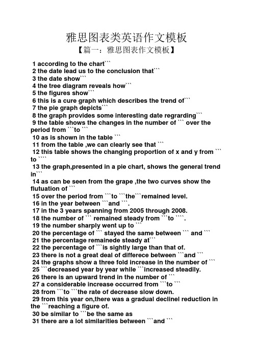
雅思图表类英语作文模板【篇一:雅思图表作文模板】1 according to the chart```2 the date lead us to the conclusion that```3 the date show```4 the tree diagram reveals how```5 the figures show```6 this is a cure graph which describes the trend of```7 the pie graph depicts```8 the graph provides some interesting date regrarding```9 the table shows the changes in the number of ``` over the period from ```to ```10 as is shown in the table ```11 from the table ,we can clearly see that ```12 this table shows the changing proportion of x and y from ``` to ````13 the graph,presented in a pie chart, shows the general trend in```14 as can be seen from the grape ,the two curves show the flutuation of ```15 over the period from ```to ```the```remained level.16 in the year between ```and ```.17 in the 3 years spanning from 2005 through 2008.18 the number of ``` remained steady from ```to ````.19 the number sharply went up to ```20 the percentage of ``` stayed the same between ``` and ```21 the percentage remainede steady at```22 the percentage of ```is sightly large than that of.23 there is not a great deal of differece between ```and ```24 the graphs show a three fold increase in the number of ```25 ```decreased year by year while ```increased steadily.26 there is an upward trend in the number of ```27 a considerable increase occurred from ```to ```28 from ```to ```the rate of decrease slow down.29 from this year on,there was a gradual declinel reduction in the ```reaching a figure of.30 be similar to ```be the same as31 there are a lot similarities between ```and ```32 the difference between x and y lies in ``para 1,两句话:第一句:this is a _____chart, which demonstrates the number of_____ from ____ to____. 如果两个图,则:there are two charts below. the _____ chart describes the number of_____, and the _____ chart illustrates the figure of ____. 第二句:(所有题目适用),from thechart we can see that the number of ______ variesconstantly/greatly in _____. )para 2, as we can see from the chart,/or it is clear from thechart that ____. 如果有两个图:则:the _____ chart shows that ______./or as we can see from the first chart, _______para 3, (如果两个图的话,) it is clear from the second chartthat ?para 4 结尾:from the figures/statistics above, we cansee/conclude/draw a conclusion that ?the bar chart indicates the current situation of the amount of money spent on fastfoods according to different income classes in britain.for those who belong to the high-income class, hamburgerhas been shown to beperson per week. by contrast fish and chips remain at a rather low level of about 16pence per person per week, and pizza, though attracts more expenses, accounts for 19pence per person per week, merely 3 pence more than that of fish and chips.as expected, low-income class spend much less in all 3 categories than high-incomeclass, with fish and chips at the top of the list at 15 pence per capital per week, andpizza at the bottom at a weekly expense of 8 pence per capital. the average income group resembles high-income class in hamburger consumptionat the largest amount of 33 per person every week, and low-income class in pizzaconsumption at the smallest amount of 11 per person every week, but amazingly, fishand chips consumed by this group leads all classes at a weekly expense of 25 penceper person.in conclusion, hamburgers, in general gain more welcome than other types of fastfood.para1. this is a table / chart / (line线状 bar柱状 pie饼状)graph which demonstrate / illustrate /reveal /depict /privide information about.............para2.(1)obvious /apparent from the graph is that ...rank thefirst/highest,while/whereas ....turn out tobe the lowest(2)it is exhibited/shown in the table that.....(3)it can be seen from the table that.....para3.(1)饼.柱图 a,which accounts for...%,ranks the first;then next is b with...%;followed byc,constituting...%;finally it comes d.e.fat...%...%and...%respectively(2)特殊变化(不变,增长或下降多的)(3)①it is worth mentioning that.... ②it must be pointed out that.... ③morestriking/suprising is that.... para4.to conclude /inconclusion/overall1. 最明显的原因__,因此___the most obvious reason for this phenomenon is that_____consequently, ____.2. 无论你喜欢与否,_____已经变得越来越流行,这是有原因的no matter you like it or not, aaa has become more and more popular and there are many reasonfor it.3. 对我们来说,改变这个不利的环境____是非常紧急的it’s an urgent task for us to change this unfavorable situation: ____.4. 这个图片会让你想起一些奇怪的东西,这种现象还是会继续存在这个社会the picture can reminds you of some strange, yet familiar phenomena existing in our society.5. 提供了大量的解决方案,一些人建议___,另一些人建议___a great number of solutions are being offered. some people suggest that ____. others argue that .6. 对于____,我们应该____confronted with aaa, we should take a serious of effective measures to cope with thesituation.7. 然而,___引起了许多为问题,however____ may cause some problems. first, it is__second, __. finally, ____. so, it is clear that__has its advantages and disadvantages.8. 虽然_____有一个__的非常大的好处,但是它不能完全__在__方面although _____ has a great advantage of _____, it cant compete with ____ in ____.9. _____也许更喜欢_____,但是_____忍受_____的不利之出_____may be preferable to ____, but it suffers from the disadvantages that___.10. _____的有利之处比____的有利之处要多,举例说明,_____the advantages of ______are much greater that thoseof____.for instance, ___.11.but i don’t think it is a very good way to solve ___. for instance, _____.worst of all,______.12.there are many ways to ______. first, _____. second, _____. third, ___.13.on the contrary, there are some people in favor of _____.14.they believe___. moreover, they think____. there are several measures for us to adopt. first,we can____, there are a number of advantages of ____. another solution is to _____.15.it is high time that something was done about it. for example,_____. in addition,_____. all these measures will certainly _.16. there are some other people, who______. their reasons are different, something for _____,sometimes for____, and sometimes simply for _____.17._____ is necessary and important to our country’s development and construction. first, ____.what’s more, ___. most important of all,___.18.however, if not managed properly, ____ can create many problems.sometimes ____.furthermore,_. therefore, ___ has been gaining public concern.19.有很多原因____,①there are probably many reasons for ____. first, ____.②second, ____. finally, ___.there are, i think, two main reasons for __. in the first place, ___. in the second place, __. therefore,③well, why is there ____? i think there might be two reasons. one is ___, and the other is _____.④why___? for one thing, ____. for another,____. perhaps the main reason is ___.⑤why_____? the first reason is that___. the second reason is ___. the third is__. for all this,the main cause of_____ is due to ____.20.it is no easy job to find the reasons for this tendency which involves several complicated factors. for some ___. for others ____.21. “why do _____?” many people often ask questions like this.22. in recent years, there is a general tendency to ___. according to a study, there is__. comparedwith __ last year. why _____?23.according to a survey, there is a growing number of ___. what brings this result? the mainreason rests with.24.①some people prefer to ___. in their opinion, ____. in addition, ____. nevertheless,nowadays, __ has become more and more common.②many people are inclined to____. in their opinion, ___.they believe that ___.25. today, there __, which have brought a lot of harms in our daily life. first, __ second, ____. what makes things worse is that ___.26.nowadays, ___ has become a problem we have to face. though it’s easier said than done, with the help of modern technology, we now have many means to solve it.27. 对于这个图,说明了_①the graph shows the general trend in _______.②according to the figures/numbers/statistics/percentages in the table/chart/bar graph/line graph, it can be seen that ___. obviously, ____, but why?③the figure indicates/shows/suggests/proves that___. there isa steady/rapid development/trend of _.④from the graph/chart, we know the statistics of __ and _. it can be seen easily that ___.⑤according to the two graphs presented, it can be observed that ___ in the left graph, __. at the same time, _ as the right graph shows.28. 现在我们经常听到_____,但是真的如此吗?①these days we are often told that ____. but is it true?②these days we often hear about ___. but is this really the case?29. 一位著名的作家曾经说过_____one of the great writers once said that _. now it still has a realistic significance.30. 回看历史,______的想法从来都没流行过,一方面_____另一方面______in our history, the idea that ____ never has been so popular. on one hand, ___, on the other hand,31. 人们中有许多像____不同的意见,一些人认为_______there are different opinions among people as to ____. some people suggest that __.32. 一些人认为__对_______来说在许多方面都是好的,然而,其他人不同意some people hold the opinion that _ is superior to __ in many ways: others, however, disagree with it.33. 现在虽然越来越多的人___,但仍有一些__的人,他们也许认为_____nowadays although more and more people __, still there are some who think __, they may think【篇二:雅思图表作文模板20篇下载】智课网ielts备考资料雅思图表作文模板20篇下载摘要:雅思图表作文模板20篇下载。

英语作文图表类 范文

英语作文图表类 范文

英语作文图表类范文Here is an essay on the given topic of "English Essay Sample with Graphs and Tables" with more than 1000 words, written entirely in English without any additional punctuation marks.Effective Communication through Graphical RepresentationsIn the realm of academic and professional writing, the seamless integration of textual information and graphical elements has become an essential skill. Graphical representations, such as charts, tables, and diagrams, possess the remarkable ability to convey complex data and ideas in a concise and visually appealing manner. By strategically incorporating these visual aids, writers can enhance the clarity, comprehension, and overall impact of their written work.One of the primary advantages of using graphical representations is their ability to organize and present data in a structured and readily understandable format. Tables, for instance, excel at displaying numerical information or categorical data in a clear and systematic manner. They allow readers to quickly compare and contrast different values or characteristics, enabling them to identify patterns, trends, and relationships that may not be immediately apparent in apurely textual format.Similarly, charts and graphs offer a powerful means of visualizing quantitative data. Bar graphs, line charts, and scatter plots can effectively illustrate trends, distributions, and correlations, making complex information more accessible and digestible for the reader. These visual tools can often convey the essence of a dataset more effectively than a dense paragraph of text, allowing the audience to grasp the key insights at a glance.Beyond numerical data, graphical representations can also be employed to simplify and clarify conceptual information. Flowcharts, for example, can be used to map out step-by-step processes or decision-making frameworks, providing a clear and logical flow of information. Venn diagrams, on the other hand, can be instrumental in demonstrating the relationships and overlaps between different concepts or categories.The strategic placement of graphical elements within a written work can also serve to enhance the overall organization and readability of the text. By positioning relevant charts, tables, or diagrams alongside the corresponding textual explanations, writers can create a seamless integration of visual and verbal content, guiding the reader through the information in a logical and intuitive manner.Moreover, the use of graphical representations can help to break up the monotony of dense textual passages, making the written work more visually appealing and engaging for the reader. Carefully selected and well-integrated graphics can serve as visual anchors, directing the reader's attention and aiding in the retention of key information.However, the effective incorporation of graphical elements in writing is not without its challenges. Writers must ensure that the chosen graphics are truly relevant and add value to the content, rather than serving as mere decorative elements. Additionally, it is crucial to maintain consistency in the style, formatting, and labeling of the graphical representations, as this can significantly impact the overall coherence and professionalism of the written work.Furthermore, writers must be mindful of the accessibility considerations when incorporating graphical elements. Ensuring that the graphics are legible, appropriately sized, and accompanied by clear captions or textual descriptions can make the information accessible to a wider range of readers, including those with visual impairments or other accessibility needs.In conclusion, the strategic use of graphical representations in writing can be a powerful tool for enhancing communication and comprehension. By skillfully integrating charts, tables, and othervisual aids, writers can effectively convey complex information, highlight key insights, and engage their audience in a more meaningful and impactful way. As the demand for clear and visually appealing communication continues to grow, the ability to effectively leverage graphical elements in written work will become an increasingly valuable and sought-after skill.。

图表类英语作文范文中考

图表类英语作文范文中考

图表类英语作文范文中考Graph-based English essays often appear in middle school examinations. These essays require students to analyze a given graph and present their findings in a coherent and structured manner. To write a high-scoring graph-based essay, students must follow specific steps, including understanding the graph, identifying key information, and presenting their analysis clearly and logically.The first step in writing a graph-based essay is to thoroughly understand the graph provided. This involves identifying the type of graph (bar graph, line graph, pie chart, etc.), the variables represented, and the time frame or context of the data. For instance, if the graph shows the annual sales of different products over five years, students should note the products, the years, and any trends or patterns in the sales data.Once the graph is understood, the next step is to identify the key pieces of information that need to be highlighted in the essay. This includes:Trends and Patterns: Are there any noticeable trends over time? For example, is there a product whose sales have consistently increased or decreased?Comparisons: How do different variables compare to each other? For example, which product had the highest sales in a particular year?Significant Changes: Are there any significant changes or anomalies in the data? For example, a sudden spike or drop in sales for a particular product.By focusing on these elements, students can ensure that their essay covers the most important aspects of the graph.A well-structured essay is crucial for clear communication.A typical structure for a graph-based essay includes an introduction, body paragraphs, and a conclusion.The introduction should provide a brief overview of the graph, mentioning its type, the variables represented, and the overall context. For example:“In the graph provided, we observe the annual sales data of three different products—Product A, Product B, and Product C—over a period of five years from 2015 to 2020. This bar graph provides insights into the sales trends and patterns of these products during this time frame.”The body paragraphs should delve into the details of the graph. Each paragraph can focus on a specific aspect, such as overall trends, detailed comparisons, and significant changes.Paragraph 1: Overall Trends“In examining the overall trends, it is evident that Product A’s sales have shown a steady increase from 2015 to 2020. Starting at 100 units in 2015, the sales gradually rose to 250 units by 2020. In contrast, Product B experienced fluctuating sales, with a peak in 2017 at 200 units, followed by a decline to 150 units in 2020. Product C maintained relatively stable sales, hovering around the 180-unit mark throughout the five years.”Paragraph 2: Detailed Comparisons“When c omparing the products, it is clear that Product A outperformed the others in terms of growth rate. By 2020, Product A not only had the highest sales but also exhibited the most consistent upward trend. Product B’s sales, while initially strong, did not sustain the growth seen in Product A, showing a downward trajectory after 2017. Meanwhile, Product C’s sales, despite being stable, did not match the growth momentum of Product A, indicating a different market performance.”Paragraph 3: Significant Changes“O ne significant change observed in the graph is the sharp increase in Product A’s sales between 2018 and 2019, where the units sold jumped from 180 to 230. This could be attributed to factors such as a new marketing strategy or an improvement in product fea tures. Conversely, Product B’s decline post-2017 suggests potential issues like market saturation or increased competition. These changes highlight the dynamic nature of the market for these products.”The conclusion should summarize the key points discussed and provide a final insight or opinion. For example:“In conclusion, the graph highlights distinct sales patterns for the three products over the five-year period. Product A’s steady growth and eventual market dominance contrast sharply with Product B’s fluctuating sales and decline. Product C’s stable performance suggests a consistent market presence but lacks the growth seen in Product A. These insights underscorethe importance of analyzing market trends to understand product performance and inform s trategic decisions.”To enhance clarity and coherence, students should use transitional phrases to connect their ideas smoothly. Phrases such as “in contrast,” “similarly,” “for example,” and “as a result” help guide the reader through the essay. Additionally, maintaining a formal tone and avoiding colloquial language ensures that the essay meets academic standards.Like any skill, writing graph-based essays improves with practice. Students should regularly practice analyzing different types of graphs and writing essays based on them. Seeking feedback from teachers and peers can provide valuable insights and help identify areas for improvement.Writing a high-scoring graph-based essay involves understanding the graph, identifying key information, andpresenting the analysis clearly and logically. By following a structured approach and practicing regularly, students can develop the skills needed to excel in this type of essay. With careful attention to detail and a focus on clear communication, they can effectively convey their understanding of the data and achieve success in their middle school examinations.。

图表类英语作文范文

图表类英语作文范文

图表类英语作文范文As we all know, English writing is an important part of English learning. In English writing, using charts and graphs can make the content more intuitive and vivid, and also help readers understand the information more easily. Therefore, mastering the skills of writing chart-based English compositions is of great significance. In this article, we will take a look at some sample chart-based English compositions and analyze their writing techniques.Sample 1: The chart above shows the changes in the number of tourists visiting a certain city from 2015 to 2020. As can be seen from the chart, the number of tourists has been steadily increasing over the past six years. In 2015, the city welcomed around 2 million tourists, and this number has risen to 3.5 million in 2020. The main reason for this growth is the improvement of the city's tourism infrastructure, as well as the increase in publicity and promotion efforts. In addition, the city's unique culture and beautiful scenery have also contributed to its popularity among tourists.Sample 2: The pie chart above illustrates the distribution of students' after-school activities. It can be observed that the majority of students, accounting for 40%, choose to participate in sports activities after school. This is followed by 30% of students who prefer to engage in artistic activities such as painting and music. 20% of students spend their time on academic enrichment, while the remaining 10% of students choose to relax at home. This chart reflects the diverse interests and hobbies of students, and also indicates the importance of providing a variety of after-school activity options for students.Sample 3: The bar graph above presents the survey results of students' favorite subjects. According to the graph, English is the most favored subject among students, with 35% of the surveyed students choosing it as their favorite. This is followed by Mathematics, which is favored by 25% of students. Science and History are equally popular, each favored by 20% of students. The least favored subject is Geography, with only 10% of students showing interest in it. This chart not only reflects students'preferences for different subjects, but also provides valuable information for educators to better understand students' learning interests and needs.In conclusion, using charts and graphs in English writing can effectively enhance the expression of information and make the content more vivid and intuitive. Through the analysis of the above sample chart-based English compositions, we can learn various writing techniques and skills, such as accurately describing the data, making comparisons, and drawing conclusions. Therefore, it is essential for English learners to practice writing chart-based compositions in order to improve their English writing abilities.。

图表作文英语作文范文

图表作文英语作文范文

图表作文英语作文范文Title: The Significance of Graphs and Charts in Academic Writing。

In the realm of academic writing, graphs and charts play a pivotal role in conveying complex information succinctly and effectively. They serve as powerful visual aids that enhance understanding and facilitate clearer communication of data. In this essay, we will explore the significance of graphs and charts in academic writing and examine their various applications across different disciplines.To begin with, graphs and charts offer a visual representation of data that is often more accessible and easier to comprehend than raw numbers or text alone. Whether it's presenting statistical findings, illustrating trends over time, or comparing different variables, graphs and charts provide a clear and concise summary of information. For instance, a line graph can effectivelydemonstrate changes in temperature over the course of several decades, while a bar chart can illustrate the distribution of wealth among different socioeconomic groups.Moreover, graphs and charts serve to enhance the credibility and persuasiveness of academic arguments by providing empirical evidence to support claims. Whenreaders encounter visual representations of data, they are more likely to perceive the information as credible and trustworthy. This is particularly important in fields such as science, where empirical evidence forms the basis of scholarly inquiry. By including graphs and charts in academic writing, researchers can bolster their arguments and strengthen the validity of their findings.Furthermore, graphs and charts facilitate the interpretation of complex data sets by highlighting key patterns and relationships. Rather than sifting through pages of numerical data, readers can quickly grasp the main points by examining visual representations. This is especially beneficial for audiences who may not have a strong background in statistics or data analysis. Bypresenting information in a visually appealing format, graphs and charts make academic writing more accessible to a wider audience.In addition, graphs and charts enable researchers to communicate their findings more efficiently, saving time and effort for both authors and readers. Instead of relying solely on lengthy descriptions or explanations, scholars can convey information more succinctly through visual representations. This not only streamlines the writing process but also facilitates faster comprehension for readers. In an era where attention spans are increasingly limited, the use of graphs and charts can help to retain audience engagement and interest.It is worth noting that different types of graphs and charts are suited to different types of data and analytical purposes. For instance, pie charts are ideal forillustrating proportions or percentages, while scatterplots are useful for displaying correlations between variables. By selecting the appropriate type of graph or chart for their data, researchers can ensure that theirvisual representations are clear, accurate, and informative.In conclusion, graphs and charts are indispensabletools in academic writing, serving to enhance comprehension, credibility, and efficiency. By providing visual representations of data, they offer a clearer and more concise summary of information, making complex conceptsmore accessible to readers. Moreover, graphs and charts strengthen the persuasiveness of academic arguments by providing empirical evidence to support claims. As such, researchers across various disciplines should utilizegraphs and charts effectively to communicate their findings and advance scholarly knowledge.。

高考英语图画型作文写作技巧及范文

高考英语图画型作文写作技巧及范文

高考英语图画型作文写作技巧及范文导语:图画型作文更能考察学生的分析问题的才能,因此深受命题者的青睐。

考生应注意认真审题,一旦审题有所偏颇,不容易得到高分。

此类作文首先要描绘图画,然后对图画进展适当的阐释(解释、说明和分析),介绍图画背后所反映的问题,最后联络实际发表自己的观点,给出自己的建议、原因等等,一般写三段。

以下是为大家精心的英语图画型作文写作技巧及范文,欢迎大家参考!1、As can be seen from the chart, …;From thechart/picture /table we can see(The chart shows) that ..;As is vividly shown in the picture( 假设两个的话用pictures,也可以用drawing,同样的假设两个的话用drawings,假设是图表那么用table ,两个图表那么用 table s) above, 图画的内容。

The picture( 假设两个的话用pictures,也可以用drawing,同样的假设两个的话用drawings,假设是图表那么用table ,两个图表那么用 table s) tells ( 注意,假设是前面的图画是复数,那么用tell) us that 这个图片的大致反映的意思。

2、 Recent years people in 地名(比方中国、北京、美国等等) have witnessed the fact that 描绘图片里的现象,And it is very mon/usual to see that in recent years.1、The implied meaning of the picture(注意,同上进展单复数的处理) should be taken into aount seriously. First/To begin with, 提醒涵义/原因/结果1,Second/What’s more, 提醒涵义/原因/结果2。

图表英语作文范文带翻译

图表英语作文范文带翻译

图表英语作文范文带翻译Title: The Importance of Graphs and Charts in Presenting Information。

Graphs and charts play a crucial role in conveying complex information effectively. In today's data-driven world, they are indispensable tools for analyzing trends, making comparisons, and illustrating relationships. This essay will explore the significance of graphs and charts in presenting information, examining their various types, and discussing their advantages and limitations.To begin with, graphs and charts offer a visual representation of data, which enhances understanding and interpretation. For instance, a line graph can illustrate changes over time, such as fluctuations in stock prices or temperature variations throughout the year. Similarly, a bar chart can depict comparisons between different categories, like sales figures for various products or the population distribution across different regions. Bypresenting data visually, graphs and charts simplify complex information, making it easier for audiences to grasp key insights at a glance.Moreover, graphs and charts facilitate data analysis by highlighting patterns and trends. Through visualizations, researchers and analysts can identify correlations, outliers, and other significant features in the data. For example, a scatter plot can reveal the relationship between two variables, such as the correlation between study hours and exam scores. By plotting data points on a graph, patterns emerge, enabling researchers to draw conclusions and make informed decisions based on evidence.Furthermore, graphs and charts aid in effective communication by presenting information in a clear and concise manner. In presentations or reports, visual aids like pie charts or histograms can convey key findings more compellingly than lengthy text or numerical tables. Visual representations engage audiences and help them absorb information more readily. Additionally, graphs and charts can be customized with colors, labels, and annotations toemphasize important points or differentiate between data sets, enhancing clarity and impact.However, it is essential to acknowledge the limitations of graphs and charts. While they excel at summarizing large datasets and identifying trends, they can also oversimplify complex phenomena. Misleading visualizations, such as distorted scales or truncated axes, can distort the true nature of the data and lead to erroneous conclusions. Therefore, it is crucial to critically evaluate the design and accuracy of graphs and charts to ensure they accurately represent the underlying information.In conclusion, graphs and charts are invaluable tools for presenting information effectively in various fields, from scientific research to business analytics. They offer visual clarity, facilitate data analysis, and enhance communication by simplifying complex concepts. However, it is essential to use them judiciously and critically evaluate their accuracy to avoid misinterpretation. Ultimately, when used appropriately, graphs and charts are powerful instruments for conveying insights and drivinginformed decision-making.标题,图表在呈现信息中的重要性。

六级英语图表类范文

六级英语图表类范文

六级英语图表类范文英文回答:I would like to discuss the chart provided, which illustrates the percentage of people in different age groups who use smartphones in a certain country. The chart is divided into three age groups: 18-25, 26-40, and 41-60. The data shows that the younger age group, 18-25, has the highest percentage of smartphone users, followed by the 26-40 age group, and then the 41-60 age group.Looking at the chart, we can see that 85% of people aged 18-25 use smartphones. This high percentage is not surprising, as younger people tend to be more tech-savvy and rely heavily on smartphones for various activities such as social media, online shopping, and entertainment. For example, I am in the 18-25 age group, and I use my smartphone for almost everything from checking my emails to watching movies on Netflix.Moving on to the 26-40 age group, we can see that 70%of people in this age range use smartphones. While the percentage is lower compared to the younger age group, itis still a significant number. This age group consists of individuals who are likely to be working professionals or parents, and smartphones play a crucial role in their daily lives. For instance, my sister is in this age group, andshe relies on her smartphone for work-related emails, scheduling appointments, and staying connected with her family.Lastly, the chart shows that 50% of people aged 41-60 use smartphones. This percentage is the lowest among the three age groups, which can be attributed to the fact that older individuals may not be as comfortable with technology or may prefer traditional methods of communication. However, it is worth noting that the percentage is still substantial, indicating that smartphones are becoming increasingly prevalent even among older generations. My parents, who are in this age group, have recently started using smartphonesto keep in touch with their friends and grandchildren through messaging apps and social media.In conclusion, the chart clearly demonstrates that the usage of smartphones varies across different age groups. The younger age group has the highest percentage of smartphone users, followed by the middle-aged group, and then the older age group. This trend can be explained by factors such as technological familiarity, lifestyle preferences, and the increasing accessibility of smartphones. It is interesting to see how smartphones have become an integral part of our lives, regardless of age.中文回答:我想讨论一下所提供的图表,该图表显示了某个国家不同年龄段使用智能手机的比例。

英语图表作文模板及范文(通用12篇)

英语图表作文模板及范文(通用12篇)

英语图表作文模板及范文(通用12篇)英语图表作文模板及范文第1篇The table/chart diagram/graph shows (that)According to the table/chart diagram/graphAs (is) shown in the table/chart diagram/graphAs can be seen from the table/chart/diagram/graph/figures,figures/statistics shows (that)……It can be seen from the figures/statisticsWe can see from the figures/statisticsIt is clear from the figures/statisticsIt is apparent from the figures/statisticstable/chart/diagram/graph figures (that) ……table/chart/diagram/graph shows/describes/illustrates图表类英语作文范文The past years have witnessed a mounting number of Chinese scholars returning from overseas. As is lively illustrated by the column chart, the number of returnees climbed from a mere thousand in 2023 to over thousand in 2023, at an annual increase rate of around 50%.A multitude of factors may have led to the tendency revealed by the chart, but the following are the critical ones from my perspective. First and foremost, along with the development of Chinese economy andsociety, the number of Chinese studying abroad has been soaring in the past years, which has provided an expanding base for the number of returnees. In the second place, the government has enacted a series of preferential policies to attract overseas Chinese scholars back home. Last but not least, the booming economy, science and technology in this country have generated more attative job opportunites for scholars returning from overseas.The waves of returnees will definitely contribute to this nation’s development, since they have brought back not only advanced science and technology but also pioneering concepts of education and management. With more scholars coming back from overseas, and with the concerted efforts of the whole nation, we have reasons to expect a faster rejuvenation of this country.更多培训课程:苏州个人提升英语更多学校信息:苏州虎丘区朗阁教育机构咨询电话:英语图表作文模板及范文第2篇Students tend to use computers more and more frequently nowadays. Reading this chart, we can find that the average number of hours a student spends on the computer per week has increased sharply. In 1990, it was less than 2 hours; and in 1995, it increased to almost 4 hours, and in 2000, the number soared to 20 hours.Obviously computers are becoming increasingly popular. There areseveral reasons for this change. First, computers facilitate us in more aspects of life. Also, the fast development of the Internet enlarges our demands for using computers. We can easily contact with friends in remote places through the Internet. Besides, the prices of computers are getting lower and lower, which enables more students to purchase them. However, there still exist some problems, such as poor quality, out-of-date designs and so on. And how to balance the time between using computers and studying is also a serious problem. Anyhow, we will benefit a lot from computers as long as we use them properly.英语图表作文模板及范文第3篇As can be clearly seen from the graph/table/chart (As is shown in the table/figure), great changed have taken place in_______, The_________ have/has skyrocketed/jumped from _____ to _____. When it comes to the reasons for the changes, different people give different explanations. Here I shall just give a begin with, ______What’s more,___________, Last but not least, ________. While it is desirable that ___________, there are still some problems and difficulties for __________ Firstly, __________ ,In addition, __________ ,In a word, __________ .以上就是为大家整理的英语专四图表作文范文模板,希望能够对大家有所帮助。

图表类考研英语作文

图表类考研英语作文

图表类考研英语作文图表类考研英语作文模板在平平淡淡的学习、工作、生活中,大家都经常看到作文的身影吧,作文是通过文字来表达一个主题意义的记叙方法。

相信很多朋友都对写作文感到非常苦恼吧,下面是店铺收集整理的图表类考研英语作文模板,仅供参考,希望能够帮助到大家。

模板The chart gives us an overall picture of the ____________(图表主题). The first thing we notice is that_______________(图表最大特点). This means that as __________, _________________(进一步说明).We can see from the statistics given that _______________(图表细节一). After ving_________(细节一中的.第一个变化), the _____Ved+幅度+时间(紧跟着的变化). The figures also tells us that_________________________(图表细节二). (数据位置,如In the second column), we can see that ____________accounts for _______(进一步描述).Judging from these figures, we can draw the conclusion that___________(结论). The reason for this, as far as I am concerned is that_____________(给出原因). / It is high time that we Ved(发出倡议)范文【1】The merit of foreign investments lies in many aspects. It increases capital investment in our economic construction, speeds up the technical innovation in our enterprises and accelerates our output. In brief, the foreign investment Plays an important m1e in the modernization of our country.外商投资的优点体现在多个方面。

图表英语作文范文

图表英语作文范文

图表英语作文范文In the first chart, we can see a clear upward trend in sales over the past year. This indicates that the company is experiencing growth and increasing demand for its products. It's a positive sign for the business and shows that they are on the right track.Moving on to the second chart, we can observe a slight decrease in profits in the last quarter. This could be due to various factors such as increased costs or a decrease in sales. It's important for the company to analyze this data further and take necessary steps to improve profitability in the coming months.Looking at the third chart, we can see a significant increase in customer satisfaction ratings. This is a great achievement for the company and shows that their efforts to improve customer service are paying off. It's crucial for businesses to prioritize customer satisfaction as it can lead to increased loyalty and repeat business.In the final chart, we see a fluctuating trend in employee turnover rates. This could be a cause for concern as high turnover rates can impact productivity and morale within the company. It's essential for the company to address any issues that may be contributing to this trend and work towards creating a positive work environment for employees.Overall, these charts provide valuable insights into different aspects of the company's performance. It's important for businesses to regularly monitor and analyze such data to make informed decisions and drive growth.。

初二图表类英语作文范文

初二图表类英语作文范文

初二图表类英语作文范文Title: Analyzing the Trend of Junior High Students' Favorite Subjects.In today's educational landscape, understanding the preferences and interests of students is crucial for effective teaching and learning. This article presents an analysis of the favorite subjects among junior high school students based on a survey conducted in a local school. The aim is to gain insights into the subjects that pique the interest of students and identify potential areas for improvement in teaching methods and resources.Methodology.The survey was conducted among 200 junior high school students from grades 7 to 9. A questionnaire wasdistributed to the students, asking them to rank their favorite subjects from a list of ten common subjects taught in junior high schools. The survey also collectedinformation on the students' gender, grade level, and academic performance.Results.The survey revealed some interesting trends in the favorite subjects of junior high school students. Overall, Science subjects such as Physics, Chemistry, and Biology were the most popular among the students. This could be attributed to the hands-on experiments and practical applications of these subjects, which engage the students' curiosity and imagination.Mathematics ranked second in popularity, possibly due to its application in daily life and other subjects. English, on the other hand, was the least favorite subject among the students. This could be due to the perceptionthat English is difficult and boring, or a lack of exposure to interesting and relevant content.When analyzed by gender, a slight difference was observed. Male students tended to prefer subjects likePhysics and Computer Science, while female studentspreferred subjects like Language Arts and Social Studies. This could be influenced by societal expectations andgender roles, or simply a reflection of personal interests and preferences.Grade level also had an impact on the favorite subjects. Students in lower grades tended to prefer subjects thatwere more hands-on and experimental, such as Science and Physical Education. As they progressed to higher grades, they began to appreciate subjects that required more analytical and critical thinking, such as Mathematics and History.Implications.The findings of this survey have several implicationsfor teachers and policymakers. Firstly, it highlights the need to engage students in practical and hands-onactivities in Science subjects to maintain their interest and curiosity. Teachers can incorporate more experimentsand projects into their lessons to make the subject moreappealing and relevant.Secondly, the low popularity of English among students calls for a rethinking of teaching methods. Teachers can explore innovative ways to make English lessons more interactive and engaging, such as through role-playing, storytelling, or using real-world examples. Additionally, providing students with access to interesting and relevant English materials can help them appreciate the subject more.Lastly, the survey reveals that students' preferences and interests evolve as they progress through different grade levels. Teachers need to be flexible and adapt their teaching methods to meet the changing needs and interestsof students. By understanding their preferences and motivations, teachers can create a more engaging and effective learning environment.Conclusion.In conclusion, the analysis of favorite subjects among junior high school students provides valuable insights intotheir interests and preferences. By understanding these trends, teachers can tailor their teaching methods to engage students more effectively and foster a positive learning environment. Policymakers can also use this information to allocate resources and develop policies that promote a more balanced and inclusive education system.。

图表类英语作文范文

图表类英语作文范文

图表类英语作文范文图表类型的英语写作如果不擅于观察漫画的话,作文写出来可能会偏题。

下面是小编给大家带来图表类英语作文,供大家参阅!图表类英语作文范文篇1第一段:说明图表开篇句:As the bar chart shows, ____ during the years of ____to____.扩展句:1、As early as _____.2、Then _____ years later, ____.3、And arriving in the year ____, ____.第二段:解释图表变化原因主题句:Several factors contribute to _____.扩展句:1、______. (原因1)2、And ______.(原因2)3、Furthermore, ______ (原因3)4、All these result in ____.第三段:提出解决办法结尾句:However, ____ is faced with some problems.扩展句:1、With _____, ____, the effect of which is not only discouraging, but also challenging.2、So my principle is to pay due attention to ___, but notjustto____.示范第一段:说明图表开篇句:As the bar chart shows, the number of people below the poverty line decreased dramatically during the years of 1978 to1997.扩展句:1、As early as 1978, about 250 million people were under the poverty line.2、Then seven years later, the number became three fifthsthatof1978.3、And arriving in the year 1997, the number was reducedto50millions.第二段:解释图表变化原因主题句:Several factors contribute to the sharp decrease ofthe below-poverty population.扩展句:1、The reform and opening following 1978 enabledthe peasants to become much better off. (原因1)2、And with the development of Chinese economy, that policy also improved city dwellers lives greatly. (原因2)3、Furthermore, the high-tech introduced made it possiblefor the countrys economy as a whole to take off. (原因3)4、All these result in the great fall of theChinesepopulationbelow the poverty line.第三段:提出解决办法结尾句:However, a further decrease in the number of poverty-stricken people is faced with some problems.扩展句:1、With quite few employees being laid off, the effect of which is not only discouraging, but also challenging.2、So my principle is to pay due attention to the newcomers, but not just to care for the poor, say, in remote mountain areas.范文As the bar chart shows, the number of people below thepoverty line decreased dramatically during the years of 1978to 1997. Asearly as 1978, about 250 million people were underthe poverty line.Then seven years later, the number became three fifths that of 1978.And arriving in the year 1997, the number was reduced to 50 millions.Several factors contribute to the sharp decrease of the below-poverty population. The reform and opening following1978 enabled the peasants to become much better off. And with the development of Chinese economy, that policy also improved city dwellers lives greatly. Furthermore, the high-tech introduced made it possible for the countryseconomy as a whole to take off. All these result in the great fallof the Chinese population below the poverty line.However, a further decrease in the number of poverty-stricken people is faced with some problems. With quite few employees being laid off, the effect of which is notonly discouraging, but also challenging. So my principle is topay due attention to the newcomers, but not just to care forthe poor, say, in remote mountain areas.图表类英语作文范文篇2The past years have witnessed a mounting number of Chinese scholars returning from overseas. As is lively illustrated by the column chart, the number of returnees climbed from a mere 69.3 thousand in 2008 to over 272.9 thousand in 2012, at an annual increase rate of around 50%.A multitude of factors may have led to the tendency revealed by the chart, but the following are the critical ones from my perspective. First and foremost, along with the development of Chinese economy and society, the number ofChinese studying abroad has been soaring in the past years,which has provided an expanding base for the number of returnees. In the second place, the government has enacted aseries of preferential policies to attract overseas Chinesescholars back home. Last but not least, the booming economy, science and technology in this country have generated moreattative job opportunites for scholars returning from overseas.The waves of returnees will definitely contribute to this nation’s development, since they have brought back not only advanced science and technology but also pioneering concepts of education and management. With more scholarscoming back from overseas, and with the concerted efforts ofthe whole nation, we have reasons to expect a faster rejuvenation of this country.图表类英语作文范文篇3一、图表类型基本单词图表类型:table(表格)、chart(图表)、diagram(图标)、graph(多指曲线图)、column chart(柱状图)、pie graph(饼图)、tree diagram(树形图)、饼图:pie chart、直方图或柱形图:bar chart/histogram、趋势曲线图:line chart/curve diagram、表格图:table、流程图或过程图:flow chart/sequence diagram、程序图:processing/procedures diagram二、图表描述基本词语1、描述:show、describe、illustrate、can be seen from、clear、apparent、reveal、represent2、内容:figure、statistic、number、percentage、proportion三、常用的描述句型The table/chart diagram/graph shows (that)According to the table/chart diagram/graphAs (is) shown in the table/chart diagram/graphAs can be seen from the table/chart/diagram/graph/figures,figures/statistics shows (that)……It can be seen from the figures/statisticsWe can see from the figures/statisticsIt is clear from the figures/statisticsIt is apparent from the figures/statisticstable/chart/diagram/graph figures (that) ……table/chart/diagram/graph shows/describes/illustrates看过图表类英语范文的人还。

  1. 1、下载文档前请自行甄别文档内容的完整性,平台不提供额外的编辑、内容补充、找答案等附加服务。
  2. 2、"仅部分预览"的文档,不可在线预览部分如存在完整性等问题,可反馈申请退款(可完整预览的文档不适用该条件!)。
  3. 3、如文档侵犯您的权益,请联系客服反馈,我们会尽快为您处理(人工客服工作时间:9:00-18:30)。

图表类英语作文范文图表类型的英语写作如果不擅于观察漫画的话,作文写出来可能会偏题。

下面是小编给大家带来图表类英语作文,供大家参阅!图表类英语作文范文篇1第一段:说明图表开篇句:As the bar chart shows, ____ during the years of ____to____.扩展句:1、As early as _____.2、Then _____ years later, ____.3、And arriving in the year ____, ____.第二段:解释图表变化原因主题句:Several factors contribute to _____.扩展句:1、______. (原因1)2、And ______.(原因2)3、Furthermore, ______ (原因3)4、All these result in ____.第三段:提出解决办法结尾句:However, ____ is faced with some problems.扩展句:1、With _____, ____, the effect of which is not only discouraging, but also challenging.2、So my principle is to pay due attention to ___, but notjustto____.示范第一段:说明图表开篇句:As the bar chart shows, the number of people below the poverty line decreased dramatically during the years of 1978 to1997.扩展句:1、As early as 1978, about 250 million people were under the poverty line.2、Then seven years later, the number became three fifths thatof1978.3、And arriving in the year 1997, the number was reduced to50millions.第二段:解释图表变化原因主题句:Several factors contribute to the sharp decrease of the below-poverty population.扩展句:1、The reform and opening following 1978 enabled the peasants to become much better off. (原因1)2、And with the development of Chinese economy, that policy also improved city dwellers lives greatly. (原因2)3、Furthermore, the high-tech introduced made it possible for the countrys economy as a whole to take off. (原因3)4、All these result in the great fall of theChinesepopulationbelow the poverty line.第三段:提出解决办法结尾句:However, a further decrease in the number of poverty-stricken people is faced with some problems.扩展句:1、With quite few employees being laid off, the effect of which is not only discouraging, but also challenging.2、So my principle is to pay due attention to the newcomers, but not just to care for the poor, say, in remote mountain areas.范文As the bar chart shows, the number of people below the poverty line decreased dramatically during the years of 1978 to 1997. Asearly as 1978, about 250 million people were under the poverty line.Then seven years later, the number became three fifths that of 1978.And arriving in the year 1997, the number was reduced to 50 millions.Several factors contribute to the sharp decrease of the below-poverty population. The reform and opening following 1978 enabled the peasants to become much better off. And with the development of Chinese economy, that policy also improved city dwellers lives greatly. Furthermore, the high-tech introduced made it possible for the countryseconomy as a whole to take off. All these result in the great fall of the Chinese population below the poverty line.However, a further decrease in the number of poverty-stricken people is faced with some problems. With quite few employees being laid off, the effect of which is not only discouraging, but also challenging. So my principle is to pay due attention to the newcomers, but not just to care for the poor, say, in remote mountain areas.图表类英语作文范文篇2The past years have witnessed a mounting number of Chinese scholars returning from overseas. As is lively illustrated by the column chart, the number of returnees climbed from a mere 69.3 thousand in 2008 to over 272.9 thousand in 2012, at an annual increase rate of around 50%.A multitude of factors may have led to the tendency revealed by the chart, but the following are the critical ones from my perspective. First and foremost, along with the development of Chinese economy and society, the number of Chinese studying abroad has been soaring in the past years, which has provided an expanding base for the number of returnees. In the second place, the government has enacted a series of preferential policies to attract overseas Chinesescholars back home. Last but not least, the booming economy, science and technology in this country have generated more attative job opportunites for scholars returning from overseas.The waves of returnees will definitely contribute to this nation’s development, since they have brought back not only advanced science and technology but also pioneering concepts of education and management. With more scholars coming back from overseas, and with the concerted efforts of the whole nation, we have reasons to expect a faster rejuvenation of this country.图表类英语作文范文篇3一、图表类型基本单词图表类型:table(表格)、chart(图表)、diagram(图标)、graph(多指曲线图)、column chart(柱状图)、pie graph(饼图)、tree diagram(树形图)、饼图:pie chart、直方图或柱形图:bar chart/histogram、趋势曲线图:line chart/curve diagram、表格图:table、流程图或过程图:flow chart/sequence diagram、程序图:processing/procedures diagram二、图表描述基本词语1、描述:show、describe、illustrate、can be seen from、clear、apparent、reveal、represent2、内容:figure、statistic、number、percentage、proportion三、常用的描述句型The table/chart diagram/graph shows (that)According to the table/chart diagram/graphAs (is) shown in the table/chart diagram/graphAs can be seen from the table/chart/diagram/graph/figures,figures/statistics shows (that)……It can be seen from the figures/statisticsWe can see from the figures/statisticsIt is clear from the figures/statisticsIt is apparent from the figures/statisticstable/chart/diagram/graph figures (that) ……table/chart/diagram/graph shows/describes/illustrates看过图表类英语范文的人还。

相关文档
最新文档