Android实现自定义带文字和图片的Button
Android开发中ImageButton与ImageView的使用
Android开发中ImageButton与ImageView的使用问题提出使用一般的按钮虽然能够实现我们需要的功能,但是程序却并不美观,用户体验也不佳。
那么如何让我们的Android开发用于个性化的按钮呢?问题分析其实,在Android开发中,做到这点还是很方便的。
Android系统的设计者们早就为我们准备了两个基本控件——ImageView和ImageButton,用来显示图片和制作图片按钮。
在本例,我们将简单了解如何使用这两个控件,比如如何动态改变他们的图片。
问题解决本例包含一个ImageView和一个ImageButton,介绍:1.在项目中导入自己的图像2.在ImageView中显示图像3.改变ImageView的图像4.I mageButton的碰触事件处理一、打开Eclipse,建立一个Android工程,属性如下:Project name:ImageButton_ImageViewBuild Target:Android 2.2PacketName:com.androidwhy.ImageButton_ImageView二、布置控件。
在main.xml中添加一个ImageView、一个ImageButton,id属性如下:三、项目实现1. 在项目中导入自己的图像在Android项目中,我们自己的图像都可以放置在res/drawable中,drawable 表现为drawable-hdpi、drawable-mdpi、drawable-ldpi 三个文件夹,他们分别储存不同大小的图像文件,以适应在不同分辨率的手机显示的需求。
将自己的图像导入到自己的项目中的方法很简单,就是将图像复制到res/drawable-hdpi文件夹下,再在项目中刷新下就可以了。
如图:这样,我们就在我们的项目中导入了自己的图像了,接下来我们就可以使用这些图像了。
2. 在ImageView中使用的图像在Android 开发中,要ImageView 上显示图像,我们可以设置ImageView 的src 属性或background 属性,在xml 文件中的引用方法是:view sourceprint?1 android:src="@drawable/imgview1"2 //在java 代码中的引用方法是:3 //声明:4 private ImageView imgV1;5 //实例化:6 imgV1 = (ImageView)findViewById(R.id.imageView1);7 //设置图像:8 imgV1.setImageResource(R.drawable.imgview2);效果如图:设置background的方法类似,这里就不再赘述了。
Android开发轻松实现带文字的图片按钮

Android开发轻松实现带文字的ImageButton实际上,ImageButton是不能添加文字的。
要实现带文字的ImageButton的方法很多,这里仅列举一种方法:自定义一个继承自ImageButton的类,然后Override它的onDraw(Canvas canvas)方法。
具体步骤如下:1)新建一个Android工程,例如工程名:TestImageButton。
怎么建工程?不用我多说了吧。
2)新建一个MyImageButton类,继承android.widget.ImageButton3)为类MyImageButton添加成员函数,详细代码如下:package ;import android.content.Context;import android.graphics.Canvas;import android.graphics.Paint;import android.util.AttributeSet;import android.widget.ImageButton;public class MyImageButton extends ImageButton {public String text = null; //要显示的文字public float textX,textY; //文本显示的坐标位置public int color; //文字的颜色public MyImageButton(Context context, AttributeSet attrs) { super(context,attrs);textX=20;textY=60;}//设置需要显示的文本public void setText(String text){this.text = text; //设置文字}//设置文本显示的颜色public void setColor(int color){this.color = color; //设置文字颜色}// 设置显示文本的X、Y坐标public void setPosition(float XX,float YY){t extX = XX;t extY = YY;}@Overrideprotected void onDraw(Canvas canvas) {// TODO Auto-generated method stubsuper.onDraw(canvas);Paint paint=new Paint();paint.setTextAlign(Paint.Align.CENTER);paint.setColor(color);canvas.drawText(text, textX, textY, paint); //绘制文字}}4)在布局文件中引用:<?xml version="1.0"encoding="utf-8"?><LinearLayout xmlns:android="/apk/res/android"android:layout_width="fill_parent"android:layout_height="fill_parent"android:orientation="vertical"android:background="#9CFFC1"><TextViewandroid:layout_width="fill_parent"android:layout_height="wrap_content"android:text="@string/hello"/><.MyImageButtona ndroid:id="@+id/button01"a ndroid:layout_width="wrap_content"a ndroid:layout_height="wrap_content"a ndroid:layout_marginLeft="25dp"a ndroid:background="@drawable/video1"/></LinearLayout>5)在启动Activity的onCreate方法中添加文字package ;import .MyImageButton;import android.app.Activity;import android.graphics.Color;import android.os.Bundle;public class TestImageButtonActivity extends Activity {/** Called when the activity is first created. */private MyImageButton button01=null;@Overridepublic void onCreate(Bundle savedInstanceState) {super.onCreate(savedInstanceState);setContentView(yout.main);button01= (MyImageButton)findViewById(R.id.button01);button01.setText("视频文件1");button01.textX =25;button01.textY =65;button01.setColor(Color.rgb(147, 48, 4));}}最后,别忘了在工程目录testImageButton\res\drawable-hdpi下放置一个名为video1.png 的图片文件。
(转)编写Android自定义按钮
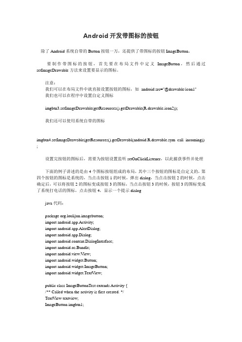
原址:/archives/3059编写Android自定义按钮写了个简单的android编写自定义效果的按钮,现在还不完整。
不过效果出来了。
见:用手指按压按钮的效果:手指抬起后,会有Toast提示:实现按钮,这里没有通过Button类或者子类去做派生,而是通过TextView派生出来的。
在这里三个按钮是三个TextView派生类实例,中间的白线,是1px宽的白色矩形,这样就可以做出类似上面的效果。
看布局文件:<?xml version="1.0" encoding="utf-8"?><LinearLayoutxmlns:android="/apk/res/android"android:orientation="vertical" android:layout_width="fill_parent" android:layout_height="fill_parent"android:background="@drawable/background_color"><LinearLayout android:layout_width="fill_parent"android:layout_height="10dip" /><LinearLayout android:layout_width="fill_parent"android:layout_height="40dip"><com.easymorse.textbutton.TextButtonandroid:layout_width="fill_parent"android:layout_height="fill_parent"android:layout_weight="1" android:text="电影"android:gravity="center_vertical|center_horizontal"android:background="@drawable/button"android:focusable="true" android:clickable="true"/><View android:layout_width="2px"android:layout_height="fill_parent"android:background="#ffffffff" /><com.easymorse.textbutton.TextButtonandroid:layout_width="fill_parent"android:layout_height="fill_parent" android:clickable="true"android:layout_weight="1" android:text="电视"android:gravity="center_vertical|center_horizontal"android:background="@drawable/button"android:focusable="true" /><View android:layout_width="2px"android:layout_height="fill_parent"android:background="#ffffffff" /><com.easymorse.textbutton.TextButtonandroid:layout_width="fill_parent"android:layout_height="fill_parent" android:clickable="true"android:layout_weight="1" android:text="明星"android:gravity="center_vertical|center_horizontal"android:background="@drawable/button"android:focusable="true" /></LinearLayout></LinearLayout>这里需要注意的几点:∙对于布局的像素设置,一般要用dip,这样在更大或者更小的屏幕下展示可以自动适配,如果是px,是物理像素,这样在小的屏幕里面可能会显得大,在大的屏幕中显得小∙在按钮布局中要使用android:focusable="true"android:clickable="true",这样才能比如通过轨迹球聚焦到按钮上,才能用手触摸按钮的时候触发事件∙点击按钮变色,主要在android:background="@drawable/button"配置,button配置了点击事件发生后的背景色改变,而不需要编写代码下面来看看drawable/button.xml文件:<?xml version="1.0" encoding="utf-8"?><selector xmlns:android="/apk/res/android" android:constantSize="true"><item android:state_focused="true"><shape><gradient android:startColor="#FFE5CF33"android:endColor="#FFF1E7A2"android:angle="90.0"></gradient></shape></item><item android:state_enabled="true" android:state_pressed="false"> <shape><gradient android:startColor="#FF1B1B1B"android:endColor="#FF969696"android:angle="90.0"></gradient></shape></item><item android:state_enabled="true" android:state_pressed="true"> <shape><gradient android:startColor="#FF000000"android:endColor="#FF474747"android:angle="90.0"></gradient></shape></item><item android:state_enabled="false" android:state_pressed="true"> <shape><gradient android:startColor="#FF000000"android:endColor="#FF474747"android:angle="90.0"></gradient></shape></item><item><shape><gradient android:startColor="#FF000000"android:endColor="#FF474747"android:angle="90.0"></gradient></shape></item></selector>这个文件中定义了当条目(也就是按钮)enable和(或)pressed的情况下的背景渐近色的配置情况。
Android开发带图标的按钮
Android开发带图标的按钮除了Android系统自带的Button按钮一万,还提供了带图标的按钮ImageButton。
要制作带图标的按钮,首先要在布局文件中定义ImageButton,然后通过setImageDrawable方法来设置要显示的图标。
注意:我们可以在布局文件中就直接设置按钮的图标,如android:src="@drawable/icon1"我们也可以在程序中设置自定义图标imgbtn3.setImageDrawable(getResources().getDrawable(R.drawable.icon2));我们还可以使用系统自带的图标imgbtn4.setImageDrawable(getResources().getDrawabl(android.R.drawable.sym_call_incoming)) ;设置完按钮的图标后,需要为按钮设置监听setOnClickListener,以此捕获事件并处理下面的例子讲述的是由4个图标按钮组成的布局,其中三个按钮的图标是自定义的,第四个按钮的图标是系统的,当点击按钮1的时候,弹出dialog,当点击按钮2的时候,点击确定后,可以将按钮2的图标变成按钮3的图标,当点击按钮3的时候,按钮3的图标变成了系统打电话的图标,点击按钮4,显示一个提示dialogjava代码:package org.loulijun.imagebutton;import android.app.Activity;import android.app.AlertDialog;import android.app.Dialog;import android.content.DialogInterface;import android.os.Bundle;import android.view.View;import android.widget.Button;import android.widget.ImageButton;import android.widget.TextView;public class ImageButtonTest extends Activity {/** Called when the activity is first created. */TextView textview;ImageButton imgbtn1;ImageButton imgbtn2;ImageButton imgbtn3;ImageButton imgbtn4;@Overridepublic void onCreate(Bundle savedInstanceState) {super.onCreate(savedInstanceState);setContentView(yout.main);textview=(TextView)findViewById(R.id.textview);//分别取得4个ImageButton对象imgbtn1=(ImageButton)findViewById(R.id.imagebutton1);imgbtn2=(ImageButton)findViewById(R.id.imagebutton2);imgbtn3=(ImageButton)findViewById(R.id.imagebutton3);imgbtn4=(ImageButton)findViewById(R.id.imagebutton4);//分别为ImageButton设置图标//imgbtn1已经在main.xml布局中设置了图标,所以就不在这里设置了(设置图标即可在程序中设置,也可在布局文件中设置)imgbtn2.setImageDrawable(getResources().getDrawable(R.drawable.icon));//在程序中设置图标imgbtn3.setImageDrawable(getResources().getDrawable(R.drawable.icon2));imgbtn4.setImageDrawable(getResources().getDrawable(android.R.drawable.sym_call_incoming) );//设置系统图标//下面为各个按钮设置事件监听imgbtn1.setOnClickListener(new Button.OnClickListener(){@Overridepublic void onClick(View v) {// TODO Auto-generated method stubDialog dialog=new AlertDialog.Builder(ImageButtonTest.this).setTitle("提示").setMessage("我是ImageButton1").setPositiveButton("确定",new DialogInterface.OnClickListener() {@Overridepublic void onClick(DialogInterface dialog, int which) {// TODO Auto-generated method stub//相应的处理操作}}).create();dialog.show();}});imgbtn2.setOnClickListener(new Button.OnClickListener(){@Overridepublic void onClick(View v) {// TODO Auto-generated method stubDialog dialog=new AlertDialog.Builder(ImageButtonTest.this).setTitle("提示").setMessage("我是ImageButton2,我要使用ImageButton3的图标").setPositiveButton("确定",new DialogInterface.OnClickListener() {@Overridepublic void onClick(DialogInterface dialog, int which) {// TODO Auto-generated method stubimgbtn2.setImageDrawable(getResources().getDrawable(R.drawable.icon2));}}).create();dialog.show();}});imgbtn3.setOnClickListener(new Button.OnClickListener(){@Overridepublic void onClick(View v) {// TODO Auto-generated method stubDialog dialog=new AlertDialog.Builder(ImageButtonTest.this).setTitle("提示").setMessage("我是ImageButton3,我想使用系统打电话的图标").setPositiveButton("确定",new DialogInterface.OnClickListener() {@Overridepublic void onClick(DialogInterface dialog, int which) {// TODO Auto-generated method stubimgbtn3.setImageDrawable(getResources().getDrawable(android.R.drawable.sym_action_call));}}).create();dialog.show();}});imgbtn4.setOnClickListener(new Button.OnClickListener(){@Overridepublic void onClick(View v) {// TODO Auto-generated method stubDialog dialog=new AlertDialog.Builder(ImageButtonTest.this).setTitle("提示").setMessage("我是使用的系统图标").setPositiveButton("确定",new DialogInterface.OnClickListener() {@Overridepublic void onClick(DialogInterface dialog, int which) {// TODO Auto-generated method stub//相应的处理操作}}).create();dialog.show();}});}}。
[Android教程_兄弟连马剑威]_013_Button和ImageButton
![[Android教程_兄弟连马剑威]_013_Button和ImageButton](https://img.taocdn.com/s3/m/93e88943767f5acfa0c7cd09.png)
• android:tint • 将图片渲染成指定的颜色。
2、ImageView
3、ImageButton
• 显示一个按钮和一个图像(而不是文字),可以按下或由用户点击。默认情况下,一个ImageButton看上去就像一个 普通的按钮,与标准按钮背景颜色变化在不同按钮的状态。表面的按钮上的图像通过android:定义XML元素的src 属性或setImageResource(int)方法。
• fitEnd
按比例拉伸图片,拉伸后图片的高度为View的高度,且显示在View的右边
• center
按原图大小显示图片,但图片宽高大于View的宽高时,截图图片中间部分显示
• centerCrop
按比例放大原图直至等于某边View的宽高显示。
• centerInside
当原图宽高或等于View的宽高时,按原图大小居中显示;反之将原图缩放至View的宽高 居中显示。
二、配置透明的Button style="?android:attr/borderlessButtonStyle“
三、配置Button style 通过配置 Android:background 来设置按钮样式。
2、ImageView
• public class ImageView extends View • 显示一个任意的图像,如一个图标。ImageView类可以加载图像从不同来源(如资源或内容提供者),负责计算图像
的测量,这样它就可以用于任何布局管理器,并提供各种显示选项,如缩放和着色。
• XML属性 • android:src • 设置View的drawable(如图片,也可以是颜色,但是需要指定View的大小) • android:adjustViewBounds • 是否保持宽高比。需要与maxWidth、MaxHeight一起使用,否则单独使用没有效果。 • android:maxHeight • 设置View的最大高度,单独使用无效, • 需要与setAdjustViewBounds一起使用。 • 如果想设置图片固定大小,又想保持图片宽高比, • 需要如下设置: • 1) 设置setAdjustViewBounds为true; • 2) 设置maxWidth、MaxHeight; • 3) 设置设置layout_width和layout_height为wrap_content • android:maxWidth • 设置View的最大宽度。同上。
android基本功能实现方法
intent.putExtra("data", value);//value可以是很多种类型,在接收activity中取出后强制转换或调用相应类型的get函数。
24 android intent取数据
String value = (String)getIntent().getExtras().get("data");
ArrayList<HashMap<String, Object>> list = new ArrayList<HashMap<String, Object>>();
SimpleAdapter adapter = new SimpleAdapter(this,list,yout.list,new String[]{"标题"},new int[]{R.id.TextView01});
{
public MyView(Context context)
{
super(context);
}
public void onDraw(Canvas canvas)
{
Paint paint = new Paint();//创建画笔
paint.setColor(Color.BLUE);//设置画笔颜色 canvas.drawRect(0, 0, 100, 100, paint);//画个正方形,坐标0,0,100,100。
listView.setAdapter(adapter);
adapter.notifyDataSetChanged();//通知更新ListView
Android开发-Button属性设置

Android Button属性设置android:id 为控件指定相应的IDandroid:text 指定控件的文本,置尽量使用strings.xmlandroid:grivity 指定控件的基本位置,比如举重,居右,android:padding 指定控件的内边距,控件当中的内容android:singleLine 如果设置为真的话,则将控件的内容在同一行当中显示android:layout_above 将该空间的底部至于给定ID的空间之上android:layout_below:将该控件的顶部至于给定ID的控件之下android:layout_toLeftOf:将该控件的右边缘和给定ID的控件的左边缘对其android:layout_toRightOf 将该控件的左边缘和给定的ID的控件的右边缘对齐android:layout_alignBaseLine 该控件的baseline和给定ID的控件的Baseline对齐android:layout_alignBottom 将该控件的底部边缘与给定ID控件的底部边缘android:layout_alignLeft 将该控件左边缘与给定ID控件的左边缘对齐android:layout_alignRight 将该控件的右边缘与给定ID控件的右边缘对齐android:layout_alignTop 将给定控件的顶部边缘与给定ID控件的顶部对齐android:alignParentBottom 如果该值为true 则将该控件的底部和父控件的底部对齐android:layout_alignParentLeft 如果该值为true则将该控件的左边与父控件的左边对齐android:layout_alignParentRight 如果该值为true则将该控件的右边与父控件的右边对齐android:layout_alignParentTop 将控件的顶部与父控件的顶部对齐android:layout_centerHorizontal 如果值为真,该控件将被至于水平方向的中央android:layout_centerInParent 将被至于父控件水平方向和垂直都居中android:layout_centerVertical 将被至于垂直方向的中央第一类:属性值为true或falseandroid:layout_centerHrizontal 水平居中android:layout_centerVertical 垂直居中android:layout_centerInparent 相对于父元素完全居中android:layout_alignParentBottom 贴紧父元素的下边缘android:layout_alignParentLeft 贴紧父元素的左边缘android:layout_alignParentRight 贴紧父元素的右边缘android:layout_alignParentTop 贴紧父元素的上边缘android:layout_alignWithParentIfMissing 如果对应的兄弟元素找不到的话就以父元素做参照物第二类:属性值必须为id的引用名“@id/id-name”android:layout_below 在某元素的下方android:layout_above 在某元素的的上方android:layout_toLeftOf 在某元素的左边android:layout_toRightOf 在某元素的右边android:layout_alignTop 本元素的上边缘和某元素的的上边缘对齐android:layout_alignLeft 本元素的左边缘和某元素的的左边缘对齐android:layout_alignBottom 本元素的下边缘和某元素的的下边缘对齐android:layout_alignRight 本元素的右边缘和某元素的的右边缘对齐第三类:属性值为具体的像素值,如30dip,40pxandroid:layout_marginBottom 离父控件底边缘的距离android:layout_marginLeft 离父控件左边缘的距离android:layout_marginRight 离父控件右边缘的距离android:layout_marginTop 离父控件上边缘的距离EditText的android:hint设置EditText为空时输入框内的提示信息。
android 带文字的图片 按钮,其实就是这么简单
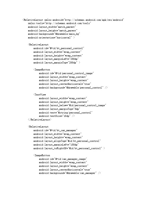
<RelativeLayoutxmlns:android="/apk/res/android" xmlns:tools="/tools"android:layout_width="match_parent"android:layout_height="match_parent"android:background="@drawable/main_bg"android:orientation="horizontal" ><RelativeLayoutandroid:id="@+id/bt_personal_control"android:layout_width="wrap_content"android:layout_height="wrap_content"android:layout_marginLeft="250dp"android:layout_marginTop="200dp" ><ImageButtonandroid:id="@+id/personal_control_image"android:layout_width="wrap_content"android:layout_height="wrap_content"android:layout_centerHorizontal="true"android:background="@drawable/personal_control" /><TextViewandroid:layout_width="wrap_content"android:layout_height="wrap_content"android:layout_below="@id/personal_control_image"android:layout_marginTop="5dp"android:text="@string/personal_control"android:textSize="18dp" /></RelativeLayout><RelativeLayoutandroid:id="@+id/bt_car_manager"android:layout_width="wrap_content"android:layout_height="wrap_content"android:layout_alignTop="@id/bt_personal_control"android:layout_marginLeft="150dp"android:layout_toRightOf="@id/bt_personal_control" ><ImageButtonandroid:id="@+id/car_manager_image"android:layout_width="wrap_content"android:layout_height="wrap_content"android:layout_centerHorizontal="true"android:background="@drawable/car_manager" /><TextViewandroid:layout_width="wrap_content"android:layout_height="wrap_content"android:layout_below="@id/car_manager_image"android:layout_marginTop="5dp"android:text="@string/car_manager"android:textSize="18dp" /></RelativeLayout><RelativeLayoutandroid:id="@+id/bt_environmental_protection_sign_manager"android:layout_width="wrap_content"android:layout_height="wrap_content"android:layout_alignTop="@id/bt_personal_control"android:layout_marginLeft="150dp"android:layout_toRightOf="@id/bt_car_manager"android:gravity="center_vertical" ><ImageButtonandroid:id="@+id/environmental_protection_sign_manager_image"android:layout_width="wrap_content"android:layout_height="wrap_content"android:layout_centerHorizontal="true"android:layout_marginLeft="12dp"android:background="@drawable/environmental_protection_sign_manager" /><TextViewandroid:layout_width="wrap_content"android:layout_height="wrap_content"android:layout_below="@id/environmental_protection_sign_manager_image" android:layout_marginTop="5dp"android:text="@string/environmental_protection_sign_manager"android:textSize="18dp" /></RelativeLayout><RelativeLayoutandroid:id="@+id/bt_check_manager"android:layout_width="wrap_content"android:layout_height="wrap_content"android:layout_alignTop="@id/bt_personal_control"android:layout_marginLeft="150dp"android:layout_toRightOf="@id/bt_environmental_protection_sign_manager"android:gravity="center_vertical" ><ImageButtonandroid:id="@+id/check_manager_image"android:layout_width="wrap_content"android:layout_height="wrap_content"android:layout_centerHorizontal="true"android:layout_marginLeft="12dp"android:background="@drawable/check_manager" /><TextViewandroid:layout_width="wrap_content"android:layout_height="wrap_content"android:layout_below="@id/check_manager_image" android:layout_marginTop="5dp"android:text="@string/check_manager"android:textSize="18dp" /></RelativeLayout><RelativeLayoutandroid:id="@+id/bt_statistical_analysis"android:layout_width="wrap_content"android:layout_height="wrap_content"android:layout_below="@id/bt_personal_control" android:layout_marginLeft="250dp"android:layout_marginTop="100dp"android:gravity="center_vertical" ><ImageButtonandroid:id="@+id/statistical_analysis_image"android:layout_width="wrap_content"android:layout_height="wrap_content"android:layout_centerHorizontal="true"android:layout_marginLeft="12dp"android:background="@drawable/statistical_analysis" /><TextViewandroid:layout_width="wrap_content"android:layout_height="wrap_content"android:layout_below="@id/statistical_analysis_image" android:layout_marginTop="5dp"android:text="@string/statistical_analysis"android:textSize="18dp" /></RelativeLayout><RelativeLayoutandroid:id="@+id/bt_system_setup"android:layout_width="wrap_content"android:layout_height="wrap_content"android:layout_below="@id/bt_car_manager"android:layout_toRightOf="@id/bt_statistical_analysis"android:layout_marginLeft="150dp"android:layout_marginTop="100dp"android:gravity="center_vertical" ><ImageButtonandroid:id="@+id/system_setup_image"android:layout_width="wrap_content"android:layout_height="wrap_content"android:layout_alignParentLeft="true"android:background="@drawable/system_setup" /><TextViewandroid:layout_width="wrap_content"android:layout_height="wrap_content"android:layout_below="@id/system_setup_image" android:layout_marginTop="5dp"android:text="@string/system_setup"android:textSize="18dp" /></RelativeLayout><TextViewandroid:id="@+id/welcomeMessage"android:layout_width="wrap_content"android:layout_height="wrap_content"android:layout_alignParentRight="true"android:layout_alignParentTop="true"android:layout_marginRight="100dp"android:layout_marginTop="45dp"android:textSize="20dp" /></RelativeLayout>杭州android 开发讨论群216045581,欢迎加入学习探讨。
materialbutton用法
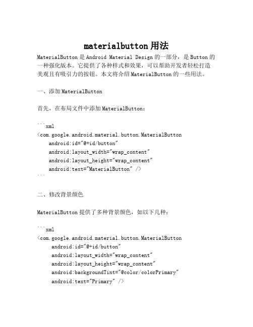
materialbutton用法MaterialButton是Android Material Design的一部分,是Button的一种强化版本。
它提供了各种样式和效果,可以帮助开发者轻松打造美观且有吸引力的按钮。
本文将介绍MaterialButton的一些用法。
一、添加MaterialButton首先,在布局文件中添加MaterialButton:```xml<com.google.android.material.button.MaterialButtonandroid:id="@+id/button"android:layout_width="wrap_content"android:layout_height="wrap_content"android:text="MaterialButton" />```二、修改背景颜色MaterialButton提供了多种背景颜色,如以下几种:```xml<com.google.android.material.button.MaterialButtonandroid:id="@+id/button"android:layout_width="wrap_content"android:layout_height="wrap_content"android:backgroundTint="@color/colorPrimary"android:text="Primary" /><com.google.android.material.button.MaterialButtonandroid:id="@+id/button"android:layout_width="wrap_content"android:layout_height="wrap_content"android:backgroundTint="@color/colorSecondary"android:text="Secondary" /><com.google.android.material.button.MaterialButtonandroid:id="@+id/button"android:layout_width="wrap_content"android:layout_height="wrap_content"android:backgroundTint="@color/colorAccent"android:text="Accent" />```三、设置按钮样式除了背景颜色外,MaterialButton还提供了多种按钮样式。
android自定义圆角button效果的实例代码(自定义viewDemo)
android⾃定义圆⾓button效果的实例代码(⾃定义viewDemo)概述在平时开发过程中经常会碰到需要使⽤圆⾓button的情况,⼀般也会包括很多其他⼩功能,⽐如要在⾥⾯添加img,设置不同的圆⾓⼤⼩等。
针对这样的场景,直接使⽤创建多个shape,定义多个xml⽂件也是可以实现的。
但是如果使⽤⾮常频繁,那么直接⾃定义⼀个就会来的⾮常⽅便。
甚⾄在⼀些情况下,不是可以⽤shape定义的规则图形,⽐如需要⽤到贝塞尔曲线等。
如果全局需要这样风格的view,那么⾃定义⼀个View是⾮常必要的。
本⽂主要是个demo记录,如有需要的读者可以借鉴学习。
Demo主要实现功能:1. ⾃定义圆⾓⼤⼩2. ⽀持设置leftDrawable,和⾃定义⽂字内容(⽂字和img默认居中)3. ⽀持点击效果源码RoundRadiusButton.java/*** author: xujiajia* description:* 1、drawable只有在设置textString的时候才会⽣效(居中效果两个⼀起测量)*/public class RoundRadiusButton extends View {//dataprivate int width = 0;private int height = 0;private int roundRadius = 16;private int bgColor = Color.LTGRAY;private boolean isTouching = false;//img and textprivate Drawable leftDrawable = null;private int drawableWidth = 20;private int drawableHeight = 20;private int leftDrawablePaddingRight = 0;private String textString;private int textSize = 30;private int textColor = Color.BLACK;//onDrawPaint paint;Path path;RectF rectF;Rect rect;public RoundRadiusButton(Context context, int width, int height) {super(context);this.width = width;this.height = height;this.setLayoutParams(new youtParams(width, height));this.setClickable(true);}public RoundRadiusButton(Context context, AttributeSet attrs) {super(context, attrs);getDataFromAttrs(context, attrs);this.setClickable(true);}public RoundRadiusButton(Context context, AttributeSet attrs, int defStyleAttr) {super(context, attrs, defStyleAttr);getDataFromAttrs(context, attrs);this.setClickable(true);}private void getDataFromAttrs(Context context, AttributeSet attrs) {if (attrs == null) {return;}TypedArray ta = context.obtainStyledAttributes(attrs, R.styleable.RoundRadiusButton);roundRadius = ta.getDimensionPixelOffset(R.styleable.RoundRadiusButton_roundRadius, 16);bgColor = ta.getColor(R.styleable.RoundRadiusButton_bgColor, Color.LTGRAY);leftDrawable = ta.getDrawable(R.styleable.RoundRadiusButton_leftDrawable);drawableWidth = ta.getDimensionPixelOffset(R.styleable.RoundRadiusButton_drawableWidth, 0); drawableHeight = ta.getDimensionPixelOffset(R.styleable.RoundRadiusButton_drawableHeight, 0); leftDrawablePaddingRight =ta.getDimensionPixelOffset(R.styleable.RoundRadiusButton_leftDrawablePaddingRight, 0);textString = ta.getString(R.styleable.RoundRadiusButton_textString);textSize = ta.getDimensionPixelOffset(R.styleable.RoundRadiusButton_textSize, 0);textColor = ta.getColor(R.styleable.RoundRadiusButton_textColor, Color.BLACK);ta.recycle();}public void setRoundRadius(int roundRadius) {this.roundRadius = roundRadius;invalidate();}public void setBgColor(int bgColor) {this.bgColor = bgColor;invalidate();}public void setLeftDrawable(Drawable leftDrawable, int drawableWidth, int drawableHeight,int paddingRight) {this.leftDrawable = leftDrawable;this.drawableWidth = drawableWidth;this.drawableHeight = drawableHeight;this.leftDrawablePaddingRight = paddingRight;invalidate();}public void setTextString(String textString) {this.textString = textString;invalidate();}public void setTextColor(int textColor) {this.textColor = textColor;invalidate();}public void setTextSize(int textSize) {this.textSize = textSize;invalidate();}@Override public boolean onTouchEvent(MotionEvent event) {if (isClickable()) {switch (event.getAction()) {case MotionEvent.ACTION_DOWN:isTouching = true;invalidate();break;case MotionEvent.ACTION_UP:isTouching = false;invalidate();break;}}return super.onTouchEvent(event);}@Override protected void onDraw(Canvas canvas) {super.onDraw(canvas);if (width == 0 || height == 0) {width = getWidth();height = getHeight();}if (paint == null) {paint = new Paint();}if (path == null) {path = new Path();}if (rectF == null) {rectF = new RectF();if (rect == null) {rect = new Rect();}paint.setColor(bgColor);paint.setAntiAlias(true);//抗锯齿paint.setStrokeWidth(0);//线的宽度设为0,避免画圆弧的时候部分圆弧与边界相切paint.setStyle(Paint.Style.FILL_AND_STROKE);path.setFillType(Path.FillType.WINDING);//左上圆⾓path.moveTo(0, roundRadius);rectF.set(0, 0, 2 * roundRadius,2 * roundRadius);path.addArc(rectF, 180, 90);//上边path.lineTo(width - roundRadius, 0);//右上圆⾓rectF.set(width - roundRadius * 2, 0, width, roundRadius * 2);path.addArc(rectF, -90, 90);//右边path.lineTo(width, height - roundRadius);//右下圆⾓rectF.set(width - roundRadius * 2, height - roundRadius * 2, width,height);path.addArc(rectF, 0, 90);//下边path.lineTo(roundRadius, height);//左下圆⾓rectF.set(0, height - roundRadius * 2, 2 * roundRadius,height);path.addArc(rectF, 90, 90);//左边path.lineTo(0, roundRadius);path.close();canvas.drawPath(path, paint);if (isTouching) {paint.setColor(getContext().getResources().getColor(R.color.black_tran_30));canvas.drawPath(path, paint);}//填充背景中间空⽩的部分path.moveTo(0, roundRadius);path.lineTo(width - roundRadius, 0);path.lineTo(width, height - roundRadius);path.lineTo(roundRadius, height);path.close();canvas.drawPath(path, paint);if (isTouching) {paint.setColor(getContext().getResources().getColor(R.color.black_tran_30));canvas.drawPath(path, paint);}//text, drawable两个⼀起计算位置if (!TextUtils.isEmpty(textString)) {paint.setStrokeWidth(1.5f);paint.setColor(textColor);paint.setTextSize(textSize);rect.setEmpty();paint.getTextBounds(textString, 0, textString.length(), rect);float leftBitmap = 0;float topBitmap = 0;if (leftDrawable != null) {if (leftDrawable != null) {leftBitmap = (1.0f * width - drawableWidth - rect.width() - leftDrawablePaddingRight) / 2; topBitmap = (1.0f * height - drawableHeight) / 2;leftDrawable.setBounds((int) leftBitmap, (int) topBitmap,(int) (leftBitmap + drawableWidth),(int) (topBitmap + drawableHeight));leftDrawable.draw(canvas);}}float textX = 0;float textY =1.0f * height / 2 + paint.getTextSize() / 2 - paint.getFontMetrics().descent / 2;if (leftBitmap == 0 && topBitmap == 0) {textX = width / 2 - rect.width() / 2;} else {textX = leftBitmap + drawableWidth + leftDrawablePaddingRight;canvas.drawText(textString, textX, textY, paint);}}}MainActivity.javapublic class MainActivity extends AppCompatActivity {private LinearLayout llContainer;@Overrideprotected void onCreate(Bundle savedInstanceState) {super.onCreate(savedInstanceState);setContentView(yout.activity_main);initView();}private void initView() {llContainer = findViewById(R.id.ll_container);RoundRadiusButton roundRadiusButton = new RoundRadiusButton(this, 500, 200);roundRadiusButton.setBgColor(Color.LTGRAY);roundRadiusButton.setRoundRadius(40);//textroundRadiusButton.setTextString("testtesttest");roundRadiusButton.setTextColor(Color.WHITE);roundRadiusButton.setTextSize(40);//drawableroundRadiusButton.setLeftDrawable(getResources().getDrawable(R.mipmap.ic_launcher), 60, 60, 80); roundRadiusButton.setOnClickListener(new View.OnClickListener() {@Override public void onClick(View v) {Toast.makeText(MainActivity.this, "testest", Toast.LENGTH_LONG).show();}});roundRadiusButton.setClickable(false);llContainer.addView(roundRadiusButton);}}activity_main.xml<?xml version="1.0" encoding="utf-8"?><LinearLayout xmlns:android="/apk/res/android"xmlns:app="/apk/res-auto"xmlns:tools="/tools"android:id="@+id/ll_container"android:layout_width="match_parent"android:layout_height="match_parent"android:background="#868684"android:gravity="center"android:orientation="vertical"tools:context=".MainActivity"><com.example.newbuttiontest.RoundRadiusButtonandroid:layout_width="300dp"android:layout_height="200dp"app:bgColor="#FFEB3B"app:drawableHeight="18dp"app:drawableWidth="18dp"app:leftDrawable="@mipmap/ic_launcher"app:leftDrawablePaddingRight="5dp"app:roundRadius="30dp"app:textColor="#FF4329"app:textSize="16dip"app:textString="testtesttest"/></LinearLayout>attrs.xml<?xml version="1.0" encoding="utf-8"?><resources><declare-styleable name="RoundRadiusButton"><attr name="roundRadius" format="dimension" /><attr name="bgColor" format="color" /><attr name="leftDrawable" format="reference" /><attr name="leftDrawablePaddingRight" format="dimension" /><attr name="drawableWidth" format="dimension" /><attr name="drawableHeight" format="dimension" /><attr name="textString" format="string" /><attr name="textSize" format="dimension" /><attr name="textColor" format="color" /></declare-styleable></resources>colors.xml<resources><color name="black_tran_30">#30000000</color></resources>总结以上所述是⼩编给⼤家介绍的android ⾃定义圆⾓button效果的实例代码,希望对⼤家有所帮助,如果⼤家有任何疑问请给我留⾔,⼩编会及时回复⼤家的。
Android自定义按钮形状
Android自定义按钮形状Android中自定义按钮形状在Android开发应用中,默认的Button是由系统渲染和管理大小的。
而我们看到的成功的移动应用,都是有着酷炫的外观和使用体验的。
因此,我们在开发产品的时候,需要对默认按钮进行美化。
在本篇里,笔者结合在应用开发中的经验,探讨一下自定义背景的按钮、自定义形状按钮的实现方法。
首先看实现效果截图:自定义背景的按钮目前有2种方式实现,矢量和位图。
1. 矢量图形绘制的方式矢量图形绘制的方式实现简单,适合对于按钮形状和图案要求不高的场合。
步骤如下:(a) 使用xml定义一个圆角矩形,外围轮廓线实线、内填充渐变色,xml代码如下。
view plain copy to clipboard print ?01.//bg_alibuybutton_default.xml02.03.< layer-list xmlns:android = "/apk/res/android" >04. < item >05. < shape android:shape = "rectangle" >06. < solid android:color = "#FFEC7600" />07. < corners08. android:topLeftRadius = "5dip"09. android:topRightRadius = "5dip"10. android:bottomLeftRadius = "5dip"11. android:bottomRightRadius = "5dip" />12.13.14. < item android:top = "1px" android:bottom = "1px" android:left ="1px" android:right = "1px" >15. < shape >16. < gradient17. android:startColor = "#FFEC7600" android:endColor = "#FFFED69E"18. android:type = "linear" android:angle = "90"19. android:centerX = "0.5" android:centerY = "0.5" />20. < corners21. android:topLeftRadius = "5dip"22. android:topRightRadius = "5dip"23. android:bottomLeftRadius = "5dip"24. android:bottomRightRadius = "5dip" />25.26.27.view plaincopy to clipboardprint?01.//bg_alibuybutton_default.xml02.03. version="1.0" encoding="utf-8"?>04.<layer-list< bdsfid="105" p=""></layer-list<>05.xmlns:android="/apk/res/an droid">06.07.08.09. <corners< bdsfid="114" p=""></corners<>10. android:topLeftRadius="5dip"11. android:topRightRadius="5dip"12. android:bottomLeftRadius="5dip"13. android:bottomRightRadius="5dip" />14.15.16. <="" android:bottom="1px" android:left="1px" android:top="1px" bdsfid="122" p="">17.android:right="1px">18.19. <gradient< bdsfid="127" p=""></gradient<>20. android:startColor="#FFEC7600" android:endColor="#FFFED69E"21. android:type="linear" android:angle="90"22. android:centerX="0.5" android:centerY="0.5" />23. <corners< bdsfid="132" p=""></corners<>24. android:topLeftRadius="5dip"25. android:topRightRadius="5dip"26. android:bottomLeftRadius="5dip"27. android:bottomRightRadius="5dip" />28.29.30.//bg_alibuybutton_default.xmlversion="1.0" encoding="utf-8"?><layer-list< bdsfid="144" p=""></layer-list<>xmlns:android="/apk/res/andro id"><corners< bdsfid="153" p=""></corners<>android:topLeftRadius="5dip"android:topRightRadius="5dip"android:bottomLeftRadius="5dip"android:bottomRightRadius="5dip" /><="" android:bottom="1px" android:left="1px" android:top="1px" bdsfid="161" p="">android:right="1px"><gradient< bdsfid="166" p=""></gradient<>android:startColor="#FFEC7600"android:endColor="#FFFED69E"android:type="linear" android:angle="90"android:centerX="0.5" android:centerY="0.5" /><corners< bdsfid="171" p=""></corners<>android:topLeftRadius="5dip"android:topRightRadius="5dip"android:bottomLeftRadius="5dip"android:bottomRightRadius="5dip" />同样定义bg_alibuybutton_pressed.xml和bg_alibuybutton_selected.xml,内容相同,就是渐变颜色不同,用于按钮按下后的背景变化效果。
安卓开发笔记(三十):自定义Button
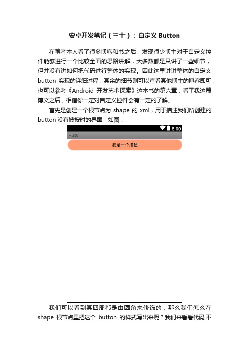
安卓开发笔记(三十):自定义Button在笔者本人看了很多博客和书之后,发现很少博主对于自定义控件能够进行一个比较全面的思路讲解,大多数都是只讲了一些细节,但并没有讲如何把代码进行整体的实现。
因此这里讲讲整体的自定义button实现的详细过程,其余的细节则可以查看其他博主的博客即可,也可以参考《Android开发艺术探索》这本书的第六章,看了我这篇博文之后,相信你一定对自定义控件会有一定的了解。
首先是创建一个根节点为shape的xml,用于描述我们所创建的button没有被按时的界面,如图:我们可以看到其四周都是由圆角来修饰的,那么我们怎么在shape根节点里把这个button的样式写出来呢?我们来看看代码,不知道如何创建shape文件的童鞋可以参考一下这个百度经验,传送门:https:///article/b907e62795139746e7891cb9. html一.button_bg.xml<?xml version="1.0" encoding="utf-8"?><shape xmlns:android="/apk/res/android"><solidandroid:color="#ff9d77"></solid><strokeandroid:width="2dp"android:color="#fad3cf"></stroke><cornersandroid:bottomLeftRadius="20dp"android:bottomRightRadius="20dp"android:topLeftRadius="20dp"android:topRightRadius="20dp" ></corners><paddingandroid:bottom="10dp"android:left="10dp"android:right="10dp"android:top="10dp"></padding></shape>这样我们的按钮自定义界面就完成了,这是在没被按住的情况下,下面再来看看在按住情况下的程序代码,也是一个shape文件,后面我们会用选择器对它们的逻辑进行整合,最后在Button控件里进行调用这个选择器的逻辑。
textview、edittext、button的基本使用
在Android开发中,`TextView`、`EditText`和`Button`是常用的用户界面控件,用于显示文本、接收用户输入和触发事件。
以下是它们的基本使用方法:1. TextView`TextView`用于在界面上显示文本内容。
您可以在布局文件(XML)中定义`TextView`,也可以在Java代码中动态创建和设置`TextView`的属性。
以下是一个简单的示例:<TextViewandroid:id="@+id/textView"android:layout_width="wrap_content"android:layout_height="wrap_content"android:text="Hello, World!" />2. EditText`EditText`用于接收用户输入的文本。
用户可以在`EditText`中输入文本内容。
以下是一个简单的示例:<EditTextandroid:id="@+id/editText"android:layout_width="match_parent"android:layout_height="wrap_content"android:hint="Enter your name" />3. Button`Button`用于触发点击事件。
用户点击`Button`时,会触发相应的操作。
以下是一个简单的示例:<Buttonandroid:id="@+id/button"android:layout_width="wrap_content"android:layout_height="wrap_content"android:text="Click Me" />在Java代码中,您可以通过`findViewById`方法找到这些控件,并对其进行操作。
Android控件View的文字周围添加图标
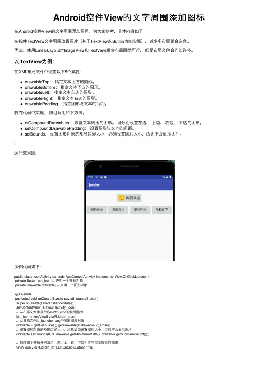
Android控件View的⽂字周围添加图标在Android控件View的⽂字周围添加图标,供⼤家参考,具体内容如下在控件TextView⽂字周围放置图⽚(基于TextView的Button也能实现),减少多布局组合嵌套。
优点:使⽤LinearLayout对ImageView和TextView组合布局固然可⾏,但是布局⽂件会冗长许多。
以TextView为例:在XML布局⽂件中设置以下5个属性:drawableTop:指定⽂本上⽅的图形。
drawableBottom:指定⽂本下⽅的图形。
drawableLeft:指定⽂本左边的图形。
drawableRight:指定⽂本右边的图形。
drawablePadding:指定图形与⽂本的间距。
若在代码中实现,则可调⽤如下⽅法。
etCompoundDrawables:设置⽂本周围的图形。
可分别设置左边、上边、右边、下边的图形。
setCompoundDrawablePadding:设置图形与⽂本的间距。
setBounds:设置图形对象的矩形边界⼤⼩,必须设置图⽚⼤⼩,否则不会显⽰图⽚。
:运⾏效果图:⽰例代码如下:public class IconActivity extends AppCompatActivity implements View.OnClickListener {private Button btn_icon; // 声明⼀个按钮对象private Drawable drawable; // 声明⼀个图形对象@Overrideprotected void onCreate(Bundle savedInstanceState) {super.onCreate(savedInstanceState);setContentView(yout.activity_icon);// 从布局⽂件中获取名叫btn_icon的按钮控件btn_icon = findViewById(R.id.btn_icon);// 从资源⽂件ic_launcher.png中获取图形对象drawable = getResources().getDrawable(R.drawable.ic_smile);// 设置图形对象的矩形边界⼤⼩,注意必须设置图⽚⼤⼩,否则不会显⽰图⽚drawable.setBounds(0, 0, drawable.getMinimumWidth(), drawable.getMinimumHeight());// 通过四个按钮分别演⽰:左、上、右、下四个⽅向展⽰图标的效果findViewById(R.id.btn_left).setOnClickListener(this);findViewById(R.id.btn_top).setOnClickListener(this);findViewById(R.id.btn_right).setOnClickListener(this);findViewById(R.id.btn_bottom).setOnClickListener(this);}@Overridepublic void onClick(View v) { // ⼀旦监听到点击动作,就触发监听器的onClick⽅法 // 监听到点击动作,就触发监听器的onClick⽅法switch (v.getId()) {case R.id.btn_left:// 设置按钮控件btn_icon内部⽂字左边的图标btn_icon.setCompoundDrawables(drawable, null, null, null);break;case R.id.btn_top:// 设置按钮控件btn_icon内部⽂字上⽅的图标btn_icon.setCompoundDrawables(null, drawable, null, null);break;case R.id.btn_right:// 设置按钮控件btn_icon内部⽂字右边的图标btn_icon.setCompoundDrawables(null, null, drawable, null);break;case R.id.btn_bottom:// 设置按钮控件btn_icon内部⽂字下⽅的图标btn_icon.setCompoundDrawables(null, null, null, drawable);break;default:}}xml中设置的2⾏核⼼代码//在控件左侧设置图标android:drawableLeft="@drawable/ic_smile"//设置图标与控件⽂件的间距android:drawablePadding="10dp"布局xml⽂件<?xml version="1.0" encoding="utf-8"?><LinearLayout xmlns:android="/apk/res/android"android:layout_width="match_parent"android:layout_height="match_parent"android:padding="12dp"android:orientation="vertical"><Buttonandroid:id="@+id/btn_icon"android:layout_width="wrap_content"android:layout_height="wrap_content"android:layout_gravity="center"android:padding="10dp"android:drawableLeft="@drawable/ic_smile"android:drawablePadding="10dp"android:text="热烈欢迎"android:textSize="17sp" /><LinearLayoutandroid:layout_width="match_parent"android:layout_height="wrap_content"android:layout_marginTop="10dp"android:orientation="horizontal"><Buttonandroid:id="@+id/btn_left"android:layout_width="0dp"android:layout_height="wrap_content"android:layout_weight="1"android:text="图标在左"android:textSize="15sp" /><Buttonandroid:id="@+id/btn_top"android:layout_width="0dp"android:layout_height="wrap_content"android:layout_weight="1"android:text="图标在上"android:textSize="15sp" /><Buttonandroid:id="@+id/btn_right"android:layout_width="0dp"android:layout_height="wrap_content"android:layout_weight="1"android:text="图标在右"android:textSize="15sp" /><Buttonandroid:id="@+id/btn_bottom"android:layout_width="0dp"android:layout_height="wrap_content"android:layout_weight="1"android:text="图标在下"android:textSize="15sp" /></LinearLayout></LinearLayout>以上就是本⽂的全部内容,希望对⼤家的学习有所帮助,也希望⼤家多多⽀持。
自定义Button样式

⾃定义Button样式(注:以前不知道这⼀点,还闹个笑话,在Timers4Me中⾃定义TimePicker控件的时候,下载了相应的源码和资源,看到它的图⽚,我还很纳闷,为什么最后多了个.9,并且图⽚还有⼏条⿊线⼏个点,还特意让美⼯对图⽚做了处理,将多余的部分去掉。
)本例中,⽤到以下图⽚:* 按钮可以点击,但处于没有点击状态下的⿊⾊XX.9格式背景图⽚* 按钮可以点击,被点击下的状态的橙⾊的XX.9格式背景图⽚* 按钮不可⽤状态下的XX.9格式的背景图⽚上⾯的三张图⽚,需要放到项⽬中/res/drawables⾼中低密度中任何⼀个⽂件夹下2.下⾯我们需要定义按钮处于不同状态下的样式:在/res/drawables/⽬录下⾼中低任何⼀个⽂件夹下,新建xml⽂件,名字可以⾃⼰取,这⾥我命名为custom_button.xml,在不同的状态下会引⽤相应的图⽚:1. <?xml version="1.0" encoding="utf-8"?>2. <selector xmlns:android="/apk/res/android">3.4. <item android:state_enabled="false" android:drawable="@drawable/btn_background_red" />5. <item android:state_pressed="true" android:state_enabled="true"6. android:drawable="@drawable/btn_background_orange" />7. <item android:state_focused="true" android:state_enabled="true"8. android:drawable="@drawable/btn_background_orange" />9. <item android:state_enabled="true" android:drawable="@drawable/btn_background_black" />10. </selector>这⾥定义还是要按照规定的顺序来的,如果把最后⼀项放到第⼀条,那么只要按钮可⽤状态下,第⼀条条件成⽴,下⾯的就不会执⾏了。
Android 美化Button、ImageButton、TextView控件
1Android 美化Button、ImageButton、TextView控件对于Android自带的Button按钮控件很多网友感觉不是很美观,如果界面上按钮不多,我们可以通过一种简单的方法实现Button脱胎换骨的外观,考虑到效率Android的layout方式的xml文件先不用了,毕竟控件不多模拟一个个性化Button还是很简单的,我们直接通过图片实现颜色的,代码如下:private Button mBtn; //定义我们的按钮在onCreate中加入Java代码:Java代码mBtn=(Button)findViewById(R.id.btn);//btn为layout中的ButtonID2mBtn.setOnTouchListener(newOnTouchListener(){3publicbooleanonTouch(Viewarg0,MotionEventarg1){4if(arg1.getAction()==MotionEvent.ACTION_DOWN){5arg0.setBackgroundResource(R.drawable.pressed);//按下的图片对应pressed6}elseif(arg1.getAction()==MotionEvent.ACTION_UP){7arg0.setBackgroundResource(R.drawable.normal);//常态下的图片对应normal8}9elseif()//这里还可以继续实现MotionEvent.ACTION_MOVE和MotionEvent.ACTION_CANCEL等实现更多的特效10returnfalse;11}12});ImageButton也相同java代码:Java代码13imageButton.setOnTouchListener(newOnTouchListener(){14@Override15publicbooleanonTouch(Viewv,MotionEventevent){16if(event.getAction()==MotionEvent.ACTION_DOWN){17//更改为按下时的背景图片18v.setBackgroundResource(R.drawable.pressed);19}elseif(event.getAction()==MotionEvent.ACTION_UP){20//改为抬起时的图片21v.setBackgroundResource(R.drawable.released);22}23returnfalse;24}25});一.ImageButton定义:.在drawable目录下添加新的xml文件button_add_x.xml,也就是定义一些selector标签,并指定Button在各种状态下背景图片,如下代码:java代码:XML/HTML代码26<?xmlversion="1.0"encoding="UTF-8"?>27<selectorxmlns:android="/apk/res/android">28<itemandroid:state_pressed="false"android:drawable="@drawable/button_add"/>29<itemandroid:state_pressed="true"android:drawable="@drawable/button_add_pressed"/> 30<itemandroid:state_focused="true"android:drawable="@drawable/button_add_pressed"/ >31<itemandroid:drawable="@drawable/button_add"/>32</selector>java代码:XML/HTML代码33<ImageButton34android:id="@+id/ImageButton"35android:layout_width="wrap_content"36android:layout_height="wrap_content"37android:background="#00000000"38android:src="@drawable/button_add_x">39</ImageButton>40二.TextView改变字体颜色:和Button的区别是改变的是textColor属性,而且selector文件定义在color1.在layout文件中指定TextView的textColor属性,如android:textColor="@color/textview_color";2.在color目录下添加新的xml文件textview_color.xml并指定TextView在各种状态下的色值,如下代码:java代码:XML/HTML代码<?xmlversion="1.0"encoding="utf-8"?>41<selectorxmlns:android="/apk/res/android"> 42<itemandroid:state_selected="true"android:color="#FFF"/>43<itemandroid:state_focused="true"android:color="#FFF"/>44<itemandroid:state_pressed="true"android:color="#FFF"/>45<itemandroid:color="#000"/>46</selector>。
Android键钮自定义样式
Android 键钮自定义样式现在的用户对APP的外观看得很重要,如果APP内所有元件都用Android默认样式写,估计下面评论里就有一堆在骂UI丑的。
今天学习自定义Button按钮样式。
Button 样式修改的是Button的背景(Background)属性。
首先写一个定义Button样式的XML文件:新建Android XML文件,类型选Drawable,根结点选selector,文件名就buton_style 吧。
程序自动给我们刚刚建的文件里加了selector结点,我们只需要在selector结点里写上三种状态时显示的背景图片(按下、获取焦点,正常)。
代码如下:Xml代码<?xml version="1.0" encoding="utf-8"?><selector xmlns:android="/apk/res/android"><item android:state_pressed="true"android:drawable="@drawable/play_press" /><item android:state_focused="true"android:drawable="@drawable/play_press" /><item android:drawable="@drawable/play" /></selector>我这里获取焦点跟点击时显示的是同一张图片,必须严格照上面的顺序写,不可倒。
接下来只要在布局时写Button控件时应用到Button的Background属性即可。
Xml代码<Button android:id="@+id/button1"android:layout_width="wrap_content"android:layout_height="wrap_content"android:background="@drawable/button_style"></Button>最终效果图:再加上一种自定义样式方法,上面的是用图片,其实我们可以直接通过定义xml文件来实现不同的样式:在上面的源代码基础上,只需要修改button_style文件,同样三种状态分开定义:Xml代码<?xml version="1.0" encoding="utf-8"?><selector xmlns:android="/apk/res/android"><item android:state_pressed="true"><shape><gradient android:startColor="#0d76e1"android:endColor="#0d76e1"android:angle="270" /><stroke android:width="1dip" android:color="#f403c9" /><corners android:radius="2dp" /><padding android:left="10dp" android:top="10dp"android:right="10dp" android:bottom="10dp" /></shape></item><item android:state_focused="true"><shape><gradient android:startColor="#ffc2b7"android:endColor="#ffc2b7"android:angle="270" /><stroke android:width="1dip" android:color="#f403c9" /><corners android:radius="2dp" /><padding android:left="10dp" android:top="10dp"android:right="10dp" android:bottom="10dp" /></shape></item><item><shape><gradient android:startColor="#000000"android:endColor="#ffffff"android:angle="180" /><stroke android:width="1dip" android:color="#f403c9" /><corners android:radius="5dip" /><padding android:left="10dp" android:top="10dp"android:right="10dp" android:bottom="10dp" /></shape></item></selector>gradient 主体渐变 startColor开始颜色,endColor结束颜色,angle开始渐变的角度(值只能为90的倍数,0时为左到右渐变,90时为下到上渐变,依次逆时针类推)stroke 边框 width 边框宽度,color 边框颜色corners 圆角 radius 半径,0为直角padding text值的相对位置。
android定制个性按钮控件
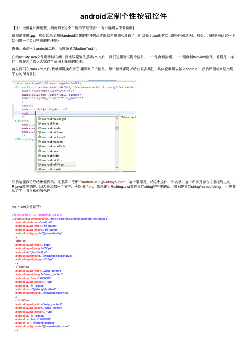
android定制个性按钮控件【注:此博客长期荒置,因此附上这个⼯程的下载链接:有兴趣可以下载看看】既然是要做app,那么如果全都⽤android⾃带的控件的话界⾯就太单调和难看了,所以每个app都有⾃⼰的风格和外观,那么,现在就来研究⼀下如何做⼀个⾃⼰中意的控件吧~⾸先,新建⼀个android⼯程,我就命名为buttonTest了。
在给activity.java⽂件动⼿脚之间,我⽐较喜欢先搞定xml⽂件,我们这⾥测试两个控件,⼀个是⾃制按钮,⼀个是⾃制textview控件,道理是⼀样的,就是为了告诉⼤家这个适⽤于任意的控件。
⾸先我们在main.xml⽂件(我就懒得换名字了)⾥添加三个控件,每个控件都可以给它很多属性,具体查看可以输⼊android:然后后⾯就⾃动出现了它的所有属性:然后这⾥我们只给出需要的。
注意第⼀⾏那个android:id="@+id/mybutton",这个意思是,给这个控件⼀个名字,这个名字是存在之前提到过的R.java⽂件⾥的,因为是添加⼀个名字,所以⽤了+id,如果是引⽤string.java⽂件⾥的string字符串的话,就只需要@string/nameofstring 。
不需要加好了,具体我们看代码:main.xml⽂件如下:<?xml version="1.0" encoding="utf-8"?><LinearLayout xmlns:android="/apk/res/android"android:orientation="vertical"android:layout_width="fill_parent"android:layout_height="fill_parent"android:background="@drawable/bg"><Buttonandroid:layout_width="55px"android:layout_height="55px"android:id="@+id/button"android:background="@drawable/buttonstyle"android:layout_margin="10px"/><TextViewandroid:layout_width="wrap_content"android:layout_height="wrap_content"android:textColor="#000000"android:layout_margin="10px"android:id="@+id/text"android:text="@string/shorttext"android:background="@drawable/textview"/><TextViewandroid:layout_width="wrap_content"android:layout_height="wrap_content"android:layout_margin="10px"android:id="@+id/text2"android:textColor="#000000"android:text="@string/longtext"android:background="@drawable/textview"/></LinearLayout>可以看到三个控件我都给了个ID,是因为我要在activity的java⽂件⾥给它⼀个listener,也就是说要对这个控件进⾏操作,这是后话了。
- 1、下载文档前请自行甄别文档内容的完整性,平台不提供额外的编辑、内容补充、找答案等附加服务。
- 2、"仅部分预览"的文档,不可在线预览部分如存在完整性等问题,可反馈申请退款(可完整预览的文档不适用该条件!)。
- 3、如文档侵犯您的权益,请联系客服反馈,我们会尽快为您处理(人工客服工作时间:9:00-18:30)。
Android实现自定义带文字和图片的Button在Android开发中经常会需要用到带文字和图片的button,下面来讲解一下常用的实现办法。
一.用系统自带的Button实现最简单的一种办法就是利用系统自带的Button来实现,这种方式代码量最小。
在Button的属性中有一个是drawableLeft,这个属性可以把图片设置在文字的左边,但是这种方式必须让icon的背景色是透明的,如果icon的背景色不是透明的话,会导致点击按钮时icon部分的背景色不会发生变化。
主要代码:<Buttonandroid:id="@+id/bt3"android:layout_marginTop="4dp"android:layout_width="wrap_content"android:layout_height="wrap_content"android:text="火车"android:textSize="16sp"android:textColor="#000000"android:paddingLeft="5dp"android:paddingTop="5dp"android:paddingRight="5dp"android:paddingBottom="5dp"android:drawableLeft="@drawable/line_bus_icon"android:background="@drawable/button_bg"></Button>实现效果:如果要让文字在图标下方,改成drawableTop即可。
二.继承系统的Button然后进行重绘package com.test;import android.content.Context;import android.graphics.Bitmap;import android.graphics.Bi tmapFactory;import android.graphics.Canvas;import android.util.AttributeSet;import andro id.widget.Button;public class ImageTextButton2 extends Button {private int resourceId = 0;private Bitmap bitmap;public ImageTextButton2(Context context) {super(context,null);}public ImageTextButton2(Context context,AttributeSet attributeSet) { super(context, attributeSet);this.setClickable(true);resourceId = R.drawable.icon;bitmap = BitmapFactory.decodeResource(getResources(), resourceId);}public void setIcon(int resourceId){this.bitmap = BitmapFactory.decodeResource(getResources(), resourceId); invalidate();}@Overrideprotected void onDraw(Canvas canvas) {// TODO Auto-generated method stub// 图片顶部居中显示int x = (this.getMeasuredWidth() - bitmap.getWidth())/2;int y = 0;canvas.drawBitmap(bitmap, x, y, null);// 坐标需要转换,因为默认情况下Button中的文字居中显示// 这里需要让文字在底部显示canvas.translate(0,(this.getMeasuredHeight()/2) - (int) this.getTextSize());super.onDraw(canvas);}}然后再布局文件中调用:<com.test.ImageTextButton2android:id="@+id/bt2"android:layout_marginTop="10dp"android:text="hello"android:textSize="15dp"android:textColor="#000000"android:layout_width="60dp"android:layout_height="70dp"android:background="@drawable/button_bg"/>注意,在xml文件中调用时,对于layout_width和layout_height两个属性千万不能用wrap_content,否则会导致按钮显示出来的只有文字部分。
三.继承布局文件分析发现一个带文字和icon的button其实可以看成一个线性布局或相对布局,因此可以继承布局来实现。
先实现一个button的布局文件img_text_bt.xml:<?xml version="1.0" encoding="utf-8"?><RelativeLayoutxmlns:android="/apk/res/android"android:layout_width="wrap_content"android:layout_height="wrap_content"><ImageViewandroid:id="@+id/imgview"android:layout_alignParentTop="true"android:layout_width="wrap_content"android:layout_height="wrap_content"android:layout_centerInParent="true"android:src="@drawable/icon"></ImageView><TextViewandroid:id="@+id/textview"android:layout_width="wrap_content"android:layout_height="wrap_content"android:layout_centerInParent="true"android:layout_below="@id/imgview"></TextView></RelativeLayout>然后去继承RelativeLayout布局:package com.test;import android.content.Context;import android.util.AttributeSet;import youtInflater;import android.widget.ImageView;import android.widget.RelativeLayout;import a ndroid.widget.TextView;public class ImageTextButton1 extends RelativeLayout {private ImageView imgView;private TextView textView;public ImageTextButton1(Context context) {super(context,null);}public ImageTextButton1(Context context,AttributeSet attributeSet) {super(context, attributeSet);LayoutInflater.from(context).inflate(yout.img_text_bt, this,true);this.imgView = (ImageView)findViewById(R.id.imgview);this.textView = (TextView)findViewById(R.id.textview);this.setClickable(true);this.setFocusable(true);}public void setImgResource(int resourceID) {this.imgView.setImageResource(resourceID);}public void setText(String text) {this.textView.setText(text);}public void setTextColor(int color) { this.textView.setTextColor(color); }public void setTextSize(float size) { this.textView.setTextSize(size);}}然后就可以在需要的xml文件中调用:<com.test.ImageTextButton1android:id="@+id/bt1"android:layout_width="wrap_content"android:layout_height="wrap_content"android:background="@drawable/button_bg"/>再在Activity中使用:bt1 = (ImageTextButton1)findViewById(R.id.bt1);bt1.setText("icon");bt1.setTextColor(Color.rgb(0, 0, 0));bt1.setOnClickListener(new OnClickListener() {@Overridepublic void onClick(View v) {// TODO Auto-generated method stubToast.makeText(MainActivity.this, "bt1被点击了", Toast.LENGTH_SHORT).show();}});三种不同方法最后的运行效果:。