雅思小作文范文汇总
雅思小作文大全及范文

101.You should spend about 20 minutes on this task.The line graph below gives information about the number of visitors to three London museums between June and September 2013.Summarise the information by selecting and reporting the main features, and make comparisons where relevant.Write at least 150 words.Test TipCheck the horizontal axis to find whether the graph refers to past, present, future or all three.We use the present simple to describe the graph: The graph … , We can see … showsIf the graph refers to past period of time,we use the past simple,andif the graph includes future times,we use will or it is predicted.that Look at the line graph and complete the text with the correct forms of the verbs in brackets and the correct prepositions.The graph shows(show) how many people visited(visit) three London museums in the summer of 2013. Most visitors went(go) to the British museum between June and September. The number fluctuated(fluctuate) between 500 and 750. By contrast, the Science Museum and the Natural History Museum received(receive) fewer visitors. The number of people who visited the Science Museum dropped(drop) gradually from 400 thousand to 300 from June to August then rose(rise) to 450 thousand in September. We can see(see) that the trend for the Natural History Museum was(be) similar. There was a sharp drop in visitors from June to July. The number remained stable(remain stable) in August and then increased(increase) steadily in September.102.You should spend about 20 minutes on this task.The chart below shows the percentage change in the share of international students among university graduates in different Canadian provinces between 2001 and 2006.Summarise the information by selecting and reporting the main features, and make comparisons where relevant.Write at least 150 words.Source:Statistics Canada,Postsecondary Student Information SystemTest TipIn Task 1 of the IELTS Writing modules, you may be asked to describe a graph which shows changes over a period of time. To do this you need to use language expressing change and appropriate tenses. In the exam, make sure you leave time to edit your written answer. You will lose marks if you make too many mistakes in grammar and vocabulary.Model answerThe chart shows changes in the share of international students who graduated from universities in different Canadian provinces over a period of 5years.In 2001, this share had a relatively narrow range, from 3% in Ontario to 7.0% in New Brunswick. Nova Scotia had the second highest proportion at 6.5%.Five years later,the figures for most provinces had risen,with the exception of Alberta.There,the figures fell by 1% to just over 4%. By 2006, some parts of Canada experienced a considerable increase in their share of international graduates.Growth in this share was especially strong in the case of New Brunswick, where the figures rose from 7% to 12%. The largest growth occurred in British Columbia, where it more than doubled to 11%.Over this five-year period,changes in the proportion of international graduates have been very uneven across the provinces of Canada. However, New Brunswick remained the province with the highest percentage overall. (158 words)103.You should spend about 20 minutes on this task.The chart below gives information about the UK's ageing population in 1985 and makes predictions for 2035.Summarise the information by selecting and reporting the main features, and make comparisons where relevant.Write at least 150 words.Source:Office for National Statistics,National Records of Scotland,Northern Ireland Statistics and ResearchAgencyExam TipIn Writing Task 1, it is essential to understand what the graph or chart is representing.Look closely at the information in the instructions as well as all details of the graph or chart.The graph in this task shows the percentage of over 65s in each country of the UK.The following are incorrect statements:•Wales had more over 65s than England. (The graph is in percentages, not numbers)• Northern Ireland had 12% of over 65s in 1985. (The countries do not add up to 100% so Northern Ireland did not have 12% of all over 65s. The graph shows that 12% of thepopulation of Northern Ireland was over 65.)Model answerThe graph shows how the size and distribution of the UK's ageing population is likely to change over a 50-year period.Overall,the proportions are predicted to increase in all UK countries.In 1985, 15 per cent of the UK population was over 65, but by 2035, this will account for 23per cent of the total population.A closer look at the data reveals that the ageing population is expected to rise more in some parts of the UK than in other. In 1985, Wales had the highest percentage of people aged 65 and over, at 16 per cent. The second-largest group could be found in England and the third in Scotland. Northern Ireland had lowest proportion, with 12 per cent aged 65 and over. By 2035,Wales is still going to have by far the greatest percentage of over 65s,with figures likely to reach 26per cent.However,the biggest increases in this age group,relative to the rest of the population,are predicted to occur in Northern Ireland and Scotland. In Northern Ireland, for example,this figure will increase almost double to 23per cent. (189 words)104.You should spend about 20 minutes on this task.The diagrams below give information on transport and car use in Edmonton. Summarise the information by selecting and reporting the main features, and make comparisons where relevant.Write at least 150 words.People’s reasons for using the car in cityCommute to work ShoppingLeisure activities Taking children to school Business 55% 15% 15% 40% 45%Test TipIn IELTS Writing Task 1, when you must describe two figures, ask yourself the following:1)What do both figures relate to?2)What kind of relationship is evident?(a similarity, a difference, a cause and effect relationship or some other type of relationship)3) Which aspects of each figure should be highlighted?4) Should I describe the figures in separate paragraphs, or should I compare different aspects of the figures within a series of paragraph? Model answerThe table shows the reason why people in Edmonton use their cars in the city and the pie chart explains what type of transport people prefer to use most of the time.Looking at the pie chart first,it is clear that the car is the most popular means of transport in this city.45%of the people say that they prefer to commute by car. The second most popular form of transport is the LRT, while busses and taxis are the main means of transport for the rest of the people.The table gives more detailed information about why people use their cars. Surprisingly, 55% of the people need to commute to work by car. Cars are also used a lot for taking children to school or business purposes.Only 15% of drivers are doing their shopping and, similarly, 15% need to travel by car for leisure.Overall, people in Edmonton make good use of alternative methods of transport but there is a heavy dependence on cars for work.(170 words)105.You should spend about 20 minutes on this task.The bar chart below shows shares of expenditures for five major categories in the United States, Canada, the United Kingdom, and Japan in the year 2009.Write a report for a university lecturer describing the information below.Write at least 150 words.Source: U.S. Bureau of Labor StatisticsTest TipIn Writing Task 1, it is a good idea to end your answer by summarizing the main information shown by the diagram. You are not required to explain this information.Read the following sample answer. Complete the answer by filling the gaps with the words in the box.by contrast indicates lowest comparesoverall whereas except higherhighest however largest amongThe bar chart compares how consumers in the United States, Canada, the United Kingdom,and Japan allocated different shares of total spending to categories such as food, housing, and transportation in 2009.We can see that the United States had the highest housing expenditure share, 26% of total expenditures in 2009. The United Kingdom and Japan followed, with 24% and 22%, respectively. Canada had the lowest housing share at 21%. Housing was the largest expenditure component in all countries except Japan.By contrast,Canada had the largest transportation share of all four countries at 20%. The United States and the United Kingdom had the next-highest transportation shares, 17% and 15%, respectively. Japan had the lowest, at 10%.However, in Japan, consumers spent 23% of their total expenditures on food in 2009. The United Kingdom had the second-highest share at 20%. Canada, with 15%, and the United States, with 14% had the lowest food expenditure shares among the countries studied.Overall,the data indicates that housing and health care shares of total expenditures were higher in the United States than in Canada, the United Kingdom, and Japan in 2009, whereas Americans had the lowest clothing share.Canada had the highest clothing and transportation shares,and Japan had the highest food share, among the countries compared.Show Answers - Hide Answers(214 words)106.Vocabulary TipNotice the following rules for the spelling of the words programme and program :programme (UK only) = a show on televisionprogram (US only) = a show on televisionprogram (UK and US) = instructions for a computer (a verb and a noun) You should spend about 20 minutes on this task.The charts give information about two genres of TV programmes watched by men and women and four different age groups in Australia.Summarise the information by selecting and reporting the main features, and make comparisons where relevant.Write at least 150 words.IELTS Tip•With graphs, make sure you understand what each axis is measuring.• With bar and pie charts, there is often a key which tells you what each different bar or area represents.• With tables, read the data across the rows and down the columns to identify the key features.Fill in the gaps in the model answer.The charts give information about the genres of TV programmes that Australian men and women and different age groups watch.It is clear from the charts that women tend to watch more television than man overall, although they watch slightly fewer game shows. The people who watch themost television are in the 45+ age group.Nearly 70% of women watch reality shows, which is almost twice as many as the percentage of men who choose this genre of programme.Nevertheless, most age groups watch more reality shows than game shows revealing that game shows are generally less popular than reality shows.The percentage of people watching reality shows increases steadily from ages 16 to 45 with the lowest / smallest percentage of viewers, at just over 50% of the age group 16-24 and the highest / biggest / largest / greatest percentage, at 68% of the over-45s.However,the pattern is different for game shows.The number of programmes watched by25-to44-year-olds is significantly/considerably lower than the number watched by 16- to 24-year-olds and those over 45. Just over 50%of16-to24-year-olds watch game shows,but this share is not as high as the share of people aged 45 and over watching game shows, at nearly 70%. Only 41% of 35- to 44-year-olds watch game shows, and the share of 24- to 34-year-olds is slightly / even lower at 38%.107.You should spend about 20 minutes on this task.The graph below shows the changes in food consumption by Chinese people between 1985 and 2010.Summarise the information by selecting and reporting the main features, and make comparisons where relevant.Write at least 150 words.Writing TipIt is best to use amount and quantity for uncountable nouns,although both are used for countable nouns as well, particularly quantity.The amount of consumption decreased in the last 25 years.AnswerThe graph shows changes in the amount of fish, salt and meat eaten per person per week in China between 1985 and 2010.From the graph we can see that people in China consumed more fish than either meat or salt throughout the period. In 1985, the consumption of fish stood at 610 grams, then increased to 700 grams in 1990. Although it dipped in 1995, it then rose steadily and reached 850 grams in 2010.In contrast, there was a consistent drop in salt consumption. The amount consumed decreased steadily from almost 500 grams per person to only 200 grams by 2010. The amount of meat consumed weekly started at about 100grams. However, this gradually increased throughout the period. By 2010 it was at the same level as the consumption of salt.Overall,the consumption of fish rose,while the consumption of salt fell. In addition, the consumption of meat, while at a relatively low level, rose significantly during this period.108.You should spend about 20 minutes on this task.The graph below shows the population change between1940and2000in three different counties in the U.S. state of Oregon.Summarise the information by selecting and reporting the main features, and make comparisons where relevant.Write at least 150 words.IELTS TipThe structure of your answer would look like this:Introduction - Explain briefly in your own words what the information shows. Give more detail than the question and make comparisons where appropriate.Main Body - Decide how to organise your paragraphs. For example, in the model answer below, paragraph 2 is about 1940- 1970, paragraph 3 is about 1970-2000 for Columbia and Yamhill, and paragraph 4 is about 1970-2000 for Washington. Use words such as although and however to make contrasts, and words such as likewise to introduce similarities.Always include the actual data you have been given. The final paragraph is not a conclusion in this type of task.Model answerThe graph shows the increase in population of three counties, Columbia, Yamhill and Washington in the U.S. state of Oregon, between 1940 and 2000. In 1940, Columbia had the lowest population of the three counties, at around 25,000. This compared with about 30,000 in Yamhill and approximately 75,000 in Washington.By 1970, Columbia’s population had risen to just under 36,000. Although this appears on the graph to be a gentle increase, it is in fact an increase of approximately 50%. Yamhill’s population also rose by nearly 50% between 1940 and 1970: from 30,000 to just under 45,000. However, the greatest real increase was in Washington, where the population in 1970 had increased by approximately 75,000, to 125,000.The years 1970 to 2000 saw the populations of Columbia and Yamhill increase by approximately the same amounts that they had increased by the thirty years before. In 2000, Columbia’s population – at approximately 76,000 – was triple what it had been in 1940. Likewise, Yamhill’s population, at around 90,000, was almost triple what it was in 1940.Although Washington ’s increase in population between 1940 and 1970 w as large,its increase in the following thirty years was even sharper,rising from about 125,000 in 1970 to more than 240,000 in 2000.(206 words)109.IELTS TipYou will lose marks if you make grammatical errors in your writing, particularly when errors are frequent and effect meaning. Be careful of the following common mistakes when describing numbers.amount and number: amount is used with uncountable nouns; number is used with countable nouns, e.g. The amount of meat consumed in China between 1985 and 2010. NOT .per cent and percentage:per cent is always used with a number;percentage is used on its own without a number,e.g.The percentage of male teachers in the UK. NOT . According to the graph, four per cent of the total household budget went towards transportation . NOT .You should spend about 20 minutes on this task.The graph below shows the amount of money spent on books in Germany,France, Italy and Austria between 1995 and 2005.Write a report for a university lecturer describing the information below.Write at least 150 words.Read the following sample plete the answer by filling the gaps with the words in the box.biggest much sharplessleastmoredramaticallythree timesThe line graph compares the amount of money spent on buying books in Germany, France, Italy and Austria over a period of ten years between 1995 and 2005.In 1995 Austria spent the least amount of money on books, while Italy and France spent about as much as each other. However, by 2001, the gap in spending between these two countries had widened and considerably more money was spent in France than In Italy.As can be seen from the graph, the amount of money spent increased in all four countries but rose the most dramatically in Austria.The period between 2000 and 2005 saw a sharp growth and in 2005 the Austrians spent three times as much money as they did in 1995.However, during this ten-year period, Germany remained the biggest spenders on book, with all three other countries spending much less on them.110.IELTS TipIt is quite common for IELTS Writing Task 1 to involve more than one piece of information relating to the topic. For example, you may get two or three pie charts that you must compare. The pie charts may represent different years and show trends over time.In this case,you will have to describe the changes and similarities/differences between the pie charts. Related Topic: Comparing pie chartsYou should spend about 20 minutes on this task.The three pie charts below show the changes in annual spending by local authorities in Someland in 1980, 1990 and 2000.Summarise the information by selecting and reporting the main features, and make comparisons where relevant.Write at least 150 words.Expenditure by local authorities in SomelandModel answerThe charts show how much local authorities spent on a range of services in Someland in three separate years: 1980, 1990 and 2000.In all three years,the greatest expenditure was on education.But while K-12 education saw a fall from 25% in 1980 to only 18% of spending in 2000, higher education remained the largest proportion, reaching 45% of total spending in 1990 and ending at 40% in 2000.Expenditure on health and human resources had increased to 20% by 1990before decreasing to only 10% by the end of the period. In contrast, the share of transportation saw an opposite trend. This cost decreased to only 6% of total expenditure in 1990 but rose dramatically in 2000 when it represented 22% of the total budget. Similarly, the cost of environmental services saw a rising trend, growing from only 4% to 9% by 2000. Overall,higher education constituted the largest cost to local authorities,and while spending increased for transportation and environmental services, there were corresponding drops in expenditure on health and human resources and K-12 education.(178 words)。
雅思背范文(通用十三篇)

雅思背范文(通用十三篇)(经典版)编制人:__________________审核人:__________________审批人:__________________编制单位:__________________编制时间:____年____月____日序言下载提示:该文档是本店铺精心编制而成的,希望大家下载后,能够帮助大家解决实际问题。
文档下载后可定制修改,请根据实际需要进行调整和使用,谢谢!并且,本店铺为大家提供各种类型的经典范文,如工作总结、工作计划、合同协议、条据文书、策划方案、句子大全、作文大全、诗词歌赋、教案资料、其他范文等等,想了解不同范文格式和写法,敬请关注!Download tips: This document is carefully compiled by this editor. I hope that after you download it, it can help you solve practical problems. The document can be customized and modified after downloading, please adjust and use it according to actual needs, thank you!Moreover, our store provides various types of classic sample essays for everyone, such as work summaries, work plans, contract agreements, doctrinal documents, planning plans, complete sentences, complete compositions, poems, songs, teaching materials, and other sample essays. If you want to learn about different sample formats and writing methods, please stay tuned!雅思背范文(通用十三篇)雅思背范文(篇一)With the adoption of the quality-education policy, many advanced teaching methods have been introduced to China,Meanwhile,many middle schools still find a good way to publicize to scores and ranks to introduce good candidates to key universities fairly.Competition is part of our modern life.If I know the eXact position where I am, I will spare no effort to catch up with others.Besides, we will face the pressure that making scores publicized applies to us.We, Senior Three students, have no choice but to adapt ourselves to all the pressure, which helps us develop our full personality.Though no one is to blame eXcept myself if the ranks are made known, test scores are private.In many eXperts’ eyes,individual student should have his own right of privacy.It’s time for education authority to create a better environment to promote quality-education, where every student can really improve himself.雅思背范文(篇二)You should spend about 40 minutes on this task.Some people think the university education is to preparestudents for employment,others think it has other functions.Discuss and say what the other functions are?You should write at least 250 words.You should use your own ideas of knowledge and eXperience and support your arguments with eXamples and relevant evidence.Some people think the university education is to prepare students for employment.While we admit that preparation for employment is an important function of education, it is not the only one.We should see this issue with an all-sided view.In the perspective of society,education is for improvement.Students make use of what they have learned to create new theories and tools.This is the way in which our human society develops.And also, through education, government can teach people how to be appropriate citizens, thus in this way,people’s moralities and behaviors are constrained in a value system and the social stability can be maintained.In the perspective of individuals, education can enrich personal lives.Through education, we can eXplore different cultures and customs.Thus in this way education can open our eyes and broaden our mind.And education can also meet interests of each student.While of course, all the functions mentioned above haveone common prerequisite: one can make a living in the first place.For this society is practical, many university students have studied for four years, but their ability to deal with practical things is too low to be acceptable.So education should provide the basic general knowledge to university students, so that they can be get employed and make a living.And if a nation wants to develop and to compete with other nations,it needs skilled workers to support economic development and to maintain the people creative, which can only be achieved through education.So it has some sense to realize that students’ preparation for employment is the function of education, but it has far more function which should not be neglected.(280 words) 雅思写作高分范文:eXaminationYou should spend about 40 minutes on this task.Some people think that eXaminations have some bad effects on both students and teachers.Some people say they do a good job in the evaluation of the students’ performance.What is your opinion?You should write at least 250 wordsYou should use your own ideas of knowledge and eXperience and support your arguments with eXamples and relevant evidence.From elementary schools to universities, students have to take many eXaminations.They even regard eXaminations as an indispensable part of their life.In most schools and colleges,eXaminations are used as a chief means of deciding whether a student succeeds or fails in a subject.However, although they do the job efficiently, their side effects are also enormous.EXaminations are unable to evaluate one’s true ability.They can only test memory or the skill of working rapidly under pressure.Sometimes the future of a candidate may be decided in a single eXamination.How can one do his best when he is under the eXtreme pressure? In other words, it does not mean that all of those who get high scores on eXaminations possess creativity in dealing with various problems.There are many stories that eXaminations failures turn out to be great scientists or successful entrepreneurs.Another effect is that eXaminations encourage bad study habits.Students tend to lay emphasis on the content which will be tested.They are encouraged to memorize rather than to think.Moreover, eXaminations induce cramming during the eXam week.However after the eXamination,most children forget nearly all the information and facts they stuff into their heads.EXaminations lower the standards of teaching as well.Theydeprive teachers of all freedom.Since teachers themselves are often judged by eXamination results,they have to train students in eXam techniques instead of teaching their subjects.Furthermore, students are required to learn only what teachers tell them.In conclusion, even though eXaminations have been used in the past, they should no longer be used as the only means of evaluation.They cannot assess a student’s performance in learning and they also have negative impacts on both students and teachers.(290 words)雅思背范文(篇三)The pie charts below show how dangerous waste products are dealt with in three countries.雅思小作文范文:The charts compare Korea, Sweden and the UK in terms of the methods used in each country to dispose of harmful waste.It is clear that in both the UK and Sweden, the majority of dangerous waste products are buried underground.By contrast,most hazardous materials in the Republic of Korea are recycled.Looking at the information in more detail, we can see that 82% of the UK’s dangerous waste is put into landfill sites.This disposal technique is used for 55% of the harmful waste inSweden and only 22% of similar waste in Korea.The latter country recycles 69% of hazardous materials, which is far more than the other two nations.While 25% of Swedens dangerous waste is recycled, the UK does not recycle at all.Instead, it dumps waste at sea or treats it chemically.These two methods are not employed in Korea or Sweden, which favour incineration for 9% and 20% of dangerous waste respectively.(15(9)雅思背范文(篇四)Dear Mr.Wang,I am much grateful to be employed by you two months ago as an editor for your magazine Design & Fashions.I appreciate the opportunity of having worked here with you and other colleagues.The eXperiences will be unforgettable throughout my life.However, as a young man whose primary interest is in computer science rather than fashion designing, I find my present job doesnt fall in with my previous training and strength.I therefore decide to quit this job for something else that may conform to my former preparation.Please accept my sincere apologies for any inconvenience my leaving may cause.Yours truly,Li Ming雅思背范文(篇五)释义:给…加插图( illustrate的第三人称单数 ); 说明; 表明;(用示例、图画等)说明;Throughout, she illustrates her analysis with eXcerpts from discussions.自始至终,她摘引讨论内容来阐明她的分析。
雅思作文满分范文(5篇)

雅思作文满分范文(5篇)(经典版)编制人:__________________审核人:__________________审批人:__________________编制单位:__________________编制时间:____年____月____日序言下载提示:该文档是本店铺精心编制而成的,希望大家下载后,能够帮助大家解决实际问题。
文档下载后可定制修改,请根据实际需要进行调整和使用,谢谢!并且,本店铺为大家提供各种类型的经典范文,如工作总结、工作计划、合同协议、条据文书、策划方案、句子大全、作文大全、诗词歌赋、教案资料、其他范文等等,想了解不同范文格式和写法,敬请关注!Download tips: This document is carefully compiled by this editor. I hope that after you download it, it can help you solve practical problems. The document can be customized and modified after downloading, please adjust and use it according to actual needs, thank you!Moreover, our store provides various types of classic sample essays for everyone, such as work summaries, work plans, contract agreements, doctrinal documents, planning plans, complete sentences, complete compositions, poems, songs, teaching materials, and other sample essays. If you want to learn about different sample formats and writing methods, please stay tuned!雅思作文满分范文(5篇)雅思作文满分范文第1篇下面给大家讲解一下小作文的心得和训练方法:小作文(A类)心得:为考的是A类,这里只说A类,留学生的话也建议考A类,平时写报告其实就是在练小作文,尤其是理工科。
雅思写作小作文模板及范文

雅思写作小作文模板及范文雅思写作小作文模板及范文。
雅思写作小作文是雅思考试中的一个重要部分,它要求考生在有限的时间内写出一篇简短的文章,表达自己的观点和看法。
为了帮助考生更好地应对雅思写作小作文,下面将介绍一些常用的写作模板和范文,供考生参考。
模板一,提出观点。
首先,引出话题,简要介绍自己的观点;其次,列举2-3个支持自己观点的理由或例子;最后,总结观点,得出结论。
范文一,提出观点。
Nowadays, more and more people prefer to work from home rather than in an office. In my opinion, working from home has several advantages.Firstly, working from home can save commuting time and reduce stress. Many people spend hours commuting to and from work every day, which can be tiring and frustrating. By working from home, they can avoid the daily commute and have more time for themselves.Secondly, working from home can improve work-life balance. With the flexibility of working hours, people can better manage their time and allocate more time to their families and personal interests. This can lead to a happier and more fulfilling life.In conclusion, working from home has many benefits, including saving time, reducing stress, and improving work-life balance. Therefore, I believe that working from home is a preferable option for many people.模板二,对比观点。
雅思小作文范文10篇

雅思小作文范文10篇英文回答:1. Write a letter to your friend describing your new house.Dear [Friend's Name],。
I hope this letter finds you well. I'm writing to you today to tell you all about my new house! I'm so excited to finally have a place of my own, and I know you're going to love it too.The house is located in a quiet neighborhood, and it's just a short walk from the beach. It's a two-story house with three bedrooms and two bathrooms. The kitchen is spacious and has all the appliances I need. The living room is cozy and has a fireplace. The backyard is fenced in and has a patio and a fire pit.I've been living in the house for about a month now, and I'm really starting to feel at home. I love cooking in the kitchen, and I've been spending a lot of time reading in the living room. The backyard is perfect for entertaining, and I've already had a few friends over for BBQs.I know you're coming to visit next month, and I can't wait to show you my new house. I think you're going to love it as much as I do.Love,。
考官Simon雅思小作文范文(22篇)
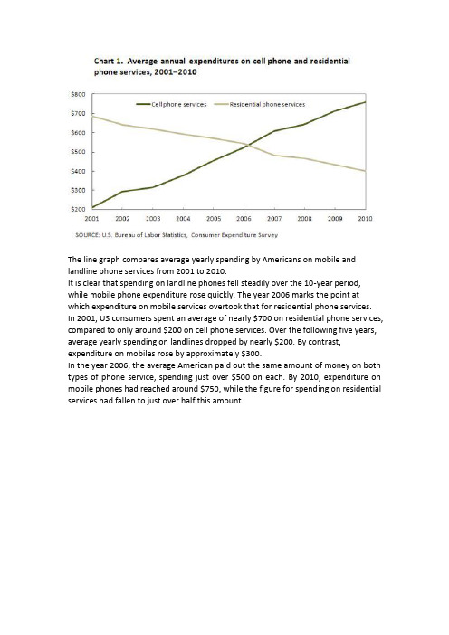
The line graph compares average yearly spending by Americans on mobile and landline phone services from 2001 to 2010.It is clear that spending on landline phones fell steadily over the 10-year period, while mobile phone expenditure rose quickly. The year 2006 marks the point at which expenditure on mobile services overtook that for residential phone services.In 2001, US consumers spent an average of nearly $700 on residential phone services, compared to only around $200 on cell phone services. Over the following five years, average yearly spending on landlines dropped by nearly $200. By contrast, expenditure on mobiles rose by approximately $300.In the year 2006, the average American paid out the same amount of money on both types of phone service, spending just over $500 on each. By 2010, expenditure on mobile phones had reached around $750, while the figure for spending on residential services had fallen to just over half this amount.The diagram illustrates the various stages in the life of a honey bee. We can see that the complete life cycle lasts between 34 and 36 days. It is also noticeable that there are five main stages in the development of the honey bee, from egg to mature adult insect.The life cycle of the honey bee begins when the female adult lays an egg; the female typically lays one or two eggs every 3 days. Between 9 and 10 days later, each egg hatches and the immature insect, or nymph, appears.During the third stage of the life cycle, the nymph grows in size and sheds its skin three times. This moulting first takes place 5 days after the egg hatches, then 7 days later, and again another 9 days later. After a total of 30 to 31 days from the start of the cycle, the young adult honey bee emerges from its final moulting stage, and in the space of only 4 days it reaches full maturity.(169 words, band 9)The chart compares average figures for temperature and precipitation over the course of a calendar year in Kolkata.It is noticeable that monthly figures for precipitation in Kolkata vary considerably, whereas monthly temperatures remain relatively stable. Rainfall is highest from July to August, while temperatures are highest in April and May.Between the months of January and May, average temperatures in Kolkata rise from their lowest point at around 20°C to a peak of just over 30°C. Average rainfall in the city also rises over the same period, from approximately 20mm of rain in January to 100mm in May.While temperatures stay roughly the same for the next four months, the amount of rainfall more than doubles between May and June. Figures for precipitation remain above 250mm from June to September, peaking at around 330mm in July. The final three months of the year see a dramatic fall in precipitation, to a low of about 10mm in December, and a steady drop in temperatures back to the January average. (173 words, band 9)Posted by Simon in IELTSThe bar charts compare students of different ages in terms of why they are studying and whether they are supported by an employer.It is clear that the proportion of students who study for career purposes is far higher among the younger age groups, while the oldest students are more likely to study for interest. Employer support is more commonly given to younger students.Around 80% of students aged under 26 study to further their careers, whereas only 10% study purely out of interest. The gap between these two proportions narrows as students get older, and the figures for those in their forties are the same, at about 40%. Students aged over 49 overwhelmingly study for interest (70%) rather than for professional reasons (less than 20%).Just over 60% of students aged under 26 are supported by their employers. By contrast, the 30-39 age group is the most self-sufficient, with only 30% being given time off and help with fees. The figures rise slightly for students in their forties and for those aged 50 or more.(178 words, band 9)The bar chart compares the number of incidents and injuries for every 100 million passenger miles travelled on five different types of public transport in 2002.It is clear that the most incidents and injuries took place on demand-response vehicles. By contrast, commuter rail services recorded by far the lowest figures.A total of 225 incidents and 173 injuries, per 100 million passenger miles travelled, took place on demand-response transport services. These figures were nearly three times as high as those for the second highest category, bus services. There were 76 incidents and 66 people were injured on buses.Rail services experienced fewer problems. The number of incidents on light rail trains equalled the figure recorded for buses, but there were significantly fewer injuries, at only 39. Heavy rail services saw lower numbers of such events than light rail services, but commuter rail passengers were even less likely to experience problems. In fact, only 20 incidents and 17 injuries occurred on commuter trains.(165 words, band 9)The line graph compares the percentage of people aged 65 or more in three countries over a period of 100 years.It is clear that the proportion of elderly people increases in each country between 1940 and 2040. Japan is expected to see the most dramatic changes in its elderly population.In 1940, around 9% of Americans were aged 65 or over, compared to about 7% of Swedish people and 5% of Japanese people. The proportions of elderly people in the USA and Sweden rose gradually over the next 50 years, reaching just under 15% in 1990. By contrast, the figures for Japan remained below 5% until the early 2000s. Looking into the future, a sudden increase in the percentage of elderly people is predicted for Japan, with a jump of over 15% in just 10 years from 2030 to 2040. By 2040, it is thought that around 27% of the Japanese population will be 65 years oldor more, while the figures for Sweden and the USA will be slightly lower, at about 25% and 23% respectively.(178 words, band 9)The table shows percentages of consumer expenditure for three categories of products and services in five countries in 2002.It is clear that the largest proportion of consumer spending in each country went on food, drinks and tobacco. On the other hand, the leisure/education category has the lowest percentages in the table.Out of the five countries, consumer spending on food, drinks and tobacco was noticeably higher in Turkey, at 32.14%, and Ireland, at nearly 29%. The proportion of spending on leisure and education was also highest in Turkey, at 4.35%, while expenditure on clothing and footwear was significantly higher in Italy, at 9%, than in any of the other countries.It can be seen that Sweden had the lowest percentages of national consumer expenditure for food/drinks/tobacco and for clothing/footwear, at nearly 16% and just over 5% respectively. Spain had slightly higher figures for these categories, but the lowest figure for leisure/education, at only 1.98%.The charts compare the amount of water used for agriculture, industry and homes around the world, and water use in Brazil and the Democratic Republic of Congo.It is clear that global water needs rose significantly between 1900 and 2000, and that agriculture accounted for the largest proportion of water used. We can also see that water consumption was considerably higher in Brazil than in the Congo.In 1900, around 500km³ of water was used by the agriculture sector worldwide. The figures for industrial and domestic water consumption stood at around one fifth of that amount. By 2000, global water use for agriculture had increased to around 3000km³, industrial water use had risen to just under half that amount, and domestic consumption had reached approximately 500km³.In the year 2000, the populations of Brazil and the Congo were 176 million and 5.2 million respectively. Water consumption per person in Brazil, at 359m³, was much higher than that in the Congo, at only 8m³, and this could be explained by the fact that Brazil had 265 times more irrigated land.(184 words, band 9)The bar chart compares the cost of an average house in five major cities over a period of 13 years from 1989.We can see that house prices fell overall between 1990 and 1995, but most of the cities saw rising prices between 1996 and 2002. London experienced by far the greatest changes in house prices over the 13-year period.Over the 5 years after 1989, the cost of average homes in Tokyo and London dropped by around 7%, while New York house prices went down by 5%. By contrast, prices rose by approximately 2% in both Madrid and Frankfurt.Between 1996 and 2002, London house prices jumped to around 12% above the 1989 average. Homebuyers in New York also had to pay significantly more, with prices rising to 5% above the 1989 average, but homes in Tokyo remained cheaper than they were in 1989. The cost of an average home in Madrid rose by a further 2%, while prices in Frankfurt remained stable.(165 words)The table gives information about poverty rates among six types of household in Australia in the year 1999.It is noticeable that levels of poverty were higher for single people than for couples, and people with children were more likely to be poor than those without. Poverty rates were considerably lower among elderly people.Overall, 11% of Australians, or 1,837,000 people, were living in poverty in 1999. Aged people were the least likely to be poor, with poverty levels of 6% and 4% for single aged people and aged couples respectively.Just over one fifth of single parents were living in poverty, whereas only 12% of parents living with a partner were classed as poor. The same pattern can be seen for people with no children: while 19% of single people in this group were living below the poverty line, the figure for couples was much lower, at only 7%.(150 words, band 9)The map shows two potential locations (S1 and S2) for a new supermarket in a town called Garlsdon.The main difference between the two sites is that S1 is outside the town, whereas S2 is in the town centre. The sites can also be compared in terms of access by road or rail, and their positions relative to three smaller towns.Looking at the information in more detail, S1 is in the countryside to the north west of Garlsdon, but it is close to the residential area of the town. S2 is also close to the housing area, which surrounds the town centre.There are main roads from Hindon, Bransdon and Cransdon to Garlsdon town centre, but this is a no traffic zone, so there would be no access to S2 by car. By contrast, S1 lies on the main road to Hindon, but it would be more difficult to reach from Bransdon and Cransdon. Both supermarket sites are close to the railway that runs through Garlsdon from Hindon to Cransdon.The bar chart compares consumer spending on six different items in Germany, Italy, France and Britain.It is clear that British people spent significantly more money than people in the other three countries on all six goods. Of the six items, consumers spent the most money on photographic film.People in Britain spent just over £170,000 on photographic film, which is the highest figure shown on the chart. By contrast, Germans were the lowest overall spenders, with roughly the same figures (just under £150,000) for each of the six products. The figures for spending on toys were the same in both France and Italy, at nearly £160,000. However, while French people spent more than Italians on photographic film and CDs, Italians paid out more for personal stereos, tennis racquets and perfumes. The amount spent by French people on tennis racquets, around £145,000, is the lowest figure shown on the chart.The diagrams show how house designs differ according to climate.The most noticeable difference between houses designed for cool and warm climates is in the shape of the roof. The designs also differ with regard to the windows and the use of insulation.We can see that the cool climate house has a high-angled roof, which allows sunlight to enter through the window. By contrast, the roof of the warm climate house has a peak in the middle and roof overhangs to shade the windows. Insulation and thermal building materials are used in cool climates to reduce heat loss, whereas insulation and reflective materials are used to keep the heat out in warm climates.Finally, the cool climate house has one window which faces the direction of the sun, while the warm climate house has windows on two sides which are shaded from the sun. By opening the two windows at night, the house designed for warm climates can be ventilated.(162 words, band 9)The picture illustrates the way in which water passes from ocean to air to land during the natural process known as the water cycle.Three main stages are shown on the diagram. Ocean water evaporates, falls as rain, and eventually runs back into the oceans again.Beginning at the evaporation stage, we can see that 80% of water vapour in the air comes from the oceans. Heat from the sun causes water to evaporate, and water vapour condenses to form clouds. At the second stage, labelled ‘precipitation’ on the diagram, water falls as rain or snow.At the third stage in the cycle, rainwater may take various paths. Some of it may fall in to lakes or return to the oceans via ‘surface runoff’. Otherwise, rainwater may filter through the ground, reaching the impervious layer of the earth. Salt water intrusion is shown to take place just before groundwater passes into the oceans to complete the cycle.(156 words, band 9)The first picture shows the layout of an art gallery, and the second shows some proposed changes to the gallery space.It is clear that significant changes will be made in terms of the use of floor space in the gallery. There will be a completely new entrance and more space for exhibitions. At present, visitors enter the gallery through doors which lead into a lobby. However, the plan is to move the entrance to the Parkinson Court side of the building, and visitors will walk straight into the exhibition area. In place of the lobby and office areas, which are shown on the existing plan, the new gallery plan shows an education area and a small storage area.The permanent exhibition space in the redeveloped gallery will be about twice as large as it is now because it will occupy the area that is now used for temporary exhibitions. There will also be a new room for special exhibitions. This room is shown in red on the existing plan and is not currently part of the gallery.(178 words, band 9)The table shows data about the underground rail networks in six major cities.The table compares the six networks in terms of their age, size and the number of people who use them each year. It is clear that the three oldest underground systems are larger and serve significantly more passengers than the newer systems. The London underground is the oldest system, having opened in 1863. It is also the largest system, with 394 kilometres of route. The second largest system, in Paris, is only about half the size of the London underground, with 199 kilometres of route. However, it serves more people per year. While only third in terms of size, the Tokyo system is easily the most used, with 1927 million passengers per year.Of the three newer networks, the Washington DC underground is the most extensive, with 126 kilometres of route, compared to only 11 kilometres and 28 kilometres for the Kyoto and Los Angeles systems. The Los Angeles network is the newest, having opened in 2001, while the Kyoto network is the smallest and serves only 45 million passengers per year.(185 words)Cambridge IELTS book 7, page 101:The pie charts compare the amount of electricity produced using five different sources of fuel in two countries over two separate years.Total electricity production increased dramatically from 1980 to 2000 in both Australia and France. While the totals for both countries were similar, there were big differences in the fuel sources used.Coal was used to produce 50 of the total 100 units of electricity in Australia in 1980, rising to 130 out of 170 units in 2000. By contrast, nuclear power became the most important fuel source in France in 2000, producing almost 75% of the country’s electricity.Australia depended on hydro power for just under 25% of its electricity in both years, but the amount of electricity produced using this type of power fell from 5 to only 2 units in France. Oil, on the other hand, remained a relatively important fuel source in France, but its use declined in Australia. Both countries relied on natural gas for electricity production significantly more in 1980 than in 2000.(170 words)The chart gives information about UK immigration, emigration and net migration between 1999 and 2008.Both immigration and emigration rates rose over the period shown, but the figures for immigration were significantly higher. Net migration peaked in 2004 and 2007.In 1999, over 450,000 people came to live in the UK, while the number of people who emigrated stood at just under 300,000. The figure for net migration was around 160,000, and it remained at a similar level until 2003. From 1999 to 2004, the immigration rate rose by nearly 150,000 people, but there was a much smaller rise in emigration. Net migration peaked at almost 250,000 people in 2004.After 2004, the rate of immigration remained high, but the number of people emigrating fluctuated. Emigration fell suddenly in 2007, before peaking at about 420,000 people in 2008. As a result, the net migration figure rose to around 240,000 in 2007, but fell back to around 160,000 in 2008.It is clear from the charts that the figures for developed countries are much higher than those for developing nations. Also, the charts show an overall increase in participation in education and science from 1980 to 1990.People in developing nations attended school for an average of around 3 years, with only a slight increase in years of schooling from 1980 to 1990. On the other hand, the figure for industrialised countries rose from nearly 9 years of schooling in 1980 to nearly 11 years in 1990.From 1980 to 1990, the number of scientists and technicians in industrialised countries almost doubled to about 70 per 1000 people. Spending on research and development also saw rapid growth in these countries, reaching $350 billion in 1990. By contrast, the number of science workers in developing countries remained below 20 per 1000 people, and research spending fell from about $50 billion to only $25 billion.(187 words)The diagram below shows how the Australian Bureau of Meteorology collectsup-to-the-minute information on the weather in order to produce reliable forecasts.The figure illustrates the process used by the Australian Bureau of Meteorology to forecast the weather.There are four stages in the process, beginning with the collection of information about the weather. This information is then analysed, prepared for presentation, and finally broadcast to the public.Looking at the first and second stages of the process, there are three ways of collecting weather data and three ways of analysing it. Firstly, incoming information can be received by satellite and presented for analysis as a satellite photo. The same data can also be passed to a radar station and presented on a radar screen or synoptic chart. Secondly, incoming information may be collected directly by radar and analysed on a radar screen or synoptic chart. Finally, drifting buoys also receive data which can be shown on a synoptic chart.At the third stage of the process, the weather broadcast is prepared on computers. Finally, it is delivered to the public on television, on the radio, or as a recorded telephoneannouncement.The line graph compares the percentage of people in three countries who used the Internet between 1999 and 2009.It is clear that the proportion of the population who used the Internet increased in each country over the period shown. Overall, a much larger percentage of Canadians and Americans had access to the Internet in comparison with Mexicans, and Canada experienced the fastest growth in Internet usage.In 1999, the proportion of people using the Internet in the USA was about 20%. The figures for Canada and Mexico were lower, at about 10% and 5% respectively. In 2005, Internet usage in both the USA and Canada rose to around 70% of the population, while the figure for Mexico reached just over 25%.By 2009, the percentage of Internet users was highest in Canada. Almost 100% of Canadians used the Internet, compared to about 80% of Americans and only 40% of Mexicans.The map shows the growth of a village called Chorleywood between 1868 and 1994.It is clear that the village grew as the transport infrastructure was improved. Four periods of development are shown on the map, and each of the populated areas is near to the main roads, the railway or the motorway.From 1868 to 1883, Chorleywood covered a small area next to one of the main roads. Chorleywood Park and Golf Course is now located next to this original village area. The village grew along the main road to the south between 1883 and 1922, and in 1909 a railway line was built crossing this area from west to east. Chorleywood station is in this part of the village.The expansion of Chorleywood continued to the east and west alongside the railway line until 1970. At that time, a motorway was built to the east of the village, and from 1970 to 1994, further development of the village took place around motorway intersections with the railway and one of the main roads.。
雅思英语作文范文10篇
雅思英语作文范文10篇英文回答:1. Environmental Sustainability.Environmental sustainability is a critical issue facing our planet today. The impact of human activities on the environment, such as pollution, deforestation, and climate change, has reached alarming levels. As a result, there is an urgent need to adopt sustainable practices and reduce our ecological footprint. One effective way to achieve this is through the implementation of renewable energy sources, such as solar and wind power. These technologies harness natural resources to generate electricity without emitting harmful greenhouse gases, thereby mitigating the effects of climate change. Additionally, promoting energy efficiency measures, such as the use of energy-efficient appliances and the adoption of sustainable transportation methods, can further reduce our dependence on fossil fuels.中文回答:1. 环境可持续性。
雅思英语作文范文10篇
雅思英语作文范文10篇英文回答:1. The impact of the internet on education.The internet has significantly transformed the educational landscape globally. Its impact can be observed in various aspects, including access to information, learning methods, and communication.Access to information: The internet provides students with unprecedented access to a vast array of educational resources. Digital libraries, online courses, and encyclopedias offer a wealth of knowledge at their fingertips, enabling them to explore diverse topics and deepen their understanding.Learning methods: The internet has facilitated the development of innovative learning methods. E-learning platforms, interactive simulations, and online games makelearning more engaging and interactive. Students can tailor their learning experiences to their individual needs and pace, fostering self-paced and personalized education.Communication: The internet has revolutionized communication between students, teachers, and parents. Email, instant messaging, and video conferencing tools enable real-time collaboration and discussion, supporting learners within and beyond the traditional classroom setting.While the internet has undoubtedly enhanced educational opportunities, it also presents certain challenges. Concerns regarding digital literacy, equitable access, and the spread of misinformation require attention to ensure that its benefits are widely enjoyed.2. The importance of creativity and innovation in society.Creativity and innovation are indispensable qualities in modern society. They drive progress, stimulate economicgrowth, and enhance our overall well-being.Economic growth: Creativity and innovation lead to new ideas, products, and services that can boost economic productivity and competitiveness. Businesses that embrace innovation often gain a competitive advantage in the market.Social progress: Creative solutions and innovative approaches contribute to solving societal challenges. From addressing environmental issues to developing accessible healthcare technologies, creativity and innovation play a crucial role in improving our communities.Personal fulfillment: Engaging in creative activities and fostering an innovative mindset bring joy, purpose, and a sense of accomplishment to individuals. It allows us to express ourselves, connect with others, and contribute to a better world.3. The challenges of transitioning into a green and sustainable economy.The transition to a green and sustainable economy presents numerous challenges that require collectiveefforts and innovative solutions.Economic restructuring: Shifting to renewable energy sources and sustainable practices requires significant investments and technological advancements. This can lead to job losses in certain industries while creating new opportunities in others, necessitating workforce training and support.Technological innovation: Developing and implementing sustainable technologies pose technical challenges that require collaboration between scientists, engineers, and policymakers. Accelerating the pace of innovation is essential to address climate change and other environmental concerns.Consumer behavior: Changing consumer habits and promoting sustainable practices require raising awareness, educating the public, and incentivizing eco-friendly behavior. Shifting towards more sustainable lifestyles iscrucial for long-term environmental preservation.4. The role of technology in healthcare.Technology is rapidly transforming the healthcare industry, offering numerous benefits and challenges.Improved diagnosis and treatment: Advanced medical devices and diagnostic tools enable more accurate and timely diagnosis of diseases. Telemedicine allows patients in remote areas to access medical care, while artificial intelligence assists healthcare professionals in analyzing medical data and making informed decisions.Increased accessibility and convenience: Technology facilitates remote patient monitoring, virtual consultations, and online appointment scheduling, making healthcare more accessible and convenient for patients. Mobile health apps empower individuals to manage their own health and wellness.Ethical concerns: The use of patient data and thepotential for algorithmic bias raise ethical concerns. Ensuring data privacy, transparency, and accountability is essential to maintain trust in technology-driven healthcare systems.5. The value of diversity and inclusion in the workplace.Diversity and inclusion in the workplace create a more enriching and productive environment for all employees.Increased innovation: Diverse perspectives and experiences foster innovation and creativity. Teams with members from different backgrounds bring unique ideas and approaches to problem-solving, leading to more effective solutions.Improved employee satisfaction: Inclusive workplaces value and respect the differences among employees, creating a sense of belonging and fostering employee engagement. This translates into increased job satisfaction and productivity.Enhanced reputation: Organizations that embrace diversity and inclusion are seen as progressive andsocially responsible. This positive reputation attracts top talent and enhances the company's brand image.6. The impact of social media on mental health.Social media platforms have become an integral part of our lives, but their impact on mental health is complex and multifaceted.Positive effects: Social media can provideopportunities for social connection, support, and self-expression. It can reduce feelings of isolation and loneliness, particularly for individuals with limitedsocial networks.Negative effects: Excessive use of social media has been linked to increased anxiety, depression, and sleep disturbances. The constant exposure to idealized content and the pursuit of social validation can lead to a negativebody image and low self-esteem.Cyberbullying and online harassment: Social media platforms can provide a fertile ground for cyberbullying and online harassment. These experiences can have severe consequences for mental health, ranging from diminishedself-worth to suicidal thoughts.7. The importance of physical activity in maintaining a healthy lifestyle.Physical activity is an essential component of a healthy lifestyle, contributing to both physical and mental well-being.Physical benefits: Regular exercise strengthens the cardiovascular system, builds muscle mass, and reduces the risk of chronic diseases such as heart disease, stroke, type 2 diabetes, and some types of cancer. It also improves flexibility, balance, and coordination.Mental benefits: Physical activity releases endorphins,which have mood-boosting effects. It can reduce stress, anxiety, and depression, promoting overall mental health and well-being. Exercise can also enhance cognitivefunction and improve sleep quality.Social benefits: Engaging in physical activities with others, such as team sports or group fitness classes, provides opportunities for social interaction and community building. It can strengthen bonds and foster a sense of belonging.8. The challenges of raising children in the digital age.Parenting in the digital age presents unique challenges that require parents to navigate the potential risks and benefits of technology.Screen time management: Regulating children's screen time is crucial to prevent excessive use and its associated negative effects on physical, cognitive, and social development. Parents must set clear limits and encouragealternative activities.Cyberbullying and online safety: Children are vulnerable to cyberbullying and online harassment. Parents must educate them about these risks, monitor their online activities, and provide support if needed.Digital literacy: Children need to develop digital literacy skills to understand and use technology effectively. Parents should encourage them to explore responsible and ethical online behavior and equip them with the necessary critical thinking skills.9. The role of government in regulating the internet.Balancing innovation and regulation in the digital realm remains a complex challenge for governments.Protecting privacy and data security: Governments must implement regulations to protect citizens' privacy and data security online. This includes safeguarding personal information, preventing data breaches, and ensuringtransparency and accountability from tech companies.Combating misinformation and hate speech: The spread of misinformation and hate speech online can have detrimental effects on society. Governments have a responsibility to regulate these harmful content without infringing on freedom of expression.Encouraging competition and innovation: Governments must strike a balance between regulating the internet to protect users and fostering competition and innovation within the tech industry. Overly restrictive regulations can stifle progress and limit consumer choice.10. The impact of climate change on future generations.Climate change poses significant threats to future generations, requiring urgent action to mitigate its effects.Environmental degradation: Climate change leads to rising sea levels, extreme weather events, and loss ofbiodiversity. These environmental impacts can displace communities, disrupt ecosystems, and threaten food security.Health risks: Climate change exacerbates health risks, including heat stress, air pollution, and waterborne diseases. Future generations may face an increased burdenof climate-related illnesses.Economic disparities: Climate change disproportionately affects vulnerable populations and can widen economic inequalities. Future generations may face job losses, reduced economic opportunities, and increased poverty.中文回答:1. 互联网对教育的影响。
- 1、下载文档前请自行甄别文档内容的完整性,平台不提供额外的编辑、内容补充、找答案等附加服务。
- 2、"仅部分预览"的文档,不可在线预览部分如存在完整性等问题,可反馈申请退款(可完整预览的文档不适用该条件!)。
- 3、如文档侵犯您的权益,请联系客服反馈,我们会尽快为您处理(人工客服工作时间:9:00-18:30)。
表格图001You should spend about 20 minutes on this task.The table below give information about Favorite Pastimes in different countries. Summarise the information by selecting and reporting the main features, and make comparisons where relevant.Write at least 150 words.model answer:This table clearly presents and compares favorable pastimes in eight different countries. The pastimes, across the top of the table, are analyzed in relation to each country.As can be seen, about 60% of Canadians, Australians and Americans like watching television. On the other hand, this figure is quite low for China where only 15% of people watch television. Predictably, Americans like music at 23%, whereas only 2 to 5% of people in the other countries feel the same way. 20% of people in England enjoy sleeping as a pastime whereas in Canada and the USA, for example, the figure is only 2%. Interestingly, the Chinese like hobbies the most at 50%, as opposed to only 20% in France. It isn't surprising that the highest percentage of beach-lovers is in Australia and the USA at 30%.It seems that pastimes of people of different nationalities may be influenced by a number offactors such as the socio-economic situation or the climate. These factors influence cultural differences between different nationalities and make cross-cultural experiences more interesting.(175 words)表格图002You should spend about 20 minutes on this task.The table below provide information on rental charges and salaries in three areas of London. Write a report for a university lecturer describing the information shown below.You should write at least 150 words.Weekly rents per propertySalaries needed (£/year)(£/w)model answer:The table shows two sets of related information: the relative cost, in pounds, of renting a property with one, two or three bedrooms in three different suburbs of London and an indication of the kind of annual salary you would need to be earning to rent in these areas.Of the three areas mentioned, Notting Hill is the most expensive with weekly rents starting at £375 (salary approximately f 100,000) and rising to £738 per week for a 3-bedroom property. To afford this, you would require a salary in the region of £200,000 per annum. Alternatively, Fulham is the cheapest area shown with rents rangin g from £215 per week for a one bedroom property to £600 per week for a 3-bedroom property. To rent in this area, salaries need to be somewhere between £85,000 and £170,000 depending on the number of bedrooms required. For those ableto pay in the middle price range for accommodation, Regent's Park might be a more suitable district.(163 words)饼状图001You should spend about 20 minutes on this task.The two graphs show the main sources of energy in the USA in the 1980s and the 1990s. Write a report for a university lecturer describing the changes which occurred.Write at least 150 words.model answer:The two graphs show that oil was the major energy source in the USA in both 1980 and 1990 and that coal, natural gas and hydroelectric power remained in much the same proportions. On the other hand, there was a dramatic rise in nuclear power, which doubled its percentage over the ten years.Oil supplied the largest percentage of energy, although the percentage decreased from 42% in 1980 to 33% in 1990. Coal in 1990 was the second largest source of energy, increasing itsproportion to 27% from 22% in the previous decade. Natural gas, the second largest source in 1980 at 26%, decreased its share very slightly to provide 25% of America's energy ten years later. There was no change in the percentage supplied by hydroelectric power which remained at 5% of the total energy used. Nuclear power the greatest change: in 1990 it was 10%, twice that of the 1980s.(152 words)饼状图002You should spend about 20 minutes on this task.Write a report for a university lecturer describing the information shown below.You should write at least 150 words.model answer:In this analysis we will examine three pie charts. The first one is headed 'World Spending.' The second is 'World Population' and the third is 'Consumption of Resources.'In the first chart we can see that people spend most of their income (24%) on food. In some countries this percentage would obviously be much higher. Transport and then housing are the next major expenses at 18% and 12% respectively. Only 6% of income is spent on clothing.In the second chart entitled 'World Population', it is not surprising to find that 57% of people live in Asia. In fact China and India are two of the most populated countries in the world and they are both situated on this continent. Europe and the Americans account for nearly 30% of the total, whilst 10% of people live in Africa.Finally, the third chart reveals that the USA and Europe consume a huge 60% of the world's resource.To sum up, the major expenditure is on food, the population figures are the highest for Asia and the major consumers are the USA and Europe.(182 words)地图题001You should spend about 20 minutes on this task.The diagrams below give information about the Eiffel Tower in Paris and an outline project to extend it underground.Write a report for a university lecturer describing the information shown.You should write at least 150 words.model answer:The Eiffel Tower is situated close to the Seine River in Paris. It is a metal structure that is 1,063 feet high and weighs 7,417 tonnes. The tower has been a tourist attraction since 1889, when it wasbuilt, and there are 1,665 steps that can be climbed in order to reach the two viewing platforms.There are now plans to build below the foundations of the tower. These plans include the development of five underground levels that will incorporate the tower's ticket office, shopping facilities, a cinema and museum and two floors of underground parking.Although details have yet to be finalised, the principle is that the five floors will be connected by two vertical passenger lifts on either side of the tower. In addition, the floor immediately below the tower, which is planned to house the ticket office, will also consist of a large atrium with a glass ceiling so that visitors can look directly up at the tower itself.(162 words)地图题002You should spend about 20 minutes on this task.The diagram below gives the information about the Hawaiian island chain in the centre of the Pacific Ocean.Write a report for a university lecturer describing the information shown.You should write at least 150 words.model answer:The Hawaiian island chain, in the centre of the Pacific Ocean, is approximately 2,700 km in length. It is formed of volcanoes and the active ones are at the south-east tip of the archipelago, where Hawaii itself is located.It is believed that the chain began to form nearly 80 million years ago. Each island started to evolve after an eruption on the sea floor. First, a `hot spot' existed on the ocean bed, which let out a plume of material called magma. This magma may originate as deep as 2,883km below the ocean bed. Next, further eruptions took place, which built up the volcano. Eventually, it emerged above the surface of the ocean.Since that time, the spume of magma has remained static as the Pacific tectonic plate moves in a north-west direction across it at a speed of 7-9cm per year. As it moves, a volcano forms as it passes over the hotspot and then become inactive when it has passed it.(164 words)流程图001You should spend about 20 minutes on this task.The flowchart illustrates the production of coloured plastic paper clips in a small factory. Write a report for a university tutor describing the production process.Write at least 150 words.model answer:There are four main stages in the production of plastic paper clips from this small factory. Two of these stages involve actual preparation of the clips, while the other two consist of quality control before the clips are sent out from the factory to the retailers to be sold to the public.To begin with, molten plastic is poured into three different moulds depending on the colour required; the colours are red, blue and yellow. Once these clips emerge from the moulds a quality control machine checks them for strength. Unsatisfactory clips are rejected. In the third stage in the process the clips are stored by hand into two groups, mixed and single colours. When this stage is complete the groups are checked a second time to ensure that the colour mixtures are divided correctly into single colours and mixed colour batches. Finally, the clips are packed and dispatched to the markets.(152 words)流程图002You should spend about 20 minutes on this task.The diagram below shows how a central heating system in a house works.Summarise the information by selecting and reporting the main features, and make comparisons where relevant.You should write at least 150 words.model answer:This diagram provides an overview of a domestic central heating system. It shows how the tank, boiler and pipes ensure a constant flow of hot waterto both the radiators and the taps.The cold water enters the house and is stored in a water storage tank in the roof. From there üflows down to the boiler, located on the ground floor of the house.The boiler, which is fuelled by gas or oil, heats up the water as it passes through it. The hot water is then pumped round the house through a system of pipes and flows into the radiators, located in different rooms. The water circulates through the radiators, which have small tubes inside them to help distribute the heat, and this warms each of the rooms. Some of the water is directed to the taps to provide hot water for the house.Once the water has been through the pipes and radiators, it is returned to the boiler to bere-heated and circulated round the house again.(172 words)曲线图001You should spend about 20 minutes on this task.The graph below shows the differences in wheat exports over three different areas.Write a report for a university lecturer describing the information shown below.Write at least 150 words.model answer:The three graphs of wheat exports each show a quite different pattern between 1985 and 1990. Exports from Australia declined over the five-year period, while the Canadian market fluctuated considerably, and the European Community showed an increase.In 1985, Australia exported about 15 millions of tonnes of wheat and the following year the number increased by one million tonnes to 16 million. After that, however, there was a gradual decline until 1989 and 1990 when it stabilised at about 11 million tonnes. Over the same period, the amount of Canadian exports varied greatly. It started at 19 million tonnes in 1985, reached a peak in 1988 of 24 million, dropped dramatically in 1989 to 14 million tonnes and then climbed back to 19 million in 1990. Seventeen million tonnes were exported from the European Community in 1985, but this decreased to 14 million tonnes in 1986 and then rose to 15 million in 1987 and 1988 before increasing once more to 20 million in 1990.(165 words)曲线图002You should spend about 20 minutes on this task.The graph and table below give information about water use worldwide and water consumption in two different countries.Summarise the information by selecting and reporting the main features, and make comparisons where relevant.Write at least 150 words.model answer:The graph shows how the amount of water used worldwide changed between 1900 and 2000.Throughout the century, the largest quantity of water was used for agricultural Purposes, and this increased dramatically from about 500 km³to around 3,000 km³in the year 2000. Water used in the industrial and domestic sectors also increased, but consumption was minimal untilmid-century. From 1950 onwards, industrial use grew steadily to just over 1,000 km³, while domestic use rose more slowly to only 300 km³, both far below the levels of consumption by agriculture.The table illustrates the differences in agriculture consumption in some areas of the world by contrasting the amount of irrigated land in Brazil (26,500 km³) with that in the D.R.C. (100 km²). This means that a huge amount of water is used in agriculture in Brazil, and this is reflected in the figures for water consumption per person: 359 m³compared with only 8 m³in the Congo. With a population of 176 million, the figures for Brazil indicate how high agriculture water consumption can be in some countries.(180 words)柱状图001The chart shows the division of household tasks by gender in Great Britain.Write a report for a university lecture describing the information shown below.You should write at least 150 words.Source: Office for National Statistics on behalf of the Controller of Her Majesty's Stationery Office.Study these three sentences and then write three similar sentences about other parts of the chart.1 Women spend over twice as much time doing kitchen tasks as men.2 Men spend 30 minutes a day doing kitchen tasks whereas / while women spend 74 minutes a day.3 Women are more active in the kitchen than men (74 minutes a day for women as opposed to 30 minutes for men).Sample Report:The chart shows the average number of minutes per day men and women in Great Britain spend on jobs around the house.In total, men spend just over two-and-a-half hours on household tasks whereas women spend slightly less than four hours. Women spend more than twice as much time doing kitchen tasks such as cooking and washing up as men (74 minutes for women as opposed to 30 minutes for men. Women are also more active in cleaning the house- it takes 58 minutes of their day compared to / with 13 minutes for men - and childcare, where women put in more than twice as much time as men.On the other hand, men are more active in gardening and pet care, where they spend twice as long as women, and maintenance and DIY, on which they spend 15 minutes more than women. Women account for almost all the time spent on washing and ironing clothes. This takes them 25 minutes, while / whereas men spend just 2 minutes on this task.Overall the figures show that women spend more time on routine domestic chores than men, while / whereas men do more household maintenance, gardening and pet care.柱状图002The chart shows student expenditure over a three-year period in the United Kingdom.Write a report for a university lecture describing the information shown below.You should write at least 150 words.Student expenditure (aged under 26 in higher education) United Kingdom*Percentage of total expenditure(1) includes non-essential consumer items and credit repayments* Source: Student Income and Expenditure Survey. Department for Education and Employment.Study these three sentences and then write three similar sentences about other parts of the chart.1 During the period 1996 to 1999, student spent 3% less on accommodation, which fell from 23% to 20% of total expenditure.2 There was a 3% decrease in spending on accommodation, which fell from 23% to 20%.3 Spending on accommodation went down by 3% from 23% to 20%.Sample Report:The chart shows the changes which took place in student spending in the United Kingdom during/over the three-year period from 1996 to 1999.Students spent 3% less on accommodation, which fell from 23% to 20% of total expenditure, andthere was a 2% decrease in spending on food, bills and household goods, which fell from 20% to 18%. At the same time course expenditure went down by 3% from 10% to 7%. Children, who constituted 1% of students' expenditure in 1996, are not represented in 1999.On the other hand, there was a 5% growth in spending on entertainment, which stood at 26% of total expenditure in 1996 but rose to 31% in 1999. Spending on other non-essential items and credit repayments grew by 4% to make up 16% of total expenditure. Spending on essential travel went up by 3% while non-essential travel underwent a 1% fall.Overall, with the exception of expenditure on travel, the most significant general change was a shift from/in spending on essential items to spending on non-essential items.组合图001You should spend about 20 minutes on this task.The table below shows CO2 emissions for different forms of transport in the European Union.The Pie Chart shows the percentage of European Union funds being spent on different forms of transport.You should write at least 150 words.Give reasons for your answer and include any relevant examples from your own knowledge or experience.model answer:The chart shows CO2 emissions per passenger kilometre for variuos methods of transport in the European Union while the pie chart shows European Union spending on transport. Flying by air produces by far the greatest CO2 emissions, approximately three times as much as passengercars which are the next largest producers. Very little is spent by the EU on air travel while roads make up more than half of the EU transport budget.Trains produce about three times less CO2 emissions per passenger kilometre than passenger cars and eight times less than air travel. Nearly a third of EU transport funds are spent on railways.Ships are a clean form of transport and produce about the same amount of CO2 per passenger kilometre as trains do. However, only 2 percent of EU funds are spent on ports. A further one percent is spent on inland waterways.Coaches are the cleanest form of transport. Emissions of CO2 per passenger kilometre from coaches are half those of buses. Buses emit less than half as much CO2 per passenger kilometre as cars. The European Union spends 10 percent of its transport budget on public transport, such as buses and coaches.(197 words)组合图002You should spend about 20 minutes on this task.The graphs show enrolment in different colleges in the Higher Colleges of Technology in 1999.Write a total of 150 - 200 words about the information in the three graphs.Write a report for a university lecturer describing the information given.You should write at least 150 words.model answer:The charts shows student enrolment by gender and level in different colleges of the Higher Colleges of Technology colleges in the UAE.There are clear differences in male and female enrolment. Females outnumber men in all the colleges, with almost 25% more students in Dubai Women's college than in Dubai Men's. Ras Al-Khaimah Women's College has almost 180 students, compared to only 100 in the Men's college.Females also outnumber males by level, with almost double the number of men at Higher Diploma level (330 compared to 181). Only at Diploma level does the number of men slightly exceed that of women.Over half the students are in Certificate level, with less than a quarter at Higher Diploma or Bachelor level.In conclusion, most students in the Higher Colleges are enrolled at Diploma level or below, and the majority of students are women.(143 words)。