(完整版)雅思小作文:饼图写法全解析
雅思写作-小作文-饼图(精选五篇)

雅思写作-小作文-饼图(精选五篇)第一篇:雅思写作-小作文-饼图雅思考试优秀作文范文:是否禁烟?Version 122 Some people claim that using tobacco has brought severe social problems and smoking should be banned.T o what extent do you agree with theabove statement?Introduction(56 words)Since the discovery of tobacco related to a number of health problems, an increasing number of people have called for prohibiting smoking.It is undeniable that still a considerable amount of smokers exist in this world.I would like to examine the advantages and disadvantages of smoking cigarettes as following and then offer my own opinion.Body1(95words) There are some advantages to taking tobacco.(topic sentence)First, tobacco industry contributes a great proportion of revenue to the nation.Extremely high taxation imposed on tobacco yielding and cigarette manufacturing has released the financial burden for both the government and the individual taxpayergeneration by generation.Second, the soothing effects of smoking has been confirmed by ordinary smokers;particularly those who have hard-brain-working jobs are in favor of it;they claim that smoking cigarettes can make them calm and stimulate brain cells to work more efficiently.Finally, cigarettes play an important role in social activities.Body2(106words)On the other hand, smoking demonstrates numerous negative effects.(topic sentence)Initially, nicotine may bring takers a number of diseases.Second-hand smoking also doesharm to your health.Moreover, hatred from non-smokers always grow against smokers hence some conflicts arise frequently.We then look at the statistics showing that thousands of fire accidents worldwide occur each year due to the litter of non-extinguished cigarette ends, not to mention the related deaths and st but not least, expenses have to be taken into consideration.Fine cigarettes are not cheap.If you get addicted to them, your daily amount of cigarette consumption will increase inevitably, emptying your pocket money.Conclusion(88words) After all, so far no direct evidence has been provided that smoking can definitely result in takers' death of lung cancer, and those fire accidents are the result of carelessness or irresponsibility of the smokers, not tobacco to be laid blames.Also, spending pocket money can never be considered as a financial burden.In addition, I suggest more restricted smoking areas be planned so as not to violate non-smokers' rights.After weighing the pros and cons of using tobacco, I, for one, am against the act to ban smoking.声明:本范文为赖老师专供无忧雅思作品,转载请注明作者和出处!范文仅供参考,切不可背诵,否则可能得非常低的分数,甚至0分。
雅思小作文 饼状图

雅思小作文饼状图英文回答:The pie chart illustrates the percentage of various sources of energy consumed in a particular region during a specific year. The data is presented in a clear and concise manner, with each slice of the pie representing a different energy source.Upon examining the pie chart, it becomes evident that non-renewable energy sources dominate the region's energy consumption. Fossil fuels, including coal, natural gas, and oil, account for a substantial 80% of the total energy usage. This heavy reliance on non-renewable resources highlights the region's dependence on finite energy sources, which raises concerns about future energy security and environmental sustainability.In contrast, renewable energy sources play a relatively minor role in the region's energy mix. Solar and wind powercombined contribute a mere 10% to the total energy consumption. This low percentage suggests a lack of investment in renewable energy infrastructure and a reluctance to transition towards cleaner and more sustainable energy sources.Hydroelectricity stands out as the most significant renewable energy source, accounting for 5% of the region's energy consumption. However, this figure is stillrelatively low compared to the potential hydroelectric resources that the region may possess. The untapped potential of hydroelectricity presents an opportunity for the region to increase its reliance on renewable energy and reduce its dependence on fossil fuels.Overall, the pie chart provides valuable insights into the region's energy consumption patterns. The dominance of non-renewable energy sources raises concerns about the region's long-term energy security and environmental sustainability. The underutilization of renewable energy sources, particularly hydroelectricity, suggests a need for increased investment and a shift towards a more sustainableenergy future.中文回答:此饼状图展示了某个地区在某一年中各种能源消耗所占的百分比。
雅思写作小作文范文 雅思写作饼状图pie chart 宾馆服务满意度.doc

雅思写作小作文范文雅思写作饼状图pie chart 宾馆服务满意度今天我们雅思写作小作文范文的文章来研究下饼状图pie chart。
该题目包含两个图形,显示了某项调查问卷在2005年和2010年的结果。
该调查要求顾客对Parkway宾馆的客户服务给出评价,并将评价结果分为很差,差,满意,良好,优秀五个等级。
小编搜集了一篇相关的考官范文,以供大家参考。
雅思写作小作文题目The charts below show the results of a questionnaire that asked visitors to the Parkway Hotel how they rated the hotel’s customer service. The same questionnaire was given to 100 guests in the years 2005 and 2010.Summarise the information by selecting and reporting the main features, and make comparisons where relevant.雅思写作小作文范文The pie charts compare visitors’ responses to a survey about customer service at the Parkway Hotel in 2005 and in 2010.饼状图比较了2005年和2010年游客对Parkway宾馆客户服务满意度的调查结果。
It is clear that overall customer satisfaction increased considerably from 2005 to 2010. While most hotel guests rated customer service as satisfactory or poor in 2005, a clear majority described the hotel’s service as good or excellent in 2010.很明显,从2005年到2010年,整体的客户满意度有了很大的提升。
雅思小作文 饼图分析

? 三倍triple 四倍quadruple n/adj/v
? fourfold adj/adv
P2
? In 1980 Australia used coal as the main electricity source (50 units) and the remainder was produced from natural gas, hydro power (each producing 20 units) and oil (which produced only 10 units).
? The difference is that in country A and B accommodation spending exceeded food spending, while the reverse was true for country C.
? 比较较大/最大
P4
? The rest of the students' spending was divided among leisure, books and others.
Jay
练习
? 女生的数量大约是男生的三倍 ? The number of girls is about 3 times that of
boys ? The number of girls is about 3 times as high as
雅思写作-小作文范文-饼图

饼图B7T4原题The pie charts below show units of electricity production by fuel source in Australia and France in 1980 and 2000.Summarize the information by selecting and reporting the main features, and make comparisons where relevant.The charts compare the sources of electricity in Australia and France in the years 1980 and 2000. Between these years electricity production almost doubled, rising from 100 units to 170 in Australia, and from 90 to 180 units in France.In 1980 Australia used coal as the main electricity source (50 units) and the remainder was produced from natural gas, hydro power (each producing 20 units) and oil (which produced only 10 units). By 2000, coal had become the fuel for more than 75% of electricity produced and only hydro continued to be another significant source supplying approximately 20%.In contrast, France used coal as a source for only 25 units of electricity in 1980, which was matched by natural gas. The remaining 40 units were produced largely from oil and nuclear power, with hydro contributing only 5 units. But by 2000 nuclear power, which was not used at all in Australia, had developed into the main source, producingalmost 75% of electricity, at 126 units, while coal and oil together produced only 50 units. Other sources were no longer significant.Overall, it is clear that by 20000 these two countries relied on different principal fuel sources: Australia relied on coal and France on nuclear power.分析:题目The pie charts below show units of electricity production by fuel source in Australia and France in 1980 and 2000.•文章谈到的四个要素:units of electricity production, fuel source, Australia and France, 1980 and 2000第一段The charts compare the sources of electricity in Australia and France in the years 1980 and 2000.•四个要素也不能少: sources, electricity, Australia and France, 1980 and 2000 •这次我们也试着将名词性短语改成一个句子, The charts indicate how many units of electricity were produced by different fuel sources in Australia and Francebetween 1980 and 2000.Between these years electricity production almost doubled, rising from 100 units to 170 in Australia, and from 90 to 180 units in France.•说明两个国家从1980到2000的总量的变化•比较一下两个double的用法Ø double [vi]: Electricity production almost doubled.Ø double [vt]: The two countries doubled their electricity production.Ø 这两种用法在雅思图表作文中都很常用,注意一下第二段In 1980 Australia used coal as the main electricity source (50 units) and the remainder was produced from natural gas, hydro power (each producing 20 units) and oil (which produced only 10 units).•说明了澳大利亚1980年情况,•注意同义表达use…as the source, be produced fromBy 2000, coal had become the fuel for more than 75% of electricity produced and only hydro continued to be another significant source supplying approximately 20%.•说明了澳大利亚2000年的情况,注意此处引用了百分数,而非绝对值•这里采用了fuel作为了表达的主语,如Coal had become the fuel, Hydro continued to be another source.第三段In contrast, France used coal as a source for only 25 units of electricity in 1980, which was matched by natural gas. The remaining 40 units were produced largely from oil and nuclear power, with hydro contributing only 5 units.•说明法国1980年的情况•类似于1980年澳大利亚的表达:use…as a source, be produced fromBut by 2000 nuclear power, which was not used at all in Australia, had developed into the main source, producing almost 75% of electricity, at 126 units, while coal and oil together produced only 50 units. Other sources were no longer significant.•说明了法国2000年的情况•类似于2000年澳大利亚的表达:nuclear had developed into the main source第四段Overall, it is clear that by 20000 these two countries relied on different principal fuel sources: Australia relied on coal and France on nuclear power.上文谈到了1980年和2000年两国的发电总量变化(年代变化),这里谈到2000年两国的主要依赖能源(国家对照)词汇句型积累雅思图表作文基本功主要考察的是同义表达,如下面的这句话,就会有多种表达•Australia used coal as the main electricity source•Coal was the main source for electricity in Australia.•The main proportion of electricity was produced from coal in Australia.•Coal became the main fuel to produce electricity in Australia.这个句子中有几个要素coal, electricity, Australia, 你只要将这几个要素所作的句子成分发生变化,句式就会呈现多样性,同义多样表达必须掌握,大家平时可以自己多做这样的练习,以便掌握好这项基本技能。
雅思小作文饼图范文

雅思小作文饼图范文下载温馨提示:该文档是我店铺精心编制而成,希望大家下载以后,能够帮助大家解决实际的问题。
文档下载后可定制随意修改,请根据实际需要进行相应的调整和使用,谢谢!并且,本店铺为大家提供各种各样类型的实用资料,如教育随笔、日记赏析、句子摘抄、古诗大全、经典美文、话题作文、工作总结、词语解析、文案摘录、其他资料等等,如想了解不同资料格式和写法,敬请关注!Download tips: This document is carefully compiled by theeditor. I hope that after you download them,they can help yousolve practical problems. The document can be customized andmodified after downloading,please adjust and use it according toactual needs, thank you!In addition, our shop provides you with various types ofpractical materials,such as educational essays, diaryappreciation,sentence excerpts,ancient poems,classic articles,topic composition,work summary,word parsing,copy excerpts,other materials and so on,want to know different data formats andwriting methods,please pay attention!《雅思小作文饼图范文》。
嘿,小朋友们!今天咱们来瞧瞧一个好玩的饼图哟!这个饼图是讲一些动物的数量占比哒。
两个时间的饼图雅思小作文

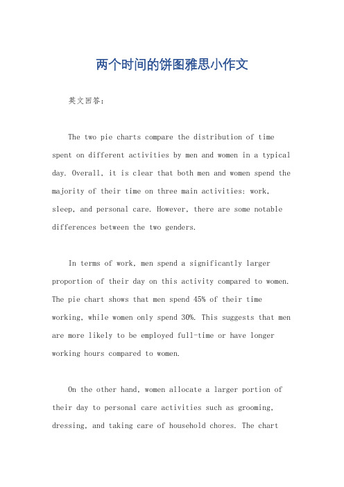
两个时间的饼图雅思小作文英文回答:The two pie charts compare the distribution of time spent on different activities by men and women in a typical day. Overall, it is clear that both men and women spend the majority of their time on three main activities: work, sleep, and personal care. However, there are some notable differences between the two genders.In terms of work, men spend a significantly larger proportion of their day on this activity compared to women. The pie chart shows that men spend 45% of their time working, while women only spend 30%. This suggests that men are more likely to be employed full-time or have longer working hours compared to women.On the other hand, women allocate a larger portion of their day to personal care activities such as grooming, dressing, and taking care of household chores. The chartreveals that women spend 35% of their time on personal care, whereas men only spend 25%. This indicates that women tendto take on more responsibilities related to maintaining the household and their personal appearance.When it comes to sleep, both genders allocate a similar amount of time for rest. Men spend 30% of their day sleeping, while women spend 28%. This suggests that both men and women prioritize getting enough rest and recognize the importance of sleep for their overall well-being.中文回答:这两个饼图比较了男性和女性在一天中不同活动上所花费的时间分配。
雅思考试饼状图写作模板探究

雅思考试饼状图写作模板探究小作文模板——饼状图1.描述It is clear that the most (adj.) xx is A, which accounts for m% of all x . B is the next largest(adj.)xx ,n% lower than A of all x and followed closely by C . The above three items of xx take uo about o% of the x%By contrast D E andF make uo the smallest percentage of total x , which are p% q% and r% ,respectively.The regions can be divided into two groups-one where … and the other where the reverse is the case.2.比较,占据,百分数Form, comprise, make up, occupyConstitute, cover, represent, account forBe shared byIn 1950, the urban population represented less than 13% of the total. It is now about 40% and is expected to reach 60% by 2030. (摘自BBC)3.比例,倍数A quarter of…Half of…A majority of…A has something in common with bA shares some similarity with bThe difference between a and b lies in…Double, triple, quadruple (v, n, adj)原来的2倍-double, 50→100原来的3倍-triple, 50→150原来的4倍-quadruple, 50→200The value of the house has increased fourfold (=it is now worth four times as much as before).…be twice as adj. as …..…more than xx times as adj. as …..外朗教育4999元托福/雅思保分课程/zhuanti/baofenkecheng/index.html。
雅思名师写作范文:饼状图作文

雅思名师写作范文:饼状图作文最权威的国际教育服务平台雅思名师写作范文:饼状图作文This is a pie chart that shows the proportion of the meal sold in a supermarket. The total meat sold in the supermarket is classified into six types as follows: chicken, pork, beef, lamb, fish and others.Overall, chicken has the largest proportion, which accounts for 40%; while others has the smallest percentage, at 2%.As can be seen in the pie chart, chicken, which makes up 40%, is the most popular among the total meat sold, then next is pork with 20%, followed by beef,constituting 18%; and finally come lamb, fish and others at 15%, 5% and 2%respectively, It should be noted that the sale of pork is half as much as that of chicken. And it is also interesting to note that the sale of chicken is 20 times as much as that of others.It can be concluded from the pie chart that chicken is most commonly bought meat while others is the least commonly bought meat.资料来源:教育优选 /第二篇:雅思小作文饼状图范文 1400字雅思小作文饼状图范文Describing an IELTS Pie ChartThis lesson will provide you with tips and advice on how to write an IELTS pie chart for task one.To begin, take a look at the pie chart below and the modelanswer. You should spend about 20 minutes on this task.The pie charts show the main reasons for migration to and from the UK in 2007.Summarize the information by selecting and reporting the main features and make comparisons where relevant.Write at least 150 wordsSample AnswerThe pie charts illustrate the primary reasons that people came to and left the UK in 2007.At first glance it is clear that the main factor influencing this decision was employment.Having a definite job accounted for 30 per cent of immigration to the UK, and this figure was very similar for emigration,at 29%. A large number of people, 22%, also emigrated because they were looking for a job, though the proportion of people leaving the UK for this purpose was noticeably lower at less than a fifth. Another major factor influencing a move to the UK was for formal study, with over a quarter of people immigrating for this reason. However, interestingly, only a small minority, 4%, left for this.The proportions of those moving to join a family member were quite similar for immigration and emigration, at 15% and 13% respectively. Although a significant number of people (32%) gave ‘other’ reasons or did not give a reason why they emigrated, this accounted for only 17% with regards to immigration.。
雅思三个饼图作文范文

雅思三个饼图作文范文
雅思饼图作文范文(口语化版)。
段落一,聊聊教育支出的那些事儿。
说到教育支出啊,学费可是大头儿,差不多占了一半呢。
这就
说明啊,在咱们现在的教育体系里,学费还是家庭和个人最得掏钱的。
不过呢,课外辅导费也不低,都快三分之一了,这说明家长们
为了孩子的学业和竞争力可是下了血本了。
教材和学习资料虽然比
较稳定,但也占了不小的比例。
其他的像交通、住宿这些费用,虽
然不多,但也是教育支出里不能少的部分。
段落二,大家平时都怎么休闲啊?
说到休闲活动,大家可真是各有各的爱好。
阅读可是个不错的
选择,很多人都喜欢通过阅读来放松和涨知识。
运动也挺受欢迎的,毕竟身体是革命的本钱嘛,大家都挺重视健康的。
不过呢,社交媒
体现在也是大家离不开的了,虽然可能占用的时间不如阅读和运动多,但影响力可不小。
当然啦,还有旅行和其他活动,这些虽然不
常做,但也让大家的休闲生活更加丰富多彩。
段落三,聊聊现在的职业选择。
说到职业选择啊,信息技术这行可是热门得很,基本上占了最
大的份额。
这也难怪,现在可是数字化时代,信息技术发展得飞快,需求也大。
金融服务和教育行业也挺不错的,稳定又有发展前景。
制造业和服务业虽然不如前面几个热门,但也吸引了不少人。
雅思小作文:饼图写作

1.步骤①审题,看图②几张饼,几种类(馅)③找最值④特殊数据和比例如25%= quarter2.关键信息①最值:最大,第二,最小②相同值③特殊值如1/2, 1/3, 1/43.动词(占有)Account for; comprise; represent; make up/take up; constitute; contribute4.句型①占据型XX + account for/ make up + the largest/highest/most proportion/percentage of total, which isN%.②拥有型XX + have + the fewest/least proportion/percentage of the chart, at N%.③排序型XX + ranks the first/second, contributing N% of the chart.④被动型the majority/main part of + XXX + made up of XXX5.特殊描述①相同/相似:share equal percentage/trendIt can be seen that / it is noted that A and B share equal percentage, both at N%.比例相近的同时描写respectively/differentlyOnly 30% and 28% Chinese students choose music and art respectively/differently.②倍数5月利润是3月的三倍The profit tripled from March to May.The profit increased by twofold from March to May.There was a twofold increase in the profit from March to MayThe profit in March is tripled as much as in May.Example: 同级比较,占据型,排序型(背下)Asia is the largest continent in the world, over four times as big as Europe. Representing one fifth of the world’s surface area, Africa ranks the second.③百分比A quarter; a third; two third; half双饼图:静态(无关联);动态(有趋势的改变,例如不同年份)1.静态对比和比较(对内和对外),使用1-2次,使用倍数关系,包括相同、不同、极值写法:按图形种类分段对内比较:在段内比,自己比,用关键数据对外比较:在结尾段,彼此比,笼统结合比2.动态结尾段:N年来,XXX的变化(类似线图结尾的变化对比)中间段写法1:两个饼图分别写中间段写法2:将数据转换成线图数据,按增加项、减少向、平稳项分组三饼图:写法1 分别写写法2 按趋势写(同线图)The table compares the difference in the ratio of both males and females who received a diploma in 1993. Obviously, males and females varied considerably in level of education.In 1993, 60% of males graduated with a master’s degree in comparison with 40% of females. When it comes to the ratio of postgraduate diploma, the gap between the males and females become even more significant, the figure of males was more than twice that of females (70% and 30% respectively). In contrast, females outnumbered males in the next two categories. A slightly higher percentage of females at 53% than males at 47% was recorded in the completion of bachelor’s degree. The rise in female rate was also witnessed in the proportion of undergraduate study where females with 65% nearly doubled males with 35%.In conclusion, more males than females received higher degree.段落的描述:美国人民的消费情况In 1996, Americans spent most money on the cars consumption, which was 45%. Restaurant and food shared the same percentages (14%), following the cars. Books accounted for the least proportion of the total, only at 1%.。
雅思写作小作文范文雅思写作饼状图piechart健康饮食.doc

雅思写作小作文范文雅思写作饼状图piechart健康饮食.doc雅思写作小作文范文雅思写作饼状图pie chart 健康饮食今天我们雅思写作小作文范文的文章来研究下饼状图pie chart。
该题目中共出现三张饼图,分别展示了碳水化合物、脂肪以及蛋白质在平均饮食、一般健康饮食、以及运动员健康饮食中所占的比例。
从中可以看出,碳水化合物占得比例越来越大,而蛋白质占得比例越来越小。
小编搜集了一篇相关的考官范文,以供大家参考。
雅思写作小作文题目雅思写作小作文范文The pie charts compare the proportion of carbohydrates, protein, and fat in three different diets, namely an average diet, a healthy diet, and a healthy diet for sport.饼状图比较了三种不同饮食中(平均饮食、健康饮食、以及专为运动员准备的健康饮食)碳水化合物、蛋白质和脂肪所占的比例。
It is noticeable that sports people require a diet comprising a significantly higher proportion of carbohydrates than an average diet or a healthy diet. The average diet contains the lowest percentage of carbohydrates but the highest proportion of protein.很明显,与平均饮食和一般的健康饮食相比,运动员需要的饮食中包含更多的碳水化合物。
平均饮食中的碳水化合物虽然较低,但蛋白质的比例最高。
Carbohydrates make up 60% of the healthy diet for sport. This is 10% higher than the proportion of carbohydrates in a normal healthy diet and 20% more than the proportion in an average diet. On the other hand, people who eat an average diet consume a greater amount of protein (40%) than those who eat a healthy diet (30%) and sportspeople (25%).碳水化合物构成运动员健康饮食的百分之60。
雅思小作文饼图写法全解析

雅思小作文饼图写法全解析雅思小作文饼图写法全解析无论是身处学校还是步入社会,大家都写过作文吧,作文根据体裁的不同可以分为记叙文、说明文、应用文、议论文。
你知道作文怎样写才规范吗?以下是店铺为大家收集的雅思小作文饼图写法全解析,仅供参考,希望能够帮助到大家。
雅思小作文饼图写法全解析在雅思的学术类小作文中我们经常会遇到饼状图写作,不要看着一张一张的图,就退缩了,但是相对来说,这个题型还是比较容易写的一种图形,不过学生们也一定不要当做这是一件简单的事情,想要拿高分还是需要努力的,千万不能掉以轻心,否则不要就是因为这部分得分的不达标而影响到最后的综合得分。
那么下面的文章中,朗阁雅思考试研究中心写作组的专家将要探讨的是饼图中静态数据和动态数据写法中的一些区别,并且将会从高分的角度来对各种写法作一汇总,希望对大家考试的准备有一定的帮助。
首先我们必须搞清楚什么是静态什么是动态数据的饼图:当我们在考试中看到这个图示上的数据都是固定的,没有发生任何变化的时候,那么就能够认定这属于静态数据,搞清楚之后我们就能够开始写作了。
图二:不要以为这里有很多的数据就属于动态的,其实这个图示还是表示是静态的,因为我们看到在途中的各项比重相对来说也是比较稳定的,因此这个饼图的数据也是属于静态的,那么究竟哪种数据属于动态的呢?图三:这个就是动态的图示,为什么这么说呢,因为两张图种的占比数据上出现了很大的差异,这是两个年份的数据,但是各自的所占比重有所不同,所以是动态的数据。
由此,我们可以得出结论,如果我们看到的是一张饼图,而且描述的是一段时间之内比较稳定的数据,那么我们就能基本上断定那就是静态的数据,但是我们如果看到的时候两张饼图,在两个时间段时间的对比,数据出现了明显的变化,那么就能够基本上断定这张图表示的就是动态的题型。
一、静态数据饼图的'主体段写作理论朗阁雅思考试研究中心建议考生可先按照扇形面积大小从大到小排列数据,若遇到饼图中有总数的描述,宜在开头先写。
雅思小作文范文-饼图

The two graphs show the main sources of energy in the USA in the 1980s and the 1990s.思路:1. 采用折线模式描述2. 注意重点数据的选取(max, min)3. 注意分段原则:一段写上升,一段写下降,一段写保持不变。
答案:The two graphs show that oil was the major energy source in the USA in both 1980 and 1990 and that coal, natural gas and hydroelectric power remained in much the same proportions. On the other hand, there was a dramatic rise in nuclear power, which doubled its percentage over the ten years.Oil supplied the largest percentage of energy, although the percentage decreased from 42% in 1980 to 33% in 1990. Coal in 1990 was the second largest source of energy, increasing its proportion to 27% from 22% in the previous decade. Natural gas, the second largest source in 1980 at 26%, decreased its share very slightly to provide 25% of America’s energy ten years later. There was no change in the percentage supplied by hydroelectric power which remained at 5% of the total energy used. Nuclear power the greatest change: in 1990 it was 10%, twice that of the 1980s.In conclusion, during the decade, the structure of energy resources remained, and the proportion of 3 aspects varied a lot, except natural gas and hydroelectric power.(180)Information on UAE government spending in 2000. The total budget was AED 315 billion.思路:1. 分段原则较为灵活,可以分,也可以不分;2. 注意数据的描述顺序为:从大到小;3. 描述的过程中注意数据的对比:大小关系,倍数关系等;答案:The graph tells us about the budget of the UAE government in 2000. In general, the most important targets were social security, health, and education.The biggest slice of the pie chart is taken up by social security including pensions, employment assistance and other benefits which made up slightly under one-third of total expenditure. Health and personal social services was the second highest budget cost. Hospital and medical services accounted for AED 53 billion, or about 15% of the budget. Education cost UAE AED 38 billion which comprises almost 12% of the whole budget. The government spent about seven percent of revenue on debt, and roughly similar amounts went towards defence (AED 22 billion) and law and order (AED 17 billion). Spending on housing, transport and industry totalled AED 37 billion. Finally, other expenditure accounted for AED 23 billion.All in all, the bulk of UAE government spending goes on social welfare and health. However, education, defence, and law and order are also major areas of spending.(167)3.消费模式The pie charts show changes in U.S. spending patterns between 1966 and 1996.思路:1. 主要采用折线模式,重点描述数据的改变和趋势2. 留意极值(MAX, MIN)的描述3. 分段的原则可为:上升的一段,下降的一段,保持不变的一段。
(完整版)piechart饼图

雅思小作文饼图解题思路饼形图与柱形图或者是线形图所截然不同的是它没有了横轴与纵轴,而以饼形的分割来表示百分比,但我们仍可以依照三步的审题分析法来进行观察:Step 1: 观察共有几张饼图,以及它们之间的关系是什么(一般说来,雅思图表题中极少见到单饼图);Step 2: 观察每张饼图中有哪几个区域,以及各个区域分别代表什么;Step 3: 观察单个饼图中各区域间的百分比差异,以及相同区域在各个饼图间的百分比的比较或发展。
现在我们就来分析一下下面的饼形图:Many women want or need to continue working even after they havechildren. The charts below show the working patterns of mothers withyoung children to care for.Write a report for a university lecturer describing the information on thecharts below.Step 1: 一共有四张饼图,它们分别按照由母亲照料的最年幼孩子的年龄大小来进行排列,从0 ~ 2岁到10岁以上;Step 2: 每张饼图中都有三种区域:白色区、深色区和浅色区。
它们分别表示母亲的工作状态:白色区为“没有工作”,深色区为“兼职工作”,浅色区为“全职工作”;Step 3: 白色区在0 ~ 2岁时处于绝对优势,占70%,而随着孩子年龄的增长,白色区渐渐地变小,在10岁以上时只有26%;深色区在孩子年幼时比例很小:0 ~ 2岁时只有19%。
随着孩子的长大,深色区急剧扩张,在5 ~ 9岁时达到顶峰,占48%,但在10岁以后却轻微下降到45%;而浅色区的变化则是在同一时期内分别占到了11%,11%,14%和29%。
当然,在开始写文章之前,我们还必须决定文章所用的时态。
雅思小作文饼图写法全解析

雅思小作文饼图写法全解析The IELTS writing task 1 often requires test-takers to describe and analyze visual data, such as graphs, charts, and diagrams. One common type of visual data is the pie chart, which presents data in a circular form, divided into segments to represent proportions of a whole. In this essay, I will provide a comprehensive guide to writing a successful IELTS task 1 essay using a pie chart as the visual data.First and foremost, it is crucial to understand the basic structure of a pie chart. A pie chart typically consists of several segments, each representing a different category or component of the whole. The size of each segment corresponds to the proportion of the whole that it represents. When describing a pie chart, it is important to provide an overview of the data by identifying the main categories and their respective proportions. This can be done by stating the total number of categories and highlighting the largest and smallest segments.Following the initial overview, the next step is to provide specific details about each category represented in the pie chart. This includes describing the data in each segment, comparing the proportions of different categories, and identifying any significant trends or patterns. For example, if the pie chart represents the distribution of household expenses, the writer should describe the percentage of income spent on categories such as housing, transportation, food, and leisure activities. Additionally, the writer should compare the proportions of these categories to highlight any notable differences or similarities.In addition to describing the data, it is important to analyze the information presented in the pie chart. This involves interpreting the significance of the proportions and identifying any implications or conclusions that can be drawn from the data. For instance, if the pie chart illustrates the market share of different smartphone brands, the writer should analyze which brand has the largest share and what this indicates about consumer preferences. Furthermore, the writer shouldconsider any potential reasons for the observed patterns and offer explanationsfor the data presented in the pie chart.When writing an IELTS task 1 essay based on a pie chart, it is essential to use a variety of language and grammatical structures to effectively convey the information. This includes using appropriate vocabulary to describe the data, such as 'the majority,' 'a significant proportion,' 'a small fraction,' and 'a negligible amount.' Additionally, the writer should utilize comparative and superlative forms to compare the proportions of different categories, as well as adverbs and adjectives to emphasize the significance of certain data points.Furthermore, it is important to organize the information in a clear andlogical manner, using cohesive devices to connect ideas and guide the reader through the essay. This can be achieved by using transition words and phrases, such as 'furthermore,' 'in addition,' 'moreover,' and 'on the other hand,' to indicate relationships between different aspects of the data. Additionally, the writer should use appropriate grammatical structures, such as passive voice and conditional sentences, to convey the information in a formal and academic tone.In conclusion, writing a successful IELTS task 1 essay based on a pie chart requires a thorough understanding of the structure and content of the visual data. By providing an overview, describing the details, analyzing the information, and using a variety of language and grammatical structures, test-takers caneffectively convey the information presented in the pie chart. This guide serves as a comprehensive resource for approaching and mastering the task of writing a pie chart-based IELTS task 1 essay.。
雅思饼状写作

饼图写作一.饼图Pie Chart的审题过程1. 看文字信息(找出描述对象的谓语的同义词)2. 标题审图标出:中间类/第二大相等/相类似剩余类小的标出:中间类/第二大相等/相类似剩余类小的无变化的/第二大/中间类相等/相类似3. 改写开头段饼图特有本质:The pie chart/graph compares the…….The pie chart/graph shows the comparison ofE.g.:The pie charts shows units of electricity production by fuel source in Australia and France in 1980 and 2000.= The charts compare the source of electricity production by five different sources in Australia and Francein the year 1980 and 2000.二.写作顺序:一个图:(静态描写)先找极端数据的,最大的,再找中间类或第二大的、同类或相类似的,最后看剩余类,即,小的或微不足道的一类的。
两个图:(静态对比描写+ 动态变化描写)1.先写第一个图(静态描述:最大,中间同类,剩余类),再写另一个图,进行对比(动态变化:上升/增长为最大的,下降的为最小,保持不变的或中间类或相等相似类)。
三.饼图写作模板(Body段)一个图:①极端类(最大/多)②中间类(同类/相类似). ③剩余类(小的/微不足道)。
范文E.g.:1.Social skills and education constitute comparatively a majority of their main fields of study, with6.5% and 5.6% respectively, while 2.24%, 1.84% and 2.10% are shared by ad., science and computer.The remaining percentages are in moderation, with 5.53% for science and 7.4% for ads.2.Coal makes up the maximal portion/ the majority of the source/was the biggest instrument of thesources of energy, with 47%, while Nuclear accounted for a tiny share, with only 1%. Furthermore, 28% altogether of the energy was shared by Oil and Hydro. The remaining 24% was due to Natural Gas.结尾1.Through the charts, we can easily draw the conclusion that the new source of energy, particularlyNuclear was given full play while the traditional ones, though still dominant, reached their bottleneck/ceiling to some extent.2.Overall, it is clear that by 2000 these two countries relied on different principal fuel source: Australiarelied on coal and Franc on nuclear power.两个图:一段(静态):①最大的②中间类(同类/相类似). ③剩余类(小的/微不足道)二段(动态):However,①上升/增长为最大的②下降为最小的③保持不变的或中间类或相等相似类)。
雅思小作文饼状图写作范例、思路、常用句式

雅思小作文:饼状图一例Many women want or need to continue working after they have children. The chart below shows the working after they have children. The chart below shows the working pattern of mothers with young children.作文写作要点:介绍各扇面及总体的关系。
各个扇面之间的比较,同类扇面在不同时间、不同地点的比较。
重点突出特点最明显的扇面:最大的、最小的、互相成倍的。
The basic trends of the four charts:Just after bearing children, back to work.The older child…the more…Most part-time during child 5~9Child 10+, full time double, part-time lessthe introduction can be written like this:Even just after having a child, a large number women return to work. As the child grows older, the percentage of mothers who choose or need to continue working rises. At least until the child is ten, the larger number of working mothers take part-time occupations. When the child is ten years or older, the number of the full-timers more than doubles while that of the part-timers decrease.Each chart entails / contains instruction, which illustrates what the chart involves rather than the over trends.Writing Paragraphs:Information analyzed according to the pie charts.Child 0~2, 30% back to work (19p.t., 11f.t.)3~4, p.t. up dramatically to 35%, f.t. same5~9, p.t. up consistently to 48%, f.t. slight increase to 14%10+, p.t. slightly 3% down, f.t. double to 29%Paragraph 1:When the youngest child is at most 2 years old, 30% of the women return to work. 19% full-time, and 11% as part-timers.Paragraph 2:The percentage of full timers remains the same until the child turns five and increased slightly to 14% when the child is at most 9 years old, but the percentage of part-time working mothers grows dramatically to 35 and continues growing to 48% by the time the child is 9.Paragraph 3:A change occurs after the child grows to ten. The number of full-time working mothers doubles in percentage to 29, while that of the part-timers is reduced slightly to by 3% to 45%.Conclusion:It appears that, when the child turns to ten, women have much fewer maternal responsibilities than the years before.Sentence Patterns:Introduction:The (two) pie charts show (reveal, suggest, illustrate, demonstrate, indicate, describe, relate) the proportion (percentage) of A and B…in (7) (categories), divided into…and…(one is…, another is…)Comparison:1、The biggest difference between (2) groups is in …, where A makes up % while (whereas) B constitutes % (makes up=constitutes=accounts for)the highest percentage / amount of A, which was approximately %, was for…. (=in) /was found in2、The percentage of A in …is more than twice the percentage of B, the ration is % to % (% compared to %)3、In…, while there is (not) a great deal of difference between the percentage of A andB (the former is % and the latter is %).in …, while a greater percentage of A than B are found in…(the former is % and the latter is %).4、There are more A (in …), reaching %, compared with % of B5、By contrast, A has increased (declined), from % in …to % in ….Compared with B, A …Conclusion:To sum upIn conclusionIt appears that…The two charts clearly show…。
雅思写作小作文范文 雅思写作饼状图pie chart 英国景点数据统计.doc

Looking at the information in more detail, we can see that 38% of the surveyed visitors went to a theme park, and 37% of them went to a museum or gallery. By contrast, the translation is from Laokaoya website, historic houses and monuments were visited by only 16% of the sample, while wildlife parks and zoos were the least popular of the four types of the tourist attraction, with only 9% of visitors.
It is clear that theme parks and museums/galleries were the two most popular types of tourist attraction in that year. Blackpool Pleasure Beach received by far the highest proportion of visitors in the theme park sector.
更加详细的看一下所给信息。我们可以看到被调查的游客中有百分之三十八去了主题公园,还有百分之三十七去了博物馆或者画廊。相比之下,该样本中只有百分之十六的人去了历史房屋或者遗址,而野生动物公园或者动物园是四类旅游景点中最不受欢迎的那个,只有百分之九的游客前往。
雅思小作文饼图写作结构解析

雅思小作文饼图写作结构解析(实用版)编制人:__________________审核人:__________________审批人:__________________编制单位:__________________编制时间:____年____月____日序言下载提示:该文档是本店铺精心编制而成的,希望大家下载后,能够帮助大家解决实际问题。
文档下载后可定制修改,请根据实际需要进行调整和使用,谢谢!并且,本店铺为大家提供各种类型的实用范文,如学习资料、英语资料、学生作文、教学资源、求职资料、创业资料、工作范文、条据文书、合同协议、其他范文等等,想了解不同范文格式和写法,敬请关注!Download tips: This document is carefully compiled by this editor.I hope that after you download it, it can help you solve practical problems. The document can be customized and modified after downloading, please adjust and use it according to actual needs, thank you!In addition, this shop provides various types of practical sample essays, such as learning materials, English materials, student essays, teaching resources, job search materials, entrepreneurial materials, work examples, documents, contracts, agreements, other essays, etc. Please pay attention to the different formats and writing methods of the model essay!雅思小作文饼图写作结构解析雅思小作文饼图写作结构一文总结了出现在雅思学术类考试的小作文中,4种不同的饼图的处理方式和写作思路。
- 1、下载文档前请自行甄别文档内容的完整性,平台不提供额外的编辑、内容补充、找答案等附加服务。
- 2、"仅部分预览"的文档,不可在线预览部分如存在完整性等问题,可反馈申请退款(可完整预览的文档不适用该条件!)。
- 3、如文档侵犯您的权益,请联系客服反馈,我们会尽快为您处理(人工客服工作时间:9:00-18:30)。
雅思小作文:饼图写法全解析
朗阁雅思考试研究中心
在雅思的学术类小作文中我们经常会遇到饼状图写作,不要看着一张一张的图,就退缩了,但是相对来说,这个题型还是比较容易写的一种图形,不过学生们也一定不要当做这是一件简单的事情,想要拿高分还是需要努力的,千万不能掉以轻心,否则不要就是因为这部分得分的不达标而影响到最后的综合得分。
那么下面的文章中,朗阁雅思考试研究中心写作组的专家将要探讨的是饼图中静态数据和动态数据写法中的一些区别,并且将会从高分的角度来对各种写法作一汇总,希望对大家考试的准备有一定的帮助。
首先我们必须搞清楚什么是静态什么是动态数据的饼图:
当我们在考试中看到这个图示上的数据都是固定的,没有发生任何变化的时候,那么就能够认定这属于静态数据,搞清楚之后我们就能够开始写作了。
图二:
不要以为这里有很多的数据就属于动态的,其实这个图示还是表示是静态的,因为我们看到在途中的各项比重相对来说也是比较稳定的,因此这个饼图的数据也是属于静态的,那么究竟哪种数据属于动态的呢?
图三:
这个就是动态的图示,为什么这么说呢,因为两张图种的占比数据上出现了很大的差异,这是两个年份的数据,但是各自的所占比重有所不同,所以是动态的数据。
由此,我们可以得出结论,如果我们看到的是一张饼图,而且描述的是一段时间之内比较稳定的数据,那么我们就能基本上断定那就是静态的数据,但是我们如果看到的时候两张饼图,在两个时间段时间的对比,数据出现了明显的变化,那么就能够基本上断定这张图表示的就是动态的题型。
一、静态数据饼图的主体段写作理论
朗阁雅思考试研究中心建议考生可先按照扇形面积大小从大到小排列数据,若遇到饼图中有总数的描述,宜在开头先写。
主体段在描写各个扇形数据的时候,要注意详略,即最大和第二大的扇形要重点描述。
下面我们先以图一作为例子来详细解读这种写作套路:
首先,我们可以看到,在图中央有一个总数,因此我们先在开头段将其预先作交代:Overall, Coca-cola sold a total of 17.1 billion cases of their fizzy drink product worldwide in the year 2000. 或者我们还可以这样写:
Overall, a total of 17.1 billion cases of Coca-cola fizzy drink were sold worldwide in the year 2000.
接着,我们就可以直接来写主体段了:
The largest consumer was North America, where 30.4 percent of the total volume was purchased. The second biggest consume r was Latin America, taking up slightly over a quarter. Europe and Asia purchased 20.5 and 16.4 percent of the total volume respectively while Africa and the Middle East remained fairly small consumers at 7 percent of the total volume of sales.
以下我们来解读一下这种写法:图中一共有5块扇形区域,最大和第二大的扇形区域我们分别使用主系表的简单句引导数据的含义,请大家注意划线的部分。
其中,两个句子的主语和表语其实都是可以互换的,这个可以让句子成分再多变些,另外,两个句子后面接续的数据描写的句型我们也要做到不同,比如第1个句子后面我们用的是定语从句,而第2个句子后面我们就用分词结构来描写了。
接下来第3大的数据由于处于中间的位置,既非最大也非最小,不是很重要,因此就直接用简单句描写了。
最小的那块扇形面积可以和前面的连起来组合成一个并列句,也可以单独写,若是单独写的话还可以用主系表的简单句引导,但是表语一般用insignificant,如:The figure for Africa and Middle East was insig nificant,…后面再接续数据即可。
在描写最大的两块扇形面积区域的时候,我们也是用相似的句式,即主系表来描述,然后接续定语从句或者介宾短语来说明数据。
饼图中所占份额相对较小的我们就采用略写的方式交
代。
二、动态数据饼图的主体段写作理论
在写作顺序上,动态数据的饼图更多的是按照扇形面积变化幅度的大小关系,按照从大到小的顺序来写的。
从句型选择上和上一种写法并无太大区别,而最大的不同在于描写中还需要交代各个数据的变化情况,这个是静态数据里不需要描写的。
在主体段的描写中,我们不难发现,除了扇形面积按照大小关系排列描述外,每个主要类别的变化情况都需要跟进描述。
在描写这些动态数据的时候,朗阁雅思考试研究中心提醒考生们特别注意一下每个描述的句子,其实这些句型都作了些小幅的改变,比如说食物的时候我们用下降了三分之二这种方式,句型上用主谓结构,而在讲汽车的时候,我们又用现在分词来写数据的变化。
后面在写其他方面的改变时,我们也尝试用了些微调,主要体现在词汇选择层面上,由此我们会发现整个主体段的表达很流畅也很学术。
(本文来自朗阁教育雅思培训教研组,供广大考生学习使用,转载请注明出处)。