雅思小作文柱状图解析
雅思写作小作文范文 雅思写作柱状图bar chart 无报酬工作时间.doc

雅思写作小作文范文雅思写作柱状图bar chart 无报酬工作时间今天我们雅思写作小作文分范文的文章来研究下柱状图bar chart。
该图表按照所拥有的孩子的数量将婚后夫妇分成三类:没有孩子,有1到2个孩子,有3个以上孩子。
并在每个类别中都给出了男性和女性每周所做的无报酬工作的时间。
对比起来还是比较容易的。
小编搜集了一篇相关的高分范文,以供大家参考。
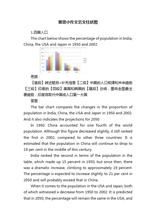
雅思写作小作文题目The diagram below shows the average hours of unpaid work per week done by people in different categories. (Unpaid work refers to such activities as childcare in the home, housework, and gardening.)Summarise the information by selecting and reporting the main features, and make comparisons where relevant.雅思写作小作文范文The given column graph shows information on the duration of unpaid works done by men and women of different categories.上面的柱状图给出的信息为不同类别的男性和女性所做的无报酬工作的持续时间。
As is presented in the illustration, married women who don’t have children do the unpaid-works (gardening, child care, and household works) 30 hours per week whereas married men do the similar unpaid jobs for about 18 hours per week. Women, this translation is from Laokaoya website, who have one or two children do such work for 50 hours/week but the men from the same category do only 17hours (approximately) each week. The women who have more than 3 kids seem to work the highest amount of unpaid works per week and that is nearly 60 hours. Surprisingly male from the same category work even less; amounting only 16 hours (approximately) of unpaid works.按照说明中所呈现的内容,结婚而没有孩子的女性每周所做没有报酬的工作(园艺,照顾孩子和整理家务)的时间为30小时。
雅思小作文范文柱状图
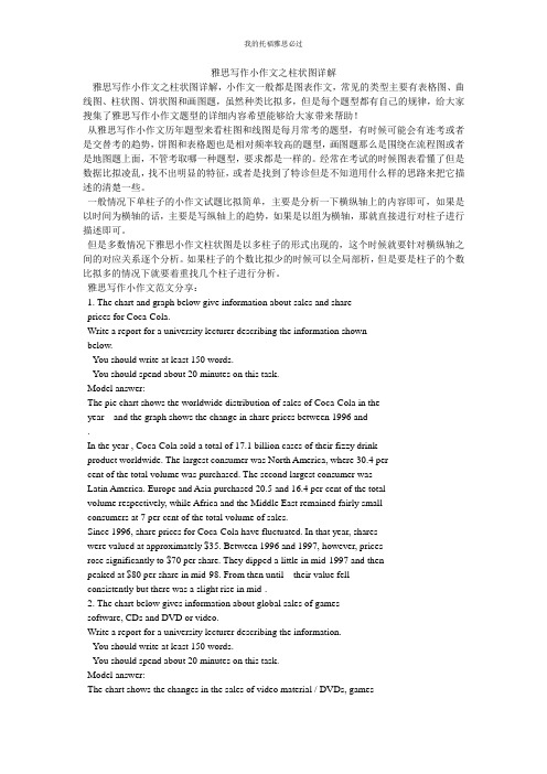
雅思小作文范文柱状图1.四国人口The chart below shows the percentage of population in India, China, the USA and Japan in 1950 and 2002.思路:【首段】转述题目+补充信息【二段】中国的人口规律和未来趋势【三段】印度的【四段】美国和韩国的【尾段】总结,重申全图最主要趋势,印度将取代中国成人口第一大国答案:The bar chart compares the changes in the proportion of population in India, China, the USA and Japan in 1950 and 2002. And it also indicates the projections for 2050.In 1950. China accounted for one fourth of the world population. Although this figure decreased slightly, it still ranked the first in 2002, compared to other three countries. It is estimated that the population in China will continue to drop to 19 per cent in the middle of this century.India ranked the second in terms of the population in the table, which made up 15 percent in 1950, but since then, there was a dramatic increase, climbing to approximately 19 percent. The percentage is expected to increase slightly to 21 per cent in 2050 and will probably exceed that in China.When it comes to the population in the USA and Japan, both of which witnessed a decrease from 1950 to 2002. It is predicted that in 2050, the percentage will remain the same in the USA, andin Japan, the percentage is likely to keep falling.Overall, it seems that India will become the country with the largest population although there is still a huge number of people in China.2.通勤工具Different modes of transport used to travel to and from work in one European city in 1960, 1980 and 2000.思路:1. 分段原则为:上升的一段,下降的一段,波动的一段。
雅思作文真题解析及范文分享

雅思作文真题解析及范文分享为了让大家更好的备考雅思写作,我给大家整理了雅思作文真题,下面我就和大家共享,来观赏一下吧。
2022年11月1日雅思小作文真题解析及范文:柱状图小作文题目是:The chart below shows the average time 16-22-year olds spent on playing video games in four different countries between 1992 and 2022.Summarize the details. Select and report the main features and make comparisons where relevant.范文解析该柱状图难度中等偏下,数字相对较少,共有8个数字。
让我们先来看一下3w(when, where, what)。
When是过去的两个年份1992和2022,切记用过去时态。
Where为四个国家,what为16-22岁的年轻人花费在视频嬉戏上的时间。
可以看出when和where两个变量,要求我们描述这十年间的变化趋势和国家之间的静态对比。
所以考生可以根据时间为主线去分段,也可以根据国家去分段。
雅思小作文真题范文:The bar chart compares the amount of time spent on video games on average by youngsters aged between 16-22 years old from four countriesin two years 1992 and 2022.该柱状图对比了1992年至2022年期间,来自四个国家、年龄在16岁至22岁之间的青少年平均花在电子嬉戏上的时间。
It is evident that in 1992, the largest amount of time (85 hours) allocated to video games was from young people in country B. This was narrowly followed by country C and country A where respectively 78 hours and 76 hours were spent while it took the minimal hours for thisage group to play video games in country D, standing at merely 50.很明显,在1992年,最大的时间(85小时)安排给视频嬉戏是年轻人的国家。
雅思写作小作文之柱状图详解
雅思写作小作文之柱状图详解雅思写作小作文之柱状图详解,小作文一般都是图表作文,常见的类型主要有表格图、曲线图、柱状图、饼状图和画图题,虽然种类比拟多,但是每个题型都有自己的规律,给大家搜集了雅思写作小作文题型的详细内容希望能够给大家带来帮助!从雅思写作小作文历年题型来看柱图和线图是每月常考的题型,有时候可能会有连考或者是交替考的趋势,饼图和表格题也是相对频率较高的题型,画图题那么是围绕在流程图或者是地图题上面,不管考取哪一种题型,要求都是一样的。
经常在考试的时候图表看懂了但是数据比拟凌乱,找不出明显的特征,或者是找到了特诊但是不知道用什么样的思路来把它描述的清楚一些。
一般情况下单柱子的小作文试题比拟简单,主要是分析一下横纵轴上的内容即可,如果是以时间为横轴的话,主要是写纵轴上的趋势,如果是以组为横轴,那就直接进行对柱子进行描述即可。
但是多数情况下雅思小作文柱状图是以多柱子的形式出现的,这个时候就要针对横纵轴之间的对应关系逐个分析。
如果柱子的个数比拟少的时候可以全局部析,但是要是柱子的个数比拟多的情况下就要着重找几个柱子进行分析。
雅思写作小作文范文分享:1. The chart and graph below give information about sales and shareprices for Coca-Cola.Write a report for a university lecturer describing the information shownbelow.· You should write at least 150 words.· You should spend about 20 minutes on this task.Model answer:The pie chart shows the worldwide distribution of sales of Coca-Cola in theyear and the graph shows the change in share prices between 1996 and.In the year , Coca-Cola sold a total of 17.1 billion cases of their fizzy drinkproduct worldwide. The largest consumer was North America, where 30.4 percent of the total volume was purchased. The second largest consumer wasLatin America. Europe and Asia purchased 20.5 and 16.4 per cent of the totalvolume respectively, while Africa and the Middle East remained fairly smallconsumers at 7 per cent of the total volume of sales.Since 1996, share prices for Coca-Cola have fluctuated. In that year, shareswere valued at approximately $35. Between 1996 and 1997, however, pricesrose significantly to $70 per share. They dipped a little in mid-1997 and thenpeaked at $80 per share in mid-98. From then until their value fellconsistently but there was a slight rise in mid-.2. The chart below gives information about global sales of gamessoftware, CDs and DVD or video.Write a report for a university lecturer describing the information.· You should write at least 150 words.· You should spend about 20 minutes on this task.Model answer:The chart shows the changes in the sales of video material / DVDs, gamessoftware and CDs around the world in billions of dollars over a three-yearperiod. It can be seen that the sales of videos / DVDs and games softwarehave increased, while the sales of CDs have gone down slightly.Between and , the sale of videos and DVDs rose by approximately13 billion dollars. In , just under 20 billion dollars worth of these itemswere sold, but in , this figure had risen to a little over 30 billion dollars.The sales of games software also rose during this period, but less sharply.Sales increased from about 13 billion dollars in to just under 20 billiondollars three years later. By contrast, during the same time period, the sale ofCDs fell from 35 billion dollars in to about 32.5 billion dollars in .3. The graphs below show the types of music albums purchased bypeople in Britain according to s3x and age.Write a report for a university lecturer describing the information shownbelow.· You should write at least 150 words.· You should spend about 20 minutes on this task.Model answer:The three graphs provide an overview of the types of music people purchase inthe UK. At first glance we see that classical music is far less popular than popor rock music.While slightly more women than men buy pop music, the rock market isdominated by men with 30% buying rock, compared to 17% of women. Fromthe first graph we see that interest in pop music is steady from age 16 to 44with 20% of the population continuing to buy pop CDs after the age of 45.The interest in rock music reaches its peak among the 25 to 34 year olds,though it never sells as well as pop. Interest also drops off after the age of 35with an even sharper fall from age 45 onwards, a pattern which is the oppositeto the classical music graph.雅思写作小作文之柱状图详解的详细内容就是这些,包括了详细的范文以及写作技巧和注意点,希望对雅思考试有所帮助,更多雅思最新资讯请继续关注雅思频道。
雅思小作文-柱状图
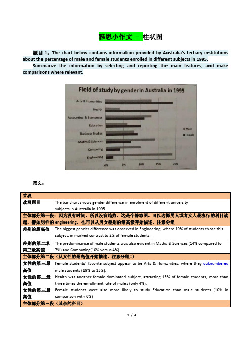
雅思小作文–柱状图题目1:The chart below contains information provided by Australia’s tertiary institutions about the percentage of male and female students enrolled in different subjects in 1995.Summarize the information by selecting and reporting the main features, and make comparisons where relevant.范文:1/ 4题目2:The chart below contains information about USA marriage and divorce rates between 1970 and 2000, and the marital status of adult Americans in two of the years.Summarize the information by selecting and reporting the main features, and make comparisons where relevant.2/ 4读图:动态图【因为有时间】,需要描述变化趋势These two graphs illustrate the change of marital status of American between 1970 and 2000.【改写题目】According to the first graph,there were 2.5m marriages in both 1970 and 1980, and then this figure decreased gradually during the next two decades, reaching to 2m in 2000. By comparison, the number of divorces first increased from 1m in 1970 to around 1.4 in 1980 and then slowly declined back to 1m in 2000.【分类描述第一幅柱状图,时态:一般过去时】As can be seen from the second bar chart,the percentage of married American adults dropped by more than 10% , from 70% in 1970 to less than 60% in 2000. Meanwhile, the percentage of adult Americans who were never married increased from about 15% in 1970 to20% in 2000, and despite still less than 10% , the proportion of divorced adults significantly went up from 1970 to 2000. Moreover, the percentages of the widowed in 1970 and 2000 accounted for less than 10% respectively, and showed a slight drop.【分类描述第二幅柱状图,时态:一般过去时】In conclusion, marital status of Americans in 2000 was not as optimistic as that of three decades ago. (1781.如果有两幅图表,则分成2段分别一一描述2.表示数值上升下降的常用句式有:•The number of …dropped from … to …•The percentage of …increased from about … to less than…•The proportion of … significantly went up from … to …3.切忌没有结论。
雅思写作小作文范文 雅思写作柱状图bar chart 奖牌数量.doc

雅思写作小作文范文雅思写作柱状图bar chart 金牌数量今天我们雅思写作小作文范文的文章来研究下柱状图bar chart。
该图表展示了12个不同的国家在奥林匹克运动会上获得的奖牌的数量,并用三种不同的颜色来标示金银铜牌。
很明显可以看出美国获得的奖牌数量远超其他国家,而苏联则排名第二。
雅思写作小作文题目The chart below shows the total number of Olympic medals won by twelve different countries.Summarise the information by selecting and reporting the main features, and make comparisons where relevant.雅思写作小作文范文The bar chart compares twelve countries in terms of the overall number of medals that they have won at the Olympic Games.该柱状图比较了12个国家在奥林匹克运动会上获得的奖牌的数量。
It is clear that the USA is by far the most successful Olympic medal-winning nation. It is also noticeable that the figures for gold, silver and bronze medals won by any particular country tend to be fairly similar.显然,美国到目前为止是最为成功的奥林匹克奖牌获得者。
也可以注意到,其他任何国家赢得金牌、银牌和铜牌数量相当相似。
The USA has won a total of around 2,300 Olympic medals, including approximately 900 gold medals, 750 silver, and 650 bronze. In second place on the all-time medals chart is the Soviet Union, with just over 1,000 medals. Again, the number of gold medals won by this country is slightly higher than the number of silver or bronze medals.美国赢得了大约2300枚奥运会奖牌,包括大约900枚金牌,750枚银牌和650枚铜牌。
(完整版)雅思写作-小作文范文-柱状图
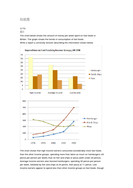
柱状图C1T3题目The chart below shows the amount of money per week spent on fast foods in Britain. The graph shows the trends in consumption of fast foods.Write a report a university lecturer describing the information shown below.The chart shows that high income earners consumed considerably more fast foods than the other income groups, spending more than twice as much on hamburgers (43 pence per person per week) than on fish and chips or pizza (both under 20 pence). Average income earners also favored hamburgers, spending 33 pence per person per week, followed by fish and chips at 24 pence, then pizza at 11 pence. Low income earners appear to spend less than other income groups on fast foods, thoughfish and chip remains their most popular fast food, followed by hamburgers and then pizza.From the graph we can see that in 1970, fish and chips were twice as popular asburgers, pizza being at that time the least popular fast food. The consumption of hamburgers and pizza has risen steadily over the 20 year period to 1990 while the consumption of fish and chips has been in decline over that same period with a slight increase in popularity since 1985.分析:题目The chart below shows the amount of money per week spent on fast foods inBritain. The graph shows the trends in consumption of fast foods.两句话,两个图第一段The chart shows that high income earners consumed considerably more fastfoods than the other income groups, spending more than twice as much onhamburgers (43 pence per person per week) than on fish and chips or pizza(both under 20 pence).说明了高收入人群的两个特点,第一是消耗快餐最多,第二是人群中hamburger, fish and chips, pizza的特点spending more than twice as much on hamburgers than on fish and chip and chips or pizza 这是一句令人费解的句子,含义应为“消耗的汉堡是薯片或匹萨的比如两倍多”,应用的句型应当为典型的表示倍数关系的句型“n times as…as”,? This airplane flies two times as fast as that one. 这家飞机的飞行速度是那架的两倍。
雅思写作小作文范文 雅思写作柱状图bar chart 学习背后的原因.doc
雅思写作小作文范文雅思写作柱状图bar chart 学习背后的原因今天我们雅思写作小作文范文的文章来研究下柱状图bar chart。
第一张图展示了不同年龄段的人们选择进一步学习的理由,对比究竟是出于兴趣多一些还是出于职业考虑多一些。
第二张图给出了其资金来源的信息,比较是自费的多一些还是雇主支持的多一些。
小编搜集了一篇相应的考官范文,以供大家参考。
雅思写作小作文题目The charts below show the main reasons for study among students of different age groups and the amount of support they received from employers.Summarise the information by selecting and reporting the main features, and make comparisons where relevant.雅思写作小作文范文The bar charts compare students of different ages in terms of why they are studying and whether they are supported by an employer.柱状图比较了不同年龄学生学习的原因,以及他们是否被其雇主所资助。
It is clear that the proportion of students who study for career purposes is far higher among the younger age groups, while the oldest students are more likely to study for interest. Employer support is more commonly given to younger students.很明显,因为职业目的学习的学生比例在年轻人中远高于其他类别,而年纪最大的学生更多的是出于兴趣去学习。
雅思小作文柱状图优秀范文及解析

雅思⼩作⽂柱状图优秀范⽂及解析 雅思写作除了词汇量要达到以外,还有很多提分点的哦。
店铺为雅思栏⽬⼤家带来雅思⼩作⽂柱状图优秀范⽂及解析,希望对⼤家备考雅思有所帮助! 第⼆类:柱状图 You should spend about 20 minutes on this task. The charts below show the levels of participation in education and science in developing and industrialized countries in 1980 and 1990.Write a report a university lecturer describing the information shown below. You should write at least 150 words. model answer 1.The data shows the differences between developing and industrialized countries’ participation in education and science.2.In terms of the number of years of schooling received, we see that the length of time people spend at school in industrialized countries was much greater at 8.5 years in 1980, compared to 2.5 years in developing countries. The gap was increased further in 1900 when the figures rose to 10.5 years and3.5 years respectively. 3.We can see a similar pattern in the second graph, which shows that the number of people working as scientists and technicians in industrialized countries increased from 55 to 85 per 1,000 people between 1980 and 1990, while the number in developing countries went from 12 to 20. 4.Finally, the figures for spending on research and development show that industrialized countries more than doubled their spending, from $200bn to$420bn, while developing countries decreased theirs , from$75bn down to $25bn. 5.Overall we can see that not only are there very large differences between the two economies but that there gaps are widening. 分析 第⼀段: 1 The data shows the differences between developing and industrialized countries’ participation in education and science. 本句话依旧是对题⼲进⾏改写。
雅思图表作文柱状类写法解析

剑盟雅思预备学院官网:/雅思图表作文柱状类写法解析在雅思作文中,图表作文也是考试的常见类型,那么图表作文中柱状类的写作题目应该如何来写呢?怎样对柱状图做出更好的解析,才能够迎合考官,拿到高分呢?下面就我们一起来看看吧!1.如果横轴有明显的时间推移的话,烤鸭们应连接柱子顶点,重在描述柱子的升降起伏,写法类似于线状图。
2.如果无时间推移,则写法和饼状图一样。
即按照各比较对象所占比例的高低写,同时要注意各所占比例之间的比较。
可以用到的词汇有:1.表示“占多少”的动词Account forTake upMake upContribute toHaveRepresent2.表示“最高级”和“比较级”第一/最小 the largest/biggest proportion of第二 the second/next largest/expensive(+ 形容词的最高级)第三 followed closely by最低/最小 the smallest percent of all3.表示“相同比例”即在饼状图中遇到了比例相同或者差不多的饼,如有A B两个比较对象。
A accounts for the same percentage asB .剑盟雅思预备学院官网:/ The proportion of A is as high as BA andB contributed equally/evenly to (all )在观察柱形图的时候首先要留意横轴的数据,若横轴为时间轴或者是年龄趋势,那么我们在主体段写作时候的基本思路就为从左到右;若横轴数据为具体专有名词诸如地点,交通工具等时,主体段的写作思路就可能是按照柱形的长度排列。
本文根据上述的分析做以下的总结:一、按照横轴从左到右排列数据:1. 两根柱且趋势截然相反在这种写法中,我们要注意观察2根柱的上升/下降的幅度。
以下我们就来看一个例子:The charts below show the main reasons for study among students of different age groups and the amount of support they received from employers.Write a report for a university lecturer describing the information below.You should write at least 150 words.You should spend about 20 minutes on this task.The first graph shows that there is a gradual decrease in study for career reasons with age. Nearly 80% of students under 26 years, study for their career. This percentage gradually declines by approximately15% every decade. Only 40% of 40-49yr olds and 18% of over 49yr olds studied for career reasons in late adulthood.Conversely, the first graph also shows that study stemming from interest increases with age.There are only 10% of under 26yr olds studying out of interest. The percentage increases slowly till the beginning of the fourth decade, and increases dramatically in late adulthood. Nearly same number of 40-49yrolds study for career and interest. However 70% of over 49yr olds study for interest in comparison to 18% studying for career reasons in that age group.在第一幅柱状图中,我们可以看到,蓝色和红色的2根柱呈现出截然相反的变化趋势,因此,我们在排列数据时可以分别描述各自的上升/下降幅度,见划线第一个句子。
雅思小作文柱状图精析
我的托福雅思必过雅思小作文柱状图精析在雅思小作文数据类题目中,柱状图的信息量往往较多且杂,因而成为了了大局部雅思烤鸭们比拟头疼的题型。
在对雅思作文柱状图的数据处理的过程中,除了对柱状图进行动态或静态的区分、进而对数据进行相应的变化趋势或分布状态描述以外,在雅思文章中还有一个重要的细节需要进行阐述,而这个夺分的关键,就是柱子间的差距所表达出的信息。
下面就以两道例题为例,简单地展示如何从“差距〞这个细节中找到隐藏的信息点。
Example 1:The graph above show information of employment rates across 6 countries in 1995 and . Summarize the information by choosing and describe the main idea, and make comparisons where appropriate.通过对数据的整理我们不难发现,这幅图两个明显的信息点,即对于这六个国家来说,1995年的雇佣率总是低于年的雇佣率,女性的受雇佣率也总是低于男性的相应数据。
接下来,还有什么信息点需要进行阐述呢?很明显,在本图中,除了年份和性别外,国家也是一个很重要的组成局部。
可是该如何描述国家间的比照关系呢?如果以国家的雇佣率上下来进行描述,会显得信息冗杂且重复。
那让我们换个角度来想,如果以一个国家内部的数据特点作为分类标准,看看国家内同年份男性和女性的雇佣率差距,不难发现Australia, Iceland 和New Zealand同年份的男女雇佣率差距很明显,而在Switzerland, UK 和USA 二者的差距就比拟小。
就此,这道题第三个重要的信息点就可以被归纳出来了。
Example 2:The chart below shows information about changes in average house prices in five different cities between 1990 and compared with the average house prices in 1989.Summarise the information by selecting and reporting the main features, and make comparisons where relevant. (剑桥雅思真题7 Test 3 Task 1)对此题的信息描述并不难,我们可以对两个时间段的房价情况进行分别描述,也可以把两个时间段的信息进行混合,按照“始终在1989年平均房价之上〞、“始终在1989年平均房价之下〞和“一开始低于1989年的平均房价但之后高于1989年的均价〞的标准进行分类描述。
描述柱状图的英语范文 雅思
描述柱状图的英语范文雅思英文回答:A bar chart is a graphical representation of data that uses rectangular bars to represent the values of different categories or groups. Each bar represents a single category or group and its height corresponds to the value of that category or group. Bar charts are commonly used to compare the values of different categories or groups and to visualize the distribution of data.Bar charts can be either vertical or horizontal. In a vertical bar chart, the bars are drawn vertically, with the height of each bar representing the value of the corresponding category or group. In a horizontal bar chart, the bars are drawn horizontally, with the length of each bar representing the value of the corresponding category or group.Bar charts are a simple and effective way to visualizedata. They are easy to read and understand, and they can be used to convey information quickly and clearly. Bar charts are also a versatile tool, and they can be used to represent a wide variety of data types.中文回答:柱状图是一种图形数据表示,使用矩形条形来表示不同类别或组的值。
雅思写作:柱状图型题目的写作思路

雅思写作:柱状图型题目的写作思路The bar chart illustrates the university enrolments in first degree coursesfor selected subjects in 2021 and the change from 2021 in percentage.(该柱状图展示了在2021年大学第一学位课程选修课的入学人数和相较2021年的百分比转变。
)这个图的数据比较复杂,一共有9门选修课,每门课都有业余制和全日制两种形式。
每一种课型对应两套数据,一个是2021年的招生人数,后面的加百分之几减百分之几表示相较2021年同期招生人数在百分比上的转变。
在开头段照例仍是先要对图表作整体介绍,告知读者这个图表讲的是什么。
由于在图表当中的文字说明已经大体告知了咱们图表描述的内容,因此在第一段咱们只需要对此稍作改写即可(固然,完全原封不动地照抄是不行的)。
From the chart, it could be noted that each subject consists of full-timeand part-time courses. (透过该图,可以注意到每一门学科都包括了全日制和业余制的课程。
)按照GS的思路,这里有必要仍是先介绍图表一些比较重要的整体概况。
比如这里每门课都包括全日制和业余制两种形式就有必要在主体段一开始就说明清楚。
And Biological, Mathematical and Computer sciences were the only threesubjects whose enrolments increased in 2021 in both courses, with Biologicalsciences having the most students (about 58,000) and the most significantincrease (9%) in part- time courses.(生物学,数学和电脑是仅有的三门入学人数在2021年全日制业余制两方面都增加的科目,而其中又以生物学这门课在业余制方面拥有最多的学生和最显著的增加。
雅思小作文柱状图解析

The graph below shows the different modes of transport used to travel to and from work in one European city in 1960, 1980 and 2000.
• The graph shows the changing patterns in commuting by train, car, tube or bus for commuters in London in the years 1960, 1980 and 2000. • The number of people using trains at first rose from just under 20% in 1960 to about 26% in 1980, but then fell back to about 23% in 2000. • Use of the tube has been relatively stable, falling from around 27% of commuters in 1960 to 22% in 1980, but climbing back to reacows how age and gender influence the frequency of heart attacks in the US. • Less than 6% of all heart attacks occur in the 2944 age group. The number of women who suffer heart attacks in this group is negligible - only 3000 per year, compared to 123,000 men. • However the proportion of men and women with heart attacks rises dramatically between 45 and 64, with over half a million per year. Over 420,000 men a year in this age group have heart attacks. The incidence amongst women increases - women have one heart attack for every three men in this age group.
雅思小作文柱状图范文和写法介绍

雅思小作文柱状图范文和写法介绍对于柱状图出现的高频情况,每一个烤鸭都十分清楚,bar chart有那么的重要。
那么今天的干货就是告诉你,逐段讲解每一段要写什么!还有怎么写!先来一个例子:The chart shows the expenditure of two conturies on consumer goods in .★首先标题很重要,这是要我们明白这个图的含义。
接下来就要看xy横坐标和纵坐标。
然后有哪些内容今天我们就省略介绍横纵坐标的内容,因为我相信你们都会看,也都知道左边是钱,右边是5种具体的工程。
还有这是两个国家的比拟。
先来看看大体结构:Introduction:改写图的标题“The chart shows the expenditure of two conturies on consumer goods in .〞OverviewBody paragraph 1Body paragraph 2Introduction:The chart illustrates the amount of money spent on 5 consumer goods〔cars、computers、books、perfume and cameras〕in France and the UK in .分析一下:我并没有把标题中的所有的单词都同意替换,因为不是每个词都可以被改写的,例如“ The chart〞,还有两个国家和时间。
这是介绍段,所以你要具体介绍到底有哪些消费品,所以我不但给出了具体的数字5种并且把这五种罗列了出来。
而且我用了括号,这个括号在写task1的时候很好用。
你可以把很多信息集合写在括号里,罗列出来就行,不涉及写句子和语法。
不过不能只改写标题,还要看看有哪些图中有但是标题中没有的信息,比方“Pounds Sterling〞所以要再加上一句。
The chart illustrates the amount of money spent on 5 consumer goods〔cars、computers、books、perfume and cameras〕in France and the UK in . Units are measured in pounds sterling.★接下来我们要说的是Overview段,这一段很重要。
- 1、下载文档前请自行甄别文档内容的完整性,平台不提供额外的编辑、内容补充、找答案等附加服务。
- 2、"仅部分预览"的文档,不可在线预览部分如存在完整性等问题,可反馈申请退款(可完整预览的文档不适用该条件!)。
- 3、如文档侵犯您的权益,请联系客服反馈,我们会尽快为您处理(人工客服工作时间:9:00-18:30)。
• Over the age of 65, the number of men suffering heart attacks only increases slightly. However there is a huge increase in the number of women with heart attacks - they comprise over 40% of all victims. • In conclusion, men are more likely to be the victims of heart attacks at all ages, but women are increasingly likely over the age of 65.
The most significant feature is that oil production will increase sharply in almost all the countries shown. Kuwait and Iraq are both expected to double their output between 1990 and 2010, with Kuwait's production rising from 1.8 million barrels per day (bpd) in 1990 to 3.8 in 2010. Iran will also increase its output by a slightly smaller amount. After remaining steady at 2.5 million bpd from 1990 to 2000, the UAE's output is expected to approach 4.0 million bpd in 2010. Only Qatar's production is predicted to fall, back to 0.8 million bpd after a slight rise in 2000.
• The graph shows how age and gender influence the frequency of heart attacks in the US. • Less than 6% of all heart attacks occur in the 2944 age group. The number of women who suffer heart attacks in this group is negligible - only 3000 per year, compared to 123,000 men. • However the proportion of men and women with heart attacks rises dramatically between 45 and 64, with over half a million per year. Over 420,000 men a year in this age group have heart attacks. The incidence amongst women increases - women have one heart attack for every three men in this age group.
The charts below show the main reasons for study among students of different age groups and the amount of support they received from employers.
• The information given by the bar charts is about the major causes of study among students in different age group and the amount of support they acquired from employers. • The first graph shows that there is a gradual decrease in study for career reasons with age. Nearly 80% of students under 26 years, study for their career. This percentage declines by 10% -20% every decade. Only 40% of 40-49 year olds and 18% of over 49 year olds are studying for career reasons. Conversely, there are only 10% of under 26 yr olds studying out of interest. The figure increases till the beginning of the fourth decade, and increases in late adulthood. However, 70% of over 49yr olds study for interest, about 4 times as many as that for career.
outnumber/ exceed/ surpass/ excel
• Boys outnumber girls in Class A. • The number of boys exceeds that of girls in Class A. • There are almost/ nealy/ roughly twice as many boys as girls in Class A.
• The chart below shows information about Heart Attacks by Age and Gender in USA.
Summarise the information by selecting and reporting the main features, and make comparisons where relevant. You should write at least 150 words. You should spend about 20 minutes on this task.
number/ percentage
• The number of boys is larger/ greater/ higher than that of girls in Class A. • The percentage of boys(67%) is larger/ greater/ higher than that of girls(33%) in Class A. • The percentage of boys is larger/ greater/ higher than that of girls in Class A (67% and 33% respectively).
Task oBiblioteka e Bar chart柱状图主体段写法
• 将图表中相似的趋势分别捏合成一段 描述。 • 第一句:比较图表中相对比的两个部 分的所有比例得出一个总体结论。 • 第二句以后:详细解释这一总体趋势。
language for comparisons
Percentage of girl and boy students in Class A
However, the greatest increase will be from Saudi Arabia. In 1990, its output capacity at 8.5 million bpd exceeded the combined production of Iran, Iraq and Kuwait. This lead is expected to continue with a 75% increase in production to 14.5 million bpd 2010. In summary, while most of the countries are expected to show increases, Saudi Arabia will maintain and strengthen its position as the major producer.
On the other hand, the use of cars increased steadily from just over 5% in 1960 to 23% in 1980, reaching almost 40% by 2000, whereas the popularity of buses has declined since 1960, falling from just under 35% in 1960 to 27% in 1980 and only 15% in 2000. • The graph indicates the growing use of cars for commuting to work between 1960 - 2000, and the corresponding decline in the popularity of buses from being the most popular mode of transport in 1960 to the least popular in 2000.
The graph below shows the different modes of transport used to travel to and from work in one European city in 1960, 1980 and 2000.