雅思写作Task1表格图考官范文(1)
雅思写作样题、范文和考官点评(1)
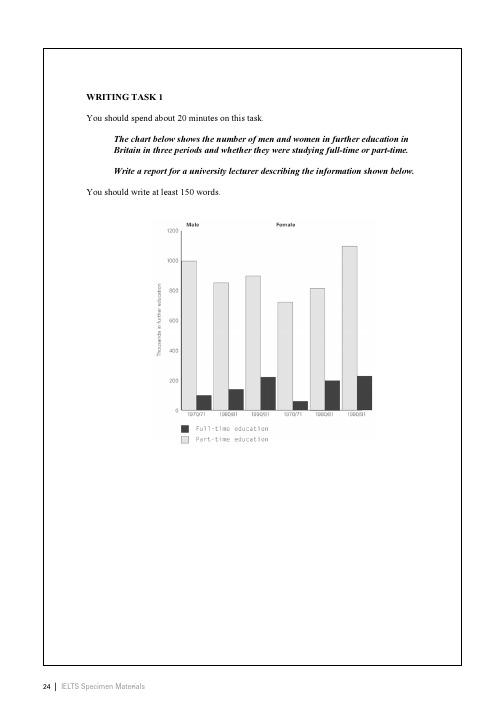
Sample Candidate Writing Scripts and Examiner CommentsBoth the Academic and General Training Writing Modules consist of two tasks, Task 1 and Task 2. Each task is assessed independently. The assessment of Task 2 carries more weightin marking than Task 1.Detailed performance descriptors have been developed which describe written performance at the 9 IELTS bands. These descriptors are confidential and apply to both the Academic and General Training Modules.Task 1 scripts are assessed on the following criteria:•Task Achievement•Coherence and Cohesion•Lexical Resource•Grammatical Range and AccuracyTask 2 scripts are assessed on the following criteria:•Task Response•Coherence and Cohesion•Lexical Resource•Grammatical Range and AccuracyCandidates should note that scripts will be penalised if they are a) under the minimum word length, b) partly or wholly plagiarised, c) not written as full, connected text (e.g. using bullet points in any part of the response, or note form, etc.).T ask 1Task AchievementThis criterion assesses how appropriately, accurately and relevantly the response fulfils the requirements set out in the task, using the minimum of 150 words.Academic Writing Task 1 is a writing task which has a defined input and a largely predictable output. It is basically an information-transfer task which relates narrowly to the factual content of an input diagram and not to speculated explanations that lie outside the given data.General Training Writing Task 1 is also a writing task with a largely predictable output in that each task sets out the context and purpose of the letter and the functions the candidate should cover in order to achieve this purpose.Coherence and CohesionThis criterion is concerned with the overall clarity and fluency of the message: how the response organises and links information, ideas and language. Coherence refers to the linking of ideas through logical sequencing. Cohesion refers to the varied and appropriate use of cohesive devices (for example, logical connectors, pronouns and conjunctions) to assist in making the conceptual and referential relationships between and within sentences clear. Lexical ResourceThis criterion refers to the range of vocabulary the candidate hasused and the accuracy and appropriacy of that use in terms ofthe specific task.Grammatical Range and AccuracyThis criterion refers to the range and accurate use of thecandidate’s grammatical resource as manifested in thecandidate’s writing at sentence level.T ask 2Task ResponseIn both Academic and General Training Modules Task 2 requiresthe candidates to formulate and develop a position in relation to a given prompt in the form of a question or statement. Ideasshould be supported by evidence, and examples may be drawnfrom the candidates’ own experience. Responses must be atleast 250 words in length.Writing scripts are marked by trained and certificated IELTS examiners. Scores are reported as whole bands only.On the next 12pages you will find candidates’ answers totwo sample Writing tests. There are two answer s for each Writing task. Each answer has been awarded a band score and is accompanied by an examiner comment on the candidate’s performance for thattask.The examiners’ guidelines for marking the Writing scripts arevery detailed.There are many different ways a candidate may achieve a particular band score.The candidates’ answers that follow should not be regarded as definitive examples of any particular band score.Sample Script AExaminer commentBand 5The length of the answer is just acceptable. There is a good attempt to describe the overall trends but the content would have been greatly improved if the candidate had included some reference to the figures given on the graph. Without these, the reader is lacking some important information. The answer is quite difficult to follow and there are some punctuation errors that cause confusion. The structures are fairly simple and efforts to produce more complex sentences are not successful.Sample Script BExaminer commentBand 6The candidate has made a good attempt to describe the graphs looking at global trends and more detailed figures. There is, however, some information missing and the information is inaccurate in minor areas. The answer flows quite smoothly although connectives are overused or inappropriate, and some of the points do not link up well. The grammatical accuracy is quite good and the language used to describe the trends is well-handled. However, there are problems with expression and the appropriate choice of words and whilst there is good structural control, the complexity and variation in the sentences are limited.Sample Script AExaminer commentBand 6The answer has a good introduction in which the candidate has attempted to incorporate his/her own words. There is good coverage of the data and a brief reference to contrasting trends. The answer can be followed although it is rather repetitive and cohesive devices are overused. In order to gain a higher mark for content, the candidate would be expected to select the salient features of the graph and comment primarily on these. Sentences are long but lack complexity. There are some errors in tense, verb form and spelling which interfere slightly with the flow of the answer.Sample Script BExaminer commentBand 7The answer deals well with both the individual media trends and the overall comparison of these trends. The opening could be more fully developed with the inclusion of information relating to the groups studied and the period of time during which the study took place. There is a good variety of cohesive devices and the message can be followed quite easily although the expression is sometimes a little clumsy. Structures are complex and vocabulary is varied but there are errors in word forms, tense and voice and occasionally the text becomes incoherent.Sample Script AExaminer commentBand 5The answer is short at just over 200 words and thus loses marks for content. There are some relevant arguments but these are not very well developed and become unclear in places. The organisation of the answer is evident through the use of fairly simple connectives but there are problems for the reader in that there are many missing words and word order is often incorrect. The structures are quite ambitious but often faulty and vocabulary is kept quite simple.Academic Writing Sample Task 2A Sample Script BExaminer commentBand 6There are quite a lot of ideas and while some of these are supported better than others, there is an overall coherence to the answer. The introduction is perhaps slightly long and more time could have been devoted to answering the question. The answer is fairly easy to follow and there is good punctuation. Organisational devices are evident although some areas of the answer become unclear and would benefit from more accurate use of connectives. There are some errors in the structures but there is also evidence of the production of complex sentence forms. Grammatical errors interfere slightly with comprehension.Academic Writing Sample Task 2B Sample Script AExaminer commentBand 5Although the script contains some good arguments, these are presented using poor structures and the answer is not very coherent. The candidate has a clear point of view but not all the supporting arguments are linked together well and sometimes ideas are left unfinished. There is quite a lot of relevant vocabulary but this is not used skilfully and sentences often have words missing or lapse into different styles. The answer is spoilt by grammatical errors and poor expression.Academic Writing Sample Task 2B Sample Script BExaminer commentBand 7The answer is well-written and contains some good arguments. It does tend to repeat these arguments but the writer’s point of view remains clear throughout. The message is easy to follow and ideas are arranged well with good use of cohesive devices. There are minor problems with coherence and at times the expression is clumsy and imprecise. There is a wide range of structures that are well handled with only small problems, mainly in the areas of spelling and word choice.44|IELTS Specimen MaterialsIELTS Specimen Materials|45Sample Candidate Writing Scripts and Examiner CommentsBoth the Academic and General Training Writing Modules consist of two tasks, Task 1 and Task 2. Each task is assessed independently. The assessment of Task 2 carries more weightin marking than Task 1.Detailed performance descriptors have been developed which describe written performance at the 9 IELTS bands. These descriptors are confidential and apply to both the Academic and General Training Modules.Task 1 scripts are assessed on the following criteria:•Task Achievement•Coherence and Cohesion•Lexical Resource•Grammatical Range and AccuracyTask 2 scripts are assessed on the following criteria:•Task Response•Coherence and Cohesion•Lexical Resource•Grammatical Range and AccuracyCandidates should note that scripts will be penalised if they are a) under the minimum word length, b) partly or wholly plagiarised, c) not written as full, connected text (e.g. using bullet points in any part of the response, or note form, etc.).T ask 1Task AchievementThis criterion assesses how appropriately, accurately and relevantly the response fulfils the requirements set out in the task, using the minimum of 150 words.Academic Writing Task 1 is a writing task which has a defined input and a largely predictable output. It is basically an information-transfer task which relates narrowly to the factual content of an input diagram and not to speculated explanations that lie outside the given data.General Training Writing Task 1 is also a writing task with a largely predictable output in that each task sets out the context and purpose of the letter and the functions the candidate should cover in order to achieve this purpose.Coherence and CohesionThis criterion is concerned with the overall clarity and fluency of the message: how the response organises and links information, ideas and language. Coherence refers to the linking of ideas through logical sequencing. Cohesion refers to the varied and appropriate use of cohesive devices (for example, logical connectors, pronouns and conjunctions) to assist in making the conceptual and referential relationships between and within sentences clear. Lexical ResourceThis criterion refers to the range of vocabulary the candidate has used and the accuracy and appropriacy of that use in terms ofthe specific task.Grammatical Range and AccuracyThis criterion refers to the range and accurate use of the candidate’s grammatical resource as manifested in thecandidate’s writing at sentence level.T ask 2Task ResponseIn both Academic and General Training Modules Task 2 requiresthe candidates to formulate and develop a position in relation to a given prompt in the form of a question or statement. Ideasshould be supported by evidence, and examples may be drawnfrom the candidates’ own experience. Responses must be atleast 250 words in length.Writing scripts are marked by trained and certificated IELTS examiners. Scores are reported as whole bands only.On the next 6pages you will find candidates’ answers to one sample Writing test. There are two answer s for this Writing task. Each answer has been awarded a band score and is accompanied by an examiner comment on the candidate’s performance for that task.The examiners’ guidelines for marking the Writing scripts are very detailed.There are many different ways a candidate may achieve a particular band score.The candidates’ answers that follow should not be regarded as definitive examples of any particular band score.General Training Writing Sample Task 1Sample Script AExaminer commentBand 5The answer is below the word limit and there is some repetition of the task rubric. (Length is a common problem in General Training scripts.) Answers that are short lose marks because of inadequate content and may also lose marks because there is insufficient material in the answer for the examiner to give credit for accuracy and coherence. Despite these problems, the introduction to the letter is appropriate and the purpose of the writer is clear. The points are not always linked together well and punctuation is sometimes faulty. The sentences are kept quite simple and mistakes occur as soon as more complex structures are attempted.Sample Script BExaminer commentBand 7This answer is also short. Although ideas are often provided in the task rubric, candidates are at liberty to include some of their own ideas in their answers. In this case, the candidate has attempted to incorporate some original material. The answer reads quite fluently, is well organised and there is good use of conjunctions to link points. There are some grammatical errors but these do not affect the reader greatly and there is evidence of some more complex sentence structures.Sample Script AExaminer commentBand 5There are quite a lot of relevant ideas in the answer but they are not always well supported and sometimes they are unclear. There are some areas in the answer where the organisation becomes weak and the reader finds the message difficult to follow. Nevertheless, the writer’s view is apparent and there is a logical flow to the points given. There are a lot of mistakes in the answer and some parts, such as the conclusion, are very hard to follow because of these errors. Although there is some appropriate vocabulary, sentence control is very weak. These problems are made worse by thepoor correcting which sometimes makes words unreadable.General Training Writing Sample Task 2 Sample Script BExaminer commentBand 8This is a very well-organised script which contains a lot of well-supported arguments and analyses the topic from different angles. The ideas follow each other well and there is a very honest conclusion. The answer is easy to read. There are some areas where the expression is clumsy but this makes little difference to the overall flow of the answer. There are minor errors in spelling and structure.。
【朗阁英语】雅思写作Task1数据类图表之第一段的写法分析(一)
【朗阁英语】雅思写作Task1数据类图表之第⼀段的写法分析(⼀)朗阁海外考试研究中⼼蒲玲⽟雅思写作考试中Task 1主要是考察考⽣对线形图、饼状图、表格和柱状图的客观概述能⼒,要求考⽣针对图表提供的信息写出⾄少150词。
具体来讲,要写出图表的主题、数据的变化趋势、最⼤值、交点等等重要特征,以及⼀些关键数据的具体值,并且在必要的时候将数据进⾏对⽐。
要写好这些内容的前提就是⼀个好的第⼀⾃然。
第⼀⾃然的写法主要有两种:改词和改句型。
⼀、改词改词是⼀种最基本最主要的⽅法。
具体的操作就是将题⽬中的名词、动词和时间类的词汇进⾏替换、删除。
以剑9 Test 3 Task 1为例:The charts below give information on the ages of the populations of Yemen and Italy in 2000 and projections for 2050.1. 名词的更改:更改名词的实质就是同义替换。
此题中,⼀个需要更改的名词就是“The charts”,可以⽤同义替换的⽅式将“charts”变成同义词“graphs”。
或者是将其改为具体的图表类型名称“The four pie charts”(这四幅饼状图)。
其次题⽬主⼲中“the populations”表⽰⼈⼝,可以替换为“people”。
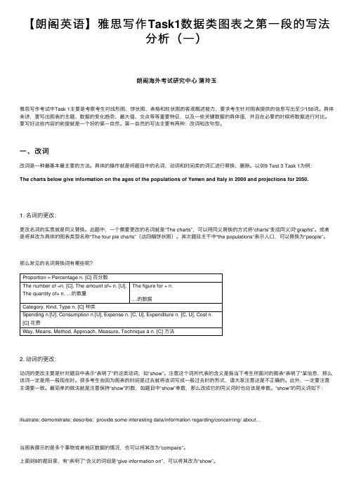
那么常见的名词替换词有哪些呢?Proportion = Percentage n. [C] 百分数The number of +n. [C], The amount of+ n. [U], The quantity of+ n. …的数量The figure for + n.…的数据Category, Kind, Type n. [C] 种类Spending n.[U], Consumption n.[U], Expense n. [C, U], Expenditure n. [C, U], Cost n.[C]花费Way, Means, Method, Approach, Measure, Technique à n. [C] ⽅法2. 动词的更改:动词的更改主要是针对题⽬中表⽰“表明了”的这类动词,如“show”。
雅思写作Task1柱状图考官范文(1)
雅思写作Task1柱状图考官范文(1)这是一篇雅思写作Task1柱状图考官范文,供大家参考。
认真研读一定的雅思范文及作文模板可以帮助我们检验自己的写作水平,并能很好地吸收和应用优秀范文里的优秀内容。
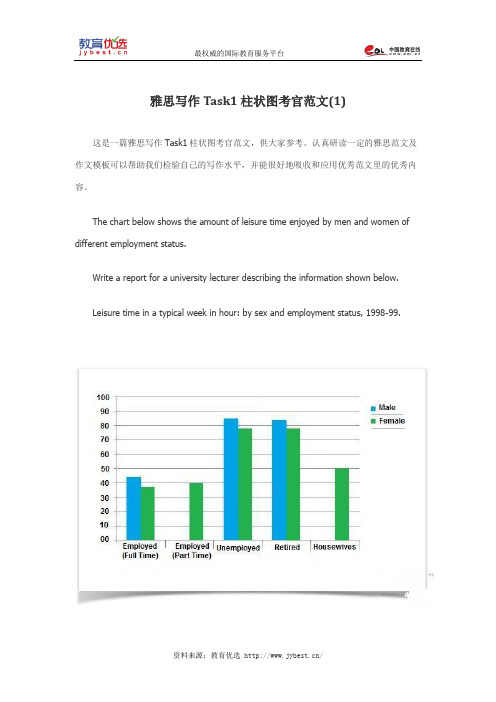
The chart below shows the amount of leisure time enjoyed by men and women of different employment status.Write a report for a university lecturer describing the information shown below.Leisure time in a typical week in hour: by sex and employment status, 1998-99.Model Answer:The provided chart shows the number of leisure hours enjoyed by men and women in a typical week in 1998-99, according to gender and employment status. As is observed from the graph, the unemployed and retired men and women had more leisure time than the other type of people.Among the full time employed people, men had about 45 hours of leisure time on an average per week compared to the 38 hours of leisure time for woman. No data is given for the part-time employed men and woman from this category enjoyed 40 hours of leisure time in a week. This figure is slightly more than the employed woman perhaps because of their employment nature.Unemployed and retired people had the longest period for leisure activity both for men and woman and men had a bit more hours than the women. As expected the retired and unemployed people enjoyed about 78 to 82 hours per week which is longer than people from other employment status. Lastly housewives enjoyed approximately 50 hours of leisure time which is more than the employed woman but less than the unemployed and retired woman. The graph reflects that men had more leisure time from all status than woman which indicates that woman spent on more time working at home than the male.The graph summarises that the male enjoy more leisure time than woman and employed people had less time for leisure activity than retired and unemployed people.(Approximately 244 words)Alternative Answer:The graph compares the amount of leisure time enjoyed by people of different employment level s in a typical week in the year 1998-1999.In the given column graph, no data has been provided for the part-time employed and house-staying men. For rest of the cases, Men have more leisure time than women of the same category. The highest amount of leisure hours are enjoyed by those, who are unemployed. Unemployed men had approximately 85 hours of spare time and women from the same category had about 83 hours. The retired people also enjoyed the same amount of leisure activities as did the unemployed men and women. On the contrary, full-time employed men had a total of 40 hours leisure time compared to about 37 hours of women from the same status. Finally woman with part-time job had 40 hours-time to spend as leisure time and Housewives had 50 hours leisure time.In conclusion, unemployed and retire people, both men and women enjoyed more leisure time than employed people and men compared to women had more time for leisure activities.。
雅思英语图表作文范文(必备3篇)
雅思英语图表作文范文第1篇A类雅思各类图表作文要点及范文一.曲线图解题关键1曲线图和柱状图都是动态图,解题的切入点在于描述趋势。
2在第二段的开头部分对整个曲线进行一个阶段式的总分类,使写作层次清晰,同时也方便考官阅卷。
接下来再分类描述每个阶段的specifictrend,同时导入数据作为分类的依据。
3趋势说明。
即,对曲线的连续变化进行说明,如上升、下降、波动、持平。
以时间为比较基础的应抓住“变化”:上升、下降、或是波动。
题中对两个或两个以上的变量进行描述时应在此基础上进行比较,如变量多于两个应进行分类或有侧重的比较。
4极点说明。
即对图表中最高的、最低的点单独进行说明。
不以时间为比较基础的应注意对极点的描述。
5交点说明。
即对图表当中多根曲线的交点进行对比说明。
6不要不做任何说明就机械地导入数据,这不符合雅思的考试目的。
曲线图常用词汇动词—九大运动趋势一:表示向上:increase,rise,improve,grow,ascend,mount,aggrandize,goup,climb, take off, jump,shoot up暴涨,soar,rocket, skyrocket雅思英语图表作文范文第2篇It is said that countries are becoming similar to each other because of the global spread of the same products, which are now available for purchase almost anywhere. I strongly believe that this modern development is largely detrimental to culture and traditions worldwide.A country’s history, language and ethos are all inextricably bound up in its manufactured artefacts. If the relentless advance of international brands into every corner of the world continues, these bland packages might one day completely oust the traditional objects of a nation, which would be a loss of richness and diversity in the world, as well as the sad disappearance of t he manifestations of a place’s character. What would a Japanese tea ceremony be without its specially crafted teapot, or a Fijian kava ritual without its bowl made from a certain type of tree bark?Let us not forget either that traditional products, whether these be medicines, cosmetics, toy, clothes, utensils or food, provide employment for local people. The spread of multinational products can often bring in its wake a loss of jobs, as people urn to buying the new brand,perhaps thinking it more glamorous than the one they are used to. This eventually puts old-school craftspeople out of work.Finally, tourism numbers may also be affected, as travelers become disillusioned with finding every place just the same as the one they visited previously. To see the same products in shops the world over is boring, and does not impel visitors to open their wallets in the same way that trinkets or souvenirs unique to the particular area too.Some may argue that all people are entitled to have access to the same products, but I say that local objects suit local conditions best, and that faceless uniformity worldwide is an unwelcome and dreary prospect.Heres my full answer:The line graphs show the average monthly amount that parents in Britain spent on their children’s s porting activities and the number of British children who took part in three different sports from 2008 to is clear that parents spent more money each year on their children’s participation in sports over the six-year period. In terms of the number of children taking part, football was significantly more popular than athletics and 2008, British parents spent an average of around £20 per month on their children’s sporting activities. Parents’ spending on children’s sports increased gradually over the followi ng six years, and by 2014 the average monthly amount had risen to just over £ at participation numbers, in 2008 approximately 8 million British children played football, while only 2 million children were enrolled in swimming clubs and less than 1 million practised athletics. The figures for football participation remained relatively stable over the following 6 years. By contrast, participation in swimming almost doubled, to nearly 4 million children, and there was a near fivefold increase in the number of children doing athletics.剑桥雅思6test1大作文范文,剑桥雅思6test1大作文task2高分范文+真题答案实感。
雅思写作小作文表格题参考
雅思写作小作文表格题参考雅思写作小作文表格题参考范文表格题的写作大家接触的比较少,可能写不好,但是一定要多练习。
因为这可是雅思小作文的常考类型之一。
下面,店铺为大家提供两篇雅思写作小作文表格题参考范文,希望对大家有用。
雅思写作小作文表格题参考篇1话题:The table below shows the amount of waste production (in millions of tonnes) in six different countries over a twenty-year period.参考范文:The chart compares the amounts of waste that were produced in six countries in the years 1980, 1990 and 2000.In each of these years, the US produced more waste than Ireland, Japan, Korea, Poland and Portugal combined. It is also noticeable that Korea was the only country that managed to reduce its waste output by the year 2000.Between 1980 and 2000, waste production in the US rose from 131 to 192 million tonnes, and rising trends were also seen in Japan, Poland and Portugal. Japan’s waste output increased from 28 to 53 million tonnes, while Poland and Portugal saw waste totals increase from 4 to 6.6 and from 2 to 5 million tonnes respectively.The trends for Ireland and Korea were noticeably different from those described above. In Ireland, waste production increased more than eightfold, from only 0.6 million tonnes in 1980 to 5 million tonnes in 2000. Korea, by contrast, cut its waste output by 12 million tonnes between 1990 and 2000.雅思写作小作文表格题参考篇2话题:The table below shows changes in the numbers of residents cycling to work in different areas of the UK between 2001 and 2011.参考范文:The table compares the numbers of people who cycled to work in twelve areas of the UK in the years 2001 and 2011.Overall, the number of UK commuters who travelled to work by bicycle rose considerably over the 10-year period. Inner London had by far the highest number of cycling commuters in both years.In 2001, well over 43 thousand residents of inner London commuted by bicycle, and this figure rose to more than 106 thousand in 2011, an increase of 144%. By contrast, although outer London had the second highest number of cycling commuters in each year, the percentage change, at only 45%, was the lowest of the twelve areas shown in the table.Brighton and Hove saw the second biggest increase (109%) in the number of residents cycling to work, but Bristol was the UK’s second city in terms of total numbers of cycling commuters, with 8,108 in 2001 and 15,768 in 2011. Figures for the other eight areas were below the 10 thousand mark in both years.雅思作文技巧推荐首先,我们来介绍一下雅思写作考试的基本内容吧。
雅思剑桥部分Task1考官范文翻译
TEST2此图表显示在所列出的四个欧洲国家中,英国对图中所包含各种商品的花费最高。
对任一种商而言,英国人的相应花费都要比其它国人高出许多。
只在网球拍上,英国人和另一个国家意大利人消费相当。
相比之下,德国人消费额度最低。
在其对胶卷的消费上可见一斑,德国人远不如英国人对胶卷的花费。
德国只在两种商品上的消费高于法国,分别是网球拍和香水。
与此同时,法国和意大利两国居民大体上消费水平居中,平均额度也趋同。
具体来说,法国人对唱片和胶卷的消费要高于意大利人,然而对网球拍的消费不及意大利人。
意大利人对随身听的花费略高于法国,玩具消费则在两国人中等同。
数据清楚表明,欧洲国家之间的消费习惯存在巨大差异。
TEST3此数据表明了发展和发达国家对科教投入之间的差异。
就在校年数而言,我们可以看到在1980年,发达国家的人在校学习所用时间为8.5年,相比之下远远超过发展中国家的2.5年。
这一差距在1990年扩大,两个数据分别增至10.5年和3.5年。
在图表二中,趋势也是如此。
1980年至1990年,发达国家的科学家和技师的人数从每1000人中的55人升到85人,然而这一数据在发展中国家从12人升到20人。
最后,对研发项目的投资显示发达国家数据的不止翻了两番,从2000亿美元增长到4200亿美元,而发展中国家实际上有所削减,从750亿美元降至250亿美元。
总体上,我们可以看出两经济体之间不仅存在巨大差异,而且这一差异正在扩大。
IELTS4TEST1此表格对1999年澳大利亚不同类型的贫困家庭进行了分类。
平均来说,11%的家庭属于贫困家庭,其组成人数近200万。
然而,那些单亲或独身家庭几乎在此比例上翻了两番,分别为21%和19%。
夫妇家庭一般更为富有。
对丁克家庭而言,贫困比例(7%)较有孩子的家庭(12%)要低。
明显的是,那时对有孩子的家庭来说,其贫困比例要高于平均比例。
老年人的贫穷可能性较小,即使数据再一次倾向老年夫妇(仅4%),而不是单身老年家庭(6%)。
雅思英语图表作文模板

雅思英语图表作文模板Title: A Comprehensive IELTS Writing Task 1 Templatefor Graphs and Charts。
Introduction:The given graph/chart illustrates/depicts/presents... (briefly describe the main subject of the graph/chart). The data spans from [start date] to [end date] and represents [specific topic or theme].Overview:To provide a general perspective, it is evident that... (summarize the main trends or patterns observed in the data). Furthermore, it is noticeable that... (highlight any significant changes or noteworthy points).Detailed Analysis:1. Introduction of the graph/chart:Begin by stating what the graph/chart is about and what it represents.Example: The bar chart provides information about the annual revenue generated by different sectors in a certain country over a ten-year period.2. Overview of the data:Summarize the main trends or patterns observed in the data.Example: Overall, the data shows a steady increase in revenue for the manufacturing sector, while the service sector experienced fluctuating growth.3. Detailed Description:Provide specific details about the data presented in the graph/chart.Example: In 20XX, the manufacturing sector accounted for the highest revenue, surpassing the service sector by $X million. However, by 20XX, the service sector experienced a significant surge in revenue, outperforming the manufacturing sector by $Y million.4. Comparisons and Contrasts:Compare different elements or categories within the data.Example: The agricultural sector consistently lagged behind both manufacturing and services throughout theentire period. Additionally, while manufacturing showed steady growth, the technology sector experienced rapid fluctuations, reaching its peak in 20XX before sharply declining in subsequent years.5. Additional Insights:Offer any additional insights or observations basedon the data.Example: It is worth noting that government policies introduced in 20XX had a significant impact on the energy sector, leading to a notable increase in revenue from renewable sources.Conclusion:In conclusion, the data presented in the graph/chart highlights... (restate the main findings or observations). Overall, it provides valuable insights into... (summarize the significance of the data in relation to the topic).Word Count: XXX words。
剑桥雅思6第一套写作Task1真题+考官范文+参考译文+分析
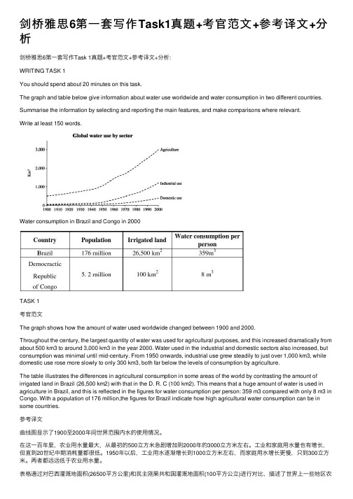
剑桥雅思6第⼀套写作Task1真题+考官范⽂+参考译⽂+分析剑桥雅思6第⼀套写作Task 1真题+考官范⽂+参考译⽂+分析:WRITING TASK 1You should spend about 20 minutes on this task.The graph and table below give information about water use worldwide and water consumption in two different countries. Summarise the information by selecting and reporting the main features, and make comparisons where relevant.Write at least 150 words.Water consumption in Brazil and Congo in 2000TASK 1考官范⽂The graph shows how the amount of water used worldwide changed between 1900 and 2000.Throughout the century, the largest quantity of water was used for agricultural purposes, and this increased dramatically from about 500 km3 to around 3,000 km3 in the year 2000. Water used in the industrial and domestic sectors also increased, but consumption was minimal until mid-century. From 1950 onwards, industrial use grew steadily to just over 1,000 km3, while domestic use rose more slowly to only 300 km3, both far below the levels of consumption by agriculture.The table illustrates the differences in agricultural consumption in some areas of the world by contrasting the amount of irrigated land in Brazil (26,500 km2) with that in the D. R. C (100 km2). This means that a huge amount of water is used in agriculture in Brazil, and this is reflected in the figures for water consumption per person: 359 m3 compared with only 8 m3 in Congo. With a population of 176 million,the figures for Brazil indicate how high agricultural water consumption can be in some countries.参考译⽂曲线图显⽰了1900⾄2000年间世界范围内⽔的使⽤情况。
雅思表格作文英语模板
雅思表格作文英语模板IELTS Writing Task 1: Bar Chart Template。
Introduction:The bar chart presents data on [topic]. It illustrates [specific information] over a given period of time. This report will analyze the data in detail and provide a clear overview of the trends and patterns observed.Overview:Overall, the data reveals [general observation]. However, there are variations in [specific observation].Body Paragraph 1:The first bar represents [category 1]. The [specific observation] for this category shows [data]. It is evident that [comparison to other categories].Body Paragraph 2:Moving on to the second bar, it represents [category 2]. The [specific observation] for this category displays [data]. It is worth noting that [comparison to other categories].Body Paragraph 3:The third bar represents [category 3]. The [specific observation] for this category indicates [data]. Interestingly, [comparison to other categories].Body Paragraph 4:Next, the fourth bar represents [category 4]. The [specific observation] for this category reveals [data]. It is important to highlight that [comparison to other categories].Body Paragraph 5:Finally, the fifth bar represents [category 5]. The [specific observation] for this category demonstrates [data]. Notably, [comparison to other categories].Conclusion:To conclude, the bar chart provides a comprehensive overview of [topic]. The data clearly shows [general observation]. It is evident that [specific observation]. Overall, it can be inferred that [conclusion based on the data].Note: This template provides a general structure for writing an IELTS Task 1 essay based on a bar chart. However, it is important to adapt the template to the specific information provided in the chart and ensure that the analysis and observations are accurate and relevant. Additionally, it is crucial to use a wide range of vocabulary and sentence structures to showcase language proficiency.。
雅思小作文表格图范文
雅思小作文表格图范文
雅思小作文中,表格图是一种常见的题型。
表格图通常用于展示数据或者比较不同事物之间的差异。
在这篇文章中,我们将会提供一篇范文,帮助大家更好地理解和应对雅思小作文表格图题型。
题目描述
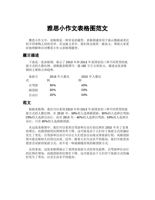
下面是一张表格图,展示了2010年和2015年某国家的三种不同类型的旅游方式的人数比例。
请根据表格图写一篇150字左右的短文,描述这张表格图的主要特点和趋势。
旅游方式
2010年人数比
例
2015年人数比
例
自驾游30% 40%
跟团游50% 30%
自由行20% 30%
范文
根据表格图,我们可以看到2010年和2015年某国家的三种不同类型的旅
游方式的人数比例。
在2010年,50%的人选择跟团游,30%的人选择自驾游,20%的人选择自由行。
而在2015年,40%的人选择自驾游,30%的人选择自
由行,只有30%的人选择跟团游。
从这张表格图中,我们可以看到自驾游和自由行的比例在2015年有了显著
的增长,而跟团游的比例则有所下降。
这可能是由于人们对于旅游方式的偏好发生了变化。
自驾游和自由行可以让人们更加自由地安排旅游行程,而跟团游则可能会限制人们的自由度。
此外,随着人们生活水平的提高,他们可能更加愿意尝试新的旅游方式,而不是一味地跟随传统的跟团游方式。
总的来说,这张表格图展示了某国家旅游方式的变化趋势。
自驾游和自由行的比例在增加,而跟团游的比例在下降。
这可能是由于人们对于旅游方式的偏好发生了变化,以及生活水平的提高。
雅思表格作文通用万能模板
雅思表格作文通用万能模板Introduction。
In recent years, the use of tables has become increasingly popular in the IELTS writing test. Tables are a great way to present and compare data, making it easier for the reader to understand complex information. In this article, we will discuss a universal template for writing task 1 essays that involve tables.Overview。
The first paragraph of your essay should provide an overview of the information presented in the table. This includes a brief description of the data and any significant trends or patterns that can be observed. It is important to give the reader a clear understanding of what the table is about before delving into the specific details.Introduction of the table。
The second paragraph should introduce the table in more detail. This includes a description of the different categories or variables presented in the table, as well as any units of measurement that are used. It is also important to mention the source of the data, if it is provided.Description of the main features。
雅思写作Task1曲线图考官范文(1)

雅思写作Task1曲线图考官范文(1)(最新版)编制人:__________________审核人:__________________审批人:__________________编制学校:__________________编制时间:____年____月____日序言作文(composition)是经过人的思想考虑和语言组织,通过文字来表达一个主题意义的记叙方法。
作文分为小学作文,中学作文,大学作文(论文)。
作文体裁包括:记叙文、说明文、应用文、议论文。
作文并不神秘,要想写好一篇文章,首先要多看,多想,勤于观察,积累素材。
只有细致的观察生活,积累素材才是写好作文的基础。
首先要明确你要写的主题,认真的审题,列出大纲,不要只注意题目中要求的字有多少,要多注意题目的本身,要多读多想,准确的用好词语和修饰语。
这是审题的关键,要确立好主题的依据,要精心的选材,布局列题,有的材料,还要分析整理。
这就要对材料进行分类,比较,概括,筛选。
我们不要象盖房子那样的把所有的材料都堆砌起来,要合理恰当的组合,具体的说开头和结尾要略写,那么经过就要仔细的推敲,修辞,润色,写好以后不要急于交稿,反复检查认真的修改。
古人说:书读百遍,其义自见。
熟读唐诗三百首,不会作诗也会吟。
这些都说明一个道理,只要你多看书,多读书对你的写作文有一定的好处。
只要你明白这样的一个道理,作文就是要你把生活中喜,怒,哀,乐用文字经过加工,修饰。
整理,也就是我们说的作文。
作文内容英语作文啦雅思频道特为大家收集整理了雅思写作Task1曲线图考官范文。
认真研读一定的雅思范文及作文模板可以帮助我们检验自己的写作水平,并能很好地吸收和应用优秀范文里的优秀内容~更多雅思报名官网的最新消息,最新、最专业的雅思备考资料,英语作文啦将第一时间为大家发布。
The graphs below show the numbers of male and female workers in 1975 and 1995 in several employment sectors of the republic of Freedonia.Write a report for a university teacher describing the information shown.Sample Answer:The provided line graphs compare the employment history of men and women in 1975 and 1995 dividing in six major sectors namely: manufacturing, communications, finance/ banking, wholesale & retail trade, non-defence public sectors and defence public sectors. As is observed from the given illustration, significantchanges have been made in women's employment and women appear to have made remarkable improvements in almost the entire job sectors in Freedonia and in some sectors women went well ahead of men.Initially in 1975, men were notably ahead of women in every sector of employment. For example, in communication sector about 260 men worked against 220 women in every thousand employees. Twenty years later, though the number of men remained unchanged, the number of women rose to over 550 in one thousand. A similar trend can be seen in the wholesale and retail trade sector, where the number of women rose from about 550 to almost 800 in every 1000 employees of this sector two decades later. The number of men in this sector remained stable over the period, at around 700 / thousand.Women also made their prominence in both the finance/ banking industries and in the defence-related public sector during this period. Where 125 women among one thousand employees worked in finance & banking institutions in 1975, this number increased to 450 by 1995. The number of men grew only marginally from 425 to 480 over the same period. In defence sector, the number of mendeclined from 225 to 200 per thousand, while the number of women rose from 25 to over 100 per thousand. Two sectors that remained almost stable in terms of men and women employee ration are manufacturing and public sector. In manufacturing about 300 women and 650 men worked in both surveyed years, and in public sector (non-defence), which employed 650 women and 850 men.In conclusion, we can say that, women appear to have made gains in the work force in Freedonia and in some sectors they went well ahead compared to men.(Approximately 338 words)Alternative Answer:The provided illustrations compare the male and female workers in different employment sectors in Freedonia over 20 years of time by providing data for the years 1975 and 1995. As is observed from the given line graphs, women were far behind in employment in Freedonia in 1975 but within 20 years they made remarkable progress almost in all sectors and went well ahead of men in communications and wholesale & retail trade sectors.The graphs compare the number of male and female workers in 6 different sectors of Freedonia per thousand.In 1975, more men than women were employed in almost all the mentioned sectors of job categories. For instance, approximately 650 men were employed in manufacturing related jobs compared to only 300 women per thousand of total employees in the same sectors. In almost all other cases, the numbers of male employees were much higher than the women and in communication sectors men were bit ahead than female in their employment ration. After 20 years, in 1995, women made outstanding progress in Freedonian job sectors. For instance, in communication sectors almost 600 female were employed compared to 300 male workers per thousand. Women went ahead of men in wholesale & retail trade sectors too. Except for the public sectors (non-defence) women hold the trends of progress compared to men in all other sectors. In 1975 only about 40 women worked in defence sectors and this number grew to more than 100 per thousand after 20 years.In summary women did remarkable progress in Freedonian job fields over 20 years and they went ahead of men in many job sectors.(Approximately 270 words)(These two model answers can be followed as examplesof a well written answer. However, please note that this is just one example out of many possible approaches.)。
雅思task1写作模板
雅思task1写作模板雅思写作Task 1是许多考生感到挑战的部分,因为它要求考生在规定的时间内,对图表、表格或流程图进行分析,并以清晰、连贯的方式呈现出来。
以下是一个雅思Task 1写作模板,旨在帮助考生更好地组织文章结构,提高写作效率。
雅思Task 1写作模板:一、开头段落1.概括介绍:简要描述图表、表格或流程图的主题,说明要分析的内容。
Example: The table below presents data on the population of three countries from 2000 to 2010.2.主题句:明确指出文章要分析的主题。
Example: This report will focus on analyzing the changes in population of these countries over the given period.二、主体段落1.第一段:描述图表/表格/流程图中的第一个数据点或阶段。
a.主题句:指出要分析的数据点或阶段。
Example: The first stage of the process involves ...b.详细描述:对数据点或阶段进行详细描述,包括数据变化、比较等。
Example: In 2000, the population of Country A was 10 million, which accounted for 20% of the total population of the three countries.2.第二段:描述图表/表格/流程图中的第二个数据点或阶段。
a.主题句:指出要分析的数据点或阶段。
b.详细描述:对数据点或阶段进行详细描述,与第一段类似。
3.依次类推,描述其他数据点或阶段。
三、结尾段落1.总结句:总结文章分析的主要结果。
Example: In conclusion, the population of these three countries experienced significant changes from 2000 to 2010.2.指出可能的趋势或关联:如有必要,指出数据之间的趋势或关联。
雅思写作图表描述

雅思写作图表描述在雅思写作任务1中,经常会出现关于图表描述的题目。
图表描述是考察考生对数据的理解和组织能力,同时也要求考生能够准确地用英文词汇和语法进行描述和分析。
本文将介绍如何写一篇清晰、准确的雅思写作图表描述。
一、引言段在引言段,我们需要简要介绍图表所展示的数据内容。
我们可以涵盖以下几个方面: - 简单描述图表类型:如线形图、柱状图、饼状图等。
- 图表展现的主题:如能源消耗、人口增长、教育水平等。
- 时间和地点范围:如1990年至2020年、全球、某个国家等。
段落一:总体概述在第一个段落,我们需要给出整个图表数据的总体描述和比较。
我们可以使用以下结构进行描述:- 展示数据的总体趋势和变化:如上升、下降、保持稳定等。
- 用具体的数据支持总体概述的观点:如数据增长了百分之几、达到了多少等。
- 对比不同的数据:如不同类别之间的比较、不同时间段的比较等。
段落二:细节描述在第二个段落,我们需要更具体地描述图表中的数据细节。
我们可以运用以下组织结构来实现:- 描述数据中的每个细节:以从最高到最低的顺序逐个描述每个数据点。
- 使用具体的数字和百分比来支持描述:如“从10%上升到了20%”、“增长了50%”等。
- 引入相关的词汇或表达来进行准确的描述:如“达到峰值”、“有显著的下降”等。
段落三:总结观点在第三个段落,我们需要总结我们在前面段落中得出的观点和结论。
我们可以运用以下结构进行总结:- 概括整篇图表描述的主要内容:简要回顾我们在前面段落中的描述。
- 强调图表中的关键点:如最高点、最低点、显著的变化等。
- 提供对于数据可能存在的原因和影响的解释:如政策变化、经济发展等。
段落四:个人观点(可选)在最后一个段落,我们可以根据需要提出个人观点。
这一段主要用于表达个人意见和看法,可以更自由地阐述个人观点,并且提供支持观点的例子。
通过以上的组织结构和写作技巧,我们可以编写出一篇清晰、准确的雅思写作图表描述。
在实际写作过程中,我们要避免重复使用相同的表达和词汇,要注重句型的变化和对比的描述。
剑8test1大小 作文课件

剑桥雅思8 test1 ---writing task 1The pie chart below shows the main reasons why agricultural land becomes less productive. The table shows how these causes affected three regions of the world during the 1990s.典型的雅思写作里面的组合图:饼图+表格我们先来看一下考官范文的第一段:The pie chart shows that there are four main causes of farmland becoming degraded in the world today.考官首先写了上面饼状图的内容,即:造成土地破坏的主要原因,作为这个段的主题句放在第一句。
从这个句子我们可以看出,组合类的小作文可以先写出主要的趋势和特征作为主题句放在第一句,这个是得高分的关键。
我们接下来继续看:Globally, 65% of degradation is caused by too much animal grazing and tree clearance, constituting 35% and 30% respectively. A further 28% globaldegradation is due to over-cultivation of crops. Other causes account for only 7% collectively.从这些描述来看,考官分别描述了图中四个造成土地破坏的原因,并且排列的顺序是由大到小,这里我们可以看出考官并没有很复杂地描述这个饼图,就把它当成一般的饼图来写,所以我们以后在写组合图的时候,对第一个单个图,也可以把它当成一般的个体图来描述。
但是大家要注意的是考官在表达方法(语句和词组)上面分别采用了:被动语态、现在分词、due to和account for等语法和词组,充分发挥了句型和词组多样化,所以还要请同学们平时多积累小作文固有的同义词和近义词的表达。
雅思图表范文
雅思图表范文以下是一篇雅思图表范文,该题目要求写一篇描述某个国家人口结构的图表分析文章。
The bar chart demonstrates the population structure of a particular country in the year 2020. Overall, it is clear that the population is aging, with a declining proportion of younger individuals and a significant increase in the percentage of older people.Looking at the details, the age group with the highest percentage is the older population (aged 65 and above), accounting for 25% of the total population. Meanwhile, the proportion of middle-aged individuals (aged 35-64) is slightly lower, making up 40% of the population. In contrast, the younger generation (aged 0-14) forms the smallest segment, representing only 20% of the total population. Breaking down the older population further, there is a clear trendof increasing longevity, as the percentage of people aged 80 and above is the highest among the elderly age groups. This indicates that the country has made significant progress in terms of healthcare and quality of life, resulting in a longer life expectancy. In contrast, the younger population is experiencing a decline. The percentage of children aged 0-4 is the lowest among the three age groups, suggesting a decrease in the birth rate. This could be attributed to various factors such as economic factors and changes in societal norms, where couples are choosing to have fewer children or delay starting a family.Overall, the aging population trend depicted in the bar chart presents challenges for the country in terms of healthcare and social security. With a declining proportion of younger individuals, there may be a strain on the workforce and a need for policies to address the aging population's needs. Additionally, there may be a need for increased investment in healthcare infrastructure and services to cater to the older population's increasing healthcare demands.。
雅思写作Task1图表作文写作方法
雅思写作Task1图表作文写作方法寫作測驗第一部份:描述圖表資訊第一部份寫作測驗的目的是要評量考生是不是有描述圖表、圖形或表格等不同資料形式的能力。
在英國,大部分大學以上的學生必須寫這樣的文章,所以對一個將到英國唸書的學生來說,是一個必備的能力。
第一 : 瞭解圖形資訊下筆之前,第一要瞭解圖表中的資料,第二要構思怎麼回答問題和如何分段組織。
第二 : 瞭解圖表中的資料第一要找圖表或表格旁的標題或主題,如此可以大概了解圖形的內容。
第二要找出圖形中各項資料的關係,大部分的數據資料會用來顯示兩組或更多組資料之間的關係。
通常,這些資訊會寫在標題欄和標題列上。
第三找出資料的特徵和趨勢,例如 2003年到2004年,越來越少小孩被生出來之類的資訊走向。
第三 : 組織和構思文章寫文章時一定要根據自己的想法組織仔細分段,而第一段通常是引言,可以描述一下圖表的基本資訊,說明將要描述的資料,然後做評論。
本文的部分,要分幾段來描述圖表上的資訊。
最後一部分是結論,要將所描述的資料做總結並且解釋發現到的趨勢。
有時候,題目會要求對形成趨勢的原因或理由作評論,而不錯的結論可能會有加分效果。
数据图表:a data graph图表, 曲线图/chart/diagram图解, 简图, 图表,示意图/illustration说明, 图解, 图示/table饼图:pie chart表格图:table直方图或柱形图:bar chart / histogram柱状图趋势曲线图:line chart / curve diagram 曲线统计图流程图或过程图:flow chart / sequence diagram程序图:processing/procedures diagram圆柱图:column chart描述:show/describe/illustrate/apparent/reveal/represent/demonstrate/indicate/depict以下是一些较常用的描述用法The table/chart diagram/graph shows (that)According to the table/chart diagram/graphAs (is) shown in the table/chart diagram/graphAs can be seen from the table/chart/diagram/graph/figures,figures figures/statistics统计资料 shows (that)...It can be seen from the figures/statisticsWe can see from the figures/statisticsIt is clear from the figures/statisticsIt is apparent from the figures/statisticstable/chart/diagram/graph figures (that)Para1. This is a table / chart / (line线状bar柱状pie饼状)graph which demonstrate / illustrate / reveal /depict /privide information about............. Para2.(1)Obvious明显的; 显而易见的; 显然的/Apparent显然的, 明白的, 清晰可见的from the graph is that ...rank the first/highest, while/whereas但是, 然而,尽管....turn out to be the lowest最低的,最底下的,最小的(2)It is exhibited显示出/shown in the table that.....(3)It can be seen from the table that.....Para3.(1)饼.柱图A,which accounts for...%,ranks the first居世界第一; then next isB with...%;followed by接着是C, constituting构成...%;finally最后it comes D.E.F at...%...%and...%respectively分别;各自;顺序为;依次为(2)特殊变化(不变,增长或下降多的)①It is worth mentioning值得一提that....②It must be pointed out必须指出……that....③More striking更令人吃惊is that....Para4.To conclude总而言之/In conclusion最后, 综上所述/overall大体上, 总的来说雅思图表作文6分范文实例解析WRITING TASK 1You should spend about 20 minutes on this task.The graph below gives information about cinema attendance in Australia between 1990 and the present, with projections to 2010.Summaries the information by selecting and reporting the main features, and make comparisons where relevant.Write at least 150 words.The graph shows percentages of cinema attendance at least once a year in Australia between 1990 to 2010 with projections for the future. The graph is described by 4 groups of different ages which are 14 to 24, 25 to 34, 35 to 49 and over 50 year olds.The youngest age group people have been going to cinema more than any other age groups and the percentage has been keeping very high at approximately90% since 1990. It is predicted to keep the high and to increase more from 2006.The middle age groups’ people have enjoyed going cinema between 60% to 80%. The percentage of age 25 to 34 groups has been higher than the one of age 35 to 49 group but from 2006 the percentage of 25 to 34 year olds people will decrease while the one of 35 to 49 year olds people will increase and get higher than the other one.The oldest people seem to go cinema less than the other groups but the percentage of the attendance has slightly going up by 15% from 40% to 55% between 1990 to 2004 and it will keep increasing to 60% by 2010.Overall, it seems the younger age people, the more going to cinema.【考官评语】Band 6This response addresses the requirements of the task and selects relevant material to describe. Key features and an overview are presented, although clearer highlighting, more support and a more comprehensive overview would be needed to reach a higher band. Information is well-organized and there is a clear overall progression in the response. There is some effective use of cohesive devices, but only limited use of reference and substitution. The range of vocabulary is not wide, but it is adequate for the task. Control of word form and spelling is consistently good, although there are some clumsy noun phrases that indicate limited flexibility. The candidate attempts to use a mix of simple and complex sentences, but control is variable and grammatical errors or omissions are quite intrusive at times. Figures are poorly integrated into sentences and indicate evident limitations.【世纪雅思0607 + 写作】雅思八分经典作文背诵:图表范文写作柱状图显示的是1970-1990二十年间英国人每周在快餐上花费了多少钱;曲线图展示的是这二十年间快餐消费的趋势。
图表类英语作文模板雅思

图表类英语作文模板雅思English:When analyzing a chart in an IELTS Writing Task 1, it is important to first introduce the chart by stating what it illustrates and the time frame covered. Following that, the key trends and comparisons should be highlighted, providing specific data and numbers to support the observations made. It is also crucial to consider the overall significance of the data presented in the chart, discussing any outliers or interesting patterns that may stand out. Additionally, linking the information back to the main question and concluding with a summary of the main findings is essential to effectively analyze a chart in an IELTS Writing Task 1.Translated content:在分析雅思写作任务1中的图表时,首先重要的是介绍图表所展示的内容以及涵盖的时间范围。
随后,应该突出主要趋势和比较,提供具体数据和数字来支持所做的观察。
同样重要的是要考虑图表所呈现数据的整体意义,讨论任何可能引人注目的异常值或有趣的模式。
此外,将信息与主要问题联系起来,最终总结主要发现是有效分析雅思写作任务1中的图表至关重要的。
- 1、下载文档前请自行甄别文档内容的完整性,平台不提供额外的编辑、内容补充、找答案等附加服务。
- 2、"仅部分预览"的文档,不可在线预览部分如存在完整性等问题,可反馈申请退款(可完整预览的文档不适用该条件!)。
- 3、如文档侵犯您的权益,请联系客服反馈,我们会尽快为您处理(人工客服工作时间:9:00-18:30)。
雅思写作Task1表格图考官范文(1)
The first chart below shows the results of a survey which sampled a cross-section of 100,000 people asking if they traveled abroad and why they traveled for the period 1994-98. The second chart shows their destinations over the same period.
Write a report for a university lecturer describing the information shown below.
Sample Answer:
The provided charts shows the data of a survey conducted on 100,000 people and the statistics shows the number of UK citizen travelled abroad during 1994 to 1998 for different purposes and their destinations. As is observed from the given graphs, most of the UK residents travelled on their holidays and Western Europe was their most favourite destination.
Initially in 1994, more than 22 thousand UK resident traveled different foreign countries and among them more than 15 thousands went on their holidays. For business tours more than 3 thousand people travelled in other countries in the same year while more than 2 thousand people visited their friends and relatives. After 1 year, this number slightly decreased and for the rest of the years until
1998, the number steadily increased in almost all of the categories. Finally in 1998, the total travelers'number reached to more than 28 thousand and among them more than twenty thousand people travelled to enjoy their holidays.
In 1994, almost 18 thousand people out of 22 thousand went to Western Europe which is significantly larger than the number of people traveled to North America and other parts of the world. The similar trends can be observed for the remaining years and the majority people of the UK went to Western Europe which makes this place the most popular tourist’s destination of UK people.
( This model answer can be followed as an example of a very good answer. However, please note that this is just one example out of many possible approaches.)。
