雅思写作Task1曲线图考官范文(1)
雅思写作样题、范文和考官点评(1)
Sample Candidate Writing Scripts and Examiner CommentsBoth the Academic and General Training Writing Modules consist of two tasks, Task 1 and Task 2. Each task is assessed independently. The assessment of Task 2 carries more weightin marking than Task 1.Detailed performance descriptors have been developed which describe written performance at the 9 IELTS bands. These descriptors are confidential and apply to both the Academic and General Training Modules.Task 1 scripts are assessed on the following criteria:•Task Achievement•Coherence and Cohesion•Lexical Resource•Grammatical Range and AccuracyTask 2 scripts are assessed on the following criteria:•Task Response•Coherence and Cohesion•Lexical Resource•Grammatical Range and AccuracyCandidates should note that scripts will be penalised if they are a) under the minimum word length, b) partly or wholly plagiarised, c) not written as full, connected text (e.g. using bullet points in any part of the response, or note form, etc.).T ask 1Task AchievementThis criterion assesses how appropriately, accurately and relevantly the response fulfils the requirements set out in the task, using the minimum of 150 words.Academic Writing Task 1 is a writing task which has a defined input and a largely predictable output. It is basically an information-transfer task which relates narrowly to the factual content of an input diagram and not to speculated explanations that lie outside the given data.General Training Writing Task 1 is also a writing task with a largely predictable output in that each task sets out the context and purpose of the letter and the functions the candidate should cover in order to achieve this purpose.Coherence and CohesionThis criterion is concerned with the overall clarity and fluency of the message: how the response organises and links information, ideas and language. Coherence refers to the linking of ideas through logical sequencing. Cohesion refers to the varied and appropriate use of cohesive devices (for example, logical connectors, pronouns and conjunctions) to assist in making the conceptual and referential relationships between and within sentences clear. Lexical ResourceThis criterion refers to the range of vocabulary the candidate hasused and the accuracy and appropriacy of that use in terms ofthe specific task.Grammatical Range and AccuracyThis criterion refers to the range and accurate use of thecandidate’s grammatical resource as manifested in thecandidate’s writing at sentence level.T ask 2Task ResponseIn both Academic and General Training Modules Task 2 requiresthe candidates to formulate and develop a position in relation to a given prompt in the form of a question or statement. Ideasshould be supported by evidence, and examples may be drawnfrom the candidates’ own experience. Responses must be atleast 250 words in length.Writing scripts are marked by trained and certificated IELTS examiners. Scores are reported as whole bands only.On the next 12pages you will find candidates’ answers totwo sample Writing tests. There are two answer s for each Writing task. Each answer has been awarded a band score and is accompanied by an examiner comment on the candidate’s performance for thattask.The examiners’ guidelines for marking the Writing scripts arevery detailed.There are many different ways a candidate may achieve a particular band score.The candidates’ answers that follow should not be regarded as definitive examples of any particular band score.Sample Script AExaminer commentBand 5The length of the answer is just acceptable. There is a good attempt to describe the overall trends but the content would have been greatly improved if the candidate had included some reference to the figures given on the graph. Without these, the reader is lacking some important information. The answer is quite difficult to follow and there are some punctuation errors that cause confusion. The structures are fairly simple and efforts to produce more complex sentences are not successful.Sample Script BExaminer commentBand 6The candidate has made a good attempt to describe the graphs looking at global trends and more detailed figures. There is, however, some information missing and the information is inaccurate in minor areas. The answer flows quite smoothly although connectives are overused or inappropriate, and some of the points do not link up well. The grammatical accuracy is quite good and the language used to describe the trends is well-handled. However, there are problems with expression and the appropriate choice of words and whilst there is good structural control, the complexity and variation in the sentences are limited.Sample Script AExaminer commentBand 6The answer has a good introduction in which the candidate has attempted to incorporate his/her own words. There is good coverage of the data and a brief reference to contrasting trends. The answer can be followed although it is rather repetitive and cohesive devices are overused. In order to gain a higher mark for content, the candidate would be expected to select the salient features of the graph and comment primarily on these. Sentences are long but lack complexity. There are some errors in tense, verb form and spelling which interfere slightly with the flow of the answer.Sample Script BExaminer commentBand 7The answer deals well with both the individual media trends and the overall comparison of these trends. The opening could be more fully developed with the inclusion of information relating to the groups studied and the period of time during which the study took place. There is a good variety of cohesive devices and the message can be followed quite easily although the expression is sometimes a little clumsy. Structures are complex and vocabulary is varied but there are errors in word forms, tense and voice and occasionally the text becomes incoherent.Sample Script AExaminer commentBand 5The answer is short at just over 200 words and thus loses marks for content. There are some relevant arguments but these are not very well developed and become unclear in places. The organisation of the answer is evident through the use of fairly simple connectives but there are problems for the reader in that there are many missing words and word order is often incorrect. The structures are quite ambitious but often faulty and vocabulary is kept quite simple.Academic Writing Sample Task 2A Sample Script BExaminer commentBand 6There are quite a lot of ideas and while some of these are supported better than others, there is an overall coherence to the answer. The introduction is perhaps slightly long and more time could have been devoted to answering the question. The answer is fairly easy to follow and there is good punctuation. Organisational devices are evident although some areas of the answer become unclear and would benefit from more accurate use of connectives. There are some errors in the structures but there is also evidence of the production of complex sentence forms. Grammatical errors interfere slightly with comprehension.Academic Writing Sample Task 2B Sample Script AExaminer commentBand 5Although the script contains some good arguments, these are presented using poor structures and the answer is not very coherent. The candidate has a clear point of view but not all the supporting arguments are linked together well and sometimes ideas are left unfinished. There is quite a lot of relevant vocabulary but this is not used skilfully and sentences often have words missing or lapse into different styles. The answer is spoilt by grammatical errors and poor expression.Academic Writing Sample Task 2B Sample Script BExaminer commentBand 7The answer is well-written and contains some good arguments. It does tend to repeat these arguments but the writer’s point of view remains clear throughout. The message is easy to follow and ideas are arranged well with good use of cohesive devices. There are minor problems with coherence and at times the expression is clumsy and imprecise. There is a wide range of structures that are well handled with only small problems, mainly in the areas of spelling and word choice.44|IELTS Specimen MaterialsIELTS Specimen Materials|45Sample Candidate Writing Scripts and Examiner CommentsBoth the Academic and General Training Writing Modules consist of two tasks, Task 1 and Task 2. Each task is assessed independently. The assessment of Task 2 carries more weightin marking than Task 1.Detailed performance descriptors have been developed which describe written performance at the 9 IELTS bands. These descriptors are confidential and apply to both the Academic and General Training Modules.Task 1 scripts are assessed on the following criteria:•Task Achievement•Coherence and Cohesion•Lexical Resource•Grammatical Range and AccuracyTask 2 scripts are assessed on the following criteria:•Task Response•Coherence and Cohesion•Lexical Resource•Grammatical Range and AccuracyCandidates should note that scripts will be penalised if they are a) under the minimum word length, b) partly or wholly plagiarised, c) not written as full, connected text (e.g. using bullet points in any part of the response, or note form, etc.).T ask 1Task AchievementThis criterion assesses how appropriately, accurately and relevantly the response fulfils the requirements set out in the task, using the minimum of 150 words.Academic Writing Task 1 is a writing task which has a defined input and a largely predictable output. It is basically an information-transfer task which relates narrowly to the factual content of an input diagram and not to speculated explanations that lie outside the given data.General Training Writing Task 1 is also a writing task with a largely predictable output in that each task sets out the context and purpose of the letter and the functions the candidate should cover in order to achieve this purpose.Coherence and CohesionThis criterion is concerned with the overall clarity and fluency of the message: how the response organises and links information, ideas and language. Coherence refers to the linking of ideas through logical sequencing. Cohesion refers to the varied and appropriate use of cohesive devices (for example, logical connectors, pronouns and conjunctions) to assist in making the conceptual and referential relationships between and within sentences clear. Lexical ResourceThis criterion refers to the range of vocabulary the candidate has used and the accuracy and appropriacy of that use in terms ofthe specific task.Grammatical Range and AccuracyThis criterion refers to the range and accurate use of the candidate’s grammatical resource as manifested in thecandidate’s writing at sentence level.T ask 2Task ResponseIn both Academic and General Training Modules Task 2 requiresthe candidates to formulate and develop a position in relation to a given prompt in the form of a question or statement. Ideasshould be supported by evidence, and examples may be drawnfrom the candidates’ own experience. Responses must be atleast 250 words in length.Writing scripts are marked by trained and certificated IELTS examiners. Scores are reported as whole bands only.On the next 6pages you will find candidates’ answers to one sample Writing test. There are two answer s for this Writing task. Each answer has been awarded a band score and is accompanied by an examiner comment on the candidate’s performance for that task.The examiners’ guidelines for marking the Writing scripts are very detailed.There are many different ways a candidate may achieve a particular band score.The candidates’ answers that follow should not be regarded as definitive examples of any particular band score.General Training Writing Sample Task 1Sample Script AExaminer commentBand 5The answer is below the word limit and there is some repetition of the task rubric. (Length is a common problem in General Training scripts.) Answers that are short lose marks because of inadequate content and may also lose marks because there is insufficient material in the answer for the examiner to give credit for accuracy and coherence. Despite these problems, the introduction to the letter is appropriate and the purpose of the writer is clear. The points are not always linked together well and punctuation is sometimes faulty. The sentences are kept quite simple and mistakes occur as soon as more complex structures are attempted.Sample Script BExaminer commentBand 7This answer is also short. Although ideas are often provided in the task rubric, candidates are at liberty to include some of their own ideas in their answers. In this case, the candidate has attempted to incorporate some original material. The answer reads quite fluently, is well organised and there is good use of conjunctions to link points. There are some grammatical errors but these do not affect the reader greatly and there is evidence of some more complex sentence structures.Sample Script AExaminer commentBand 5There are quite a lot of relevant ideas in the answer but they are not always well supported and sometimes they are unclear. There are some areas in the answer where the organisation becomes weak and the reader finds the message difficult to follow. Nevertheless, the writer’s view is apparent and there is a logical flow to the points given. There are a lot of mistakes in the answer and some parts, such as the conclusion, are very hard to follow because of these errors. Although there is some appropriate vocabulary, sentence control is very weak. These problems are made worse by thepoor correcting which sometimes makes words unreadable.General Training Writing Sample Task 2 Sample Script BExaminer commentBand 8This is a very well-organised script which contains a lot of well-supported arguments and analyses the topic from different angles. The ideas follow each other well and there is a very honest conclusion. The answer is easy to read. There are some areas where the expression is clumsy but this makes little difference to the overall flow of the answer. There are minor errors in spelling and structure.。
雅思英语图表作文范文(必备3篇)

雅思英语图表作文范文第1篇A类雅思各类图表作文要点及范文一.曲线图解题关键1曲线图和柱状图都是动态图,解题的切入点在于描述趋势。
2在第二段的开头部分对整个曲线进行一个阶段式的总分类,使写作层次清晰,同时也方便考官阅卷。
接下来再分类描述每个阶段的specifictrend,同时导入数据作为分类的依据。
3趋势说明。
即,对曲线的连续变化进行说明,如上升、下降、波动、持平。
以时间为比较基础的应抓住“变化”:上升、下降、或是波动。
题中对两个或两个以上的变量进行描述时应在此基础上进行比较,如变量多于两个应进行分类或有侧重的比较。
4极点说明。
即对图表中最高的、最低的点单独进行说明。
不以时间为比较基础的应注意对极点的描述。
5交点说明。
即对图表当中多根曲线的交点进行对比说明。
6不要不做任何说明就机械地导入数据,这不符合雅思的考试目的。
曲线图常用词汇动词—九大运动趋势一:表示向上:increase,rise,improve,grow,ascend,mount,aggrandize,goup,climb, take off, jump,shoot up暴涨,soar,rocket, skyrocket雅思英语图表作文范文第2篇It is said that countries are becoming similar to each other because of the global spread of the same products, which are now available for purchase almost anywhere. I strongly believe that this modern development is largely detrimental to culture and traditions worldwide.A country’s history, language and ethos are all inextricably bound up in its manufactured artefacts. If the relentless advance of international brands into every corner of the world continues, these bland packages might one day completely oust the traditional objects of a nation, which would be a loss of richness and diversity in the world, as well as the sad disappearance of t he manifestations of a place’s character. What would a Japanese tea ceremony be without its specially crafted teapot, or a Fijian kava ritual without its bowl made from a certain type of tree bark?Let us not forget either that traditional products, whether these be medicines, cosmetics, toy, clothes, utensils or food, provide employment for local people. The spread of multinational products can often bring in its wake a loss of jobs, as people urn to buying the new brand,perhaps thinking it more glamorous than the one they are used to. This eventually puts old-school craftspeople out of work.Finally, tourism numbers may also be affected, as travelers become disillusioned with finding every place just the same as the one they visited previously. To see the same products in shops the world over is boring, and does not impel visitors to open their wallets in the same way that trinkets or souvenirs unique to the particular area too.Some may argue that all people are entitled to have access to the same products, but I say that local objects suit local conditions best, and that faceless uniformity worldwide is an unwelcome and dreary prospect.Heres my full answer:The line graphs show the average monthly amount that parents in Britain spent on their children’s s porting activities and the number of British children who took part in three different sports from 2008 to is clear that parents spent more money each year on their children’s participation in sports over the six-year period. In terms of the number of children taking part, football was significantly more popular than athletics and 2008, British parents spent an average of around £20 per month on their children’s sporting activities. Parents’ spending on children’s sports increased gradually over the followi ng six years, and by 2014 the average monthly amount had risen to just over £ at participation numbers, in 2008 approximately 8 million British children played football, while only 2 million children were enrolled in swimming clubs and less than 1 million practised athletics. The figures for football participation remained relatively stable over the following 6 years. By contrast, participation in swimming almost doubled, to nearly 4 million children, and there was a near fivefold increase in the number of children doing athletics.剑桥雅思6test1大作文范文,剑桥雅思6test1大作文task2高分范文+真题答案实感。
【2019最新】雅思小作文攻略+范文:曲线图-word范文模板 (1页)

【2019最新】雅思小作文攻略+范文:曲线图-word范文模板本文部分内容来自网络整理,本司不为其真实性负责,如有异议或侵权请及时联系,本司将立即删除!== 本文为word格式,下载后可方便编辑和修改! ==雅思小作文攻略+范文:曲线图下面雅思为大家整理了雅思小作文攻略+范文:曲线图,供考生们参考,以下是详细内容。
曲线图范文 1:【第一句】 The curve illustrates the number of cases of A - type crimes committed in the UK between the years 1990 and 201X.【第二句】It can be seen that A - type crimes decreased dramatically to 200 cases around the middle of the 1990 s and then increased to 201X before the year 201X.范文 2:From the graph , we can see clearly that in the early morning ,at 6 a . m ., few people watch TV . However , from this time onwards , the number of TV audience is on the rise . At noon , the people watching TV account for about 8% of the total population . In the period between 12:00 and 2:00 p . m ., the TV audience experiences a sharp increase from 8% to approximately 18%.From 2:00 p . m . to 4:00 p . m ., the figure remains constantat about 18%, then balloons to the peak of the day , reaching approximately 50%. The number of TV audiences drops dramatically from 10 p . m . till it reaches its bottom at 3 p . m .On the other hand , there is a sharp increase in radio audience from 6. a . m to 9 a . m ., peaking at about 28% at 8:30 a . m . However , from this point onwards , it declines gradually for therest of the day , bottoming out at 4:00 a . m . the next day .In brief , the number of TV and radio audiences varies according to different phases of time probably due to the different features of these two media .。
雅思英语图表作文范文
雅思英语图表作文范文Certainly, here's an example of an IELTS Academic Writing Task 1 essay on a graph:---。
Title: Trends in Global Carbon Emissions。
The bar chart illustrates the variations in global carbon emissions from 2000 to 2020, measured in million metric tons. Overall, there was a noticeable upward trendin carbon emissions over the two decades, with some fluctuations along the way.In 2000, global carbon emissions stood at approximately 6,000 million metric tons. Over the next five years, there was a steady increase, reaching around 7,500 million metric tons by 2005. This period saw a relatively rapid growth rate in emissions.From 2005 to 2010, there was a slight dip in emissions, dropping to just below 7,000 million metric tons. This could be attributed to various factors such as increased awareness of climate change and efforts to adopt cleaner energy sources.However, the downward trend was short-lived as emissions surged again from 2010 onwards. By 2015, global carbon emissions had exceeded 8,000 million metric tons, marking a significant increase from the previous years. This rapid rise in emissions could be linked to factors such as industrialization in developing countries and the continued reliance on fossil fuels for energy.By the year 2020, global carbon emissions had reached their highest point yet, surpassing 9,000 million metric tons. This steep increase underscores the pressing need for more stringent measures to curb emissions and combat climate change on a global scale.In conclusion, the bar chart highlights the concerning trend of rising global carbon emissions over the past twodecades. While there have been brief periods of decline, overall, the trajectory has been upward, signaling the urgent need for concerted efforts to address this pressing environmental issue.---。
(完整word版)雅思作文写作Task 1第一课时—曲线图、表格图

IELTS图表作文讲解:曲线图表格图范文分析:开头段(首段改写)The graph ①illustrates changes in the amounts of② beef, lamb, chicken and fish③consumed in a particular European country④ between 1979 and 2004。
①改写题目中的shows⑧下降表达,类似的有decrease, go down , decline, fall down ,drop ,sink。
这句话描写相反的趋势。
⑨交叉点⑩时间+上升表达⑪⑩最大值结尾段Overall,the graph shows how the consumption of ①chicken increased dramatically while the popularity of ②these other foods decreased over the period.①上升②下降,结尾段一般总结图中最主要的信息或最终要的趋势.❖TABLE③ 低于平均值的家庭类型情况④ 高于平均值的情况⑤ 倍数表达,清晰的对比⑥ 尾段对表中的主要类型的总趋势进行了重述Besides,此文章中作者用括号表达数据,很有新意,清晰三、结构及句型总结首段常用句型:1。
The table /graph shows (that)...2. The figures/statistics show (that)。
3. The diagram shows/ describes/ illustrates how。
.4。
According to/As (is) shown in the/As can be seen from the table/chart, diagram, graph, figures5. It can be seen/obse rved from the/ we can see from the…6. It is clear/ apparent from the table/chart/diagram/graph/figures (that)。
剑桥雅思6第一套写作Task1真题+考官范文+参考译文+分析
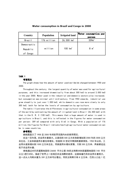
Water consumption in Brazil and Congo in 2000TASK 1考官范文The graph shows how the amount of water used worldwide changed between 1900 and 2000.Throughout the century, the largest quantity of water was used for agricultural purposes, and this increased dramatically from about 500 km3 to around 3,000 km3 in the year 2000. Water used in the industrial and domestic sectors also increased, but consumption was minimal until mid-century. From 1950 onwards, industrial use grew steadily to just over 1,000 km3, while domestic use rose more slowly to only 300 km3, both far below the levels of consumption by agriculture.The table illustrates the differences in agricultural consumption in some areas of the world by contrasting the amount of irrigated land in Brazil (26,500 km2) with that in the D. R. C (100 km2). This means that a huge amount of water is used in agriculture in Brazil, and this is reflected in the figures for water consumption per person: 359 m3 compared with only 8 m3 in Congo. With a population of 176 million,the figures for Brazil indicate how high agricultural water consumption can be in some countries.参考译文曲线图显示了1900至2000年间世界范围内水的使用情况。
(扬州沃的)雅思写作之曲线图写作攻略

雅思写作之曲线图写作攻略雅思写作包含图表作文以及议论文,也就是我们常说的小作文和大作文。
评分上前者占1/3,后者占2/3。
很多考生根据评分上的比重,错误地认为小作文没有议论文重要,殊不知,虽然只占1/3,但图表作文的技巧性比较强,短期内强化训练更能有较大提高。
若考生的写作总分要求达到6分,那图表作文至少要达到7分,这样才更为保险。
以下是扬州沃的雅思托福培训中心的老师通过总结,对数据类图表中的曲线图做出的分类写作攻略。
曲线图是所有数据类动态图表的基础,掌握了曲线图的写法,其他图表就很容易下手了。
曲线图一般分为三种情况,单曲线,双曲线和多根曲线。
单曲线单曲线最简单,没有纵向的对比,只需要横向比较,从起点至终点按照时间段把趋势提出来即可。
需要注意的是不仅要列趋势,还要作对比。
双曲线双曲线即图表里出现了两根曲线,而且大部分情况下这两根曲线的趋势是不同的。
也就是说,当Line 1的趋势是上升的,Line 2基本是下降的,这种情况一般推荐一根一根分段描写,具体的描写方法按照上文所提到的单曲线写法进行。
需要注意的是,两段之间必须加上表示转折关系的连接词,如On the contrary, In contrast, Conversely, whereas, whilst 等。
另外,在整篇文章的结尾段,需要进行时间段上两根曲线纵向的对比,如从整体上来看,前半年看电视的人数大大超过听收音机的,然而后半年情况完全相反。
第二种双曲线的情况是图中的两根曲线前面一阶段时间内趋势相同,然后从某个时间点开始两根线开始走不同的趋势。
这种也没有什么难度,老师推荐的写法是按照时间段描写。
Body 1写相同趋势的部分,Body 2写趋势不同的部分。
具体来讲,Body 1也有两种写法,可以把两根曲线放在一起写,如A and B both experienced agentle growth from… and … to … and … respectively;或者可以分开写,如A declined substantially during the initial decade from … to … . Similarly/ Likewise/ Also, B ... . 至于Body 2,开始部分需要告知读者从哪个时间点开始两者不一样了,如However, from 1970 onwards, two different trends can be witnessed. 接下来,一根一根按照单曲线写法分开描述。
雅思线图范文
雅思线图范文The line graph illustrates the changes in the number of people using public transportation in a particular city from 2010 to 2020. Overall, there was a significant increase in the usage of public transportation over the decade, with the number of people using buses and trains showing a steady rise.In 2010, the number of people using buses stood at around 2 million, while the number of train users was slightly higher at 2.5 million. Over the next five years, there was a noticeable increase in the usage of both buses and trains, with the number of bus users reaching 3.5 million and train users reaching 4 million in 2015.From 2015 to 2020, the number of people using buses continued to rise, reaching a peak of 4.5 million, while the number of train users remained relatively stable at 4 million. This indicates that buses were the preferred mode of public transportation for the majority of people in the city.In contrast, the number of people using bicycles and walking showed a downward trend over the same period. In 2010, the number ofcyclists and pedestrians stood at 1.5 million and 2 million respectively. However, by 2020, the number of cyclists had dropped to 1 million, while the number of pedestrians had decreased to 1.5 million.The reasons behind the increase in the number of people using buses and trains could be attributed to the city's efforts to improve public transportation infrastructure, such as the introduction of new bus routes and the expansion of the train network. Additionally, the rising cost of owning and maintaining a car may have prompted more people to opt for public transportation as a more cost-effective and environmentally friendly alternative.In conclusion, the line graph clearly demonstrates the upward trend in the number of people using buses and trains for public transportation in the city over the past decade. This shift towards public transportation may have been influenced by a combination of factors, including improvements in infrastructure and the increasing cost of car ownership.。
- 1、下载文档前请自行甄别文档内容的完整性,平台不提供额外的编辑、内容补充、找答案等附加服务。
- 2、"仅部分预览"的文档,不可在线预览部分如存在完整性等问题,可反馈申请退款(可完整预览的文档不适用该条件!)。
- 3、如文档侵犯您的权益,请联系客服反馈,我们会尽快为您处理(人工客服工作时间:9:00-18:30)。
Sample Answer:
The provided line graphs compare the employment history of men and women in 1975 and 1995 dividing in six major sectors namely: manufacturing, communications, finance/ banking, wholesale & retail trade, non-defence public sectors and defence public sectors. As is observed from the given illustration, significant changes have been made in women's employment and women appear to have made remarkable improvements in almost the entire job sectors in Freedonia and in some sectors women went well ahead of men.
Initially in 1975, men were notably ahead of women in every sector of employment. For example, in communication sector about 260 men worked against 220 women in every thousand employees. Twenty years later, though the number of men remained unchanged, the number of women rose to over 550 in one thousand. A similar trend can be seen in the wholesale and retail trade sector, where the number of women rose from about 550 to almost 800 in every 1000 employees of this sector two decades later. The number of men in this sector remained stable over the period, at around 700 / thousand.
(These two model answers can be followed as examples of a well written answer. However, please note that this is just one example out of many possible approaches.)
Women also made their prominence in both the finance/ banking industries and in the defence-related public sector during this period. Where 125 women among one thousand employees worked in finance & banking institutions in 1975, this number increased to 450 by 1995. The number of men grew only marginally from 425 to 480 over the same period. In defence sector, the number of men declined from 225 to 200 per thousand, while the number of women rose from 25 to over 100 per thousand. Two sectors that remained almost stable in terms of men and women employee ration are manufacturing and public sector. In manufacturing about 300 women and 650 men worked in both surveyed years, and in public sector (non-defence), which employed 650 women and 850 men.
The graphs compare the number of male and female workers in 6 different sectors of Freedonia per thousand. In 1975, more men than women were employed in almost all the mentioned sectors of job categories. For instance, approximately 650 men were employed in manufacturing related jobs compared to only 300 women per thousand of total employees in the same sectors. In almost all other cases, the numbers of male employees were much higher than the women and in communication sectors men were bit ahead than female in their employment ration. After 20 years, in 1995, women made outstanding progress in Freedonian job sectors. For instance, in communication sectors almost 600 female were employed compared to 300 male workers per thousand. Women went ahead of men in wholesale & retail trade sectors too. Except for the public sectors (non-defence) women hold the trends of progress compared to men in all other sectors. In 1975 only about 40 women worked in defence sectors and this number grew to more than 100 per thousand after 20 years.
In summary women did remarkபைடு நூலகம்ble progress in Freedonian job fields over 20 years and they went ahead of men in many job sectors.
(Approximately 270 words)
In conclusion, we can say that, women appear to have made gains in the work force in Freedonia and in some sectors they went well ahead compared to men.
(Approximately 338 words)
Alternative Answer:
The provided illustrations compare the male and female workers in different employment sectors in Freedonia over 20 years of time by providing data for the years 1975 and 1995. As is observed from the given line graphs, women were far behind in employment in Freedonia in 1975 but within 20 years they made remarkable progress almost in all sectors and went well ahead of men in communications and wholesale & retail trade sectors.
雅思写作
这是一篇雅思写作Task1曲线图考官范文。认真研读一定的雅思范文及作文模板可以帮助我们检验自己的写作水平,并能很好地吸收和应用优秀范文里的优秀内容。
The graphs below show the numbers of male and female workers in 1975 and 1995 in several employment sectors of the republic of Freedonia.