WPF中往COMBOBOX里添加选项并指定默认选项
MFC Combo Box(组合框)控件的用法

最后介绍一下列表框几种常用的消息映射宏:
ON_CBN_DBLCLK鼠标双击
ON_CBN_DROPDOWN列表框被弹出
ON_CBN_KILLFOCUS / ON_CBN_SETFOCUS在输入框失去/得到输入焦点时产生
ON_CBN_SELCHANGE列表框中选择的行发生改变
其中dwStyle将指明该窗口的风格,除了子窗口常用的风格WS_CHILD,WS_VISIBLE外,你可以针对列表控件指明专门的风格。
CBS_DROPDOWN下拉式组合框
CBS_DROPDOWNLIST下拉式组合框,但是输入框内不能进行输入
CBS_SIMPLE输入框和列表框同时被显示
LBS_SORT所有的行按照字母顺序进行排序
二、属性里有个No integral height钩选项,表示最大长度为设计长度,如果实际内容比设计长度多,就出现滚动条,少就以实际长度显示。
VC++ Combo Box/Combo Box Ex控件
组合窗口是由一个输入框和一个列表框组成。创建一个组合窗口可以使用成员函数:
BOOL CListBox::Create( LPCTSTR lpszText, DWORD dwStyle, const RECT& rect, CWnd* pParentWnd, UINT nID = 0xffff );
int InsertItem( const COMBOBOXEXITEM* pCBItem );来添加行,其中COMBOBOXEXITEM定义如下:
typedef struct {UINT mask;int iItem;LPTSTR pszText;int cchTextMax;int iImage;int iSelectedImage;int iOverlay;int iIndent;LPARAM lParam;} COMBOBOXEXITEM, *PCOMBOBOXEXITEM;
WPF中往ComboBox里添加选项并指定默认选项

WPF中往ComboBox里添加选项并指定默认选项这ComboBox里可以在XAML中直接给它添加选项,这里不直接废话,下面是在你要添加的ComboBox在XAML中的实现:1<ComboBox x:Name="MyComBox"Height="20"Canvas.Left="110"Canvas.To p="255"Width="86"DisplayMemberPath="Frequ"SelectionChanged="myComboB ox_SelectionChanged">注意代码里在ComboBox属性里的DisplayMemberPath="Frequ"这个是一种绑定也是填充选项的关键,要与C#里的定义的结构体的成员名字一致。
这个事件是当你选择ComboBox 里的选项时触发的事件SelectionChanged="myComboBox_SelectionChanged"。
接着是定义结构体:1public struct Frequency2{3public int ID{get;set;}4public string Frequ{get;set;}5}里面的ID可以不设置,但很重要,当我们选择选项的时候可以用index处理我们的选择,其中关于取到选项的索引很容易但要取到选项的内容好像不太容易。
1List<Frequency>list=new List<Frequency>();2Frequency freq=new Frequency();3for(int i=0;i<lFreq.Length;i++)4{5freq.ID=i;6freq.Frequ=lFreq[i].ToString();7list.Add(freq);8}50this.MyComBox.ItemsSource=list;//这里MyComBox是我们控件的ID51this.MyComBox.SelectedIndex=0;5253//在此点之下插入创建对象所需的代码。
ComboBox控件的用法教程

ComboBox控件的⽤法教程前⾯我们了解了ListBox(列表框)控件的使⽤,在中还有⼀个与ListBox控件⼗分相似的控件——ComboBox 控件,也叫组合框。
组合框控件包括两个部分,⼀部分是上部可以输⼊列表项的⽂本框;另⼀部分是位于⽂本框下⽅的列表框,⽤于显⽰⽤户可以从中选择的项的列表 ComboBox 控件和ListBox 控件在功能上很相似,很多情况下,这两个控件是可以互换使⽤的,但是还是有某种特定的环境下只适合使⽤⼀种控件的情况。
通常,ComboBox控件适合于建议⽤户选择控件所列举的选项、同时⼜可以让⽤户⾃⾏在⽂本框中输⼊列表中不存在的选项的情况;⽽ListBox 控件适合于限制⽤户只能选择列表中的选项的情况。
在⽤户界⾯上,因为ComboBox 控件默认情况下是存在下拉列表框的,所以⽐ListBox 控件占⽤的窗体空间少,更加适合于使⽤在存在⼤量列表项的情况下。
如下图三所⽰的是QQ修改个⼈设置的界⾯,它⼤量地合理使⽤ComboBox 控件,使得⽤户界⾯简洁且能容纳下更多的选项信息。
由此可见,ComboBox 控件的⽐ListBox 控件更加能灵活多⽤。
⼀、ComboBox 控件的常⽤属性: 1、BackColor 属性:获取或设置ComboBox 控件的背景⾊。
2、DropDownStyle 属性:获取或设置指定组合框样式的值,确定⽤户能否在⽂本部分中输⼊新值以及列表部分是否总显⽰。
它包含三个值,默认值为 DropDown,如下表所⽰:成员名称说明DropDown ⽂本部分可编辑。
⽤户必须单击箭头按钮来显⽰列表部分。
DropDownList ⽤户不能直接编辑⽂本部分。
⽤户必须单击箭头按钮来显⽰列表部分。
Simple ⽂本部分可编辑。
列表部分总可见。
3、DropDownWidth 属性:⽤于获取或设置组合框下拉部分的宽度(以像素为单位),有些列表项太长,则需要通过改变该属性来显⽰该类表项的全部⽂字,如果未设置 DropDownWidth 的值,该属性返回组合框的 Width。
ComboBox的使用方法

Combo Box (组合框)控件很简单,可以节省空间。
从用户角度来看,这个控件是由一个文本输入控件和一个下拉菜单组成的。
用户可以从一个预先定义的列表里选择一个选项,同时也可以直接在文本框里面输入文本。
下面的例子简要说明如何利用 MFC CComboBox Class来操作字符串列表。
1、定义控件对应变量假定已经创建了一个Dialog,并且从控件工具箱将 Combo Box 控件拖放到上面。
打开 Class Wizard,添加控件对应变量,如:CComboBox m_cbExamble;在后面的代码中会不断使用这个变量。
2、向控件添加 Items1) 在Combo Box控件属性的Data标签里面添加,一行表示Combo Box下拉列表中的一行。
换行用ctrl+回车。
2)利用函数 AddString()向Combo Box 控件添加 Items,如:m_cbExample.AddString(“StringData1”);m_cbExample.AddString(“StringData2”);m_cbExample.AddString(“StringData3”);3)也可以调用函数 InsertString()将 Item插入指定位置 nIndex,如:m_cbExample.InsertString( nIndex, “StringData” );3、从控件得到选定的Item假设在控件列表中已经选定某项,现在要得到被选定项的内容,首先要得到该项的位置,然后得到对应位置的内容。
这里会用到两个函数,如:int nIndex = m_cbExample.GetCurSel();CString strCBText;m_cbExample.GetLBText( nIndex, strCBText);这样,得到的内容就保存在 strCBText中。
若要选取当前内容,可调用函数GetWindowText(strCBText)。
ComboBox控件属性

一、combobox 属性、事件、方法公共属性名称说明AccessibilityObject获取分配给该控件的AccessibleObject。
AccessibleDefaultActionDescription获取或设置控件的默认操作说明,供辅助功能客户端应用程序使用。
AccessibleDescription获取或设置辅助功能客户端应用程序使用的控件说明。
AccessibleName获取或设置辅助功能客户端应用程序所使用的控件名称。
AccessibleRole获取或设置控件的辅助性角色AllowDrop获取或设置一个值,该值指示控件是否可以接受用户拖放到它上面的数据。
Anchor获取或设置控件绑定到的容器的边缘并确定控件如何随其父级一起调整大小。
AutoCompleteCustomSource获取或设置在AutoCompleteSource 属性设置为CustomSource 时使用的自定义System.Collections.Specialized.StringCollectionAutoCompleteMode获取或设置控制自动完成如何作用于ComboBox 的选项。
AutoCompleteSource获取或设置一个值,该值指定用于自动完成的完整字符串源。
AutoScrollOffset获取或设置一个值,该值指示在ScrollControlIntoView 中将控件滚动到何处。
BindingContext获取或设置控件的BindingContext。
Bottom获取控件下边缘与其容器的工作区上边缘之间的距离(以像素为单位)。
Bounds获取或设置控件(包括其非工作区元素)相对于其父控件的大小和位置(以像素为单位)。
CanFocus获取一个值,该值指示控件是否可以接收焦点。
CanSelect获取一个值,该值指示是否可以选中控件。
Capture获取或设置一个值,该值指示控件是否已捕获鼠标。
CausesValidation获取或设置一个值,该值指示控件是否会引起在任何需要在接收焦点时执行验证的控件上执行验证。
ComboBox控件的用法(转载)

ComboBox控件的用法(转载)一、如何添加/删除Combo Box内容1,在Combo Box控件属性的Data标签里面添加,一行表示Combo Box下拉列表中的一行。
换行用ctrl+回车。
2,在程序初始化时动态添加如://控件内容初始化CString strTemp;((CComboBox*)GetDlgItem(IDC_COMBO_CF))->ResetConte nt();//消除现有所有内容for(int i=1;i<=100;i++){strTemp.Format("%d",i);((CComboBox*)GetDlgItem(IDC_COMBO_CF))->AddString(st rTemp);}3,下拉的时候添加如:CString strTemp;intiCount=((CComboBox*)GetDlgItem(IDC_COMBO_CF))->GetCou nt();//取得目前已经有的行数if(iCount<1)//防止重复多次添加{((CComboBox*)GetDlgItem(IDC_COMBO_CF))->ResetConte nt();for(int i=1;i<=100;i++){strTemp.Format("%d",i);((CComboBox*)GetDlgItem(IDC_COMBO_CF))->AddString(st rTemp);}}4,删除DeleteString( UINT nIndex )//删除指定行,5,插入InsertString( int nIndex, LPCTSTR lpszItem )//将行插入到指定位置6,查找FindString( int nStartAfter, LPCTSTR lpszItem )//可以在当前所有行中查找指定的字符串的位置,nStartAfter指明从那一行开始进行查找。
wpf listview 多选 用法
wpf listview 多选用法WPF(WindowsPresentationFoundation)是一种用于构建跨平台用户界面的框架,它提供了丰富的控件和工具,用于创建具有吸引力和交互性的应用程序。
ListView是WPF中一个常用的控件,它用于显示和编辑列表数据。
在WPFListView中,多选功能是一种常见的需求,本文将介绍如何使用WPFListView进行多选操作。
一、准备工作在使用WPFListView进行多选操作之前,需要确保已正确安装和配置了WPF开发环境。
另外,还需要准备要显示在ListView中的数据,可以使用对象数组或数据绑定源来提供数据。
要启用ListView的多选功能,需要设置其SelectionMode属性为Multiple,表示允许多个项被选中。
另外,可以通过设置IsSelectionRequired属性为false,允许用户选择任意一个项。
三、实现ListView选中项的逻辑当用户选择ListView中的项时,可以通过在ViewModel中实现相应的逻辑来处理选中项的操作。
可以通过观察器(Observer)模式来监听ListView的选中项变化,并在发生变化时执行相应的操作。
例如,可以在ViewModel中定义一个SelectionChanged事件,并在ListView的选中项发生变化时触发该事件。
在事件处理程序中,可以获取当前选中的项,并进行相应的处理,例如更新数据模型或发送通知给其他部分。
四、使用CheckBox控件作为选中标记为了方便用户查看和操作选中的项,可以在每个ListView项中使用CheckBox控件作为选中标记。
通过设置CheckBox的IsChecked属性,可以表示该项是否被选中。
在用户选择或取消选择项时,可以通过编程方式更新CheckBox的IsChecked属性,以反映当前项的选中状态。
五、总结本文介绍了如何使用WPFListView进行多选操作。
C#中combobox控件属性、事件、方法
C#中combobox控件属性、事件、⽅法/baggio7095586/article/details/6150075⼀、combobox 属性、事件、⽅法公共属性名称说明AccessibilityObject获取分配给该控件的 AccessibleObject。
AccessibleDefaultActionDescription获取或设置控件的默认操作说明,供辅助功能客户端应⽤程序使⽤。
AccessibleDescription获取或设置辅助功能客户端应⽤程序使⽤的控件说明。
AccessibleName获取或设置辅助功能客户端应⽤程序所使⽤的控件名称。
AccessibleRole获取或设置控件的辅助性⾓⾊AllowDrop获取或设置⼀个值,该值指⽰控件是否可以接受⽤户拖放到它上⾯的数据。
Anchor获取或设置控件绑定到的容器的边缘并确定控件如何随其⽗级⼀起调整⼤⼩。
AutoCompleteCustomSource获取或设置在 AutoCompleteSource 属性设置为 CustomSource 时使⽤的⾃定义 System.Collections.Specialized.StringCollection AutoCompleteMode获取或设置控制⾃动完成如何作⽤于 ComboBox 的选项。
AutoCompleteSource获取或设置⼀个值,该值指定⽤于⾃动完成的完整字符串源。
AutoScrollOffset获取或设置⼀个值,该值指⽰在 ScrollControlIntoView 中将控件滚动到何处。
BindingContext获取或设置控件的 BindingContext。
Bottom获取控件下边缘与其容器的⼯作区上边缘之间的距离(以像素为单位)。
Bounds获取或设置控件(包括其⾮⼯作区元素)相对于其⽗控件的⼤⼩和位置(以像素为单位)。
CanFocus获取⼀个值,该值指⽰控件是否可以接收焦点。
wpf 常用控件和使用方法
wpf 常用控件和使用方法WPF(Windows Presentation Foundation)是一种用于创建用户界面的框架,它提供了丰富的控件库和强大的功能,使开发人员能够轻松构建现代化的应用程序。
本文将介绍WPF中常用的控件和它们的使用方法。
一、Button(按钮)Button是WPF中最基本的控件之一,用于触发操作或执行命令。
它可以显示文本、图像或两者的组合。
创建一个Button控件很简单,只需在XAML中添加<Button>标签,并设置相应的属性即可。
例如:```<Button Content="Click me!" Click="Button_Click" />```这里,Content属性设置按钮显示的文本,Click属性指定按钮被点击时触发的事件。
我们可以在代码中编写Button_Click方法来处理按钮点击事件。
二、TextBox(文本框)TextBox用于输入和显示文本。
它允许用户在界面中输入文本,并可以通过绑定来实时获取或设置文本的值。
创建一个TextBox控件同样很简单,只需在XAML中添加<TextBox>标签,并设置相应的属性。
例如:```<TextBox Text="{Binding UserName}" />```这里,Text属性用于绑定文本框的值到一个名为UserName的属性。
通过这种方式,我们可以方便地获取和修改文本框中的内容。
三、ComboBox(下拉框)ComboBox用于从预定义的选项中选择一个值。
它可以显示一个下拉列表,用户可以通过点击该列表选择一个选项。
创建一个ComboBox控件同样很简单,只需在XAML中添加<ComboBox>标签,并设置相应的属性和选项。
例如:```<ComboBox SelectedItem="{Binding SelectedItem}" ><ComboBoxItem Content="Option 1" /><ComboBoxItem Content="Option 2" /><ComboBoxItem Content="Option 3" /></ComboBox>```这里,SelectedItem属性用于绑定选中的选项到一个名为SelectedItem的属性。
ComboBoxEdit?方法与属性设置
ComboBoxEdit 方法与属性设置1:读取ComboBoxEdit选中值的方法comboBoxEdit1.Properties.Items[comboBoxEdit1.SelectedIn dex].ToString()使用前需要先确认comboBoxEdit1.SelectedIndex不能等于-1,不然报错。
2 :ComboBoxEdit也是DevExpress winform控件中经常使用的一个,我们在使用的过程中可能有时需要对ComboBoxEdit控件进行数据绑定,而ComboBoxEdit控件不像LookUpEdit控件拥有DataSource属性,可以直接绑定一个数据集。
下面我们使用ComboBoxEdit的comboBoxEdit1.Properties.Items.Add(object item)方法来实现数据绑定.1.先用GetAreaDataTable方法返回一个DataTable,代码如下:public static DataT able GetAreaDataT able(){string sqlStr = "select BMMC from usiCLB where BMLID=3";DataBase db = new DataBase();DataTable dt = db.GetDataTable(sqlStr);return dt;}2.然后将数据循环添加到ComboBoxEdit中,代码如下:private void LoadComboBoxEdit(){boBoxEdit1.Properties.NullText = "请选择...";DataTable dt = UserInfo.GetAreaDataTable();for (int i = 0; i < dt.Rows.Count; i++){comboBoxEdit1.Properties.Items.Add(dt.Rows[i]["BMMC"].T oString());}}3:ComboBoxEdit只可输入不可编辑属性设置boBoxEdit1.Properties.TextEditStyle=DevExpress.Xtr aEditors.Controls.T extEditStyles.DisableTextEditor;4:ComboBoxEdit是否排序后显示boBoxEdit1.Properties.Sorted = false;。
ComboBox的常用属性

ComboBox的常⽤属性前⾯介绍了⽂本框,以及列表框的常⽤属性和⽅法。
我们所没有介绍的是,这两个控件幸福地⽣活在了⼀起,然后呢?当然有然后了,ComboBox就出世了!ComboBox,中⽂叫复合框,顾名思义,是把⽂本框和列表框的特性结合起来的⼀种控件。
这个控件,既可以输⼊⽂字,也可以像列表框⼀样选择选项。
属性ComboBox的很多属性,例如List,RowSource,BoundColumn,ColumnCount是和ListBox⼀样的,这⾥就不再做详细解释。
同样的,MaxLength,SelStart,SelLength这些属性和TextBox中的也是⼀样的。
另外,ComboBox的AddItem 和 Clear⽅法,也是和ListBox⼀样的。
当然,作为⼀个独⽴的控件,ComboBox也有⾃⼰特定的属性,在这⾥仔细研究⼀下。
限制输⼊作为⼀个⾼贵的ComboBox,如果要摒弃TextBox的⾎统,也就是不能在框⾥输⼊⽂字,可以由这么两种⽅式:MatchRequired这是⼀个布尔变量,可以在F4调出ComboBox的属性然后进⾏设置。
设置为True之后,当ComboBox失去焦点时,ComboBox的值必须是他的列表项中的⼀个。
否则,即使ComboBox 为空,也会报错。
Style使⽤MatchRequired这种设置⽅法,虽然起到了限制作⽤,但还是存在⽤户把ComboBox中的数据删除留空,然后报错的情况。
那么如何避免呢?可以通过调整Style属性来处理。
Style属性有两个可选值,0代表正常可以输⼊⽂本,并且选择列表项设置为2,就代表只能选择列表项中的数据,⽽不能⾃⾏改变。
代码检查当然,我们也可以通过代码来检查⽤户输⼊的到底是不是有效数据。
这⾥会⽤到ListIndex属性。
我在这⾥先定义了⼀个叫做CboCurrency的ComboBox,然后⽤他的Exit事件:Private Sub CboCurrency_Exit(ByVal Cancel As MSForms.ReturnBoolean) If CboCurrency.ListIndex = -1 Then MsgBox 'invalid data !', vbCritical vbOKOnly End SubTextColumn⽤于设定Text属性返回哪⼀列的数据。
WPF的ComboBox数据模板自定义

WPF的ComboBox数据模板⾃定义WPF的ComboBox 有些时候不能满⾜⽤户需求,需要对数据内容和样式进⾏⾃定义,下⾯就简要介绍⼀下⽤数据模板(DataTemplate)的⽅式对ComboBox 内容进⾏定制:原型设计如下:步骤:1、新建⼀个WPF应⽤程序WpfAppDemo(VS2012),并新建⼀个images⽂件夹(上传图⽚素材);2、在主界⾯MainWindow.xaml⽂件中添加⼀个Label、ComboBox 和Button控件,如下图:代码如下:1 <Window x:Class="WpfAppDemo.MainWindow"2 xmlns="/winfx/2006/xaml/presentation"3 xmlns:x="/winfx/2006/xaml"4 Title="MainWindow" Height="350" Width="525">5 <Grid>6 <ComboBox x:Name="myColorComBox" HorizontalAlignment="Left" Margin="110,79,0,0" VerticalAlignment="Top" Width="309" Height="48" >7 <!--ItemTemplate-->8 <ComboBox.ItemTemplate>9 <!--DataTemplate开始-->10 <DataTemplate>11 <Grid>12 <Grid.ColumnDefinitions>13 <ColumnDefinition Width="36"/>14 <ColumnDefinition Width="100*"/>15 </Grid.ColumnDefinitions>16 <Grid.RowDefinitions>17 <RowDefinition Height="50*"/>18 <RowDefinition Height="50*"/>19 </Grid.RowDefinitions>20 <!--绑定数据对象Image属性-->21 <Image Source="{Binding Image}" Width="32" Height="32" Margin="3,3,3,3" Grid.Row="0" Grid.Column="0" Grid.RowSpan="2" />22 <!--绑定数据对象Name属性-->23 <TextBlock Text="{Binding Name}" FontSize="12" Grid.Row="0" Grid.Column="1" HorizontalAlignment="Left" VerticalAlignment="Center"/>24 <!--绑定数据对象Desc属性-->25 <TextBlock Text="{Binding Desc}" FontSize="10" Grid.Row="1" Grid.Column="1" HorizontalAlignment="Left" VerticalAlignment="Center"/>26 </Grid>27 </DataTemplate>28 <!--DataTemplate结束-->29 </ComboBox.ItemTemplate>30 </ComboBox>31 <Label Content="员⼯: " HorizontalAlignment="Left" Margin="66,92,0,0" VerticalAlignment="Top"/>32 <Button Content="显⽰" HorizontalAlignment="Left" Margin="110,166,0,0" VerticalAlignment="Top" Width="75" Height="22" Click="Button_Click"/>3334 </Grid>3536 </Window>3、在主界⾯MainWindow.xaml.cs⽂件中进⾏逻辑处理,代码如下:1 using System;2 using System.Collections.Generic;3 using System.Linq;4 using System.Text;5 using System.Threading.Tasks;6 using System.Windows;7 using System.Windows.Controls;8 using System.Windows.Data;9 using System.Windows.Documents;10 using System.Windows.Input;11 using System.Windows.Media;12 using System.Windows.Media.Imaging;13 using System.Windows.Navigation;14 using System.Windows.Shapes;151617 namespace WpfAppDemo18 {19 /// <summary>20 /// MainWindow.xaml 的交互逻辑21 /// </summary>22 public partial class MainWindow : Window23 {24 public MainWindow()25 {26 InitializeComponent();27 //初始化数据,并绑定28 LodData();29 }303132 private void LodData()33 {34 IList<empoyee> customList = new List<empoyee>();35 //项⽬⽂件中新建⼀个images⽂件夹,并上传了001.png,002.png,003.png36 customList.Add(new empoyee() { ID ="001", Name = "Jack" ,Image="images/001.png",Desc="this is good gay!"});37 customList.Add(new empoyee() { ID = "002", Name = "Smith", Image = "images/002.png", Desc = "this is great gay!" });38 customList.Add(new empoyee() { ID = "003", Name = "Json", Image = "images/003.png", Desc = "this is the bset gay!" });394041 this.myColorComBox.ItemsSource = customList;//数据源绑定42 this.myColorComBox.SelectedValue = customList[1];//默认选择项4344 }454647 private void Button_Click(object sender, RoutedEventArgs e)48 {49 //显⽰选择的员⼯ID信息50 MessageBox.Show((this.myColorComBox.SelectedItem as empoyee).ID);51 }525354555657 }58 //定义员⼯类59 public class empoyee60 {61 public string ID { get; set; }62 public string Name { get; set; }63 public string Image { get; set; }64 public string Desc { get; set; }6566 }67 }4、编译运⾏,如果运⽓不错的话,应该能看到如下的界⾯:。
wpf mvvm 默认值
wpf mvvm 默认值在WPF MVVM中,设置默认值是非常常见的需求。
它允许我们在应用程序中初始化和显示控件的初始值,而无需用户交互。
在本文中,我们将详细介绍如何在WPF MVVM中设置控件的默认值,涵盖从简单到复杂的场景。
首先,我们需要理解什么是WPF MVVM。
MVVM是一种软件架构模式,它将应用程序的界面逻辑(即View)与业务逻辑(即ViewModel)分离开来。
这种分离使得应用程序更容易测试、维护和扩展。
而WPF是一种使用XAML(可扩展应用程序标记语言)定义用户界面的框架。
它与MVVM 架构非常搭配,可以实现数据绑定和命令绑定,使界面和逻辑分离。
接下来,让我们看看如何设置WPF控件的默认值。
一种常见的场景是在文本框中设置默认文本。
我们可以通过设置控件的实例属性来实现。
在XAML中,我们可以使用`Text`属性来设置文本框的内容,并通过绑定来设置默认值。
例如:xml<TextBox Text="{Binding DefaultText, Mode=OneWay, FallbackValue='这是默认文本'}"/>在ViewModel中,我们需要添加一个名为`DefaultText`的属性,并在其构造函数中为其提供初始值:csharpprivate string _defaultText;public string DefaultText{get { return _defaultText; }set { _defaultText = value; OnPropertyChanged(); }}public MyViewModel(){DefaultText = "这是默认文本";}当ViewModel被实例化时,`DefaultText`属性将被初始化为"这是默认文本"。
另一个常见的场景是设置默认选项。
wpf中Combox的文本改变事件如何得到
wpf中Combox的文本改变事件如何得到1、在使用vs2008的wpf的时候,combobox用到的会很多,估计大家都遇到过Combobox控件的文本改变事件的问题在Combobox控件中本身并没有TextChanged事件,所以对文本改变事件没有办法处理。
我就遇到过这样的问题。
在网上查资料也没有这方面的资料只碰到有个说视觉树中存在TextChanged事件,不明白视觉树是什么意思,后来还是无意中发现Combobox还是能变相的实现T extChanged事件,具体的例子如下在Xaml文件里添加如下语句TextBoxBase.TextChanged="txb_StaffID_TextChanged"这样Combobox就有了文本的改变事件了2、使用Combobox控件是能得到TextChanged事件了,但是这时还会存在另外一个问题,也比较麻烦,那就是控制Combobox文本输入的长度问题,利用Combobox的TextChanged事件是能控制长度,但是当判断完后Combobox的光标会跑到第一位了这时候再输入的时候就会改变原有的值,这个也是个麻烦事,但是后来也是通过另外的方法实现了具体例子如下:txb_StaffID是Combobox控件private void txb_StaffID_T extChanged(object sender, TextChangedEventArgs e){if (PublicMethodBLL.StrLength(txb_StaffID.Text) > 20){txb_StaffID.Text = PublicMethodBLL.StrCut(txb_StaffID.Text, 21);TextBox textBox =(TextBox)GetDescendantByType(this.txb_StaffID,typeof(TextBox));textBox.SelectionStart = 20; //或者写成txb_StaffID.Text.LengthtextBox.SelectionLength = 0;}}其中有几个方法StrLength()方法是得到字符串的真实长度(汉字两个字节),StrCut()方法是截取字符的方法(包含汉字的两个字节),最关键的是下面这句TextBox textBox =(TextBox)GetDescendantByType(this.txb_StaffID,peof(T extBox));只有有这句话 Combobox才能真正的控制光标的位置。
WPF基于ComboBox实现(花里胡哨)搜索功能与占位符提示

WPF基于ComboBox实现(花里胡哨)搜索功能与占位符提示目标首先,网上还有很多更高级的方式来实现题目中描述的功能,比如自定义样式,自定义控件(应该叫那个)。
在这里,我只记录我的个人经历。
毕竟花了很长时间才明白其中的一些原理。
一、实现搜索功能ComboBox本身已经具备搜索功能,只需要将其IsEditable和IsTextSearchEnable开关打开就可以了。
但是这个搜索功能是比较简单的,它能够帮你定位到第一个(如果有的话)匹配项。
我想实现的是根据搜索文字更新列表内容,理由是这样更加酷炫。
下面是实现方法(和一些坑)。
1. ComboBox定义首先!我们需要关闭IsTextSearchEnable,理由是:它不仅帮我们定位匹配项,同时还会将SelectedItem也设置成这一项,这样会给我们的代码带来逻辑混乱。
具体解释如下:从属性角度来看,ComboBox的SelectedIndex,SelectedItem和Text的更新顺序是从前往后的,搜索逻辑本来应该是基于Text去更新源,但是更新源的操作会导致Selected的更新,进而再次引起Text更新,那么逻辑就会变得未知且不可控(甚至程序行为会出现有断点和没断点时两个样的情况)从事件的角度来说,我观察到很奇怪的一点,即控件内部由Selected引起的更新优先级是高于用户的输入行为的,假如说我输入“六”,代码自动选中“六六六”这一项并开始更新Text以及其他属性,等到这些更新都完成了,用户输入的“六”才会开始去更新Text(甚至会更新多次),最终导致界面显示的和代码选中的内容不一致,而且由于逻辑上的混乱,很难在这个情况下去解决不一致的问题。
我们所用到的ComboBox大概长这样:<ComboBox ItemsSource="{Binding FilterItems}"Text="{Binding SearchText}"IsEditable="True"IsTextSearchEnable="False"/>基于这个定义,我们将搜索逻辑放到searchText的set方法中实现。
wpf中subscribe的用法

wpf中subscribe的用法WPF中subscribe的用法- 一种强大的事件订阅机制在WPF(Windows Presentation Foundation)中,subscribe是一种强大的事件订阅机制,它允许开发人员在应用程序中有效地处理各种事件。
通过使用subscribe,开发人员可以向特定的事件注册一个或多个事件处理程序,这些处理程序将在事件发生时自动被调用。
本文将针对WPF中subscribe的用法进行详细的讲解和演示。
1. 什么是subscribe?在WPF中,subscribe是指将一个事件处理程序注册到特定事件的过程。
通过subscribe,我们可以告诉应用程序在特定事件发生时执行特定的代码逻辑。
2. 如何使用subscribe?首先,在XAML文件中定义一个控件,并为需要订阅的事件添加一个事件触发器。
例如,我们可以在一个按钮上添加一个点击事件的触发器:<Button Content="Click Me" Click="Button_Click" />在后台代码中,我们需要定义一个事件处理程序来响应按钮的点击事件。
我们可以使用C#或编写此代码。
例如,在C#中:private void Button_Click(object sender, RoutedEventArgs e){处理按钮点击事件的代码逻辑}在这个例子中,我们为Button的Click事件注册了一个事件处理程序Button_Click。
当用户点击按钮时,Button_Click方法将被调用。
3. 如何使用subscribe处理事件?在WPF中,我们可以使用subscribe为各种事件注册处理程序。
以下是一些常见的事件和其处理程序的注册方法的示例:- Button的Click事件:Button.Click += new RoutedEventHandler(Button_Click);- TextBox的TextChanged事件:TextBox.TextChanged += new TextChangedEventHandler(TextBox_TextChanged);- ComboBox的SelectionChanged事件:ComboBox.SelectionChanged += newSelectionChangedEventHandler(ComboBox_SelectionChanged);通过使用这种方式,我们可以将事件处理程序与我们感兴趣的事件进行连接,以实现所需的功能。
wpf datagrid column 类型
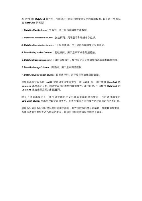
在WPF 的DataGrid 控件中,可以通过不同的列类型来显示和编辑数据。
以下是一些常见的DataGrid 列类型:
1. DataGridTextColumn:文本列,用于显示和编辑文本数据。
2. DataGridCheckBoxColumn:复选框列,用于显示和编辑布尔数据。
3. DataGridComboBoxColumn:下拉列表列,用于显示和编辑预定义的选项。
4. DataGridHyperlinkColumn:超链接列,用于显示可点击的超链接。
5. DataGridTemplateColumn:自定义模板列,使用自定义的数据模板来显示和编辑数据。
6. DataGridImageColumn:图像列,用于显示图像数据。
7. DataGridDatePickerColumn:日期选择列,用于显示和编辑日期数据。
这些列类型可以通过XAML 或代码来设置和定义。
在XAML 中,可以使用DataGrid 的Columns 属性来定义列,同时设置列的类型和其他属性。
在代码中,可以使用DataGrid 的Columns 集合来动态添加和配置列。
除了上述列类型之外,还可以使用自定义列类型来满足特殊需求。
可以通过继承自DataGridColumn 类来创建自定义列类型,并重写相关方法和属性来定制列的行为和外观。
使用适当的列类型可以提供更好的用户体验,并方便数据的显示和编辑。
根据具体的需求,选择合适的列类型并进行相应的配置,以达到预期的数据展示和交互效果。
WPFCombox实现下拉多选,可选中多个值

WPFCombox实现下拉多选,可选中多个值⾃定义多选MultiCombox,可以实现下拉列表多选using System;using System.Collections.Generic;using System.Collections.ObjectModel;using System.Linq;using System.Text;using System.Windows;using System.Windows.Controls;namespace MES.Plugin.Report.Controls{public class MultiComboBox : ComboBox{static MultiComboBox(){DefaultStyleKeyProperty.OverrideMetadata(typeof(MultiComboBox), new FrameworkPropertyMetadata(typeof(MultiComboBox)));}private static void OnPropertyChanged(DependencyObject d, DependencyPropertyChangedEventArgs e){d.SetValue(e.Property, e.NewValue);}/// <summary>/// 选中项列表/// </summary>public ObservableCollection<MultiCbxBaseData> ChekedItems = new ObservableCollection<MultiCbxBaseData>();/// <summary>/// ListBox竖向列表/// </summary>private ListBox _ListBoxV;/// <summary>/// ListBox横向列表/// </summary>private ListBox _ListBoxH;public override void OnApplyTemplate(){base.OnApplyTemplate();_ListBoxV = Template.FindName("PART_ListBox", this) as ListBox;_ListBoxH = Template.FindName("PART_ListBoxChk", this) as ListBox;_ListBoxH.ItemsSource = ChekedItems;_ListBoxV.SelectionChanged += _ListBoxV_SelectionChanged;_ListBoxH.SelectionChanged += _ListBoxH_SelectionChanged;if (ItemsSource != null){foreach (var item in ItemsSource){MultiCbxBaseData bdc = item as MultiCbxBaseData;if (bdc.IsCheck){_ListBoxV.SelectedItems.Add(bdc);}}}}private void _ListBoxH_SelectionChanged(object sender, SelectionChangedEventArgs e){foreach (var item in e.RemovedItems){MultiCbxBaseData datachk = item as MultiCbxBaseData;for (int i = 0; i < _ListBoxV.SelectedItems.Count; i++){MultiCbxBaseData datachklist = _ListBoxV.SelectedItems[i] as MultiCbxBaseData;if (datachklist.ID == datachk.ID){_ListBoxV.SelectedItems.Remove(_ListBoxV.SelectedItems[i]);}}}}void _ListBoxV_SelectionChanged(object sender, SelectionChangedEventArgs e){foreach (var item in e.AddedItems){MultiCbxBaseData datachk = item as MultiCbxBaseData;datachk.IsCheck = true;if (ChekedItems.IndexOf(datachk) < 0){ChekedItems.Add(datachk);}}foreach (var item in e.RemovedItems){MultiCbxBaseData datachk = item as MultiCbxBaseData;datachk.IsCheck = false;ChekedItems.Remove(datachk);}}public class MultiCbxBaseData{private int _id;public int ID{get { return _id; }set { _id = value; }}private string _viewName;public string ViewName{get { return _viewName; }set{_viewName = value;}}private bool _isCheck;/// <summary>/// 是否选中/// </summary>public bool IsCheck{get { return _isCheck; }set { _isCheck = value; }}}}}Style: ComboBox.xmal<ResourceDictionary xmlns="/winfx/2006/xaml/presentation"xmlns:x="/winfx/2006/xaml"xmlns:local="clr-namespace:MES.Plugin.Report"xmlns:controls="clr-namespace:MES.Plugin.Report.Controls"><!--ComboBox--><!--ComBoBox项选中背景⾊--><SolidColorBrush x:Key="ComboBoxSelectdBackground" Color="#ff8c69"/><!--ComBoBox项⿏标经过背景⾊--><SolidColorBrush x:Key="ComboBoxMouseOverBackground" Color="#ff3030"/><!--ComBoBox项选中前景⾊--><SolidColorBrush x:Key="ComboBoxSelectedForeground" Color="White"/><!--ComBoBox项⿏标经过前景⾊--><SolidColorBrush x:Key="ComboBoxMouseOverForegrond" Color="White"/><ControlTemplate x:Key="ComboBoxToggleButton" TargetType="{x:Type ToggleButton}"><Grid Height="25" HorizontalAlignment="Stretch"><Grid.ColumnDefinitions><ColumnDefinition Width="*"/><ColumnDefinition Width="30"/></Grid.ColumnDefinitions><Border Background="White" Grid.ColumnSpan="2" Opacity="0"/><Path x:Name="Arrow" Grid.Column="1" Data="M 0 0 6 6 12 0 Z" VerticalAlignment="Center" HorizontalAlignment="Center" Stretch="None" Fill="#999" /></Grid><ControlTemplate.Triggers><Trigger Property="IsChecked" Value="true"><Setter TargetName="Arrow" Property="RenderTransform"><Setter.Value><RotateTransform CenterX="6" CenterY="3" Angle="180"></RotateTransform></Setter.Value></Setter><Setter TargetName="Arrow" Property="Margin" Value="0 0 0 2"/></Trigger></ControlTemplate.Triggers></ControlTemplate><!--MultiComboBox普通样式--><Style TargetType="{x:Type controls:MultiComboBox}"><Setter Property="Width" Value="200" /><Setter Property="HorizontalContentAlignment" Value="Stretch" /><Setter Property="VerticalContentAlignment" Value="Center" /><Setter Property="SnapsToDevicePixels" Value="True" /><Setter Property="MaxDropDownHeight" Value="400" /><Setter Property="Template"><Setter.Value><ControlTemplate TargetType="{x:Type controls:MultiComboBox}"><Grid><Border x:Name="Bg" SnapsToDevicePixels="{TemplateBinding SnapsToDevicePixels}" Width="{TemplateBinding Width}" Height="{TemplateBinding Height}" BorderBrush="#eaeaea" BorderThickness="1" ><Grid x:Name="PART_Root"><Grid x:Name="PART_InnerGrid" Margin="0"><Grid.ColumnDefinitions><ColumnDefinition Width="*" /><ColumnDefinition Width="0.3*" MaxWidth="30" /></Grid.ColumnDefinitions><ListBox x:Name="PART_ListBoxChk" Background="#2d2f3e" SelectionMode="Multiple" BorderThickness="0" ScrollViewer.VerticalScrollBarVisibility="Disabled"><ListBox.ItemsPanel><ItemsPanelTemplate><VirtualizingStackPanel Orientation="Horizontal" VirtualizingStackPanel.IsVirtualizing="True" /></ItemsPanelTemplate></ListBox.ItemsPanel><ListBox.ItemContainerStyle><Style TargetType="ListBoxItem"><Setter Property="BorderThickness" Value="0"/><Setter Property="IsSelected" Value="True"/><Setter Property="Template"><Setter.Value><ControlTemplate TargetType="ListBoxItem"><CheckBox BorderThickness="0" Background="#2d2f3e" Foreground="White" VerticalAlignment="Center" HorizontalAlignment="Center" Content="{Binding ViewName}" IsChecked="{Binding Path=IsSele </ControlTemplate></Setter.Value></Setter></Style></ListBox.ItemContainerStyle></ListBox><!--下拉按钮--><ToggleButton x:Name="PART_DropDownToggle" IsTabStop="False"IsChecked="{Binding IsDropDownOpen, Mode=TwoWay, RelativeSource={RelativeSource TemplatedParent}}"Grid.Column="1" Template="{StaticResource ComboBoxToggleButton}" /></Grid></Grid></Border><!--弹出多选列表--><Popup x:Name="PART_Popup" AllowsTransparency="True" Focusable="False" StaysOpen="False"IsOpen="{Binding IsDropDownOpen, RelativeSource={RelativeSource TemplatedParent}}"PopupAnimation="{DynamicResource {x:Static boBoxPopupAnimationKey}}" Placement="Bottom"><Grid Width="{Binding ActualWidth, RelativeSource={RelativeSource TemplatedParent}}" MaxHeight="{Binding MaxDropDownHeight, RelativeSource={RelativeSource TemplatedParent}}" ><ListBox x:Name="PART_ListBox" SelectionMode="Multiple" BorderThickness="1 0 1 1" Background="White" ItemsSource="{Binding ItemsSource,RelativeSource={RelativeSource TemplatedParent}}"MaxHeight="{TemplateBinding MaxDropDownHeight}" BorderBrush="#eaeaea" ><ListBox.ItemContainerStyle><Style TargetType="ListBoxItem"><Setter Property="Template"><Setter.Value><ControlTemplate TargetType="{x:Type ListBoxItem}" ><Grid Height="22"><Border x:Name="bg" BorderBrush="#eaeaea" BorderThickness="0"/><ContentPresenter x:Name="content" /><Border Background="White" Opacity="0"/></Grid><ControlTemplate.Triggers><Trigger Property="IsSelected" Value="True"><Setter TargetName="bg" Property="Background" Value="#ADD6FF" /></Trigger><MultiTrigger><MultiTrigger.Conditions><Condition Property="IsMouseOver" Value="true" /><Condition Property="IsSelected" Value="false"/></MultiTrigger.Conditions><Setter TargetName="bg" Property="Background" Value="#009BDB" /><Setter TargetName="bg" Property="Opacity" Value="0.7"/><Setter Property="Foreground" Value="White" /></MultiTrigger><Trigger Property="IsEnabled" Value="False"><Setter TargetName="bg" Property="Opacity" Value="0.3" /><Setter Property="Foreground" Value="Gray" /></Trigger></ControlTemplate.Triggers></ControlTemplate></Setter.Value></Setter></Style></ListBox.ItemContainerStyle><ListBox.ItemTemplate><DataTemplate><Grid><CheckBox x:Name="chk" Visibility="Hidden" IsChecked="{Binding IsCheck,Mode=TwoWay}" VerticalAlignment="Center"/><CheckBox VerticalAlignment="Center" Foreground="{Binding Foreground,RelativeSource={RelativeSource AncestorType=ListBoxItem}}" IsChecked="{Binding RelativeSource={RelativeSource AncestorType=L </Grid><DataTemplate.Triggers><DataTrigger Binding="{Binding RelativeSource={RelativeSource AncestorType=ListBoxItem},Path=IsSelected}" Value="true"><Setter TargetName="chk" Property="IsChecked" Value="true"/></DataTrigger><DataTrigger Binding="{Binding RelativeSource={RelativeSource AncestorType=ListBoxItem},Path=IsSelected}" Value="false"><Setter TargetName="chk" Property="IsChecked" Value="false"/></DataTrigger></DataTemplate.Triggers></DataTemplate></ListBox.ItemTemplate></ListBox></Grid></Popup></Grid></ControlTemplate></Setter.Value></Setter></Style></ResourceDictionary>前端使⽤:1.引⽤Style资源,在前端引⽤上⾯建好的ComboBox.xmal 样式2.控件使⽤<controls:MultiComboBox x:Name="MultiCmb" VerticalAlignment="Center" Margin="10,0,10,0" Grid.Column="6" Grid.Row="0"Width="Auto"/>3.MutilComboBox 数据源绑定,刷新数据源ObservableCollection<Controls.MultiComboBox.MultiCbxBaseData> MultiComboBoxListData = new ObservableCollection<Controls.MultiComboBox.MultiCbxBaseData>();for (int i = 0; i<LstLine.Count; i++){SFC_WORKCENTER workcenter = LstLine[i];if (string.IsNullOrEmpty(workcenter.ID)) continue;if (workcenter.WORKCENTER_NAME.Contains("过塑")) {MultiComboBoxListData.Add(new Controls.MultiComboBox.MultiCbxBaseData(){ID = i,ViewName = workcenter.WORKCENTER_CODE,//LineName = workcenter.WORKCENTER_NAME,IsCheck = false});}else{MultiComboBoxListData.Add(new Controls.MultiComboBox.MultiCbxBaseData(){ID = i,ViewName = workcenter.WORKCENTER_CODE,//LineName = workcenter.WORKCENTER_NAME,IsCheck = true});}}plugin.MultiCmb.ItemsSource = MultiComboBoxListData; plugin.MultiCmb.OnApplyTemplate();。
WPFCombobox样式
WPFCombobox样式<ControlTemplate x:Key="ComboBoxToggleButton" TargetType="{x:Type ToggleButton}"><Grid x:Name="grid"><Grid.ColumnDefinitions><ColumnDefinition /><ColumnDefinition Width="20" /></Grid.ColumnDefinitions><Rectangle Grid.ColumnSpan="2" HorizontalAlignment="Stretch" x:Name="Rectangle" VerticalAlignment="Stretch" Width="Auto" Height="Auto" RadiusX="3" RadiusY="3" Fill="LightBlue" /> <!--Combobox控件外壳--><Rectangle Grid.Column="0" HorizontalAlignment="Stretch" VerticalAlignment="Stretch" Width="Auto" Height="Auto" RadiusX="3" RadiusY="3" Fill="Gray" /> <!--除开下拉按钮的其他部分--><Border Margin="2,2,2,2" Grid.Column="1" Background="Red" Width="Auto" CornerRadius="3,3,3,3" x:Name="drop_border" /><Path Grid.Column="1" HorizontalAlignment="Center" Width="Auto" x:Name="Arrow" VerticalAlignment="Center" Fill="{x:Null}" Data="M0.5,0.5 L3,6.5 5.5,0.5" Stroke="Black" Margin="5,0,5,0" Height="7" StrokeThickness="2" Stretch </Grid><ControlTemplate.Triggers><Trigger Property="IsMouseOver" Value="true"><Setter TargetName="drop_border" Property="Background" Value="White" /></Trigger></ControlTemplate.Triggers></ControlTemplate><ControlTemplate x:Key="ComboBoxTextBox" TargetType="{x:Type TextBox}"><Border x:Name="PART_ContentHost" Focusable="False" Background="{TemplateBinding Background}" /></ControlTemplate><Style TargetType="{x:Type ComboBox}"><Setter Property="SnapsToDevicePixels" Value="true" /><Setter Property="Template"><Setter.Value><ControlTemplate TargetType="{x:Type ComboBox}"><Border BorderBrush="Orange" x:Name="border"><Grid x:Name="grid"><ToggleButton Template="{StaticResource ComboBoxToggleButton}" x:Name="ToggleButton" Focusable="false" IsChecked="{Binding Path=IsDropDownOpen, Mode=TwoWay, RelativeSource={RelativeSource TemplatedP <ContentPresenter HorizontalAlignment="Left" x:Name="ContentSite" VerticalAlignment="Center" Content="{TemplateBinding SelectionBoxItem}" ContentTemplate="{TemplateBinding SelectionBoxItemTemplate}" ContentT <TextBox Visibility="Hidden" Margin="2,2,22,2" x:Name="PART_EditableTextBox" Style="{x:Null}" VerticalAlignment="Center" Focusable="True" IsReadOnly="{TemplateBinding IsReadOnly}" Foreground="Black" Horizonta <Popup IsOpen="{TemplateBinding IsDropDownOpen}" Placement="Bottom" x:Name="Popup" Focusable="False" AllowsTransparency="True" PopupAnimation="Slide"><Grid MaxHeight="{TemplateBinding MaxDropDownHeight}" MinWidth="{TemplateBinding ActualWidth}" x:Name="DropDown" SnapsToDevicePixels="True"><Border x:Name="DropDownBorder" Background="WhiteSmoke" CornerRadius="3,3,3,3" /><ScrollViewer Margin="4,6,4,6" SnapsToDevicePixels="True" HorizontalScrollBarVisibility="Auto" VerticalScrollBarVisibility="Auto" CanContentScroll="True" Foreground="{StaticResource {x:Static SystemColors.Activ <StackPanel IsItemsHost="True" KeyboardNavigation.DirectionalNavigation="Contained" /></ScrollViewer></Grid></Popup></Grid></Border><ControlTemplate.Triggers><Trigger Property="HasItems" Value="false"><Setter Property="MinHeight" Value="95" TargetName="DropDownBorder" /></Trigger><Trigger Property="IsGrouping" Value="true"><Setter Property="ScrollViewer.CanContentScroll" Value="false" /></Trigger><Trigger Property="AllowsTransparency" SourceName="Popup" Value="true"><Setter Property="Margin" Value="0,2,0,0" TargetName="DropDownBorder" /></Trigger><Trigger Property="IsEditable" Value="true"><Setter Property="IsTabStop" Value="false" /><Setter Property="Visibility" Value="Visible" TargetName="PART_EditableTextBox" /><Setter Property="Visibility" Value="Hidden" TargetName="ContentSite" /></Trigger></ControlTemplate.Triggers></ControlTemplate></Setter.Value></Setter></Style>⼀直没搞懂Combobox具体是怎么设计的,今天抽空研究了⼀下,终于看懂了,主要有3个控件组成,ToggleButton,TextBox 和Popup,ToggleButton:整个控件是由ToggleButton铺满的HorizontalAlignment="Stretch",ToggleButton⾥⾯由⼀个Rectangle铺满,设置Combobox的圆⾓,边框及背景颜⾊,然后宽度20px的Border,path 为下拉按钮样式,点击combobox下拉按钮实际是点击ToggleButtonTextBox :当IsEditable为True,会把Textbox 显⽰出来,Textbox是覆盖在ToggleButton之上的,注意应设置HorizontalAlignment="Stretch",这样才会把Textbox铺满,⽹上很多设置的是Left,很不好选中TextBox,其次还应设置Margin="2,2,22,2",距右边22px,这样才不能遮挡出下拉按钮Popup:⽤于显⽰ComboboxItem<ControlTemplate x:Key="ComboBoxToggleButton" TargetType="{x:Type ToggleButton}"> <Grid x:Name="grid"> <Grid.ColumnDefinitions><ColumnDefinition /> <ColumnDefinition Width="20" /> </Grid.ColumnDefinitions> <Rectangle Grid.ColumnSpan="2"HorizontalAlignment="Stretch" x:Name="Rectangle" VerticalAlignment="Stretch" Width="Auto" Height="Auto" RadiusX="3" RadiusY="3" Fill="LightBlue" /> <!--Combobox控件外壳--> <Rectangle Grid.Column="0" HorizontalAlignment="Stretch" VerticalAlignment="Stretch" Width="Auto" Height="Auto" RadiusX="3" RadiusY="3" Fill="Gray" /><!--除开下拉按钮的其他部分--> <Border Margin="2,2,2,2" Grid.Column="1" Background="Red" Width="Auto" CornerRadius="3,3,3,3" x:Name="drop_border" /><Path Grid.Column="1" HorizontalAlignment="Center" Width="Auto" x:Name="Arrow" VerticalAlignment="Center" Fill="{x:Null}" Data="M0.5,0.5 L3,6.5 5.5,0.5"Stroke="Black" Margin="5,0,5,0" Height="7" StrokeThickness="2" Stretch="Fill" /> <!--Border 和 Path为下拉按钮--> </Grid> <ControlTemplate.Triggers><Trigger Property="IsMouseOver" Value="true"> <Setter TargetName="drop_border" Property="Background" Value="White" /> </Trigger></ControlTemplate.Triggers> </ControlTemplate><ControlTemplate x:Key="ComboBoxTextBox" TargetType="{x:Type TextBox}"> <Border x:Name="PART_ContentHost" Focusable="False" Background="{TemplateBinding Background}" /> </ControlTemplate> <Style TargetType="{x:Type ComboBox}"> <Setter Property="SnapsToDevicePixels" Value="true" /><Setter Property="Template"> <Setter.Value> <ControlTemplate TargetType="{x:Type ComboBox}"> <Border BorderBrush="Orange"x:Name="border"> <Grid x:Name="grid"> <ToggleButton Template="{StaticResource ComboBoxToggleButton}" x:Name="ToggleButton"Focusable="false" IsChecked="{Binding Path=IsDropDownOpen, Mode=TwoWay, RelativeSource={RelativeSource TemplatedParent}}" ClickMode="Press" /><ContentPresenter HorizontalAlignment="Left" x:Name="ContentSite" VerticalAlignment="Center" Content="{TemplateBinding SelectionBoxItem}" ContentTemplate="{TemplateBinding SelectionBoxItemTemplate}" ContentTemplateSelector="{TemplateBinding ItemTemplateSelector}" IsHitTestVisible="False" /> <TextBoxVisibility="Hidden" Margin="2,2,22,2" x:Name="PART_EditableTextBox" Style="{x:Null}" VerticalAlignment="Center" Focusable="True" IsReadOnly="{TemplateBindingIsReadOnly}" Foreground="Black" HorizontalAlignment="Stretch" Background="Azure" /> <!--⽂本输⼊框,当IsEditable为true 才显⽰--> <Popup IsOpen="{TemplateBinding IsDropDownOpen}" Placement="Bottom" x:Name="Popup" Focusable="False" AllowsTransparency="True" PopupAnimation="Slide"><Grid MaxHeight="{TemplateBinding MaxDropDownHeight}" MinWidth="{TemplateBinding ActualWidth}" x:Name="DropDown" SnapsToDevicePixels="True"><Border x:Name="DropDownBorder" Background="WhiteSmoke" CornerRadius="3,3,3,3" /> <ScrollViewer Margin="4,6,4,6"SnapsToDevicePixels="True" HorizontalScrollBarVisibility="Auto" VerticalScrollBarVisibility="Auto" CanContentScroll="True" Foreground="{StaticResource {x:StaticSystemColors.ActiveCaptionTextBrushKey}}"> <StackPanel IsItemsHost="True" KeyboardNavigation.DirectionalNavigation="Contained" /></ScrollViewer> </Grid> </Popup> </Grid> </Border> <ControlTemplate.Triggers><Trigger Property="HasItems" Value="false"> <Setter Property="MinHeight" Value="95" TargetName="DropDownBorder" /></Trigger> <Trigger Property="IsGrouping" Value="true"> <Setter Property="ScrollViewer.CanContentScroll" Value="false" /></Trigger> <Trigger Property="AllowsTransparency" SourceName="Popup" Value="true"> <Setter Property="Margin"Value="0,2,0,0" TargetName="DropDownBorder" /> </Trigger> <Trigger Property="IsEditable" Value="true"> <SetterProperty="IsTabStop" Value="false" /> <Setter Property="Visibility" Value="Visible" TargetName="PART_EditableTextBox" /> <Setter Property="Visibility" Value="Hidden" TargetName="ContentSite" /> </Trigger> </ControlTemplate.Triggers> </ControlTemplate> </Setter.Value> </Setter> </Style>。
DevExpressComboBoxEdit添加值

DevExpressComboBoxEdit添加值今天在使⽤ComboBoxEdit 这个控件的时候,不知道怎么添加值.在官⽹上找到代码。
在这⾥做个记录ComboBoxEdit combo = new ComboBoxEdit();ComboBoxItemCollection coll = combo.Properties.Items;coll.BeginUpdate();try {coll.Add(new PersonInfo("Sven", "Petersen"));coll.Add(new PersonInfo("Cheryl", "Saylor"));coll.Add(new PersonInfo("Dirk", "Luchte"));}finally {coll.EndUpdate();}combo.SelectedIndex = -1;Controls.Add(combo);//...public class PersonInfo {private string _firstName;private string _lastName;public PersonInfo(string firstName, string lastName) {_firstName = firstName;_lastName = lastName;}public override string ToString() {return _firstName + "" + _lastName;}}public class ExComboBox{public int Index { get; set; }public string Key { get; set; }public string Value { get; set; }public string Tag { get; set; }public ExComboBox(int pIndex, string pKey, string pValue){this.Index = pIndex;this.Key = pKey;this.Value = pValue;}public ExComboBox(int pIndex, string pKey, string pValue, string pTag){this.Index = pIndex;this.Key = pKey;this.Value = pValue;this.Tag = pTag;}public override string ToString(){return this.Value;}}comboBox.Properties.Items.Add("全部");for (int i = 0; i < arg.Result.Count; i++){comboBox.Properties.Items.Add(new ExComboBox(i, arg.Result[i].F_RoadwayCode, arg.Result[i].F_StationCode.ToString())); }void comboBoxEditStation_SelectedValueChanged(object sender, System.EventArgs e){var exComboBox1 = boBoxEditRoadWay.SelectedItem as ExComboBox;}。
- 1、下载文档前请自行甄别文档内容的完整性,平台不提供额外的编辑、内容补充、找答案等附加服务。
- 2、"仅部分预览"的文档,不可在线预览部分如存在完整性等问题,可反馈申请退款(可完整预览的文档不适用该条件!)。
- 3、如文档侵犯您的权益,请联系客服反馈,我们会尽快为您处理(人工客服工作时间:9:00-18:30)。
WPF中往ComboBox
里添加选项并指定默认选项
这ComboBox里可以在XAML中直接给它添加选项,这里不直接废话,下面是在你要添加的ComboBox在XAML中的实现:
1 <ComboBox x:Name="MyComBox" Height="20" Canvas.Left="110" Canvas.Top="255" Width="86" DisplayMemberPath="Frequ"SelectionChanged="myComboBox_SelectionCh anged">
注意代码里在ComboBox属性里的DisplayMemberPath="Frequ" 这个是一种绑定也是填充选项的关键,要与C#里的定义的结构体的成员名字一致。
这个事件是当你选择ComboBox里的选项时触发的事件SelectionChanged="myComboBox_SelectionChanged"。
接着是定义结构体:
1 public struct Frequency
2 {
3 public int ID{get;set;}
4 public string Frequ{get;set;}
5 }
里面的ID可以不设置,但很重要,当我们选择选项的时候可以用index处理我们的选择,其中关于取到选项的索引很容易但要取到选项的内容好像不太容易。
1 List<Frequency> list = new List<Frequency>();
2 Frequency freq = new Frequency();
3 for(int i = 0; i < lFreq.Length; i++)
4 {
5 freq.ID = i;
6 freq.Frequ = lFreq[i].ToString();
7 list.Add(freq);
8 }
50 this.MyComBox.ItemsSource = list;//这里MyComBox是我们控件的ID 51 this.MyComBox.SelectedIndex = 0;
52
53 // 在此点之下插入创建对象所需的代码。
54 }
接着是处理事件的定义:
1 public void myComboBox_SelectionChanged(object sender,
System.Windows.Controls.SelectionChangedEventArgs e)。