Color marketing色彩营销学
100个国内外最先进的管理理念和实战经验词汇解析

3.Convenience(便利),即所谓为顾客提供最大的购物 和使用便利 4C理论强调企业在制订分销策略时,要更多的考虑顾客 的方便,而不是企业自己方便。要通过好的售前、售中和售后 服务来让顾客在购物的同时,也享受到了便利。便利是客户价 值不可或缺的一部分。 4.Communication(沟通)则被用以取代4P中对应的 Promotion(促销) 4C认为,企业应通过同顾客进行积极有效的双向沟通, 建立基于共同利益的新型企业/顾客关系。这不再是企业单向 的促销和劝导顾客,而是在双方的沟通中找到能同时实现各自 目标的通途。
文化营销 (Cultural Marketing) 文化营销强调企业的理念、宗旨、目标、价值观、职 员行为规范、经营管理制度、企业环境、组织力量、品牌 个性等文化元素,其核心是理解人、尊重人、以人为本, 调动人的积极性与创造性,关注人的社会性。 在文化营销 观念下,企业的营销活动一般为奉行一些原则:给予产品 、企业、品牌以丰富的个性化的文化内涵。
定制营销 (Customization Marketing) 定制营销,是指企业在大规模生产的基础上,将每一 位顾客都视为一个单独的细分市场,根据个人的特定需求 来进行市场营销组合,以满足每位顾客的特定需求的一种 营销方式。现代的定制营销与以往的手工定做不同,定制 营销是在简单的大规模生产不能满足消费者多样化、个性 化需求的情况下提出来的,其最突出的特点是根据顾客的 特殊要求来进行产品生产。
1.Customer(顾客)主要指顾客的需求 企业必须首先了解和研究顾客,根据顾客的需求来提 供产品。同时,企业提供的不仅仅是产品和服务,更重要 的是由此产生的客户价值(Customer Value)。 2.Cost(成本)不单是企业的生产成本,或者说4P中 的Price(价格) 它还包括顾客的购买成本,同时也意味着产品定价的 理想情况,应该是既低于顾客的心理价格,亦能够让企业 有所盈利。此外,这中间的顾客购买成本不仅包括其货币 支出,还包括其为此耗费的时间,体力和精力消耗,以及 购买风险。
4C营销理论——中英文单词

4C营销理论(The Marketing Theory of 4Cs)4R营销理论(The Marketing Theory of 4Rs)4P营销理论(The Marketing Theory of 4Ps)感性营销(Sensibility Marketing)利基营销(Niche Marketing)交叉营销(Cross Marketing)知识营销(Information Marketing)文化营销(Cultural Marketing)服务营销(Services Marketing)体验营销(Experience Marketing)定制营销(Customization Marketing)色彩营销(Color Marketing)绿色营销(Green Marketing)关系营销(Relationship Marketing)合作营销(The Co Marketing Solution)伙伴营销(Partnership Marketing)一对一营销(One-to-One Marketing)差异化营销(Difference Marketing)大市场营销(Big Marketing)个性化营销(Personalization Marketing)堡垒式营销(Focalization Marketing)数据库营销(Data base Marketing)服务分销策略(Services Distribution Strategy)服务促销策略(Services Sales Promotion Strategy)整合营销传播(Integrated Marketing Communications, IMC)水坝式经营(Dam Operation)战略营销联盟(Strategic Marketing Union)网络数据库营销(Internet Data base Marketing)“整时营销”与“晚盈利”(Profit by Timing Marketing and Lag Profit Marketing) 管理篇目标管理(Management by Objectives, MBO)标杆瞄准(Benchmarking)开明管理(Open Management)宽容管理(Allowance Management)危机管理(Crisis Management)标杆管理(Benchmarking Management)人格管理(Character Management)品牌管理(Brand Management)变革管理(Change Management)沟通管理(Communication Management)走动管理(Management by Walking Around,MBWA)价值管理(Value Management)钩稽管理(Innovation and Practice Management)能本管理(Capacity Core Management)绩效管理(Managing For Performance)赋权管理(Delegation Management)灵捷管理(Celerity Management)物流管理(Logistics Management/Physical Distribution ) (Physical Distribution为传统意义上的物流)知识管理(Knowledge Management)时间管理(Time-Management)互动管理(Interactive Management)T型管理(T Management)预算管理(Budget Management)末日管理(End Management)柔性管理(Soft Management)例外管理(Exception Management)K型管理(K Management)EVA管理(Economic Value Added, EVA)5S管理法(5S :Seiri、Seiten、Seigo、Seiketsu、Shitsuke)零缺陷管理(Zero Defects)一分钟管理(One Minute Management)供应链管理(Supply Chain Management, SCM)客户关系管理(Customer Relationship Management,CRM)产品数据管理(Product Data Management, PDM)过程质量管理法(Process of Quality Management)管理驾驶舱(Cockpit of Management)OEC管理法(Over All Every Control and Clear)数字化管理(Digital Management)海豚式管理(Management as Porpoise)丰田式管理(Toyota- Management)跨文化管理(Span-Culture Management)蚂蚁式管理(Style of Ant Management)购销比价管理(Purchase by Grade Management)企业内容管理(Enterprise Content Management)企业健康管理(Health of Enterprise Management)薪酬外包管理(Salary Epibolic Management)戴明的质量管理(William Edwards Dem’s Quality Management)六西格玛管理法(Six Sigma)倒金字塔管理(Handstand Pyramidal Management)变形虫式管理(Amoeba Management)定律篇木桶定律(Cannikin Law)墨菲定律(Moffe's Law)羊群效应(Sheep-Flock Effect)帕金森定律(Parkinson's Law)华盛顿合作定律(Washington Company Law)手表定律(Watch Law)蘑菇定律(Mushroom Law)鲇鱼效应(Weever Effect)飞轮效应(Flywheel Effect)光环效应(Halo Effect)马太效应(Matthew Effect)蝴蝶效应(Butterfly Effect)多米诺效应(Domicile Effect)皮格马利翁效应(Pygmalion Effect)彼德原理(The Peter Principle)破窗理论(Break Pane Law)路径依赖(Path Dependence)奥卡姆剃刀(Occam's Razor)博弈论(Game Theory)定位法则(Orientation Law)80/20原理(80/20 Law)X理论-Y理论(Theory X- Theory Y)超Y理论(Exceed theory Y)综合篇7S模型(Principle of 7S)ABC分析法(ABC-Analysis)SWOT分析(SWOT Analysis)波士顿矩阵法(Boston Matrix Analysis)新7S原则(Principle of New 7S)PDCA循环(PDCA Cyc)平衡记分卡(Balanced Score Card)品管圈(Quality Control Circle,QCC)零库存(In-Time Inventory)顾客份额(Constituency Share)业务流程重组(Business Process Reengineer)动态薪酬(Dynamic Salary)管理审计(Managed Audit)管理层收购(Management Buy-out)逆向供应链(Reverse Supply Chain)宽带薪酬设计(Broad Band Salary Design)员工持股计划(Employee Stock Ownership Plan,ESOP)人力资源外包(Epiboly HR)360度绩效反馈(360-Degree Performance Feedback)人力资源价值链(Human Resource Value Chain)柯氏模式(Kirkpatrick Model)归因模型(Attribution Model)期望模型(Expectancy Model)五力模型(The Five-force Model)安东尼模型(Anthony Model)CS经营战略(Customer Satisfaction)532绩效考核模型(532 Performance Appraisal Model)101℃理论(101℃Theory)双因素激励理论(Dual Stimulant Theory)注意力经济(The Economy of Attention)灵捷竞争(Adroitly Compete)德尔菲法(Delphi Technique)执行力(Execution)领导力(Leadership)学习力(Learning Capacity)企业教练(Corporate Coach)首席知识官(Chief Knowledge Officer)第五级领导者(Fifth Rank Leader)智力资本(Intellect Capital)智能资本(Intellectual Capital)高情商团队(High EQ Team)学习型组织(Learning Organization)知识型企业(Knowledge Enterprise)高智商企业(Knowledge-Intensive Enterprise)灵捷组织(Adroitly Organization)虚拟企业(Virtual Enterprise,VE)4Cs营销理论(The Marketing Theory of 4Cs)随着市场竞争日趋激烈,媒介传播速度越来越快,4Ps理论越来越受到挑战。
颜色在营销中的作用

颜色在营销中的作用色彩是品牌视觉设计中最有表现力的要素之一,因为它能直接影响人们的感情。
不同的颜色会让人产生不同的心理感受:红色热烈而大胆,绿色开放而友好,蓝色常常代表沉静与可靠,紫色则显得华丽与神秘。
基于这种心理效应,色彩营销理论应运而生。
”那么色彩在品牌营销中起到了什么作用?让我们一起来探讨,色彩对于品牌营销的价值:一、色彩影响消费者购买决定消费者在选购产品时,与产品本身性质相贴合的色彩更能获得消费者的青睐,如果一个食品外包装使用让人看起来没有食欲的色彩,消费者往往不会进行购买,大部分时候色彩左右着消费者的选择。
调查数据显示或者研究表明,色彩可提高80%的品牌认知度、增加品牌理解能力达73%;在消费者关于是否购买的决策中,颜色因素占85%之多(以上数据引自色彩营销集团在其“色彩利润”上发表的一篇报告。
)国际流行色协会调查数据显示,在成本不变的情况下,合适的、受欢迎的色彩设计可给产品带来10%-25%的附加值,为品牌带来持续的利益增长。
所以色彩有能力直接影响消费者购买的决定和品牌的利益增长。
二、色彩能激发消费者的本能情感色彩感知与视觉记忆有直接的联系,维护与视觉体验有关的感官特征,是我们的自然本能。
研究证明,色彩确实能增强视觉记忆、提高捕捉或直觉理解的精确性、降低误解信息的可能性。
色彩是消费者和社会公众最容易接受、最容易辨识的品牌元素。
色彩的物理刺激会对消费者产生相应的心理感受,有利于消费者识别和记忆、方便选择、激发对品牌及产品的情感喜爱。
三、色彩是品牌自我表达的武器在人们的日常生活中,色彩就像是品牌用来“攻克”消费者的“武器”,在品牌推广和营销方面发挥出了巨大的作用,甚至色彩本身都是可以用来销售的,例如:涂料、油漆、颜料,它们都是销售的色彩本身。
一些行业和色彩的关系尤为紧密,如汽车、服装等时尚属性强、高度竞争的行业,色彩无疑是其高度个性化、高度自我表达的有力武器。
色彩都有其独特的色彩识别“语言”,不仅有统一品牌形象的作用,还体现着品牌的定位和独特性。
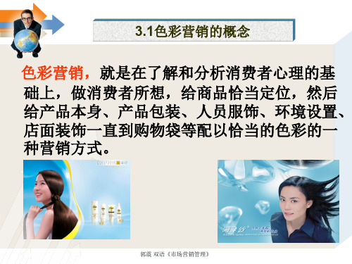
市场营销-色彩营销的概念
绿色green 绿色是大自然本身的色彩,令人联想到广大的田园和 牧场,对于都市生活者而言,绿色是令人向往田园风 光的颜色.
郭震 双语《市场营销管理》
紫色purple 紫色使人联想到高尚、威严,同时也有让人的眼睛 获得休息、优美、满足、希望、生气、成长等感觉。 要使人联想安详、松懈的时候,紫色是非常适合的颜 色。
郭震 双语《市场营销管理》
红色red
红色除了显示温暖、热情和快活之外,同时还能使 人联想到危险、斗争,或愤怒。甚至,广告中的红色 也能吸引读者的视线,给予其强烈的刺激。但是,也 要小心使用过多时,会使整体效果呈现出一种粗俗的 感觉。
郭震 双语《市场营销管理》
黄色yellow
黄色代表快活和阳光的和煦,使人充分感受到生命 的活力。因为具备此种引人注目的刺激的力量,所以, 黄色经常使用在户外广告中。此外,黄色也令人联 想到黄金,所以,能够使人进一步联想到财富或高 贵。。
市场营销应用
市场营销发展
色彩营销
生
产The De推velopm市ent
产 观 念
(M品观念arkeotfinMg销观念arckoentcinegp场 营 销 观 念tions社市营观) 会场销念
郭震 双语《市场营销管理》
郭震 双语《市场营销管理》
第三节:市场营销应用 思考:欣赏并学习色彩营销(英语部分简略)
How to Use colour in Marketing
郭震 双语《市场营销管理》
黑色black 黑色则令人联想到庄严,但是千万必须注意,在使用过
度时,往往会令人联想到死亡、忧愁等不幸。另外, 黑色也可能使读者产生不正、黑暗、罪恶及悲哀告状 感觉。
郭震 双语《市场营销管理》
100个最流行的营销词汇
4C营销理论(The Marketing Theory of 4Cs)4R营销理论(The Marketing Theory of 4Rs)4P营销理论(The Marketing Theory of 4Ps)感性营销(Sensibility Marketing)利基营销(Niche Marketing)交叉营销(Cross Marketing)知识营销(Knowledge Marketing)文化营销(Cultural Marketing)服务营销 (Services Marketing)体验营销 (Experience Marketing)定制营销 (Customization Marketing)色彩营销(Color Marketing)绿色营销 (Green Marketing)关系营销 (Relationship Marketing)合作营销 (The Co Marketing Solution)伙伴营销 (Partnership Marketing)一对一营销 (One-to-One Marketing)差异化营销 (Difference Marketing)大市场营销(Big Marketing)个性化营销 (Personalization Marketing)堡垒式营销(Formalization Marketing)数据库营销(Data base Marketing)服务分销策略(Services Distribution Strategy)服务促销策略(Services Sales Promotion Strategy)整合营销传播(Integrated Marketing Communications, IMC)水坝式经营(Dam Operation)战略营销联盟 (Strategic Marketing Union)网络数据库营销(Internet Data base Marketing)“整时营销”与“晚盈利”(Profit by Timing Marketing and Lag Profit Marketing)管理篇目标管理(Management by Objectives, MBO),现在这个缩写也常用于代称“管理层收购”(Management Buy Out)标杆瞄准(Benchmarking)开明管理(Open Management)宽容管理(Allowance Management)危机管理(Crisis Management)标杆管理(Benchmarking Management)人格管理(Character Management)品牌管理(Brand Management)变革管理(Change Management)沟通管理(Communication Management)走动管理(Management by Walking Around,MBWA)价值管理(Value Management)钩稽管理(Innovation and Practice Management)能本管理 (Capacity Core Management)绩效管理(Managing For Performance)赋权管理(Delegation Management)灵捷管理(Celerity Management)物流管理 (Logistics Management/Physical Distribution ) (Physical Distribution为传统意义上的物流)知识管理(Knowledge Management)时间管理(Time-Management)互动管理(Interactive Management)T型管理 (T Management)预算管理(Budget Management)末日管理(End Management)柔性管理 (Soft Management)例外管理(Exception Management)K型管理 (K Management)EVA管理 (Economic Value Added, EVA)5S管理法(5S :Seiri、Seiten、Seigo、Seiketsu、Shitsuke)零缺陷管理(Zero Defects)一分钟管理(One Minute Management)供应链管理(Supply Chain Management, SCM)客户关系管理(Customer Relationship Management,CRM)产品数据管理 (Product Data Management, PDM)过程质量管理法(Process of Quality Management)管理驾驶舱(Cockpit of Management)OEC管理法 (Over All Every Control and Clear)数字化管理 (Digital Management)海豚式管理 (Management as Porpoise)丰田式管理(Toyota- Management)跨文化管理(Span-Culture Management)蚂蚁式管理(Style of Ant Management)购销比价管理(Purchase by Grade Management)企业内容管理(Enterprise Content Management)企业健康管理(Health of Enterprise Management)薪酬外包管理(Salary Episodic Management)戴明的质量管理 (William Edwards Dem’s Quality Management)六西格玛管理法 (Six Sigma)倒金字塔管理(Handstand Pyramidal Management)变形虫式管理 (Amoeba Management)</P< p>定律篇木桶定律(Cannikin Law)墨菲定律 (Moffe’s Law)羊群效应(Sheep-Flock Effect)帕金森定律(Parkinson’s Law)华盛顿合作定律 (Washington Company Law)手表定律(Watch Law)蘑菇定律(Mushroom Law)鲇鱼效应(Weever Effect)飞轮效应(Flywheel Effect)光环效应(Halo Effect)马太效应(Matthew Effect)蝴蝶效应(Butterfly Effect)多米诺效应(Domicile Effect)皮格马利翁效应(Pygmalion Effect)彼德原理 (The Peter Principle)破窗理论(Break Pane Law)路径依赖(Path Dependence)奥卡姆剃刀(Occam’s Razor)博弈论 (Game Theory)定位法则(Orientation Law)80/20原理(80/20 Law)X理论-Y理论(Theory X- Theory Y)超Y理论(Exceed theory Y)综合篇7S模型(Principle of 7S)ABC分析法(ABC-Analysis)SWOT分析 (SWOT Analysis)波士顿矩阵法(Boston Matrix Analysis)新7S原则 (Principle of New 7S)PDCA循环(PDCA Cyc)平衡记分卡 (Balanced Score Card)品管圈(Quality Control Circle,QCC)零库存(In-Time Inventory)顾客份额(Constituency Share)业务流程重组 (Business Process Reengineer)动态薪酬(Dynamic Salary)管理审计(Managed Audit)管理层收购(Management Buy-out)逆向供应链 (Reverse Supply Chain)宽带薪酬设计(Broad Band Salary Design)员工持股计划(Employee Stock Ownership Plan,ESOP)人力资源外包(Epiboly HR)360度绩效反馈 (360-Degree Performance Feedback)人力资源价值链(Human Resource Value Chain柯氏模式(Kirkpatrick Model)归因模型(Attribution Model)期望模型(Expectancy Model)五力模型(The Five-force Model)安东尼模型(Anthony Model)CS经营战略(Customer Satisfaction)532绩效考核模型(532 Performance Appraisal Model)101℃理论(101℃Theory)双因素激励理论(Dual Stimulant Theory)注意力经济(The Economy of Attention)灵捷竞争(Adroitly Compete)德尔菲法(Delphi Technique)执行力(Execution)领导力(Leadership)学习力(Learning Capacity)企业教练(Corporate Coach)首席知识官(Chief Knowledge Officer)第五级领导者(Fifth Rank Leader)智力资本(Intellect Capital)智能资本(Intellectual Capital)高情商团队(High EQ Team)学习型组织(Learning Organization)知识型企业(Knowledge Enterprise)高智商企业(Knowledge-Intensive Enterprise)灵捷组织(Adroitly Organization)虚拟企业(Virtual Enterprise,VE)</P< p>。
色彩营销案例
色彩营销案例色彩营销是一种通过色彩来传达品牌信息、吸引消费者的营销策略。
在市场竞争日益激烈的今天,色彩营销已经成为了品牌营销中不可或缺的一部分。
下面列举了10个成功的色彩营销案例。
1. Coca-Cola的红色标志:Coca-Cola的标志采用了红色,这种颜色代表着热情、活力和快乐。
这种颜色营销策略已经成为了Coca-Cola 品牌的标志性特征。
2. Tiffany的蓝色盒子:Tiffany的蓝色盒子是该品牌的标志性特征之一。
这种颜色代表着高贵、优雅和品质保证。
这种颜色营销策略已经成为了Tiffany品牌的标志性特征。
3. McDonald's的黄色拱门:McDonald's的黄色拱门代表着快乐、温暖和欢迎。
这种颜色营销策略已经成为了McDonald's品牌的标志性特征。
4. Apple的白色:Apple的产品采用了白色,这种颜色代表着简洁、现代和高端。
这种颜色营销策略已经成为了Apple品牌的标志性特征。
5. Nike的黑色和白色:Nike的标志采用了黑色和白色,这种颜色代表着力量、速度和优雅。
这种颜色营销策略已经成为了Nike品牌的标志性特征。
6. UPS的棕色:UPS的标志采用了棕色,这种颜色代表着可靠、稳定和专业。
这种颜色营销策略已经成为了UPS品牌的标志性特征。
7. Coca-Cola Zero的黑色:Coca-Cola Zero的包装采用了黑色,这种颜色代表着时尚、高端和神秘。
这种颜色营销策略已经成为了Coca-Cola Zero品牌的标志性特征。
8. Pepsi的蓝色:Pepsi的标志采用了蓝色,这种颜色代表着清新、自由和创新。
这种颜色营销策略已经成为了Pepsi品牌的标志性特征。
9. KFC的红色:KFC的标志采用了红色,这种颜色代表着热情、美味和快乐。
这种颜色营销策略已经成为了KFC品牌的标志性特征。
10. Amazon的橙色:Amazon的标志采用了橙色,这种颜色代表着创新、乐观和活力。
【从色彩的通感说起】色彩通感

【从色彩的通感说起】色彩通感本文从心理、历史和文化的角度阐述了色彩与视觉、味觉、听觉等感觉的联系,从而导出色彩通感对艺术设计和色彩营销的重要性。
From psychological, historical and cultural perspective, the author elaborated on the relationship among vision, taste and hearing which show the importance of art design and color marketing.小到私人空间,大到社会领域,色彩的影响无处不在。
人人熟知的色彩,似乎简单,却是一门复杂的学问,比如仅色彩学本身,理论上便有扬?赫尔姆赫兹的三色理论、马克斯韦尔论证了的加色混合法和薛夫鲁尔的色彩和谐与对比等,创作使用上又有色彩意象、色彩构成理论等等。
1色彩的属性及其间的联系1666年,牛顿通过三棱镜首先对色彩有了新的认识,人们才知道,“色彩是一种视感现象,并不是物质的客观成分或特性。
它是视觉的一个方面,是一种心理反应,由眼睛的物理反应和大脑对高出某种亮度标准的光的波长特性所做出的自动译释反应组成。
”色彩具有物质属性。
比如大家熟知的红色光穿透力最强,可见度高,在交通方面用它来表示禁止最为合适。
色彩不仅可视,它还可以联想听觉、嗅觉、甚至可以唤起味觉,形成综合的心理效应。
比如美食讲究色香味俱全,人们有时给色彩起名叫咖啡色、苹果绿或杏花红等,红红的辣椒会使人想起四川火锅,这些都是由色彩联想起味觉的结果。
色彩的味觉感是人们在长期生活中,对各种食品、水果等味觉认识的积累。
这种在视觉与生理、心理的联合作用下,所产生的联觉、心理效应在人们当中已形成了广泛的认同,是色彩与味觉必然的融合。
视觉和听觉也可以融合运用。
比如《礼记?乐记》中对歌声的描述:“故歌者,上如抗,下如队(坠),曲如折,止如槁木,倨中矩,句中钩,累累乎端如贯珠。
色彩在营销中的影响

色彩在营销中的影响在营销中,色彩是一种非常重要的元素,它能够直接影响消费者的情感和购买决策。
通过巧妙地运用色彩,企业可以创造出吸引人的广告和包装,提升产品的形象和品牌价值。
本文将从心理学和营销角度探讨色彩在营销中的影响。
色彩与情感之间存在着密切的联系。
不同的颜色能够引发不同的情绪和情感反应。
比如,红色通常被视为充满活力和激情的色彩,常常用于吸引消费者的注意力和刺激购买欲望。
而蓝色则被认为是一种冷静和可靠的颜色,常常被用于传达信任和安全感。
研究表明,对于同一产品而言,使用不同的颜色可以引发不同的情感反应,从而影响消费者的购买决策。
色彩可以帮助建立品牌形象和认知。
在市场竞争激烈的环境中,企业需要通过品牌形象来吸引消费者的关注和记忆。
色彩是构建品牌形象的重要组成部分之一。
比如,可口可乐使用红色作为主要标志色,强调其产品充满活力和激情的特点;而百事可乐则使用蓝色,传达出信任和可靠的形象。
通过巧妙地运用色彩,企业可以在消费者心中建立起独特的品牌形象,提升品牌认知度和忠诚度。
第三,色彩对于产品包装和广告设计也起到了至关重要的影响。
消费者在购买产品时,往往会受到包装的影响。
色彩鲜艳、吸引人的包装往往能够引起消费者的好奇心和兴趣,从而促使消费者选择该产品。
此外,广告设计中的色彩运用也能够吸引消费者的注意力,提升广告的传播效果。
研究表明,使用明亮和鲜艳的颜色会引起消费者的兴奋和愉悦感,从而更容易吸引他们的注意力。
不同的文化对于色彩有着不同的理解和意义。
在国际化营销中,了解和尊重不同文化对于色彩的理解是非常重要的。
比如,红色在中国传统文化中代表吉祥和喜庆,而在西方文化中常常与危险和警告联系在一起。
因此,在进行跨文化营销时,企业需要根据不同的文化背景和消费者的偏好,灵活地运用色彩,以确保营销活动的有效性和适应性。
色彩在营销中具有重要的影响力。
通过运用色彩,企业可以引发消费者的情感反应,建立品牌形象和认知,吸引消费者的注意力,促进产品销售。
实训项目指导书零售企业营销实训
实训项目指导书实训项目名称:认知增城地区零售业态、营销组织和营销活动实训课时:4课时实训目的:⒈能够认知零售企业营销活动并进行分析总结。
⒉了解零售企业营销组织架构、主要营销活动。
实训内容:实训知识补充:一、什么是零售营销:零售营销是市场营销的一个重要分支。
所谓零售营销,零售营销直接面对最终消费者,通过物料设计、策略支持、渠道安排等多种多样的组合方式促使顾客产生购物冲动的一些列营销策划。
[1]零售业者计划和执行关于商品、服务或创意的观念、定价、促销和分销,以创造出符合消费者用于个人或家庭消费的交换的一种过程。
零售营销既是一门艺术又是一门科学,它需要分析并选择消费者市场,分析竞争对手,宣传零售商品,塑造零售企业形象,调查与预测零售市场,制定商品价格,营造购物环境,进行营销传播和销售促进,以此获得顾客的忠诚。
二、零售营销的特点:由于零售商是直接面对最终消费者的产业,可供选择的零售组合要素比较多,因此,与制造商或批发商相比,零售商在营销上有许多特点,掌握这些特点对有效实施零售营销具有重要意义。
零售营销的主要特点如下:1、顾客是以个人为主。
2、购买者以女性为主。
3、购买动机或原因是获得效用。
4、购买态度是以感性为主。
5、购买批量小而购买次数较多。
6、付款方式是以现金或信用卡为主等。
三、零售营销新方法1、关系营销(Relationship Marketing)把营销活动看成一个零售企业与消费者、供应商、竞争者、政府机构及其他公众发生互动作用的过程。
关系营销的实质是培养顾客的忠诚度。
2、体验营销(Experiential Marketing)在21世纪的体验经济下已经显得越来越重要。
零售企业作为销售终端直接和消费者接触,如何掌握体验营销的策略并结合自身企业的特点加以有效运用将直接影响着企业的成败。
在体验经济下,消费者越来越重视情感因素,顾客导向的精神需求显得越来越重要。
3、色彩营销:在零售业里,色彩营销(Color Marketing)就是建立在对顾客的心理和习惯研究的基础之上,通过对商场的标准色、商品的陈列、内外部环境的协调、销售技巧等配以恰当的色彩,满足众多消费者的视觉、心理和特殊需求,从而提高商场营销活动的效率,让色彩帮助营销,实现需求、色彩、商品的三者有机结合,从而最终促成交换,实现销售目标。
色彩营销:新的营销“风向”

希 望 、 智 慧 、 追 求 , 负 面
联 想意义 是孤独 、伤 感 、 忧郁等等。 “ 彩 理 论 ” 为 世 界 色
点 的 案 例 给 了 我 们 国 内 企
业 很清 晰 的诠释 ,在此 ,
苦 , 再 配 以 广 泛 的 媒 介 传 播 和 公 关
国 内企 业 家很 多 启 发—— 芒 果 网大 胆 的 名 称 , 就 像 苹 果 电 脑 一 样 , 具 有
WWW.g jz。o g szsc r n
公 关营 销
的 感 觉 , 冷 色 系 统 给 人 以 清 冷 沉 静 采 用 鲜 明 的 橙 黄 色 和 嫩 绿 色 , 并 以 鲜 明 的 个 性 。 不 光 是 创 立 品 牌 , 还
的 感 觉 。 如 将 冷 暖 两 色 并 列 , 给 人 芒 果 为 主 要 形 象 , 组 合 成 明 快 易 记 在 于 培 育 品 牌 的 忠 诚 度 。 与 携 程 、
想 意 义 是 太 阳 、 火 焰 、 热
血 、喜悦 、欢快 、爱情 、
热 情 , 负 面 联 想 意 义 是 危
险 、嫉 妒 、 不 安 、 鲜 血 ; 蓝 色 的 正 面 联 想 意 义 是 天 空、海 洋 、宁静 、深邃 、
之 道 。 笔 者 认 为 , 创 品 牌
必 须 做 到 差 异 化 , 上 面 芒
是 色 彩 联 想 。 色 彩 联 想 一 般 具 有 正 负 两 方 面 的 意 义 , 例 如 , 白 色 的 正 面 联 想 是 : 洁 白 、 纯 真 、 清 洁 、 明 快 、 贞 洁 , 负 面 联
念 去 倡 导 人 们 随 生 活 标 准 的 不 断 提 高 , 从 而 对 旅 游
色彩如何影响购买决策ppt课件

色彩 色彩与消费者
色彩
色彩
色彩
色彩
色彩
色彩与消费者 营销
品牌
体验
消费 者
其他
色彩 色彩与消费者
C 色彩 olour
具有吸引特定消费群体,变化其消费行为旳独特力量
橘红 黑色 宝蓝 品蓝 青色 粉红 天蓝 玫红
!
冲动类型 消费者
场 快餐
合
名牌特价购物中心 清仓大甩卖
精打细算型 消费者
黄色
乐观青春
常用于吸引只逛不 买者旳注意
红色
活力|心跳加速
制造紧迫感,常用 于清仓大甩卖
蓝色
信任|安全
常用于银行及大型 交易
绿色
富有|轻松
常用于眼部放松及 店面装饰
橙色
粉色
主动|进取
浪漫|女人
常用于发起行动如: 常用于女性及年轻
购置、销售等
女孩旳产品销售
黑色
影响力|潮流
常用于奢侈品旳销 售
紫色
抚慰|平静心态
色彩怎样影响购置决策
色彩怎样影响购置决策
色彩
色彩与品牌
色彩
色彩
色彩
色彩
色彩
色彩与营销 营销
品牌
购物首要考虑原因:视觉外观
6%
93%
质感
视觉外观
2 购特定商品首要考虑原因:色彩
15%
其他
85%
色彩
1%
声音|气味
色彩
色彩与品牌
色彩
色彩
色彩
色彩
色彩
色彩与品牌 营销
占52%
因网站整体界面缺乏美感而拒绝二次购置旳消费者
色彩
跨境电子商务视觉营销 2.4 跨境电商视觉营销中的色彩应用

在阿根廷 黑色、紫色和 紫褐色应避免 使用,流行的 包装颜色是黄 色、绿色和红 色。
阿根廷小镇
The Kingdom of Norway
跨境电商视觉营销中的色彩应用
挪威
挪威冬季漫长,在颜色 的使用上更偏爱鲜明的颜色, 特别是红、蓝、绿色。挪威 人毫不掩饰在衣物方面对于 红色的热爱,女孩的大衣、 儿童的滑雪衫或是男人毡帽 的镶边全是红色。
爱尔兰建筑
The Hellenic Republic
跨境电商视觉营销中的色彩应用 希腊
希腊人喜爱蓝白相配及鲜明 的色彩,例如大黄、绿、蓝色, 禁忌黑色。
希腊建筑
THANKS
Байду номын сангаас
挪威小镇
Republic of Ireland
跨境电商视觉营销中的色彩应用
爱尔兰
爱尔兰人喜爱绿色,忌用红 白蓝色组合(英国国旗的颜色), 爱尔兰国旗是由绿、白、橙三个 相等的垂直长方形构成。旗杆左 边的为绿色,右面为橙色,白色 居中。绿色代表天主教,橙色代 表新教派,白色象征希望,希望 “绿”和“橙”之间永久休战, 天主教徒和新教派兄弟般的团结。
跨境电商 视觉营销
色彩设计
CONTENTS
目录
2.1 色彩基本属性 2.2 色彩心理学 2.3 配色技巧 2.4 跨境电商视觉营销中的色彩应用
第四节
跨境电商视觉营销中的色彩应用
认识色彩
本节要点
01 产品目标客户所在国家的文化和 颜色使用习惯
the Republic of Argentina
跨境电商视觉营销中的色彩应用
色彩营销

色彩营销理论的兴起及发展 世纪末, 色彩应用” 色彩营销” 到20世纪末,“色彩应用”及“色彩营销”理论已被欧 世纪末 美及世界其它许多国家的企业广泛运用到企业的营销活动当 并在激烈的市场中战胜竞争对手, 中,并在激烈的市场中战胜竞争对手,获取竞争优势的一种 一个小策略。在美国,“苹果”电脑在推出彩色电脑之后,就 一个小策略。在美国 苹果”电脑在推出彩色电脑之后, 苹果 赶超了“IBM”。在意大利,服装设计师们把大自然的和谐 赶超了“ 。在意大利, 之美完美地融入到服装中, 之美完美地融入到服装中,引起了人们对自然和谐之美的向 往和反思。 往和反思。
色彩营销策略 〖企业形象的色彩策略〗 企业形象的色彩策略〗 企业形象策划又称CI策划 是企业经营理念MI, 策划, 企业形象策划又称 策划,是企业经营理念 ,行为活动 规范BI和视觉传达设计 三位一体的综合体, 和视觉传达设计VI三位一体的综合体 规范BI和视觉传达设计VI三位一体的综合体,是企业整体 经营战略,其中视觉识别系统包括企业标志、标准色、 经营战略,其中视觉识别系统包括企业标志、标准色、专用 字体等等。有时一种色彩就能代表一个企业的形象, 字体等等。有时一种色彩就能代表一个企业的形象,比如绿 色的“鳄鱼” 金黄色的“柯达” 彩色的“苹果电脑” 色的“鳄鱼”,金黄色的“柯达”,彩色的“苹果电脑”, 红黄色的“麦当劳” 企业选择“标准色” 红黄色的“麦当劳”,企业选择“标准色”的目的就是要展 示企业独特形象,建立品牌,培养企业忠实的顾客群, 示企业独特形象,建立品牌,培养企业忠实的顾客群,因此 企业在选择“标准色”时首先要依据目标顾客的色彩偏好。 企业在选择“标准色”时首先要依据目标顾客的色彩偏好。
橱窗色彩营销(Color Marketing) 橱窗色彩营销 美国营销界总结出“ 秒定律 秒定律” 即消费者会在 秒内 美国营销界总结出“7秒定律”,即消费者会在7秒内 营销界总结出 决定是否有购买商品的意愿。 决定是否有购买商品的意愿。商品留给消费者的第一眼印象 可能引发消费者对商品的兴趣,希望在功能、 可能引发消费者对商品的兴趣,希望在功能、质量等其他方 面对商品有进一步的了解。 面对商品有进一步的了解。如果企业对商品的视觉设计敷衍 了事,失去的不仅仅是一份关注,更将失去一次商机。 了事,失去的不仅仅是一份关注,更将失去一次商机。而在 这短短7秒内 色彩的决定因素为67%,这就是20世纪 秒内, %,这就是 世纪80 这短短 秒内,色彩的决定因素为 %,这就是 世纪 年代出现“色彩营销” 年代出现“色彩营销”。
色彩营销模式在市场营销管理中的应用

Marketing营销策略0262012年11月 色彩营销模式在市场营销管理中的应用研究江西科技学院 金雪雯摘 要:随着社会经济的发展,市场中的竞争越来越激烈,为了提高自身的竞争优势,企业在提高自身产品质量的同时还在产品营销模式上做出了不断的创新,彩色营销模式就是产品创新营销模式的一种。
该种创新模式利用色彩满足了消费者的审美需求,让企业提高了自身竞争能力,可以说彩色营销模式在现今的商业运用中具有着广阔的发展前景。
关键词:企业 市场营销 彩色营销 发展 问题 措施中图分类号:F722 文献标识码:A 文章编号:1005-5800(2012)11(c)-026-02社会的发展和人们生活水平的提高让消费者对企业产品的要求也越来越高,无论是质量还是产品包装上都有着高要求的审美。
企业为了提高自身的竞争力,提出了色彩营销模式,这种竞争模式是根据消费者对色彩的敏感和消费者关注时尚的心理,在吸引消费者的基础上达到提高企业品牌影响力以及企业核心竞争力的目的。
1 色彩营销模式的发展解析经济的迅猛发展促使消费者将消费目光从之初的产品量的需求扩展到产品的质量需求上,这种量到质的转变刺激了企业对自身产品营销模式的改革。
而这种及时把握市场状态的营销模式改革在一定程度上确实提高了企业的竞争能力,其中色彩营销模式是产品营销模式中比较成功的一种新型营销模式。
下面本文就从色彩营销模式的发展开始对该种新型营销模式进行深层次的探究分析。
1.1 色彩营销模式的发展色彩营销理论是20世纪80年代由美国卡罗尔·杰克逊根据自己的市场营销工作经验总结得出的。
这种新型营销模式的立足点是消费者的心理及需求,在卡罗尔·杰克逊看来,色彩市场营销模式将不同人群的特征诸如头发颜色、皮肤颜色或者个体从事的职业和身高与不同季节的色彩相统一起来。
但是也有人认为,色彩市场营销是企业促销时注意到了消费者对色彩的喜好,然后将这种色彩优势运用到自身企业的形象策划、产品设计以及广告宣传上,这种色彩运用能够吸引目标人群的注意力,达到目标人群对产品的标准,是提高企业竞争力的一种最佳方法之一。
色彩营销案例
色彩营销案例首先,让我们来看一个成功的色彩营销案例,星巴克。
星巴克的绿色标识成为了人们对咖啡店的一种强烈联想。
绿色代表着健康、自然和生机,与星巴克所推崇的环保理念相契合。
此外,星巴克在店内的装饰和包装上也大量运用了绿色,让消费者在品尝咖啡的同时也能感受到一种舒适和放松的氛围。
这种与品牌理念一致的色彩运用,使得星巴克在激烈的咖啡市场中脱颖而出。
另一个成功的案例是可口可乐。
可口可乐的红色标识成为了人们对碳酸饮料的一种代表。
红色代表着活力、热情和欢乐,与可口可乐所要传达的快乐和活力的形象完美契合。
此外,可口可乐还运用了大量的红色包装和广告,使得消费者在购买和饮用可口可乐时都能感受到一种愉悦和兴奋的情绪。
这种与品牌形象一致的色彩运用,使得可口可乐成为了全球最受欢迎的饮料之一。
除了这些成功的案例,还有一些失败的色彩营销案例也值得我们关注。
例如,百事可乐曾经推出了一款蓝色的可乐,但由于蓝色在饮料中常被人们认为是不正常的颜色,这款产品并没有获得成功。
这个案例告诉我们,色彩的选择必须与产品本身和品牌形象相符,否则就会产生负面的影响。
在进行色彩营销时,我们需要注意以下几点,首先,要了解不同颜色对人们情绪和行为的影响,比如红色会让人产生兴奋和活力的感觉,蓝色则会让人感到安静和放松。
其次,要考虑产品本身的特点和品牌形象,选择与之相符的色彩。
最后,要在产品包装、广告和店内装饰等方面统一运用色彩,形成一致的品牌形象。
总的来说,色彩营销对于品牌形象的塑造和产品销售起着至关重要的作用。
通过以上案例的分析,我们可以看到,正确的色彩选择和运用能够帮助品牌赢得消费者的青睐,从而取得市场成功。
因此,在进行营销策划时,我们务必要充分重视色彩的选择和运用,以确保其与品牌形象和产品特点相契合,从而达到最佳的营销效果。
色彩营销的案例

色彩营销的案例
1.Coca-Cola的红色与白色:Coca-Cola的经典红色与白色标志着可口可乐品牌的独特性。
这些颜色代表了快乐、能量与欢庆,让人们在喝可口可乐时感到愉悦和兴奋。
2. Tiffany & Co的蓝色:Tiffany & Co的蓝色是品牌的标志性颜色,让人们立刻想到贵重的珠宝和礼品。
这种淡蓝色代表了优雅和高端,让人们愿意花费更多的钱购买这个品牌的产品。
3. Airbnb的爱彼迎绿:Airbnb的绿色代表了清新和生气,这种色彩也与旅行和冒险有关。
这种明亮的颜色吸引了年轻人和探险家,让他们更愿意预订Airbnb的房源。
4. McDonald's的黄色和红色:McDonald's的黄色和红色代表了快乐和美味,这些颜色让人们渴望吃汉堡和薯条。
这些鲜明的颜色也让餐厅在城市中醒目突出。
5. Apple的白色和黑色:Apple的白色和黑色代表了现代、简洁和高端。
这些颜色在产品设计中得到了广泛应用,让人们感觉到这个品牌的产品非常高级和时尚。
这些成功的色彩营销案例表明,颜色对品牌的重要性不容忽视。
正确选择和运用颜色可以增加品牌的认知度和销售量。
- 1 -。
《视觉营销》课程标准
《视觉营销》课程标准视觉营销课程标准一、课程简介视觉营销是一门以图像、颜色、排版等视觉元素为核心,通过设计与传播策略相结合,引导并影响目标用户的消费行为的学科。
本课程将通过理论讲解、案例分析和实践操作等方式,帮助学生全面了解视觉营销的基本原理和方法。
二、课程目标1. 理解视觉营销的概念及其在企业营销中的重要性;2. 掌握色彩、图像、排版等视觉元素的运用原则;3. 能够运用视觉营销策略提升产品和品牌的竞争力;4. 能够分析评估视觉营销策略的实施效果,并进行合理调整。
三、课程大纲1. 视觉营销基础1.1 视觉营销概述1.2 视觉营销与品牌建设的关系1.3 视觉营销在市场传播中的作用2. 色彩运用与管理2.1 色彩心理学及其在视觉营销中的应用 2.2 色彩搭配原则2.3 色彩管理与品牌一致性3. 图像设计与运用3.1 图像设计原则与技巧3.2 图像在广告传播中的应用3.3 图像与品牌形象的塑造4. 排版与版式设计4.1 基本排版原则与规范4.2 版式设计与信息传递效果4.3 响应式设计在视觉营销中的应用5. 视觉营销策略案例分析5.1 国内外知名品牌的视觉营销实践5.2 视觉营销成功案例解析5.3 基于不同媒体平台的视觉营销策略6. 实践操作与项目实施6.1 设计软件应用与操作技巧6.2 视觉营销项目实施与管理6.3 实践项目报告和总结四、教学方法本课程采用多种教学方法相结合的方式,包括理论讲解、案例分析、课堂讨论、实践操练等。
通过学生的参与和实际操作,提升学生的实际应用能力和创造力。
五、考核方式根据实际情况,考核方式包括平时表现、课堂作业、项目报告等形式,综合评定学生的综合能力和实际应用水平。
六、教材与参考资料1. 教材:《视觉营销导论》《色彩心理学》《品牌设计与传播》2. 参考资料:《广告与传媒设计实务指南》《视觉传达设计艺术指南》相关学术期刊与论文七、备注本课程的具体内容和教学方法将会根据实际情况进行调整和优化。
探索色彩力量在商品色彩营销中的应用

探索色彩力量在商品色彩营销中的应用作者:鲁彦娟来源:《艺术评论》 2012年第6期鲁彦娟色彩营销(Color Marketing),就是在了解消费者心理的基础上,给商品一个恰当定位,然后在产品本身、产品包装、产品展示环境装饰等环节配以适当的色彩,利用色彩架起商品与消费者之间沟通的桥梁,实现“人-色彩-商品”的统一,将商品的所有信息第一时间通过色彩传递给消费者,从而提高商品营销的效率,同时减少营销成本。
国外色彩研究的权威人士法伯·比兰曾指出:在商品广告中往往不在于其使用了多少色彩,而关键在于色彩运用的是否恰当,因此在广告中选择色彩时就既要根据目标市场的色彩需求、偏好特征,并结合企业的文化、产品的特色与环境相协调,形成企业独特的广告宣传效应。
随着色彩营销理论的发展与传播,色彩策略在企业营销活动中的运用越来越频繁,并逐渐成为企业在激烈的市场竞争获得优势的一个重要手段。
色彩是世界通用的语言,它超越国界,让世界上的人们得以相互交流。
21世纪,色彩战略将在商品企划和推广中越来越占有重要的地位。
一、色彩的力量色彩是人与人沟通交流的重要武器,色彩具有触动心灵的力量,在古希腊时期人们就已经开始探索和利用色彩,发展到近现代,歌德和弗洛伊德都从心理学的角度开始追寻色彩与心理之间的关系,开启了利用色彩的能量治疗心理疾病的阶段。
色彩无论在什么时代,都会带来不同的使用价值。
从20世纪60年代的CIS(企业形象识别系统)创建以来,在商业空间中有计划地使用色彩开始盛行,特别是在设计领域,如果不能合理地运用色彩,就不是一个合格的设计人员。
由于受到来自西方和日本色彩研究的影响,色彩作为一门独立的专业在中国也开始得到认可。
二、商品滞销与商品色彩目前市场上的某些大企业的企划部负责人经常陷入到这样的困惑:“我们的产品质量非常好,与竞争对手相比毫不逊色,而且价格上面更具有优势,但是为什么就是卖不出去,是因为宣传方式不对,还是经营方式不行?”一般我们都会认为,物美价廉的产品自然会受到消费者的喜欢,所以不明白自己的企业为什么市场占有量和销售量无法超越竞争对手。
用于品牌推广和市场营销的最佳颜色

用于品牌推广和市场营销的最佳颜色_eEaea鹱商学院用于品牌推广责任编辑/段文学duanwx@twicechinacorn和市场营销的最佳颜色JimHoward.HeatherKirkandChrisHoward—Expe~BusinessSource———————————————————————一———————————————————————————————————————————————————————————————————我们对于颜色有着天生的敏感.我们看一种产品或者材料,最先注意到的东西之一就是颜色.我们对于这些颜色的看法会从心理上影响我们的感觉和看法.它们甚至会影响我们的购买欲望.颜色的选择将会传递出一种商业理念.当设计一个品牌的时候,可以根据颜色的特征来打造一种形象.这不失为一种很好的市场营销方式.想想那些顶级的品牌吧.当人们一提到IBM,Wal—Mart或者HP的时候,很自然地就会想到蓝色.当人们一想起Target门店的时候,很自然的就会想到红色的靶心.一提起AmericanExpress,人们自然而然地就会想到绿色.当人们一提到McDonald'S的时候,那些黄色的拱形和红色的标记马上就会浮现在人们的脑海中.当然,这些颜色并不是随随便便选择的.IBM代表着商业.AmericanExpress主要经营货币业务.McDonald'S则想要激发消费者的情绪,让他们变得饥肠辘辘.他ff]x,t于他们的目标市场了如指掌.那么你的品牌想要激起人们怎样的情绪呢?它们是否恰当的情绪从而能够抓住你的目标消费群呢?当然你不会忽视通过色彩所传递的信息而浪费大量的时间和金钱.下列是一系列常用的颜色以及通常情况下人们对他们的感受:白色:白色代表天真,纯洁,平静和满足.它被认为是清洁和卫生的标志.而且它清爽宜人,沁人心脾.白色可以带来镇静和稳定的作用.黑色:黑色是象征最高权力的颜色.它代表力量,权势,威严,大量,庄重,沉稳和优雅.它与众不同,高贵典雅,可以创造出极强的戏剧效果.与其他颜色相比黑色更加凝重,并且更加深不可测.灰色或者银色:灰色可以让人联想起稳健保守的特质,并且被认为是传统的表现.在商业领域,它象征高科技并且显示出权威性,实用性,认真和创造性.金色:金色象征财富.它被认为是非常有派头和档次的颜色.蓝色:蓝色是许多企业所中意的颜色.它代表神圣和财务上的责任.它可以带给人们信任的感觉.它是最受欢迎的颜色,它在所有颜色中的效力排名第二.黑色色调象征权威.深蓝色代表信任,安全,忠64III『lCECHIlIIA2o0了实和尊贵.浅蓝色蕴含着新鲜和清洁的含义,当然它们也可能会传递出一些虚弱的含义.红色红色可以激起人们很多种感觉.红色可以引起人们的注意,提高人们的激情并且带来一种迫切的感觉.它被认为是所有颜色中晶性感的颜色.红色象征热度,火焰,鲜血,爱情,温暖,权力,刺激,能量,力量,热情,活力,风险,危险和挑衅.在财务上,它经常会被和负债联系在一起,如赤字.黄色:黄色是阳光的色调,并且是一一种神圣的颜色.黄色代表髫告,但是它也可以带来幸福和温暖的感觉.最受欢迎的黄色是米黄色和色调比较温暖的黄色.亮黄色对眼睛的刺激很火.黄色可以加速陈代谢.它通常会被用来强调或者引起人们的注意.绿色:人们通常会将绿色跟钱的颜色以及特性联系在一起.橄拱绿象征着健康和新鲜,非常适合用于环境保护方面.绿色代表富饶,E 由,恢复和宁静.绿色也带有妒忌的含义.在商业上,它被用来传地位和财富的信息.绿色是一种安静和清新的颜色,看上去非常的箭服和悦目.褐色:褐色会让人联想到自然和土地.深褐色是木头或者皮革颜色.褐色和米色搭配在一起会让人感到温暖和舒适.褐色代表富有文雅,帮助和效力.它厚重,可信,成熟和可靠.浅棕色则蕴含真的含义.橙色:橙色让人联想到活跃和热带的感觉,以及温暖和满足.t可以注入一种有趣和刺激的感觉.它蕴含着健康的含义.它代表着惰悦,快乐,慷慨和雄b-1:l:志.它可以让一件昂贵的产品看上去更加易让人接受.它对各种各样的人群都具有吸引力,不论是男人还是人.粉红色粉红色被认为是一种非常女性化性的颜色.它代表温柔浪漫,幸福和纯洁.紫色:紫色代表皇室和奢侈.采用较深的色调时,它被认为是见富的象征.给人带来灵性和精深的感觉.采用较浅的色调时,例如紫色,它则被认为是阴柔和浪漫的象征.当你要为自己的品牌选择一种颜色的时候,一定要问一下自己走种颜色会强化还是会削弱你所要传递的信息,并且使用上面的提示着让你快速获得成功的效果.日。
包装色彩的营销策略

包装色彩的营销策略杨莉包装色彩的营销策略包装色彩的营销策略杨莉(湖南商学院,长沙410205)摘要:阐述了包装色彩营销理念,通过对目标市场消费者色彩偏好分析,确定商品色彩形象及营销策略,并制定色彩文化和流行趋势策略,提出了"色彩营销策略"必将成为新一轮的包装营销热点.关键词:包装色彩;营销;策略中图分类号:F713.55:J524.1文献标识码:A文章编号:1001—3563(2007)06—0167—02Discussion.ontheMarketingStrategyofPackagingColor,ⅣG(HunanBusinessCollege,Changsha410205,China)Abstract:Thepackagingcolormarketingideawaselaborated.Thecolorimageandmarketin gstrategyofproductWasdetermined,andthecolorcultureandfashiontrendWasestablishedthroughan alysisofcolorpreferenceinconsumeroftargetmarket.ItWasputforwardthat"thecolormarketingstrategy'' willbecomeamarketinghotspot.Keywords:packingcolor;marketing;strategy商品包装在现代市场营销活动中的地位和作用越来越令人瞩目,而色彩又是商品最重要的外部特征,它包括商品的实物色彩,包装色彩和广告宣传色彩.色彩是影响消费者购买商品决策的重要因素之一,因而对商品进行科学的色彩包装可产生巨大的销售力,乃至产生强烈的消费需求.据国际流行色协会调查数据表明:在不增加成本的基础上,通过改变颜色的设计,可以给商品带来10%~25%的附加值.不仅商品本身及包装可充分利用色彩来提升价值,色彩还可以成为企业形象识别的核心理念,因此,企业,设计师应了解和把握包装色彩的营销策略.1消费市场调查策略生产市场上需要的产品,才可以使企业有利可图,所以第一步,当然是了解消费者需要什么样的商品.世界上最大的化学公司——杜邦公司的营销人员经过周密的市场调查后,发明了着名的杜邦定律:即63%的消费者是根据商品的包装和色彩进行购买决策的;到超市购物的家庭主妇,由于精美包装和色彩的吸引,所购物品通常超过她们出门时打算购买数量的45%.可以看出,包装是商品的脸面和衣着,它作为商品的"第一印象进入消费者的眼帘,撞击着消费者购买与否的心理天平j.色彩营销,就是要在了解和分析消费者心理的基础上,做消费者所想,给商品恰当定位,然后给产品,包装,人员的服饰,环境装饰一直到购物袋等配以恰当的色彩,使商品成为与消费者沟通的桥梁,实现人心一色彩一商品的统一,将商品的思想传达给消费者,使营销省力和高效.因此,色彩是一把打开消费者心灵的钥匙.好的色彩不仅可以向消费者传达商品的信息,而且能吸引消费者的目光.研究表明,人们在挑选商品的时候,存在一个7秒钟定律:面对琳琅满目的商品,人们只要7秒钟,就可以确定对这些商品是否有兴趣.在这短暂而关键的7秒之中,色彩的作用达到了67%,成为决定人们对商品喜好的重要要素.因此,厂商若想使自家的产品深得目标客户群体的认可,需要深入挖掘"颜色之中蕴藏的巨大商机.用户对于色彩及搭配有着什么样的偏好和喜爱?这种偏好和喜爱有过什么样的演变过程?未来又会有什么的变化趋势?因此,商家一方面是调查海内外的色彩情报,流行趋势,杂志街头,店面,生活模式,销售系统色彩,注目色等;另一方面就其它行业,竞争对手的市场进行调查,分析,使外包装的色彩与产品的消费群相搭配.另外,年龄,性别,消费水平等都影响消费者对色彩的认可程度,女人比男人更容易受色彩的影响;家庭收入也影响着消费者的色彩敏感性:低收入阶层有较强的求实,求廉动机,较少关注商品的色彩;而高收入阶层的收稿日期:2007-01-22;修订日期:2007-04-25基金项目:湖南省教育厅立项资助课题(5C551)作者简介:杨莉(1970一),女,长沙人,硕士,湖南商学院副教授,主要从事室内软装饰,色彩设计等的教学与研究.167包装工程PACKAGINGENGINEERINGV o1.28No.62007.06消费注重感性和心理需要满足,更关注商品的色彩,情调和象征意义.《体验经济》一书的作者约瑟夫?派恩二世和詹姆斯?吉尔摩指出,体验本身也是一种商品,只要是让顾客的身心和灵魂都能够快乐的体验,都会有其经济价值.2确定商品色彩形象及营销策略首先明确商品的消费对象和公司产品的战略位置了以后,就要根据所调查和收集到的有关时代潮流,其他相关商品的用途,客户的嗜好等信息,设定商品形象,并运用色彩理论,结合消费者需要商品色彩给予他们的感觉,考虑色彩的组合问题,包装的色彩,商品本身的造型,材料和图案等,选定具体的色彩.色彩的选配要与产品本身的功能,使用范围,目标受众色彩爱好相适应.所以,一方面组织调查目标市场的消费者色彩偏好及需求,另一方面组织将色彩应用于产品当中,这里面包括产品外观设计,产品内在设计,产品包装设计,产品陈列设计等,同时组织采用各种色彩营销组合策略运用在组织形象宣传,广告,产品促销等营销活动,从而满足目标市场消费者的需求,实现美学,色彩,商品3者的有机结合,最终促成交换,实现企业的目标.对消费者来说,关注的不单纯是商品色彩,事实上,包括色彩在内的营销整体都会成为评价企业形象和存在价值的对象.其次,特定顾客情感需求的动力是难以估量的,实施以满足色彩需求为主要特征的来定制营销策略,并充分利用色彩信息,细化市场,彰显色彩,最大限度地满足顾客的视觉心理要求,将是一种方向性的,长远性的,理想化的营销模式.其实,一定规模的定制营销是按需生产,以销定产模式的延伸和补缺,其核心是将现代化大生产的要求与顾客对同一产品不同需求结合起来,最大限度满足顾客的个别需求并实现企业规模效益.美国通用汽车公司可以让顾客坐在计算机前面选择颜色,座位,设备,并能在生产线上按要求组装汽车.服装行业运用"电子镜"逼真地反映顾客穿着各种尺寸,颜色,布料的形象效果,将顾客合意的数据存入计算机并连接激光仪控制剪裁和缝纫.这些手段都是在凸现商品的色彩优势,完善了现代营销手段.销售计划的实施要能给顾客以深刻的印象,其成功运作要借助于商品本身,包装,广告,宣传资料,说明书,商品陈列等色彩形象策略.营销的总体设计(战略设计),活用色彩特性的营销具体立案,商品的广告宣传,装饰(VMD),商品宣传活动].如展示陈列对色彩的要求虽没有产品和包装那么关键,但在整个营销系统中仍然不可或缺.它的色彩运用一旦与主色调背离,将成为整个营销的败笔.据日本最大的陈列公司介绍,如果将商品按照色系和视觉规律摆放,销售额可多出10%甚至20%.五颜六色的艳丽繁华未必引人喜爱,反倒可能给人一种华而不实的印象,让人眼花缭乱.恰当使用简约的色彩语言,更能体现设计者驾驭色彩的能力,最大限度发挥色168彩的潜能.结合包装设计与商品的属性要求,采用无彩色系列中的黑,白,灰进行设计的包装,则更显商品的永恒之美.色彩营销就是把现代美学,心理学,营销学有机结合的一种边缘学科理论.色彩作为一种最普遍的审美形式,存在于我们日常生活的各个方面.如果说色彩是人的感觉(外界的刺激)与人的知觉(记忆,联想,对比…)联系在一起的,那么色彩营销就是把色彩与营销有机的结合在一起.3制定色彩文化和流行趋势策略在色彩营销的过程中,一定要与色彩文化相合拍,否则就会失败.色彩是人们辨别和认识事物的重要依据,人们赋予色彩特定的文化内涵,来表达喜好感和厌恶感.由于文化背景的不同,世界各国对色彩的文化定位也不尽相同.因此,梁一儒在《民族审美心理学概论》中指出:色彩文化是民族文化中最突出醒目的部分.不同国家和民族的人,都有各自所喜欢的色彩.美国人喜欢黄色,因此美国的商品常用黄色作为主色调,比如美国的柯达相纸包装采用黄色;麦当劳采用的是金黄色;美国的电话号码薄采用的黄色,简称黄页.据说,黄色缎带是还美国南北战争时北军的识别色,这是一种民族色的表现j.而日本人却讨厌黄色,喜欢白色与红色,所以日本的国旗是白色与红色,显示出日本人是一个喜受清洁,清爽,淡漠的色彩感觉.基于这一点,中国流行色协会目前已经建立色彩设计中心,以色彩为基础,对社会的流行色彩做调查研究,同时考虑与环境,与社会的协调等多方面的影响因素,综合的进行色彩的设计和选配;此外,从全球的角度观察,收集色彩文化的动态与变迁,力求色彩与建筑物,与人,与大自然最大程度的和谐共存,借鉴国际品牌的运作模式,帮助企业突出品牌文化J.在企业的整个营销过程中,色彩与文化渗透共始终,商品中须蕴涵着色彩的文化.只有这样,把色彩营销战略作为企业长期的战略,企业才能在激烈的市场竞争中,能够最快地获取目标市场消费者色彩偏好,从而更好地抓住目标受众消费心理,适时地推出迎合消费者需求的色彩产品.色彩营销不但要考虑不同消费环境的地域特点和色彩喜好,还要把握好色彩的流行趋势,才能让色彩营销成为商品包装新的市场竞争力.近些年来,随着我国经济的迅速发展和国力的提高,世界时尚潮流正逐渐从欧美向东方转移,而我国的流行色预测,研究,推广与运用也不断得到提升].要把色彩打造成一种竞争力,包装色彩设计就要把握好色彩的"流行化.4建立验证辅助管理系统策略收集资料,掌握"什么东西最好卖和"为什么好卖两个要点,验证色彩营销策略,同时建立验证辅助管理资料系统,利用色彩营销积累的资料,更有效地为色彩营销策略提供帮助. (下转第182页)包装工程PACKAGINGENGINEERINGV o1.28No.62007.06中央工艺美术学院(现清华美院)教师留学德国,带回了西方先进的工业设计教育,开始了中国现代设计教育改革.问题是如何在吸收引进的基础上,结合我们东方哲学思想以及文化特色,创造出适合我们国家的设计教育体系,才是我们努力的方向和目标.对于现代设计发展起步较晚的国家来说,只有从认识上站在比较高的起点上,才有可能赶上发达国家的水平.西方现代设计发展的经验和教训腧实具有可供借鉴的实际意义. 荷兰德夫特技术学院工业设计系具有世界上各个设计学院中最多的教员,这个学院一方面继承了荷兰风格派的传统,另一方面则继承欧洲的现代主义设计的广泛传统,形成更加国际化的教育体系.亚洲的日本也是一个极好的例证.日本在本世纪的50年代才开始现代设计的进程,但日本民族是一个非常擅长学习别人长处的民族,他们一方面派设计师出国学习,一方面请国外的着名设计师来日本讲学,通过举办发达国家的设计展览来唤起国人的设计意识,开办设计专业和设计学校来促进日本设计的快速发展.日本人正是在先学习,然后基于他们对现代设计的认识进行了发展,把设计作为了他们发展工业化生产的重要手段.日本工业在短短的时间里迅速崛起,仅仅过了十几年,日本的产品就开始进入国际市场,使得欧洲的工业大国和美国都很快感到了来自东方岛国的威胁.我们若想在21世纪在经济上赶超先进国家,也必须在高起点上学习借鉴西方的先进设计后,再进行设计上的创新..中国艺术的现代化,只有通过民族形式才能实现口.我国学习西方先进的设计理论,应当吸收那些先进的,共性的理论.而东西方文化根本差异,决定了我们不能一味地照搬照抄西方已有的理论知识.东方文化的根本特点在于其整体观念和整体思维,力求达到天人合一的完美境界.日本的现代设计受到西方文化深刻影响,但日本的设计家并没有对西方的设计亦步亦趋,而是在国际流行的西方风格与日本民族设计中寻找结合的可能性,而从二次世界大战后到20世纪90年代日本现代设计发展的过程,表现它的探索是成功的,民族的绘画,民族传统设计风格,民族文化观念,民族的色彩计划,民族的审美立场,民族的文字(特别是书法)等等,都能够在一定水平上保存和发展,且影响了亚洲许多国家和地区.我国有五千年的灿烂文明,可供挖掘和吸收的文化底蕴十分丰厚."对于当代中国的设计而言,如何使其更具民族性和本土化的特征,这是走向世界的根本,也是立足世界的根本嘲.3结语现代设计不仅仅提供人类良好的人际关系,提供舒适,安全,美观的工作环境和生活环境,提供人类以方便的工具,同时,也是促进人类在现代社会中能够有方便和自然的交流的重要手段.现代人类的生活快捷方便等等充分体现了设计在促进交流方面的作用.正是因为设计的这个作用,才使世界越来越接近,人们的交流越来越容易方便.在建设有中国特色社会主义现代化的今天,我I门设计师幸运地享受改革开放的阳光.新世纪为我们带来新的机遇与挑战.我们在吸收引进西方先进的设计方法和成功经验,同时将新的设计文化融汇传统文化与现代文明.我们深信,中国设计师会为民族文化的复兴,发扬和广大再创新高.参考文献:[1]王受之.世界现代设计史[M].深圳:新世纪出版社,2001.[2]王春立.我国美术现代化通过民族形式才能实现[J].美术观察,2002,(1):13.[3]李国庆,宋国彬.平面设计及其设计元素的本土化与再造[J].包装工程,2004,25(6):157—159.[4]王受之.世界现代平面设计史[M].深圳:新世纪出版社,1999.[5]李砚祖.外国设计艺术经典论着选读[M].北京:清华大学出版社,2006.[6]杉浦康平.亚洲的书籍,文字与设计——杉浦康平与亚洲同人的对话[M].杨晶,李建华,译.北京:三联书店,2006.[7]靳埭强.日本设计家对谈录[M].香港:聚贤馆文化有限公司,】992.4P组合平行的第55"P.在市场营销实践中,色彩营销战咯已[4]于西蔓-色彩引爆中国人形象革命[R]?北京:中国流行色协竺5无穷.由此见,色为圭茎理曼;;,论:社,...视为摆脱同质化竞争,实施差异化品牌策略,提高产品附加值8'.特勒.营管理[M9版.上海:上海人民出版社,。
- 1、下载文档前请自行甄别文档内容的完整性,平台不提供额外的编辑、内容补充、找答案等附加服务。
- 2、"仅部分预览"的文档,不可在线预览部分如存在完整性等问题,可反馈申请退款(可完整预览的文档不适用该条件!)。
- 3、如文档侵犯您的权益,请联系客服反馈,我们会尽快为您处理(人工客服工作时间:9:00-18:30)。
Color marketing
To date, we have examined logos presented in a single color on a white background, yet many brands are associated with color combinations, such as FedEx with purple and crimson, BP with yellow and green.
Work on the inherent meaning of color combinations has produced conflicting findings.For instance, Madden et al.(2000) asked people to select a color to partner a logo that consisted of a red, blue or green square.Colors with complementary meanings were paired with red; colors with consistent meanings were paired with blue; while green exhibited no obvious pattern across cultures.Having identified a color combination, the impact of foreground and background color combination, the impact of foreground and background color might be explored using theories of color harmony (Morriss and Dunlap, 1987)that focus on issues of spatial balance and relative area to refine the meaning.While both Shell and McDonald’s are associated with red and yellow, the colors are combined in different proportions.
Do these differences contribute to subtle variations in connotative meaning?
From an international perspective, more research is required on color’s cross-cultural meaning.For instance, Madden et al. (2000) suggested that blue, green, red, white, black, and brown are culturally invariant, while purple, yellow and orange are not.Hupka et al. (1997) distinguished between primary emotions (anger, fear) that are genetically based with roots in evolution, and culturally based compound emotions (envy, jealousy).Colors associated with primary emotions were held more consistently across countries than colors with compound emotions, suggesting that brand images based on primary emotions offer more opportunities for standardization across countries.
Consequently, we might expect IBM’s logo(Big Blue) to convey a culturally invariant meaning, while FedEx’s purple and orange trade-dress to be culturally variant, and requiring customization to ensure a consistent image in the global marketplace. Further, Tavassoli (2001) found that Chinese students had better memory for the color of logographs than American students did for the color of alphabetic word. With greater reliance placed on visual processing when reading logographs rather than words, the connotative meaning of color may
be more important in communicating a desired brand image in eastern rather than western cultures.。