写作大作文图表作文
英语写作大赛图表作文

英语写作大赛图表作文在英语写作大赛中,图表作文是一个常见的题型,它要求参赛者根据图表提供的数据进行分析,并撰写一篇有逻辑、有条理的文章。
以下是一篇关于图表作文的范文:Introduction:In recent years, the integration of technology into the educational system has been a topic of much debate. The chart below provides a comprehensive overview of the percentage of students using various technological tools for learning purposes in the past five years.Body Paragraph 1:The chart illustrates a significant increase in the use of smartphones, tablets, and laptops among students. In 2019, only 30% of students reported using smartphones for educational purposes. However, by 2024, this figure has risen dramatically to 70%. This trend suggests that smartphones have become an integral part of the learning process,offering instant access to information and educational apps.Body Paragraph 2:Tablets have also seen a steady rise in popularity among students. In 2019, 20% of students used tablets for learning, but by 2024, this has increased to 50%. The portability andversatility of tablets make them an attractive option for students who prefer a more interactive and dynamic learning experience.Body Paragraph 3:While the use of laptops has not seen as dramatic an increase as smartphones and tablets, there has still been a notable uptick. The percentage of students using laptops for educational purposes has grown from 40% in 2019 to 60% in 2024. Laptops remain a staple for more traditional forms of learning, such as writing essays and conducting research.Conclusion:The data presented in the chart clearly indicates that technology plays an increasingly significant role in education. The rise in the use of smartphones, tablets, and laptops demonstrates a shift towards a more technologically integrated learning environment. As educators and policymakers, it is crucial to harness this trend to enhance the educational experience and prepare students for the digital age.在撰写图表作文时,重要的是要确保文章结构清晰,包括引言、主体段落和结论。
英语写作大赛图表作文

英语写作大赛图表作文The bar chart shows the percentage of people indifferent age groups who participate in regular physical exercise. It is clear that the younger age groups are more active in exercising than the older age groups. The highest percentage of people who exercise regularly is in the 18-29 age group, at 75%, while the lowest percentage is in the60+ age group, at only 25%.The line graph depicts the average hours of sleep that people get each night according to their age. Interestingly, the graph shows a gradual decrease in the average hours of sleep as age increases. The 18-29 age group gets the most sleep, with an average of 8 hours per night, while the 60+ age group gets the least sleep, with an average of 6 hours per night.The pie chart illustrates the distribution of daily screen time among different age groups. It is evident that the 18-29 age group spends the most time on screens,accounting for 40% of the total daily screen time. On the other hand, the 60+ age group spends the least time on screens, making up only 10% of the total daily screen time.The table presents the percentage of people in various age groups who report feeling stressed on a daily basis. The data shows that the 30-39 age group has the highest percentage of people reporting daily stress, at 50%, while the 60+ age group has the lowest percentage, at 20%.In conclusion, the data from these charts and graphs highlights the differences in lifestyle and habits across different age groups. It is clear that younger age groups tend to be more active, get more sleep, spend more time on screens, and report less daily stress compared to older age groups.。
大学英语四级图表作文写作

01
Introduction
What is a chart essay
A chart essay is a type of writing task that requires students to analyze and interpret data presented in a chart, graph, or table
Form is a type of chart that uses tables or grids to present structured data It is often used to show detailed information about each data point, including numerical values and additional descriptors
03
Example: A line chart can be used to show the changes in temperature over a day, or the changes in a company's quarterly revenue over the years
Bar chart
Use chart language
When describing charts, chart language such as bar charts, line charts, pie charts, etc. should be used to clearly convey information.
• Improve communication skills: Writing clear and peer assessments about charts helps students improve their ability to communicate complex ideas and information effectively
雅思作文图表题范文(热门3篇)

雅思作文图表题范文第1篇It is said that countries are becoming similar to each other because of the global spread of the same products, which are now available for purchase almost anywhere. I strongly believe that this modern development is largely detrimental to culture and traditions worldwide.A country’s history, language and ethos are all inextricably bound up in its manufactured artefacts. If the relentless advance of international brands into every corner of the world continues, these bland packages might one day completely oust the traditional objects of a nation, which would be a loss of richness and diversity in the world, as well as the sad disappearance of the manifestations of a place’s character. What would a Japanese tea ceremony be without its specially crafted teapot, or a Fijian kava ritual without its bowl made from a certain type of tree bark?Let us not forget either that traditional products, whether these be medicines, cosmetics, toy, clothes, utensils or food, provide employment for local people. The spread of multinational products can often bring in its wake a loss of jobs, as people urn to buying the new brand, perhaps thinking it more glamorous than the one they are used to. This eventually puts old-school craftspeople out of work.Finally, tourism numbers may also be affected, as travelers become disillusioned with finding every place just the same as the one they visited previously. To see the same products in shops the world over is boring, and does not impel visitors to open their wallets in the same way that trinkets or souvenirs unique to the particular area too.Some may argue that all people are entitled to have access to the same products, but I say that local objects suit local conditions best, and that faceless uniformity worldwide is an unwelcome and dreary prospect.Heres my full answer:The line graphs show the average monthly amount that parents in Britain spent on their children’s sporting activities and the number of British children who took part in three different sports from 2008 to is clear that parents spent more money each year on their children’s participation in sports over the six-year period. In terms of the number of children taking part, football was significantly more popular than athletics and 2008, British parents spent an average of around £20 per month on their children’s sporting activities. Parents’ spending on children’s sports increased gradually over the following six years, and by 2014 the average monthly amount had risen to just over £ at participation numbers, in 2008 approximately 8 million British children played football, while only 2 million children were enrolled in swimming clubs and less than 1 million practised athletics. The figures for football participation remained relatively stable over the following 6 years. By contrast, participation in swimming almost doubled, to nearly 4 million children, and there was a near fivefold increase in the number of children doing athletics.剑桥雅思6test1大作文范文,剑桥雅思6test1大作文task2高分范文+真题答案实感。
图表型英语作文模板
图表型英语作文模板篇一:英语作文图表类提纲类作文写作模板第一部分、写作模板——图表式作文It is obvious in the graphic/table that the rate/number/amount of Y has undergone dramatic changes. It has gone up/grown/fallen/dropped considerably in recent years (as X varies). At the point of X1, Y reaches its peak of …(多少).What is the reason for this change? Mainly there are …(多少) reasons behind the situation reflected in the graphic/table. First of all, …(第一个原因). More importantly, …(第二个原因). Most important of all, …(第三个原因).From the above discussions, we have enough reason to predict what will happen in the near future. The trend described in the graphic/table will continue for quite a long time (if necessary measures are not taken括号里的使用于那些不太好的变化趋势).第二部分、写作模板——提纲式作文一、说明原因型模块(一)Nowadays , there are more and more XX in some big cities . It is estimated that ( 1 ). Why have there been so many XX ? Maybe thereasons can be listed as follows.The first one is that ( 2 ) .Besides, ( 3 ) . The third reason is ( 4 ). To sum up , the main cause of XX is due to ( 5 ) .It is high time that something were done upon it. For one thing , ( 6 ). On the other hand , ( 7 ). All these measures will certainly reduce the number of XX .注释:(1)用具体数据说明XX现象;(2)原因一;(3)原因二;(4)原因三(5)指出主要原因;(6)解决建议一;(7)解决建议二。
高考备考写作专题:图表分析作文

高考备考写作专题:图表分析作文第一篇:全球二氧化碳排放量变化趋势随着工业化和现代化的发展,全球二氧化碳排放量不断增加,给地球的生态环境带来了巨大挑战。
下面是一幅描述全球二氧化碳排放量变化趋势的图表。
从图表中可以看出,自20世纪50年代开始,全球二氧化碳排放量呈现出逐年增加的趋势。
在20世纪70年代到80年代之间,排放量增速开始明显加快,到了90年代更是达到了高峰。
然而,在近几年,尽管二氧化碳排放量仍然在增加,但增速明显放缓。
造成全球二氧化碳排放量增加的原因有很多,但主要是工业生产、能源消耗和交通运输等活动所引起的。
这些活动大量使用化石燃料,例如煤炭、石油和天然气,导致了大量的二氧化碳释放到大气中。
全球二氧化碳排放量的增加给地球的生态环境带来了诸多问题。
首先,大量的二氧化碳排放导致大气中温室气体浓度升高,进而造成气候变化,例如全球气温上升、极端天气事件增多等。
其次,二氧化碳还会导致海洋酸化,对海洋生物造成威胁。
此外,由于空气污染加剧,人们的健康也受到了威胁。
为了应对全球二氧化碳排放量增加的问题,各国政府和国际组织已经采取了一系列的措施,例如限制工业排放、推广清洁能源和绿色交通等。
但要真正解决二氧化碳排放问题,还需要全球各方共同努力,包括改变生活方式、提高环保意识等。
第二篇:中国城市人口增长随着城市化进程的不断推进,中国城市人口呈现出快速增长的趋势。
下面是一幅描述中国城市人口增长的图表。
从图表中可以看出,1990年以前,中国城市人口增长较为缓慢,但之后迅速加快。
尤其是在2000年以后,城市人口增长速度急剧提升。
目前,中国的城市化率已经超过了50%。
城市人口增长的原因有很多,主要是农村人口向城市转移和城市自然增长导致的。
一方面,农村居民为了追求更好的生活条件和就业机会,纷纷涌向城市。
另一方面,由于医疗水平的提高和生活条件的改善,城市人口的自然增长也较快。
城市人口增长给中国带来了很多挑战。
首先,城市人口的快速增加导致了城市基础设施和公共服务压力的加大。
英语图表作文精选10篇

英语图表作文精选10篇四级英语作文图表类篇一图片模板:It seems to me that the cartoon / drawing issending a message about ____________(图画内容),which reveals ____________(稍作评价).In myperspective of view, ____________ (表明个人观点)。
Apparently, ____________(将个人观点和图片内容相结合,得出观点。
)For one thing, ____________(从社会角度论证).For another thing, ____________(从个人角度说明).For example, ____________(自己、朋友或他人,只要自己知道或听过的例子).Last but not least, ____________(从反面角度谈论).Asa result, the drawer of the illustration is urging us to _____________(建议或措施).Only inthis way can we ____________(展望结果).In conclusion / To my understanding, ____________(再次表明观点或态度).We should____________(进一步说明个人的观点).图表模板:According to the bar chart / pie chart / line graph displays the changes in the numberof____________(图表整体趋势).There was an increase in ____________(图表细节).At the point of ____________, ____________reaches its peak value of ____________(数据或变化).What has caused these changes? There are mainly three reasons.Firstly, ____________ (原因一).Secondly, ____________(原因二).The number of ____________ increased overthe period.____________ rose by _________ from ________ to ________________.Andthere were____________.Finally, ____________(最后一个原因).In conclusion / We can safely draw the conclusion that ____________(结论).Therefore, ____________(进一步谈论更多个人想法).英语四级图表类作文篇二In the morning, the clear sky, father-in-law of the sun was inlaid with a golden halo. A group of happy little magpies chirped in the branches, as if holding a singing contest, very lively!Noon is the hottest time of the day. The sun gave out a blazing light, as if to roast the earth. There was no one in the street. Everyone hid in the house to blow the air conditioner, for fear that they would be cooked outside. At this time, the little magpie on the tree also became quiet, they all hide in the deep leaves of the nap. Only the indefatigable cicada was still shouting “hot, hot.。
雅思图表作文——条形图写作
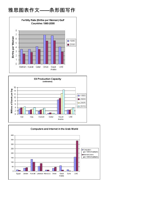
雅思图表作⽂——条形图写作Fertility RatesThe chart shows striking changes in the fertility rate of women in six Gulf countries –Saudi Arabia, the UAE, Oman, Qatar, Kuwait and Bahrain between 1990 and 2000.In the ten year period, there was a decline in the number of births per woman in all countries. The biggest declines were in two countries which had low fertility rates at the start of the decade, Bahrain and the UAE.Fertility rates vary greatly between the six countries. Oman and Saudi Arabia had the highest rates, with over seven births per woman in 1990. This compared with around 4 births per woman in Bahrain and the UAE, and just 3.75 in KuwaitBy 2000, the rate had fallen below three births per woman in Kuwait, Bahrain and the UAE, with a drop of over 25% in a decade in the UAE. However, in Saudi Arabia and Oman, the rates fell by just 20%, from 7.0 to 5.5.In summary, there were major decreases in birth rates in all countries, but some countries in the region have double the fertility rate of others.Oil Production CapacityThe graph shows Oil Production Capacity in millions of barrels per day for selected Gulf countries. There are several features in this graph.The most significant feature is that oil production will increase sharply in almost all the countries shown. Kuwait and Iraq are both expected to double their output between 1990 and 2010, with Kuwait’s production rising from 1.8 million barrels per day (bpd) in 1990 to 3.8 in 2010. Iran will also increase its output by a slightly smaller amount. After remaining steady at 2.5 million bpd from 1990 to 2000, the UAE’s output is expected to approach 4.0 million bpd in 2010. Only Qatar’s production is predictedto fall, 0.8 million bpd after a slight rise in 2000.However, the greatest increase will be from Saudi Arabia. In 1990, its output capacity at 8.5 million bpd exceeded the combined production of Iran, Iraq and Kuwait. Thislead is expected to continue with a 75% increase in production to 14.5 million bpd 2010.In summary, while most of the countries are expected to show increases, Saudi Arabia will maintain and strengthen its position as the major producer.Computers & Internet in the Arab WorldThe chart shows striking differences in the level of computer andInternet penetration in the Arab world.The UAE and Kuwait are by far the most computerized countries, with Lebanon a distant third. The UAE has over 150 computers for every 1000 inhabitants, compared to Kuwait’s 130 and Lebanon’s 60.In contrast, countries such as Egypt,Morocco and Syria have less than 20 computers per 1000 inhabitants.There are also great differences in Internet use and availability. The UAE has by far the highest proportion of users, with more than one-third of its population using the Internet. Kuwait and Lebanon are second and third again, with 100 users per thousand in Kuwait and 80 in Lebanon. In some countries the number using the Internetis negligible: Saudi Arabia has less than 20 users per thousand, and there are fewer than 5 users per thousand in Syria.One unusual feature of the graph is that Internet use does not seem to be directly related to the number of computers. In several countries (the UAE, Lebanon, Jordan and Oman), there are more Internet users per thousand people than computers. However, in other countries, such as Kuwait, Saudi Arabia and Syria, the number of Internet users is lower than the number of computers.In summary, there are major differences between computer use and Internet use in the Arab world, but the UAE clearly leads the area in both number of computers and number of internet users per capita.Coffee ProductionThe graph shows coffee exports for the top 12 countries in the world in 2010 and 2011. Overall, the biggest producers by far are Brazil and Vietnam, and there has not been much change in the ranking of the top producers in the last two years. Almost every country in the graph produced more coffee in 2011 than in 2010. Brazil was the largest producer. It increased exports from 30,000,000 bags in 2010 to almost35,000,000 in 2011. Vietnam was the second largest producer, and it also increased its output from under 14,000,000 bags to about 17,000,000. Colombia, Indonesia and India exported almost the same amount, at between 6 and 8 million bags, and then a large group of countries including Peru, Guatemala, Honduras, Ethipia, Uganda and Mexico produced about 3 or 4 million bags in both years.Only two countries in the graph exported less in 2011. They were Indonesia and Coted’Ivoire. In Cote d’Ivoire, production fell by 50%, fro m 2 million bags to 1 million.。
英语四级写作万能之主题作文及图画作文
英语四级写作万能之主题作文及图画作文英语四级写作万能模板之主题作文及图画作文一、主题作文及图画作文的模板:These days 现象 often hits the headlines of newspapers and has been brought into focus of the public. Just as the picture shown that… (如果是图画作文可以写出具体的现象或问题,也可以一句话描述图画:As is vividly illustrated above, in the +地方 +动词(be, come, run, walk, jump, sit, stand, lie, crouch, float等)+主题词,非谓语动词/非限制性定语从句,独立主格/非限制性定语从句。
) Indeed, it is widely accepted / acknowledged that it has gained increasing popularity among people in all walks of life/ college students.Those who are in favor of 现象 maintain that 描述观点1. In their view, 阐释观点1. On the contrary, those who are against 现象 hold/ point out that 描述观点2. Besides, 阐释证实观点2 . (第二段可以根据文章来分析原因,影响,优点或缺点等。
)It is high time we put an end to the undesirable phenomenon of… (虚拟语气的句子) 然后再分条来说明措施。
On the one hand, … on the other hand, … I believe we humans c an overcome this difficulty and we will have a brighter future.改革之后,图画作文考的比较多,无论是图画作文还是主题作文,上面的结构是可以通用的,考生可以重点记下图画作文与主题作文的.句型。
专业四级看图作文-(精选5篇)

专业四级看图作文-(精选5篇)第一篇:专业四级看图作文-模板一① 总的趋势② 图表具体描述③剖析图表所揭示的含义④理由一⑤ 理由二⑥理由三⑦ 理由四⑧总结⑨ 前景预测As can be seen from the table, the past decade has witnessed dramatic changes in①______.While ②_______.It is obvious from the table that③_________.What contributed to these changes? I think the reasons are as follows.To start with, ④______.Secondly, ⑤______.What’s more, ⑥ _______.Last but not lease, ⑦________.In conclusion, ⑧_________.Moreover, ⑨ ________.模板二①描述图表②分三方面解释原因③下结论1)During the period from _______to _______, ________rose from ________to _______, while _______ decreased from _______ to _______.2)We believe that three reasons can account for this phenomenon.First,____.Second, ____.Third, _____.3)___.We are happy to see that things are becoming better and better nowadays.We can imagine that ___.模板三①描述图表②解释图表③补充解释1)During the period between _______ and ________, ________ declined abruptly from _______ to ________, while ________ increased sharply from ________ to _______.2)Several reasons can account for this pared with _________ is much cheaper and more convenient__________.Apart from that, _________.3)However, there are still a number of people who _________, generally for two reasons.On the one hand,________.On the other hand, ________. 第二篇:四级看图作文英语四级图表作文讲解及参考范文图表作文也是四(六)级考试中常见,而且被认为是一种较难的作文形式。
四级写作预测范文:图表作文
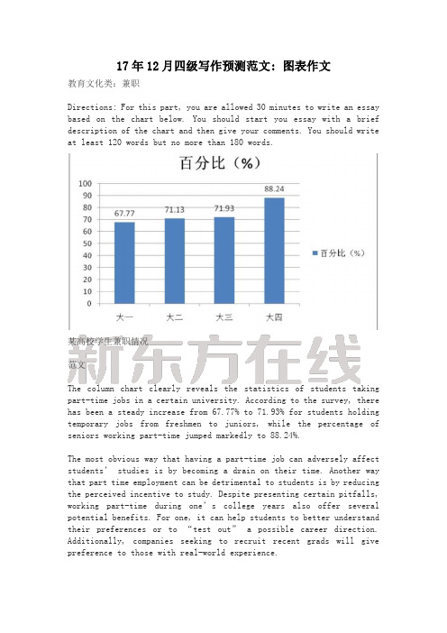
17年12月四级写作预测范文: 图表作文教育文化类:兼职Directions: For this part, you are allowed 30 minutes to write an essay based on the chart below. You should start you essay with a brief description of the chart and then give your comments. You should write at least 120 words but no more than 180 words.某高校学生兼职情况范文The column chart clearly reveals the statistics of students taking part-time jobs in a certain university. According to the survey, there has been a steady increase from 67.77% to 71.93% for students holding temporary jobs from freshmen to juniors, while the percentage of seniors working part-time jumped markedly to 88.24%.The most obvious way that having a part-time job can adversely affect students’ studies is by becoming a drain on their time. Another way that part time employment can be detrimental to students is by reducing the perceived incentive to study. Despite presenting certain pitfalls, working part-time during one’s college years also offer several potential benefits. For one, it can help students to better understand their preferences or to “test out” a possible career direction. Additionally, companies seeking to recruit recent grads will give preference to those with real-world experience.In the end, the impact of a part-time job on student’s academic career depends on the student’s ability to maintain focus and balance his or her own time.译文这幅柱状图清晰显示了某高校学生兼职情况的数据。
雅思写作八分经典范文背诵:图表作文(5)
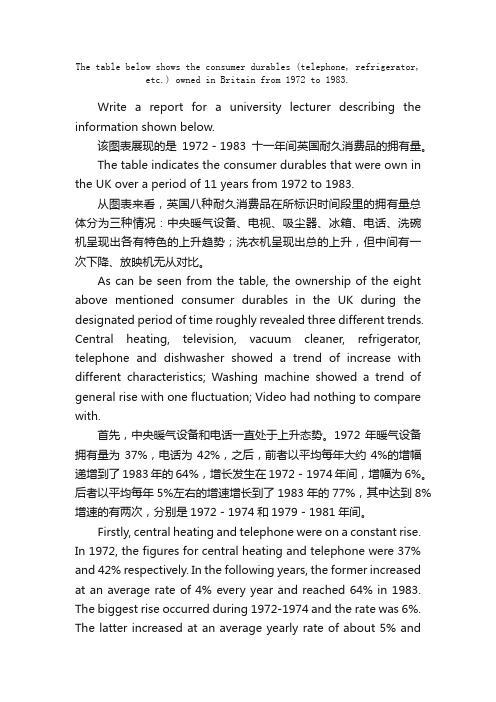
The table below shows the consumer durables (telephone, refrigerator, etc.) owned in Britain from 1972 to 1983.Write a report for a university lecturer describing the information shown below.该图表展现的是1972-1983十一年间英国耐久消费品的拥有量。
The table indicates the consumer durables that were own in the UK over a period of 11 years from 1972 to 1983.从图表来看,英国八种耐久消费品在所标识时间段里的拥有量总体分为三种情况:中央暖气设备、电视、吸尘器、冰箱、电话、洗碗机呈现出各有特色的上升趋势;洗衣机呈现出总的上升,但中间有一次下降、放映机无从对比。
As can be seen from the table, the ownership of the eight above mentioned consumer durables in the UK during the designated period of time roughly revealed three different trends. Central heating, television, vacuum cleaner, refrigerator, telephone and dishwasher showed a trend of increase with different characteristics; Washing machine showed a trend of general rise with one fluctuation; Video had nothing to compare with.首先,中央暖气设备和电话一直处于上升态势。
英语图表作文写作

英语图表作文写作The bar chart shows the percentage of people in different age groups who use social media. It's interesting to see that the highest percentage of social media users is in the 18-34 age group, with over 80% of people usingsocial media. This is not surprising, as this age group is known to be the most tech-savvy and active on social platforms.In contrast, the lowest percentage of social media users is in the 65+ age group, with only around 30% of people using social media. This is understandable, as older generations may not be as familiar with technology and may prefer more traditional forms of communication.It's worth noting that the 35-49 age group has aslightly lower percentage of social media users compared to the 18-34 age group, but still over 70% of people in this age group use social media. This shows that social media usage is still quite prevalent in the middle-agedpopulation.Overall, the chart highlights the significant impact of age on social media usage, with younger age groups being the most active users. This reflects the trend of younger generations being more digitally connected and engaged with social media platforms.。
图表作文及范文

折线图类图表作文
总结词
折线图类图表作文通过折线图展 示数据的变化趋势,要求考生分 析数据随时间的变化情况。
详细描述
折线图类图表作文包括标题、图 例、折线图和结论四个部分。标 题应简明扼要,图例应清晰列出 各项指标,折线图应准确展示数 据的变化趋势,结论应对数据进 行分析和总结。
范文解析
例如,一篇关于某国家GDP增长 的折线图类图表作文,可以通过 折线图展示该国家近十年来的 GDP增长率变化情况。考生在分 析数据时,应关注GDP增长率的 波动情况,分析其变化趋势和影 响因素,从而得出结论。
饼状图类图表作文
总结词
饼状图类图表作文通过饼状图展示数据的比例关系,要求考生分析不同部分之间的比例和关系。
详细描述
饼状图类图表作文包括标题、图例、饼状图和结论四个部分。标题应简明扼要,图例应清晰列出各项指标,饼状图应 准确展示各部分的比例关系,结论应对数据进行分析和总结。
范文解析
例如,一篇关于某企业年度销售收入的饼状图类图表作文,可以通过饼状图展示该企业各产品线的销售 收入比例。考生在分析数据时,应关注各产品线销售收入的比重和变化情况,分析其优劣势和市场需求, 从而得出结论。
04
范文点评与反思
范文点评
01
02
03
04
语言表达能力
范文的语言表达清晰、准确, 用词恰当,语法结构完整,符
合英语写作规范。
逻辑思维能力
范文在描述图表内容时,逻辑 清晰,层次分明,能够准确把
握图表的主旨和细节。
内容完整性
范文对图表进行了全面、细致 的描述,涵盖了图表中的所有
重要信息,没有遗漏。
创新性
范文在分析图表时,能够从多 个角度进行思考,提出一些新
英语作文图表分析范文(汇总30篇)
英语作文图表分析范文(汇总30篇)(经典版)编制人:__________________审核人:__________________审批人:__________________编制单位:__________________编制时间:____年____月____日序言下载提示:该文档是本店铺精心编制而成的,希望大家下载后,能够帮助大家解决实际问题。
文档下载后可定制修改,请根据实际需要进行调整和使用,谢谢!并且,本店铺为大家提供各种类型的经典范文,如工作总结、工作计划、合同协议、条据文书、策划方案、句子大全、作文大全、诗词歌赋、教案资料、其他范文等等,想了解不同范文格式和写法,敬请关注!Download tips: This document is carefully compiled by this editor. I hope that after you download it, it can help you solve practical problems. The document can be customized and modified after downloading, please adjust and use it according to actual needs, thank you!Moreover, our store provides various types of classic sample essays for everyone, such as work summaries, work plans, contract agreements, doctrinal documents, planning plans, complete sentences, complete compositions, poems, songs, teaching materials, and other sample essays. If you want to learn about different sample formats and writing methods, please stay tuned!英语作文图表分析范文(汇总30篇)英语作文图表分析范文第1篇图表类写作模版(1)模版1According to the chart / graph / diagram / table, we clearly learn that _________.As early as _________,___________.Then,_________.Last,__________.In contrast, by _________,__________.There are many reasons accounting for _________.Firstly, _________.Secondly,__________.Finally,_________.As a result,_________.As far as I am concerned,_________.For one thing,__________.For another,________.In brief, I hold that__________.(2)模版2What is shown in the chart / graph / diagram / table above indicates that in recent years, more and more people payattention to _________.The number of those who _________has increased ________,and furthermore,____________.There are two factors responsible for the changes.In the first place,_________.Moreover,__________.Yet, it is noticeable that __________.From the analysis, we can safely draw the conclusion that__________.It is possible that in the future,the tendency will__________.(3)模版3As is shown in the chart / graph / diagram / table above,__________has charged drastically in the past _________.While ___________,now the percentage of__________is __________.Meanwhile,the number of _________has soared up to ________.There are mainly two possible reasons contributing to the rapid changes.The first is that _________.Secondly,__________.In my point of view, the changes have a great influence on _________.At the same time,_______.To sum up ,_________.英语作文图表分析范文第2篇1、图形种类及概述法:泛指一份数据图表: a data graph/chart/diagram/illustration/table饼图:pie chart直方图或柱形图:bar chart / histogram趋势曲线图:line chart / curve diagram表格图:table流程图或过程图:flow chart / sequence diagram程序图:processing/procedures diagram2、常用的描述用法The table/chart diagram/graph shows (that)According to the table/chart diagram/graphAs (is)shown in the table/chart diagram/graphAs can be seen from the table/chart/diagram/graph/figures,figures/statistics shows (that)……It can be seen from the figures/statisticsWe can see from the figures/statisticsIt is clear from the figures/statisticsIt is apparent from the figures/statisticstable/chart/diagram/graph figures (that)……table/chart/diagram/graph shows/describes/illustrates how……3、图表中的数据(Data)具体表达法数据(Data)在某一个时间段固定不变:fiXed in time在一系列的时间段中转变:changes over time持续变化的data在不同情况下:增加:increase / raise / rise / go up ……减少:decrease / grow down / drop / fall ……波动:fluctuate / rebound / undulate / wave ……稳定:remain stable / stabilize / level off ……最常用的两种表达法:动词+副词形式(Verb+Adverb form)形容词+名词形式(Adjective+Noun form)英语作文图表分析范文第3篇雅思考试学术类图表作文分析考试学术类图表作文要求考生观察一幅图表并用自己的语言呈现出图表中的信息。
考研大作文(适用于英语二)
2018 年考研英语(二)大作文万能高分模板(图表类)第一部分,模板与说明图表类作文分为两大类:1。
动态类,即描述事物变化趋势,比如2010、2011、2014、2017年真题。
2。
静态类,即描述某一事物各部分比例,比如2012、2013、2015、2016年真题。
无论2018大作文考研出什么情况和话题,都是用这个模板套用,大家背诵熟练,拿每一年的真题练手试验即可.具体方法,参见第二部分真题实战演练。
二者区别:1。
动态类描述一种或多种事物在不同时间点的状态或性质。
(图标中通常出现有关时间的信息)2。
静态类描述一种或多种事物在同一时间点的状态或性质。
(图表中通常不出现有关时间的信息)图表作文写作思路:第一段:描述图表内容。
第二段:分析原因,解释现象。
第三段:预测趋势,建议措施。
说明,我们的模板在170字左右,再加上自己写的主题词和图表描述句,这样字数就更多了.建议大家根据自己的情况删减一些句子,把总的字数控制在160~180。
[模板#1(动态类图表)]:What is clearly presented in the above 图表类型 is that dramatic changes have taken place in 主题词1from年份1to年份2.During the period, there was a marked jump from数字1to数字2in 事物1,while that of 事物2 declined significantly/climbed slightly from 数字3 to 数字4(.若有第三个事物,则再简单介绍第三个事物的情况)The 图表类型 informs us of the phenomenon that people in mounting numbers 图表所示的内容(and i believe there are several fundamental factors to account for the above-mentioned changes).Primarily ,with the rapid development of modern society which led by economy,快速发展的事物has turned out to be a trend that anyone cannot evade。
考研英语大作文图表作文范文及模板

考研英语大作文图表作文范文及模板图表作文1.写作攻略图表作文是考研英语写作中较为常见的题型之一,也是难度较大的一种写作题型。
这类作文可综合提供题目、数据、图像、提纲,形式多样,但实际上只涉及5个方面:描述图表、指明寓意、分析原因、联系实际、给出建议,而每次考试只是从这5个方面的内容中选出3个结合在一起。
从写作类型来看,基本上属于说明文。
要求考生围绕题目将有关信息转化为文字形式,考生应该具有一定数据分析和材料归纳的能力,同时会运用一定的写作方法。
考研试题一般以三段式写作方法来组织文章,第一段总结归纳信息反映的整体情况,点出主题思想,第二段回答第一段所得出的问题,对数字、数据等做出有条理的分析比较,第三段做出总结或给以简单的评论。
表格和图表题型写作要点:(1)考生应仔细研究题目以及提示信息,认清图表中的数字、线条、阴影等部分的变化趋势和走向,抓住其主要特点,然后根据图表所显示的中心信息确定内容层次以及主题句。
(2)考生应该仔细研究图表所给出的大量信息,从中选取最重要,最有代表性的信息,然后根据全文的主旨去组织运用所获取的关键信息。
切忌简单地罗列图表所给出的信息。
(3)图表作文一般采用的时态为一般现在时,但如果图表中给出了具体时间参照,考生则应对时态进行相应的调整。
(4)图表作文有一些固定句型和表达法,考生应对此融会贯通。
(5)图表作文可以细分为表格,曲线图、柱形图和饼形图。
除了上述共同要点,考生还应了解这四种图在写作方面的不同特点。
——表格可以表示多种事物的相互关系,所以考生要对表格中所给出的大量数字进行比较分析,从中找出其变化规律。
——曲线图常表示事物的变化趋势,考生应认真观察坐标系所显示的数据信息,并且密切注意交汇在坐标横轴和纵轴上的数字及单位。
——柱形图用来表示各种事物的变化情况及相互关系,要求考生通过宽度相等的柱形的高度或长度差别来判断事物的动态发展趋势,因此考生应密切关注坐标线上的刻度单位及图表旁边的提示说明与文字。
- 1、下载文档前请自行甄别文档内容的完整性,平台不提供额外的编辑、内容补充、找答案等附加服务。
- 2、"仅部分预览"的文档,不可在线预览部分如存在完整性等问题,可反馈申请退款(可完整预览的文档不适用该条件!)。
- 3、如文档侵犯您的权益,请联系客服反馈,我们会尽快为您处理(人工客服工作时间:9:00-18:30)。
写作大作文:图表作文图表作文1.写作攻略图表作文是考研英语写作中较为常见的题型之一,也是难度较大的一种写作题型。
这类作文可综合提供题目、数据、图像、提纲,形式多样,但实际上只涉及5个方面:描述图表、指明寓意、分析原因、联系实际、给出建议,而每次考试只是从这5个方面的内容中选出3个结合在一起。
从写作类型来看,基本上属于说明文。
要求考生围绕题目将有关信息转化为文字形式,考生应该具有一定数据分析和材料归纳的能力,同时会运用一定的写作方法。
考研试题一般以三段式写作方法来组织文章,第一段总结归纳信息反映的整体情况,点出主题思想,第二段回答第一段所得出的问题,对数字、数据等做出有条理的分析比较,第三段做出总结或给以简单的评论。
表格和图表题型写作要点:(1)考生应仔细研究题目以及提示信息,认清图表中的数字、线条、阴影等部分的变化趋势和走向,抓住其主要特点,然后根据图表所显示的中心信息确定内容层次以及主题句。
(2)考生应该仔细研究图表所给出的大量信息,从中选取最重要,最有代表性的信息,然后根据全文的主旨去组织运用所获取的关键信息。
切忌简单地罗列图表所给出的信息。
(3)图表作文一般采用的时态为一般现在时,但如果图表中给出了具体时间参照,考生则应对时态进行相应的调整。
(4)图表作文有一些固定句型和表达法,考生应对此融会贯通。
(5)图表作文可以细分为表格,曲线图、柱形图和饼形图。
除了上述共同要点,考生还应了解这四种图在写作方面的不同特点。
——表格可以表示多种事物的相互关系,所以考生要对表格中所给出的大量数字进行比较分析,从中找出其变化规律。
——曲线图常表示事物的变化趋势,考生应认真观察坐标系所显示的数据信息,并且密切注意交汇在坐标横轴和纵轴上的数字及单位。
——柱形图用来表示各种事物的变化情况及相互关系,要求考生通过宽度相等的柱形的高度或长度差别来判断事物的动态发展趋势,因此考生应密切关注坐标线上的刻度单位及图表旁边的提示说明与文字。
——饼形图表示各事物在总体中所占的比例及相互关系,旨在要求考生准确理解并阐述一个被分割成大小不等切片的饼形图所传达的信息。
考生应清楚掌握部分与整体,部分与部分之间的相互关系,这种关系通常是以百分比的数字形式给出的。
(6)列出各段主题句。
考生可以根据所给提纲或已知信息列出每段的主题句,为全文的展开做好铺垫。
(7)围绕主题句完成段落的展开。
尽量做到主题明确、条理清楚、文字简练。
(8)检查与修改。
对图表作文的检查与修改应着重看文章中所列举的信息是否与图表所显示的信息一致,资料是否恰当。
2.必背模版句型As can be seen from/in the chart/diagram/table/graph...从表格/图形中我们可以看到……The table shows a three times increase over that of last year.表格显示比去年上升了3倍。
According to /As is shown in the Table /Figure/Chart...如表格/图表中显示……The number is 5 times as much as that of...此数字是……的5倍。
It has increased by three times as compared with that of ...同……相比,增长了3倍。
It can be seen from the chart/diagram/table/graph/figures/statistics that...从表格/图表/数据中我们可以看到……From the table/figures/data/results/information above, it can/may beseen/concluded/shown/estimated/calculated/inferred that...从以上的表格/图表/数据/结果/信息中,我们可以看到/总结/预测/计算/得出……A has the highest sales figure in the three departments, followed byB and C.在3个部门中,A的销售额最高,其次是B和C。
The figure of A is about twice as much as that of B.A的数字是B的两倍。
The rise lasted for two weeks and then began to level off in August.上升两个星期后,8月份开始平稳。
It accounts for 30% of the total population.占到总人口的30%。
The number of students has reached 500, indicating a rise of 20%, compared to last semester.学生人数达到500人,与上个学期相比上升了20%。
It picked up speed at the end of this month.这个月底加快了速度。
The pie charts show the changes on... in some place in 2000.此饼形图显示了2000年一些地方……的变化。
from this year on,there was a gradual declined reduction in the..., reaching a figure of...从这年起,……逐渐下降至……There are a lot of similarities/differences between...and...……与……之间有许多相似(不同)之处It can be drawn from the chart that the proportions of A and B are going down, though the falling level of the latter is a lot lower/higher than that of the former.尽管B的下降速度比A要慢/快,从表中我们可以看到A和B的比例都在下降。
在5年期限的后半段,增长/降低比较明显。
It falls from 50% in 2000 to 30% in 2004, and then the trend reverse, finishing at 58% in 2005.从2000年的50%降到2004年的30%,然后形势逆转,2005年达到了58%。
The table shows the changes in the number of...over the period from...to...该表格描述了在……年之……年间……数量的变化。
As can be seen from the graph, the two curves show the fluctuation of...如图所示,两条曲线描述了……的波动情况。
3.必背经典范文Directions: the table below shows the number of road accidents which occurred in Britain in different places and the ages of the injured persons. Write a report describing the information shown below.Road accidents in Britainwhen/where accidents occurredAge2-4Age5-7Age8-11Age11-13Age14-16TOTALGoing to school21383127Going home from school21692231Playing in the street89812651202Cycling into the street110259247Shopping for their parents432132152TOTAL9815281217359The chart above organizes data about road accidents involving children in Britain by and by when and whereand that age correlates with the circumstances surrounding the accident.For all ages, the most common situation leading to accident is playing in the street but young children were particularly affected. Children between the ages of 5-7 seemed to get into accidents while engaged in activities appropriate to their age, such as shopping for their parents or going home from school. In fact, this age group accounted for the most road accidents of all. Children between 8 and age 11 had the most accidents cycling in the street. After age 11, the number of accidents dropped considerably in all situations.From the chart, we get to know that playing in the street is the most common and universal site of accidents of all ages, but the risks that other sites and situations present vary with the children's ages.题目:表格给出了英国在不同地点和不同年龄段的人所发生的交通事故。
请描述一下这个表格。
译文上面的图表中的数据反映了英国不同年龄段的孩子在不同地点发生交通事故的情况。