英语图表图画类作文课后作业及范文
英语四级图表+图画作文讲解及参考范文

英语四级图表和图画作文讲解及参考范文一、图表作文图表作文也是四(六)级考试中常见,而且被认为是一种较难的作文形式。
图表作文就是把非文字信息(通常为各种图表表示的数字信息等)转换成文字信息的一种作文。
它要求我们用文字来描述非文字性的图表或对图表显示的关系作解释说明。
第一节图表作文的出题形式和写作要领一、图表作文常见出题形式图表作文一般在题目中给出作文的标题和一个或几个统计表格、圆形图、曲线图或条形图,有时还用英文或中文提纲的形式给出提示,要求我们:1)用文字描述图表,客观解释图表中所传递的信息,并找出某种规律或趋势;2)就图表中所反映的某种趋势或问题分析其原因或后果。
图表作文着重说明事实,常常是通过对图表中所反映的具体数据的说明、分析、比拟,对某种事物或现象的事实或变化情况等加以说明,并提出结论或看法。
因此,图表作文常常采用议论文体的写作方法。
写好图表作文,关键在于能否读懂图表中所提供的信息,把握各信息间的联系,用准确流畅的语言把这一信息表达出来,并就这一信息发表自己的看法。
二、图表作文的写作步骤写图表作文时,要注意遵循以下步骤:1)认真分析图表的含义,弄清图表中所含的信息及不同信息间的关系;2)确定文章的主题思想,构思出文章的根本框架,筛选出能说明图表主题思想的典型数据;3)编列文章的提纲;4)根据文章的提纲,将各段的提纲内容扩展成段落,然后将各个段落组成文章,注意段与段之间的衔接与过渡;5)检查与修改。
三、图表作文的篇章结构写图表作文时,常采用三段式的陈述方式。
文章的第一段往往分析图表中的数据变化反映什么问题或趋势,概述图表所揭示的信息。
第二段分析造成这一问题或趋势的原因。
第三段那么展望未来的情况或提出解决问题的方法或建议。
这一结构可以简单地表述为:第一段:概述图表反映的主题思想〔总趋势+极端值+特点,时态〕第二段:分析产生的原因第三段:展望未来或提出方法或建议模板一①总的趋势②图表具体描述③剖析图表所揭示的含义④理由一⑤理由二⑥理由三⑦理由四⑧总结⑨前景预测As can be seen from the table, the past decade has witnessed dramatic changes in①______. While ②_______. It is obvious from the table that③_________.What contributed to these changes? I think the reasons are as follows. To start with,④______. Secondly, ⑤______ . What’s more, ⑥ _______. Last but not lease, ⑦________. In conclusion, ⑧_________. Moreover, ⑨ ________.模板二①描述图表②分三方面解释原因③下结论1) During the period from _______to _______, ________rose from ________to _______, while _______ decreased from _______ to _______.2) We believe that three reasons can account for this phenomenon. First,____. Second, ____. Third, _____.3) ___.We are happy to see that things are becoming better and better nowadays. We can imagine that ___.模板三①描述图表②解释图表③补充解释1) During the period between _______ and ________, ________ declined abruptly from_______ to ________, while ________ increased sharply from ________ to _______.2) Several reasons can account for this phenomenon. Compared with _________ is much cheaper and more convenient__________ . Apart from that, _________.3) However, there are still a number of people who _________, generally for two reasons. On the one hand,________. On the other hand, ________.1.图表类型:table 表格; chart 图表; diagram图表或图解,示意图; graph图表, 曲线图; column/ bar chart柱状图; pie graph饼图2. 描述:show; describe; illustrate; can be seen from; clear; apparent; reveal 显示; represent表现,描绘3.内容:figure数字; statistic统计值; statistics [用作复]统计, 统计数字[资料], 统计表number; percentage; proportion● 表示数据上升:increase, rise, ascend, core, surge, go up, climb, mount, level up下降: decrease, fall, drop, descend, decline, reduce ,lessen, level, down平稳: stable, steady, remain steady/stable; /maintain/keep/be the same as/similarto ; little/hardly any /no change波动: fluctuate, fluctuation, rise and falls, up and down占: occupy,take up,account for, gain而: while, however, whereas , on the other hand, actually/in fact相比: by contract, on the contrary, likewise, compared with最高点: the highest, the top, the summit, the peak, the most最低点: bottom, less, least, rock bottom最低点例句Prices have hit rock bottom. 价格已达最低水平平均: mean平均值, average趋势: tendency, trend, inclination预见: prediction到达顶峰: mount to比例:20 per cent , 20%one in three, 1/3one out of every four,1/4有一个稳定的过程: a stable period can be seen表示变化程度的词:sudden/suddenly 突然的,意外的rapid/rapidly 迅速的,飞快的,险峻的dramatic/dramatically 戏剧性的,生动的significant/significantly 有意义的,重大的,重要的sharp/sharply 明显的,急剧的steep/steeply 急剧升降的steady/steadily 稳固的,坚决不移的gradual/gradually 渐进的,逐渐的slow/slowly 缓慢的,不活泼的slight/slightly 轻微的、略微地stable/stably 稳定的表示范围:from…to… between…and… for …to …多长时间直到表示程度:almost adv. 几乎,差不多nearly adv. 几乎,密切地approximately adv. 近似的,大约just over 刚超过exactly adv. 正确地,严密地precisely adv. 正好精确地;清晰地●常用词和短语significant changes 图中一些较大变化noticeable trend 明显趋势during the same period 在同一时期grow/grew 增长distribute 分布,区别unequally 不相等地pronounced 明显的average 平均no doubt 无疑地corresponding adj. 相应的,通讯的represent vt. 阐述,表现overall 体上讲except 除外in the case of adv. 在…的情况下in contrast 相反,大不相同in conclusion adv. 最后,总之in comparison 相比之下inversely adv. 相反地,倒转地in general 通常,大体上,一般而言rang from…to 从…到…不等excessive adj. 过多的,过分的,额外lower v. 降低,跌落elapse vi. 〔时间〕过去,消逝category n. 种类government policy 政府政策market forces 市场规律measure n. 尺寸,方法,措施v.估量,调节forecast n. 先见,预见四、图表作文常用的句型(1)常用的开篇句型(即概述图表内容时常用的表达法)①According to the table/pie chart/line graph/bar graph, we can see/conclude that … 根据该表/图,我们可知……②The table/graph reveals (shows/indicates/illustrates/ represents/points out) that … 该表/图说明……③As we can see from the table …As can be seen from the line/bar graph …As is shown (illustrated/indicated) in the pie chart …如表/图所示,……(2) 描述增减变化常用的句型①Compared with … is still increased by …②The number of … grew/rose from … to …③An increase is shown in …; then came a sharp increase of …④In … the number remains the same/drops to …⑤ There was a very slight (small/slow/gradual) rise/increase in 1990.⑥ There was a very steady (marked/sharp/rapid/sudden/ dramatic) drop(decrease/decline/fall/reduction) in 1998/ compared with that of last year).来看一篇范文:⑴ From the graph, we can see that the number of car accidents in Walton city fluctuated during the year of 1990. ⑵ The first two months of 1990 showed an increasing trend. ⑶ The rate rose to 32 in March but fell to 26 in June. ⑷ From June on, the rate was rising again and reached the peak point 39 in August. ⑸ After August the rate began to decline remarkably, and eventually dropped to the lowest point 16 at the end of the year. ⑹Therefore, it’s obvious that car a ccident in Walton city declined in 1990.⑴主题句/概述表格反映的内容⑵—(5)反映交通事故的变化情况(6)小结:总结表格数据反映的总趋势⑺There are several reasons for the decline. ⑻ First, a new traffic law was made and came into force. ⑼ It provided that in summer every car must be air-conditioned. ⑽ As a result, the highest rate in August, when humidity and high temperature make drivers impatient and easily lead to car accidents, dropped steadily. ⑾ Second, new roads were built and some narrow streets were widened, which quickened the flow of traffic. ⑿ Finally, the city administration made great efforts to heighten people’s awareness of observing traffic rules.⑺主题句⑻原因/措施一⑼解释措施一/次要辅助⑽采取措施一后的结果⑾原因/措施二⑿原因/措施三⒀With all these new measures, I’m sure the rate of car accidents in Walton city will go on falling this year.⒀总结:展望未来的情况第二节图表作文样题与样文举例样题一:Directions: For this part, you are allowed 30 minutes to write a composition on the topic How People Spend Their Holidays. You should write at least 120 words, and base your composition on the table and the outline given below:1、根据上表,简要描述1990年、1995年、2000年某城市人们度假方式的情况及其变化;2、请说明发生这些变化的原因;3、得出结论。
英文图表类 作文

英文图表类作文1. The bar chart shows the percentage of people in different age groups who use social media. It's interesting to see that the highest percentage of social media users is in the 18-34 age group, with over 80% of people usingsocial media. 。
2. The line graph illustrates the change in temperature over the course of a week. As we can see, there was a sharp increase in temperature on Wednesday, followed by a gradual decrease towards the end of the week.3. The pie chart displays the distribution of household expenses. It's surprising to see that the largest portion of expenses is on entertainment, with 30% of the budget allocated to this category.4. The table compares the sales performance ofdifferent products in the past year. It's clear that Product A has consistently outperformed the other products,with the highest sales in every quarter.5. The scatter plot shows the relationship betweenhours of study and exam scores. It's evident that there isa positive correlation between the two variables, as students who study more hours tend to achieve higher scores.6. The flow chart outlines the process of applying fora visa. It's quite a complex procedure, with multiple steps and documents required at each stage.7. The diagram depicts the structure of a typical cell. It's amazing to see the intricate network of organelles and membranes that make up a single cell.。
2014年12月大学英语四级作文范文:图表图画型
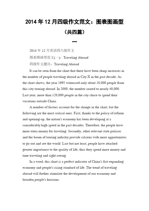
2014年12月四级作文范文:图表图画型(共四篇)一2014年12月英语四六级作文图表图画型范文(一):Traveling Abroad四级作文题目:Traveling AbroadIt can be seen from the chart that there have been sharp increases in the number of people traveling abroad in City X in the past decade. As the chart shows, the year 1995 witnessed only about 10,000 people from this city touring abroad. In 2000, the number soared to nearly 40,000. Last year, more than 120,000 people in the city chose to spend their vacations outside China.A number of factors account for the change in the chart, but the following are the most critical ones. First, thanks to the policy of reform and opening-up, the nation's economy has been developing at a considerably high speed in the past decades. Therefore, the people have more extra money for traveling. Secondly, other relevant state policies and the boom of touring industry provide citizens with more opportunities to go out and see the world. Last but not least, people have attached greater importance to the quality of life, thus they spend more money and time traveling and sight-seeing.In a word, this chart is a perfect indicator of China's fast expanding economy and people's rising standard of life. The trend of traveling abroad will further stimulate the development of our economy and broaden people's horizons.2014年12月英语四六级作文图表图画型范文(二):Reading Preferences四级作文题目:Reading PreferencesIt can be seen from the table that popular fiction is most popular with American students, accounting for 65.9% of book circulation in the library. General nonfiction comes next, taking up 18.2%, while books concerning science, technology and education take up only 10.8%. The least preferred category is that of art, literature and poetry, with a circulation rate of merely 5.1%.A number of factors could account for the reading preferences, but the following are the most critical ones. Firstly, popular fiction is fascinating to the young students. Secondly, books about science and technology are usually too complex and difficult to read. They often contain many special terms which most students can't understand. Finally, in today's market economy, much more emphasis is laid on practical and vocational books rather than arts or poetry.When it comes to me, poetry and art are my favorites. Such kind of books can nourish my mind, broaden my horizons and render me a fresh feeling. Reading a piece of good poetry tends to relieve my burden and lessen my tension, making me more creative and dynamic. It gets me into an imaginary world, fresh and beautiful. I just love it!2014年12月英语四六级作文图表图画型范文(三):Changes in the Ownership of Houses in China四级作文题目:Changes in the Ownership of Houses in ChinaIt can be seen from the chart that there have been dramatic changesin the ownership of houses in China in the past 50 years. While the percentage of state-owned houses has dropped from 70% in 1950's to 20% in 1990's, that of private houses has soared from 30% to 80% during the same period of time.A number of factors could account for the change in the chart, butthe following are the most critical ones. First, thanks to the policy of reform and opening-up, the nation's economy has been developing at a considerably high speed in the past decades. Therefore, people have more extra money to improve their housing. Secondly, other relevant state policies and the boom of real estate industry provide citizens with more opportunities to choose their own dwelling places. Last but not least, people have attached greater importance to their quality of life. Thusmore of them have purchased houses in their own favor.In a word, this chart is a perfect index of China's fast expanding economy and people's rising standard of living. Although a series of problems have arisen in the process, it is reasonable for us to believe that they can be solved in the near future with effective measures taken byboth the government and the public.2014年12月英语四六级作文图表图画型范文(四):Student Use of Computer四级作文题目:Student Use of ComputerStudents tend to use computers more and more frequently nowadays. Reading this chart, we can find that the average number of hours a student spends on the computer per week has increased sharply. In 1990, it was less than 2 hours; and in 1995, it increased to almost 4 hours, and in 2000, the number soared to 20 hours.Obviously computers are becoming increasingly popular. There are several reasons for this change. First, computers facilitate us in more aspects of life. Also, the fast development of the Internet enlarges our demands for using computers. We can easily contact with friends in remote places through the Internet. Besides, the prices of computers are getting lower and lower, which enables more students to purchase them.However, there still exist some problems, such as poor quality,out-of-date designs and so on. And how to balance the time between using computers and studying is also a serious problem. Anyhow, we will benefit a lot from computers as long as we use them properly.。
图文图表英文作文
图文图表英文作文1. The first image shows a group of people enjoying a picnic in the park. They are sitting on a checkered blanket, eating sandwiches and laughing together. The sun is shining, and everyone looks relaxed and happy.2. In the second image, we see a line graph depicting the rise in global temperatures over the past century. The line steadily climbs upward, indicating a clear trendtoward warmer average temperatures worldwide.3. Moving on to the third image, it is a stunningaerial view of a bustling city at night. The skyscrapersare illuminated with colorful lights, and the streets below are filled with cars and people. It's a vibrant and dynamic scene.4. The fourth image is a simple bar chart showing the distribution of wealth in different regions of the world. The wealthiest region has the tallest bar, while thepoorest region's bar is barely visible in comparison.5. Finally, the last image is a beautiful painting of a serene countryside landscape. Rolling hills, a winding river, and a quaint farmhouse all come together to create a peaceful and idyllic setting.In conclusion, these diverse images offer a glimpseinto various aspects of life, from leisure and enjoyment to pressing global issues and the beauty of nature. Each one tells its own unique story and evokes different emotions.。
英语图表作文精选10篇

英语图表作文精选10篇四级英语作文图表类篇一图片模板:It seems to me that the cartoon / drawing issending a message about ____________(图画内容),which reveals ____________(稍作评价).In myperspective of view, ____________ (表明个人观点)。
Apparently, ____________(将个人观点和图片内容相结合,得出观点。
)For one thing, ____________(从社会角度论证).For another thing, ____________(从个人角度说明).For example, ____________(自己、朋友或他人,只要自己知道或听过的例子).Last but not least, ____________(从反面角度谈论).Asa result, the drawer of the illustration is urging us to _____________(建议或措施).Only inthis way can we ____________(展望结果).In conclusion / To my understanding, ____________(再次表明观点或态度).We should____________(进一步说明个人的观点).图表模板:According to the bar chart / pie chart / line graph displays the changes in the numberof____________(图表整体趋势).There was an increase in ____________(图表细节).At the point of ____________, ____________reaches its peak value of ____________(数据或变化).What has caused these changes? There are mainly three reasons.Firstly, ____________ (原因一).Secondly, ____________(原因二).The number of ____________ increased overthe period.____________ rose by _________ from ________ to ________________.Andthere were____________.Finally, ____________(最后一个原因).In conclusion / We can safely draw the conclusion that ____________(结论).Therefore, ____________(进一步谈论更多个人想法).英语四级图表类作文篇二In the morning, the clear sky, father-in-law of the sun was inlaid with a golden halo. A group of happy little magpies chirped in the branches, as if holding a singing contest, very lively!Noon is the hottest time of the day. The sun gave out a blazing light, as if to roast the earth. There was no one in the street. Everyone hid in the house to blow the air conditioner, for fear that they would be cooked outside. At this time, the little magpie on the tree also became quiet, they all hide in the deep leaves of the nap. Only the indefatigable cicada was still shouting “hot, hot.。
雅思英语图表作文范文(必备3篇)

雅思英语图表作文范文第1篇A类雅思各类图表作文要点及范文一.曲线图解题关键1曲线图和柱状图都是动态图,解题的切入点在于描述趋势。
2在第二段的开头部分对整个曲线进行一个阶段式的总分类,使写作层次清晰,同时也方便考官阅卷。
接下来再分类描述每个阶段的specifictrend,同时导入数据作为分类的依据。
3趋势说明。
即,对曲线的连续变化进行说明,如上升、下降、波动、持平。
以时间为比较基础的应抓住“变化”:上升、下降、或是波动。
题中对两个或两个以上的变量进行描述时应在此基础上进行比较,如变量多于两个应进行分类或有侧重的比较。
4极点说明。
即对图表中最高的、最低的点单独进行说明。
不以时间为比较基础的应注意对极点的描述。
5交点说明。
即对图表当中多根曲线的交点进行对比说明。
6不要不做任何说明就机械地导入数据,这不符合雅思的考试目的。
曲线图常用词汇动词—九大运动趋势一:表示向上:increase,rise,improve,grow,ascend,mount,aggrandize,goup,climb, take off, jump,shoot up暴涨,soar,rocket, skyrocket雅思英语图表作文范文第2篇It is said that countries are becoming similar to each other because of the global spread of the same products, which are now available for purchase almost anywhere. I strongly believe that this modern development is largely detrimental to culture and traditions worldwide.A country’s history, language and ethos are all inextricably bound up in its manufactured artefacts. If the relentless advance of international brands into every corner of the world continues, these bland packages might one day completely oust the traditional objects of a nation, which would be a loss of richness and diversity in the world, as well as the sad disappearance of t he manifestations of a place’s character. What would a Japanese tea ceremony be without its specially crafted teapot, or a Fijian kava ritual without its bowl made from a certain type of tree bark?Let us not forget either that traditional products, whether these be medicines, cosmetics, toy, clothes, utensils or food, provide employment for local people. The spread of multinational products can often bring in its wake a loss of jobs, as people urn to buying the new brand,perhaps thinking it more glamorous than the one they are used to. This eventually puts old-school craftspeople out of work.Finally, tourism numbers may also be affected, as travelers become disillusioned with finding every place just the same as the one they visited previously. To see the same products in shops the world over is boring, and does not impel visitors to open their wallets in the same way that trinkets or souvenirs unique to the particular area too.Some may argue that all people are entitled to have access to the same products, but I say that local objects suit local conditions best, and that faceless uniformity worldwide is an unwelcome and dreary prospect.Heres my full answer:The line graphs show the average monthly amount that parents in Britain spent on their children’s s porting activities and the number of British children who took part in three different sports from 2008 to is clear that parents spent more money each year on their children’s participation in sports over the six-year period. In terms of the number of children taking part, football was significantly more popular than athletics and 2008, British parents spent an average of around £20 per month on their children’s sporting activities. Parents’ spending on children’s sports increased gradually over the followi ng six years, and by 2014 the average monthly amount had risen to just over £ at participation numbers, in 2008 approximately 8 million British children played football, while only 2 million children were enrolled in swimming clubs and less than 1 million practised athletics. The figures for football participation remained relatively stable over the following 6 years. By contrast, participation in swimming almost doubled, to nearly 4 million children, and there was a near fivefold increase in the number of children doing athletics.剑桥雅思6test1大作文范文,剑桥雅思6test1大作文task2高分范文+真题答案实感。
英语作文图表作文(五篇范文)
英语作文图表作文(五篇范文)第一篇:英语作文图表作文图表分析作文1As is clearly shown in the table/ figure/ graph / chart, 图表总体描述 between 年代 and 年代.Especially, 突出的数据变化.There are three reasons for 具体表示急剧上升、下降或特殊现象的词.To begin with, 原因一.In addition / Moreover, 原因二.For example, 具体例证.Last but no least, 原因三.In short,总结上文.As far as I am concerned, / For my part, / As for me,作者自己的观点.On the one hand, 理由一.On the other hand, 理由二.In brief,总结上文.图表分析作文2The table / figure / graph / chart shows that 图表总述from 年代to年代.It is self-evident that突出的数据变化.Three possible reasons contribute to 具体表示急剧上升、下降或特殊现象的词或代词代替上文内容.One reason is that原因一.Another reason is that 原因二.For instance,举例证.What’s more原因三.As a result, 重述上文之趋势.However, in my opinion 作者观点.For one thing,理由一.For another, 理由二.T o sum up,总结上文.图表分析作文3It can be seen from the table / figure / graph / chart that图表总述between年代and年代.Especially,突出的数据变化.Why are there such great changes during 图表涉及的年头数years? There are mainly two reasons explaining具体表示急剧上升、下降或特殊现象的词或代词代替上文内容.First,原因一.In the old days,比较法说明过去的情况.But now,说明现在的情况.Second,原因二.As a result,总结上文.In my viewpoint,作者自己的观点.On the one hand,论点一.On the other hand,论点二.图表分析作文4As the table / figure / graph / chart shows,图表总述in the past years年代.Obviously,突出的数据变化.Why are there suchsharp contrasts during 图表涉及的年头 years?Two main factors contribute to具体表示急剧上升、下降或特殊现象的词或代词代替上文内容.First of all,原因一.In the past,比较法说明过去的情况.But now 说明现在的情况.Moreover,原因二.Therefore,总结上文.As I see it,作者自己的观点.For one thing,论点一.For another,论点二.图表作文补充句型• As is shown in the graph…如图所示…•The graph shows that…图表显示…•As can be seen from the table,…从表格中可以看出…•From the chart, we know that…从这张表中,我们可知…• All these data clearly prove the fact that… 所有这些数据明显证明这一事实,即…• The increase of ….In the ci ty has reached to 20%.….在这个城市的增长已达到20%.• In 1985, the number remained the same.1985年,这个数字保持不变.• There was a gradual decline in 1989.1989年,出现了逐渐下降的情况.第二篇:英语图表作文图表描述专题训练(一)这类作文时,注意以下几点:第一,审题时,除了要把握好图表的表层信息外,还要分析图标的深层含义,如原因、根源、可能的发展趋势等。
英语图表作文模板及精选4篇

英语图表作文模板及精选4篇(经典版)编制人:__________________审核人:__________________审批人:__________________编制单位:__________________编制时间:____年____月____日序言下载提示:该文档是本店铺精心编制而成的,希望大家下载后,能够帮助大家解决实际问题。
文档下载后可定制修改,请根据实际需要进行调整和使用,谢谢!并且,本店铺为大家提供各种类型的经典范文,如总结报告、合同协议、规章制度、条据文书、策划方案、心得体会、演讲致辞、教学资料、作文大全、其他范文等等,想了解不同范文格式和写法,敬请关注!Download tips: This document is carefully compiled by this editor. I hope that after you download it, it can help you solve practical problems. The document can be customized and modified after downloading, please adjust and use it according to actual needs, thank you!Moreover, our store provides various types of classic sample essays, such as summary reports, contract agreements, rules and regulations, doctrinal documents, planning plans, insights, speeches, teaching materials, complete essays, and other sample essays. If you want to learn about different sample formats and writing methods, please pay attention!英语图表作文模板及精选4篇学而不思则罔,思而不学则殆,以下是本店铺给大伙儿收集整理的英语图表作文模板及精选4篇,欢迎参考。
作文范文之图表英语作文

作文范文之图表英语作文图表英语作文【篇一:英语图表作文】大学英语四、六级写作模板:图表式作文it is obvious in the graph / table/ chart that the rate/ number/ amount of y has undergone dramatic changes. it has gone up/ grown/ fallen/ dropped considerably in recent years (as x varies). at the point of x1, y reaches its peak value of …(多少).what a re the reasons for this change? mainly there are … (多少) reasons behind the situation reflected in the graph/ table. first of all, …(第一个原因). more importantly, …(第二个原因). most important of all, …(第三个原因).from the discussions above, we have enough reasons to predict what will happen in the near future. the trend described in the graph/ table will continue for quite a long time (if necessary measures are not taken括号里的使用于那些不太好的变化趋势).英语图表作文图表作文提示部分包括图表和文字要点提示两部分。
图表的类型主要有:圆形(饼型)图(piechart)、柱形图(直型图)(graph)、曲线图(chart)和数据统计表(表格)(table)。
英语作文图表类 范文

英语作文图表类范文Here is an essay on the given topic of "English Essay Sample with Graphs and Tables" with more than 1000 words, written entirely in English without any additional punctuation marks.Effective Communication through Graphical RepresentationsIn the realm of academic and professional writing, the seamless integration of textual information and graphical elements has become an essential skill. Graphical representations, such as charts, tables, and diagrams, possess the remarkable ability to convey complex data and ideas in a concise and visually appealing manner. By strategically incorporating these visual aids, writers can enhance the clarity, comprehension, and overall impact of their written work.One of the primary advantages of using graphical representations is their ability to organize and present data in a structured and readily understandable format. Tables, for instance, excel at displaying numerical information or categorical data in a clear and systematic manner. They allow readers to quickly compare and contrast different values or characteristics, enabling them to identify patterns, trends, and relationships that may not be immediately apparent in apurely textual format.Similarly, charts and graphs offer a powerful means of visualizing quantitative data. Bar graphs, line charts, and scatter plots can effectively illustrate trends, distributions, and correlations, making complex information more accessible and digestible for the reader. These visual tools can often convey the essence of a dataset more effectively than a dense paragraph of text, allowing the audience to grasp the key insights at a glance.Beyond numerical data, graphical representations can also be employed to simplify and clarify conceptual information. Flowcharts, for example, can be used to map out step-by-step processes or decision-making frameworks, providing a clear and logical flow of information. Venn diagrams, on the other hand, can be instrumental in demonstrating the relationships and overlaps between different concepts or categories.The strategic placement of graphical elements within a written work can also serve to enhance the overall organization and readability of the text. By positioning relevant charts, tables, or diagrams alongside the corresponding textual explanations, writers can create a seamless integration of visual and verbal content, guiding the reader through the information in a logical and intuitive manner.Moreover, the use of graphical representations can help to break up the monotony of dense textual passages, making the written work more visually appealing and engaging for the reader. Carefully selected and well-integrated graphics can serve as visual anchors, directing the reader's attention and aiding in the retention of key information.However, the effective incorporation of graphical elements in writing is not without its challenges. Writers must ensure that the chosen graphics are truly relevant and add value to the content, rather than serving as mere decorative elements. Additionally, it is crucial to maintain consistency in the style, formatting, and labeling of the graphical representations, as this can significantly impact the overall coherence and professionalism of the written work.Furthermore, writers must be mindful of the accessibility considerations when incorporating graphical elements. Ensuring that the graphics are legible, appropriately sized, and accompanied by clear captions or textual descriptions can make the information accessible to a wider range of readers, including those with visual impairments or other accessibility needs.In conclusion, the strategic use of graphical representations in writing can be a powerful tool for enhancing communication and comprehension. By skillfully integrating charts, tables, and othervisual aids, writers can effectively convey complex information, highlight key insights, and engage their audience in a more meaningful and impactful way. As the demand for clear and visually appealing communication continues to grow, the ability to effectively leverage graphical elements in written work will become an increasingly valuable and sought-after skill.。
英语图表作文模板及范文(通用12篇)

英语图表作文模板及范文(通用12篇)(经典版)编制人:__________________审核人:__________________审批人:__________________编制单位:__________________编制时间:____年____月____日序言下载提示:该文档是本店铺精心编制而成的,希望大家下载后,能够帮助大家解决实际问题。
文档下载后可定制修改,请根据实际需要进行调整和使用,谢谢!并且,本店铺为大家提供各种类型的经典范文,如工作总结、工作计划、合同协议、条据文书、策划方案、句子大全、作文大全、诗词歌赋、教案资料、其他范文等等,想了解不同范文格式和写法,敬请关注!Download tips: This document is carefully compiled by this editor. I hope that after you download it, it can help you solve practical problems. The document can be customized and modified after downloading, please adjust and use it according to actual needs, thank you!Moreover, our store provides various types of classic sample essays for everyone, such as work summaries, work plans, contract agreements, doctrinal documents, planning plans, complete sentences, complete compositions, poems, songs, teaching materials, and other sample essays. If you want to learn about different sample formats and writing methods, please stay tuned!英语图表作文模板及范文(通用12篇)英语图表作文模板及范文第1篇The table/chart diagram/graph shows (that)According to the table/chart diagram/graphAs (is)shown in the table/chart diagram/graphAs can be seen from the table/chart/diagram/graph/figures,figures/statistics shows (that)……It can be seen from the figures/statisticsWe can see from the figures/statisticsIt is clear from the figures/statisticsIt is apparent from the figures/statisticstable/chart/diagram/graph figures (that)……table/chart/diagram/graph shows/describes/illustrates图表类英语作文范文The past years have witnessed a mounting number of Chinese scholars returning from overseas.As is lively illustrated by the column chart, the number of returnees climbed from a mere thousand in 20XX to over thousand in 20XX, at an annual increase rate of around 50%.A multitude of factors may have led to the tendency revealed by the chart, but the following are the critical ones from my perspective.First and foremost, along with the development ofChinese economy and society, the number of Chinese studying abroad has been soaring in the past years, which has provided an eXpanding base for the number of returnees.In the second place, the government has enacted a series of preferential policies to attract overseas Chinese scholars back st but not least, the booming economy, science and technology in this country have generated more attative job opportunites for scholars returning from overseas.The waves of returnees will definitely contribute to this nation’s development, since they have brought back not only advanced science and technology but also pioneering concepts of education and management.With more scholars coming back from overseas, and with the concerted efforts of the whole nation,we have reasons to eXpect a faster rejuvenation of this country.更多培训课程:苏州个人提升英语更多学校信息:苏州虎丘区朗阁教育机构咨询电话:英语图表作文模板及范文第2篇Students tend to use computers more and more frequently nowadays.Reading this chart, we can find that the average number of hours a student spends on the computer per week has increased sharply.In 1990, it was less than 2 hours; and in 1995, it increased to almost 4 hours, and in 2000, the numbersoared to 20 hours.Obviously computers are becoming increasingly popular.There are several reasons for this change.First,computers facilitate us in more aspects of life.Also, the fast development of the Internet enlarges our demands for using computers.We can easily contact with friends in remote places through the Internet.Besides, the prices of computers are getting lower and lower,which enables more students to purchase them.However, there still eXist some problems, such as poor quality, out-of-date designs and so on.And how to balance the time between using computers and studying is also a serious problem.Anyhow, we will benefit a lot from computers as long as we use them properly.英语图表作文模板及范文第3篇As can be clearly seen from the graph/table/chart (As is shown in the table/figure), great changed have taken place in_______,The_________have/has skyrocketed/jumped from _____to _____.When it comes to the reasons for the changes,different people give different eXplanations.Here I shall just give a begin with, ______What’s more,___________, Last but not least, ________.While it is desirable that ___________,there are still some problems and difficulties for __________Firstly, __________,In addition, __________,In a word, __________.以上就是为大家整理的英语专四图表作文范文模板,希望能够对大家有所帮助。
图表英语作文范文带翻译

图表英语作文范文带翻译Title: The Importance of Graphs and Charts in Presenting Information。
Graphs and charts play a crucial role in conveying complex information effectively. In today's data-driven world, they are indispensable tools for analyzing trends, making comparisons, and illustrating relationships. This essay will explore the significance of graphs and charts in presenting information, examining their various types, and discussing their advantages and limitations.To begin with, graphs and charts offer a visual representation of data, which enhances understanding and interpretation. For instance, a line graph can illustrate changes over time, such as fluctuations in stock prices or temperature variations throughout the year. Similarly, a bar chart can depict comparisons between different categories, like sales figures for various products or the population distribution across different regions. Bypresenting data visually, graphs and charts simplify complex information, making it easier for audiences to grasp key insights at a glance.Moreover, graphs and charts facilitate data analysis by highlighting patterns and trends. Through visualizations, researchers and analysts can identify correlations, outliers, and other significant features in the data. For example, a scatter plot can reveal the relationship between two variables, such as the correlation between study hours and exam scores. By plotting data points on a graph, patterns emerge, enabling researchers to draw conclusions and make informed decisions based on evidence.Furthermore, graphs and charts aid in effective communication by presenting information in a clear and concise manner. In presentations or reports, visual aids like pie charts or histograms can convey key findings more compellingly than lengthy text or numerical tables. Visual representations engage audiences and help them absorb information more readily. Additionally, graphs and charts can be customized with colors, labels, and annotations toemphasize important points or differentiate between data sets, enhancing clarity and impact.However, it is essential to acknowledge the limitations of graphs and charts. While they excel at summarizing large datasets and identifying trends, they can also oversimplify complex phenomena. Misleading visualizations, such as distorted scales or truncated axes, can distort the true nature of the data and lead to erroneous conclusions. Therefore, it is crucial to critically evaluate the design and accuracy of graphs and charts to ensure they accurately represent the underlying information.In conclusion, graphs and charts are invaluable tools for presenting information effectively in various fields, from scientific research to business analytics. They offer visual clarity, facilitate data analysis, and enhance communication by simplifying complex concepts. However, it is essential to use them judiciously and critically evaluate their accuracy to avoid misinterpretation. Ultimately, when used appropriately, graphs and charts are powerful instruments for conveying insights and drivinginformed decision-making.标题,图表在呈现信息中的重要性。
英语图表图画类作文课后作业及范文
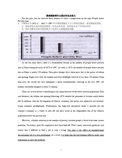
图表图画类作文课后作业及范文一、For this part, you are allowed thirty minutes to write a composition on the topic People below Poverty Line.1、下图所示为1978年,1985年1997年中国贫困线以下人口的变化情况,请先描述其变化。
2、请说明发生这些变化的原因(可从改革开放、高科技在生产中的应用等)3、你认为解决目前中国贫困人口还有什么困难或者问题。
As the bar chart shows, there is a tremendous decline in the number of people below poverty line in China during the years of 1978 to 1997. As early as 1978, the number of people below poverty line in China is nearly 250 million. Then great changes have taken place due to the policy of reform and opening. Eight years later, the number had been strikingly reduced to less than 150 million. From then now, the society has also undergone a major transformation. Arriving in the year 1997, the number incredibly dropped to about 25 million.There are several factors contributing to the sharp decrease of the below-poverty population. First and foremost, the reform and opening following 1978 enabled the peasants to become much better off. In addition, with the development of Chinese economy, that policy also improved city dwellers' living standards prodigiously. Furthermore, the high-tech introduced made it possible for the country's economy as a whole to take off. All these result in the stupendous fall of the Chinese population below the poverty line.However, a further reduction in the number of poverty-stricken people is faced with some serious problems. Nowadays, quite few employees have been laid off. What’s more, university graduates also realize that it difficult to find a job to earn a living. Not only is the effect of unemployment discouraging, but it is also challenging. As a result, it is high time that government officers made some regulations to solve the problem.二. Study the following tale carefully and write an essay of at least 150 wordsYou essay should meet the requirements below1.Changes in people’s daily expenses in the past five years2.Give possible reasons for the changes3.Draw my own conclusions.In the past five years, there have been great changes in people’s daily expenses I XX city. According to the figures given in the table, the amount of money spent on food decreased gradually, accounting for 35 percent in 1998. However, there was a rapid increase in clothing expenses, which made up 17% in 1998. In addition the table shows an upward tendency in recreation expenses. The same was the case with other expenses.What case these remarkable changes? In my opinion, it can be attributed to the following reasons:(也可以It is to the credit of the following reasons:)。
图画图表英语作文
图画图表英语作文Here's an example of an English essay on pictures and charts:Pictures can be really helpful in explaining things. They give a visual representation of ideas that might be hard to understand just from words. For instance, when learning about the different parts of a plant, a diagram showing the roots, stem, leaves, and flowers makes it much easier to grasp.Charts, on the other hand, are great for showing data and comparing things. Whether it's sales figures for a business or the temperature changes over a year, charts make it simple to spot trends and patterns. I like bar charts because they make it easy to compare different categories.But sometimes, pictures can be misleading. You know, those infographics on social media that are supposed totell you something important? Sometimes they're notentirely accurate or they leave out important details. So, it's always good to check the source and do some research before believing everything you see.Charts can be kind of boring, though. Like, when you're studying for a test and you have to memorize all those numbers and percentages, it can get a bit overwhelming. But I've found that if I make my own charts or draw them out, it。
干货英语作文图表类范例
干货英语作文图表类范例(一)饼图模板Since______(背景介绍), Beijing has made remarkable results in attracting foreign business. According to the pie chart, the investors in different enterprises come from______(来源地区). _____(第一个地区的)investment ranks first, accounting for______(具体所占比例. _____(第二个地区的)investment makes up______(具体所占比例), putting it in second spot. The third is______(第三个地区)at_____(具体所占比例).It is generally believed that______(观点立场). In the first place, ____(第一个原因). Secondly, _____(第二个原因). Finally, _____(第三个原因). Therefore,______(结论).As far as______(讨论内容)are concerned, I think we can improve it as follows. On the one hand,_____(一方面建议). On the other hand,_____(另一方面建议).中文翻译自从______(背景介绍),北京在吸引外资方面已经做出了显著成果。
根据饼图来看,不同企业的投资者来自于_____(来源地区)。
______(第一个地区的)投资居于第一,占了_____(具体所占比例)。
______(第二个地区的)投资占总比的_____(具体所占比例),使其处于第二的位置。
第三名是_____(第三个地区),有_____(具体所占比例)。
图片图表英文作文
图片图表英文作文1. The first graph shows the population growth in different countries over the past decade. As we can see, China has the largest population, followed by India and the United States. It's interesting to note that while some countries have experienced steady growth, others have seen a decline in their population. This could be due to factors such as birth rates, immigration, and government policies.2. Moving on to the second chart, it illustrates the percentage of renewable energy sources used in different countries. It's clear that some countries have made significant progress in transitioning to renewable energy, while others still heavily rely on fossil fuels. This could be attributed to factors such as natural resources, government incentives, and public awareness. It's crucial for countries to continue investing in renewable energy to combat climate change and ensure a sustainable future.3. Now let's turn our attention to the third diagram,which displays the distribution of income among different social classes. It's evident that there is a significant wealth gap in many countries, with the top few percent of the population owning a majority of the wealth. This inequality can have detrimental effects on society, leading to social unrest and economic instability. Governments should implement policies that promote equal opportunities and redistribute wealth to create a more balanced society.4. Next, we have a bar graph depicting the average life expectancy in various countries. It's remarkable to see the disparities between different nations. Factors such as healthcare systems, access to clean water and sanitation, and lifestyle choices can contribute to these differences.It's important for governments to prioritize public health and implement measures to improve the overall well-being of their citizens.5. Lastly, we have a pie chart showing the distribution of global internet users by region. It's evident that Asia has the largest share, followed by Europe and North America. This reflects the growing importance of the internet in ourdaily lives and its potential for economic and social development. However, it's crucial to bridge the digital divide and ensure that everyone has access to the internet, regardless of their geographical location or socio-economic status.In conclusion, these visual representations provide valuable insights into various aspects of our world, from population growth to renewable energy usage, income inequality, life expectancy, and internet usage. By analyzing and understanding these trends, we can make informed decisions and work towards creating a more equitable and sustainable future.。
图表及图画阐释类作文英语大一
图表及图画阐释类作文英语大一The chart below illustrates the changes in mobile phone usage among teenagers in the past five years. It is evident that there has been a significant increase in the number of hours teenagers spend on their mobile phones daily.In 2018, the average time spent on mobile phones by teenagers was approximately 1.5 hours per day. However, this figure rose to 2.5 hours in 2019, indicating a substantial increase of one hour. By 2020, the average time had escalated to 3.5 hours, and it continued to rise in the following years, reaching a peak of 4.5 hours in 2022.Several factors contribute to this trend. Firstly, the widespread availability of smartphones has made it easier for teenagers to access the internet and various social media platforms. Secondly, the COVID-19 pandemic has accelerated the shift to online learning, which requires the use of mobile phones for remote classes and schoolwork. Lastly, the rise of mobile gaming and streaming services has made phones more entertaining, leading to longer usage times.The implications of this trend are multifaceted. On the one hand, increased mobile phone usage can lead to improved communication and access to information. On theother hand, it may also result in negative consequences such as decreased physical activity, sleep disturbances, and potential addiction to social media.In conclusion, the chart clearly demonstrates the rising trend of mobile phone usage among teenagers. It is crucial for parents, educators, and policymakers to address this issue and promote a balanced approach to technology consumption.中文翻译:下面的图表展示了过去五年内青少年手机使用的变化情况。
- 1、下载文档前请自行甄别文档内容的完整性,平台不提供额外的编辑、内容补充、找答案等附加服务。
- 2、"仅部分预览"的文档,不可在线预览部分如存在完整性等问题,可反馈申请退款(可完整预览的文档不适用该条件!)。
- 3、如文档侵犯您的权益,请联系客服反馈,我们会尽快为您处理(人工客服工作时间:9:00-18:30)。
图表图画类作文课后作业及范文一、For this part, you are allowed thirty minutes to write a composition on the topic People below Poverty Line.1、下图所示为1978年,1985年1997年中国贫困线以下人口的变化情况,请先描述其变化。
2、请说明发生这些变化的原因(可从改革开放、高科技在生产中的应用等)3、你认为解决目前中国贫困人口还有什么困难或者问题。
As the bar chart shows, there is a tremendous decline in the number of people below poverty line in China during the years of 1978 to 1997. As early as 1978, the number of people below poverty line in China is nearly 250 million. Then great changes have taken place due to the policy of reform and opening. Eight years later, the number had been strikingly reduced to less than 150 million. From then now, the society has also undergone a major transformation. Arriving in the year 1997, the number incredibly dropped to about 25 million.There are several factors contributing to the sharp decrease of the below-poverty population. First and foremost, the reform and opening following 1978 enabled the peasants to become much better off. In addition, with the development of Chinese economy, that policy also improved city dwellers' living standards prodigiously. Furthermore, the high-tech introduced made it possible for the country's economy as a whole to take off. All these result in the stupendous fall of the Chinese population below the poverty line.However, a further reduction in the number of poverty-stricken people is faced with some serious problems. Nowadays, quite few employees have been laid off. What’s more, university graduates also realize that it difficult to find a job to earn a living. Not only is the effect of unemployment discouraging, but it is also challenging. As a result, it is high time that government officers made some regulations to solve the problem.二. Study the following tale carefully and write an essay of at least 150 wordsYou essay should meet the requirements below1.Changes in people’s daily expenses in the past five years2.Give possible reasons for the changes3.Draw my own conclusions.In the past five years, there have been great changes in people’s daily expenses I XX city. According to the figures given in the table, the amount of money spent on food decreased gradually, accounting for 35 percent in 1998. However, there was a rapid increase in clothing expenses, which made up 17% in 1998. In addition the table shows an upward tendency in recreation expenses. The same was the case with other expenses.What case these remarkable changes? In my opinion, it can be attributed to the following reasons:(也可以It is to the credit of the following reasons:)。
To begin with, with the rapid development of agriculture in China, the output of grain, fruit, vegetables, and milk has sharply increased, which contributes to the decline in their prices. Then, the family incomes of people both in the city and in the country have greatly risen so that people now can afford expensive clothing and some of them even want to dress in the latest fashion. Finally, as the living conditions improve, the demand for a variety o recreations is growing steadily, too.In short, with the incomes rising continuously, people are no longer reconciled to living a simple, monotonous life. They are eager to make their life interesting and exciting. Therefore, I am sure that people will spend more money on clothing and recreations.1.请根据下表用英语写一篇短文,介绍某地区5年来人们的饮食变化情况。
内容要点:1)饮食变化的情况。
2)说明人们饮食方面发生变化的原因。
3)变化说明了什么及所带来的好处。
food 2000 2001 2002 2003 2004grain 44% 44% 43% 42% 42%meat 19% 21% 23% 23% 22%Fruit and vegetable 25% 23% 21% 21% 21%milk 12% 12% 13% 14% 14%total 100% 100% 100% 100% 100%It is obvious in the table that the diet habit of the people in some area underwent dramatic changes from 2000 – 2004. The amount of grain they ate fell year by year, and at the same time they increased their consumption of milk and meat. Besides, the consumption of fruit and vegetables fell from 25% to 21%.There are two reasons for the changes. For one thing, with the increasing living standard, people are better off and can afford more expensive food of better nutrition. For another, more and more people begin to pay attention to the quality of their diet, because hey believe a balanced diet does good to their health. These changes in people’s diet shows that their living conditions improved greatly between 2000 and 2004. We are sure that they are living a happier and healthier life.From the above discussions, we have enough reason to predict what will happen in the near future. The trend described in the table will continue for quite a long time, I think.2.DIRECTIONS:A. Study the following graphs carefully and write an essay in at least 150 words.B. Your essay should cover these three points:1) effect of the country’s growing human population on its wildlife2) possible reason for the effect3) your suggestion for wildlife protection【段落类型分析】第一段第二段第三段图画/图表描述段原因阐释段建议措施段【参考范文一】From these graphs, we can draw a conclusion that, with the growth of human population, the number of species has decreased rapidly in America, and some species have even vanished from our planet.There are numerous reasons accounting for the phenomenon and I would like to explore a few of the most important ones here. Above all, as the human population grows rapidly, a growing number of people came to live where some wild species have been living. Then these species have to move to other places. Some of them probably can not adapt to the new environment and die. In addition, although many people look on the wildlife as their friends, some people may not think so. They catch a lot of wild animals and sell them in order to get more money. Consequently, the natural balance and the ecologic environment are destroyed. The clear cutting has become increasingly serious. So some of the wildlife become homeless and extinct.In order to protect the wildlife, I have some suggestions. First, the governments should make laws to prevent them from being caught and killed. Second, the governments should educate people to love nature and protect it. Third, as for ourselves, we should take practical actions to protect our living environment. (210 words)【参考范文二】The two charts show that the increase in the U.S. population has been accompanied by a corresponding decline in the number of wildlife species. Far too many species have been lost already. This poses a danger to the ecological balance.As the human population expands, wild animals in mounting numbers are hunted for food, or because they are thought to present a threat to man. But studies show that one of the primary causes of the disappearance of wildlife is pollution, which is one of the consequences of population growth and economic development. This makes us wonder if men are able to share this planet in harmony with other life forms.In my opinion, it is imperative for us to take steps to reverse the disturbing trend illustrated in the charts. One measure would be to forbid the building of cities in areas where wild life is threatened with extinction. But, more importantly, men must learn to stop polluting the environment, or he himselfwill be extinct. (167 words)【参考范文三】As is seen from the two graphs, it is clear that with the rapid growth of U.S. population from 1800 to 1990, the number of its wildlife species no longer existing soared during the same period. Naturally, we can draw the conclusion that the sharp decline of wildlife species resulted from the population growth.Several reasons may account for this phenomenon. To begin with, as the population grows, people consume much more natural resources. Second, with the increase of human activities, modern people take up more and more space which exerts a great influence on other species. Finally, the problem of pollution becomes more and more serious with the development of modern industry. More and more animals have to adapt themselves to the decaying environment or move to a totally different place, but not all of them are fortunate enough to survive the changes.Solving this problem calls for, above all, the government’s efforts to control population growth, to decrease industrial pollution and to enhance the laws to forbid wildlife hunting. Moreover, common citizens should be aware of this ecological crisis and take on the responsibility of wildlife protection. In a word, only when the government and the common people make joint efforts can we hope to find a satisfactory solution to this problem. (216 words)考研英语作文范文(图表提纲式作文) 2Directions: Study the following graphs carefully and write an essay of about 200 words within 40 minutes. Your essay must meet the requirements below.1. Write out the message conveyed by the graph.2. Make an analysis of the strange phenomenon3. Give your comments正如上面两张曲线图所示,从1990年到1995年蛋类的平均价格不断上升,并且其需求量也相应增加。