雅思写作 小作文PART1 图表题
雅思作文图表题范文
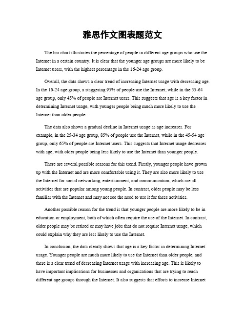
雅思作文图表题范文The bar chart illustrates the percentage of people in different age groups who use the Internet in a certain country. It is clear that the younger age groups are more likely to be Internet users, with the highest percentage in the 16-24 age group.Overall, the data shows a clear trend of increasing Internet usage with decreasing age. In the 16-24 age group, a staggering 95% of people use the Internet, while in the 55-64 age group, only 45% of people are Internet users. This suggests that age is a key factor in determining Internet usage, with younger people being much more likely to use the Internet than older people.The data also shows a gradual decline in Internet usage as age increases. For example, in the 25-34 age group, 85% of people use the Internet, while in the 45-54 age group, only 65% of people are Internet users. This suggests that Internet usage decreases with age, with older people being less likely to use the Internet than younger people.There are several possible reasons for this trend. Firstly, younger people have grown up with the Internet and are more comfortable using it. They are also more likely to use the Internet for social networking, entertainment, and communication, which are all activities that are popular among young people. In contrast, older people may be less familiar with the Internet and may not see the need to use it for these activities.Another possible reason for the trend is that younger people are more likely to be in education or employment, both of which often require the use of the Internet. In contrast, older people may be retired or may have jobs that do not require Internet usage, which could explain why they are less likely to use the Internet.In conclusion, the data clearly shows that age is a key factor in determining Internet usage. Younger people are much more likely to use the Internet than older people, and there is a clear trend of decreasing Internet usage with increasing age. This is likely to have important implications for businesses and organizations that are trying to reach different age groups through the Internet. It also suggests that efforts to increase Internetusage among older people may be needed in order to bridge the digital divide between different age groups.。
雅思作文图表题范文(热门3篇)

雅思作文图表题范文第1篇It is said that countries are becoming similar to each other because of the global spread of the same products, which are now available for purchase almost anywhere. I strongly believe that this modern development is largely detrimental to culture and traditions worldwide.A country’s history, language and ethos are all inextricably bound up in its manufactured artefacts. If the relentless advance of international brands into every corner of the world continues, these bland packages might one day completely oust the traditional objects of a nation, which would be a loss of richness and diversity in the world, as well as the sad disappearance of the manifestations of a place’s character. What would a Japanese tea ceremony be without its specially crafted teapot, or a Fijian kava ritual without its bowl made from a certain type of tree bark?Let us not forget either that traditional products, whether these be medicines, cosmetics, toy, clothes, utensils or food, provide employment for local people. The spread of multinational products can often bring in its wake a loss of jobs, as people urn to buying the new brand, perhaps thinking it more glamorous than the one they are used to. This eventually puts old-school craftspeople out of work.Finally, tourism numbers may also be affected, as travelers become disillusioned with finding every place just the same as the one they visited previously. To see the same products in shops the world over is boring, and does not impel visitors to open their wallets in the same way that trinkets or souvenirs unique to the particular area too.Some may argue that all people are entitled to have access to the same products, but I say that local objects suit local conditions best, and that faceless uniformity worldwide is an unwelcome and dreary prospect.Heres my full answer:The line graphs show the average monthly amount that parents in Britain spent on their children’s sporting activities and the number of British children who took part in three different sports from 2008 to is clear that parents spent more money each year on their children’s participation in sports over the six-year period. In terms of the number of children taking part, football was significantly more popular than athletics and 2008, British parents spent an average of around £20 per month on their children’s sporting activities. Parents’ spending on children’s sports increased gradually over the following six years, and by 2014 the average monthly amount had risen to just over £ at participation numbers, in 2008 approximately 8 million British children played football, while only 2 million children were enrolled in swimming clubs and less than 1 million practised athletics. The figures for football participation remained relatively stable over the following 6 years. By contrast, participation in swimming almost doubled, to nearly 4 million children, and there was a near fivefold increase in the number of children doing athletics.剑桥雅思6test1大作文范文,剑桥雅思6test1大作文task2高分范文+真题答案实感。
雅思写作Task1饼状图考官范文(4)

雅思写作Task1饼状图考官范文(4)The table below shows CO2 emissions for different forms of transport in the European Union. The Pie Chart shows the percentage of European Union funds being spent on different forms of transport.Write a report for a university lecturer describing the information in the graph below.Sample Answer:The given graphs provide information on the amount of Carbon dioxide emission per person from different vehicles in the European Union and also show the expenditures on different modes of transportations. As is observed from the given illustration, the highest amount of CO2 per person is emitted by the Air transports and European Union spends highest percentage of funds for the road transportation system.According to the bar graph, a single passenger of a personal cars emit around 130 gm of CO2 per kilometer while a passenger in a bus contribute to 65 gm of emission per kilometer. Coaches, maritime and rail passengers emit the lowest amount of CO2which is about 50 grams per passenger in a kilometer. Finally a single passenger of airplane contributes to 370 km of CO2 per kilo which is the highest amount of CO2 emission among the given transportations.Based on the pie chart, the European Union spent the highest amount (52%) on the road transportation system while spent only 1% or 2% on ports, waterway airport intermodal and other transport systems. They spent 31% on rail system and 10% on public transportation system. This indicates the European Union spent the majority of the budget on public transportations.In summary, Airplanes and personal car using passengers per person cause more CO2 emission than other mode of public transportation and European Union spend more on road and railways than other mode of transports.(Approximately 238 words)( This model answer can be followed as an example of a very good answer. However, please note that this is just one example out of many possible approaches.)。
雅思小作文之图表作文
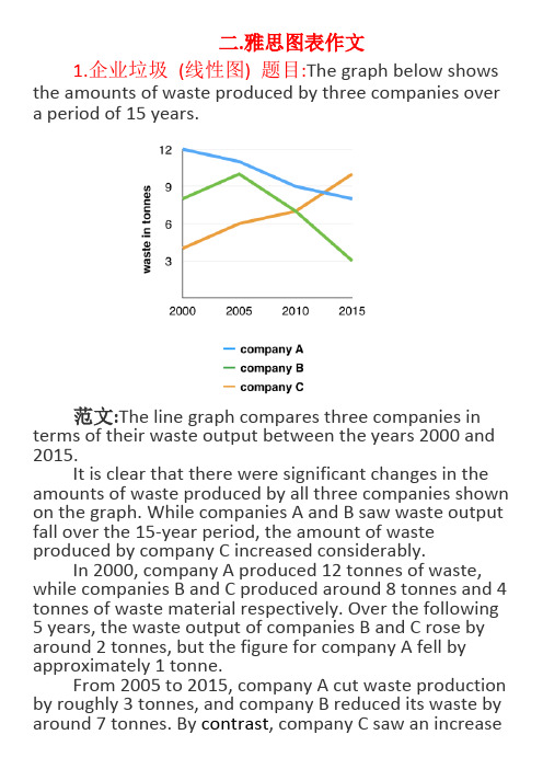
二.雅思图表作文1.企业垃圾(线性图) 题目:The graph below shows the amounts of waste produced by three companies over a period of 15 years.范文:The line graph compares three companies in terms of their waste output between the years 2000 and 2015.It is clear that there were significant changes in the amounts of waste produced by all three companies shown on the graph. While companies A and B saw waste output fall over the 15-year period, the amount of waste produced by company C increased considerably.In 2000, company A produced 12 tonnes of waste, while companies B and C produced around 8 tonnes and 4 tonnes of waste material respectively. Over the following 5 years, the waste output of companies B and C rose by around 2 tonnes, but the figure for company A fell by approximately 1 tonne.From 2005 to 2015, company A cut waste production by roughly 3 tonnes, and company B reduced its waste by around 7 tonnes. By contrast, company C saw an increasein waste production of approximately 4 tonnes over the same 10-year period. By 2015, company C’s waste output had risen to 10 tonnes, while the respective amounts of waste from companies A and B had dropped to 8 tonnes and only 3 tonnes.(192 words, band 9)这条线图对三家公司的废物产出从2000年到2015年进行了比较。
雅思写作八分经典范文背诵:图表作文
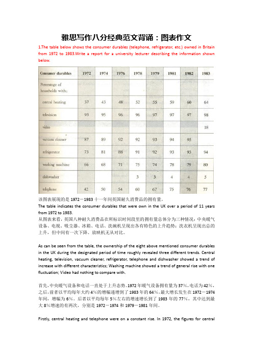
雅思写作八分经典范文背诵:图表作文1.The table below shows the consumer durables (telephone, refrigerator, etc.) owned in Britain from 1972 to 1983.Write a report for a university lecturer describing the information shown below.该图表展现的是1972-1983十一年间英国耐久消费品的拥有量。
The table indicates the consumer durables that were own in the UK over a period of 11 years from 1972 to 1983.从图表来看,英国八种耐久消费品在所标识时间段里的拥有量总体分为三种情况:中央暖气设备、电视、吸尘器、冰箱、电话、洗碗机呈现出各有特色的上升趋势;洗衣机呈现出总的上升,但中间有一次下降、放映机无从对比。
As can be seen from the table, the ownership of the eight above mentioned consumer durables in the UK during the designated period of time roughly revealed three different trends. Central heating, television, vacuum cleaner, refrigerator, telephone and dishwasher showed a trend of increase with different characteristics; Washing machine showed a trend of general rise with one fluctuation; Video had nothing to compare with.首先,中央暖气设备和电话一直处于上升态势。
雅思图表小作文详解解析

Writing the main body
1. Selecting important information 2. Grouping information 3. Comparing and contrasting data N: 1)Word selection and variation 2) Time description 3) Coherence and cohesion 4) Fixed / standard expressions
Part 2: Structure Planning
两段: 1. 描写实线的走向,实线由三段组成, 故第一段由三部分构成; 2. 描写虚线的走向, 虚线由四段组成,因此第二段应由四部分构成。
两种方案: 1. 按照Office Grade的高低来进行逐级描述,从Office Grade E 到Office Grade A,共分成五个小段,每段中进行男女员工的 人数比较; 2. 按照浅色柱和深色柱来分别进行描述,共分两大段,每段中 进行Office Grade 的相互比较。
1. The company’s earnings decreased by nearly $50 million between 1970 and 1980. 2. They hit a low point at $25 million in 1980. 3.There was a steady increase in earnings until the year 1990. 4. The company earned just above $50 million in 1990. 5. The earnings decreased over the next five years to $50 million in 1995. 6. Over the next nine years the earnings rose. 7. The earnings first rose slowly. 8.The earnings then rose dramatically. 9. They exceeded $100 million in 2004.
雅思图表小作文详解解析
Sample 3 Many women want or need to continue working even after they have children. The charts below show the working patterns of mothers with young children to care for. Step 1: examine the number of charts and their connections Step 2: observe the representation of each division Step 3: observe the percentage of different divisions in each pie chart and compare the differences among different pie charts
Describing Charts
Strategies and Techniques
Lesson Core
Task analysis Structure planning
Chart description Introduction Main body Conclusion
Part 1: Task Analysis
Sample 2 The graph shows the percentage of men and women employed in executive positions in ACME Oil Company from July 1993 to June 1994.
Step 1: observe x-axis and y-axis Step 2: examine the representations of different graphs Step 3: observe the trend, including the highest point and the lowest point
雅思写作Task1曲线图考官范文(6)
雅思写作Task1曲线图考官范文(6)The chart below shows the amount of money per week spent on fast foods in Britain. The graph shows the trends in consumption of fast foods.Write a report for a university lecturer describing the information shown below.Sample Answer:The given graphs show data on the money spent by British people on fast food items in 1990 and also present the consumption of three fast food items over 30 years.As is presented in the bar graph, in 1990, British people with high income range spent more than 40 thousands on Hamburger per week which is higher than other fast food items. People from this income status spent only 16 thousand on Fish & Chips whilethey spent around 18 thousand on Pizza in a week. Again Hamburger was the most popular fast food item in the medium income earning people also. They spent over 30 thousand dollar on this food item while they spent only 25 thousand on Fish & Pizza and 11 thousand on Pizza. Finally among the low income group, the fish & chips was the most popular fast food item as they spend most on this item (17 thousand per week). Their expenditure of pizza was only 6 thousand per week while they spent 14 thousand per week on hamburger.According to the line graph, people consume pizza more than any other fast food items in 1970. In this year UK citizens consumed more than 300 tons of pizza while the consumed only 100 tons of hamburger and fish & chips. The percentage of pizza consumption started declining and reached to only 200 tons on 1990. On the contrary, the popularity of the fish and chips reached to 500 tons in 1990 from the initial consumption volume of 80 tons. Finally the consumption of hamburger also increased over the year and reached to around 300 tons in 1990 from the initial amount of 20 tons.(Approximately 280 words)。
雅思小作文---TASK1图表题

雅思小作文 T A S K 1 图表题规律注意事项:1 . Task1 是客观写作,要求客观真实。
2 . 客观性:不应该有任何图里没有而靠自己主观想象加入的成分。
结尾段针对图形做出的总结性结论也应该是根据图表的实际内容做出的符合逻辑的总结。
准确性:图表里面的数据介绍要力求精确,不能抄错数字。
但当一个特征点没有落在一个准确的坐标值上时,允许进行合理的目测或估计一个大概数值。
详尽性:要有层次感,并不需要把所有的数字都推到文章里。
3 . 类型Table 表格题Line Graph 线图Bar Chart 柱状图Pie Chart 饼状图Process Chart 流程图4 . 看图要注意单位,标题和图例。
5 . 对于多数小作文题,题中给出了几个图就对应的写出几个主体段。
题目里只给出一个图,根据图中包含几类图形元素写几个主体段。
图中只给了一个图,但图中所含图形元素很多,则分类。
题目中出现多线多柱多饼,用“对应提取法“,把每组里的对应元素提出来组织主体段。
6 . 时态和发生时间意义对应。
陈述永恒事实的句型,其主句的谓语动词必定用一般现在时。
若题目里没有出现时间,则全文都使用一般现在时。
7 . 结构开头段(1~2句)改写原题主体段1 总体概括具体介绍数字主体段N 总体概括具体介绍数字结尾段(1~2句)介绍总数(若图里并没有明确的给出总数,则省略)结论(根据图里的数据得出有一定合理性的结论)8 . 开头段的改写题目中ShowProportion InformationThe number/amount of FamilyMalesFemaleInfluence改写成illustrate /compare percentagedatathe figure for householdmenwomenaffect/effectCategories kinds/typesSubway system Storeunderground railway/train system shop9 . 介绍数据或描述变化趋势的常用词。
【表格】剑桥雅思真题小作文题目分类总结48
【关键字】表格题型1——Table(表格)Cambridge IELTS 4TEST 1:The table below shows the proportion of different categories of families living in poverty in Australia in 1999.Summarise the information by selecting and reporting the main features, and make comparisons where relevant.Cambridge IELTS 5TEST 4:The table below gives information about the underground railway systems in six cities.Summarise the information by selecting and reporting the main features, and make comparisons where relevant.Cambridge IELTS 6TEST 2:The table below gives information about changes in modes of travel in England between 1985 and 2000.Summarise the information by selecting and reporting the main features, and make comparisons where relevant.Cambridge IELTS 7TEST 1:The table below gives information on consumer spending on different items in five different countries in 2002.Summarise the information by selecting and reporting the main features, and make comparisons where relevant.题型2——Line Graph(线性图)Cambridge IELTS 5TEST 1:The graph blew shows the proportion of the population aged 65 and over between 1940 and 2040 in three different countries.Summaries the information by selecting and reporting the main features, and make comparisons where relevant.Cambridge IELTS 7TEST 2:The pargh below shows the consumption of fish and some different kinds of meat in European country between 1979 and 2004.Summarise the information by selecting and reporting the main features, and make comparisons where relevant.Cambridge IELTS 8TEST 4:The graph below shows the quantities of goods transport in the UK between 1974 and2002 by four different modes of transport.Summarise the information by selecting and reporting the main features and make comparisons where relevant.题型3——Bar Chart(条形图/柱状图)Cambridge IELTS 4TEST 3:The chart below shows the different levels of post-school qualifications in Australia and the proportion of men and women who held them in 1999.Summaries the information by selecting and reporting the main features, and make comparisons where relevant.Cambridge IELTS 5TEST 2:The charts below show the main reasons for study among students of different age groups and amount of support they received from employers.Summarise the information by selecting and reporting the main features, and make comparisons where relevant.Cambridge IELTS 6TEST 4:The charts below give information about USA marriage and divorce rates between 1970 and 2000, and the marital status of adult America in two of the years. Summarise the information by selecting and reporting the main features, and make comparisons where relevant.Cambridge IELTS 7TEST 3:The chart below shows information about changes in average house prices in five different cities between 1990 and 2002 compared with average house prices in 1989. Summaries the information by selecting and reporting the main features, and make comparisons where relevant.题型4——Pie Chart(饼图)Cambridge IELTS 7TEST 4:The pie charts below show units of electricity production by fuel source in Australia and France in 1980 and 2000.Summarise the information by selecting and reporting the main features, and make comparisons where relevant.Cambridge IELTS 8TEST 2:The three pie charts below show the changes in annual spending by a particular UK school in 1981, 1991, and 2001.Summarise the information by selecting and reporting the main features, and make comparisons where relevant.题型5——混合图Cambridge IELTS 4TEST 2:The graph blew shows the demand electricity in Engliand during typical days in winter and summer.The pie chart shows how electricity is used in an average English home.Summarise the information by selecting and reporting the main features and make comparisions where ralevant.Cambridge IELTS 4TEST 4:The charts below give information about travel to and from the UK, and about the most popular countries from UK residents to visit.Summarise the information by selecting and reporting the main features, and make comparisons where relevant.Cambridge IELTS 6TEST 1:The graph and table below give information about water use worldwide and water consumption in two different countries.Summarise the information by selecting and reporting the main features, and make comparisons where relevant.Cambridge IELTS 8TEST 1:The pie chart below shows the main reasons why agricultural land becomes less productive. The table shows how these causes affected three regions of the world during the 1990s.Summarise the information by selecting and reporting the main features, and make comparisons where relevant题型6——Process Diagram(流程图)Cambridge IELTS 6TEST 3:The diagrams below show the life cycle of the silkworm and the stages in the production of silk cloth.Summarise the information by selecting and reporting the main features, and make comparisons where relevant.Cambridge IELTS 8TEST 3:The diagrams below show the stages and equipment used in the cement-making process, and how cement is used to produce concrete for building purpose. Summaries the information by selecting and reporting the main features, and make comparisons where relevant.题型7——Map(地图题)Cambridge IELTS 5TEST 3:The map below is of the town of Garlsdon. A new supermarket(s) is planned for thetown. The map shows two possible sites for the supermarket.Summarise the information by selecting and reporting the main features, and make comparisons where relevant.此文档是由网络收集并进行重新排版整理.word可编辑版本!。
雅思写作_小作文PART1_图表题
Peak at,reach the peak at Reach the bottom at
Stand at, amount to
占多少比例
Account for, represent
超过
Exceed, surpass, overtake
Sharp, rapid, dramatic, drastic Gradual, continuous, steady Significant, noticeable Slight, minimal Approximately, just over, just
Thoroughness (no need to cover all numbers, instead, pick the most key ones)
Eg1: the graph below shows radio and television audiences throughout the day in 1992.
Summarize the information by selecting and reporting the main features, and make comparisons where relevant.
The following table gives statistics showing the aspects of quality of life in five countries.
, rise (?), grow (grew) Jump ( jumped), soar (soared) Decline, decrease, drop, dip plummet
Fluctuate between A and B Level off at, remain stable at
雅思小作文静态图表必备
上海环球雅思老师于君星今天为大家带来的是雅思小作文中静态图表必备考点解析。
雅思A 类小作文的图标题其实是非常有用的,对考生之后出国留学过程中,大家写论文的时候是经常会碰到的。
所以说能写得一手好图标解析的小作文是有很大的作用的。
一、何为静态图静态图表可以为所呈现的信息,只有不同数据之间的对比,无时间变化的图表。
主要常见的静态图可以分为:柱状图,饼状图,表格以及对比式的地图题。
二、静态图表的例题解析(一)图表You may spend about 20 minutes on this task.The chart below shows the different levels of post-school qualification in Australia and the proportion of men and women who held them in 1999.Summarise the information by selecting and reporting the main features, and make comparisons if necessary.You should write about 150 words.(二)范文分析1、Part 1: IntroductionThe bar chart here reflects 5 different levels of post-school qualifications as well as the proportion of qualification-holders according to gender in Australia in 1999.(1)表示开头段介绍句的句型The bar chart here reflects 5 different levels of post-school qualifications as well as the proportion of qualification-holders according to gender in Australia in 1999.(2)该句可以做成句型:The 图表名称+(given/here/provided)+describe/demonstrate/depict/ details/ display/ illustrate/ indicate/ represent/reflect............(3)该句可以改写成:Given in the 图表名称is the information/are figures regarding/concerning/about/on............A glance at the + 图表名称+provided/here/given + reveals/indicates.........2、Part 2: Main BodyMain Body 1:Apparently, there is a striking/remarkable contrast/gap in the proportion of both genders who attained skilled vocational diploma. More precisely, men in this level reached/accounted for 90%, +,which is nine times as much as their female counterparts., and women’s percentage was only 10%., nine times as much as females.+ What should be emphasized is that both data ranked the most and the least among five level. (1)主体段落开头必备副词clearly, .../ obviously, .../ apparently, .../ evidently, ...短语:According to the table/data, .......In accordance with the table/data, .....That从句:It can be seen from the + 图表+that ......We can see from the + 图表+that ......It appears from the data that ......It indicates from the table that.......As从句:As we can see from the data/table, ......As we can see from the data/ table, .......As is reflected in the table, ......(2)主体段落写作必备表示平级/倍数/比值关系的句型men in this level reached/accounted for 90%, which is nine times as much as their female counterparts.该句可以做成句型:A + be +(表示倍数或比值的数字)+as +形容词的平级+as B其他变通例句:Canada received/had/welcomed more than twice/half as many foreign visitors as Mexico.The number of visitors to these two countries from both UK and USA was the same/similar. North America (16% of the area and 8% of the population) and South America (12% of the area and 5.5% of the population) have populations equal to about half of what has been expected.Main Body 2However, /Conversely,/on the other hand, the percentage of females was somewhere 65% and 55% (respectively) at the level of undergraduate diploma and Bachelor’s degree, It should deserve mentioning that the highest females’percentage and the lowest males’percentage occurred at the level undergraduate diploma.表示比较级的句型the percentage of females was somewhere 65% and 55% (respectively) at the level of undergraduate diploma and Bachelor's degree, +说法1:surpassing/ outweighing/exceeding that of males (approximately 35% and 45%).+说法2:, both of which were (30% and 20%)higher than that of males by (30% and 20%).+说法3 , with males’30% and 20% lower.其他例句:France received a larger total number of foreign visitors than any of the other countries on the list. Africa's population is about a third smaller than what would be expected (20% of the area and 13% of the population).Also is the fact that men are far more likely to offend than women.Also more popular in 1995 was talking with friends, at 26% compared to 21% a decade earlier/aprevious decade.As can be see from the chart, the car was a much less popular household item in the 1960s than it is today.表示最高级的句型What should be emphasized is that both data ranked the most and the least among five level.It should deserve mentioning that the highest females’percentage and the lowest males’percentage occurred at the level undergraduate diploma.其他最高级句型:Europe is the second densest continent, occupied 7% of areas and 12% of population in the world. (会改写一下吗?)Asia has the largest percentage of the total land area (30%) and Oceania has the least (6%).The sparest continent is Oceania, which has 6% of area and 0.5% of population.Asia is the largest continent in terms of both area (30%) and population (61%).It is noticeable that Middle East produced the biggest amount of oil (22.2 million barrels), which was nearly five times of the amount of the daily oil consumption.Clearly, watching TV was the number one leisure activity/the most popular/was the most favored/enjoyed the greatest popularity/was the most widely enjoyed in both years, at 32% in 1985 and a slightly lower 30% in 1995.Watching TV was regarded/rated as the most enjoyed/favored/preferred in both years. However, by 1995 this figure stood at 27%---the second highest overall.It can be seen from the third chart that actions games were by far the best selling genre, constituting 42% of the electronic game sales in Korea.Finally, Egypt is where the most striking gender difference is found.Main Body 3:What is interesting, at the higher level, the percentage of males who got postgraduate diploma and Master’s degree roughly doubled that of females (75% vs. 30%, 60% vs. 40% respectively).3、Part 4: ConclusionAs can be summarized from the overall comparison, the proportion of females who possessed undergraduate diploma or Bachelor's degree is more than males’, while a reversed trend in other 3 levels is true.(1)表示结尾段的句型As can be summarized from the overall comparison, the proportion of females who possessed undergraduate diploma or Bachelor's degree is more than males’, while a reversed trend in other 3 levels is true.结尾的衔接结构还可以写成:In conclusion, ......; In summary, ……; To conclude, ……;By and large, In general=generally, overallIt can be seen that……As can be seen from……, ……It indicates that…….(2)表示数据对比总结的句型:the proportion of females who possessed undergraduate diploma or Bachelor's degree is more than males’, while a reversed trend in other 3 levels is true.还可以写成:females’proportion in terms of undergraduate diploma or Bachelor's degree is more than males’, while the trend/picture/story/situation in other 3 levels is just contrary/opposite/reverse.三、结尾小作文静态图表总体难度相对较大,这就要求考生在备考时,多加练习,充分理解静态图表中数据写作的顺序、数据对比的主次、数据信息的取舍以及句型结构的变化四个大点,并能够做到触类旁通。
Simon雅思小作文真题范文 Task 1: 柱状图

The charts below show the levels of participation in education and science in developing and industrialised countries in 1980 and 1990.范文:The three bar charts show average years of schooling, numbers of scientists and technicians, and research and development spending in developing and developed countries. Figures are given for 1980 and 1990.It is clear from the charts that the figures for developed countries are much higher than those for developing nations. Also, the charts show an overall increase in participation in education and science from 1980 to 1990.People in developing nations attended school for an average of around 3 years, withonly a slight increase in years of schooling from 1980 to 1990. On the other hand, the figure for industrialised countries rose from nearly 9 years of schooling in 1980 to nearly 11 years in 1990.From 1980 to 1990, the number of scientists and technicians in industrialised countries almost doubled to about 70 per 1000 people. Spending on research and development also saw rapid growth in these countries, reaching $350 billion in 1990. By contrast, the number of science workers in developing countries remained below 20 per 1000 people, and research spending fell from about $50 billion to only $25 billion.(187 words)。
2020雅思小作文考官范文(图表类题型)
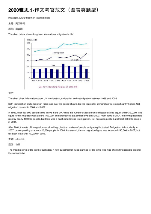
2020雅思⼩作⽂考官范⽂(图表类题型)2020雅思⼩作⽂考官范⽂(图表类题型)主题:英国移民题型:混合图The chart below shows long-term international migration in UK.范⽂:The chart gives information about UK immigration, emigration and net migration between 1999 and 2008.Both immigration and emigration rates rose over the period shown, but the figures for immigration were significantly higher. Net migration peaked in 2004 and 2007.In 1999, over 450,000 people came to live in the UK, while the number of people who emigrated stood at just under 300,000. The figure for net migration was around 160,000, and it remained at a similar level until 2003. From 1999 to 2004, the immigration rate rose by nearly 150,000 people, but there was a much smaller rise in emigration. Net migration peaked at almost 250,000 people in 2004.After 2004, the rate of immigration remained high, but the number of people emigrating fluctuated. Emigration fell suddenly in 2007, before peaking at about 420,000 people in 2008. As a result, the net migration figure rose to around 240,000 in 2007, but fell back to around 160,000 in 2008.主题:超市选址题型:地图The map below is of the town of Garlsdon. A new supermarket (S) is planned for the town. The map shows two possible sites for the supermarket.满分范⽂:The map shows two potential locations (S1 and S2) for a new supermarket in a town called Garlsdon.The main difference between the two sites is that S1 is outside the town, whereas S2 is in the center of the town. The sites can also be compared in terms of access by road or rail, and their positions relative to three smaller towns.Looking at the information in more detail, S1 is in the countryside to the north west of Garlsdon, but it is close to the residential area of the town. S2 is also close to the housing area, which surrounds the town centre.There are main roads from Hindon, Bransdon and Cransdon to Garlsdon town centre, but this is a no traffic zone, so there would be no access to S2 by car. By contrast, S1 lies on the main road to Hindon, but it would be more difficult to reach from Bransdon and Cransdon. Both supermarket sites are close to the railway that runs through Garlsdon from Hindon to Cransdon.主题:村庄变迁题型:地图The map shows the village of Chorleywood showing development between 1868 and 1994满分范⽂:The map shows the growth of a village called Chorleywood between 1868 and 1994.It is clear that the village grew as the transport infrastructure was improved. Four periods of development are shown on the map, and each of the populated areas is near to the main roads, the railway or the motorway.From 1868 to 1883, Chorleywood covered a small area next to one of the main roads. Chorleywood Park and Golf Course is now located next to this original village area. The village grew along the main road to the south between 1883 and 1922, and in 1909 a railway line was built crossing this area from west to east. Chorleywood station is in this part of the village.The expansion of Chorleywood continued to the east and west alongside the railway line until 1970. At that time, a motorway was built to the east of the village, and from 1970 to 1994, further development of the village took place around motorway intersections with the railway and one of the main roads.主题:垃圾处理题型:饼图The pie charts below show how dangerous waste products are dealt with in three countries.满分范⽂:The charts compare Korea, Sweden and the UK in terms of the methods used in each country to dispose of harmful waste.It is clear that in both the UK and Sweden, the majority of dangerous waste products are buried underground. By contrast, most hazardous materials in the Republic of Korea are recycled.Looking at the information in more detail, we can see that 82% of the UK’s dangerous waste is put into landfill sites. This disposal technique is used for 55% of the harmful waste in Sweden and only 22% of similar waste in Korea. The latter country recycles 69% of hazardous materials, which is far more than the other two nations.While 25% of Sweden's dangerous waste is recycled, the UK does not recycle at all. Instead, it dumps waste at sea or treats it chemically. These two methods are not employed in Korea or Sweden, which favour incineration for 9% and 20% of dangerous waste respectively.主题:⽔消耗题型:混合图The graph and table below give information about water use worldwide and water consumption in two different countries.满分范⽂:The charts compare the amount of water used for agriculture, industry and homes around the world, and water use in Brazil and the Democratic Republic of Congo.It is clear that global water needs rose significantly between 1900 and 2000, and that agriculture accounted for the largest proportion of water used. We can also see that water consumption was considerably higher in Brazil than in the Congo.In 1900, around 500km3 of water was used by the agriculture sector worldwide. The figures for industrial and domestic water consumption stood at around one fifth of that amount. By 2000, global water use for agriculture had increased to around3000km3, industrial water use had risen to just under half that amount, and domestic consumption had reached approximately 500km3.In the year 2000, the populations of Brazil and the Congo were 176 million and 5.2 million respectively. Water consumption per person in Brazil, at 359m3, was much higher than that in the Congo, at only 8m3, and this could be explained by the fact thatBrazil had 265 times more irrigated land.。
雅思写作task 1 饼状图 Pie Chart

P3
• In contrast, France used coal as a source for only 25 units of electricity in 1980, which was matched by natural gas. • The remaining 40 units were produced largely from oil and nuclear power, with hydro contributing only 5 units. • But by 2000 nuclear power, which was not used at all in Australia, had developed into the main source, producing almost 75% of electricity, at 126 units, while coal and oil together produced only 50 units. Other sources were no longer significant.
练习
• 女生的数量大约是男生的三倍 • The number of girls is about 3 times that of boys • The number of girls is about 3 times as high as boys • The number of girls is about twice higher than boys
写作步骤
• 先审题,在看图
• 几张饼,几种馅
• 哪个馅儿多,哪个馅儿少
• 数字,比率
整体+局部
• The following two pie charts illustrate the energy use in the U.S.A. • Write a report for a university lecturer describing the information given in the pie charts below.
雅思英语图表作文第一段模板
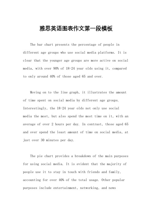
雅思英语图表作文第一段模板The bar chart presents the percentage of people in different age groups who use social media platforms. It is clear that the younger age groups are more active on social media, with over 90% of 18-24 year olds using it, compared to only around 40% of those aged 65 and over.Moving on to the line graph, it illustrates the amount of time spent on social media by different age groups. Interestingly, the 18-24 year olds not only use social media the most, but also spend the most time on it, with an average of over 2 hours per day. In contrast, those aged 65 and over spend the least amount of time on social media, at just over 30 minutes per day.The pie chart provides a breakdown of the main purposes for using social media. It is evident that the majority of people use it to stay in touch with friends and family, accounting for over 40% of the total usage. Other popular purposes include entertainment, networking, and newsconsumption.In conclusion, the data clearly shows that social media usage varies significantly across different age groups, with younger people being the most active users. Additionally, the main purposes for using social media are to connect with others and for entertainment.。
- 1、下载文档前请自行甄别文档内容的完整性,平台不提供额外的编辑、内容补充、找答案等附加服务。
- 2、"仅部分预览"的文档,不可在线预览部分如存在完整性等问题,可反馈申请退款(可完整预览的文档不适用该条件!)。
- 3、如文档侵犯您的权益,请联系客服反馈,我们会尽快为您处理(人工客服工作时间:9:00-18:30)。
The following table gives statistics showing the aspects of quality of life in five countries. Summarize the information by selecting and reporting the main features, and make comparisons where relevant.
Eg1: the graph below shows radio and television audiences throughout the day in 1992. Summarize the information by selecting and reporting the main features, and make comparisons where relevant.
Go up (went up), increase (increased) , rise (?), grow (grew) Jump (jumped), soar (soared) Decline, decrease, drop, dip plummet
Fluctuate between A and B Level off at, remain stable at
Shows, describe, illustrate, demonstrate, summarize, outline, indicate… Percentage ____ proportion Categories ____ types
Do not write “below”
Man and woman Number Information family
Proportion Respectively Make up=account for Approximate Figure Slightly Dramatically In addition
最高点,最低点
Peak at,reach the peak at Reach the bottom at
Hale Waihona Puke Stand at, amount to Account for, represent Exceed, surpass, overtake
占多少比例
超过
Sharp, rapid, dramatic, drastic Gradual, continuous, steady Significant, noticeable Slight, minimal Approximately, just over, just under respectively
图表作文 JOEY
Table 表格 Line graph 线图(直线,曲线) Bar chart 柱形图,条形图 Pie chart 饼状图 Process diagram 流程图
Objectivity (no subjective opinions) Accuracy (use around, just over, just under) Thoroughness (no need to cover all numbers, instead, pick the most key ones)
Describe the trend as a whole Or summarize how many parts in total 1.in order 2.key numbers 3.起始,终止,趋势,转折,极值, 交点,百分比
According to the, As shown in the, As can be seen from the,
Objectivity Eg: 1.subway, therefore, it is clear the most people use the subway station during the early morning and early evening rush hours. parision, in conclusion, we can see that the rate of smoking in men dropped throughout the whole period but was always at a higher level than the female figures.