图画图表作文(江苏高考)
江苏省2019高考英语第三部分写作层级训练第二步通览全局写作分类突破第五讲图“简”意“深”巧解漫画图画类
第五讲图“简”意“深”,巧解漫画、图画类写作李仕才一、题型特点图画类作文要求将画面所包含的信息转换成文字,旨在避免汉语思维,要求直接用英语思维。
它要求根据图画提供的图像信息写一篇短文,包括叙述一个故事,或通过几幅相关的图画说明某个问题或得出结论。
图画类作文就内容而言,可以写观察到的内容,也可以根据合理想象适当进行发挥来补充一些内容;就表达方式而言,可以单纯地理解、说明,也可以在说明中加以描写、叙述,因此该类文体不仅具有一定的观察分析能力,还要有较强的语言表达能力、想象力和逻辑思维能力。
写好图画类作文的关键是:一定要根据自己掌握的词汇与熟悉的句型结构构思短文内容,并直接用英语表达,千万不要先想好一句句的中文,然后逐句译成英文,那样就往往会超出自己的英语水平,作文中就会出现“生造”的英语句子,难免会出错。
另外,对于与图画无关的事要少写,还要注意人称、时态的呼应,整个作文要通篇考虑。
二、写作技巧1.写作要领(1)准确审题。
这是看图作文写作的基础。
准确审题就是注意文体、人物和时态。
(2)把握情境。
这是看图作文的关键。
要根据图画,合理想象,围绕特定的主题,把握情景,(利用图中人物间的关系、人物的对话、人物的活动及所处场所,以及图中的文字说明和标识来)提炼要点等。
(3)发表感想。
围绕主题展开合理的想象,发表自己的联想或感想。
2.具体步骤(1)认真审题首先要看题头的汉语要求或提示,通常包括:①审文体,如是要求写说明文还是记叙文;②审时态,如若是写日记用过去时;③审人称;④审要求。
(2)看懂图意把图片展示的时间、地点、人物、事件等有机地串联起来,使之成为内容连贯完整的故事或事件。
注意:文字说明和参考词汇对我们理解图画的意思非常有用。
(3)组织要点在看懂图画的基础上,最好在草稿纸上逐条列出要点,以免遗漏。
若是几幅图,要列出各图的大意,然后将所列要点用完整地道的英语句子表达出来。
(4)连句成篇首先,在理清句子之间的关系后选用恰当的关联词语,把句子连接成文。
江苏省2010届英语看图作文专项练习七篇
江苏省2010 届英语看图作文专项练习七篇2010 年江苏高考作文新增图画型作文,这种题型更能考查学生的分析问题的能力,因此深受命题者的青睐。
考生应注意认真审题,一旦审题有所偏颇,不容易得到高分。
此类作文首先要描述图画,然后介绍图画背后所反映的问题,最后联系实际发表自己的观点。
本人选编七篇时新的图画作文供你参考选用。
江苏省2010 届英语看图作文专项练习1请根据下面这幅漫画写一篇150 词左右的短文。
Ks5u 要求: 1.请阐述温室效应所产生的原因。
2. 简述其后果,应尽可能涵盖图中所有信息(至少谈及二个方面)。
3. 我们该怎幺办?These years, global warming is becoming a serious problem, endangering people’s life.Several factors contribute to the rise of temperature. First of all, a lot of greenhouse gas is produced by cars and factories; further more, the loss of forests is another cause of global warming. Ks5uGlobal warming will cause some harmful effects. In the first place, some islands will disappear because of the rise of sea level. Extreme weather will also result from global warming. When temperature rises, the production of crops will decrease. Besides, some animals and plants will disappear from the planet, thus destroying the ecosystem.Facing such a threat, we should join efforts to ‘cool’the earth, such as taking a subway or bus to work instead of driving private cars to reduce greenhousegas. All in all, we are supposed to remember it’s our responsibility to save our earth. Ks5u江苏省2010 届英语看图作文专项练习2高考是全社会关注的大事, 学校和家庭表现尤为突出。
江苏省2010届英语看图作文专项练习七篇
江苏省2010 届英语看图作文专项练习七篇2010 年江苏高考作文新增图画型作文,这种题型更能考查学生的分析问题的能力,因此深受命题者的青睐。
考生应注意认真审题,一旦审题有所偏颇,不容易得到高分。
此类作文首先要描述图画,然后介绍图画背后所反映的问题,最后联系实际发表自己的观点。
本人选编七篇时新的图画作文供你参考选用。
江苏省2010 届英语看图作文专项练习1请根据下面这幅漫画写一篇150 词左右的短文。
Ks5u 要求: 1.请阐述温室效应所产生的原因。
2. 简述其后果,应尽可能涵盖图中所有信息(至少谈及二个方面)。
3. 我们该怎幺办?These years, global warming is becoming a serious problem, endangering people’s life.Several factors contribute to the rise of temperature. First of all, a lot of greenhouse gas is produced by cars and factories; further more, the loss of forests is another cause of global warming. Ks5uGlobal warming will cause some harmful effects. In the first place, some islands will disappear because of the rise of sea level. Extreme weather will also result from global warming. When temperature rises, the production of crops will decrease. Besides, some animals and plants will disappear from the planet, thus destroying the ecosystem.Facing such a threat, we should join efforts to ‘cool’the earth, such as taking a subway or bus to work instead of driving private cars to reduce greenhouse。
(江苏专用)2020版高考英语渐进写作全辑StepThree第14讲图画类作文讲义牛津译林版

第 14 讲图画类作文解题指导图画类作文以图画和文字相联合的方式体现内容重点,其难点在于怎样将图画语言转变为逻辑语言。
只有读懂图画所包含的深刻道理才能有的放矢。
需注意以下几点:1.认真察看图画。
图画中的每一个因素对表达图画的寓意都有提示作用,注企图画中每一个因素供给的信息。
2.品尝图画文字。
图画配有的语言文字要言不烦,认真思虑这些文字所隐含的看法,使之成为弄清图画寓意的钥匙。
3.发掘深刻内涵。
图画背后隐蔽的深刻寓意才是图画要揭露的真切主题。
发掘出图画寓意是写作的重点所在。
4.适量联想发挥。
图画作文一般要求做适量的联想发挥,使上下文更好地连接。
可是要注意,必定要依据图画进行联想发挥,做到通情达理。
5.描绘虚实联合。
关于图画中的内容,要分清主次,详略适合。
6.做好连接过渡。
在适量发挥的前提下,注意连词的使用,达到水乳交融的成效。
实战操练( 一 )Each week , we provide a cartoon in need of a caption.You, the reader, submit a caption, we choose three finalists, and you vote for your favorite.Caption submissions for this week’s cartoon,by Paul Noth , must be received by Sunday,March 22nd.The finalists in the March 9th contest appear below.We will announce the winner ,and the finalists in this week’s contest, in the April6th issue.The winner receives a signed print of the cartoon.Any resident of the United States,Canada(except Quebec) ,Australia,the United Kingdom,or the Republic of Ireland aged eighteen or over can enter or vote.To do so, and to read the complete rules, visitcontest .newyorker..(, March 23)com THE NEWYORKER写作内容1.用约 30 个单词概括大赛的主要内容;2.从左边漫画下方三则图片配词中选出你最喜爱的一句,并说明原因;3.简述你对上边漫画的理解,并为之写一句图片配词。
2024届高考语文作文主题:图画理解(含解析)
2024届高考语文作文主题:图画理解1.阅读下面的材料,根据要求写作。
书法老师让同学们一起欣赏颜真卿的《三表贴》(如图),同学甲说:这副作品妙在字体结构外紧内松;同学乙说:书法作品的整体效果,有赖于个体字的大小揖让,以达到整体的和谐统一;同学丙说:真正好的作品,还要注意适当留白,以求虚实相生的效果。
以上材料给我们以怎样的启示,请结合自己的理解写一篇文章。
要求:选准角度,确定立意,明确文体,自拟标题;不要套作,不得抄袭;不得泄露个人信息;不少于800字。
2.阅读下面的材料,根据要求写作。
请整体把握漫画的内容和寓意写一篇文章,反映你的认识与评价、鉴别与取舍,体现新时代青年的思考。
要求;选好角度,确定立意,明确文体,自拟标题;不要套作,不得抄袭;不得泄露个人信息;不少于800字。
3.阅读下面的漫画材料,根据要求写一篇不少于800字的文章。
要求:结合材料的内容和寓意,选好角度,确定立意,明确文体,自拟标题;不要套作,不得抄袭;不得泄露个人信息。
4.阅读下面的图画材料,根据要求写作。
对上面的两幅漫画,你有怎样的感想?请写一篇文章表达自己的认识和思考。
要求:自拟题目,自选角度,确定立意;不要套作,不得抄袭;不得泄露个人信息;不少于800字。
5.阅读下面的材料,根据要求写作。
请整体把握漫画的内容和寓意写一篇文章,体现新时代青年的认识与思考。
要求:选好角度,确定立意,明确文体,自拟标题;不要套做,不得抄袭;不得泄露个人信息,不少于800字。
6.阅读下面的材料,根据要求写作。
(“小林漫画”作品,有改动)请结合漫画的内容和寓意写一篇文章,体现你的感悟与思考。
要求:选好角度,确定立意,明确文体,自拟标题;不要套作,不得抄袭;不得泄露个人信息;不少于800字。
参考答案:1.例文:适度留白,人生精彩欣赏颜真卿的《三表贴》时,有学生认为,真正好的作品,还要注意适当留白,以求虚实相生的效果。
留白本是传统绘画中的一种创作手法,指在进行美术创作时有意在画面中留出空白,进而渲染美的意境。
高考语文作文主题练习:画图式材料

请结合材料内容和漫画寓意写一篇文章。
5.阅读下面的漫画材料,根据要求写一篇不少于800字的文章。
要求:选准角度,确定立意,明确文体,自拟标题:不要套作,不得抄袭;不得泄露个人信息:不少于800字。
6.阅读下面的漫画,根据要求写作。
当今多元化社会,为每个人,特别是青年人的理想实现增添了无穷可能。有些人在经历不断的尝试、选择、努力后,找到自己的职业方向,也有些人在这种过程中,展现出多方面的才华,在不同领域取得成功,这些都是时代进步的表现。然而,这种环境下也容易滋生出浮躁心态,追名逐利的社会氛围让“一生择一事”显得十分“奢侈”。一段时间里,所谓“成名要趁早”,在社会上有了一定的认同。踏实认真地做小事、做一件小事的社会土壤,正日益贫瘠。
3.阅读下面的漫画,根据要求写作。
这幅漫画引发你怎样的思考与联想?请根据你的感悟与认识,联系社会生活实际,写一篇作文。
要求:选准角度,确定立意,明确文体,自拟标题;不要套作,不得抄袭;不得泄露个人信息;不少于800字。
4.阅读下面的材料与漫画,根ห้องสมุดไป่ตู้要求写一篇不少于800字的作文。
到本世纪中叶,老年人在我国总人口中占比将增至近五分之二,我国推进实现中国式现代化的过程同人口老龄化加速发展的过程相叠加,党的二十大报告强调,要“实施积极应对人口老龄化的国家战略”。老年人拥有幸福的晚年,后来人就有可期的未来。
学生可结合人生道路的选择来构思行文。比如首先亮明自己对于两种“路”的选择,指出“必须走的路”代表着现实,“想走的路”代表着理想,理想要建立于现实的根基之上。然后从为什么这样选择和错误选择会带来什么危害的角度加以论述,思考要结合当下的社会实际,赋予新时代的意蕴,对青年人的成长要有指导意义。
高考真题漫画作文及范文

高考真题漫画作文及范文第一篇:高考真题漫画作文解析高考真题中出现的漫画作文,多以社会热点话题为主题,形式则以图片的方式呈现。
学生需要结合漫画内容及背景,分析其中所蕴含的信息,并进行思考,得出自己的见解,进而完成作文。
下面以2020年河南省高考语文真题为例,对高考漫画作文进行解析。
题目:请你写一篇文章,阐述图片所反映的教育问题,并谈谈你的建议。
图片描述:一名老师把学生们塞进一个宽度不足一米的小门里,学生们脸上露出痛苦的表情,老师却毫不在意,仍在推门进入。
解析:首先,通过图片可以看出,学生们被塞进一个宽度不足一米的小门里,形象地表达了当前学生面临的班额超大问题,学生在拥挤的教室里无法得到足够的呼吸空间和灵活度,长期处于压抑状态,很容易形成心理问题。
其次,老师明知门口已经塞满学生,仍然一意孤行地要强行进入,反映出有些教师只关注自己的任务和目标,缺少对学生健康成长的关注。
面对这一问题,我们应该提出建议。
一方面,教育部门需要重视班额问题,加强教育资源的公平配置和优化,让学生能够在更宽敞、更加舒适的环境下学习和成长;另一方面,每一位教师都应该将学生的身心健康放在第一位,充分关注学生在学习中的问题,为学生提供更多的支持和帮助。
高考漫画作文不仅考察学生的语言表达能力,还要求学生在短时间内分析图片、掌握背景信息、深入思考问题并进行充分的表达,既考验了学生的语言能力,又考验了学生的思维能力和逻辑能力。
第二篇:高考真题漫画作文范文以2020年江苏省高考语文真题为例,提供一篇漫画作文范文:题目:请你就图画主题和相关问题,按以下提示写一篇文章。
图片描述:山区学校的校园一个多月没有水,学生需要放学后到几公里外的水源乘车接水。
解析:通过图片可以看出,该地区的山区学校面临缺水问题,学生们需要付出额外的辛苦才能获取足够的用水,在学习、生活中面临很大的困难。
我们应该关注缺水现象背后可能存在的原因。
一方面,由于地理位置的限制和基础设施的缺乏,一些山区学校无法顺利解决水资源问题。
高考语文作文练习:画图式材料作文
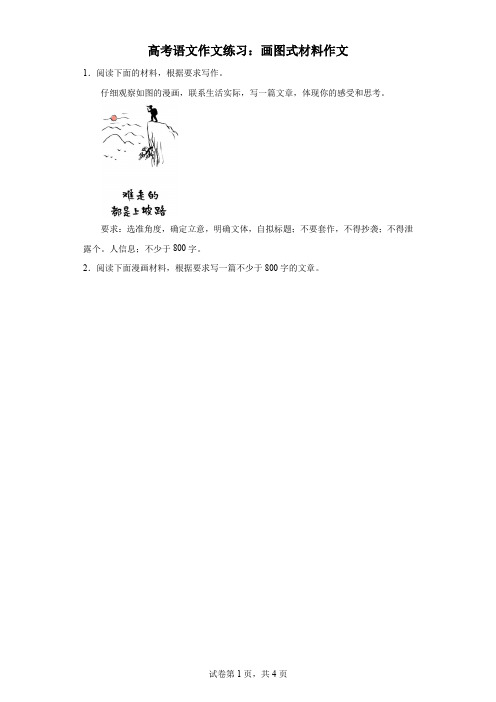
高考语文作文练习:画图式材料作文1.阅读下面的材料,根据要求写作。
仔细观察如图的漫画,联系生活实际,写一篇文章,体现你的感受和思考。
要求:选准角度,确定立意,明确文体,自拟标题;不要套作,不得抄袭;不得泄露个。
人信息;不少于800字。
2.阅读下面漫画材料,根据要求写一篇不少于800字的文章。
图中文字:晚归,德溶先生雅属,廿四年子恺画要求:结合材料的内容和寓意,选好角度,确定立意,明确文体,自拟标题;不要套作,不得抄袭;不得泄露个人信息。
3.阅读下面的材料,根据要求写作。
要求:结合材料,选好角度,确定立意,自拟标题;不要套作,不得抄袭;不得泄露个人信息;不少于800字。
4.阅读下面的材料,根据要求写作。
要求:结合材料的内容和寓意,选好角度,确定立意,明确文体,自拟标题;不要套作,不得抄袭;不少于800字。
5.阅读下面的材料,根据要求写作。
以上材料对我们颇具启示意义,请结合漫画的内容和寓意写一篇文章,体现你的感悟和思考。
要求:选准角度,确定立意,明确文体,自拟标题;不要套作,不得抄袭;不得泄露个人信息;不少于800字。
6.阅读下面的材料,根据要求写作。
图一“我的地盘我做主。
”(广告语)图二“君子和而不同,小人同而不和。
”(孔子)图三“冲出迷雾走向光明,最强大的力量是同心合力,最有效的方法是和衷共济。
”(习近平在博鳌亚洲论坛2022年年会开幕式上的主旨演讲)以上材料对你有何启示,请结合材料写一篇文章,体现你的感悟和思考。
要求:选准角度,确定立意,明确文体,自拟标题;不要套作,不得抄袭;不得泄露个人信息;不少于800字。
参考答案:1.例文:“上坡”漫浩浩,跋涉见精神人生是一个不断行走的过程,每一个生命个体都是匆匆的旅者。
行走的路上有一马平川的坦荡,有坑坑洼洼的泥泞,更有不断向天际延伸的险峻巍峨。
漫溯整个人生,我们遇到的“上坡路”要占据主体。
三种路,三种不同的行走体验。
其中,“上坡路”行走起来更充满挑战。
高考英语(江苏专用译林)大一轮复习课件:第三部分+第三讲 图画类作文+(18张)

【模拟训练】 请 你 根 据 对 下 面 这 幅 漫 画 的 理 解 , 以 “Come Back to
Reality”为题,用英语写一篇作文。
你的作文应包括以下内容: 1.简要描述漫画的内容; 2.概述你对这幅图的理解; 3.举例说明你会怎样做。 注意:1.词数150左右; 2.可参照漫画适当发挥; 3.题目和开头已为你写好,不计入总词数。
二、具体步骤 1.认真审题
首先要看题头的汉语要求或提示,通常包括:①审文体,如 是要求写说明文还是记叙文;②审时态,如若是写日记用过 去时;③审人称;④审要求。
2.看懂图意 把图片展示的时间、地点、人物、事件等有机地串联起来, 使之成为内容连贯完整的故事或事件。注意:文字说明和参 考词汇对我们理解图画的意思看图作文写作的基础。准确审题就是注意文
体、人物和时态。 2.把握情境。这是看图作文的关键。要根据图画,合理想象,
围绕特定的主题,把握情景,(利用图中人物间的关系、人 物的对话、人物的活动及所处场所,以及图中的文字说明和 标识来)提炼要点等。 3.发表感想。围绕主题展开合理的想象,发表自己的联想或感 想。
第三讲 图画类作文
【题型解读】 图画类作文要求将画面所包含的信息转换成文字,旨在避
免汉语思维,要求直接用英语思维。它要求根据图画提供的图 像信息写一篇短文,包括叙述一个故事,或通过几幅相关的图 画说明某个问题或得出结论。图画类作文就内容而言,可以写 观察到的内容,也可以根据合理想象适当进行发挥来补充一些 内容;就表达方式而言,可以单纯地理解、说明,也可以在说 明中加以描写、叙述,因此该类文体不仅具有一定的观察分析 能力,还要有较强的语言表达能力、想象力和逻辑思维能力。 写好图画类作文的关键是:一定要根据自己掌握的词汇与熟悉 的句型结构构思短文内容,并直接用英语表达,千万不要先想 好一句句的中文,然后逐句译成英文,那样就往往会超出自己 的英语水平,作文中就会出现“生造”的英语句子,难免会出 错。另外,对于与图画无关的事要少写,还要注意人称、时态 的呼应,整个作文要通篇考虑。
高考语文作文主题练习:图画式材料系列
在这个时代,很多人喜欢随大流,喜欢模仿。如果不这样的话,就会显得自己不合群,所以别人做什么,自己就跟着做什么。然而,一味的模仿只会使人平庸。走自己的路,不随波逐流,去追寻更适合自己的路,最后才能成功。
3.阅读下面的材料,根据要求写作。
请整体把握漫画的内容和寓意,结合你的实际生活,写一篇文章,反映你的认识与评价,体现你的感悟与思考。
要求:选准角度,确定立意,明确文体,自拟标题;不要套作,不得抄袭;不得泄露个人信息;不少于800字。
4.阅读下面的漫画材料,根据要求写作。
看了这幅漫画,你有什么感想?请结合这幅漫画的内容和寓意,联系实际写一篇文章。要求:书写工整;选好角度,确定立意,自拟标题;不得抄袭;不得泄露个人信息;不少于800字。
超市里人头攒动,每个人都拎着自己买的东西,到了上楼的时候,每个人都选择了电梯,而一旁的楼梯却没人走。不一会儿电梯就都挤满了人,你挤我,我挤你,随着电梯上的人越来越多,人们只好在电梯旁边排队,漫长的排队就为等一个电梯。然反观旁边的楼梯,楼梯上有一个人,两手拿着两袋东西在楼梯上爬行,不一会儿就要到达二楼了,而坐在排队苦苦等待。爬楼梯的人比坐电梯的还快呢,因此,大胆选择自己想走的路,也许就会开辟成功之路。
2024届高考语文作文主题练习:图画式材料系列
1.阅读下面的漫画材料,根据要求写作。
要求:结合材料的内容和寓意,选好角度,确定立意,明确文体,自拟标题;不要套作,不得抄袭;不得泄露个人信息;不少于800字。
2.阅读下面的材料,根据要求写作。
以上漫画引发了你怎样的联想和思考?请写一篇文章。
要求:结合材料的内容和寓意,选好角度,确定立意,明确文体,自拟标题;不要套作,不得抄袭;不得泄露个人信息;不少于800字。
(江苏专用)2020版高考英语渐进写作全辑StepThree第15讲图画类作文讲义牛津译林版

第15讲提纲类作文解题指导提纲类作文是高考试题中最为常见的书面表达命题方式之一,通常会以中文、英文、中文+英文、文字+表格、文字+图片等不同的形式给出要点,并要求考生根据所列要点组织语言,将所列要点完整、清晰地表达出来。
需要注意以下几点:1.仔细研读题目。
确定所写文章的主题、人称、时态及写作内容等。
2.分析整合要点。
对所给要点进行分析并重新整合,适当进行细节扩展。
重新整合信息是为了根据要点间的逻辑关系和相似性等将信息分为若干部分。
3.确定文章体裁。
根据题目要求及要点的特征来进一步确定文章的体裁,根据要点的逻辑关系来确定文章的整体框架和具体段落,并根据重新整合的信息来确定每个段落的具体内容。
4.斟酌具体表达。
根据要点的关键词来确定所用的具体词汇及搭配。
根据要点的内容及确立的文体特点来选择使用何种句型。
根据文体信息选择合适的句型、适时地交叉使用不同的句型。
实战演练(一)目前,越来越多的家长花巨资送孩子出国学习,某英文报社就这一问题做了调查,并开辟了专栏讨论。
请你根据所给的提示,以“On Teenagers Studying Overseas”为题用英语写一篇短文。
1.目前,很多家长都送孩子出国学习,且呈低龄化,但部分教育工作者和家长都不赞成这种做法。
2.38%的人赞成这种做法:(1)这样孩子可以接受良好的教育;(2)学好外语将来发展的机会更多等。
62%的人不赞成这种做法:(1)花钱太多,是在国内花费的10倍;(2)孩子太小,在陌生的环境中容易学坏等。
3.你的看法。
(启示:政府应该建立各类学校以适应人们的需求等。
)注意:1.文章的题目和开头已给出,不计入总词数;2.可根据内容适当发挥;3.词数150左右。
参考词汇:教育工作者educationistsOn Teenagers Studying OverseasNowadays more and more people are sending their children overseas for further study,参考范文On Teenagers Studying OverseasNowadays more and more people are sending their children overseas for further study,even at middle school age.38% of the people investigated agree to this.They think their children can receive better education and learn a foreign language as well.And they have more golden opportunities to develop themselves.What is the most valuable is to learn to depend on themselves and to broaden their horizons and improve their understanding of the world.However,over 62% of the people,especially some educationists and parents,are not in favor of this,for they think studying abroad costs over ten times as much money as in China.Besides,children are too young to take care of themselves.Many parents worry about the safety of their children.What’s more,they might follow bad examples.In my opinion,measures should be taken by the government to set up various schools and colleges to meet the needs of the people.(二)学生会做了一个关于中学生睡眠、饮食和休闲等生活习惯的调查,发现学生有不良习惯。
高考写作真题练--看图作文(教师版)-备战2021年高考英语四大“金纲”写作专项突破
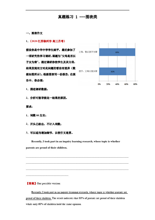
真题练习 1 ---图表类一、图表作文1.(2020·江苏徐州市·高三月考)假设你是中华中学学生姚平,最近参加了一项研究性学习调研,课题为“父母是否以子女为荣”。
通过调研你校学生及其父母,结果发现双方对此问题的看法有差异(数据如图所示)。
根据图表写一份报告,在报告中,你必须:1.描述调研数据;2.分析可能导致这一结果的原因。
要求:1.词数80左右;2.开头已给出,不计入词数;3.可以适当增加细节,以使行文连贯。
Recently, I took part in an inquiry learning research, whose topic is whether parents are proud of their children.___________________________________________________________________________ ___________________________________________________________________________ ___________________________________________________________________________ _______________________________【答案】One possible version:Recently, I took part in an inquiry learning research, whose topic is whether parents are proud of their children. The result indicates that 80% of parents are proud of their children while only 60% of children hold the same opinion.There seem to be two causes leading to the subtle difference. First, Chinese parents are too conservative to convey their feelings, which may discourage their children. Second, the current society excessively emphasizes the value of academic performance. As a result, children believe only by achieving excellent scores can they make their parents proud.To sum up, a kid could only grow into a positive adult with parents' genuine encouragement.【分析】本篇书面表达属于看图作文,要求考生以“父母是否以子女为荣”为主题,结合所给图片,写一份调查报告。
2020高考江苏二轮专题复习:专题5 考点2 图表类作文

impossible previously. Actually, it has been universally acknowledged that self-confidence is half of the success that can bring us courage to stick to what we do.
As for the solutions to this phenomenon, parents of high-income families should increase their awareness of the s evere problem of obesity and help their children develop healthy eating habits.Meanwhile, parents of low-income f amilies should and must try every means to improve the quality of their children's diets, which helps them grow healthily.
考点2 图表类作文
高考导航
考点2 图表类作文
典题引领
(2018江苏扬州高三上学期期中试题) 请仔细观察下面的图表,并按照要求用英语写一篇150词左右的文 章。 中国不同家庭收入学龄儿童与健康状况示意图
[写作提示] 本文属于图表类作文,以第三人称为主,时态主要是一般现在时。可以 根据提示将这些信息进行整理和安排,使文章衔接更自然。注意条理 清楚,结构清晰,要点全面。 [写作要点] 1.用约30个单词概述中国不同家庭收入的学龄儿童营养与健康状况 的现象; 2.分析出儿童肥胖的原因;hart shows that family income greatly affects the health problems of school-age children.With the family in
江苏省高三英语 写作专题指导 图表类作文公开课课件

句型应用3:
... accounts for % of the total ...
上网占总业余爱好的36%。 Surfing the Internet accounts for 36% . of the total hobbies . 扩展润色句子 第二受学生欢迎的活动是上网,占总业余 爱好的36%。 The second popular activity for the students. is surfing the Internet, which accounts for 36% of the total hobbies.
(pie
chart) 7%同学聚会或活
动
2% 去探望亲友
12%自主学习 或完成作业
38%在家看电视
41%上网聊天 或玩游戏
假如你受某报社的委托,对你校高流中三程个图年级学生的
近视情况做了个调查。请你根据下图三个年级各一个
班的抽样调查信息,写一篇文章,介(f绍lo相w关数据,并
分析其原因。
chart)
。 学校英文报“Happy Teens”专栏投稿
(2013江苏高考) 请根据你对以下两幅图的理解, 以"Actions Speak Louder than Words"为题,
。 用英语写一篇作文
• 参考词汇: banner (横幅) stump (树桩) • 你的作文应包括以下内容: • 1.简要描述两幅图的内容; • 2.概述你对两幅图中不同做法的理解; • 3.举例说明两幅图对你的启示。 • 注意: • 1.可参照图片适当发挥; • 2.作文词数150左右; • 3.作文中不得提及有关考生个人身份的任何 信息,如校名、人名等。
How to end a passage
高考英语二轮专题复习 图画作文提分训练(含真题,含解析)新人教版1

(一)图画作文/漫画作文Passage 1 (2011•江苏卷)右面这幅照片展现了女儿为回家的妈妈拿包的情景。
请根据你对这幅照片的理解用英语写一篇短文。
你的短文应包含以下内容:1. 描述照片内容,如情景、人物、动作等等;2. 结合自身实际,谈谈你的感想;3. 举例说明你能为家长减负做些什么。
注意:1. 可参照图中文字....及下面文章开头....所给提示,作必要的发挥想象。
2. 词数150左右。
开头已经写好,不计入总词数。
3. 作文中不得提及考生所在学校和本人姓名。
The burden of students has been a hot topic for years, but the load of parentshas received little attention, especially from their own children.【参考范文】The burden of students has been a hot topic for years, but the load of parentshas received little attention, especially from their own children.The picture shows us a touching moment when a little girl comes to greet herworking mom. Realizing her mom must be very tired after a day’s work, the girl helpsto remove the bag from her shoulder. In response, the mom kneels down to show howhappy and thankful she feels.All this reminds me of my mother who has been doing whatever she could do to letme have the best. But, totally engaged in my own study, I seldom pay attention towhat mother needs and feels, and always think studying well is the only thing I coulddo in return. Now I know I can do my bit to help with the everyday washing, bedroomcl eaning, or at least prepare breakfast myself, so as to share mother’s daily burden.The picture convinces me it is even more important to be a good daughter than a“good” student.Passage 2 (2011•湖南卷)假设你参加所在年级的英文写作比赛,请按如下要求完成一篇短文:A.简要描述下图内容,并点明主题;B.联系实际,表达该图带给你的启示。
- 1、下载文档前请自行甄别文档内容的完整性,平台不提供额外的编辑、内容补充、找答案等附加服务。
- 2、"仅部分预览"的文档,不可在线预览部分如存在完整性等问题,可反馈申请退款(可完整预览的文档不适用该条件!)。
- 3、如文档侵犯您的权益,请联系客服反馈,我们会尽快为您处理(人工客服工作时间:9:00-18:30)。
2.图表作文
“三段式”写作要点 ◆ 起始段
简要、准确描述图表内容; 揭示寓意或点明观点。
2.图表作文
◆ 拓展段 阐释寓意或对观点展开论述 方法1:现象解释(即原因分析) 方法2:观点对比(即利弊分析) 方法3:举例论证
2.图表作文
◆ 结尾段 提出自己的观点、看法、意见或建
议或预测未来。
Sample
1)表格(table)
侧重于数据排序
Grain Milk Meat vegetable
2004
49% 10% 17% 24%
2005
46% 12% 20% 22%
2006
35% 17% 27% 21%
2007
30% 20% 30% 20%
2004— 2007年人民饮食习惯变化表
2) 柱状图(Bar Graph/Chart)
Lecture of Writing
一、考核要求
➢ 四级大学英语写作考试时间均为30分钟,分值占总分 的15%。
➢ 四级要求考生写出一篇不少于120词的短文,试卷上可 能给出题目,或规定情景,或要求看图作文,或给出 段首句要求续写;或给出关键词要求写成短文。
➢ 要求能够正确表达思想,意义连贯,无重大语法错误。
First Paragraph
图表描述
As is clearly shown in the table above, from 2004 to 2007,
the amount of grain while the amount of
miniplkeohpalse'isncdrieeat sheadsbdyec1r0e%aseadnbdyth1主a9t%旨of,句
Grain Milk Meat vegetable
2004
49% 10% 17% 24%
2005
46% 12% 20% 22%
2006
35% 17% 27% 21%
2007
30% 20% 30% 20%
1.描述图表中的数据
1)要注意一些特殊数字: ◆极端数字
图表中的最大最小点值、最好最差点值、基本相同点和完 全相反点值等; ◆变化明显的数字 往往是同一类事物在不同时间或不同背景中的巨大反差。 •
2. 拟定主题句,揭示寓意或点明观点
图表作文的主题句通常放在首段,在引言/导入句之 后说明整体变化趋势,而文章也将围绕这个整体 趋势展开议论或描述。
For instance: Great changes have been taking place in people’s diet/student use of computer from 2004/1995 to 2007/ 2000. In recent years, the time students using computers has increased greatly.
有说服力的数据:首尾两端数字或其增减值。
◆以表1为例,用: The percentage of grain consump-tion(消耗) decr eased from 49 % in 1986 to 30 % in 1990.
两端数据49%和30%说明变化趋势是递减。
◆ 或者直接计算出增加值或减少值: The amount of grain in people's diet has decreased by 19%. However, the amount of milk has increased by 10% and that of meat has increased by 13%.
grain
总的变化规律:grain的消费量在减少,而milk和
meat的消费量在增加。
表2:Student Use of Computer
横向为日期(99、95、2000),纵向为大学生每 周使用计算机的时间。 柱形图清晰显示出这样一个变化特点:随着时间 的推移,大学生越来越多地使用计算机。
(3)筛选数据
Grain Milk Meat vegetable
2004
49% 10% 17% 24%
2005
46% 12% 20% 22%
2006
35% 17% 27% 21%
2007
30% 20% 30% 20%
横向比较,milk 逐年增加
m逐e年at增加
减gr少
ain
变化趋势相同,占总消费的比例在增大
纵向看, milk和比m例ea变t 化正相反
Directions: For this part you are allowed thirty minutes to write a composition on the topic Changes in People’s Diet in China . You should write at least 120 words and base your composition on the chart and the outline given below.
(a): Number of TV watchers
10
B (b): Number of film goers
0
1995 1997 1999 2001 2003 2005
近年来看电影与看电视的人数变化情况。
4)饼形图(Pie Graph/Chart)
Food drink
other 18%
57% Housing
meat has increased by 13%. From which, we can see great
changes have been taking place in people’s diet .
惯用表达和句型
1.说明图表的表达结构(如图所示): The graph shows/ points out that… 图表显示。。。 As is shown in the table, we can see/conclude that… 如图所示,我们可以看出/得出结论。。。 As can be seen in the table released/provided by the government,… We can see from the table that…; 我们可以从图表看出 According to the graph, it can be learned that 根据图表,可以知道
2.引用数据的表达结构: The statistics presented in the chart are rather convincing. 图表中所显示的数据相当具有说服力。 All these data clearly prove the fact that… 所有这些数据明显证明这一事实。 The figures lead us to the conclusion that… 这些数据得到这样的结论。 The above data can be interpreted as follows: 上面的数据可以解释如下:
1. state the changes in people’s diet in the past five years; 2. give possible reasons for the changes; 3. draw your own conclusions;
图表作文着重说明事实,常常是通过对图表中所反映的具体数据的说 明、分析、比较,对某种事物或现象的事实或变化情况等加以说明, 并提出结论或看法。因此,图表作文常常采用议论文体或说明文体的 写作方法。
侧重数据对比
%
100 80 60 40 20
1995 2000 2005
State-owned private
美国近年住房产权的变化情况
3) 曲线图(Line Graph/Chart)
侧重数据变化
100
A
90
80
70
60
50
40
Number of People (in thousands)
30 20
切忌简单地罗列图表所给出的信息。 •
2)对比分析,寻找数据的变化规律; 横向和纵向的比较:
从横向看,同一类(如事物A)数据随时间变化是升还是降, 升降的幅度多大;
从纵向看,不同类别(如事物A、B、C)的变化是相似还是 相反,从中寻找规律。
表1:Changes in People’s Diet in China
25%
other 46%
Food drink 22%
Housing 32%
侧重内部结构变化
A
B
Percentage of Average Percentage of Average Family Expense in 2000 Family Expense in2007
2000与2007年平均家庭开支情况变化表.
Grain Milk Meat vegetable
2004
49% 10% 17% 24%
2005
46% 12% 20% 22%
2006
35% 17% 27% 21%
2007
30% 20% 30% 20%
2.图表作文
◆ 起始段 简要、准确描述图表内容; 揭示寓意或点明观点。
1.描述图表中的数据
表1:Changes in People’s Diet in China
4.时间和趋势的表达结构:
1)表示时间跨度 from 1990 to 1999 over the period from 1981 to 2001 during the past three decades between 1998 and 2001
2)表示“上升” increase, rise, go up, rocket, soar e.g. The number of population increased. 3)表示“下降” decrease, fall, go down, decline,reduce e.g. The number of population decreased. 4)表示“上升/下降到---”to e.g. The number of population decreased to 1 billion. 5)表示“上升/下降了---” by e.g. The number of population decreased by 1 million.