图表描述
雅思图表描述必备表达

Graph Description 图表描述:表示程度的副词:1. 程度较大:considerably,dramatically,greatly,markedly,obviously,quickly,rapidly,sharply,significantly,suddenly 2. 程度较小:slightly,gradually,slowly,steadily时间的嵌入in,from……to……,between…….and……,during……and……at the start of ……,by the end of ……,at the end of ……throughout ……上升1. 对于上升趋势的描述:可以使用的动词或动词词组:to increase,to go up,to rise,to grow,to shoot,to pick up可以使用的名词:an increase,a growth,a jump,an upward trend2. 对于上升到某个位置的描述:动词+reaching + 具数据。
to peak at +具体数据to climb to + 具体数据3. 对于上升的程度的描述:动词+by +具体数据动词+副词。
下降1. 对于下降趋势的描述:可以使用的动词或动词词组:to fall,to decrease,to go down,to decline,to drop可以使用的名词:a decrease,a fall,a decline,a drop2. 对于下降到某个位置的描述:动词+to+具体数据动词+reaching the bottom of +具体数据动词+reaching + 具体数据。
3. 对于下降程度的描述:动词+by +具体数据用1. a. 中的动词+副词。
对于平稳的趋势的描述:可以使用的动词或动词词组:to hardly change,to keep steady,to level off,to stay the same上升和下降趋势的组合描述(嵌入了时间和程度之后):1. 先上升后下降的句型:...... increased slowly during…… and ……, but fell sharply in …….A steady fall in …… during …… and ……,followed the sharp increase in …….2. 先下降后上升的句型:…… fell before …… began to make a recovery ………… continue the recovery, climbing to ………… dropped during …… but increased again in ………… fell and then pick up during ………… collapsed before rising to ……at the end of ……3. 起伏波动的句型:…… fluctuated sharply all through ……4. 波动不大的句型:…… hardly changed through the period between ……and……对于百分比进行描述所使用的句型:…… accounts for ……% of the total…… takes up ……% in the whole chart趋势的比较1. 表示相似的句型:Both share prices rose sharply in January.Neither company has made a profit yet.Like X, Y fell in June.X rose just as sharply as Y.2. 表示差异的句型:X fell sharply whereas/while Y remained steady.X fell quickly compared to Y.Unlike Y, X rose by 10%.X rose far more dramatically than Y.3. 表示倍数的句型:the …… doubled/tripled in …… compared with those in ……数据的修饰1. 表示不足的词或词组:a lmost,nearly表示超过的词或词组:over,more than3. 表示大约的词:around,approximatelyExamples:Practice 1. The following graph shows the USA and European unemployment rates. Look at the curve for European men and prepare a short description using the approximations listed below: just over, approximately, roughly, well over.Model versionIn 1982, the unemployment rate for men in Europe stood at just over five percent of the Labor Force. By 1991 it was still approximately f ive percent, having been roughly stable throughout the period.Nevertheless, the unemployment rate for. European men can be seen to be well over that recorded for USA men, almost three percent highe r in the period 1988 to 1990.Practice 2 Use the graph below to give a short presentation on European consumer price changes in the five major countries between 1988 and 1991.Model versionThis morning Fm going to talk briefly about consumer price changes in five major countries during the period 1988 to 1991.Let's look at 'the United States figures. As you can see, the annual change in consumer prices rose from around 4% in 1988 to just under 6% in 1990, before falling back to around 3% in 1991.Throughout this period, the United States had the second highest rate of inflation of the five countries considered.Now, turning to France, we can see that consumer prices rose less quickly than those in Britain and the United States throughout this period. Inflation r ose to over 3% i n 1989 and 1990, before falling back to just over 2% in 1991. Indeed by 1991, the inflation rate in France had fallen below that in Germany and was now equal to that in Japan.Practice 3 The graph below shows sales of a child's bicycle called the DBM. Using the information from the graph to write a brief report on the trends of the sales since the launch of the DBM in 1985.Model versionThe DBM bicycle was launched in 1985 and sales rose steadily over the following two year period, reaching a total of 40,000 units in 1987. Over the next 12 months sales fluctuated considerably, reaching a peak of around 50,000 units at the end of 1988. After that,the sales dropped dramatically, falling to just below 20,000 at the end of '89. A further drop was sustained over the following months, but after that the situation picked up and the sales increased quite sharply.Practice 4: Describe the following graph using these words: after that, subsequently, afterwards.Model versionThe 2B3 was launched in 1986, and by 1987 sales had risen to just under 10,000. After that, sales rose quite sharply. At the end of 1987 they peaked momentarily at30,000, before dropping slightly at the beginning of 1988. However, afterwards they picked up again and rose quite spectacularly until leveling out at about 55,000 at the end of 1989.。
图表描述常用句子

图表描述常用句子(总5页) --本页仅作预览文档封面,使用时请删除本页--图表描述常用句子1. At a slower rate... 以较低的速度……2. It reflects the great differences that exist between...在……之间反应了巨大的差异3. These figures were overwhelmingly greater than the corresponding figure of... 这些数据远远大于XXX的相关数据4. It can be seen from the chart that significantly...-er(比较级)...than... 由图可以看出,XXX明显更……5. In all locations, A out numbered B... 在所有方面,A都比B……6. These two pie charts (饼状图) show the differences between two groups of... 这两个饼状图显示了两组XXX之间的不同之处7. The first point to note is the huge increase (in the number of)... 首先要注意的就是(数据方面的)巨幅增加8. A is more than... times (bigger) than B . A比B多(大)XXX倍。
9. The biggest loss was to A, which decreased from... to... of the whole. 损失最大的是A,整体上,它从XXX降至XXX10. The biggest gains (in graduate numbers) were made by A which, as a group, have increased by over...A获得了最大的效益,整体上,它增长了……11. To sum up, ... 总之,……12. This bar chart displays the numbers of... 该柱状图显示了XXX的数据13. The chart reflects several trends. 该图显示了如下几种趋势……14. But... we see a different trend emerging. 但是……我们发现了另一种趋势慢慢浮现15. When we compare..., we see... 当比较……我们会发现……16. This suggests increased educational opportunities for women in higher education. 这一点表明女性接受高等教育的机会得到增加。
学术英语图表描述范文

学术英语图表描述范文英文回答:Chart Description.The provided chart illustrates the average number of visitors to a particular national park over a six-year period. The data is presented in a bar graph, with the X-axis representing the year and the Y-axis representing the number of visitors in millions.The chart reveals a steady increase in the number of visitors to the park over the six-year period. In 2015, the park received approximately 2 million visitors. This number rose to around 2.5 million in 2016 and continued to increase each year thereafter. In 2020, the park welcomed an estimated 3.5 million visitors, marking a significant increase from the previous year.It is evident from the chart that the number ofvisitors to the park has grown substantially since 2015. This growth trend suggests that the park is becoming increasingly popular, possibly due to factors such as improved accessibility, increased marketing efforts, or the introduction of new attractions and facilities.中文回答:图表描述。
统计图表特征描述

【统计图表特征描述】
变化型统计图表
①读数值:水平高、低。
②描述变化趋势:副词——一直、持续、大致、总体;动词——上升、下降、增多、减少、稳定、不变。
③描述变化速度(看斜率):快、慢、变化率、变化幅度、增长倍数。
④描述变化规律:周期性、季节性。
⑤描述特点:周期性:相邻两个极值时间等差排列;季节性:同一季节,某地理现象变化一致。
⑥两个要素之间的关系:正(负)相关;大致相当
结构型统计图表
①读数值;
②计算比例与数量;
③分析主导因素;
④描述特点,描述用语:××以××为主(××占绝对优势);××比重波动大(小);××所占比重逐渐上升(下
降)
【练习】
1.材料:福建省低山丘陵区是崩塌、滑坡、泥石流等地质灾害的多发区。
图为该区域近十年地质灾害各月年平均发生的次数统计。
概括该区域地质灾害月际变化特点。
(4分)
2.改革开放以来,伴随着工业化进程加速,我国城镇化经历了一个起
点低、速度快的发展过程。
材料:我国城镇水平变化图和我国城镇数量和规模变化情况图。
分析材料一,说明我国城镇化从1978年到2012年的变化特点。
(4分)
答案:1.每月都有地质灾害发生;主要分布在5-8月;分布不均匀;6月发生次数最多(4分)
2.城镇人口数量增多;城镇化率不断上升;与世界平均水平接近;1996年以后城市化水平速度快;城镇数量不断增多,以中小城镇为主。
(4点、4分)。
图表描述英语范文

图表描述英语范文描述图表的英语写作是怎么写的,不妨看看别人的写作情况。
下面是店铺给大家整理例文的图表英语范文,供大家参阅!图表描述英语范文:Investment in Beijing不同国家和地区在京投资Investment in Beijing from different countries and regions From the pie chart given above, we can observe that it reflects the statistics of investmentin Beijing from different countries and regions. The proportion of investment from Hong Kongaccounts for 44%, ranking first. The percentage of investment from other 23 countries andregions ranks second among all, making up 20.8 %. Japan occupies 19.2%, ranking third. Whenit comes to the U.S.A., we can find that it takes up 16% , 28% lower than that of Hong Kong.The pie chart reveals the phenomenon that most of the investment in Beijing stem fromHong Kong. What exactly contribute to this phenomenon? Reasons can be listed as follows:in the first place, China's investment policy provide preferential treatment to investors fromHong Kong. They are more likely to be immune to high taxes and other charges. Moreover,quite a few Hong Kong investors hold the opinion that, with the same language, cultures,traditions and customs, mainland is an ideal and promising investment resort which will bebound to generate considerable profits. Last but not least, it will not take a long time tocommute between Hong Kong and Chinese mainland, the region advantage also has attractedmore Hong Kong investors to locate their companies and factories in the mainland.The public can benefit a lot from Hong Kong investment.People can buy products withsuperior quality at a comparatively cheaper price. However, balancing the investmentproportion from different countries is also a issue needed to be put at the top of relevantadministration departments’ agenda. Thus, people can be exposed to a greater variety ofproducts and have more purchasing options. (272 words)图表描述英语范文:坐下来餐厅发展趋势快餐和坐下来餐厅发展趋势The development tendency of fast food and sitdown restaurantFrom the curve chart given above, we can observe that the number meals of fast food andsitdown restaurant experienced some changes during the past several years. The number ofmeals of fast food increased slowly from 20 in 1970 to nearly 30 in 1980. From 1980 to 2000, itascended rapidly from 30 to approximately 90. On the contrary, when observing thestatistics of sitdown restaurant meals, we can find that it increased slowly from 20 in 1970 toroughly 50 in 2000.The curve chart informs us of the phenomenon that there exists some difference in thedevelopment tendency between fast food and sitdown restaurants. What exactly contributeto this phenomenon? Reasons can be listed as follows: for one thing, with the pace of modernlife quickening, people barely have much time to waste in lining up for restaurant meals, on thecontrary, fast food meals can do help busy people save a great deal of time. Additionally, theauthorities have issued some preferential policies to protect and encourage the rapidextension of fast food industry , thus the public can buy fast food at shops scattering aroundthe city. On the contrary , people in diminishing numbers are willing to eat at sitdownrestaurant. They think that eating atrestaurant is always time-consuming and inconvenient.Besides, food at restaurant is comparatively expensive than fast food.by observing the trend of the past, we may forecast that the number of fast food mealswill continue to rise in the years to come. However, we should also take the detrimental impactof fast food into consideration. Do remember that fast food is one of the main causing factorsof diseases such as heart attack, obesity and diabetes.图表描述英语范文:The changes of Chinese中国职业的变化The changes of Chinese professionsFrom the pie chart given above, we can observe that the professions structure of Chinesepeople experienced some changes during the past several years. From 1980 to 1999, thepercentage of agricultural professions decreased by 30% from 68% to 38%. During the sameperiod, however, service sectors increased rapidly from 5% to 22%. When it comes to themanufacturing professions, its percentage rose markedly from 27% in 1980 to 40% in 1999.The pie chart reveals the phenomenon that there exists some difference in thedevelopment tendency among different professions in China. What exactly contribute to thisphenomenon ? reasons can be listed as follows: for one thing, with the rapid process ofurbanization, people in mounting numbers, especially youngster, have left their village homes,moved into big cities and thus been out of agricultural industries. Moreover, quite a few people,especially college graduates hold that it is comparatively easy for them to make more money inthe service industry. When it comes to the manufacturing industry, its transformation mightbe attributed tothe adjustment of industrial structure: the authorities have issued somepreferential policies to promote the rapid extension of manufacturing industry, thus, moreworkforces are required.By observing the change over the past several years, we may forecast that theproportion of professions of service and manufacture will continue to rise. However, a highvalue should be placed on the development of agricultural industry by the public and theauthorities. Otherwise, with the number of people who are engaged in agriculture diminishing,we will one day have nothing to eat! (262words)图表描述英语范文:Different job inclination between boys and girls职业选择Different job inclination between boys and girlsFrom the bar chart given above, we can find that it reflects the statistics of professioninclination between girls and boys. Most obviously, 40% of boys intend to be a manager, withonly 15% of girls choosing this job. When it comes to the profession of teacher, we canobserve that 45% of girls prefer to take this job, while the proportion of boys only accountfor 5%, 40% lower than that of girls.The bar chart informs us of the phenomenon that there exists some difference inprofession inclination between boys and girls. What exactly contribute to this phenomenon? reasons can be listed as follow: for one thing, quite a few boys regard being a manager as asymbol of success. As this profession stands for promising futures, fat pay and competence.Moreover, boys’ decision to be a manager can also be attributed to the power of so-called“group dynamics”: whe n members of their social network prefer to be a manager aftergraduation, they are easilyinfluenced and imitate others’ behavior unconsciously orconsciously. When it comes to girls, the are more inclined to be a teacher. As this professionfeatures stability and respect. Take social and biological factors into account, we know that itis reasonable for girl to choose teacher as their ideal profession goals.Both girls and boys have rights to choose their profession. However, one thing we shouldbear in mind is that there exists no better or worse, superior or inferior jobs, but suitableand satisfactory ones. (254words).图表描述英语范文:大气污染空气污染范文Writing (图画提纲式议论文)1. Describe the picture2. Deduce the purpose of the drawer of the picture3. Suggest your counter – measures范文:The cartoon presents the Earth with a personified human face that seems quite unhappy.A examination of the picture immediately reveals that the source of its mood is the airpollution resulting from a huge number of automobiles spread around its surface.The cartoon, no doubt, aims at alarming humans of the heavy load we have exerted onEarth by our insatiable production and usage of automobiles. However, the majority of peoplemerely indulge in the celebration of the convenience brought by cars, while forgetting orsimply neglecting their harmful impact on the atmosphere. Admittedly, there are various factorscontributing to the current worldwide air pollution, but it is undeniable that the exhaustfrom automobiles is categorized asone of the major elements.I would like to make the following proposals to solve this problem: firstly, we should applythe most cutting-edge technologies in order to adopt new forms of energy as substitutes forfossil fuels. It should also be guaranteed that the clean energy be inexpensive so that it can bewidely accepted. Besides, there should be attempts to develop possible transportation means,so that citizens can be diverted from dependence on cars. In short, it is humans'responsibility to resume clean air for Earth.译文:这幅漫画以拟人的方式呈现地球,它的脸显得非常不高兴。
雅思写作备考中的图表数据描述与分析方法

雅思写作备考中的图表数据描述与分析方法在雅思写作备考中,图表数据的描述与分析方法是一个关键的技巧。
图表数据描述与分析旨在帮助考生清晰地传达图表中的信息,并展示对数据的深入理解。
本文将介绍一些有效的方法来描述和分析雅思写作中的图表数据。
一、图表数据描述1. 描述整体趋势:首先,我们可以描述图表中呈现的整体趋势。
可以使用类似于“总体来看”、“总体趋势是”等短语来引出描述。
例如,如果图表显示了过去几年某个城市的人口变化情况,可以说“总体来看,该城市的人口在近几年稳定增长”。
2. 细节描述:接下来,我们需要针对图表中的具体数据进行描述。
可以使用具体的数字、比例或百分比等来描述。
例如,如果图表显示了某个国家不同年龄段的人口比例,可以说“18至30岁年龄段的人口占总人口的30%,是各个年龄段中的最高比例”。
3. 时间和地点描述:如果图表中涉及到时间和地点的变化,我们也需要对其进行描述。
可以使用时间词和地点词来具体说明。
例如,如果图表显示了某个地区不同月份的降水量情况,可以说“6月份的降水量最高,为100毫米”。
二、图表数据分析1. 找出关键信息:在分析图表数据时,需要从中挑选出关键的信息。
这些关键信息可能是特殊的数据点、变化的趋势或者与主题相关的数据。
通过找出这些关键信息,可以帮助我们进行更有针对性的分析。
2. 建立对比:图表数据可以提供不同变量之间的比较基础。
在分析时,可以通过对比不同变量的数据来突出差异和相似之处。
例如,如果图表显示了不同国家的能源消耗量,可以对比两个或多个国家之间的差异并分析原因。
3. 确定影响因素:对图表数据进行深入分析时,需要确定可能影响数据变化的因素。
这些因素可能是经济因素、政治因素、社会因素等。
通过分析这些因素与数据的关系,可以深入理解数据的背后含义。
4. 展望未来趋势:在分析图表数据时,考生可以尝试根据已有数据预测未来的趋势。
这要求考生具备一定的推理能力和对数据的深入理解。
通过展望未来,可以增加文章的可读性和独特性。
如何准确解读和描述报告中的图表数据

如何准确解读和描述报告中的图表数据1. 清晰的图表标题和标签在报告中,图表通常会有标题和标签。
准确解读和描述图表数据的第一步是确保对标题和标签的理解。
标题应该简明扼要地概括图表所展示的主要内容,标签则应该清晰地标识不同的变量和单位。
通过理解标题和标签,可以帮助读者正确理解数据。
2. 理解图表类型和数据展示方式报告中的图表可以有多种类型,例如折线图、柱状图、饼图等。
每种类型的图表都有其特定的用途和适用场景。
在解读和描述图表数据时,需要先理解所使用的图表类型,进而对数据进行分析和解释。
此外,还要了解图表中的数据展示方式,例如是否使用了百分比或比例。
3. 分析趋势与变化图表通常用于展示数据的趋势和变化。
在解读和描述图表数据时,应该关注趋势和变化的方向、幅度和速度。
比较图表中不同时间段或不同类别的数据,找出变化的原因和影响因素。
此外,还可以通过趋势和变化的分析,预测未来的发展趋势和可能的变化。
4. 注意数据的精确度和范围在解读和描述图表数据时,应该注意数据的精确度和范围。
精确度指的是数据的准确性和可靠性,而范围指的是数据所涵盖的时间、地区或样本的范围。
正确理解数据的精确度和范围,可以避免误导性的解读和描述。
5. 利用数据之间的关系进行推断图表中的不同数据之间可能存在一定的关系和相关性。
在解读和描述图表数据时,可以利用这些关系进行推断和分析。
比如,通过比较不同变量的数据,推测它们之间可能存在的因果关系;通过观察数据的分布和趋势,推断出可能的影响因素等。
6. 结合上下文进行综合分析最后,解读和描述图表数据时应该结合上下文进行综合分析。
在报告中,图表通常是和文字一起出现的,而文字部分会对图表所展示的数据提供解释和背景信息。
通过结合上下文进行综合分析,可以更全面、准确地理解和描述图表数据。
总结:准确解读和描述报告中的图表数据需要注意清晰的图表标题和标签,理解图表类型和数据展示方式,分析趋势与变化,注意数据的精确度和范围,利用数据之间的关系进行推断,以及结合上下文进行综合分析。
结果解读与图表描述

结果解读与图表描述1. 结果解读的重要性及意义2. 图表的种类及其适用场景3. 图表描述的基本要素4. 图表描述中常见的错误及避免方法5. 图表描述和结果解读的关联与互补6. 图表描述的技巧和实例分析结果解读与图表描述一、结果解读的重要性及意义结果解读是研究分析中的重要环节,它能够将复杂的数据呈现给读者,并从中提取出重要的信息和见解。
结果解读不仅是研究者对研究结果的理解,也是为读者传递研究成果的关键步骤。
通过有效的结果解读,读者能够更好地理解研究成果,并将其应用于实践。
二、图表的种类及其适用场景在结果解读中,图表是常用的数据呈现方式之一。
常见的图表类型包括折线图、柱状图、饼图、散点图等。
不同类型的图表在表达不同类型的数据上有各自的优势,例如折线图适用于展示趋势变化,柱状图适用于比较不同组别的数据等。
三、图表描述的基本要素图表描述需要包含的基本要素有:图表标题、坐标轴标签、图例说明等。
图表标题应该简洁明确地概括图表所展示的主要内容;坐标轴标签应该清晰明了地标注所示数据的含义和单位;图例说明应该准确地解释图表中不同颜色、图案等表示的数据。
四、图表描述中常见的错误及避免方法在图表描述中,常见的错误包括标题不准确、坐标轴未标注单位、图例不清晰等。
为避免这些错误,作者应该仔细审查图表描述,确保信息准确无误,并酌情添加辅助说明,使图表描述更加完善。
五、图表描述和结果解读的关联与互补图表描述和结果解读是相辅相成的步骤。
图表描述提供了数据的可视化呈现,为结果解读提供了基础;而结果解读则对图表描述中的数据进行解释和推论,为读者提供了更全面的理解。
两者相互依存,共同构建出研究成果的完整解读。
六、图表描述的技巧和实例分析图表描述的技巧有很多,例如合理选择图表类型、精心设计图表风格、注重数据标签等。
在实例分析中,可以通过具体的研究案例来展示如何应用这些技巧,从而更好地完成图表描述和结果解读的工作。
综上所述,结果解读与图表描述在研究分析中扮演着重要的角色。
图表描述类英语作文(4篇)

图表描述类英语作文(4篇)图表描述类英语作文篇一The above bar chart informs us of the phenomenon that there exist some differences in additional working hours among diverse careers, especially between self-employed businessmen and civil servants. Self-employed businessmen spend nearly 2 hours per day in working overtime. On the contrary, civil servants’ additional working hours is the shortest, only less than 50 minutes per day. The overtime of scientific researchers, cultural and sports workers and teachers is 80 minutes, 70 minutes and 55 minutes respectively.Ample reasons can account for this phenomenon. Firstly, to make more profits, self-employed businessmen have to spend more time in manufacturing products, attracting customers, providing after-sale services and managing staff. Moreover, with the competition becoming fiercer, they have no alternative but to work overtime to avoid being eliminated by the market and their rivals. When it comes to civil servants, things have gone otherwise. Confronted with less risks as well as pressures and leading a steady and routine life, they don’t have to work overtime frequently.Working overtime is a two-bladed sword. Surely, it will generate considerable benefits. However, it will give rise to some damages, especially to our health. We should balance our work, life and health or we will eventually become a machine and salve of work.四级英语作文图表类篇二图片模板:It seems to me that the cartoon / drawing issending a message about ____________(图画内容),which reveals ____________(稍作评价).In myperspective of view, ____________ (表明个人观点)。
7-2 图表描述方法及常用语

特殊句式
3. 由此可见,虽然中国人民生活水平不断提高,但是城乡收入的不平衡依 然存在。 由此可见,物价水平和失业率呈负相关的关系。 中国人有句话叫“民以食为天”,由此可见饮食在中国人心目中的地位。
特殊句式
4. 其中,日系品牌轿车销量占中国轿车总销量的25.69%,超过中系品牌 0.02个百分点,市场份额名列第一。 我们女生占全班人数60%。 饮食支出占总支出的3%。 中国有13亿人口,占世界总人口的五分之一。
图表描述方法及常用语
一看二比
看:表中的文字内容 比:横向比较
纵向比较
图表描述
一、图表名称及资料来源 二、总体趋势:找出数字变化的规律 三、细节描述 四、分析原因,支出对策
描述与解释趋势
价格、成本、销售额、产量、市场占有率、失业率、经济增长率 (一)上升趋势 增加、增长、上升、上涨、提高、扩展、发展、繁荣 价格上涨、销售额增加、经济繁荣、经济增长等 (二)下降趋势 减少、降低、下降、下跌、收缩、衰退 (三)不变的趋势 平稳、稳定、相持不下
特殊句式
5. 名列第一 居于第三位 排在第二至第五位
他以99分的成绩排在第一位。 这次考试他名列第一。式
6. 如果把德、法、意归为欧系品牌,那么欧系品牌仅次于日系和中系品牌, 名列第三,市场份额为24.44%。 仅次于= 仅仅比……差 印度人口仅次于中国。 中国工业产值仅次于美国,居世界第二位。 人在饮食方面的消费仅次于旅游。
特殊句式
1. 这份表格显示,从1989年到2007年中国的城镇居民和农村居民的收入 均有大幅度的提高。
“……显示”用来引出调查或图表的结论。 调查显示,人们普遍认为房价还会上涨。 研究显示,压力会导致很多现代人的疾病。
雅思写作图表描述

雅思写作图表描述在雅思写作任务1中,经常会出现关于图表描述的题目。
图表描述是考察考生对数据的理解和组织能力,同时也要求考生能够准确地用英文词汇和语法进行描述和分析。
本文将介绍如何写一篇清晰、准确的雅思写作图表描述。
一、引言段在引言段,我们需要简要介绍图表所展示的数据内容。
我们可以涵盖以下几个方面: - 简单描述图表类型:如线形图、柱状图、饼状图等。
- 图表展现的主题:如能源消耗、人口增长、教育水平等。
- 时间和地点范围:如1990年至2020年、全球、某个国家等。
段落一:总体概述在第一个段落,我们需要给出整个图表数据的总体描述和比较。
我们可以使用以下结构进行描述:- 展示数据的总体趋势和变化:如上升、下降、保持稳定等。
- 用具体的数据支持总体概述的观点:如数据增长了百分之几、达到了多少等。
- 对比不同的数据:如不同类别之间的比较、不同时间段的比较等。
段落二:细节描述在第二个段落,我们需要更具体地描述图表中的数据细节。
我们可以运用以下组织结构来实现:- 描述数据中的每个细节:以从最高到最低的顺序逐个描述每个数据点。
- 使用具体的数字和百分比来支持描述:如“从10%上升到了20%”、“增长了50%”等。
- 引入相关的词汇或表达来进行准确的描述:如“达到峰值”、“有显著的下降”等。
段落三:总结观点在第三个段落,我们需要总结我们在前面段落中得出的观点和结论。
我们可以运用以下结构进行总结:- 概括整篇图表描述的主要内容:简要回顾我们在前面段落中的描述。
- 强调图表中的关键点:如最高点、最低点、显著的变化等。
- 提供对于数据可能存在的原因和影响的解释:如政策变化、经济发展等。
段落四:个人观点(可选)在最后一个段落,我们可以根据需要提出个人观点。
这一段主要用于表达个人意见和看法,可以更自由地阐述个人观点,并且提供支持观点的例子。
通过以上的组织结构和写作技巧,我们可以编写出一篇清晰、准确的雅思写作图表描述。
在实际写作过程中,我们要避免重复使用相同的表达和词汇,要注重句型的变化和对比的描述。
图标描述

图表描述一.图表分类二.数据表述1.上升Increase vt.& vi.增加,增大,增多vt.增强,增进;[缝纫]放(针)vi.增强;增进;增殖,繁殖;[缝纫]放针n.提高;增长;增加量;Rise vi.上升;增强;(数量)增加;休会n.兴起;(数量或水平的)增加;(数量、价格、价值等的)增长;(日、月等的)升起vt.使…浮上水面;使(鸟)飞起;复活;发酵;go up上升;响起;(幕布)升起;破产;Grow vt.种植;增加;扩大;扩展vi.生长;渐渐变得;逐渐开始vt.& vi.(使)留长,蓄长;Double adj.双的;两倍的;两面派的;双人用的vt.使加倍;把…对折;重复vi.加倍,加倍努力;快步走adv.两倍地;双重地n. 两倍;双精度型;Triple adj.三倍的,三方的,三部分的vt.& vi.(使)增至三倍n.三倍的数[量];三个一组;[棒]三垒安打;Rocket n.火箭;火箭发动机;火箭发射器;芝麻菜vi.飞快地移动;急速上升vt.用火箭运送;用火箭攻击;Leap vi.跳;冲动的行动vt.跳过,跃过;使跳跃n.跳跃,飞跃;跳跃的距离; peak n.山峰;最高点;尖端;帽舌vi.达到高峰,达到最大值;消瘦;变憔悴adj.最高的;最大值的;Summit n.顶点;高层会议;最高阶层adj.最高级的;政府首脑的, upward trend上升趋势2.下降Decrease n.减少,减小;减少量vi.&vt.减少,减小;Fall v.跌倒;落下;减少;沦陷n.秋天;落下;瀑布;减少;go down停止;被接受;沉下;被打败,Decline n.下降;(力量、健康、品格、权力、价值等的)衰退;下倾;(人、生命等的)衰退期vt.& vi.辞谢,谢绝(邀请等)vi.(道路、物体等)下倾;(太阳)落下;(在品格、价值上)降低;衰落,谢绝vt.谢绝,婉拒;Reduce vt.减少;缩小;使还原;使变弱vi.减少;节食;蒸发;(液体)浓缩变稠;Drop vt.& vi.(使)落下;投下;(使)降低;减少vt.放弃;停止;(故意)降下;垂下(眼睛)n.滴;空投;降落;少量vi.(水或其他液体)滴;结束;(因受伤或死等)倒下;退出; Plummet vi.垂直落下;骤然跌落n.铅锤;坠子;重压物; Plunge vt.用力插入;使陷入vi.跳入;全心投入;突降,俯冲n.投入,陷入;游泳,跳水downward trend下降趋势3.上下波动Fluctuate vi.波动;涨落vt.使波动;使动摇Vary vi.变化;不同,偏离;[生]变异vt.使不同;使多样化;[音乐]变奏has been experienced ups and downs 经历过起伏4.保持稳定Remain stable (at);Remain steady (at);Stay (at);Stay constant (at);Maintain the same level5.趋势的形容Dramatic,dramatically;adj.引人注目的;戏剧的,戏剧性的;激动人心的Sharp,sharply;adj.锋利的;尖锐的;敏锐的;狡猾的,聪明的adv.猛烈地;尖锐地;尖利地;偏高地n.升半音;尖头;骗子;内行,专家vt.[音乐]把(音调)升高(半音)vi.[音乐]升音演奏(或演唱)Huge,hugely;adj.巨大的;庞大的;极大的Enormous,enormously;adj.巨大的;庞大的;极恶的;凶暴的Substantial,substantially;adj.大量的;结实的,牢固的;重大的n.本质;重要材料Considerable,considerably;adj.相当大(或多)的;该注意的,应考虑的Significant,significantly;adj.重要的;有意义的;有重大意义的;值得注意的n.有意义的事物;象征,标志Marked,markedly;adj.显著的,著名的;有记号的;加印记的;受监视的v.表示(mark的过去分词);作记号;给…打分;在…留下痕迹Moderate,moderately;adj.有节制的;稳健的,温和的;适度的,中等的;<美俚>慢吞吞的vt.使和缓;主持;节制vi.变缓和;作主持人Minimal,minimally;adj.极小的;<正式>最小的,极少的n. 最简单派艺术作品Swift,swiftly;adj.迅速的;敏捷的;立刻的;突然发生的n. 雨燕;环球金融同业电讯会;[人]斯威夫特,《格利佛游记》作者adv.迅速地,敏捷地Sudden,suddenly;adj.突然的,未预见到的;急躁的,仓促的;快的,迅速的;急剧Steady,steadily;adj.稳定的,不变的;镇定的,沉着的;坚定的vt.使稳定,使坚定n.关系固定的情侣Gradual,gradually;adj.渐进的,渐(升)降的;倾斜度小的逐次的,逐渐的;平缓的n.弥撒升阶圣歌;弥撒圣歌集Slow,slowly adj.慢的;迟钝的;温和的;慢于…的adv.慢慢地;缓慢地vt.& vi.(使)缓行,(使)减速vi.变慢;变条vt.放慢;阻碍三.常用套句1. The table shows the changes in the number of...over the period from...to...该表格描述了在...年之...年间...数量的变化.2. The bar chart illustrates that...该柱状图展示了...3. The graph provides some interesting data regarding... 该图为我们提供了有关...有趣数据.4. The diagram shows (that)...该图向我们展示了...5. The pie graph depicts (that)...该圆形图揭示了...6.This is a graph which describes the trend of...这是一个描述…7. The number sharply went up to...数字急剧上升至...7.The percentage of...stayed the same between...and.... ...至...期间...的比率维持不变.8.The figures peaked at...in (month/year)..数目在...月(年)达到顶点,为...9. The percentage remained steady at.....比率维持在...10. The percentage of...is slightly larger/smaller than that of......的比例比...的比例略高(低).11.There is not a great deal of difference between...and......与...的区别不大.12.The graphs show a threefold increase in the number of... 该图表表明...的数目增长了三倍.13. The situation reached a peak (a high point at) of [%] ...的情况(局势)到达顶(高)点,为...百分点.14. The figures/situation bottomed out in...数字(情况)在...达到底部.15.The figures reached the bottom/a low point 低谷期数字(情况)达到底部(低谷).16. A is ...times as much/many as b.a是b的...倍.17. A increased by... a增长了...18. A increased to...a增长到...19.There is an upward trend in the number of......数字呈上升趋势.20.A considerable increase/decrease occurred from...to......到...发生急剧上升.21.from...to...the rate of decrease slows down.从...到...,下降速率减慢.22. from this year on,there was a gradual decline /reduction in the...,reaching a figure of...从这年起,...逐渐下降至...23.There are a lot of similarities/differences between...and.....与...之间有许多相似(不同)之处24. A has something in common with b a与b有共同之处.25. The difference between A and B lies in...a与b之间的差别在于...26. ...(year) witnessed/saw a sharp rise in......年...急剧上升27.This is a pie chart/bar chart/line chart/tableof...这是一个关于...的饼状图/柱形图/线型图/表格。
用SPSS作图表描述

1. 在SPSS中打开数据文件。
2. 选择“图形”菜单,然后选择“3D 散点图”。
3. 选择适当的变量作为x轴、y轴和z 轴。
4. 调整图表属性,如颜色、标签等, 以完善图表的可视化效果。
雷达图
01
适用场景:用于展示多个变量的相对大小或强度,特别是 在比较不同个体的多个特征时非常有用。
02
03
饼图
用于展示数据的比例关系,可以显示 各部分在整体中所占的比重。
箱线图
用于展示数据的分布情况,可以显示 数据的集中趋势、离散程度和异常值。
05
04
点图
用于展示两个变量之间的关系,可以 显示变量之间的相关性。
图表制作流程
2. 在菜单栏中选择 “图形”选项,选 择需要的图表类型 。
4. 点击“确定”按 钮,SPSS将自动生 成所选类型的图表 。
03
02
制作步骤
04
2. 选择“图形”菜单,然后选择“热力图 ”。
3. 选择适当的变量作为行和列。
05
06
4. 调整图表属性,如颜色、标签等,以完 善图表的可视化效果。
05 SPSS图表优化
调整图表元素
01
02
03
添加数据标签
在图表上直接显示数据, 有助于更直观地了解数据 分布和变化趋势。
调整坐标轴
03 制作双变量图表
散点图
描述两个变量之间的关系,通过点的分布情况展 示变量间的关联程度。
可以添加线性拟合线,判断变量间是否存在线性 关系。
适用三个变量的 值,同时展示两个变量之间的关
系。
气泡图可以更直观地展示多维数 据之间的关系。
适用于展示三个变量之间的关系, 其中第三个变量对其他两个变量
商务英语图表描述作文范文(通用25篇)
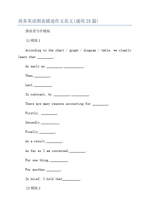
商务英语图表描述作文范文(通用25篇)图表类写作模版(1)模版1According to the chart / graph / diagram / table, we clearly learn that _________.As early as _________,___________.Then,_________.Last,__________.In contrast, by _________,__________.There are many reasons accounting for _________.Firstly, _________.Secondly,__________.Finally,_________.As a result,_________.As far as I am concerned,_________.For one thing,__________.For another,________.In brief, I hold that__________.(2)模版2What is shown in the chart / graph / diagram / table above indicates that in recent years, more and more people pay attention to _________.The number of those who _________ has increased ________, and furthermore,____________.There are two factors responsible for the changes.In the first place,_________.Moreover,__________.Yet, it is noticeable that __________.From the analysis, we can safely draw the conclusionthat__________.It is possible that in the future, the tendencywill__________.(3)模版3As is shown in the chart / graph / diagram / table above,__________ has charged drastically in the past _________.While ___________,now the percentage of__________ is__________.Meanwhile, the number of _________ has soared up to ________.There are mainly two possible reasons contributing to the rapid changes.The first is that _________.Secondly,__________.In my point of view, the changes have a great influence on _________.To sum up ,_________.1、主章开头图表类型:table、chart、diagramgraph、column chart、pie graph描述:show、describe、illustrate、can be seen from、clear、apparent、reveal、represent内容:figure、statistic、number、percentage、proportion2、表示数据变化的单词或者词组rapid/rapidly 迅速的,飞快的,险峻的dramatic/dramatically 戏剧性的,生动的significant/significantly 有意义的,重大的,重要的sharp/sharply 锐利的,明显的,急剧的steep/steeply 急剧升降的steady/steadily 稳固的,坚定不移的gradual/gradually 渐进的,逐渐的slow/slowly 缓慢的,不活跃的slight/slightly 轻微的、略微地stable/stably 稳定的3、其它在描述中的常用到的词significant changes 图中一些较大变化noticeable trend 明显趋势during the same period 在同一时期grow/grew 增长distribute 分布,区别unequally 不相等地in the case of adv. 在……的.情况下in terms of / in respect of / regarding 在……方面in contrast 相反,大不相同government policy 政府政策market forces 市场规率measure n.尺寸,方法,措施v.估量,调节forecast n.先见,预见v.预测一、说明原因型模块(一)Nowadays , there are more and more XX in some big cities . It is estimated that ( 1 ).Why have there been so many XX ? Maybe the reasons can be listed as follows.The first one is that ( 2 ) .Besides, ( 3 ) .The third reason is ( 4 ). To sum up , the main cause of XX is due to ( 5 ) .注释:(1)用具体数据说明XX现象;(2)原因一;(3)原因二;(4)原因三;(5)指出主要原因;(6)解决建议一;(7)解决建议二。
英语常用图表描述句型

常用图表阐释语:(1)表示“图表所示”句型:As is shown in the chart…如图所示As can be seen in the table…从表中可知As the graph shows…该曲线图表明The above table illustrates…该表格显示The first column represents…第一栏代表The second row demonstrates that…第二行表示See Figure (Table) 2 请看图(表)2(2)表示上升的动词:>.increase, rise, go up, grow, climb, rocket, soar, rebound, ascend. Leap upwards, jump, speed up, surge, shoot up(3)表示下降的动词:.go down, fall, drop, decline, abate,decrease, slump, diminish, descend, plummet (fall quickly), shrink, slip, slide, take a plunge, dive,sink, slow down,(4)表示快速的副词:rapidly, quickly, sharply, dramatically, surprisingly, fast.(5)表示程度的副词、短语:considerably, a great deal, very much, a lot, rather, somewhat, quite a lot, a bit, a little, slightlysignificantly, markedly, noticeably, exactly, precisely, almost, nearly, roughly, approximately.(6)表示缓慢、逐步的副词、短语:steadily, gradually, small increase, slightly, moderately, slowly.:(7)表示达到顶峰、平行向前等短语:to peak a high point at…, reach a peak at…, reach a plateau;reach the bottom at…, to bottom a low point at…,drop to the bottom at…, to level off;keep constant, stay the same, remain steady, remain the same/constant, stabilize.(8) 表示状况的单词、短语:erratic movements (unstable trend), fluctuations, trough (the lowest point), to the bottom, upward trend, downward trend.图表描述例句:Sales stood at the lowest level in March.三月份的销售额呈最底水平。
如何描述图表

如何描述图表其实,无论英语一和英语二的大纲说到写作B节都涉及到了图表描述,只是由于英语二的大纲样题以及近两年的真题考的都是图表,所以考生们自动地就将英语二和图表绑定在了一起。
我的看法是,英语一和英语二的考生都该关注一下图表写作,尤其图表描述。
无论是表格,柱状图,饼状图还是曲线图,都是命题者试图通过一些数据来反映社会问题或社会趋势现象.考生们要善于对图表中的数据进行排列,组合或对照,从而抓住数据背后所欲揭示的主题(问题或现象)。
图表的描述注意四点:1. 主旨信息。
图表中的数据只要描写几个核心数据就行(有时考生要进行数据的合并概括).这样做是为了将图表数据的描述与其所要揭示的主题一致起来.2. 有序描述。
图表中的数据要重新排列,组合,井然有序地描述出来.3. 过渡生动。
描述的过程中,根据前后的数据关系,添加连接词(however,furthermore等),使得描述条理清晰,一目了然。
4. 词句多样。
由于图表的描述需要反复说同样的句式,以及反复提到“增加”或“减少”之类的意思,为了避免重复,考生需要刻意地变化句子和词汇,以免单调乏味。
如:One problem affecting US presently is that its energy supply depends, to a larger extent, on the consumption of fossil fuels. As shown in the chart, 77.1% of total of electricity of U.S. is generated by burning coal, oil and gas, each accounting for 46.5%, 16.9% and 13.7% respectively. And regrettably, nuclear power supplies only 12.5% of the country’s energy needs and water power merely 10.5%.再如:The past few years have witnessed a growing surge of interest in buying lottery tickets, especially in large cities. It may even be said that people are going crazy about it. As can be seen from the chart, 70 percent of those polled in a large scale survey, held in Guangzhou, Shanghai and Beijing, claimed to have dreamed of winning a fortune of 5 million yuan. Roughly 80 percent of those polled in Guangzhou had had such a dream, while the number in Shanghai and Beijing accounted for 60 percent respectively.又如:Obviously the rate of car accidents in the city varies from month to month in 1999. As we can see from the graph, during the period from Jan. to Mar., the number of accidents grew sharply, reaching 32 in March. Then the rate began to decline, and there were only 26 accidents in June. However, there was a rapid increase during the summer months, the peak being 39 accidents in August.Fortunately, the rate was gradually falling in the last four months of the year. It is interesting to note that there happened to be as many accidents in Oct. as in Apr. Generally speaking, the trend involved a downward direction.最后如:In the past five years, there have been great changes in people’s daily expenses in X city. According to the figures given in the table, the amount of money spent on food decreased gradually, accounting for 35 percent in 1998. However, there was a rapid increase in clothing expenses, which made up 17% in 1998. In addition, the table shows an upward tendency in recreation expenses. The same was the case with other expenses.。
图表描述词汇

图标描述资料1.各种图表的名称(Types of chart)饼状图(Pie chart):饼状图内部分成一块一块,用于表示所占分量,那一块一块就叫"segment"。
线形图(Line graph):柱状图(Bar chart):每一个矩形就叫一个bar表格(Table):表的“行”是“row”,“列”是“column”流程图(Flow chart)组织结构图(organigram)2.描述变化时(Describing Change)(1)向上的趋势(Upward movement):To increase/rise/go upTo grow/expandTo rocket/boom/soare.g. We increased sales。
We expanded our workforce。
We raised our prices。
(注意:Raise是及物动词)(2)向下的趋势(Downward movement)To decrease/fall/drop/decline/go downTo slump/collapse/plummet/crash注意:decrease和drop是及物动词(3)不再变动(an end to movement)To flatten out/ level off(4)无变化(No change)To remain constant/stableTo stay the same/ at the same levelTo maintain/hold/keepe.g. We need to hold our costs down。
我们需要保持低成本3.变化的程度(Degree of change)Dramatically/considerably/significantly/moderately/slightlye.g. Sales have fallen considerably。
- 1、下载文档前请自行甄别文档内容的完整性,平台不提供额外的编辑、内容补充、找答案等附加服务。
- 2、"仅部分预览"的文档,不可在线预览部分如存在完整性等问题,可反馈申请退款(可完整预览的文档不适用该条件!)。
- 3、如文档侵犯您的权益,请联系客服反馈,我们会尽快为您处理(人工客服工作时间:9:00-18:30)。
1、图形种类及概述法:泛指一份数据图表:a data graph(曲线图)/chart/diagram/illustration/table饼图:pie chart直方图或柱形图:bar chart/histogram趋势曲线图:line chart/curve diagram表格图:table流程图或过程图:flow chart/sequence diagram程序图:processing/procedures diagram2、常用的描述用法The table/chart diagram/graph shows (that)According to the table/chart diagram/graphAs (is)shown in the table/chart diagram/graphAs can be seen from the table/chart/diagram/graph/figures,figures/statistics shows (that)……It can be seen from the figures/statisticsWe can see from the figures/statisticsIt is clear from the figures/statisticsIt is apparent from the figures/statisticstable/chart/diagram/graph figures (that)……table/chart/diagram/graph shows/describes/illustrates3、图表中的数据(Data)具体表达法数据(Data)在某一个时间段固定不变:fixed in time在一系列的时间段中转变:changes over time持续变化的data在不同情况下:增加:increase/raise/rise/go up ……减少:decrease/grow down/drop/fall ……波动:fluctuate/rebound/undulate/wave ……稳定:remain stable/stabilize/level off ……二、相关常用词组1、主章开头图表类型:table(表格)、chart(图表)、diagram(图标)、graph(多指曲线图)、column chart(柱状图)、pie graph(饼图)、tree diagram(树形图)描述:show、describe、illustrate、can be seen from、clear、apparent、reveal、represent内容:figure、statistic、number、percentage、proportion2、表示数据变化的单词或者词组rapid/rapidly 迅速的,飞快的,险峻的dramatic/dramatically 戏剧性的,生动的significant/significantly 有意义的,重大的,重要的sharp/sharply 锐利的,明显的,急剧的steep/steeply 急剧升降的steady/steadily 稳固的,坚定不移的gradual/gradually 渐进的,逐渐的slow/slowly 缓慢的,不活跃的slight/slightly 稍微的、略微地stable/stably 稳定的3、其它在描述中的常用到的词significant changes 图中一些较大变化noticeable trend 明显趋势during the same period 在同一时期grow/grew 增长distribute 分布unequally 不相等地in the case of 在……的情况下in terms of/in respect of/regarding 在……方面in contrast 相反,大不相同government policy 政府政策market forces 市场力量measuren n.尺寸,方法,措施v.估量,调节forecast n.先见,预见v.猜测三、图表描述套句精选1.the table shows the changes in the number of……over the period from……to 该表格描述了在……年之……年间……数量的变化。
2.the bar chart illustrates that……该柱状图展示了……3.the graph provides some interesting data regarding……该图为我们提供了有关……有趣数据。
4.the diagram shows (that)……该图向我们展示了……5.the pie graph depicts (that)……该圆形图揭示了……6.this is a cure graph which describes the trend of……这个曲线图描述了……的趋势。
7.the figures/statistics show (that)……数据(字)表明……8.the tree diagram reveal s how……该树型图向我们揭示了如何……9.the data/statistics show (that)……该数据(字)可以这样理解……10.the data/statistics/figures lead us to the conclusion that……这些数据资料令我们得出结论……11.as is shown/demonstrated/exhibited in the diagram/graph/chart/table……如图所示……12.according to the ch art/figures……根据这些表(数字)……13.as is shown in the table……如表格所示……14.as can be seen from the diagram,great changes have taken place in……从图中可以看出,……发生了巨大变化。
15.from the table/chart/diagram/figure,we can see clearly that……or it is clea from the chart that……从图表我们可以很清楚(明显)看到……16.this is a graph which illustrates……这个图表向我们展示了……17.this table shows the changing proportion of a & b from……to……该表格描述了……年到……年间a与b的比例关系。
18.the graph,presented in a pie chart,shows the general trend in……该图以圆形图形式描述了……总的趋势。
19.this is a column chart showing……这是个柱型图,描述了……20.as can be seen from the graph,the two curves show the flutuation of……如图所示,两条曲线描述了……的波动情况。
21.over the period from……to……, the……remained level.在……至……期间,……基本不变。
22.in the year between……and……在……年到……期间……23.in the 3 years spanning from 1995 through 1998……1995年至1998三年里……24.from then on/from this time onwards……从那时起……25.the number of……remained steady/stable from(month/year) to (month ……月(年)至……月(年)……的数量基本不变。
26.the number sharply went up to……数字急剧上升至……27.the percentage of……stayed the same between……and…………至……期间……的比率维持不变。
28.the figures peaked at……in(month/year)……的数目在……月(年)达到顶点,为……29.the percentage remained steady at……比率维持在……30.the percentage of……is sightly larger/smaller than that of…………的比例比……的比例略高(低)。
31.there is not a great deal of difference between……and…………与……的区别不大。
32.the graphs show a threefold increase in the number of……该图表表明……的数目增长了三倍。
四倍(fourfold),五倍(fivefold)33……decreased year by year while……increased steadily.……逐年减少,而……逐步上升。
34.the situation reached a peak(a high point at) of[%].……的情况(局势)到达顶(高)点,为……百分点。
35.the figures/situation bottomed out in……数字(情况)在……达到底部。
36.the figures reached the bottom/a low point/hit a trough.数字(情况)达到底部(低谷)。
37.a is ……times as much/many as b.a是b的……倍。
38.a increased by……a增长了……39.a increased to……a增长到……40.high/low/great/small/ percentage.比率高(低)41.there is an upward trend in the number of…………数字呈上升趋势。
42.a considerable increase/decrease occurred from……to…………到……发生急剧上升。
43.from……to……the rate of decrease slow down.从……到……,下降速率减慢。