雅思小作文图表题练习题目
雅思真题小作文柱形图

雅思真题小作文柱形图英文回答:The given bar chart provides a comparison of the average number of hours spent on various types of digital media by individuals in two different age groups: 18-24 and 55-64.The chart reveals that individuals in the 18-24 age group spend significantly more time on digital media than those in the 55-64 age group across all categories except watching television.Specifically, 18-24 year-olds spend an average of 3.5 hours per day on social media, compared to only 1.8 hours per day for 55-64 year-olds. Similarly, they spend an average of 2.8 hours per day on instant messaging, while55-64 year-olds spend only 1.4 hours per day on this activity. For playing video games, the difference is even more pronounced, with 18-24 year-olds spending an averageof 2.4 hours per day compared to just 0.8 hours per day for 55-64 year-olds.Interestingly, the trend reverses for watching television, with 55-64 year-olds spending an average of 2.2 hours per day on this activity, while 18-24 year-olds spend only 1.6 hours per day.Overall, the chart demonstrates a clear generational divide in digital media consumption, with younger individuals spending significantly more time on social media, instant messaging, and video games, while older individuals spend more time watching television.中文回答:根据给定的条形图,我们可以对18-24岁和55-64岁这两个年龄组的个人在不同类型数字媒体上花费的平均小时数进行比较。
雅思小作文题型整理
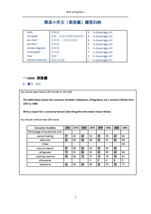
雅思小作文(图表题)题型归纳一.t able 表格题1.剑2 (1)4.剑5(4)6.剑7(1)二.Line graph线图(含直线和曲线图)1.剑3(4)You should spend about 20 minutes on this task.The graph below shows the unemployment rates in the US and Japanbetween March 1993 and March 1999.Write a report for a university lecturer describing the information shownbelow.You should write at least 150 words.You should spend about 20 minutes on this task.The graph below shows the proportion of the population aged 65 and overbetween 1940 and 2040 in three different countries.Summarize the information by selecting and reporting the main features,and make comparisons where relevant.Write at least 150 words.You should spend about 20 minutes on this task.The graph below shows the consumption of fish and some different kinds of meatin a European country between 1979-2004.Summarize the information by selecting and reporting the main features, andmake comparisons where relevant.Write at least 150 words.You should spend about 20 minutes on this task.The graph below shows the quantities of goods transported in the UK between 1974 and 2002 by four different modes of transport.Summarize the information by selecting and reporting the main features, and make comparisons where relevant.Write at least 150 words.5.剑9(4)三.Bar chart 柱状图You should spend about 20 minutes on this task.The chart below shows the amount of leisure time enjoyed by men and women of different employment status.Write a report for a university lecturer describing the information shown below.Write at least 150 words.Leisure time in a typical week: by sex and employment status,1998-99You should spend about 20 minutes on this task.The table below shows the figures for imprisonment in five countries between 1930 and 1980.Write a report for a university lecturer describing the information shown below.You should write at least 150 words.You should spend about 20 minutes on this task.The chart below shows the amount spent on six consumer goods in fourEuropean countries.Write a report for a university lecturer describing the information shown below. You should write at least 150 words.You should spend about 20 minutes on this task.The charts below show the level of participation in education and sciencein developing and industrialized countries in 1980 and 1990Write a report for a university lecturer describing the information shown below. You should write at least 150 words.5.剑4(3)You should spend about 20 minutes on this task.The chart below shows the different levels of post-school qualifications inAustralia and the proportion of men and women who held them in 1999.Summarize the information by selecting and reporting the main features,and make comparisons where relevant.You should write at least 150 words.You should spend about 20 minutes on this task.The charts below show the main reasons for study among students ofdifferent age groups and the amount of support they received from employers.Summarize the information by selecting and reporting the main features,and make comparisons where relevant.You should write at least 150 words.You should spend about 20 minutes on this task.The charts below give information about USA marriages and divorce ratesbetween 1970 and 2000, and the marital status of adult Americans in twoof the years.Summarize the information by selecting and reporting the main features,and make comparisons where relevant.You should write at least 150 words.You should spend about 20 minutes on this task.The chart below shows information about changes in average house prices in fivedifferent cities between 1990 and 2002 compared with the average house prices in 1989.Summarize the information by selecting and reporting the main features, and makecomparisons where relevant.You should write at least 150 words.四.Pie chart饼图1.剑7(4)2.剑8(2)3.剑9(3)五.流程图1.剑1(2)You should spend about 20 minutes on this task.The diagrams below show the life cycle of the silkworm and the stages inthe production of silk cloth.Summarize the information by selecting and reporting the main features,and make comparisons where relevant.Write at least 150 words.六.混合图。
雅思小作文范文表题(必备14篇)

雅思小作文范文表题(必备14篇)雅思小作文范文表题第9篇雅思小作文范文表题第10篇Task achievement1. 文章基本呈现了图表中的全部数字。
为了避开数字过多的状况,同一学位水平中男女所占比例只消失了一个(总和为100%)。
不影响我们对图表的认知。
2. 文章结尾处总结了图表的整体特点,即文章来自老烤鸭雅思男性在高等学位和低等学位所占比例较多,而女性则在本科阶段所占比例较多。
3. 文章对数据进行了合理对比。
主体段一开头先指出男女差异最大的类别。
然后将剩余类别根据男性多于女性或者女性多于男性进行分类比较。
Coherence and Cohesion1. 文章规律结构合理。
分组之间没有消失重复的状况,而且点出了最大的差异所在。
2. 使用了各种各样的链接手段。
如其次段开头的immediately, 其次段结尾处的by contrast, 第三段开头的at the higher levels of education等。
也就是说链接手段并不肯定得是and或者however,重要的是让文章整体行文流利通常。
3. 指代方面,利用定语从句和词汇(counterpart)来避开混乱和重复。
Lexical Resource文章用词丰富,持有学位使用了held,with,reach等进行同义替换。
同时比较过程中除了使用比较级之外,还用了outnumber这样的词来展现自己的词汇积累。
Grammatical Range语法结构方面,文章虽然也有各种各样的从句,但并不是每个句子都很简单。
关键在于句子结构各不相同。
敏捷使用各种非谓语动词,状语前置来呈现句子的多样性。
雅思小作文范文表题第11篇题目:The bar chart below shows the proportions of English men and women of different ages who were living alone in 2023. The pie chart compares the numbers of bedrooms in these one-person households. Living alone in England by age and gender, 2023Number of bedrooms in one-person households (England, 2023)雅思小作文范文表题第12篇Dear Sir/ Madam,Dear Professor Moss,I am Sandy, a junior student of the Department of Electrical and Computer Engineering. I am writing to enquire about your African Literature and Culture course.Just a few days ago, I found the course when we were asked to choose optional courses for next semester. The name of African Literature and Culture aroused my great interest. Because of your reputation and my enthusiasm in literature, I hope I could study this course next semester. Except the name, however, all I know about the course is that it is atwo-hour one held every Thursday afternoon. I want to get more details of the course. First of all, I would like to know the brief outline of the course. Moreover, I wonder if there are some relevant books that you can recommend for me to read before the course.I also heard that another course of yours, Chinese Literature, is held every Friday afternoon. If the registration of this course hasn’t closed yet, I will be so glad to participate in your class.Sorry to bother you. Your help will be greatly appreciated.Yours sincerely,Sandy雅思小作文范文表题第13篇题目:The chart below shows the total number of minutes (in billions) of telephone calls in the UK, divided into three categories, from 1995-2023. Here's my suggested outline for a 4-paragraph report: Introduction: rewrite the question statement in your own words.Overview: point out which category was highest in each year, which was lowest, and which saw the biggest changes.Details: compare the 3 categories in 1995, then say what happened up until 1999.Details: notice what happened to local calls from 1999 onwards, and contrast this with the other 2 categories. Finish with a comparison of thefigures in 2023.雅思小作文范文表题第14篇The graph below shows the proportion of the population aged 65 and over between 1940 and 2040 in three different countries.雅思小作文范文:The line graph compares the percentage of people aged 65 or more in three countries over a period of 100 years.It is clear that the proportion of elderly people increases in each country between 1940 and 2040. Japan is expected to see the most dramatic changes in its elderly population.In 1940, around 9% of Americans were aged 65 or over, compared to about 7% of Swedish people and 5% of Japanese people. The proportions of elderly people in the USA and Sweden rose gradually over the next 50 years, reaching just under 15% in 1990. By contrast, the figures for Japan remained below 5% until the early 2000s.Looking into the future, a sudden increase in the percentage of elderly people is predicted for Japan, with a jump of over 15% in just 10 years from 2030 to 2040. By 2040, it is thought that around 27% of the Japanese population will be 65 years old or more, while the figures for Sweden and the USA will be slightly lower, at about 25% and 23% respectively.(178 words, band 9)。
雅思小作文柱图表图写作_英语考试_外语学习_教育专区

Language for comparisons
80% 60% 40% 20%
67% 33%
outnumber
boy
girl exceed
0%
Boys outnumber girls in class A.
The number of boys exceeds that of girls in class A.
P2
• The number of people using trains at first
rose from just under 20% in 1960 to about 26% in 1980, but then fell back to about 23% in 2000.
• Use of the tube was relatively stable, falling
雅思小作文之图表作文
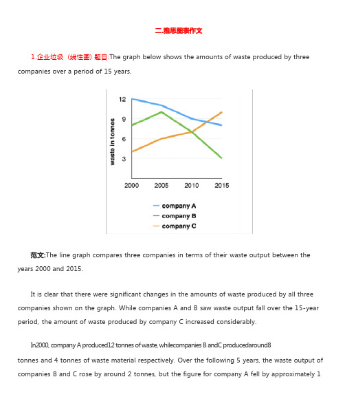
1.企业垃圾 (线性图) 题目:The graph below shows the amounts of waste produced by three companies over a period of 15 years.years 2000 and 2015.It is clear that there were significant changes in the amounts of waste produced by all three companies shown on the graph. While companies A and B saw waste output fall over the 15-year period, the amount of waste produced by company C increased considerably.In2000, company A produced12 tonnes of waste, whilecompanies B andC producedaround8tonnes and 4 tonnes of waste material respectively. Over the following 5 years, the waste output of companies B and C rose by around 2 tonnes, but the figure for company A fell by approximately 1tonne.From 2005 to 2015, company A cut waste production by roughly 3 tonnes, and company B reduced its waste by around 7 tonnes. By contrast, company C saw anincrease inwaste productionof approximately 4 tonnes over the same 10- year period. By 2015, company C’swaste output hadrisento10tonnes, while the respective amounts of waste fromcompanies A andB haddroppedto8 tonnes and only 3 tonnes.(192 words, band 9)这条线图对三家公司的废物产出从 2000 年到 2015 年进行了比较。
雅思小作文饼图题

雅思小作文饼图题篇一:两个雅思写作小作文饼图练习题两个雅思写作小作文饼图练习题雅思小作文饼图是所有图表中出现次数最多的一个,所以需要大家更为关注。
下面为大家搜集整理了雅思写作小作文饼图的练习题,共有两个,都是比较简单的两个饼图,大家在备考的时候,注意结构和顺序的描写。
1. The following pie charts illustrate the energy use in the USA. Write a report for a university lecturer describing the information given in the pie charts below.2. The following two pies show the average family income of New Zealand in 1990 and 2000 and the way people spend their income. Write a report for a university lecturer describing the information given in the pie charts below.以上就是这两个雅俗写作小作文饼图练习题的全部内容,包括了美国的能源使用和新西兰的平均家庭收入两个话题。
大家在备考雅思写作小作文饼图的时候,可以适当的练习一下上面的这两个题目。
雅思小作文图表描述方式小结雅思小作文的图表描述是有自己的方式和特点的,掌握了这个方式可以让大家的小作文备考更快也更加贴近考试的要求。
下面就为大家整理了雅思小作文图表描述的方式,供大家参考。
1. 与趋势有关的词语:上升(v.):increase, rise, climb, ascend, surge, shoot up下降(v.):decrease, decline, drop, fall, descend, plunge持平(v.):remain stable, keep constant, level off, flatten out波动(v.):fluctuate, wave, go up and down快速(adj./adv.):considerable/considerably, significant/significantly, substantial/substantially, remarkable/remarkably, dramatic/dramatically稳步(adj./adv.):steady/steadily, stable/stably, moderate/moderately, modest/modestly缓慢(adj./adv.):slight/slightly, minimal/minimally, marginal/marginally顶点(n. /v.):peak趋势(n.):trend/ tendency2. 与大小相关的词语:Outnumber (v.):在数量上超过The demonstrators were outnumbered by the policeExceed (v.):在数量上超过Triple (v.):变成三倍The figure has tripled.Double (v.):变成两倍The price of houses has virtually doubled over the past few years.Mount to (v.):达到Counterpart (n.):对应的另一方,比较的另一方this product is better than its counterparts此外,朗阁海外考试研究中心建议考生还应考虑一下题中数据和百分比有没有联系,如果有的话还应辅以一些关于比例和占据的语句。
雅思图表作文真题范文
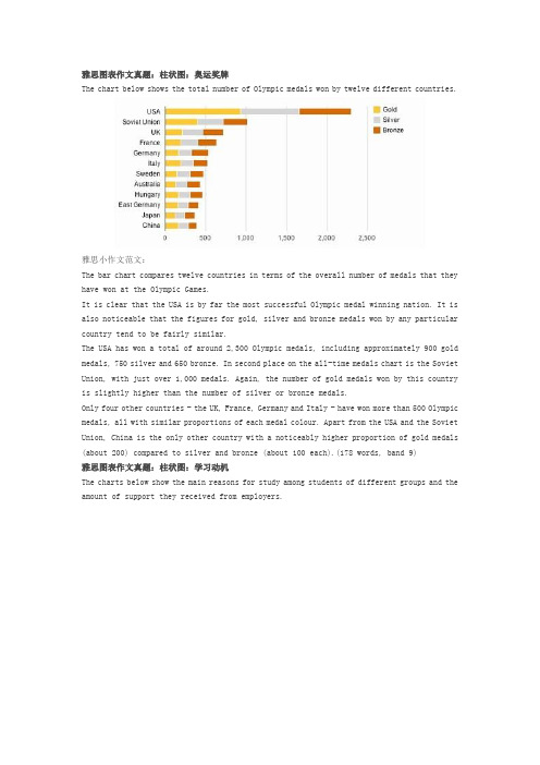
雅思图表作文真题:柱状图:奥运奖牌The chart below shows the total number of Olympic medals won by twelve different countries.雅思小作文范文:The bar chart compares twelve countries in terms of the overall number of medals that they have won at the Olympic Games.It is clear that the USA is by far the most successful Olympic medal winning nation. It is also noticeable that the figures for gold, silver and bronze medals won by any particular country tend to be fairly similar.The USA has won a total of around 2,300 Olympic medals, including approximately 900 gold medals, 750 silver and 650 bronze. In second place on the all-time medals chart is the Soviet Union, with just over 1,000 medals. Again, the number of gold medals won by this country is slightly higher than the number of silver or bronze medals.Only four other countries - the UK, France, Germany and Italy - have won more than 500 Olympic medals, all with similar proportions of each medal colour. Apart from the USA and the Soviet Union, China is the only other country with a noticeably higher proportion of gold medals (about 200) compared to silver and bronze (about 100 each).(178 words, band 9)雅思图表作文真题:柱状图:学习动机The charts below show the main reasons for study among students of different groups and the amount of support they received from employers.参考雅思小作文范文The bar charts compare students of different ages in terms of why they are studying and whether they are supported by an employer.It is clear that the proportion of students who study for career purposes is far higher among the younger age groups, while the oldest students are more likely to study for interest. Employer support is more commonly given to younger students.Around 80% of students aged under 26 study to further their careers, whereas only 10% study purely out of interest. The gap between these two proportions narrows as students get older, and the figures for those in their forties are the same, at about 40%. Students aged over 49 overwhelmingly study for interest (70%) rather than for professional reasons (less than 20%).Just over 60% of students aged under 26 are supported by their employers. By contrast, the 30-39 age group is the most self-sufficient, with only 30% being given time off and help with fees. The figures rise slightly for students in their forties and for those aged 50 or more.(178 words, band 9)雅思图表作文真题:柱状图:The chart below shows numbers of incidents and injuries per 100 million passenger miles travelled (PMT) by transportation type in 2002.雅思小作文范文The bar chart compares the number of incidents and injuries for every 100 million passenger miles travelled on five different types of public transport in 2002.It is clear that the most incidents and injuries took place on demand-response vehicles. By contrast, commuter rail services recorded by far the lowest figures.A total of 225 incidents and 173 injuries, per 100 million passenger miles travelled, took place on demand-response transport services. These figures were nearly three times as high as those for the second highest category, bus services. There were 76 incidents and 66 people were injured on buses.Rail services experienced fewer problems. The number of incidents on light rail trains equalled the figure recorded for buses, but there were significantly fewer injuries, at only 39. Heavy rail services saw lower numbers of such events than light rail services, but commuter rail passengers were even less likely to experience problems. In fact, only 20 incidents and 17 injuries occurred on commuter trains.(165 words, band 9)雅思图表作文真题:柱状图:各地房价The chart below shows information about changes in average house prices in five different cities between 1990 and 2002 compared with the average house prices in 1989.雅思小作文范文:The bar chart compares the cost of an average house in five major cities over a period of 13 years from 1989.We can see that house prices fell overall between 1990 and 1995, but most of the cities saw rising prices between 1996 and 2002. London experienced by far the greatest changes in house prices over the 13-year period.Over the 5 years after 1989, the cost of average homes in Tokyo and London dropped by around 7%, while New York house prices went down by 5%. By contrast, prices rose by approximately 2% in both Madrid and Frankfurt.Between 1996 and 2002, London house prices jumped to around 12% above the 1989 average. Homebuyers in New York also had to pay significantly more, with prices rising to 5% above the 1989 average, but homes in Tokyo remained cheaper than they were in 1989. The cost of an average home in Madrid rose by a further 2%, while prices in Frankfurt remained stable. (165 words)雅思图表作文真题:饼状图:垃圾处理The pie charts below show how dangerous waste products are dealt with in three countries.雅思小作文范文:The charts compare Korea, Sweden and the UK in terms of the methods used in each country to dispose of harmful waste.It is clear that in both the UK and Sweden, the majority of dangerous waste products are buried underground. By contrast, most hazardous materials in the Republic of Korea are recycled.Looking at the information in more detail, we can see that 82% of the UK’s dangerous waste is put into landfill sites. This disposal technique is used for 55% of the harmful waste in Sweden and only 22% of similar waste in Korea. The latter country recycles 69% of hazardous materials, which is far more than the other two nations.While 25% of Sweden's dangerous waste is recycled, the UK does not recycle at all. Instead, it dumps waste at sea or treats it chemically. These two methods are not employed in Korea or Sweden, which favour incineration for 9% and 20% of dangerous waste respectively.(159)。
雅思图表题范例
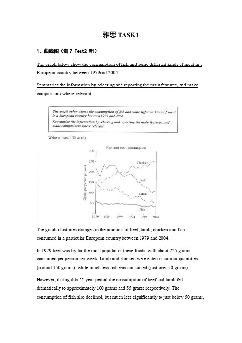
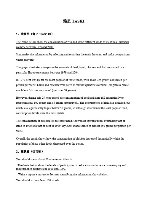
雅思TASK11、曲线图(剑7 Test2 W1)The graph below show the consumption of fish and some different kinds of meat in a European country between 1979and 2004.Summaries the information by selecting and reporting the main features, and make comparisons where relevant.The graph illustrates changes in the amounts of beef, lamb, chicken and fish consumed in a particular European country between 1979 and 2004.In 1979 beef was by far the most popular of these foods, with about 225 grams consumed per person per week. Lamb and chicken were eaten in similar quantities (around 150 grams), while much less fish was consumed (just over 50 grams).However, during this 25-year period the consumption of beef and lamb fell dramatically to approximately 100 grams and 55 grams respectively. The consumption of fish also declined, but much less significantly to just below 50 grams,so although it remained the least popular food, consumption levels were the most stable.The consumption of chicken, on the other hand, showed an upward trend, overtaking that of lamb in 1980 and that of beef in 1989. By 2004 it had soared to almost 250 grams per person per week.Overall, the graph shows how the consumption of chicken increased dramatically while the popularity of these other foods decreased over the period.2、柱状图(C3T3W1)You should spend about 20 minutes on thistask.Thecharts below show the levels of participation in education and science indeveloping and industrialized countries in 1980 and 1990.Write a report a university lecturer describing the information shownbelow.You should write at least 150 words.The data shows the differences between developing and industrialized countries’ participation in education and science.In terms of the number of years of schooling received, we see that the length of time people spend at school in industrialized countries was much greater at 8.5 years in 1980, compared to 2.5 years in developing countries. The gap was increased further in 1900 when the figures rose to 10.5 years and 3.5 years respectively.We can see a similar pattern in the second graph, which shows that the number of people working as scientists and technicians in industrialized countries increased from 55 to 85 per 1,000 people between 1980 and 1990, while the number in developing countries went from 12 to 20.Finally, the figures for spending on research and development show that industrialized countries more than doubled their spending, from $200bn to$420bn, while developing countries decreased theirs , from$75bn down to $25bn.Overall we can see that not only are there very large differences between the two economies but that there gaps are widening.3、饼状图(C7T4W1)The charts compare the sources of electricity in Australia and France in the years 1980 and 2000. Between these years, electricity production almost doubled, rising from 100 units to 170 in Australia, and from 90 to 180 units in France.In 1980 Australia used coal as the main electricity source (50 units) and the remainder was produced from natural gas, hydro power (each producing 20 units) and oil (which produced only 10 units). By 2000, coal had become the fuel for more than 75% of electricity produced and only hydro continued to be another significant source supplying approximately 20%.In contrast, France used coal as a source for only 25 units of electricity in 1980, which was matched by natural gas. The remaining 40 units were produced largely from oil and nuclear power, with hydro contributing only 5 units. But by 2000, nuclear power, which was not used at all in Australia, had developed into the main source, producing almost 75% of electricity, at 126 units, while coal and oil together produced only 50 units. Other sources were no longer significant.Overall, it is clear that by 2000 these two countries relied on different principal fuel sources: Australia relied on coal and France on nuclear power.4、表格类(C5T4W1)The take below gives information about the underground railway systems in six cities.Summarise the information by selecting and reporting the main features, and make comparisons where relevant. You should write at least 150 words.The table shows the detailed information regarding the underground railway systems in six cities, namely, London, Paris, Tokyo ,Washington DC, Kyoto and Los Angeles.London has the oldest underground railway system among the six cities which was opened in 1863. AndParis is the second oldest, and it was opened in 1900. This was then followed by other four cities, namely,Tokyo,WashingtonDC andKyoto with the opening date of 1927, 1976, and 1981 respectively. As forLos Angeles, it is the last one in this table to have its own underground railway system (opened in 2001).In terms of the size of the railway system, Londonenjoys the largest underground railway systems, with 394 kilometres of route in total, which is nearly twice as large as that in Paris(199 kilometres). Kyoto, in contrast, has the smallest system, for it only has 11 kilometres of route, which is nearly 1/36 of the route of London. The other three cities(Tokyo, Washington DC, and Los Angeles) have 155, 126 and 28 kilometres respectivelyInterestingly, Tokyo, which only has 155 kilometres of route, enjoys the greatest number of passengers per year, at 1927 million passengers. The system inParis has the second greatest number of passengers, at 1191 millions passengers per year. Thesmallest underground railway system,Kyoto, serves the smallest number (only 45 people).In conclusion, the underground railway systems in different cities vary a lot in the opening date, the size as well as the number of passengers served per year.5、地图题(真题)The following two maps show the development of a coastal city from 1950 to 2007.Summarize the information by selecting and reporting the main features, and make comparisons where relevant.The two maps illustrate the changes of a coastal city between 1950 and 2007. We can see clearly that the city became more and more modern.1n 1950, the city was like a small village, with vast grassland areas all over the city. There was a sea in the north of this city, with a park to the west. In front of the park, there was a big building area where things were under construction. By that time, three large areas were all grasslands, with a cross road dividing them.However, when it comes to 2007, things experienced significant changes. A new apartment had been built where the park was, and the original building areas were converted into industry buildings such as parks, parking lots and swimming pools. The most obvious changes were that the former grasslands disappeared, becomingcinemas in the southwest, shops in the southeast, and houses in the northeast. On the north side, although the sea was still there, a wharf was built in it so people could travel more easily by sea.Finally, although there was still a cross road in the city, the horizontal road was moved to the south. By doing so, industry buildings and houses could be left more places to develop. Anyway, the city had experienced tremendous changes throughout the 57-year period.6、流程图(C6T3W1)The first diagram shows that there are four main stages in the life of the silk worm.First of all, eggs are produced by the moth and it takes ten days for each egg to become a silkworm larva that feeds on mulberry leaves. This stage lasts for up to six weeks until the larva produces a cocoon of silk thread around itself. After a period of about three weeks, the adult moths eventually emerge from these cocoons and the life cycle begins again.The cocoons are the raw material used for the production of silk cloth. Once selected, they are boiled in water and the threads can be separated in the unwinding stage. Each thread is between 300 and 900 metres long, which means they can be twisted together, dyed and then used to produce cloth in the weaving stage.Overall, the diagrams show that the cocoon stage of the silkworm can be used to produce silk cloth through a very simple process.。
雅思小作文---TASK1图表题

雅思小作文 T A S K 1 图表题规律注意事项:1 . Task1 是客观写作,要求客观真实。
2 . 客观性:不应该有任何图里没有而靠自己主观想象加入的成分。
结尾段针对图形做出的总结性结论也应该是根据图表的实际内容做出的符合逻辑的总结。
准确性:图表里面的数据介绍要力求精确,不能抄错数字。
但当一个特征点没有落在一个准确的坐标值上时,允许进行合理的目测或估计一个大概数值。
详尽性:要有层次感,并不需要把所有的数字都推到文章里。
3 . 类型Table 表格题Line Graph 线图Bar Chart 柱状图Pie Chart 饼状图Process Chart 流程图4 . 看图要注意单位,标题和图例。
5 . 对于多数小作文题,题中给出了几个图就对应的写出几个主体段。
题目里只给出一个图,根据图中包含几类图形元素写几个主体段。
图中只给了一个图,但图中所含图形元素很多,则分类。
题目中出现多线多柱多饼,用“对应提取法“,把每组里的对应元素提出来组织主体段。
6 . 时态和发生时间意义对应。
陈述永恒事实的句型,其主句的谓语动词必定用一般现在时。
若题目里没有出现时间,则全文都使用一般现在时。
7 . 结构开头段(1~2句)改写原题主体段1 总体概括具体介绍数字主体段N 总体概括具体介绍数字结尾段(1~2句)介绍总数(若图里并没有明确的给出总数,则省略)结论(根据图里的数据得出有一定合理性的结论)8 . 开头段的改写题目中ShowProportion InformationThe number/amount of FamilyMalesFemaleInfluence改写成illustrate /compare percentagedatathe figure for householdmenwomenaffect/effectCategories kinds/typesSubway system Storeunderground railway/train system shop9 . 介绍数据或描述变化趋势的常用词。
雅思写作_小作文PART1_图表题

Peak at,reach the peak at Reach the bottom at
Stand at, amount to
占多少比例
Account for, represent
超过
Exceed, surpass, overtake
Sharp, rapid, dramatic, drastic Gradual, continuous, steady Significant, noticeable Slight, minimal Approximately, just over, just
Thoroughness (no need to cover all numbers, instead, pick the most key ones)
Eg1: the graph below shows radio and television audiences throughout the day in 1992.
Summarize the information by selecting and reporting the main features, and make comparisons where relevant.
The following table gives statistics showing the aspects of quality of life in five countries.
, rise (?), grow (grew) Jump ( jumped), soar (soared) Decline, decrease, drop, dip plummet
Fluctuate between A and B Level off at, remain stable at
雅思小作文

雅思小作文英文回答:Task 1。
Bar Chart: Internet Usage and Mobile Device Ownership。
The bar chart illustrates the percentage of adults aged 16 and over who used the internet and owned a mobile device, such as a smartphone or tablet, in five different countries: the United Kingdom, Brazil, South Africa, India, and China. The data was collected in 2021 and is presented in descending order of internet usage.In 2021, 99% of adults in the United Kingdom used the internet, making it the country with the highest level of internet usage among the five surveyed. Brazil followed closely with 97% of adults using the internet, while South Africa had an internet usage rate of 89%. India rankedfourth with 62% of adults using the internet, and China hadthe lowest internet usage rate at 52%.Regarding mobile device ownership, the United Kingdom again topped the list with 97% of adults owning a mobile device. Brazil came in second with 93% of adults owning a mobile device, and South Africa took the third spot with 80% ownership. India and China had lower rates of mobile device ownership, with 58% and 51% of adults owning a mobile device, respectively.The data presented in the bar chart highlights the significant variations in internet usage and mobile device ownership across these five countries. These differencescan be attributed to factors such as socioeconomic conditions, cultural factors, and the availability of infrastructure. Understanding these discrepancies can help policymakers and businesses tailor their services and strategies to meet the specific needs of each country.Task 2。
【雅思写作真题】剑桥9Test3饼图类小作文实例参考

【雅思写作真题】剑桥9Test3饼图类小作文实例参考【雅思写作真题】剑桥9 Test3 饼图类小作文实例参考“真题:剑桥9 Test3 图表类小作文”The charts below give information on the ages of the populations of Yemen and Italy in 2000 and projections for 2050.Summarise the information by selecting and reporting the main features, and make comparisons where relevant.考生原文These pie charts illustrates what proportion are accounted by human in respective age group of Yemen and Italy in 2002, and predicting the future changes to 2050.In Yemen, 0-14 years old young children were the domain group in 2000, at 50.1%. And smaller proportion of 15-19 years old person in the same period, which was 46.3%. While 50 years past, 15-59 years old people will become the most group of people, rising to 57.3%. Although there is a increase in old peoplewho are over 60 years old. But they still the least group of person, which were rising from 3.6% in 2000 to 5.7% in 2005.In terms of Italy, according to projection, 15-59 years old people experience a dramatic decrease, declining from 61.6% in 2000 to 46.2% in 2050. While it still the most group of people. In 2000, the proportion of over 60 years old was 24.1%, which doubled the percentage in 2050 through projection. Contrary to Yemen, the percentage of people who are 15-59 years old is the least no matter what period.Overall, there are decrease of young children in both countries. Even in Italy, the percentage of children is much smaller than those in Italy.批改By 晟睿 Anna本次批改严格按照IELTS小作文评分标准进行。
雅思图表写作范例

Overall, the PRC has the largest number of enrolled students (17) and Germany the smallest (5).Japan and Taiwan both have 12 students; Korea has 11. It is noticeable that Japan and Korea have similar profiles.
3
第三页,编辑于星期三:十八点 五分。
线型图:model answer
On the other hand, between 1900 and 1918 the death
rate stayed constant at 41 per thousand. In 1918, however, it rose sharply and reached the peak of 60 per thousand in 1920. From 1920 to 1930 the death rate fell. It reached the same point of 30 per thousand as the birth rate in 1930. There was a rapid increase in 1930 and also in 1940. Since 1945 it had fallen steadily and arrived at 10 per thousand in 1980. This is very similar to the case of the birth rate.
9 respectively ). For each nationality the males taking CAD
雅思小作文柱图表图写作

80% 60% 40% 20% 0%
33% 67%
boy girl
Language for comparisons
80% 60% 40% 20% 0%
33% 67%
more than
boy girl
fewer than
There are more boys than girls in class A. Class A has fewer girls than boys.
Language for comparisons
80% 60% 40% 20% 0%
33% 67%
boy girl
outnumber
exceed
Boys outnumber girls in class A. The number of boys exceeds that of girls in class A.
The graph below shows the different modes of transport used to travel to and from work in one European city in 1960, 1980 and 2000.
图表作文英文考题

图表作文英文考题1. The first chart shows the population growth in different countries over the past decade. It's clear that China has the largest population, followed by India and the United States. The population of China has been steadily increasing, while India's population growth rate has been even higher. On the other hand, the population of the United States has been relatively stable.2. Moving on to the second chart, it displays the percentage of renewable energy sources used in different countries. It's interesting to see that Iceland is leading the way with almost 100% of its energy coming from renewable sources. Other countries like Sweden and Costa Rica are also doing well in this aspect. However, there are still countries like Saudi Arabia and Kuwait that heavily rely on non-renewable energy sources.3. Now let's take a look at the third chart, which illustrates the average income levels in variousprofessions. It's not surprising to see that doctors and lawyers are among the highest paid professions. On the other hand, teachers and social workers earn relatively lower incomes. This chart highlights the income disparity that exists in many societies.4. The fourth chart provides information on the number of hours spent on different activities by people in different age groups. It's noticeable that teenagers spend a significant amount of time on social media and video games. In contrast, adults spend more time on work-related activities and household chores. This chart reflects the changing lifestyles and priorities across different age groups.5. Lastly, let's discuss the fifth chart, which shows the distribution of internet users by region. It's evident that Asia has the highest number of internet users, followed by Europe and North America. This reflects the growing connectivity and digitalization in these regions. However, Africa and parts of South America still have a relatively low percentage of internet users, indicating theneed for further development in these areas.In conclusion, these charts provide valuable insights into various aspects of our society, such as population growth, renewable energy usage, income levels, activity preferences, and internet usage. They highlight the diversity and disparities that exist in different countries and age groups.。
雅思图表题范例
雅思TASK11、曲线图(剑7 Test2 W1)The graph below show the consumption of fish and some different kinds of meat in a European country between 1979and 2004.Summaries the information by selecting and reporting the main features, and make comparisons where relevant.The graph illustrates changes in the amounts of beef, lamb, chicken and fish consumed in a particular European country between 1979 and 2004.In 1979 beef was by far the most popular of these foods, with about 225 grams consumed per person per week. Lamb and chicken were eaten in similar quantities (around 150 grams), while much less fish was consumed (just over 50 grams).However, during this 25-year period the consumption of beef and lamb fell dramatically to approximately 100 grams and 55 grams respectively. The consumption of fish also declined, but much less significantly to just below 50 grams, so although it remained the least popular food, consumption levels were the most stable.The consumption of chicken, on the other hand, showed an upward trend, overtaking that of lamb in 1980 and that of beef in 1989. By 2004 it had soared to almost 250 grams per person per week.Overall, the graph shows how the consumption of chicken increased dramatically while the popularity of these other foods decreased over the period.2、柱状图(C3T3W1)You should spend about 20 minutes on thistask.Thecharts below show the levels of participation in education and science indeveloping and industrialized countries in 1980 and 1990.Write a report a university lecturer describing the information shownbelow.You should write at least 150 words.The data shows the differences between developing and industrialized countries’ participation in education and science.In terms of the number of years of schooling received, we see that the length of time people spend at school in industrialized countries was much greater at 8.5 years in 1980, compared to 2.5 years in developing countries. The gap was increased further in 1900 when the figures rose to 10.5 years and 3.5 years respectively.We can see a similar pattern in the second graph, which shows that the number of people working as scientists and technicians in industrialized countries increased from 55 to 85 per1,000 people between 1980 and 1990, while the number in developing countries went from 12 to 20.Finally, the figures for spending on research and development show that industrialized countries more than doubled their spending, from $200bn to$420bn, while developing countries decreased theirs , from$75bn down to $25bn.Overall we can see that not only are there very large differences between the two economies but that there gaps are widening.3、饼状图(C7T4W1)The charts compare the sources of electricity in Australia and France in the years 1980 and 2000. Between these years, electricity production almost doubled, rising from 100 units to 170 in Australia, and from 90 to 180 units in France.In 1980 Australia used coal as the main electricity source (50 units) and the remainder was produced from natural gas, hydro power (each producing 20 units) and oil (which produced only 10 units). By 2000, coal had become the fuel for more than 75% of electricity produced and only hydro continued to be another significant source supplying approximately 20%.In contrast, France used coal as a source for only 25 units of electricity in 1980, which was matched by natural gas. The remaining 40 units were produced largely from oil and nuclear power, with hydro contributing only 5 units. But by 2000, nuclear power, which was not used at all in Australia, had developed into the main source, producing almost 75% of electricity, at 126 units, while coal and oil together produced only 50 units. Other sources were no longer significant.Overall, it is clear that by 2000 these two countries relied on different principal fuel sources: Australia relied on coal and France on nuclear power.4、表格类(C5T4W1)The take below gives information about the underground railway systems in six cities.Summarise the information by selecting and reporting the main features, and make comparisons where relevant. You should write at least 150 words.The table shows the detailed information regarding the underground railway systems in six cities, namely, London, Paris, Tokyo ,Washington DC, Kyoto and Los Angeles.London has the oldest underground railway system among the six cities which was opened in 1863. AndParis is the second oldest, and it was opened in 1900. This was then followed by other four cities, namely,Tokyo,WashingtonDC andKyoto with the opening date of 1927, 1976, and 1981 respectively. As forLos Angeles, it is the last one in this table to have its own underground railway system (opened in 2001).In terms of the size of the railway system, Londonenjoys the largest underground railway systems, with 394 kilometres of route in total, which is nearly twice as large as that in Paris(199 kilometres). Kyoto, in contrast, has the smallest system, for it only has 11 kilometres of route,which is nearly 1/36 of the route of London. The other three cities(Tokyo, Washington DC, and Los Angeles) have 155, 126 and 28 kilometres respectivelyInterestingly, Tokyo, which only has 155 kilometres of route, enjoys the greatest number of passengers per year, at 1927 million passengers. The system inParis has the second greatest number of passengers, at 1191 millions passengers per year. The smallest underground railway system,Kyoto, serves the smallest number (only 45 people).In conclusion, the underground railway systems in different cities vary a lot in the opening date, the size as well as the number of passengers served per year.5、地图题(真题)The following two maps show the development of a coastal city from 1950 to 2007.Summarize the information by selecting and reporting the main features, and make comparisons where relevant.The two maps illustrate the changes of a coastal city between 1950 and 2007. We can see clearly that the city became more and more modern.1n 1950, the city was like a small village, with vast grassland areas all over the city. There was a sea in the north of this city, with a park to the west. In front of the park, there was a big building area where things were under construction. By that time, three large areas were all grasslands, with a cross road dividing them.However, when it comes to 2007, things experienced significant changes. A new apartment had been built where the park was, and the original building areas were converted into industry buildings such as parks, parking lots and swimming pools. The most obvious changes were that the former grasslands disappeared, becoming cinemas in the southwest, shops in the southeast, and houses in the northeast. On the north side, although the sea was still there, a wharf was built in it so people could travel more easily by sea.Finally, although there was still a cross road in the city, the horizontal road was moved to the south. By doing so, industry buildings and houses could be left more places to develop. Anyway, the city had experienced tremendous changes throughout the 57-year period.6、流程图(C6T3W1)The first diagram shows that there are four main stages in the life of the silk worm.First of all, eggs are produced by the moth and it takes ten days for each egg to become a silkworm larva that feeds on mulberry leaves. This stage lasts for up to six weeks until the larva produces a cocoon of silk thread around itself. After a period of about three weeks, the adult moths eventually emerge from these cocoons and the life cycle begins again.The cocoons are the raw material used for the production of silk cloth. Once selected, they are boiled in water and the threads can be separated in the unwinding stage. Each thread is between 300 and 900 metres long, which means they can be twisted together, dyed and then used to produce cloth in the weaving stage.Overall, the diagrams show that the cocoon stage of the silkworm can be used to produce silk cloth through a very simple process.。
雅思写作图表题

幅度小
slight minimal moderate modest gradual marginal
Relative expression
V.+adv. 或者 Adj. + N. 持续下降: dip gradually, a smooth decline 缓慢上升: increase slightly, a slow rise 急剧下降: fall sharply, a sharp decrease, plunge, slump,
1.美国总趋势下降,需包含最大最小值,期间有轻微反弹,在97后趋于平稳 2. 日本的总体趋势,96的明显好转,93和98的显著恶化 3. 98年中期,两国情况类似
曲线图Line Graph
1.美国总趋势下降,需包含最大最小值,期间有轻微反弹,在97后趋于平稳 The general trend of US unemployment information was declining (from7% in 1993 to about 5% in 1999), with frequent slight rebounds from time to time, plus the comparatively leveling up period since1997, averaging at 5% more or less. 总结:表趋势词作主语,具体趋势的最大最小值可放其后的括号,with结构和非 谓语结构表示总趋势中的特殊点