图表作文1英语
图表描述 英语作文

图表描述英语作文The bar chart shows the percentage of people in different age groups who use social media on a daily basis. As we can see, the age group with the highest percentage of daily social media users is 18-24, with over 90% of people in this age group using social media every day. On the other hand, the age group with the lowest percentage of daily social media users is 65 and above, with only around 20% of people in this age group using social media on a daily basis.The pie chart illustrates the distribution of social media platforms used by people of different ages. It is clear that Facebook is the most popular social media platform across all age groups, with over 50% of people in each age group using Facebook. Instagram is also quite popular, especially among younger age groups, with around 30% of people aged 18-34 using Instagram. Twitter, on the other hand, is less popular, with only around 10% of people in each age group using Twitter.In conclusion, social media usage varies significantly across different age groups, with younger people being more likely to use social media on a daily basis. Additionally, Facebook remains the most popular social media platform across all age groups, followed by Instagram and Twitter.。
大学英语图表作文范文

大学英语图表作文范文1. The bar chart shows the percentage of students participating in extracurricular activities in a university. It's interesting to see the variation in participationrates among different activities.2. The pie chart illustrates the distribution of majors among undergraduate students. It's clear that the majorityof students are enrolled in the business and engineering programs.3. The line graph depicts the trend of international student enrollment over the past five years. It's evident that there has been a steady increase in the number of international students studying at the university.4. The scatter plot displays the correlation between GPA and hours spent studying per week. It's apparent that students who study more hours tend to have higher GPAs, but there are also outliers that defy this trend.5. The table presents the average class sizes in various departments. It's notable that classes in the humanities department tend to be smaller compared to those in the science and technology departments.6. The heatmap indicates the peak times of library usage throughout the day. It's clear that the library is most crowded during the late afternoon and evening hours.7. The radar chart showcases the skills and competencies developed by students through internships.It's impressive to see the diverse range of skills that students have acquired in areas such as communication, problem-solving, and teamwork.8. The histogram displays the distribution of student grades in a particular course. It's evident that the majority of students fall within the average grade range, with a smaller number of students achieving high or low grades.9. The box plot illustrates the variability in student performance on a standardized test. It's interesting to see the range of scores, as well as any outliers that may indicate exceptional performance or areas for improvement.10. The area chart shows the allocation of university funding across different departments. It's clear that a significant portion of the budget is allocated to research and development, reflecting the university's commitment to academic excellence.。
英语图表作文精选10篇

英语图表作文精选10篇四级英语作文图表类篇一图片模板:It seems to me that the cartoon / drawing issending a message about ____________(图画内容),which reveals ____________(稍作评价).In myperspective of view, ____________ (表明个人观点)。
Apparently, ____________(将个人观点和图片内容相结合,得出观点。
)For one thing, ____________(从社会角度论证).For another thing, ____________(从个人角度说明).For example, ____________(自己、朋友或他人,只要自己知道或听过的例子).Last but not least, ____________(从反面角度谈论).Asa result, the drawer of the illustration is urging us to _____________(建议或措施).Only inthis way can we ____________(展望结果).In conclusion / To my understanding, ____________(再次表明观点或态度).We should____________(进一步说明个人的观点).图表模板:According to the bar chart / pie chart / line graph displays the changes in the numberof____________(图表整体趋势).There was an increase in ____________(图表细节).At the point of ____________, ____________reaches its peak value of ____________(数据或变化).What has caused these changes? There are mainly three reasons.Firstly, ____________ (原因一).Secondly, ____________(原因二).The number of ____________ increased overthe period.____________ rose by _________ from ________ to ________________.Andthere were____________.Finally, ____________(最后一个原因).In conclusion / We can safely draw the conclusion that ____________(结论).Therefore, ____________(进一步谈论更多个人想法).英语四级图表类作文篇二In the morning, the clear sky, father-in-law of the sun was inlaid with a golden halo. A group of happy little magpies chirped in the branches, as if holding a singing contest, very lively!Noon is the hottest time of the day. The sun gave out a blazing light, as if to roast the earth. There was no one in the street. Everyone hid in the house to blow the air conditioner, for fear that they would be cooked outside. At this time, the little magpie on the tree also became quiet, they all hide in the deep leaves of the nap. Only the indefatigable cicada was still shouting “hot, hot.。
英语图表作文模板及精选4篇

英语图表作文模板及精选4篇(经典版)编制人:__________________审核人:__________________审批人:__________________编制单位:__________________编制时间:____年____月____日序言下载提示:该文档是本店铺精心编制而成的,希望大家下载后,能够帮助大家解决实际问题。
文档下载后可定制修改,请根据实际需要进行调整和使用,谢谢!并且,本店铺为大家提供各种类型的经典范文,如总结报告、合同协议、规章制度、条据文书、策划方案、心得体会、演讲致辞、教学资料、作文大全、其他范文等等,想了解不同范文格式和写法,敬请关注!Download tips: This document is carefully compiled by this editor. I hope that after you download it, it can help you solve practical problems. The document can be customized and modified after downloading, please adjust and use it according to actual needs, thank you!Moreover, our store provides various types of classic sample essays, such as summary reports, contract agreements, rules and regulations, doctrinal documents, planning plans, insights, speeches, teaching materials, complete essays, and other sample essays. If you want to learn about different sample formats and writing methods, please pay attention!英语图表作文模板及精选4篇学而不思则罔,思而不学则殆,以下是本店铺给大伙儿收集整理的英语图表作文模板及精选4篇,欢迎参考。
图表类英语作文范文
图表类英语作文范文图表类型的英语写作如果不擅于观察漫画的话,作文写出来可能会偏题。
下面是小编给大家带来图表类英语作文,供大家参阅!图表类英语作文范文篇1第一段:说明图表开篇句:As the bar chart shows, ____ during the years of ____to____.扩展句:1、As early as _____.2、Then _____ years later, ____.3、And arriving in the year ____, ____.第二段:解释图表变化原因主题句:Several factors contribute to _____.扩展句:1、______. (原因1)2、And ______.(原因2)3、Furthermore, ______ (原因3)4、All these result in ____.第三段:提出解决办法结尾句:However, ____ is faced with some problems.扩展句:1、With _____, ____, the effect of which is not only discouraging, but also challenging.2、So my principle is to pay due attention to ___, but notjustto____.示范第一段:说明图表开篇句:As the bar chart shows, the number of people below the poverty line decreased dramatically during the years of 1978 to1997.扩展句:1、As early as 1978, about 250 million people were under the poverty line.2、Then seven years later, the number became three fifths thatof1978.3、And arriving in the year 1997, the number was reduced to50millions.第二段:解释图表变化原因主题句:Several factors contribute to the sharp decrease of the below-poverty population.扩展句:1、The reform and opening following 1978 enabled the peasants to become much better off. (原因1)2、And with the development of Chinese economy, that policy also improved city dwellers lives greatly. (原因2)3、Furthermore, the high-tech introduced made it possible for the countrys economy as a whole to take off. (原因3)4、All these result in the great fall of theChinesepopulationbelow the poverty line.第三段:提出解决办法结尾句:However, a further decrease in the number of poverty-stricken people is faced with some problems.扩展句:1、With quite few employees being laid off, the effect of which is not only discouraging, but also challenging.2、So my principle is to pay due attention to the newcomers, but not just to care for the poor, say, in remote mountain areas.范文As the bar chart shows, the number of people below the poverty line decreased dramatically during the years of 1978 to 1997. Asearly as 1978, about 250 million people were under the poverty line.Then seven years later, the number became three fifths that of 1978.And arriving in the year 1997, the number was reduced to 50 millions.Several factors contribute to the sharp decrease of the below-poverty population. The reform and opening following 1978 enabled the peasants to become much better off. And with the development of Chinese economy, that policy also improved city dwellers lives greatly. Furthermore, the high-tech introduced made it possible for the countryseconomy as a whole to take off. All these result in the great fall of the Chinese population below the poverty line.However, a further decrease in the number of poverty-stricken people is faced with some problems. With quite few employees being laid off, the effect of which is not only discouraging, but also challenging. So my principle is to pay due attention to the newcomers, but not just to care for the poor, say, in remote mountain areas.图表类英语作文范文篇2The past years have witnessed a mounting number of Chinese scholars returning from overseas. As is lively illustrated by the column chart, the number of returnees climbed from a mere 69.3 thousand in 2008 to over 272.9 thousand in 2012, at an annual increase rate of around 50%.A multitude of factors may have led to the tendency revealed by the chart, but the following are the critical ones from my perspective. First and foremost, along with the development of Chinese economy and society, the number of Chinese studying abroad has been soaring in the past years, which has provided an expanding base for the number of returnees. In the second place, the government has enacted a series of preferential policies to attract overseas Chinesescholars back home. Last but not least, the booming economy, science and technology in this country have generated more attative job opportunites for scholars returning from overseas.The waves of returnees will definitely contribute to this nation’s development, since they have brought back not only advanced science and technology but also pioneering concepts of education and management. With more scholars coming back from overseas, and with the concerted efforts of the whole nation, we have reasons to expect a faster rejuvenation of this country.图表类英语作文范文篇3一、图表类型基本单词图表类型:table(表格)、chart(图表)、diagram(图标)、graph(多指曲线图)、column chart(柱状图)、pie graph(饼图)、tree diagram(树形图)、饼图:pie chart、直方图或柱形图:bar chart/histogram、趋势曲线图:line chart/curve diagram、表格图:table、流程图或过程图:flow chart/sequence diagram、程序图:processing/procedures diagram二、图表描述基本词语1、描述:show、describe、illustrate、can be seen from、clear、apparent、reveal、represent2、内容:figure、statistic、number、percentage、proportion三、常用的描述句型The table/chart diagram/graph shows (that)According to the table/chart diagram/graphAs (is) shown in the table/chart diagram/graphAs can be seen from the table/chart/diagram/graph/figures,figures/statistics shows (that)……It can be seen from the figures/statisticsWe can see from the figures/statisticsIt is clear from the figures/statisticsIt is apparent from the figures/statisticstable/chart/diagram/graph figures (that) ……table/chart/diagram/graph shows/describes/illustrates看过图表类英语范文的人还。
图表类的英语作文

图表类的英语作文The pie chart shows the distribution of household expenses in the United States. As we can see, the largest portion of the expenses goes to housing, accounting for 33% of the total. This is followed by transportation at 17%, food at 13%, and healthcare at 8%. Other expenses,including entertainment, clothing, and education, make up the remaining 29%.Moving on to the bar graph, it illustrates the average monthly temperature in a city over the course of a year. We can observe that the temperature starts off relatively low in January, gradually increases, and reaches its peak in July. After that, it begins to decrease again, hitting the lowest point in December. This pattern reflects the typical seasonal changes in temperature.Next, the line graph depicts the fluctuation of stock prices for a particular company over the span of one year. It shows that the stock prices experienced a sharp increasein the first quarter, followed by a slight dip in the second quarter. However, they rebounded in the third quarter and remained relatively stable in the fourth quarter. This indicates the company's performance and the market's reaction to it throughout the year.Finally, the scatter plot displays the relationship between the amount of studying and the grades achieved by a group of students. It reveals that there is a positive correlation between the two variables, as students who study more tend to achieve higher grades. However, there are also outliers, suggesting that other factors may come into play in determining academic performance.In conclusion, these various types of charts and graphs provide valuable insights into different aspects of data and can be used to better understand and analyze complex information.。
英语四级图表作文
英语四级图表作文英语四级图表作文模板(精选8篇)图表作文的写作是英语四级里常会遇到的,下面,店铺为大家送上一些英语四级图表作文模板(精选8篇),希望能对大家有所帮助。
英语四级图表作文篇1As can be clearly seen from the graph/table/chart (As is shown in the table/figure), great changed have taken place in_______, The _________ have/has skyrocketed/jumped from _____ to _____.When it comes to the reasons for the changes, different people give different explanations. Here I shall just give a few.To begin with, ______What’s mo re,___________, Last but not least, ________.While it is desirable that ___________, there are still some problems and difficulties for __________ Firstly, __________ ,In addition, __________ ,In a word, __________英语四级图表作文篇2as is shown/indicated/illustrated by the figure/percentage in the table(graph/picture/pie/chart), ___作文题目的`议题_____ has been on rise/ decrease (goesup/increases/drops/decreases),significantly/dramatically/st eadily rising/decreasing from______ in _______ to ______ in _____. From the sharp/marked decline/ rise in the chart, it goes without saying that ________.There are at least two good reasons accounting for ______. On the one hand, ________. On the other hand, _______ is due to the fact that ________. In addition, ________ is responsible for _______. Maybe there are some other reasons to show ________. But it is generally believed that the above mentioned reasonsare commonly convincing.As far as I am concerned, I hold the point of view that _______. I am sure my opinion is both sound and well-grounded. 英语四级图表作文篇3It is obvious in the graph/table that the rate/number/amount of Y has undergone dramatic changes. It has gone up/grown/fallen/dropped considerably in recent years (as X varies). At the point of (接近)X1, Y reaches its peak value of (多少).What is the reason for this change? Mainly there are (多少) reasons behind the situation reflected in the graphic/table. First of all, (第一个原因). More importantly, (第二个原因). Most important of all, (第三个原因).From the above discussions, we have enough reason to predict what will happen in the near future. The trend described in the graph/table will continue for quite a long time (if necessary measures are not taken括号里的使用于那些不太好的变化趋势).英语四级图表作文篇4①As can be clearly seen from the graph/table/chart,great changes have taken place in __________②The __________ have/has skyrocketed/jumped from _____ to _____.③When it comes to the reasons for the changes, different people give different explanations. Here I shall just give a few.④To begin with, . 原因之一⑤Whats more, . 原因之二⑥Last but not least, 原因之三⑦While it is desirable that ___________, there are still some problems and difficulties for __________⑧Firstly, __________ 要点一⑨In addition, __________ 要点二⑩In a word, __________ 总结补充:1.As we can see from the chart/graph/table/diagram2.The chart/graph/table/diagram shows thatAs is shown in According to As can be seen in3. This chart/graph/table/diagram shows a sharp great//sudden/slow/rapid. increase/drop...4. To make a generalization; on the whole; in general/generally speaking英语四级图表作文篇5(1)模版1According to the chart / graph / diagram / table, we clearly learn that _________. As early as _________,___________. Then,_________. Last,__________. In contrast, by _________,__________.There are many reasons accounting for _________. Firstly, _________.Secondly,__________. Finally,_________. As a result,_________.As far as I am concerned,_________. For one thing,__________. For another,________. In brief, I hold that__________.(2)模版2What is shown in the chart / graph / diagram / table above indicates that in recent years, more and more people pay attention to _________. The number of those who _________ has increased ________, and furthermore,____________.There are two factors responsible for the changes. In the first place,_________. Moreover,__________. Yet, it is noticeable that __________.From the analysis, we can safely draw the conclusion that__________. It is possible that in the future, the tendency will__________.(3)模版3As is shown in the chart / graph / diagram / table above, __________ has charged drastically in the past _________. While ___________,now the percentage of__________ is __________. Meanwhile, the number of _________ has soared up to ________.There are mainly two possible reasons contributing to the rapid changes. The first is that _________. Secondly,__________.In my point of view, the changes have a great influence on _________. At the same time,_______. To sum up ,_________.英语四级图表作文篇6Students tend to use computers more and more frequently nowadays. Reading this chart, we can find that the average number of hours a student spends on the computer per week has increased sharply. In 1990, it was less than 2 hours; and in 1995, it increased to almost 4 hours, and in 2000, the number soared to 20 hours.Obviously computers are becoming increasingly popular. There are several reasons for this change. First, computers facilitate us in more aspects of life. Also, the fast development of the Internet enlarges our demands for using computers. We can easily contact with friends in remote places through the Internet. Besides, the prices of computers are getting lower and lower, which enables more students to purchase them.However, there still exist some problems, such as poor quality, out-of-date designs and so on. And how to balance the time between using computers and studying is also a serious problem. Anyhow, we will benefit a lot from computers as long as we use them properly.英语四级图表作文篇7It can be seen from the graph that the rate of car accidents in Walton City experienced rises and falls in 1990. From Januaryto March last year it increased by 45%. From March to June it dropped by about half the previous rate. From June to August there was a steep rise of 50%. After that, however, there was a steady decrease.There are several reasons for this improvement, but the following are the most critical ones. First, new traffic regulations have made drivers more careful. Second, more people are using bicycles for transportation. Finally, in the later part of the year good weather made the roads safer to drive on.I am confident that there will be even fewer car accidents in Walton in the future. First, major roads have been repaired and the number of public buses has been increased in the past few months. Moreover, a traffic safety campaign has made all the local people more aware of the dangers of unsafe driving.英语四级图表作文篇8As can be clearly seen from the graph/table/chart (As is shown in the table/figure), great changed have taken place in_______, The_________ have/has skyrocketed/jumped from _____ to _____. When it comes to the reasons for the changes, different people give different explanations. Here I shall just give a few.To begin with, ______What’s more,___________, Last but not least, ________. While it is desirable that ___________, there are still some problems and difficulties for __________ Firstly, __________ ,In addition, __________ ,In a word, __________ .【英语四级图表作文模板(精选8篇)】。
图表类英语作文初中

图表类英语作文初中1. The bar chart shows the distribution of students' favorite subjects in our school. Math is the most popular subject, followed by English and Science. History and Art are the least favorite subjects among students.2. The line graph illustrates the trend of global temperature over the past century. It clearly shows a steady increase in temperature, especially in the last few decades. This is a concerning trend that requires immediate action to address climate change.3. The pie chart displays the breakdown of household expenses in a typical family. The largest portion goes to housing, followed by transportation and food. Other expenses include utilities, healthcare, and entertainment.4. The scatter plot indicates a positive correlation between hours of study and exam scores. Students who study more tend to achieve higher grades. However, it's importantto note that other factors, such as study habits and learning environment, also play a significant role in academic performance.5. The radar chart compares the performance ofdifferent countries in terms of economic growth, education, healthcare, and environmental sustainability. Each country has its strengths and weaknesses, highlighting the need for global cooperation to address these challenges.。
图表分析型英语作文[1]
![图表分析型英语作文[1]](https://img.taocdn.com/s3/m/8e9da73ccec789eb172ded630b1c59eef8c79ae2.png)
图表分析型英语作文Sample 1 More Candidates for Civil Servants1.根据下图描述报考公务员人数变化的趋势2.分析导致这种趋势的原因3.你的建议As is shown in the bar chart, the number of applicants for civil servants has increased abruptly—by about 10 times, from 100,000 in 2003 to 1,000,000 in 2005.Several factors may contribute to the rush. First and foremost, working as civil servants in China is relatively stable, and Chinese people have a traditional preference for maintaining a life-long career. The rising interest could also be attributed to the unique social status. Comparatively speaking , civil servants are generally highly respected by common people in China. Last, we should not neglect the benefits such as the welfare in government departments.Compared with the striking number of applicants for becoming civil servants, the vacancies issued by the government are scarce.Thus, it is suggested that applicants should weigh their own advantages and disadvantages in case that they would blindlySample 2 College Students’ Booklist1.这是一所大学里学生所购书籍的变化2.你对于学生选择书记类别变化的评价3.哪类书籍你买得比较多?说明原因.198519952005 Philosophy & Society45%23%13%Novels33%17%5%Foreign Language11%31%39%Computer Science2%19%30%Others9%10%13% The table shows the changes of students’ choices of various kinds of books from1985 to 2005. Obviously enough, the number of novels and books of philosophy and society has declined gradually, with that of foreign languages books and computer science ones enjoying much more popularity.Though different readers have their own particular tastes, this phenomenon involves several complicated factors.Firstly, nowadays, most of the college students tend to buy more books concerning foreign languages learning and computer-science, mainly because there is a pressing need of foreign languages and computer skills for their future employment. Secondly, novels are still popular though the selling number decreased thanks to the availability of the Internet. Most of popular books could be read on line.I always buy books of computer science, firstly because it is my major. Secondly, it is well known that computer science often witnesses the fastest changes, thus in order to keep up with the pace, I have to constantly arm myself with new information.enjoy much more popularity. tend to do sth. 倾向于books concerning (有关于) foreign languages learning…thanks to the availability of the Internet. 多亏了网络的便利性on line 在线it is well known that computer science often witnesses (见证了) the fastest changeskeep up with the pace 跟上步伐I have to constantly arm myself with new information.Sample 3 Directions: For this part, you are allowed 30 minutes to write a composition on the topic How People Spend Their Holidays. You should write at least 120 words, and base your composition on the table and the outline given below:1、根据上表,简要描述1990年、1995年、2000年某城市人们度假方式的情况及其变化;2、请说明发生这些变化的原因;3、得出结论。
英语作文描述图表

英语作文描述图表The bar chart shows the percentage of people in different age groups who use social media. As we can see, the highest percentage of social media users is in the 18-24 age group, at around 90%. The percentage then gradually decreases as the age group increases, with the lowest percentage being in the 65+ age group, at around 20%.Looking at the pie chart, we can see the distribution of social media platforms used by the surveyed individuals. It is clear that the most popular platform is Instagram, accounting for 40% of the total usage. This is followed by Facebook at 30%, Twitter at 20%, and LinkedIn at 10%.The line graph illustrates the amount of time spent on social media by people in different age groups. Surprisingly, the 25-34 age group spends the most time on social media, with an average of 3 hours per day. This is followed by the 18-24 age group at 2.5 hours per day, and the 35-44 age group at 2 hours per day. The 45-54, 55-64,and 65+ age groups all spend less than 1.5 hours per day on social media.In conclusion, the data clearly shows that social media usage is most prevalent among younger age groups, with Instagram being the most popular platform. Additionally, the amount of time spent on social media tends to decrease as age increases.。
英语图表作文模板及范文(通用12篇)

英语图表作文模板及范文(通用12篇)(经典版)编制人:__________________审核人:__________________审批人:__________________编制单位:__________________编制时间:____年____月____日序言下载提示:该文档是本店铺精心编制而成的,希望大家下载后,能够帮助大家解决实际问题。
文档下载后可定制修改,请根据实际需要进行调整和使用,谢谢!并且,本店铺为大家提供各种类型的经典范文,如工作总结、工作计划、合同协议、条据文书、策划方案、句子大全、作文大全、诗词歌赋、教案资料、其他范文等等,想了解不同范文格式和写法,敬请关注!Download tips: This document is carefully compiled by this editor. I hope that after you download it, it can help you solve practical problems. The document can be customized and modified after downloading, please adjust and use it according to actual needs, thank you!Moreover, our store provides various types of classic sample essays for everyone, such as work summaries, work plans, contract agreements, doctrinal documents, planning plans, complete sentences, complete compositions, poems, songs, teaching materials, and other sample essays. If you want to learn about different sample formats and writing methods, please stay tuned!英语图表作文模板及范文(通用12篇)英语图表作文模板及范文第1篇The table/chart diagram/graph shows (that)According to the table/chart diagram/graphAs (is)shown in the table/chart diagram/graphAs can be seen from the table/chart/diagram/graph/figures,figures/statistics shows (that)……It can be seen from the figures/statisticsWe can see from the figures/statisticsIt is clear from the figures/statisticsIt is apparent from the figures/statisticstable/chart/diagram/graph figures (that)……table/chart/diagram/graph shows/describes/illustrates图表类英语作文范文The past years have witnessed a mounting number of Chinese scholars returning from overseas.As is lively illustrated by the column chart, the number of returnees climbed from a mere thousand in 20XX to over thousand in 20XX, at an annual increase rate of around 50%.A multitude of factors may have led to the tendency revealed by the chart, but the following are the critical ones from my perspective.First and foremost, along with the development ofChinese economy and society, the number of Chinese studying abroad has been soaring in the past years, which has provided an eXpanding base for the number of returnees.In the second place, the government has enacted a series of preferential policies to attract overseas Chinese scholars back st but not least, the booming economy, science and technology in this country have generated more attative job opportunites for scholars returning from overseas.The waves of returnees will definitely contribute to this nation’s development, since they have brought back not only advanced science and technology but also pioneering concepts of education and management.With more scholars coming back from overseas, and with the concerted efforts of the whole nation,we have reasons to eXpect a faster rejuvenation of this country.更多培训课程:苏州个人提升英语更多学校信息:苏州虎丘区朗阁教育机构咨询电话:英语图表作文模板及范文第2篇Students tend to use computers more and more frequently nowadays.Reading this chart, we can find that the average number of hours a student spends on the computer per week has increased sharply.In 1990, it was less than 2 hours; and in 1995, it increased to almost 4 hours, and in 2000, the numbersoared to 20 hours.Obviously computers are becoming increasingly popular.There are several reasons for this change.First,computers facilitate us in more aspects of life.Also, the fast development of the Internet enlarges our demands for using computers.We can easily contact with friends in remote places through the Internet.Besides, the prices of computers are getting lower and lower,which enables more students to purchase them.However, there still eXist some problems, such as poor quality, out-of-date designs and so on.And how to balance the time between using computers and studying is also a serious problem.Anyhow, we will benefit a lot from computers as long as we use them properly.英语图表作文模板及范文第3篇As can be clearly seen from the graph/table/chart (As is shown in the table/figure), great changed have taken place in_______,The_________have/has skyrocketed/jumped from _____to _____.When it comes to the reasons for the changes,different people give different eXplanations.Here I shall just give a begin with, ______What’s more,___________, Last but not least, ________.While it is desirable that ___________,there are still some problems and difficulties for __________Firstly, __________,In addition, __________,In a word, __________.以上就是为大家整理的英语专四图表作文范文模板,希望能够对大家有所帮助。
初二英语图表数据作文范文

初二英语图表数据作文范文Title: Analysis of Graph Data on Teenagers' Internet Usage。
Introduction:The graph presents data regarding teenagers' internet usage across different activities, including social media, gaming, studying, and watching videos. This essay aims to analyze the trends depicted in the graph and draw insights into teenagers' online behavior.Analysis of Social Media Usage:According to the graph, the majority of teenagers spend a significant portion of their time on social media platforms. Approximately 40% of respondents reported spending 2-3 hours daily on social media, while about 30% indicated spending more than 3 hours. This suggests a prevalent trend of heavy social media usage among teenagers,which can have both positive and negative implications.Positive Aspects:Social media platforms provide avenues for teenagers to connect with peers, share experiences, and express themselves creatively. It fosters social interactions and facilitates the development of interpersonal skills. Additionally, social media can serve as a source of entertainment and relaxation, offering teenagers an escape from the stresses of daily life.Negative Aspects:Excessive use of social media may lead to addiction and negatively impact teenagers' mental health. It can contribute to feelings of loneliness, anxiety, and depression, especially when teenagers compare their lives to the curated images presented on social media. Moreover, prolonged screen time can affect sleep patterns and physical well-being.Analysis of Gaming Activities:The graph indicates that a significant proportion of teenagers engage in gaming activities. Around 25% of respondents reported spending 2-3 hours daily on gaming, while approximately 15% indicated spending more than 3 hours. This reflects the popularity of gaming among today's youth and its influence on their daily routines.Positive Aspects:Gaming can enhance cognitive skills, such as problem-solving, strategic thinking, and hand-eye coordination. It provides an immersive experience that stimulates the mind and promotes creativity. Additionally, multiplayer gaming fosters teamwork and communication skills, as players collaborate to achieve common objectives.Negative Aspects:Excessive gaming can lead to addiction and have adverse effects on teenagers' academic performance and socialinteractions. It may result in decreased productivity, as teenagers prioritize gaming over studying or other constructive activities. Moreover, certain games containing violent or inappropriate content can desensitize teenagers to real-world issues and promote aggressive behavior.Analysis of Study Habits:The graph reveals that a considerable number of teenagers allocate time to studying amidst their online activities. Approximately 30% of respondents reported spending 2-3 hours daily on studying, while about 20% indicated spending more than 3 hours. This highlights the importance of academic pursuits despite the prevalence of digital distractions.Positive Aspects:Dedicated study habits are essential for academic success and future prospects. Spending adequate time on studying can improve teenagers' knowledge retention,critical thinking skills, and academic performance. Itcultivates a disciplined approach to learning and prepares teenagers for the challenges they will encounter in higher education and the workforce.Negative Aspects:However, the influence of digital distractions, such as social media and gaming, can impede teenagers' ability to focus on studying. Procrastination and multitasking may diminish the effectiveness of study sessions, leading to subpar academic outcomes. Therefore, it is crucial for teenagers to adopt strategies to manage their time effectively and minimize distractions while studying.Conclusion:In conclusion, the graph provides valuable insightsinto teenagers' internet usage patterns and their implications for various aspects of their lives. While social media and gaming offer opportunities for entertainment and socialization, excessive use can have detrimental effects on teenagers' mental health andacademic performance. Balancing online activities with productive pursuits, such as studying, is essential for teenagers to thrive academically and personally in today's digital age.。
图表作文20篇
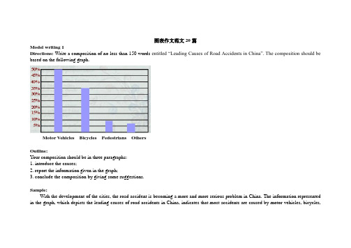
图表作文范文20篇Model writing 1Directions: Write a composition of no less than 150 words entitled “Leading Causes of Road Accidents in China”. The composition should be based on the following graph.Motor Vehicles Bicycles Pedestrians OthersOutline:Your composition should be in three paragraphs:1. introduce the causes;2. report the information given in the graph;3. conclude the composition by giving some suggestions.Sample:With the development of the cities, the road accident is becoming a more and more serious problem in China. The information represented in the graph, which depicts the leading causes of road accidents in China, indicates that most accidents are caused by motor vehicles, bicycles,and pedestrians.In the graph we can clearly see that motor vehicles are responsible for the largest part of road accidents, namely about 50% of them. Bicycles account for 35% of the accidents and pedestrians caused nearly 10%. These statistics indicate that motor vehicles have to some extent become a threat to the security of whole society, which endangers people’s lives.Since we know that motor vehicles are the leading cause of road accidents in China, we should take some measures to improve the situation. First, we should make a law to punish any violators of traffic regulations. Then, cyclists should use hand signals to warn other road users of their intentions. Last but not least, the department concerned should educate ordinary people to walk on a zebra crossing or overpass when they cross a street. All in all, it’s time for us to attach great importance to this problem.Model writing 2Directions: Take a look at the table below. It shows the number of road accidents in Britain in different places as well as the ages of theSampleThe chart above organizes data about road accidents involving children in Britain by when and where the accidents occurred. It can be seen that the incidence of accidents decreases as the children’s age increases and that age correlates with the circumstances surrounding the accident.For all ages, the most common situation leading to accident is playing in the street but young children were particularly affected. Children between the ages of 5-7 seemed to get into accidents while engaged in activities appropriate to their age, such as shopping for their parents orgoing home from school. In fact, this age group accounted for the most road accidents of all. Children between 8 and age 11 had the most accidents cycling in the street. After age 11, the number of accidents dropped considerably in all situations.From the chart, we get to know that playing in the street is the most common and universal site of accidents of all ages, but the risks that other sites and situations present vary with the children’s ages.Model writing 3Directions: Write a composition entitled “Changes in US Spending Patterns”. The composition should be based on the following pie charts.Sample:The pie charts show changes in American spending patterns between 1966 and 1996.Food and cars made up the two biggest items of expenditure in both years. Together they comprised over half of household spending. Food accounted for 44% of spending in 1966, but this dropped by two thirds to 14% in 1996. However, the outlay on cars doubled, rising from 23% in 1966 to 45% in 1996.Other areas changed significantly. Spending on eating out doubled, climbing from 7% to 14%. The proportion of salary spent on computers increased dramatically, up from 1% in 1996 to 10% in 1996. However, as computer expenditure rose, the percentage of outlay on books plunged from 6% to 1%.Some areas remained relatively unchanged. Americans spent approximately the same amount of salary on petrol and furniture in both years.In conclusion, increased amounts spent on cars, computers, and eating out were made up for by drops in expenditure on food and books. Model writing 4Directions: For this part, you are allowed 30 minutes to write a composition of no less than 150 words on Changes in People’s Diet. Study the following table carefully and your composition must be based on the information given in the table. You should quote as few figures as possible.Outline:Write three paragraphs to:1. State the changes in people’s diet in the past five years2. Give possible reasons for the changes3. Draw your own conclusionSample:As can be seen in the table, there have been great changes in people’s diet in the past five years. During the five years, the consumption ofgrain decreased by 4%, while that of meat and milk increased by 4% and 3% respectively. From the figures we can draw the conclusion that grain, as the staple food in China, is playing a less important role in people’s diet, while the consumption of high-energy food, such as meat and milk, has increased steadily.What caused these changes? I think the reasons are as follows: First, the open policy brings the people opportunities to earn a lot of money. Second, people nowadays pay more attention to the structure of their diet. They are seeking the most reasonable diet structure, which will do good to their health.From the above, we can see that, with the development of the country, people’s living standard has greatly improved in the five years. We can also expect better living standard and more reasonable diet structure in the future.Model writing 5Directions: For this part, you are allowed 30 minutes to write a composition on the topic Health Gains in Developing Countries. Your composition should be no less than 120 words.Outline:You must base your composition on the following instruction given in Chinese:1. 以下图为依据描述发展中国家的期望寿命(life expectancy)和婴儿死亡率(infant mortality)的变化情况。
高一英语图表作文范例
高一英语图表作文范例English:The bar chart illustrates the percentage of students participating in various extracurricular activities at a high school in China. It can be observed from the chart that the most popular activity among students is sports, with 45% of students choosing to participate. Following sports, music and art activities are the next most popular choices, each with 20% of students participating. Interestingly, only a small percentage of students, approximately 15%, are involved in academic clubs or volunteer work. Overall, the data indicates a preference for physical and creative pursuits among the student population.Translated content:这幅条形图展示了中国某所高中学生参与各种课外活动的百分比。
从图中可以看出,最受学生欢迎的活动是体育运动,有45%的学生选择参加。
紧随其后的是音乐和艺术活动,每种活动都有20%的学生参与。
有趣的是,只有约15%的学生参与学术社团或义工活动。
总体而言,数据表明学生群体更偏爱体育和创意追求。
图表作文英语模板

图表作文英语模板Introduction:The prevalence of social media in the modern world has raised concerns about its influence on various aspects of life, particularly among teenagers. The following essay explores the positive and negative impacts of social media on the younger generation.Body Paragraph 1 (Positive Impact):Firstly, social media has revolutionized the way teenagers communicate and interact with each other. Platforms such as Facebook, Instagram, and Twitter allow them to stay connected with friends and family, regardless of geographical distance. This has fostered a sense of global community and has been particularly beneficial for those who may feel isolated in their immediate surroundings.Body Paragraph 2 (Negative Impact - Mental Health): However, the excessive use of social media can have detrimental effects on the mental health of teenagers. Studies have shown that spending long hours on social media can lead to increased feelings of anxiety, depression, and loneliness. The pressure to present a perfect life online can lead to unrealistic expectations and a distorted self-image.Body Paragraph 3 (Negative Impact - Privacy and Safety): Additionally, there are significant concerns regarding privacy and safety on social media. Teenagers may not befully aware of the risks associated with sharing personal information online, making them vulnerable to cyberbullying, identity theft, and other online threats.Conclusion:In conclusion, while social media offers a platform for connection and communication, it is crucial for teenagers tobe aware of its potential pitfalls. Educating young users about responsible social media use and providing support for those struggling with the negative aspects can help mitigate the adverse effects. It is a shared responsibility of parents, educators, and the social media platforms themselves toensure a safe and positive online experience for teenagers.。
图表分析作文模板英语

图表分析作文模板英语Chart Analysis Essay Template。
Introduction。
In today's data-driven world, the ability to interpret and analyze visual representations of information has become increasingly crucial. This essay aims to delve into the intricacies of a given chart, exploring its key features, underlying trends, and potential implications. By doing so, we hope to gain a deeper understanding of the information presented and its significance in the broader context.Description of the Chart。
The chart under scrutiny is a [type of chart, e.g., bar graph, line graph, pie chart, etc.], depicting [brief description of the main content or data represented]. Thex-axis represents [variable or category on the x-axis],while the y-axis corresponds to [variable or measurement on the y-axis]. The chart is color-coded, with [specific colors] used to distinguish between different data pointsor categories.Analysis of Key Features。
图表作用英文作文

图表作用英文作文Charts and graphs are used to visually represent data and information. They help to present complex information in a clear and concise manner.When it comes to analyzing trends and patterns, charts and graphs are extremely useful. They allow us to quickly identify relationships and make comparisons between different sets of data.Charts and graphs are also effective for making predictions and forecasts. By examining the data presented in a chart or graph, we can often make educated guesses about future outcomes.In addition, charts and graphs are valuable for highlighting key points and findings. They can draw attention to important information and make it easier for the audience to understand the significance of the data.Furthermore, charts and graphs are essential for presenting data in a way that is easily understandable to a wide audience. Visual representations can be more accessible and engaging than raw data or written reports.Moreover, charts and graphs are instrumental in supporting arguments and conclusions. They provide visual evidence to back up claims and help to persuade others of the validity of a particular point of view.Overall, charts and graphs play a crucial role in conveying information, analyzing data, and communicating complex ideas. They are an indispensable tool for anyone working with data and statistics.。
- 1、下载文档前请自行甄别文档内容的完整性,平台不提供额外的编辑、内容补充、找答案等附加服务。
- 2、"仅部分预览"的文档,不可在线预览部分如存在完整性等问题,可反馈申请退款(可完整预览的文档不适用该条件!)。
- 3、如文档侵犯您的权益,请联系客服反馈,我们会尽快为您处理(人工客服工作时间:9:00-18:30)。
Graphs
14
Sample 2
?The table shows the changes in the way people travel. During the years between 1990 and 2003, the number of people traveling by train, by air and by private car has changed a great deal.
出结论) . (结尾句).
Graphs
7
Sample 1
?People Below Poverty Line
250
150
50
Year
Graphs
8
Sample 1
?Recentlyt,he issueof peoplebelowpovertyline has arousedmuchinteres.tAscanbeseenfromthegraph, the numberof peoplebelowpovertyline decreased duringthe yearsof 1978to 1997.In 1978,thereare 250millionthroughoutthecountrywhilein 1997only 50millionpeoplewereundertheline.
Graphs
9
Sample 1
?Severaflactorscontributeto thedecreaseF. irstof all, thegovernment'psolicyof reformandopeningup has acceleratedthe country'sdevelopmenatnd prospered its economy.Secon,d people'sliving conditionhas improvedremarkablyA. ll this resultsin a dropin the poverty-strickepnopulation.
Several factors contribute to the change. Firs第t o一f all, 原因). In addition第, (二原因). Perhaps the main cause第is ( 三原因).
From the analysis above, we can safely conclu(得de tha
12
Sample 2
? Changes in the Way of Travel ? Outline:
1. 下图所示为某城市1990年至2003年间人们旅行乘车
方式的变化,请描述其变化 简述变化+细节描述 2. 简述你从中得出的结论 结论
Graphs
13
Template 2
Thegraphdescribes (点题) . As canbeseenfromthe graph,(概括描述). (展开一句).
图表作文
Graphs
?类类俱到、选取典型数据 ?简单明确、说明一个问题 ?套用模板、牢记表达方式
Graphs
2
Types
table
1999 2000
xxx xxx xxx
line graph
pie graph
12%
30% 58%
100 50 0 第一季度
第四季度
Graphs
bar graph
东部 西部 北部
1. 下图所示为中国三年中贫困线以下人口的 变化,请
描述其变化 变化 2. 请说明发生这些变化的原因 原因 3. 解决目前中国贫困人口问题还有什么困难 结论
Graphs
6
Template 1
The graph describes点题( ) . As can be seen from the graph,(概括描述). (展开一句). 1
? Fromthe analysisabove,we cansafelyconcludethat thischangewillbringus muchbenefit.Howevert,here are still manypeoplelivingbelowpovertyline dueto China's overpopulation,limited resources and relativelylow employmentt,o mane just a few. Of course,thegovernmenist makingeveryeffortto solve thoseproblems.
Graphs
11
Sample 2
? Changes in the Way of Travel
Mode of traveling
1990
√ By air
8%
2003 25%
By train
√ By car
By bike
58% 10% 24%
35% 32% 8%
Total
100% 100%
Graphs
As can be seen from the table, there are several remarkablteendencies(对: 图表进行细节描述).
I thinktwothingscausedthechanges(.对原因的分析或 自己的结论). So,wemaypredictthat(得出结论或对未来的
3
Graphs
1. Templates & Samples 2. Expressions & Class work
Graphs
4
Sample 1
?People Below Poverty Line
250
150
50
Year
Graphs
5
Sample 1
? People Below Poverty Line ? Outline:
Graphs
15
Sample 2
?As can be seen from the table, there are two remarkable tendencies: one is the rate of traveling by air, and the other is that by private cars. The former rose from 8% in 1990 to 25% in 2003, while the latter from 10% to 32%, both increasing more than 3 times. The table also shows that the number of people traveling by train decreased by 23%