大学英语写作技巧与训练(图表作文之饼状图和表格s)
英语专业四级写作备考四-图表作文

易犯错误&解决方法
盲目地把图表中所有数据都描写出来,不管是否和主题有 关。
解决方法:可以在描写和引用数字前,先把这些数据要反 映的问题用一句话写出来。这样就把数据看成是一种用来 说明问题的具体数据材料 (statistical evidence) 。选用的数 据必须和论述有关。
例2
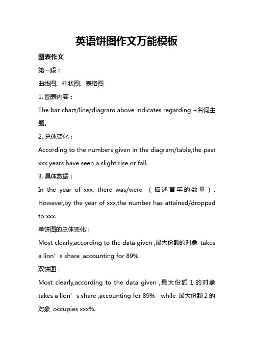
Rising Divorce Rates in China
12%
58%
30%
1992
1
2
3
上图1、2 、3分别表示: 1:Graduates who continue to study 2:Graduates who take jobs irrelevant to their majors 3:Graduates who hold jobs in their majors
1. The rapid growth of divorce rates from 1987 to 1992 results from two obvious facts. The new marriage law simplifies the procedures of divorce. Besides, the improvement of women social status makes divorce a common thing.
2023最新整理收集 do something
Writing a Composition According
to Tables and Graphs
By Lara
Table of Contents
图表作文和一般作文的区别 看懂图表要领(1) 看懂图表要领(2) 图一、图二分析
易犯错误&解决方法 常用数字表达法 Basic Writing Structure etc. More Exercises
英语饼图作文万能模板
英语饼图作文万能模板图表作文第一段:曲线图、柱状图、表格图1.图表内容:The bar chart/line/diagram above indicates regarding+名词主题。
2.总体变化:According to the numbers given in the diagram/table,the past xxx years have seen a slight rise or fall.3.具体数据:In the year of xxx,there was/were(描述首年的数量). However,by the year of xxx,the number has attained/dropped to xxx.单饼图的总体变化:Most clearly,according to the data given,最大份额的对象takes a lion’s share,accounting for89%.双饼图:Most clearly,according to the data given,最大份额1的对象takes a lion’s share,accounting for89%while最大份额2的对象occupies xxx%.具体数据:剩下排名的数据Meanwhile,part-time jobs and scholarship as sources of income rank second and third,occupying30%and10% respectively.第二段:写原因原因:AS far as I am concerned,there are some obvious reasons behind the change.Firstly reason1,secondly reason2,one more point that can be overlooked is that reason3.万能原因:1.With the rapid development of economy and society,Chinese people become more wealthy,so...2.The general Chinese people are under a lot of pressure,and therefore they relax themselves by doing sth.3.People nowadays develop a better awareness to accept a quality life style and that’s why a lot of people do sth.第三段:(两句话)Based on the discussions above,we may reach the conclusion that the trend will continue for a while in the future.I also suggest that we create a better environment so that we can keep up the good trend.现象分析:第一段:1.现象介绍:The recent decades have witnessed a widespread social and economic phenomenon:online shopping.2.现象之普遍性:2.1官方数据:According to the data given by the relevant government,as may as xx%of the people surveyed have such experience.2.2身边例子:A friend of mine recently...第二段(和图表一样)第三段:(两句话)和图表一样。
2023年英语四级图表作文的类型及参考范文

您目前旳位置: 首页 > 英语四级 > 英语四级作文 > 英语四级作文综合辅导 > 正文英语四级图表作文旳类型及参照范文图表作文也是四(六)级考试中常见, 并且被认为是一种较难旳作文形式。
图表作文就是把非文字信息(一般为多种图表表达旳数字信息等)转换成文字信息旳一种作文。
它规定我们用文字来描述非文字性旳图表或对图表显示旳关系作解释阐明。
下面我们先来看一看图表作文旳类型。
第一节图表作文旳类型图表作文可分为两大类: 表作文和图作文。
表作文表格(Table)可以使大量数据系统化, 便于阅读、比较。
表格常由标题(Title)、表头(Boxhead)(表格旳第一行)、侧目(Stub)(表格左边旳第一列)和主体(Body)部分(表格旳其他部分)等部分构成。
如下表:用表格体现旳信息详细精确, 并且表格中旳各项均按一定规律排列。
阅读表格时要注意找出表格中各个项目旳互相关系, 表格中各个项目旳变化规律。
例如, 上面旳表格中旳数字阐明, 和1978年相比, 1983年大学入学旳人数在增长, 而小学旳入学人数在减少。
弄清晰这些变化规律也就读懂了表格旳内容。
图作文图作文又可分为三种: 圆形图作文、曲线图作文和条状图作文。
(1) 圆形图作文圆形图(Pie chart)也称为饼状图或圆面分割图。
圆形图由于比较形象和直观, 各部分空间大小差异轻易辨别, 因此常用来表达总量和各分量之间旳比例关系。
整个圆表达总量, 楔形块表达分量。
有时圆形图尚有数值表, 两者结合可把各分量表达得更精确、清晰。
例如:Thi.i..pi.char.o.th.averag.weekl.expenditur.o..famil.i.Grea.Britain.A.ca.b.se.fr o.th.chart.th.mai.expenditur.o.a.averag.Britis.famil.i.spen.o.food.whic.account. fo.25.o.it.tota.expenditure.Th.nex.tw.significan.expendin.item.ar.transpor.an.ho using.whic.ar.15.an.12.respectively.I.w.tak.int.accoun.clothin.an.footwear.whic. make.u.10%.th.fou.essential.o.life.tha.is.food.transport.housing.an.clothin.an.f ootwear.amoun.t.62.o.th.tota.expenditure.(2) 曲线图作文曲线图(Line graph)也称为线性图或坐标图。
新大学英语四级作文专题(图表作文和应用文)(含答案)

图表作文图表作文提示部分包括图表和文字要点提示两部分。
图表的类型主要有:圆形(饼型)图(pie chart)、柱形图(直型图)(graph)、曲线图(chart)和数据统计表(表格)(table)。
图表作文的写作容包括综合理解、客观详述和主观表达。
模板一①总的趋势②图表具体描述③剖析图表所揭示的含义④理由一⑤理由二⑥理由三⑦理由四⑧总结⑨前景预测As can be seen from the table, the past decade has witnessed dramatic changes in ①______. While②_______. It is obvious from the table that③_________.What contributed to these changes?I think the reasons are as follows.To start with,④______. Secondly,⑤______ . What’s more,⑥ _______. Last but not least,⑦________.In conclusion,⑧_________. Moreover,⑨ ________.文: How People Spent Their HolidaysYear 1990 1995 2000Traveling 37% 51% 76%Staying at home 63% 49% 24%1.上图所示为1990、1995、2000年某城市人们度假方式的情况,请描述其变化:2.请说明发生这些变化的原因。
3.得出结论。
How People Spent Their HolidaysAs can be seen from the table,the past decade have witnessed dramatic changes in the way people spent their holiday between 1990 and 2000.In 1990, 63% of people spent their holidays at home,while the figure dropped considerably to24%in2000.It is obvious from the table that people tended to be more and more mobile,and they wanted to get entertainment in the outside world.What contributed to these changes?I think the reasons are as follows.To start with,with the rapid development of economy,people earn by far more money than they used to.Thus,people are able to afford traveling expenses.Secondly,people thinkit important to get well-informed about the outside world in this new era when everything is on the move.Traveling,of course,is a sure way to achieve this goal. What's more, in this competitive society, people are usually under great stress. However,it is not difficult to find traveling an effective way to relieve people's stress and get st but not least,by traveling outside,people are closeto nature, which is not only beneficial to both their health and peace of mind.In conclusion, people prefer to go traveling rather than stay at home during holidays for a combination of reasons.Moreover,it seems that this trend will lastin the foreseeable future.模板二①描述图表②分三方面解释原因③下结论1)During the period from_______to_______,________rose from________to_______,while _______ decreased from _______ to _______.2)We believe that three reasons can account for this phenomenon.First,____.Second,____. Third, _____.3) ___.We are happy to see that things are becoming better and better nowadays. We can imagine that ___.文: Health Gains in Developing Countries1.以下图为依据描述发展中国家的期望寿命(1ife expectancy)和婴儿死亡率(infant mortality)的变化情况2.说明引起变化的各种原因Health Gains in Developing CountriesDuring the period from1960to1990,the life expectancy of developing countries rose from 40 years to nearly 60 years, while infant mortality decreased from 200 deaths per 1000 births to around 100.We believe that three reasons can account for this phenomenon. First, economy develops quickly in developing countries during this period, and living quality improves significantly as a result.Second,people's health conditions also become better and better with the development of national health care systems. When they become richer and richer, they care more about personal health conditions. Third, medical sciences also develop at a fantastic speed,and it is much safer for mothersto give birth.We are happy to see that things are becoming better and better nowadays.We can imagine that people will live longer and the infant mortality will again fall. [1996.6. CET-6]模板三①描述图表②解释图表③补充解释1)During the period between_______and________,________declined abruptly from_______ to ________, while ________ increased sharply from ________ to _______. 2)Several reasons can account for this pared with_________is much cheaper and more convenient__________ . Apart from that, _________.3) However, there are still a number of people who _________, generally for two reasons. On one hand,________. On the other hand, ________.文: Film Is Giving Way to TV1.电影观众越来越少2.电视观众越来越多,因为……3.然而,还是有人喜欢看电影,因为……Film Is Giving Way to TVDuring the period between1975and1985,film-goers declined abruptly from85,000to about12,000,while TV-watchers increased sharply from5,000to more than100,000.Several reasons can account for this phenomenon. Compared with a film, TV is much cheaper and more convenient--you don't have to leave your house at all.Apart from that, you have many choices while watching TV, but a film concentrates on a certain topic.However, there are still a number of people who enjoy going to the cinema,generally for two reasons. On the one hand, the audio-visual effect of a cinema is much better. On the other hand, in a quiet and comfortable place such as a cinema,you can concentrate on what you are watching and get the most of the film.作业:2002年06月英语四级写作试题Directions: For this part, you are allowed thirty minutes to write a composition on the topic Student Use of Computers.You should write at least 120words,and base your composition on the chart and the outline given below:181614121086420三维柱形图 11990199520001.上图所示为1990年、1995年、2002年某校大学生使用计算机的情况,请描述其变化;2.请说明发生这些变化的原因(可从计算机的用途、价格或社会发展等方面加以说明);3.你认为目前大学生在计算机使用中有什么困难或问题。
饼状图的英文作文

饼状图的英文作文英文:Pie chart is a type of graph that is commonly used to represent data in a circular format. It is divided into slices, where each slice represents a proportion of the whole. Pie charts are useful in displaying data that can be broken down into categories or percentages.One advantage of using a pie chart is that it is easy to interpret. The slices of the pie represent a clearvisual representation of the data. It is also easy to compare the sizes of the slices, which can help to identify patterns or trends in the data.However, there are also some disadvantages to using a pie chart. One of the main criticisms is that it can be difficult to accurately compare the sizes of the slices, especially if there are a large number of slices. Another disadvantage is that it can be difficult to accuratelyrepresent small percentages, as the slices can become too small to be easily visible.In my personal experience, I have used pie charts to represent survey data. For example, I conducted a survey on favorite types of pizza toppings, and used a pie chart to show the percentage of respondents who preferred each topping. The pie chart made it easy to see that pepperoni was the most popular topping, followed by mushrooms and onions.Overall, pie charts can be a useful tool for representing data, but it is important to consider their limitations and use them appropriately.中文:饼状图是一种常用的图表类型,用于以圆形格式表示数据。
大学英语四级图表写作

大学英语四级图表写作大学英语四级图表写作:如何准确传达数据信息在大学英语四级考试中,图表写作是必考题型之一。
考生需要具备良好的图表解读能力和语言表达能力,才能准确传达数据信息。
本文将为大家分享大学英语四级图表写作的技巧和注意事项,帮助大家提高图表写作水平。
一、理解图表类型在开始写作之前,考生需要了解不同的图表类型。
大学英语四级考试中常见的图表类型包括柱状图、饼图、曲线图和表格等。
每一种图表类型都有其特点和适用范围,考生需要根据题目要求选择合适的图表类型进行写作。
二、明确图表主题在开始写作之前,考生需要先明确图表的主题是关于什么的。
只有准确理解图表的主题,才能确定文章的中心思想。
在写作过程中,考生需要紧紧围绕主题展开论述,确保文章内容与主题密切相关。
三、关注数据变化图表中的数据变化是文章的重点。
考生需要认真观察数据变化,找出趋势和规律,然后对这些趋势和规律进行分析和解释。
在描述数据时,考生需要注意数据的准确性和语言的简洁性,避免夸大或歪曲事实。
四、注意语言表达在大学英语四级图表写作中,语言表达是非常重要的。
考生需要使用准确、简洁的语言描述图表中的数据信息。
在写作过程中,考生可以适当地使用一些连接词和过渡句,使文章更加流畅。
此外,考生还需要注意语法、拼写和标点等方面的错误,确保文章质量。
五、练习与总结最后,考生需要进行大量的练习,熟悉各种图表类型和写作技巧。
在练习过程中,考生可以发现自己存在的问题和不足,然后及时进行总结和改进。
只有通过不断的实践和反思,才能提高自己的图表写作能力。
总之,大学英语四级图表写作需要考生具备良好的图表解读能力和语言表达能力。
在写作过程中,考生需要准确理解图表类型、明确主题、关注数据变化、注意语言表达等方面的技巧和注意事项。
通过大量的练习和总结,相信大家一定可以写出优秀的图表作文。
大学英语四级图表作文写作大学英语四级图表作文写作在大学英语四级考试中,图表作文是一个重要的考点。
大学英语写作技巧与训练图表作文之饼状图和表格s

4)描述
It is clear that the most (adj.) ____ is A, which accounts
for __% of all ____ . B is the next largest (adj.) ____ , __%
lower than A of all ____ and followed closely by C . The
2)百分数
Proportion / rate / percentage
3)比例,倍数
a quarter of…
half of…
a majority of…
A has something in common with B
A shares some similarity with B
The difference between A and B lies in…
Double (2倍), triple (3倍), quadruple (4倍), (v, n, adj.)
…be twice as +adj.+ as …..
…more than ____ times as +adj.+ as …..
fourfold( adv., adj.)=four times as much as
1.1.1 饼状图的写作思路
1.审题分析三步法:
Step 1:观察共有几张饼图,以及它们之间的关系是什么
(一般说来,雅思图表题中极少见到单饼图);
Step 2:观察每张饼图中有哪几个区域,以及各个区域分别
代表什么;
Step 3:观察单个饼图中各区域间的百分比差异,以及相同
区域在各个饼图间的百分比的比较或发展。
饼状图类英语作文模板
饼状图类英语作文模板英文回答:Pie Chart。
A pie chart is a circular statistical graphic that is divided into slices to illustrate numerical proportions. Each slice represents a different category of data, and the size of each slice corresponds to the percentage of the total that category represents.Creating a Pie Chart。
To create a pie chart in Microsoft Excel, follow these steps:1. Create a table of data with two columns: one for the category labels and one for the corresponding numerical values.2. Select the data range.3. Click on the "Insert" tab.4. In the "Charts" group, click on the "Pie" button.5. A pie chart will be inserted into the worksheet.Formatting a Pie Chart。
Once a pie chart has been created, it can be formatted to improve its appearance and clarity. Some of the formatting options available include:Changing the colors of the slices。
图表类英语作文范文
图表类英语作文范文图表类型的英语写作如果不擅于观察漫画的话,作文写出来可能会偏题。
下面是小编给大家带来图表类英语作文,供大家参阅!图表类英语作文范文篇1第一段:说明图表开篇句:As the bar chart shows, ____ during the years of ____to____.扩展句:1、As early as _____.2、Then _____ years later, ____.3、And arriving in the year ____, ____.第二段:解释图表变化原因主题句:Several factors contribute to _____.扩展句:1、______. (原因1)2、And ______.(原因2)3、Furthermore, ______ (原因3)4、All these result in ____.第三段:提出解决办法结尾句:However, ____ is faced with some problems.扩展句:1、With _____, ____, the effect of which is not only discouraging, but also challenging.2、So my principle is to pay due attention to ___, but notjustto____.示范第一段:说明图表开篇句:As the bar chart shows, the number of people below the poverty line decreased dramatically during the years of 1978 to1997.扩展句:1、As early as 1978, about 250 million people were under the poverty line.2、Then seven years later, the number became three fifths thatof1978.3、And arriving in the year 1997, the number was reduced to50millions.第二段:解释图表变化原因主题句:Several factors contribute to the sharp decrease of the below-poverty population.扩展句:1、The reform and opening following 1978 enabled the peasants to become much better off. (原因1)2、And with the development of Chinese economy, that policy also improved city dwellers lives greatly. (原因2)3、Furthermore, the high-tech introduced made it possible for the countrys economy as a whole to take off. (原因3)4、All these result in the great fall of theChinesepopulationbelow the poverty line.第三段:提出解决办法结尾句:However, a further decrease in the number of poverty-stricken people is faced with some problems.扩展句:1、With quite few employees being laid off, the effect of which is not only discouraging, but also challenging.2、So my principle is to pay due attention to the newcomers, but not just to care for the poor, say, in remote mountain areas.范文As the bar chart shows, the number of people below the poverty line decreased dramatically during the years of 1978 to 1997. Asearly as 1978, about 250 million people were under the poverty line.Then seven years later, the number became three fifths that of 1978.And arriving in the year 1997, the number was reduced to 50 millions.Several factors contribute to the sharp decrease of the below-poverty population. The reform and opening following 1978 enabled the peasants to become much better off. And with the development of Chinese economy, that policy also improved city dwellers lives greatly. Furthermore, the high-tech introduced made it possible for the countryseconomy as a whole to take off. All these result in the great fall of the Chinese population below the poverty line.However, a further decrease in the number of poverty-stricken people is faced with some problems. With quite few employees being laid off, the effect of which is not only discouraging, but also challenging. So my principle is to pay due attention to the newcomers, but not just to care for the poor, say, in remote mountain areas.图表类英语作文范文篇2The past years have witnessed a mounting number of Chinese scholars returning from overseas. As is lively illustrated by the column chart, the number of returnees climbed from a mere 69.3 thousand in 2008 to over 272.9 thousand in 2012, at an annual increase rate of around 50%.A multitude of factors may have led to the tendency revealed by the chart, but the following are the critical ones from my perspective. First and foremost, along with the development of Chinese economy and society, the number of Chinese studying abroad has been soaring in the past years, which has provided an expanding base for the number of returnees. In the second place, the government has enacted a series of preferential policies to attract overseas Chinesescholars back home. Last but not least, the booming economy, science and technology in this country have generated more attative job opportunites for scholars returning from overseas.The waves of returnees will definitely contribute to this nation’s development, since they have brought back not only advanced science and technology but also pioneering concepts of education and management. With more scholars coming back from overseas, and with the concerted efforts of the whole nation, we have reasons to expect a faster rejuvenation of this country.图表类英语作文范文篇3一、图表类型基本单词图表类型:table(表格)、chart(图表)、diagram(图标)、graph(多指曲线图)、column chart(柱状图)、pie graph(饼图)、tree diagram(树形图)、饼图:pie chart、直方图或柱形图:bar chart/histogram、趋势曲线图:line chart/curve diagram、表格图:table、流程图或过程图:flow chart/sequence diagram、程序图:processing/procedures diagram二、图表描述基本词语1、描述:show、describe、illustrate、can be seen from、clear、apparent、reveal、represent2、内容:figure、statistic、number、percentage、proportion三、常用的描述句型The table/chart diagram/graph shows (that)According to the table/chart diagram/graphAs (is) shown in the table/chart diagram/graphAs can be seen from the table/chart/diagram/graph/figures,figures/statistics shows (that)……It can be seen from the figures/statisticsWe can see from the figures/statisticsIt is clear from the figures/statisticsIt is apparent from the figures/statisticstable/chart/diagram/graph figures (that) ……table/chart/diagram/graph shows/describes/illustrates看过图表类英语范文的人还。
饼状图的英文作文

饼状图的英文作文英文:As we all know, a pie chart is a popular way to display data in a visual format. It is a circular chart that is divided into slices, with each slice representing a proportion of the whole. Pie charts are commonly used to show percentages, proportions and distributions.One of the advantages of using a pie chart is that itis easy to understand and interpret. With just a quick glance, you can see the relative sizes of each slice and understand the overall picture. This makes it a great tool for presenting complex data in a clear and concise way.Another advantage of pie charts is that they can beused to compare data from different categories. For example, if you wanted to compare the sales of different products in a particular market, you could use a pie chart to show the percentage of sales for each product. This would allow youto quickly see which products are most popular and which are less popular.However, there are also some disadvantages to using pie charts. One of the main criticisms is that they can be misleading if the slices are not accurately sized or labeled. This can lead to misinterpretation of the data and can result in incorrect conclusions being drawn.In conclusion, pie charts are a useful tool for displaying data in a visual format. They are easy to understand and can be used to compare data from different categories. However, they should be used with caution and care should be taken to ensure that the data is accurately represented.中文:众所周知,饼状图是一种流行的数据可视化展示方式。
2024届全国新高考英语精准复习图表类作文

纵向对比: 从1990到2020年,经过有效的措施,世界总贫困人口 和中国贫困人口一直在下降。 From 1990 to 2020, through effective
measures, the total number of poor people
both in the world and in China has been
Excitedly, China sucessfully got rid of absolute poverty in 2020.
As far as I am concerned, China has set a good example for the world.The Chinese people are living a better and better life. I am proud of China. Hopefully, the total number of poor people in the world will come to an end in the future.
countries pay high attention to the issue of
poverty,
especially
China.
China has been taking effective measures
to solve the problem of poverty. According to
declining.
范文一:Chinas Achievement in Ending Absolute Poverty
As we all know, poverty is one of the
biggest i s s u e s a r o u n d t h e w o r l d fective measures adopted by the government, all of the poor people across China have been lifted out of absolute poverty by the end of 2020. China has made such amazing achievements that gives the world a hope that ending poverty is possible.
英语图表类作文(万能套用模式)

Observe the chart carefully and describe the main trend.
An example
The No. of Students Learning Chinese
12000 10000
8000 6000 4000 2000
0 Jun-94 Jan-95 Jun-95 Jan-96 Jun-96 Jan-97
A similar pattern is also recorded / discovered for…
A similar pattern is also recorded in Japan for the first half of 1995.
Large difference
There is a significant difference between…
An example
The No. of Students Learning Chinese
12000 10000
8000 6000 4000 2000
0 Jun-94 Jan-95 Jun-95 Jan-96 Jun-96 Jan-97
Japan France
Many reasons may account for the new trend. Firstly,…. secondly,….. Thirdly…
_g_r_a_d_u_a_l_/_s_t_e_a_d_y_ decrease reach the __b_o_t_t_o_m__/ _fl_o_o_r___ of…
Fluctuation (波动)
vary / range between 数字A and 数字B vary / range from 数字A to 数字B
英语作文表格类作文
表格解题关键1表格与饼图一样,都是静态图。
切入点在描述分配;2表格题考查列举数字的能力和方法。
通过举一些有代表性的数据来说明问题;3横向比拟。
介绍横向各个数据的区别、变化和趋势;4纵向比拟。
介绍纵向各个数据的区别、变化和趋势;5不需要将每一个数据分别说明,突出强调数据最大值和最小值;6比照时要总结出数据比照最悬殊的和最小的。
表格举例Topic4-4:ThetablebelowshowscarbondioxideemissionsfromtransportinthreeEuropeancountriesin1994and2004.Summarisetheinformationbyselectingandreportingthemainfeaturesan dmakecomparisonswhererelevant.范文Thegiventableprovidesanoverviewofcarbondioxideemissionsfromfourmaintransportsources(namely,road transport,railways,civilaviationandshipping)intheUnitedKingdom,FranceandGermanyin1994and2004 .Germany,althoughhavinghigheremissionsthaneithertheUnitedKingdomorFrancedid,sawtheamountdecreaseslightlyfromtomilliontonnes.Bycomparison,Francerecordedanincreaseoffourmilliontonnesfrommillionin1994,whiletheUnitedKingdomhadasmallergrowth,milliontonnesoverthesameperiod.〔纵向比拟三个国家1994到2004年间二氧化碳释放量的整体趋势变化。
大学英语四级图表作文写作

table/chart/diagram/graph/figures, It can be seen from the figures/statistics We can see from the figures/statistics It is clear/apparent from the
⑺There are several reasons for the decline. ⑻First, a new traffic law was made and came into force. ⑼ It provided that in summer every car must be airconditioned. ⑽As a result, the highest rate in August, when humidity and high temperature make drivers impatient and easily lead to car accidents, dropped steadily. ⑾Second, new roads were built and some narrow streets were widened, which quickened the flow of traffic. ⑿Finally, the city administration made great efforts to heighten people’s awareness of observing traffic rules.⑺主 题句⑻原因/措施一⑼解释措施一/次要辅助⑽采取措施 一后的结果⑾原因/措施二⑿原因/措施三 ⒀With all these new measures, I’m sure the rate of car accidents in Walton city will go on falling this year.⒀总结:展望未来的情况
作文训练系列之图表作文(一)
• I think we have more freedom to choose what we would like to do after graduation. Going to college is no longer the only choice for most of us as it was years ago. For one thing, our city government has made more efforts to help the non-local workers. For example, their children can enjoy the equal right of a good education with the city students. • For another, with the economic development of our city, more foreigners are attracted to set up business here and they are happy to send their children to local schools to learn more about China and Chinese culture. • I believe the future of the education in our city is promising! • That's all. Thank you.
• 实战演练 实战演练: • 下面的饼状图(pie chat)显示了你对你校 学生兴趣爱好的调查结果。请你用英语给 English Weekly写一篇短文,报道你的调查 结果,并对此结果发表你的看法或建议。 字数120词左右。首句已给出(不计入词 数)。
饼状图英语作文模板英语四级范文

饼状图英语作文模板英语四级范文English:A pie chart is a type of graph in which a circle is divided into sectors that each represent a proportion of the whole. It is commonly usedto show the distribution of data in a clear and visually appealing way. The size of each sector is proportional to the quantity it represents, making it easy for viewers to understand the relative importance of each category. Additionally, pie charts are often color-coded to further enhance readability and make it easier for viewers to distinguish between different segments. Overall, pie charts are a useful tool for presenting complex data sets in a simplified and digestible format.中文翻译:饼状图是一种图表类型,其中圆被分成代表整体比例的扇区。
它通常用于清晰、视觉上吸引人的方式展示数据的分布。
每个扇区的大小与其代表的数量成比例,使观众易于理解每个类别的相对重要性。
此外,饼状图通常进行颜色编码以进一步增强可读性,并使观众更容易区分不同的部分。
总的来说,饼状图是一个有用的工具,可以以简化且易于理解的方式呈现复杂的数据集。
(完整版)大学英语四级考试---图表作文写作方法

段落二:Possible reasons for this are as follows. (问题产生的原因) On the one hand, _____________________________________________________. (原因一) On the other
hand, ______________________________________. (原因二) Furthermore, _________________________________________________. (原因三)
4) It can be seen / We can see from the figures / statistics that …
5) It is clear/apparent from the figures/statistics that …
6) A careful study of the table shows that …
段落二:We can see from the statistics given that _______________(图表细 节一). After v.-ing_________(细节一中的第一个变化), the _____V.-ed+幅度+时 间(紧跟着的变化). The figures also tells us that_________________________(图表细节二). (数据位置,如In the second column), we can see that ____________accounts for _______(进一步描述).
大学英语四六级图表作文
图表的类型
图表的类型主要有下列几种:简称“三图一 表”即柱状图(Bar Graph/Chart)、线形图 (Line Graph)、饼状图(Pie Graph)和表格 (Table)。下边给出了三种图样:
大学英语四级考试图表作文及范文
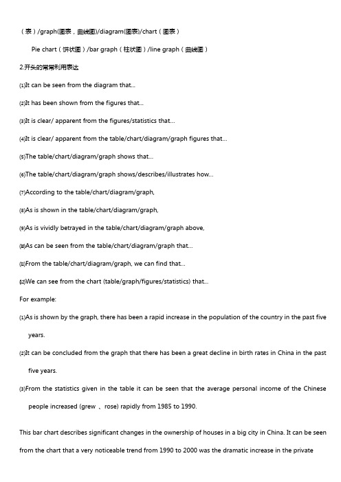
(表)/graph(图表,曲线图)/diagram(图表)/chart(图表)Pie chart(饼状图)/bar graph(柱状图)/line graph(曲线图)2.开头的常常利用表达⑴It can be seen from the diagram that...⑵It has been shown from the figures that...⑶It is clear/ apparent from the figures/statistics that…⑷It is clear/ apparent from the table/chart/diagram/graph figures that…⑸The table/chart/diagram/graph shows that…⑹The table/chart/diagram/graph shows/describes/illustrates how…⑺According to the table/chart/diagram/graph,⑻As is shown in the table/chart/diagram/graph,⑼As is vividly betrayed in the table/chart/diagram/graph above,⑽As can be seen from the table/chart/diagram/graph that…⑾From the table/chart/diagram/graph, we can find that…⑿We can see from the chart (table/graph/figures/statistics) that...For example:⑴As is shown by the graph, there has been a rapid increase in the population of the country in the past fiveyears.⑵It can be concluded from the graph that there has been a great decline in birth rates in China in the pastfive years.⑶From the statistics given in the table it can be seen that the average personal income of the Chinesepeople increased (grew 、rose) rapidly from 1985 to 1990.This bar chart describes significant changes in the ownership of houses in a big city in China. It can be seen from the chart that a very noticeable trend from 1990 to 2000 was the dramatic increase in the privateownership of houses as opposed to the huge drop in the state ownership of houses. In 1990, three out of four houses were state-owned. However, by 2000, the percentage of the ownership of private houses has soared to 80%.The above chart reveals that the huge expansion in the private house ownership has been accompanied by a corresponding fall in the state ownership of houses in a span of a decade. (1990-2000)As is suggested ( unfolded / demonstrated / illustrated / mirrored ) in the above chart, with the sharp rise in the private ownership of houses, the state ownership of houses has dramatically ( substantially / alarmingly ) dropped in a passage of a decade. (1990-2000)According to the above chart, there has been a drastic growth in the private ownership of houses, while the state ownership of houses has shrunk steeply over the past decade. ( 1990-2000)From the above chart, we can see distinctly that the private ownership of houses has witnessed an huge rise as distinct from ( as opposed to / in contrast to / in comparison with ) the drastic decrease in the state ownership of houses in a matter of a decade. (1990-2000)2.图表数据描述的常常利用表达1.上升趋势⑴The number of …has increased/rose slightly/slowly/gradually/steadily/significantly/rapidly/dramatically/steeply/suddenly…from…year to…year/ between…year and…year.⑵The number of …has soared/rocketed to/over…in …year/in the year of…⑶There was a very sudden/rapid/dramatic/significant/sharp/steady gradual/slow/slight increase/rise in thenumber of …from…year to…year/ between…year and…year.For example:⑴The number of teaching staff members in this school has decreased to 700 persons.⑵The number of paticipants grew up to 300000 persons.⑶The number of colour TV sets produced by the factory increased (rose , grew , climbed) from 5000 in 1986 to 21000 in 1990.2.下降趋势The number of …has decreased/fallen/dropped slightly/slowly/gradually/steadily/significantly/rapidly/dramatically/steeply/suddenly…from…year to…year/ between…year and…year.There was a very sudden/steep/rapid/dramatic/significant/sharp/steady gradual/slow/slight decrease /decline/reduction/fall/drop in the number of …from…year to…year/ between…year and…year.3.先上升后下降的句型:...... increased slowly during…… and …… but fell sharply in …….A steady increase in …… during …… and …… followed the sharp fall in …….4.先下降后上升的句型:…… fell before …… began to make a recovery ………… continue the recovery, climbing to ………… dropped during …… but increased again in ………… fell and then pick up during ………… collapsed before rising to ……at the end of ……5.波动There was a minor fluctuation between……remained fairly steady fluctuating between…and ……… fluctuated sharply all through ……6.稳固The number of …remained steady/stable from…year to…year/ between…year and…year.The number of…stayed the same from…year to…year/ between…year and…year.There was little change/hardly any change/no change in the number of…from…year to…year/ between…year and…year.… hardly changed through the period between ……and …3.结尾的常常利用表达As the report indicates…One of the most surpris ing finds was…Overall, the chart demonstrate that…From the diagram it can be safely concluded that…In conclusion, …In summary, we can see that…I. 上图所示为某校大学生平均每周利用运算机的时刻: 1990年(2 hours)、1995年(4 hours)、2002年(14 hours),请描述其转变;II. 请说明发生这些转变的缘故(可从运算机的用途、价钱或社会进展等方面加以说明);III. 你以为目前大学生在运算机利用中有什么困难或问题。
英语饼图作文万能模板
英语饼图作文万能模板英语饼图作文万能模板一文章结构图表式作文是说明文的一种。
一般可分三个层次:1.按照题目要求描述图表反映的总情况,即概括大意。
也可以在首段前加入几句引入正文。
2.对数字进行仔比较,抓住特点进行分析、归纳,找出变化的原因。
3.可写读图表后的想法、结论、评论或针对反映出的问题的解决措施。
二图表分类1 数字表,函数关系图:曲线图 graph2 表格 table3 几何图形 figure4 图形表:饼状图 pie chart5 条状图、柱状图bar chart6 平面图, 示意图,外形图 diagram三图表作文写作1.句型The table/graph/chart shows (that)According to the table/chart diagram/graphAs is shown in the table/chart, ……As can be seen from the table/chart/diagram/graph/figures……,…It can be seen from the figures/statistics thatWe can see from the figures/statisticsIt is clear / apparent from the figures/statistics(that)……The table/chart/diagram/graph shows/describes/illustrates how……2.描述图表中的数据:A 数据(Data)在某一个时间段固定不变: fixed in time 在一系列的时间段中转变: changes over timeB 持续变化的data在不同情况下:增加:increase / raise / rise / go up ……减少:decrease / grow down / drop / fall ……稳定:remain stable / steady/ level / stabilize波动:fluctuate / rebound / undulate / wave ……C 表示数据变化的单词或者词组迅速的,飞快的,险峻的rapid/rapidly戏剧性的,生动的dramatic/dramatically意义重大的,重要的significant/significantly明显的,急剧的sharp/sharply急剧升降的steep/steeply稳固的,坚定不移的steady/steadily渐进的,逐渐的 gradual/gradually缓慢的,不活跃的slow/slowly轻微的、略微地slight/slightly稳定的stable/stablyD其它在描述中常用到的词noticeable / obvious trend 明显的趋势a downward trend in sth在。
- 1、下载文档前请自行甄别文档内容的完整性,平台不提供额外的编辑、内容补充、找答案等附加服务。
- 2、"仅部分预览"的文档,不可在线预览部分如存在完整性等问题,可反馈申请退款(可完整预览的文档不适用该条件!)。
- 3、如文档侵犯您的权益,请联系客服反馈,我们会尽快为您处理(人工客服工作时间:9:00-18:30)。
Approach
Practice
一.数据类图表
1.1 Pie chart(圆形图/饼状图/圆面分割图 ) 它是比较形象和直观的一种图形,此图形反映的是整体与部 分的关系,整个圆表示总量,楔形块表示分量。有时圆形图还有 数值表,两者结合可把各分量表示得更准确、清楚。 通常以百分数的形式表现出来,所以描写重点是图中的比例 构成和最具特点的扇面。描写的时候注意最大或最小的扇面,对 于各扇面数据的描写最好以从大到小的顺序来进行。 This is a pie chart of the average weekly expenditure of a family in Great Britain. As can be see from the chart, the main expenditure of an average British family is spent on food, which accounts for 25% of its total expenditure. The next two significant expending items are transport and housing, which are 15% and 12% respectively. If we take into account clothing and footwear, which makes up 10%, the four essentials of life, that is, food, transport, housing, and clothing and footwear, amount to 62% of the total expenditure.
←Body (主体)
Australia
coal oil
1980 2000 绝对值 相对值 绝对值 50 50% 130 10 10% 2
17% 31% 11%
common interest and goals Economic status Appearance Ablilities
14%
27%
Personality
What do you look for first in a boyfriend?
What’s the most important for a happy life?
1.1.3 295978 (pie graph1): 2013年1月5日雅思
Directions: For this part, you are allowed 30 minutes to write an essay. Study the following data on reasons why people leave the UK and reasons why people stay in the UK. ? You should write at least 120 words but no more than 200 words
As to their views about a happy life, nearly 70 percent of the girls attached the greatest importance to marriage and family. “Career” was given top priority by just under 20 percent, while even fewer, around 9 percent, believed that money was the key to a happy life.
1.1.3 295978 (pie graph1): 2013年1月5日雅思
Table
Approach
Practice
1.4表格(Table)
表格常由标题(Title)、表头(Box-head)(表格 的第一行)、侧目(Stub)(表格左边的第一列)和 主体(Body)部分(表格的其余部分)等部分组成。 表格中的各项均按一定规律排列。阅读表格时要注意 找出表格中各个项目的相互关系,表格中各个项目的变 化规律 。 表格中的数字较多,但是数字间的规律性却很强,所 以可以通过归纳和突出典型数据的思路来分析。把变化 趋势或特征相似的几项归为一类,这样就使复杂的数据 简单化。至于典型的数据,可以通过横向和纵向两个方 面进行比较来获得,同时留意最大或最小的数据。
146.24m 135.78m 43.98m 1.14m 1.12m
Regular secondary schools (中 65.48m 学) Specialized secondary schools 0.89m (中专) Institutions of higher learning 0.86m (大学)
例如,下面的表格中的数字说明:
和1978年相比,1983年大学入学的人数在增加,而小 学的入学人数在减少。
STUDENT ENROLLMENT BYLEVEL IN CHINA (←Titleb(侧目)
←Boxhead (表头)
Primary schools(小学)
1.1.1 饼状图的写作思路 1.审题分析三步法: Step 1:观察共有几张饼图,以及它们之间的关系是什么 (一般说来,雅思图表题中极少见到单饼图); Step 2:观察每张饼图中有哪几个区域,以及各个区域分别 代表什么; Step 3:观察单个饼图中各区域间的百分比差异,以及相同 区域在各个饼图间的百分比的比较或发展。 2.选词和万能句 在饼图中,表示百分比的句子是必不可少的。一般表示百分比 有两种比较容易掌握的句型。 1)占据 …be / form / comprise / make up / constitute / cover / represent / account for/ amount to … …be shared by… 2)百分数 Proportion / rate / percentage
3)比例,倍数 a quarter of… half of… a majority of… A has something in common with B A shares some similarity with B The difference between A and B lies in… Double (2倍), triple (3倍), quadruple (4倍), (v, n, adj.) …be twice as +adj.+ as ….. …more than ____ times as +adj.+ as ….. fourfold( adv., adj.)=four times as much as 4)描述 It is clear that the most (adj.) ____ is A, which accounts for __% of all ____ . B is the next largest (adj.) ____ , __% lower than A of all ____ and followed closely by C . The above three items of ____ take up about __% of the __% By contrast, D, E and F make up the smallest percentage of total ____ , which are __%, __% and __% , respectively. The regions can be divided into two groups: one where … and the other where the reverse is the case.
1.1.2 Model Analysis (1):p59
Study the following data on love and marriage based on a survey with girl students. Write a passage on the topic “What do girl students look for in love and life?”
19.7%
9.1% 68.2% 3%
Career Money Other Marriage ^ Family
What Do Girl Students Look for in Love and Life? In order to know about girl students’ opinion about love and life, a survey with girl students was conducted in 2005 in two universities — Chongqing University of Technology and Business and East China Normal University. The survey sought answers to two questions: What do you look for first in a boyfriend? What’s the most important thing for a happy life? About one third of the students chose personality as the top factor in choosing a boyfriend, followed by 27 percent focusing on abilities. Next came common interests and goals, favored by 17 percent, with only 14 percent of students claiming appearance to be uppermost in their minds. Fewer still, 11 percent, rated economic status as the first consideration.