pentaho_report_designer汉译版官方使用文档
pentaho报表详解附图

• 图形报表的创建 • 首先在控件区找到图标
,拖拽到编辑区。
• 双击图表,弹出数据配置表,为其配置数据
所 有 图 表 类 型 绑 定 图 标 数 据 的 字 段
图标属性
• 注意:图表的数据字段即是其数据源,其必须是数字类型 • 点击浏览之后的效果如下
• 报表的发部 • 一个数据报表创建完成之后,可将其部署到pentaho提供的server上 进行管理,pentaho server的下载地址 /projects/pentaho/files/
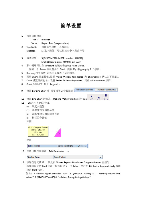
工具栏
控 件 区
数据管理 区 主编辑区 熟 悉 风 格
• 配置数据源 • Data->Add Datasource->JDBC选择jdbc连接本地数据源
• 选择添加数据源按钮
添加数据源
• 增加连接方式,如下图,点击“Test”测试连接,弹出如 • 下图的提示框,则可以连接成功。
• 新建数据集,点击新增按钮之后,可在query name更改查询名称, 然后点击query右侧的编辑按钮
Pentaho 概述
• 数据报表:通过pentaho Report designer将既定产生的 数据以指定的格式展现的一种形式。
• 下载pentaho Report designer • 地址:/projects/pentaho/files/
• 解压上图的文件后,执行目录中的report-designer.bat批处理文件, 就可以启劢PRD设计器
• • • • • •
解压下载好的压缩包之后会有两个目录 第一个是可以跑在jetty上的pentaho后台管理的程序 第二个是可以跑在tomcat上的报表管理的服 务器,其中有个start-pentaho.bat批处理文 件,运行他之后就可以把已经创建的报表发布 到该服务器上了。
Pentaho_Report_Designer-1.5.4
Space DetailsKey:ReportingName:Pentaho Reporting Documentation-Latest Description:Creator(Creation Date):mdamour(Nov27,2006)Last Modifier(Mod.Date):admin(Nov28,2006)Available Pages•Report Designer• 1.Quick Start• er Interface• 3.Report Wizard• 4.Data Sets• 5.Graphical Report Elements• 6.Localizing ReportsReport DesignerThis page last changed on Nov29,2006by mdamour.• 1.Quick Start• er Interface• 3.Report Wizard• 4.Data Sets• 5.Graphical Report Elements• 6.Localizing Reports1.Quick StartThis page last changed on Nov29,2006by mdamour.This chapter shows how to create a simple report and explains the minimal background of the underlying reporting model.When you want a more thorough description of the individual parts,you can use the supplied links to the full description.•Windows XP Professional,Mac OSX10.4.6,Linux SUSE,RedHat Linux•Requires the1.5.0_06Java Runtime Environment(JRE)1.To install,extract contents into a folder.2.In the ReportDesigner folder that is created,click the startdesigner.*file that is appropriate for youroperating system.When you start the Report Designer you are presented with the default workspace divided into five main sections.In the middle of the screen there is a large white area which represents the main working area where the report can be composed.On the left side there is a toolwindow called"Palette"where all graphical elements are listed that can be placed on a report.On the right side are two toolwindows,the upper one called"Structure"where you can see a hierarchical representation of the report,below is a toolwindow called properties where can adjust the settings of the currently available st but no least theres the toolwindow called messages which shows useful information,hints warnings or,most importantly,errors that apply to your current report definition.A report usually consist of data supplied by a database in the form of a table and a report definiton which defines how the report should be formatted or printed.The columns can by identified by an unique columnname with a certain datatype.In the above sample FIRST_NAME is a column identifier and String is the datatype of this column.For simplicity there is a database embedded in the Report Designer to have some useful data to play with.In this first step we are going to configure the sample dataset.If you have not yet started the Report Designer,and want to follow the next sections,then please start the Report Designer now.In the Structure toolwindow,open the popupmenu by clicking the right mouse button on the"Data Sets" node and add the"Sample Dataset"A window is opened where you can configure the query used in the dataset.A default query is automatically inserted when using the sample dataset.For now don't modify this query,as the data delivered by this query is used to describe the following steps in the quickstart chapter.You can press the"Preview"button to see the data we will use in the report.The sample consist of some kind of a sales listing,where customers bought some DVDs.Press the Close button and approve the configuration by pressing OKThe dataset is added to the report.The Properties toolwindow shows the available columns and the datatype of each column.You can press the Configure button to change the configuration of a dataset.The dataset is now setup and installed correctly,we can now go on and define how the report should look like.The report definiton is what you compose in the main area of the graphical Report Designer.This definition tells the reporting engine where to place each field on the report.The report definition consist of several sections called bands,such bands may include a report header,a page header,the item band and others.The following image represents a schematic report as it may appear on screen:The standard bands available in all reports are marked with different colors in the following image.•Red:the page header band.This band is usually printed at the top of each page•Green:the report header band.This band is printed once when the report starts•Blue:the item band.This band is printed for each row available in the data table•Turquoise:the report footer band.This band is printed once at the end of the report•Orange:the page footer band.This band is printed once at the bottom of each pageThe same bands are marked with the same color in the Report Designer.Note that the bands have a label on the left side describing what this band is used for.If you adjusted a band to be really small,chances are high that you can not read the descriptive label anymore.In this case you can hover with the mouse over the label and a tooltip appears with the text.There can also be multiple group header and group footer bands.In a first step we are going to add a static title label to our report which should be printed once on the first page of the report.Therefore we are going to add this label to the report header band.This label does not depend on the data delivered by our sample dataset hence it's also called a static label.Select the"Label"report element from the Palette toolwindow by pressing the mousebutton,dragging the label to the report header band and releasing the mouse button.The label is automatically selected after it was added to the report header band.You can move the label around using the mouse or resize the label by dragging one of the handles.You can use the Properties toolwindow to adjust the text and font in use.Change the text to"Sales Report"and the font to"Dialog24Bold".If you did not considerably change the size of the label,there will probably appear a warning in the Messages toolwindow telling you that the label is not big enough to show the e the mouse and resize the label until there's enough space for the label to print the contents.Note that the warning message is immediatly removed as soon as the label has a good size.The report header band should now look roughly as shown in the screenshot below.Now the report definition is already valid although minimal and can be previewed.Just press the Preview button on the bottom of the report definition area.After the reporting engine has been started up,you are presented with a preview that looks the same as the final report,but is limited to a certain amount of data rows you can configure in the dataset.The booting process is only done once,subsequent invocations of the preview are almost instantaneous.You can go back to the design view by pressing the Design button.Now we are going to add textfields to the which will finally show the selected data from our sample dataset.Report elements dynamically filled with data have the suffix field.Drag&drop four Text Fields from the palette to the item band.The report definition should look like the following screenshot:The Messages toolwindow now shows several warnings about undefined fields.Each textfield should display a column from our sample dataset hence we need to set each textfields"Field Name"property in the Properties toolwindow to match a column from the dataset.You can now preview the report and customize the report definition by using different fonts,background colors,lines and additional static labels as you like.The following section will show you how to create the total sum of all sales by introducing functions.A function is a custom program that can return a value depending on other values available in the report.A function can use values available in a dataset or use the value returned by another function.This canbe used to calculate a total sum,average,minimum,maximum or can be used to hide a label or to hide a rectangle for every second line.Functions can also collect values used to create charts or toformat/convert a value from a dataset into another datatype.Functions are very flexible and make almost everything possible.In the following section,we show you how to calculate the total sum of all sold items.Functions can be added in the Structure toolwindow by selecting the"Reporting Functions"node.All available functions are listed in the Properties toolwindow with a short description in a tooltip.Since we want to calculate the sum of all price items in the report we select the"ItemSumFunction"and press the Add Function to Report button.First we have to tell the function what field should be used to calculate the sum for and as a second property we must set the name of the function.This is very important,since the value of the sum will be accessible by this name.Note that an error is displayed in the messages toolwindow until you set the name.It won't be possible to preview a report as long as an error is shown in this toolwindow.We set PRICE as the Field to use to calculate the sum and we use PRICE_SUM as the name of the function.Don't change the values of the Dependency Level and the Group.We now just have to show this value somewhere on the report.For this purpose we best add a Text Field to the report footer band and set the Field Name property of the Text Field to PRICE_SUM(the functions name).You can now preview the report and it should look something like the screenshot shown below.The sum is printed after the last item is printed.As usual you can adjust the report definition as you like.The structure of the report definition we have so far is perfectly fine,but we might want to merge the items for each customer and calculate the sum for each customer separately.This can by achieved by a concept called grouping.In the following section we show you how to group the data by customer.Groups can be added in the Structure toolwindow by selecting the"Groups"node and opening the popup menu.Select"Add Group"from the menu.A group merges or groups all consecutive items with the same values in a group.Each time a new group starts,the group header band of this group is printed.Whenever a group ends,the group footer band is printed.When you take a look at the preview of our current report,we would like a group to start for the first item of"Erik Brown".The group should be finished after the last entry of"Erik Brown"and a new group should start for"Hans Meiser"etc.For this to happen we have to tell the group to apply to the fields FIRST_NAME and LAST_NAME. (FIRST_NAME only won't be sufficient because there is a"Hans Meiser"and a"Hans Müller").Therefore we set Group Fields of the group as shown in the next screenshot:In addition it's always a good idea to give the group a meaningful name.In this sample we will use CUSTOMER_GROUP as the name.When you expand the group in the Structure toolwindow you can see that there is also a group header band and a group footer band available.These bands do not yet appear in the graphical report definition area.To make them appear just select both bands in the Structure toolwindow and turn the Show In Layout GUI property on:You can now see the the group header band above the item band and the group footer baand below the item band.This is also the direction how they are printed.To effectively make the group take visually effect,we move the FIRST_NAME and LAST_NAME Text Fields to the group header.To do this you can either delete the existing fields and create new ones in the group header or you can cut/paste them.You can achieve this by selecting both fields,either in the graphical view or in the Structure toolwindow,by holding the CTRL button on your keyboard and selecting the fields with the mouse.Now you can right click into the group header band and select paste:The bands should look like this now:Adding the total sum for each group is almost identical as before:•Select the Report Functions node in the Structure toolwindow•Choose the ItemSumFunction and add it to the report•Enter PRICE as the Field,CUSTOMER_GROUP as the group and CUSTOMER_PRICE_SUM as the function name•Add a Text Field to the group footer band,and set the Field Name to CUSTOMER_PRICE_SUM.That's all!You now have a report that sums the total sales and calculates the total sum for each customer.You can now start to visually enhance the report definition as you like.After some adjustments,additional labels and a few lines here and there there resulting report looks as follows:If you want to achieve almost the same thing with just a few clicks the chapter about the wizard is for you.er InterfaceThis page last changed on Nov29,2006by mdamour.This chapter describes all user interface elements of Report Designer.Most functions and available actions are designed to be easy accessible and easy to understand,yet this chapter might reveal some more advanced functions to customize the user interface.When starting the Report Designer the following user interface is shownThe menubar consists of most commands a user can invoke in the Report Designer.The following section provides a short overview of the main menuitems available:Commands sometimes depend on the current state of the Report Designer like the current selection, contents available in the clipboard.If not all required information is available for a command to be executed successfully,the command is either disabled or will show a message explaining why this command can not be invoked at this time.Invoking the command is not possible in this case and visially drawn in a disabed style.Invoking the command by a keyboard shortcut is also prevented.The report definition area is the center part of the Report Designer.It is used to graphically compose and preview the report.The following screenshot shows one of the bands of the report definition area.Clicking on the Band Description makes the band receive the input.Invoking commands like Select All or Paste will be in the context of this band.The current selection is not changed by this action.Clicking on the Page Border will select this band and makes the band receive the input.Clicking on the Band Content Area will make the band receive the input and will possibly select elements under the cursor.A band can be visually resized by dragging the mouse on the Band separator,this does not have any effect on the generated report.This just for convenience while designing the report:Elements part of the band can be selected by clicking the mous on this element.If there are multiple overlapping elements under the mousecursor,you can repeatedly click on the same spot,and the selection will cycle through the possible elements.You can select multiple elements by holding down the CTRL key of your keyboard.Doubleclicking a text element starts the inline editing mode.You can directly type in text like in a usual textfield.You can leave this inline editing mode by hitting Enter and accepting the changes you made or by hitting Escape and undo the changes you made.Clicking outside the element will also cancel the inline editing mode and not accept your changes.!Report Designer^inline_labels.jpg!A popup menu for the most common commands like copy/paste is available by clicking the right mouse button.A Toolwindow is a part of the iterface that groups together related control elements.There are four built in toolwindows available in the Report Designer.•Palette Toolwindow•Structure Toolwindow•Properties Toolwindow•Messages ToolwindowToolwindows can be resized with the mouse and can be completely hidden by pressing the Toolwindow control button.By clicking the right mouse button on the toolwindow control button you can move the Toolwindow to another side of the screen.The Palette toolwindow stores all graphical report elements available to be added to a report.You can drag&drop elements from the palette to one of the bands available in the report definition area by pressing the mouse button on an element in the palette and dragging the mouse to the band and releasing the mouse button:The Structure toolwindow shows all visual and non visual report elements added to a report:•Report Under this node are all report elements,visual and non-visual,currently available in the report.•Data Sets Under this node are all datasets listed currently added to the report.•Report Functions All functions that are available in the report.•Page Header All visual elements added to the page header band.•Report Header All visual elements added to the report header band.•Item Band All visual elements added to the item band.•Report Footer All visual elements added to the report footer band.•Page Footer All visual elements added to the page footer band.•No Data Band All visual elements added to the no data band.•Watermaark All visual elements added to the watermark band.•Groups All groups with their subgroups and visual elements.All these listed report elements are mandatory and can only occure once in a report definition.Therefore these elements can not be deleted,and can not be part of a cut/copy/paste command.Each node in the Structure toolwindow has an individual popup menu.The Data Sets node has special entries to add additional datasets.The Groups node has a special popupmenu to add additional groups to the report.All entries in the popupmenu are enabled or disabled depending on the current selection or clipboard content.The Structure Toolwindow can also be used to select multiple elements from the same or from different bands.Just keep the CTRL key pressed while selecting elements with the mouse or keyboard.The Properties toolwindow lists all properties of the currently active selection.You can also select multiple elements and the common properties can be modified at once.This is useful if you want to e.g.change the background color of several labels at once.Each type of report element has its own set of properties. The toplevel report element has a Name,Page Definition,Default Locale and Resources Path.Depending on the type of property there are different components to edit value of the property.All those editors are pretty self-explanatory.The most important properties for a report element are printed in bold.The properties are grouped into different sections depending by the type of influence they can take.All properties listed under ID don't have a direct impact to the visual appearance of the report,but are used to refer to an element from a function or similar.All properties listed under Appearance have a direct impact on how this report element will look on the report.All properties listed under Spatial affect the size or position of a report element.These properties usually also have a direct or indiret impact on how the report will look.All properties listed under Output take effect for some output targets.Font embedding and encoding are only used when a report is stored as a PDF file.The Messages toolwindow shows at any given time what kind of errors or warnings are available in your current report definition.An error is a problem that prevents the report from being generated.A preview is not possible when an error is shown.A warning is a problem that doas not prevent the report from being generated but means that not all report elements are printed.When you select an error or a warning in the Messages toolwindow the report elements posing the problem are automatically selected if available.If possible the property that needs to be adjusted is also selected in the Properties toolwindow.The statusbar can show descriptions of the commands the mouse is currently hovering.In addition it shows the memory consumption of the application.You can click on the memory consumption panel to force a garbage collection.A red blinking icon indicates that an internal error has occured.This is usually a bad sign and the developers of the application should be contacted and the error reported.You can do this by clicking on the blinking icon.A dialog asking for a description what the user did to make the error occur and a submit button.The developers are automatically notified about the problem if you press the Submit button.If an error occured,it is recommended to save the report under a different name and to restart the Report Designer If you can not open the saved report anymore,it is important to send the report file to the developers by sending them a mail to<reportdesignerbugs@>.3.Report WizardThis page last changed on Nov29,2006by mdamour.The Report Wizard is a very easy to use way to create basic reports which you can customize afterwards in the Report Designer It is meant to get you started,and not to create highly customized sophisticated reports directly.The wizard can be started from the Menubar using the File->Report mand.The first page lets you select what kind of dataset you would like to use.We will use the JDBC Dataset to show all possible pages supplied with the built in datasets.Note that the wizard highly depends on what kind of dataset is selected.Third party datasets can provide their own completely different wizard pages.In the case of the JDBC dataset there is a wizardpage that can be used to configure the connection settings.Following fields are available:•Jar Path to a third-party Jar-file that contains a valid JDBC driver.•Driver Class The fully qualified classname of the driver class.•Connection String The vendor dependent connection string to connect to the database.•Username The username used to connect to the database.•Password The password used to connect to the database.The following screenshot shows the settings used to connect to the built in database.If the connection test was successfull,the Next button is enabled and we can proceed to the next page.The SQL Query page lets you compose a userdefined query by either writing it on your own,or you can try to let the automatic querybuilder to this for you.Just select the columns you want to see in your report and invoke the Insert SELECT command from the popup menu.Select the columns as shown in the screenshot below:When the querybuilder successfully analysed your database and all required foreignkeys have been set, the query is inserted.You need to use the Preview button to see if your query can be successfully executed and the wizard can fetch the required data to continue.When the preview was successfull,the Next button is enabled and we can go to the next wizardpage.In this sample we already sufficiently specified the columns in the query page and can therefore continue with all fields selected.The Groups wizardpage is used to specify how the data should be grouped.We add the FIRST_NAME and the LAST_NAME as our grouping fields as shown in the following screenshot.Press the Add button to add the selected fields.We can continue to the next wizardpage by pressing the Next button.The Functions wizardpage is used to specify what calculations should be applied to the columns.Note that only a subset with the most important functions is available.Choose the ItemSumFunction for the PRICE column and proceed to the next page by pressing the Next button.The Appearance wizardpage is the last page and can be used to specify the pageformat and to choose a template.Press the Finish button to let the wizard generate the report.You now have a simple yet complete report and you can start to customize the layout or add more advanced elements or functions as you like.It is usually a good idea to verify that you have ordered your data according to the fields you specified as group fields.You can use the Layout Bands command from the View menu to automatically adjust the visual size of the bands.This adjusts the bands to the size they will use on the final report.4.Data SetsThis page last changed on Nov29,2006by mdamour.Datasets are the parts that supply the report with data.Right now there are three built in datasets available at your disposal:•Sample Dataset used to access the relational sample database•JDBC Dataset used to access a custom database accessible by a JDBC driver•Properties Dataset used to supply single values to the report like a date,a company nameThe Sample Dataset and the JDBC Dataset are the most important datasets since these datasets are so called table dataset and can be used to fill the item band with data.The Properties Dataset is just a comfortable way to supply additional values.If you wanted to use inputs from a Pentaho Action Sequence,you could add them to the Properties Dataset making them available to the report.A report with just the Properties Dataset won't be sufficient to create a meaningful report.Only one table dataset can be added to a report at a time.5.Graphical Report ElementsThis page last changed on Nov29,2006by mdamour.Report elements are the parts that make up a report.Graphical elements,functions,groups,datasets to name just the most important.This chapter will deal with just the graphical report elements.The Structure toolwindow visualizes the hierarchical structure the best:The topmost all-embracing report element is the report itself.Although the report is one of the most important elements one can not set that many properties and it's a special visual element because most of the characteristic properties for visual elements,size and position,are missing.•Name The name is used by some output targets to set the metainformations but is not very important.•Page DefinitionThe page definition specifies the page format,orientation and the borders,you can use the ellipsis button to open a configuration dialog.•Default LocaleThe default locale defines what language to use for the localization and also influences how numbers and dates are formatted.It's set to the system default locale.•Resources PathSpecifies where the resource engine should look for localization files,files containing translations for the languages you want to support.On the next hierarchical level of the visual elements there are the toplevel bands.These elements are real visual elements as they have the characteristic size properties.•Minimum SizeThis is the size that an element has at least.For bands this size is automatically adjusted to include all contained elements.This is the size mostly set by the designer and is automatically set by placing and resizing elements visually.Most of the time it is perfectly fine to just use this size.The other sizes discussed below are for advanced purposes only.•Preferred SizeThe size that should be used when possible.When not enouogh space is available the element can also be printed smaller,but not smaller than the minimum size.The preferred size should therefore always be bigger than the minimum size or not set at all(0,0).•Maximum SizeThe biggest possible size an element can grow,the maximum size must always be bigger than the preferred size or not set at all(0,0).The toplevel bands have some common properties only used in the Report Designer and which do not affect the printed report in any way.•Visual HeightThe height the band occupies in the report definition area.This does not have any effect on the printed report.•Show in Layout GUIWhether to show the band in the report definition area.This does not have any effect on the printed report.You can use this to hide bands you don't use to not clutter the user interface.The page header band,when not empty,is printed at the top of each page.•Display on First PageWhether to print the page header on the first page or not.•Display on Last PageWhether to print the page header on the last page or not.The report header band,when not empty,is printed once when the report starts but after the page header band.•Page Break Before Whether to insert a pagebreak just before the header is printed.This does not really have an effect.。
pentaho report designer 生成excel报表

pentaho report designer 生成excel报表全文共四篇示例,供读者参考第一篇示例:Pentaho Report Designer是一款功能强大的报表设计工具,可以帮助用户快速生成Excel报表。
在日常工作中,我们经常需要向上级领导或客户展示数据分析结果,而Excel表格是一种常见的展示方式。
使用Pentaho Report Designer可以轻松地将数据转化为漂亮、易读的Excel报表,让我们看看如何使用Pentaho Report Designer来生成Excel报表。
我们需要下载并安装Pentaho Report Designer软件。
它是一款免费开源的报表设计软件,可以在Pentaho官网上进行下载。
安装完成后,打开软件,我们就可以开始设计我们的Excel报表了。
在Pentaho Report Designer中,我们可以选择不同的数据源来获取数据。
可以是数据库、CSV文件、XML文件等等。
选择好数据源后,我们就可以开始设计报表的布局和样式了。
可以添加数据字段、文本框、图片等元素,并对它们进行样式设置。
在设计报表的过程中,我们可以设置报表的标题、子标题、页眉、页脚等部分,以便更好地展示数据。
还可以设置报表的分组和排序规则,使报表更加清晰明了。
设计完报表后,我们可以预览报表的效果。
如果满意了,就可以将报表导出为Excel格式。
选择导出为Excel后,我们可以设置导出的文件名和路径,然后点击导出按钮就可以生成Excel报表了。
通过Pentaho Report Designer生成的Excel报表,不仅外观精美,而且数据准确完整。
我们可以通过Excel的各种功能来进一步编辑和处理报表数据,满足不同的需求。
Pentaho Report Designer是一款非常实用的报表设计工具,可以帮助我们快速生成漂亮的Excel报表。
无论是对于个人使用还是企业使用,都是一款值得推荐的软件。
pentaho report designer 生成excel报表-概述说明以及解释

pentaho report designer 生成excel报表-概述说明以及解释1.引言1.1 概述文章概述部分的内容可以从以下角度进行描述:概述:随着大数据时代的到来,数据分析和报表生成变得越来越重要。
而Excel报表作为业务人员最熟悉和普遍使用的工具之一,在企业中扮演着至关重要的角色。
然而,传统的Excel报表生成方式存在一些问题,如手动操作繁琐、容易出错,不便于数据更新和共享等。
为了解决这些问题,人们开始寻找更高效、自动化的Excel报表生成工具。
本文将重点介绍Pentaho Report Designer,一个强大的报表设计工具,可以帮助用户快速、灵活地生成Excel报表。
Pentaho Report Designer具有丰富的功能和友好的界面,不仅支持多种数据源的连接和查询,还提供了多种报表设计元素和样式,能够满足不同的报表需求。
文章结构:本文包括引言、正文和结论三个部分。
引言部分将对Pentaho Report Designer生成Excel报表的重要性和现实需求进行概述,介绍文章的结构和目的。
正文部分将详细介绍Pentaho Report Designer的功能和特点,并重点介绍了生成Excel报表的具体步骤。
结论部分将总结Pentaho Report Designer生成Excel报表的优势和挑战,并展望未来其发展的方向。
目的:本文的目的是帮助读者了解Pentaho Report Designer生成Excel 报表的基本原理和操作步骤,同时探讨其在实际应用中的优势和挑战。
通过阅读本文,读者可以加深对Pentaho Report Designer的了解,并在实际工作中更加高效地生成Excel报表。
希望本文能为读者提供有价值的信息和启示,促进Excel报表生成工作的改进和提升。
1.2文章结构文章结构部分将介绍本文的组织结构和各个章节的主要内容概要。
本文的文章结构如下:1. 引言- 1.1 概述:介绍Pentaho Report Designer生成Excel报表的背景和意义。
pentaho 4.5工具使用手册

Pentaho工具使用手册目录BI 介绍 (2)Pentaho产品介绍 (2)Pentaho产品线设计 (3)Pentaho BI Platform安装 (4)Pentaho Data Integration-------Kettle (8)Pentaho Report Designer (13)Saiku (24)Schema Workbench (28)附件 (33)BI 介绍1. BI基础介绍挖掘技术对客户数据进行系统地储存和管理,并通过各种数据统计分析工具对客户数据进行分析,提供各种分析报告,为企业的各种经营活动提供决策信息。
其中的关键点是数据管理,数据分析,支持决策。
根据要解决问题的不同,BI系统的产出一般包括以下三种:2. BI系统的产出2.1 固定格式报表固定格式报表是BI最基本的一种应用,其目的是展示当前业务系统的运行状态。
固定格式报表一旦建立,用户就不可以更改报表的结构,只能依据数据库的数据不断刷新报表,以便取得较新的数据。
在pentaho产品线中,我们使用pentaho report designer来实现固定格式报表的需求。
2.2 OLAP分析OLAP分析是指创建一种动态的报表展示结构,用户可以在一个IT预定义的数据集中自由选择自己感兴趣的特性和指标,运用钻取,行列转换等分析手段实现得到知识,或者验证假设的目的。
在pentaho产品线中,我们使用Saiku来实现OLAP分析的需求。
2.3 数据挖掘数据挖掘是BI的一种高级应用。
数据挖掘是指从海量数据中通过数据挖掘技术得到有用的知识,并且以通俗易懂的方式表达知识,以便支持业务决策。
在pentaho产品线中,我们使用weka来实现数据挖掘的需求。
Pentaho产品介绍1. 产品介绍Pentaho是世界上最流行的开源商业智能软件,以工作流为核心的、强调面向解决方案而非工具组件的BI套件,整合了多个开源项目,目标是和商业BI相抗衡。
aggregation_designer_guide

Pentaho Aggregation Designer User GuideThis document is copyright © 2011 Pentaho Corporation. No part may be reprinted without written permission from Pentaho Corporation. All trademarks are the property of their respective owners.Help and Support ResourcesIf you have questions that are not covered in this guide, or if you would like to report errors in the documentation, please contact your Pentaho technical support representative.Support-related questions should be submitted through the Pentaho Customer Support Portal at.For information about how to purchase support or enable an additional named support contact, please contact your sales representative, or send an email to sales@.For information about instructor-led training on the topics covered in this guide, visit/training.Limits of Liability and Disclaimer of WarrantyThe author(s) of this document have used their best efforts in preparing the content and the programs contained in it. These efforts include the development, research, and testing of the theories and programs to determine their effectiveness. The author and publisher make no warranty of any kind, express or implied, with regard to these programs or the documentation contained in this book.The author(s) and Pentaho shall not be liable in the event of incidental or consequential damages in connection with, or arising out of, the furnishing, performance, or use of the programs, associated instructions, and/or claims. TrademarksPentaho (TM) and the Pentaho logo are registered trademarks of Pentaho Corporation. All other trademarks are the property of their respective owners. Trademarked names may appear throughout this document. Rather than list the names and entities that own the trademarks or insert a trademark symbol with each mention of the trademarked name, Pentaho states that it is using the names for editorial purposes only and to the benefit of the trademarkowner, with no intention of infringing upon that trademark.Company InformationPentaho CorporationCitadel International, Suite 3405950 Hazeltine National DriveOrlando, FL 32822Phone: +1 407 812-OPEN (6736)Fax: +1 407 517-4575E-mail: communityconnection@Sales Inquiries: sales@Documentation Suggestions: documentation@Sign-up for our newsletter: /newsletter/ContentsIntroduction (4)Pentaho Aggregation Designer Overview (5)Defining the Data Source (6)Adding a JDBC Driver (6)Adding a Simple JNDI Data Source For Design Tools (7)Simple JNDI Options (8)Defining Additional Parameters (8)Selecting a Model (9)Getting Recommendations Using Aggregate Advisor (10)Customizing Aggregates (11)Customizing an aggregate (12)Adding Aggregates (12)Deleting Aggregates (12)Exporting Aggregates (13)Glossary of Terms (14)| TOC | 3IntroductionThis guide provides you with instructions and recommendations for designing aggregate tables for Mondrian ROLAP models. The use of aggregate tables can dramatically improve the query performance of analysis solutions.AssumptionsThis document is written for Database Administrators and consultants who design specific aggregate tables or get recommendations for aggregate tables based on an intelligent adviser algorithm. It is assumed that you, the reader, have a strong understanding of database design and concepts (such as database modeling, SQL security, andperformance), and are familiar with aggregate table concepts.4 | Pentaho BI Suite Official Documentation | IntroductionPentaho Aggregation Designer OverviewThe Pentaho Aggregation Designer simplifies the creation and deployment of aggregate tables that improve theperformance of your Pentaho Analysis (Mondrian) OLAP cubes. Pentaho Analysis is a pure, relational OLAP enginethat works solely with the data stored in your relational database rather than providing its own multidimensional datastorage model. This simplifies deployment and data management, but places limitations on performance when working with very large data sets (fact tables with more than 10 million records and/or cubes with a high cardinality of levelsand members). To improve performance in these scenarios, Pentaho Analysis supports aggregate tables. Aggregatetables coexist with the base fact table and contain pre-aggregated measures built from the fact table. This improvesperformance by enabling the Mondrian engine to fulfill certain summary level queries from the smaller aggregate table versus aggregating a large number of individual facts from the base fact table.The Pentaho Aggregation Designer provides you with a simple interface that allows you to create aggregate tablesfrom levels within the dimensions you specify. Based on these selections, the Aggregation Designer generatesthe Data Definition Language (DDL) for creating the aggregate tables, the Data Manipulation Language (DML) forpopulating them, and an updated Mondrian schema which references the new aggregate tables. If you are unfamiliarwith aggregate table design concepts, the Aggregation Designer also includes an intelligent adviser that evaluates the structure and cardinality of your OLAP cube and recommends some initial aggregate tables to create for improvingperformance.The components of the Pentaho Aggregation Designer workspace are shown below:Pentaho BI Suite Official Documentation | Pentaho Aggregation Designer Overview | 56 | Pentaho BI Suite Official Documentation | Defining the Data SourceDefining the Data SourceTo design an aggregate table, you must first establish a connection with your target relational database, then select the OLAP model to optimize. You can connect to any relational database that is supported by Mondrian. In some instances,you may need to define additional parameter-related values for your JDBC driver.To define a data source connection...1.In the Pentaho Aggregation Designer tool bar, click Connection to open the Connect to Data Source dialog box.2.Click Configure . The Connection Properties dialog box appears.3.In the Connection Name field, enter a name for your connection; this is a free-text field. A connection name uniquely defines a connection.4.In the Connection Type list, select a database.5.In the Access list, keep the default choice, which should be Native (JDBC).6.In the Settings section, type the host name of the database server into the Host Name field. In the Database Name field, type the name of the database you're connecting to. In the Port Number field, enter the TCP port number.Optionally, in the User Name and Password fields, type the user name and password used to connect to the database.7.Click Test .If the settings you typed in are correct, a success message appears.8.Click OK .Adding a JDBC DriverBefore you can connect to a data source in any Pentaho server or client tool, you must first install the appropriatedatabase driver. Your database administrator, CIO, or IT manager should be able to provide you with the proper driver JAR. If not, you can download a JDBC driver JAR file from your database vendor or driver developer's Web site. Once you have the JAR, follow the instructions below to copy it to the driver directories for all of the Business Analyticscomponents that need to connect to this data source.Note: Microsoft SQL Server users frequently use an alternative, non-vendor-supported driver called JTDS. If you are adding an MSSQL data source, ensure that you are installing the correct driver.Pentaho BI Suite Official Documentation | Defining the Data Source | 7Backing up old driversYou must also ensure that there are no other versions of the same vendor's JDBC driver installed in these directories.If there are, you may have to back them up and remove them to avoid confusion and potential class loading problems.This is of particular concern when you are installing a driver JAR for a data source that is the same database type as your Pentaho solution repository. If you have any doubts as to how to proceed, contact your Pentaho support representative for guidance.Installing JDBC driversCopy the driver JAR file to the following directories, depending on which servers and client tools you are using(Dashboard Designer, ad hoc reporting, and Analyzer are all part of the BA Server):Note: For the DI Server: before copying a new JDBC driver, ensure that there is not a different version of the same JAR in the destination directory. If there is, you must remove the old JAR to avoid version conflicts.•BA Server: /pentaho/server/biserver-ee/tomcat/lib/•Enterprise Console: /pentaho/server/enterprise-console/jdbc/•Data Integration Server: /pentaho/server/data-integration-server/tomcat/webapps/pentaho-di/WEB-INF/lib/•Data Integration client: /pentaho/design-tools/data-integration/libext/JDBC/•Report Designer: /pentaho/design-tools/report-designer/lib/jdbc/•Schema Workbench: /pentaho/design-tools/schema-workbench/drivers/•Aggregation Designer: /pentaho/design-tools/agg-designer/drivers/•Metadata Editor:/pentaho/design-tools/metadata-editor/libext/JDBC/Note: To establish a data source in the Pentaho Enterprise Console, you must install the driver in both theEnterprise Console and the BA Server or Data Integration Server. If you are just adding a data source through the Pentaho User Console, you do not need to install the driver to Enterprise Console.RestartingOnce the driver JAR is in place, you must restart the server or client tool that you added it to.Connecting to a Microsoft SQL Server using Integrated or Windows AuthenticationThe JDBC driver supports Type 2 integrated authentication on Windows operating systems through theintegratedSecurity connection string property. To use integrated authentication, copy the sqljdbc_auth.dll file to all the directories to which you copied the JDBC files.The sqljdbc_auth.dll files are installed in the following location:<installation directory>\sqljdbc_<version>\<language>\auth\Note: Use the sqljdbc_auth.dll file, in the x86 folder, if you are running a 32-bit Java Virtual Machine (JVM)even if the operating system is version x64. Use the sqljdbc_auth.dll file in the x64 folder, if you are running a 64-bit JVM on a x64 processor. Use the sqljdbc_auth.dll file in the IA64 folder, you are running a 64-bit JVM on an Itanium processor.Adding a Simple JNDI Data Source For Design ToolsPentaho provides a method for defining a JNDI connection that exists only for locally-installed client tools. This is useful in scenarios where you will be publishing to a BA Server that has a JNDI data source; if you establish the same JNDI connection on your client tool workstation, you will not need to change any data source details after publishing to the BA Server. Follow the directions below to establish a simple JNDI connection for Pentaho client tools.1.Navigate to the .pentaho directory in your home or user directory.For a user name of fbeuller , typically in Linux and Solaris this would be /home/fbeuller/.pentaho/, and in Windows it would be C:\Users\fbeuller\.pentaho\2.Switch to the ~/.pentaho/simple-jndi/ subdirectory. If it does not exist, create it.3.Edit the default.properties file found there. If it does not exist, create it now.4.Add a data source by declaring a JNDI name followed by a forward slash, then a JNDI parameter and its propervalue.Refer to Simple JNDI Options on page 8 for more information on parameter options.SampleData/type=javax.sql.DataSourceSampleData/driver=org.hsqldb.jdbcDriverSampleData/user=pentaho_userSampleData/password=passwordSampleData/url=jdbc:hsqldb:mem:SampleData5.Save and close the file.You now have a global Pentaho data source that can be used across all of the client tools installed on this machine.You must restart any running Pentaho program in order for this change to take effect.Simple JNDI OptionsEach line in the data source definition must begin with the JNDI name and a forward slash (/), followed by the required parameters listed below.Defining Additional ParametersIf you must define additional parameters for your JDBC driver, or if you want to enter your server settings manually,follow the instructions below:1.Click Options in the left panel..2.Enter the parameter name and value for the settings you need to specify. For example, PORT (parameter name),1025 (parameter value).3.Click Test when your settings are entered.A success message appears if everything was typed in correctly.4.Click OK.8 | Pentaho BI Suite Official Documentation | Defining the Data SourceSelecting a ModelAfter defining your data source, you must select the cube you want to use for defining and building aggregate tables.To select a model...1.In the Connect to Data Source dialog box, under OLAP Model, select Mondrian Schema File.2.Click the ellipsis (...) to display a file dialog box.3.Browse to locate and select your Mondrian schema file, then click OK.4.Click Apply. The Cube list is populated with a list of cubes defined in your schema.5.Select the Mondrian cube you want to optimize, then click Connect.When the Pentaho Aggregation Designer establishes a connection, it runs several validation tests to ensure thatyour database structure is ready to support aggregate tables. A validation summary dialog box appears with a list oftest results. If you see an error message, contact your database administrator.Pentaho BI Suite Official Documentation | Selecting a Model | 910 | Pentaho BI Suite Official Documentation | Getting Recommendations Using Aggregate Advisor Getting Recommendations Using Aggregate AdvisorIf you are unfamiliar with aggregate table design and need help creating aggregates to optimize a cube, you can rely on the Aggregate Advisor to provide you with a list of recommendations. The Pentaho Aggregation Designer uses yourschema file and the data in your database to create aggregate definitions.To display recommended aggregates...1.In the Pentaho Aggregation Designer toolbar, click Advisor .2.Specify your Advisor Input Parameters .SettingDescription Max Aggregates Allows you to specify the maximum numberof aggregates you want the Advisor torecommend.Max Time to RunAllows you to specify the maximum amountof time (in seconds) you want the Advisor torun before making recommendations. Note :Allowing the Advisor to run for longer periods oftime allows for more potential recommendationsto be evaluated and results in more accuraterecommendations.3.Click Recommend .The Advisor runs for a few seconds before it displays an initial list of recommended aggregates. The Advisor is designed to keep running until it finds an optimal solution. If you stop the Advisor prematurely, the Advisor returns the best set of recommendations it has found up to the point when it was stopped.Pentaho BI Suite Official Documentation | Customizing Aggregates | 11Customizing AggregatesWhen you select an aggregate, the Pentaho Aggregation Designer pulls information from the schema file to display its dimensions and levels. You can modify any aggregate the Pentaho Aggregation Designer recommends, customizing itfor your needs. You can also create an aggregate from scratch and delete aggregates you do not want.Impact summaryThe impact summary in the lower right pane provides you with information on the estimated impact for creating all of the currently selected aggregates. This summary includes the number of aggregate tables that will be created, the estimated number of rows contained in those tables, and the estimated amount of space it will occupy on the hard drive. The impact summary is automatically updated as you select and deselect aggregates from the list of proposed aggregates.Cost/benefit chartThe Cost/Benefit chart provides a high-level comparison of the benefit of all currently selected aggregates relative to their estimated cost. The benefit scale represents the relative number of queries that can be fulfilled by an aggregate table versus having to be retrieved from the base fact table. The cost scale is an indicator of the impact in terms of number of tables and disk space needed to create the selected aggregate recommendations.Saving your designThe Pentaho Aggregation Designer allows you to save all aggregate-related data (custom- or advisor-created) in your workspace at any time. Saving ensures that all of the data (your designs) in the workspace is retained; you are saving the state of your workspace as an XML file in a location you specify. To save, go to the File menu and click Save As .To open a saved file, go to the File menu and click Open , then navigate to the design you previously saved.12 | Pentaho BI Suite Official Documentation | Customizing AggregatesCustomizing an aggregateTo customize an aggregate...1.In the Pentaho Aggregation Designer, click on an aggregate in the proposed aggregate list to select it.Note: When you modify an aggregate created using the Advisor, the aggregate becomes a Customaggregate as indicated by the Type column in the proposed aggregate list.2.In the left pane, you can (optionally) modify the Name and Description for your custom aggregate.3.In the Aggregation Levels tab, click the down arrows to make changes to the hierarchy and levels associated with the aggregate definition you are customizing.4.Click Apply .The Pentaho Aggregation Designer updates the proposed aggregate list, cost/benefit chart, and impact summary.Adding AggregatesTo add an aggregate...1.In the right pane of the Pentaho Aggregation Designer, click Add .2.In the left pane, type a Name and Description for your new aggregate.3.Under Level , click the down arrows to define the hierarchy and levels associated with the aggregate you are creating.4.Click Apply .Your aggregate is added to the aggregate list.Deleting AggregatesTo delete an aggregate, select it from the proposed aggregate list and click Remove .Exporting AggregatesThe Pentaho Aggregation Designer allows you to preview the DDL, DML, and schema (for relational databases) outputs before you build aggregate tables. You can also save the outputs and edit them later. If you are using OLAP, DML is the only available output.To preview the DDL and DML outputs...1.Select the aggregates that have DML/DDL output you want to preview.2.In the Pentaho Aggregation Designer toolbar, click Export.3.In the Execute and Publish dialog box, click Preview.4.Click Copy to Clipboard or Save to retain the output.5.If you examine the DDL/DML outputs and are satisfied with the results, you can allow the Pentaho AggregationDesigner to build (Execute/Publish) the aggregate tables. Follow the instructions for publishing and exportingincluded in the Execute and Publishdialog box.Pentaho BI Suite Official Documentation | Exporting Aggregates | 13Glossary of TermsBelow is a list of terms used in this document.AggregateDefinitions for aggregate tables that help optimize a cube; also, summarized data.Aggregate TablesCoexists with the base fact table, and contains pre-aggregated measures built from the fact table. It is registered inMondrian's schema, so that Mondrian can choose whether to use the aggregate table rather than the fact table, ifapplicable for a particular query.AggregationThe process of merging multiple data values into one value. For example, sales data collected daily can then beaggregated to the week level, the week data could be aggregated to the month level, and so on. The data can then be referred to as aggregate data. Aggregation and summarization are synonyms, as are aggregate data and summary data.Data Definition Language (DDL)Originally a subset of SQL, this language defines data structures, including rows, columns, tables, indexes, and database specifics such as file locations. DDL SQL statements are more a part of the database management system, and have large differences between SQL implementations.Mondrian SchemaDefines a multi-dimensional database. A Mondrian schema contains a logical model, consisting of cubes, hierarchies, and members, and a mapping of this model onto a physical model. The logical model consists of the constructs used to write queries in the MDX language: cubes, dimensions, hierarchies, levels, and members. The physical model is the source of the data presented through the logical model. It is typically a star schema, which is a set of tables in a relational databases.Relational Online Analytic Processing (ROLAP)An alternative to MOLAP (Multidimensional OLAP) technology. While both ROLAP and MOLAP analytic tools aredesigned to allow analysis of data through the use of a multidimensional data model, ROLAP differs significantly in that it does not require the pre-computation and storage of information. Instead, ROLAP tools access the data in a relational database and generate SQL queries to calculate information at the appropriate level when an end user requests it. With ROLAP, it is possible to create additional database tables (summary tables or aggregations) which summarize the data at any desired combination of dimensions.Snowflake SchemaA way of arranging tables in a relational database such that the entity relationship diagram resembles a snowflake inshape. At the center of the schema are fact tables which are connected to multiple dimension tables. Thus a snowflake simplifies to a star schema when relatively few dimensions are used. The star and snowflake schemas are mostcommonly found in data warehouses where the speed of data retrieval is more important than the speed of insertion. As such, these schemas are not normalized much, and are frequently left in third normal form or second normal form.14 | Pentaho BI Suite Official Documentation | Glossary of Terms。
pentaho工具使用手册

Pentaho工具使用手册作者:马腾,李洪宇版本:1。
0目录BI 介绍 (2)Pentaho产品介绍 (3)Pentaho产品线设计 (4)Pentaho BI Platform安装 (4)Pentaho Data Integration-------Kettle (8)Pentaho Report Designer (13)Saiku (24)Schema Workbench (28)附件 (33)BI 介绍1。
BI基础介绍技术对客户数据进行系统地储存和管理,并通过各种数据统计分析工具对客户数据进行分析,提供各种分析报告,为企业的各种经营活动提供决策信息。
其中的关键点是数据管理,数据分析,支持决策。
根据要解决问题的不同,BI系统的产出一般包括以下三种:2. BI系统的产出2。
1 固定格式报表固定格式报表是BI最基本的一种应用,其目的是展示当前业务系统的运行状态.固定格式报表一旦建立,用户就不可以更改报表的结构,只能依据数据库的数据不断刷新报表,以便取得较新的数据.在pentaho产品线中,我们使用pentaho report designer来实现固定格式报表的需求。
2.2 OLAP分析OLAP分析是指创建一种动态的报表展示结构,用户可以在一个IT预定义的数据集中自由选择自己感兴趣的特性和指标,运用钻取,行列转换等分析手段实现得到知识,或者验证假设的目的.在pentaho产品线中,我们使用Saiku来实现OLAP分析的需求。
2。
3 数据挖掘数据挖掘是BI的一种高级应用。
数据挖掘是指从海量数据中通过数据挖掘技术得到有用的知识,并且以通俗易懂的方式表达知识,以便支持业务决策.在pentaho产品线中,我们使用weka来实现数据挖掘的需求。
Pentaho产品介绍1。
产品介绍Pentaho是世界上最流行的开源商业智能软件,以工作流为核心的、强调面向解决方案而非工具组件的BI套件,整合了多个开源项目,目标是和商业BI相抗衡。
Pentaho_Report_Designer
目录Report Designer (1)1. 快速入门 (1)2. 用户接口 (12)3. 报表向导 (17)4. Data Sets (22)5. 图形化报表元素 (22)Report DesignerThis page last changed on Nov 29, 2006 by mdamour.1. 快速入门This page last changed on Nov 29, 2006 by mdamour.这章显示了如何创建一个简单的报表,并解释了底层报表模型的最小背景。
如果你想了解单独部分的详尽描述,可使用提供的链接。
系统需求Windows XP Professional,Mac OSX 10.4.6,Linux SUSE,RedHat Linux需要1.5.0_06 Java Runtime Environment (JRE)安装1. 为了安装,将内容解压进一个文件夹。
2. 在被创建的ReportDesigner 文件夹,点击适合于你的操作系统的startdesigner.* 文件。
Report Designer当你启动Report Designer 时,你会看到默认的workspace,其被分割成 5 个主要区域。
在屏幕中间,有一个很大的白色区域,其表示生成报表的主要工作区域。
在左边,有一个名为'1Palette'1 的toolwindow,此处列出的所有图形元素均可用于报表中。
在右边是 2 个toolwindows,上边的叫'1Structure'1,此处你可看到报表的层次化表现,下面是一个名为properties 的toolwindow,此处可调整目前可用选择的设置。
最后是一个名为messages 的toolwindow,此处会显示有用信息,提示警告或,最重要的,你当前报表定义的错误。
数据模型一个报表通常包含数据库以表格形式提供的数据,以及定义了如何格式化或打印报表的报表定义。
pentaho report designer 生成excel报表
pentaho report designer 生成excel报表全文共四篇示例,供读者参考第一篇示例:Pentaho Report Designer是一款功能强大的报表设计工具,可以帮助用户快速生成各种类型的报表,包括Excel报表。
通过Pentaho Report Designer,用户可以轻松地设计出适合自己需求的Excel报表,并且可以自定义报表的格式、布局、样式等各种属性。
生成Excel报表的步骤如下:1. 数据源连接:用户需要连接到所需的数据源,可以选择数据库、文件等多种数据源连接方式,例如MySQL、Oracle、CSV文件等。
2. 设计报表:通过Pentaho Report Designer的可视化界面,用户可以轻松地拖拽、放置和调整各种组件,包括文本框、表格、图形等,来设计报表的结构和内容。
3. 设置报表属性:用户可以设置报表的属性,包括报表的标题、副标题、页眉、页脚等,还可以设置报表的样式、格式、颜色等,以便生成符合自己需求的Excel报表。
4. 预览报表:用户可以在Pentaho Report Designer中预览报表的效果,查看报表的展示效果和布局是否符合预期,并可以对报表进行调整和优化。
5. 导出Excel报表:用户可以选择将报表导出为Excel文件,保存到本地或者发送给他人进行查看和分析。
Pentaho Report Designer生成的Excel报表具有丰富的功能和灵活的设计,用户可以根据自己的需求定制报表的样式和内容,从而实现更加直观、清晰和易于理解的数据展示效果。
第二篇示例:Pentaho Report Designer 是一款功能强大的报表设计工具,可以帮助用户快速、灵活地生成各种格式的报表,包括Excel报表。
Excel是一种非常流行的办公软件,用于创建和管理电子表格,Pentaho Report Designer 的Excel报表功能使用户能够将数据直观地呈现在Excel中,并轻松地进行修改和分享。
report design 使用手册2
netGarmentReport Designer 使用手册一、初识Report Designer (4)1.1、Report Designer的独特之处 (4)1.2、 Report Designer界面 (4)1.3、报表产生的一般过程 (5)二、使用Report Designer制作第一张报表 (5)2.1、登录Report Designer (5)2.2、Report Designer 基本界面 (6)2.3、获取数据 (6)2.4、处理数据 (7)2.5、表现数据 (8)2.5.1、表头部分 (10)2.5.2、表体部分 (11)2.5.3、报表结尾部分 (13)2.5.4、看看自己的成果 (14)2.5.5、“FR3”报表设计的简单操作技巧 (14)2.5.6、有关“FR3”帮助文档的说明 (15)三、创建复杂的SQL语句 (15)3.1、多表SQL (15)3.1.1、创建连接 (15)3.1.2、连接模式 (15)3.1.3、多表连接举例 (16)3.2、SQL语句的列操作 (16)3.2.1、SQL列的显示 (16)3.2.2、字段操作区中字段的顺序 (17)3.2.3、为SQL添加排序 (18)3.2.4、SQL中的聚合操作 (19)3.3、包含条件和参数的SQL语句 (20)3.3.1、条件 (21)3.3.2、参数 (24)3.3.3、参数高级操作 (25)3.3.3.1、区间类型 (26)3.3.3.2、编辑类型 (27)3.3.3.3、查找值的作法 (27)3.4、SQL语句的高级操作 (30)3.4.1、引用前面所写的SQL语句 (30)3.4.2、返回或不返回数据 (31)3.4.3、手工书写SQL (32)3.4.3.1、SQL图形页面的手工书写 (33)3.4.3.2、完全手工书写 (34)3.4.3.3、利用索引提高SQL语句的性能 (35)3.4.3.4、手工书写SQL时需要注意的事情 (35)3.5、察看结果 (35)四、对数据进一步处理 (37)4.1、组成Master&Detail数据集 (37)4.1.1、获取单个的数据集 (37)4.1.2、设置Master&Detail数据集 (38)4.2、OLAP中的自定义字段 (40)4.2.1、自定义字段的介绍 (40)4.2.2、源字段为字符型字段的自定义字段 (41)4.2.3、源字段为数值型字段的自定义字段 (42)4.2.3.1、数值型字段的显示格式定义 (42)4.2.3.2、区间定义 (43)4.2.4、源字段是日期型字段的自定义字段 (45)4.2.4.1、日期型字段显示格式的定义 (46)4.2.4.2、日期型字段的自定义字段 (46)4.2.5、自定义字段应用 (47)五、用FR3来将你的数据转换为报表 (47)5.1、“Master&Detail”的Band (47)5.1.2、SubReport的解决方法 (48)5.1.3、“Master&Detail”Band的解决方法 (49)5.2、利用iWork Cross Table来制作报表 (51)5.2.1、FastReport提供的Cross Table控件 (52)5.2.2、iWork Cross Table的特性 (53)5.2.3、利用iWork Cross Table制作报表 (53)六、设计Excel类型的报表 (58)6.1、Excel报表模版 (58)6.1.1、命名区域 (58)6.1.2、在区域中添加数据 (59)6.1.3、区域的嵌套 (60)6.2、一个简单的Excel报表 (61)6.3、给Excel报表添加统计功能 (63)6.4、Master&Detail类型的Excel报表 (65)七、OLAP分析型报表 (67)7.1、OLAP报表简介 (67)7.2、创建OLAP报表 (67)7.3、OLAP的多角度分析 (70)7.4、OLAP的基本操作 (71)7.5、OLAP中的自定义字段 (73)7.6、OLAP的图表 (74)7.7、OLAP的导出 (75)7.8、OLAP的高级操作 (75)八、报表翻译 (78)8.1、翻译的制作 (78)8.1.1、添加待翻译信息到MLF文件 (79)8.1.2、录入翻译信息 (79)8.2、运用翻译 (81)九、运用代码对数据和报表做处理 (82)9.1、Report Designer提供的函数和方法 (82)9.2、什么地方允许添加代码 (82)十、报表管理 (83)10.1、NRS文件的简述 (83)10.2、报表文件上传 (83)10.3、已上传报表的修改 (85)十一、Off Line 工作模式 (85)附录:系统提供的函数与方法 (86)通用型函数 (86)和数据集有关的函数和方法 (86)报表是各个公司作决策分析的重要数据来源,如果可以根据需要自行设计和实现报表,就可以做到报表随需求的变化而变化。
Pentaho_Cube_Designer_User_Guide_zh_CN_0.7.0
Pentaho Cube Designer 用户指南原文版本 0.7.0(2006.10.11)原文链接网址翻译王娜校对覃辉Pentaho 中文讨论组QQ 群:12635055,18806621论坛:/bipub/index.asp 1 概览这个文档描述了 Pentaho cube designer。
cube designer使用一个图形化的用户接口,帮助创建Mondrian cube schema,并将 cube schema 也发布到 Pentaho solution engine。
译者注:由于Pentaho cube designer是头一次发布,有很多bug。
如果大家在使用中发现有什么异常,欢迎把异常汇报给Pentaho,或者提交到我们的论坛上。
2 软件需求−JRE 1.5 或更高版本−Oracle / MySQL / Microsoft SQL Server / Hibernate 或任何 JDBC 兼容的数据库−Mondrian 服务器/Pentaho 服务器−Windows / Linux (Redhat/Suse) / Mac OSX (PPC/Carbon)Cube 向导支持任何 JDBC 兼容的数据库。
可在 s/w 分发包中找到 Oracle,MySQL,Microsoft SQL Server 和 Hibernate 数据库的 JDBC drivers。
如果需求是访问任何其它的 JDBC 兼容的数据库,必须将必需的 JDBC driver 复制进 “CubeDesigner/lib/jdbc” 文件夹。
Pentaho cube designer 作为单独的应用发布。
3 Mondrian 支持的 schemasCube designer 支持以下 cube schema 类型:单一表 schema (measures 和 dimensions 都来自一个单一的表)−Star schema (single fact table 和多维表)−Snow flake schema (single fact table 和hierarchical dimension tables)4 限制/不支持的特征以下是 Cube Wizard 的限制/不支持的特征:4.1不支持的 Mondrian 特征−Shared Dimensions−Aggregation−Calculated Members−Inline Tables−相同 schema 文件中的多个 cubes4.2Query Designer panel 限制(Map Tables)当使用 automatic joins 时,query designer panel 工作的最好。
Pentaho技术白皮书中文版(一)用 Eclipse 构建和调试 Pentaho
这篇文档的目的是教会开发人员如何开始进行Pentaho 的开发。
这篇文档解释了如何在Eclipse 中设置一个开发环境,包括如何连接到Pentaho Subversion repository,检出Pentaho 项目,使用一个'1stand-alone'1 Java 应用和Eclipse JBoss IDE 来构建调试它们。
这篇文档也解释了Pentaho repository 结构和对于开发Pentaho 来说,许多很重要的build targets。
目标读者是软件开发人员。
我们假设读者已经很熟悉Eclipse 平台和Java 开发。
如果目的是将平台配置为一个J2EE 应用,我们假设读者了解J2EE 和应用服务器。
我们此处就是使用JBoss 应用服务器进行演示。
虽然不是很重要,但如果读者有使用Apache Ant 的经验也会很有用处。
如果你仔细阅读了这个指南中的说明,但仍没有解决你的问题,请到论坛寻找答案:/.01. 设置你的环境以下是开始研究Pentaho,你需要使用的工具列表。
推荐你现在就下载所有必需的包,这样你就可不间断的进行试用。
1. 一个Java SDK:Pentaho BI Platform 在Java SDK 1.4 上构建和测试。
注意你需要完整的SDK,而不仅仅是runtime (JRE)。
2. Ant:基于Java 的构建工具。
3. Eclipse:平台IDE。
4. Subclipse:一个Eclipse 插件,其在Eclipse IDE 上添加了Subversion 集成。
5. JBoss IDE for Eclipse。
为开始设置:1. 下载和安装你的Java SDK。
2. 下载和安装Ant。
3. 下载和安装Eclipse。
4. 下载和安装Subclipse。
5. 下载和安装JBoss IDE for Eclipse。
以后章节是关于Pentaho 团队使用的这些工具的版本说明,以及使环境适合于Pentaho 平台codeline 开发的技巧。
Pentaho Report Designer 发布报表设置

Pe ntaho report designer 3.5文档前言Pentaho Report Designer是一款所见即所得的开源报表设计工具。
在设计报表的时候,用户可以随意拖放和设置各种报表的控件,还可以快速方便地设置报表的数据来源。
在报表的设计过程中,用户可以随时预览报表的结果。
是一款不错的报表设计工具。
下面简单列出Pentaho Report Designer的一些主要技术特点:1、以JFreeReport为核心引擎;2、是一款所见即所得的報表设计工具。
图形化界面,支持拖放,支持5种格式(PDF,HTML,XLS,RTF,CSV)预览和生成报表。
3、是一个独立的报表设计工具。
可以不依赖Pentaho的报表服务器。
4、提供基本的画图功能。
包括:直线、长方形、椭圆等;5、提供SQL query builder。
使得用户创建自定义查询非常方便;6、支持XQuery,Mondrian和自定义数据源;7、提供联机报表校验功能,随时提示用户当前报表存在什么错误。
8、可以很方便地发布报表到Pentaho应用服务器。
Pentaho Report Designer目前的一些不足地方:1、目前没有汉化。
2、不支持画斜线。
如果碰到一些需要画斜线的中国式报表就没有办法了。
3、报表格式调整的功能有些弱。
为了调整多个文本框成等高、等宽、上下左右对齐还挺费劲的。
4、当前用户比较少,还存在着一些易见的bug。
====================================================== =======================一、Run按钮1、Print Preview -------------->打印预览2、PDF -------------->pdf3、HTML -------------->html4、XLS -------------->Excel5、RTF -------------->word6、Preview As Text -------------->text7、CSV -------------->Excel====================================================== =======================二、test例子Page Header -------------->页报头Report Header -------------->报表报头Details -------------->详细资料Report Footer --------------> 报表页脚Page Footer --------------> 页页脚。
Pentaho Report Designer 笔记
简单设置1当前日期设置:Type : messageValue: Report Run: $(report.date)2Text-field:直接去字段值,不做加工Message:$()取字段值,可以拼接多个字段或符号3格式设置:$(CUSTOMERNUMBER, number, ######)$(ORDERDATE, date, MMMM dd, yyyy)4多个循环可以在Structure右键点击group –Add Group。
如果一个Group中设置多个Field,类似SQL中group by 2个字段。
5Running相关函数计算的是报表上显示的值。
6图形Chart 显示数值:设置Value → show-item-lables 为Show Lables(默认为不显示)。
7Chart设置图例别名:设置Series → Series-by-values,对应value-columns序列。
8Chart图例设置位于Legend 。
9设置Bar Line Char 时需要设置2个数据源10设置Line Chart的节点:Options →show-markers为True11Chart中各{n}的含义:{0} 维度字段值{1} 该维度对应的指标值{2} 该维度对应的指标值占比{3} 指标的合计值如图:设置12设置日期控件方法:Edit Parameter ->13添加自定义的JS 一般是在Master Report→Attributes→append-header直接写。
添加自定义的html元素一般是自定义一个Lable,然后在Attributes→append-body写相应的html代码。
例如:="<INPUT type='checkbox' ID='" & [PRODUCTNAME] & "' name='productname' value='" & [PRODUCTNAME] & "'> "高级设置1数据表格隔行背景色设置:例子:\pentaho\design-tools\report-designer\samples\LegacySales_by_Supplier.report 效果图:设置方法:方法一:将需要的structure band命名(是系统自带的band,如Group header,Details等),此处设置的Details然后add functions –> Report Row Banding,设置应用的band及相应的背景色等方法二(过期):先添加rectangle,设置name然后Add functions – Deprecated – Elevent Visibile Switch2动态设置rectangle颜色及长度(例子:pentaho\design-tools\report-designer\samples\Operational Reports\Inventory.prpt ) 在width 和fillcolor 处设置expr效果图:添加一个rectangle,在fill-color 添加expr设置表达式:此处为设置默认颜色长度设置同理:3根据Parameter设置某Item的显示效果图:添加一个Table设置Parameter然后设置visible为=([HideBarSection])4设置筛选条件效果图:设置query,先设置选择条(Line)的数据其他query添加where条件设置变量:5HTML中设置展开、收起:例子:Advance Advanced HTML.prpt设置为:在Master Report中设置append-header:html collspan script.TXT脚本如下:67。
pentaho reporting designer曲线报表

pentaho reporting designer曲线报表
Pentaho Reporting Designer是一款强大的报表设计工具,它允许用户通过拖放的方式来创建复杂的报表。
在Pentaho Reporting Designer中创建曲线报表(通常指的是图表或图形报表)的基本步骤如下:
启动Pentaho Reporting Designer:首先,打开Pentaho Reporting Designer软件。
创建新报表:在菜单栏上选择“文件” -> “新建” -> “报表”。
选择数据源:为你的报表选择一个数据源。
你可以连接到数据库、XML文件、CSV文件等。
创建数据集:基于你的数据源创建一个数据集。
数据集是报表的数据基础。
添加图表组件:在工具箱中找到曲线图组件,并拖放到报表设计区域。
配置图表:在属性窗口中配置图表的参数,如标题、坐标轴、数据系列等。
绑定数据:将图表的数据系列绑定到你的数据集的适当字段。
预览报表:点击工具栏上的“预览”按钮来查看报表的最终效果。
保存和导出:完成报表设计后,保存并导出为所需的格式(如
PDF、Excel等)。
这只是一个基本的指南,具体步骤可能会根据Pentaho Reporting Designer的版本和你的具体需求有所不同。
如果你需要更详细的指导或遇到具体问题,建议查阅Pentaho的官方文档或寻求社区的帮助。
PentahoReport Designer 入门教程
PentahoReport Designer 入门教程
采用Pentaho Report Designer5.1版本,也是最新的版本。
一、安装和介绍
介绍部分内容略,首先安装jdk,并配置java相关环境变量,下载pentaho report并解压,直接运行即可。
二、第一个示例
本示例是《Pentaho Reporting 3.5 for Java Developers》第二章中的例子,比较容易上手;在报表中显示11个java库及其大小(最新版本5.1已经不是11库了),同时对java库数量和大小进行汇总。
首先要新建一个文件夹chapter2,存储我们创建的报表文件。
报表的环境及基本内容暂时就不介绍了,用到的时候在详细说明。
1、创建和配置数据源
首先我们需要给报表定义数据集,为了简化示例,我们使用表格数据集。
在报表设计器右边的,点击data选项卡,右击在弹出菜单中选择table。
点击加号图标,创建一个表格数据集,命名为libDs,默认有两列,在点击增加列按钮,增加一列并命名为Library Size,并设置类型为ng.Integer。
点击增加行,添加表格数据,数据内容如下表。
Pentaho_Report_Design_Wizard-1.5.4

Space DetailsKey:ReportingName:Pentaho Reporting Documentation-Latest Description:Creator(Creation Date):mdamour(Nov27,2006)Last Modifier(Mod.Date):admin(Nov28,2006)Available Pages•Report Design Wizard• 1.Getting Started• 2.Step-by-Step Guide• 1.Query• 2.Map Template• yout• 4.Format Setup• 5.Page Setup• 6.Advanced Options•7.Integrating Charts•8.Preview• 3.Deploying Reports into Pentaho BI PlatformReport Design WizardThis page last changed on Nov29,2006by mdamour.The Pentaho Report Design Wizard was created to facilitate report authoring for JFreeReport.While the Report Design Wizard is flexible in its report generation it is not possible to solve some specific requirements.The Report Design Wizard is meant to bridge the gap between having no report authoring and having a full fledged report designer.First-time users will enjoy the ease of use and power the Report Design Wizard brings to them. Meanwhile,expert users will appreciate the tedious work the Report Design Wizard will save them.In certain cases it might be necessary for an advanced user to edit the generated reports manually to achieve specific requirements.The Pentaho Report Design Wizard uses the Pentaho BI Platform to manage report data and to execute the JFreeReport Engine to generate report previews.For a more detailed explanation on the Pentaho BI Platform see /project/showfiles.php?group_id=140317for additional documentation.It is possible to take reports and action sequences generated by the Report Design Wizard and deploy them in a Pentaho BI solution with a variety of benefits such as scheduling,bursting, workflow and email forwarding of reports.A JFreeReport consists of several major sections which essentially define the layout and content of a report.These sections are usually defined in the following order:Report Header/Footer,PageHeader/Footer,Group Headers/Footers,Items or Details and a section of functions or expressions.The Report Header and Footer are printed at the very beginning and at the very end of a report (respectively).A Report Header usually shows information about the report itself such as a title,the date the report was run and if the report was run with a set of parameters.A corporate logo might also appear in the report header.This is currently beyond the scope of the Report Design Wizard.Page Headers and Footers are printed at the beginning and end of each and every page of a report.They usually contain page number,although they are free to include report parameters and any other report components.The Report Design Wizard does not currently create or manipulate page headers or footers.The next section of interest is the Group Headers and Footers.A Group Header typically displays the name of the column and the current value of the column for the group.A report is divided into sections of groups,repeating headers and footers for each iteration of the group.If any column calculations are being performed there will be a group footer with the calculated values.In order to give calculated values for an entire column across all groups,the wizard has an option for Grand Totals.The Items section defines the columns that belong to the same group.The items section repeats for each row in the query.This is where the actual values from the query appear.As discussed in the paragraph about calculations in Group Headers and Footers a report may have calculated values,such as subtotaling a column.These calculations are defined in terms of functions or expressions in a section called Functions.The Report Design Wizard will generate the functions needed by the report.The Pentaho Report Design Wizard is capable of producing fairly complex reports that will meet most needs.The goal of the Report Design Wizard is to take the tedious guesswork out of creating reports.It dynamically adjusts almost every aspect of a report.For example,if you change the font height for your items/details section the row banding will automatically be adjusted.Previously this sort of thing had to be managed by hand and often resulted in many hours of trial and error.The Pentaho Report Design Wizard is distributed as Open Source under the Mozilla Public License(MPL).A copy of the license is available at /MPL/MPL-1.1.txt.1.Getting StartedThis page last changed on Nov29,2006by mdamour.The Pentaho Report Design Wizard is available for download on Sourceforge at/project/showfiles.php?group_id=140317&package_id=175834as a compressed ZIP file.Unzip the Report Design Wizard archive using your favorite unzip program to a location you will remember.A good choice,on Windows,might be"C:\pentaho-reportwizard".If you're using*NIX we assume you can find a safe location on your own.From this point forward we will refer to the installation path as{WIZARD-ROOT}.To follow this documentation it may be to your benefit to install the Pentaho sample data available from Sourceforge(/project/showfiles.php?group_id=140317&package_id=175834)The Pentaho data ZIP file contains Hypersonic,which can be started by clicking the start-hypersonic.bat(Windows)orstart-hypersonic.sh(*NIX).This database will be referenced throughout this documentation.The Report Design Wizard is distributed as a ZIP archive and comes pre-configured.There is no installation process or configuration other than unzipping.If you are going to be using JNDI you must edit{WIZARD-ROOT}/resources/solutions/system/simple-jndi/jdbc.properties.An example entry in this file would appear as follows.SampleData is the name of the JNDI connection being setup,all of the name/value pairs configure the pertinent connection information.The*/type setting tells JNDI what is being managed,in this case,a SQL datasource.The*/driver setting is the JDBC driver class name for the database we're accessing.The */url is the JDBC connect string,the example shown here is for a Hypersonic database server running locally.The next two settings are the user's credentials for logging in to the database if required. Database driver setup only requires that the drivers be located in the{WIZARD-ROOT}/lib/jdbc directory.A Hypersonic database driver is included with the Report Design Wizard under{WIZARD-ROOT}/lib/jdbc. Additional drivers may be dropped into this same location and they will be picked up by the application automatically.The easiest type of connection to create is an XQuery ing an XML data-file and a query we can walk through the wizard and generate a report-spec.There is an XML data-file in{WIZARD-ROOT}/samples/data called Quad_Data.xml.This file is the same data in the Hypersonic database.To launch the Report Design Wizard use the included Ant build.xml target called"launch".If you do not have Ant or are unfamiliar with it you may also double-click the reportwizard.bat file to launch the wizard using Microsoft Windows.The starting point allows you to create a report from scratch or to work off an existing report.The Report Design Wizard supports'templates,'which are pre-defined report definitions(layouts)for specific types of reports(e.g.Customer Invoices)and require the user to enter'mappings'.The Report Name field is used to set the name of the report in the JFreeReport XML definition and as a filename to create in the temporary Pentaho solution path while generating previews.When a report is exported several files are copied to the specified path.These files are the JFreeReport XML definition,the Pentaho Report-Spec document,images used by the report(watermark),and the action sequence document necessary to run the report by the Pentaho Solution engine.2.Step-by-Step GuideThis page last changed on Nov28,2006by mdamour.Having the Hypersonic'SampleData'database up and running on your machine(localhost)will be highly beneficial to follow along with this guide.We're going to walk you through the steps of our Report Design Wizard from setting up the database query to selecting a report template.• 1.Query• 2.Map Template• yout• 4.Format Setup• 5.Page Setup• 6.Advanced Options•7.Integrating Charts•8.Preview1.QueryThis page last changed on Nov30,2006by bhagan.2.Step-by-Step Guide 2.Map TemplateFrom the first step of the wizard,select the<Blank>template and hit Next.You are now at the Query step.We assume that you will have a query to insert into the Query section.For this tutorial we are using the following query:You have the option of using JNDI or XQuery for our'SampleData'database.The JNDI name to select is 'SampleData'.If you are going to create a new JNDI connection,click the"Add"button and enter the JDBC information for the JNDI connection.Be sure to give the connection a name.The list of drivers found in lib/jdbc is automatically populated in the list of drivers.Adding a new JNDI connection.The new connection is now available in the list of JNDI connections.For SQL queries you can design your query using the Query Designer.This will allow you to graphicallysimply enter your MDX query for your Mondrian cube and proceed to the next step.Using Mondrian in the Report Design Wizard{WIZARD_ROOT}/samples/data.The query to use for this type of connection is/result-set/*.A more interesting query might be to select only data for the Central region.That query might look somethinglike2.Map TemplateThis page last changed on Nov30,2006by bhagan.yout1.Query2.Step-by-StepGuideThis step is only valid for reports that are being created from a template.When using a template report you must provide the wizard with values for certain labels that might appear in the report.Templates will also have custom headers/footers that reference certain columns from the query.Since the template cannot know what column name you might have you must provide that mapping in this step.Here we are setting the'Report_Title'Mapping Key to the"Product Line Report"There are three different types of mappings.A label mapping is simply a straight text replacement used only for display purposes.An item or detail mapping is used to map a column which will appear in the items section of the report.A group mapping is used to setup report groups.When the report groups are mapped,the wizard will automatically update the report to use the desired columns as groups.youtThis page last changed on Nov30,2006by bhagan.4.Format Setup2.Map Template 2.Step-by-StepGuideAfter defining the query our next step is to choose Item Details&Groups.By default all of the columns that are returned from the connection's metadata are put into Item Details.There is no obligation to move items into groups.For this example we are going to pick two groups,REGION and DEPARTMENT. When the report is generated the Item Details will be grouped by REGION and DEPARTMENT.The report will have4columns of data(details)and two groups.Notice that this wizard step allows Item Details and Groups to be sorted.The order that you arrange the Item Details will dictate the order which the columns will appear in the report.If you think of groups as nested,the outermost group is the highest in the groups list and the innermost group is the lowest.This screenshot shows the Layout wizard step setup as described above.4.Format SetupThis page last changed on Nov30,2006by bhagan.5.Page Setupyout 2.Step-by-StepGuideThe Format Setup step is not required but it is the step where you can really make a report take shape. For each field there is a row of configuration that can be setup.Report Formatting-DetailThe Display Name text field allows you to enter a human friendly/pretty name for a column.The name POSITIONTITLE might not be all that appealing in a generated report so we can change it to'Position'. Anytime the column name POSITIONTITLE appears in the report it will be replaced with'Position."In the example shown below,all of the fields have been given a display name.The Null String field is a text replacement which is used when there is no data available.The default is to use the string'null'.Expressions are used to create a row of'summary'data for a group in its footer.If no expressions are selected the group footer will be blank and not take up any report real estate.The expression types are filtered based on the metadata pulled for the column.We're not exactly sure what an"average"of a set of strings would look like!For the report we are building in this example give ACTUAL,BUDGET and VARIANCE an expression of"sum".For each group we will see a row at the bottom(footer)of the group containing these expressions.Since we know the data uses US dollars we will add a Data Formatting string of"$#,###".This formatwill attach a dollar sign in front of the data and force digit groups by comma separator.The number 235832in the database will appear in our report as$235,832.For a detailed explanation of legal format strings please see /j2se/1.5.0/docs/guide/intl/overview.html for an explanation of each type of formatting.The columns widths section might be a bit confusing at first,especially when trying to see the effect changing them has on the generated report output.Column widths are only valid for details,not for groups.The widths are percent based out of a maximum of100%,you do not have to worry about the page type or margins.The default values are created by dividing100%of the space evenly by the number of details.In this report we have4details,so each item gets25%of the report width.The POSITIONTITLE column contains significantly longer data than our numeric fields such as ACTUAL and BUDGET.Because of this,we're going to give POSITIONTITLE40%of the useable page width and divide the rest of the space evenly.ACTUAL,BUDGET AND VARIANCE will each have20%of the width.All told,we make sure the total space accounted for is100%,although it is not necessary,as we could intentionally use less space.For fields that will be used as groups it may be desirable to page break after each set of data for the group.This behavior can be turned on/off using the Group Page Break checkbox.You might also repeat group headers on each page that the group spans.This can be turned on/off using the Repeat Group Header on Page Break checkbox.Each field has left horizontal alignment by default.Numeric fields will be easier to read and compare if they are right aligned,so adjust ACTUAL,BUDGET and VARIANCE to right.Alignment on groups sets the location of the group in the group header.REGION is out outermost group and it may look more appealing if it is centered.In this example we gave POSITION title right alignment as well.Vertical alignment may also be specified and the default is to be aligned to the middle of the space.Report Formatting-GroupIf the default size of your window opens a bit small it chops off data in right columnThe Master Detail option creates a special Group Header for the innermost group(the last group in the Groups list)with the group information appearing below the column headers and above the items.Since the value is present for all rows in the group we get away with not producing redundancy and creating a cleaner looking report.Since the master detail is part of a group header the background color for the group will be used unless specifically turned off.The master detail will get its own column header as well, so we have to shift the columns accordingly.This is handled by the Report Design Wizard automatically based on the widths given in the field setup.Bear in mind that the width of the master detail must be defined as well or else it will have a width of zero and will not appear in the report,although I can assure you it st part of this sentence lost meThese settings work well with this set of data,feel free to change any of the settings once we have finished with the report.After hitting finish you can go back to this step,make changes and hit finish again to see what effect the settings might have on the report.See the screenshot above showing theFormat Setup wizard step filled out as required for this guide.5.Page SetupThis page last changed on Nov30,2006by bhagan.4.Format Setup 2.Step-by-StepGuide6.Advanced OptionsThe Report Setup wizard step allows you to setup some high level report details like page format, margins and watermark.The Paper setup consists of three sections,orientation,page size and margins.The orientation is typically set to portrait or landscape.When the report output is generated it will be put on pages respecting the orientation.We're going to select portrait for this example.Think of the page size as the type of paper being used.The default choice here is"LETTER".Other common choices are LEGAL and A4.There is quite a long list of supported page types.Margins create reserved white space surrounding the report on all sides.Selecting page margins is trivial and does not require much discussion.We've selected margins of12all the way around.The watermark is a page element that is rendered behind all other elements.It should be anon-obtrusive image,as to not interfere with the appearance of the report.There is a watermark included in the{WIZARD-ROOT}/resources/images folder called"watermark.jpg".Select this image by picking the browse button.The width,height,x and y settings are all percent based.For this watermark a width of 75%,a height of75%,a x coordinate of0and a y coordinate at30%of the y axis.The scale checkbox indicates whether or not we want the image to stretch to fit the width/height chosen.Keep aspect ratio means that if an image is stretched,the dimensions will retain the original width to height ratio.This setting is useful if it is important to keep a rectangle from becoming square or vice-versa.Uncheck the image checkbox if you have selected an image but no longer wish to use it.Screenshot showing Page Setup6.Advanced OptionsThis page last changed on Nov30,2006by bhagan.5.Page Setup 2.Step-by-StepGuide7.Integrating ChartsThe Advanced Options step allows you to setup some high level report details like row banding,grid lines, and fonts.To improve the readability of your reports a convenient feature is row banding.This will alternate every other row of data with the selected background color.To turn row banding on select the"Use Row Banding"checkbox.Press the"Color.."button to launch the color chooser dialog to select the row banding color.This example does not use row banding,but you are welcomed to use it if you like.Another nice thing to add to certain reports are gridlines.You can create horizontal and vertical gridlines and specify their colors.The horizontal offset shifts the report to the right by the specified percentage of total space.This will move all report elements including group headers,column headers and the details section.The expression setup section is used to configure miscellaneous report features.Here you can choose to generate Grand Totals(calculations across all groups).For some financial reports the calculated values are underlined or double underlined.This can be configured by checking them on or off as needed.Column Headers are technically created on the innermost group so their default values come from the settings of that group.This is mostly undesirable.To address this you can manually adjust the column header height and the column background color.Fonts may be defined for all of the major parts of a report and a font preview is provided as well.There may be times when you have a group of related reports that share a common report or page header(for example)which exists as a separate definition(XML).This file may be included into the report to customize it in ways not possible with the wizard.Screenshot showing Advanced Options7.Integrating ChartsThis page last changed on Nov30,2006by bhagan.6.Advanced Options 2.Step-by-StepGuide8.PreviewUsing the Report Design Wizard you can create reports with charts embedded in them.The supported chart types include area,bar,line,pie,multi-pie,ring and waterfall.The Chart Settings dialog may be reached from the Advanced Options step of the wizard for report-level charting.If you would like a chart to repeat for each group in your report,this is available from the Formatting step when you select a group.The Series and Values tabs are where you define the labels for the series and where the data will be coming from.In the example given below we are using ACTUAL and BUDGET as the Series names and we are selecting ACTUAL and BUDGET as our values columns.8.PreviewThis page last changed on Nov30,2006by bhagan.7.Integrating Charts 2.Step-by-Step GuideAll of the information collected from the wizard is used to create a Report Spec XML document.In order to generate a preview of the report the Report Spec is merged with the template creating a JFreeReport XML flle.The JFreeReport XML file is then referenced by a Pentaho Action Sequence to generate output. The output,either PDF,HTML or Excel is displayed in an SWT browser component which allows to preview directly in the wizard PDF,HTML or Excel.The preview tab can be detached from the application by double clicking on it.This will allow you to make changes,hit finish,and instantly see the preview.You can go through many iterations of report tweaking by doing this.Once you close the detached preview it will return back to the wizard application.Using SWT we're able to use an embedded browser with the Adobe Reader plug-in within the wizard.At this point if you are happy with your report you may save the report-spec definition and edit it at a later time.Most users will end up publishing their report which is covered in more detail in the next section.PDF Preview3.Deploying Reports into Pentaho BI PlatformThis page last changed on Nov28,2006by mdamour.The publish feature allows you to deploy your report to a Pentaho Solution path or to a folder of your choice.The files exported are the JFreeReport XML,an action sequence,the report-spec,and a datasource file if used.If you export to the Pentaho Samples,your report will appear as a solution if the PCI is restarted or re-published.There are two publish options,to location or to server.If you have an running application server with the Pentaho web application running you can publish directly to the running server.Additionally,if your server is running JBoss you can have the server automatically generate a JBoss JNDI datasource for you.If you are publishing against the open source server you will have to enter only the server's publish password,which is located in the publish_config.xml in pentaho-solutions/system.You do not need to enter user id or password when publishing to an open source server as there is no additional security.When publishing to a Pentaho Professional BI server you will need to supply a valid userid and password along with the system publish password.Publishing a report from the Report Design Wizard to the Pentaho BI Web Application.The report(action sequence)is now available in the sample solutions.After selecting the report,the query is run and the report generated it is displayed here as HTML.。
pentaho report-designer 创建发布报表操作步骤
pentaho report-designer 创建发布报表操作步骤1.版本说明:MySQL数据库版本:5.5.28(mysql-5.5.28-winx64)Pentaho report-designer版本:5.0.1(prd-ce-5.0.1-stable.zip)2.测试启动report-designer是否能正常跑起来。
可以略过。
解压prd-ce-5.0.1-stable,双击prd-ce-5.0.1-stable\report-designer \report-designer.bat,启动report-designer 平台。
3.新建报表模型:4.定义数据源:5.添加查询语句:6.添加筛选条件:1---添加2---输入查询条件相关信息3---将查询条件加入SQL中。
使用${}7.新建报表:⏹1---添加一个报表样式2---修改报表内容,这部分确定了最终展示效果。
3---报表本地测试4---报表本地测试8.报表发布:1---crl+shift+P或菜单2---填写发布信息3---将文件导入到目标存储库中。
也可以直接在存储库中直接上传保存好的文件,效果一样。
如下图。
9.报表运行:1—启动biserver:双击biserver-ce-5.0.1\biserver-ce\start-pentaho.bat,待服务器启动后,将登录可以访问报表的用户,eg:admin\password。
2:由于报表访问是基于路径的,则当前报表的访问连接为:http://localhost:8080/pentaho/api/repos/:Demo:ChartDemo.prpt/viewer?yearStart=2003&yearEnd前面标黄的为存储库中该数据模型存储路径,后面标黄的为传递的参数。
运行效果:至此,一张报表开发完毕。
下分文档整理URL访问跳登录框的解决方案。
pentaho_report_designer文档
Pentaho report designer 3.5文档前言Pentaho Report Designer是一款所见即所得的开源报表设计工具。
在设计报表的时候,用户可以随意拖放和设置各种报表的控件,还可以快速方便地设置报表的数据来源。
在报表的设计过程中,用户可以随时预览报表的结果。
是一款不错的报表设计工具。
下面简单列出Pentaho Report Designer的一些主要技术特点:1、以JFreeReport为核心引擎;2、是一款所见即所得的報表设计工具。
图形化界面,支持拖放,支持5种格式(PDF, HTML, XLS, RTF, CSV)预览和生成报表。
3、是一个独立的报表设计工具。
可以不依赖Pentaho的报表服务器。
4、提供基本的画图功能。
包括:直线、长方形、椭圆等;5、提供SQL query builder。
使得用户创建自定义查询非常方便;6、支持XQuery, Mondrian和自定义数据源;7、提供联机报表校验功能,随时提示用户当前报表存在什么错误。
8、可以很方便地发布报表到Pentaho应用服务器。
Pentaho Report Designer目前的一些不足地方:1、目前没有汉化。
2、不支持画斜线。
如果碰到一些需要画斜线的中国式报表就没有办法了。
3、报表格式调整的功能有些弱。
为了调整多个文本框成等高、等宽、上下左右对齐还挺费劲的。
4、当前用户比较少,还存在着一些易见的bug。
=============================================================================一、Run按钮1、Print Preview -------------->打印预览2、PDF -------------->pdf3、HTML -------------->html4、XLS -------------->Excel5、RTF -------------->word6、Preview As Text -------------->text7、CSV -------------->Excel=============================================================================二、test例子Page Header -------------->页报头Report Header -------------->报表报头Details -------------->详细资料Report Footer -------------->报表页脚Page Footer -------------->页页脚Style -------------->风格Attributables -------------->属性Formula -------------->规则inherit -------------->继承structure -------------->结构master -------------->主要的watermark -------------->水印function -------------->功能parameter -------------->参数============================================================================= 三、菜单功能==============FileNewReport Wizard--------------OpenOpen From Repository仓库Open Recent--------------CloseClose AllSaveSave AsPublish出版--------------Export输出Preview预览as--------------PrintPage SetupPrint Preview预览--------------Report Properties道具configuration配置resource资源--------------exit==============EditUndoRedo--------------CutCopyPastePaste Formatting格式化Delete--------------Select AllClear All Selections--------------Groupspreferences参数--------------Report Wizard==============ViewPreview预览--------------Grids栅格Guides指导Element-Names要素Element-Alignment队列-Hints 暗示Snap to ElementsShow Overlapping重叠Elements --------------Outline大纲SelectionClamp夹住Selection--------------UnitsZoomLayout规划Bands装饰==============FormatFont字体Size & Border边界Paragraph段落Hyperlinks超链接Row-Banding联合--------------Arrange排列--------------Align排列Distribute--------------Morph形素--------------Chart图表==============DataAdd Data SourceAdd FuntionAdd ParameterEdit Parameter参数, 参量==============WindowReport Explorer资源管理器Element要素Properties道具Messages消息--------------Select Next Tab制表Select Previous早先的Tab--------------test==============HelpWelcomeDecumentation--------------System InformationCheck for UpdatesReport a Bug缺陷Online Forum 论坛About============================================================================= 四、菜单功能1、label说明:显示标签,可以以数字和文字。
- 1、下载文档前请自行甄别文档内容的完整性,平台不提供额外的编辑、内容补充、找答案等附加服务。
- 2、"仅部分预览"的文档,不可在线预览部分如存在完整性等问题,可反馈申请退款(可完整预览的文档不适用该条件!)。
- 3、如文档侵犯您的权益,请联系客服反馈,我们会尽快为您处理(人工客服工作时间:9:00-18:30)。
Pentaho报表设计器入门本文档版权所有©2011 Pentaho Corporation。
未经Pentaho Corporation书面许可,不得转载。
所有商标均为其各自所有者的财产。
帮助和支持资源如果您有本指南未涉及的问题,或者如果要报告文档中的错误,请联系您的Pentaho技术支持代表。
支持相关问题应通过Pentaho客户支持门户网站提交。
有关如何购买支持或启用其他命名支持联系人的信息,请联系您的销售代表,或发送电子邮件至sales@。
有关本指南涵盖的讲师指导的培训信息,请访问/training。
责任限制和免责声明本文作者在编写内容及其中包含的方案时,尽最大的努力。
这些努力包括开发,研究和测试理论和程序,以确定其有效性。
作者和发行人对这些程序或本书中包含的文档不作任何明示或暗示的保证。
作者和Pentaho不对因提供,表演或使用程序,相关说明和/或声明而造成的或由此产生的附带或后果性损害负责。
商标Pentaho(TM)和Pentaho标志是Pentaho Corporation的注册商标。
所有其他商标均为其各自所有者的财产。
商标名称可能会出现贯穿本文档。
Pentaho不是列出拥有商标的名称和实体,也不是每次提到商标名称都插入商标符号,Pentaho表示,它只是为了编辑而使用这些名称,并且为了商标所有者的利益,无意侵犯对该商标。
公司信息百度公司Citadel International,Suite 340 5950 HazeltineNational Drive Orlando,FL32822电话:+1 407 812-OPEN(6736)传真:+1 407 517-4575E- 邮箱:communityconnection@销售查询:sales@文件建议:documentation@注册我们的通讯:/newsletter/内容欢迎 (4)使用报表设计器创建报表 (4)设计报告 (7)精炼你的报告 (7)向您的报告添加图表 (12)将参数添加到您的报告 (14)发布您的报告 (17)从评估到实施 (18)| TOC | 34| | Welcome欢迎感谢您考虑Pentaho 作为商业智能解决方案提供商。
如果您正在阅读本指南,您已经选择下载,安装和评估Pentaho Report Designer 3.8 GA 版。
本文档的目的是为您提供创建简单报表设计器报表的说明。
Pentaho 报告提供无与伦比的部署灵活性。
无论您是寻找独立的桌面报告工具,基于Web 的报告,还是综合商业智能(BI ),包括报告,分析和仪表板,Pentaho Reporting 可让您“报告开始”,如果您的报告需求增长未来。
Pentaho 报表设计器为您提供以下功能:• 拖放图形设计器,可让用户完全控制数据访问,布局,分组,计算,绘图和格式化,以实现像素完美报告• 集成的分步向导,指导报告设计人员进行设计过程• 报告模板,加速报告创建并提供一致的外观报表设计器允许您按照四步向导创建报表; 然而,为了向您展示更多的功能,本文中的练习将引导您完成创建简单报告的手动过程。
请记住,这是基础教程,不会提供有关高级报表设计器功能的详细信息。
重要提示:本文档的范围仅限于上述段落中描述的主题。
如果您需要更多信息部署Pentaho BI Suite 或具有自定义配置要求,请联系您的Pentaho 销售代表或发送电子邮件给支持。
使用报表设计器创建报表按照以下说明开始创建报告:1. 启动报表设计器。
转到开始 - >程序 - > Pentaho 企业版 - >设计工具- >报表设计器。
将显示“报表设计器”主页。
2. 在“欢迎”对话框中单击“新建报告”。
出现设计工作区。
| Welcome |5注意:如果要更改布局区域的大小,以使自己有更多区域可以使用,而不更改已发布报表的维度,则可以单击并拖动工作区左上角的百分比数字。
默认情况下,它表示100%,但是如果您单击并将其向对角线向左上角或右下角拖动,则视图将放大或缩小。
如果要将视图重置为100%,请双击百分比显示的左上角。
3. 在右窗格中,单击数据选项卡。
4. 为了本练习的目的,右键单击数据集并选择JDBC 。
或者,您可以单击黄色数据库图标以显示JDBC 对话框。
将显示“JDBC 数据源”对话框。
5. 在连接下,选择SampleData (内存)。
6。
在可用查询旁边单击 (加)。
查询1显示在可用查询下。
请注意,编辑图标/已启用。
7. 点击 (编辑)。
SQL 查询设计器窗口打开。
SQL 查询设计器为您提供了一个图形化环境,即使您不了解SQL (用于从数据库检索内容的标准编程语言)也可以使用数据。
8. 双击ORDERFACT ,使表格出现在工作区中,如上图所示。
9. 在SQL 查询设计器工作区中,右键单击“ORDERFACT ”,然后选择全部取消选择。
10. 现在,在ORDERFACT 表中选择以下字段:ORDERNUMBER ,QUANTITYORDERED ,PRICEEACH 和ORDERDATE 。
6| | Welcome11. 双击“产品”,使表格显示在工作区中。
请注意,有一行将ORDERFACT 和PRODUCTS 表连接在一起。
12. 取消选择所有产品表格字段,但PRODUCTNAME 和PRODUCTLINE 除外。
13. 为了本练习的目的,请单击SQL 查询设计器工作区左下角的“语法”选项卡,以显示与表关联的简单SQL 语句。
请注意,PRODUCTCODE 是ORDERFACT 和PRODUCTS 表之间的通用字段。
14. 在语法窗口中单击“确定”返回“JDBC 数据源”对话框。
请注意,SQL 语句显示在“查询”下方的右侧。
15. 在“JDBC 数据源”对话框中,单击“确定”返回“设计”页面。
请注意,与表相关联的字段列在查询1下。
您现在可以开始 设计报告第7页。
| Welcome | 7设计报告本练习将引导您完成设计报表外观的过程。
1. 在“报表设计器”菜单栏中的“查看”项下,单击“元素对齐提示”和“对齐元素”以启用它们。
这些选项可帮助您调整报表的元素。
2. 在“设计”页面的“查询1”下,单击并将“ORDERNUMBER ”字段拖动到“详细信息”频段。
确保字段名称的顶行和“详细信息”频段的顶行匹配。
3. 将ORDERDATE ,PRODUCTNAME ,QUANTITYORDERED 和PRICEEACH 字段放入详细信息带。
注意不要重叠字段,否则您的报告将无法正确显示。
4. 使用调整大小的句柄可以使“PRODUCTNAME ”字段更大,“QUANTITYORDERED ”字段更小,如下例所示:5.您已经创建了第一个报告。
点击/(预览)来检查你的报告。
点击(编辑)返回到工作区视图。
提示:您也可以单击工作区左侧的/(预览)或从中选择查看菜单选项来预览报告。
/(编辑)返回到工作区视图。
但是,等等...有一个问题。
没有标题,报告用户将难以理解其内容。
您必须继续完善报告,请参阅第7页的优化报告。
精炼你的报告您在上一个练习中创建了一个报告,但现在您需要使报告更具描述性,以便用户能够了解报告中的内容。
按照以下说明精简您的报告。
1. 单击/(编辑)返回到设计页面。
8| | Welcome2. 单击并将工具调色板中的/(标签)拖动到页面标题带的中间。
请注意报表设计器如何跟踪报表结构(如下所示)。
3. 单击标签项目并键入订单报告4. 双击订单报告标签内部选择文本,然后在工具栏中选择较大的字体大小(18点)并应用粗体。
更改适用于文本; 然而,现在文本较大,您可能看不到所有文本,所以使用您的调整大小的句柄并放大标签,直到看到所有的文本。
或者,您可以将调整大小的句柄一直延伸到工作区的每个边缘,然后单击工具栏中的对齐中心图标,以便文本自动放置在报告页面的中心。
5. 在“订单报告”标签仍然选中的情况下,单击工具栏中字体颜色图标的向下箭头。
为您的标签选择一种颜色。
字体颜色变化。
此页面标题将显示在报表的每一页上。
6. 现在,您必须创建列标题。
在工作区的右侧,单击结构 - >详细信息标题。
7. 在工作区的右下方,单击属性。
8. 通常情况下,将“隐藏在画布”选项的值更改为False 。
请注意,详细信息标题窗格出现在工作区中。
9. 在工具栏中,单击/(选择对象)。
请注意,当您进入工作区时,图标会变为十字线。
10. 将鼠标移动到“详细信息”窗格的最右侧。
现在,将鼠标拖到最左边的所有列对象上进行选择。
您可能需要将鼠标移动到标题下方以使其更易于选择。
11.单击<CTRL + C>复制对象和<CTRL + V>将其粘贴到“详细信息标题”窗格中。
注意:或者,您可以从右键单击菜单中选择“复制”。
12.在“报表设计器”菜单中的“格式”下,选择“变形”。
列对象更改为标签。
13.为每个列输入正确的标题名称:订单号,订单日期,产品名称,全部和价格。
您的标题将正确对齐在您的列上。
14.点击/(预览)显示您的报告。
报告看起来不错,但您可能希望通过应用一些条带使其更容易阅读。
15.在工具栏中,转到Format - > Row Banding。
16.在行条带对话框中,从可见颜色旁边的下拉列表中选择黄色,然后单击好。
17.点击/(预览)显示您的报告。
18.在菜单栏中,转到文件 - >保存将报告保存在... \ report-designer \ samples文件夹中。
类型文件名文本框中的订单。
| Welcome | 910 | | Welcome 注意:有关优化报告的其他信息,请参阅第10页上的有关行条带,数据格式和对齐的更多信息。
更多关于行条,数据格式和对齐行带通过创建行带元素,您可以选择报告中将显示行带的特定字段。
例如,您可能需要强调特定的领域,而不是强调其他行。
你可以给你的行带元素任何名称你选择。
在下面的示例中,行带元素称为行宽元素。
创建元素后,返回到报表并选择其数据始终以行带显示的列(字段)。
您还必须在属性下的名称字段中键入row-band-element 。
是在下面的示例中,与报告中的每个列相关联的数据将显示一个行带。
请注意报表预览中的条带。
数据格式报表设计器使用日期和数字的默认格式。
您可以通过选择对象(字段)来更改日期和数字的显示方式,并从格式(属性)下方的下拉列表中选择格式的适当值。
在下面的示例中,与订单日期字段相关联的日期将显示为MM-dd-yy 。
| Welcome | 11当您预览报告时,请注意它以更干净的格式显示:注意:如果您知道正确的JavaScript 字符串命名法,您可以为自己的格式键入值。