图表类高中英语作文
图表型英语作文模板
图表型英语作文模板篇一:英语作文图表类提纲类作文写作模板第一部分、写作模板——图表式作文It is obvious in the graphic/table that the rate/number/amount of Y has undergone dramatic changes. It has gone up/grown/fallen/dropped considerably in recent years (as X varies). At the point of X1, Y reaches its peak of …(多少).What is the reason for this change? Mainly there are …(多少) reasons behind the situation reflected in the graphic/table. First of all, …(第一个原因). More importantly, …(第二个原因). Most important of all, …(第三个原因).From the above discussions, we have enough reason to predict what will happen in the near future. The trend described in the graphic/table will continue for quite a long time (if necessary measures are not taken括号里的使用于那些不太好的变化趋势).第二部分、写作模板——提纲式作文一、说明原因型模块(一)Nowadays , there are more and more XX in some big cities . It is estimated that ( 1 ). Why have there been so many XX ? Maybe thereasons can be listed as follows.The first one is that ( 2 ) .Besides, ( 3 ) . The third reason is ( 4 ). To sum up , the main cause of XX is due to ( 5 ) .It is high time that something were done upon it. For one thing , ( 6 ). On the other hand , ( 7 ). All these measures will certainly reduce the number of XX .注释:(1)用具体数据说明XX现象;(2)原因一;(3)原因二;(4)原因三(5)指出主要原因;(6)解决建议一;(7)解决建议二。
图表类的英语作文模板
图表类的英语作文模板Title: A Template for Writing English Essays on Graphs and Charts。
Introduction:Graphs and charts are essential tools for presenting data and illustrating trends in various fields. In this essay, we will explore a template for crafting well-structured essays based on graphs and charts.1. Overview of the Graph/Chart:Start by describing the type of graph/chart you are analyzing (e.g., bar graph, line graph, pie chart).Provide a brief summary of the data presented and its source.2. Key Trends or Patterns:Identify and discuss the main trends or patterns depicted in the graph/chart.Highlight any significant fluctuations, peaks, or valleys.3. Comparison and Contrast:If applicable, compare different data sets or elements represented in the graph/chart.Analyze similarities and differences between various categories or groups.4. Causes and Implications:Explore potential factors contributing to the observed trends or patterns.Discuss the implications of these findings on the subject matter or relevant stakeholders.5. Forecasting or Projection:Offer insights into future trends based on the data presented in the graph/chart.Discuss potential outcomes or scenarios that may arise.6. Limitations and Considerations:Acknowledge any limitations or constraintsassociated with the data or methodology used to create the graph/chart.Consider alternative interpretations or perspectives.7. Conclusion:Summarize the main points discussed in the essay.Emphasize the significance of the findings and theirrelevance in the broader context.Example Essay Using the Template:Introduction:The following essay analyzes a bar graph depicting the annual sales revenue of a company over the past five years.Overview of the Graph:The bar graph illustrates the annual sales revenue of XYZ Company from 2019 to 2023. The data is sourced from the company's financial reports.Key Trends or Patterns:The graph reveals a steady increase in sales revenue from 2019 to 2022, with a peak in 2022. However, there was a slight decrease in revenue in 2023 compared to the previous year.Comparison and Contrast:Comparing the sales revenue across the five years, it is evident that the growth rate was highest between 2020 and 2022. Furthermore, there is a notable contrast between the substantial increase in revenue from 2021 to 2022 and the subsequent decline in 2023.Causes and Implications:The significant growth in sales revenue from 2020 to 2022 can be attributed to several factors, including expanded market presence, successful product launches, and strategic partnerships. However, the decline in 2023 may be linked to economic downturns or increased competition. This downturn raises concerns about the company's future profitability and market position.Forecasting or Projection:Based on the trends observed, it is projected that the company may experience continued challenges in maintainingrevenue growth in the coming years. Addressing competitive pressures and adapting to changing market dynamics will be critical for sustained success.Limitations and Considerations:It is important to note that the graph only provides a snapshot of the company's financial performance and does not account for external factors such as macroeconomic trends or industry-specific challenges. Additionally, fluctuations in revenue may be influenced by one-time events or seasonal variations.Conclusion:In conclusion, the analysis of the sales revenue graph highlights both positive and concerning trends for XYZ Company. While the growth trajectory from 2019 to 2022 is promising, the decline in 2023 underscores the need for strategic adjustments and proactive measures to ensure future profitability and competitiveness.This template provides a structured approach to effectively analyze and discuss graphs and charts in English essays. By following these guidelines, you can craft insightful and cohesive essays that demonstrate your understanding of data visualization and its implications.。
图表类关于学习的英语作文
图表类关于学习的英语作文English:According to the bar chart, it is clear that the amount of time spent studying increases as students progress through the education system. In elementary school, students spend an average of 2-3 hours a day studying, while in middle school and high school, the amount of study time nearly doubles to 4-6 hours a day. This is likely due to the increasing complexity of the subjects being studied and the higher expectations for academic performance as students move through the grades. Additionally, the chart also highlights the significant drop in study time once students enter college, where they only spend about 1-2 hours a day studying. This could be attributed to a number of factors, such as the newfound freedom and independence that comes with college life, as well as the increasing social and extracurricular demands on students' time. Overall, the chart emphasizes the trend of increasing study time in the earlier years of education, followed by a decrease in study time during higher education.中文翻译:根据这个柱状图,清楚地显示出随着学生在教育体系中的进展,学习时间的增加。
英语图表高中作文【优秀3篇】
英语图表高中作文【优秀3篇】(经典版)编制人:__________________审核人:__________________审批人:__________________编制单位:__________________编制时间:____年____月____日序言下载提示:该文档是本店铺精心编制而成的,希望大家下载后,能够帮助大家解决实际问题。
文档下载后可定制修改,请根据实际需要进行调整和使用,谢谢!并且,本店铺为大家提供各种类型的经典范文,如工作资料、求职资料、报告大全、方案大全、合同协议、条据文书、教学资料、教案设计、作文大全、其他范文等等,想了解不同范文格式和写法,敬请关注!Download tips: This document is carefully compiled by this editor.I hope that after you download it, it can help you solve practical problems. The document can be customized and modified after downloading, please adjust and use it according to actual needs, thank you!In addition, this shop provides you with various types of classic model essays, such as work materials, job search materials, report encyclopedia, scheme encyclopedia, contract agreements, documents, teaching materials, teaching plan design, composition encyclopedia, other model essays, etc. if you want to understand different model essay formats and writing methods, please pay attention!英语图表高中作文【优秀3篇】There are differences between high school in China and that in the United States。
上海高考英语作文分类训练:图表作文
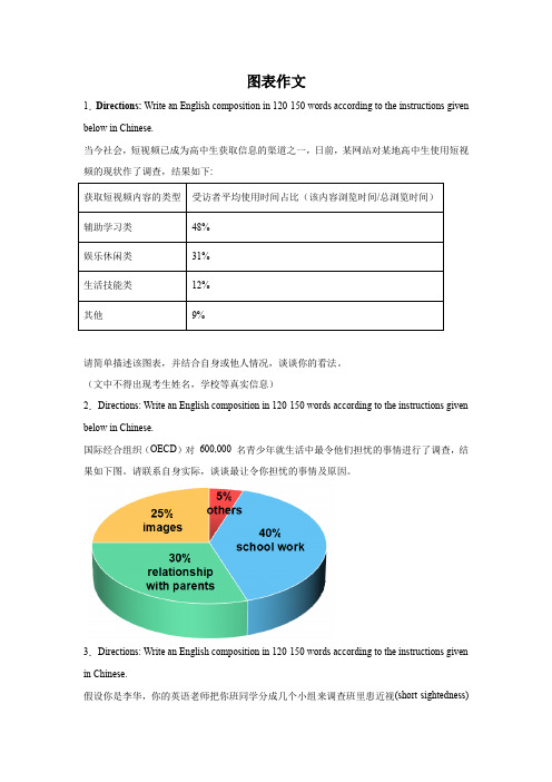
图表作文1.Directions: Write an English composition in 120-150 words according to the instructions given below in Chinese.当今社会,短视频已成为高中生获取信息的渠道之一,日前,某网站对某地高中生使用短视频的现状作了调查,结果如下:请简单描述该图表,并结合自身或他人情况,谈谈你的看法。
(文中不得出现考生姓名,学校等真实信息)2.Directions: Write an English composition in 120-150 words according to the instructions given below in Chinese.国际经合组织(OECD)对600,000 名青少年就生活中最令他们担忧的事情进行了调查,结果如下图。
请联系自身实际,谈谈最让令你担忧的事情及原因。
3.Directions: Write an English composition in 120-150 words according to the instructions given in Chinese.假设你是李华,你的英语老师把你班同学分成几个小组来调查班里患近视(short-sightedness)的同学的人数和原因。
你们小组调查后做了如下图所示的统计,请分析下面的饼状图,并谈谈你的看法及建议。
注意:1. 词数100左右;2. 可以适当增加细节,以使行文连贯。
_______________________________________________________________________________ _______________________________________________________________________________ _______________________________________________________________________________ _______________________4.Directions: Write an English composition in 120-150 words according to the instructions given in Chinese.下列图表反映的是某高中2010年与2013年学生健康状况调查的部分数据,请你用英语为某报写一份报告,反映你校三年间学生健康状况的变化情况,分析其中原因,并提出一些改进措施。
英语作文图表类 范文
英语作文图表类范文Here is an essay on the given topic of "English Essay Sample with Graphs and Tables" with more than 1000 words, written entirely in English without any additional punctuation marks.Effective Communication through Graphical RepresentationsIn the realm of academic and professional writing, the seamless integration of textual information and graphical elements has become an essential skill. Graphical representations, such as charts, tables, and diagrams, possess the remarkable ability to convey complex data and ideas in a concise and visually appealing manner. By strategically incorporating these visual aids, writers can enhance the clarity, comprehension, and overall impact of their written work.One of the primary advantages of using graphical representations is their ability to organize and present data in a structured and readily understandable format. Tables, for instance, excel at displaying numerical information or categorical data in a clear and systematic manner. They allow readers to quickly compare and contrast different values or characteristics, enabling them to identify patterns, trends, and relationships that may not be immediately apparent in apurely textual format.Similarly, charts and graphs offer a powerful means of visualizing quantitative data. Bar graphs, line charts, and scatter plots can effectively illustrate trends, distributions, and correlations, making complex information more accessible and digestible for the reader. These visual tools can often convey the essence of a dataset more effectively than a dense paragraph of text, allowing the audience to grasp the key insights at a glance.Beyond numerical data, graphical representations can also be employed to simplify and clarify conceptual information. Flowcharts, for example, can be used to map out step-by-step processes or decision-making frameworks, providing a clear and logical flow of information. Venn diagrams, on the other hand, can be instrumental in demonstrating the relationships and overlaps between different concepts or categories.The strategic placement of graphical elements within a written work can also serve to enhance the overall organization and readability of the text. By positioning relevant charts, tables, or diagrams alongside the corresponding textual explanations, writers can create a seamless integration of visual and verbal content, guiding the reader through the information in a logical and intuitive manner.Moreover, the use of graphical representations can help to break up the monotony of dense textual passages, making the written work more visually appealing and engaging for the reader. Carefully selected and well-integrated graphics can serve as visual anchors, directing the reader's attention and aiding in the retention of key information.However, the effective incorporation of graphical elements in writing is not without its challenges. Writers must ensure that the chosen graphics are truly relevant and add value to the content, rather than serving as mere decorative elements. Additionally, it is crucial to maintain consistency in the style, formatting, and labeling of the graphical representations, as this can significantly impact the overall coherence and professionalism of the written work.Furthermore, writers must be mindful of the accessibility considerations when incorporating graphical elements. Ensuring that the graphics are legible, appropriately sized, and accompanied by clear captions or textual descriptions can make the information accessible to a wider range of readers, including those with visual impairments or other accessibility needs.In conclusion, the strategic use of graphical representations in writing can be a powerful tool for enhancing communication and comprehension. By skillfully integrating charts, tables, and othervisual aids, writers can effectively convey complex information, highlight key insights, and engage their audience in a more meaningful and impactful way. As the demand for clear and visually appealing communication continues to grow, the ability to effectively leverage graphical elements in written work will become an increasingly valuable and sought-after skill.。
图表类英语作文模板
图表类英语作文模板Introduction:In recent years, the use of charts and graphs has become increasingly common in various fields. These visual representations of data provide a clear and concise way to present information and analyze trends. In this essay, we will explore a template for writing an English essay about charts and graphs.Body Paragraph 1:The first paragraph of the essay should introduce the chart or graph being analyzed. Start by describing the type of chart or graph, such as a line graph, bar chart, or pie chart. Provide a brief overview of the data being presented and any relevant background information. For example, "The chart displays the sales figures for different products over a period of five years."Body Paragraph 2:The second paragraph should focus on describing themain trends or patterns shown in the chart or graph. Use comparative language to discuss increases, decreases, or fluctuations in the data. Additionally, identify anyoutliers or exceptional data points. For instance, "Theline graph reveals a steady increase in sales for Product A, while Product B experienced a gradual decline. However, in the third year, there was a sudden spike in sales for Product C."Body Paragraph 3:The third paragraph should delve deeper into theanalysis of the chart or graph. Identify the factors or reasons behind the trends observed. This can involvedrawing connections to external factors or events that may have influenced the data. Support your analysis withspecific data points from the chart or graph. For example, "The increase in sales for Product A can be attributed to a successful marketing campaign and positive customerfeedback. On the other hand, the decline in sales for Product B may be due to increased competition in the market."Body Paragraph 4:In the fourth paragraph, discuss any limitations or potential inaccuracies in the chart or graph. Consider factors such as sample size, data collection methods, or potential biases. This demonstrates critical thinking and a well-rounded analysis. For instance, "It is important to note that the chart only represents sales figures for a specific region, and results may vary in other areas. Additionally, the data collection method relied on self-reporting by the sales team, which could introducepotential biases."Conclusion:Conclude the essay by summarizing the main findings and providing a final analysis of the chart or graph. Emphasize the significance of the data and its implications for thetopic being discussed. Additionally, you can suggestfurther areas of research or propose recommendations based on the findings. For example, "Overall, the chart provides valuable insights into the sales performance of different products. Further research could explore the impact of pricing strategies on sales figures. This analysis can help businesses make informed decisions to optimize their product offerings."In conclusion, charts and graphs are powerful tools for presenting and analyzing data. By following this template, you can effectively structure your English essay on charts and graphs, ensuring a comprehensive analysis and a well-supported argument.。
图表描述类英语作文(4篇)
图表描述类英语作文(4篇)图表描述类英语作文篇一The above bar chart informs us of the phenomenon that there exist some differences in additional working hours among diverse careers, especially between self-employed businessmen and civil servants. Self-employed businessmen spend nearly 2 hours per day in working overtime. On the contrary, civil servants’ additional working hours is the shortest, only less than 50 minutes per day. The overtime of scientific researchers, cultural and sports workers and teachers is 80 minutes, 70 minutes and 55 minutes respectively.Ample reasons can account for this phenomenon. Firstly, to make more profits, self-employed businessmen have to spend more time in manufacturing products, attracting customers, providing after-sale services and managing staff. Moreover, with the competition becoming fiercer, they have no alternative but to work overtime to avoid being eliminated by the market and their rivals. When it comes to civil servants, things have gone otherwise. Confronted with less risks as well as pressures and leading a steady and routine life, they don’t have to work overtime frequently.Working overtime is a two-bladed sword. Surely, it will generate considerable benefits. However, it will give rise to some damages, especially to our health. We should balance our work, life and health or we will eventually become a machine and salve of work.四级英语作文图表类篇二图片模板:It seems to me that the cartoon / drawing issending a message about ____________(图画内容),which reveals ____________(稍作评价).In myperspective of view, ____________ (表明个人观点)。
高中英语作文万能模板
高中英语作文万能模板一:图表作文As is shown by the figure/percentage in the table/picture as ___has been on rise/ decrease, significantly/dramatically rising/decreasing from___in___to___in___.From the sharp rise/declinein the chart, it goes without saying that___.There are at least two good reasons accounting for___.In one hand,___.In the other hand,___is due to the fact that___.In addition,___is responsible for___.Maybe there are some other reasons to show.But it is generally believed that the above mentioned reasons are commonly convincing.As far as I am concerned, I hold the point of view that___.I am sure my opinion is both sound and well-grounded.高中英语作文万能模板二:正反观点式议论文导入:第1段:Recently we’ ve had a discussion about whether we should...(导入话题) Our opinions are divided on this topic.(观点有分歧)正文:第2段:Most of the students are in favour of it.(正方观点)Here are the reasons.First... Second...Finally...(列出2-3个赞成的理由)第3段:However, the others are strongly against it.(反方观点)Their reasons are as follows. In the first place...What’s more...In addition...(列出2-3个反对的理由)结论:第4段:Personally speaking, the advantages overweight the disadvantages, for it will do us more harm than good,so i support it.(个人观点)高中英语作文万能模板三:“A或者B”类议论文导入:第一段:Some people hold the opinion that A is superior to B in many ways. Others, however, argue that B is much better.Personally, I would prefer A because I think A has more advantages.正文:第二段:There are many reasons why I prefer A. The main reason is that...Another reason is that...(赞同A的原因)第三段:Of course, B also has advantages to some extent.(列出1-2个B的优势)结论:第四段:But if all these factors are considered,A is much better than B.From what has been discovered above, we may finally draw the conclusion that...(得出结论)高中英语作文万能模板四:观点论述类议论文导入:第1段:提出一种现象或某个决定作为议论的话题As a student, I am strongly in favour of the decision.(亮明自己的观点是赞成还是反对)The reasons for this may be listed as fo1lows.(过渡句,承上启下)正文:第2段:First of all... Secondly... Besides...(列出2-3个赞成或反对的理由)结论:第3段:In conclusion,I believe that...(照应第1段,构成”总-分-总”结构)高中英语作文万能模板五:“How to”类议论文模板导入:第1段:提出一种现象或某种困难作为议论的话题正文第2段:Many ways can help to solve this serious problem, but the following may be most effective. First of all... Another way to solve the problem is...Finally...(列出2-3个解决此类问题的办法)结论:第3段:These are not the best but the only two/ three measures we can take. But. it should be noted that we should. take action to...(强调解决此类问题的根本方法)高中英语作文万能模板六:书信作文Your address Month, Date, year Receiver' s addressDear...,I am extremely pleased to hear from you. And I would like to write a letter to tell you that...I will greatly appreciate a response from you at your earliest convenience/I am looking forward to your replies at your earliest convenience.Best regards for your health and success.Sincerely yours.高中英语作文万能模板七:话题作文Nowadays, there are more and more___in___.It is estimated that___.Why have there been so many___?Maybe the reasons can be listed as follows.The first one is___.Besides,___.The third one is____.To sum up, the main cause of it is due to___.It is high time that something were done upon it. For one thing,___.For another thing,___.All these measures will certainly reduce the number of___.。
高一英语图表作文范例
高一英语图表作文范例English:The bar chart illustrates the percentage of students participating in various extracurricular activities at a high school in China. It can be observed from the chart that the most popular activity among students is sports, with 45% of students choosing to participate. Following sports, music and art activities are the next most popular choices, each with 20% of students participating. Interestingly, only a small percentage of students, approximately 15%, are involved in academic clubs or volunteer work. Overall, the data indicates a preference for physical and creative pursuits among the student population.Translated content:这幅条形图展示了中国某所高中学生参与各种课外活动的百分比。
从图中可以看出,最受学生欢迎的活动是体育运动,有45%的学生选择参加。
紧随其后的是音乐和艺术活动,每种活动都有20%的学生参与。
有趣的是,只有约15%的学生参与学术社团或义工活动。
总体而言,数据表明学生群体更偏爱体育和创意追求。
图表类英语作文范文
图表类英语作文范文图表类型的英语写作如果不擅于观察漫画的话,作文写出来可能会偏题。
下面是小编给大家带来图表类英语作文,供大家参阅!图表类英语作文范文篇 1 第一段:说明图表开篇句:As the bar chart shows, ____ during the years of ____to____.扩展句:1、As early as _____.2、Then _____ years later, ____.3、And arriving in the year ____, ____.第二段:解释图表变化原因主题句:Several factors contribute to _____.扩展句:1、______. 原(因1)2、And ______.(原因2)3、Furthermore, ______ ( 原因3)4、All these result in ____.第三段:提出解决办法结尾句:However, ____ is faced with some problems.扩展句:1、With _____, ____, the effect of which is not only discouraging, but also challenging.2、So my principle is to pay due attention to ___, but notjustto____.示范第一段:说明图表开篇句:As the bar chart shows, the number of people below the poverty line decreased dramatically during the years of 1978 to1997.扩展句:1、As early as 1978, about 250 million people were under the poverty line.2、Then seven years later, the number became three fifthsthatof1978.3、And arriving in the year 1997, the number was reducedto50millions.第二段:解释图表变化原因主题句:Several factors contribute to the sharp decrease ofthe below-poverty population.扩展句:1、The reform and opening following 1978 enabledthe peasants to become much better off. ( 原因1)2、And with the development of Chinese economy, that policy also improved city dwellers lives greatly. ( 原因2)3、Furthermore, the high-tech introduced made it possiblefor the countrys economy as a whole to take off. ( 原因3)4 、All these result in the great fall of theChinesepopulationbelow the poverty line.第三段:提出解决办法结尾句:However, a further decrease in the number of poverty-stricken people is faced with some problems.扩展句:1、With quite few employees being laid off, the effect of which is not only discouraging, but also challenging.2 、So my principle is to pay due attention to the newcomers, but not just to care for the poor, say, in remote mountain areas.范文As the bar chart shows, the number of people below thepoverty line decreased dramatically during the years of 1978to 1997. Asearly as 1978, about 250 million people were underthe poverty line.Then seven years later, the number became three fifths that of 1978.And arriving in the year 1997, the number was reduced to 50 millions.Several factors contribute to the sharp decrease of the below-poverty population. The reform and opening following1978 enabled the peasants to become much better off. And with the development of Chinese economy, that policy also improved city dwellers lives greatly. Furthermore, the high-tech introduced made it possible for the countryseconomy as a whole to take off. All these result in the great fallof the Chinese population below the poverty line.However, a further decrease in the number of poverty-stricken people is faced with some problems. With quite few employees being laid off, the effect of which is notonly discouraging, but also challenging. So my principle is topay due attention to the newcomers, but not just to care forthe poor, say, in remote mountain areas.图表类英语作文范文篇2The past years have witnessed a mounting number of Chinese scholars returning from overseas. As is lively illustrated by the column chart, the number of returnees climbed from a mere 69.3 thousand in 2008 to over 272.9 thousand in 2012, at an annual increase rate of around 50%.A multitude of factors may have led to the tendency revealed by the chart, but the following are the critical ones from my perspective. First and foremost, along with the development of Chinese economy and society, the number ofChinese studying abroad has been soaring in the past years,which has provided an expanding base for the number of returnees. In the second place, the government has enacted aseries of preferential policies to attract overseas Chinesescholars back home. Last but not least, the booming economy, science and technology in this country have generated moreattative job opportunites for scholars returning from overseas.The waves of returnees will definitely contribute to this nation’s development, since they have brought back not only advanced science and technology but also pioneering concepts of education and management. With more scholarscoming back from overseas, and with the concerted efforts ofthe whole nation, we have reasons to expect a faster rejuvenation of this country.图表类英语作文范文篇 3 一、图表类型基本单词图表类型:table( 表格)、chart( 图表)、diagram( 图标)、graph( 多指曲线图) 、column chart( 柱状图) 、pie graph( 饼图) 、tree diagram( 树形图)、饼图:pie chart 、直方图或柱形图:bar chart/histogram 、趋势曲线图:line chart/curve diagram 、表格图:table 、流程图或过程图:flow chart/sequence diagram 、程序图:processing/procedures diagram二、图表描述基本词语1、描述:show 、describe 、illustrate 、can be seen from 、clear 、apparent 、reveal 、represent2、内容:figure 、statistic 、number 、percentage 、proportion三、常用的描述句型The table/chart diagram/graph shows (that)According to the table/chart diagram/graphAs (is) shown in the table/chart diagram/graphAs can be seen from the table/chart/diagram/graph/figures ,figures/statistics shows (that)……It can be seen from the figures/statisticsWe can see from the figures/statisticsIt is clear from the figures/statisticsIt is apparent from the figures/statisticstable/chart/diagram/graph figures (that) ……table/chart/diagram/graph shows/describes/illustrates看过图表类英语范文的人还。
图表英语作文范文带翻译
图表英语作文范文带翻译Title: The Importance of Graphs and Charts in Presenting Information。
Graphs and charts play a crucial role in conveying complex information effectively. In today's data-driven world, they are indispensable tools for analyzing trends, making comparisons, and illustrating relationships. This essay will explore the significance of graphs and charts in presenting information, examining their various types, and discussing their advantages and limitations.To begin with, graphs and charts offer a visual representation of data, which enhances understanding and interpretation. For instance, a line graph can illustrate changes over time, such as fluctuations in stock prices or temperature variations throughout the year. Similarly, a bar chart can depict comparisons between different categories, like sales figures for various products or the population distribution across different regions. Bypresenting data visually, graphs and charts simplify complex information, making it easier for audiences to grasp key insights at a glance.Moreover, graphs and charts facilitate data analysis by highlighting patterns and trends. Through visualizations, researchers and analysts can identify correlations, outliers, and other significant features in the data. For example, a scatter plot can reveal the relationship between two variables, such as the correlation between study hours and exam scores. By plotting data points on a graph, patterns emerge, enabling researchers to draw conclusions and make informed decisions based on evidence.Furthermore, graphs and charts aid in effective communication by presenting information in a clear and concise manner. In presentations or reports, visual aids like pie charts or histograms can convey key findings more compellingly than lengthy text or numerical tables. Visual representations engage audiences and help them absorb information more readily. Additionally, graphs and charts can be customized with colors, labels, and annotations toemphasize important points or differentiate between data sets, enhancing clarity and impact.However, it is essential to acknowledge the limitations of graphs and charts. While they excel at summarizing large datasets and identifying trends, they can also oversimplify complex phenomena. Misleading visualizations, such as distorted scales or truncated axes, can distort the true nature of the data and lead to erroneous conclusions. Therefore, it is crucial to critically evaluate the design and accuracy of graphs and charts to ensure they accurately represent the underlying information.In conclusion, graphs and charts are invaluable tools for presenting information effectively in various fields, from scientific research to business analytics. They offer visual clarity, facilitate data analysis, and enhance communication by simplifying complex concepts. However, it is essential to use them judiciously and critically evaluate their accuracy to avoid misinterpretation. Ultimately, when used appropriately, graphs and charts are powerful instruments for conveying insights and drivinginformed decision-making.标题,图表在呈现信息中的重要性。
关于图表的英语作文
关于图表的英语作文Certainly! Here's an example of an English essay about charts:The Power of Visual Representation: Understanding ChartsIn the age of information overload, the ability to convey complex data in a clear and concise manner is crucial. One of the most effective tools for this purpose is the chart. Awell-designed chart can simplify data, making it accessible and understandable to a wide audience. This essay willexplore the different types of charts, their uses, and the importance of proper design in creating effective visual representations.Types of ChartsCharts come in various forms, each serving a distinct purpose. The most common types include:1. Bar Charts: These are ideal for comparing quantitiesacross different categories. They can be vertical orhorizontal and are particularly useful when there are many categories to compare.2. Pie Charts: Pie charts are excellent for showing the proportion of parts to a whole. They are visually appealingand can quickly convey the relative sizes of different segments.3. Line Graphs: Line graphs are perfect for displaying trends over time. They are particularly useful when data points are numerous and the focus is on how values change over a period.4. Scatter Plots: These charts are used to show the relationship between two variables. They are useful for identifying correlations and patterns that might not be immediately apparent.5. Histograms: Histograms are similar to bar charts but are used to represent the distribution of a dataset. They are particularly useful in statistics to show the frequency of data points within certain ranges.Uses of ChartsCharts are used across various fields and for different purposes:- In business, they help in making strategic decisions by visualizing sales trends, market shares, and customer demographics.- In education, they are used to explain complex concepts by breaking them down into visual components.- In science, they are essential for presenting experimental data and results.- In media, they are used to report statistics and trends to the public in an easily digestible format.Importance of DesignThe design of a chart plays a critical role in its effectiveness. A poorly designed chart can lead to confusion and misinterpretation of data. Key design principles include:- Clarity: The chart should be easy to understand at a glance. - Consistency: The use of colors, fonts, and symbols shouldbe consistent throughout the chart.- Simplicity: Avoid overcrowding the chart with too much information.- Legibility: Text should be large enough to read, and labels should be clear and concise.ConclusionCharts are powerful tools in our visual toolkit. They can transform complex data into easily digestible information, making it accessible to a non-specialist audience. By understanding the different types of charts and adhering to good design principles, we can ensure that our visual representations are both informative and engaging.This essay provides a general overview of charts, their types, uses, and the importance of design in creating effectivevisual representations.。
英语作文图表分析范文(汇总30篇)
英语作文图表分析范文(汇总30篇)(经典版)编制人:__________________审核人:__________________审批人:__________________编制单位:__________________编制时间:____年____月____日序言下载提示:该文档是本店铺精心编制而成的,希望大家下载后,能够帮助大家解决实际问题。
文档下载后可定制修改,请根据实际需要进行调整和使用,谢谢!并且,本店铺为大家提供各种类型的经典范文,如工作总结、工作计划、合同协议、条据文书、策划方案、句子大全、作文大全、诗词歌赋、教案资料、其他范文等等,想了解不同范文格式和写法,敬请关注!Download tips: This document is carefully compiled by this editor. I hope that after you download it, it can help you solve practical problems. The document can be customized and modified after downloading, please adjust and use it according to actual needs, thank you!Moreover, our store provides various types of classic sample essays for everyone, such as work summaries, work plans, contract agreements, doctrinal documents, planning plans, complete sentences, complete compositions, poems, songs, teaching materials, and other sample essays. If you want to learn about different sample formats and writing methods, please stay tuned!英语作文图表分析范文(汇总30篇)英语作文图表分析范文第1篇图表类写作模版(1)模版1According to the chart / graph / diagram / table, we clearly learn that _________.As early as _________,___________.Then,_________.Last,__________.In contrast, by _________,__________.There are many reasons accounting for _________.Firstly, _________.Secondly,__________.Finally,_________.As a result,_________.As far as I am concerned,_________.For one thing,__________.For another,________.In brief, I hold that__________.(2)模版2What is shown in the chart / graph / diagram / table above indicates that in recent years, more and more people payattention to _________.The number of those who _________has increased ________,and furthermore,____________.There are two factors responsible for the changes.In the first place,_________.Moreover,__________.Yet, it is noticeable that __________.From the analysis, we can safely draw the conclusion that__________.It is possible that in the future,the tendency will__________.(3)模版3As is shown in the chart / graph / diagram / table above,__________has charged drastically in the past _________.While ___________,now the percentage of__________is __________.Meanwhile,the number of _________has soared up to ________.There are mainly two possible reasons contributing to the rapid changes.The first is that _________.Secondly,__________.In my point of view, the changes have a great influence on _________.At the same time,_______.To sum up ,_________.英语作文图表分析范文第2篇1、图形种类及概述法:泛指一份数据图表: a data graph/chart/diagram/illustration/table饼图:pie chart直方图或柱形图:bar chart / histogram趋势曲线图:line chart / curve diagram表格图:table流程图或过程图:flow chart / sequence diagram程序图:processing/procedures diagram2、常用的描述用法The table/chart diagram/graph shows (that)According to the table/chart diagram/graphAs (is)shown in the table/chart diagram/graphAs can be seen from the table/chart/diagram/graph/figures,figures/statistics shows (that)……It can be seen from the figures/statisticsWe can see from the figures/statisticsIt is clear from the figures/statisticsIt is apparent from the figures/statisticstable/chart/diagram/graph figures (that)……table/chart/diagram/graph shows/describes/illustrates how……3、图表中的数据(Data)具体表达法数据(Data)在某一个时间段固定不变:fiXed in time在一系列的时间段中转变:changes over time持续变化的data在不同情况下:增加:increase / raise / rise / go up ……减少:decrease / grow down / drop / fall ……波动:fluctuate / rebound / undulate / wave ……稳定:remain stable / stabilize / level off ……最常用的两种表达法:动词+副词形式(Verb+Adverb form)形容词+名词形式(Adjective+Noun form)英语作文图表分析范文第3篇雅思考试学术类图表作文分析考试学术类图表作文要求考生观察一幅图表并用自己的语言呈现出图表中的信息。
图表类作文范文 英文
图表类作文范文英文英文回答:In the given chart, we can observe the trends in smartphone ownership and internet usage among different age demographics in a certain region. The data is presented in a bar graph format, categorizing the population into five age groups: 18-24, 25-34, 35-44, 45-54, and 55 and above.Smartphone ownership has witnessed significant growth across all age groups in recent years, with the highest penetration rate among younger individuals. In the 18-24 age group, an overwhelming 95% of individuals own a smartphone, indicating near-universal adoption of this technology. The ownership rate remains high in the 25-34 age group, with 92% of individuals owning a smartphone. In the 35-44 age group, the ownership rate stands at 86%, followed by 79% in the 45-54 age group. Even among the oldest age group, 55 and above, smartphone ownership has reached 62%, demonstrating the widespread adoption of thisdevice across all generations.Internet usage, closely tied to smartphone ownership, also exhibits a strong correlation with age. The highest internet usage rate is observed among the 18-24 age group, where 97% of individuals access the internet. The usage rate remains high in the 25-34 age group, with 93% of individuals using the internet. Internet usage starts to decline gradually in older age groups, with 88% usage in the 35-44 age group, 80% in the 45-54 age group, andfinally 58% among individuals 55 and above. It is noteworthy that a significant proportion of older individuals still engage in internet usage, highlighting the increasing digital literacy and accessibility of online resources across all age demographics.In summary, the chart reveals the pervasive adoption of smartphones and the widespread use of the internet among different age groups. The high ownership and usage rates, particularly among younger individuals, reflect the transformative impact of these technologies on communication, information access, and daily life. As wemove forward, it will be crucial to ensure equitable access to these technologies and promote digital literacy to harness their full potential for social and economic development.中文回答:图表显示了某个地区不同年龄段的人群中智能手机拥有率和互联网使用率的趋势。
高考英语作文万能模板:图表类作文
高考英语作文全能模板:图表类作文导读:本文高考英语作文全能模板:图表类作文,仅供参照,假如能帮助到您,欢迎评论和分享。
下边是整理的“高考英语作文全能模板:图表类作文”,欢迎阅读参照,相关内容请持续关注高考栏目。
高考英语作文全能模板:图表类作文图表作文写作模板:The chart gives us an overall picture of the图表主题. The first thing we notice is that图表最大特色. This means that as (进一步说明 ).We can see from the statistics given that图表细节一. After动词-ing细节一中的第一个变化,the 动词 -ed+ 幅度 + 时间 (紧随着的变化 ) . The figures also tell us that图表细节二. Inthe column, we can see that accounts for( Judging from these figures, we can draw 进一步描绘 ). the conclusionthat ( 结论 ). The reason for this, as far as I am concerned is that(给出原由 ). / It is high time that we (发出提议).图画类写作模板:1.开头Look at this picture./The picture shows that.../From thispicture, we can see.../As is shown in the picture.../As is seen inthe picture...2.连接句As we all know, .../As is known to all,.../It is well known that (I)my opinion,.../As far as I am concerned,.../This sight reminds me of something in my daily life.3.结尾句In conclusion.../In brief.../On the whole.../In short.../In a word.../Generally speaking.../As has been stated...。
高考英语作文图表类
高考英语作文图表类1. According to the chart, the number of people living in urban areas has been steadily increasing over the past decade.2. The data shows a significant rise in the use of smartphones among teenagers, with almost 90% of them owning a smartphone.3. The bar graph indicates a clear correlation between education level and income, with higher education leading to higher earning potential.4. The pie chart reveals that the majority of greenhouse gas emissions come from the transportation sector, highlighting the need for more sustainable transportation options.5. The line graph illustrates the fluctuating trend of global temperatures over the years, emphasizing the urgencyof addressing climate change.6. The data table presents a comparison of average life expectancy across different countries, showing disparities in healthcare access and quality.7. The scatter plot demonstrates a positiverelationship between hours of study and exam scores, suggesting that hard work does pay off in academic achievement.8. The chart displays the distribution of household income in a particular region, indicating income inequality and the need for economic reforms.9. The line graph depicts the increasing trend of online shopping, reflecting the convenience and popularity of e-commerce in today's digital age.10. The bar graph shows the consumption patterns of various age groups, highlighting differences in spending habits and preferences.。
高中图表类英语作文如何写
文章标题:Approaches to Writing High School Chart-Based English EssaysIn the realm of high school English essays, chart-based writing stands out as a unique and challenging genre. It requires a blend of analytical skills, data interpretation, and creative expression to present information in a clear, concise, and engaging manner. This article aims to provide insights and practical tips for writing chart-based essays effectively.Firstly, it is crucial to understand the chart thoroughly. Whether it's a bar chart, line graph, pie chart, or any other type, a careful analysis is essential.Identify the key elements such as titles, labels, scales, and data points. Pay attention to trends, patterns, and significant changes in the data. This will help you formulate a clear understanding of the informationpresented and lay the foundation for your essay.Secondly, organize your thoughts and develop a coherent outline. Start by stating the main purpose of the essay andintroduce the chart briefly. Then, proceed to discuss the key findings and trends observed in the chart. Make sure to support your observations with specific data points and examples. You can also compare different aspects of thechart or draw connections to related topics. Finally, conclude your essay by summarizing the main points and offering any insights or implications derived from the data. Thirdly, focus on effective language use. Avoid redundant or vague expressions and strive for clarity and precision. Use specific vocabulary related to the chart and the topic being discussed. Employ transition words and phrases to create a smooth flow of ideas. Additionally, utilize descriptive language to bring the chart to life and engage the reader's imagination.Lastly, practice makes perfect. Writing chart-based essays requires practice and refinement. Look for opportunities to write on different charts and topics. Seek feedback from teachers or peers and incorporate their suggestions into your writing. With time and practice, you will become more confident and proficient in this genre of writing.In summary, writing chart-based English essays in high school demands a combination of analytical skills, data interpretation, and creative expression. By thoroughly understanding the chart, organizing your thoughts, using effective language, and practicing regularly, you canmaster this challenging genre and produce engaging and informative essays.**文章标题**:高中图表类英语作文的写作方法在高中英语作文的范畴中,图表类作文以其独特性和挑战性脱颖而出。
关于图表的英语作文
关于图表的英语作文Title: The Significance of Charts in Presenting Data。
In today's data-driven world, charts play a crucialrole in presenting information effectively. Whether it's in academic research, business reports, or public presentations, charts are indispensable tools for conveying complex data in a clear and concise manner. In this essay, we will explore the importance of charts in data visualization and how they enhance communication and decision-making processes.First and foremost, charts serve as powerful visual aids that enable viewers to grasp information quickly. Unlike lengthy paragraphs or tables filled with numbers, charts condense data into visually appealing graphics that are easy to understand. For example, a bar chart comparing sales figures for different quarters allows stakeholders to identify trends and patterns at a glance, saving time and effort in data analysis.Moreover, charts facilitate comparisons and highlight relationships between variables. Whether it's a scatterplot showing the correlation between two factors or a pie chart illustrating the distribution of resources, charts make it easy to identify connections and disparities within data sets. This ability to visualize relationships enhances comprehension and fosters deeper insights into the underlying data.Furthermore, charts enhance the persuasiveness of arguments by providing compelling visual evidence. When presenting findings or making recommendations,incorporating relevant charts can bolster the credibility of the message. For instance, a line graph depicting the growth of renewable energy sources over time can strengthen the case for sustainable development policies. By presenting data in a visually compelling manner, charts engage the audience and reinforce key points effectively.In addition, charts facilitate data-driven decision-making by providing actionable insights. Whether it'sidentifying areas for improvement, predicting future trends, or allocating resources strategically, charts empower decision-makers with valuable information. For instance, a heat map highlighting customer demographics can inform marketing strategies and target specific market segments more effectively. By transforming raw data into actionable insights, charts enable organizations to make informed decisions that drive success.Furthermore, charts enhance collaboration and communication among stakeholders. In collaborative settings such as team meetings or academic research groups, charts serve as a common visual language that transcendslinguistic barriers and facilitates understanding. Whetherit's brainstorming ideas, analyzing research findings, or presenting project updates, charts foster effective communication and ensure that everyone is on the same page.In conclusion, charts play a vital role in presenting data effectively and enhancing communication and decision-making processes. From simplifying complex information to highlighting relationships and trends, charts serve aspowerful tools for visualizing data in a clear and compelling manner. By incorporating charts into presentations, reports, and analyses, individuals and organizations can convey information more effectively, make informed decisions, and drive success in today's data-driven world.。
- 1、下载文档前请自行甄别文档内容的完整性,平台不提供额外的编辑、内容补充、找答案等附加服务。
- 2、"仅部分预览"的文档,不可在线预览部分如存在完整性等问题,可反馈申请退款(可完整预览的文档不适用该条件!)。
- 3、如文档侵犯您的权益,请联系客服反馈,我们会尽快为您处理(人工客服工作时间:9:00-18:30)。
6,It is no longer what it used to be.
7,It is more convenient for sb to do sth.
2.好---环(过渡)
1 In the past …used to be…, However,… At present,… 2 To one’s great surprise, things have changed a lot since… 3,Then things began to go wrong. 4, But worse was to follow.
1 With time going by…/ As time goes by
2 Our life is getting better and better than before 3 With the development of economy,as well as the rapid increase of people’s income,great changes have taken place in their daily life, 4, Great changes have taken place in the last / past few years. 5,Sth has taken on a new look.
4. The table / chart shows / tells th had a research/survey about the educational differences between China and America. As is shown in the table, there is a sharp contrast(鲜明对比) between China and America. From what we have seen in the form, we can reach a conclusion that…
4 建议
1 we do hope sb can take measures to do sth. 2 from our experiences , we all have realized how important it is to do sth instead of doing sth so as to improve our living conditions
3坏
1.do great harm to… affect…
2. have a negative effect on… 3.suffer a lot from 4.The survey about sth shows that… 5.According to a survey released before, more than 13% of Chinese youths are addicted to the Internet.
三、表示时间跨度 1.between 1990 and 2012
2. From …to…..
3. Over the period from…to……
4.in the three years from …to… 5. During the past …years
四、表示增减变化
1. Some changes have taken place in the past five years.
how you do your homework . If you take an active part in classroom activities , you can get another 20% of the score . Teamwork in class is also important. If you want a higher score , you should be good at working together with your classmates .
The students’ final score will be made up of 5 parts. About 30% of it will come from their test results . The rest of the score is decided by the performances of the students in the following parts : 20% comes from your note-book, and another 20% is decided by
2. …has brought about many changes in all parts of our life . 3. …has now increased /decreased to …
4. It has risen /fallen from …to …
5. The number is going up /going down from …to…. 6. No increase was shown in1998; then came a sharp increase of …. 7. In ….. The number remained the same /dropped to….
八、表示预测
1. There are good reasons to believe that…. 2. We have good reasons to believe that … 3. I’m sure / certain that…. 4. I suppose /think /believe / hold that …. 5. From what we have seen in the chart , we can see that…. 九. 表示结论
In all / In short / In brief / In summary
The New Grading System in Our School
In order to help students develop their abilities in all fields , our school now has asked the teachers to make some changes in the grading system.This chart shows how it works.
The most important thing we should do is to make clear what is the best way to do sth.
The best education is what is fit for the country’s culture.
1.好的方面
8. The number is half of /double/triple /four times that of…
五、 表示 “占” Make up
六、表示比较
1. Compared with the number of …, it still increased /decreased by … 2. There is a sharp contrast between A and B. 七 、 表示原因 1.There are several reasons f2o.rT…he reasons for this are as follows: 3. The reasons for this are obvious.
图表提示类 一、表示图表
1.chart 2.table 二、表示 “如图所示”
1. As is shown /can be seen in the chart /table ,…. 2. According to the chart /table , we can see that…. 3. From the chart /table ,it can be seen that….
What I would like to say is that… From my point of view, education of America is as reasonable as, if not more reasonable than that of China. My arguments for this point are listed as follows,… In a word, the American education is up to date, while Chinese education fades to it.And it is the differences between Chinese and American culture that lead to the different education.