雅思图表题作文套用大全
雅思图表题常用套句.

雅思图表题常用套句.IELTS套句式写作大全第一部分:TASK1图表写作套句精选1.the table shows the changes in the number of...over the period from...to... 该表格描述了在...年之...年间...数量的变化。
2.the bar chart illustrates that...该柱状图展示了...3.the graph provides some interesting data regarding...该图为我们提供了有关...有趣数据。
4.the diagram shows (that...该图向我们展示了...5.the pie graph depicts (that....该圆形图揭示了...6.this is a cure graph which describes the trend of...这个曲线图描述了...的趋势。
7.the figures/statistics show (that...数据(字)表明...8.the tree diagram reveals how...该树型图向我们揭示了如何...9.the data/statistics show (that...该数据(字)可以这样理解...10.the data/statistics/figures lead us to the conclusion that...这些数据资料令我们得出结论...11.as is shown/demonstrated/exhibited in the diagram/graph/chart/table... 如图所示...12.according to the chart/figures...根据这些表(数字)...13.as is shown in the table...如表格所示...14.as can be seen from the diagram,great changes have taken place in...从图中可以看出,...发生了巨大变化。
雅思作文图表题范文(热门3篇)

雅思作文图表题范文第1篇It is said that countries are becoming similar to each other because of the global spread of the same products, which are now available for purchase almost anywhere. I strongly believe that this modern development is largely detrimental to culture and traditions worldwide.A country’s history, language and ethos are all inextricably bound up in its manufactured artefacts. If the relentless advance of international brands into every corner of the world continues, these bland packages might one day completely oust the traditional objects of a nation, which would be a loss of richness and diversity in the world, as well as the sad disappearance of the manifestations of a place’s character. What would a Japanese tea ceremony be without its specially crafted teapot, or a Fijian kava ritual without its bowl made from a certain type of tree bark?Let us not forget either that traditional products, whether these be medicines, cosmetics, toy, clothes, utensils or food, provide employment for local people. The spread of multinational products can often bring in its wake a loss of jobs, as people urn to buying the new brand, perhaps thinking it more glamorous than the one they are used to. This eventually puts old-school craftspeople out of work.Finally, tourism numbers may also be affected, as travelers become disillusioned with finding every place just the same as the one they visited previously. To see the same products in shops the world over is boring, and does not impel visitors to open their wallets in the same way that trinkets or souvenirs unique to the particular area too.Some may argue that all people are entitled to have access to the same products, but I say that local objects suit local conditions best, and that faceless uniformity worldwide is an unwelcome and dreary prospect.Heres my full answer:The line graphs show the average monthly amount that parents in Britain spent on their children’s sporting activities and the number of British children who took part in three different sports from 2008 to is clear that parents spent more money each year on their children’s participation in sports over the six-year period. In terms of the number of children taking part, football was significantly more popular than athletics and 2008, British parents spent an average of around £20 per month on their children’s sporting activities. Parents’ spending on children’s sports increased gradually over the following six years, and by 2014 the average monthly amount had risen to just over £ at participation numbers, in 2008 approximately 8 million British children played football, while only 2 million children were enrolled in swimming clubs and less than 1 million practised athletics. The figures for football participation remained relatively stable over the following 6 years. By contrast, participation in swimming almost doubled, to nearly 4 million children, and there was a near fivefold increase in the number of children doing athletics.剑桥雅思6test1大作文范文,剑桥雅思6test1大作文task2高分范文+真题答案实感。
作文范文之雅思图表类英语作文模板
雅思图表类英语作文模板【篇一:雅思图表作文模板】1 according to the chart```2 the date lead us to the conclusion that```3 the date show```4 the tree diagram reveals how```5 the figures show```6 this is a cure graph which describes the trend of```7 the pie graph depicts```8 the graph provides some interesting date regrarding```9 the table shows the changes in the number of ``` over the period from ```to ```10 as is shown in the table ```11 from the table ,we can clearly see that ```12 this table shows the changing proportion of x and y from ``` to ````13 the graph,presented in a pie chart, shows the general trend in```14 as can be seen from the grape ,the two curves show the flutuation of ```15 over the period from ```to ```the```remained level.16 in the year between ```and ```.17 in the 3 years spanning from 2005 through 2008.18 the number of ``` remained steady from ```to ````.19 the number sharply went up to ```20 the percentage of ``` stayed the same between ``` and ```21 the percentage remainede steady at```22 the percentage of ```is sightly large than that of.23 there is not a great deal of differece between ```and ```24 the graphs show a three fold increase in the number of ```25 ```decreased year by year while ```increased steadily.26 there is an upward trend in the number of ```27 a considerable increase occurred from ```to ```28 from ```to ```the rate of decrease slow down.29 from this year on,there was a gradual declinel reduction in the ```reaching a figure of.30 be similar to ```be the same as31 there are a lot similarities between ```and ```32 the difference between x and y lies in ``para 1,两句话:第一句:this is a _____chart, which demonstrates the number of_____ from ____ to____. 如果两个图,则:there are two charts below. the _____ chart describes the number of_____, and the _____ chart illustrates the figure of ____. 第二句:(所有题目适用),from thechart we can see that the number of ______ variesconstantly/greatly in _____. )para 2, as we can see from the chart,/or it is clear from thechart that ____. 如果有两个图:则:the _____ chart shows that ______./or as we can see from the first chart, _______para 3, (如果两个图的话,) it is clear from the second chartthat ?para 4 结尾:from the figures/statistics above, we cansee/conclude/draw a conclusion that ?the bar chart indicates the current situation of the amount of money spent on fastfoods according to different income classes in britain.for those who belong to the high-income class, hamburgerhas been shown to beperson per week. by contrast fish and chips remain at a rather low level of about 16pence per person per week, and pizza, though attracts more expenses, accounts for 19pence per person per week, merely 3 pence more than that of fish and chips.as expected, low-income class spend much less in all 3 categories than high-incomeclass, with fish and chips at the top of the list at 15 pence per capital per week, andpizza at the bottom at a weekly expense of 8 pence per capital. the average income group resembles high-income class in hamburger consumptionat the largest amount of 33 per person every week, and low-income class in pizzaconsumption at the smallest amount of 11 per person every week, but amazingly, fishand chips consumed by this group leads all classes at a weekly expense of 25 penceper person.in conclusion, hamburgers, in general gain more welcome than other types of fastfood.para1. this is a table / chart / (line线状 bar柱状 pie饼状)graph which demonstrate / illustrate /reveal /depict /privide information about.............para2.(1)obvious /apparent from the graph is that ...rank thefirst/highest,while/whereas ....turn out tobe the lowest(2)it is exhibited/shown in the table that.....(3)it can be seen from the table that.....para3.(1)饼.柱图 a,which accounts for...%,ranks the first;then next is b with...%;followed byc,constituting...%;finally it comes d.e.fat...%...%and...%respectively(2)特殊变化(不变,增长或下降多的)(3)①it is worth mentioning that.... ②it must be pointed out that.... ③morestriking/suprising is that.... para4.to conclude /inconclusion/overall1. 最明显的原因__,因此___the most obvious reason for this phenomenon is that_____consequently, ____.2. 无论你喜欢与否,_____已经变得越来越流行,这是有原因的no matter you like it or not, aaa has become more and more popular and there are many reasonfor it.3. 对我们来说,改变这个不利的环境____是非常紧急的it’s an urgent task for us to change this unfavorable situation: ____.4. 这个图片会让你想起一些奇怪的东西,这种现象还是会继续存在这个社会the picture can reminds you of some strange, yet familiar phenomena existing in our society.5. 提供了大量的解决方案,一些人建议___,另一些人建议___a great number of solutions are being offered. some people suggest that ____. others argue that .6. 对于____,我们应该____confronted with aaa, we should take a serious of effective measures to cope with thesituation.7. 然而,___引起了许多为问题,however____ may cause some problems. first, it is__second, __. finally, ____. so, it is clear that__has its advantages and disadvantages.8. 虽然_____有一个__的非常大的好处,但是它不能完全__在__方面although _____ has a great advantage of _____, it cant compete with ____ in ____.9. _____也许更喜欢_____,但是_____忍受_____的不利之出_____may be preferable to ____, but it suffers from the disadvantages that___.10. _____的有利之处比____的有利之处要多,举例说明,_____the advantages of ______are much greater that thoseof____.for instance, ___.11.but i don’t think it is a very good way to solve ___. for instance, _____.worst of all,______.12.there are many ways to ______. first, _____. second, _____. third, ___.13.on the contrary, there are some people in favor of _____.14.they believe___. moreover, they think____. there are several measures for us to adopt. first,we can____, there are a number of advantages of ____. another solution is to _____.15.it is high time that something was done about it. for example,_____. in addition,_____. all these measures will certainly _.16. there are some other people, who______. their reasons are different, something for _____,sometimes for____, and sometimes simply for _____.17._____ is necessary and important to our country’s development and construction. first, ____.what’s more, ___. most important of all,___.18.however, if not managed properly, ____ can create many problems.sometimes ____.furthermore,_. therefore, ___ has been gaining public concern.19.有很多原因____,①there are probably many reasons for ____. first, ____.②second, ____. finally, ___.there are, i think, two main reasons for __. in the first place, ___. in the second place, __. therefore,③well, why is there ____? i think there might be two reasons. one is ___, and the other is _____.④why___? for one thing, ____. for another,____. perhaps the main reason is ___.⑤why_____? the first reason is that___. the second reason is ___. the third is__. for all this,the main cause of_____ is due to ____.20.it is no easy job to find the reasons for this tendency which involves several complicated factors. for some ___. for others ____.21. “why do _____?” many people often ask questions like this.22. in recent years, there is a general tendency to ___. according to a study, there is__. comparedwith __ last year. why _____?23.according to a survey, there is a growing number of ___. what brings this result? the mainreason rests with.24.①some people prefer to ___. in their opinion, ____. in addition, ____. nevertheless,nowadays, __ has become more and more common.②many people are inclined to____. in their opinion, ___.they believe that ___.25. today, there __, which have brought a lot of harms in our daily life. first, __ second, ____. what makes things worse is that ___.26.nowadays, ___ has become a problem we have to face. though it’s easier said than done, with the help of modern technology, we now have many means to solve it.27. 对于这个图,说明了_①the graph shows the general trend in _______.②according to the figures/numbers/statistics/percentages in the table/chart/bar graph/line graph, it can be seen that ___. obviously, ____, but why?③the figure indicates/shows/suggests/proves that___. there isa steady/rapid development/trend of _.④from the graph/chart, we know the statistics of __ and _. it can be seen easily that ___.⑤according to the two graphs presented, it can be observed that ___ in the left graph, __. at the same time, _ as the right graph shows.28. 现在我们经常听到_____,但是真的如此吗?①these days we are often told that ____. but is it true?②these days we often hear about ___. but is this really the case?29. 一位著名的作家曾经说过_____one of the great writers once said that _. now it still has a realistic significance.30. 回看历史,______的想法从来都没流行过,一方面_____另一方面______in our history, the idea that ____ never has been so popular. on one hand, ___, on the other hand,31. 人们中有许多像____不同的意见,一些人认为_______there are different opinions among people as to ____. some people suggest that __.32. 一些人认为__对_______来说在许多方面都是好的,然而,其他人不同意some people hold the opinion that _ is superior to __ in many ways: others, however, disagree with it.33. 现在虽然越来越多的人___,但仍有一些__的人,他们也许认为_____nowadays although more and more people __, still there are some who think __, they may think【篇二:雅思图表作文模板20篇下载】智课网ielts备考资料雅思图表作文模板20篇下载摘要:雅思图表作文模板20篇下载。
最新雅思考试图表作文

图表作文模板
• This is a _____chart, which demonstrates the number of_____ from ____ to ____. 如果两个图,则: There are two charts below. The _____ chart describes the number of _____, and the _____ chart illustrates the figure of ____. • 第二句:(所有题目适用),From the chart we can see that the number of ______ varies constantly/ greatly in _____. • Para 2, As we can see from the chart,/or It is clear from the chart that ____. • 如果有两个图:则:the _____ chart shows that ______./or As we can see from the first chart, _______ • Para 3, (如果两个图的话,) It is clear from the second chart that … • Para 4 结尾:From the figures/statistics above, we can see/conclude/draw a conclusion that …
•
11.As is shown in the table...如表格所示...
•
•
12.As can be seen from the diagram, great changes have taken place in... 从图中可以看出,...发生了巨大变化。
雅思图表题作文套用模板大全
雅思图表作文模板句Para1. This is a table / chart / (line线状bar柱状pie饼状)graph which demonstrate / illustrate / reveal /depict /privide information about............. Para2. (1)Obvious /Apparent from the graph is that ...rank the first/highest,while/whereas ....turn out to be the lowest(2)It is exhibited/shown in the table that.....(3)It can be seen from the table that.....Para3.(1)饼.柱图A,which accounts for...%,ranks the first;then next is B with...%;followed by C,constituting...%;finally it comes D.E.F at...%...%and...%respectively(2)特殊变化(不变,增长或下降多的)①It is worth mentioning that....②It must be pointed out that....③More striking/suprising is that....Para4.To conclude /In conclusion/overallPara5. this is a graph which illustrates...这个图表向我们展示了...Para6 .this table shows the changing proportion of a &b from...to...该表格描述了...年到...年间a与b的比例关系。
雅思英语图表作文范文(必备3篇)

雅思英语图表作文范文第1篇A类雅思各类图表作文要点及范文一.曲线图解题关键1曲线图和柱状图都是动态图,解题的切入点在于描述趋势。
2在第二段的开头部分对整个曲线进行一个阶段式的总分类,使写作层次清晰,同时也方便考官阅卷。
接下来再分类描述每个阶段的specifictrend,同时导入数据作为分类的依据。
3趋势说明。
即,对曲线的连续变化进行说明,如上升、下降、波动、持平。
以时间为比较基础的应抓住“变化”:上升、下降、或是波动。
题中对两个或两个以上的变量进行描述时应在此基础上进行比较,如变量多于两个应进行分类或有侧重的比较。
4极点说明。
即对图表中最高的、最低的点单独进行说明。
不以时间为比较基础的应注意对极点的描述。
5交点说明。
即对图表当中多根曲线的交点进行对比说明。
6不要不做任何说明就机械地导入数据,这不符合雅思的考试目的。
曲线图常用词汇动词—九大运动趋势一:表示向上:increase,rise,improve,grow,ascend,mount,aggrandize,goup,climb, take off, jump,shoot up暴涨,soar,rocket, skyrocket雅思英语图表作文范文第2篇It is said that countries are becoming similar to each other because of the global spread of the same products, which are now available for purchase almost anywhere. I strongly believe that this modern development is largely detrimental to culture and traditions worldwide.A country’s history, language and ethos are all inextricably bound up in its manufactured artefacts. If the relentless advance of international brands into every corner of the world continues, these bland packages might one day completely oust the traditional objects of a nation, which would be a loss of richness and diversity in the world, as well as the sad disappearance of t he manifestations of a place’s character. What would a Japanese tea ceremony be without its specially crafted teapot, or a Fijian kava ritual without its bowl made from a certain type of tree bark?Let us not forget either that traditional products, whether these be medicines, cosmetics, toy, clothes, utensils or food, provide employment for local people. The spread of multinational products can often bring in its wake a loss of jobs, as people urn to buying the new brand,perhaps thinking it more glamorous than the one they are used to. This eventually puts old-school craftspeople out of work.Finally, tourism numbers may also be affected, as travelers become disillusioned with finding every place just the same as the one they visited previously. To see the same products in shops the world over is boring, and does not impel visitors to open their wallets in the same way that trinkets or souvenirs unique to the particular area too.Some may argue that all people are entitled to have access to the same products, but I say that local objects suit local conditions best, and that faceless uniformity worldwide is an unwelcome and dreary prospect.Heres my full answer:The line graphs show the average monthly amount that parents in Britain spent on their children’s s porting activities and the number of British children who took part in three different sports from 2008 to is clear that parents spent more money each year on their children’s participation in sports over the six-year period. In terms of the number of children taking part, football was significantly more popular than athletics and 2008, British parents spent an average of around £20 per month on their children’s sporting activities. Parents’ spending on children’s sports increased gradually over the followi ng six years, and by 2014 the average monthly amount had risen to just over £ at participation numbers, in 2008 approximately 8 million British children played football, while only 2 million children were enrolled in swimming clubs and less than 1 million practised athletics. The figures for football participation remained relatively stable over the following 6 years. By contrast, participation in swimming almost doubled, to nearly 4 million children, and there was a near fivefold increase in the number of children doing athletics.剑桥雅思6test1大作文范文,剑桥雅思6test1大作文task2高分范文+真题答案实感。
雅思小作文之图表作文
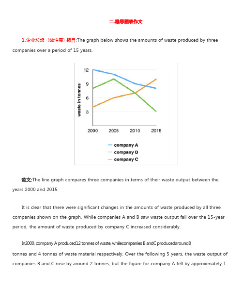
1.企业垃圾 (线性图) 题目:The graph below shows the amounts of waste produced by three companies over a period of 15 years.years 2000 and 2015.It is clear that there were significant changes in the amounts of waste produced by all three companies shown on the graph. While companies A and B saw waste output fall over the 15-year period, the amount of waste produced by company C increased considerably.In2000, company A produced12 tonnes of waste, whilecompanies B andC producedaround8tonnes and 4 tonnes of waste material respectively. Over the following 5 years, the waste output of companies B and C rose by around 2 tonnes, but the figure for company A fell by approximately 1tonne.From 2005 to 2015, company A cut waste production by roughly 3 tonnes, and company B reduced its waste by around 7 tonnes. By contrast, company C saw anincrease inwaste productionof approximately 4 tonnes over the same 10- year period. By 2015, company C’swaste output hadrisento10tonnes, while the respective amounts of waste fromcompanies A andB haddroppedto8 tonnes and only 3 tonnes.(192 words, band 9)这条线图对三家公司的废物产出从 2000 年到 2015 年进行了比较。
雅思4类图表作文范文

雅思4类图表作文范文下载温馨提示:该文档是我店铺精心编制而成,希望大家下载以后,能够帮助大家解决实际的问题。
文档下载后可定制随意修改,请根据实际需要进行相应的调整和使用,谢谢!并且,本店铺为大家提供各种各样类型的实用资料,如教育随笔、日记赏析、句子摘抄、古诗大全、经典美文、话题作文、工作总结、词语解析、文案摘录、其他资料等等,如想了解不同资料格式和写法,敬请关注!Download tips: This document is carefully compiled by theeditor. I hope that after you download them,they can help yousolve practical problems. The document can be customized andmodified after downloading,please adjust and use it according toactual needs, thank you!In addition, our shop provides you with various types ofpractical materials,such as educational essays, diaryappreciation,sentence excerpts,ancient poems,classic articles,topic composition,work summary,word parsing,copy excerpts,other materials and so on,want to know different data formats andwriting methods,please pay attention!好的,以下是一篇更加口语化的文章:《各国学生每周学习时间大揭秘》。
雅思图表题范例
雅思TASK11、曲线图(剑7 Test2 W1)The graph below show the consumption of fish and some different kinds of meat in a European country between 1979and 2004.Summaries the information by selecting and reporting the main features, and make comparisons where relevant.The graph illustrates changes in the amounts of beef, lamb, chicken and fish consumed in a particular European country between 1979 and 2004.In 1979 beef was by far the most popular of these foods, with about 225 grams consumed per person per week. Lamb and chicken were eaten in similar quantities (around 150 grams), while much less fish was consumed (just over 50 grams).However, during this 25-year period the consumption of beef and lamb fell dramatically to approximately 100 grams and 55 grams respectively. The consumption of fish also declined, but much less significantly to just below 50 grams, so although it remained the least popular food, consumption levels were the most stable.The consumption of chicken, on the other hand, showed an upward trend, overtaking that of lamb in 1980 and that of beef in 1989. By 2004 it had soared to almost 250 grams per person per week.Overall, the graph shows how the consumption of chicken increased dramatically while the popularity of these other foods decreased over the period.2、柱状图(C3T3W1)You should spend about 20 minutes on thistask.Thecharts below show the levels of participation in education and science indeveloping and industrialized countries in 1980 and 1990.Write a report a university lecturer describing the information shownbelow.You should write at least 150 words.The data shows the differences between developing and industrialized countries’ participation in education and science.In terms of the number of years of schooling received, we see that the length of time people spend at school in industrialized countries was much greater at 8.5 years in 1980, compared to 2.5 years in developing countries. The gap was increased further in 1900 when the figures rose to 10.5 years and 3.5 years respectively.We can see a similar pattern in the second graph, which shows that the number of people working as scientists and technicians in industrialized countries increased from 55 to 85 per1,000 people between 1980 and 1990, while the number in developing countries went from 12 to 20.Finally, the figures for spending on research and development show that industrialized countries more than doubled their spending, from $200bn to$420bn, while developing countries decreased theirs , from$75bn down to $25bn.Overall we can see that not only are there very large differences between the two economies but that there gaps are widening.3、饼状图(C7T4W1)The charts compare the sources of electricity in Australia and France in the years 1980 and 2000. Between these years, electricity production almost doubled, rising from 100 units to 170 in Australia, and from 90 to 180 units in France.In 1980 Australia used coal as the main electricity source (50 units) and the remainder was produced from natural gas, hydro power (each producing 20 units) and oil (which produced only 10 units). By 2000, coal had become the fuel for more than 75% of electricity produced and only hydro continued to be another significant source supplying approximately 20%.In contrast, France used coal as a source for only 25 units of electricity in 1980, which was matched by natural gas. The remaining 40 units were produced largely from oil and nuclear power, with hydro contributing only 5 units. But by 2000, nuclear power, which was not used at all in Australia, had developed into the main source, producing almost 75% of electricity, at 126 units, while coal and oil together produced only 50 units. Other sources were no longer significant.Overall, it is clear that by 2000 these two countries relied on different principal fuel sources: Australia relied on coal and France on nuclear power.4、表格类(C5T4W1)The take below gives information about the underground railway systems in six cities.Summarise the information by selecting and reporting the main features, and make comparisons where relevant. You should write at least 150 words.The table shows the detailed information regarding the underground railway systems in six cities, namely, London, Paris, Tokyo ,Washington DC, Kyoto and Los Angeles.London has the oldest underground railway system among the six cities which was opened in 1863. AndParis is the second oldest, and it was opened in 1900. This was then followed by other four cities, namely,Tokyo,WashingtonDC andKyoto with the opening date of 1927, 1976, and 1981 respectively. As forLos Angeles, it is the last one in this table to have its own underground railway system (opened in 2001).In terms of the size of the railway system, Londonenjoys the largest underground railway systems, with 394 kilometres of route in total, which is nearly twice as large as that in Paris(199 kilometres). Kyoto, in contrast, has the smallest system, for it only has 11 kilometres of route,which is nearly 1/36 of the route of London. The other three cities(Tokyo, Washington DC, and Los Angeles) have 155, 126 and 28 kilometres respectivelyInterestingly, Tokyo, which only has 155 kilometres of route, enjoys the greatest number of passengers per year, at 1927 million passengers. The system inParis has the second greatest number of passengers, at 1191 millions passengers per year. The smallest underground railway system,Kyoto, serves the smallest number (only 45 people).In conclusion, the underground railway systems in different cities vary a lot in the opening date, the size as well as the number of passengers served per year.5、地图题(真题)The following two maps show the development of a coastal city from 1950 to 2007.Summarize the information by selecting and reporting the main features, and make comparisons where relevant.The two maps illustrate the changes of a coastal city between 1950 and 2007. We can see clearly that the city became more and more modern.1n 1950, the city was like a small village, with vast grassland areas all over the city. There was a sea in the north of this city, with a park to the west. In front of the park, there was a big building area where things were under construction. By that time, three large areas were all grasslands, with a cross road dividing them.However, when it comes to 2007, things experienced significant changes. A new apartment had been built where the park was, and the original building areas were converted into industry buildings such as parks, parking lots and swimming pools. The most obvious changes were that the former grasslands disappeared, becoming cinemas in the southwest, shops in the southeast, and houses in the northeast. On the north side, although the sea was still there, a wharf was built in it so people could travel more easily by sea.Finally, although there was still a cross road in the city, the horizontal road was moved to the south. By doing so, industry buildings and houses could be left more places to develop. Anyway, the city had experienced tremendous changes throughout the 57-year period.6、流程图(C6T3W1)The first diagram shows that there are four main stages in the life of the silk worm.First of all, eggs are produced by the moth and it takes ten days for each egg to become a silkworm larva that feeds on mulberry leaves. This stage lasts for up to six weeks until the larva produces a cocoon of silk thread around itself. After a period of about three weeks, the adult moths eventually emerge from these cocoons and the life cycle begins again.The cocoons are the raw material used for the production of silk cloth. Once selected, they are boiled in water and the threads can be separated in the unwinding stage. Each thread is between 300 and 900 metres long, which means they can be twisted together, dyed and then used to produce cloth in the weaving stage.Overall, the diagrams show that the cocoon stage of the silkworm can be used to produce silk cloth through a very simple process.。
雅思图表类英语作文模板

雅思图表类英语作文模板英文回答:1. Introduce the chart/graph: Briefly describe the type of chart/graph, the data it presents, and the time period or geographical location it covers.2. Overall trend: State the general trend or pattern observed in the data. Use specific numbers or percentages to support your statement.3. Key features: Highlight the most important or noticeable features of the chart/graph, such as peaks, valleys, or changes over time.4. Possible reasons: Speculate on the reasons behind the trends or features you have identified. Consider external factors or events that may have influenced the data.5. Predictions or recommendations: Based on the data presented, make predictions about future trends or provide recommendations for action.中文回答:雅思图表类英语作文模板。
1. 图表介绍,简要描述图表类型、数据内容以及时间跨度或地理范围。
2. 总体趋势,陈述数据中观察到的总体趋势或模式。
雅思图表作文模板「经典篇」

雅思图表作文模板「经典篇」雅思图表作文模板「经典篇」静态图表可以为所呈现的信息,只有不同数据之间的对比,无时间变化的图表。
主要常见的静态图可以分为:柱状图,饼状图,表格以及对比式的地图题。
不同于比如折线图的雅思小动态图,静态图的写作技巧有所不同。
首先分类,其次按比例进行描写。
对于比例的描述中常用的词:(大比例:Dominate/occupy the majority of/ stand at the largest of proportion ofwhich is…注意词性的'替换。
)模板句型:1.B rank/position second followed immediately/closely by C and D.B is in the second place.B is the second most/least popular…2. 占据(占据多少百分比)Be/consist/compose/take up…/comprise/constitute/make up/account for/occupies a majority of sth.E.g. Voluntary workers take up nearly half of the work force in house care sector (医护产业).Hispanics (a speaking person living into the US. Especially one of Latin American)综合句型:1.A be 倍数 as many/much as B(利用句型,雅思想要达到高分要求的话,要尽量在主语上下功夫,脑袋里首先想到的主语一定是大家都能想到的,再想想看是否可以用别的主语进行造句)E.g. Women working as/employed as child minder in the under-35 age group in 1995 were twice as many as in 1990.Television was twice as popular as washing machine in 1999,with close to 10% of household owning one TV set at home.(sale volume of television销售量;新高/新低 new high/new low) 主体段落开头必备:副词clearly, .../ obviously, .../ apparently, .../ evidently, ...短语:According to the table/data, .......In accordance with the table/data, .....That从句:It can be seen from the + 图表+that ......We can see from the + 图表+that ......It appears from the data that ......It indicates from the table that.......As从句:As we can see from the data/table, ......As we can see from the data/ table, .......As is reflected in the table, ......。
(完整版)雅思经典图表作文范文

#45.The charts below show the percentage of their food budget the average family spent on restaurant meals in different years.The graph shows the number of meals eaten in fast food restaurants and sit-down restaurants.You should write at least 150 words.Give reasons for your answer and include any relevant examples from your own knowledge or experience.Over the past30years,the average family has dramatically increased the number of meals that they eat at restaurants.The percentage of the family's food budget spent on restaurant meals steadily climbed.Just10percent of the food budget was spent on restaurant meals in1970,and15percent in1980.That percentage more than doubled in1990,to35percent,and rose again in2000to50percent. Where families eat their restaurant meals also changed during that30-year period. In1970,families ate the same number of meals at fast food and sit-down restaurants.In1980,fam¬ilies ate slightly more frequently at sit-down restaurants. However,since1990,fast food restaurants serve more meals to the families than do the sit-down restaurants.Most of the restaurant meals from2000were eaten at fast food restaurants.If this pattern continues,eventually the number of meals that families eat at fast food restaurants could double the number of meals they eat at sit-down restaurants.(164words)#44. You should spend about 20 minutes on this task.The map below is of the town of Garlsdon.A new supermarket(S)is planned for the town.The map shows two possible sites for the supermarket.Summarise the information by selecting and reporting the main features,and make comparisons where relevant.You should write at least 150 wordsmodel answer:The first potential location(S1)is outside the town itself,and is sited just off the main road to the town of Hindon,lying12kms to the north-west.This site is in the countryside and so would be able to accommodate a lot of car parking.This would make it accessable to shoppers from both Hindon and Garlsdon who could travel by car.As it is also close to the railway line linking the who towns to Cransdon(25km to the south-east),a potentially large number of shoppers would also be able to travel by train.In contrast,the suggested location,S2,is right in the town centre,which would begood for local residents.Theorically the store could be accessed by road or rail from the surrounding towns,including Bransdon,but as the central area is a no-traffic zone,cars would be unable to park and access would be difficult.Overall,neither site is appropriate for all the towns,but for customers in Cransdon,Hindon and Garlsdon,the out-of-town site(S1)would probably offer more advantages.(179words)#43. You should spend about 20 minutes on this task.The table below shows CO2emissions for different forms of transport in the European Union.The Pie Chart shows the percentage of European Union funds being spent on different forms of transport.You should write at least 150 words.model answer:The chart shows CO2emissions per passenger kilometre for variuos methods of transport in the European Union while the pie chart shows European Union spending on transport.Flying by air produces by far the greatest CO2emissions, approximately three times as much as passenger cars which are the next largest producers.Very little is spent by the EU on air travel while roads make up more than half of the EU transport budget.Trains produce about three times less CO2emissions per passenger kilometre than passenger cars and eight times less than air travel.Nearly a third of EU transport funds are spent on railways.Ships are a clean form of transport and produce about the same amount of CO2 per passenger kilometre as trains do.However,only2percent of EU funds are spent on ports.A further one percent is spent on inland waterways.Coaches are the cleanest form of transport.Emissions of CO2per passenger kilometre from coaches are half those of buses.Buses emit less than half as much CO2per passenger kilometre as cars.The European Union spends10 percent of its transport budget on public transport,such as buses and coaches. (197words)The table below shows the sales at a small restaurant in a downtown business district.Summarize the information by selecting and reporting the main features,and make comparisons where relevant.You should write at least 150 words.Give reasons for your answer and include any relevant examples from your own knowledge or experience.Sales:week of October7-13Mon.Tues.Wed.Thurs.Fri.Sat.Sun. Lunch $2,400 $2,450 $2,595 $2,375 $2,500 $1,950 $1,550 Dinner $3,623 $3,850 $3,445 $3,800 $4,350 $2,900 $2,450model answer:The sales at this small restaurant during the week of October7to13th followed a fairly set pattern from Monday to Friday,and then showed notable shift on the weekend.The lunch and dinner sales during the week peaked on Friday and then dipper down as the weekend set in.During the week of October7-14th,the lunch sales averaged at approximately $2,400.The highest lunch sales occurred on Friday,and the lowest occurred on Sunday.Sunday's lunch sales were approximately$1,000less than the average lunch sales during the rest of the week.Dinner sales,which generated at least$1,000to$1,500more a day than lunch sales,also remained steady during the week.Just like the lunch sales,the dinner sales peak on Friday and dipped down for the weekend.Excluding Wednesday and Thursday,the lunch and dinner sales from October7-11rose gradually until the end of the business week.Midweek,on Wednesday and Thursday,the sales were slightly lower than they were on Tuesday.According to the sales report,this restaurant has a steady lunch and dinner crowd. The most profitable day during the second week of October was Friday.Sunday, was the least prof¬itable day,with the full day's sales totaling/totalling less than the Friday dinner sales.These numbers are reflective of a restaurant that is located in a business/financial district where business hours are Monday through Friday.In June1996,an experimental flu vaccine was trialled in a large country town on females only.Summarise the information by selecting and reporting the main features,and make comparisons where relevant.You should write at least 150 words.Give reasons for your answer and include any relevant examples from your own knowledge or experience.model answer:The diagrams show data for a flu epidemic which hit a large country town in1996. Figure1gives the number of persons who died;Figure2shows the percentage breakdown of females who received a new flu vaccine;and Figure3gives the number of cases of flu before and during the epidemic.In Figure1it can be seen that the flu was responsible for the deaths of2females but no males in the period from March to May.However,from June to August, there were4female deaths and1male death.According to the pie chart in Figure2,only those females most at risk were given the new flu vaccine;28%did not take part in the trial.Of those females who took part,35%were aged(over65years old);24%were babies or children;and13% were either hospitalised or receiving other medical attention.From Figure3it is clear that the new vaccine had a positive effect on the number of new cases of flu reported in females.There were just over1000cases reported in March,climbing rapidly to a peak of3500in June.Thereafter,the number of cases dropped slowly to about2800in August,before levelling off at2500for the rest of the year.For males,the figures were lower but showed a similar trend throughout the epidemic.(232words)#39. You should spend about 20 minutes on this task.The chart below shows estimated world literacy rates by region and by gender for the year2000.Write a report for a university lecturer describing the information below.You should write at least 150 words.model answer:In this report I will describe a bar chart that shows the estimated world illiteracy rates by gender and region for the year2000.First I will look at male illiteracy for the6areas shown.The lowest rates were in Developed Countries,Latin America/Caribbean and East Asia/Oceania with rates of1%(approximately),10%and8%(approximately)respectively.The rates for the next three areas were much higher and quite similar to each other.Sub-Saharan Africa,the Arab States and South Asia had rates of approximately31%,29%and 34%.Female illiteracy was much higher relatively in each area except LatinAmerica/Caribbean where it was only slightly higher.The lowest rates for female illiteracy were again Developed Countries,Latin America/Caribbean and East Asia/Oceania with rates of approximately2%,12%and20%.Again the rates for the next three areas were much higher and quite similar to each other.Sub-Saharan Africa,the Arab States and South Asia had rates of approximately48%, 52%and56%.This ends my report.#38. You should spend about 20 minutes on this task.The chart shows the number of mobile phones and landlines per100people in selected countries.Write a report for a university lecturer describing the information given.You should write at least 150 words.model answer:The graph shows the number of mobile phones and landlines per100users,for selected countries.Overall,most of the countries included in the graph have more mobile phones subscribers than landlines.Most European countries have high mobile phone use.The biggest users of mobile phones are the Italians,with88cell phones per100people.For example, Italy has twice as many mobile phones as landlines,with88mobiles per hundred people compared to45for landlines.Mobile phone use is low in Canada,with fewer than40phones per100people.Denmark is also unusual because it has slightly more landlines than mobile phones.However,in some countries,the number of landlines is higher than the number of mobile phones.One example is the USA,where the number of mobiles,at50per 100people,is much lower than the number of landlines,at almost70per hundred.A similar pattern can be seen in Canada.The highest number of landlines in the graph is in Denmark,with about90per100people.In contrast,the lowest figures for fixed lines are in Italy and the UK.In conclusion, it seems that mobile phone use is higher in Europe than in North America.#37. You should spend about 20 minutes on this task.The graphs show enrolment in different colleges in the Higher Colleges of Technology in1999.Write a total of150-200words about the information in the three graphs. Write a report for a university lecturer describing the information given. You should write at least 150 wordsmodel answer:The charts shows student enrolment by gender and level in different colleges of the Higher Colleges of Technology colleges in the UAE.There are clear differences in male and female enrolment.Females outnumber men in all the colleges,with almost25%more students in Dubai Women's college than in Dubai Men's.Ras Al-Khaimah Women's College has almost180students, compared to only100in the Men's college.Females also outnumber males by level,with almost double the number of men at Higher Diploma level(330compared to181).Only at Diploma level does the number of men slightly exceed that of women.Over half the students are in Certificate level,with less than a quarter at Higher Diploma or Bachelor level.In conclusion,most students in the Higher Colleges are enrolled at Diploma level or below,and the majority of students are women.(143words)# 36. You should spend about 20 minutes on this task.The line graph below shows the number of annual visits to Australia by overseas residents.The table below gives information on the country of origin where the visitors came from.Write a report for a university lecturer describing the information given.You should write at least 150 words.NUMBER OF VISITORS (million)SOUTH KOREAJAPANCHINAUSABRITAINEUROPETotal20059.112.00.81.12.94.530.4 19752.93.20.30.40.91.18.8model answer:The given line graph illustrates information on the number of overseas visitors traveling to Australia in millions of people.Overall,one notable trend seems to be that Australia has steadily become more popular as a destination spot.For example,there were20million more visitors to Australia in2005than in1975. That's a jump from10million to30million in20years.The second table gives statistics showing the countries whose residents went to Australia between1975and2005.In both years,the largest number of visitors came from Japan,followed by South Korea and Europe.Britain,the United States and China also had many people traveling to Australia in these years.In fact,the number of people visiting Australia grew in every one of these countries.For example,in2005,12million people went there from Japan compared with only3.2 million in1975.(147words)#35. You should spend about 20 minutes on this task.The table below shows the consumer durables (telephone, refrigerator, etc.) owned in Britain from 1972 to 1983.Write a report for a university lecturer describing the information shown below. You should write at least 150 words.model answer:The chart shows that the percentage of British households with a range of consumer durables steadily increased between 1972 and 1983. The greatest increase was in telephone ownership, rising from 42% in 1972 to 77% in 1983. Next came centralheating ownership, rising from 37% of households in 1972 to 64% in 1983. The percentage of households with a refrigerator rose 2 1% over the same period and of those with a washing machine by 14%. Households with vacuum-cleaners. televisions and dishwashers increased by 8%, 5% and 2% respectively. In 1983. the year of their introduction, 18% of households had a video recorder.The significant social changes reflected in the statistics are that over the period the proportion of British houses with central heating rose from one to two thuds, and of those with a phone from under a half to over three-quarters. Together with the big increases in the ownership of washing machines and refrigerators, they are evidence of both rising living standards and the trend to lifestyles based on comfort and convenience.Consumer durables Percentage of households with: central heating television videovacuum cleaner refrigerator washing machine dishwasher telephone198260 9795 93 79 4 76197852 9692 91 75 3 60197239 9387 73 6642197443 9589 81 6850197648 9692 88 7154197955 9793 92 74 3 67198159 9794 93 78 4 75198364 98 1894 80 5 77#34. You should spend about 20 minutes on this task.The table below shows the figures for imprisonment in five countries between 1930and1980.Write a report for a university,lecturer describing the information shown below. You should write at least 150 wordsmodel answer:The table shows that the figures for imprisonment in the five countries mentioned indicate no overall pattern of increase or decrease.In fact there is considerable fluctuation from country to country.In Great Britain the numbers in prison have increased steadily from30000in1930 to80,000in1980.On the other hand in Australia,and particularly in New Zealand the numbers fell markedly from1930to1940.Since then they have increased gradually,apart from in1980when the numbers in prison in New Zealand fell by about30,000from the1970total.Canada is the only country in which the numbers in prison have decreased over the period1930to1980,although there have been fluctuations in this trend.The figures for the United States indicate the greatest number of prisoners compared to the other four countries but population size needs to be taken into account in this analysis.The prison population in the United States increased rapidly from1970to1980and this must be a worrying trend.。
最新雅思考试图表作文
•
11.As is shown in the table...如表格所示...
•
•Байду номын сангаас
12.As can be seen from the diagram, great changes have taken place in... 从图中可以看出,...发生了巨大变化。
13.From the table/chart/diagram/figure,we can see clearly that...or it is clear/apparent from the chart that... 从图表我们可以很清楚(明显)看 到... 14.This is a graph which illustrates...这个图表向我们展示了... 15.This table shows the changing proportion of a & b from..to... 该表格描述了...年到...年间a与b的比例关系。 16.The graph,presented in a pie chart, shows the general trend in... 该图以圆形图形式描述了...总的趋势。 17.This is a column chart showing...这是个柱型图,描述了...
•
1.The bar chart illustrates that... 该柱状图展示了...
•
• • • • • • • •
2.The graph provides some interesting data regarding... 该图为我们提供了有关...有趣数据。
3.The diagram shows (that)...该图向我们展示了... 4.The pie graph depicts (that)....该圆形图揭示了... 5.This is a cure graph which describes the trend of...这个曲线图描述 了...的趋势。 6.The figures/statistics show (that)...数据(字)表明... 7.The tree diagram reveals how...该树型图向我们揭示了如何... 8.The data/statistics show (that)...该数据(字)可以这样理解... 9.The data/statistics/figures lead us to the conclusion that... 这些数据资料令我们得出结论... 10.According to the chart/figures...根据这些表(数字)...
图表类英语作文模板雅思

图表类英语作文模板雅思篇 1When it comes to IELTS chart-based writing, there is a common template structure that can guide us to present the data effectively. In the opening paragraph, we should clearly state the main topic of the chart, like "The chart provides information about the consumption habits of people in different age groups!" This gives a direct and clear start.In the middle part, it's crucial to analyze the data trends and make comparisons. For instance, if it's a bar chart showing the consumption habits of different age groups, we could say, "The consumption of young people on entertainment is significantly higher than that of the elderly! While the elders spend more on healthcare." We need to describe the details precisely and compare the differences vividly.Finally, in the concluding paragraph, we summarize the main findings. For example, "It is obvious that age plays a significant role in shaping consumption patterns!" By following this template, we can handle IELTS chart writing tasks with more confidence and clarity.篇 2When it comes to IELTS chart essays, there are some remarkable language features that deserve our attention! Firstly, the use of proper linking words is crucial. For instance, 'moreover', 'furthermore', and 'however' help to connect ideas smoothly. In a pie chart, describing the proportions of each part requires accurate language. We might say, "The largest portion, accounting for approximately 40%, represents..." Or when dealing with a table, we could state, "The data shows asignificant increase from 20% to 50% within a short period." Isn't it fascinating how precise language can make the description clear and vivid? So, always be careful in choosing words and expressions to present the data accurately and effectively. Don't you think mastering these skills is essential for a high score in IELTS writing?篇 3Oh my goodness! When it comes to IELTS chart-based composition templates, there are several crucial points to keep in mind. Firstly, grammar mistakes must be avoided at all costs! Imagine a situation where you wrongly use verb tenses or confusing sentence structures. For instance, saying "The number of students was increased" instead of "The number of students increased". Such a mistake can significantly lower your score. Secondly, the accuracy of data description is of utmost importance! A wrong interpretation of the data could lead to a completely wrong conclusion. Like once a student wrongly stated that the proportion of male workers was higher than that of female workers, but the chart clearly showed the opposite. So, always double-check your data and make sure your expressions are clear and accurate. Isn't it essential to pay close attention to these details for a high score in IELTS?篇 4Oh my goodness! Let's take a look at how to apply the template for IELTS chart-based essays through some practical examples. Consider a chart showing the population growth in a certain area. First of all, we need to have a clear introduction. Like, "The chart presents a vivid picture of the population growth in [area name] over [time period]. It is truly remarkable how this data unfolds!" Then, when describing the details, we could say, "The population started at [initial number] and steadily climbed to [final number], which is astonishing! Isn't it?" And in the conclusion, we might summarize by saying, "In conclusion, the population growth in this area haswitnessed significant changes, highlighting the importance of [relevant factors]. What does this imply for the future? It surely demands our attention!" By following such a template, we can present our ideas clearly and effectively in the IELTS exam. Isn't that wonderful?篇 5When it comes to writing IELTS essays based on different types of charts, it's essential to master the flexible application of templates. Take line graphs for instance. They often show trends over time. So, we might start by describing the overall trend, like "Oh my goodness! The data clearly indicates a significant upward trend throughout the period!" For bar graphs, the focus could be on comparisons between different categories. We could say, "How astonishing! Category A far exceeds Category B in terms of quantity!" When it comes to pie charts, the emphasis is on proportions. We might exclaim, "Isn't it remarkable? The majority of the share belongs to X!" However, we must adjust the language and structure of the template according to the specific characteristics of each chart. Isn't that the key to a high-scoring essay? Remember, a precise and vivid description is crucial for presenting the data effectively and impressing the examiners. So, let's practice and master this skill!。
雅思作文——柱状图和表格
对比和比较
All the same/just the same as Contrary to B,A is …. Conversely, B is … On one hand, on the other hand Compare, contrast A with B
高分词汇 A is higher than B的高级方法 Be superior/inferior to 社会地位 social status
Overall, the students who watch less television have higher scores, and the average test scors increases.
The highest score of 80 is for students who usually watch one hour or less of television a day.
100 50
25 20
T.V
Newspaper
Internet
Billboards
250
125
50
25
200
75
100
20
Advertising Expenditure
Model
The bar chart shows the respective amounts of money in thousands of dollars spent on different types of advertising by two companies- Acme and Famous.
As much as 不可数名词 as many as 可数 The books of this semester are two times as
雅思图表写作范例
Overall, the PRC has the largest number of enrolled students (17) and Germany the smallest (5).Japan and Taiwan both have 12 students; Korea has 11. It is noticeable that Japan and Korea have similar profiles.
3
第三页,编辑于星期三:十八点 五分。
线型图:model answer
On the other hand, between 1900 and 1918 the death
rate stayed constant at 41 per thousand. In 1918, however, it rose sharply and reached the peak of 60 per thousand in 1920. From 1920 to 1930 the death rate fell. It reached the same point of 30 per thousand as the birth rate in 1930. There was a rapid increase in 1930 and also in 1940. Since 1945 it had fallen steadily and arrived at 10 per thousand in 1980. This is very similar to the case of the birth rate.
9 respectively ). For each nationality the males taking CAD
雅思写作图表题之模板和词汇汇总
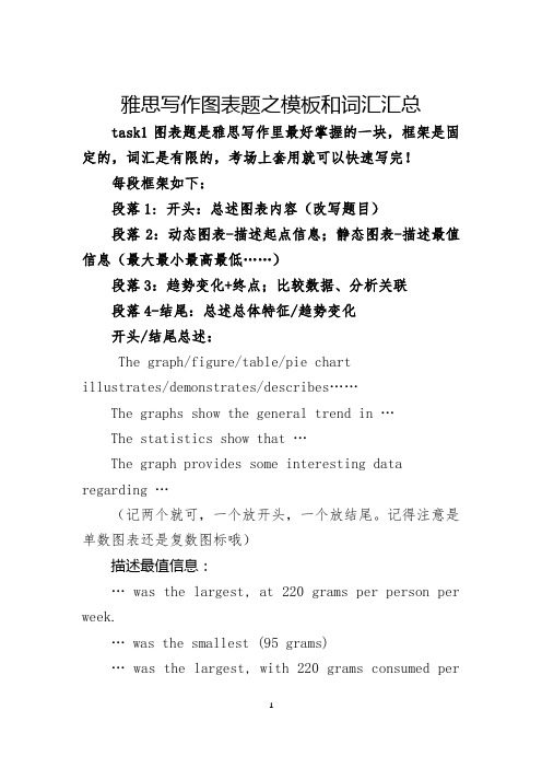
雅思写作图表题之模板和词汇汇总task1图表题是雅思写作里最好掌握的一块,框架是固定的,词汇是有限的,考场上套用就可以快速写完!每段框架如下:段落1: 开头:总述图表内容(改写题目)段落2:动态图表-描述起点信息;静态图表-描述最值信息(最大最小最高最低……)段落3:趋势变化+终点;比较数据、分析关联段落4-结尾:总述总体特征/趋势变化开头/结尾总述:The graph/figure/table/pie chartillus trates/demonstrates/describes……The graphs show the general trend in …The statistics show that …The graph provides some interesting data regarding …(记两个就可,一个放开头,一个放结尾。
记得注意是单数图表还是复数图标哦)描述最值信息:… was the largest, at 220 grams per person per week.… was t he smallest (95 grams)… was the largest, with 220 grams consumed perweek, while that of … was the least (…peak at;reach a peak; reach the highest point达到最高峰bottom out; fall to/ hit the lowest point 降到最低点描述百分比:According to the figure, it is obvious that the most (adj.) component is A, which accounts for a% of all. B is the next largest proportion/part, b%, m% lower than A, followed closely by C (c%).The above three items take up about n% of all. By contrast, D, E, F make up a small percentage of the t otal…, which are p%, q% and r% respectively.Comprise only a small percentage. Stand at m%...描述趋势变化:(一)词汇1、上升:rise, increase, climb, grow, go up. (迅速上升)boom, surge, soar2、下降:fall, decrease, decline, drop, go down, dip, reduce. (骤降)slump3、不变:level out/off, remain stable/steady, stay constant, maintain the same level4、波动:fluctuate around5、幅度大:dramatically; sharply; rapidly;substantially; considerably; significantly; markedly6、幅度中等:moderately; gradually; steadily7、幅度小:slightly; minimally(二)句型1. The number of people increase steadily from approximately 300 at 6a.m. to 450 to 8a.m.2. There is a steady increase in the number of people from … to …3. There are increasingly more people at the subway station from … to …4. The time from 6a.m. to 8a.m./The subway station witnesses a steady increase in …5. A noticeable increase can be found/seen in the …6. The trend is a steady increase in the number of …7. The number of … showed an upward trend from …衔接词:then/ from then on/ from this time onwards…after… / before… which is followed by…however/ by contrast / on the contrary / , while / , whereassimilarly, / likewise, …。
- 1、下载文档前请自行甄别文档内容的完整性,平台不提供额外的编辑、内容补充、找答案等附加服务。
- 2、"仅部分预览"的文档,不可在线预览部分如存在完整性等问题,可反馈申请退款(可完整预览的文档不适用该条件!)。
- 3、如文档侵犯您的权益,请联系客服反馈,我们会尽快为您处理(人工客服工作时间:9:00-18:30)。
雅思图表作文模板句Para1. This is a table / chart / (line线状bar柱状pie饼状)graph which demonstrate / illustrate / reveal /depict /privide information about............. Para2. (1)Obvious /Apparent from the graph is that ...rank the first/highest,while/whereas ....turn out to be the lowest(2)It is exhibited/shown in the table that.....(3)It can be seen from the table that.....Para3.(1)饼.柱图A,which accounts for...%,ranks the first;then next is B with...%;followed by C,constituting...%;finally it comes D.E.F at...%...%and...%respectively(2)特殊变化(不变,增长或下降多的)①It is worth mentioning that....②It must be pointed out that....③More striking/suprising is that....Para4.To conclude /In conclusion/overallPara5. this is a graph which illustrates...这个图表向我们展示了...Para6 .this table shows the changing proportion of a &b from...to...该表格描述了...年到...年间a与b的比例关系。
Para7 .the graph,presented in a pie chart, shows the general trend in...该图以圆形图形式描述了...总的趋势。
Para8. this is a column chart showing...这是个柱型图,描述了...Para9 . as can be seen from the graph,the two curves show the flutuation of...如图所示,两条曲线描述了...的波动情况。
Para10 .over the period from...to...the...remained level.在...至...期间,...基本不变。
Para11 .in the year between...and...在...年到...期间...Para12.in the 3 years spanning from 1995 through 1998...1995年至1998三年里...Para13 .from then on/from this time onwards...从那时起...Para14 .the number of...remained steady/stable from (month/year) to (month/year)....月(年)至...月(年)...的数量基本不变。
1、通过第一个曲线图,我们可以知道____,也说明了结果是___ According to the first graph, it can be seen that ______________, it can also be concluded from it that ______________.2、一张有趣、有教育意义的、(内容)的图片There is an interesting and instructive picture which goes like this: ___________.3、当前有一张涉及______的增长曲线图,许多人______,然而其他人倾向于___ Nowadays there is a growing concern over ______________. Many people like ______________, while others are inclined to ______________.4、目前,共同之处是_________,许多人喜欢______因为_______除此之外还由于_____ Nowadays, it is common to ______________. Many people like ______________ because______________. Besides, ______________.5、(图表所示)_____,就像许多其他事物,被____更加喜爱,然而这一观点正被________ 所抨击,一些人认为_________,他们指出___________ ______________, just like many other things, are preferred by ______________.While being attacked by the idea that ______________, some people consider ______________. They point that ______________.6、每种事物都有两面性和________,是没有异议的,包括利和弊Everything has two sides and ______________ is not an exception, it has both advantages and disadvantages.7、_____作为_____被观察了许多年,但是人们现在像发现新大陆一样注视着它For years ______________ had been viewed as ______________. But people are taking a fresh look at it now.8、政府保证________,对于这份保证,大多数人做出了强烈地回应,因为_____ It has stipulated by the government that ______________. To this stipulation, many people respond actively because ______________.9._____也许更喜欢_____,但是_____忍受_____的不利之出______________ may be preferable to ______________, but it suffers from the disadvantages that ______________.10._____的有利之处比______的有利之处要多,举例说明,_____ The advantages of ______________ are much greater that those of_________. For instance, ______________.11. But I don’t think it is a very good way to solve ______________. For instance, ______________. Worst of all, ______________.12. There are many ways to ______________. First, ______________. Second, ______________. Third, ______________.13. On the contrary, there are some people in favor of ______________. They believe ______________. Moreover, they think ______________.14.There are several measures for us to adopt. First, we can ______________, there are a number of advantages of __________. Another solution is to ________.15.It is high time that something was done about it. For example, ______________. In addition, ______________. All these measures will certainly ______________.16. There are some other people, who ______________. Their reasons are different something for ______________, sometimes for ______________, and sometimes simply for ______________.17.______________ is necessary and important to our country’sdevelopment and construction. First, ______________. What’s more, ______________. Most important of all, ______________.18. However, if not managed properly, ______________ can create many problems. Sometimes ______________. Furthermore, ______________.Therefore, ______________ has been gaining public concern.19. 有很多原因____,………①There are probably many reasons for ______________. First, ______________.②Second, ______________. Finally, ______________. There are, I think, two main reasons for ______________. In the first place, ______________. In the second place, ______________. Therefore, ______________.③Well, why is there ______________ I think there might be two reasons. One is ______________, and the other is ______________.④Why ______________ For one thing, ______________. For another, ______________. Perhaps the main reason is ______________.⑤Why ______________ The first reason is that ______________. The second reason is ______________. The third is ______________. For all this, the main cause of ______________ is due to ______________.20. It is no easy job to find the reasons for this tendency which involves several complicated factors. For some ______________. For others ______________.21. “Why do ______________” Many people often ask questions like this.22. In recent years, there is a general tendency to ______________.According to a study, there is ______________. compared with ______________ last year. Why ______________23. According to a survey, there is a growing number of ______________. What brings this result The main reason rests with.24.①Some people prefer to ______________. In their opinion, ______________. In addition, ______________. Nevertheless, nowadays, ______________ has become more and more common.②Many people are inclined to ______________. In their opinion, _____. They believe that ______________.25. Today, there ______________, which have brought a lot of harms in our daily life. First, ______________ second, ______________. What makes things worse is that ______________.26. Nowadays, ______________ has become a problem we have to face. Though it’s easier said than done, with the help of modern technology, we now have many means to solve it.27. 对于这个图,说明了_____ ①The graph shows the general trend in __________②According to the figures/numbers/statistics/percentages in the table/chart/bar graph/line graph, it can be seen that ______________. Obviously, ______________, but why③The figure indicates/shows/suggests/proves that ______________.There is a steady/rapid development/trend of ______________.④From the graph/chart, we know the statistics of ______________ and ______________. It can be seen easily that ______________.⑤According to the two graphs presented, it can be observed that _____ In the left graph, ______________. At the same time, ______________ as the right graph shows.28. 现在我们经常听到_____,但是真的如此吗?①These days we are often told that ______________. But is it true②These days we often hear about ______________. But is this really the case29. 一位着名的作家曾经说过_____,One of the great writers once said that ______________. Now it still has a realistic significance.30. 回看历史,______的想法从来都没流行过,一方面_____另一方面______ In our history, the idea that ______________ never has been so popular. On one hand, ______________, on the other hand, ______________.31. 人们中有许多像____不同的意见,一些人认为_______ There are different opinions among people as to ______________. Some people suggest that ______________.32. 一些人认为________对_______来说在许多方面都是好的,然而,其他人不同意Some people hold the opinion that ______________ is superior to ______________ in many ways: Others, however, disagreewith it.33. 现在虽然越来越多的人______,但仍有一些_____的人,他们也许认为_____Nowadays although more and more people ______________, still there are some who think ______________, they may think ______________.。