图表作文
图表作文(2010-05-06)
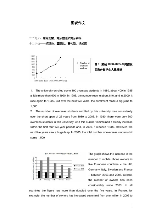
图表作文三个充分:充分观察、充分描述和充分解释十二字诀——抓趋势、重配比、套句型、析成因图1:某校1980-2005年间招收的海外留学生人数情况1. The university enrolled some 300 overseas students in 1980, about 400 in 1985,a little more than 600 in 1990. In 1995, the number rose to about 840, and in 2000, it rose again to 1,000. But over the next five years, the enrolment made a big jump to 1,500.2. The number of overseas students enrolled by this university rose consistently over the short span of 25 years from 1980 to 2005. In 1980, there were only 300 overseas students in this university. And this number maintained a steady increase within the first four five-year periods and, in 2000, it reached 1,000. However, the next five years saw a huge leap. In 2005, the total number of overseas students hit some 1,500.The graph shows the increase in thenumber of mobile phone owners infive European countries –the UK,Germany, Italy, Sweden and France– between 2003 and 2008. Overall,the number of owners has risenconsiderably since 2003. In all countries the figure has more than doubled over the five years. In France, for example, the number of owners has increased sevenfold from one million in 2003 toseven million in 2008. In 2003, the UK had the greatest number of owners at just under five million and this figure increased to 12 million in 2008. The greatest number of mobile phone owners now, however, is in Germany, where ownership has risen from four million in 2003 to 14 million in 2008.套句型表1:描写变化趋势的词汇(表中―*‖标注的动词可兼做名词)表21. 表示图书销量增加可以说:Book sales have grown substantially.或者There has been a modest increase in book sales.2. 表示图书销量减少可以说:Book sales have fallen dramatically.或者There has been a slight drop in book sales.3. 表示图书销量持平可以说:Book sales have remained unchanged.或者Book sales have levelled off.请描述以下文字:―自2007年1月国际油价跌破每桶60美元大关后,次月油价再次回到60美元。
考研英语图表作文考前必备范文

21篇图表作文范文第一类:市场经济、行业发展类T opic 1: Mobile-phone subscriptionsFrom the bar chart given above, we can observe that mobile-phone subscriptions in developing and developed country experienced some changes during the past several year. The number of mobile-phone subscriptions in developing countries increased dramatically from less than 1 billion in 2000 to 4 billion in 2008. Taking a look at the statistics of mobile-phone subscriptions in developed countries, we can see that it ascended gradually from less than 1 billion in 2000 to the maximum at 1 billion in 2007, and then remained unchanged in 2008.The bar chart reveals that there exists difference in the development of mobile-phone subscriptions between developing and developed countries. What exactly contribute to this phenomenon? Reasons can be listed as follows: the authorities in developing countries have issued some preferential policies to protect and promote the development of the mobile-phone industry. Moreover, with the improvement of financial status and purchasing power, people in mounting numbers can afford to buy mobile-phones which was once deemed expensive. When it comes to developed countries, its slow growth can be best attributed to the market saturation: almost every one has owned mobile-phones, it is no need for them to buy a new one.By observing the trend in developed countries, we may forecast that the mobile-phone subscriptions will not continue to grow rapidly, as developing countries will meet the same problem of “limited grow space”. This is, obviously, the law of the market development.(236 words )T opic 2: Domestic market share of different car brandsFrom the bar chart given above, we can observe that the market share of different brands in domestic car markets experienced some changes during the past several years. The car market share of Chinese brands increased markedly from 25% in 2008 to roughly 35% in 2009. During the same period , the proportion of Japanese brands decreased sharply by nearly 10% from 35% to 25%. The percentage of American brands remained unchanged at 15% from 2008 to 2009.The bar chart reveals that there exists some difference in the development tendency among different car brands. What exactly contribute to this phenomenon ? Reasons can be listed as follows: for one thing, the Chinese government has issued some preferential policies to protect and promote the rapid extension of domestic automotive industry. Moreover, with the decline of the prices of domestic cars, people in mounting numbers are more inclined to choose them. As for Japanese car brands, its loss of customers can be attributed to the “Recall Crisis” and low price performance ration.To maintain the leading position, Chinese automotive industry should spare no efforts to improve their capabilities of products innovation, service awareness and continue to lower its prices. Only in this way can the car industry enjoy a sustainable development. (208 words)T opic 3: The boom of overseas traveling industryFrom the bar chart given above, we can observe that the number of people traveling abroad experienced some changes during the past several years. From 1999 to 2000, the number of Chinese people traveling abroad increased rapidly from 7.5 million to 10 million, and then to 12.1 million in 2001.The bar chart reveals that people in mounting numbers are going to travel abroad. What exactly contribute to this phenomenon? Reasons can be listed as follows: for one thing, the authorities have issued some preferential policies to promote the development of the overseas tourism industry, which encourages a sudden emergence of travel agencies that can provide customers with convenient overseas tourism services. Additionally, with the improvement of financial status and purchasing power, a considerable number of Chinese people can afford the once-deemed-expensive traveling expenses. Last but not least, as there exists huge difference in cultures, customs and landscapes between China and overseas countries, quite a few people hold that overseas traveling is not only a perfect way to relax oneself, but also enrich their knowledge and expand their horizons.By observing the past trends, we may forecast that the growth tendency will continue. However,it is also a highly variable industry which is vulnerable to seasons and climates,international political situation,fluctuations in exchange.T opic 4: Changes in the ownership of houses in ChinaFrom the bar char given above, we can observe that the ownership of houses in China experienced some changes during the past several years. The proportion of state-owned houses decreased sharply by almost 50% from 70% in 1950’ to 20% in 1990’. On the contrary, during the same period, the percentage of private houses increased rapidly from 30% to 80%.The bar chart reveals that there exists an opposite trend in the development of state-owned and private houses ownership. What exactly contribute to this phenomenon? Reasons can be listed as follows: for one thing, the authorities have issued some preferential policies to the development of private houses industry. Additionally, with the improvement of financial status and purchasing power, citizens in mounting numbers can afford to buy private houses which were deemed expensive. Last but not least, people’s decision to buy a house can also be ascribed to the power of so-called “group dynamics”: when members of our social networks own their private house one after another, we unconsciously imitate them , of course, if we have enough money.The continual growth of private houses is a symbol of the improvement of people’s living standard. However, the authorities should also place a value on the restriction of houses’ price. Otherwise, it will one day be a obstacle of the rapid and sound development of economy. (224words)T opic 5: Changes in the number of TV-goers and Film-goers From the curve chart given above, we can observe that the number of film-goers and TV-goers experienced some changes over the past decade. From 1975 to 1985, the number of film-goers decreased rapidly from 80 million to nearly 10 million. During the same period, the number of TV-goers increased sharply from less than 10 million to approximately 100 million.The curve chart informs us of the phenomenon that there exists an opposite tendency between film-goers and TV-goers. Many reasons can account for this phenomenon, and the followings might be the most critical ones: for one thing, by improving the quality of programs, the TV-industry has retained a large body of televiewers and attracted quite a few potential viewers that would have swarmed into cinemas. When it comes to the cinema, the reason why it slackens might be attributed to the change of people’s consumption idea, people in increasing numbers hold the opinion that the ticket fare is sometimes too high for them to afford. Besides, by taking advantage of the convenience offered by the Internet, people can download their favorite movies from the websites directly instead of sitting in the movie theater, which also reinforces the inexorable decline of cinema industry.Whether the film industry will continue to shrink away or not is still unknown. However, no one can deny the fact that movies play an indispensable role in enriching our lives. Perhaps one day, the cinema industry will enjoy a revival, time will tell.T opic 6: Global E-commerce turnoverFrom the curve chart given above, we can observe that the turnover of global E-commerce experienced some change during the past several years. From 1997 to 2005, it rose dramatically from 20 billion to 900 billion.The curve chart reveals that the global E-commerce industry enjoys an explosive growth. Quite a few reasons can be listed to account for this phenomenon, and the followings might be the most critical ones: for one thing, the authorities of different countries have issued some preferential policies to protect and encourage the development of E-commerce, thus quite a few online-transaction websites emerge overnight. Moreover, the one-click-payment consumption mode has been widely accepted by the public thanks to the widespread availability of the Internet. Last but not least, people’s decision to purchase on-line can also be put down to the power of so-called “group-dynamics”: when our friends are shopping at network, we will be influenced by them and imitate their behaviors unconsciously.The rapid development of E-commerce signals that new business models contribute largely to the sustainable development of the global economy. However, when enjoying the fruits offered by modern technology, we should also keep an eye on the underlying threat of it. In a world features open boundary, deception and fraud sometime abound. (209 words )T opic 7: The development tendency of fast food and sitdown restaurantFrom the curve chart given above, we can observe that the number meals of fast food and sitdown restaurant experienced some changes during the past several years. The number of meals of fast food increased slowly from 20 in 1970 to nearly 30 in 1980. From 1980 to 2000, it ascended rapidly from 30 to approximately 90. On the contrary, when observing the statistics of sitdown restaurant meals, we can find that it increased slowly from 20 in 1970 to roughly 50 in 2000.The curve chart informs us of the phenomenon that there exists some difference in the development tendency between fast food and sitdown restaurants. What exactly contribute to this phenomenon? Reasons can be listed as follows: for one thing, with the pace of modern life quickening, people barely have much time to waste in lining up for restaurant meals, on the contrary, fast food meals can do help busy people save a great deal of time. Additionally, the authorities have issued some preferential policies to protect and encourage the rapid extension of fast food industry , thus the public can buy fast food at shops scattering around the city. On the contrary , people in diminishing numbers are willing to eat at sitdown restaurant. They think that eating at restaurant is always time-consuming and inconvenient. Besides, food at restaurant is comparatively expensive than fast food.by observing the trend of the past, we may forecast that the number of fast food meals will continue to rise in the years to come. However, we should also take the detrimental impact of fast food into consideration. Do remember that fast food is one of the main causing factors of diseases such as heart attack, obesity and diabetes.T opic 8: Investment in Beijing from different countries and regionsFrom the pie chart given above, we can observe that it reflects the statistics of investment in Beijing from different countries and regions. The proportion of investment from Hong Kong accounts for 44%, ranking first. The percentage of investment from other 23 countries and regions ranks second among all, making up 20.8 %. Japan occupies 19.2%, ranking third. When it comes to the U.S.A., we can find that it takes up 16% , 28% lower than that of Hong Kong.The pie chart reveals the phenomenon that most of the investment in Beijing stem from Hong Kong. What exactly contribute to this phenomenon? Reasons can be listed as follows: in the first place, China's investment policy provide preferential treatment to investors from Hong Kong. They are more likely to be immune to high taxes and other charges. Moreover, quite a few Hong Kong investors hold the opinion that, with the same language, cultures, traditions and customs, mainland is an ideal and promising investment resort which will be bound to generate considerable profits. Last but not least, it will not take a long time to commute between Hong Kong and Chinese mainland, the region advantage also has attracted more Hong Kong investors to locate their companies and factories in the mainland.The public can benefit a lot from Hong Kong investment. People can buy products with superior quality at a comparatively cheaper price. However, balancing the investment proportion from different countries is also a issue needed to be put at the top of relevant administration departments’agenda. Thus, people can be exposed to a greater variety of products and have more purchasing options. (272 words)第二类:职场职业类满意不清楚不满意小于等于40岁16.7% 50.0% 33.3%41-50岁0.0% 36.0% 64.0%大于50岁40.0 50.0% 10.0%T opic 9: The difference of job satisfaction among people at diverse ages.From the table chart given above,we can observe that it reflects the statistics of staff’s job satisfaction in a certain company. 50% of staff at the age less than and equal to 40 years old are not clear about their job satisfaction. Staff at the age between 41 and 50 years old who are not content with their jobs account for 64%. When it comes to the staff at the age over 50 years old, we can find that 40% of them are satisfied with their jobs, ranking first among all the three age groups.The table chart reveals that there exists huge difference in job satisfaction among people at different ages. What exactly contribute to this phenomenon ? Reasons can be listed as follows: the reason why people at the age less than and equal to 40s are not clear about their jobs is that they don’t have so much time and energy to reflect on whether his job is goo or not, all they have to do is to work hard and contend for more opportunities. As forthose who are at the age between 41 and 50 years old, confronted with pressures from works, families and society, they can hardly stay put. Instead, they should pour all their energies into making money, supporting their families and enhance their social status. However, entering into a new stage of life: 50 years old, they are more likely to enjoy their life. Moreover, a fat pay, high social status, sense of achievement and respect form others enables them to lead a comfortable and satisfactory life.As common saying goes, “ it is impossible to please anyone.” In terms of jobs, it also can hardly please any staffs. However, we can do something to change the situation : staffs themselves should adjust their attitude towards jobs. The companies should also enforce some policies to improve staffs’ living standard and enhance the sense of gratification. (325words)T opic 10: The changes of Chinese professionsFrom the pie chart given above, we can observe that the professions structure of Chinese people experienced some changes during the past several years. From 1980 to 1999, the percentage of agricultural professions decreased by 30% from 68% to 38%. During the same period, however, service sectors increased rapidly from 5% to 22%. When it comes to the manufacturing professions, its percentage rose markedly from 27% in 1980 to 40% in 1999.The pie chart reveals the phenomenon that there exists some difference in the development tendency among different professions in China. What exactly contribute to this phenomenon ? reasons can be listed as follows: for one thing, with the rapid process of urbanization, people in mounting numbers, especially youngster, have left their village homes ,moved into big cities and thus been out of agricultural industries. Moreover, quite a few people, especially college graduates hold that it is comparatively easy for them to make more money in the service industry. When it comes to the manufacturing industry, its transformation might be attributed to the adjustment of industrial structure: the authorities have issued some preferential policies to promote the rapid extension of manufacturing industry, thus, more workforces are required.By observing the change over the past several years, we may forecast that the proportion of professions of service and manufacture will continue to rise. However, a high value should be placed on the development of agricultural industry by the public and the authorities. Otherwise, with the number of people who are engaged in agriculture diminishing, we will one day have nothing to eat! (262words)T opic 11: Different job inclination between boys and girlsFrom the bar chart given above, we can find that it reflects the statistics of profession inclination between girls and boys. Most obviously, 40% of boys intend to be a manager, with only 15% of girls choosing this job. When it comes to the profession of teacher, we can observe that 45% of girls prefer to take this job, while the proportion of boys only account for 5%, 40% lower than that of girls.The bar chart informs us of the phenomenon that there exists some difference in profession inclination between boys and girls. What exactly contribute to this phenomenon ? reasons can be listed as follow: for one thing, quite a few boys regard being a manager as a symbol of success. As this profession stands for promising futures, fat pay and competence. Moreover, boys’ decision to be a manager can also be attributed to the power of so-called “group dynamics”: when members of their social network prefer to be a manager after graduation, they are easily influenced and imitate others’ behavior unconsciously or consciously. When it comes to girls, the are more inclined to be a teacher. As this profession features stability and respect. Take social and biological factors into account, we know that it is reasonable for girl to choose teacher as their ideal profession goals.Both girls and boys have rights to choose their profession. However, one thing we should bear in mind is that there exists no better or worse, superior or inferior jobs, but suitable and satisfactory ones. (254words)T opic 12:Different additional working hours among diverse professionsFrom the bar chart given above, we can observe that it reflects the statistics of additional working hours among different kinds of professions. Self-employed businessmen spends nearly 2 hours per day in working overtime, ranking first. On the contrary, civil servants’ additional working hours is the shortest, only less than 50 minutes per day. The overtime of scientific researchers, cultural and sports workers and teachers ranks from 80 minutes to less than 50 minutes.The bar chart informs us of the phenomenon that there exists some difference in additional working hours among diverse careers, especially between self-employed businessmen and civil servants. Ample reasons can account for this phenomenon: firstly, to make more profits, businessmen have to spend more time in manufacturing products, attracting and retaining customers and managing staffs. Moreover, with the competition becoming fiercer, they have no alternative but to work overtime to avoid being eliminated by the market and their rivals. When it comes to civil servants, things are not all the thing. Confronted with less risks and pressures, leading a steady and routine life, they don’t have to work overtime frequently.Working overtime is a two-bladed sword. Surely, it will both generate considerable benefits. However, it will give rise to some damages. We should balance our work, life and health. Otherwise we will eventually become a machine and slave of work. (224words)第三类:文化教育T opic 13: The enrollments of The master of engineeringFrom the bar chart given above, we can observe that the enrollments of master of engineering experienced some changes during the past several years. From 1998 to 2000, it increased gradually from roughly 2,500 to nearly 5000. However,it rose rapidly from 15,000 in 2001 to approximately 3,5000 in 2004.The bar chart reveals the phenomenon that the enrollments of master of engineering is growing sharply. Many factors can account for this phenomenon, and the followings might be the most critical ones: for one thing , the authorities have issued some policies to promote the development and expansion of engineering industry which includes architecture, electric engineering and so on. Thus, experts , specialists and graduates majoring in this field are needed. Moreover, Quite a few students hold that a master degree of engineering can ensure them to find an ideal and promising job with ease. Last but not least, students’ decision to pursue a master degree of engineering can also be attributed to the power of “group dynamics”: when members of their social networks take engineering as a college major, they unconsciously imitate and follow the trend.By observing the trend of the past, we may forecast that this tendency will continue. However, A master degree of engineering can not ensure students an ideal and well-paid job, it is their abilities, skills and diligence that will guarantee a satisfactory job and promising future.(234 words)T opic 14: The expansion of university enrollmentsFrom the bar graph given above, we can observe that the enrollments of colleges and universities experienced some changes during the past several years. College enrollments increased rapidly from 1.5 million in 1998 to 2.25 million in 1999. From 1999 to 2000, it ascended more dramatically by 1.15 million from 2.25 million to 3.4 million.The bar char informs us of the phenomenon that students in mounting numbers are going to colleges and universities. Quite a few reasons can account for this phenomenon, and the followings might be the most critical ones: for one thing, the authorities have issued some policies to promote the development of college education and the expansion of enrollment. Additionally, It is universally acknowledged that college education is the basic requirement for an ideal and promising job. Last but not least, with the improvement of financial status, people can afford to pay the intuition of university education.By observing the tendency of the past, combined with the current economic situation, we may forecast that the enrollments of colleges and universities will continue to rise. However, we might as well take the unemployment rate into consideration, with so many students graduating, will there be enough openings for them ? (202 words)T opic 15: Sources of income of American and Chinese studentsFrom the pie chart given above, we can observe that it reflects the statistics of sources of income of American and Chinese students. When it comes to American students, they get 15% of income from scholarship, 35% from part-time jobs and 50% from parents. In terms of Chinese students, income from scholarship accounts for 5%, and 5% of their income are from part-time jobs, 90% from their parents, 40% higher than that of American students.The pie charts informs us of the phenomenon that there exists some difference in the sources of income between American and Chinese students. What exactly contribute to this phenomenon? Reasons can be listed as follows: for one thing, the reason why Chinese students get most of income from their parents is that Chinese parents hold that students should focus all their energies on study, they don’t need to worry about their living expense and endeavor to make money. For another, However, American students tend to have a strong sense of independence. They would rather make money through part-time jobs or scholarship than ask their parents for money.This difference between American and Chinese students may stem from cultural difference. Americans emphasize independence, to encourage students from their parents earlier. While Chinese people emphasize interpersonal relationships ,mutual aid and rely on. From my perspective, Chinese students should enhance their consciousness of independence. On in this way can they be mature sooner. (235 words )T opic 16: Students’ graduation intentionsFrom the table chart given above, we can observe that it reflects the statistics of students’ graduation intention. From 2004 to 2012, the proportion of students who are determined to further study increased rapidly from 45% to 76%. During the same period, the percentage of students who are willing to work after graduation remains steady.The table chart informs us of the phenomenon that students in increasing numbers are willing to further study after graduation. What exactly contribute to this phenomenon? Reason can be listed as follows: for one thing, facing with intense competition in the employment market, quite a few students regard further study as a buffer. moreover, they are convinced that a higher education will put them in a competitive position in the future employment market. their decision could also be attributed to the power of so-called “group dynamics”: when their friends and classmates choose to study after graduation, they will be influenced easily and imitate others’behaviors.By observing the tendency of the past, we may forecast that the proportion of further study will continue to rise. However, students should bear in mind that a higher education will not guarantee them an ideal job. It iscapabilities and skills that determine their future. (206words)第四类:社会负面现象话题T opic 17: The correlation between population growth and extinct speciesFrom the curve chart given above, we can observe that the number of population and extinct species in U.S. experienced some changes during the past several hundreds of years. From 1800 to 2000, the number of population increased rapidly from 0 to 250 million. From 1600 to 1800, the number of extinct species rose gradually from 10 to 30. However, it increased sharply from 30 in 1800 to 70 in 1900.The curve graph informs us of the phenomenon that there exists close correlation in the growth between extinct species and population. Many reasons can account for this phenomenon, and the followings might be the most critical ones: firstly, the growing extinction of species could be attributed to the absence of people’s consciousness of wild animal’s protection. Moreover, to rake in excessive profit margins from animal-products transaction, quite a few businessmen tend to overlook the existence rights of wild animals and poach them savagely. Last but not least, relevant laws and regulations might not have been strictly enforced to impose a heavy penalty on those who poach and kill animals, which also reinforces this trend.something must be done to change the current situation. For one thing, the public should enhance their consciousness of animals’protection. Moreover, a large-scale education campaign should be launched to popularize the idea that wild animals are also members of our nature and ecosystem. Only in this way can we balance the relationships between human being and other species. (244 words)T opic 18: The phenomenon of aging populationFrom the table chart given above, we can observe that it reflects the statistics of the trend of population in China. From 1990 to 2003, the number of people aged 60 and above increased gradually from 97.19 million to 136 million. While from 2020 to 2050, it will ascend from 230 million to 410 million. From 1990 to 2003, the proportion of people aged 60 and above rose slowly from 8.8% to 10.2%. While from 2020 to 2050, it will rise from 15.6% to 27.4%.The table chart informs of the phenomenon that the aging population is becoming increasingly severe. What exactly contribute to this phenomenon? Reasons can be listed as follows: for one thing, the authorities have issued some preferential policies to improve senile security’s system, which enables the elders to lead a comfortable life. Moreover, with the improvement of living standard, elderly people in mounting numbers are placing a high value on health care, thus people can live longer than ever before. Moreover, the phenomenon of aging population canalso be attributed to the improvement of medical technology, many once-seemingly-incurable diseases could be healed nowadays, which means that people lead a much longer life.The aging of the population is a result of social progress and economic development. However, This phenomenon will bring about undesirable consequences in the future. By 2035, economists say, there will be two retirees for each worker. Thus, the problem of how to deal with it should be on the agenda. (247words)T opic 19:Life expectancy and infant mortalityFrom the bar chart given above, we can observe that the life expectancy and infant mortality experienced some changes during the past several years. From 1960 to 1990, the life expectancy increased from 40 years old to roughly 60 years old. During the same period, the rate of infant mortality decreased from nearly 20% to 10%.The bar chart inform us of the phenomenon that people can live longer nowadays. What exactly contribute to this phenomenon ? Reasons can be listed as follows: for one thing, with the improvement of living standard, elderly people in mounting numbers are placing a high value on health care, thus people can live longer than ever before. When it comes to the decline of the rate of infant mortality, it can be attributed to the improvement of medical technology, many once-seemingly-incurable diseases could be healed nowadays, which means that less infant will suffer from fatal diseases and can lead a longer life.Rising life expectancy and decline of infant mortality is a symbol of social progress and economic development. However, it will also bring about some undesirable consequences such as the aging of population. Thus, the problem of how to deal with it should be on the agenda.(204 words)T opic 19: Accidents in a Chinese cityThe table chart given above reveals the statistics of accidents in a Chinese city. 608 accidents are caused by drivers turning left without due care, ranking first, and it increased by 10% over 2004. The number of accidents caused by drivers driving under the influence of alcohol is 208, and it increased rapidly by 15%.The table chart informs us of the phenomenon that accidents are mainly caused by drivers turning left without due care and accidents caused by drivers driving under the influence of alcohol is rising dramatically. What exactly contribute to this phenomenon ? Reasons can be listed as follows: for one thing, accidents caused by turning left without due care can be attributed to the absence of people’s consciousness of driving security. In terms of the causing factor of alcohol, the reason why people often drive after drinking is that laws and regulations might not have been strictly enforced to warn people not to do this.Due attention should be paid to this phenomenon before things get worse. The authorities should impose a。
六级图表类作文范文
六级图表类作文范文
范文:
第一段,图表揭秘。
一看这图表,就知道近几年那城市居民出行方式可变了不少。
私家车越来越多,公共交通和走路的人越来越少。
第二段,私家车火爆。
说起私家车,那可真是火得一塌糊涂。
从2018年到2023年,
私家车的使用率从30%一路飙升到快50%了。
这背后啊,肯定是大家
生活好了,都想开车方便点。
第三段,公共交通遇冷。
可另一边呢,公共交通就没那么受欢迎了。
图表显示,用公共
交通的人越来越少,可能和私家车多了、公交服务没跟上都有关系。
第四段,步行渐少。
再来说说步行。
以前大家都爱走路,现在可不一样了。
城市的节奏越来越快,大家都想快点到达目的地,所以走路的人就少了。
第五段,环境与健康小忧。
这出行方式一变,环境和健康也跟着受影响。
私家车多了,空气和噪音污染都加重了;走路的人少了,大家运动也少了,健康自然就受影响了。
第六段,未来咋办。
那未来怎么办呢?城市管理者可得好好想想了。
高考备考写作专题:图表分析作文

高考备考写作专题:图表分析作文第一篇:全球二氧化碳排放量变化趋势随着工业化和现代化的发展,全球二氧化碳排放量不断增加,给地球的生态环境带来了巨大挑战。
下面是一幅描述全球二氧化碳排放量变化趋势的图表。
从图表中可以看出,自20世纪50年代开始,全球二氧化碳排放量呈现出逐年增加的趋势。
在20世纪70年代到80年代之间,排放量增速开始明显加快,到了90年代更是达到了高峰。
然而,在近几年,尽管二氧化碳排放量仍然在增加,但增速明显放缓。
造成全球二氧化碳排放量增加的原因有很多,但主要是工业生产、能源消耗和交通运输等活动所引起的。
这些活动大量使用化石燃料,例如煤炭、石油和天然气,导致了大量的二氧化碳释放到大气中。
全球二氧化碳排放量的增加给地球的生态环境带来了诸多问题。
首先,大量的二氧化碳排放导致大气中温室气体浓度升高,进而造成气候变化,例如全球气温上升、极端天气事件增多等。
其次,二氧化碳还会导致海洋酸化,对海洋生物造成威胁。
此外,由于空气污染加剧,人们的健康也受到了威胁。
为了应对全球二氧化碳排放量增加的问题,各国政府和国际组织已经采取了一系列的措施,例如限制工业排放、推广清洁能源和绿色交通等。
但要真正解决二氧化碳排放问题,还需要全球各方共同努力,包括改变生活方式、提高环保意识等。
第二篇:中国城市人口增长随着城市化进程的不断推进,中国城市人口呈现出快速增长的趋势。
下面是一幅描述中国城市人口增长的图表。
从图表中可以看出,1990年以前,中国城市人口增长较为缓慢,但之后迅速加快。
尤其是在2000年以后,城市人口增长速度急剧提升。
目前,中国的城市化率已经超过了50%。
城市人口增长的原因有很多,主要是农村人口向城市转移和城市自然增长导致的。
一方面,农村居民为了追求更好的生活条件和就业机会,纷纷涌向城市。
另一方面,由于医疗水平的提高和生活条件的改善,城市人口的自然增长也较快。
城市人口增长给中国带来了很多挑战。
首先,城市人口的快速增加导致了城市基础设施和公共服务压力的加大。
英语图表作文精选10篇

英语图表作文精选10篇四级英语作文图表类篇一图片模板:It seems to me that the cartoon / drawing issending a message about ____________(图画内容),which reveals ____________(稍作评价).In myperspective of view, ____________ (表明个人观点)。
Apparently, ____________(将个人观点和图片内容相结合,得出观点。
)For one thing, ____________(从社会角度论证).For another thing, ____________(从个人角度说明).For example, ____________(自己、朋友或他人,只要自己知道或听过的例子).Last but not least, ____________(从反面角度谈论).Asa result, the drawer of the illustration is urging us to _____________(建议或措施).Only inthis way can we ____________(展望结果).In conclusion / To my understanding, ____________(再次表明观点或态度).We should____________(进一步说明个人的观点).图表模板:According to the bar chart / pie chart / line graph displays the changes in the numberof____________(图表整体趋势).There was an increase in ____________(图表细节).At the point of ____________, ____________reaches its peak value of ____________(数据或变化).What has caused these changes? There are mainly three reasons.Firstly, ____________ (原因一).Secondly, ____________(原因二).The number of ____________ increased overthe period.____________ rose by _________ from ________ to ________________.Andthere were____________.Finally, ____________(最后一个原因).In conclusion / We can safely draw the conclusion that ____________(结论).Therefore, ____________(进一步谈论更多个人想法).英语四级图表类作文篇二In the morning, the clear sky, father-in-law of the sun was inlaid with a golden halo. A group of happy little magpies chirped in the branches, as if holding a singing contest, very lively!Noon is the hottest time of the day. The sun gave out a blazing light, as if to roast the earth. There was no one in the street. Everyone hid in the house to blow the air conditioner, for fear that they would be cooked outside. At this time, the little magpie on the tree also became quiet, they all hide in the deep leaves of the nap. Only the indefatigable cicada was still shouting “hot, hot.。
雅思英语图表作文范文(必备3篇)

雅思英语图表作文范文第1篇A类雅思各类图表作文要点及范文一.曲线图解题关键1曲线图和柱状图都是动态图,解题的切入点在于描述趋势。
2在第二段的开头部分对整个曲线进行一个阶段式的总分类,使写作层次清晰,同时也方便考官阅卷。
接下来再分类描述每个阶段的specifictrend,同时导入数据作为分类的依据。
3趋势说明。
即,对曲线的连续变化进行说明,如上升、下降、波动、持平。
以时间为比较基础的应抓住“变化”:上升、下降、或是波动。
题中对两个或两个以上的变量进行描述时应在此基础上进行比较,如变量多于两个应进行分类或有侧重的比较。
4极点说明。
即对图表中最高的、最低的点单独进行说明。
不以时间为比较基础的应注意对极点的描述。
5交点说明。
即对图表当中多根曲线的交点进行对比说明。
6不要不做任何说明就机械地导入数据,这不符合雅思的考试目的。
曲线图常用词汇动词—九大运动趋势一:表示向上:increase,rise,improve,grow,ascend,mount,aggrandize,goup,climb, take off, jump,shoot up暴涨,soar,rocket, skyrocket雅思英语图表作文范文第2篇It is said that countries are becoming similar to each other because of the global spread of the same products, which are now available for purchase almost anywhere. I strongly believe that this modern development is largely detrimental to culture and traditions worldwide.A country’s history, language and ethos are all inextricably bound up in its manufactured artefacts. If the relentless advance of international brands into every corner of the world continues, these bland packages might one day completely oust the traditional objects of a nation, which would be a loss of richness and diversity in the world, as well as the sad disappearance of t he manifestations of a place’s character. What would a Japanese tea ceremony be without its specially crafted teapot, or a Fijian kava ritual without its bowl made from a certain type of tree bark?Let us not forget either that traditional products, whether these be medicines, cosmetics, toy, clothes, utensils or food, provide employment for local people. The spread of multinational products can often bring in its wake a loss of jobs, as people urn to buying the new brand,perhaps thinking it more glamorous than the one they are used to. This eventually puts old-school craftspeople out of work.Finally, tourism numbers may also be affected, as travelers become disillusioned with finding every place just the same as the one they visited previously. To see the same products in shops the world over is boring, and does not impel visitors to open their wallets in the same way that trinkets or souvenirs unique to the particular area too.Some may argue that all people are entitled to have access to the same products, but I say that local objects suit local conditions best, and that faceless uniformity worldwide is an unwelcome and dreary prospect.Heres my full answer:The line graphs show the average monthly amount that parents in Britain spent on their children’s s porting activities and the number of British children who took part in three different sports from 2008 to is clear that parents spent more money each year on their children’s participation in sports over the six-year period. In terms of the number of children taking part, football was significantly more popular than athletics and 2008, British parents spent an average of around £20 per month on their children’s sporting activities. Parents’ spending on children’s sports increased gradually over the followi ng six years, and by 2014 the average monthly amount had risen to just over £ at participation numbers, in 2008 approximately 8 million British children played football, while only 2 million children were enrolled in swimming clubs and less than 1 million practised athletics. The figures for football participation remained relatively stable over the following 6 years. By contrast, participation in swimming almost doubled, to nearly 4 million children, and there was a near fivefold increase in the number of children doing athletics.剑桥雅思6test1大作文范文,剑桥雅思6test1大作文task2高分范文+真题答案实感。
英语图表作文模板及精选4篇

英语图表作文模板及精选4篇(经典版)编制人:__________________审核人:__________________审批人:__________________编制单位:__________________编制时间:____年____月____日序言下载提示:该文档是本店铺精心编制而成的,希望大家下载后,能够帮助大家解决实际问题。
文档下载后可定制修改,请根据实际需要进行调整和使用,谢谢!并且,本店铺为大家提供各种类型的经典范文,如总结报告、合同协议、规章制度、条据文书、策划方案、心得体会、演讲致辞、教学资料、作文大全、其他范文等等,想了解不同范文格式和写法,敬请关注!Download tips: This document is carefully compiled by this editor. I hope that after you download it, it can help you solve practical problems. The document can be customized and modified after downloading, please adjust and use it according to actual needs, thank you!Moreover, our store provides various types of classic sample essays, such as summary reports, contract agreements, rules and regulations, doctrinal documents, planning plans, insights, speeches, teaching materials, complete essays, and other sample essays. If you want to learn about different sample formats and writing methods, please pay attention!英语图表作文模板及精选4篇学而不思则罔,思而不学则殆,以下是本店铺给大伙儿收集整理的英语图表作文模板及精选4篇,欢迎参考。
完整版)雅思经典图表作文范文
完整版)雅思经典图表作文范文XXX in fast food and sit-down restaurants.As can be seen from the charts。
XXX over the years。
In 1970.only 25% of a family's food budget was spent on eating out。
but this figure rose to almost 50% in 2000.This trend is likely dueto the XXX.The graph shows that the number of meals eaten in fast food restaurants has increased significantly compared to sit-down restaurants。
In 1980.the average person ate 20 meals in fast food restaurants and 60 meals in sit-XXX。
by 2000.the average person ate 60 meals in fast food restaurants and only 20 meals in sit-XXX fast-XXX society。
XXX.XXX。
XXX a negative one。
as it allows XXX。
it is XXX.Over the past three decades。
XXX。
In 1970.only 10% of the food budget was XXX。
but by 1980.this had increased to 15%。
In 1990.the pXXX 35%。
and in 2000.it rose again to 50%。
The n of family restaurant meals has also changed over the years。
英语四级图表作文
英语四级图表作文英语四级图表作文模板(精选8篇)图表作文的写作是英语四级里常会遇到的,下面,店铺为大家送上一些英语四级图表作文模板(精选8篇),希望能对大家有所帮助。
英语四级图表作文篇1As can be clearly seen from the graph/table/chart (As is shown in the table/figure), great changed have taken place in_______, The _________ have/has skyrocketed/jumped from _____ to _____.When it comes to the reasons for the changes, different people give different explanations. Here I shall just give a few.To begin with, ______What’s mo re,___________, Last but not least, ________.While it is desirable that ___________, there are still some problems and difficulties for __________ Firstly, __________ ,In addition, __________ ,In a word, __________英语四级图表作文篇2as is shown/indicated/illustrated by the figure/percentage in the table(graph/picture/pie/chart), ___作文题目的`议题_____ has been on rise/ decrease (goesup/increases/drops/decreases),significantly/dramatically/st eadily rising/decreasing from______ in _______ to ______ in _____. From the sharp/marked decline/ rise in the chart, it goes without saying that ________.There are at least two good reasons accounting for ______. On the one hand, ________. On the other hand, _______ is due to the fact that ________. In addition, ________ is responsible for _______. Maybe there are some other reasons to show ________. But it is generally believed that the above mentioned reasonsare commonly convincing.As far as I am concerned, I hold the point of view that _______. I am sure my opinion is both sound and well-grounded. 英语四级图表作文篇3It is obvious in the graph/table that the rate/number/amount of Y has undergone dramatic changes. It has gone up/grown/fallen/dropped considerably in recent years (as X varies). At the point of (接近)X1, Y reaches its peak value of (多少).What is the reason for this change? Mainly there are (多少) reasons behind the situation reflected in the graphic/table. First of all, (第一个原因). More importantly, (第二个原因). Most important of all, (第三个原因).From the above discussions, we have enough reason to predict what will happen in the near future. The trend described in the graph/table will continue for quite a long time (if necessary measures are not taken括号里的使用于那些不太好的变化趋势).英语四级图表作文篇4①As can be clearly seen from the graph/table/chart,great changes have taken place in __________②The __________ have/has skyrocketed/jumped from _____ to _____.③When it comes to the reasons for the changes, different people give different explanations. Here I shall just give a few.④To begin with, . 原因之一⑤Whats more, . 原因之二⑥Last but not least, 原因之三⑦While it is desirable that ___________, there are still some problems and difficulties for __________⑧Firstly, __________ 要点一⑨In addition, __________ 要点二⑩In a word, __________ 总结补充:1.As we can see from the chart/graph/table/diagram2.The chart/graph/table/diagram shows thatAs is shown in According to As can be seen in3. This chart/graph/table/diagram shows a sharp great//sudden/slow/rapid. increase/drop...4. To make a generalization; on the whole; in general/generally speaking英语四级图表作文篇5(1)模版1According to the chart / graph / diagram / table, we clearly learn that _________. As early as _________,___________. Then,_________. Last,__________. In contrast, by _________,__________.There are many reasons accounting for _________. Firstly, _________.Secondly,__________. Finally,_________. As a result,_________.As far as I am concerned,_________. For one thing,__________. For another,________. In brief, I hold that__________.(2)模版2What is shown in the chart / graph / diagram / table above indicates that in recent years, more and more people pay attention to _________. The number of those who _________ has increased ________, and furthermore,____________.There are two factors responsible for the changes. In the first place,_________. Moreover,__________. Yet, it is noticeable that __________.From the analysis, we can safely draw the conclusion that__________. It is possible that in the future, the tendency will__________.(3)模版3As is shown in the chart / graph / diagram / table above, __________ has charged drastically in the past _________. While ___________,now the percentage of__________ is __________. Meanwhile, the number of _________ has soared up to ________.There are mainly two possible reasons contributing to the rapid changes. The first is that _________. Secondly,__________.In my point of view, the changes have a great influence on _________. At the same time,_______. To sum up ,_________.英语四级图表作文篇6Students tend to use computers more and more frequently nowadays. Reading this chart, we can find that the average number of hours a student spends on the computer per week has increased sharply. In 1990, it was less than 2 hours; and in 1995, it increased to almost 4 hours, and in 2000, the number soared to 20 hours.Obviously computers are becoming increasingly popular. There are several reasons for this change. First, computers facilitate us in more aspects of life. Also, the fast development of the Internet enlarges our demands for using computers. We can easily contact with friends in remote places through the Internet. Besides, the prices of computers are getting lower and lower, which enables more students to purchase them.However, there still exist some problems, such as poor quality, out-of-date designs and so on. And how to balance the time between using computers and studying is also a serious problem. Anyhow, we will benefit a lot from computers as long as we use them properly.英语四级图表作文篇7It can be seen from the graph that the rate of car accidents in Walton City experienced rises and falls in 1990. From Januaryto March last year it increased by 45%. From March to June it dropped by about half the previous rate. From June to August there was a steep rise of 50%. After that, however, there was a steady decrease.There are several reasons for this improvement, but the following are the most critical ones. First, new traffic regulations have made drivers more careful. Second, more people are using bicycles for transportation. Finally, in the later part of the year good weather made the roads safer to drive on.I am confident that there will be even fewer car accidents in Walton in the future. First, major roads have been repaired and the number of public buses has been increased in the past few months. Moreover, a traffic safety campaign has made all the local people more aware of the dangers of unsafe driving.英语四级图表作文篇8As can be clearly seen from the graph/table/chart (As is shown in the table/figure), great changed have taken place in_______, The_________ have/has skyrocketed/jumped from _____ to _____. When it comes to the reasons for the changes, different people give different explanations. Here I shall just give a few.To begin with, ______What’s more,___________, Last but not least, ________. While it is desirable that ___________, there are still some problems and difficulties for __________ Firstly, __________ ,In addition, __________ ,In a word, __________ .【英语四级图表作文模板(精选8篇)】。
英语四级图表类作文的万能高分模板

英语四级图表类作文的万能高分模板图表类作文是大学英语四级考试的一个难点,考生可以适当的掌握一些万能的写作模板。
一起来看看小编为大家整理收集了大学英语四级图表类作文的几个模板吧,欢迎大家阅读!英语四级图表类作文的高分模板高分模板1What is shown in the chart / graph / diagram / table above indicates that in recent years, more and more people pay attention to _________. The number of those who _________ has increased ________, and furthermore,____________.There are two factors responsible for the changes. In the first place,_________. Moreover,__________. Yet, it is noticeable that __________.From the analysis, we can safely draw the conclusion that__________. It is possible that in the future, the tendency will__________.高分模板2According to the chart / graph / diagram / table, we clearly learn that _________. As early as _________,___________. Then,_________. Last,__________. In contrast, by _________,__________.There are many reasons accounting for _________. Firstly, _________.Secondly,__________. Finally,_________. As a result,_________.As far as I am concerned,_________. For one thing,__________. For another,________. In brief, I hold that__________.高分模板3As is shown in the chart / graph / diagram / table above, __________ has charged drastically in the past _________. While ___________,now the percentage of__________ is __________. Meanwhile, the number of _________ has soared up to ________.There are mainly two possible reasons contributing to the rapid changes. The first is that _________. Secondly,__________.In my point of view, the changes have a great influence on _________. At the same time,_______. To sum up ,_________.英语四级写作常用谚语1. Sound in body, sound in mind.身体健康,神清气爽2.Wealth is nothing without health.失去健康,枉有家当3.Actions speak louder than words.事实胜于雄辩。
关于写图表作文的模板

关于写图表作文的模板
段落一,快速扫一眼数据。
这张图表啊,一眼看上去就挺有料的。
你看这线条的起伏,这
柱子的高低,都反映着不同时间段里的情况。
这就像是咱们生活中
的小起伏,有高潮有低谷,但整体趋势还是挺明显的。
段落二,深挖一下细节。
具体到每个数据点,真是有惊喜也有惊吓。
比如那个销售额啊,一季度就蹦了15%,这得归功于咱们的新产品和市场策略吧。
但竞
争对手B也不甘示弱,市场份额都悄悄涨了点,这可得警惕了。
段落三,琢磨下背后的门道。
为啥销售额能涨这么多?我猜啊,可能是新功能的吸引力太强了,大家都爱买。
还有咱们的品牌效应也越来越强,大家都认准咱
们了。
至于竞争对手B,我猜他们是搞了什么大动作,比如疯狂打
折之类的,才能抢到这么多市场。
段落四,找找不寻常的地方。
这图表里还有个挺有意思的点,就是第四季度的销售额突然降了一下。
这是怎么回事呢?我猜可能是大家那时候都去旅游了,或者都忙着过节,没时间购物吧。
或者是竞争对手搞了个大促销,把咱们的顾客都抢走了?
段落五,总结几句。
总的来说,这张图表可是个宝啊,给咱们提供了好多信息。
咱们得好好琢磨琢磨,看看接下来该怎么调整策略,才能保持领先地位。
对了,还得多关注下竞争对手的动态,别让他们给咱们来个出其不意。
雅思图表作文真题范文
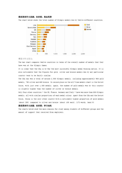
雅思图表作文真题:柱状图:奥运奖牌The chart below shows the total number of Olympic medals won by twelve different countries.雅思小作文范文:The bar chart compares twelve countries in terms of the overall number of medals that they have won at the Olympic Games.It is clear that the USA is by far the most successful Olympic medal winning nation. It is also noticeable that the figures for gold, silver and bronze medals won by any particular country tend to be fairly similar.The USA has won a total of around 2,300 Olympic medals, including approximately 900 gold medals, 750 silver and 650 bronze. In second place on the all-time medals chart is the Soviet Union, with just over 1,000 medals. Again, the number of gold medals won by this country is slightly higher than the number of silver or bronze medals.Only four other countries - the UK, France, Germany and Italy - have won more than 500 Olympic medals, all with similar proportions of each medal colour. Apart from the USA and the Soviet Union, China is the only other country with a noticeably higher proportion of gold medals (about 200) compared to silver and bronze (about 100 each).(178 words, band 9)雅思图表作文真题:柱状图:学习动机The charts below show the main reasons for study among students of different groups and the amount of support they received from employers.参考雅思小作文范文The bar charts compare students of different ages in terms of why they are studying and whether they are supported by an employer.It is clear that the proportion of students who study for career purposes is far higher among the younger age groups, while the oldest students are more likely to study for interest. Employer support is more commonly given to younger students.Around 80% of students aged under 26 study to further their careers, whereas only 10% study purely out of interest. The gap between these two proportions narrows as students get older, and the figures for those in their forties are the same, at about 40%. Students aged over 49 overwhelmingly study for interest (70%) rather than for professional reasons (less than 20%).Just over 60% of students aged under 26 are supported by their employers. By contrast, the 30-39 age group is the most self-sufficient, with only 30% being given time off and help with fees. The figures rise slightly for students in their forties and for those aged 50 or more.(178 words, band 9)雅思图表作文真题:柱状图:The chart below shows numbers of incidents and injuries per 100 million passenger miles travelled (PMT) by transportation type in 2002.雅思小作文范文The bar chart compares the number of incidents and injuries for every 100 million passenger miles travelled on five different types of public transport in 2002.It is clear that the most incidents and injuries took place on demand-response vehicles. By contrast, commuter rail services recorded by far the lowest figures.A total of 225 incidents and 173 injuries, per 100 million passenger miles travelled, took place on demand-response transport services. These figures were nearly three times as high as those for the second highest category, bus services. There were 76 incidents and 66 people were injured on buses.Rail services experienced fewer problems. The number of incidents on light rail trains equalled the figure recorded for buses, but there were significantly fewer injuries, at only 39. Heavy rail services saw lower numbers of such events than light rail services, but commuter rail passengers were even less likely to experience problems. In fact, only 20 incidents and 17 injuries occurred on commuter trains.(165 words, band 9)雅思图表作文真题:柱状图:各地房价The chart below shows information about changes in average house prices in five different cities between 1990 and 2002 compared with the average house prices in 1989.雅思小作文范文:The bar chart compares the cost of an average house in five major cities over a period of 13 years from 1989.We can see that house prices fell overall between 1990 and 1995, but most of the cities saw rising prices between 1996 and 2002. London experienced by far the greatest changes in house prices over the 13-year period.Over the 5 years after 1989, the cost of average homes in Tokyo and London dropped by around 7%, while New York house prices went down by 5%. By contrast, prices rose by approximately 2% in both Madrid and Frankfurt.Between 1996 and 2002, London house prices jumped to around 12% above the 1989 average. Homebuyers in New York also had to pay significantly more, with prices rising to 5% above the 1989 average, but homes in Tokyo remained cheaper than they were in 1989. The cost of an average home in Madrid rose by a further 2%, while prices in Frankfurt remained stable. (165 words)雅思图表作文真题:饼状图:垃圾处理The pie charts below show how dangerous waste products are dealt with in three countries.雅思小作文范文:The charts compare Korea, Sweden and the UK in terms of the methods used in each country to dispose of harmful waste.It is clear that in both the UK and Sweden, the majority of dangerous waste products are buried underground. By contrast, most hazardous materials in the Republic of Korea are recycled.Looking at the information in more detail, we can see that 82% of the UK’s dangerous waste is put into landfill sites. This disposal technique is used for 55% of the harmful waste in Sweden and only 22% of similar waste in Korea. The latter country recycles 69% of hazardous materials, which is far more than the other two nations.While 25% of Sweden's dangerous waste is recycled, the UK does not recycle at all. Instead, it dumps waste at sea or treats it chemically. These two methods are not employed in Korea or Sweden, which favour incineration for 9% and 20% of dangerous waste respectively.(159)。
雅思写作八分经典范文背诵:图表作文(5)
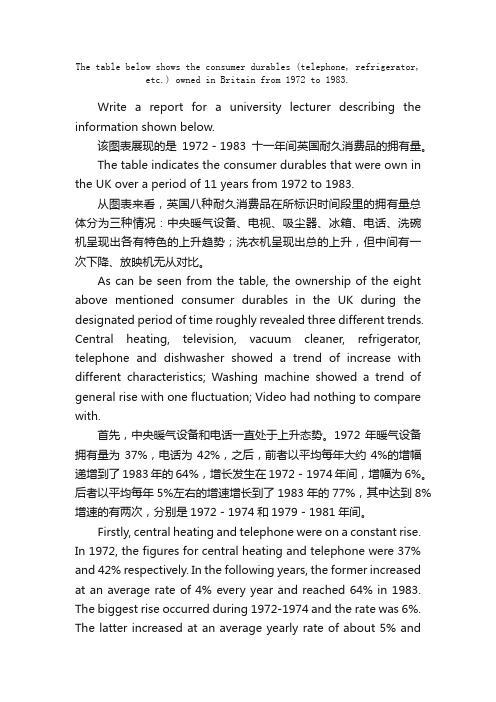
The table below shows the consumer durables (telephone, refrigerator, etc.) owned in Britain from 1972 to 1983.Write a report for a university lecturer describing the information shown below.该图表展现的是1972-1983十一年间英国耐久消费品的拥有量。
The table indicates the consumer durables that were own in the UK over a period of 11 years from 1972 to 1983.从图表来看,英国八种耐久消费品在所标识时间段里的拥有量总体分为三种情况:中央暖气设备、电视、吸尘器、冰箱、电话、洗碗机呈现出各有特色的上升趋势;洗衣机呈现出总的上升,但中间有一次下降、放映机无从对比。
As can be seen from the table, the ownership of the eight above mentioned consumer durables in the UK during the designated period of time roughly revealed three different trends. Central heating, television, vacuum cleaner, refrigerator, telephone and dishwasher showed a trend of increase with different characteristics; Washing machine showed a trend of general rise with one fluctuation; Video had nothing to compare with.首先,中央暖气设备和电话一直处于上升态势。
图表作文20篇
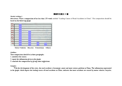
图表作文范文20篇Model writing 1Directions: Write a composition of no less than 150 words entitled “Leading Causes of Road Accidents in China”. The composition should be based on the following graph.Motor Vehicles Bicycles Pedestrians OthersOutline:Your composition should be in three paragraphs:1. introduce the causes;2. report the information given in the graph;3. conclude the composition by giving some suggestions.Sample:With the development of the cities, the road accident is becoming a more and more serious problem in China. The information represented in the graph, which depicts the leading causes of road accidents in China, indicates that most accidents are caused by motor vehicles, bicycles,and pedestrians.In the graph we can clearly see that motor vehicles are responsible for the largest part of road accidents, namely about 50% of them. Bicycles account for 35% of the accidents and pedestrians caused nearly 10%. These statistics indicate that motor vehicles have to some extent become a threat to the security of whole society, which endangers people’s lives.Since we know that motor vehicles are the leading cause of road accidents in China, we should take some measures to improve the situation. First, we should make a law to punish any violators of traffic regulations. Then, cyclists should use hand signals to warn other road users of their intentions. Last but not least, the department concerned should educate ordinary people to walk on a zebra crossing or overpass when they cross a street. All in all, it’s time for us to attach great importance to this problem.Model writing 2Directions: Take a look at the table below. It shows the number of road accidents in Britain in different places as well as the ages of theSampleThe chart above organizes data about road accidents involving children in Britain by when and where the accidents occurred. It can be seen that the incidence of accidents decreases as the children’s age increases and that age correlates with the circumstances surrounding the accident.For all ages, the most common situation leading to accident is playing in the street but young children were particularly affected. Children between the ages of 5-7 seemed to get into accidents while engaged in activities appropriate to their age, such as shopping for their parents orgoing home from school. In fact, this age group accounted for the most road accidents of all. Children between 8 and age 11 had the most accidents cycling in the street. After age 11, the number of accidents dropped considerably in all situations.From the chart, we get to know that playing in the street is the most common and universal site of accidents of all ages, but the risks that other sites and situations present vary with the children’s ages.Model writing 3Directions: Write a composition entitled “Changes in US Spending Patterns”. The composition should be based on the following pie charts.Sample:The pie charts show changes in American spending patterns between 1966 and 1996.Food and cars made up the two biggest items of expenditure in both years. Together they comprised over half of household spending. Food accounted for 44% of spending in 1966, but this dropped by two thirds to 14% in 1996. However, the outlay on cars doubled, rising from 23% in 1966 to 45% in 1996.Other areas changed significantly. Spending on eating out doubled, climbing from 7% to 14%. The proportion of salary spent on computers increased dramatically, up from 1% in 1996 to 10% in 1996. However, as computer expenditure rose, the percentage of outlay on books plunged from 6% to 1%.Some areas remained relatively unchanged. Americans spent approximately the same amount of salary on petrol and furniture in both years.In conclusion, increased amounts spent on cars, computers, and eating out were made up for by drops in expenditure on food and books. Model writing 4Directions: For this part, you are allowed 30 minutes to write a composition of no less than 150 words on Changes in People’s Diet. Study the following table carefully and your composition must be based on the information given in the table. You should quote as few figures as possible.Outline:Write three paragraphs to:1. State the changes in people’s diet in the past five years2. Give possible reasons for the changes3. Draw your own conclusionSample:As can be seen in the table, there have been great changes in people’s diet in the past five years. During the five years, the consumption ofgrain decreased by 4%, while that of meat and milk increased by 4% and 3% respectively. From the figures we can draw the conclusion that grain, as the staple food in China, is playing a less important role in people’s diet, while the consumption of high-energy food, such as meat and milk, has increased steadily.What caused these changes? I think the reasons are as follows: First, the open policy brings the people opportunities to earn a lot of money. Second, people nowadays pay more attention to the structure of their diet. They are seeking the most reasonable diet structure, which will do good to their health.From the above, we can see that, with the development of the country, people’s living standard has greatly improved in the five years. We can also expect better living standard and more reasonable diet structure in the future.Model writing 5Directions: For this part, you are allowed 30 minutes to write a composition on the topic Health Gains in Developing Countries. Your composition should be no less than 120 words.Outline:You must base your composition on the following instruction given in Chinese:1. 以下图为依据描述发展中国家的期望寿命(life expectancy)和婴儿死亡率(infant mortality)的变化情况。
(完整版)图表作文范文汇总

n e图表作文范文汇总假如你是Li Hua,是一名国际学校的学生。
你最近对200名同学(男女各半)的择业理想做了一次调查,并根据调查结果(如图所示)谈谈你的看法。
I have recently made a survey among 200 boys and girls about their future jobs.As can be seen from the chart, what boys like to do most is to become scientists and their second choice is to become businessmen. While the largest group of girls would like to be teachers. Only a few boys want to do this job.It is interesting that the numbers of boys and girls who want to be doctors are equal. As for lawyer, more boys expect to have this job. However, there are still some students who are not clear about their future.As for me , I would like to be a …because …BusinessmanTeacherLawyeri n t h07崇文一模某英文报纸正在开展题为“中学生课堂注意力”的专栏讨论,你校准备参加,并请你代表学校写一篇文章给该英文报纸投稿。
下面的图表为你校的调查结果,请你根据所提供的信息做简要说明,并根据提示给出改善的建议。
注意:图中数据为学生人数百分比。
改善注意力的建议:教室通风、明亮课堂积极参与课堂活动课间适量活动或适当休息注意:1.词数:不少于60。
雅思4类图表作文范文

雅思4类图表作文范文
一、柱状图。
哇塞,看这柱状图,某城市的私家车数量可是像火箭一样往上
冲啊!五年前才5万辆,现在直接飙到15万辆了,涨得比房价还快!不过话说回来,公共交通那边就不太好过了,以前每天80万人次,
现在只剩下60万了,看来大家都更喜欢自己开车出门啊。
二、折线图。
话说这折线图,看得我心情都跟着起伏了。
那国家失业率啊,
前几年涨得跟股票似的,从4%一路飙升到6%,让人看了都捏把汗。
不过好在后来稳住了,还往下掉了点,虽然没回到从前,但好歹也
算个好兆头吧。
图表作文及范文

折线图类图表作文
总结词
折线图类图表作文通过折线图展 示数据的变化趋势,要求考生分 析数据随时间的变化情况。
详细描述
折线图类图表作文包括标题、图 例、折线图和结论四个部分。标 题应简明扼要,图例应清晰列出 各项指标,折线图应准确展示数 据的变化趋势,结论应对数据进 行分析和总结。
范文解析
例如,一篇关于某国家GDP增长 的折线图类图表作文,可以通过 折线图展示该国家近十年来的 GDP增长率变化情况。考生在分 析数据时,应关注GDP增长率的 波动情况,分析其变化趋势和影 响因素,从而得出结论。
饼状图类图表作文
总结词
饼状图类图表作文通过饼状图展示数据的比例关系,要求考生分析不同部分之间的比例和关系。
详细描述
饼状图类图表作文包括标题、图例、饼状图和结论四个部分。标题应简明扼要,图例应清晰列出各项指标,饼状图应 准确展示各部分的比例关系,结论应对数据进行分析和总结。
范文解析
例如,一篇关于某企业年度销售收入的饼状图类图表作文,可以通过饼状图展示该企业各产品线的销售 收入比例。考生在分析数据时,应关注各产品线销售收入的比重和变化情况,分析其优劣势和市场需求, 从而得出结论。
04
范文点评与反思
范文点评
01
02
03
04
语言表达能力
范文的语言表达清晰、准确, 用词恰当,语法结构完整,符
合英语写作规范。
逻辑思维能力
范文在描述图表内容时,逻辑 清晰,层次分明,能够准确把
握图表的主旨和细节。
内容完整性
范文对图表进行了全面、细致 的描述,涵盖了图表中的所有
重要信息,没有遗漏。
创新性
范文在分析图表时,能够从多 个角度进行思考,提出一些新
英语作文图表分析范文(汇总30篇)

英语作文图表分析范文(汇总30篇)(经典版)编制人:__________________审核人:__________________审批人:__________________编制单位:__________________编制时间:____年____月____日序言下载提示:该文档是本店铺精心编制而成的,希望大家下载后,能够帮助大家解决实际问题。
文档下载后可定制修改,请根据实际需要进行调整和使用,谢谢!并且,本店铺为大家提供各种类型的经典范文,如工作总结、工作计划、合同协议、条据文书、策划方案、句子大全、作文大全、诗词歌赋、教案资料、其他范文等等,想了解不同范文格式和写法,敬请关注!Download tips: This document is carefully compiled by this editor. I hope that after you download it, it can help you solve practical problems. The document can be customized and modified after downloading, please adjust and use it according to actual needs, thank you!Moreover, our store provides various types of classic sample essays for everyone, such as work summaries, work plans, contract agreements, doctrinal documents, planning plans, complete sentences, complete compositions, poems, songs, teaching materials, and other sample essays. If you want to learn about different sample formats and writing methods, please stay tuned!英语作文图表分析范文(汇总30篇)英语作文图表分析范文第1篇图表类写作模版(1)模版1According to the chart / graph / diagram / table, we clearly learn that _________.As early as _________,___________.Then,_________.Last,__________.In contrast, by _________,__________.There are many reasons accounting for _________.Firstly, _________.Secondly,__________.Finally,_________.As a result,_________.As far as I am concerned,_________.For one thing,__________.For another,________.In brief, I hold that__________.(2)模版2What is shown in the chart / graph / diagram / table above indicates that in recent years, more and more people payattention to _________.The number of those who _________has increased ________,and furthermore,____________.There are two factors responsible for the changes.In the first place,_________.Moreover,__________.Yet, it is noticeable that __________.From the analysis, we can safely draw the conclusion that__________.It is possible that in the future,the tendency will__________.(3)模版3As is shown in the chart / graph / diagram / table above,__________has charged drastically in the past _________.While ___________,now the percentage of__________is __________.Meanwhile,the number of _________has soared up to ________.There are mainly two possible reasons contributing to the rapid changes.The first is that _________.Secondly,__________.In my point of view, the changes have a great influence on _________.At the same time,_______.To sum up ,_________.英语作文图表分析范文第2篇1、图形种类及概述法:泛指一份数据图表: a data graph/chart/diagram/illustration/table饼图:pie chart直方图或柱形图:bar chart / histogram趋势曲线图:line chart / curve diagram表格图:table流程图或过程图:flow chart / sequence diagram程序图:processing/procedures diagram2、常用的描述用法The table/chart diagram/graph shows (that)According to the table/chart diagram/graphAs (is)shown in the table/chart diagram/graphAs can be seen from the table/chart/diagram/graph/figures,figures/statistics shows (that)……It can be seen from the figures/statisticsWe can see from the figures/statisticsIt is clear from the figures/statisticsIt is apparent from the figures/statisticstable/chart/diagram/graph figures (that)……table/chart/diagram/graph shows/describes/illustrates how……3、图表中的数据(Data)具体表达法数据(Data)在某一个时间段固定不变:fiXed in time在一系列的时间段中转变:changes over time持续变化的data在不同情况下:增加:increase / raise / rise / go up ……减少:decrease / grow down / drop / fall ……波动:fluctuate / rebound / undulate / wave ……稳定:remain stable / stabilize / level off ……最常用的两种表达法:动词+副词形式(Verb+Adverb form)形容词+名词形式(Adjective+Noun form)英语作文图表分析范文第3篇雅思考试学术类图表作文分析考试学术类图表作文要求考生观察一幅图表并用自己的语言呈现出图表中的信息。
图表作文
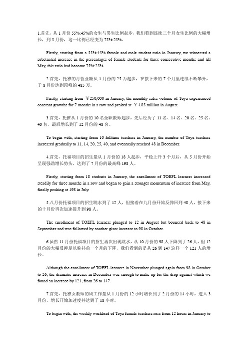
1.首先,从1月份55%:45%的女生与男生比例起步,我们看到连续三个月女生比例的大幅增长,到5月份,这一比例已经变为75%:25%。
Firstly, starting from a 55%:45% female and male student ratio in January, we witnessed a substantial increase in the percentages of female students for three consecutive months and till May, this ratio had become 75%:25%.2.首先,托雅的月营业额从1月份的25万起步,在接下来的7个月里连续不断攀升,于8月份达到顶峰的485万。
Firstly, starting from ¥250,000 in January, the monthly sales volume of Toya experienced constant growths for 7 months in a row and peaked at ¥4.85 million in August.3.首先,托雅从1月份的10名全职教师起步,先后经历了11名、14名、20名、25名、40名,最后增长到了12月份的48名。
To begin with, starting from 10 fulltime teachers in January, the number of Toya teachers increased gradually to 11, 14, 20, 25, 40, and eventually reached 48 in December.4.首先,托福项目的招生量从1月份的18人起步,平稳上升3个月后,从5月份开始呈现强劲增长势头,达到了7月份的最高峰198人。
Firstly, starting from 18 students in January, the enrollment of TOEFL learners increased steadily for three months in a row and began to gain a stronger momentum of increase from May, finally peaking at 198 in July.5.八月份托福项目的招生跳水到了12人,但接着在九月份开始反弹回到48人,接下来的十月份再次加速提升到98人。
六级图表作文开头结尾

六级图表作文开头结尾
开头段落。
看这图表,XX领域的发展真是一目了然啊!那些跳动的数字,真的就像是在讲一个个真实的故事。
曲线一升一降,柱状图有高有低,都告诉我们这个行业的起伏变化。
结尾段落(一)。
仔细研究了这图表,我对XX领域的未来有了更多想法。
数据可是实打实的,它不会说谎。
看这趋势,XX领域肯定要更上一层楼,发展得越来越好。
结尾段落(二)。
这图表,不只是数字那么简单。
它告诉我们,XX领域里机会和困难都有。
想要在这个行业里混得好,就得不断学习,不断创新,跟上时代的步伐。
我相信,XX领域一定会越来越火!
结尾段落(三)。
在数据的大海里,我仿佛看到了时代的影子。
这图表不只是告诉我们XX领域现在啥样,还告诉我们它可能会变成啥样。
在这个信息满天飞的时代,数据可是个宝贝,它能帮我们看清这个世界。
- 1、下载文档前请自行甄别文档内容的完整性,平台不提供额外的编辑、内容补充、找答案等附加服务。
- 2、"仅部分预览"的文档,不可在线预览部分如存在完整性等问题,可反馈申请退款(可完整预览的文档不适用该条件!)。
- 3、如文档侵犯您的权益,请联系客服反馈,我们会尽快为您处理(人工客服工作时间:9:00-18:30)。
图表作文1.写作攻略图表作文是考研英语写作中较为常见的题型之一,也是难度较大的一种写作题型。
这类作文可综合提供题目、数据、图像、提纲,形式多样,但实际上只涉及5个方面:描述图表、指明寓意、分析原因、联系实际、给出建议,而每次考试只是从这5个方面的内容中选出3个结合在一起。
从写作类型来看,基本上属于说明文。
要求考生围绕题目将有关信息转化为文字形式,考生应该具有一定数据分析和材料归纳的能力,同时会运用一定的写作方法。
考研试题一般以三段式写作方法来组织文章,第一段总结归纳信息反映的整体情况,点出主题思想,第二段回答第一段所得出的问题,对数字、数据等做出有条理的分析比较,第三段做出总结或给以简单的评论。
表格和图表题型写作要点:(1)考生应仔细研究题目以及提示信息,认清图表中的数字、线条、阴影等部分的变化趋势和走向,抓住其主要特点,然后根据图表所显示的中心信息确定内容层次以及主题句。
(2)考生应该仔细研究图表所给出的大量信息,从中选取最重要,最有代表性的信息,然后根据全文的主旨去组织运用所获取的关键信息。
切忌简单地罗列图表所给出的信息。
(3)图表作文一般采用的时态为一般现在时,但如果图表中给出了具体时间参照,考生则应对时态进行相应的调整。
(4)图表作文有一些固定句型和表达法,考生应对此融会贯通。
(5)图表作文可以细分为表格,曲线图、柱形图和饼形图。
除了上述共同要点,考生还应了解这四种图在写作方面的不同特点。
——表格可以表示多种事物的相互关系,所以考生要对表格中所给出的大量数字进行比较分析,从中找出其变化规律。
——曲线图常表示事物的变化趋势,考生应认真观察坐标系所显示的数据信息,并且密切注意交汇在坐标横轴和纵轴上的数字及单位。
——柱形图用来表示各种事物的变化情况及相互关系,要求考生通过宽度相等的柱形的高度或长度差别来判断事物的动态发展趋势,因此考生应密切关注坐标线上的刻度单位及图表旁边的提示说明与文字。
——饼形图表示各事物在总体中所占的比例及相互关系,旨在要求考生准确理解并阐述一个被分割成大小不等切片的饼形图所传达的信息。
考生应清楚掌握部分与整体,部分与部分之间的相互关系,这种关系通常是以百分比的数字形式给出的。
(6)列出各段主题句。
考生可以根据所给提纲或已知信息列出每段的主题句,为全文的展开做好铺垫。
(7)围绕主题句完成段落的展开。
尽量做到主题明确、条理清楚、文字简练。
(8)检查与修改。
对图表作文的检查与修改应着重看文章中所列举的信息是否与图表所显示的信息一致,资料是否恰当。
2.必背模版句型As can be seen from/in the chart/diagram/table/graph...从表格/图形中我们可以看到……The table shows a three times increase over that of last year.表格显示比去年上升了3倍。
According to /As is shown in the Table /Figure/Chart...如表格/图表中显示……The number is 5 times as much as that of...此数字是……的5倍。
It has increased by three times as compared with that of ...同……相比,增长了3倍。
It can be seen from the chart/diagram/table/graph/figures/statistics that...从表格/图表/数据中我们可以看到……From the table/figures/data/results/information above, it can/may beseen/concluded/shown/estimated/calculated/inferred that...从以上的表格/图表/数据/结果/信息中,我们可以看到/总结/预测/计算/得出……A has the highest sales figure in the three departments, followed byB and C.在3个部门中,A的销售额最高,其次是B和C。
The figure of A is about twice as much as that of B.A的数字是B的两倍。
The rise lasted for two weeks and then began to level off in August.上升两个星期后,8月份开始平稳。
It accounts for 30% of the total population.占到总人口的30%。
The number of students has reached 500, indicating a rise of 20%, compared to last semester.学生人数达到500人,与上个学期相比上升了20%。
It picked up speed at the end of this month.这个月底加快了速度。
The pie charts show the changes on... in some places in 2000.此饼形图显示了2000年一些地方……的变化。
from this year on,there was a gradual declined reduction in the..., reaching a figure of...从这年起,……逐渐下降至……There are a lot of similarities/differences between...and...……与……之间有许多相似(不同)之处It can be drawn from the chart that the proportions of A and B are going down, though the falling level of the latter is a lot lower/higher than that of the former.尽管B的下降速度比A要慢/快,从表中我们可以看到A和B的比例都在下降。
The increase/decrease is more noticeable during the second half of the 5 year period.在5年期限的后半段,增长/降低比较明显。
The table shows the changes in the number of...over the period from...to... 该表格描述了在……年之……年间……数量的变化。
As can be seen from the graph, the two curves show the fluctuation of...如图所示,两条曲线描述了……的波动情况。
3.单词与词组饼pie chart直方图或柱形bar chart / histogram趋势曲线line chart / curve diagram表格table流程图或过程flow chart / sequence diagram程序processing/procedures diagram数据(Data)在某一个时间段固定不变:fixed in time在一系列的时间段中转变:changes over time增加:increase / raise / rise / go up ……减少:decrease / grow down / drop / fall ……波动:fluctuate / wave ……稳定:remain stable / stabilize / level off ……描述:show、describe、illustrate、can be seen from、clear、apparent、reveal、represent内容:figure、statistic、number、percentage、proportion rapid/rapidly迅速的,飞快的,险峻的dramatic/dramatically戏剧性的,生动的significant/significantly有意义的,重大的,重要的sharp/sharply锐利的,明显的,急剧的steep/steeply急剧升降的steady/steadily稳固的,坚定不移的gradual/gradually渐进的,逐渐的slow/slowly缓慢的,不活跃的slight/slightly轻微的、略微地stable/stably稳定的significant changes图中一些较大变化noticeable trend明显趋势during the same period在同一时期grow/grew增长distribute分布,区别unequally不相等地in the case of adv.在……的情况下in terms of / in respect of / regarding在……方面in contrast相反,大不相同government policy政府政策market forces市场规律measure n.尺寸,方法,措施v.估量,调节forecast n.先见,预见v.预测补充:1. The table shows the changes in the number of……over the period from……to……该表格描述了在……年之……年间……数量的变化。
2. The bar chart illustrates that……该柱状图展示了……3.the graph provides som e interesting data regarding……该图为我们提供了有关……有趣数据。
4.the diagram shows (that)……该图向我们展示了……5.the pie graph depicts (that)……该圆形图揭示了……6.this is a cure graph which describes the trend of……这个曲线图描述了……的趋势。
7.the figures/statistics show (that)……数据(字)表明……8.the tree diagram reveals how……该树型图向我们揭示了如何……9.the data/statistics show (that)……该数据(字)可以这样理解……10.the data/statistics/figures lead us to the conclusion that……这些数据资料令我们得出结论……11.as is shown/demonstrated/exhibited in the diagra m/graph/chart/table……如图所示……12.according to the chart/figures……根据这些表(数字)……13.as is shown in the table……如表格所示……14.as can be seen from the diagram,great changes have taken place in……从图中可以看出,……发生了巨大变化。