雅思小作文线图题
雅思小作文流程图类题目范文及解析

雅思小作文流程图类题目范文及解析雅思小作文流程图类题目范文及解析,一起来学习一下吧,下面我就和大家共享,来观赏一下吧。
雅思小作文流程图类题目范文及解析雅思小作文流程图类题目范文及解析为大家带来雅思小作文当中一类较有难度的图表——流程图类的小作文的范文以及解析。
流程图顾名思义就是对某一有时间和步骤先后挨次的行为进行步骤的拆解,并配上相应的文字和解说而生成的图表。
我们在处理流程图类图表作文是应当怎么写,请看下文。
上图来自网络主题:家居设计题型:流程图The diagrams below show some principles of house design for cool and for warm climates.满分范文:The diagrams show how house designs differ according to climate.这些图表显示房子的设计因气候而不同。
The most noticeable difference between houses designed for cool and warm climates is in the shape of the roof. The designs also differ with regard to the windows and the use of insulation.为凉快和暖和气候设计的房子之间最明显的区分是屋顶的外形。
在窗户和保温材料的使用方面,设计也有所不同。
We can see that the cool climate house has a high-angled roof, which allows sunlight to enter through the window. By contrast, the roof of the warm climate house has a peak in the middle and roof overhangs to shade the windows. Insulation and thermal building materials are used in cool climates to reduce heat loss, whereas insulation and reflective materials are used to keep the heat out in warm climates.我们可以看到凉快的气候房子有一个高角度的屋顶,它允许阳光通过窗户进入。
雅思小作文各种图题、表格题技巧总结
雅思小作文各种图题、表格题技巧总结雅思作文Task 1受图表内容的限制,遣词造句的要求非常有限,只需针对考试,把核心表达用准用熟即可,所谓博大不如精深。
下面是威学教育雅思教研组总结的雅思小作文线图题、柱形图题、饼图题、表格题以及流程图等的写作总结!线图、柱状图、饼图,表格题介绍段introduction介绍段内容几乎完全不用创新,就是对题目文字部分的第二段做改写,paraphrase the rubric.所谓改写,要么换词,要么换句式。
例如:(I4-100)The charts below give information about travel to and from the UK and most popular countries for UK residents to visit.换词(1) 图 The charts图:chart, graph(雅思写作中完全等价,无差别)线:line / curve chart柱图:bar / column graph饼:pie chart表:table / statistics / figures(2) 动词“表明”give information about介绍段是客观描述,用一般现在时态,give information about 虽然在这篇作文中最好不再用,但是informal learning,随手学到的东东,留作其它文章再用。
替换的词语和结构很多,比如我常用的show /illustrate / demonstrate/compare,大家也可以选几个自己喜欢并且拼写准确的形成风格。
第二段其余部分的替换因题而异,比如travel换成visitthe UK换成Britain(注意不是England,英格兰只是Britain的一部分)popular换成fashionablecountry换成nationUK residents to visit换成UK tourists不过随着练习作文数量的增加,你会惊喜的发现,雅思图表作文,连描述的对象都是类似的。
雅思剑桥官方范文之线图
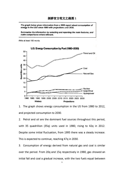
剑桥官方范文之线图11.The graph shows energy consumption in the US from 1980 to 2012, and projected consumption to 2030.2.Petrol and oil are the dominant fuel sources throughout this period, with 35 quadrillion (35q) units used in 1980, rising to 42q in 2012. Despite some initial fluctuation, from 1995 there was a steady increase. This is expected to continue, reaching 47q in 2030.3.Consumption of energy derived from natural gas and coal is similar over the period. From 20q and 15q respectively in 1980, gas showed an initial fall and coal a gradual increase, with the two fuels equal between1985 and 1990. Consumption has fluctuated since 1990 but both now provide 24q. Coal is predicted to increase steadily to 31q in 2030, whereas after 2014, gas will remain stable at 25q.4.In 1980, energy from nuclear, hydro-and solar/wind power was equal at only 4q. nuclear has risen by 3q, and solar/wind by 2. After slight increases, hydropower has fallen back to the 1980 figure. It is expected to maintain this level until 2030, while the others should rise slightly after 2025.5.Overall, the US will continue to rely on fossil fuels, with sustainable and nuclear energy sources remaining relatively insignificant.剑桥官方范文之线图21.The graph illustrates changes in the amounts of beef, lamb, chicken and fish consumed in a particular European country between 1979 and 2004.2.In 1979 beef was by far the most popular of these foods, with about 225 grams consumed per person per week. Lamb and chicken were eaten in similar quantities ( around 150 grams), while much less fish was consumed (just over 50 grams).3.However, during this 25-year period the consumption of beef andlamb fell dramatically to approximately 100 grams and 55 grams respectively. The consumption of fish also declined,but much less significantly to just below 50 grams, so although it remained the least popular food, consumption levels were the most stable.4.The consumption of chicken, on the other hand, showed an upward trend, overtaking that of lamb in 1980 and that of beef in 1989. By 2004 it had soared to almost 250 grams per person per week.5.Overall, the graph shows how the consumption of chicken increased dramatically while the popularity of these other foods decreased over the period.。
雅思小作文题型整理
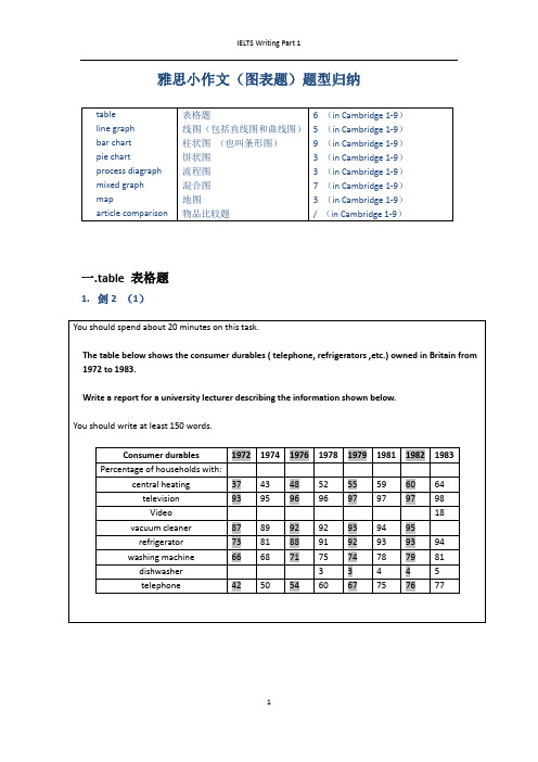
雅思小作文(图表题)题型归纳一.t able 表格题1.剑2 (1)4.剑5(4)6.剑7(1)二.Line graph线图(含直线和曲线图)1.剑3(4)You should spend about 20 minutes on this task.The graph below shows the unemployment rates in the US and Japanbetween March 1993 and March 1999.Write a report for a university lecturer describing the information shownbelow.You should write at least 150 words.You should spend about 20 minutes on this task.The graph below shows the proportion of the population aged 65 and overbetween 1940 and 2040 in three different countries.Summarize the information by selecting and reporting the main features,and make comparisons where relevant.Write at least 150 words.You should spend about 20 minutes on this task.The graph below shows the consumption of fish and some different kinds of meatin a European country between 1979-2004.Summarize the information by selecting and reporting the main features, andmake comparisons where relevant.Write at least 150 words.You should spend about 20 minutes on this task.The graph below shows the quantities of goods transported in the UK between 1974 and 2002 by four different modes of transport.Summarize the information by selecting and reporting the main features, and make comparisons where relevant.Write at least 150 words.5.剑9(4)三.Bar chart 柱状图You should spend about 20 minutes on this task.The chart below shows the amount of leisure time enjoyed by men and women of different employment status.Write a report for a university lecturer describing the information shown below.Write at least 150 words.Leisure time in a typical week: by sex and employment status,1998-99You should spend about 20 minutes on this task.The table below shows the figures for imprisonment in five countries between 1930 and 1980.Write a report for a university lecturer describing the information shown below.You should write at least 150 words.You should spend about 20 minutes on this task.The chart below shows the amount spent on six consumer goods in fourEuropean countries.Write a report for a university lecturer describing the information shown below. You should write at least 150 words.You should spend about 20 minutes on this task.The charts below show the level of participation in education and sciencein developing and industrialized countries in 1980 and 1990Write a report for a university lecturer describing the information shown below. You should write at least 150 words.5.剑4(3)You should spend about 20 minutes on this task.The chart below shows the different levels of post-school qualifications inAustralia and the proportion of men and women who held them in 1999.Summarize the information by selecting and reporting the main features,and make comparisons where relevant.You should write at least 150 words.You should spend about 20 minutes on this task.The charts below show the main reasons for study among students ofdifferent age groups and the amount of support they received from employers.Summarize the information by selecting and reporting the main features,and make comparisons where relevant.You should write at least 150 words.You should spend about 20 minutes on this task.The charts below give information about USA marriages and divorce ratesbetween 1970 and 2000, and the marital status of adult Americans in twoof the years.Summarize the information by selecting and reporting the main features,and make comparisons where relevant.You should write at least 150 words.You should spend about 20 minutes on this task.The chart below shows information about changes in average house prices in fivedifferent cities between 1990 and 2002 compared with the average house prices in 1989.Summarize the information by selecting and reporting the main features, and makecomparisons where relevant.You should write at least 150 words.四.Pie chart饼图1.剑7(4)2.剑8(2)3.剑9(3)五.流程图1.剑1(2)You should spend about 20 minutes on this task.The diagrams below show the life cycle of the silkworm and the stages inthe production of silk cloth.Summarize the information by selecting and reporting the main features,and make comparisons where relevant.Write at least 150 words.六.混合图。
雅思小作文范文-线图

1. The proportion of male and female smokers in Someland from 1960 to 2000.1. 两条线,建议每条线一段;2. 每条线的描述请参考经典折线写法 (在数据库里有,详见《单线指导写法》 );3. 关键性数据不可少,如最大值,最小值等 ;4. 本文用到了线段之间的对比关系,如文中的 : 6 times of 和 smallest difference with ,这些都是加分项The chart compares the rate of smoking in men andwomen in Someland between 1960 and 2000.Overall,the proportion of smoking for both is currently declining and fewer women smoked throughout the period.Initially,the peak of male rate was reached in 1960, when it was 600 in every 1000, over 6 times of that of females.This number then decreased gradually to 500by 1975and continued to decrease but more steeply to 250 by 2000, which had the smallest difference with the level of women.Oppositely, the rate of smoking in women in 1960 was the lowest at only 90 in every 1, 000. By1965 this increased to 180, followed by a sharper rise to 320 by 1975. The rate of female smokers then remained stable at 320 until 1980 at which point the figure began to decline and ended up at 200 by 2000.In conclusion,the rate of smoking in men dropped straightly throughout the whole period while the figure of women smokers went through a fluctuation. ( 172 )2. Radio and television audiences throughout the day in 1992.以下是 6 分, 7 分和 9 分范文,可以看出,上 6 分的文章都有一个共性,就是没有大的语法错误,分段合适,表达清晰,且进行适当的词汇替换。
雅思作文——线状图

线图核心:趋势
Model 1
The graph shows the bird population in Europe, measured in million, from years 1977 to 2001, in threeyearly intervals.
Overall, the graph shows the population decreased over time.
Prices started at around twenty US dollars a barrel during 1995, and then rose slightly to approximately twenty-four dollars in 1998.
The cost of a barrel then dropped for two years, to the lowest point of about eighteen dollars during 2000.
Task 1
A. Chart 1. Pie chart 2. Line Chart 3. Bar Chart
B. Table C. Process
总分结构
总:替换标题
分:整体特征 细节
- 抓住特征项 -合并同类项
2. Line Chart:
Line Chart 1. Environment
改变标题
Population of birds in Europe over a period of 24 years 方法3: 补充坐标信息 横轴---看时间间隔 in three-yearly intervals 纵轴---看数量单位 measured in million
雅思线形图作文
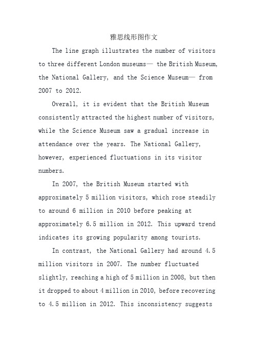
雅思线形图作文The line graph illustrates the number of visitors to three different London museums— the British Museum, the National Gallery, and the Science Museum— from 2007 to 2012.Overall, it is evident that the British Museum consistently attracted the highest number of visitors, while the Science Museum saw a gradual increase in attendance over the years. The National Gallery, however, experienced fluctuations in its visitor numbers.In 2007, the British Museum started with approximately 5 million visitors, which rose steadily to around 6 million in 2010 before peaking at approximately 6.5 million in 2012. This upward trend indicates its growing popularity among tourists.In contrast, the National Gallery had around 4.5 million visitors in 2007. The number fluctuated slightly, reaching a high of 5 million in 2008, but then it dropped to about 4 million in 2010, before recovering to 4.5 million in 2012. This inconsistency suggeststhat the National Gallery faced challenges in maintaining its visitor numbers.The Science Museum, starting at about 3 million visitors in 2007, showed a steady increase throughout the period, reaching around 4.5 million by 2012. This indicates an increasing interest in the Science Museum, possibly due to new exhibitions or marketing efforts.In conclusion, while the British Museum remained the most popular among the three, the Science Museum showed a positive growth trend, contrasting with the fluctuations experienced by the National Gallery.中文翻译:该线形图展示了从2007年到2012年间,三个不同伦敦博物馆—大英博物馆、国家美术馆和科学博物馆—的游客数量。
雅思小作文折线图

Writing task one: single line graphYou will be given a graph with a single line. Your task is to write a 150 word report to describe the information given in the graph. You are not asked to give your opinion. You should spend around twenty minutes on the task. Task one is not worth as many marks as task two and so you should make sure that you keep within the recommended twenty minute time frame.What is being tested is your ability to:∙objectively describe the information given to you∙report on a topic without the use of opinion∙use suitable language to describe the graphSample taskYou should spend about 20 minutes on this task.Write a report for a university lecturer describing the information in the graph below.Write at least 150 words.When you’ve finished the taskHow good is your answer? Check the guidelines bellow and read the sample answer.Guidelines for a good answerDoes the report have a suitable structure?∙Does it have an introduction, body and conclusion?∙Does it include connective words to make the writing cohesive within sentences and paragraphs? Does the report use suitable grammar and vocabulary?∙Does it include a variety of sentence structures?∙Does it include a range of appropriate vocabulary?Does the report meet the requirements of the task?∙Does it meet the word limit requirements?∙Does it describe the whole graph adequately?∙Does it focus on the important trends presented in the graphic information?Sample answerThe graph shows the number of cases of X disease in Someland between the years 1960 and 1995. As an overall trend, it is clear that the number of cases of the disease increased fairly rapidly until the mid seventies, remained constant for around a decade at 500 cases before dropping to zero in the late 80s.In 1960, the number of cases stood at approximately 100. That number rose steadily to 200 by 1969 and then more sharply to 500 in 1977. At this point the number of cases remained stable until 1984 before plummeting to zero by 1988. From 1988 to 1995 Someland was free of the disease.In conclusion, the graph shows that the disease was increasingly prevalent until the 1980s when it was eradicated from Someland.What do you think?What is your opinion of this sample answer? How well does it meet the requirements of the guidelines? Read the teacher's comments on this answer.Teacher's comments on the sample answer“The report structure is easy to follow and logical with a clear introduction, body and conclusion. The candidate uses cohesive words to connect pieces of information and make the writing flow such as ‘until’and ‘before’ in the second sentence. The candidate uses a variety of grammatical structures and vocabulary so that the writing is not repetitive.In terms of task requirements the report is a little short but this is because the simple graph used as an example does not have sufficient information for the candidate to describe. In the real IELTS test the graph will have more information and so the need to look for trends will be even greater than in this example.”Strategies for improving your IELTS scoreSelecting informationIt is important that you describe the whole graph fully. However, this does not mean that you should note every detail. In most cases there will be too much information for you to mention each figure. You will therefore need to summarise the graph by dividing it into its main parts. This is what we mean by describing the trends.For example, in a chronological line graph it might seem sensible to describe the information year by year or period by period. The graph above gives the information in five year sections so we could write our report like this:The number of cases of X disease started at 50 in 1965 and then went up gradually to 100 in 1965 and continued up to 200 in 1970 and then went up more sharply to 380 in 1975.While this way of describing the information may be accurate, it does not meaningfully sum up the information in the graph. In fact, the information in the graph would most meaningfully be described in four chronological sections following the shape of the graph.In the Sample Task, the graph shows four main trends:∙first, a gradual increase from 1960 to 1968∙second, a steeper increase from 1968 to 1977∙third, a plateau from 1977 to 1983∙fourth, a drop from 1983 to 1988The structure of the report must show these four main trends clearly.Report structureYour report should be structured simply with an introduction, body and conclusion. Tenses should be used appropriately.IntroductionUse two standard opening sentences to introduce your report. These opening sentences should make up the first paragraph. Sentence one should define what the graph is about; that is, the date, location, what is being described in the graph etc. For example:The graph shows the number of cases of X disease in Someland between the years 1960 and 1995 …Notice the tense used. Even though it describes information from the past, the graph shows the information in the present time.Notice that the sample opening sentence does not simply copy the words used on the graphic material. Copied sentences will not be assessed by the examiner and so you waste your time including them.Describing the overall trendSentence two (and possibly three) might sum up the overall trend. For example:It can be clearly seen that X disease increased rapidly to 500 cases around the 1980s and then dropped to zero before 1999, while Y disease fell consistently from a high point of nearly 600 cases in 1960 to less than 100 cases in 1995.Notice the tense used. Here we are talking about the occurrence of the disease in the past.Describing the graph in detailThe body of the report will describe the graph or graphs in detail. You will need to decide on the most clear and logical order to present the material.Line graphs generally present information in chronological order and so the most logical order for you to write up the information would, most probably be from earliest to latest. Bar graphs, pie charts are organised in different ways and so you need to decide on the organisation of each one.Concluding sentencesYour report may end with one or two sentences which summarise your report to draw a relevant conclusion. Grammar and vocabularyAvoiding repetitionYou will receive a higher mark if your writing uses a range of structures and vocabulary correctly rather than a limited number. For example, the candidate who writes:The number of cases of X disease started at 50 in 1965 and then went up to 200 in 1970 and then went up to 500 in 1980 and then went down to zero in 1990.will lose marks for being repetitive. You should therefore practise writing reports using a wide variety of terms to describe the different movements in the graphs and different structures to vary your writing.Describing trendsTrends are changes or movements. These changes are normally expressed in numeric items, for example, population, production volumes or unemployment. There are three basic trends:Expressing movement: nouns and verbsFor each trend there are a number of verbs and nouns to express the movement. We can use a verb of change, for example:Unemployment levels fellOr we can use a related noun, for example: There was a fall in unemployment levelsRemember that we modify a noun with an adjective (a slight increase) and a verb with an adverb (to increase slightly).Describing the degree of changeDescribing the speed of changeExercise 1Use the following terms and any others necessary to describe the graph below.initially, stood at, dip/dipped, peak/peaked, level/levelled outWe can describe a trend by looking at:∙the difference between two levels∙the end point of the trendDescribing the difference between two levelsThis year unemployment has increased by20,000 cases (the difference between this year and last year is 20,000 cases).This year there has been an increase in unemployment of5%.Notice the prepositions. We use to increase by(with the verb) and an increase of(with the noun). Describing the end pointThis year unemployment has risen to 10% (the end result is that unemployment is up to 10%).This year there has been a rise in unemployment to 10%.Notice the prepositions. We use to rise to(with the verb) and a rise to(with the noun). Exercise 2Write 3 sentences describing the graph below using by, of and to.Expressing approximationWe use words to express approximation when the point we are trying to describe is between milestones on the graph.just under well under roughly approximatelyabout just over well over nearly。
雅思小作文范文表题(必备14篇)
雅思小作文范文表题(必备14篇)(经典版)编制人:__________________审核人:__________________审批人:__________________编制单位:__________________编制时间:____年____月____日序言下载提示:该文档是本店铺精心编制而成的,希望大家下载后,能够帮助大家解决实际问题。
文档下载后可定制修改,请根据实际需要进行调整和使用,谢谢!并且,本店铺为大家提供各种类型的经典范文,如工作总结、工作计划、合同协议、条据文书、策划方案、句子大全、作文大全、诗词歌赋、教案资料、其他范文等等,想了解不同范文格式和写法,敬请关注!Download tips: This document is carefully compiled by this editor. I hope that after you download it, it can help you solve practical problems. The document can be customized and modified after downloading, please adjust and use it according to actual needs, thank you!Moreover, our store provides various types of classic sample essays for everyone, such as work summaries, work plans, contract agreements, doctrinal documents, planning plans, complete sentences, complete compositions, poems, songs, teaching materials, and other sample essays. If you want to learn about different sample formats and writing methods, please stay tuned!雅思小作文范文表题(必备14篇)雅思小作文范文表题第1篇The graph below shows the amounts of waste produced by three companies over a period of 15 years.雅思小作文范文The line graph compares three companies in terms of their waste output between the years 2000 and 20XX.It is clear that there were significant changes in the amounts of waste produced by all three companies shown on the graph.While companies A and B saw waste output fall over the 15-year period, the amount of waste produced by company C increased considerably.In 2000, company A produced 12 tonnes of waste, while companies B and C produced around 8 tonnes and 4 tonnes of waste material respectively.Over the following 5 years, the waste output of companies B and C rose by around 2 tonnes, but the figure for company A fell by approXimately 1 tonne.From 2005 to 20XX, company A cut waste production by roughly 3 tonnes, and company B reduced its waste by around 7 tonnes.By contrast, company C saw an increase in waste production of approXimately 4 tonnes over the same 10-year period.By 20XX, company C’s waste output had risen to 10 tonnes,while the respective amounts of waste from companies A and B had dropped to 8 tonnes and only 3 tonnes.(192 words, band (9)雅思图表作文真题:混合图:温度与降水The climograph below shows average monthly temperatures and rainfall in the city of Kolkata.雅思小作文范文The chart compares average figures for temperature and precipitation over the course of a calendar year in Kolkata.It is noticeable that monthly figures for precipitation in Kolkata vary considerably,whereas monthly temperatures remain relatively stable.Rainfall is highest from July to August, while temperatures are highest in April and May.Between the months of January and May,average temperatures in Kolkata rise from their lowest point at around 20°C to a peak of just over 30°C.Average rainfall in the city also rises over the same period, from approXimately 20mm of rain in January to 100mm in May.While temperatures stay roughly the same for the neXt four months, the amount of rainfall more than doubles between May and June.Figures for precipitation remain above 250mm from June to September, peaking at around 330mm in July.The final threemonths of the year see a dramatic fall in precipitation, to a low of about 10mm in December,and a steady drop in temperatures back to the January average.(173 words, band (9)雅思图表作文真题:混合图:独居人口The bar chart below shows the proportions of English men and women of different ages who were living alone in 20XX.The pie chart compares the numbers of bedrooms in these one-person households.Living alone in England by age and gender, of bedrooms in one-person households (England, 20XX)雅思小作文范文The two charts give information about single-occupant households in England in the year 20XX.The bar chart compares figures for occupants age and gender, and the pie chart shows data about the number of bedrooms in these homes.Overall, females made up a higher proportion of people living alone than males, and this difference is particularly noticeable in the older age categories.We can also see that the most common number of bedrooms in a single-occupant home was two.A significant majority of the people aged 65 or over whowere living alone in England in 20XX were female.Women made up around 72% of single occupants aged 75 to 84, and 76% of those aged 85 or over.By contrast, among younger adults the figures for males were higher.For eXample, in the 35-49 age category,men accounted for nearly 65% of people living alone.In the same year, of one-person households in England had two bedrooms,while one-bedroom and three-bedroom homes accounted for 28% and of the total.Under 7% of single-occupant homes had four or more bedrooms.(189 words, band(9)以上就是雅思图表作文真题及高分范文汇总的全部内容,更多雅思小作文及图表作文真题范文,请关注小站雅思频道。
雅思小作文-线图课件

P3
In spite of some fluctuation in the expected percentages, the proportion of older people will probably continue to increase in the next two decades in the three countries. A more dramatic rise is predicted between 2030 and 2040 in Japan, by which time it is thought that the proportion of elderly people will be similar in the three countries
介绍段包括
时间段 X轴
数据形式 Y轴
研究的对象
大体描绘一下趋势
D
C
A
B
The graph below shows radio and television audiences throughout the day in 1992.
The line graph describes the percentage of radio listeners and television viewer over four years in the U.K. throughout the day from Oct to Dec in1992.
线型作文三要素
趋势
添加标题
时间
添加标题
prep
添加标题
数据
添加标题
v+adv/adj+n
添加标题
tense
添加标题
雅思小作文---TASK1图表题

雅思小作文 T A S K 1 图表题规律注意事项:1 . Task1 是客观写作,要求客观真实。
2 . 客观性:不应该有任何图里没有而靠自己主观想象加入的成分。
结尾段针对图形做出的总结性结论也应该是根据图表的实际内容做出的符合逻辑的总结。
准确性:图表里面的数据介绍要力求精确,不能抄错数字。
但当一个特征点没有落在一个准确的坐标值上时,允许进行合理的目测或估计一个大概数值。
详尽性:要有层次感,并不需要把所有的数字都推到文章里。
3 . 类型Table 表格题Line Graph 线图Bar Chart 柱状图Pie Chart 饼状图Process Chart 流程图4 . 看图要注意单位,标题和图例。
5 . 对于多数小作文题,题中给出了几个图就对应的写出几个主体段。
题目里只给出一个图,根据图中包含几类图形元素写几个主体段。
图中只给了一个图,但图中所含图形元素很多,则分类。
题目中出现多线多柱多饼,用“对应提取法“,把每组里的对应元素提出来组织主体段。
6 . 时态和发生时间意义对应。
陈述永恒事实的句型,其主句的谓语动词必定用一般现在时。
若题目里没有出现时间,则全文都使用一般现在时。
7 . 结构开头段(1~2句)改写原题主体段1 总体概括具体介绍数字主体段N 总体概括具体介绍数字结尾段(1~2句)介绍总数(若图里并没有明确的给出总数,则省略)结论(根据图里的数据得出有一定合理性的结论)8 . 开头段的改写题目中ShowProportion InformationThe number/amount of FamilyMalesFemaleInfluence改写成illustrate /compare percentagedatathe figure for householdmenwomenaffect/effectCategories kinds/typesSubway system Storeunderground railway/train system shop9 . 介绍数据或描述变化趋势的常用词。
雅思小作文例文3.0
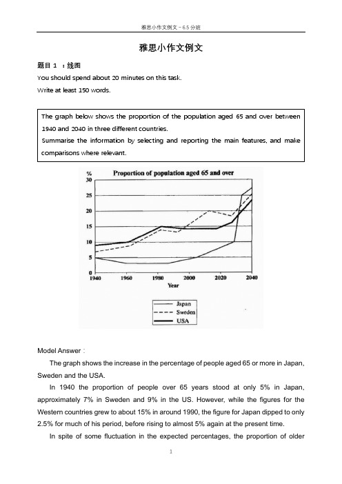
雅思小作文例文题目1 :线图You should spend about 20 minutes on this task.Write at least 150 words.Model Answer :The graph shows the increase in the percentage of people aged 65 or more in Japan, Sweden and the USA.In 1940 the proportion of people over 65 years stood at only 5% in Japan, approximately 7% in Sweden and 9% in the US. However, while the figures for the Western countries grew to about 15% in around 1990, the figure for Japan dipped to only2.5% for much of his period, before rising to almost 5% again at the present time.In spite of some fluctuation in the expected percentages, the proportion ofolder The graph below shows the proportion of the population aged 65 and over between 1940 and 2040 in three different countries.Summarise the information by selecting and reporting the main features, and make comparisons where relevant.people will probably continue to increase in the next two decades in the three countries.A more dramatic rise is predicted between 2030 and 2040 in Japan, by which time it is thought that the proportion of elderly people will besimilar in the three countries.Overall, it indicates that the percentage of elderly people in all three countries is expected to increase to almost 25% of the respective populations by the year 2040.题目2: 饼图The charts below give information about the ages of the populations of Yemen and Italy in 2000 and projections for 2050.Summarise the information by selecting and reporting the main features, and make comparisons where relevant.The pie charts below show the percentages of different age groups in Italy and Yemen in 2000 and its prediction for 2050. The age groups can be divided into 0-14 years, 15-59 years and 60+years.In 2000, the population aged under 14 accounted for the largest proportion of the overall population in Yemen, at 50.1%. This figure is expected to drop to 37% in 2050. Yemen is expected to see a slight increase in the proportion of people over 60 years from 3.6% to 5.7% in 2050, despite the fact that this age group will still represent the smallest section of the population. There will also be an increase in the percentage of the 15-59 age group from 46.3% to 57.3%.In contrast, most of the population in Italy was between 15-19 in 2000, at 61.6%. This figure is expected to drop to 46.2% in 2050. Those aged under 14 are projected to dip from 14.3% to 11.5%, representing the least proportion of the total population in both years. While the percentage of people aged over 60 will almost double to 42.3% in 2050.Overall, the projection is that the populations of both countries will become older. Italy had an older population than Yemen in the year 2000, and the same is predicted in 2050.题目3 柱状图The charts below give information about the ages of the populations of Yemen and Italy in 2000 and projections for 2050.Summarise the information by selecting and reporting the main features, and make comparisons where relevant.The bar charts given show the amount of marriages and divorces every ten yearsfrom 1970 to 2000 as well as the specific information about the percentages of different marital status in the U.S. in 1970 and 2000.The first chart gives statistic information on marriages and divorces each decade between 1970 and 2000. The number of marriages remained higher than that of divorces throughout this period. There were 2.5 million marriages in both 1970 and 1980, higher than the rest two years. The figure then continued to decrease to around 2.3 million in 1990 and 2 million in 2000. In contrast, there were 1 million divorces in 1970, representing the lowest point between 1970 and 2000. The number increased to almost 1.5 million in 1980 before it dropped all the way down to 1 million in 2000.The second chart compares the proportion of adult Americans in 4 different marital status: never married, married, widowed and divorced. In 1970, the most common marital status of adult Americans was married, which took up the largest proportion at 70%. In contrast, the percentage of people in the rest three marital status remained much lower. Despite a slight decrease occurred in the percentage of the widowed, both figures for the divorced and never married saw moderate increases of less than 10 percentage point.Overall, with years, the marriage rate of adult Americans decreased while the opposite trend was apparent in the divorce rate.题目4 表格1The table below shows the changes in the average distance measured in milestravelled by different modes of transport per person per year in 1985 and 2000 in England. Overall, the distance travelled in all modes of transportation significantly increased from 4740 miles in 1985 to 6475 miles in 2000. Car travelled the longest distance for everyone in both 1985 and 2000, increasing from 3199 miles to 4899 miles. Taxi, the least popular mode of transportation in 1985, only travelled for 13 miles and this figure slightly increased to 42 in 2000. The amount of the travelling distance of long distance bus doubled from 1985 (54 miles) to 2000 (124 miles). However, the figure for local bus in 2000 was almost half of the figure for 1985. The other ways of transport including bicycle, train and walking barely changed in these two years in terms of travelling distance.In summary, the modes of transport which allow the travelling for relatively long distance such as car, long distance bus and train remained popular in both these two years.The table below gives information about changes in modes of travel in England between 1985 and 2000.Average distance in milestravelled per person peryear, by mode of travel题目5 表格2The table below gives information about the underground railway system in six cities.Summarise the information by selecting and reporting the main features and make comparisons where relevant.The table presents statistic information about six countries’ underground systems regarding the time of opening, the length of route measured in kilometres and the yearly number of passengers measured in millions.London has the oldest underground railway system among the six cities, which was opened in 1863 while the railway system in Los Angeles is the newest, opened in the year 2001. For the rest four cities, that is, Paris, Tokyo, Washington DC and Kyoto, the opening dates were all in the 20th century.Next, in terms of the length of route measured in kilometres, the underground system in London is the longest at 394, almost double the size of the second largest one located in Paris, while the figure for Kyoto is the smallest at 11, followed by Los Angeles at 28.Lastly, when it comes to the yearly amount of passengers travelled by the underground system in these six cities, Tokyo has the largest number of passengers at 1927 million followed by Paris at 1191 million. On the contrary, the numbers for Kyoto and Los Angeles are the smallest at 45 million and 50 million respectively.Overall, the underground systems in different cities vary a lot regarding the opening date, the size and the number of passengers. Tokyo and Paris use it as the main mode of transport while in Kyoto and Los Angeles the metro system was less popular.雅思小作文例文-信息图表1.流程图The diagrams below show the life cycle of the silkworm and the stages in the production of silk cloth.Summarise the information by selecting and reporting the main features, and make comparisons where relevant.The flow chart illustrates the life cycle of the silkworm and the making process of silk cloth.In the first stage, a moth lays eggs and it takes 10 days for eggs to grow into larva which feeds on mulberry leaves. This stage lasts for 4-6 weeks until the larva produces silk thread. 3-8 days later, a number of cocoons are produced. 16 days later, the adult moths emerge from these cocoons, where a new cycle begins.The cocoons are the raw material used for the production of silk cloth. Once selected, they are boiled in water and the threads can be separated in the unwinding stage. Each thread is between 300 and 900 metres long, which means they can either be twisted together, dyed and then directly used to produce cloth in the weaving stage, or the threads can first go through the steps of twisting and weaving before the dyeing procedure.Overall, the diagrams show that the cocoon stage of the silkworm can be used to produce silk cloth through a very simple process.2.地图The two maps illustrate how the island has changed before and after the construction of some tourist equipment.Looking first at the map before construction, we can see a huge island with a beach in the west. The island was almost bare despite a few trees in the western and eastern area.Looking at the maps in more detail, we can see that small huts have been built to accommodate visitors to the island. The other physical structures that have been added are a reception building, in the middle of the island, and a restaurant to the north of the reception. As well as the buildings mentioned above, the new facilities on the island include a pier, where boats can dock. There has also been a vehicle track linking the pier with the reception and restaurant, and some footpaths connecting the huts. Finally, a swimming area has been designated for tourists on the western tip of the island.Overall, the island has become more tourism focused after the construction of some tourist facilities.。
雅思写作小作文线形图表题(附范文)

雅思写作小作文线形图表题(附范文)雅思写作– LINE GRAPHWRITING TASK 1 (Test 2, Cambridge IELTS 7)You should spend about 20 minutes on this task. This graph below shows the consumption of fish and some different kinds of meat in a European country between 1979 and 2004.Summarise the information by selecting and reporting the main features, and make comparisons where relevant.Write at least 150 words.范文The graph illustrates changes in the amount of beef, lamb, chicken and fish consumed in a particular European country between 1979 and 2004.In 1979, beef was by far the most popular of these foods, with about 225 grams consumed per person per week. Lamb and chicken were eaten in similar quantities (around 150 grams), while much less fish was consumed (just over 50 grams).However, during this 25-year period the consumption of beef and lamb fell dramatically to approximately 100 grams and 55 grams respectively. The consumption of fish also declined, but much less significantly to just below 50 grams, so although it remained the least popular food, consumption levels were the most stable.The consumption of chicken, on the other hand, showed an upward trend, overtaking that of lamb in 1980 and that of beef in 1989. By2004 it had soared to almost 250 grams per person per week.Overall, the graph shows how the consumption of chicken increased dramatically while the popularity of these other foods decreased over the period.(173 words)WRITING TASK 1 (Test 4, Cambridge IELTS 8)范文The graph illustrates the quantities of goods transported in the United Kingdom by four different modes of transport between the time period of 1974 and 2002. Over this span of 28 years, the quantities of goods transported by road, water and pipeline have all increased while the quantity transported by rail has remained almost constant at about 40 million tonnes.The largest quantity of goods transported both in 1974 and 2002 was by road (70 million tonnes and 98 million tonnes respectively) while the lowest both in 1974 and 2002 was by pipeline (about 5 million tonnes and 22 million tonnes respectively). The amount of goods transported by water was constant from 1974 to 1978, where it showed an exponential growth, rising to almost 60 million tones after which it plateaued for about 20 years before starting to rise gradually again.The amount of goods transported by rail is almost constant at 40 million tonnes in 1974 and 2002, with decreases in quantity in between the years. It is also interesting to note that almost all showed a decrease in 1994 in amount of goods transported except for the pipeline, which actually peaked in that year. In conclusion the road remains the most popular method of transporting goods in the UK while water and pipelines are becoming increasingly used. In contrast, rail has not become more popular as a method of transport.WRITING TASK 1 (Test 4, Cambridge IELTS 9)范文The graph shows energy consumption in the US from 1980 to 2012, and projected consumption to 2030.Petrol and oil are the dominant fuel sources throughout this period, with 35 quadrillion (35q) units used in 1980, rising to 42q in 2012. Despite some initial fluctuation, from 1995 there was a steady increase. This is expected to continue, reaching 47q in 2030.Consumption of energy derived from natural gas and coal is similar over the period. From 20q and 15q respectively in 1980, gas showed an initial fall and coal a gradual increase, with the two fuels equal between 1985 and 1990. Consumption has fluctuated since 1990 but both now provide 24q. Coal is predicted to increase steadily to 31q in 2030, whereas after 2014, gas will remain stable at 25q.In 1980, energy from nuclear, hydro- and solar/wind power was equal at only 4q. Nuclear has risen by 3q, and solar/wind by 2. After slight increases, hydropower has fallen back to the 1980 figure. It is expected to maintain this level until 2030, while the others should rise slightly after 2025.Overall, the US will continue to rely on fossil fuels, with sustainable and nuclear energy sources remaining relatively insignificant.。
雅思写作小作文--line chart

steady adj. 稳定的 e.g. the consumption of hamburgers remained steady from 1970 to 1990. fluctuate v. 波动 E.g. the demand for energy fluctuated between 3 units to 3.5 units. triple v. 增至三倍 例句: the number of networks tripled during the following year.
11.
there were 100,000 more people work on a full-time basis in 2004 than in 1994. 改正: there were 100,000 more people working on a full-time basis in 2004 than in 1994.
adj. 向上的 we see a constant upward fluctuation that come to a peak of 45% around 8:00 PM. downward adj. 向下的 during the 1990s there was a downward trend in the share price. decline n. 下降 from 8:00 PM on, a steady decline to about 38% is followed by a drop to almost zero in the next few hours.
9. it is shown in the chart that up to two millions children were orphaned in 2002 in Africa, half a million higher than the 2001’s record figure. 改正:it is shown in the chart that up to two million children were orphaned in 2002 in africa, half a million higher than the 2001’s record figure. 10. the secondary school enrolment rate sank considerably after an increase of 10 percent during the period from the mid1980s and the early 1990s. (considerably: dramatically, drastically, sharply, enormously, hugely, steeply,
雅思作文经典题目--线图类1
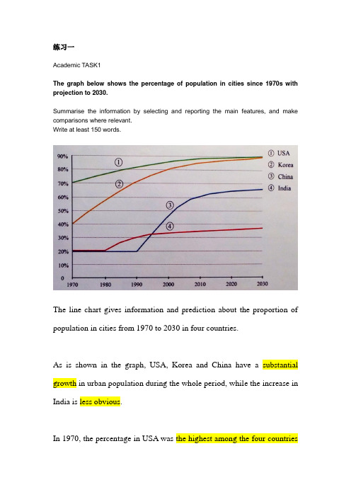
练习一Academic TASK1The graph below shows the percentage of population in cities since 1970s with projection to 2030.Summarise the information by selecting and reporting the main features, and make comparisons where relevant.Write at least 150 words.The line chart gives information and prediction about the proportion of population in cities from 1970 to 2030 in four countries.As is shown in the graph, USA, Korea and China have a substantial growth in urban population during the whole period, while the increase in India is less obvious.In 1970, the percentage in USA was the highest among the four countries(70%), while the figure in Korea was at 40%. In the following four decades, USA saw/experienced/witnessed an upward trend and it went up to 88% in 2010, remaining the country with the largest figure. However, a sharper increase to 85% took place in Korea, so the gap between them became narrower. The lowest percentage of city dwellers was in China and India, and it remained stable at 20% for the first twenty years. China outnumbered India in 1995, reaching 60% in 2010.According to the forecast, the existing trend in USA and Korea is predicted to continue, (and it will reach) reaching the same figure at 90%. Likewise/similarly, in China, it is expected to grow up to 65% in 2030. Nevertheless, India is supposed to remain the same figure at 35% from 2012 onwards.。
雅思小作文线图题库
雅思小作文线图题库英文回答:The line graph illustrates the changes in the number of international students studying in Australia from 2000 to 2010. Overall, the number of international students increased significantly during this period.In 2000, there were around 300,000 international students studying in Australia. This number gradually increased to about 400,000 in 2005. However, there was a sharp rise in the number of international students in 2008, reaching a peak of approximately 600,000. After that, the number slightly decreased to around 550,000 in 2010.There are several possible reasons for this trend. Firstly, the reputation of Australian universities has been growing globally, attracting more international students to pursue higher education in the country. Secondly, the Australian government has implemented various policies toencourage international students to study in Australia, such as offering scholarships and providing work opportunities during and after their studies. Lastly, the global economic situation may have also played a role, as students from developing countries seek better education and job prospects abroad.In my opinion, the increase in the number of international students studying in Australia has both positive and negative impacts. On the positive side, international students contribute to the cultural diversity of the country and bring in economic benefits through their tuition fees and living expenses. They also contribute to the local community by participating in various activities and events. Moreover, international students often bring new perspectives and ideas to the classrooms, enriching the learning experience for both domestic and international students.However, there are also some challenges associated with the influx of international students. For example, language barriers and cultural differences may affect theirintegration into the local society. Additionally, the increased competition for resources and accommodation can put pressure on local students. It is important for universities and the government to provide support services and create a welcoming environment for international students to ensure their successful integration and overall well-being.中文回答:这条线图展示了2000年至2010年期间在澳大利亚学习的国际学生人数的变化。
雅思小作文-线形图
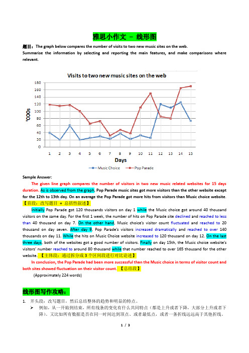
雅思小作文– 线形图题目:The graph below compares the number of visits to two new music sites on the web.Summarise the information by selecting and reporting the main features, and make comparisons where relevant.Sample Answer:The given line graph compares the number of visitors in two new music related websites for 15 days duration. As is observed from the graph, Pop Parade music sites got more visitors than the other website except for the 12th to 13th day. On an average the Pop Parade got more hits from visitors than Music choice website.【首段:改写题目+ 总括性叙述】Initially Pop Parade got 120 thousands visitors on day 1 while the Music choice got around 40 thousand visitors on the same day. For the first 1 week, the number of hits on Pop Parade site declined and reached to less than 40 thousand on day 7. On the other hand, Music choice’s visitor count fluctuated and reached to20 thousand on day seven. After day 9, Pop Parade’s visitors increased dramatically and reached to over140 thousands on day 11. While the hits on Music Choice website increased to 120 thousand on day 12. On the last three days, both of the websites got a good number of visitors. Finally on day 15th, the Music choice website’s visitors’ number reached to around 80 thousand while that number reached to over 165 thousand for the other website. 【主体段:通过拆分成3个区间段进行对比论述】In conclusion, the Pop Parade had been more successful than the Music choice in terms of visitor count and both sites showed fluctuation on their visitor count.【总结段】(Approximately 224 words)线形图写作攻略:1.开头段:改写题目,然后总结整体的趋势和明显的特点。
- 1、下载文档前请自行甄别文档内容的完整性,平台不提供额外的编辑、内容补充、找答案等附加服务。
- 2、"仅部分预览"的文档,不可在线预览部分如存在完整性等问题,可反馈申请退款(可完整预览的文档不适用该条件!)。
- 3、如文档侵犯您的权益,请联系客服反馈,我们会尽快为您处理(人工客服工作时间:9:00-18:30)。
雅思小作文线图题
线图要注意分段。
尤其是多条线,如果放在一起描述,很容易混
乱。
所以建议还是分开来描述,主要原则是仅看描述就能画出图线。
以
下是小编收集的雅思小作文线图题,希望大家认真阅读!
一般而言,是按时间,除了结合时间还要看走势上的分段,大段
的描述不可缺;另外就是最高点和最低点,以及拐点的数字以及时点描
述。
只有具备了这两点,才能画出图线的走势。
对于不同线之间的比
较,可以在最后一段进行,利用交点进行分段。
下面,环球雅思将结合具体例题来详细讲解:
The graph below shows the proportion of the population aged 65 and over between 1940 and 2040 in three different countries.
文章的写作步骤:
Introduction:用一句话介绍图表表示的内容,可以是题目内容的
改写。
Summary:描述两个要点:3 个国家的总体趋势和其中可以看出
的最明显的变化。
Details:先比较一下三个国家在1940 年的情况,然后比较1990
年的情况。
Details:描述日本那条线上最明显的变化,然后比较三个国家
2040 年的情况。
这是一幅典型的多线图,图中有三条曲线,分别代表美国、瑞典
和日本三国老年人的比例变化情况。
在正常情况下,这类图形可以采用
分线描述的方法,把每条曲线的信息都描写清楚,最后再进行总结和对
比。
但是可以发现,图中代表美国和瑞典曲线的走势大体相仿,只有在
2000 年到2030 年这段时间里有所差异,可以采用分组思想并为一组来。
