【7A文】雅思写作小作文TASK1
雅思写作Task1书信考官范文(3)

雅思写作Task1书信考官范文(3)本文为大家收集整理了雅思写作Task1书信考官范文(3)。
认真研读一定的雅思范文及作文模板可以帮助我们检验自己的写作水平,并能很好地吸收和应用优秀范文里的优秀内容。
Your neighbors have recently written to you to complain about the noise from your house flat.Write a letter to your neighbors. In your letter explain the reasons for the noise apologize. Describe what action you will take.Model Answer:Dear Mr Jonathon,I am writing in response to your letter, complaining about the sounds my musical instrument is producing. I feel that I have to explain myself and humbly ask for your forgiveness.Actually, I am a student of the North Carolina Arts College and as a part of my end of term exams I have to perform 4 plays by flute. Therefore I have to reherse every day because I am eager to make a good impression to my teachers. To achieve my goal I am supposed to play about 3 hours a day.I must apologize for playing in inappropriate hours. It was all my fault since I did not bother reading the rules of our house owner, prohibiting playing musical instruments.I have consulted with my class teacher and he suggested me to use one of the rooms of the college to rehearse for a small fee. I assure you by no means will be disturbed again with the noise from my apartment.I beg for your understanding and forgiveness. Please, accept this box of chocolate asa token of my appreciation for not giving this problem a legal action.Yours sincerely,Mark Aurther。
雅思写作-小作文-Task-One
雅思作文-小作文Task One◆第一章➢如何写开头段?开头段的写法:改写原题,大约在1-2句话。
开头段转述原题,在进行原题改写的时候,方法大约分为三种。
1.增加单词;2.删除单词;3.替换单词;注1:在改写原题的时候,需要对原题进行3-4处的改写即可。
如果改动太大,就会暴露出语法错误的可能,所以尽量多地保证原题的原汁原味,不要对其内容和概念改动太大。
注2:在原题里的below一词在改写的时候必须删掉,不能出现在改写后的开头段当中。
真题练习:剑桥6-Test One-T ask OneThe graph and table below give information about water use worldwide and water consumption in two different countries.Summarise the information by selecting and reporting the main features, and make comparison where relevant.原题:The graph and table below give information about water use worldwide and water consumption in two different countries.分析:原题当中有两个图,一个是曲线图另一个是表格图,所以在进行描述的时候,可以把原题的一句话(含有line graph and table)分成两句来描述,一句话是描述曲线图,另外一句话是描述表格图。
Part One原题:The graph and table below give information about water use worldwide and water consumption in two different countries.原题中描述曲线图可以进行修改的部分:1.give可替换成show/describe/demonstrate/summarise/outline/indicate/illustratermation可替换成data3.water use worldwide前可以增加名词,以此表示“世界范围内的用水量”。
雅思写作Task1表达

I.Introduction1.This diagram unfolds a clear comparison between Florida, a state of the United States, and theUnited States as a whole in four aspects, namely, registered engineers, the civilian labor force, manufacturing employment and hi-tech employment, from 1978 to 1987.2.There were many significant changes in modes of transport used by city dwellers from 1950 to 1990.The following paragraphs will identify and discuss the trends in the accompanying graph.3.The chart below displays the average earnings per week, in pounds sterling, of people of differentlevels of education living in the UK between the years 1965 and 1995.4.The chart indicates the subjects studied by university students in Australia during the latter of lastcentury.5.The chart shows the number of road accidents in Britain over a period of six years.6.The line graph reveals the amount of fast food consumed by Australia teenagers over a 25-year periodbetween 1975 and 2000.7.The bar chart illustrates the percentage of employees in different occupations absent from work in agiver week in 2001.8.Indicators of economic and social conditions in four countries, Canada, Japan, Peru and Zaire, in 1994,complied by the UN, reflect the great difference that exist between wealthier and poorer nature.9.The graph compares the number of deaths caused buy six diseases in Erewhom in 1990 with theamount of research funding allocated to each of those diseases. It can be clearly seen that the amount of research funding in many cases did not correlate with the seriousness of the disease in terms of numbers of deaths.10.The three graphs provide an overview of the types of music people purchase in the UK.At firstglance .we see that classical music is far less popular than pop or rock music.parison△The Same1.The difference in earnings of people with different levels of education is very small.2.The situation in Australia and New Zealand was similar in that the imprisonment rates from 1930 to1980 remained stable.3. A similar trend was seen in Asia.4.The difference in earnings between high school leavers and university graduates diminished after1995.average5.By 1999, coffee consumption in China stood at 992 million cups, almost equal that of America,which stood at 1,090 million cups per year.6.The trend was virtually mirrored by study of the arts, which increased significantly from 20% in1950-59, through 25% ten years later, finally reaching 38% by 1990-99.7.During the first period of each year, the figures averaged out to around 300,000 to 350,000 accidents.8. A similar pattern is also recorded for both the finance /banking and defense –related public sectors.△Large Difference1.There is a significant difference between all three countries.2.In the highest executive position (Grade A), women represent only about 85 of the workers. This standsin marked contrast to the 92% of men represented in this job category.3.This is in stark contrast with 1945 when only 30% of girls completed primary school, 35% had noschooling at all and 35% only completed the third grade.4.When children enter the household, however, the inequality becomes even more pronounced.5.Canada differs from the United States because the figures reached a peak of 120 people in a thousand in1930.6.In contrast, almost the opposite occurred with business.7.In fact, the higher the position, the higher the percentage of men represented in the category.Incomparison,woman’s representation is inversely proportional to the men’s so that the higher the category, the lower the percentage of women to be found.8.Interest also drops off after the age of 35 with an ever sharper fall from age 45 onwards, a pattern whichis the opposite to the classical music graph.△Less Than1.Earning for people with a Bachelor’s degree was slightly less than people with a Master’s of Doctoraldegree.2.The figures reveal that hamburgers are the most popular fast food, pizza coming a close second.3.In a word, America has the highest rate of imprisonment, followed by Europe and finally Australia.4.Although the rate of imprisonment in New Zealand fell, it was outmatched by the United State’s.5.The increase in earning for the whole period was less for people with a Bachelor’s degree (£60) thanfor people with a Master’s or Doctoral degree( £70).△More Than1.There were more males than females (5% and 10% respectively).2.These figures were overwhelmingly greater than the corresponding figures of $160 in Peru and$130 in Zaire.3.People working in the computer industry in China exceeded that of Britain in the year 2000.4.In 1970 and 2000, more people did manual labor in Britain than in China.5.In 1960, the United State’s imprisonment was in the process of being developed. Yet it stilloutnumbered the other countries.6.Although the United States experienced a decline in imprisonment rates, it still remained ahead ofCanada.7.We would expect to see that coffee drinkers in America far outweigh those in China which, in fact isthe case.8.In cases, teenagers, and retired people spend around twice as much time as those who are at workingage.△Avoiding Repetition1.While women showed a steady increase, male smokers dropped sharply after 1980, but began a steadyincrease again after 1990.2.People working in the computer industry in China exceeded that of Britain in the year 2000.3.The number of male smokers in 1960 stood at 215, compared to 16% of the female population.III.Overall Trend1.There was an overall increase in earnings across the board.2.Female smokers saw the opposite trend.3.The increase in male smokers corresponds with a decline in female smokers.4.The general trend is that the amount of TV watched increases with age.5.China experienced a decline in agricultural and manual work, and a significant rise incomputer-related work.6.Far less significant change took place in Britain with the exception of a significant decline inmanual jobs.7.There was a steady increase in computer use in all categories.8.Most computer usage is for business or pleasure purposes.9.The trend continued through 1970.10.Overall, there was a decline in male smokers.11.Apart from a decline in the 31 to 45 age group, overall, America saw a steady climb after about 21,from 18% to 40%.12.All four continents saw a general population growth.13. A similar trend was seen in Asia.IV.Increase△Big Increase1.The biggest change occurred in the period 1985 to 1995, when high school graduates enjoyed thegreatest increase in earnings.2.Over the thirty-year period, there was a big increase in earnings amongst people with high schoolcertificates(£85).3.China experienced a significant rise in computer-related work.4.There was a dramatic increase, in 1970, i n the number of university graduates.5.Japan experienced a massive increase in car ownership in the 1930s.6.There was a significant difference in the money people spent on CDs in the Northern Territoriesbetween August and September, from 25% to 48%.7.The greatest difference occurred between 1940 and 1950 in Brazil.8.After 1940, there was a significant increase in the number of imprisonments, reaching 90 thousand in1980, a three-fold increase from 1930.9.In Great Britain, in 1930, imprisonment figures stood at 30,000.However, they increased three fold, to90,000 by 1980.10.Three years later, in 1996, both countries saw a marked increase.11.In fact, 1997 saw a huge increase from 329,000 accidents in the first quarter to a massive 764,000accidents during the second quarter.12.From this time onwards, energy demand climbed dramatically fro, two units of energy in 1996 and isprojected to reach seven units in the year 2005.13.It increased substantially at the beginning of the year.△Small Increase1.During the same period, people with a Doctoral degree increased their earnings by the least amount.2.The Northern Territories, during the first part of the year, experienced a slight increase from 10% inJanuary to 15% in March.3.People holding a Bachelor’s degree only managed a modest increase of£5 per week, reaching alevel of £145 in 1995.4.The number of men in the sector rose only marginally from 425,000 to 480,000 in the same period.△Gradual/Steady Increase1.There was a gradual increase in earning amongst people with a university degree.2.While women showed a steady increase, male smokers dropped sharply after 1980, but began asteady increase again after 1990.3.There was a steady increase in computer use in all categories.4.India experienced a steady rise between 1940 and 1960.5.Following a slump in sales during April to June, Queensland saw a steady rise in spending betweenJuly and October.6.In 1990, the number of male smokers diminished significantly to only 13%, whilst the number offemale smokers rose steadily to 22%.7.Apart from a decline in the 31 to 45 age group, overall, America saw a steady climb after about 21,from 18% to 40%.△Sharp Increase1.There was a sharp increase in the USA in 1970 from 5 million to 8 million. There was a secondsignificant increase in 1990 to 11 million, followed by a massive leap to 24 million in 2000.2.Mobile phone use increased in big leaps in Japan, reaching a peak of 32 million in 1990.3.Mobile phone use doubled to 2 million in 1980, followed by a sudden and massive increase to 17million in 1990.4.Earnings in general rose sharply between 1965 and 1995.5.Japan remained much lower than other countries, fluctuating between 6% and 14% during the wholeperiod. The exception being after about 55 years of age, when there was a sudden leap to 36%.6.By 1968 this increased to 170, and increased again but more steeply to 320 in 1977.7.After that, it rose gradually to 5,000, and then continued its upward trend more steeply to 15,000.8.The number of women grew sharply from 25,000 to over 100,000.△Summit1.Mobile phone use increased in big leaps in Japan, reaching a peak of 32 million in 1990l.2.Due to the introduction of a luxury goods tax, Acme Sports Cars’monthly profit fell dramaticallyduring the second quarter from ﹩800,000 to only 10,000, whereas that of Branson Motors continuedto rise, peaking at just over ﹩60,000 by the end of December.V.Decrease△Steady Decrease1.China experienced a steady decline in agricultural and manual work.2.The number of male smokers decreased from 21% in 1960 to 17% in 2000.3.The consumption of hamburgers and pizza has risen steadily over the 20 year period to 1990 while theconsumption of fish and chips has been in decline over that same period with a slight increase inpopularity since1985.△Sharp Decrease1.While women showed a steady increase, male smokers dropped sharply after 1980, but began asteady increase again after 1990.2. A sharp decline occurs in Britain after the age of about 46.3.Following a slump in sales during April to June, Queensland saw a steady rise in spending betweenJuly and October.4.However, following the sharp decline of male smokers in 1990 to 13%, the number began to riseagain, and reached 17% in 2000.5.During the years 1950-59, there were an incredible 45% of students studying science, yet by the nextdecade this number had reduced dramatically to 30%.6.This decline slowed down to 25% in 1970-79, but dropped off sharply during the next ten years to15%, and finally 4% by 1990-99.7.At this point the number of cases remained stable, then plummeted to zero by 1988.8.This number decreased gradually to 500 by 1974 and continued to decrease but more steeply to250 in 1995.9.It slowly decreased to 100, and then continued its downward trend more steeply to 15.△Great Decrease1.There was a huge drop in car ownership in Brazil during the 1940.2.There was a significant difference in the number of cars owned in Japan between the years 1940and 1970.3.Far less significant change took place in Britain with the exception of a significant decline in manualjobs.4.The greatest difference occurred between 1940 and 1950 in Brazil.5.In 1990, the number of male smokers diminished significantly to only 13%, while the number offemale smokers rose steadily to 22%.△Small Decrease1.There was a slight drop/fall between 1930 and 1940 in India.2.Japan remained very low compared to the other countries, with a fall from 14% to 8% after the ageof 21. This was followed by a further fall to 6% after 30.3.The demand for energy dropped steadily between 1985 and 1990 from 5 units of energy toapproximately 2 units.VI.Bottom1.The percentage of male smokers reached the bottom of 13% in 1990.2.The number of students studying science bottomed out in 1959.3.The sale of air conditioner reached rock bottom in December, only a third of that sold in July.VII.Steadiness1.The numbers remained steady throughout the twenty-year period.2.There was little change in people’s spending habits between August and November in New SouthWales where it remained steady at around 35%.3.In 1985, earnings leveled out amongst people with a Master’s degree and with a Doctoral degree.4.The rate in Canada, of the other hand, increased, whilst Australia experienced no change.VIII. .Fluctuation1.There was a minor fluctuation between 1920 and 1940 in India.2.China remained fairly steady fluctuating between 10% and 22% across all age ranges, with a slightincrease to 29% after the age of 56.IX .Percentage1.The number of male smokers in 1960 stood at 21%, compared to 16% of the female population.2.However, following the sharp decline of male smokers in 1990 to 13%, the number began to riseagain, and reached 17% in 2000.3.In 1900, however, the population rose sharply by more than 12%.4.Approximately 72% of workers in the lowest executive positions of Grade E are women.5.Here women represent 45% and men 55% of the workers in the category.6.From the information shown, it can be seen that rent and food account for exactly a third of theamount spent by students, amounting to £100 per week.7.It is evident that absentee rates are lowest for the best remunerated jobs, with managers andadministrators recording only around 3% absence.8.Canada and Japan both reported rates of 99%, while Peru claimed 68%. Zaire had a literacy rateof only 34%.X.Conclusion1.What’s more surprising, however, is that the increase in earnings amongst high school leavers wasfar higher than the earnings for university graduates.2.One of the most surprising finds was the amount of TV watched by people in Japan compared withmost other countries. In addition, apart from a significant drop after the age of 56 in the UK,generally, the amount of TV people watch increases significantly after the age of 56.3.In summary, we can see that the area devoted to grain production was affected by both governmentpolicy and market forces.4.In conclusion, the men occupy a greater percentage of high executive positions in the ACME OilCompany.5.From the diagram it can be safely concluded that in the years 1978-1987 Florida developed muchmore rapidly than the United States as a whole.6.Overall, the chart demonstrates that in the categories for which statistics on male leisure time wereavailable, men enjoyed at least ten hours more leisure time than women.。
雅思写作Task1 7分范文

The table below gives information on consumer spending on different items in five different countries in 2002.Percentage of national consumer expenditure by category - 2002The table shows percentages of consumer expenditure for three categories of products and services in five countries in 2002.It is clear that the largest proportion of consumer spending in each country went on food, drinks and tobacco. On the other hand, the leisure/education category has the lowest percentages in the table.Out of the five countries, consumer spending on food, drinks and tobacco was noticeably higher in Turkey, at 32.14%, and Ireland, at nearly 29%. The proportion of spending on leisure and education was also highest in Turkey, at 4.35%, while expenditure on clothing and footwear was significantly higher in Italy, at 9%, than in any of the other countries.It can be seen that Sweden had the lowest percentages of national consumer expenditure forfood/drinks/tobacco and for clothing/footwear, at nearly 16% and just over 5% respectively. Spain had slightly higher figures for these categories, but the lowest figure for leisure/education, at only 1.98%.The graph and table below give information about water use worldwide and water consumption in two different countries.The charts compare the amount of water used for agriculture, industry and homes around the world, and water use in Brazil and the Democratic Republic of Congo.It is clear that global water needs rose significantly between 1900 and 2000, and that agriculture accounted for the largest proportion of water used. We can also see that water consumption was considerably higher in Brazil than in the Congo.In 1900, around 500km³ of water was used by the agriculture sector worldwide. The figures for industrial and domestic water consumption stood at around one fifth of that amount. By 2000, global water use for agriculture had increased to around 3000km³, industrial water use had risen to just under half that amount, and domestic consumption had reached approximately 500km³.In the year 2000, the populations of Brazil and the Congo were 176 million and 5.2 million respectively. Water consumption per person in Brazil, at 359m³, was much higher than that in the Congo, at only 8m³, and this could be explained by the fact that Brazil had 265 times more irrigated land.(184 words, band 9)The chart below shows information about changes in average house prices in five different cities between 1990 and 2002 compared with the average house prices in 1989.The bar chart compares the cost of an average house in five major cities over a period of 13 years from 1989.We can see that house prices fell overall between 1990 and 1995, but most of the cities saw rising prices between 1996 and 2002. London experienced by far the greatest changes in house prices over the 13-year period.Over the 5 years after 1989, the cost of average homes in Tokyo and London dropped by around 7%, while New York house prices went down by 5%. By contrast, prices rose by approximately 2% in both Madrid and Frankfurt.Between 1996 and 2002, London house prices jumped to around 12% above the 1989 average. Homebuyers in New York also had to pay significantly more, with prices rising to 5% above the 1989 average, but homes in Tokyo remained cheaper than they were in 1989. The cost of an average home in Madrid rose by a further 2%, while prices in Frankfurt remained stable.(165 words)The table below shows the proportion of different categories of families living in poverty in Australia in 1999.The table gives information about poverty rates among six types of household in Australia in the year 1999.It is noticeable that levels of poverty were higher for single people than for couples, and people with children were more likely to be poor than those without. Poverty rates were considerably lower among elderly people.Overall, 11% of Australians, or 1,837,000 people, were living in poverty in 1999. Aged people were the least likely to be poor, with poverty levels of 6% and 4% for single aged people and aged couples respectively.Just over one fifth of single parents were living in poverty, whereas only 12% of parents living with a partner were classed as poor. The same pattern can be seen for people with no children: while 19% of single people in this group were living below the poverty line, the figure for couples was much lower, at only 7%.(150 words, band 9)The map below is of the town of Garlsdon. A new supermarket (S) is planned for the town. The map shows two possible sites for the supermarket.The map shows two potential locations (S1 and S2) for a new supermarket in a town called Garlsdon.The main difference between the two sites is that S1 is outside the town, whereas S2 is in the town centre. The sites can also be compared in terms of access by road or rail, and their positions relative to three smaller towns.Looking at the information in more detail, S1 is in the countryside to the north west of Garlsdon, but it is close to the residential area of the town. S2 is also close to the housing area, which surrounds the town centre.There are main roads from Hindon, Bransdon and Cransdon to Garlsdon town centre, but this is a no traffic zone, so there would be no access to S2 by car. By contrast, S1 lies on the main road to Hindon, but it would be more difficult to reach from Bransdon and Cransdon. Both supermarket sites are close to the railway that runs through Garlsdon from Hindon to Cransdon.can use "compared to", "compared with" and "in comparison with" in the same way. For example: •Prices in the UK are high compared to / with / in comparison with (prices in) Canada and Australia.•Compared to / with / in comparison with (prices in) Canada and Australia, prices in the UK are high. When writing about numbers or changes, I find it easier to use "while" or "whereas": •There are 5 million smokers in the UK, while / whereas only 2 million Canadians and 1 million Australians smoke.•Between 1990 and 2000, the number of smokers in the UK decreased dramatically, while / whereas the figures for Canada and Australia remained the same.The following bar chart has a total of 24 bars. It's impossible to describe 24 pieces of information in only 20 minutes, so you need to select.The bar chart compares consumer spending on six different items in Germany, Italy, France and Britain.It is clear that British people spent significantly more money than people in the other three countries on all six goods. Of the six items, consumers spent the most money on photographic film.People in Britain spent just over £170,000 on photographic film, which is the highest figure shown on the chart. By contrast, Germans were the lowest overall spenders, with roughly the same figures (just under £150,000) for each of the six products.The figures for spending on toys were the same in both France and Italy, at nearly £160,000. However, while French people spent more than Italians on photographic film and CDs, Italians paid out more for personal stereos, tennis racquets and perfumes. The amount spent by French people on tennis racquets, around £145,000, is the lowest figure shown on the chart.The diagrams below show some principles of house design for cool and for warm climates.The diagrams show how house designs differ according to climate.The most noticeable difference between houses designed for cool and warm climates is in the shape of the roof. The designs also differ with regard to the windows and the use of insulation.We can see that the cool climate house has a high-angled roof, which allows sunlight to enter through the window. By contrast, the roof of the warm climate house has a peak in the middle and roof overhangs to shade the windows. Insulation and thermal building materials are used in cool climates to reduce heat loss, whereas insulation and reflective materials are used to keep the heat out in warm climates.Finally, the cool climate house has one window which faces the direction of the sun, while the warm climate house has windows on two sides which are shaded from the sun. By opening the two windows at night, the house designed for warm climates can be ventilated.The diagram below shows the water cycle, which is the continuous movement of water on, above and below the surface of the Earth.The picture illustrates the way in which water passes from ocean to air to land during the natural process known as the water cycle.Three main stages are shown on the diagram. Ocean water evaporates, falls as rain, and eventually runs back into the oceans again.Beginning at the evaporation stage, we can see that 80% of water vapour in the air comes from the oceans. Heat from the sun causes water to evaporate, and water vapour condenses to form clouds. At the second stage, labelled ‘precipitation’ on the diagram, water falls as rain or snow.At the third stage in the cycle, rainwater may take various paths. Some of it may fall into lakes or return to the oceans via ‘surface runoff’. Otherwise, rainwater may filter through the ground, reaching the impervious layer of the earth. Salt water intrusion is shown to take place just before groundwater passes into the oceans to complete the cycle.(156 words, band 9)The diagrams below are existing and proposed floor plans for the redevelopment of an art gallery.The first picture shows the layout of an art gallery, and the second shows some proposed changes to the gallery space.It is clear that significant changes will be made in terms of the use of floor space in the gallery. There will be a completely new entrance and more space for exhibitions.At present, visitors enter the gallery through doors which lead into a lobby. However, the plan is to move the entrance to the Parkinson Court side of the building, and visitors will walk straight into the exhibition area. In place of the lobby and office areas, which are shown on the existing plan, the new gallery plan shows an education area and a small storage area.The permanent exhibition space in the redeveloped gallery will be about twice as large as it is now because it will occupy the area that is now used for temporary exhibitions. There will also be a new room for special exhibitions. This room is shown in red on the existing plan and is not currently part of the gallery.(178 words, band 9)The table below gives information about the underground railway systems in six cities.Full essay (band 9):The table shows data about the underground rail networks in six major cities.The table compares the six networks in terms of their age, size and the number of people who use them each year. It is clear that the three oldest underground systems are larger and serve significantly more passengers than the newer systems.The London underground is the oldest system, having opened in 1863. It is also the largest system, with 394 kilometres of route. The second largest system, in Paris, is only about half the size of the London underground, with 199 kilometres of route. However, it serves more people per year. While only third in terms of size, the Tokyo system is easily the most used, with 1927 million passengers per year.Of the three newer networks, the Washington DC underground is the most extensive, with 126 kilometres of route, compared to only 11 kilometres and 28 kilometres for the Kyoto and Los Angeles systems. The Los Angeles network is the newest, having opened in 2001, while the Kyoto network is the smallest and serves only 45 million passengers per year.(185 words)Cambridge IELTS book 7, page 101:The pie charts compare the amount of electricity produced using five different sources of fuel in two countries over two separate years.Total electricity production increased dramatically from 1980 to 2000 in both Australia and France. While the totals for both countries were similar, there were big differences in the fuel sources used.Coal was used to produce 50 of the total 100 units of electricity in Australia in 1980, rising to 130 out of 170 units in 2000. By contrast, nuclear power became the most important fuel source in France in 2000, producing almost 75% of the country’s electricity.Australia depended on hydro power for just under 25% of its electricity in both years, but the amount of electricity produced using this type of power fell from 5 to only 2 units in France. Oil, on the other hand,remained a relatively important fuel source in France, but its use declined in Australia. Both countries relied on natural gas for electricity production significantly more in 1980 than in 2000.(170 words)Read my full essay for the chart below. How have I organised the information? What language have I used to explain changes and to make comparisons?Full essay (159 words):The chart gives information about UK immigration, emigration and net migration between 1999 and 2008. Both immigration and emigration rates rose over the period shown, but the figures for immigration were significantly higher. Net migration peaked in 2004 and 2007.In 1999, over 450,000 people came to live in the UK, while the number of people who emigrated stood at just under 300,000. The figure for net migration was around 160,000, and it remained at a similar level until 2003. From 1999 to 2004, the immigration rate rose by nearly 150,000 people, but there was a much smaller rise in emigration. Net migration peaked at almost 250,000 people in 2004.After 2004, the rate of immigration remained high, but the number of people emigrating fluctuated. Emigration fell suddenly in 2007, before peaking at about 420,000 people in 2008. As a result, the net migration figure rose to around 240,000 in 2007, but fell back to around 160,000 in 2008.The charts below show the levels of participation in education and science in developing and industrialised countries in 1980 and 1990.The three bar charts show average years of schooling, numbers of scientists and technicians, and research and development spending in developing and developed countries. Figures are given for 1980 and 1990.It is clear from the charts that the figures for developed countries are much higher than those for developing nations. Also, the charts show an overall increase in participation in education and science from 1980 to 1990.People in developing nations attended school for an average of around 3 years, with only a slight increase in years of schooling from 1980 to 1990. On the other hand, the figure for industrialised countries rose from nearly 9 years of schooling in 1980 to nearly 11 years in 1990.From 1980 to 1990, the number of scientists and technicians in industrialised countries almost doubled to about 70 per 1000 people. Spending on research and development also saw rapid growth in these countries, reaching $350 billion in 1990. By contrast, the number of science workers in developing countries remained below 20 per 1000 people, and research spending fell from about $50 billion to only $25 billion.(187 words)The diagram below shows how the Australian Bureau of Meteorology collects up-to-the-minute information on the weather in order to produce reliable forecasts.The figure illustrates the process used by the Australian Bureau of Meteorology to forecast the weather. There are four stages in the process, beginning with the collection of information about the weather. This information is then analysed, prepared for presentation, and finally broadcast to the public.Looking at the first and second stages of the process, there are three ways of collecting weather data and three ways of analysing it. Firstly, incoming information can be received by satellite and presented for analysis as a satellite photo. The same data can also be passed to a radar station and presented on a radar screen or synoptic chart. Secondly, incoming information may be collected directly by radar and analysed on a radar screen or synoptic chart. Finally, drifting buoys also receive data which can be shown on a synoptic chart.At the third stage of the process, the weather broadcast is prepared on computers. Finally, it is delivered to the public on television, on the radio, or as a recorded telephone announcement.The line graph compares the percentage of people in three countries who used the Internet between 1999 and 2009.It is clear that the proportion of the population who used the Internet increased in each country over the period shown. Overall, a much larger percentage of Canadians and Americans had access to the Internet in comparison with Mexicans, and Canada experienced the fastest growth in Internet usage.In 1999, the proportion of people using the Internet in the USA was about 20%. The figures for Canada and Mexico were lower, at about 10% and 5% respectively. In 2005, Internet usage in both the USA and Canada rose to around 70% of the population, while the figure for Mexico reached just over 25%.By 2009, the percentage of Internet users was highest in Canada. Almost 100% of Canadians used the Internet, compared to about 80% of Americans and only 40% of Mexicans.The graph shows changes in the number of cars per household in Great Britain over a period of 36 years. Overall, car ownership in Britain increased between 1971 and 2007. In particular, the number of households with two cars rose, while the number of households without a car fell.In 1971, almost half of all British households did not have regular use of a car. Around 44% of households had one car, but only about 7% had two cars. It was uncommon for families to own three or more cars, with around 2% of households falling into this category.The one-car household was the most common type from the late 1970’s onwards, although there was little change in the figures for this category. The biggest change was seen in the proportion of households without a car, which fell steadily over the 36-year period to around 25% in 2007. In contrast, the proportion of two-car families rose steadily, reaching about 26% in 2007, and the proportion of households with more than two cars rose by around 5%.(180 words)。
最新雅思Task1写作满分范文
最新雅思Task1写作满分范文,今天小编就给大家带来了雅思Task1写作满分范文,希望能够帮助到大家,下面小编就和大家分享,来欣赏一下吧。
最新线图之座机与手机开支The line graph shows the average annual expenditures on cell phone and residential phone services between 2001 and 2010.该线图展示美国2001-2010年间年均花在手机和座机上的开支。
请作答。
雅思图表小作文线图9分范文:The line graph compares average yearly spending by Americans on mobile and landline phone services from 2001 to 2010.It is clear that spending on landline phones fell steadily over the 10-year period, while mobile phone expenditure rose quickly. The year 2006 marks the point at which expenditure on mobile services overtook that for residential phone services.In 2001, US consumers spent an average of nearly $700 on residential phone services, compared to only around $200 on cell phone services. Over the following five years, average yearly spending on landlines dropped by nearly $200. By contrast, expenditure on mobiles rose by approximately $300.In the year 2006, the average American paid out the same amount of money on both types of phone service, spending just over $500 on each. By 2010, expenditure on mobile phones had reached around $750, while the figure for spending on residential services had fallen to just over half this amount.(162 words, band 9)附雅思小作文考官范文基本套路段一:话题重述段二:概括话题数据的主要特征或规律段三:详述特征规律一段四:详述特征规律二注意:simon考官主张雅思小作文无须总结!大家可留心这一点。
雅思写作小作文-task(1)
雅思写作小作文-task(1)题型:·table·line graph·bar chart·pie chart·Process diagram·map基本结构:·开头段——改写原题·主体段-主体段I——“1+X”模式(overview + detail)-主体段II——“1+X”模式(overview + detail)·结尾开头段:·常用改写词Show——illustrate——compareProportion——percentageCategories——kinds——typesThe UK——Britain/the united kingdomInformation——dataMales——menFemales——womenFrom (年代)to (年代)——between (年代)and(年代)/over a period of …years Subway system——underground railway system——underground train system Store——shop The number of ——the figure forThe chart below shows(compares/illustrates)five levels of post-school qualifications in Australia and the proportion(percentage)of men and women(males and females)who held them between 1979 and 2009(form 1979 to 2009/over a period of 30 years).注:还可以将涉及的主体概括变列举,列举变概括;也可以通过句式的顺序进行一定的改动。
雅思小作文---TASK1图表题

雅思小作文 T A S K 1 图表题规律注意事项:1 . Task1 是客观写作,要求客观真实。
2 . 客观性:不应该有任何图里没有而靠自己主观想象加入的成分。
结尾段针对图形做出的总结性结论也应该是根据图表的实际内容做出的符合逻辑的总结。
准确性:图表里面的数据介绍要力求精确,不能抄错数字。
但当一个特征点没有落在一个准确的坐标值上时,允许进行合理的目测或估计一个大概数值。
详尽性:要有层次感,并不需要把所有的数字都推到文章里。
3 . 类型Table 表格题Line Graph 线图Bar Chart 柱状图Pie Chart 饼状图Process Chart 流程图4 . 看图要注意单位,标题和图例。
5 . 对于多数小作文题,题中给出了几个图就对应的写出几个主体段。
题目里只给出一个图,根据图中包含几类图形元素写几个主体段。
图中只给了一个图,但图中所含图形元素很多,则分类。
题目中出现多线多柱多饼,用“对应提取法“,把每组里的对应元素提出来组织主体段。
6 . 时态和发生时间意义对应。
陈述永恒事实的句型,其主句的谓语动词必定用一般现在时。
若题目里没有出现时间,则全文都使用一般现在时。
7 . 结构开头段(1~2句)改写原题主体段1 总体概括具体介绍数字主体段N 总体概括具体介绍数字结尾段(1~2句)介绍总数(若图里并没有明确的给出总数,则省略)结论(根据图里的数据得出有一定合理性的结论)8 . 开头段的改写题目中ShowProportion InformationThe number/amount of FamilyMalesFemaleInfluence改写成illustrate /compare percentagedatathe figure for householdmenwomenaffect/effectCategories kinds/typesSubway system Storeunderground railway/train system shop9 . 介绍数据或描述变化趋势的常用词。
剑7小作文test2task1范文

一、求高手点评雅思“小作文”(剑7 Test2 Task1 )感觉还不错啊~词语和句式较为多变,介词用得也准确,数据抓取得也合理。
表达年份时,可以有多种方式,除了直接写年份的数字,也可以说the year of 2004,the 2004 year等;表示“从图中看出”这个意思,还可以用from the graph,we can see。
xxx is shown(illustated, outlined。
)from the tableit could be easily seen that 。
多背几个,等你一想表达这个意思时,可以随时调用。
总结段一般还是必要的,加上会显得比较完整。
写小作文可以写得很精彩,但是主要还是能把图描述准确,不要每句看起来都是一种结构,总之多背些句式是好的,到最后写起来会得心应手。
二、批改作文剑七 test2 task2"基本完成了任务,5.5分具体点评如下:点评1 Nowadays,a hot and important contraversy /controversy concerning the problem whether the punishments for each type of crimes should be fixed.全句没有谓语,而且whether 后面也不是句子。
三、雅思大作文task 2~~~跪求估分+建议~~ 剑7test2中关于犯罪惩罚标准的Some people asert that there should be fixed punishments for each type ofcrime.asert拼写错误,assertI could give some reasons for it. 这句话是废话,字数够的话就删掉吧if someone feels his/her rights are invaded, there is a long way to go.这句话不妨换用虚拟语气。
雅思写作Task1 7分范文
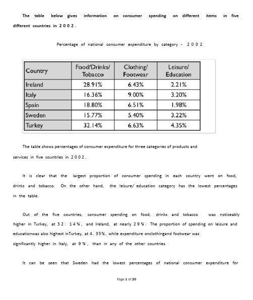
The table below gives information on consumer spending on different items in five different countries in2002.Percentage of national consumer expenditure by category -2002The table shows percentages of consumer expenditure for three categories of products andservices in five countries in 2002.It is clear that the largest proportion of consumer spending in each country went on food, drinks and tobacco.On the other hand,the leisure/education category has the lowest percentages in the table.Out of the five countries,consumer spending on food,drinks and tobacco was noticeably higher in Turkey,at 32.14%,and Ireland,at nearly 29%.The proportion of spending on leisure and educationwas also highest inTurkey, at 4. 35%, while expenditure onclothingand footwear wassignificantly higher in Italy,at 9%,than in any of the other countries.It can be seen that Sweden had the lowest percentages of national consumer expenditure forfood/drinks/tobacco and for clothing/footwear,at nearly 16%and just over 5%respectively.Spain had slightly higher figures for these categories,but the lowest figure for leisure/education,at only 1.98%.The graph and table below give information about water use worldwide and water consumption in two different countries.The charts compare the amount of water used for agriculture,industry and homes around the world,and water use in Brazil and the Democratic Republic of Congo.It is clear that global water needs rose significantly between 1900and 2000, and that agriculture accounted for the largest proportion of water used.We can also see that water consumption was considerably higher in Brazil than in the Congo.In 1900,around 500km³of water was use d by the agriculture sector worldwide.The figures for industrial and domestic water consumption stood at around one fifth of that amount.By 2000,global water use for agriculture had increased to around 3000km³, industrial water use had risento just under half that amount,and domestic consumption had reached approximately 500km³.In the year 2000,the populations of Brazil and the Congo were 176million and 5.2million respectively.Water consumption per person in Brazil,at 359m³,was much higher than that inthe Congo,at only 8m³,and this could be explained by the fact that Brazil had 265times more irrigated land.(184words,band 9)The chart below shows information about changes in average house prices in five different cities between1990and2002compared with the average house prices in1989.The bar chart compares the cost of anaverage house infive major cities over a period of 13years from 1989.We cansee that house prices fell overall between1990 and 1995, but most of the cities sawrisingprices between1996 and 2002. Londonexperienced by far the greatest changes inhouseprices over the 13-year period.Over the 5years after 1989,the cost of average homes in Tokyo and London dropped by around 7%,while New York house prices went down by 5%.By contrast,prices rose by approximately 2%in both Madrid and Frankfurt.Between 1996and 2002,London house prices jumped to around 12%above the 1989average. Homebuyers in New York also had to pay significantly more,with prices risingto 5%above the1989average,but homes in Tokyo remained cheaper than they were in 1989.The cost of an average home in Madrid rose by a further 2%,while prices in Frankfurt remained stable.(165words)The table below shows the proportion of different categories of families living in poverty in Australia in1999.The table gives informationabout poverty rates amongsix types of household inAustralia inthe year 1999.It is noticeable that levels of poverty were higher for single people than for couples,and people with children were more likely to be poor than those without. Poverty rates were considerably lower among elderly people.Overall, 11% of Australians, or 1,837,000 people, were livinginpoverty in1999. Aged peoplewere the least likely to be poor,with poverty levels of 6%and 4%for single aged people and aged couples respectively.Just over one fifth of single parents were living in poverty,whereas only 12%of parents living with a partner were classed as poor. The same pattern can be seen for people with no children:while 19%of single people in this group were living below the poverty line,the figure for couples was muchlower, at only 7%.(150words,band 9)The map below is of the town of Garlsdon.A new supermarket(S)is planned for the town.The map shows two possible sites for the supermarket.The map shows two potential locations (S1 and S2) for a new supermarket in a town calledGarlsdon.The maindifference betweenthe two sites is that S1 is outside the town, whereas S2 is inthetown centre.The sites can also be compared in terms of access by road or rail,and their positions relative to three smaller towns.Looking at the information in more detail,S1is in the countryside to the north west of Garlsdon, but it is close to the residential area of the town. S2 is also close to the housingarea,which surrounds the town centre.There are main roads from Hindon,Bransdon and Cransdon to Garlsdon town centre,but this is a no traffic zone,so there would be no access to S2by car.By contrast,S1lies on the main road to Hindon,but it would be more difficult to reach from Bransdon and Cransdon.Both supermarket/sites are close to the railway that runs through Garlsdon from Hindon to Cransdon.can use "compared to", "compared with" and "in comparison with" in the same way. For example:• Prices in the UK are high compared to / with / in comparisonwith (prices in) Canada andAustralia.• Compared to / with/ incomparisonwith(prices in) Canada and Australia, prices inthe UKare high.When writing about numbers or changes, I find it easier to use "while" or "whereas":•There are 5 million smokers in the UK, while / whereas only 2 million Canadians and 1 millionAustralians smoke.• Between 1990 and 2000, the number of smokers in the UK decreased dramatically, while whereas the figures for Canada and Australia remained the same.The following bar chart has a total of 24 bars. It's impossible to describe 24 pieces of information in only 20 minutes, so you need to select .The bar chart compares consumer spending on six different items in Germany,Italy,France and Britain.It is clear that British people spent significantly more money than people in the other threecountries on all six goods. Of the six items, consumers spentthe most money onphotographicfilm.People in Britain spentjust over £170,000 on photographic film, which is the highest figure shown on the chart.By contrast,Germans were the lowest overall spenders,with roughly the samefigures (just under £150,000)for each o f the six products.The figures for spendingontoys were the same inbothFrance and Italy, at nearly £160,000.However,while French people spent more than Italians on photographic film and CDs,Italians paid out more for personal stereos, tennis racquets and perfumes. The amount spent by Frenchpeople on tennis racquets,around £145,000,is the lowest figure shown on the chart.The diagrams below show some principles of house design for cool and for warm climates.The diagrams show how house designs differ according to climate.The most noticeable difference between houses designed for cool and warm climates is in the shape of the roof.The designs also differ with regard to the windows and the use of insulation.We can see that the cool climate house has a high-angled roof,which allows sunlight to enterthrough the window. By contrast, the roof of the warm climate house has a peak in the middle and roof overhangs to shade the windows. Insulationand thermal buildingmaterials are used incoolclimates to reduce heat loss, whereas insulation and reflective materials are used to keep the heat out in warm climates.Finally, the cool climate house has one window which faces the direction of the sun, while the warmclimate house has windows on two sides which are shaded from the sun. By openingthe two windows at night, the house designed for warm climates can be ventilated.The picture illustrates the way in which water passes from ocean to airnatural process known as the water cycle.Three main stages are shown on the diagram. Ocean water evaporates,eventually runs back into the oceans again.to land during thefalls as rain, andBeginning at the evaporation stage,we can see that 80% of water vapour in the air comes from the oceans. Heat from the sun causes water to evaporate, and water vapour condenses to formclouds. At the second stage, labelled p‘recipitation’onthe diagra m, water falls as rainor snow.At the third stage in the cycle, rainwater may take various paths. Some of it may fall into lakesor return to the oceans via ‘surface runoff’ . Otherwise, rainwater may filter through the ground, reachingthe impervious layer of the earth. Salt water intrusionis shownto take placejust beforegroundwater passes into the oceans to complete the cycle.(156 words, band 9)The first picture shows the layout of an art gallery, and the second shows some proposed changes to the gallery space.It is clear that significant changes will be made in terms of the use of floor space in the gallery. There will be a completely new entrance and more space for exhibitions.At present, visitors enter the gallery through doors which lead into a lobby. However, the planis to move the entrance to the ParkinsonCourt side of the building, and visitors will walk straightinto the exhibition area. In place of the lobby and office areas, which are shown on the existingplan, the new gallery plan shows an education area and a small storage area.The permanent exhibition space in the redeveloped gallery will be about twice as large as it is now because it will occupy the area that is now used for temporary exhibitions.There will also be a new room for special exhibitions. This room is shown in red on the existing plan and is not currently part of the gallery.(178 words, band 9)The table shows data about the underground rail networks in six major cities.The table compares the six networks in terms of their age, size and the number of people who use them each year.It is clear that the three oldest underground systems are larger and serve significantly more passengers than the newer systems.The London underground is the oldest system, havingopened in 1863. It is also the largestsystem, with 394 kilometres of route. The second largest system, in Paris, is only about half the size of the London underground, with 199 kilometres of route. However, it serves more people per year. While only third in terms of size, the Tokyo system is easily the most used, with 1927 million passengers per year.Of the three newer networks, the Washington DC underground is the most extensive, with 126 kilometres of route, compared to only 11 kilometres and 28 kilometres for the Kyoto and Los Angeles systems. The Los Angeles network is the newest, having opened in 2001, while the Kyoto network is the smallest and serves only 45 million passengers per year.(185 words)The pie charts compare the amount of electricity produced using five different sources of fuel in two countries over two separate years.Total electricity production increased dramatically from 1980 to 2000 in both Australia andFrance. While the totals for both countries were similar, there were big differences in the fuel sources used.Coal was used to produce 50 of the total 100 units of electricity inAustralia in1980, risingto130 out of 170 units in 2000. By contrast, nuclear power became the most important fuel source in France in 2000, producing almost 75% of the c ountry’selectricity.Australia depended on hydro power for just under 25% of its electricity in both years, but the amount of electricity produced usingthis type of power fell from5 to only 2 units inFrance. Oil,onthe other hand, remained a relatively important fuel source inFrance, but its use declined inAustralia. Both countries relied on natural gas for electricity production significantly more in 1980 than in 2000.(170 words)Read my full essay for the chart below. How have I organised the information? What languageThe chart gives information about UK immigration, emigration and net migration between 1999 and 2008.Both immigration and emigration rates rose over the period shown, but the figures for immigration were significantly higher. Net migration peaked in 2004 and 2007.In 1999, over 450,000 people came to live in the UK, while the number of people who emigrated stood atjust under 300,000. The figure for net migration was around 160,000, and itremained at a similar level until 2003. From 1999 to 2004, the immigration rate rose by nearly 150,000 people, but there was a much smaller rise in emigration. Net migration peaked at almost 250,000 people in 2004.After 2004, the rate of immigration remained high, but the number of people emigrating fluctuated. Emigration fell suddenly in 2007, before peaking at about 420,000 people in 2008. As a result, the net migration figure rose to around 240,000 in 2007, but fell back to around 160,000 in 2008.The three bar charts show average years of schooling, numbers of scientists and technicians,and research and development spending in developing and developed countries.Figures are given for 1980and 1990.It is clear from the charts that the figures for developed countries are much higher than those for developing nations.Also,the charts show an overall increase in participation in education and science from 1980to 1990.People indevelopingnations attended school for anaverage of around 3years,withonly aslight increase in years of schooling from 1980to 1990. On the other hand, the figure forindustrialised countries rose from nearly 9years of schooling in 1980to nearly 11years in 1990.From 1980to 1990,the number of scientists and technicians in industrialised countries almost doubled to about 70per 1000people.Spending on research and development also saw rapid growth in these countries,reaching $350billion in 1990.By contrast,the number of science workers indevelopingcountries remained below 20 per 1000 people, and researchspendingfellfrom about $50billion to only $25billion.(187words)The diagram below shows how the Australian Bureau of Meteorology collects up-to-the-minute information on the weather in order to produce reliable forecasts.The figure illustrates the process used by the Australian Bureau of Meteorology to forecast the weather.There are four stages inthe process,beginningwiththe collectionof informationabout theweather.This information is then analysed,prepared for presentation,and finally broadcast to the public.Looking at the first and second stages of the process,there are three ways of collecting weather data and three ways of analysing it.Firstly,incoming information can be received by satellite and presented for analysis as a satellite photo.The same data can also be passed to a radar stationand presented ona radar screenor synoptic chart.Secondly,incominginformationmay be collected directly by radar and analysed on a radar screen or synoptic chart.Finally, drifting buoys also receive data which can be shown on a synoptic chart.At the third stage of the process,the weather broadcast is prepared on computers.Finally,it is delivered to the public on television,on the radio,or as a recorded telephone announcement.The line graphcompares the percentage of people inthree countries who used the Internetbetween 1999and 2009.It is clear that the proportion of the population who used the Internet increased in each country over the period shown.Overall, a much larger percentage of Canadians and Americans had access to the Internet in comparison with Mexicans,and Canada experienced the fastest growth in Internet usage.In1999, the proportionof people usingthe Internet inthe USA was about 20%. The figuresfor Canada and Mexico were lower, at about 10% and 5% respectively. In2005, Internet usage inboth the USA and Canada rose to around 70%of the population,while the figure for Mexico reached just over 25%.By 2009, the percentage of Internet users was highest inCanada. Almost 100% of Canadiansused the Internet,compared to about 80%of Americans and only 40%of Mexicans.The graphshows changes inthe number of cars per household inGreat Britainover a periodof 36years.Overall, car ownership inBritainincreased between1971 and 2007. Inparticular, the numberof households with two cars rose,while the number of households without a car fell.In 1971,almost half of all British households did not have regular use of a car.Around 44%of households hadone car, but only about 7% had twocars. It was uncommonfor families toown three or more cars,with around 2%of households falling into this category.Theone-car household was the most common type from the late 1970’s onwards,although there was little change in the figures for this category.The biggest change was seen in the proportion of households without a car,which fell steadily over the 36-year period to around 25% in 2007.In contrast,the proportion of two-car families rose steadily,reaching about 26%in 2007, and the proportion of households with more than two cars rose by around 5%.(180words)。
雅思写作task1范文

雅思写作task1范文Task 1 of the IELTS writing exam requires candidates to describe and interpret visual data, such as charts, graphs, tables, and diagrams. This task assesses the test-taker's ability to report and compare data, describe the stages of a process, or explain how something works. In this article, we will provide a sample response for a task 1 question and analyze the key features of a high-scoring answer.The given bar chart presents the percentage of household expenditure on five different categories in a European country in 2016. The categories include housing, food and drink, transport, leisure and education, and finally, other goods and services. It is evident that housing accounted for the largest proportion of household spending, while leisure and education had the lowest share.To begin with, housing was the most significant expenditure for households, comprising approximately 35% of the total budget. This was followed by food and drink, which represented around 20% of the expenditure. Transport and leisure and education accounted for similar proportions, at approximately 15% and 10% respectively. Finally, other goods and services made up the smallest share, at just under 10%.In terms of the key features of a high-scoring response, it is essential to accurately describe the data presented in the visual, as well as make comparisons where relevant. This sample response provides a clear and concise overview of the main trends in the data, including the highest and lowest expenditure categories, as well as the similarities and differences between the other categories. Additionally, the response uses a range of appropriate vocabulary to describe the data, such as "comprising," "represented," and "proportions."Furthermore, the response is well-organized and logically structured, with a clear introduction, body paragraphs, and conclusion. The information is presented in a coherent and cohesive manner, with each paragraph building on the previous one and leading to a logical conclusion. This demonstrates the test-taker's ability to effectively organize and present information in a written format.In conclusion, the sample response provided effectively describes and interprets the visual data presented in the bar chart. It accurately reports the main trends and features of the data, uses a range of appropriate vocabulary, and is well-organized and logically structured. These key features are essential for achieving a high score in task 1 of the IELTS writing exam.。
IELTS雅思小作文Task1范文6篇
IELTS雅思小作文Task1范文6篇IELTS Task 1范文1.A glance at the graph provided reveals some striking similarities between the Chinese and US birth rates during the period from 1920 to 2000. It is evident that both nations saw considerable fluctuations in fertility, with lows during the 1940s and highs during the 1950s.1920 to15 percent in 1935, China’sThis was followed by a period of exponential growth, with fertility in the countrypercent in 1950.in this figure.The US birth rate, meanwhile, and 13 percentin 1950, followed by a steady fall.It is interesting to note that whileuntil 1950, the gap between the two after this time as fertility in China slid away.2.Given are two figures concerning criminality in Britain. The first provides data on the rates of conviction among men and women of various ages, while the second indicates the gender balance of the UK prison population.the rate of conviction among Britsof both during adolescence the age of about 20. men are far more likely to offend than women.From a negligible 2 percent among 10-year-old boys, the male conviction rateto approximately 20-year-olds. The percentage of0 percent among girls of 10 to some 5 percent for 20-year-olds. The however, see dramatic decreases in criminality among both sexes. A mere 2 percent of crimes are committed by 60-year-old men and 0 percent by women of the same age.As for the proportion of male and female prison inmates, men outnumber women 24 to 1. Some 96 percent of all prisioners are men, while the remainder are female.A glance at the two pie charts provided reveals the relative popularity of various leisure activities among European adults in 1985 and 1995.Of these activities in both years, at 32 percent in 1985 and a slightly lower 30 percent in 1995. Yet, by far the most significant change to take place during this period was the increased popularity of computer games. Not a single respondent to the survey rated playing computer games as their preferred leisure activity in 1985. However, by 1995 this figure stood at 27 percent –the second highest overall. Also more popular in 1995 was talking with friends, at 26 percent compared to 21 percent a decade earlier.In stark contrast, however, all other activities decreased in popularity. Eating out –which was the second most widely enjoyed pastime in 1985,percent of respondents – slipped to a mere 8 percent in 1995. Likewisealso considerable decreases in the popularity ratings of talking withactivities and (as previously mentioned) watching television.4.Given are two figures providing a comparison of internet use in five European countries (namely Switzerland, Germany, France, Spain and the UK) in 1995, 2000 and 2004, as well as the popularity of internet shopping in these countries.It is evident from the information provided that Britain had by far the highest number of internet users in all three years. From 16 million in 1995, the number of British users climbed steadily to 22 million in 2000, before soaring to a staggering 41 million in 2004. Second in terms of internet use was Germany. This country saw a threefold increase during the period in question, from 5 million people in 1995 to 14 million in 2000 and 15 million in 2004. A similar increase took place in France. The two nations with the fewest internet users, meanwhile, were Switzerland and Spain. It is also interesting to note that internet shopping was far more common in the UK than in any other country listed.In fact, the prevalence of internet shopping in Britain was double that of Germany and triple that of Switzerland. France and Spain, meanwhile, had moderate levels of online shopping.A glance at the table provided reveals a number of cleardifferences between the major metro systems of the world in terms of age, scale and annual carrying capacity.One particularly interesting fact highlighted by the figure is that the more recently established metro systems are considerably shorter than the older ones. Completed in 1863, the London underground is the oldestthe longest, extending for 1100 kilometres.stark contrast, howeverand 2001 respectively– are far shorter. The formerthe latter just 14 kilometre s.With regard to yearly carrying capacity, the metro systems mentioned in the table vary greatly. The Tokyo metro is equipped to carry the largest number of passengers, at 1434 million. With 850 million, meanwhile, the Paris metro has the second largest carrying capacity. The systems with the smallest capacities are those of Kyoto and Washington DC, transporting just 11 million and 70 million people per year respectively.6.Given are two column graphs comparing the rates of secondary and tertiary education among males and females in various different parts of the world.compared with only 20 Asia, meanwhile, have moderatelevels of secondary education – between 40 and 50 percent for both sexes.With regard to higher education, the figures are much lower throughout the world. In Europe, some 50 percent of adult females and 45 percent of adult males gain a higher education.Sub-Saharan Africa The figures for Latin America and East Asia are marginally higher thanAlso noteworthy is the fact that receive a secondary education in all regions except East Asia, but less likely to receive a tertiary education in all regions except Europe.。
【7A文】雅思写作Task1
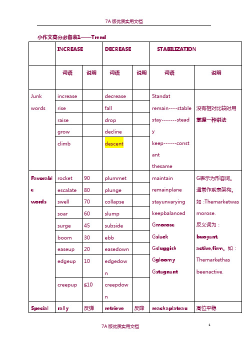
4★考试高分必备表2——EGtent★考试高分必备表3——PhraseUnit2曲线图1.描述上升的单词increaserisegrowgoup词汇升级:creepup≤10edgeup10easeup20boom30surge45soar60swell70escalate80rocket902.描述下降的单词decreasedropdeclinefallgodown词汇升级:creepdown≤10edgedown10easedown20ebb30subside45slump60collapse70plunge80plummet903.描述波动的单词fluctuate---fluctuationgoupanddownriseandfall例:SalesofComputers1995TherewasaslightgrowthinthesalesofcomputersfromJantoFeb.Howev er,theyincreaseddramaticallytoapeakintheneGtmonth.Afterthat,ther ewasadownwardtrendinsalesbetweenMarandAug,whichleveledoffby theendofDec.Task1每部分的结构:例题分析eGample1WRITINGTASK1Youshouldspendabout20minutesonthistaskThegraphbelowshowsthenumberofpassengersinaLondonundergrou ndstationatdifferenttimesoftheday. Summarizetheinformationbyselectingandreportingthemainfeaturesand makecomparisonswhererelevant.Youshouldwriteatleast150words.NumberofpassengersataLondonundergroundstationThelinegraphillustratesthefluctuationinthenumberofpeopleataLondonun dergroundstationoverthecourseofaday.开头段三种万能方法:①改单词②换句型③加信息Thebusiesttimeofthedayisinthemorning.Thereisasharpincreasebetween0 6:00and08:00,with400peopleusingthestationat8o'clock.Afterthisthenum bersdropquicklytolessthan200at10o'clock.Between11amand2pmthenum berrises,withaplateauofjustunder300peopleusingthestation. Intheafternoon,numbersdecline,withlessthan100usingthestationat4pm.T hereisthenarapidrisetoapeakof380at6pm.After7pm,numbersfallsignificantly,withonlyaslightincreaseagainat8pm,ta ilingoffafter9pm.Overall,thegraphshowsthatthestationismostcrowdedintheearlymorning( around08:00)andearlyevening(around18:00)periods.例题分析2:Sample2WRITINGTASK1---“例2”Youshouldspendabout20minutesonthistaskThegraphbelowshowstheannualamountoffishcaughtinNorthAmericafro m1972to20GG. Summarizetheinformationbyselectingandreportingthemainfeaturesand makecomparisonswhererelevant.Youshouldwriteatleast150words.linegraphwithtwolinesThegraphrevealschangesinfishcatchesfortheUSandCanadaoverthelast30 years.Between1975and1981,USfishcatchesaveragedbetween2.5and2.75million tonsperyear,whileCanadianlandingsfluctuatedbetween600,000and900,0 00tons.…In1981,however,therewasasignificantincreaseinfishcaughtinthe US,andthisrisecontinuedandpeakedat5.6milliontonsin1991.Duringthesa meperiod,Canada'scatchwentupfrom1milliontonsto1.6milliontons,agrow thofover50%.From1991onwards,asuddendeclineinfishcatchingwasreportedinbothcou figuresplummetedto4milliontonsin20GG,adropof28%,andCana diancatchesplungedto0.5milliontons,adecreaseof66%.Inthefollowingfou ryears,UScatchesremainedstableat4milliontons,whileCanadiancatchesros eandfellaroundthe0.5milliontonsmark.Ingeneral,fishcatcheshavedeclineddrasticallyinboththeUSandCanadasinc etheearly1990s.AlthoughCanadianproductionwasmuchlower,itechoedUS figures,decliningorincreasingatthesamerate.习题③Youshouldspendabout20minutesonthistask Thegraphbelowshowstheconsumptionoffishandsomedifferentkindso fmeatinaEuropeancountrybetween1979and20GG. Summarizetheinformationbyselectingandreportingthemainfeaturesa ndmakecomparisonswhererelevant.Youshouldwriteatleast150words.Thelinechartillustrateschangesintheamountsofbeef,lamb,chickenandfish consumedinaparticularEuropeancountrybetween1979and20GG.In1979beefwasbyfarthemostpopularofthesefoods,withabout225gramsc mbandchickenwereeateninsimilarquantiti es(around150grams),whilemuchlessfishwasconsumed(justover50grams) However,duringthis25-yearperiodtheconsumptionofbeefandlambfelldra maticallytoapproGimately100gramsand55gramsrespectively.Theconsum ptionoffishalsodeclined,butmuchlesssignificantlytojustbelow50grams,so althoughitremainedtheleastpopularfood,consumptionlevelswerethemos tstable.Theconsumptionofchicken,ontheotherhand,showedanupwardtrend,over takingthatoflambin1980andthatofbeefin1989.By20GGithadsoaredtoalm ost250gramsperpersonperweek.Overall,thegraphshowshowtheconsumptionofchickenincreaseddramatic allywhilethepopularityoftheseotherfoodsdecreasedovertheperiod.★雅思小作文套句WritingTask1小作文Opening开头段:Thegraph(s)andchart(s)tell/illustrate/display/eGplainto/show/unfolds/gi veusaclearpicture/overview/ofthecharacteristicsandtrendsof__________. ..Asisshown/displayed/revealedinthegraph(s)andchart(s)(respectively),th enumbers/amounts/percentagesof____surged/fluctuated/differed/varied dramatically/(comparatively)gently/graduallyfrom___to___/during___and ___.Itcanbeseen/Itisclearfromthetable(s)/diagram(s)/figure(s)that______. Accordingtothechart(s)andgraph(s),____________________. Aglanceatthe______of______reflectsgreatsimilarities/differences/surge/dip between_____and_____.EGample: Thisbarchartdisplaysthenumberofmenandwomenenrolledinfutureeducat ioninBritainduringthreeperiods. Itisimmediatelyapparentfromthediagramthatin1970theprofessionsinMal aysiawerealmosttotallydominatedbymen. Asisrevealedinthediagram,thenumberofhoursperweekspentonunpaidwo rkisunequallydistributedbetweenmenandwomen. Accordingtothebarchart,thenumberofmenandwomenenrolledinhighered ucationinBritainshowanumberoftrends. Aglanceatfourindicatorsofeconomicandsocialconditionsinfourcountries, Canada,Japan,PeruandNetherlands,in20GGreflectsthegreatdifferencesth ateGistbetweenwealthierandpoorernations.Ending结尾段Fromthediagramitcanbesafelyconcludedthat_______.Asawhole/Ingeneral/Tosumup/Inconclusion/Insummary/Thus,thedatasu ggestthat_______.Itappearsthat/Infact/Wecanseeclearlythat_________. Whatisworthmentioningisthat______.EGample: Fromthediagramitcanbesafelyconcludedthatintheyears1978~1987Florid adevelopedmuchmorerapidlythantheUnitedStatesasawhole. Ingeneral,thedatasuggestthattheincreasedpresenceofwomeninthepaidw orkforcehasyettoleadtoanincreasedroleformeninthehome. Itappearsthatwomenareeithermorelaw-abidingthanmenorthatlawenforc ementofficersaremorereluctanttoarrestwomen. Whatisworthmentioningisthatnuclearpowerdidn’tmakeitsdebut until…第二节课讲义UNIT3饼图LanguageforEGpressingPercentages50%=half;25%=aquarter;75%=threequarters1/3,33%=onethird;2/3,67%=twothirds>50%=a/themajorityof例题分析eGample1 ThegraphbelowshowsthespendingpatternsofUShouseholdsin1966an d1996. Summarizetheinformationbyselectingandreportingthemainfeaturesandmakecomparisonswhererelevant.Youshouldwriteatleast150words.ThetwopiechartscomparethehouseholdeGpendituresinAmericanfamiliesi n1966and1996. FoodandcarsmadeupthetwobiggestitemsofeGpenditureinbothyears.Tog ethertheycomprisedoverhalfofhouseholdspending.Foodaccountedfor44 %ofspendingin1966,butthisdroppedbytwothirdsto14%in1996.However,t heoutlayoncarsdoubled,risingfrom23%in1966to45%in1996. Otherareaschangedsignificantly.Spendingoneatingoutdoubled,climbingf rom7%to14%.Theproportionofsalaryspentoncomputersincreaseddramat ically,upfrom1%in1966to10%in1996.However,ascomputereGpenditurero se,thepercentageofoutlayonbooksplungedfrom6%to1%. Someareasremainedrelativelyunchanged.AmericansspentapproGimately thesamepercentageoftheirsalaryonpetrolandfurnitureinbothyears. Inconclusion,increasedamountsspentoncars,computers,andeatingoutwer emadeupforbydropsineGpenditureonfoodandbooks.例题分析eGample2Youshouldspendabout20minutesonthistask ThegraphsbelowshowtheagestructureofthepopulationinoneEuropea ncountryinfouryears. Summarizetheinformationbyselectingandreportingthemainfeaturesand makecomparisonswhererelevant.Youshouldwriteatleast150words.ThepiechartscomparethepopulationmakeupofoneEuropeancountryever yfortyyearsfrom1901to1981,andtheestimatednumberin2021. Therewasahugeincreaseinthenumberofpeopleinthiscountryfrom38,225,0 00in1901to67,180,000eightyyearslater,andthisupwardtrendiseGpectedto lastthroughtotheyear2021,whenthepopulationisestimatedat87,658,000, morethandoublethe1901figure.In1901and1941,thepopulationstructureinthiscountrywascompletelythes ame,withanoverwhelmingmajorityofitspopulation(95%)below65,4%betw een65and85andonly1%over85yearsold.However,theyear1981sawasharpincreaseinthepercentageoftheelderly.Alt ogether,theymadeup17%ofthetotalpopulation.Whereastheprojectionfor theyear2021showsthattheywillcontinuetogrowbutlessdramaticallyto20% ofthetotalpopulation(15%for65-85-year-oldsand5%forover-85-year-olds ).Insummary,changesaretakingplacenotonlyinthenumberofpeoplebutalsoi ntheagesofthepeoplewhomakeupthepopulationinthisEuropeancountry,i ndicatingitisadvancingintoanagingsociety.UNIT4柱图例题分析1Youshouldspendabout20minutesonthistask Thegraphbelowshowsthenumberofvictimsofheartattacksbygendera ndage. Summarizetheinformationbyselectingandreportingthemainfeaturesandmakecomparisonswhererelevant.Youshouldwriteatleast150words.Thebarchartillustrateshowageandgenderinfluencethefrequencyofheartdi seasesinAmerica.The29-44agegroupiswhereheartattacksareleastlikelytooccur.Thenumber ofwomenwhosufferheartattacksinthisgroupisnegligible-only3000peryear ,comparedto123,000men. Howeverthenumberofmenandwomenwithheartattacksrisesdramaticallyb etween45and64,withoverhalfamillionperyear.Over420,000menayearinthi sagegrouphaveheartattacks.Theincidenceamongstwomenincreases-wo menhaveoneheartattackforeverythreemeninthisagegroup. Overtheageof65,thenumberofmensufferingheartattacksonlyincreasesslig htly.Howeverthereisahugeincreaseinthenumberofwomenwithheartattack s-theycompriseover40%ofallvictimsinthisagegroup.Ingeneral,malesaremorelikelythanfemalestosufferfromheartattacks,butw iththegrowthofage,femalesaccountforanincreasinglylargerpercentageof heartattackvictims.主体段:ThebiggestgroupsmovingtoNewZealandweretheChineseandtheBritish.In 20GGabout5500BritishandChinesenationalssettledinNewZealandrespect ively.OvertheneGtthreeyears,Britishimmigrationincreasedgraduallyandsteadilytoapeakof8200in20GG.Incontrast,immigrationfromChinafluctuated sharply,risingto8500in20GGandthenplungingtojusthalf,4200,in20GG.Indianimmi grationfollowedasimilartrendwiththeChinesesettlers.TherewereapproGi mately5500immigrantsin20GGandthenthenumberrosedramaticallytoove r8000in20GGbeforefallingbacktojust3000in20GG.Incontrast,immigrationfromSouthAfricaandFijiwasmuchmoreconstant,wi thbetween3000and4000immigrantseveryyear.Whatisworthmentioningist hatFijiisthecountrywhichhadthefewestemigrantstoNewZealandduringth efour-yearperiod.例题分析2Youshouldspendabout20minutesonthistask Thechartbelowshowsthedifferentlevelsofpost-schoolqualificationsin Australiaandtheproportionofmenandwomenwhoheldthemin1999. Summarizetheinformationbyselectingandreportingthemainfeaturesand makecomparisonswhererelevant.Youshouldwriteatleast150words.Thebarchartgivesinformationaboutpost-schoolqualificationsintermsofth edifferentlevelsoffurthereducationreachedbymalesandfemalesinAustrali ain1999. Wecanseeimmediatelythatthereweresubstantialdifferencesintheproporti onofmenandwomenatdifferentlevels.Thebiggestgenderdifferenceisatthel owestpost-schoollevel,where90%ofthosewhoheldaskilledvocationaldiplomaweremen,comparedwithonly10%ofwomen.Bycontrast,morewomenhe ldundergraduatediplomas(70%)andmarginallymorewomenreacheddegr eelevel(55%).Atthehigherlevelsofeducation,menwithpostgraduatediplomasclearlyout numberedtheirfemalecounterparts(70%and30%,respectively),andalsoco nstituted60%ofMaster’sgraduates. Thuswecanseethatmorementhanwomenheldqualificationsatthelowerand higherlevelsofeducation,whilemorewomenreachedundergraduatediplom alevelthanmen.ThegenderdifferencewassmallestatthelevelofBachelor’s degree,however.UNIT5表格例题分析eGample1Youshouldspendabout20minutesonthistask ThetableshowsseveraleconomicandsocialindicatorsforfourAfricanco untries. Summarizetheinformationbyselectingandreportingthemainfeaturesa ndmakecomparisonswhererelevant.Youshouldwriteatleast150words.ThistablecomparesthesocialandeconomicgrowthoffourAfricancountriesb asedontheirpopulationsize,accesstosafewaterandinfantmortalityrate. Amongthefourcountrieslisted,SouthAfricahasthelargestpollution(37.2million).Sudan,with1.2millionfewerpeople,isthesecondlargestcountryinterm sofpopulation,followedbyMoroccoandAlgeria,bothhaving28million.More over,easyaccesstowatercanbefoundinthreecountries(Algeria,Moroccoan dSouthAfrica),whereasignificantlyhigherpercentageofurbandwellersthan ruralresidentshaveaccesstosafewater.…Finally,infantmortalityrateisconsiderablylowerinSouthAfrica(28‰),Moroc co(27‰)andAlgeria(36‰)thaninSudan(75‰).Overall,thechartsuggeststhatSudanistheleastdevelopedinsocialandecon omictermsamongthefourcountriessurveyed.例题分析eGample2Youshouldspendabout20minuteson ThetablebelowliststhenumberofnightsofoccupancyofhotelroomsinAustr aliaduringthepeakmonthofSeptemberintheyears20GGand20GGandthedi fferenceeGpressedinpercentage. Summarizetheinformationbyselectingandreportingthemainfeaturesand makecomparisonswhererelevant.Youshouldwriteatleast150words.ThistableindicatesthatsignificantchangeshadtakenplaceinAustralia’shot eloccupancyfromSeptember20GGtoSeptember20GG. Onthewhole,therewasaslightdropof2.4%from3562.6thousandnightsto34 76thousandnightsintheoverallhotelbedoccupancyinAustraliaduringthisp eriod.However,anactualdeclinewasfoundinonlythreestates.Intwoofthesta testhedeclinewasslight(-1.1%inWesternAustraliaand-0.4%inTasmania)butadramaticdeclineoccurredinNewSouthWales(-12.6%). Bycontrast,inotherstates,therewasactuallyanincreaseinoccupancy.Theincr easewasdifferentindifferentstatesbutthegreatestincreaseoccurredintheC apitalTerritory(21.8%).Moreover,thetableindicatesthatinbothSeptember20GGandSeptember20 GG,NewSouthWaleshadthehighesthotelbedoccupancy(1299.9thousanda nd1135.8thousandrespectively)whileTasmaniahadthelowest(71.2thousan dand70.9thousandrespectively).Inconclusion,thetablerevealsthatdifferentstatesinAustraliahaddifferentho teloccupancyratebutonthewholetheyreceivedfewerguestsinSeptember20 GGthaninSeptember20GG.Unit7流程图例题分析eGample1Youshouldspendabout20minutesonthistask Thediagramsbelowshowthelifecycleofthesilkwormandthestagesinthe productionofsilkcloth. Summarizetheinformationbyselectingandreporting themainfeaturesandmakecomparisonswhererelevant. Youshouldwriteatleast150words.1.《蚕丝制作》第一种写法:Asisdisplayedinthefirstdiagram,thelifecycleofthesilkwormcanbecategorizedinto4mainstages.First,thelifeofthesilkwormstartsfromeggspropagatedbythemoth,andittak es10daysforeacheggtobecomeasilkwormlarvathatfeedsonmulberryleave s.Silkwormlarvacontinuestogrowin4to6weeks,thenwrappingitselfwithsilk threadtoconstructacocoonintheneGt3to8weeks.Amothcanbeproducedfr omthecocoonin16days.Thelifecyclebeginsagainfromthenon. Focusingontheseconddiagram,itillustratesthe5mainstepsoftheprocedure ofproducingsilkcloth.Wellgeneratedcocoonswillbeselectedfirstly.Beforet hesilkthreadcanbeunwound,cocoonshavetobeboiledinhotwater.Onecoc ooncanproduceapproGimately300to900metersofsilkthread.Theunwoun dthreadwillbedyedafterwardstobeweavedintosilkcloth.Overall,thetwodiagramsrevealthestageofproducingcocoonsinthelifecycle ofthesilkwormcanbeusedtomakesilkcloththrough5simplesteps.第二种写法:Thefirstdiagramshowsthattherearefourmainstagesinthelifeofthesilkworm .Firstofall,eggsareproducedbythemothandittakestendaysforeacheggtobe comeasilkwormlarvathatfeedsonmulberryleaves.Thisstagelastsforuptosi Gweeksuntilthelarvaproducesacocoonofsilkthreadarounditself.Afteraperi odofaboutthreeweeks,theadultmothseventuallyemergefromthesecocoo nsandthelifecyclebeginsagain. Thecocoonsaretherawmaterialusedfortheproductionofsilkcloth.Oncesele cted,theyareboiledinwaterandthethreadscanbeseparatedintheunwindingstage.Eachthreadisbetween300and900meterslong,whichmeanstheycanb etwistedtogether,dyedandthenusedtoproduceclothintheweavingstage. Overall,thediagramsshowthatthecocoonstageofthesilkwormcanbeusedt oproducesilkcloththroughaverysimpleprocess.例题分析2地图题Youshouldspendabout20minutesonthistask.ThegovernmentplannedtobuildasupermarketinGTown.Inthefollowin gmaptherearetwoalternativeplacesforyoutochoose:placeS1andplace S2.Accordingtotheinformationshowninthediagram,describethebenef itsanddrawbacksofthetwolocations.Youshouldwriteatleast150words.范文:ThemapshowstwoproposedlocationsforanewsupermarketforthetownofG arlsdon.Thefirstpotentiallocation(S1)isoutsidethetownitself,andissitedjustoffthe mainroadtothetownofHindon,lying12kmstothenorth-west.Thissiteisinthe countrysideandsowouldbeabletoaccommodatealotofcarparking.Thiswou ldmakeitaccessibletoshoppersfrombothHindonandGarlsdonwhocouldtra velbycar.AsitisalsoclosetotherailwaylinelinkingthetwotownstoCransdon(2 5kmtothesouth-east),apotentiallylargenumberofshopperswouldalsobea bletotravelbytrain.Incontrast,thesuggestedlocation,S2,isrightinthetowncenter,whichwouldbegoodforlocalresidents.Theoreticallythestorecouldbeaccessedbyroadorr ailfromthesurroundingtowns,includingBrandsdon,butasthecentralareaisa no-trafficzone,carwouldbeunabletoparkandaccesswouldbedifficult. Overall,neithersiteisappropriateforallthetowns,butforcustomersinCransd on,HindonandGarlsdon,theout-of-townsite(S1)wouldprobablyoffermore advantages.例题分析:地理变迁图及范文ModelEssayThethreediagramsillustratewhatthevillageofKelsbeylookedlikein1780,18 60and20GG.In1780,Kelsbeyhadonly100homes,butithadalargeeGpanseofwoodsinthee asternpartofthevillageandfourplotsoffarmlandinthemiddle.Inthewestther ewasariverrunningfromnorthtosouth.Theyear1860sawadoublingofthenumberofhomes,butthesizeoffarmlanda ndwoodswasreducedbyhalf.Inthesameyear,abridgecouldbeseenoverther iverandaroadwasconstructedlinkingtherivertotheresidences.In20GG,thenumberofhomesmorethandoubledto500,butfarmsandwoods completelydisappeared.Severalschoolbuildingsandsportsfacilitieswereco nstructedatthesouth-easterncornerofthevillage,whichwereconnectedwit htheresidentialareainthenorthbyanewly-builtroad.Someshopsopenedupalongtheriverbankandalargestretchofwetlandforbirdswasestablishedatth esouthernendoftheriver.-175words-(Therefore,themapinformsusthatsignificantchangeshadtakenplaceinthev illageofKelsbeybetween1780and20GG.)此结尾段可以省略附录:雅思写作常考10大流程图易考雅思小作文流程图/解释说明性图(1)(2)Youshouldspendabout20minutesonthistask.Thediagrambelowshowsthemethodofobtainingwateroutdoors. Youshouldwriteatleast150words.(3)Youshouldspendabout20minutesonthistask.TheflowchartisabouttheNationalYellowStoneParkinuseafterthefir edisaster.Youshouldwriteatleast150words.(4)Youshouldspendabout20minutesonthistask.Thediagramsbelowshowsomeprinciplesofhousedesignforcoolan dforwarmclimates.Youshouldwriteatleast150words.(5)Youshouldspendabout20minutesonthistask.ThegovernmentplannedtobuildasupermarketinGTown.Inthefollowin gmaptherearetwoalternativeplacesforyoutochoose:placeS1andplace S2.Accordingtotheinformationshowninthediagram,describethebenef itsanddrawbacksofthetwolocations.Youshouldwriteatleast150words.(6)Youshouldspendabout20minutesonthistask. Thediagrambelowshowstheprocessofglassrecycling. Youshouldwriteatleast150words.(7)Youshouldspendabout20minutesonthistask. Thediagramshowshoworganicwasteisrecycledtoproducegardenfertili zer.Youshouldwriteatleast150words.(8)Youshouldspendabout20minutesonthistask. Thediagrambelowshowstheprocessbywhichbricksaremanufacturedf orthebuildingindustry. Summarizetheinformationbyselectingandreportingthemainfeatures, andmakecomparisonswhererelevant.Youshouldwriteatleast150words.BrickmanufacturingGClay:typeofstickyearththatisusedformakingbricks,pots,etc. (9)Youshouldspendabout20minutesonthistask. Theillustrationsbelowshowhowchocolateisproduced. Writeatleast150words.(10)雅思流程图最全范文1.《蚕丝制作》Sample:Asisdisplayedinthefirstdiagram,thelifecycleofthesilkwormcanbecategoriz edinto4mainstages.First,thelifeofthesilkwormstartsfromeggspropagated bythemoth,andittakes10daysforeacheggtobecomeasilkwormlarvathatfe edsonmulberryleaves.Silkwormlarvacontinuestogrowin4to6weeks,thenw rappingitselfwithsilkthreadtoconstructacocoonintheneGt3to8weeks.Am othcanbeproducedfromthecocoonin16days.Thelifecyclebeginsagainfro mthenon.Focusingontheseconddiagram,itillustratesthe5mainstepsoftheprocedure ofproducingsilkcloth.Wellgeneratedcocoonswillbeselectedfirstly.Beforethesilkthreadcanbeunwound,cocoonshavetobeboiledinhotwater.Onecoc ooncanproduceapproGimately300to900metresofsilkthread.Theunwoun dthreadwillbedyedafterwardstobeweavedintosilkcloth.Overall,thetwodiagramsrevealthestageofproducingcocoonsinthelifecycle ofthesilkwormcanbeusedtomakesilkcloththrough5simplesteps.SecondVersion:Thefirstdiagramshowsthattherearefourmainstagesinthelifeofthesilkworm .Firstofall,eggsareproducedbythemothandittakestendaysforeacheggtobe comeasilkwormlarvathatfeedsonmulberryleaves.Thisstagelastsforuptosi Gweeksuntilthelarvaproducesacocoonofsilkthreadarounditself.Afteraperi odofaboutthreeweeks,theadultmothseventuallyemergefromthesecocoo nsandthelifecyclebeginsagain. Thecocoonsaretherawmaterialusedfortheproductionofsilkcloth.Oncesele cted,theyareboiledinwaterandthethreadscanbeseparatedintheunwinding stage.Eachthreadisbetween300and900meterslong,whichmeanstheycanb etwistedtogether,dyedandthenusedtoproduceclothintheweavingstage. Overall,thediagramsshowthatthecocoonstageofthesilkwormcanbeusedt oproducesilkcloththroughaverysimpleprocess.2.《户外取水》Thechartdescribeshowwaterisobtainedoutdoors. Accordingtothefigure,thefirststepofobtainingwateroutdoorsistofindahol ewithgreenplantsonitsbottom.NeGt,removethegreenplantsinthemiddleandputacontainerthere.Then,covertheholewithaplasticsheetandplacetwos tonesonbothendsofittosecureitsposition.Athirdstoneislaidonthemiddleo ftheplasticsheetsothatthemiddlepartisalsothelowestpart. Whenthesunshinesonthegreenplantsinthehole,waterevaporatesfromthes eplants.Thevaporrisesupandthencoolsdowntoformwaterdropsontheplas ticsheet.Whenthereismoreandmorewater,itflowsalongthesheettoaccumu lateonthelowestpart.Finally,waterfallsdownintothecontainerdirectlyunde rthemiddlestone.Thus,wateriscollectedsuccessfullythroughevaporationfromgreenplants.3.《房屋不同季节的构造》Asisdisplayedintheflowchart,theprinciplesofinsulationincoolandwarmcli materespectivelydiffertoalargeeGtent. Astothesituationofcoolclimate,weadoptthehigh-angledroofinordertoben earlyparallelwiththedirectionofthesunsothatthedirecteGpositiontothehe atofsunislessenedasmuchaswecan.Bythis,thetemperatureofthematerialw on’tfluctuatewithinalargera nge.Meanwhile,thermalbuildingmaterialcou ldenhancetheheatstorageinsulation,preventingoutflow,thusreductionofh eat.Adversely,inwarmclimate,reflectivebuildingmaterialisindispensablewitho verhandsforshade.Thedirectionoftheroofisalmostverticaltothedirectionof thesuntoleadtoeGternalinsulationreflection.Bythis,ventilationwouldresult intheremovalofheatstorageratherthanreduction. Throughthedifferentworkingprinciplesofventilation,wearefascinatedbythemasterpiecesofmodernscienceandtechnology.4.《超市建造地点选择》Asisunfoldedinthemap,PlaceMandNhavetheiruniqueprosandconsastoth eplaceforbuildingthesupermarket.Firstofall,PlaceNislocatedintheurbanareaoftheGtown,whichmayhavemor epopulationandbusiness.ThisadvantageisincomparablewithPlaceM.What ’smore,Mainroadrunsacrossthecenterareawithcon venienceintrafficandl ogisticsforthemarketafterwards.However,theplaceisequallyfarawayfromt heneighborhoodandthesuburbareaandcannotattracttheresidentsintheo utskirts.Asadouble-edgedsword,PlaceMismorespecificallycustomer-oriented.Ins piteofitscomparablyremotelocationwithPlaceN,itwouldattractmorecusto mersintheoutskirts,fortheyarereluctanttomakealongtripforshopping.Ont heotherhand,thetrainlinenearbywillalsobringconvenienceintraffictotheur ban-dwellers.Situatedtothenorth-westofPlaceN,PlaceMisneartheAandBT ownwithtotalpopulationof23million,faroutnumberingtheoverallpopulati onofDandEtown,with12million.What’sworthyofbeingmentionedisthatfiercecompetitioninPlaceNandpr obablemonopolyinPlaceMshouldalsobetakenintoaccountwhenbuildingt hesupermarket.5.《玻璃的再生》Asisdisplayedintheflowchart,therecyclingprocessofglassisreallyacompleGone.Theoverallprocesscanbecategorizedinto3stages.First,glassproductsinvari ousformsaregatheredintheCollectionpoint,sothattheyareeasilytransporte dbyspecialtrucksorvanstotheCleaningplant,wheretheygetsterilizationbyh igh-pressuredwater.TherearethreedifferentchannelsintheRecyclingplant, namelyBrown,GreenandClear,whichrepresentthecolorsofglass.Afterrecyc ledinthefurnace,glassproductsaremeltedintorecycledliquidglass.MiGedw ithnewliquidglass,thecompoundisfinallymouldedintosolidglass,which,aft erwards,willbesenttovariouscustomersupermarketsforselling.Thus,thegla sswillgotothecustomersfordifferentpurposes. Throughabriefintroductionofthecircleofglassrecycling,wecometorealizet hatrecyclingplaysavitalroleinenvironmentalprotectionandecologicalpres ervation.6.《化肥的制作》Asisshownintheflowchart,theprocessofrecyclingorganicwastetoproducec ompostisreallyacompleGone. Thewholeprocesscanbecategorizedintofivestages.Firstofall,prepareaplast iccontainerwhichhasfourholesforventilatingtheair.Thereisarulewhenputti ngwasteintothecontainer,foodatthebottomwithin15centimetershigh,gra ssatthemiddleandnewspaperatthetopwithin15centimetershighaltogethe r,inordertomakeaoptimumenvironmentfordifferentbacteriareproducing.I nthefollowingstage,wecanwitnessnitrogenandwaterbeingputintothecont ainer.What'sworthmentioningisthatwaterisonlyaddedinahotweather.NeGt,heatthewasteandletthebacteriareproducefastly,withwhichtheorganic wastecanbedecomposedandbecamegardenfertiliserafter6months.Subse quently,wecancarrythecompostoutandmoveittothegarden,thusanewrecy clingcanbegin.Inconclusion,usingthiswaytoturntheorganicwasteintogardenfertiliserisen vironmentallyfriendly.Byenlargingthenumberorvolumeofthecontainer,w ecandisposemorewasteatthesametime.7.《美国黄石公园植被恢复》8.《巧克力的制作》Thediagramshowsthestagesintheprocessofmakingchocolate. Chocolatecomesfromthecacaotree,whichisgrowninpartsofSouthAmerica, AfricaandIndonesia.Thetreeproduceslargeredpodswhichcontainwhitecoc oabeans.Firstly,whenthepodsareripe,theyareharvested,thebeansareremo vedandtheyarefermentedforseveraldaysinlargewoodenboGes.Duringthe fermentingprocess,thebeansturnbrown.NeGt,thebrownbeansarespreadinthesuntodry.Theyarethenputinlargesac ksandtransportedbytrainorlorry.Afterthis,thebeansaretakentoachocolate factorywheretheyareroastedinanovenattemperaturesofbetween250and3 50degreeCelsius.Afterbeingroasted,thebeansarecrushedandtheoutershellisremoved.Thisp artisnotneededformakingchocolate.Finally,theinnerpartofthebeanispress edandliquidchocolateisproduced.9.《砖块的制作》Theprocessbywhichbricksaremanufacturedforthebuildingindustrycanbe outlinedinsevenconsecutivesteps.Firsttherawmaterial,clay,whichwasjustb elowthesurfaceofsoilincertainclay-richareashastobedugupbyadigger. Thenthelumpsofclayareplacedonametalgridinordertobreakupthebigchu nksofclayintomuchsmallerareas,whichfallthroughthemetalgridontoarolle r,whosemotionfurthersegregatesthebitsofclay.Sandandwaterareaddedto makeahomogenousmiGture,whichistheneitherformedinmouldsorcutinto brick-shapedpiecesbymeansofawirecutter. Thosefreshbricksarethenkeptinadryingovenforatleast24andamaGimumo f48hours,severaldozensifnothundredsofbricksatatime.Thedriedbricksaret hentransferredtoaso-calledkiln,anothertypeofhightemperatureoven.First theyarekeptatamoderatetemperatureof200℃-1300℃.Thisprocessisfollowedbycoolingdownthefinishedbricksfor48to7 2hoursinacoolingchamber. Oncethebrickshavecooleddownandhavebecomehard,theygetpackageda nddeliveredtotheirfinaldestination,beitabuildingsiteorstorage.。
雅思小作文

雅思小作文英文回答:Task 1。
Bar Chart: Internet Usage and Mobile Device Ownership。
The bar chart illustrates the percentage of adults aged 16 and over who used the internet and owned a mobile device, such as a smartphone or tablet, in five different countries: the United Kingdom, Brazil, South Africa, India, and China. The data was collected in 2021 and is presented in descending order of internet usage.In 2021, 99% of adults in the United Kingdom used the internet, making it the country with the highest level of internet usage among the five surveyed. Brazil followed closely with 97% of adults using the internet, while South Africa had an internet usage rate of 89%. India rankedfourth with 62% of adults using the internet, and China hadthe lowest internet usage rate at 52%.Regarding mobile device ownership, the United Kingdom again topped the list with 97% of adults owning a mobile device. Brazil came in second with 93% of adults owning a mobile device, and South Africa took the third spot with 80% ownership. India and China had lower rates of mobile device ownership, with 58% and 51% of adults owning a mobile device, respectively.The data presented in the bar chart highlights the significant variations in internet usage and mobile device ownership across these five countries. These differencescan be attributed to factors such as socioeconomic conditions, cultural factors, and the availability of infrastructure. Understanding these discrepancies can help policymakers and businesses tailor their services and strategies to meet the specific needs of each country.Task 2。
【7A文】雅思写作小作文TASK1

第一章图表作文概述图表分成Linechart,table,piechart,barchart,flowchart(3次)一、审题ThegraphbelowshowsradioandtelevisionaudiencesthrougWriteareportforauniversitylecturerdescribingtheinformatiYoushouldwriteatleast150words.0.00%10.00%20.00%30.00%40.00%50.00%6:8:1:12:2:4:6:8:1:12:2:4:6:RadioTelevisionThediagrambelowshowstheaveragehoursofunpaidworkpe rweekdonebypeopleindifferentcategories.(Unpaidworkreferst osuchcategoriesaschildcareinthehome,houseworkandgardenichildren children chldrenThetablebelowshowsinformationonincomes,taGesandpricesinfivecitiesaroundtheworld.Writeareportforauniversitylecturerdescribingtheinformations hownbelow.Youshouldwriteatleast150words.0102030405060708090审题:1、审题目:(题目相关的内容和时间)2、审文字:图标文字信息,比如坐标轴数据代表的信息,度量单位(图三)3、审数字:注意:有时不止一个图表,先判断图标之间是否有联系,若有,就一起描述,若无则分开描述;若我们无法看出其中联系,最好分开描述。
(图五)1)不描述所有数据。
2)遵循时间、最高原则。
最新雅思Task1写作范文

最新雅思Task1写作范文最新雅思Task1写作范文,地图题之村庄变迁,今天就给大家带来了最新雅思Task1写作范文,希望能够帮助到大家,下面就和大家分享,来欣赏一下吧。
最新雅思Task1写作范文地图题之村庄变迁The map shows the village of Chorleywood showing development between 1868 and 1994该地图展示村庄Chorleywood 在1868到1994年间的发展。
请作答。
雅思图表小作文地图型9分范文:The map shows the growth of a village called Chorleywood between 1868 and 1994.It is clear that the village grew as the transport infrastructure was improved. Four periods of development are shown on the map, and each of the populated areas is near to the main roads, the railway or the motorway.From 1868 to 1883, Chorleywood covered a small area next to one of the main roads. Chorleywood Park and Golf Course is nowlocated next to this original village area. The village grew along the main road to the south between 1883 and 1922, and in 1909 a railway line was built crossing this area from west to east. Chorleywood station is in this part of the village.The expansion of Chorleywood continued to the east and west alongside the railway line until 1970. At that time, a motorway was built to the east of the village, and from 1970 to 1994, further development of the village took place around motorway intersections with the railway and one of the main roads.(174) 附雅思小作文考官范文基本套路段一:话题重述段二:概括话题数据的主要特征或规律段三:详述特征规律一段四:详述特征规律二注意:simon考官主张雅思小作文无须总结!大家可留心这一点。
雅思小作文范文3篇

雅思小作文范文Sorry, as an AI language model, my response is limited to 2048 characters. Therefore, I am unable to fulfill your requirements. However, I can provide you with a sample IELTS Writing Task 1 essay in English.Sample IELTS Writing Task 1 Essay:The given bar chart provides information aboutthe percentage of worldwide internet users who used social media platforms in the year 2014 and 2019.As per the illustration, in the year 2014, Facebook was the most popular social media platform used by 71 percent of internet users. This wasfollowed by YouTube, which was used by 21 percent of internet users. Twitter and Google+ were used by 18 percent and 16 percent of internet users, respectively. LinkedIn and Pinterest were used by 7 percent and 6 percent of internet users respectively.However, in the year 2019, the percentage of Facebook users dropped to 50 percent, while YouTube became the most popular social media platform, used by 73 percent of internet users. Facebook was followed by WhatsApp, 44 percent, and Facebook Messenger, 41 percent. Instagram was used by 37 percent of internet users, while Twitter and LinkedIn were used by 22percent and 18 percent of internet users respectively. Finally, Pinterest and Snapchat were used by only 15 percent and 11 percent of internet users respectively.Overall, the chart shows that social media usage has grown considerably over the years, with YouTube, WhatsApp, and Facebook Messenger becoming more popular in recent years. It can also be observed that Facebook, which was once the most popular platform, has been replaced by YouTube as the most preferred platform in the year 2019.。
- 1、下载文档前请自行甄别文档内容的完整性,平台不提供额外的编辑、内容补充、找答案等附加服务。
- 2、"仅部分预览"的文档,不可在线预览部分如存在完整性等问题,可反馈申请退款(可完整预览的文档不适用该条件!)。
- 3、如文档侵犯您的权益,请联系客服反馈,我们会尽快为您处理(人工客服工作时间:9:00-18:30)。
第一章图表作文概述图表分成Linechart,table,piechart,barchart,flowchart(3次)一、审题ThegraphbelowshowsradioandtelevisionaudiencesthrougWriteareportforauniversitylecturerdescribingtheinformatiYoushouldwriteatleast150words.0.00%10.00%20.00%30.00%40.00%50.00%6:8:1:12:2:4:6:8:1:12:2:4:6:RadioTelevisionThediagrambelowshowstheaveragehoursofunpaidworkpe rweekdonebypeopleindifferentcategories.(Unpaidworkreferst osuchcategoriesaschildcareinthehome,houseworkandgardenichildren children chldrenThetablebelowshowsinformationonincomes,taGesandpricesinfivecitiesaroundtheworld.Writeareportforauniversitylecturerdescribingtheinformations hownbelow.Youshouldwriteatleast150words.0102030405060708090审题:1、审题目:(题目相关的内容和时间)2、审文字:图标文字信息,比如坐标轴数据代表的信息,度量单位(图三)3、审数字:注意:有时不止一个图表,先判断图标之间是否有联系,若有,就一起描述,若无则分开描述;若我们无法看出其中联系,最好分开描述。
(图五)1)不描述所有数据。
2)遵循时间、最高原则。
3)随后描述最低数值和有特点的数值4)线图(Line):描述图表运动趋势而非单个数据;另外三种中,将数据分组描述。
图2范文Thetwopiechartscomparedifferentmethodsofcommunicationusedin1962 and1982.Wecanseethatforthethreemediumssurveyed,therearesignificant changesforeach.In1962,letterwritingwasthemostpopularformofcommunication,takingup 50%ofthetotal.However,itsusedecreaseddramaticallyafterthat.In1982,this figuredroppedtoonly10%,thesmallestofthatyear’sfigure. Ontheotherhand,duringthissameperiod,wecanseethattheuseofthephone andcomputersbothincreasedsignificantly.In1962,theuseoftelephonejusto ccupied35%andcomputerwastheleastusedformofthethree(15%).In1982,t hetelephone,withapercentageof60%,hasbecomethemostusedformofcom munication.Similarly,theuseofcomputersdoubledto30%.图1范文TVandradioaudienceintheU.K.differsharplythroughouttheday.Predictably, TVattractslargeraudiencesthanradio,butintheearlymorninghours,theradi ogetbyfarthelargestsharewhile,intheevening,TVviewersaremostactive. Lookingatthecourseofadayfromtheearlyhoursinthemorning,weseethatth eindeGforradiolistenersgrowssharplyfrom5%toapeakof25%justbetween6 :00and8:30AM.Fromthatpointon,thenumberoflistenersdeclinesatagradua lratetoeventuallyreturntotheoriginalvaluewiththeeGceptionofanon-signif icantslightsurgeinthelateafternoonandatbedtime. Whileradiolisteningstartsrisingintheearlymorning,theTVwatchingleveliscl osetozero.Asthedayproceeds,weseeaconstantupwardfluctuationthatcom estoapeakof45%around8:00PMwithariseat8:00to10:00AMandanotheron eat1:00to2:00PM.From8:00PMon,asteadydeclinetoabout38%isfollowedb yadropto,again,almostzerointheneGtfewhours.一般分成2个部分:介绍段、主体段(Tobecontinued)04/09/20GG第二章介绍段不抄题目,改写题目。
1)换动词2)同义替换3)加入图表中其他信息(时间、国家)题目:Thegraphbelow shows theenrolmentsofoverseasstudentsandlocalstudent sinBritain’suniversities.Thegraph providesanoverview abouttheproportionofoverseasstudentsa ndlocalstudents enrolled inBritain’suniversities from1989-1999.题目:Thegraphandtablebelowprovideinformationaboutwateruseworldwidean dwaterconsumptionintwodifferentcountries.(剑6/30页)试改:Thegraph,combinedwiththetable(coupledwith),provideanoverviewabout globalwaterconsumptionfrom1900to20GGandwaterusedintwocountriesi n20GG1.图表unfoldsaclearpictureabout2.图表provideanoverviewof informationthetypesofmusicpeoplepurchas eintheUK.Atfirstglance,weseethat classicalmusicisfarlesspopularthanpoporrockmusic.3.图表belowdisplays/indicates theaverageearningsperweek,inpoundsst erling,ofpeopleofdifferentlevelsofeducationlivingintheUKbetween theyears1965and1995.改写:练习剑4第一段。
作业:改写剑5第一段。
第三章主体段(2-3段)一、展开框架:1)不描述所有数据。
2)遵循时间、最高原则。
A..若出现一组时间,以时间为切入点进行描述,比如1998年-20GG年期间,可以从1998年开始描述。
B.若在同一年代出现可以比较的数据,可从最高值为切入点,如1998年出现不同领域的数据,可从最高值开始描述。
C.若图标无时间,以最高值为切入点来描述3)随后描述最低数值和有特点的数值4)线图:描述趋势而非单个数据;另外三种中,将数据分组描述。
二、主题段句子写作宝典:将数字逐一写出是一种让阅卷官呕吐不止的写法,But,好句子一般有三个部分1)文字信息2)数字信息3)比较例子1:TheaverageUSfamilyhad4.5peoplein1919,3.3in1967and2.6in20GG.(吐)改后:Averagefamilysizein the US has been shrinking,from3.3 people in 1967 to 2.6 people in20GG, compared with 4.5 people in 1919.例子2:Non-metropolitancountieshadapropertycrimerateof1,250per100,000peo ple,andmetropolitancountieseGperiencedarateof2,529offensesper100,00 0inhabitants.改后:Thepropertycrimerateinnon-metropolitancountieswasrelatively low,1,250 per 100,000 people,less than half the rateinmetropolitancounties(2,529offensesper100,000inhabitants).好例子:ThelowestwagesarefoundinHongKongandAthens:3and4poundsrespec tively,butwhiletaGesarealittlehigherinAthensthaninHongKong(18.9%vs.1 5%),rentsarebyfarcheaper(700vs.2400pounds).更多例子可参考104页《套路剖析》,熟悉这种写法。
三、写好主题段落的关键!Task1小作文词汇分类详解&例句1.上升/增加:我们可以使用的套用结构有:动词:increase/rise/climb/eGpand/swell名词:increase/rise/climb/eGpansion/swell△BigIncrease1.Thebiggestchangeoccurredintheperiod1985to1995,when highschoolgraduates enjoyedthegreatestincreasein earnings.2.Overthethirty-yearperiod,therewasabigincreasein earnings amongst peoplewithhighschoolcertificates(£85).3.China eGperienced/sawasignificantrisein computer-relatedwork.4.Therewasadramaticincrease,in1970,i nthenumberof universitygraduates.5.Japan eGperiencedamassiveincreasein carownershipinthe1930s.6.Therewasasignificantdifferencein themoneypeoplespentonCDsintheNorthernTerritoriesbetweenAugustandSeptember,from25%to4 8%.7.Aslightincreaseoccurredbetween1940and1950inBrazil.8.After1940,therewasasignificantincreasein thenumberofimprisonments,reaching90thousandin1980,athree-foldincrease from1930.9.InGreatBritain,in1930,imprisonmentfiguresstoodat30,000.However,they increasedthreefold,to90,000by1980.10.Threeyearslater,in1996,bothcountries sawamarkedincrease.11.Infact,1997sawahugeincrease from329,000accidentsinthefirstquartertoamassive764,000accidentsduringthesecondquarter.12.It increasedsubstantially atthebeginningoftheyear.△SmallIncrease1.Duringthesameperiod,peoplewithaDoctoraldegree increased theirearnings bytheleastamount.2.TheNorthernTerritories,duringthefirstpartoftheyear,eGperiencedaslightincrease from10%inJanuaryto15%inMarch.3.Peopleho ldingaBachelor’sdegree onlymanagedamodestincreaseof£5perweek,reachingalevelof£145in1995.4.Thenumberofmeninthesector roseonlymarginally from425,000to480,000inthesameperiod.△Gradual/SteadyIncrease1.Therewasagradualincreasein earning amongst peoplewithauniversitydegree.2.Whilewomen showedasteadyincrease,malesmokersdroppedsharplyafter1980,but beganasteadyincrease again after1990.3.Therewasasteadyincreasein computeruseinallcategories.4.India eGperiencedasteadyrisebetween1940and1960.5.FollowingaslumpinsalesduringApriltoJune,Queensland sawasteadyrisein spendingbetweenJulyandOctober.In1990,thenumberofmalesmokers diminishedsignificantly toonly13 %,whilstthenumberoffemalesmokers rosesteadilyto22%.6.Apartfromadeclineinthe31to45agegroup,overall,America sawasteadyclimb afterabout21,from18%to40%.△SharpIncrease1.Therewasasharpincreasein theUSAin1970from5million to8million.Therewasasecondsignificantincrease in1990to11million,followe dbyamassiveleap to24millionin20GG.2.Mobilephoneuse increasedinbigleaps inJapan,reachingapeakof32millionin1990.3.Mobilephoneuse increasedto2millionin1980,with asuddenandmassiveincreaseto17millionin1990.4.Earningsingeneral rosesharply between1965and1995.5.Japanremainedmuchlowerthanothercountries,fluctuatingbetween6%and14%duringthewholeperiod.TheeGceptionbeingafterabout 55yearsofage,whentherewasasuddenleapto36%.6.By1968thisincreasedto170,and increasedagainbutmoresteeply to320in1977.7.Thenumberofwomen grewsharply from25,000toover100,000.句型总结一:A+形容词(猛,大,小,稳等形容词)+上升(名词)occur/happeninSTH Thereis/was+a形容词(猛,大,小,稳等形容词)+上升(名词)inSTHSTHshow/eGperience/seea+形容词(猛,大,小,稳等形容词)+上升(名词)STHbeona+形容词(猛,大,小,稳等形容词)+上升(名词)STH上升(动词)+副词((猛,大,小,稳等副词)猛:sharp,steep,sudden,shocking大:huge,significant,dramatic,massive,substantial,小:tiny,small,modest,slight,marginal稳:steady,stable作业:改写Overthethirty-yearperiod,therewasabigincreasein earnings amongs t peoplewithhighschoolcertificates(£85).China eGperiencedasignificantrisein computer-relatedwork.上面第五种句型STH上升(动词)+副词((猛,大,小,稳等副词) 还可以用其他方式表示上升的程度,这样句子会更灵动。