WPF实现炫酷Loading控件
WPF漂亮的窗体样式、按钮样式、复选框样式
WPF漂亮的窗体样式、按钮样式、复选框样式<!--窗体样式--><ControlTemplate x:Key="WindowTemplateKey" TargetType="{x:Type Window}"><Border Background="{TemplateBinding Background}" BorderBrush="{TemplateBinding BorderBrush}" BorderThickness="{TemplateBinding BorderThickness}"><Grid><AdornerDecorator><ContentPresenter/></AdornerDecorator><ResizeGrip x:Name="WindowResizeGrip" HorizontalAlignment="Right" VerticalAlignment="Bottom" IsTabStop="false" Visibility="Collapsed"/></Grid></Border><ControlTemplate.Triggers><MultiTrigger><MultiTrigger.Conditions><Condition Property="ResizeMode" Value="CanResizeWithGrip"/><Condition Property="WindowState" Value="Normal"/></MultiTrigger.Conditions><Setter Property="Visibility" TargetName="WindowResizeGrip" Value="Visible"/></MultiTrigger></ControlTemplate.Triggers></ControlTemplate><ControlTemplate x:Key="WindowControlRectangleTemplate" TargetType="{x:Type Window}"><Border Background="{TemplateBinding Background}" BorderThickness="1,1,1,1" CornerRadius="0,0,0,0" ><Border.BorderBrush><ImageBrush ImageSource="/Controls;component\Images\bgtop.png"></ImageBrush></Border.BorderBrush><Grid Width="Auto" Height="Auto" VerticalAlignment="Stretch"><Grid.ColumnDefinitions><ColumnDefinition Width="*"/></Grid.ColumnDefinitions><Grid.RowDefinitions><RowDefinition Height="25"/><RowDefinition/></Grid.RowDefinitions><Border x:Name="topborder" Margin="0" Grid.Column="0" BorderBrush="{x:Null}" BorderThickness="0" CornerRadius="0,0,0,0" Grid.ColumnSpan="1"><Border.Background><ImageBrush ImageSource="/Controls;component/images/bgtop.png"></ImageBrush></Border.Background><Grid HorizontalAlignment="Stretch" Margin="0" VerticalAlignment="Stretch" Width="Auto" Height="Auto"><Grid.ColumnDefinitions><ColumnDefinition Width="9.27"/><ColumnDefinition Width="137.397"/><ColumnDefinition/><ColumnDefinition Width="28.207"/><ColumnDefinition Width="0"/><ColumnDefinition Width="27.398"/><ColumnDefinition Width="7.586"/></Grid.ColumnDefinitions><TextBlock Margin="0,0,0,-8" Name="txtTile" Grid.Column="1" HorizontalAlignment="Left" VerticalAlignment="Center" FontFamily="微软雅⿊" Height="25" Width="122" FontSize="12" Foreground="White"/><Button x:Name="btnMin" HorizontalAlignment="Center" VerticalAlignment="Center" Margin="2.668,2.795,2.777,3.776" Content="-" Style="{StaticResource ButtonMini}" Height="25" Width="30" Grid.Column="3" FontWeight= <Button x:Name="btnClose" HorizontalAlignment="Center" VerticalAlignment="Center" Margin="2.668,2.795,1.968,3.776" Content="×" Style="{StaticResource ButtonClose}" Height="25" Width="30" FontWeight="Bold</Grid></Border><Grid Margin="0" Grid.Row="1"><Grid.ColumnDefinitions><ColumnDefinition Width="*"/></Grid.ColumnDefinitions><Grid.RowDefinitions><RowDefinition/></Grid.RowDefinitions><ContentPresenter HorizontalAlignment="Stretch" Margin="0" Width="Auto" Grid.Column="0" Grid.ColumnSpan="1" Grid.RowSpan="1"/></Grid></Grid></Border></ControlTemplate><Style x:Key="WindowRectangleStyle" TargetType="{x:Type Window}"><Setter Property="Foreground" Value="{DynamicResource {x:Static SystemColors.WindowTextBrushKey}}"/><Setter Property="Background" Value="{DynamicResource {x:Static SystemColors.WindowBrushKey}}"/><Setter Property="Template" Value="{StaticResource WindowControlRectangleTemplate}"/><Style.Triggers><Trigger Property="ResizeMode" Value="CanResizeWithGrip"><Setter Property="Template" Value="{StaticResource WindowTemplateKey}"/></Trigger></Style.Triggers></Style><!--登录按钮样式--><Style x:Key="ButtonOther" TargetType="{x:Type Button}"><Setter Property="Template"><Setter.Value><ControlTemplate TargetType="{x:Type Button}"><Grid><Grid.ColumnDefinitions><ColumnDefinition x:Name="columnDefinition1" Width="0.982*"/><ColumnDefinition x:Name="columnDefinition" Width="0.018*"/></Grid.ColumnDefinitions><Rectangle x:Name="rectangle" Stroke="{x:Null}" Fill="#dfa854" /><ContentPresenter HorizontalAlignment="{TemplateBinding HorizontalContentAlignment}" RecognizesAccessKey="True" SnapsToDevicePixels="{TemplateBinding SnapsToDevicePixels}" VerticalAlignment="{TemplateBinding V </Grid><ControlTemplate.Triggers><Trigger Property="IsFocused" Value="True"><Setter Property="Stroke" TargetName="rectangle" Value="{x:Null}"/><Setter Property="Fill" TargetName="rectangle" Value="#dfa854"/></Trigger><Trigger Property="IsDefaulted" Value="True"><Setter Property="Fill" TargetName="rectangle" Value="#dfa854"/><Setter Property="Stroke" TargetName="rectangle" Value="{x:Null}"/></Trigger><Trigger Property="IsMouseOver" Value="True"><Setter Property="Stroke" TargetName="rectangle" Value="{x:Null}"/><Setter Property="Fill" TargetName="rectangle" Value="#efbc6e"/></Trigger><Trigger Property="IsPressed" Value="True"><Setter Property="Stroke" TargetName="rectangle" Value="{x:Null}"/><Setter Property="Fill" TargetName="rectangle" Value="#dfa854"/></Trigger><Trigger Property="IsEnabled" Value="False"><Setter Property="Stroke" TargetName="rectangle" Value="{x:Null}"/><Setter Property="Fill" TargetName="rectangle" Value="{x:Null}"/></Trigger></ControlTemplate.Triggers></ControlTemplate></Setter.Value></Setter></Style><!--最⼩化按钮样式--><Style x:Key="ButtonMini" TargetType="{x:Type Button}"><Setter Property="Template"><Setter.Value><ControlTemplate TargetType="{x:Type Button}"><Grid><Grid.ColumnDefinitions><ColumnDefinition x:Name="columnDefinition1" Width="0.982*"/><ColumnDefinition x:Name="columnDefinition" Width="0.018*"/></Grid.ColumnDefinitions><Rectangle x:Name="rectangle" Stroke="{x:Null}" Fill="{x:Null}" /><ContentPresenter HorizontalAlignment="{TemplateBinding HorizontalContentAlignment}" RecognizesAccessKey="True" SnapsToDevicePixels="{TemplateBinding SnapsToDevicePixels}" VerticalAlignment="{TemplateBinding V </Grid><ControlTemplate.Triggers><Trigger Property="IsFocused" Value="True"><Setter Property="Stroke" TargetName="rectangle" Value="{x:Null}"/><Setter Property="Fill" TargetName="rectangle" Value="{x:Null}"/></Trigger><Trigger Property="IsDefaulted" Value="True"><Setter Property="Fill" TargetName="rectangle" Value="#00a1da"/><Setter Property="Stroke" TargetName="rectangle" Value="{x:Null}"/></Trigger><Trigger Property="IsMouseOver" Value="True"><Setter Property="Stroke" TargetName="rectangle" Value="{x:Null}"/><Setter Property="Fill" TargetName="rectangle" Value="#00a1da"/></Trigger><Trigger Property="IsPressed" Value="True"><Setter Property="Stroke" TargetName="rectangle" Value="{x:Null}"/><Setter Property="Fill" TargetName="rectangle" Value="#3e86cc"/><Setter Property="Width" TargetName="columnDefinition" Value="Auto"/><Setter Property="MinWidth" TargetName="columnDefinition" Value="0"/><Setter Property="Width" TargetName="columnDefinition1" Value="*"/></Trigger><Trigger Property="IsEnabled" Value="False"><Setter Property="Stroke" TargetName="rectangle" Value="{x:Null}"/><Setter Property="Fill" TargetName="rectangle" Value="{x:Null}"/></Trigger></ControlTemplate.Triggers></ControlTemplate></Setter.Value></Setter></Style><!--关闭按钮样式--><Style x:Key="ButtonClose" TargetType="{x:Type Button}"><Setter Property="Template"><Setter.Value><ControlTemplate TargetType="{x:Type Button}"><Grid><Grid.ColumnDefinitions><ColumnDefinition x:Name="columnDefinition1" Width="0.982*"/><ColumnDefinition x:Name="columnDefinition" Width="0.018*"/></Grid.ColumnDefinitions><!--RadiusY="2" RadiusX="2"圆⾓属性--><Rectangle x:Name="rectangle" Stroke="{x:Null}" Fill="{x:Null}" Grid.ColumnSpan="1" /><ContentPresenter HorizontalAlignment="{TemplateBinding HorizontalContentAlignment}" RecognizesAccessKey="True" SnapsToDevicePixels="{TemplateBinding SnapsToDevicePixels}" VerticalAlignment="{TemplateBinding V </Grid><ControlTemplate.Triggers><Trigger Property="IsFocused" Value="True"><Setter Property="Stroke" TargetName="rectangle" Value="{x:Null}"/><Setter Property="Fill" TargetName="rectangle" Value="{x:Null}"/></Trigger><Trigger Property="IsDefaulted" Value="True"><Setter Property="Fill" TargetName="rectangle" Value="{x:Null}"/><Setter Property="Stroke" TargetName="rectangle" Value="{x:Null}"/></Trigger><Trigger Property="IsMouseOver" Value="True"><Setter Property="Stroke" TargetName="rectangle" Value="{x:Null}"/><Setter Property="Fill" TargetName="rectangle" Value="#d44027"/></Trigger><Trigger Property="IsPressed" Value="True"><Setter Property="Stroke" TargetName="rectangle" Value="{x:Null}"/><Setter Property="Fill" TargetName="rectangle" Value="#3e86cc"/><Setter Property="Width" TargetName="columnDefinition" Value="Auto"/><Setter Property="MinWidth" TargetName="columnDefinition" Value="0"/><Setter Property="Width" TargetName="columnDefinition1" Value="*"/></Trigger><Trigger Property="IsEnabled" Value="False"><Setter Property="Stroke" TargetName="rectangle" Value="{x:Null}"/><Setter Property="Fill" TargetName="rectangle" Value="{x:Null}"/></Trigger></ControlTemplate.Triggers></ControlTemplate></Setter.Value></Setter></Style><!-- 复选框样式 --><Style TargetType="CheckBox"><Setter Property="Background"><Setter.Value><SolidColorBrush Color="#FFFFBA00"/></Setter.Value></Setter><Setter Property="Foreground" Value="#FF000000"/><Setter Property="HorizontalContentAlignment" Value="Left"/><Setter Property="VerticalContentAlignment" Value="Top"/><Setter Property="Padding" Value="4,1,0,0"/><Setter Property="BorderThickness" Value="1"/><Setter Property="BorderBrush" Value="#dcdcdc"/><Setter Property="Template"><Setter.Value><ControlTemplate TargetType="CheckBox"><Grid><vsm:VisualStateManager.VisualStateGroups><vsm:VisualStateGroup x:Name="CommonStates"><vsm:VisualState x:Name="Normal"/><vsm:VisualState x:Name="MouseOver"><Storyboard><!--<DoubleAnimationUsingKeyFrames Storyboard.TargetName="BackgroundOverlay" Storyboard.TargetProperty="Opacity"><SplineDoubleKeyFrame KeyTime="0" Value="1"/></DoubleAnimationUsingKeyFrames><DoubleAnimationUsingKeyFrames Storyboard.TargetName="BoxMiddleBackground" Storyboard.TargetProperty="Opacity"><SplineDoubleKeyFrame KeyTime="0" Value="1"/></DoubleAnimationUsingKeyFrames>--><ColorAnimationUsingKeyFrames Storyboard.TargetName="BoxMiddle" Storyboard.TargetProperty="(Shape.Fill).(GradientBrush.GradientStops)[3].(GradientStop.Color)"><SplineColorKeyFrame KeyTime="0" Value="#e9e9ef"/></ColorAnimationUsingKeyFrames><ColorAnimationUsingKeyFrames Storyboard.TargetName="BoxMiddle" Storyboard.TargetProperty="(Shape.Fill).(GradientBrush.GradientStops)[2].(GradientStop.Color)"><SplineColorKeyFrame KeyTime="0" Value="#e9e9e9"/></ColorAnimationUsingKeyFrames><ColorAnimationUsingKeyFrames Storyboard.TargetName="BoxMiddle" Storyboard.TargetProperty="(Shape.Fill).(GradientBrush.GradientStops)[1].(GradientStop.Color)"><SplineColorKeyFrame KeyTime="0" Value="#e9e9e9"/></ColorAnimationUsingKeyFrames></Storyboard></vsm:VisualState><vsm:VisualState x:Name="Pressed"><Storyboard><!--<DoubleAnimationUsingKeyFrames Storyboard.TargetName="BackgroundOverlay" Storyboard.TargetProperty="Opacity"><SplineDoubleKeyFrame KeyTime="0" Value="1"/></DoubleAnimationUsingKeyFrames><DoubleAnimationUsingKeyFrames Storyboard.TargetName="BoxMiddleBackground" Storyboard.TargetProperty="Opacity"><SplineDoubleKeyFrame KeyTime="0" Value="1"/></DoubleAnimationUsingKeyFrames>--><ColorAnimationUsingKeyFrames Storyboard.TargetName="BoxMiddle" Storyboard.TargetProperty="(Shape.Fill).(GradientBrush.GradientStops)[3].(GradientStop.Color)"><SplineColorKeyFrame KeyTime="0" Value="#e9e9e9"/></ColorAnimationUsingKeyFrames><ColorAnimationUsingKeyFrames Storyboard.TargetName="BoxMiddle" Storyboard.TargetProperty="(Shape.Fill).(GradientBrush.GradientStops)[2].(GradientStop.Color)"><SplineColorKeyFrame KeyTime="0" Value="#e9e9e9"/></ColorAnimationUsingKeyFrames><ColorAnimationUsingKeyFrames Storyboard.TargetName="BoxMiddle" Storyboard.TargetProperty="(Shape.Fill).(GradientBrush.GradientStops)[1].(GradientStop.Color)"><SplineColorKeyFrame KeyTime="0" Value="#e9e9e9"/></ColorAnimationUsingKeyFrames><ColorAnimationUsingKeyFrames Storyboard.TargetName="BoxMiddle" Storyboard.TargetProperty="(Shape.Fill).(GradientBrush.GradientStops)[0].(GradientStop.Color)"><SplineColorKeyFrame KeyTime="0" Value="#e9e9e9"/></ColorAnimationUsingKeyFrames><!--<DoubleAnimationUsingKeyFrames BeginTime="00:00:00" Duration="00:00:00.0010000" Storyboard.TargetName="grid" Storyboard.TargetProperty="(UIElement.Opacity)"><SplineDoubleKeyFrame KeyTime="00:00:00" Value="0.5"/></DoubleAnimationUsingKeyFrames>--></Storyboard></vsm:VisualState><vsm:VisualState x:Name="Disabled"><Storyboard><DoubleAnimationUsingKeyFrames Storyboard.TargetName="contentPresenter" Storyboard.TargetProperty="(UIElement.Opacity)"><SplineDoubleKeyFrame KeyTime="0" Value=".55"/></DoubleAnimationUsingKeyFrames><DoubleAnimationUsingKeyFrames Storyboard.TargetName="DisabledVisualElement" Storyboard.TargetProperty="(UIElement.Opacity)"><SplineDoubleKeyFrame KeyTime="0" Value="0.55"/></DoubleAnimationUsingKeyFrames></Storyboard></vsm:VisualState></vsm:VisualStateGroup><vsm:VisualStateGroup x:Name="CheckStates"><vsm:VisualState x:Name="Checked"><Storyboard><DoubleAnimationUsingKeyFrames Storyboard.TargetName="CheckIcon" Storyboard.TargetProperty="(UIElement.Opacity)"><SplineDoubleKeyFrame KeyTime="0" Value="1"/></DoubleAnimationUsingKeyFrames></Storyboard></vsm:VisualState><vsm:VisualState x:Name="Unchecked"/><vsm:VisualState x:Name="Indeterminate"><Storyboard><DoubleAnimationUsingKeyFrames Storyboard.TargetName="IndeterminateIcon" Storyboard.TargetProperty="(UIElement.Opacity)"><SplineDoubleKeyFrame KeyTime="0" Value="1"/></DoubleAnimationUsingKeyFrames></Storyboard></vsm:VisualState></vsm:VisualStateGroup><vsm:VisualStateGroup x:Name="FocusStates"><vsm:VisualState x:Name="Focused"><!--<Storyboard><DoubleAnimationUsingKeyFrames Storyboard.TargetName="ContentFocusVisualElement" Storyboard.TargetProperty="Opacity"><SplineDoubleKeyFrame KeyTime="0" Value="1"/></DoubleAnimationUsingKeyFrames></Storyboard>--></vsm:VisualState><vsm:VisualState x:Name="Unfocused"/></vsm:VisualStateGroup></vsm:VisualStateManager.VisualStateGroups><Grid.ColumnDefinitions><ColumnDefinition Width="20"/><ColumnDefinition Width="*"/></Grid.ColumnDefinitions><Grid HorizontalAlignment="Left" VerticalAlignment="Top" x:Name="grid"><Rectangle Height="18" Margin="1" x:Name="Background" Width="18" Stroke="{TemplateBinding BorderBrush}" StrokeThickness="{TemplateBinding BorderThickness}" RadiusX="1" RadiusY="1" Fill="{x:Null}"/><Rectangle Height="18" Margin="1" x:Name="BackgroundOverlay" Width="18" Opacity="0" Fill="{StaticResource NormalBrush}" Stroke="#00000000" StrokeThickness="1" RadiusX="1" RadiusY="1"/><Rectangle Height="14" x:Name="BoxMiddleBackground" Width="14" Fill="{TemplateBinding Background}" Stroke="#00000000" StrokeThickness="1" RadiusX="1" RadiusY="1"/><Rectangle Height="14" x:Name="BoxMiddle" Width="14" StrokeThickness="1" RadiusX="1" RadiusY="1" Stroke="{x:Null}"><Rectangle.Fill><LinearGradientBrush EndPoint="0.64,0.88" StartPoint="0.62,0.15"><GradientStop Color="#FFFFFFFF" Offset="0.013"/><GradientStop Color="#F9FFFFFF" Offset="0.375"/><GradientStop Color="#EAFFFFFF" Offset="0.603"/><GradientStop Color="#D8FFFFFF" Offset="1"/></LinearGradientBrush></Rectangle.Fill></Rectangle><Rectangle Height="14" x:Name="BoxMiddleLine" Width="14" Opacity=".4" Stroke="{TemplateBinding BorderBrush}" StrokeThickness="2" RadiusX="1" RadiusY="1"/><Path Height="14" Margin="1,1,0,1.5" x:Name="CheckIcon" Width="14.5" Opacity="0" Fill="Green" Stretch="Fill" Data="M102.03442,598.79645 L105.22962,597.78918 L106.78825,600.42358 C106.78825,600.42358 108.51028 <!--<Rectangle Height="2" x:Name="IndeterminateIcon" Width="6" Opacity="0" Fill="#FF333333"/><Rectangle Height="14" x:Name="DisabledVisualElement" Width="14" Opacity="0" Fill="#FFFFFFFF" RadiusX="1" RadiusY="1"/>--><!--<Rectangle Height="16" x:Name="ContentFocusVisualElement" Width="16" IsHitTestVisible="false" Opacity="0" Stroke="{StaticResource HighlightBrush}" StrokeThickness="1" RadiusX="2" RadiusY="2"/>--></Grid><ContentPresenter HorizontalAlignment="{TemplateBinding HorizontalContentAlignment}" Margin="{TemplateBinding Padding}" x:Name="contentPresenter" VerticalAlignment="{TemplateBinding VerticalContentAlignment}</Grid></ControlTemplate></Setter.Value></Setter></Style>以上代码是窗体各个控件的样式源码和效果图,简单的样式其实不复杂,但是如果想要界⾯效果惊艳⼀些;就需要使⽤微软的另⼀个⼯具Microsoft Expression Blend 4去画⾃⼰想实现呈现的效果。
四叶花瓣旋转loading代码
四叶花瓣旋转loading代码
四叶花瓣旋转loading是一种常见的加载动画效果,它以四个花瓣旋转的形式展现在用户面前。
这个效果有如下几个特点:首先是简洁明了,四个花瓣的旋转动作非常简单易懂,不会给用户带来困扰;其次是美观大方,四叶花形状的设计给人一种优雅的感觉,增加了用户的审美享受;最后是加载效果明显,旋转的花瓣能够清晰地告诉用户当前页面正在加载中,避免用户的不耐烦。
在实现四叶花瓣旋转loading效果时,我们可以使用HTML和CSS来完成。
首先,我们可以使用div元素来创建一个容器,然后通过CSS设置容器的样式,包括宽度、高度、背景颜色等。
接着,我们可以使用伪元素::before和::after来创建四个花瓣,通过CSS设置它们的样式,包括大小、形状、颜色、动画等。
最后,通过CSS 的@keyframes规则来定义花瓣旋转的动画效果,使其循环播放。
通过以上的步骤,我们就可以实现一个简单的四叶花瓣旋转loading效果。
当用户访问一个需要加载的页面时,页面会展示这个loading效果,告诉用户当前页面正在加载中。
当页面加载完成后,loading效果会消失,用户就可以正常使用页面了。
四叶花瓣旋转loading是一种简洁美观且效果明显的加载动画,它能够增加用户的审美享受,同时也能够有效地告知用户当前页面正在加载中。
在实现时,我们可以使用HTML和CSS来完成,通过设置容器和花瓣的样式,以及定义旋转的动画效果,来实现这个
loading效果。
这个loading效果的实现不仅简单易懂,而且能够有效地提升用户体验。
Winform圆形环绕的Loading动画实现代码
Winform圆形环绕的Loading动画实现代码之前写了⼀个WPF的圆形环绕的Loading动画,现在写⼀个Winform的圆形环绕的Loading动画。
1.新建Winform项⽬,添加⼀个pictureBox控件,命名为:pictureBox;2.引⽤中添加using System.Drawing.Drawing2D;3.Form窗体命名为:Loading,cs全部代码如下:复制代码代码如下:using System;using System.Collections.Generic;using ponentModel;using System.Data;using System.Drawing;using System.Linq;using System.Text;using System.Windows.Forms;using System.Collections;using System.Drawing.Drawing2D;namespace Circle_ProcessBar{public partial class Loading : Form{private int count = -1;private ArrayList images = new ArrayList();public Bitmap[] bitmap = new Bitmap[8];private int _value = 1;private Color _circleColor = Color.Red;private float _circleSize = 0.8f;public Loading(){InitializeComponent();}public Color CircleColor{get { return _circleColor; }set{_circleColor = value;Invalidate();}}public float CircleSize{get { return _circleSize; }set{if (value <= 0.0F)_circleSize = 0.05F;else_circleSize = value > 4.0F ? 4.0F : value;Invalidate();}}public Bitmap DrawCircle(int j)const float angle = 360.0F / 8; Bitmap map = new Bitmap(150, 150); Graphics g = Graphics.FromImage(map);g.TranslateTransform(Width / 2.0F, Height / 2.0F);g.RotateTransform(angle * _value);g.InterpolationMode = InterpolationMode.HighQualityBicubic;g.SmoothingMode = SmoothingMode.AntiAlias;int[] a = new int[8] { 25, 50, 75, 100, 125, 150, 175, 200 };for (int i = 1; i <= 8; i++){int alpha = a[(i + j - 1) % 8];Color drawColor = Color.FromArgb(alpha, _circleColor);using (SolidBrush brush = new SolidBrush(drawColor)){float sizeRate = 3.5F / _circleSize;float size = Width / (6 * sizeRate);float diff = (Width / 10.0F) - size;float x = (Width / 80.0F) + diff;float y = (Height / 80.0F) + diff;g.FillEllipse(brush, x, y, size, size);g.RotateTransform(angle);}}return map;}public void Draw(){for (int j = 0; j < 8; j++){bitmap[7-j] = DrawCircle(j);}}protected override void OnResize(EventArgs e){SetNewSize();base.OnResize(e);}protected override void OnSizeChanged(EventArgs e){SetNewSize();base.OnSizeChanged(e);}private void SetNewSize(){int size = Math.Max(Width, Height);Size = new Size(size, size);}public void set(){for (int i = 0; i < 8; i++){Draw();Bitmap map = new Bitmap((bitmap[i]), new Size(120, 110));images.Add(map);pictureBox.Image = (Image)images[0];pictureBox.Size = pictureBox.Image.Size;}private void pictureBox_Click(object sender, EventArgs e) {this.Visible = false;base.Dispose();}private void Timer_Tick(object sender, EventArgs e){set();count = (count + 1) % 8;pictureBox.Image = (Image)images[count];}private void button1_Click(object sender, EventArgs e){this.Visible = false;base.Dispose();}}}4.效果如图:。
WPF漂亮的现代化控件新ModernWPF界面库
WPF漂亮的现代化控件新 ModernWPF界面库
这是一个在 GitHub 上完全开源的库,有十分漂亮的界面,整个都是 Win10 风,界面部分和默认 UWP 相近
这个库支持了 .NET Framework 4.5 和以上的版本,以及 .NET Core 3.0 和以上的版本,可以在 Windows Vista SP2 和以上的系统运行
界面如下
使用方法简单,从 NuGet 上安装 ModernWpfUI 库,然后打开 App.xaml 添加下面代码
<Application ... xmlns:ui="/2019"> <Application.Resources> <ResourceDictionary> <ResourceDictionary.MergedDictionaries> <ui:ThemeResources /> <ui:XamlControlsResources /> </ResourceDictionary.MergedDictionaries> </ResourceDictionary> </Application.Resources>
</Application>
更多请到 GitHub 的仓库:
Hale Waihona Puke
C#-WPF实现抽屉式风格主题框架源码-使用MaterialDesignThemes实现W。。。

C#-WPF实现抽屉式风格主题框架源码-使⽤MaterialDesignThemes实现W。
使⽤C#-WPF实现抽屉式风格源码,应⽤MaterialDesignThemes实现炫酷漂亮的界⾯效果1.使⽤Nuget安装MaterialDesignThemes2.在App.xaml的<Application.Resources>中的添加以下代码<ResourceDictionary><ResourceDictionary.MergedDictionaries><ResourceDictionary Source="pack://application:,,,/MaterialDesignThemes.Wpf;component/Themes/MaterialDesignTheme.Light.xaml"/><ResourceDictionary Source="pack://application:,,,/MaterialDesignThemes.Wpf;component/Themes/MaterialDesignTheme.Defaults.xaml"/><ResourceDictionary Source="pack://application:,,,/MaterialDesignColors;component/Themes/Recommended/Primary/MaterialDesignColor.Blue.xaml"/><ResourceDictionary Source="pack://application:,,,/MaterialDesignColors;component/Themes/Recommended/Accent/MaterialDesignColor.Indigo.xaml"/></ResourceDictionary.MergedDictionaries></ResourceDictionary>3.界⾯中添加以下代码<Window.Resources><Storyboard x:Key="MenuOpen"><DoubleAnimationUsingKeyFrames Storyboard.TargetProperty="(FrameworkElement.Width)" Storyboard.TargetName="GridMenu"><EasingDoubleKeyFrame KeyTime="0" Value="60"/><EasingDoubleKeyFrame KeyTime="0:0:0.5" Value="200"/></DoubleAnimationUsingKeyFrames></Storyboard><Storyboard x:Key="MenuClose"><DoubleAnimationUsingKeyFrames Storyboard.TargetProperty="(FrameworkElement.Width)" Storyboard.TargetName="GridMenu"><EasingDoubleKeyFrame KeyTime="0" Value="200"/><EasingDoubleKeyFrame KeyTime="0:0:0.5" Value="60"/></DoubleAnimationUsingKeyFrames></Storyboard></Window.Resources><Window.Triggers><EventTrigger RoutedEvent="ButtonBase.Click" SourceName="ButtonOpenMenu"><BeginStoryboard Storyboard="{StaticResource MenuOpen}"/></EventTrigger><EventTrigger RoutedEvent="ButtonBase.Click" SourceName="ButtonCloseMenu"><BeginStoryboard Storyboard="{StaticResource MenuClose}"/></EventTrigger></Window.Triggers><Grid Background="LightGray"><Grid x:Name="GridTitle" Height="50" VerticalAlignment="Top" Background="#FF1368BD" MouseDown="GridTitle_MouseDown" Margin="60,0,0,0"><TextBlock Text="智慧⼯程管理监控系统" HorizontalAlignment="Center" VerticalAlignment="Center" FontSize="22" Foreground="White"/><StackPanel VerticalAlignment="Center" Orientation="Horizontal" HorizontalAlignment="Right"><TextBlock Text="欢迎使⽤" VerticalAlignment="Center" FontSize="14" Foreground="White"/><materialDesign:PopupBox Foreground="White" Margin="10" PlacementMode="BottomAndAlignRightEdges" StaysOpen="False"><StackPanel Width="150"><Button Content="账号"/><Button Content="设置"/><Button Content="帮助"/><Separator/><Button Content="最⼩化"/><Button Content="最⼤化"/><Button x:Name="ButtonPopUpLogout" Content="退出" Click="ButtonPopUpLogout_Click"/></StackPanel></materialDesign:PopupBox></StackPanel></Grid><Grid x:Name="gdMian" Background="White" MouseDown="GridTitle_MouseDown" Margin="60,50,0,0"></Grid><Grid x:Name="GridMenu" Width="60" HorizontalAlignment="Left" Background="#FF1B3861" Margin="0" SizeChanged="GridMenu_SizeChanged"><StackPanel><Grid Background="#FF1368BD"><Button x:Name="ButtonCloseMenu" Width="60" Height="50" Background="{x:Null}" BorderBrush="{x:Null}" VerticalAlignment="Top" HorizontalAlignment="Right" Visibility="Collapsed" Click="ButtonCloseMenu_Click"<materialDesign:PackIcon Kind="ArrowLeft" Foreground="#FF1B3861" Width="25" Height="25"/></Button><Button x:Name="ButtonOpenMenu" Width="60" Height="50" Background="{x:Null}" BorderBrush="{x:Null}" VerticalAlignment="Top" HorizontalAlignment="Right" Click="ButtonOpenMenu_Click"><materialDesign:PackIcon Kind="Menu" Foreground="#FF1B3861" Width="25" Height="25"/></Button></Grid><ListView ScrollViewer.HorizontalScrollBarVisibility="Disabled" Foreground="#FF1368BD"><ListViewItem Height="60" MouseLeftButtonUp="ListViewItem_MouseLeftButtonUp"><StackPanel Orientation="Horizontal"><materialDesign:PackIcon Kind="ViewDashboard" Width="25" Height="25" Margin="10" VerticalAlignment="Center"/><TextBlock Text="⾸页" VerticalAlignment="Center" Margin="20 10" Foreground="White"/></StackPanel></ListViewItem><ListViewItem Height="60" MouseLeftButtonUp="ListViewItem_MouseLeftButtonUp"><StackPanel Orientation="Horizontal"><materialDesign:PackIcon Kind="Pencil" Width="25" Height="25" Margin="10" VerticalAlignment="Center"/><TextBlock Text="设备管理" VerticalAlignment="Center" Margin="20 10" Foreground="White"/></StackPanel></ListViewItem><ListViewItem Height="60" MouseLeftButtonUp="ListViewItem_MouseLeftButtonUp"><StackPanel Orientation="Horizontal"><materialDesign:PackIcon Kind="Ticket" Width="25" Height="25" Margin="10" VerticalAlignment="Center"/><TextBlock Text="策略模式" VerticalAlignment="Center" Margin="20 10" Foreground="White"/></StackPanel></ListViewItem><ListViewItem Height="60" MouseLeftButtonUp="ListViewItem_MouseLeftButtonUp"><StackPanel Orientation="Horizontal"><materialDesign:PackIcon Kind="Message" Width="25" Height="25" Margin="10" VerticalAlignment="Center"/><TextBlock Text="数据统计" VerticalAlignment="Center" Margin="20 10" Foreground="White"/></StackPanel></ListViewItem><ListViewItem Height="60" MouseLeftButtonUp="ListViewItem_MouseLeftButtonUp"><StackPanel Orientation="Horizontal"><materialDesign:PackIcon Kind="Account" Width="25" Height="25" Margin="10" VerticalAlignment="Center"/><TextBlock Text="个⼈中⼼" VerticalAlignment="Center" Margin="20 10" Foreground="White"/></StackPanel></ListViewItem></ListView></StackPanel></Grid></Grid>4.在代码中添加事件定义代码private void ButtonPopUpLogout_Click(object sender, RoutedEventArgs e){Application.Current.Shutdown();}private void ButtonOpenMenu_Click(object sender, RoutedEventArgs e){ButtonOpenMenu.Visibility = Visibility.Collapsed;ButtonCloseMenu.Visibility = Visibility.Visible;}private void ButtonCloseMenu_Click(object sender, RoutedEventArgs e){ButtonOpenMenu.Visibility = Visibility.Visible;ButtonCloseMenu.Visibility = Visibility.Collapsed;}private void GridTitle_MouseDown(object sender, MouseButtonEventArgs e){DragMove();}private void GridMenu_SizeChanged(object sender, SizeChangedEventArgs e){gdMian.Margin = new Thickness(e.NewSize.Width, 50, 0, 0);}private void ListViewItem_MouseLeftButtonUp(object sender, MouseButtonEventArgs e) {}。
WPF下制作的简单瀑布流效果
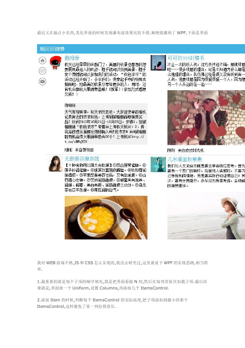
最近又在搞点小东西,美化界面的时候发现瀑布流效果比较不错.顺便就搬到了WPF,下面是界面我对WEB前端不熟,JS和CSS怎么实现的,我没去研究过,这里就说下WPF的实现思路,相当简单.1.最重要的就是每个子项的顺序填充,我是把界面看做N列,然后在每列里依次加载子项.最后结果就是,界面放一个Uniform,设置Columns,再添加几个ItemsControl.2.添加Item的时候,判断每个ItemsControl的实际高度,把子项添加到最小的那个ItemsControl,这样避免了某一列拉得很长.3.再做一层封装,就变成了一个支持Binding的WaterfallControl.这里上几段控件的源码,供参考:1.WaterfallControl.cs1 [TemplatePart(Name = "grdRoot", Type = typeof(UniformGrid))]2public class WaterfallControl : ItemsControl3{4private UniformGrid grdRoot;56private List<ItemsControl> itemsContorls;78public int Columns9{10get { return (int)GetValue(ColumnsProperty); }11set { SetValue(ColumnsProperty, value); }12}1314// Using a DependencyProperty as the backing store for Columns. This enables animation, styling, binding, etc...15public static readonly DependencyProperty ColumnsProperty =16DependencyProperty.Register("Columns", typeof(int), typeof(WaterfallControl), new PropertyMetadata(3, OnColumnsChanged));1718private static void OnColumnsChanged(DependencyObject sender, DependencyPropertyChangedEventArgs e)19{20int columns = (int)e.NewValue;21if (columns < 1)22{23throw new ArgumentOutOfRangeException("Columns"); 24}25var control = sender as WaterfallControl;26control.Columns = columns;27control.InitPanel();28}2930public WaterfallControl()31{32this.Loaded += WaterfallControl_Loaded;33this.itemsContorls = new List<ItemsControl>();34}3536void WaterfallControl_Loaded(object sender, RoutedEventArgs e) 37{38this.InitPanel();39}4041private void InitPanel()42{43if (!this.IsLoaded)44{45return;46}4748grdRoot.Children.Clear();49itemsContorls.Clear();50for (var i = 0; i < this.Columns; i++)51{52var ic = new ItemsControl();53ic.ItemTemplate = this.ItemTemplate;54ic.VerticalAlignment =System.Windows.VerticalAlignment.Top;55grdRoot.Children.Add(ic);56itemsContorls.Add(ic);57}5859if (this.ItemsSource != null)60{61var enumerator = this.ItemsSource.GetEnumerator();62while (enumerator.MoveNext())63{64this.AddChild(enumerator.Current);65}66}67}6869public override void OnApplyTemplate()70{71base.OnApplyTemplate();72grdRoot = (UniformGrid)this.GetTemplateChild("grdRoot"); 73}7475protected override void AddChild(object value)76{77var ic = itemsContorls.OrderBy(t =>t.ActualHeight).FirstOrDefault();78ic.Items.Add(value);79ic.UpdateLayout();80}8182protected override voidOnItemsChanged(System.Collections.Specialized.NotifyCollectionChangedEventArg s e)83{84if (e.Action == NotifyCollectionChangedAction.Add || e.Action == NotifyCollectionChangedAction.Remove)85{86var enumerator = e.NewItems.GetEnumerator();87while (enumerator.MoveNext())88{89if (e.Action == NotifyCollectionChangedAction.Add) 90{91this.AddChild(enumerator.Current);92}93else94{95foreach (var ic in this.itemsContorls)96{97ic.Items.Remove(enumerator.Current);98}99}100}101}102}103}2.WaterfallControl的样式<Style TargetType="controls:WaterfallControl"><Setter Property="Template"><Setter.Value><ControlTemplate TargetType="controls:WaterfallControl"><ScrollViewerHorizontalScrollBarVisibility="{TemplateBindingScrollViewer.HorizontalScrollBarVisibility}"VerticalScrollBarVisibility="{TemplateBindingScrollViewer.VerticalScrollBarVisibility}"><UniformGrid Name="grdRoot"Columns="{TemplateBinding Columns}"></UniformGrid></ScrollViewer></ControlTemplate></Setter.Value></Setter></Style>3.调用WaterfallControl继承自ItemsControl,所以和ItemsControl的使用没有区别,只需要额外指定一个Columns即可.可能遇到的问题:1.遇到图片不能直接计算高度,可能导致某列很长.可以用扩展属性给图片指定一个初始占位高度.2.遇到界面大小变化,列数是不是应该动态变化,这个要实现也简单,监视下Window.SizeChanged,然后改变Columns就行了.3.我直接把ScrollViewer放到WaterfallControl的模板里了,建议抽出来,监视下滚动事件,实现滚动到底加载数据.4.不知道是否有更简单明了的方法.WPF制作的小型笔记本-仿有道云笔记楼主所在的公司不允许下载外部资源, 不允许私自安装应用程序, 平时记录东西都是用记事本,时间久了很难找到以前记的东西. 平时在家都用有道笔记, 因此就模仿着做了一个, 先看下实际运行图片:1. 初始化的时候2.添加了些笔记3. 添加笔记本窗口4.改了模板,做的一个还算好看的菜单5.日记列表可以选择不同的视图, 比如我改成了简单列表视图6.模仿云笔记做的历史版本功能,只能看,还没做还原和对比功能7.日记可以导出成不同格式,这个东西真心没用8.顶部也有个菜单谈下这个小东西:1. 程序采用WPF+MVVM实现, 修改了大部分控件的Template, 以达到高仿的目的. 同时, 也得感谢有道在安装目录下有一套图片资源,可以原封不动的搬过来美化界面.2. 实现了笔记本的增删改, 笔记的增删改. 笔记的查询只实现了关键字查询.3. 自己做了一些有意思的控件, 比如一个LoadingButton, 在Loading的时候会转个圈圈, 后台处理完毕后隐藏. 还做了一个文本编辑框, 其实有道的编辑框相当漂亮,但是没有放出按钮图片,我只有网上淘了些山寨的图片, 而且有些功能就没去实现,比如添加表格添加超链接什么的,我自己都不知道这个能干嘛用.4. 采用SQLite数据库把所有数据保存到了本地, 我自己也有虚拟主机, 本来想顺便公布一套WEB API实现真正的云笔记, 但是现在的客户端设计怕是要经过大改才能实现, 这个想到就头痛.5. 历史版本功能本来是可以继续做下去的, 比如还原到某一版本这个功能就很好做. 但是有道有个对比不同文本的功能,这个就像源码管理工具那样,我不知道该怎么整了.6. 本来想实现插入图片的, 但是有两个问题, 第一就是我们公司没有截图程序, 我用不上, 第二就是这里的图片只能保存到RTF, 加载时会写入内存, 数据量大或者图片大了会影响性能.7. 本来也想实现插入文件的, 这个对我很有用, 不过还没想好UI怎么画, 一直就没做.8. 编辑框输入很卡, 还没去研究什么原因.9. 微软的个人版TFS相当不错, 我在不能用U盘的情况下, 家里和办公室都可以开发.最后, 实在是觉得很遗憾,一个项目我可以兴冲冲的很快完成70%的代码,但是剩下的30%就实在太折磨人了. 现在一打开VS就犯困, 实在是没法把剩下的东西全部实现完. 这个笔记目前在公司运行良好, 我需要的功能几乎都有, 也就不打算再继续下去了. 在此放出源代码, 供有兴趣的同学研究下控件样式, MVVM, Prism, 依赖注入等WPF里面常见的问题.。
wpf常用控件和使用方法
wpf常用控件和使用方法WPF(Windows Presentation Foundation)是微软开发的用于创建用户界面的框架。
它提供了丰富的控件库,可以用来构建各种功能强大、美观的应用程序。
下面介绍一些常用的WPF控件及其使用方法。
1. Button(按钮)按钮是WPF应用程序中最常用的控件之一、它用于触发事件或执行命令。
使用Button控件可以通过设置Content属性来显示文本或图像。
示例代码:```xaml<Button Content="Click Me" Click="Button_Click"/>```在代码中,我们设置了按钮的Content属性为“Click Me”,并订阅了按钮的Click事件。
在代码中定义事件处理程序:```csharpprivate void Button_Click(object sender, RoutedEventArgs e) //处理点击按钮的逻辑```2. TextBox(文本框)文本框用于输入和显示文本信息。
可以通过设置Text属性来设置文本框中的文本内容。
示例代码:```xaml<TextBox Text="Hello World"/>```示例代码:```xaml<TextBox Text="Hello World" IsReadOnly="True"/>```可以通过订阅TextChanged事件来捕获用户输入的文本变化。
示例代码:```xaml```4. ListBox(列表框)列表框用于显示一组项目的列表。
可以通过设置ItemsSource属性来设置数据源,通过设置ItemTemplate属性来设置项目的显示方式。
示例代码:```xaml<ListBox><ListBoxItem>Item 1</ListBoxItem><ListBoxItem>Item 2</ListBoxItem><ListBoxItem>Item 3</ListBoxItem></ListBox>```可以使用数据绑定的方式来动态设置列表框的数据源。
WPF实现炫酷Loading控件

WPF实现炫酷Loading控件WPF是一个用于创建Windows桌面应用程序的框架,它提供了丰富的用户界面控件和功能。
在WPF中实现一个炫酷的Loading控件可以为应用程序增添一些动感和交互性。
下面我会介绍一个简单的实现方式,通过使用WPF动画和样式来创建一个漂亮的Loading控件。
```markup<UserControl x:Class="YourNamespace.CircularLoading"mc:Ignorable="d"d:DesignHeight="300" d:DesignWidth="300"><Grid><Ellipse x:Name="circle" Width="100" Height="100" StrokeThickness="10" Stroke="#FF007ACC"><Ellipse.RenderTransform><RotateTransform x:Name="rotate" CenterX="50" CenterY="50"/> </Ellipse.RenderTransform><Ellipse.Triggers><EventTrigger RoutedEvent="Loaded"><BeginStoryboard><Storyboard RepeatBehavior="Forever"><DoubleAnimationStoryboard.TargetProperty="(Ellipse.RenderTransform).(RotateTran sform.Angle)" From="0" To="360" Duration="0:0:1"/></Storyboard></BeginStoryboard></EventTrigger></Ellipse.Triggers></Ellipse><Label Content="Loading..." HorizontalAlignment="Center" VerticalAlignment="Top" Margin="0,120,0,0" FontSize="20" FontWeight="Bold"/></Grid></UserControl>```接下来,我们可以在应用程序中使用这个Loading控件,例如在一个MainWindow中的Grid中添加一个Loading控件。
前端开发实训案例利用CSS动制作一个炫酷的Loading效果
前端开发实训案例利用CSS动制作一个炫酷的Loading效果前端开发实训案例:利用CSS动画制作一个炫酷的Loading效果在前端开发的实训中,为了提升用户体验,我们常常需要使用一些动效来增加页面的吸引力。
本文将介绍一种利用CSS动画制作一个炫酷的Loading效果的实例。
1. 准备工作首先,我们需要在HTML文件中创建一个占位符用来展示Loading 效果。
可以使用div元素,并给予一个合适的id,比如"loading"。
```html<div id="loading"></div>```2. CSS动画的制作接下来,我们要利用CSS来为这个占位符添加动画效果。
可以通过@keyframes关键字定义一个动画,并将它应用在该元素上。
```css#loading {width: 50px;height: 50px;border: 5px solid #fff;border-top-color: #000;border-radius: 50%;animation: spin 1s infinite linear;}@keyframes spin {0% {transform: rotate(0deg);}100% {transform: rotate(360deg);}}```在上面的代码中,我们为#loading元素设置了宽度、高度、边框、边框颜色和边框圆角属性。
然后通过animation属性,将spin动画应用在该元素上。
spin动画会使该元素以线性动画方式无限旋转。
3. 更多效果的实现上述的示例只是一个简单的旋转效果,我们还可以通过修改相关属性和增加新的关键帧,来实现更多复杂的Loading效果。
以下是一个带有颜色变化和大小变化的实例:```css#loading {width: 50px;height: 50px;border: 5px solid #fff;border-radius: 50%;animation: spin 1s infinite linear, color 2s infinite alternate;}@keyframes spin {0% {transform: rotate(0deg);}100% {transform: rotate(360deg);}}@keyframes color {0% {background-color: red;transform: scale(1);}50% {background-color: blue;transform: scale(1.5);}100% {background-color: green;transform: scale(1);}}```在这个示例中,我们为#loading元素添加了一个新的keyframes动画color。
使用 CSS3 实现超炫的 Loading(加载)动画效果
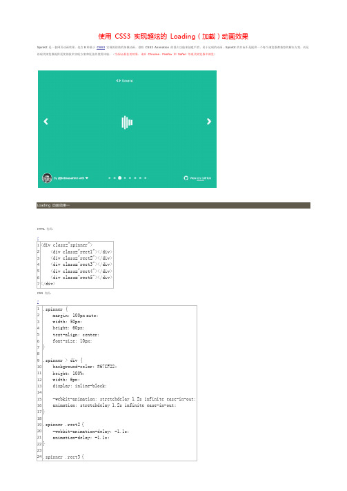
使用CSS3 实现超炫的Loading(加载)动画效果
SpinKit 是一套网页动画效果,包含8种基于CSS3实现的很炫的加载动画。
借助CSS3 Animation 的强大功能来创建平滑,易于定制的动画。
SpinKit 的目标不是提供一个每个浏览器都兼容的解决方案,而是给现代浏览器提供更优的技术实现方案和更佳的使用体验。
(为保证最佳的效果,请在Chrome、Firefox 和Safari 等现代浏览器中浏览)
Loading 动画效果一
HTML 代码:
CSS 代码:
Loading 动画效果二HTML 代码:
CSS 代码:
Loading 动画效果三HTML 代码:
CSS 代码:
Loading 动画效果四 HTML 代码:
CSS 代码:
Loading 动画效果五 HTML 代码:
CSS 代码:
Loading 动画效果六 HTML 代码:
CSS 代码:
Loading 动画效果七HTML 代码:
CSS 代码:
Loading 动画效果八HTML 代码:
CSS 代码:
+ View Code?。
CSS3实现10种Loading效果
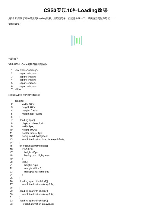
CSS3实现10种Loading效果⽤CSS3实现了⼏种常见的Loading效果,虽然很简单,但还是分享⼀下,顺便也当是做做笔记……第1种效果:代码如下:XML/HTML Code复制内容到剪贴板1. <div class="loading">2. <span></span>3. <span></span>4. <span></span>5. <span></span>6. <span></span>7. </div>CSS Code复制内容到剪贴板1. .loading{2. width: 80px;3. height: 40px;4. margin: 0 auto;5. margin-top:100px;6. }7. .loading span{8. display: inline-block;9. width: 8px;10. height: 100%;11. border-radius: 4px;12. background: lightgreen;13. -webkit-animation: load 1s ease infinite;14. }15. @-webkit-keyframes load{16. 0%,100%{17. height: 40px;18. background: lightgreen;19. }20. 50%{21. height: 70px;22. margin: -15px 0;23. background: lightblue;24. }25. }26. .loading span:nth-child(2){27. -webkit-animation-delay:0.2s;28. }29. .loading span:nth-child(3){30. -webkit-animation-delay:0.4s;31. }32. .loading span:nth-child(4){33. -webkit-animation-delay:0.6s;34. }35. .loading span:nth-child(5){36. -webkit-animation-delay:0.8s;37. }38.第2种效果:代码如下:XML/HTML Code复制内容到剪贴板1. <div class="loading">2. <span></span>3. </div>4.CSS Code复制内容到剪贴板1. .loading{2. width: 150px;3. height: 4px;4. border-radius: 2px;5. margin: 0 auto;6. margin-top:100px;7. position: relative;8. background: lightgreen;9. -webkit-animation: changeBgColor 1.04s ease-in infinite alternate;10. }11. .loading span{12. display: inline-block;13. width: 16px;14. height: 16px;15. border-radius: 50%;16. background: lightgreen;17. position: absolute;18. margin-top: -7px;19. margin-left:-8px;20. -webkit-animation: changePosition 1.04s ease-in infinite alternate;21. }22. @-webkit-keyframes changeBgColor{23. 0%{24. background: lightgreen;25. }26. 100%{27. background: lightblue;28. }29. }30. @-webkit-keyframes changePosition{31. 0%{32. background: lightgreen;33. }34. 100%{35. margin-left: 142px;36. background: lightblue;37. }38. }39.第3-5种效果:代码如下:XML/HTML Code复制内容到剪贴板1. <div class="loading">2. <span></span>3. <span></span>4. <span></span>5. <span></span>6. <span></span>7. </div>第3-5种效果的css样式分别为:CSS Code复制内容到剪贴板1. .loading{2. width: 150px;3. height: 15px;4. margin: 0 auto;5. position: relative;6. margin-top:100px;7. }8. .loading span{9. position: absolute;10. width: 15px;11. height: 100%;12. border-radius: 50%;13. background: lightgreen;14. -webkit-animation: load 1.04s ease-in infinite alternate;15. }16. @-webkit-keyframes load{17. 0%{18. opacity: 1;19. -webkit-transform: translate(0px);20. }21. 100%{22. opacity: 0.2;23. -webkit-transform: translate(150px);24. }25. }26. .loading span:nth-child(1){27. -webkit-animation-delay:0.13s;28. }29. .loading span:nth-child(2){30. -webkit-animation-delay:0.26s;31. }32. .loading span:nth-child(3){33. -webkit-animation-delay:0.39s;34. }35. .loading span:nth-child(4){36. -webkit-animation-delay:0.52s;37. }38. .loading span:nth-child(5){39. -webkit-animation-delay:0.65s;40. }第6-8种效果:代码如下:XML/HTML Code复制内容到剪贴板1. <div class="loading">2. <span></span>3. <span></span>4. <span></span>5. <span></span>6. <span></span>7. </div>第6-8种效果的css样式分别为:CSS Code复制内容到剪贴板1. .loading{2. width: 150px;3. height: 15px;4. margin: 0 auto;5. margin-top:100px;6. text-align: center;7. }8. .loading span{9. display: inline-block;10. width: 15px;11. height: 100%;12. margin-right: 5px;13. background: lightgreen;14. -webkit-animation: load 1.04s ease infinite;15. }16. .loading span:last-child{17. margin-right: 0px;18. }19. @-webkit-keyframes load{20. 0%{21. opacity: 1;22. }23. 100%{24. opacity: 0;25. }26. }27. .loading span:nth-child(1){28. -webkit-animation-delay:0.13s;29. }30. .loading span:nth-child(2){31. -webkit-animation-delay:0.26s;32. }33. .loading span:nth-child(3){34. -webkit-animation-delay:0.39s;35. }36. .loading span:nth-child(4){37. -webkit-animation-delay:0.52s;38. }39. .loading span:nth-child(5){40. -webkit-animation-delay:0.65s;41. }第9-10种效果:代码如下:XML/HTML Code复制内容到剪贴板1. <div class="loadEffect">2. <span></span>3. <span></span>4. <span></span>5. <span></span>6. <span></span>7. <span></span>8. <span></span>9. <span></span>10. </div>CSS样式分别为:CSS Code复制内容到剪贴板1. .loadEffect{2. width: 100px;3. height: 100px;4. position: relative;5. margin: 0 auto;6. margin-top:100px;7. }8. .loadEffect span{9. display: inline-block;10. width: 16px;11. height: 16px;12. border-radius: 50%;13. background: lightgreen;14. position: absolute;15. -webkit-animation: load 1.04s ease infinite;16. }17. @-webkit-keyframes load{18. 0%{19. opacity: 1;20. }21. 100%{22. opacity: 0.2;23. }24. }25. .loadEffect span:nth-child(1){26. left: 0;27. top: 50%;28. margin-top:-8px;29. -webkit-animation-delay:0.13s;30. }31. .loadEffect span:nth-child(2){32. left: 14px;33. top: 14px;34. -webkit-animation-delay:0.26s;35. }36. .loadEffect span:nth-child(3){37. left: 50%;38. top: 0;39. margin-left: -8px;40. -webkit-animation-delay:0.39s;41. }42. .loadEffect span:nth-child(4){43. top: 14px;44. rightright:14px;45. -webkit-animation-delay:0.52s;46. }47. .loadEffect span:nth-child(5){48. rightright: 0;49. top: 50%;50. margin-top:-8px;51. -webkit-animation-delay:0.65s;52. }53. .loadEffect span:nth-child(6){54. rightright: 14px;55. bottombottom:14px;56. -webkit-animation-delay:0.78s;57. }58. .loadEffect span:nth-child(7){59. bottombottom: 0;60. left: 50%;61. margin-left: -8px;62. -webkit-animation-delay:0.91s;63. }64. .loadEffect span:nth-child(8){65. bottombottom: 14px;66. left: 14px;67. -webkit-animation-delay:1.04s;68. }PS:CSS样式代码其实很多重复,主要就是动画不⼀样,但为了⽅便以后直接拿来⽤,就先不整理了。
wpf 常用控件和使用方法

WPF常用控件和使用方法WPF(Windows Presentation Foundation)是一种用于创建用户界面的技术,它提供了一套丰富的控件库,可以用于构建各种类型的应用程序。
本文将介绍WPF中常用的控件以及它们的使用方法。
1. Button(按钮)按钮是WPF中最基本、最常用的控件之一,用于触发用户操作。
以下是创建和使用按钮的示例:<Button Content="Click Me" Click="Button_Click"/>在上述示例中,我们创建了一个名为”Click Me”的按钮,并通过Click事件指定了点击按钮时要执行的方法。
2. TextBox(文本框)文本框用于接收用户输入或显示文本内容。
以下是创建和使用文本框的示例:<TextBox Text="{Binding UserName}" Width="200"/>上述示例中,我们创建了一个绑定到UserName属性的文本框,并设置其宽度为200个单位。
3. Label(标签)标签用于显示静态文本内容。
以下是创建和使用标签的示例:<Label Content="Hello, World!" FontSize="16"/>在上述示例中,我们创建了一个内容为”Hello, World!“的标签,并设置其字体大小为16个单位。
4. CheckBox(复选框)复选框允许用户从多个选项中选择一个或多个。
以下是创建和使用复选框的示例:<CheckBox Content="Option 1" IsChecked="{Binding Option1}"/>在上述示例中,我们创建了一个名为”Option 1”的复选框,并通过IsChecked属性绑定到Option1属性。
前端页面loading效果(CSS实现)

前端页⾯loading效果(CSS实现)当⾸页内容或图⽚⽐较多时,加载时间会⽐较长,此时可能出现页⾯⽩屏的情况,⽤户体验较差。
所以,在页⾯完全加载出来之前,可以考虑加⼊loading效果,当页⾯完全加载完后,是loading消失即可。
1. ⽅法html:在页⾯开头部分加⼊:<div id="loading"><div class="loadingImage"></div></div>js:在页⾯最后⾯引⼊:$("#loading").fadeOut(400);css:#loading {background: #f3815e;position: fixed;left: 0;top: 0;width: 100%;height: 100%;display: flex;align-items: center;justify-content: center;z-index: 999;}.loadingImage {position: relative;width: 30px;height: 30px;background: #2e98df;border-radius: 50px;animation: loadingImage 1.5s infinite linear;}.loadingImage::after {position: absolute;width: 50px;height: 50px;border-top: 10px solid #b160d1;border-bottom: 10px solid #b160d1;border-left: 10px solid transparent;border-right: 10px solid transparent;border-radius: 50px;content: '';top: -20px;left: -20px;animation: loadingImage_after 1.5s infinite linear;}@keyframes loadingImage {0% {transform: rotate(0deg);}50% {transform: rotate(180deg);background: #2ecc71;}100% {transform: rotate(360deg);}}@keyframes loadingImage_after {0% {border-top: 10px solid #b160d1;border-bottom: 10px solid #b160d1;}50% {border-top: 10px solid #2e98df;border-bottom: 10px solid #2e98df; }100% {border-top: 10px solid #b160d1;border-bottom: 10px solid #b160d1; }}2. 效果如图:3. loading效果图汇总,。
页面加载时loading实现方法

页面加载时 loading实现方法
loading实现大概就这个意思,首先将要显示的内容隐藏,先显示loading文字或图片什么的,然后文档加载完毕后将内容显示出来,loading隐藏掉就好了。 这里我用到了jquery,用不用无所谓。
<html> <head> <script language="javascript" type="text/javascript" src="jquery-1.6.1.js"></script> /** * 页面加载完成后显示页面 */ function showPage(){
$('#divPageLoading').remove(); $('#divPageBody').show(); } </head>
<body onload="showPage();"> <div id="divPageLoading">
<img src="pageloading.gif" style="width:120px;height:120px;position:absolute;left:45%;top:40%;"/> <பைடு நூலகம்div> <div id="divPageBody" style="display:none;">
wpf toolkit loadding 组件样式
wpf toolkit loadding 组件样式WPF Toolkit Loading组件样式WPF(Windows Presentation Foundation)Toolkit是一个开源的组件库,为WPF应用程序提供了许多常用的控件和功能。
其中的Loading组件在应用程序中常用于展示和指示操作的进行状态,如数据加载、文件上传等。
在本文中,我们将着重讨论如何为WPF Toolkit Loading组件设计和应用样式。
第一步:了解WPF Toolkit Loading组件的基本结构和功能在开始设计样式之前,我们需要先了解WPF Toolkit Loading组件的基本结构和功能。
Loading组件通常由一个父容器和一个或多个子元素组成。
父容器用于定义Loading组件的整体样式和布局,而子元素则包含了具体的加载动画和文字提示等内容。
基于这个认识,我们可以进一步思考如何设计和应用样式来实现自定义的Loading组件。
第二步:分析设计需求和目标在设计样式之前,我们需要明确设计需求和目标。
这些需求和目标可以根据具体的应用场景和设计风格来确定,如下所示:1. 色彩和形状:选择合适的颜色和形状来展示Loading组件,以与整体应用程序的风格和主题保持一致。
2. 动画效果:设计合适的动画效果来吸引用户的注意力,并清晰地展示操作的进行状态。
3. 文字提示:提供清晰的文字提示来指示用户当前的操作和状态,以增强用户体验。
4. 可自定义性:设计样式时,考虑到用户可能需要根据具体的应用需求来进行样式调整,提供一定的可自定义性。
第三步:创建样式资源并应用到Loading组件接下来,我们将一步步创建自定义的样式并将其应用到Loading组件上。
1. 创建样式资源:使用WPF的Style和ControlTemplate来定义Loading 组件的整体样式。
可以通过在XAML中使用<ResourceDictionary>元素来创建一个样式资源文件,或直接在应用程序的资源文件中添加样式。
WPF自定义Expander控件样式实现酷炫Style
WPF⾃定义Expander控件样式实现酷炫Style ⾸先, 看⼀下效果图。
实现思路1.PS处理两张选中得特效背景, ⼀张为主选择得效果图, 另外⼀张为次选择项得效果图。
![]()![]()图⽚资源定义<!--静态资源--><ImageBrush x:Key="leftImage" ImageSource="/IndustrialMaterials;component/images/leftImage.png"/><ImageBrush x:Key="leftImageSub" ImageSource="/IndustrialMaterials;component/images/leftImageSub.png"/><ImageBrush x:Key="topImage" ImageSource="/IndustrialMaterials;component/images/topImage.png"/>ToggleButton样式实现:1.⾃定义Expander样式, Expander样式模板中, 主要分为两个部分, 1.ToggleButton2.ContentPresenter2.ToogleButton主要通过IsChecked进⾏触发器控制设置Background, 以下代码:<!--下拉列表样式--><Style x:Key="ToggleButtonStyle" TargetType="{x:Type ToggleButton}"><Setter Property="FocusVisualStyle" Value="{x:Null}"/><Setter Property="Height" Value="80" /><Setter Property="HorizontalContentAlignment" Value="Right"/><Setter Property="VerticalContentAlignment" Value="Center"/><Setter Property="Padding" Value="10 10"/><Setter Property="Template"><Setter.Value><ControlTemplate TargetType="{x:Type ToggleButton}"><Grid><Border x:Name="border2" Background="{TemplateBinding Background}"HorizontalAlignment="{TemplateBinding HorizontalContentAlignment}"Margin="{TemplateBinding Padding}"VerticalAlignment="{TemplateBinding VerticalContentAlignment}"><ContentPresenter HorizontalAlignment="{TemplateBinding HorizontalContentAlignment}"Margin="{TemplateBinding Padding}"RecognizesAccessKey="True"SnapsToDevicePixels="{TemplateBinding SnapsToDevicePixels}"VerticalAlignment="{TemplateBinding VerticalContentAlignment}"/></Border></Grid><ControlTemplate.Triggers><Trigger Property="IsPressed" Value="true"><Setter Property="Background" Value="#FFd2e7f4" /></Trigger><Trigger Property="IsChecked" Value="true"><Setter Property="Background" TargetName="border2" Value="{StaticResource ResourceKey=leftImage}"/></Trigger><Trigger Property="IsChecked" Value="false"><Setter Property="Background" TargetName="border2" Value="#191E36"/></Trigger><Trigger Property="IsEnabled" Value="false"><Setter Property="Foreground" Value="White"/></Trigger></ControlTemplate.Triggers></ControlTemplate></Setter.Value></Setter></Style>Expander样式实现<Style x:Key="ExpanderStyle" TargetType="{x:Type Expander}"><Setter Property="Foreground" Value="{DynamicResource {x:Static SystemColors.ControlTextBrushKey}}"/><Setter Property="HorizontalContentAlignment" Value="Stretch"/><Setter Property="VerticalContentAlignment" Value="Stretch"/><Setter Property="BorderBrush" Value="Transparent"/><Setter Property="BorderThickness" Value="1"/><Setter Property="Template"><Setter.Value><ControlTemplate TargetType="{x:Type Expander}"><DockPanel><ToggleButton x:Name="HeaderSite" ContentTemplate="{TemplateBinding HeaderTemplate}"ContentTemplateSelector="{TemplateBinding HeaderTemplateSelector}"Content="{TemplateBinding Header}" DockPanel.Dock="Top"Foreground="{TemplateBinding Foreground}"FontWeight="{TemplateBinding FontWeight}"FontStyle="{TemplateBinding FontStyle}" FontStretch="{TemplateBinding FontStretch}"FontSize="{TemplateBinding FontSize}" FontFamily="{TemplateBinding FontFamily}"HorizontalContentAlignment="{TemplateBinding HorizontalContentAlignment}"IsChecked="{Binding IsExpanded, Mode=TwoWay, RelativeSource={RelativeSourceTemplatedParent}}" Margin="1" MinWidth="0" MinHeight="0" Padding="{TemplateBinding Padding}"Style="{StaticResource ToggleButtonStyle}"VerticalContentAlignment="{TemplateBinding VerticalContentAlignment}"/><ContentPresenter x:Name="ExpandSite" DockPanel.Dock="Left" Focusable="false"HorizontalAlignment="{TemplateBinding HorizontalContentAlignment}"Margin="{TemplateBinding Padding}" Visibility="Collapsed"VerticalAlignment="{TemplateBinding VerticalContentAlignment}"/></DockPanel><ControlTemplate.Triggers><Trigger Property="IsExpanded" Value="true"><Setter Property="Visibility" TargetName="ExpandSite" Value="Visible"/></Trigger></ControlTemplate.Triggers></ControlTemplate></Setter.Value></Setter></Style>Expander引⽤样式部分代码:到此这篇关于WPF⾃定义Expander控件样式实现酷炫Style的⽂章就介绍到这了。
WPF实现炫酷Loading控件
WPF实现炫酷Loading控件Win8系统的Loading效果还是很不错的,网上也有人用CSS3等技术实现,研究了一下,并打算用WPF自定义一个Loading 控件实现类似的效果,并可以让用户对Loading的颗粒(Particle)背景颜色进行自定义,话不多说,直接上代码:1、用VS2012新建一个WPF的用户控件库项目WpfControlLibraryDemo,VS自动生成如下结构:2、删除UserControl1.xaml,并新建一个Loading的CustomControl(不是UserControl),如下图所示:3、如果报错找不到Loading类型,请编译,下面在Generic.xaml主题文件中对Loading的样式和内容进行定义(注意添加 xmlns:system = "clr-namespace:System;assembly=mscorlib"),代码如下:1<ResourceDictionary 2xmlns="/winfx/2006/xaml/presentation" 3xmlns:x="/winfx/2006/xaml" 4 xmlns:system ="clr-namespace:System;assembly=mscorlib" 5xmlns:local="clr-namespace:WpfControlLibraryDemo"> 6 7 8<Style TargetType="{x:Type local:Loading}"> 9<Setter Property="Template"> 10<Setter.Value> 11<ControlTemplate TargetType="{x:Type local:Loading}"> 12<BorderBackground="{TemplateBinding Background}" 13BorderBrush="{TemplateBinding BorderBrush}" 14BorderThickness="{TemplateBinding BorderThickness}">15<Grid Width = "50" Height = "50"> 16<Grid.Resources> 17<!-- Value Converters --> 18 19<!-- Particle Styling ,must to has RelativeSource -->20<SolidColorBrush x:Key = "ParticleColor" Color = "{Binding Path=FillColor,RelativeSource={RelativeSource TemplatedParent}}"/> 21<SolidColorBrush x:Key = "ParticleBackgroundColor"Color = "Transparent"/>22<system:Double x:Key = "ParticleOpacity">1</system:Double>23<system:Double x:Key = "ParticleRadius">5</system:Double> 24 25<system:Double x:Key = "StartingPointX">0</system:Double> 26<system:Double x:Key = "StartingPointY">-20</system:Double> 27 28<system:Double x:Key = "RotationPointX">0.5</system:Double> 29<system:Double x:Key = "RotationPointY">0.5</system:Double> 30 31<!-- StoryBoard --> 32 <system:TimeSpan x:Key = "StoryBoardBeginTimeP0">00:00:00.000</system:TimeSpan> 33<system:TimeSpan x:Key = "StoryBoardBeginTimeP1">00:00:00.100</system:TimeSpan> 34<system:TimeSpan x:Key = "StoryBoardBeginTimeP2">00:00:00.200</system:TimeSpan> 35<system:TimeSpan x:Key = "StoryBoardBeginTimeP3">00:00:00.300</system:TimeSpan> 36<system:TimeSpan x:Key = "StoryBoardBeginTimeP4">00:00:00.400</system:TimeSpan> 37<Duration x:Key = "StoryBoardDuration">00:00:01.800</Duration> 38 39<!-- Particle Origin Angles --> 40<system:Double x:Key = "ParticleOriginAngleP0">0</system:Double>41<system:Double x:Key = "ParticleOriginAngleP1">-10</system:Double> 42<system:Doublex:Key = "ParticleOriginAngleP2">-20</system:Double> 43<system:Double x:Key = "ParticleOriginAngleP3">-30</system:Double> 44<system:Double x:Key = "ParticleOriginAngleP4">-40</system:Double> 45 46<!-- Particle Position & Timing 1 --> 47<system:Double x:Key = "ParticleBeginAngle1">0</system:Double> 48<system:Double x:Key = "ParticleEndAngle1">90</system:Double> 49<system:TimeSpan x:Key = "ParticleBeginTime1">00:00:00.000</system:TimeSpan> 50<Duration x:Key = "ParticleDuration1">00:00:00.750</Duration> 51 52<!-- Particle Position & Timing 2 --> 53<system:Double x:Key = "ParticleBeginAngle2">90</system:Double> 54<system:Double x:Key = "ParticleEndAngle2">270</system:Double>55<system:TimeSpan x:Key ="ParticleBeginTime2">00:00:00.751</system:TimeSpan> 56<Duration x:Key = "ParticleDuration2">00:00:00.300</Duration> 57 58<!-- Particle Position & Timing 3 --> 59<system:Double x:Key = "ParticleBeginAngle3">270</system:Double>60<system:Double x:Key = "ParticleEndAngle3">360</system:Double>61<system:TimeSpan x:Key = "ParticleBeginTime3">00:00:01.052</system:TimeSpan> 62<Duration x:Key = "ParticleDuration3">00:00:00.750</Duration> 63 64<Style x:Key = "EllipseStyle"TargetType = "Ellipse">65<Setter Property = "Width"Value = "{StaticResource ParticleRadius}"/>66<Setter Property = "Height" Value = "{StaticResource ParticleRadius}"/> 67<Setter Property = "Fill" Value = "{StaticResource ParticleColor}"/> 68<Setter Property = "RenderTransformOrigin" Value = "0.5, 0.5"/> 69<Setter Property = "Opacity" Value = "{StaticResource ParticleOpacity}"/> 70</Style> 71</Grid.Resources> 72<Canvas Width = "1" Height = "1" Margin="0,0,0,0"> 73<Canvas.Triggers> 74<EventTrigger RoutedEvent = "Canvas.Loaded"> 75<EventTrigger.Actions> 76<BeginStoryboard> 77<Storyboard 78 79BeginTime = "{StaticResource StoryBoardBeginTimeP0}" 80 Duration = "{StaticResource StoryBoardDuration}" 81 RepeatBehavior = "Forever"> 82<DoubleAnimation 83Storyboard.TargetName = "p0" 84Storyboard.TargetProperty = "(UIElement.RenderTransform).(RotateTransform.Angle)" 85From = "{StaticResource ParticleBeginAngle1}" 86 To = "{StaticResource ParticleEndAngle1}"87 BeginTime = "{StaticResource ParticleBeginTime1}" 88 Duration = "{StaticResourceParticleDuration1}"/> 89<DoubleAnimation 90 Storyboard.TargetName = "p0" 91 Storyboard.TargetProperty = "(UIElement.RenderTransform).(RotateTransform.Angle)" 92 From = "{StaticResource ParticleBeginAngle2}" 93 To = "{StaticResource ParticleEndAngle2}" 94 BeginTime = "{StaticResource ParticleBeginTime2}" 95 Duration = "{StaticResourceParticleDuration2}"/> 96<DoubleAnimation 97 Storyboard.TargetName = "p0" 98 Storyboard.TargetProperty = "(UIElement.RenderTransform).(RotateTransform.Angle)" 99 From = "{StaticResource ParticleBeginAngle3}"100 To = "{StaticResource ParticleEndAngle3}"101 BeginTime = "{StaticResource ParticleBeginTime3}"102 Duration = "{StaticResourceParticleDuration3}"/>103</Storyboard>104</BeginStoryboard>105<BeginStoryboard>106<Storyboard107108BeginTime = "{StaticResource StoryBoardBeginTimeP1}"109 Duration = "{StaticResource StoryBoardDuration}"110 RepeatBehavior = "Forever">111112<DoubleAnimation113Storyboard.TargetName = "p1"114Storyboard.TargetProperty = "(UIElement.RenderTransform).(RotateTransform.Angle)"115From = "{StaticResource ParticleBeginAngle1}"116 To = "{StaticResource ParticleEndAngle1}"117 BeginTime = "{StaticResource ParticleBeginTime1}"118 Duration = "{StaticResource ParticleDuration1}"/>119<DoubleAnimation120Storyboard.TargetName = "p1"121Storyboard.TargetProperty = "(UIElement.RenderTransform).(RotateTransform.Angle)"122From = "{StaticResource ParticleBeginAngle2}"123 To = "{StaticResource ParticleEndAngle2}"124 BeginTime = "{StaticResource ParticleBeginTime2}"125 Duration = "{StaticResource ParticleDuration2}"/>126<DoubleAnimation127Storyboard.TargetName = "p1"128Storyboard.TargetProperty = "(UIElement.RenderTransform).(RotateTransform.Angle)"129From = "{StaticResource ParticleBeginAngle3}"130 To = "{StaticResource ParticleEndAngle3}"131 BeginTime = "{StaticResource ParticleBeginTime3}"132 Duration = "{StaticResource ParticleDuration3}"/>133</Storyboard>134</BeginStoryboard>135<BeginStoryboard>136<Storyboard137138BeginTime = "{StaticResource StoryBoardBeginTimeP2}"139Duration = "{StaticResource StoryBoardDuration}"140 RepeatBehavior = "Forever">141142<DoubleAnimation143Storyboard.TargetName = "p2"144 Storyboard.TargetProperty = "(UIElement.RenderTransform).(RotateTransform.Angle)"145 From = "{StaticResource ParticleBeginAngle1}"146 To = "{StaticResource ParticleEndAngle1}"147 BeginTime = "{StaticResource ParticleBeginTime1}"148 Duration = "{StaticResourceParticleDuration1}"/>149<DoubleAnimation150 Storyboard.TargetName = "p2"151 Storyboard.TargetProperty = "(UIElement.RenderTransform).(RotateTransform.Angle)"152 From = "{StaticResource ParticleBeginAngle2}"153 To = "{StaticResource ParticleEndAngle2}"154 BeginTime = "{StaticResource ParticleBeginTime2}"155 Duration = "{StaticResourceParticleDuration2}"/>156<DoubleAnimation157 Storyboard.TargetName = "p2"158 Storyboard.TargetProperty = "(UIElement.RenderTransform).(RotateTransform.Angle)"159 From = "{StaticResource ParticleBeginAngle3}"160 To = "{StaticResource ParticleEndAngle3}"161 BeginTime = "{StaticResource ParticleBeginTime3}"162 Duration = "{StaticResourceParticleDuration3}"/>163</Storyboard>164</BeginStoryboard>165166<BeginStoryboard>167<Storyboard168169BeginTime = "{StaticResource StoryBoardBeginTimeP3}"170 Duration = "{StaticResource StoryBoardDuration}"171 RepeatBehavior = "Forever">172173<DoubleAnimation174Storyboard.TargetName = "p3"175Storyboard.TargetProperty = "(UIElement.RenderTransform).(RotateTransform.Angle)"176From = "{StaticResource ParticleBeginAngle1}"177 To = "{StaticResource ParticleEndAngle1}"178 BeginTime = "{StaticResource ParticleBeginTime1}"179 Duration = "{StaticResource ParticleDuration1}"/>180<DoubleAnimation181Storyboard.TargetName = "p3"182Storyboard.TargetProperty = "(UIElement.RenderTransform).(RotateTransform.Angle)"183From = "{StaticResource ParticleBeginAngle2}"184 To = "{StaticResource ParticleEndAngle2}"185 BeginTime = "{StaticResource ParticleBeginTime2}"186 Duration = "{StaticResource ParticleDuration2}"/>187<DoubleAnimation188Storyboard.TargetName = "p3"189Storyboard.TargetProperty = "(UIElement.RenderTransform).(RotateTransform.Angle)"190From = "{StaticResource ParticleBeginAngle3}"191 To = "{StaticResource ParticleEndAngle3}"192 BeginTime = "{StaticResource ParticleBeginTime3}"193 Duration = "{StaticResource ParticleDuration3}"/>194</Storyboard>195</BeginStoryboard>196197<BeginStoryboard>198<Storyboard199200BeginTime = "{StaticResource StoryBoardBeginTimeP4}"201Duration = "{StaticResource StoryBoardDuration}"202 RepeatBehavior = "Forever">203204<DoubleAnimation205Storyboard.TargetName = "p4"206 Storyboard.TargetProperty = "(UIElement.RenderTransform).(RotateTransform.Angle)"207 From = "{StaticResource ParticleBeginAngle1}"208 To = "{StaticResource ParticleEndAngle1}"209 BeginTime = "{StaticResource ParticleBeginTime1}"210 Duration = "{StaticResourceParticleDuration1}"/>211<DoubleAnimation212 Storyboard.TargetName = "p4"213 Storyboard.TargetProperty = "(UIElement.RenderTransform).(RotateTransform.Angle)"214 From = "{StaticResource ParticleBeginAngle2}"215 To = "{StaticResource ParticleEndAngle2}"216 BeginTime = "{StaticResource ParticleBeginTime2}"217 Duration = "{StaticResourceParticleDuration2}"/>218<DoubleAnimation219 Storyboard.TargetName = "p4"220 Storyboard.TargetProperty = "(UIElement.RenderTransform).(RotateTransform.Angle)"221 From = "{StaticResource ParticleBeginAngle3}"222 To = "{StaticResource ParticleEndAngle3}"223 BeginTime = "{StaticResource ParticleBeginTime3}"224 Duration = "{StaticResourceParticleDuration3}"/>225</Storyboard>226</BeginStoryboard>227</EventTrigger.Actions>228</EventTrigger>229</Canvas.Triggers>230<Border231x:Name = "p0"232 Background = "{StaticResource ParticleBackgroundColor}"233 Opacity = "{StaticResource ParticleOpacity}">234</Border.RenderTransform>237<Border.RenderTransformOrigin>238 <Point X = "{StaticResource RotationPointX}" Y = "{StaticResource RotationPointY}"/>239</Border.RenderTransformOrigin>240<Ellipse Style = "{StaticResource EllipseStyle}">241<Ellipse.RenderTransform>242<TransformGroup>243<TranslateTransform X = "{StaticResource StartingPointX}" Y = "{StaticResource StartingPointY}"/>244<RotateTransform Angle = "{StaticResource ParticleOriginAngleP0}"/>245</TransformGroup>246</Ellipse.RenderTransform>247</Ellipse>248</Border>249<Border250 x:Name = "p1"251 Background = "{StaticResource ParticleBackgroundColor}"252Opacity = "{StaticResource ParticleOpacity}">253<Border.RenderTransform>254<RotateTransform/>255</Border.RenderTransform>256<Border.RenderTransformOrigin>257 <Point X = "{StaticResource RotationPointX}" Y = "{StaticResource RotationPointY}"/>258</Border.RenderTransformOrigin>259<Ellipse Style = "{StaticResource EllipseStyle}">260<Ellipse.RenderTransform>261<TransformGroup>262<TranslateTransform X = "{StaticResource StartingPointX}" Y = "{StaticResource StartingPointY}"/>263<RotateTransform Angle = "{StaticResource ParticleOriginAngleP1}"/>264</TransformGroup>265</Ellipse.RenderTransform>266</Ellipse>267</Border>268<Border269 x:Name = "p2"270 Background = "{StaticResource ParticleBackgroundColor}"271Opacity = "{StaticResource ParticleOpacity}">272<Border.RenderTransform>273<RotateTransform/>274</Border.RenderTransform>275<Border.RenderTransformOrigin>276 <Point X = "{StaticResource RotationPointX}" Y = "{StaticResource RotationPointY}"/>277</Border.RenderTransformOrigin>278<Ellipse Style = "{StaticResource EllipseStyle}">279<Ellipse.RenderTransform>280<TransformGroup>281<TranslateTransform X = "{StaticResource StartingPointX}" Y = "{StaticResourcePointY}"/>282<RotateTransform Angle = "{StaticResource ParticleOriginAngleP2}"/>283</TransformGroup>284</Ellipse.RenderTransform>285</Ellipse>286</Border>287<Border288 x:Name = "p3"289 Background = "{StaticResource ParticleBackgroundColor}"290Opacity = "{StaticResource ParticleOpacity}">291<Border.RenderTransform>292<RotateTransform/>293</Border.RenderTransform>294<Border.RenderTransformOrigin>295 <Point X = "{StaticResource RotationPointX}" Y = "{StaticResource RotationPointY}"/>296</Border.RenderTransformOrigin>297<Ellipse Style = "{StaticResource EllipseStyle}">298<TranslateTransform X = "{StaticResource StartingPointX}" Y = "{StaticResource StartingPointY}"/>301<RotateTransform Angle = "{StaticResource ParticleOriginAngleP3}"/>302</TransformGroup>303</Ellipse.RenderTransform>304</Ellipse>305</Border>306<Border307 x:Name = "p4"308 Background = "{StaticResource ParticleBackgroundColor}"309Opacity = "{StaticResource ParticleOpacity}">310<Border.RenderTransform>311<RotateTransform/>312</Border.RenderTransform>313<Border.RenderTransformOrigin>314 <Point X = "{StaticResource RotationPointX}" Y = "{StaticResource RotationPointY}"/>315</Border.RenderTransformOrigin>316<Ellipse Style = "{StaticResource EllipseStyle}">317<Transform>318<TransformGroup>319<TranslateTransform X = "{StaticResource StartingPointX}" Y = "{StaticResource StartingPointY}"/>320<RotateTransform Angle = "{StaticResource ParticleOriginAngleP4}"/>321</TransformGroup>322</Ellipse.RenderTransform>323</Ellipse>324</Border>325</Canvas>326</Grid>327328329330</Border>331</ControlTemplate>332</Setter.Value>333</Setter>334</Style>335336337338</ResourceDictionary>在构建中发现,一开始在设定绑定时,写成<SolidColorBrush x:Key = "ParticleColor" Color = "{Binding Path=FillColor}" />一直都无法绑定成功,后来查了资料,改成<SolidColorBrush x:Key = "ParticleColor" Color = "{BindingPath=FillColor,RelativeSource={RelativeSource TemplatedParent}}" /> 后成功。
winform自定义控件:半透明Loading控件
public MyLoadingCtl() : this(125, true) { }
/// <summary> /// 显示遮罩层 /// </summary> /// <param name="form">要显示的父窗体</param> public void ShowLoading(Form form) {
try { // SetStyle(System.Windows.Forms.ControlStyles.Opaque, true); base.CreateControl(); form.Controls.Add(this); // this._alpha = Alpha; // if (isShowLoadingImage) //{ // PictureBox pictureBox_Loading = new PictureBox(); // pictureBox_Loading.BackColor = System.Drawing.Color.White; // pictureBox_Loading.Image = 加载中.Properties.Resources.loading; // pictureBox_ = "pictureBox_Loading"; // pictureBox_Loading.Size = new System.Drawing.Size(48, 48); // pictureBox_Loading.SizeMode = System.Windows.Forms.PictureBoxSizeMode.AutoSize; // Point Location = new Point(this.Location.X + (this.Width - pictureBox_Loading.Width) / 2, this.Location.Y + (this.Height pictureBox_Loading.Height) / 2);//居中 // pictureBox_Loading.Location = Location; // pictureBox_Loading.Anchor = AnchorStyles.None;
前端-自己实现好看的loading,其实也简单
前端-自己实现好看的loading,其实也简单现代浏览器越来越标准化了,这样的好处就是很多好用的CSS可以跨浏览器运行,效果很不错。
大家看下面两个loading样式,实现起来也非常简单。
首先看下右边那个,它其实只有三种颜色,你看到多余三种颜色,是因为当两种颜色重叠到一起的时候,它会叠加出第三种颜色,这是mix-blend-mode: overlay的结果。
现在我们来详细说一下,首先是HTML:由于有三种颜色,所以HTML结构也非常简单。
每个spinner-sector代表一个颜色,现在我们加入一些基本样式:现在显示结果如下:加入红色背景,是为了让大家看清楚现在它长什么样。
接下来,我们去掉红色背景,给每个spinner-sector的边框上颜色,如下,给每个div分别上了,上边框色和左右边框色。
现在看起来如下:注意看那个mix-blend-mode:overlay:它就是当两个颜色叠加一起,它会生成第三种颜色。
比如下面这个,我们让top和right合并起来,会合并出一个淡粉色,显示如下:如果需要这个CSS的详细说明,可以去看MDN。
接着,我们就可以给它加上动画了。
我们用到里CSS property, 这样每一个spinner-sector都会有不同的动画效果,并且有不同的速度,这样他们就会产生不同的重叠,出现不同的颜色。
最终效果如下,不错吧,简单么?这种方式挺灵活的,如果需要增加一种颜色,只要增加一个spinner-sector div,并进行相应的CSS配置就行了。
如果你不需要那么多颜色,并且希望HTML简单点,那可以使用CSS伪类实现,它只可以实现两种颜色,因为只有::before, ::after可以使用,其实::before, ::after就是上面的spinner-sector, 它们的代码实现基本上是一样的超简单的HTML:伪类CSS:效果如下:虽然只有两种颜色,但它也可以mix出来第三种颜色。
- 1、下载文档前请自行甄别文档内容的完整性,平台不提供额外的编辑、内容补充、找答案等附加服务。
- 2、"仅部分预览"的文档,不可在线预览部分如存在完整性等问题,可反馈申请退款(可完整预览的文档不适用该条件!)。
- 3、如文档侵犯您的权益,请联系客服反馈,我们会尽快为您处理(人工客服工作时间:9:00-18:30)。
WPF实现炫酷Loading控件Win8系统的Loading效果还是很不错的,网上也有人用CSS3等技术实现,研究了一下,并打算用WPF自定义一个Loading 控件实现类似的效果,并可以让用户对Loading的颗粒(Particle)背景颜色进行自定义,话不多说,直接上代码:1、用VS2012新建一个WPF的用户控件库项目WpfControlLibraryDemo,VS自动生成如下结构:2、删除UserControl1.xaml,并新建一个Loading的CustomControl(不是UserControl),如下图所示:3、如果报错找不到Loading类型,请编译,下面在Generic.xaml主题文件中对Loading的样式和内容进行定义(注意添加 xmlns:system = "clr-namespace:System;assembly=mscorlib"),代码如下:1<ResourceDictionary 2xmlns="/winfx/2006/xaml/presentation" 3xmlns:x="/winfx/2006/xaml" 4 xmlns:system ="clr-namespace:System;assembly=mscorlib" 5xmlns:local="clr-namespace:WpfControlLibraryDemo"> 6 7 8<Style TargetType="{x:Type local:Loading}"> 9<Setter Property="Template"> 10<Setter.Value> 11<ControlTemplate TargetType="{x:Type local:Loading}"> 12<BorderBackground="{TemplateBinding Background}" 13BorderBrush="{TemplateBinding BorderBrush}" 14BorderThickness="{TemplateBinding BorderThickness}">15<Grid Width = "50" Height = "50"> 16<Grid.Resources> 17<!-- Value Converters --> 18 19<!-- Particle Styling ,must to has RelativeSource -->20<SolidColorBrush x:Key = "ParticleColor" Color = "{Binding Path=FillColor,RelativeSource={RelativeSource TemplatedParent}}"/> 21<SolidColorBrush x:Key = "ParticleBackgroundColor"Color = "Transparent"/>22<system:Double x:Key = "ParticleOpacity">1</system:Double>23<system:Double x:Key = "ParticleRadius">5</system:Double> 24 25<system:Double x:Key = "StartingPointX">0</system:Double> 26<system:Double x:Key = "StartingPointY">-20</system:Double> 27 28<system:Double x:Key = "RotationPointX">0.5</system:Double> 29<system:Double x:Key = "RotationPointY">0.5</system:Double> 30 31<!-- StoryBoard --> 32 <system:TimeSpan x:Key = "StoryBoardBeginTimeP0">00:00:00.000</system:TimeSpan> 33<system:TimeSpan x:Key = "StoryBoardBeginTimeP1">00:00:00.100</system:TimeSpan> 34<system:TimeSpan x:Key = "StoryBoardBeginTimeP2">00:00:00.200</system:TimeSpan> 35<system:TimeSpan x:Key = "StoryBoardBeginTimeP3">00:00:00.300</system:TimeSpan> 36<system:TimeSpan x:Key = "StoryBoardBeginTimeP4">00:00:00.400</system:TimeSpan> 37<Duration x:Key = "StoryBoardDuration">00:00:01.800</Duration> 38 39<!-- Particle Origin Angles --> 40<system:Double x:Key = "ParticleOriginAngleP0">0</system:Double>41<system:Double x:Key = "ParticleOriginAngleP1">-10</system:Double> 42<system:Doublex:Key = "ParticleOriginAngleP2">-20</system:Double> 43<system:Double x:Key = "ParticleOriginAngleP3">-30</system:Double> 44<system:Double x:Key = "ParticleOriginAngleP4">-40</system:Double> 45 46<!-- Particle Position & Timing 1 --> 47<system:Double x:Key = "ParticleBeginAngle1">0</system:Double> 48<system:Double x:Key = "ParticleEndAngle1">90</system:Double> 49<system:TimeSpan x:Key = "ParticleBeginTime1">00:00:00.000</system:TimeSpan> 50<Duration x:Key = "ParticleDuration1">00:00:00.750</Duration> 51 52<!-- Particle Position & Timing 2 --> 53<system:Double x:Key = "ParticleBeginAngle2">90</system:Double> 54<system:Double x:Key = "ParticleEndAngle2">270</system:Double>55<system:TimeSpan x:Key ="ParticleBeginTime2">00:00:00.751</system:TimeSpan> 56<Duration x:Key = "ParticleDuration2">00:00:00.300</Duration> 57 58<!-- Particle Position & Timing 3 --> 59<system:Double x:Key = "ParticleBeginAngle3">270</system:Double>60<system:Double x:Key = "ParticleEndAngle3">360</system:Double>61<system:TimeSpan x:Key = "ParticleBeginTime3">00:00:01.052</system:TimeSpan> 62<Duration x:Key = "ParticleDuration3">00:00:00.750</Duration> 63 64<Style x:Key = "EllipseStyle"TargetType = "Ellipse">65<Setter Property = "Width"Value = "{StaticResource ParticleRadius}"/>66<Setter Property = "Height" Value = "{StaticResource ParticleRadius}"/> 67<Setter Property = "Fill" Value = "{StaticResource ParticleColor}"/> 68<Setter Property = "RenderTransformOrigin" Value = "0.5, 0.5"/> 69<Setter Property = "Opacity" Value = "{StaticResource ParticleOpacity}"/> 70</Style> 71</Grid.Resources> 72<Canvas Width = "1" Height = "1" Margin="0,0,0,0"> 73<Canvas.Triggers> 74<EventTrigger RoutedEvent = "Canvas.Loaded"> 75<EventTrigger.Actions> 76<BeginStoryboard> 77<Storyboard 78 79BeginTime = "{StaticResource StoryBoardBeginTimeP0}" 80 Duration = "{StaticResource StoryBoardDuration}" 81 RepeatBehavior = "Forever"> 82<DoubleAnimation 83Storyboard.TargetName = "p0" 84Storyboard.TargetProperty = "(UIElement.RenderTransform).(RotateTransform.Angle)" 85From = "{StaticResource ParticleBeginAngle1}" 86 To = "{StaticResource ParticleEndAngle1}"87 BeginTime = "{StaticResource ParticleBeginTime1}" 88 Duration = "{StaticResourceParticleDuration1}"/> 89<DoubleAnimation 90 Storyboard.TargetName = "p0" 91 Storyboard.TargetProperty = "(UIElement.RenderTransform).(RotateTransform.Angle)" 92 From = "{StaticResource ParticleBeginAngle2}" 93 To = "{StaticResource ParticleEndAngle2}" 94 BeginTime = "{StaticResource ParticleBeginTime2}" 95 Duration = "{StaticResourceParticleDuration2}"/> 96<DoubleAnimation 97 Storyboard.TargetName = "p0" 98 Storyboard.TargetProperty = "(UIElement.RenderTransform).(RotateTransform.Angle)" 99 From = "{StaticResource ParticleBeginAngle3}"100 To = "{StaticResource ParticleEndAngle3}"101 BeginTime = "{StaticResource ParticleBeginTime3}"102 Duration = "{StaticResourceParticleDuration3}"/>103</Storyboard>104</BeginStoryboard>105<BeginStoryboard>106<Storyboard107108BeginTime = "{StaticResource StoryBoardBeginTimeP1}"109 Duration = "{StaticResource StoryBoardDuration}"110 RepeatBehavior = "Forever">111112<DoubleAnimation113Storyboard.TargetName = "p1"114Storyboard.TargetProperty = "(UIElement.RenderTransform).(RotateTransform.Angle)"115From = "{StaticResource ParticleBeginAngle1}"116 To = "{StaticResource ParticleEndAngle1}"117 BeginTime = "{StaticResource ParticleBeginTime1}"118 Duration = "{StaticResource ParticleDuration1}"/>119<DoubleAnimation120Storyboard.TargetName = "p1"121Storyboard.TargetProperty = "(UIElement.RenderTransform).(RotateTransform.Angle)"122From = "{StaticResource ParticleBeginAngle2}"123 To = "{StaticResource ParticleEndAngle2}"124 BeginTime = "{StaticResource ParticleBeginTime2}"125 Duration = "{StaticResource ParticleDuration2}"/>126<DoubleAnimation127Storyboard.TargetName = "p1"128Storyboard.TargetProperty = "(UIElement.RenderTransform).(RotateTransform.Angle)"129From = "{StaticResource ParticleBeginAngle3}"130 To = "{StaticResource ParticleEndAngle3}"131 BeginTime = "{StaticResource ParticleBeginTime3}"132 Duration = "{StaticResource ParticleDuration3}"/>133</Storyboard>134</BeginStoryboard>135<BeginStoryboard>136<Storyboard137138BeginTime = "{StaticResource StoryBoardBeginTimeP2}"139Duration = "{StaticResource StoryBoardDuration}"140 RepeatBehavior = "Forever">141142<DoubleAnimation143Storyboard.TargetName = "p2"144 Storyboard.TargetProperty = "(UIElement.RenderTransform).(RotateTransform.Angle)"145 From = "{StaticResource ParticleBeginAngle1}"146 To = "{StaticResource ParticleEndAngle1}"147 BeginTime = "{StaticResource ParticleBeginTime1}"148 Duration = "{StaticResourceParticleDuration1}"/>149<DoubleAnimation150 Storyboard.TargetName = "p2"151 Storyboard.TargetProperty = "(UIElement.RenderTransform).(RotateTransform.Angle)"152 From = "{StaticResource ParticleBeginAngle2}"153 To = "{StaticResource ParticleEndAngle2}"154 BeginTime = "{StaticResource ParticleBeginTime2}"155 Duration = "{StaticResourceParticleDuration2}"/>156<DoubleAnimation157 Storyboard.TargetName = "p2"158 Storyboard.TargetProperty = "(UIElement.RenderTransform).(RotateTransform.Angle)"159 From = "{StaticResource ParticleBeginAngle3}"160 To = "{StaticResource ParticleEndAngle3}"161 BeginTime = "{StaticResource ParticleBeginTime3}"162 Duration = "{StaticResourceParticleDuration3}"/>163</Storyboard>164</BeginStoryboard>165166<BeginStoryboard>167<Storyboard168169BeginTime = "{StaticResource StoryBoardBeginTimeP3}"170 Duration = "{StaticResource StoryBoardDuration}"171 RepeatBehavior = "Forever">172173<DoubleAnimation174Storyboard.TargetName = "p3"175Storyboard.TargetProperty = "(UIElement.RenderTransform).(RotateTransform.Angle)"176From = "{StaticResource ParticleBeginAngle1}"177 To = "{StaticResource ParticleEndAngle1}"178 BeginTime = "{StaticResource ParticleBeginTime1}"179 Duration = "{StaticResource ParticleDuration1}"/>180<DoubleAnimation181Storyboard.TargetName = "p3"182Storyboard.TargetProperty = "(UIElement.RenderTransform).(RotateTransform.Angle)"183From = "{StaticResource ParticleBeginAngle2}"184 To = "{StaticResource ParticleEndAngle2}"185 BeginTime = "{StaticResource ParticleBeginTime2}"186 Duration = "{StaticResource ParticleDuration2}"/>187<DoubleAnimation188Storyboard.TargetName = "p3"189Storyboard.TargetProperty = "(UIElement.RenderTransform).(RotateTransform.Angle)"190From = "{StaticResource ParticleBeginAngle3}"191 To = "{StaticResource ParticleEndAngle3}"192 BeginTime = "{StaticResource ParticleBeginTime3}"193 Duration = "{StaticResource ParticleDuration3}"/>194</Storyboard>195</BeginStoryboard>196197<BeginStoryboard>198<Storyboard199200BeginTime = "{StaticResource StoryBoardBeginTimeP4}"201Duration = "{StaticResource StoryBoardDuration}"202 RepeatBehavior = "Forever">203204<DoubleAnimation205Storyboard.TargetName = "p4"206 Storyboard.TargetProperty = "(UIElement.RenderTransform).(RotateTransform.Angle)"207 From = "{StaticResource ParticleBeginAngle1}"208 To = "{StaticResource ParticleEndAngle1}"209 BeginTime = "{StaticResource ParticleBeginTime1}"210 Duration = "{StaticResourceParticleDuration1}"/>211<DoubleAnimation212 Storyboard.TargetName = "p4"213 Storyboard.TargetProperty = "(UIElement.RenderTransform).(RotateTransform.Angle)"214 From = "{StaticResource ParticleBeginAngle2}"215 To = "{StaticResource ParticleEndAngle2}"216 BeginTime = "{StaticResource ParticleBeginTime2}"217 Duration = "{StaticResourceParticleDuration2}"/>218<DoubleAnimation219 Storyboard.TargetName = "p4"220 Storyboard.TargetProperty = "(UIElement.RenderTransform).(RotateTransform.Angle)"221 From = "{StaticResource ParticleBeginAngle3}"222 To = "{StaticResource ParticleEndAngle3}"223 BeginTime = "{StaticResource ParticleBeginTime3}"224 Duration = "{StaticResourceParticleDuration3}"/>225</Storyboard>226</BeginStoryboard>227</EventTrigger.Actions>228</EventTrigger>229</Canvas.Triggers>230<Border231x:Name = "p0"232 Background = "{StaticResource ParticleBackgroundColor}"233 Opacity = "{StaticResource ParticleOpacity}">234</Border.RenderTransform>237<Border.RenderTransformOrigin>238 <Point X = "{StaticResource RotationPointX}" Y = "{StaticResource RotationPointY}"/>239</Border.RenderTransformOrigin>240<Ellipse Style = "{StaticResource EllipseStyle}">241<Ellipse.RenderTransform>242<TransformGroup>243<TranslateTransform X = "{StaticResource StartingPointX}" Y = "{StaticResource StartingPointY}"/>244<RotateTransform Angle = "{StaticResource ParticleOriginAngleP0}"/>245</TransformGroup>246</Ellipse.RenderTransform>247</Ellipse>248</Border>249<Border250 x:Name = "p1"251 Background = "{StaticResource ParticleBackgroundColor}"252Opacity = "{StaticResource ParticleOpacity}">253<Border.RenderTransform>254<RotateTransform/>255</Border.RenderTransform>256<Border.RenderTransformOrigin>257 <Point X = "{StaticResource RotationPointX}" Y = "{StaticResource RotationPointY}"/>258</Border.RenderTransformOrigin>259<Ellipse Style = "{StaticResource EllipseStyle}">260<Ellipse.RenderTransform>261<TransformGroup>262<TranslateTransform X = "{StaticResource StartingPointX}" Y = "{StaticResource StartingPointY}"/>263<RotateTransform Angle = "{StaticResource ParticleOriginAngleP1}"/>264</TransformGroup>265</Ellipse.RenderTransform>266</Ellipse>267</Border>268<Border269 x:Name = "p2"270 Background = "{StaticResource ParticleBackgroundColor}"271Opacity = "{StaticResource ParticleOpacity}">272<Border.RenderTransform>273<RotateTransform/>274</Border.RenderTransform>275<Border.RenderTransformOrigin>276 <Point X = "{StaticResource RotationPointX}" Y = "{StaticResource RotationPointY}"/>277</Border.RenderTransformOrigin>278<Ellipse Style = "{StaticResource EllipseStyle}">279<Ellipse.RenderTransform>280<TransformGroup>281<TranslateTransform X = "{StaticResource StartingPointX}" Y = "{StaticResourcePointY}"/>282<RotateTransform Angle = "{StaticResource ParticleOriginAngleP2}"/>283</TransformGroup>284</Ellipse.RenderTransform>285</Ellipse>286</Border>287<Border288 x:Name = "p3"289 Background = "{StaticResource ParticleBackgroundColor}"290Opacity = "{StaticResource ParticleOpacity}">291<Border.RenderTransform>292<RotateTransform/>293</Border.RenderTransform>294<Border.RenderTransformOrigin>295 <Point X = "{StaticResource RotationPointX}" Y = "{StaticResource RotationPointY}"/>296</Border.RenderTransformOrigin>297<Ellipse Style = "{StaticResource EllipseStyle}">298<TranslateTransform X = "{StaticResource StartingPointX}" Y = "{StaticResource StartingPointY}"/>301<RotateTransform Angle = "{StaticResource ParticleOriginAngleP3}"/>302</TransformGroup>303</Ellipse.RenderTransform>304</Ellipse>305</Border>306<Border307 x:Name = "p4"308 Background = "{StaticResource ParticleBackgroundColor}"309Opacity = "{StaticResource ParticleOpacity}">310<Border.RenderTransform>311<RotateTransform/>312</Border.RenderTransform>313<Border.RenderTransformOrigin>314 <Point X = "{StaticResource RotationPointX}" Y = "{StaticResource RotationPointY}"/>315</Border.RenderTransformOrigin>316<Ellipse Style = "{StaticResource EllipseStyle}">317<Transform>318<TransformGroup>319<TranslateTransform X = "{StaticResource StartingPointX}" Y = "{StaticResource StartingPointY}"/>320<RotateTransform Angle = "{StaticResource ParticleOriginAngleP4}"/>321</TransformGroup>322</Ellipse.RenderTransform>323</Ellipse>324</Border>325</Canvas>326</Grid>327328329330</Border>331</ControlTemplate>332</Setter.Value>333</Setter>334</Style>335336337338</ResourceDictionary>在构建中发现,一开始在设定绑定时,写成<SolidColorBrush x:Key = "ParticleColor" Color = "{Binding Path=FillColor}" />一直都无法绑定成功,后来查了资料,改成<SolidColorBrush x:Key = "ParticleColor" Color = "{BindingPath=FillColor,RelativeSource={RelativeSource TemplatedParent}}" /> 后成功。