Simon雅思小作文真题范文 Task 1: bar chart sample answer
雅思作文图表题范文
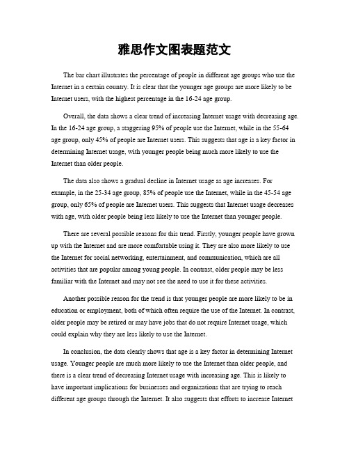
雅思作文图表题范文The bar chart illustrates the percentage of people in different age groups who use the Internet in a certain country. It is clear that the younger age groups are more likely to be Internet users, with the highest percentage in the 16-24 age group.Overall, the data shows a clear trend of increasing Internet usage with decreasing age. In the 16-24 age group, a staggering 95% of people use the Internet, while in the 55-64 age group, only 45% of people are Internet users. This suggests that age is a key factor in determining Internet usage, with younger people being much more likely to use the Internet than older people.The data also shows a gradual decline in Internet usage as age increases. For example, in the 25-34 age group, 85% of people use the Internet, while in the 45-54 age group, only 65% of people are Internet users. This suggests that Internet usage decreases with age, with older people being less likely to use the Internet than younger people.There are several possible reasons for this trend. Firstly, younger people have grown up with the Internet and are more comfortable using it. They are also more likely to use the Internet for social networking, entertainment, and communication, which are all activities that are popular among young people. In contrast, older people may be less familiar with the Internet and may not see the need to use it for these activities.Another possible reason for the trend is that younger people are more likely to be in education or employment, both of which often require the use of the Internet. In contrast, older people may be retired or may have jobs that do not require Internet usage, which could explain why they are less likely to use the Internet.In conclusion, the data clearly shows that age is a key factor in determining Internet usage. Younger people are much more likely to use the Internet than older people, and there is a clear trend of decreasing Internet usage with increasing age. This is likely to have important implications for businesses and organizations that are trying to reach different age groups through the Internet. It also suggests that efforts to increase Internetusage among older people may be needed in order to bridge the digital divide between different age groups.。
雅思写作task1范文

雅思写作task1范文The bar chart illustrates the amount of money spent on five consumer goods in a European country in 2018. Overall, it can be seen that the highest expenditure was on food and drink, followed by clothing and footwear. On the other hand, the least amount of money was spent on electronic goods.Food and drink had the highest expenditure, with a total of 250 billion euros. This was followed by clothing and footwear, which had an expenditure of 200 billion euros. In contrast, the least amount of money was spent on electronic goods, with only 50 billion euros.Looking at the individual items, it is evident that the highest expenditure was on groceries, with 150 billion euros spent. This was followed by dining out, with an expenditure of 100 billion euros. The least amount of money was spent on alcoholic drinks, with only 50 billion euros.In terms of clothing and footwear, it can be seen that the highest expenditure was on shoes, with 120 billion euros spent. This was followed by clothing, with an expenditure of 80 billion euros. The least amount of money was spent on accessories, with only 20 billion euros.In conclusion, the bar chart illustrates the expenditure on five consumer goods in a European country in 2018. Food and drink had the highest expenditure, while electronic goods had the least. Groceries and shoes were the items with the highest expenditure in their respective categories.。
simon的雅思小作文模板
simon的雅思小作文模板英文回答:Task 1 Bar Chart。
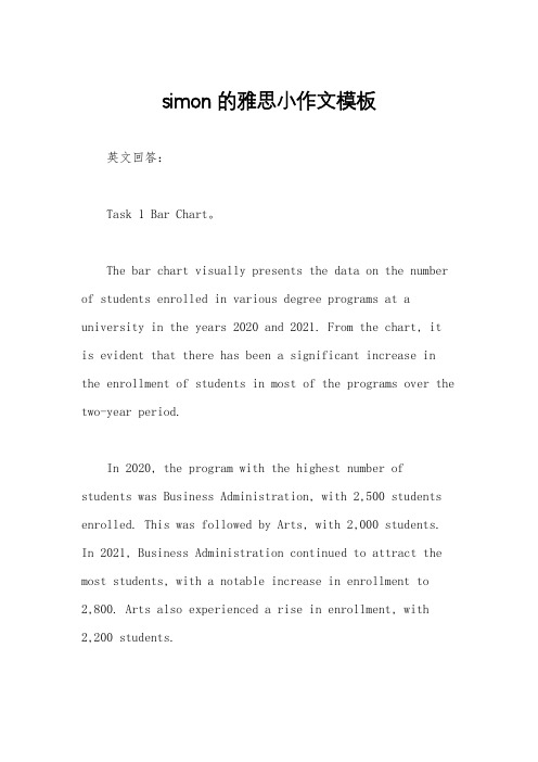
The bar chart visually presents the data on the number of students enrolled in various degree programs at a university in the years 2020 and 2021. From the chart, itis evident that there has been a significant increase in the enrollment of students in most of the programs over the two-year period.In 2020, the program with the highest number of students was Business Administration, with 2,500 students enrolled. This was followed by Arts, with 2,000 students. In 2021, Business Administration continued to attract the most students, with a notable increase in enrollment to2,800. Arts also experienced a rise in enrollment, with2,200 students.Other programs that showed an increase in enrollment include Engineering (from 1,500 to 1,800), Law (from 1,200to 1,400), and Science (from 1,000 to 1,200).However, there was a decline in enrollment in two programs: Education and Nursing. Education saw a drop from 1,800 students in 2020 to 1,600 in 2021. Nursing also experienced a decrease, from 1,400 students to 1,300.Task 2 Essay。
雅思小作文bar模板
雅思小作文bar模板英文回答:Introduction。
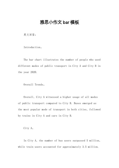
The bar chart illustrates the number of people who used different modes of public transport in City A and City B in the year 2020.Overall Trends。
Overall, City A witnessed a higher usage of all modes of public transport compared to City B. Buses emerged as the most popular mode of transport in both cities, followed by trains in City A and cars in City B.City A。
In City A, the number of bus users surpassed 5 million, while train users accounted for approximately 3.5 million.Car usage was relatively low, with just over 2 million people opting for it. A significant number of people, nearly 1 million, opted for bicycles as their mode of transport.City B。
In contrast, City B had a lower number of bus users, with approximately 3.2 million people using it. Train usage was minimal, with only around 0.5 million users. Cars were the second most popular mode of transport in City B, with 3 million people using it. Bicycles were not as prevalent, with only 0.2 million users.Comparison。
2023雅思写作大小作文原题
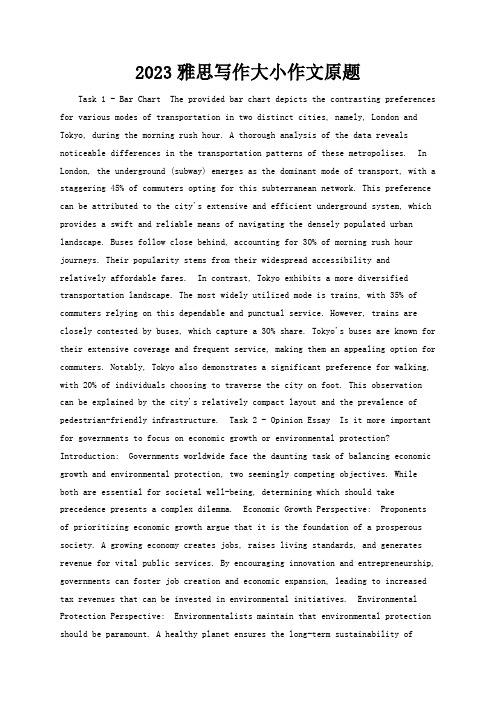
2023雅思写作大小作文原题Task 1 - Bar Chart The provided bar chart depicts the contrasting preferences for various modes of transportation in two distinct cities, namely, London and Tokyo, during the morning rush hour. A thorough analysis of the data reveals noticeable differences in the transportation patterns of these metropolises. In London, the underground (subway) emerges as the dominant mode of transport, with a staggering 45% of commuters opting for this subterranean network. This preference can be attributed to the city's extensive and efficient underground system, which provides a swift and reliable means of navigating the densely populated urban landscape. Buses follow close behind, accounting for 30% of morning rush hour journeys. Their popularity stems from their widespread accessibility andrelatively affordable fares. In contrast, Tokyo exhibits a more diversified transportation landscape. The most widely utilized mode is trains, with 35% of commuters relying on this dependable and punctual service. However, trains are closely contested by buses, which capture a 30% share. Tokyo's buses are known for their extensive coverage and frequent service, making them an appealing option for commuters. Notably, Tokyo also demonstrates a significant preference for walking, with 20% of individuals choosing to traverse the city on foot. This observation can be explained by the city's relatively compact layout and the prevalence of pedestrian-friendly infrastructure. Task 2 - Opinion Essay Is it more important for governments to focus on economic growth or environmental protection? Introduction: Governments worldwide face the daunting task of balancing economic growth and environmental protection, two seemingly competing objectives. While both are essential for societal well-being, determining which should take precedence presents a complex dilemma. Economic Growth Perspective: Proponents of prioritizing economic growth argue that it is the foundation of a prosperous society. A growing economy creates jobs, raises living standards, and generates revenue for vital public services. By encouraging innovation and entrepreneurship, governments can foster job creation and economic expansion, leading to increased tax revenues that can be invested in environmental initiatives. Environmental Protection Perspective: Environmentalists maintain that environmental protection should be paramount. A healthy planet ensures the long-term sustainability ofhuman life and the preservation of biodiversity. By investing in renewable energy sources, implementing pollution control measures, and protecting natural resources, governments can mitigate the detrimental effects of human activities on the environment. This approach safeguards the health of future generations andprotects the planet's ecological balance. Balancing the Two: However,recognizing the importance of both perspectives, a balanced approach is crucial. Economic growth should not come at the expense of environmental degradation, and environmental protection measures should not stifle economic prosperity. Governments must adopt sustainable development practices that harmonize economic growth with environmental protection. One such approach is investing in renewable energy technologies, which can create jobs while reducing greenhouse gas emissions. Role of Technology: Technological advancements can play a pivotal role inachieving this balance. Clean energy technologies, such as solar and wind power, enable economic growth without compromising environmental sustainability. Additionally, innovations in pollution control and resource conservation can help mitigate the environmental impact of economic activities. Social Responsibility: The responsibility for balancing economic growth and environmental protection does not solely fall on governments. Individuals, businesses, and civil society organizations must also contribute to sustainable practices. Informed choices,such as reducing consumption, recycling, and supporting eco-friendly businesses,can make a significant difference in protecting the environment. Conclusion: The debate between economic growth and environmental protection is a complex onewithout easy answers. Both are essential for a thriving society. Governments, in collaboration with individuals and organizations, must adopt a balanced approachthat prioritizes both objectives. By leveraging technological advancements and fostering social responsibility, it is possible to achieve sustainable development that ensures both economic prosperity and environmental stewardship for future generations.。
Simon雅思小作文真题范文 Task 1: 'living alone' charts
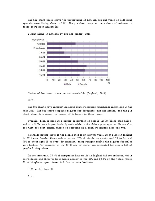
The bar chart below shows the proportions of English men and women of different ages who were living alone in 2011. The pie chart compares the numbers of bedrooms in these one-person households.Living alone in England by age and gender, 2011Number of bedrooms in one-person households (England, 2011)范文:The two charts give information about single-occupant households in England in the year 2011. The bar chart compares figures for occupants' age and gender, and the pie chart shows data about the number of bedrooms in these homes.Overall, females made up a higher proportion of people living alone than males, and this difference is particularly noticeable in the older age categories. We can also see that the most common number of bedrooms in a single-occupant home was two.A significant majority of the people aged 65 or over who were living alone in England in 2011 were female. Women made up around 72% of single occupants aged 75 to 84, and 76% of those aged 85 or over. By contrast, among younger adults the figures for males were higher. For example, in the 35-49 age category, men accounted for nearly 65% of people living alone.In the same year, 35.4% of one-person households in England had two bedrooms, while one-bedroom and three-bedroom homes accounted for 28% and 29.8% of the total. Under 7% of single-occupant homes had four or more bedrooms.(189 words, band 9)Tip:Notice that I was forced to leave out some of the information from the bar chart. This is normal when you only have 20 minutes; examiners expect you to select some key figures, not to try to include everything.。
雅思作文之Task1范文
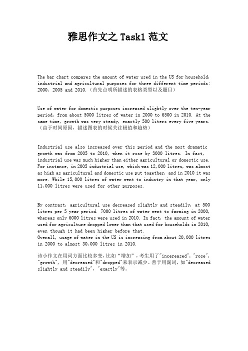
雅思作文之Task1范文The bar chart compares the amount of water used in the US for household, industrial and agricultural purposes for three different time periods: 2000, 2005 and 2010.(首先点明所描述的表格类型以及题目)Use of water for domestic purposes increased slightly over the ten-year period, from about 5000 litres of water in 2000 to 6500 in 2010. At the same time, growth was very steady, exactly 500 liters every five years.(由于时间原因,描述图表的时候关注极值和趋势)Industrial use also increased over this period and the most dramatic growth was from 2005 to 2010, when it rose by 3000 litres. In fact, industrial use was much higher than either agricultural or domestic use. For instance, in 2005 industrial use, which was 12,000 litres, was almost as high as agricultural and domestic use put together, and in 2010 it was more. While 15,000 litres of water went to industry in that year, only 11,000 litres were used for other purposes.By contrast, agricultural use decreased slightly and steadily, at 500 litres per 5 year period. 7000 litres of water went to farming in 2000, whereas only 6000 litres were used in 2010. In fact, the amount of water used for agriculture dropped lower than that used for households in 2010, even though it had been higher before that.Overall, usage of water in the US is increasing from about 20,000 litres in 2000 to almost 30,000 litres in 2010.该小作文在用词方面比较多变,比如“增加”,考生用了"incereased", "rose", "growth", 用"decreased"和"dropped"来表示减少。
雅思作文小组作业模板

雅思作文小组作业模板英文回答:Task 1: Bar Chart。
The bar chart depicts the percentage of people using different modes of transportation in three cities: London, New York, and Tokyo. In London, 35% of commuters travel by bus, 25% by underground, 20% by car, 15% by bicycle, and 5% by other means. In New York, 45% of people use the subway, 30% drive, 15% take buses, and 10% walk. Tokyo exhibits a different pattern, with 50% of residents commuting by train, 30% by bicycle, 15% by bus, and 5% by other methods.Observation:London has a more diversified transportation system, with a significant proportion of people using multiple modes, including buses, underground, cars, and bicycles.New York relies heavily on its subway system, with nearly half of the population using it for daily commutes.Tokyo stands out with a high percentage of train commuters and a notable presence of cyclists.Task 2: Cause and Effect Essay。
- 1、下载文档前请自行甄别文档内容的完整性,平台不提供额外的编辑、内容补充、找答案等附加服务。
- 2、"仅部分预览"的文档,不可在线预览部分如存在完整性等问题,可反馈申请退款(可完整预览的文档不适用该条件!)。
- 3、如文档侵犯您的权益,请联系客服反馈,我们会尽快为您处理(人工客服工作时间:9:00-18:30)。
题目:
The chart below shows the total number of minutes (in billions) of telephone calls in the UK, divided into three categories, from 1995-2002.
Here's my suggested outline for a 4-paragraph report:
Introduction: rewrite the question statement in your own words.
Overview: point out which category was highest in each year, which was lowest, and which saw the biggest changes.
Details: compare the 3 categories in 1995, then say what happened up until 1999.
Details: notice what happened to local calls from 1999 onwards, and contrast this with the other 2 categories. Finish with a comparison of the figures in 2002.
范文:
The bar chart compares the amount of time spent by people in the UK on three different types of phone call between 1995 and 2002.
It is clear that calls made via local, fixed lines were the most popular type, in terms of overall usage, throughout the period shown. The lowest figures on the chart are for mobile calls, but this category also saw the most dramatic increase in user minutes.
In 1995, people in the UK used fixed lines for a total of just over 70 billion minutes for local calls, and about half of that amount of time for national or international calls. By contrast, mobile phones were only used for around 4 billion minutes. Over the following four years, the figures for all three types of phone call increased steadily.
By 1999, the amount of time spent on local calls using landlines had reached a peak at 90 billion minutes. Subsequently, the figure for this category fell, but the rise in the other two types of phone call continued. In 2002, the number of minutes of national / international landline calls passed 60 billion, while the figure for mobiles rose to around 45 billion minutes.
(197 words, band 9)。