Simon雅思小作文真题范文 Task 1: 'waste table' essay
Simon考官雅思口语范文part1-word版(汇总-59页)
1) At what age did you start studying mathematics?I can't exactly remember, but it was probably in my first year at primary school when I was 5 years old. I probably learnt simple addition at that age.2) Do you like mathematics? Why / why not?I don't dislike maths, but I wouldn't say that I've ever really liked the subject either. I'm happy to do simple calculations, but my brain can't cope with the complex stuff!3) Is it necessary for everyone to learn mathematics?Yes, I think it is. We all need a basic grounding in maths so that we can do daily tasks, like managing our money, working out bills, and so on.4) Do you prefer to use a calculator when doing mathematics?It depends. I quite like exercising my brain with anything that's easy enough, but I use the calculator on my phone for anything tricky.1) Do you have a favourite number or a number that is special to you?Yes, my favourite number is... because it's the day I was born on, and it's my lucky number.2) Do any numbers have special importance in your country?Yes, certain ages are special. For example, your 18th birthday is important because it's when you are considered to become an adult.3) Are you good at remembering numbers? Why / why not?No, I'm not very good at remembering numbers. I don't think it's necessary to learn them by heart; I just save them on my phone.4) What numbers do people often have to memorise?The most important number to remember on a daily basis is the pin number for your bank card. Without this you can't pay for anything or get cash out.建议:Remember that part 1 is supposed to be easy, so you should give short, direct answers.题目1:How well do you know your next-door neighbours?I know my neighbours quite well. They're really nice people, and I always stop to talk whenever I see them. I think it's important to get on well with the people who live next door.题目2. How often do you see them?I see my neighbours at least a few times a week. We usually see each other when we're leaving for work in the morning or coming home in the evening.题目 3. What problems do people sometimes have with their neighbours?I think the most common problem is probably noise. It's difficult to live next to people who have a dog that barks at night, or who play loud music or have too many parties.Here are my sample answers for the 'chocolate' topic. Remember that your priority in speaking part 1 is to demonstrate fluency by giving answers that are short, direct and natural, without hesitating too much.1) Do you like chocolate? Why / why not?Yes, I love chocolate. I like the taste, the texture and the feeling that you get when you eat it. And it goes really well with my favourite drink, coffee.2) What type of chocolate do you prefer? Why?I prefer dark chocolate to milk chocolate, because it has a stronger taste. I also like chocolate when it's in a cake, and I love drinking hot chocolate too.3) When do you usually eat chocolate?I try not to eat too much, but I probably eat or drink something that contains chocolate every couple of days.4) Do people give chocolate as a present in your country? When?Yes, it's very common to give boxes of individual chocolates as a gift. You can give chocolates on any special occasion really: birthdays, Valentine's day, Easter, Christmas, and so on.1. Do you like cooking? Why / why not?Sometimes. I like preparing a special meal for family or friends who visit, but everyday cooking is a bit boring; it's something that has to be done, but it's not really fun.2. Who did the cooking in your family when you were a child?My mother almost always did the cooking when I was young. I don't think she trusted my father to make a nice meal.3. Do you think that it's important to know how to cook well?I'm not sure whether it's important to cook well, but I do think that everyone should know the basics. It definitely isn't healthy to rely on pre-prepared meals or fast food.4. Do you think that children should be taught cookery at school?Yes, that's probably a good idea. If all children knew how to cook a few basic, healthy meals, that would surely be a good thing.1. What’s the weather like today?It’s really freezing today. If I don’t have to take the IELTS exams, I would prefer to stay at home.2. What kind of weather do you like (best)? (Why?)Actually I prefer the cloudy day as it’s neither too hot nor too cold. And what’s more important to me is that this whether is perfect for photography as the light is soft and tender. So at this time of day, I’ll always go out with my camera to the forest parks to take photos.3. What’s the weather (usually) like in your hometown?In my hometown, as it is surrounded by mountains, the whether is quite pleasant, neither too hot nor too cold. Even in winter, the temperature is still quite mild. The weather is good almost all year round as my hometown is a tourist city and there is no any industrial pollutionout there.4. Do you like that weather (or, that kind of climate)? (Why?/Why not?)The bad points about the weather in my hometown are that it doesn’t snow as heavily as up north like Beijing. It does snow, but is just a little bit. Every time I saw children having a snowball flight or making a snowman on TV, I really envied them. It was really pity.5. What is the typical weather in China like?I believe though China is a vast country, there are four distinct seasons in most places. But unfortunately in recent years, many places in summer are becoming boiling hot. I guess the changes are primarily due to the green-house effect. So in this extreme whether, I will really prefer to work at home, and the air-conditioning is working all day long, and at night, I even sleep on the floor.6. Have there been any changes in the weather over the past few years?Yes, as Beijing is facing more and more oppressive haze, I always keep a watchful eye on the weather forecast. I installed an app in my mobile phone, and see the indicator of PM 2.5. It has been a routine for me.7. Do you always pay attention to the unusual weather?As for the unusual weather, the global warming has really become a heated topic around the world. It is caused by the greenhouse effect as the a sheer volume of carbon dioxide have been emitted into the air, preventing the atmosphere from cooling off at night. And another unusual weather, I’m afraid is the hurricane which can easily flatten thousands of homes near the coast in a short period of time.8. Would you prefer to live in a place that has just one, warm season that lasts the whole year or a place with different seasons?Well, if I were to choose between the two, I’ll probably go with the distinct seasons in each year because each season has its own merits. Whereas I will get bored if it is warm all year round.19. Do people in China play the same sports in different seasons ofthe year?No, when in spring and autumn, the temperature is neither too cold nor too hot, people in China tend to hike in the mountains, or go running. When it comes to summer, people can choose more physical activities like swimming, camping in the forests and playing balls, etc. But in winter, people believe it not suitable for outdoor exercises, so they prefer to stay at home for resting.1. What kinds of thing make you laugh?I laugh most when I'm with friends talking about funny things that have happened to us. I also like watching comedians and comedy films.2. Do you like making other people laugh?Yes, it's a nice feeling when you can make someone laugh because you can see that you've made them happy. It's great to share a funny moment with someone.3. Do you think it's important for people to laugh?Yes, of course. It's important to see the funny side of things; humourhelps us not to take life too seriously. I think that laughter is good for our health.4. Is laughing the same as feeling happy?It's not exactly the same because you can be happy without laughing, and sometimes we laugh when something bad has happened; a sense of humour can help us to cope with difficult situations.1) How much time do you spend at home?Obviously I sleep at home, but I don't spend very much time at home during the day, because I'm usually busy with work.2) Do you prefer to spend your free time at home or outside the house?During the day I prefer to be out of the house, so I like visiting family or meeting up with friends. But I do like relaxing at home in the evenings.3) What do you do when you have some free time and you're at home?I usually sit and watch some TV or a film, or I listen to some music. I also like sitting outside if the weather is nice.4) Would you like to have more spare time to spend at home in the future?No, not really. I get bored if I'm at home for too long. In the future, I imagine I'll still prefer to go out and do things rather than stay indoors.1. Are there many advertisements in your country?Yes, there are adverts everywhere in the city. You can easily see them near the subway station, along the express way and in the elevator.2. Why do you think there are so many advertisements now?The main factor is that adverts are the most efficient way for the companies to reach their end users, and also every company wants to stand out from the crowd in such fierce competition.3. How do you feel about advertisements?I’m afraid that the advertisements are really annoying in some way,and they always exaggerate the true functions of products. So I guess they are not as reliable as they seem to be.4. What kind of advertisements do you like the most?I am fond of the adverts that are well-designed and deliver the high quality contents, but that doesn’t mean I will go and buy that products.5. Do advertisements influence your choice about what to buy?No, I believe buying things totally based on adverts is unreasonable.6. Do you like advertisements on TV?I’m not into TV adverts, because I am often interrupted by the adverts when watching the TV programmes. It is really annoying.7. Do you prefer advertisements on TV or those in magazines?Well, if I were to choose between the two, I’ll probably go with the adverts in magazines because they are well-designed and I can have plenty of time to look through them, whereas the TV adverts are reallyannoying.8. Do you think adverting plays an important role in today’s world?In general, it’s a prosperous industry. The number of enterprises that pay attention to adverts is growing, and there are more students who apply to study advertisement in university.1) Have you ever collected anything as a hobby? (What?)Yes. When I was younger I used to collect keyrings. I remember that my favourite was a Lego man keyring that someone bought me as a present.2) What kinds of thing do people often like collecting?Some people collect cheap items like stamps, keyrings or toys. Others collect expensive antiques, watches, jewellery or even cars.3) Why do you think people collect certain objects?Maybe they like the constant search for a new item, or they want to remember past experiences. Others might like the feeling of organisingand presenting what they own.4) Is there anything that you would like to collect in the future?Yes. If I could afford it, I'd love to have a collection of guitars in different colours, shapes and sizes!1. Do you often do any cooking?Normally I don’t frequently cook at home on weekdays because I have no time. But on weekends, I usually cook food at home for my family.2. Do you like cooking? (Why?/Why not?)Yes, I’m quite into cooking because I believe that good dinner could guarantee our health and also I’m a foodie, I’d like to taste all kinds of tasty food. I always do some cooking in my home with my family during the weekend to enjoy the family time.3. What cooking experience have you had?Obviously, in my opinion, a fabulous cooking can’t be done withoutfresh food resources. So I always try to go to the super market early in the morning and select today’s vegetables and meat. Besides, I always put several vegetables such as carrot, bamboo shoots, pepper, tofu, along with meat to cook in order to get the balanced diet.4. Who taught you to cook?My mother is an expert at cooking, and she taught me how to cook when I graduated from university and started to live independently. She told me that the ability to cook was fairly important because good dinner could guarantee our health.5. When you were a child, did you ever help your parents to preparea meal?I remember when I was a little boy, I was used to help wash the vegetables, go out to buy some flavours, etc. I strongly recommend that children should take part in this kind of housework because it can help cultivate the hands-on abilities, a sense of achievement and even learn some table manners.1. What is your favourite food?The fish is my favourite, especially with red hot chilies, cos it is so tasty and colourful and beside fish is nutritious too. I will cook it myself at home during the weekends for my family.2. When do you usually eat that food?When I was a child, I liked the food made by my mother. She was an expert at cooking, and the fish was my favourite. I’m still fond of eating fish when I became an adult, and now I always cook it myself at home during the weekends for my family, once a week maybe.3. Is food important to you?Yes, definitely. I believe good food is very important because it is not only very tasty, but could also guarantee our health.4. What food do you usually eat?In general, I eat a lot of rice and vegetables every day. And once a week, I will cook a fish myself at home during the weekends for my family which is my favourite.5. Do you usually eat the same food every day?No, it will be boring to eat the same food every day. I also like noodles, dumpling, and sometimes I eat pizza and curry which are both delicious.6. Is there any food you don’t like?I’m really not into Japanese food because they are sometimes cold, or even are raw food, like sushi. I once bought them in the supermarket, but the taste really disgusted me.1. What sports or physical activities do you regularly do?Unfortunately I don't have time to do any sports or physical activities because of my work commitments. I'd like to find more time for regular exercise.2. Which sport or game would you like to be good at?I'd like to be good at tennis. It must be great to be able to hit the ball as hard as you can and watch it land exactly where you wanted it to.3. Do you prefer watching or playing sports?I don't watch much sport on TV and I'm not a big sports fan, so I think I would probably enjoy doing sports more than watching them.4. Do you think children should be encouraged to do more sport?Yes, I think that sport is really important for children. Sports and games teach children to play together and try their best.题目:1. Do you like (to learn about) history?2. What historical event do you find most interesting?3. Do you think history is important?4. Do you like to watch programmes on TV about history?5. Do you think you can really learn history from films and TV programmes?6. Do you think the internet is a good place to learn about history?7. Can you name a person from history who you would like to learn more about?8. Why would you like to learn more about him/her?参考答案:Yes, I am a big fan of reading historical stories. When I was a little boy, I always took some historical books from my father’s bookshelf and read the historical events. I feel that history not only can cultivate my mental development, but also give me a better picture of human society.Personally I am fond of the Battle of Red Cliffs happened in the early period of Three Kingdoms, which was a decisive battle at the end of the Han Dynasty. It was also the typical battle in Chinese history renowned for the fewer and weaker defeating the more and stronger.Yes, the main factor is that like our native language, history forms a cultural identity and keeps a unique record of country, and also we can learn the experiences from history to correct our current actions.Yes, I enjoy watching some documentaries about history on TV because I can see a lot of video materials that can not bee seen in the textbooks. I always watch them at home.I don’t feel that watching the current TV series can make you be aware of the history, you know, TV programmes are more engaging than books, however the true historical events in most of the TV series have been distorted by the producers to cater for the audience. It’s really shame as the young people will misunderstand the history by these irresponsible productions.Yes. History is full of debates so you can find both of the two sides of opinion online which will help you be aware of the true facts and think critically. I always google some engaging historical materials about the Song Dynasty, for example, to know about the truth.The people I’d like to learn about is Wu Chengen, the author of A Journey to the West. He combined the folk tales and his own imagination to write the great fairy story in the 16th century. I want to know about his personality as much as possible and I believe that his imagination is what is lack of nowadays.必备词汇:1.很喜欢:I am big fan of XX2.熏陶我的心灵发展:cultivate my mental development3.人类社会:Human society4.个人地来说:Personally5.三国时期:the period of Three Kingdoms6.文化属性:cultural identity7.纪录片(复):documentaries8. 被曲解:have been distorted by9.误解历史:misunderstand the history10.西游记:a journey of the West1. Are there many (or, any) museums in your hometown?Not so many, actually there is only one museum in my small county about the local history. It allows the local residents to know better about their traditions and historical celebrities.2. Do you think museums are useful for visitors to your hometown/country?I go to the museum a lot, when I come to the new place, I’ll find some local museums that have interesting features. The museum I visited last time was the Guanfu Museum located in the rural area of Beijing. It is a private-owned museum featuring Chinese antiques like porcelain, furniture, jade and some paintings.3. Do you think museums are important?Museums are really important in protecting, preserving, propagating and researching numerous human treasure. Once the antiques are in the museums, they are permanently out of circulation, which means they can be seen by public.4. Do you think it’s suitable for museums to sell things to visitors?Yes, the reason is that generally, most museums are nonprofit organisations, and these goods are their large portion of income, except the tickets, and also partly because these items are closely related to the theme of the museums, which cannot be bought in most other bookstores or shops.1. Do you like visiting natural places?Yes, I am fond of getting close to the nature. Once I am free, I’d like to visit one of the forest parks around Changsha. These places are not only really perfect for physical activities, but also can help me let off steam.2. What are some well-known natural attractions in your country?There are so many natural attractions in my country, for example, the best one, in my opinion, is the Huangshan Mountain, which earns a high reputation for its magnificent natural scenery. Besides, I travel to the Inner Mongolian grasslands every year to see the vast grassland as well as the blue sky and the white cloud which can be rarely seen in Beijing.3. Have you ever gone camping?Yes, just once, but really memorable. I went to the Lingshan Mountain with my friends this year. We slept in the forest in the camps at night. It was totally dark outside, but we sang the songs loudly with others and heard the sound of rain dropping on my camp gently. It was really an interesting experience.4. How do city kids in your country have contact with nature?Cities in China usually have many parks in them so that children can visit with their parents. Most of these parks have plenty of trees, meadow, rockery and even lakes, which are good enough for children to get close to nature. Besides, on holidays, children will have opportunities to go for an outing to some natural sceneries.5.. What are the benefits of learning about nature?People can definitely benefit a lot from nature. Apart from the physical fitness, people can loose up in the natural environment and inspire their love to life. As for children, I believe getting close to nature can cultivate their natural motivations to investigation and discovery theworld around them based on their interests.1. What do you do in your spare time?Well, there are lots of things I can do if I’m free. For instance, I stay at home sometimes to read books to enjoy the leisure hours with myself, or I’ll go with my friends to do some outdoor activities such as playing football and hiking.2. Do you like outdoor activities?Yes, I’m really into outdoor activities. You know, the main factor is that I can take some physical to keep me fit, so I always go hiking or jogging if I am free.3. What outdoor activities do you most like to do?Normally I’ll go for a jogging around my house in the morning so that I can take some physical exercises while enjoying the fresh air, but if I can invite some more friends I would go for a simple football match with them because football is a sociable activities so that I can have more fun with my friends and make new friends as well.4. How often do you do that?Well, I do these physical exercises from time to time. Normally if I’m not busy with my work, I will go for a jogging around my house in the morning to take some physical exercises while enjoying the fresh air, probably four times in a week; but if I have lots of on things my hands I’ll probably focus on my work.5. What (types of) outdoor activities are popular in your country?It’s kind of hard to say but people that I know around me tend to go jogging in the morning or take a walk after dinner, but maybe for others, they probably like to take some indoor activities like swimming and yoga.1. Do you like to take photographs? (Why?)Yes, I am a big fan of photography in my spare time. I always travel around to the stunning natural scenery with my camera. I have been in the habit of it for almost 8 years. The main factor is that I can capture the precious moment in my life, such as the graduation ceremony, or the sweet moment with my girlfriend, and also I believe the photography will cultivate my mental development.2. Do you prefer to take photos yourself or to have other people take photos? (Why?)If I were to choose between the two, I’ll probably go with taking photos of others because I feel that different people have different characteristic, so the photos will be distinguishing. Whereas, I barely take a selfie because it will make me embarrassed.3. Do you prefer to take pictures of people or of scenery?Normally, I’ll probably go with the scenery to take photos because I really enjoy the marvellous natural scenery such as the seashore, sunset and twilight, but if I take my son travelling around, I’ll take photos of him to capture his happiness.4. How do you keep your photos?I store my photos both in my computer disk and Internet for backup. And besides I have a photography website running for 4 years, keeping all my premium photos there.5. Do you frame (of have you framed) any of your photos? (If yes,which?&why?)Yes, I used to print some photos of my kid to hang them in his room, which can help us memorise the warm moment we had together.6. Do you prefer to send postcards to people or to send photos that you took yourself? (Why?)Well, if I were to choose between the two, I’ll probably go with my own photos because they are unique and seeing a lot of comments from friends is really a pleasant thing. Whereas postcards are not as meaningful as photos taken by myself.1. What public holidays do you have in your country?We celebrate a lot of public festivals in my country. I am sure you know about the Spring Festival which is the most important one. In addition, we get together with our family for the Mid-Autumn Day and the National Day.2. Do people in your country celebrate Christmas?Yes, there are so many people in my country, it’s really hard to say,probably most people tend to go shopping with families or friends to take advantage of the sales the shops are offering, but personally speaking, I am afraid we don’t celebrate Christmas like the way in Western countries.3. Do you like public holidays?Yes, I am fond of holidays. The main factor is that on these days, I don’t have to work and have plenty of time travelling around to unwind myself and also I will have more consecutive time with my family.4. Which public holidays do you like the most?I believe my favourite public holiday would be the National Day because I will have at least seven days to go travelling and also it’s the best time to go around, the weather is neither too cold nor too hot, and the foliage of trees have turned yellow or red, which will give you picturesque views.5. What do other people in your country usually do on public holidays?It’s kind of hard to say but people that I know around me tend to go shopping with families or friends to take advantage of the sales the shops are offering, but maybe for others, they probably stay at home for resting.6. Do you think public holidays are important?I believe the public holidays are rather important and there should be more of them in my country. The main factor is that people really need unwind themselves without any distractions after tiring work and also public holidays can dramatically boost consumption as the goods will be sold at a discount during these days.1. Do you like science?I love science so much because it can explain everything in life. It allows me to know where things come from and how we act, why roses are red, how airplanes fly, and so much more! Besides, it is never ending, which means that there is always something new to discover because the topic of science is so huge.2. What science have you studied (or learned)?I have studied several science in the middle school and university, such as maths, physics, chemistry, biology, geography and computer science. I found most of them were very challenging and thought-provoking.3.Is your work related to science?Yes, I’m an IT engineer now so I think it’s belong to the computer science. I learned lots of them from the university lessons.4. What’s the most interesting (part of) science to you?I like physics better than any other science because it makes me feel ignorant and it has helped me realize how big and interesting the universe is, how relative our reality is, how small we are and how many questions there are unanswered. I also adore the fact that I feel like a kid when I learn new stuff, for me, it is like opening a Christmas present because you don’t expect what’s coming.1. What’s your favourite season?I guess the autumn is the best time to travel. As it is neither too hot nor too cold, people will feel comfortable to go out. Besides, as the。
雅思小作文真题
雅思小作文真题雅思小作文是雅思考试中的一部分,通常包括图表题和流程图题。
在考试中,学生需要根据提供的图表或流程图,撰写一篇150字左右的作文,描述图表或流程图中的主要信息和趋势。
雅思小作文的考察重点主要在于学生的描述能力和数据分析能力。
下面我们将通过几个真实的雅思小作文题目,来看一下如何有效地完成这部分考试。
第一篇作文题目是一个饼状图,图中展示了2010年和2015年全球能源消耗的比例。
我们可以看到,石油和天然气在能源消耗中占据了主导地位,而可再生能源和核能的比例相对较小。
在描述这个图表时,我们可以先介绍整体的能源消耗情况,然后逐一描述各个能源的比例变化,最后总结出主要的趋势和结论。
在写作过程中,我们需要使用一些数据和比例的具体数字来支撑我们的描述,同时也要注意使用一些连接词来使得整个作文逻辑清晰,层次分明。
第二篇作文题目是一个流程图,图中展示了如何制作巧克力。
在这个题目中,我们需要按照流程图的顺序,依次描述制作巧克力的每一个步骤。
我们可以使用一些动词和时间状语来描述每一个步骤的具体操作,同时也要注意使用一些连接词来使得整个作文流畅自然。
在写作过程中,我们可以适当使用一些形象生动的语言来描述制作巧克力的过程,这样可以使得作文更加生动有趣。
第三篇作文题目是一个柱状图,图中展示了2000年和2010年某国家人口的年龄结构。
在这个题目中,我们可以先描述整体的人口年龄结构情况,然后逐一描述不同年龄段的人口比例变化,最后总结出主要的趋势和结论。
在写作过程中,我们可以使用一些形容词和副词来描述不同年龄段的人口比例,同时也要注意使用一些连接词来使得整个作文逻辑清晰,层次分明。
通过以上三个真实的雅思小作文题目,我们可以看到,完成雅思小作文并不难,关键在于我们需要对图表或流程图有一个清晰的理解,然后按照一定的逻辑顺序来进行描述。
同时,我们也需要注意使用一些具体的数据和连接词来使得整个作文更加生动有趣,逻辑清晰。
希望以上内容对大家有所帮助,祝大家在雅思考试中取得好成绩!。
simon范文(15篇)
simon范文(15篇)simon范文第1篇假如大家有空闲时间,并且想提高听力反应速度,可以渐渐从慢速过渡到正常速读。
在全部的慢速材料中,推举VOA 和BBC 英语,可以挑里面话题比较日常的新闻听一听。
练习的时候肯定要听懂每一个单词每一个句子,不要留下任何死角。
一旦习惯了这种语速,就可以听正常语速的材料了。
平常也要多涉猎一些题材,可以选择一些自己感爱好的英文电视剧或者电影,不要带字幕,然后一边看剧一边听,消遣的同时还能练习听力力量。
假如一部剧的一半以上都听不懂,那就选择更简洁一点的,比如一些动画片之类的,小猪佩奇也可以,哈哈哈。
simon范文第2篇part1 和2 是整个口最简单拿高分的部分,这个环节回答的好了,part3 也会水到渠成,大家务必重视。
关于part2,简单考察的话题就那么多,大家可以在训练营get 一下免费的题库,然后分为不同的话题,积累不同的表达,着重背诵和练习。
前两个部分是最基础和重要的,是能够通过不断反复练习快速拿下的。
对于前两个部分的话题和考官简单问的问题,口语题库基本是能够掩盖的。
大家平常肯定要去多多练习和积累。
对于真题上面的题目,可以预留1 个月的时间,着重练习一遍,检验自己的复习效果,也看看真题一般是怎么考察的。
对于心理素养和口语基础不好的同学,肯定要反复练习,只有娴熟到肯定程度,才不会在考试的时候由于紧急、可怕等各种缘由出错。
simon范文第3篇雅思阅读对阅读速度要求是很高的,一共三篇学术文章,有40 个题目,答题时间仅仅只有 1 个小时左右,想都读完读懂做题是完全不行能的事情。
假如每一句、每一段都细读的话,可能一半的题目都做不完。
因此,肯定要学会利用关键词句快速定位到答案,这就是为什么许多时候看不懂文章,题目正确率却很高的缘由。
有了肯定的长难句和语法基础后,平常肯定要养成快速阅读的习惯,抓住一个句子的主干,把一些修饰性的内容跳过或者略读,丢掉逐个单词阅读的坏习惯,而是要一行一行地快速阅读,查找关键词和关键句。
simon雅思写作小作文模板

simon雅思写作小作文模板英文回答:Part 1。
The pie chart shows the proportion of different types of waste produced by a household in one week.Introduction:This pie chart illustrates the various categories of waste generated by a household over a seven-day period.Body:Food waste: The largest segment (40%) is attributed to food scraps, leftovers, and spoiled food.Paper products: The second largest category (25%) consists of paper items such as newspapers, magazines, andcardboard.Plastic and metal: Plastic packaging, bottles, andmetal cans account for 15% of the waste.Yard waste: Grass clippings, leaves, and other organic materials from gardening contribute 12% to the total.Other: The remaining 8% comprises a diverse range of items, including textiles, electronics, and hazardous waste.Conclusion:In conclusion, this pie chart underscores thesignificant contribution of food waste and paper productsto a household's weekly waste output. It emphasizes theneed for effective waste management strategies, including recycling, composting, and waste reduction initiatives.Part 2。
Simon雅思小作文真题范文Task1:wastetableessay
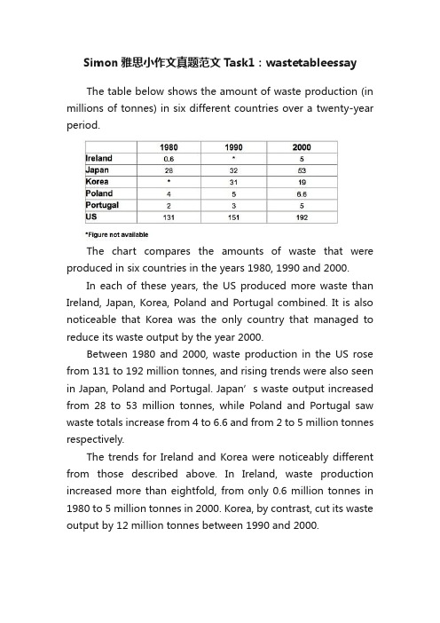
The trends for Ireland and Korea were noticeably different from those described above. In Ireland, waste production increased more than eightfold, from only 0.6 million tonnes in 1980 to 5 million tonnes in 2000. Korea, by contrast, cut its waste output by 12 million tonnes between 1990 and 2000.
The chart compares the amounts of waste that were produced in six countries in the years 1980, 1990 and 2000.
In each of these years, the US produced more waste than Ireland, Japan, Korea, Poland and Portugal combined. It is also noticeable that Korea was the only country that managed to reduce its waste output by the year 2000.
雅思Simon写作大小范文(高清PDF解析使用经验)
雅思Simon写作大小范文(高清PDF解析使用经验)我来讲一下我的学习方法:写作我应该是比较有发言权的。
网上五花八门的雅思写作教程一大堆,别用了这个换那个,把思维全搞乱了,只需要认准一个,一开始先把自己习惯的写作思维方式定下来,后面就只用积累素材就好了。
雅思作文真的不是像洪水猛兽一样可怕的东西。
我全程用的是雅思前考官 Simon 的写作结构和idea第一步,去看他的simon writing,了解一下雅思写作从头到位到底是什么结构,该如何构思,在构思过后该怎么下笔才能让整篇文章连接下来。
然后:①大作文:Simon的一篇自编书籍《idea books for IELTS topics》总结了雅思作文24个topic,关于家庭,政府,教育之类的各种话题素材,每个话题都给出了简洁精辟的idea,这些话题一定要一遍遍的过,亲测非常有效!我这次考的题目是“男人和女人之间对家庭和工作有各自分工”,我用的就是他给的Gender role(性别角色)这个topic里的观点。
此外,我分享的资料里面还有他的范文,我希望大家在读他的范文的时候不要去死记硬背,要去看里面可以模仿和运用的词汇和短语(比如“持续增长”这个词,可以用growing代替continues to increase),Simon的表达和用词非常地道,这些词汇都是可以用来学习在写作里面是要加分的哦!他还有28篇流传很久的经典范文,涵盖了几乎所有的题型,我建议是先不要看范文自己对着题目先写,最后在用范文对比看自己的薄弱点在哪里。
切记不要忘记了他的素材技巧书的24个话题,写的时候去翻前面提到的Simon的idea,看过idea之后再去写,你会发现和自己之前比起来有质的飞跃。
准备一个专门的作文本,每次自己写完之后对照Simon写的把自己的句型和词汇用的不好的都记下来,等复习的时候可以及时发现自己的缺点。
当然我们有时候很难完全自己发现问题,可以去找专门的雅思老师给你修改作文,不是说每篇都得改,你可以根据个人情况自己决定。
浪费是必不可少的英语作文
浪费是必不可少的英语作文Waste: An Inevitable Component of ProgressIn the grand tapestry of human endeavor, waste is often seen as a negative byproduct, a sign of inefficiency or excess. However, when examined through a different lens, waste can be understood as an essential element in the process of innovation, learning, and ultimately, progress. This essay will explore the paradoxical role of waste in the journey towards advancement.Firstly, waste in the context of resource usage is a catalyst for innovation. When resources are scarce, the need to conserve and optimize becomes paramount. This necessity drives the development of new technologies and methods that can make better use of what is available. For instance, the rise in electronic waste has spurred the creation ofrecycling programs and the development of more sustainable materials for electronics.Secondly, waste can also refer to the process of trial and error, which is fundamental to learning and discovery. In scientific research, many experiments result in failure, but these 'wasted' efforts are crucial for understanding what does not work, thereby guiding the path to success. The same principle applies to education, where students often make mistakes that are invaluable for their intellectual growth.Moreover, waste can be a measure of abundance and choice, which are indicators of a thriving society. In a world where every item is precious and scarce, there is little room for diversity and personal preference. The ability to discard items that do not meet our needs or desires is a sign of a society that has the luxury of options and the freedom to make choices.However, it is important to recognize the limits of waste. While waste can be a necessary component of progress, it becomes problematic when it exceeds sustainable levels or when it is the result of thoughtless consumption. The key is to find a balance where waste is minimized without stifling creativity, innovation, and the freedom of choice.In conclusion, waste is not merely a sign of extravagance or carelessness. It is a complex phenomenon that can be both a symptom of societal progress and a driver of it. By understanding and managing waste responsibly, we can continue to advance without compromising the health of our planet or the well-being of future generations.。
Simon雅思小作文真题范文 Task 1: 'coffee and bananas' table
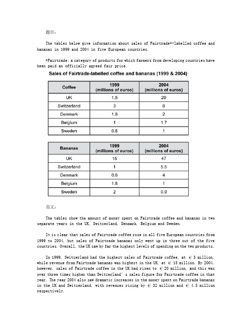
题目:The tables below give information about sales of Fairtrade*-labelled coffee and bananas in 1999 and 2004 in five European countries.*Fairtrade: a category of products for which farmers from developing countries have been paid an officially agreed fair price.范文:The tables show the amount of money spent on Fairtrade coffee and bananas in two separate years in the UK, Switzerland, Denmark, Belgium and Sweden.It is clear that sales of Fairtrade coffee rose in all five European countries from 1999 to 2004, but sales of Fairtrade bananas only went up in three out of the five countries. Overall, the UK saw by far the highest levels of spending on the two products.In 1999, Switzerland had the highest sales of Fairtrade coffee, at 3 million, while revenue from Fairtrade bananas was highest in the UK, at 15 million. By 2004, however, sales of Fairtrade coffee in the UK had risen to 20 million, and this was over three times higher than Switzerland’s sales figure for Fairtrade coffee in that year. The year 2004 also saw dramatic increases in the money spent on Fairtrade bananas in the UK and Switzerland, with revenues rising by 32 million and 4.5 million respectively.Sales of the two Fairtrade products were far lower in Denmark, Belgium and Sweden. Small increases in sales of Fairtrade coffee can be seen, but revenue remained at2 million or below in all three countries in both years. Finally, it is noticeable that the money spent on Fairtrade bananas actually fell in Belgium and Sweden.。